Invisible Text

The invisible text control provides a simple hidden text that can be used by assistive technologies such as screen readers to provide contextual information.

When to Use

Use invisible text if:

  • You need to make contextual information that is visible for sighted users available to users of assistive technologies, such as screen readers.
  • You need to provide contextual information specifically for users of assistive technologies (not required by sighted users).

Do not use invisible text if:

  • You want to provide additional information for users of assistive technologies that is not available for sighted users. While you should not discriminate users of assistive technologies, you should also not give them “privileges” .
  • You want to hide information. It might still be available for users of assistive technologies.
  • You want to hide long texts. The information is probably important enough to be shown! Furthermore, short texts are far more convenient, even for users of assistive technologies.
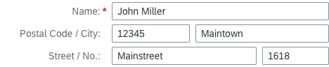
Examples

Here are some examples of use cases that require invisible texts:

  • A title that sighted users don’t need (for example, a title for a form or table).
  • A form row with more than one form element: Use the concatenated label for sighted users and single invisible texts for users of assistive technologies.
A form with two fields in one row
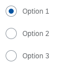
A group of radio buttons without a visible label
  • A visual element without any kind of label, such as a busy indicator animation.
Animation for loading
  • Information about uncommon states or properties, such as semantic states.
Buttons use the invisible text control to announce their type

Properties

The properties busybusyIndicatorDelay, and visible have no effect. Do not use them.

Top Tips

  • Provide short and meaningful texts. Adhere to the text guidelines for labels.
  • Do not use an invisible text as a replacement for a label (property: text).
Developer Hint
It is not sufficient to just add the invisible text control. You must also assign it to the corresponding control. Unlike labels, invisible texts are not assigned automatically in forms.

To assign the invisible text to a control, add the ID of the invisible text to the ariaLabelledBy association of the corresponding control.

Related Links

Elements and Controls

Implementation

Breadcrumb

A breadcrumb (or breadcrumb trail) is a type of secondary navigation that indicates the position of a page in its application hierarchy. It is typically used for drilldown scenarios where users navigate through related object pages, tables, and charts.

Usage

Use a breadcrumb if:

  • You want to show secondary navigation on the object page
  • You want to show navigation in a table
  • You want to show navigation in charts

Use a breadcrumb only when the drilldown scenario leads to related object pages: parent object page / child object page 1 / child object page 2 / child object page 3.

Do not use a breadcrumb if:

  • Your hierarchy contains only one level.

Do not include these elements in your breadcrumb path:

  • Other floorplans, such as overview pages and list reports
  • Cross-application navigation to other object pages
  • Standalone object pages, such as fact sheets

These cases are covered in the global navigation concept for SAP Fiori 2.0.

Responsiveness

Breadcrumbs are responsive. If there is insufficient horizontal space, the links in the breadcrumb trail collapse into a dropdown menu (sap.m.Select):

  • The first link in the breadcrumb (the point of origin) collapses first, followed by the next link in the hierarchy.
  • The last element in the breadcrumb is always visible, and should never collapse into the dropdown menu.
  • The last element is truncated if the horizontal space is insufficient.
Breadcrumb – Size L
Breadcrumb – Size L
Breadcrumb – Size M
Breadcrumb – Size M
Breadcrumb – Size S
Breadcrumb – Size S
Breadcrumb – Size S (dropdown menu selected)

Layout

The horizontal layout of the breadcrumb never changes. Links always appear next to each other.

Types

There are two types of breadcrumb:

  • Standard breadcrumb
    The standard breadcrumb shows the current page as the last item in the trail. The last item contains only plain text and not a link.
  • Breadcrumb without the current page
    Use this breadcrumb for the object page only. The breadcrumb shows the position of the object page in the application hiearchy, without the current page. All items in the breadcrumb are links.
Standard breadcrumb
Standard breadcrumb
Breadcrumb without the current page

Components

A breadcrumb can contain both links and text (standard breadcrumb), or just links (breadcrumb without current page).

Behavior and Interaction

Navigation

The purpose of the breadcrumb is to trigger navigation. The action is triggered when the user clicks a link in the breadcrumb trail.
For link behavior and interaction, see Link.

Styles

You can define the style of the separator between the breadcrumb links using the separatorStyle property.

The available values are:

  • Slash
  • Backslash
  • Double slash
  • Double backslash
  • Greater than
  • Double greater than

To find out about the different link styles, see Link.

Guidelines

  • In the dropdown menu on desktop and tablet devices, show only the links that are not visible in the breadcrumb trail.
  • In the dropdown menu on smartphones, show all the links in the breadcrumb trail in their hierarchical order.

Resources

Want to dive deeper? Follow the links below to find out more about related controls, the SAPUI5 implementation, and the visual design.

Elements and Controls

Implementation