
Theming
The latest theme for SAP applications is called Morning Horizon. In addition, SAP provides alternative themes: Evening Horizon as an optional dark theme and also Quartz Light, Quartz Dark and the accessibility themes High-Contrast Black (HCB) and High-Contrast White (HCW).
SAP Fiori Themes
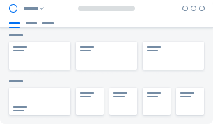
Morning Horizon
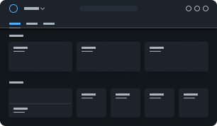
Evening Horizon
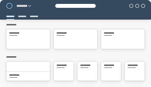
Quartz Light
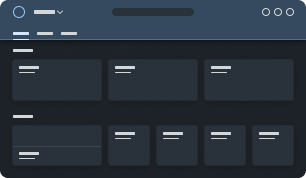
Quartz Dark
SAP Fiori High Contrast Themes
High-Contrast Black theme
High-Contrast White theme
All of the user interface components are specified using cross-technology design tokens that are mapped 1:1 with theming variables provided in multiple formats in the SAP theming base content. Theming variables come in the form of CSS variables, LESS, SASS, and JSON. This enables customers to apply their own brand identity to the user interface using the UI theme designer, which works across all SAP UI technologies. It allows customers to easily change a few basic colors (quick theming) as well as individual control colors (detailed theming).
Concept
Customers can apply their own branding by adapting the standard SAP Fiori theme. Some customers will simply replace the logo or change the main branding colors of the UI by replacing the default brand and base colors of the theme. Other customers want more control to change the colors of the UI controls. Some companies even create multiple themes to reflect the various sub-brands of their different divisions.
From Quick Theming to Detailed Control Theming
Theming is driven by customer requirements and works using a top down approach, from quick to detailed UI control adaptations:
- Quick theming: replacing logo and main brand colors
- Detailed theming: replacing detailed color values of specific UI controls
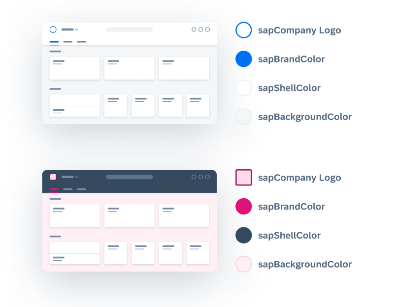
Quick Theming
Customers can easily change the logo and a few colors in the UI by replacing the colors in the UI theme designer. This automatically creates a recalculated tonal color palette that is applied to various UI elements, creating a harmonious look and feel.
One of the main parts of a corporate branding guide is a set of primary and secondary branding colors. When creating a custom theme, these colors can simply be added to the custom palette of the UI theme designer, making it easy to replace the default SAP Fiori colors.
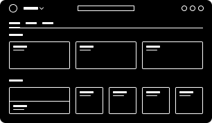
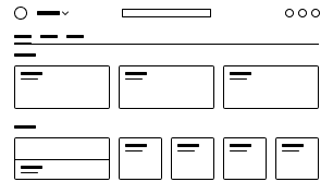
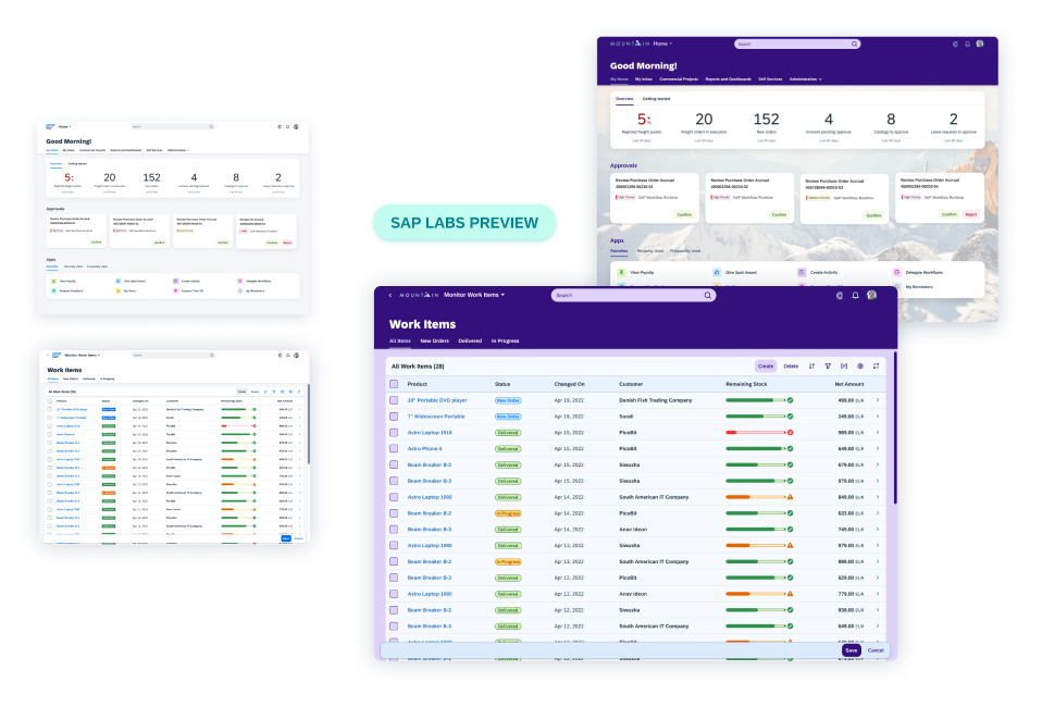
The following example shows a combination of quick theming changes.
Example: Before and After Customer Branding
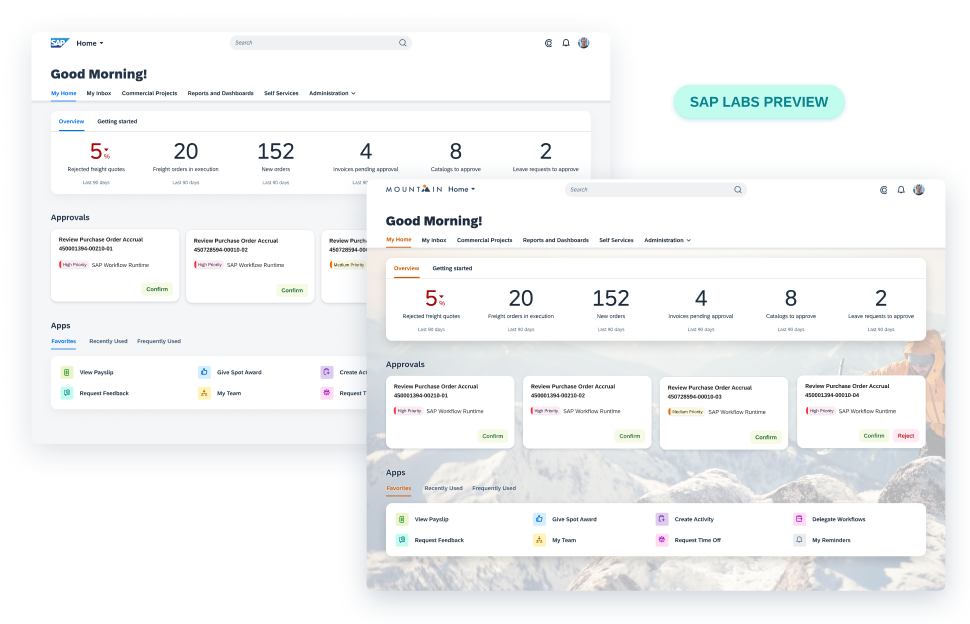
Detailed Theming
All of the main brand colors used for quick theming are also interlinked within the controls. Quick theming variables (main/base tokens) like the brand color are connected to individual control parameters (component tokens), such as icons and emphasized buttons. They can even be connected to interaction states, such as the selected and active state colors. Other quick theming parameters (main/base tokens) like the base color are connected to cards, lists, and table backgrounds.
Example: Before and After Customer Branding
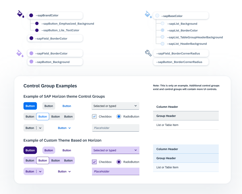
Detailed theming isn’t simply changing colors in the UI, but rather determining how specific colors are used. For example, all of the theme parameters for input controls (input field, radio button, checkbox, and so on) have been grouped together and contain the word “field“. Similarly, all the color parameters for all types of buttons, menus, and tokens (background, borders, and so on) have been grouped together and contain the word “button“. Theme parameters are set for each semantically named part of the control. These semantically named control parameters remain stable and do not change from theme to theme. Each theme has specific color values that are linked into these stable control parameters. For example, a parameter called sapButton_Background may have a gray color value in the Morning Horizon theme, a black value in the High Contrast Black theme, and a white value in the High Contrast White theme.
Accessibility
As well as the accessibility themes High Contrast Black (HCB) and High Contrast White (HCW), all SAP’s visual themes have been aligned with Web Content Accessibility Guidelines (WCAG) and follow the recommendations for the “Perceivable” principle.
SAP visual themes follow the WCAG target version that was valid at the time of the theme release. See below for details.
Related Links
Follow the links below to find out more about theming and the UI theme designer.
Using the UI Theme Designer
UI Theme Designer Documentation
Learn how to apply custom themes.
Walkthrough Process (video)
See how the UI theme designer can be used to adapt a corporate theme in this step-by-step example.
UI Theme Designer Community
Learn more about the UI theme designer and engage with the community.
Implementation
SAP Theming Base Content
GitHub repository of SAP themes.


 Your feedback has been sent to the SAP Fiori design team.