Message View
Intro
You can use the message view to display messages that are not related to form or table fields. These messages are triggered in response to a user action.
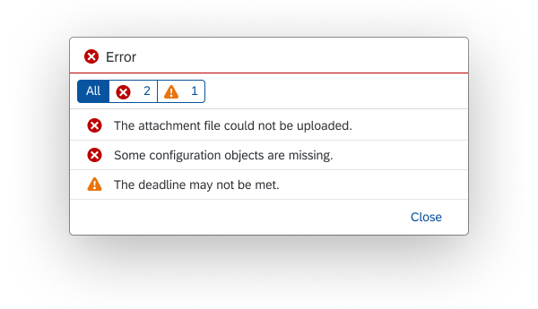
Although the message view can be embedded within various controls, we recommend that you use it only within a dialog.
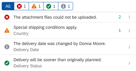
Message view
Usage
Use the message view if:
- You want to display multiple messages triggered by an action within a disruptive dialog.
Do not use the message view if:
- You want to display messages for form field validation. Instead, use the message popover.
- You want to display a single message that interrupts the user. Instead, use the message box.
Responsiveness
Size S (Smartphone)
The responsiveness of the message view is determined by the dialog container in which it is embedded.
Layout
Filtering
Multiple Message types – Filtering by Message Severity
If different types of message are available, users can filter messages by type (error, warning, success, and information) using the segmented buttons at the top of the message view.
One Message Type Only – Filtering Hidden
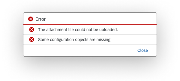
The filter bar is hidden if there is only one type of message (for example, only errors).
List
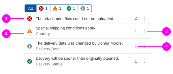
Short Description (1)
A simple and helpful short message text.
Subtitle (2)
You can use the subtitle to give your message a description that helps users to identify the object they are looking for.
Navigation to Message Details (3)
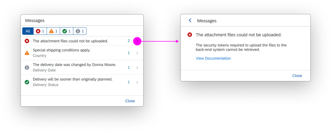
If message details are provided, the message view automatically provides a chevron on the right-hand side for navigating to the message details.
If the view contains only one message that also has message details, the message details page is displayed by default.
Aggregating Messages (4)
You can aggregate messages by filling out the counter property of each list item.
The message view only provides the counter property. The aggregation itself must be implemented by the app team.
Message Details
Behavior and Interaction
Navigation to Message Details
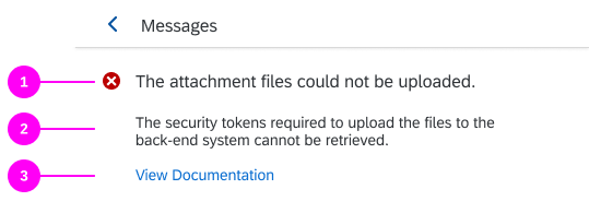
If the backend contains a long text, the user can click the arrow/chevron on the right-hand side to view the full text in the message details.
Life Cycle
We recommend that messages no longer be displayed after the user closes the dialog (sap.m.MessageBox/sap.m.Dialog).
Resources
Want to dive deeper? Follow the links below to find out more about related controls, the SAPUI5 implementation, and the visual design.
Elements and Controls
- Message Box (guidelines)
- Message Handling (guidelines)
- Message Popover (guidelines)
- Dialog (guidelines)

 Your feedback has been sent to the SAP Fiori design team.