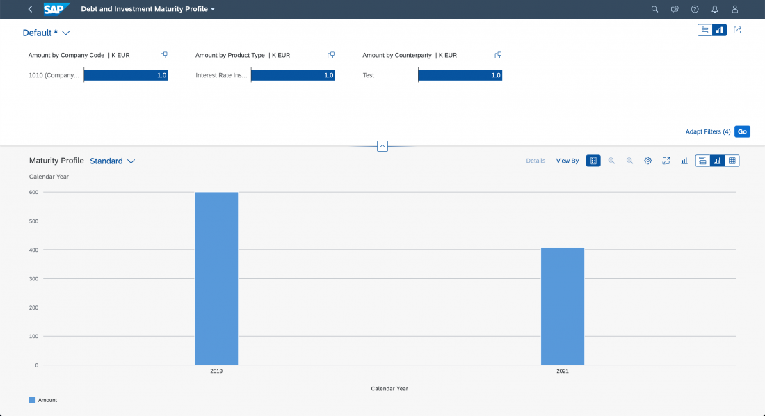
User Feedback

In the context of intelligent systems, “user feedback” refers to the process of collecting, interpreting, and integrating user feedback into the system to improve the intelligence and the results.

Feedback is always triggered by the user. The feedback is based on the user’s judgement and experiences while reviewing and responding to the AI output.

Collecting data for further manual analysis for other purposes (such as marketing or usability research) is out of scope.

When to Use

Collect user feedback on AI output if you want to enable dynamic learning behavior to enhance the intelligence of your product.

Prerequisites

  • You have implemented a retraining infrastructure.
  • There is sufficient data to run instant or periodic model training.

User Consent

Some user feedback types can be legally sensitive and require user consent. When applying user feedback elements to your product, validate your use case with users, customers, and legal team. Local data protection regulations may also put constraints on how user feedback is processed.

Feedback Collection

There are four main aspects to consider when deciding how to collect feedback:

  • Feedback collection method
  • Feedback collection context
  • Type of user input
  • Feedback interaction method

The sections below look at each aspect in more detail.


Feedback Collection Methods

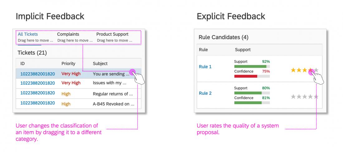
Feedback collection can be implicit or explicit.

Implicit vs. explicit user feedback

Implicit Feedback

Implicit feedback is collected by tracking the user’s activities, including navigation paths, search queries, inputs, and other interactions. This methodology gathers feedback while the user is interacting with the system, and is non-disruptive.

Implicit methods serve most collection needs.

Guidelines
Use implicit feedback methods if:

  • Adequate feedback collection is critical for retraining the model on a regular basis and explicit feedback methods fail to meet the requirements.
  • Users are unlikely to register the feedback accurately using the explicit feedback methods.
  • It is part of the user’s main task to make the decisions that are being tracked.

Note: Users are not aware when implicit feedback is collected. Evaluate carefully whether you need to request consent from each user in advance.

Explicit Feedback

Explicit feedback is given when the users interrupt their regular course of action to give feedback, or when the system interrupts the user to ask for feedback. Use explicit feedback methods judiciously, and only if implicit methods aren’t suitable.

Explicit methods serve special collection needs.

Guidelines
Use explicit feedback methods if:

  • Giving feedback is a choice, and not mandatory.
  • Providing the feedback doesn’t demand too much cognitive effort.
  • Giving feedback doesn’t distract users from performing their primary tasks.


Feedback Collection Context

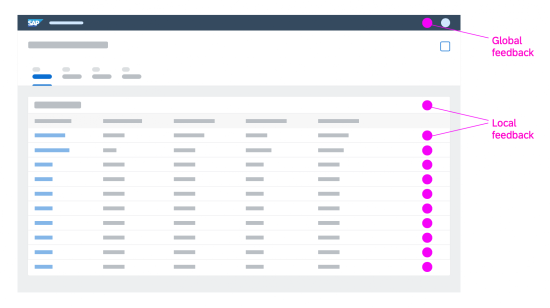
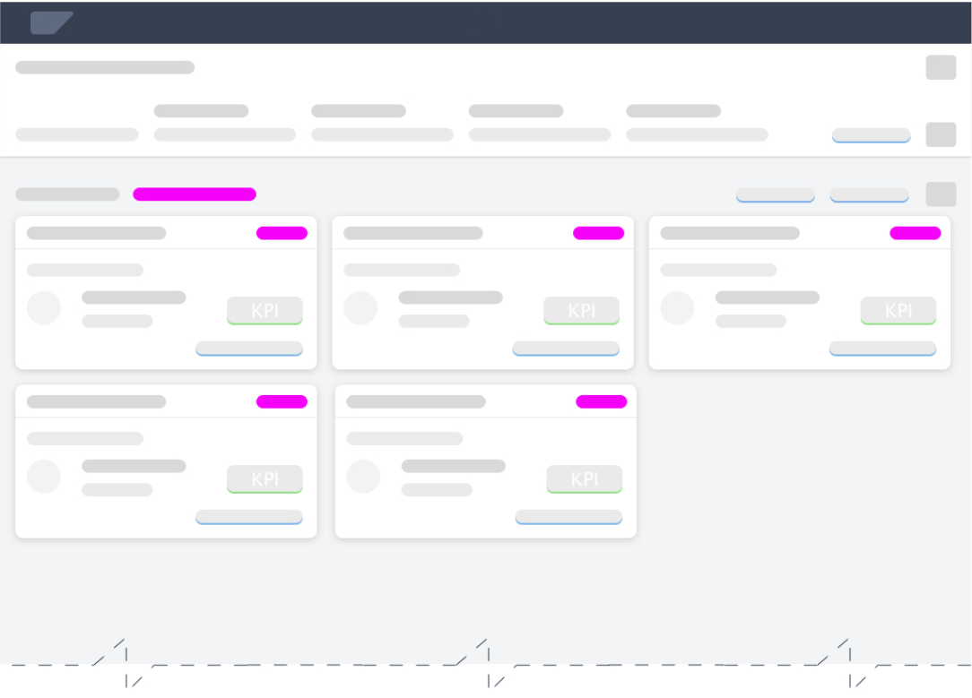
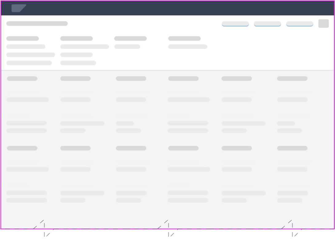
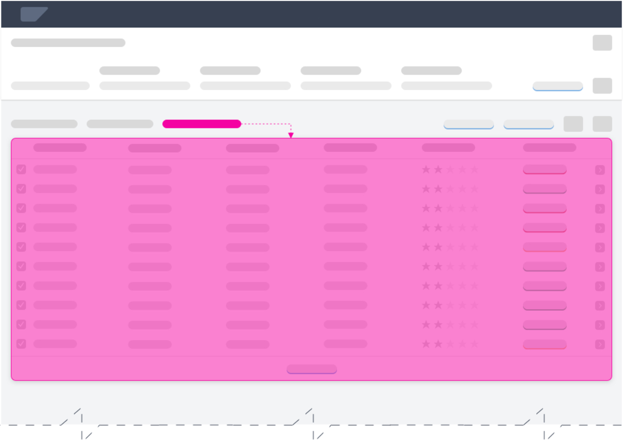
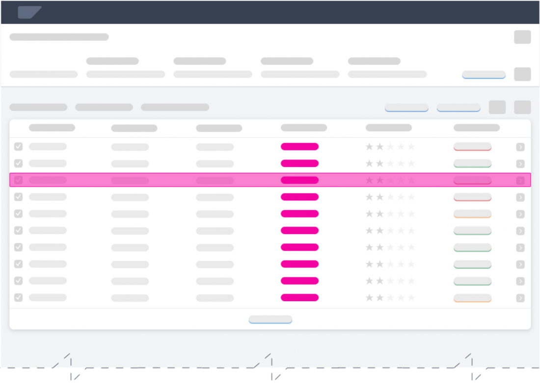
The position of the triggers reflects the context or purpose for collecting the feedback. We can broadly classify the context as either “local” feedback or “global” feedback.

Placement of global vs. local feedback

Characteristics of Local Feedback

  • The feedback trigger is close to the UI element and contextual information.
  • Users can give direct feedback on a specific component or value.
  • Local feedback is clearly focused, which makes it easier to interpret the feedback afterwards.

Characteristics of Global Feedback

  • The feedback applies for an entire page, or even an entire app.
  • The focus is not limited to a specific component or value.
  • The feedback is collected with the intent to improve the overall ML model, not a single inference.

Guidelines
To avoid cluttering table line items with multiple feedback triggers, use the table toolbar to collect both local and global feedback.

Types of User Input

To choose the appropriate input control, think about different ways of asking for the feedback and how well you will be able to utilize the insights. The method and format determine the quality of the feedback.

We differentiate between structured user input and unstructured user input.

Structured Input

You can collect very specific feedback by asking a closed question with a given set of options. The user can answer only in the predefined format and can’t give feedback freely.
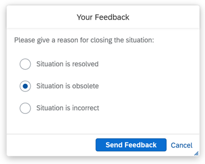

Example of structured input

Characteristics of structured feedback:

  • Questions have a clear focus.
  • Questions can be answered with “yes” or “no”.
  • The feedback collected usually relates to the quality of recommendations.

Unstructured Input

You also can collect unrestricted feedback by asking open questions. Here, the user can provide complex answers and include feedback on aspects you hadn’t thought of. This allows you to collect insights on external real-world factors that aren’t part of your system.
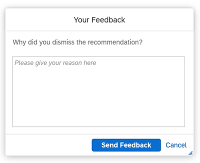
Example of unstructured input

Characteristics of unstructured feedback:

  • Questions are formulated openly, inviting unlimited answers.
  • Feedback is collected to gain information on the quality and performance of intelligence services.
  • Feedback is collected to understand user behavior on the UI while performing a task.
  • Feedback processing takes time and needs detailed investigation to be interpreted accurately.

Feedback Interaction Methods

The interaction method for collecting explicit feedback depends on the use case and the user’s motivation. We differentiate between active users and passive users:

Interaction Methods for Active Users

For active users, offer an optional feedback trigger on the UI so that users can give feedback whenever they want.

Interaction Methods for Passive Users

For passive users, prompt the user to provide feedback using a feedback form or notification. With this approach, the system interrupts the user’s workflow to ask for feedback.

Guidelines

  • Do not interrupt the user’s workflow in the middle of a process to ask for feedback.
  • For active users, place the feedback trigger close to the content you are collecting feedback about (context).
  • For passive users, request the feedback towards the end of the process. After the user has submitted feedback, display a message to confirm that the feedback has been received.
  • Give the user an option to skip the feedback step.
  • To gain the user’s trust, provide a timely system response to the user’s feedback and make sure the feedback can be tracked.

AI Feedback Patterns

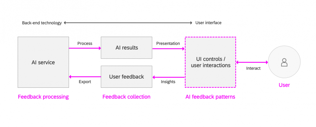
An AI feedback pattern is a set of recommended UI controls that can be used to collect user feedback implicitly or explicitly to improve the AI output. The purpose of an AI feedback pattern is to help the designer and the product team understand the use case requirements and choose suitable UI interactions for the task.

The feedback patterns have been carefully designed to support different use cases. The recommended UI controls need to be implemented at app level to collect the user feedback and deliver it back to the AI service.

AI feedback patterns help UX designers choose a suitable user interaction for the feedback requirements

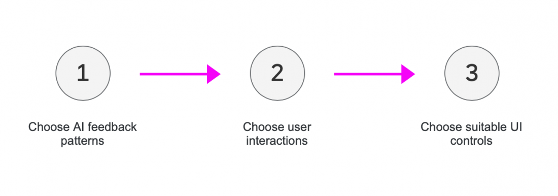
Steps for Implementing AI Feedback Patterns 

  1. Choose the AI feedback pattern for your AI implementation.
  2. Narrow down the required user interactions.
  3. Incorporate the feedback pattern using the appropriate UI controls.
3-step process for incorporating an AI feedback pattern into your design


Pattern Types

So far, we have identified three AI feedback pattern types:

  • Confirm or correct: The user confirms or corrects the solution provided by the AI.
  • Track user actions: The system tracks user actions performed on the AI results.
  • Measure observable behavior: The system measures the observable behavior of a user experiencing AI results.

Confirm or Correct

Users can actively give structured feedback on the AI output to help the system learn and improve its intelligence over time. Examples of this type of feedback include confirming and correcting the AI results. We distinguish between binary and non-binary feedback collection methods.

Binary feedback collection

Examples of simple binary feedback collection methods are action buttons, toggle buttons, or toggle controls like checkboxes (selected, deselected).

Toggle buttons for binary feedback collection
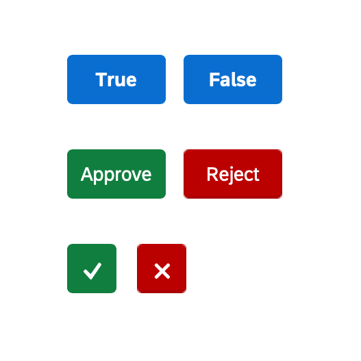
Primary action buttons for binary feedback collection

Non-binary feedback collection

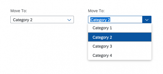
In non-binary feedback collection methods, multiple selection categories are offered. Possible controls include combo boxes or a combination of list selection and radio buttons.

Combo box for non-binary feedback collection
Guidelines
Use this pattern if you want to:

  • Collect bias-reduced user feedback
  • Prepare your AI model for supervised learning with predefined user feedback
  • Create an AI model that can only consume structured feedback
  • Collect feedback for multi-class classifications or clustering problem types


Track User Actions

Intelligent systems can also learn from the UI actions users perform on the AI results. These actions include:

  • Selecting, sorting, filtering, and grouping the AI results
  • Rating the AI results
  • Searching the AI results

All of these interactions can be tracked implicitly for retraining to display refined and optimized AI results.


Selecting, sorting, filtering, and grouping the AI results 

Users can personalize AI results by selecting, sorting, or filtering items. They can also perform actions to group the results, such as:

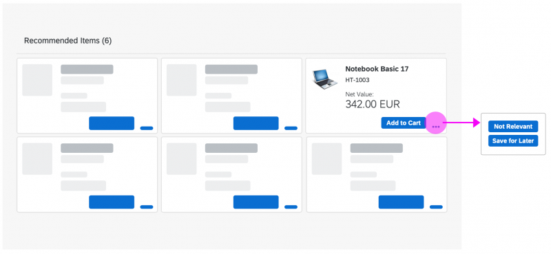
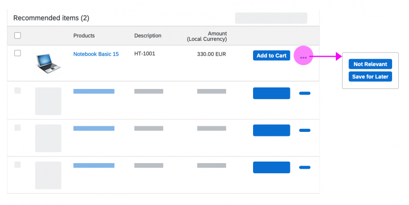
  • Add to cart: The user moves the item to a more focused list, which will be processed soon.
  • Not relevant: The user isn’t interested in the item determined by the AI but would like to see the item in the future in other contexts.
  • Save for later: The item isn’t relevant in the current context but is an interesting find. The user moves it to a less focused list to revisit it later.

Here, you can use a grid list to display the recommended list of items. Each block contains one item, with enough details for user to make a decision. To collect local feedback, you can place a primary action button in the block to record the user’s actions. If you need to accommodate more actions, use an overflow menu.

Recommended products displayed in a grid list

Alternatively, you can use a responsive table to display the list of recommended items. In this case, you can offer a primary action button at line item level to record user actions. If you need to accommodate more actions, use an overflow menu.

Recommended products displayed in a responsive table

Rating the AI results

You can give users the option to prioritize rate AI results using a rating indicator. The rating can then be used to determine the usefulness of individual AI results, based on a numeric scale for all the results (highest to lowest).

A rating indicator for collecting user feedback

Searching the AI results 

When a user searches for a specific item in a list of AI results, the system can use the search information to return similar results or optimize the order of results based on user’s interests and search history.

Guidelines
Use this pattern if you want to:

  • Primarly collect feedback about the quality of an AI result 
  • Collect feedback for a multi-class classifications or clustering problem types


Measure Observable Behavior

Once a user starts examining the AI results, the system can learn by observing the user’s behavior as they browse through the results. The system can track a variety of interaction variables, known collectively as clickstream data analysis. This includes tracking viewed itemsbrowsing patternsitems retained for future reference, items recommended to a friendthe time spent on individual tasks, and more. Insights derived from clickstream data analysis are used to improve the quality of future AI output.

Since this feedback is entirely implicit, no UI interactions are defined for this pattern. It is up to individual application domains to explore how clickstream data analysis could feed into their own AI models.

Note: This implicit feedback collection method is not transparent to end users and is likely to require advance user consent. Users are more likely to trust and accept SAP intelligence if you always ask for explicit user consent before collecting feedback data and using it to optimize AI results.

Guidelines
Use this pattern if you want to:

  • Collect feedback for a UI with a list of recommended products or services
  • Collect user feedback implicitly because explicit feedback collection methods cannot assemble enough adequate data to train the AI


Related Links

Ranking

Intro

Ranking simplifies complex decisions for business users by showing the best options first.

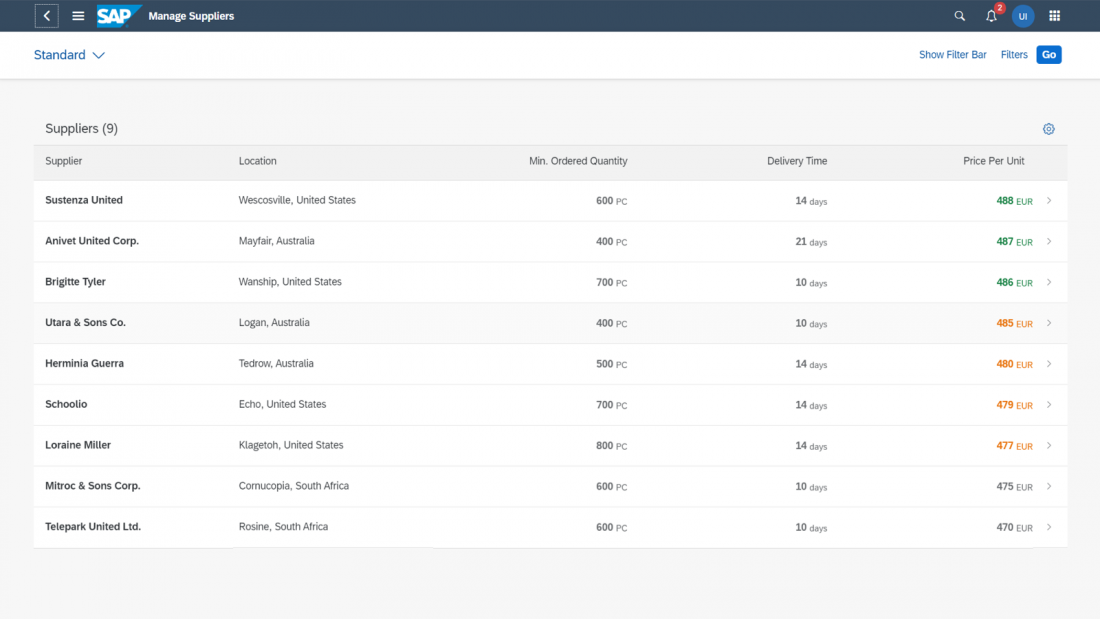
Items in a group are ranked by comparing criteria that are relevant for the user’s business context, such as an amount, the priority, or score. In a ranked table or list, the results are always sorted to show the most highly ranked items on top.

Types of Ranking

We differentiate between ranking that uses an available (inherent) value, and ranking based on a calculated score.

Ranking by inherent value

Ranking is based on a value that is already available in the existing dataset, such as the price.

The value is typically known and understood by the user and requires no further explanation.

Ranking by score

Ranking is based on a calculated grade, mark or score.

In this case, users might need to understand the calculation behind the score (see Ranking Details).

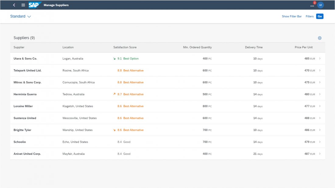
Supplier dataset ranked by price (inherent value)
Supplier dataset ranked by satisfaction score (calculated value)

Ranking and AI

Ranking can incorporate intelligent algorithms, but they aren’t a must. Items can also be ranked using simple rules, thresholds, or heuristics.

Ranking vs. Rating

Although you can rank a list of items based on their rating, ranking and rating are two different concepts:

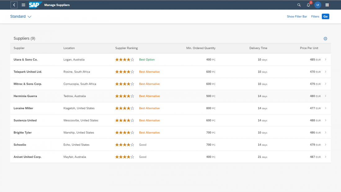
  • Rating places a single item on a predetermined scale. For example:
    Rate your lunch on a scale from 1 (very bad) to 10 (very good).
    Rate your service provider on a scale from 0 stars to 5 stars.
  • Ranking is always about comparing a common value across a group of items. On the UI, ranking is usually shown for a list or group.

This article focuses only on ranking.

Supplier dataset ranked by a rating score

Ranking Indicator

Elements of the ranking indicator

The concept for ranking in lists and tables comprises three basic elements grouped in a common reusable component: Ranking value, ranking description (optional), and change indicator (optional).

To provide transparency and support the user decision-making process, provide additional ranking details whenever possible.

Ranking Indicator Elements

A) Ranking value

This is the common value on which the ranking is based.

The value is mostly numeric and defines the rank of an object. It can be an implicit value, like price or delivery time, or a score. Depending on the use case, you can also show the score as a percentage, or without a unit of measure. Another option is to use a micro chart (such as a radial micro chart).

Ranking based on a non-numeric value is not common, but possible. An example would be academic grading systems using letters ( A+, A, A−; B+, B, B−; C+, C, C−; D+, D, D−).

Clicking the ranking value opens a dialog with ranking details for the corresponding item.

If a list for some reason contains items that do not have a ranking value, show them at the bottom of the list. An example might be a new supplier that doesn’t yet have enough data to be ranked by the system.

B) Ranking description

The ranking description provides additional context for the ranking value.

Terms like “Best” or “Alternative” can offer more specific guidance without being too complicated. It is important to understand that ranking descriptions are highly contextual. The wording and how they map to the ranking score depend on the content, use case, and process.

C) Change indicator

The change indicator makes it easier to track the ranking value for fast-changing data sets, such as live streams for IoT scenarios.

The ranking value is the minimum element needed to show a ranking for a list or table. The ranking description and change indicator support the basic value of the ranking and may not be required in all cases.

In addition to the three basic elements of the ranking component, there are two other aspects to consider: semantic colors and presentation variants.

Semantic Colors

You can use semantic colors to underline the ranking message. The semantic color of the ranking indicator follows the KPI concept in analytics (for example, in the analytical card).

Satisfaction score column contains ranking indicators with semantic colors

Presentation Variants

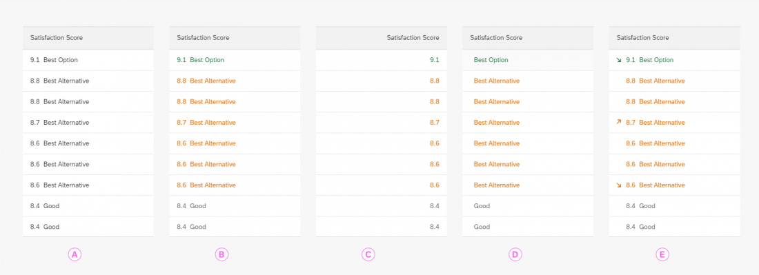
The ranking concept supports different representations of the same data point. The appropriate representation will depend on the role and use case, as well as the relative importance of ranking in your app.

Different ranking representations

A) Ranking as a regular data point

If the ranking is part of the dataset, but is not relevant for the role or task, do not use a semantic color, and display the ranking as for all other values in the table.

B) Ranking as the primary criterion

When the ranking is at the core of the use case and highly relevant for users, the ranking component can use both a measure and a ranking description. Semantic colors indicate at a glance how the different objects are ranked.

C), D) Ranking with high user confidence

When users trust the system ranking, you can display a common ranking value on its own without additional context (variant C), or just show a ranking description without a value (variant D). Bear in mind that even if user confidence in the system is high, other factors like the stake or risk can still warrant using the full representation.

If you decide to show only the ranking description, always allow the user to access the underlying score in a popover with the ranking details.

E) Ranking for fast-changing data streams

If the data is subject to constant change, you can use a trend indicator to help users track changes in the ranking position.

Ranking Details

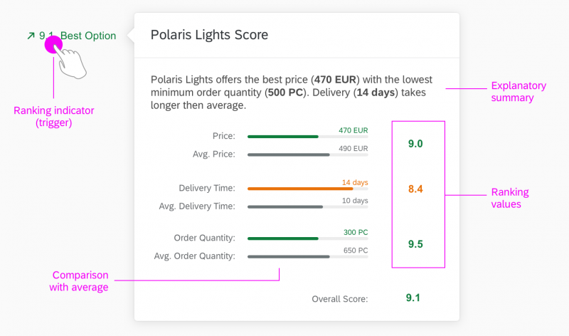
To gain additional insights into the ranking for a specific object, the user can view the ranking details. The detail dialog is triggered by clicking the ranking indicator. In the ranking details, explain the position of the object in the overall ranking and the individual ranking components. Also include a comparison between the current object and the average score for all other objects. Comparing individual values with an overall score helps users to assess their importance.

Ranking details with explanation and ranking components

Top Tips

  • When items are ranked, sort the table by default from the highest-ranked to the lowest ranked. However, ensure that users still have the option to sort in the other direction or sort by another column value.
  • Help users understand the order of ranked items by providing ranking details with explanations.
  • When possible, give users the opportunity to personalize the ranking by setting their own ranking preferences.
  • If the user has full confidence in the system’s ability to identify the best match, there may be no need to show an implicit score. However, always make the score available using progressive disclosure and explanations.
  • User confidence is highly contextual and might differ even for the same scenario, task or role. Consider this if you decide to use only a ranking value or a ranking description.
  • Use semantic colors for the ranking only if ranking is the main use case for the role or task. Never use semantic colors for decoration only.
  • If other values in the table already use semantic colors, consider not using semantic colors for rankings.
  • If you use semantic colors for both the status and ranking, try to position the ranking to the left of the table, next to the item description. This keeps it separate from the status column, which is usually on the right side of the table.
  • Use the change indicator only for fast-changing datasets. Don’t use it for decoration or for “static” lists that rarely change.

Related Links

Explainable AI

Intro

To help build trust between human and machine, we need to provide sufficient information about the underlying model and the reasoning behind the results of an algorithm. This is even more critical in business applications, where users are held accountable for the decisions they make.

“Explainable AI” means explaining the reasoning behind intelligent system proposals in context and at the right time. 

Usage

Consider using AI explanations if one or more of the following conditions apply:

  • Criticality – There is a high risk associated with making the wrong decision. Once taken, actions are hard to reverse.
    By contrast, if the risk is low and actions can easily be rolled back, users might not need an explanation for the system proposal.


  • Complexity – It’s hard for users to assess the impact and quality of their decisions. This might be due to a lack of process insight because of the automation of this task with machine learning.
    By contrast, if users can easily tell when a proposal fits (without training), they probably don’t need additional input.
  • Transparency – Your business case is subject to extensive auditing requirements. Auditors must be able to trace transactions back and see the underlying reasoning for each execution step. Auditors may require more information than end users.
    By contrast, if there are no auditing requirements, explanations might not be necessary (assuming they are also not required by end users).


  • Volatility – To adapt your machine learning model to changing conditions or requirements, your AI application relies on continuous feedback.
    By contrast, if the feedback has little or no effect on the output of the algorithm or the user experience, it can be more distracting than helpful to provide an additional explanation.

What Needs to be Explained?

When AI (machine learning) is introduced into business applications, systems originally designed to “react” can become active players that propose, change or create elements in the interface. Objects, actions, or attributes are manipulated not only by humans, but also by the AI algorithms.

To avoid confusion and loss of control, users need to be aware of the working principles, actions, and consequences of AI at any point in time. When designing AI services, we therefore recommend following our guiding principles for intelligent systems.

How Much Detail Do Users Need?

The amount of information users need to understand a system proposal can vary. This depends on the applied AI, usage context, user task, and user role. We differentiate between three explanation levels: minimum, simple, and expert.

Explanation level 1
Explanation level 1

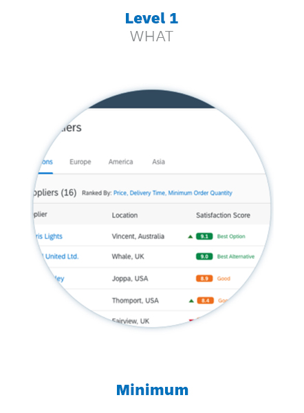
Level 1: Indicator (What?)
The minimum explanation level. An indicator is required whenever AI (machine learning) output is provided. The indicator is also the access point for the next explanation level (if required).

Explanation level 2
Explanation level 2

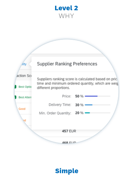
Level 2: Abstract (Why?)
A condensed view of the relevant properties, amounts, and contextual information. An abstract helps users to better understand the AI proposals. It can contain links to the last and most detailed explanation level.

Explanation level 3
Explanation level 3

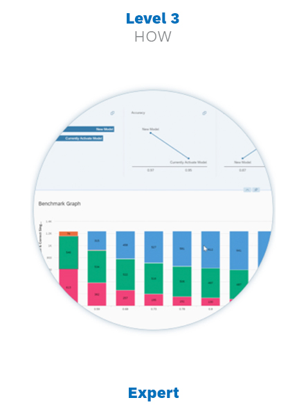
Level 3: Detail (How?)
An extended report specifically for advanced users. It covers all aspects processed by the intelligent system, the AI performance, and any further context and conditions that help users to monitor AI operations.

Guidelines

  • Decide which explanation levels are relevant for your user profile. Some user groups and roles might benefit from seeing all levels. Typically, these will be AI subject matter experts, such as data scientists and software engineers. For most users, the first two levels will be sufficient.
  • Use the explanation levels to apply progressive disclosure principles to your AI explanations.
  • Think about how users will access each level. The indicators can look and behave differently, depending on the user’s permission to access the next explanation level.

Progressive Disclosure

Progressive disclosure avoids overwhelming users with too much information at once. Initially, the user sees only an explanation indicator, and can then drill into two further layers of detail. The benefit of this approach is that the explanations don’t clutter the existing UI. Users only need to concern themselves with details if they actually need them.

Overview of Progressive Disclosure Levels

Level Type of Information
Level 0 No additional explanation elements. For cases where users do not expect or require an explanation from the system.
Level 1 Briefly explains the context, with or without the option to get more detailed information.
In simple cases where a short explanation clarifies the issue, a level 1 explanation may be enough.
Level 2 Presents condensed information, including tables, charts, or any other UI elements that offer more insight into the issue. Users access this level by clicking the explanation provided as a link in Level 1.
Level 3 Presents detailed information, including tables, charts, or any other UI elements that offer more insight into the issue.
Users access this level by clicking the explanation provided as a link in Level 2.
Via Conversational UI Not really part of the explanation concept, but gives users the option to engage SAP CoPilot (Ask CoPilot button or input field).

Level 1
Explanation indicator

Global / local indicator in lists and tables
Global / local indicator for cards

Level 2
Simple explanation

Explanation popover, conversation items
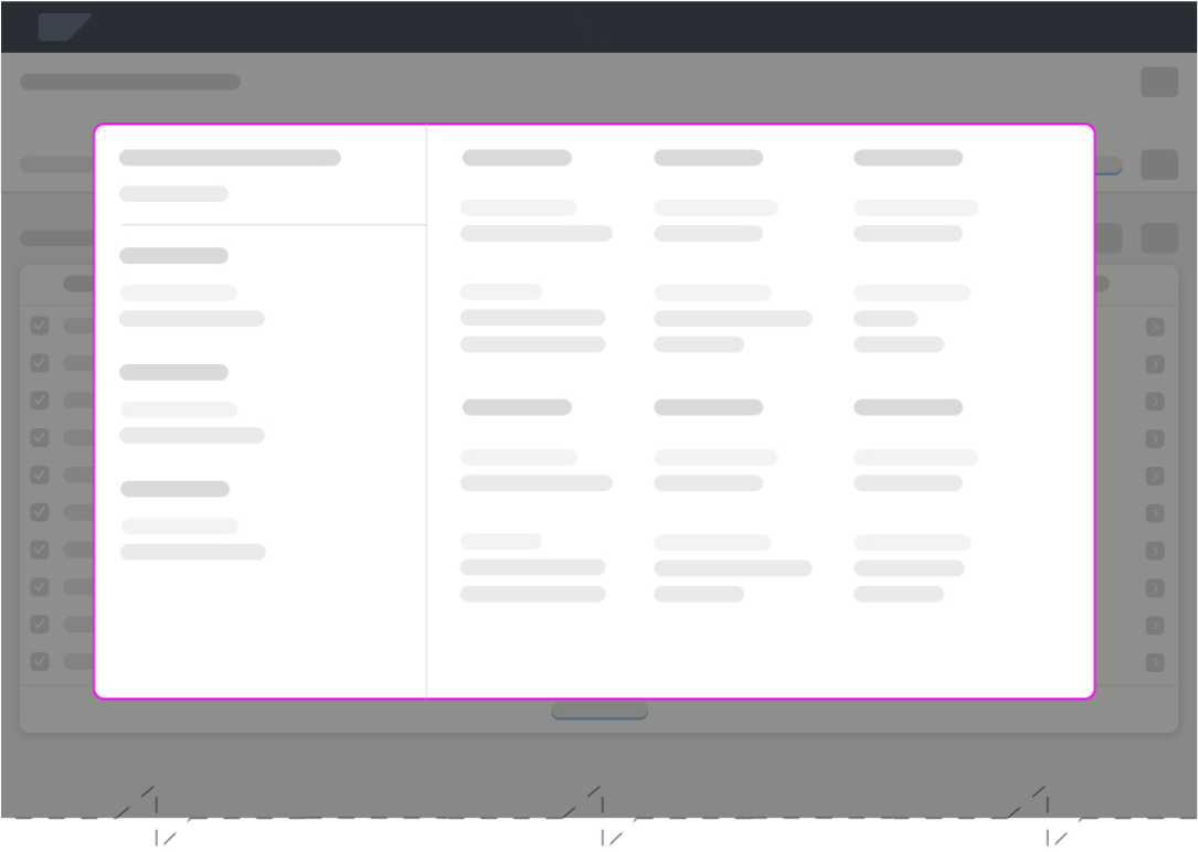
Overlay
Overlay

Level 3
Extended explanation

Explanation page
Explanation page
Dedicated explanation application
Guidelines

  • Show the most frequently-used information in a concise form on the main screen (Level 1 – Explanation Indicator), with an option to drill down to more detailed information on secondary screens (Level 2 – Explanation Popover/Overlay). 
  • Use a separate page or app to offer a more demanding analysis of the AI, such as benchmarking or monitoring, or to let users make improvements (Level 3 – Extended Explanation Page/Monitor). Give access to this page or app via the explanation popover or by means of a dedicated tile on the SAP Fiori launchpad.

Explanation Components

The UX pattern for explanations builds on the explanation levels above (What?/ Why?/ How?). We use dedicated UI components for each of these levels.

Level 1: Explanation Indicator

The explanation indicator marks elements or combinations of elements that are created or manipulated with the help of AI. The indicator provides context about the “nature” and “quality” of a service provided. Clicking the indicator reveals a more detailed explanation (Level 2).

The following sections describe the different explanation indicator variants and when to use them.

Explanation Type

Explanation indicators can be global or local. This affects both the type of information they contain and their placement on the UI.

Global – Model level
Explains the AI output for a group of elements, such as a list, table, or whole section. The global explanation provides the overall context for more complex constellations affecting multiple objects or aspects.

Local – Item level
Explains the AI output for a single value or item.

Global Indicator

Example: Global indicator for a table or list

Local Indicator

Example: Local indicator in a table or list

It isn’t always necessary to provide explanations at both levels, but can be necessary if AI affects both the individual object and its position in the group.


Indicator Styles

The styling of the indicator influences how the user perceives and interprets the displayed output. We distinguish between a default style and an extended style.

Default Style
The default style provides the minimum amount of indication about the type of AI output. It uses explicit and descriptive labels and blue coloring for clickable explanations.

The default style offers sufficient visual affordance for non-critical AI applications.

Extended Style
The extended style uses semantic colors and to offer more contextual insight at the first explanation level. It can also include other semantic elements, such as an icon to indicate a trend.

The extended style can further improve the affordance for the user and emphasize the importance of the information provided.

Guidelines

  • If users need to be fully aware of the nature and quality of the output from the start, add semantic colors to the explanation indicator (extended style).
  • Don’t use icons or other “smartness” labels to show that the result was provided by a machine learning algorithm. Currently, we don’t have any proven research to indicate that highlighting “intelligence” improves the user experience.


Explanation Indicator Patterns / Examples

The table below outlines the recommended controls, placement, and patterns for different local/global explanation scenarios. The Examples column shows both a default explanation indicator and alternative (extended) indicators with semantic components.

Scenario Pattern Examples
Global Indicator

Ranking for table items
Placement: Table toolbar
sap.m.Link
sap.m.Button

Link/Button Text:
View <AI Operation> <Value Name>
Default:
View Ranking Criteria
Alternative:
  
How does this work?

 
ML Ranking
Global Indicator

Ranking for table items
Placement: Next to table title
sap.m.Label
sap.m.Link

Label Text:
<AI Operation> By:
Link (value) Text:
<Decision C
riterion>
<Criterion1, Criterion2, Criterion3> …
Default:
Ranked By: Price-Performance
Alternative:
  
Ranked By: 
Price, Delivery Time, Minimum Order Quantity, … 
 
Ranked By: Ranking Criteria
Local Indicator

Predicted priority of an item
sap.m.ObjectStatus
sap.m.ObjectNumber

Column Title:
 <AI Operation> <Value Name>:
Cell Value:
 <AI Output Value>
Default:
Column Header: Recommended Priority:
Cell: Very High (on a scale from very high to very low)
Alternatives:
  Very High
  9.6  Very High
    9.6  Very High

  9.6
  90%
Local Indicator

Quality classification for a product (such as wine)
sap.m.ObjectStatus
sap.m.ObjectNumber

Column Title:
 <AI Operation> <Value Name>:
Cell Value:
 <AI Output Value>
Default:
Column Header: Predicted Product Quality:
Cell: 
Premium
 (scale depends on use case)
Alternatives:
  Premium
  9.6  Premium
    9.6  Premium 

  9.6
  90%
Local Indicator

Price regression or prediction in a table
sap.m.Label
sap.m.ObjectStatus
sap.m.ObjectNumber

Column Title:
 <AI Operation> <Value Name>:
Cell Value:
 <AI Output Value>
Default:
Column Header: Predicted Achievable Price:
Cell: 100.00 EUR (scale depends on use case)
Alternatives:
  100 EUR
  100 EUR (+/- 10%)
    100 EUR

  100 EUR

Styling Conditions

The length of the explanation indicator and whether or not you display a link to a simple explanation (level 2) depends on your use case:

Form Factor Length Action Conditions
All form factors
(S, M, L, XL, >)
Short (default) Display only

Clickable

Display permission limited to level 1 or level 2 explanation is missing.

Display permission for levels 1 and 2 and level 2 explanation is available.

Large
(L, XL, >)
Long (optional) Display only

Clickable

Display permission limited to level 1 or level 2 explanation is missing.

Display permission for levels 1 and 2 and level 2 explanation is available.


Guidelines
Display clickable explanation indicators if:

  • The context is explained in more detail in level 2.
  • The user needs access to the level 2 explanations and has the appropriate authorization.

Ensure that the length of the explanation indicator is suitable for the screen size. To prevent truncated explanation indicators, apply the following rules:

  • Use the optional long style only if there is sufficient space and no collision with other UI elements.
  • If you are listing criteria, show 3 criteria and use the ellipsis to indicate that there are more criteria. If there is not enough space to show 3 criteria, use a short explanation indicator instead.
      Ranked By: Price, Delivery Time, Minimum Order Quantity, …
     
    Ranked By: Price, De…
  • If you use the long style, always offer a fallback to the default short indicator for smaller screens or form factors.
  • If you have no other options to free up space on the UI (for example, by moving other actions into the overflow), wrap the text.

For more information about responsive and adaptive design, see Multi-Device Support and Responsive Spacing System.


Confidence Indicator

A confidence indicator is a variant of the explanation indicator, and is used to indicate the quality for an individual result. Rather than percentage-based confidence levels, the explainable AI concept uses confidence categories.

Guidelines

  • Use simplified prediction ratings (confidence categories), such as “Recommended”, “Preferred”, or “Best …”.
  • Supply a reference system for interpreting the rating.
  • Exception:
    in some scenarios you may want to emphasize the rating or ranking of items. In such cases, you can also use scoring indicators for local explanations (see the examples for indicator styles above). This is because the AI output (which is a score or rating) and the explanation indicator are the same element in this scenario. For more information, see Ranking.

Confidence Indicator – Best Practices 

 Do    Don’t  
Approach Use confidence categories Use confidence levels
 

High level of accuracy
Acceptable accuracy

Examples:

Recommended
Alternative 

Examples:

89.68% 
77.53%

Reference system Provided Not provided
Design Rationale
A common approach in AI applications is to use percentage values to indicate the quality of a prediction. However, there is a usability issue with this method. People interpret confidence percentages differently, depending on their character and mood and the current situation.

Some users might reject predictions with a relatively high confidence rating (like 84%). Others will go with a proposal despite a much lower confidence rating (like 64%).

The percentage value for the confidence level has no bearing on the actual output. Poor user choices can also adversely affect learning algorithms. In this case, the machine learns from inefficient or misleading feedback.


Level 2: Simple Explanation

Explanation Popover/Overlay

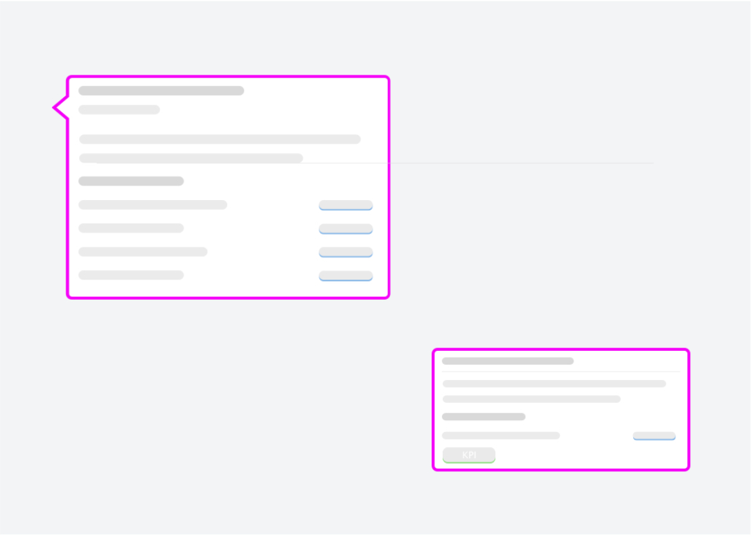
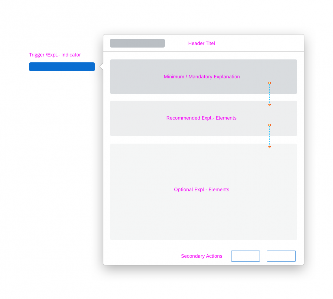
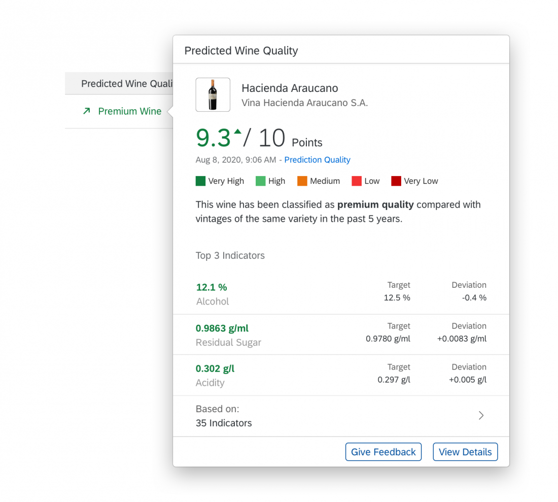
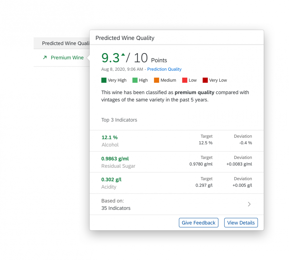
Users access the explanation popover by clicking the explanation indicator. The popover is a canvas to provide contextual information beyond quality ratings, and to list or visualize key factors, inputs, or criteria that led to the AI result (for example, you could use a model induction algorithm or “Explainer” to reveal which data best supports the prediction).

Explanation popovers, screen overlays or conversational items can include the following elements:

  • Self-explanatory header title
  • Minimum: Short explanation of what the AI has performed in natural language.
  • Minimum: For AI outputs that are part of a scale, offer a key or legend to explain how the current value should be read.
  • Recommended: A timestamp indicating when the result or prediction was computed. If the output is time-critical, show when the result or prediction was last updated.
  • Recommended: A list of the 3-5 most important parameters that influenced the result being explained. This can include a comparison with averages or reference values, if required.
  • Optional: A short explanation in natural language of how the AI has performed in comparison to a given reference (historical cases, given data, average prediction accuracy, or similar). This can be combined with performance indicators or a trend.
  • Optional: In-place feedback controls if you want to collect explicit user feedback. For more information, see User Feedback.
Guidelines
Structure

  • Limit the breakdown to 3-5 factors, unless there is a critical reason to include more. Users may not benefit from greater detail – more conditional facts also trigger more questions and cross-checks.
  • To ensure a consistent experience, follow the suggested structure above.

Content

Make it easy to identify the most relevant information.

  • Use the most suitable format for conveying information. This can be language, visual elements, or a combination of both.
  • In longer texts, emphasize important information. This makes it easier for users to scan the content quickly.
  • Be careful with text formatting and visuals; do not use them for decoration only.
  • Try to restrict text explanations to no more than 3 short sentences.

Reveal information progressively.

  • Add value with each disclosure level. Do not just repeat information from the previous level.
  • Make sure that the information on each level is self-contained and that all elements form a natural flow.
  • If your use case offers the Ask CoPilot entry field, think of a smooth transition to the CoPilot panel. Guide the user and offer a useful hint. Use the phrase “Try asking”, followed by the hint.

Natural Language Explanations

Natural language explanations are a variation of AI explanations that apply conversational interaction principles as they are used in conversational interfaces. Reasoning and relations are represented in the form of sentences and non-technical speech.

The usage of natural language explanations is limited to the components explanation popover/overlay, explanation page, recommendation items, and conversational UI/SAP CoPilot. Currently, we have no proven research that natural language explanations are beneficial in other locations. For more complex situations, also see Situation Handling.

Natural Language Explanations – Examples

Scenario Examples
Adding value at each disclosure level Level 1: Ranked By: Price, Delivery Time, Minimum Order Quantity, …

Level 2:
  The price has the biggest impact on the score, followed by the delivery time and then the minimum order quantity.
  Suppliers are ranked by price, delivery time, and minimum order quantity.

Specific information   “Polaris Lights” offers the best price (470 USD) for the product “Taillight”, with the lowest minimum order quantity (300 PC). Delivery (14 days) takes longer than average.
  Best price with lowest minimum order quantity. Delivery takes longer than average.
Just enough formatting   This is high priority because the net payment is due soon (in 3 days) and the amount is small (1.200,00 USD). Customer Electronics usually pays on time.
  This is high priority because the net payment is due soon (in 3 days) and the amount is small (1.200,00 USD). Customer Electronics usually pays on time.

Guidelines

  • Use natural language to summarize the overall situation and to explain dependencies, origins or principles. For more information about the conversational user interaction, see the guideline for SAP CoPilot.
  • To display the simple description, we recommend using plain text.

Level 3: Extended Explanation

Explanation Page

You can use the extended explanation page to offer a more in-depth analysis. You can either direct users to a separate, dedicated application, or provide an additional page within your own app. This will depend on how much control and insight you are willing or able to provide for the technology being used. In most cases, extended explanations have a distinct use case that requires a separate implementation.

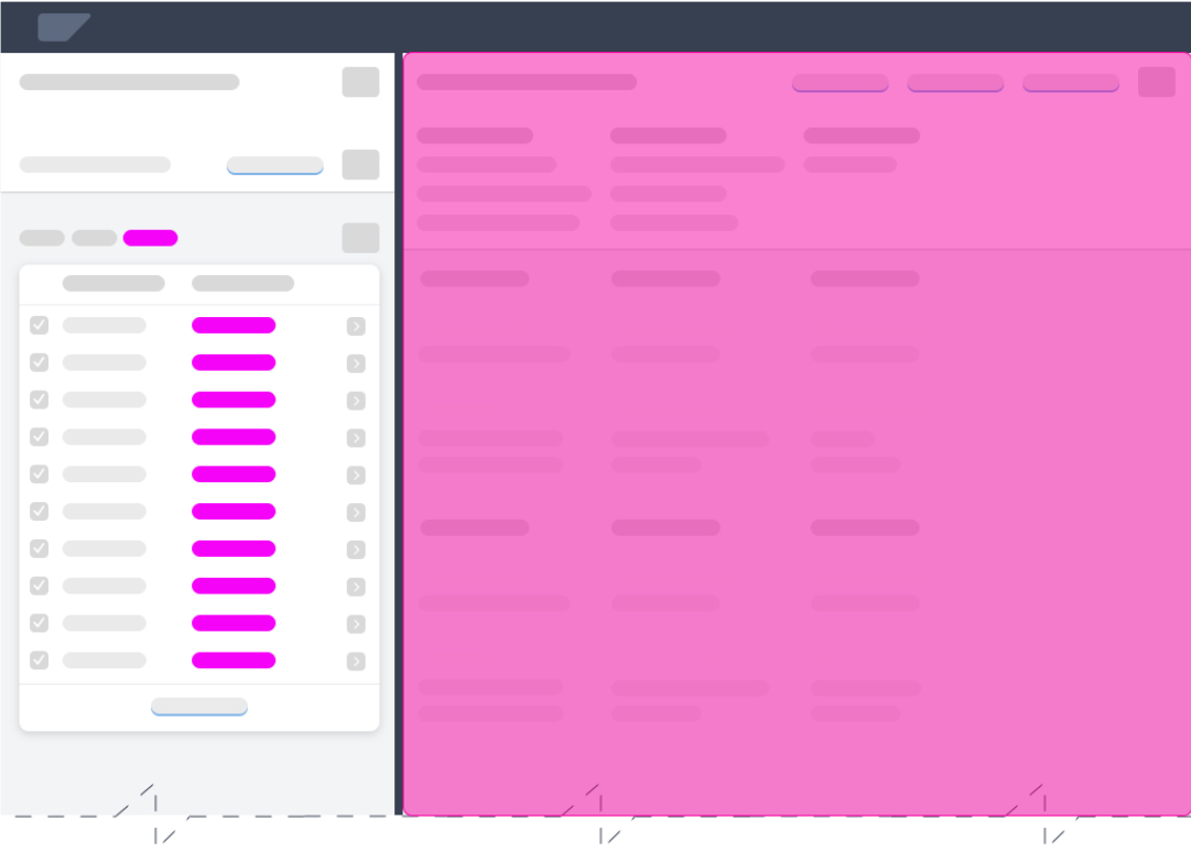
Explanation Page

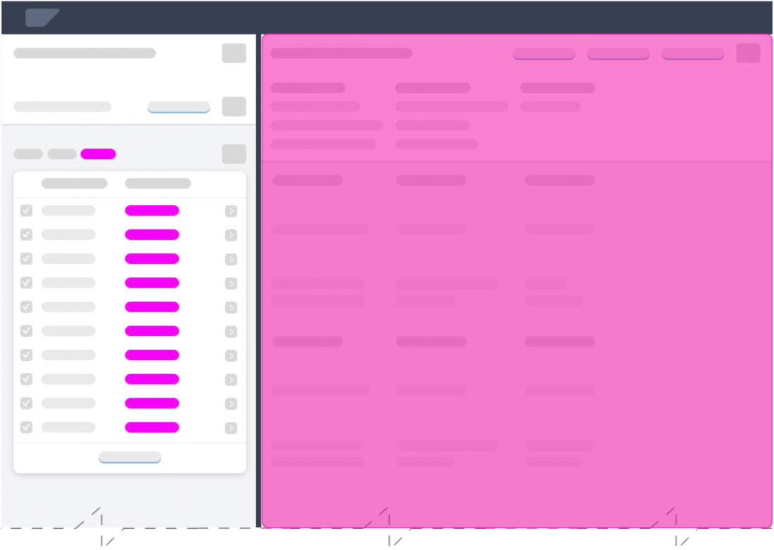
Detail explanation page in a flexible column layout

Dedicated Explanation App

Guidelines

  • Only provide links from explanation level 2 to the explanation page or app if the user has appropriate authorization. AI analysis is relevant for only very few roles, and should only be offered on a need-to-know basis.
  • Do not offer the link to regular business users.

Explanation Page Content

The content on the explanation page depends on the needs of the user. At this point in time, the user probably has a specific reason for opening the detailed explanation.

  • If the explanation page is opened from a global explanation popover, the user focus is on the service as a whole. In this case, the user might want to learn more about the overall reliability of the service (business user), or the performance of the AI model (AI expert).
  • If the explanation page is opened from a local explanation popover, the user focus is on how a specific result was inferred. In this case, the user might want to see which other parameters were used for this prediction (business user), or review the log entries for the system reasoning (AI expert).
Guidelines
Identify the intention of your user.

  • Focus on the aspects that users want to explore in more detail, based on the preceding local or global level 2 explanation.

Display only relevant information.

  • Only expose the information users need to get clarity on their particular issue.
  • Don’t disclose information that users can’t utilize in their work. Hide elements and sections that are irrelevant for the current user role.

Provide separate views for each AI experience level.

You can roughly categorize users into three larger groups:

  • Business users (AI consumers)
  • AI lay users (such as configuration experts)
  • Subject matter experts (such as data scientists)

Behavior and Interaction 

When to Display Explanations

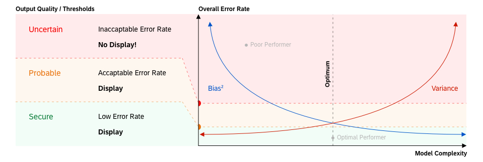
Display explanation components only when the AI service is able to provide predictions with reasonable confidence/accuracy. The threshold for acceptable prediction quality must be defined on a case-by-case basis, and depends on the given use case and AI capabilities. Nevertheless, we do not recommend exposing any predictions that have only poor reliability. Unreliable results lead to damaged user trust and hinder adoption of the AI functionality.

Example: Definition of quality thresholds

How Long is an Explanation Valid?

The validity of an explanation depends on the machine learning cycle. We differentiate two cases based on the explanation lifespan.

Static Explanations

Static explanations are suitable for “offline learning” or instance-based AI services. We assume that the need for a repeated explanation of the model can decrease or even disappear over time as the user gains more experience with the system.

Guidelines

  • Once the user understands the main principle of the underlying service (algorithm), consider leaving out explanations at the model level.
  • Always display the explanation again if the AI model is changed or updated. This applies to explanations that are hard-coded or maintained manually.

Dynamic Explanations

Dynamic explanations are required for “online learning” AI services. This type of explanation is generated (refined) every time the AI has learned and adapted its model. In most cases, it’s not necessary to change the appearance and content of the explanations completely. However, if an AI service discovers new rules to process items in the system, this newly-acquired knowledge must be reflected in its explanations.

Guidelines

  • Adapt the main AI description to reflect newly-applied processing principles.
  • Change the list of decision criteria whenever objectives/directions change.

Responsiveness

Fully Responsive

The explanation components explanation indicator and explanation popover must be fully responsive and available on all devices.

Partially Responsive

We recommend limiting the extended explanation (level 3) to larger form factors (desktop, large tablets) due to its complexity and type of use. If your scenario requires mobile access to detailed explanations, try to limit the amount of information and options to the essential elements.

Partially Adaptive

Explanation indicators are partially adaptive due to the two possible indicator styles (default and extended). The default style is the mandatory format. The extended style is optional for cases where decision criteria are available or beneficial for the user. If the information for the extended display is missing, or there is insufficient screen real estate, revert back to the default state.

For more information about responsiveness, see Multi-Device Support.

Top Tips

Before you start with your design, conduct research to figure out the answers to the questions below.

If extensive research is not an option, use a heuristic evaluation method to test your design. This should be the minimum investment.

  • Does the user expect an explanation?
    If the risks associated with an action are quite low and the results can easily be rolled back, users are not normally interested in an explanation of the system proposal.
  • What level of automation are you aiming for?
    Depending on the automation level, the use case and target user roles and app functionality can change dramatically.
  • Which other roles are involved in the experience besides your target business user?
    The interaction with AI systems also involves technical, non-business roles. Also consider roles involved in development, support, or maintenance.
  • How transparent or traceable does your machine learning service have to be?
    Some use cases are more critical than others. Due to legal and regulatory provisions, enterprise applications are often subject to stricter auditing requirements than consumer software.
  • Are your users generally able to relate to the displayed information and data, and can they infer the follow-on actions and impact (detail and explicitness)?
    Although AI can help optimize even simpler tasks, it might be overengineered to provide AI explanations when the user fully understands the results and implications.
  • How harmful can wrongly processed data be for the business of your client?
    Some actions in processes are critical by design and can have serious side effects. AI explanations must safeguard such scenarios and help prevent any damage or disruption.
  • How easy or difficult is it to revert changes applied to the system or process?
    In scenarios where the user faces deadlines, period-end closing, or other actions that must succeed first time, providing information to support the user is crucial. However, may not need explanations if it is possible to just revert everything instantly in case of failure.
  • Does your business case require continuous adaptation?
    We assume that the need for a repeated (static) explanation of the model can decrease or even disappear over time as the user gains more experience. However, if the AI learns dynamically, users must always be informed of changing conditions (dynamic explanations).

Related Links

UI Text Guidelines for SAP Fiori Apps

This page contains product-specific UI text guidelines for SAP Fiori. It is split into two parts:

About this guideline

The SAP Fiori UI text guidelines are not exhaustive. They build on the other writing guidelines at SAP, and cover only specific conventions for SAP Fiori applications. The guidelines have evolved on an as-needed basis to clarify questions that have arisen during SAP Fiori app development, or to reiterate points that recur in SAP Fiori app design reviews.

The guidelines are based on US English, the primary source language at SAP. There are no specific SAP Fiori text guidelines for other languages.

Finding your way

See the content overview at the beginning of each section to navigate. You can also return to the start of each section at any time using the anchors in the header area.

General Guidelines

Content Overview

Abbreviations

Using abbreviations

Limit the use of abbreviations as much as possible to avoid unnecessary abbreviations appearing on the desktop, where space is often sufficient.

Test your screens on all three device types (smartphone, tablet, and desktop) to ensure that you see the labels live in each case. Optimize as required and as far as space allows.

Abbreviating “Quantity”

Do not use the abbreviated form Qty. Abbreviations in other languages do not work. If there is enough space on the screen, spell out the full word.

Application names

General rules

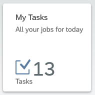
Ensure that the title of the app (initial screen) matches the title on the tile.

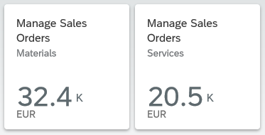
Do not use the tile subtitle for explanations. Use the subtitle only for differentiating information.
Background: Explanations are often redundant, and will typically be truncated in some target languages.

Don't
Don't use the tile subtitles for hints or explanations
Do
You can use tile subtitles to differentiate between similar apps

Transactional or hybrid apps

If the user can make changes to the data on the database, start the app name with a verb.

Exceptions:
For employee self-service apps, start the name with My.
If the key focus of the app is to process items assigned to the user, start the name with My.

Choose a verb that best fits the main purpose of the app:

  • For approval apps, start the name with Approve.
  • If the app is used primarily for CRUD actions (create, update, delete), start the name with Manage.
  • If the main focus of the app is on processing documents, start the name with Process.

Use the plural for the business object, as the user can generally process more than one object within the app.

Examples:
  Create Billing Documents
  My Timesheet
  My Open Worklists
  Approve Supplier Invoices
  Manage Purchase Orders
  Process Sales Orders

Analytical apps

Use a noun-based name and avoid the word “analysis” (to avoid unnecessary repetition across all analytical apps).
Exception: If your app offers analytical data that is specific to the current user, you may start the name with My.

Use the plural for the business object where it makes sense.

Examples:
  Journal Entries
  Liquidity Forecast
  Cash Flow
  Cash Flow Analysis

If your app also allows users to take action after analyzing the data (hybrid app), use the naming guidelines for transactional/hybrid apps.

Overview page

Use a noun-based name.

Do not use the term “Overview Page”. This is just the name of the floorplan. However, it’s fine to use “Overview” on its own.

Examples:
  Quality Engineer Overview
  My Sales Overview
  Quality Technician Overview Page

Formatting

Currencies

Use the three-letter currency code instead of the currency symbol. This prevents ambiguity when multiple currencies share the same symbol.

Example:
  EUR
  USD
 
  $

Case

Unless otherwise specified for individual UI elements, use title case for all SAP Fiori user interface short texts (labels, headings, value help texts, and so on), and sentence case for all messages and explanations.

Exceptions:

Use sentence case for:

  • Relative times
  • Values and statuses that start with a number

Examples:
  4 days ago
  4 items left

Consider using sentence case if a text is very long, making it difficult to read in title case.

For example, you might have a long status text, or long subtitles in the cards on an overview page.

Examples:
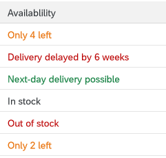
  Material damaged in transit   (status)
  Sorted by turnover and region  
(card subtitle)

Status texts in a table column

 If you opt to use sentence case for a certain text type, use it consistently in your context (for example, all subtitles for the cards on an overview page, or all the labels for a set of radio buttons or checkboxes).

Hyphenation

Email

Do not use a hyphen for email.

OData service

Hyphenate OData service in German.

Example:
  DE: OData-Service

Text wrap

Do not add manual hyphens to wrap texts (for example, on tiles or in column headings).

Information
The point at which a text wraps is determined automatically.

Punctuation

Colon

Warning
Colons must always be exposed as translatable strings. Other languages may use a different symbol (for example, Chinese), or require different spacing (such as French, which requires a space before the colon).

Where possible, include the colon at the end of the corresponding natural language string.

Colons after field labels

Place a colon after the field label if the field label and value are visually separate and do not form a running phrase or sentence.

Examples:
  Description:   Laser Jet Printer
  Valid From:    09/13/2013
  Forwarded by Joe Bloggs

For form fields, the colon is added automatically by the UI control. For other field labels, the colon must be added manually by the app development team.

Do not add a colon after titles (for example, in an object page header).

Colon as a separator

Use a colon to separate concatenated texts that would otherwise be hard to translate.
Note: If possible, avoid concatenated texts in the first place.

Example:
  Search In: Sales Orders

Here, this format ensures that the verb comes at the beginning in all languages, and is never truncated.

Ellipsis (…)

Use the ellipsis (…) if a menu item leads to a set of further menu options.

Do not use the ellipsis:

  • In placeholders (input prompts) in entry fields.
    These are texts that show for empty field values, but disappear as soon as the user starts typing or selects a value.
  • In menu buttons.
    Here, the dropdown arrow already indicates that there are multiple selection options.
  • In labels for actions that open a follow-on dialog or screen.
    Exception: Consider using an ellipsis if it’s standard practice to do so (for example, Browse… to select files).
  • To indicate a busy state. SAP Fiori normally uses a graphical busy state rather than a text. If a text is used, check with your UX designer.
    Exception: If a text is required, add an ellipsis at the end to indicate that the user has to wait (for example, Loading…).
Don't
Don't use the ellipsis in placeholder texts
Don't
Don't use the ellipsis for menu buttons

Period

Many SAP Fiori apps use texts from back-end systems that were written without an ending period, based on the ABAP guidelines. To avoid changing (and retranslating) a large number of legacy texts, we have adopted the following approach for SAP Fiori:

Use periods at the end of complete sentences:

  • If your sentence is written out in full with all its grammatical components, use a period.
    Rule of thumb: Add a period if your text is obviously incorrect without one.

    Examples
    :
      You don’t have authorization to view this page.
      To start, enter your filter settings.
  • If your sentence is incomplete, written in short form (implicit sentence), or very short, leave out the period.
    Rule of thumb: The text does not look “wrong” without a period.

    Examples
    :
      Leave request created
      No matching items found

Exceptions

  • Placeholders: Do not use a period for placeholders (input prompt texts).
    Reason: This avoids a mixture of prompt texts with and without periods on one page.

Examples:

  Enter an alphanumeric key
  Enter a 3-digit code.

  • Illustrated messages: Never use an ending period in the headline for an illustrated message, even if it’s a complete sentence.
    For more information, see Illustrated Message – Headline.
Do
Illustrated message headline without a period
Don't
Don't use an ending period in the illustrated message headline

Punctuation in buttons and labels

Avoid using hyphens, colons, or parentheses in button texts. Use a preposition instead.

Examples:

  Material Number for Receipt
  Material Number – Receipt

Quotation marks

If you need to set off a text in quotes, use double quotation marks.

Developer Hint
In the system, always use straight quotes (""). Typographical (smart) quotes can lead to errors.

Messages / Descriptions

Use quotation marks if:

  • Your message or description refers to a text on the screen.

Example:
  To start, set the relevant filters and choose “Go”.

  • The string contains a dynamic text variable for a customer text, such as a product name.
    Without quotes, text variables can result in incorrect grammar and make the text difficult to read.

Examples:
  Material “Soft copper pipe 10 mm” is out of stock.
  Staffing requirements have changed for project “Quartz”.

  • The string cites a value selected or entered by the user. This can be a text string, date, or number.
    Quotes help to highlight the user’s entry.

Examples:
  “December 25, 2020” is not a working day.
  “2026” is not in the current planning cycle.

  • Your string contains any other variable that may cause grammatical or legibility issues without quotes.

Do not use quotation marks if:

  • The string contains a variable for a system-generated object ID.
    IDs are typically numeric or alphanumeric and do not affect the grammar of the text.

Example:
  Purchase order 12345678 was deleted.

  • The string contains a variable for an absolute date that is provided by the system.

Example:
  Your license is due to expire on May 2, 2021.

  • Your string contains a variable that can be inserted without compromising the grammar or legibility of the text in any language.

Other considerations:

  • If your string contains multiple variables that all need to be set off with quotes, texts can become difficult to read. Consider alternative formats, such as listing the variables in parentheses or below the main text.
  • Do not use text variables at all for system parameters, such as object types or categories. Use a generic term or write separate messages for each case.

Titles

Avoid using quotation marks for concatenated title texts with text variables. Use a colon instead. If in doubt, check with your translation team.
Note: If possible, avoid concatenated texts in the first place.

Example:
  Select: Products
  Select “Products”

Slash

If you are using a slash to separate distinct concepts, include a space before and after the slash. In this case, all the text before the slash belongs to one concept, and all the text after the slash belongs to another.

Example:

  Insurance Type / Tax Rate
  Amount in Local Currency / Due Date
  Amount in Local Currency/Due Date

This is typically the case in SAP Fiori if:

  • You have two adjacent field labels in a form.
Adjacent field labels in a form ('Postal Code' and 'City')
  • You have two labels in a table column header.
Two values in one column ('Division' and 'Plant')
  • You are using the slash to separate items shown on one line.
    Note: This is an exception. Normally, SAP Fiori uses commas to separate listed items.
Items in a breadcrumb

If all the texts separated by a slash (or slashes) qualify a term that precedes or follows, do not include a space before and after the slash

Example:

  Plan/Actual Costs      (both Plan and Actual relate to costs)
  Configure Rules and Approved List of Suppliers/Manufacturers      (list contains both suppliers and manufacturers)
  Configure Rules and Approved List of Suppliers / Manufacturers     (Manufacturers is not a standalone concept here)

Note: Even if you can use a slash to avoid redundancy (as in First/Last Name), we still recommend writing out both labels in full in forms and column headers (First Name / Last Name) – space permitting.

Exception: Tile Subtitles

In tile subtitles, space is very limited. You may need to leave out spaces before and after a slash even if the concepts are distinct.

However, you should be sure that the text can’t be misunderstood, especially if you are using compound terms.

Also bear in mind that if space is already tight in English, there may still not be space for the translated text.

Symbols

Do not use ampersands (&) in SAP Fiori apps or app names.
You can use other common symbols, such as %, but avoid more technical or mathematical symbols, such as ∑, <, >, =.
Exception: The use of an ampersand or other symbol is a widely-accepted standard in your business domain. For example, the short form S&OP is commonly used for sales and operations planning.

Avoid using symbols that can have multiple meanings (for example # can be a number, a metadata tag, or a phone extension number).

Bear in mind that symbols can be difficult to translate.

Examples:

  % Confirmed
  Due in less than 5 days
  SWIFT Code: DEUTDE8L875

  Due in < 5 days
  SWIFT # DEUTDE8L875

Singular and Plural

Messages, descriptions

If messages or descriptions contain a number variable, differentiate between singular and plural cases, depending on the value.

Don’t use parentheses “(s)” to express the plural. This won’t work in all languages.

Examples:

  Your subscription is due to expire in 1 day.
  Your subscription is due to expire in 3 days.
  Your subscription is due to expire in 1 day(s).

Labels for number values (count)

If a label describes a number value (count), write the label as follows:

Where appropriate, indicate the type of value in the label text.

Examples:

  Number of Purchase Orders
  Order Quantity

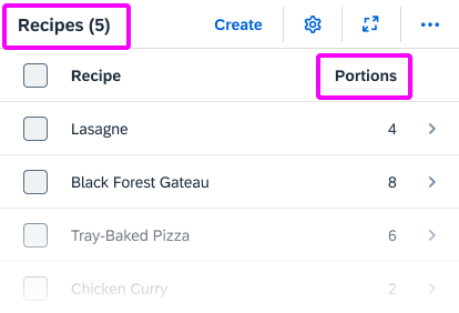
If space is limited, and the label contains only the name of the object or item, use the plural to cover all possible values (0, 1, or more).

Examples:

Do
Table title with count / column heading for count
Do
Tab labels with count

Word Choice

Actions for requests

Action Description
Approve Grant permission (for example, for budget or vacation).
Reject Refuse permission.
Accept Accept invitations.
Decline Decline invitations.
Forward Forward a request to a manager or decision-maker.

Completing an action

(Finalizing action on the footer toolbar)

Action Description
Create Save a new object to the database. It doesn’t matter how the object was created (from scratch, or by adapting a copy of an existing object). Create is used in both cases.
OK Confirm settings that may or may not have been changed (for example, filter settings for a table).
Save Standard action for saving changes to existing objects when no workflow is being triggered.
Save and Next <Qualifier> Continue to the next screen or object (for example, in a workflow with sequence of activities).

Include a qualifier. While “Next” works as a standalone label in English, this is not the case for many other languages.

Examples:
  Save and Next Page
  Save and Next Item
  Save and Next Customer
  Forward

Submit Submit to a workflow (for example, for manager approval).
Send Send a request to another person, especially in employee apps (for example, a vacation request).
Next <Qualifier> Continue to the next screen or object (for example, in a workflow with sequence of activities).

Include a qualifier. While “Next” works as a standalone label in English, this is not the case for many other languages.

Examples:
  Next Page
  Next Item
  Next Customer
  Forward

Finish Trigger the completion of a workflow or process.

Examples:
  Finish
  Done

Terminating an action

Action Description
Cancel Standard term for terminating an action without saving any changes.

Cancel as a business action

Action Description
Cancel <Object> If Cancel is a standard business term, include the object type.

Examples:
  Cancel Job
  Cancel Purchase Order
 Abort

Don’t Cancel In confirmation dialogs, for terminating “Cancel <Object>”.
Do
'Don't Cancel' action in 'Cancel Job' confirmation dialog

Navigation actions

Action Description
Back Go back to the previous screen.
Next <Qualifier> Continue to the next screen or object (for example, in a workflow with a sequence of activities, or when navigating to the next image in a carousel).

Include a qualifier. While “Next” works as a standalone label in English, this is not the case for many other languages.

Examples:
  Next Page
  Next Item
  Next Customer
  Forward

Previous <Qualifier> Navigate back to the last object or image (for example, the previous image in a carousel).

Include a qualifier. While “Previous” works as a standalone label in English, this is not the case for many other languages.

Examples:
  Previous Image
  Previous Product
  Previous Item

Contact details

Label Description
Phone Landline phone
Mobile Cell phone
Email Email address

Creating an object or item

(also see the naming guidelines on the Object Handling page)

Action Description
Add Add an existing item to a list.

Example:
  Add Contact  (for example, add a contact from the global address book to a list of my contacts)

Create Create a new object (either from scratch, or by adapting a copy of an existing object).

Example:
  Create Purchase Order
  Create New Purchase Order

Create and New Create an object from scratch and return to the create screen to add another new object.
New <Object> Title of an object until the name has been defined (for example, on an object page or “create” dialog).

Example:
  New Purchase Order

Copy
Create a new object or item based on an existing one. In this case, the user adapts the core data copied from an existing object.

Do not use Duplicate.

Copy of <Object> Title of new object until the name has been defined.

Example:
  Copy of Purchase Order 12345678

Country

Do not use the label Country for politically controversial territories or special regions. This affects all values or selection lists that may contain such territories. An alternative label might be Country/Region, depending on your context.

Exporting content

Use the following standard labels for download icons in a toolbar:

  • Export to PDF
  • Export to Spreadsheet

Do not refer to specific products.

Example:
  Export to Excel

Global actions

Use the following standard labels for the global actions toolbar:

Action Description
Copy Copy the current object to create a new object.
Edit Make changes to an existing object.
Delete Delete the current object.
Share Tooltip text for the  share icon.

Local actions – Table toolbar

Use the following  labels for standard actions in the table toolbar:

Action Description
Add  Add an existing object or item to a list.
Copy Copy the selected object to create a new object.
Create Create a new object or item.
Edit Make changes to the selected object.
Delete Delete the selected object.
Sort Tooltip text for the   icon.
Filter Tooltip text for the   icon.
Group Tooltip text for the   icon.

Navigation

Action Description
Back Go back to the previous screen.
Open [app] Open an SAP Fiori app.
Note: In the SAP Fiori environment, use the term “open” rather than “launch”.
Open in <App Name> Open the current item in another app.
Open In… Show a list of apps in which the current item can be opened.

“No data” texts

When no data is available for the selection or filter criteria entered by the user, SAPUI5 displays a “No data” text by default. Replace the “No data” text with a more specific text:

  • Where appropriate, refer to the business object handled by your app.
  • If the user needs to change a setting to see data, offer a hint.

There are no rigid standard texts, since the the exact formulation you use will depend on where the “No data” text appears, and the logic of your application.

Examples:
  No matching products found (for example, in the list of a list-detail app)
  No products found. Try adjusting your search and filter settings. (for example, when no items are found for the selected filter criteria in a list report table)

Object administration

For object admin data, use the following standard labels:

  • Created By
  • Created On
  • Changed By
  • Changed On

Exceptions:

  • If your app family has consistently used different labels (such as Last Changed By or Last Changed On), consider using the existing labels for new apps to avoid inconsistencies.
  • If you are showing a relative date (such as Today or Yesterday), or a mixture of relative and absolute dates, use the labels Created and Changed instead of Created On and Changed On.

Translation

To ensure translatability, the label and value placeholder must be in one text string.

Example:
  “Created By: <variable for name>”

What about combined date/time fields?  

  • In many apps, the date is the main reference point, even if both the date and time are shown. In this case, use the field labels Created On and Changed On.
  • If the time is an important reference point for users, include both elements in the label:
    Created On / Created At (or shorten to Created On/At)
    Changed On / Changed At (or shorten to Changed On/At)
  • Do not use Created At and Changed At as labels for joint fields where the date comes first.
  • If users need to scan the exact times, consider using a separate field for the time to make scanning easier:
    Created At
    Changed At
    Do not use separate fields for the date and time in SAP S/4HANA apps. Always use the combined date/time time stamp for the relevant time zone (for example, Operation Start: 06.02.2022, 19:47:25 America/Chicago).

“Please”

Use “please” judiciously:

  • Do not use “please” unless you would also use it naturally in a spoken conversation.
  • Consider using “please” if you are inconveniencing the user.
  • Base your decision on your target group and language.

Removing and deleting items

Action Description
Delete Delete the object or item itself. Use “Delete” if the object or item has already been actively saved.

Example:
Delete an order from the database.

Discard Discard a draft for a new object, or a draft version containing changes to an existing object. Use “Discard” if the object or item has not yet been actively saved by the user.

Example:
Discard the changes you started making to the measurements for product A.

Remove Remove the reference to an item.

Example:
Remove selected contacts from a distribution list.

Setting favorites

The tooltip label for the Favorite icon ( ) depends on how the app handles favorites:

Action Description
Mark as Favorite Flag an item as a favorite without adding it to a list of favorites.
Add to Favorites Flag an item as a favorite and add it to a list of favorites that the user can call up independently.

For more information, see Flag and Favorite and Object Marker.

Showing more information

Action Description
Show Details Show more information within the same page or dialog (for example, a message long text within a message dialog).
View Details (Charts) Display additional information about a chart.
Show More Expand a list or screen area.
Show Less Collapse a list or screen area.
Show All Show all the items in a list.

Signing in and out

With SAP Fiori 2.0 (SAPUI5 version 1.40), Log On and Log Out were replaced by Sign In and Sign Out on the SAP Fiori launchpad.

Validity period

For a validity period, use the labels Valid From and Valid To.

If you have only one label for both values, use the label Valid From/To.

Writing for AI

The AI Design Team are developing standard UI texts for use with AI features.

For more information, see AI UI Text.

Guidelines for Specific Floorplans or UI Elements

Action

Button

Formulate button texts as actions, starting with a verb, and keep them as short as possible.

Examples:
  Approve Order
  Simulate Payment Run     
    
  Payment Run     

Display Elements

Tooltip

Information
Tooltips only appear on desktop devices, and not on mobile/touchscreen devices.

Use tooltips only to show the labels for elements that have no text, such as icons.

Use title case.

Icon Buttons

If the icon represents an action, formulate the tooltip as an action, starting with a verb.
Exception: Standard labels used across the IT industry, such as Settings.

Describe the action that will be triggered by pressing the button. For example,  Expand Header,  Collapse Header.

If the icon button is a toggle button that merely changes its state (same icon button, “on” or “off” state), always use the positive action for the label. For example,   Pin Header for both pinned and unpinned states.

Do not use tooltips if:

  • A text label already exists. Do not create (redundant) tooltips for field labels that are written out in full and visible on the desktop.
  • You want to abbreviate a text label. Instead, write the label out in full and ask development/UX to allow enough space for texts in all languages to avoid truncation. Always aim for a responsive solution that will allow users to view the full text on all devices.
  • You want to provide an explanation. For embedded help, use the SAP Companion instead.

Examples:
    Share
    Export to Spreadsheet
    Maximize
    Minimize   

  Displays the orders you have already processed   (Additional tooltip for “Completed” label) 

For more information, see Using Tooltips.

Messages

SAP Fiori uses a variety of messaging elements for different purposes. This section covers general guidelines for SAP Fiori messages, as well as text guidelines for specific message types.

General message guidelines

Topic Guideline
 “Please” Avoid overusing “please” in message texts. For example, it’s often not necessary when asking users to correct their entries.

Examples:
  The system is currently unavailable. Please try again later.
  Include at least one symbol in your password.

Singular/plural Use separate strings for singular and plural cases. Do not use “(s)”.
Semicolons Do not use semicolons to separate phrases in a message text. Instead, use two separate sentences ending with periods.

Although semicolons are not incorrect, you are unlikely to see semicolons in modern mobile app interfaces.

Variables Use a single string for messages, including variables. This is necessary to enable translators to change the word order for other languages.

If you need to set off text variables in messages, use double quotation marks. Do not use text variables. This can lead to grammatical errors in other languages.

Examples:
  “<processed items> of <total items> items were processed.”
  “This item was closed on <date> by <name>.”
  “The item was deleted by” + “<name>” (two concatenated strings)
  “The <business object> <business object number> was deleted.”     (the article for an unknown business object name cannot be translated correctly)

Before using variables, consider using distinct error messages for each use case. This often allows you to write a friendlier text that is easier to read and translate than a text designed for reuse.

Form field validation

Instruct the user what to do to correct the error. Avoid generic error messages.

Examples:
  Select a supplier
  Invalid entry
  Enter a valid value

If a value for a required field is missing, use the standard formulation:

<Field Label> is a required field (*).

Example:
  Email is a required field (*).

For more information, see Form Field Validation.

Message box

(message/confirmation prompt)

Topic Guideline
Heading For message dialogs, use only the standard headings: Error, Warning, Information, Success

For confirmation dialogs, use the imperative of the action being confirmed.
If the context is clear, only use the verb.

Example

  Delete
  Approve

If the verb alone would be ambiguous, add a qualifier.

Example

  Delete History

Special Case: Confirming Deletion
Delete confirmations use a warning message box with Delete as the heading and button. See Delete Message.

Message text Avoid showing system or configuration details in a message short text. Move technical information to the long text.

Do not repeat the short text in the long text. Otherwise, the text shows twice when the long text is expanded.

Confirmation prompts: If your target user is likely to see the message frequently, use a short form that’s easy to scan.

Examples:
  Approve order 12345?
  Do you really want to approve order 12345?

Confirmation prompts: If the confirmation dialog allows the user to enter a note, use sentence style for the input prompt.

Success messages: Do not use “successfully.”

Buttons Use action verbs for buttons in all dialogs that involve a decision with a specific action.

Exception: If naming the action takes up too much space, formulate the message as a statement, and use the OK/Cancel buttons. Also consider translation. If the mobile use case is critical for your application, always test on a mobile device.

Error messages: Use Close instead of OK as the button text for closing an error message.Use OK if the user is just acknowledging a piece of information or a group of settings.

Do not combine questions with OK/Cancel buttons. Avoid Yes/No buttons.
Reason: Like OK/Cancel buttons,Yes/No buttons force the user to read the whole message text.

For more information, see Message Box.

Object Page

Headings

Use title case for the headings in anchors or tabs.

Avoid repeating the section/anchor heading in a subsection heading.

Exception: If you need explicit subsection headers, and the only meaningful term for a subsection is the same as the overall section name, use the same term. Do not use different terms for exactly the same concept. Instead, think about framing your content differently so that the concept for an overall section doesn’t overlap too much with the concept for an individual subsection.

If different apps in your app family group data in similar ways, consider aligning the section headings.

Tables

Column headings

Topic Guideline
Column headings with multiple labels If a table column contains multiple values, use a slash to separate the labels in the column heading. Include a space before and after the slash.

Examples:
  Price / Local Currency
  Price/Local Currency

Singular vs. plural Use the singular in the column heading if there is only one entry per table row.

Examples:
  Product (each row contains one product)
  Contacts (each row can contain more than one contact)

Table content

Topic Guideline
Blank/empty fields Leave fields without a value blank.

Examples:
  ” “ (blank)
  (hyphen)
   N/A

Table fields with “null” values If the back end returns a “null” value for a table field, also leave the field blank. In most use cases, it will not be critical for end users to know exactly why a field is not filled (“null” value that is never supplied by the back-end system, or “empty” value that might be filled later).

In exceptional cases only: If it is critical for your use case to distinguish between “null” and “empty” values, you can consider showing a text for either “null” values or “empty” values.

Examples:

  • If you have one or two fields where a value is not available yet, but expected or possible later, a text such as “Pending”  or “Not yet available” could give the user a hint.
  • If you have just one or two fields with “null” values, a standard text “Unknown” could serve as a differentiator. In this case, however, you should ensure that “Unknown” is not a possible value in your dataset.

If you are likely to have several “empty” and “null” value fields in your table, we strongly recommend leaving all the fields blank. This makes the table much easier to scan and helps users recognize fields that are actually populated.

User Input

Input field

Topic Guideline
Placeholder  

Only offer placeholder text (input prompt) if you need to provide an additional hint. Do not repeat the label in the placeholder text.

Never use placeholders instead of labels.

Use sentence case.
Exception: The input prompt describes a format with specific capitalization (for example, lower case for a URL).

Do not use a period or ellipsis at the end of the text.
Exception: The input prompt describes a format containing a period.

Use a consistent style for all input prompts on one page (the style may vary, depending on your use case).

For URL or email address placeholders, use the domain example.com.

Examples:
  Select a building by location
  www.example.com
  username@example.com

  Select a product category (when the label is Product Category)

Showing a previous value If you need to indicate the previous value for a field, add the following text after the field value:

Previously: <Old Value>

Note: This is not a standard feature for forms, but may be required for some use cases.

Example:
  Supplier: DelBont Industries     Previously: Company ABC

Selection list options

Topic Guideline
No options selected Relevant for: Select, Select Dialog, Table Select Dialog, Radio Button

If you need to indicate that none of the options in a list are selected, provide a corresponding text. Show the text at the beginning of the list and place it in parentheses to distinguish it from the other values. Do not leave the entry blank.

Use a text that best fits your use case and the content of your list, such as (Not Selected), (Not Assigned), or an app-specific text such as (No Supplier Selected).

Do not use (None). Although “None” works in English, it is difficult to translate correctly into languages with gendered nouns.

Examples:
  (Not Selected)   
  (Not Assigned)
  (No Product Selected)
  (None)        

All options selected If a list is used for filtering, and you need to indicate that all values are included, offer an All option it at the beginning of the list.

Example:
All
France

Germany
Italy
Spain

Here, All indicates that no filters have been set. France, Germany, Italy, and Spain are all included.

Relevant for: SelectSelect Dialog, Table Select Dialog, Radio Button

Wizard Floorplan

Wizard steps

If you are using the wizard floorplan, formulate the texts for each step as follows:

Use a noun for the name of the step (for example, Customer). This text appears in 3 places:

  • The header of the walkthrough screen (showing all steps)
  • The heading for each step on the walkthrough screen
  • The heading for each section on the summary screen

Offer an explanatory text for each step in the walkthrough screen (sap.m.text). Phrase this text as an instruction (for example, Enter the payment details.)
Note: This explanatory text does not show in the wizard summary.

Rich Text Editor

The rich text editor (RTE) is a complex control for data input and editing. It allows users to format the text and insert different types of elements within the text, such as images and hyperlinks.

The rich text editor uses the third party component TinyMCE. In addition to the native toolbar, you can also use a toolbar built with SAPUI5 controls. This custom toolbar acts as a wrapper around the native toolbar and takes care of synchronizing the state of the internal controls with the current state of the selection in the editor.

Rich text editor
Rich text editor

Usage

Use the rich text editor if:

  • You want to enable users to enter rich text with different styles and colors.
  • You need to provide an instrument for texts that require additional formatting.

Do not use the rich text editor if:

  • You want to let users add simple text that doesn’t require formatting. Use text area instead.

Responsiveness

The rich text editor is intended primarily for use on desktop devices, even though it still displays smoothly on mobile devices. You can also enable the mobile theme of TinyMCE, but we don’t recommend using it as it comes with some limitations explained in the Mobile Theme section.

Overflow Behavior

On smaller screens, the custom toolbar utilizes the overflow behavior of the standard SAP Fiori toolbar.

If the available actions do not all fit into the available space in the toolbar, the extra actions disappear from the visible part of the toolbar from right to left, and an overflow menu button appears on the right of the toolbar. Clicking the overflow button reveals the hidden options.

Each action has a priority, which determines whether and when the action moves into the overflow menu. You can prioritize the actions in the toolbar by applying one of five statuses:

  • Always overflow: The action always goes into the overflow.
  • Disappear: An action that is not so relevant for the user can disappear if the space is limited.
  • Low: Actions with the priority “Low” overflow first. Assign this status to actions the user rarely needs.
  • High: Actions with priority “High” remain visible in the toolbar until all lower-priority actions have moved to the overflow. Lower-priority actions are those with the priorities “Disappear” or “Low”, and all unprioritized actions.
  • Never overflow: These actions are always visible in the toolbar.
Size S
Size S

Mobile Theme

From version 4.7, TinyMCE provides native mobile support with the mobile theme. If your use case requires it and you have enabled the mobile theme, the custom toolbar cannot be used, and the native TinyMCE toolbar and layout are loaded. This is why we don’t recommend using the mobile theme.

Layout

The rich text editor has two main components – the toolbar and the content area.

  • Toolbar: All available actions are displayed in the toolbar. App development teams can add or remove individual action groups, depending on the use case.
  • Content area: The content area is where users create their text. It visualizes all the changes made using the actions in the toolbar.
Schematic visualization of the rich text editor

Toolbar Types

The rich text editor comes with two types of toolbar: the common TinyMCE toolbar and the custom toolbar.

The first image shows the default (native) toolbar, which comes with its own behavior for smaller screens.

Rich text editor – Native TinyMCE toolbar

The next image shows the custom toolbar, which includes common SAP Fiori controls and utilizes the overflow toolbar behavior. All common actions provided by the native toolbar are also offered by the custom toolbar.

Rich text editor – Custom SAP Fiori toolbar with overflow
Developer Hint
You can decide which toolbar to use. Bear in mind that the type of toolbar is only considered when control is being initialized. It cannot be changed during runtime because of lifecycle incompatibilities between SAPUI5 and the third-party library. You can enable the TinyMCE mobile theme, but once you do so, the native TinyMCE toolbar and layout are always loaded.

Actions in the Custom Toolbar

The custom toolbar includes most of the native TinyMCE actions. The actions are separated into several virtual groups. You can hide each group of actions individually if it is not required by the use case.

Rich text editor – Actions in the custom toolbar

1) Font Styles: A group of four styles that can be applied to individual symbols (Bold, Italic, Underline and Strikethrough). All of the actions can be combined, which means that a preselected text can be bold, italicized, underlined and crossed out at the same time.

2) Align Text: A group of actions for aligning the text: Align Left, Align Right, Center and Justify. By default the text is left aligned. The selected style is applied to the entire paragraph.

3) Styles: Offers a list of predefined styles, including 6 heading levels and a paragraph. The default style is Paragraph.

4) Font: Changes the font family of the text. All the available fonts are displayed in a select control. 17 font families are supported, including popular fonts like Verdana, Tahoma, Arial, Times New Roman, and Helvetica. The change is applied to individual symbols.

5) Font Size: Changes the size of the text. All available font sizes are displayed in a select control. The minimum size is 8 pt and the maximum size is 36 pt. The change is applied to individual symbols.

6) Text Color: Opens a menu with different options for choosing the color of the text, including a color picker dialog. The default text color is black.

7) Background Color: Opens a menu with different options for choosing the color of the background, including a color picker dialog. The default background color is white.

8) List Type: Part of the structure group. There are two types of list: Bulleted List and Numbered List. This action is applied at paragraph level and turns a normal paragraph into a list. The two list types cannot be applied simultaneously.

9) Text Indent: Part of the structure group. These two actions let users increase or decrease the indentation of the text.

10) Link: A group with two actions: Insert/Edit Link and Remove Link.

11) Insert/Edit image: This option opens a dialog for adding and editing images. Users can also define some of the image properties, such as the width, height, and description.

12) Insert Table: Inserts a simple table within the content area.

13) Clipboard: This action group includes the Cut, Copy, and Paste actions.

14) Custom Action: If the use case requires an action that is not available in the set of common actions, you can attach an external plugin to the custom action. Technically, you can add as many custom actions as you like. However, because custom actions are displayed after the common actions, we recommend keeping the number of custom actions down to a reasonable level.

Developer Hint
The rich text editor is actually an SAPUI5 wrapper around the open source TinyMCE editor. TinyMCE’s functionality can easily be extended using plugins, which can also be attached to the custom toolbar.

The general approach for enabling 3rd-party TinyMCE plugins for the rich text editor is:

  1. Create or find a plugin.js file and place it in convenient place in your application. Alternatively, define the plugin directly in your code.
  2. Load or call the plugin after the TinyMCE core library has loaded. This can be done in the rich text editor’s beforeEditorInit hook.
  3. Add the plugin to the TinyMCE instance.
    • If you’ve defined the plugin directly in your code (synchronous), you can also enable the plugin in the beforeEditorInit hook.
    • If the plugin is in external file and is loaded asynchronously, the plugin should be registered in the instance when the plugin file is downloaded. A convenient place to enable the plugin is the rich text editor’s ready or readyRecurring event.
  4. Optional: If the rich text editor is instantiated with the custom toolbar, be sure to add a custom button to it to make the functionality available.

Important: Third-party plugins are not supported by SAP. We cannot guarantee that there will not be any issues with their enablement.

Behavior and Interaction

General Information

The rich text editor is only available in edit mode of the floorplan it is displayed in. In display mode the content is shown as it is formatted by the user. The user-defined formatting cannot be overwritten.

The toolbar is always visible and the user has access to all the action groups. To start typing, the user has to click inside the content area.

To apply any of the actions from the toolbar, the user has to select the text to be formatted upfront.

Some of the actions can be preselected and applied prior to typing the text. These actions are:

  • Font family, font size and styling (bold, italic, underline)
  • Paragraph alignment
  • Color selection (text color and background color)

Font Styles

The user selects the font style using the respective icon toggle buttons (Bold, Italic, Underline, Strikethrough). The style is applied to a preselected text and remains active until the user clicks the button again or moves the marker to an area where a different style is applied, or no style is applied.

Alignment

The user can change the alignment of the text (Align Left, Align Right, Center, Justify).

By default the text is left-aligned. The selected style is applied to the entire paragraph. To apply any of the styles, the user selects the text and then clicks on the Align Text button  . It is also possible to select the alignment upfront, but in this case only the text written after the selection will have the desired alignment.

Font

The user selects the desired font family from a list of all available font families. The selected font family can be applied to a preselected text, or selected upfront. The default font family is Verdana.

Font Size

The user selects the desired font size from a list of font sizes from 8 pt to 36 pt. The selected font size can be applied to a preselected text, or selected upfront.

List Types

The user can create two types of lists, both of which are triggered by toggle buttons: bulleted lists   and numbered lists  . List formatting is applied at paragraph level. To apply list formatting, the user preselects the relevant paragraphs and selects the relevant list type action.

Text Indent

The text indent defines the amount of empty space in front of a paragraph. The user can increase the indentation  , or decrease it  . Both actions are triggered by standard buttons, and are applied at paragraph level. To change the indentation, the user selects the paragraph (or just positions the cursor within the text) and selects the indent action. The text is moved 30 px left or right, depending on the action chosen.

Color Selection

The user can change the text color and the background color. The chosen colors can be applied to a preselected text or selected upfront.

To choose a color, the user clicks on the color arrow button for the font or background (the right-hand segment of the split button). This opens a popover where users can choose the default color (black for text, white for background), select one of 15 predefined colors, or open a separate color picker dialog.

Within the color picker dialog, the following options are available:

  • Move the circle inside the color field
  • Define RGB values
  • Define HSL values
  • Enter the HEX value
  • Use the horizontal color slider

Users can also define the transparency with the transparency slider.

Clicking OK confirms the selection.

The user can also apply the most recent font or background color without opening the color palette or the dropdown menu. This is done by pressing the left-hand segment of the split button.

Inserting, Editing, and Removing Links

The Insert/Edit Link button opens a dialog for entering the link details. These include the URL, the link text, a title, and the target for the link (same or new browser window) .

It is also possible to attach a link to a preselected text and to edit details for an existing link.

The Remove Link button   is only active when an existing text link has been selected.

Inserting and Editing Images

The Insert/Edit Image button opens a dialog for entering the image URL, a description, and the size.

Beforehand, the user must upload the image to a library that can be accessed by the application. In the dialog itself, users can only enter an existing image link. Images cannot be uploaded directly to the server.

To change the alignment of the inserted image, the user selects the image and applies the relevant alignment action. The text around the image is positioned as follows:

  • Right-aligned image: The text is displayed to the left of the image.
  • Left-aligned image: The text is displayed to the right of the image.
  • Centered image: Only the image is displayed in the center of the paragraph.

Users can also edit the URL, description, and size of an existing image by selecting the image and choosing Insert/Edit Image.

Guidelines

Minimum Width

Although the control allows a minimum width of 6 rem (96 px), we recommend setting the width to at least 17.5 rem (280 px). Any less will make the editor practically unusable.

Minimum Height

The minimum height of the control is 12.5 rem (200 px), which ensures that the editor is usable.

Number of Actions in the Toolbar

Only offer actions that are relevant for the use case. If you just need simple text formatting (such as bold, italic, underline, and strikethrough), remove the other groups.

Custom Plugins

Exercise judgement when adding custom plugins to the editor. Only offer a reasonable number of additional options.

Use self-explanatory icons for custom actions. Do not use a text label, or combine a text label with and icon.
As for all icons, offer a tooltip with a text label instead.

Additional Guidelines

The guidelines for the following controls also apply:

Resources

Want to dive deeper? Follow the links below to find out more about related controls, the SAPUI5 implementation, and the visual design.

Elements and Controls

Implementation

Visual Filter Bar

Information
The Remove/Close icons shown in this article do not yet reflect the new Remove/Close icon    defined in the product standard for UX consistency. We will update this article as soon as the new icon is available in the corresponding controls.

Intro

The visual filter bar offers a unique way of filtering large datasets through visualizations. This helps users to recognize facts and situations, while reducing the number of interaction steps needed to gain insights or to identify significant single instances.

The visual filter bar allows users to combine measures with filter values. For example, a “Product” might have the filter value “Product Name” and the measure might typically be “Revenue”, “Cost”, or “Quantity”. If you opt for the measure “Revenue”, the chart would show the “Revenue by Product”, enabling the user to filter the data by choosing a particular product name and its revenue.

Chart visualization increases the joy of use and helps users to see relevant data more quickly. For filtering, the visual filter bar uses all of the three types of interactive chartbar chartline chart and donut chart.

Visual filter bar - Size L

Usage

Use the visual filter bar if:

  • You are using analytical list page floorplan.
  • Users need to see both the result and the direct impact of their filter settings in a chart representation.
  • You would like to give users a condensed overview of the data in the dataset.

Do not use the visual filter bar if:

  • You are not using the analytical list page floorplan.
  • Users are not interested in seeing the impact or their filter settings directly in a chart representation.
  • Users are not interested in a condensed overview of the data in the dataset.

Responsiveness

The visual filter bar itself is fully responsive. For overall responsiveness within the analytical list page, see the Analytical List Page article.

Layout

The visual filter bar is a composite control built with other responsive controls, such as the header container and the interactive charts. It is used in the header area of the analytical list page, which incorporates the dynamic page layout.

Collapsed Visual Filter Bar

The collapsed visual filter bar takes up less space, leaving most of the screen for displaying the actual results. However, the variant selector in the upper left corner is still available for switching between variants. The user can expand or collapse the filter bar by clicking the header. If required by the use case, you can expand the filter bar by default.
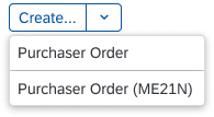
On desktop and tablet devices, the collapsed filter bar shows a summary of the filters currently applied. The format of the summary text is:

Filtered By (number of filters): <comma-separated list of the filters currently applied>
Example: Filtered By (2): Country/Region, Product

Up to 5 filters are listed. If more filters have been applied, an ellipsis (…) appears at the end of the string. If no filters have been applied, the summary text is Not Filtered.

Expanded Visual Filter Bar

The expanded visual filter bar also shows a user-defined filter subset of the selected variant. The Adapt Filters link opens the visual filter dialog, where the user can add or hide visual filters. The switch button on the top right switches between the visual filter bar and the standard (input-based) filter bar. The Go button triggers the filter. Note that the Go button is only shown in manual update mode.
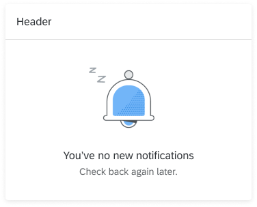
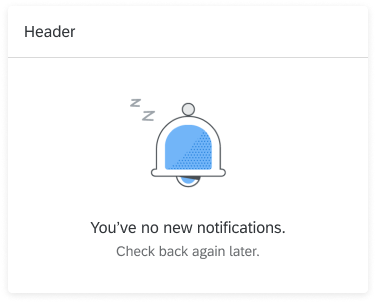
Structure

In order to achieve filtering through visualization, the visual filter bar uses interactive charts. Currently, three interactive chart types are available: bar chartline chart, and donut chart. Each chart has a dedicated area for the chart title, the (x) link showing the number of applied filters, and the value help icon  . When the user clicks the (x) link, a popover containing the selected filter values appears. The value help icon opens a value help dialog.

Filter Title Area

In addition to the chart title, the filter title area also contains a value help icon  with (x) indicator, where “x” stands for the number of applied filters. Clicking the icon opens the value help dialog. The value help dialog can be replaced with the select popover icon  .

Use the following naming convention for the filter title, using title case: <Measure Name> by <Dimension Name> | <Scale Factor> <Unit of Measure>. For example, Project Costs by Project | K EUR, Sales Volume by Commodity | M PC.

Visual filter bar - Title area
Visual filter bar - Title area with selected filter values

Bar Chart

The interactive bar chart in the visual filter bar can display only three bars. Based on the measure, they can be sorted ascending or descending. This makes it easy to compare the items and see the highest and lowest values.

Visual filter bar - Interactive bar chart

Line Chart

The interactive line chart is used to display variations over a specified period of time. This chart is only used for displaying a time series and can contain only the first or last six time points (for example, last six days, last six months, and so on). 

Do not use a line chart to show categories. Instead, use a bar chart.

Visual filter bar - Interactive line chart

Donut Chart

The interactive donut chart is best used to display up to three slices. Use this chart if the exact value of each slice is not needed for filtering.

In the visual filter bar, only the top or bottom two values are shown; the rest are aggregated into the Other section.

Visual filter bar - Interactive donut chart

Visual Filter Selections

Any data point or segment selected in a chart remains selected when the user changes the measure, chart type, or sort order in any of the charts.

If a selected record falls outside the top or bottom three records being displayed, the (x) status above the chart shows the number of selected records.

Developer Hint

Do not bind a single visual filter (chart) to more than one ID. This will lead to an incorrectly derived item count in the (x) link. Define separate visual filters instead. If this split is not desired, create a calculated column (dimension) in the back end to represent this combined ID.

Don't
Don't use a relative format for time
Do
Use titles that give context
Do
Add the year in the title if you display only 4 quarters

Visual Filter Dialog

The filter dialog is launched by clicking the Adapt Filters (number of applied filters) link in the upper right filter area. In the filter dialog for visual filters, the user can choose which filter fields are shown in the visual filter bar.

In this dialog, the user can make the following changes:

  • Add visual filters
  • Delete visual filters
  • Hide visual filters in the visual filter bar
  • Search for visual filters
  • Change the sort order of each visual filter
  • Change the chart type of each visual filter
  • Switch to other measures in the visual filter display

The footer toolbar at the bottom of the dialog provides the following functions:

  • Save: Saves your modified filter set variant. Save and Save As can be provided.
  • Cancel: Closes the dialog and undoes all changes.
  • Restore: Restores the initial variant values. You can hide this button if it does not fit the app use case.
  • Go: Applies the selected filter set.
  • Clear (optional): Clears all filters. Only use this button if it fits the app use case.
Visual filter dialog

Visual Filter Configuration

In the filter dialog, users can configure individual visual filters using the icons in the filter title area:

  • Change the sort order   (not supported for line charts)
  • Switch to a different chart type  
  • Choose between different measures
Visual filter configuration - Sort, chart type, measure

Behavior and Interaction

Unlike micro charts, the charts in the visual filter bar are interactive. If you are using live update mode, selecting a filter value triggers data filtering in the content area. Both single and multiple selection are supported.

Selecting Filters

In the visual filter, you can make a selection by clicking a chart value. To deselect it, you can either click the same value in the chart again, or click the (x) link showing the number of selected filters, such as (1).

Any data point selected in a chart remains selected, even if the user selects a data point in another chart. Filter values also react to each other.

If a selected record in a chart falls outside the displayed filter values, the selection is visible in the (x) link above the chart, where (x) represents the number of selected records.

Users can select more filter values with the value help or select popover.

Personalizing the Visual Filter Bar

Add Visual Filter

Users can add more visual filters via the visual filter dialog. The additional filter groups appear below the Basic filter group, which contains the standard filters for the application. While the Basic filter group is always visible, the additional filter groups are initially collapsed.

The More (x) link in the filter group header indicates the number of filters that have not yet been added, for example More (2). Clicking this link opens a dialog for selecting the additional filter. Once a filter has been selected, it displays under the group header in the visual filter dialog, and the user can customize the individual filter settings (sort order, chart type, measure, display in the visual filter bar).

If all filters in a group have already been added in the visual filter dialog, the More (x) link label in the filter group title switches to Change Filters.

Hide Visual Filter

Users can hide a filter by deselecting the checkbox next to the relevant filter in the filter dialog. This allows the user to hide filters that are rarely changed from the extended filter bar, giving complex filters a more lightweight appearance.

Guidelines

Live Update / Manual Update

The visual filter bar is available in two modes: live update and manual update. In both modes the visual filter charts refresh based on the selection.

Live Update

In live update mode, the filter bar reacts instantly to every input change. Because the content area updates automatically whenever the user changes a filter selection, the Go button is not necessary, and is not shown.

Visual filter bar - Live update mode

Manual Update

In manual update mode, the filter results are only updated when the user clicks the Go button that is shown in manual mode. Pressing ENTER on the keyboard also triggers the filter.

Visual filter bar - Manual update mode

Recommendation 

In general, use live update mode, which is more convenient for users. However, consider using manual update mode if the user has to configure multiple filters to obtain a useful result set, or if you expect the resulting traffic to be excessively high.

Chart Types

Choosing the right chart type as a representation for a particular filter will not only increase the joy of use but also will convey the right information to the user. Inappropriate chart types can mislead the user during the filtering process.

In the visual filter bar, you can choose between three interactive chartsbar chartline chart, and donut chart.

Recommendation

  • If you expect users to be working with a large number of datasets, and your scenario does not depict time periods, consider using a bar chart.
  • If you want to measure trends and changes over time when filtering, consider using the line chart.
  • If your scenario requires filtering by parts of a whole and has only a small number of datasets, consider using the donut chart.

Filter Selection

In the visual filter, users can make a selection by clicking a chart value or by using the value help to select data points that are not visible. Depending on the number of available data points, you can use the value help or the select popover.

Recommendation

If your scenario involves filtering 200 or more filter values, consider using the value help. For filtering less than 200 values, we recommend using the select popover.

Scaling Factor

Always use a scaling factor to display values larger than 1000. The scaling factor is usually displayed in the interactive chart header. Do not repeat the scaling factor inside the chart itself.

Recommendation

Due to the limited space inside the chart, we recommend showing a maximum of 3 digits before the decimal point.

Visual filter bar with scaling factor (M)

Resources

Want to dive deeper? Follow the links below to find out more about related controls, the SAPUI5 implementation, and the visual design.

Elements and Controls

Implementation

  • No links.