3D Viewport

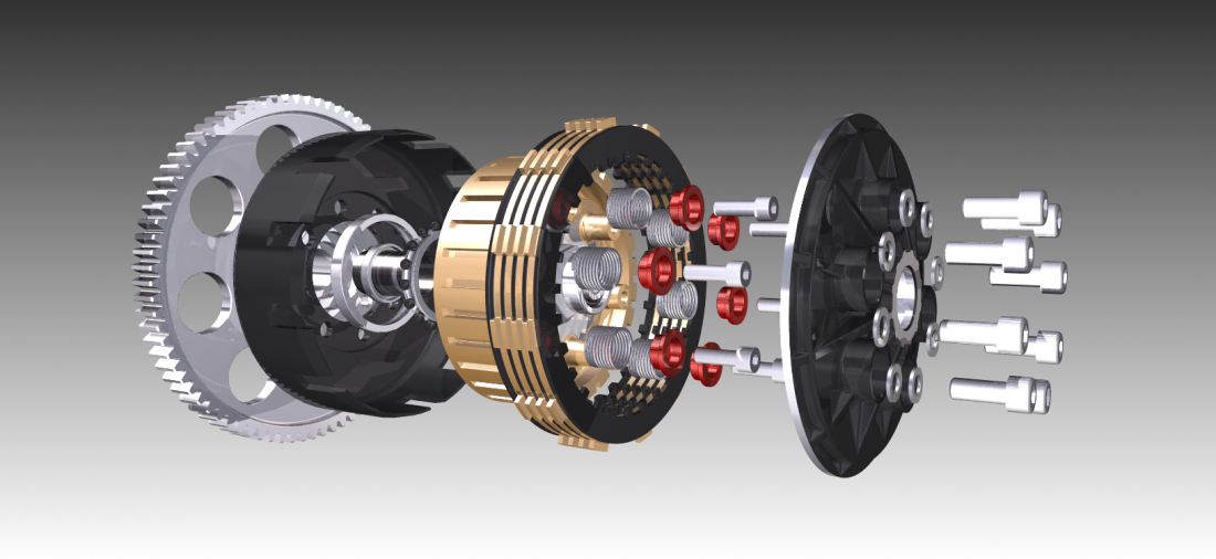
You can use the the 3D viewport control to enable 3D viewing in your SAP Fiori application. This control is available in the Visual Interaction toolkit library. The 3D viewport control can display simple and complex 3D objects in SAP Fiori, and offers basic user interaction with the 3D environment and its objects.

3D objects in the 3D viewport control

You can use the 3D viewer in various locations in the app, such as the object page, the dynamic side content control, dialogs, or popovers.

Usage

Use the 3D viewport control if:

  • You want to show 3D models in an SAP Fiori environment.
  • You want to let users view 3D files in the browser without downloading any browser plugins.
  • You want to enable users to interact with 3D models stored locally or remotely.
  • You want to load multiple 3D models at the same time.

Do not use the 3D viewport if:

  • There is not enough space for users to interact with 3D content (in other words, the 3D viewport is too small to interact with 3D models).
  • You require simple visual representations of objects or functions. In this case, use sap.m.Image instead.


Developer Hint
The 3D viewport control was designed to help developers load and display 3D content quickly and easily. It does not require knowledge of 3D space or the programming techniques needed for correct data visualization.

If you need more control over the elements in the 3D viewport, or if you require extended functionality, you can use an API within the Visual Interaction toolkit to manipulate or interrogate 3D content.

The 3D viewport control uses the SAPUI5 logging mechanism to log various messages, which may include information, warnings or errors. For more information, see the SAPUI5 log page: https://ui5.sap.com//sdk/#/api/jQuery.sap.log

Responsiveness

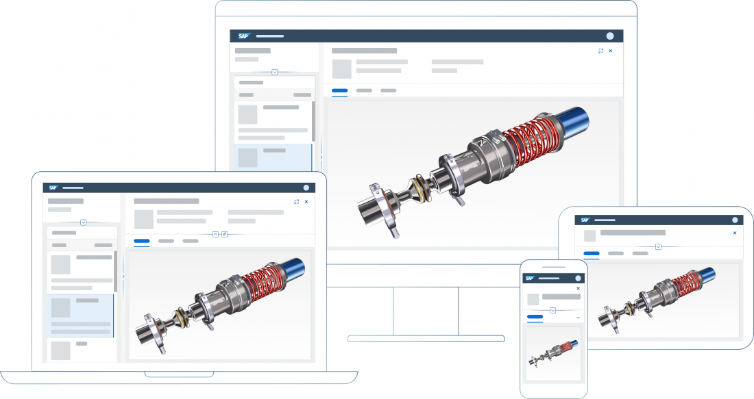
If you use the 3D viewport in conjunction with SAP Fiori page layouts or floorplansresponsiveness is determined by the respective layout or floorplan, such as the dynamic page layout or flexible column layout.

The 3D viewport adjusts its size to fit within the available space.

Example: 3D viewport within an object page - Sizes XL/L, M, and S

Behavior and Interaction

The 3D viewport supports a range of specific mouse and touch gestures by default. The available gestures are determined by the viewport component with which you interact.

When a 3D model is loaded into the 3D viewport, you can pan, zoom, rotate, and click or tap the model with the following actions:

Action Touch Gesture Mouse Gesture Keyboard Shortcut
Select or deselect an object in the scene Tap Left click N/A
Zoom onto and visually focus on an object in the scene Double tap Double click N/A
Rotate the scene Tap and drag Left click + drag Cursor keys
Pan the scene Two-finger tap and drag Hold mouse middle button and drag

or

Hold both left and right buttons and drag

Shift + cursor keys
Zoom out of the model Pinch Mouse wheel scroll forward

or

Right click + move mouse up

Minus key (-)
Zoom into the model Stretch Mouse wheel scroll backwards

or

Right click + move mouse down

Plus key (+)


The recommended selection behavior is known as “sticky” selection (default):

  • When a user clicks on an object, it is marked as selected.
  • Clicking another object selects that object, along with all previously selected objects.
  • Clicking a selected object deselects it.
  • Clicking empty space deselects all objects.
Information
There are no keyboard shortcuts for object selection. As a scene can have thousands of objects, direct interaction with the Viewport using a pointing device is required to select objects.

Resources

Want to dive deeper? Follow the links below to find out more about related controls, the SAPUI5 implementation, and the visual design.

Elements and Controls

No links.

Implementation

Line Chart

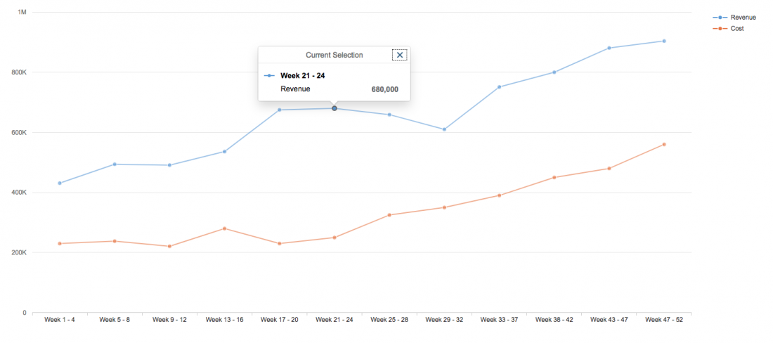
A line chart displays information as a series of data points connected by straight lines. It is a basic type of chart that is common in many areas. Line charts are typically used to visualize a data trend over intervals of time, so the line is often drawn chronologically.

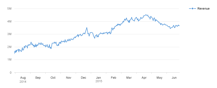
Line chart with time axis

Usage

Use the line chart if:

  • You want to display trends over time, where the focus is on the trend, not on the individual values.
  • You want to help users see dependencies between two or more variables.
  • You want to show higher and lower values (like prices or workloads).

Do not use the line chart if:

  • The y axis has a set of distinct (not successive) categories (not a timeline). In this case, use a bar chart, or a line chart with separate horizontal lines.

Color Palette

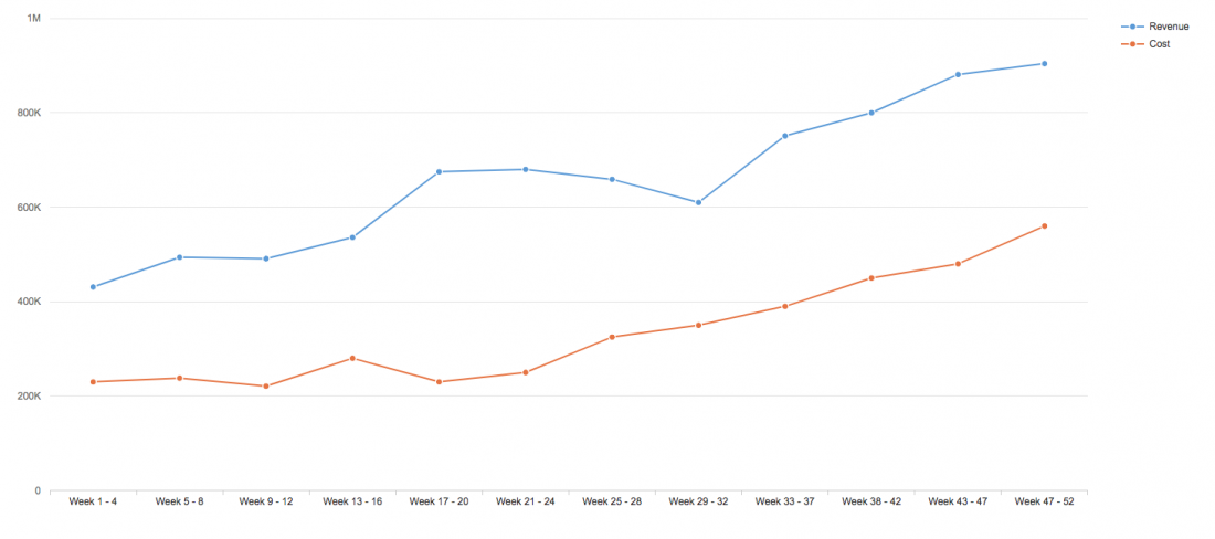
By default, the line chart automatically uses colors from the qualitative palette. However, you can also customize the colors (for example, if you want to differentiate between categories).

Line chart using the qualitative palette

Selection and Popover

When the user clicks on a data point in the line chart, the associated value is displayed in the popover. The popover can also be customized to display other information and actions.

Popover is displayed when you select a data point

Axes

Line charts can be used with 3 types of axes:

Using the Time Axis

If the horizontal axis represents time and you want to show the variation of values over time, you can use the time axis.

It can display years, quarters, months, weeks, days, hours, minutes, and seconds.

The time axis has three main advantages:

  • It allows you to display dates and times in a responsive manner.
  • All the complexity involved with formatting the axis labels is automatically taken care of.
  • The physical spacing between the data points accurately represents the time scale, as opposed to being equidistant.

If you do not need the advantages offered by the time axis, you can use a horizontal categorical axis instead.

Line chart with time axis

Choosing the Corrects Axis

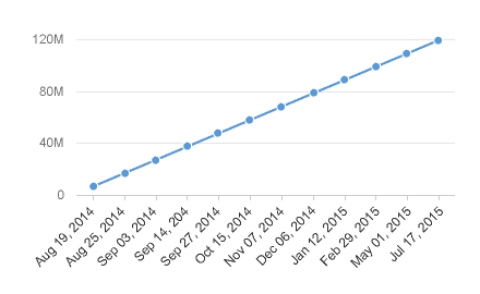
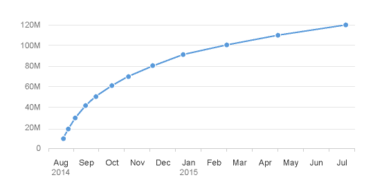
For certain chart types, the physical spacing between your data points accurately reflects the time scale being displayed, as opposed to just rendering all your data points equidistantly. We can see what a difference this makes by comparing the charts below. The chart on the left uses the categorical axis, and the chart on the right uses the time axis. Even though both charts were generated from exactly the same dataset, the high concentration of early data points means they tell completely different stories about how the values have increased over time.

Don't
Categorical axis (misleading)
Do
Time axis (accurate)

Customization

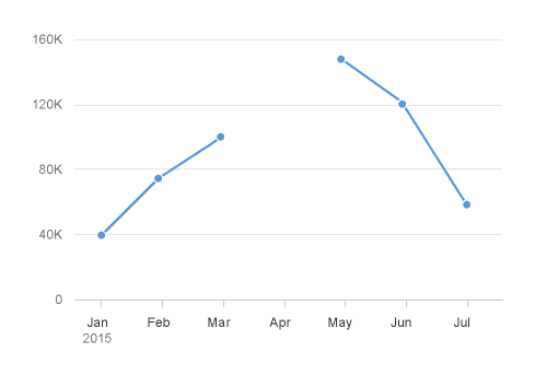
Managing Null or Missing Values in a Line Chart

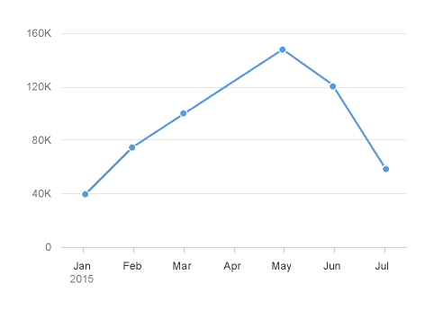
If you expect to have null values or missing values in your dataset, you can connect the available data points, or show a clear break between them.

Ignore missing values
Break missing values

Resources

Want to dive deeper? Follow the links below to find out more about related controls, the SAPUI5 implementation, and the visual design.

Elements and Controls

Implementation