
Which Selection Control Should I Use?
Selection controls are UI elements that allow the user to pick one or several values or options. Different selection controls are available, which each support dedicated use cases. This article offers guidance on when to use the following selection controls:
Selecting a Single Value or Option
To enable users to select a single value or option, display either a combo box, an input field, or a select control. A value is usually a single data point, while an option can consist of several data points, such as product attributes.
Combo Box
The combo box allows users to select one value/option from a predefined list. It’s also possible to type in a value or custom value and filter the predefined selection list (if the application allows it).
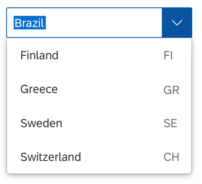
Combo box with two-column layout and option to enter custom value
Input Field
The input field allows users to enter and edit text or numeric values in one line. To help the user enter a valid value, you can enable the autocomplete suggestion feature or provide a selection dialog.
The selection dialog opens when the user clicks the input field icon.
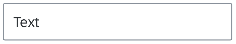
Input field
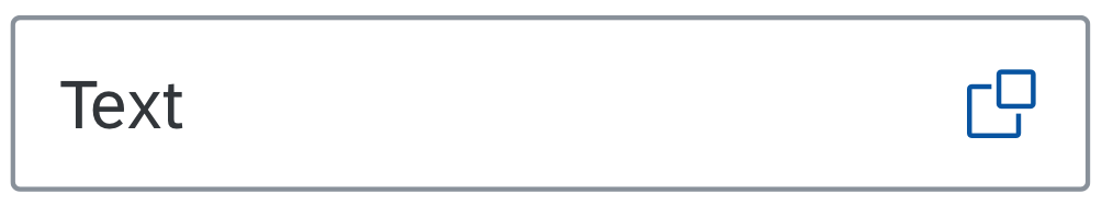
Input field with a button to open one of the selection dialogs
Select
The select control (also known as a dropdown) is commonly used to select a value/option from a predefined list.
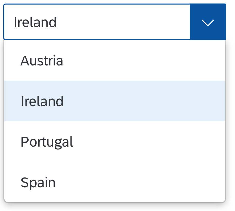
Select control
Selecting Multiple Values or Options
The multi-combo box and multi-input field support the selection of multiple single values or options. A value is usually a single data point, while an option can consist of several data points, such as product attributes.
Multi-Combo Box
Use the multi-combo box if users need to select multiple values/options from a predefined list. The values/options in the list have checkboxes that support multi-selection. Users can also type in a value to filter the list (if the application allows it).
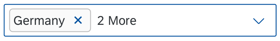
Multi-combo box with three selected values
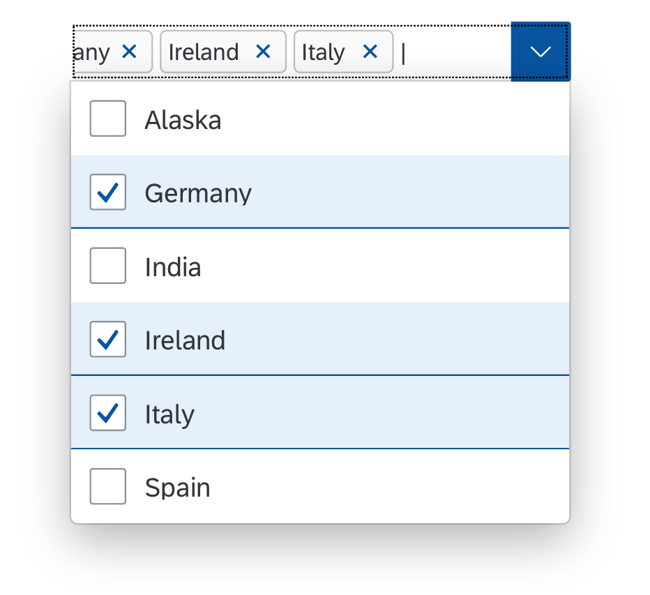
Focused, opened multi-combo box
Multi-Input Field
A multi-input field allows users to enter more than one value/option which are are displayed as tokens. You can enable the suggestions feature or provide a selection dialog to help users enter a valid value/option.
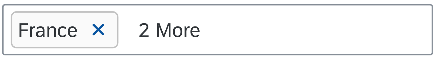
Multi-input field with three values
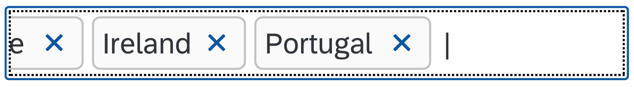
Multi-input field with three values while typing
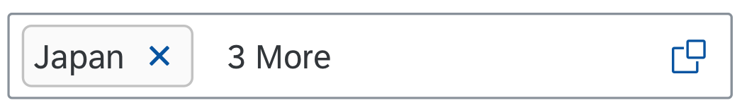
Multi-input field with values and the option to open a selection dialog
Supporting Selection Dialogs
There are three selection dialogs: the select dialog, the table select dialog, and the value help dialog. These dialogs enable users to pick one or several values or options from a long list. Selection dialogs are useful when users need more than one data point to identify the “right” value/option, or when they want to search the list to find a particular value/option.
The selection dialogs are always used in combination with one of the following controls:
- Input field for selecting one value/option
- Multi-input field for selecting more than one value/option
Users can open the respective selection dialog from within these controls.
Example
The user wants to pick a certain product. However, because the product names are very similar, it’s difficult to identify the right one. Additional product attributes in the selection dialog, such as an image and the product release date, help the user to pick the correct option.
Select Dialog
The select dialog enables users to select one or more values/options from a comprehensive list. The select dialog comes with a list of entries containing a few attributes. It also provides a search field to filter the list.
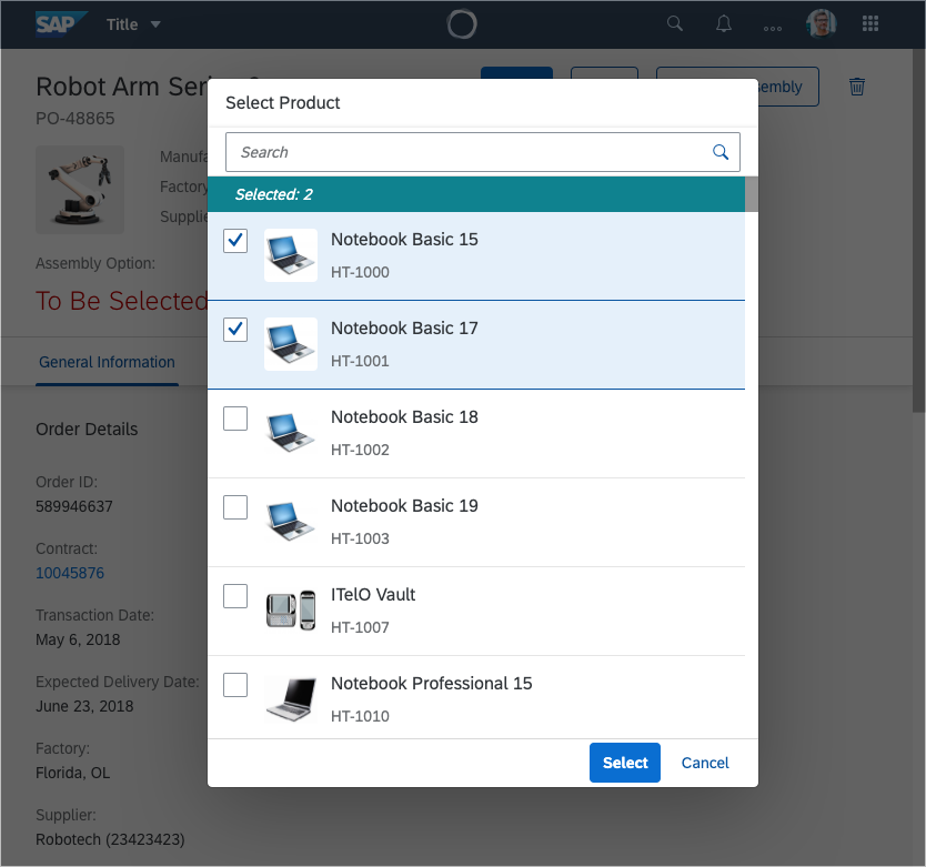
Select dialog with two selected items
Table Select Dialog
The table select dialog enables users to select one or more values/options from a comprehensive table. Usually, the table displays multiple attributes or other related information for an item. Making this additional information available for an entry helps users identify the correct value/option.
The table select dialog reuses the responsive table. It also provides a search field to filter the list.
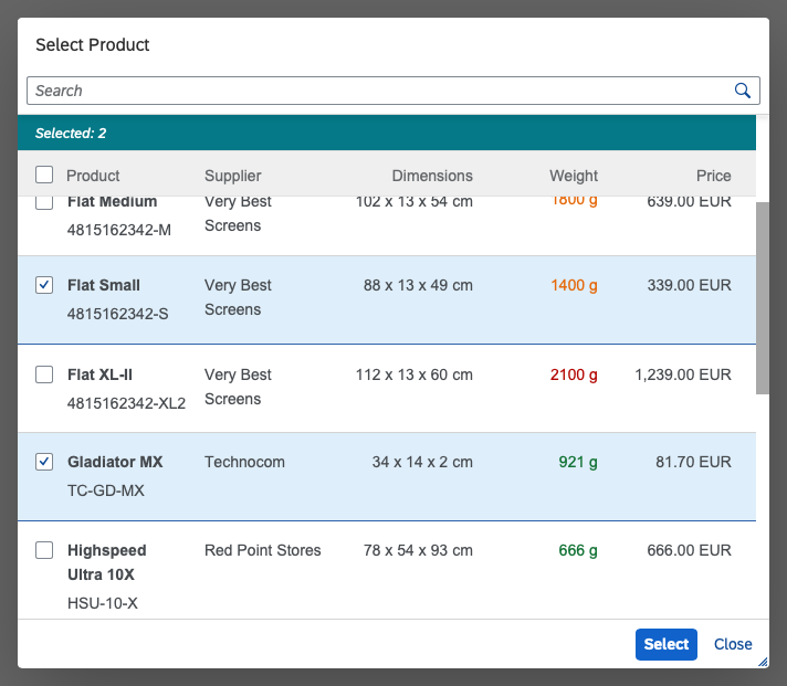
Table select dialog with two selected items
Value Help Dialog
The value help dialog enables users to find and select single and multiple values/options. It also allows users to define conditions and multiple ranges.
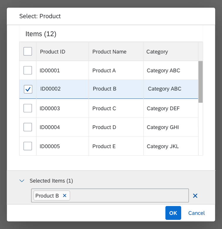
Value help dialog on a mobile device
Best Practices
Depending on the number of entries in the selection list, users might need more information to identify the “right” single value/option or multiple values/options.
Use the criteria in the tables below to choose the most suitable selection control according to the number of data points you have for each value/option and the number of entries you have in the selection list.
Selecting a Single Value or Option
| The user can identify the “right” value/option based on… | 2-12 entries in the selection list | 13-200 entries in the selection list |
200-1,000 entries in the selection list |
More than 1,000 entries in the selection list |
| …a single data point | Select or combo box | Combo box with validator that prohibits custom values |
Input field with suggestions and select dialog | Input field with suggestions and value help dialog |
| …two data points | Select or combo box with two-column layout |
Combo box with validator that prohibits custom values |
Input field with suggestions and select dialog | Input field with suggestions and value help dialog |
| ...3 or 4 data points with/without an image | Input field with suggestions and select dialog | Input field with suggestions and select dialog | Input field with suggestions and select dialog | Input field with suggestions and value help dialog |
| …more than 4 data points with/without an image | Input field with suggestions and table select dialog | Input field with suggestions and table select dialog | Input field with suggestions and table select dialog | Input field with suggestions and value help dialog |
| …several data points and option to narrow selection list down (by defining conditions, selecting ranges) | Input field with suggestions and value help dialog | Input field with suggestions and value help dialog | Input field with suggestions and value help dialog | Input field with suggestions and value help dialog |
Selecting Multiple Values or Options
| The user can identify an individual value/option based on… | 2-12 entries in the selection list | 13-200 entries in the selection list |
200- 1,000 entries in the selection list |
More than 1,000 entries in the selection list |
| …a single data point | Multi-combo box | Multi-combo box | Multi-input field with suggestions and select dialog | Multi-input field with suggestions and value help dialog |
| …two data points | Multi-combo box with two-column layout |
Multi-combo box with two-column layout |
Multi-input field with suggestions and select dialog | Multi-input field with suggestions and value help dialog |
| …3 or 4 data points with/without an image | Multi-input field with suggestions and select dialog | Multi-input field with suggestions and select dialog | Multi-input field with suggestions and select dialog | Multi-input field with suggestions and value help dialog |
| …more than 4 data points with/without an image | Multi-input field with suggestions and table select dialog | Multi-input field with suggestions and table select dialog | Multi-input field with suggestions and table select dialog | Multi-input field with suggestions and value help dialog |
| …several data points and option to narrow selection list down (by defining conditions, selecting ranges) | Multi-input field with suggestions and value help dialog | Multi-input field with suggestions and value help dialog | Multi-input field with suggestions and value help dialog | Multi-input field with suggestions and value help dialog |
Resources
Want to dive deeper? Follow the links below to find out more about related controls, the SAPUI5 implementation, and the visual design.
Elements and Controls
- Combo Box (guidelines)
- Input Field (guidelines)
- Select (guidelines)
- Multi-Combo Box (guidelines)
- Multi-Input Field (guidelines)
- Select Dialog (guidelines)
- Table Select Dialog (guidelines)
- Value Help Dialog (guidelines)
Implementation
- Combo Box (SAPUI5 samples)
- Input Field (SAPUI5 samples)
- Select (SAPUI5 samples)
- Multi-Combo Box (SAPUI5 samples)
- Multi Input (SAPUI5 samples)
- Select Dialog (SAPUI5 samples)
- Table Select Dialog (SAPUI5 samples)
- Smart Field with value help dialog (SAPUI5 samples)


 Your feedback has been sent to the SAP Fiori design team.