Generic Tag

The generic tag control displays complementary information that relates to the current page, such as key performance indicators (KPI) and situations.

Usage

Use the generic tag:

Do not use the generic tag:

  • For decorative purposes.
  • For navigation.

Structure

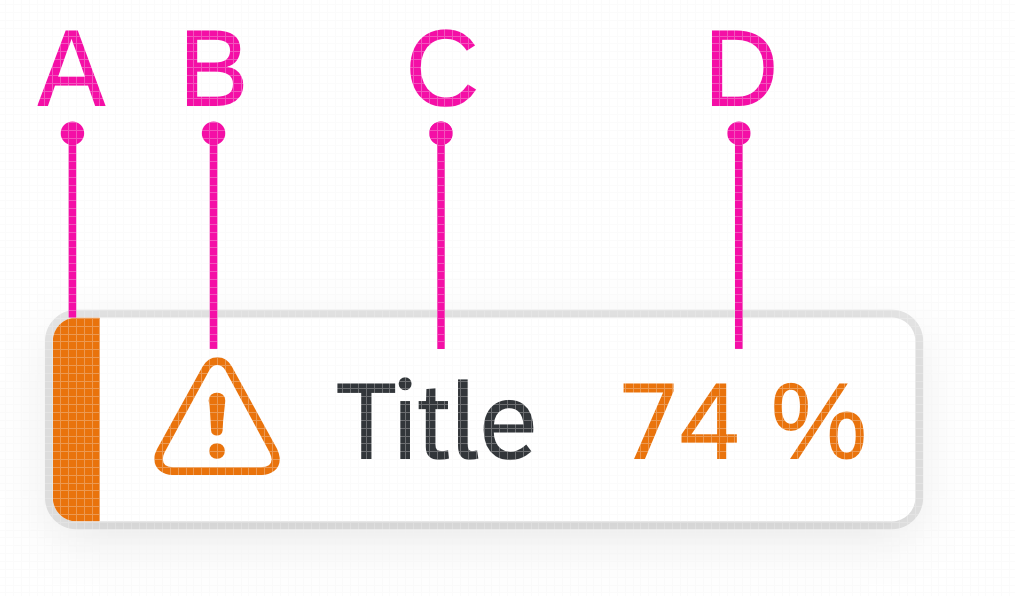
A – Status Indicator / Criticality Indicator – Mandatory

The indicator displays the status/criticality of the tag. Only use it with the available semantic colors.


B – Message Icon – Optional

The message icon can help visualize the status/criticality of the tag. The color of the icon is always the same as the color of the status indicator. Always use the correct message icon for the respective status/criticality.


C – Title – Mandatory

Always use a meaningful title. Keep it simple and try to use no more than 3 words.


D – Value and Unit of Measure – Optional

The value represents the numeric (key) attribute and its unit. The value has a semantic color, and the unit inherits the color from the value. The color of the value must be the same as the color of the status indicator. For more information, see Object Number.

Generic Tag for KPIs

Structure of generic tag

To display KPIs, use the following structure:

  • A – Status indicator / criticality indicator
  • C – Title
  • D – Value and unit of measure
KPI as a generic tag

The generic tag for KPIs also contains an error state. It is shown when the KPI cannot be properly displayed.

KPI error
KPI error

Responsiveness

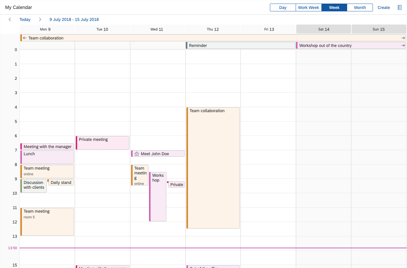
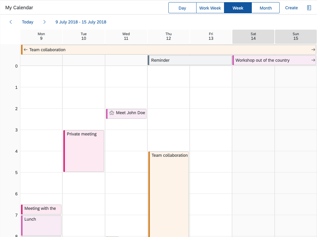
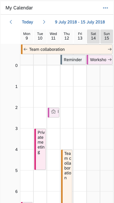
The generic tag itself is not responsive. To enable responsiveness, use the overflow toolbar.

Generic tag overflow on object page

Behavior and Interaction

The generic tag has a press event. Use this event only to open a popover or analytical card containing relevant information, using the progressive disclosure technique.

Resources

Want to dive deeper? Follow the links below to find out more about related controls, the SAPUI5 implementation, and the visual design.

Elements and Controls

Implementation

Single Planning Calendar

The single planning calendar is a scheduling control that displays the calendar of a single person or resource over a day, work week, or week. Users can view appointments, create new appointments, and delete appointments.

Single planning calendar

Usage

Use the single planning calendar if:

  • You want to enable users to schedule or monitor the calendar of a single person or resource.
  • You want to offer multiple calendar views (day, work week, week).

Do not use the single planning calendar if:

  • You want to compare objects of the same type over a given period (for example, appointments for multiple persons or resources). In this case, use the planning calendar.
  • The main use case is to schedule all-day appointments, and you don’t need to see an hour axis. In this case, use the planning calendar.
  • You need a complex graphical representation or planning application involving activities, resources, hierarchical project structures, relationships, and so on. In this case, use the Gantt chart.

Responsiveness

The single planning calendar is responsive and supports the cozy and compact density modes.

Overflow Behavior

On smaller screens, the custom toolbar utilizes the overflow behavior of the standard SAP Fiori toolbar.

If the available actions do not all fit into the available space on the toolbar, an overflow menu button appears on the right of the toolbar. The rightmost actions move into the overflow menu first.

Single planning calendar - Size L
Single planning calendar - Size M
Single planning calendar - Size S

Components

The single planning calendar consists of the following components:

  1. Header
  2. Toolbar
  3. View switch
  4. Navigation
  5. Date strip
  6. All-day appointment
  7. Timeline
  8. Appointment
  9. Calendar grid
  10. Now marker
Components of the single planning calendar
Developer Hint
To prevent waiting time, app developers should load the sap.ui.unified library.

1. Header

The header contains the toolbar and the navigation.

2. Toolbar

The toolbar consists of the calendar title (optional) and the toolbar actions, including a default view switch. You can add other app-specific actions that are relevant for your use case (such as creating an appointment, search, filter, settings, showing the calendar legend, and so on). Always place actions that affect the entire calendar in the toolbar.

3. View switch

The view switch allows the user to switch between different time intervals. The default views are day, work week, week, and month. The app developer can choose which views to include, depending on the use case.

In the month view, all appointments for the respective day have the same width and height. Each grid cell can hold 4 appointments in compact mode and 3 appointments in cozy mode. The remaining appointments can be accessed with a # More link. In month view, all-day appointments look and behave like regular appointments.

Month view
Month view

You can also create custom views by setting a different number of visible columns in the grid. We only recommend doing this if your use case really requires it. You must also ensure that any custom views are responsive. For anything over 7 days, provide an alternative view for size S.

Custom view 10 days - size L
Custom view 3 days - size S
Developer Hint
If no view is set by the application developer, the single planning calendar renders the week view. If the application developer sets only the day view, the week view is not visible.

4. Navigation

The navigation area contains back and forward arrows, the Today button, a date interval link, and the date strip. Clicking the Today button takes the user to the period containing the current day.

5. Date strip

The date strip is the horizontal axis of the calendar grid, showing the currently visible day or days. Non-working days are a darker color.

6. All-day appointment

All-day appointments are appointments that take up 24 hours. They are located in a dedicated area below the date strip and above the first hour of the timeline.

The option to create all-day appointments must be added at application level. Consider using a switch or checkbox that automatically sets the start and end time of the appointment to 00:00. We recommend reflecting this in the UI for creating the appointment as well. For example, offer a date picker instead of a date/time picker for selecting the start and end of the appointment (as shown in the sample dialog).

There is no limit of the height of the all-day appointments area. However, if your use case involves a lot of all-day appointments (and their area takes up most of the screen), consider using the planning calendar instead.

7. Timeline

The timeline is the vertical axis of the calendar grid, showing the hours.

8. Appointment

Each appointment can have an icon or image, a title, and a subtitle. If there is not enough horizontal space for the text, it is truncated. If an appointment has an icon, the icon remains visible as long as there is space for it, even if that does not leave enough space for the title. If there is not enough vertical space, the subtitle is not shown.

Appointments vary in height, depending on their duration, and in width, depending on how many appointments take place simultaneously. The minimum height of an appointment corresponds to a 30-minute appointment.

The app can set up to 20 types of appointments. Each type has its assigned color. Always choose appointment types with contrasting colors. Make sure that each type is also represented as a text, and not only by the color.

9. Calendar grid

The calendar contains the appointments and all-day appointments, and is controlled by the currently selected view. Non-working days have a darker background color in the calendar grid.

10. Now marker

The now marker is a horizontal line through the calendar grid, which indicates the current time. The current time is visible on the timeline. If the current time falls within 15 minutes of a full hour, it replaces the full hour.

Appointment structure
Now marker - Current time replaces the full hour

Single Planning Calendar Legend

You can highlight special days within the calendar. A legend is used to define the meaning of the highlights. Users open the legend using the legend icon button in the toolbar (  ). Like all other actions in the toolbar, the app developer must add the legend button explicitly.

For details, see the legend sections for the Planning Calendar and Calendar.

Guidelines
Ensure that colors are used consistently within your product area.
Single planning calendar legend

Behavior and Interaction

Date Picker

The visible period is indicated with the date interval link in the navigation. Clicking the link opens a date picker, which helps the user to navigate quickly to a specific day or week.

Creating an Appointment

We recommend offering a Create action in the toolbar.

The UI for creating the appointment must be implemented at app level. The control provides only the underlying functionality for creating appointments. For most use cases, a dialog works best and is recommended (see sample dialog below).

First day of the week

You can set the day that displays as the first day of the week in the week and month views. Valid values are 0 to 6, starting with Sunday. If no value is set, the default of the used locale is used.

Zooming

To make appointments easier to read, you can implement the zoom behavior using the controls buttonstep input, or slider.

The scaleFactor property controls the zoom level. Its values can be numbers from 1 to 6. The number represents a multiplier for the height of the rows.

Viewing Appointment Details

The UI for viewing appointment details must be implemented at app level. The control provides only the underlying functionality for displaying appointment details. We recommend using a popover to keep the context for the user (see sample popover below).

Working Hours

You can opt to set working hours in the single planning calendar (properties: startHourendHour). The non-working hours then have a different background and can be hidden (property: fullDay). You can also give the user the option to toggle between working and non-working hours. We recommend offering a toggle button in the toolbar (the button must be added by the app team).

Sticky Header

To keep the context when the user scrolls down the calendar, the header area of the single planning calendar can remain fixed at the top of the screen (property: stickyMode).

At app level, you can choose to have the entire header area sticky (value: All) or only the Navigation area (value: NavBarAndColHeaders).

Drag and Drop

You can enable drag and drop for moving appointments (property: enableAppointmentDragAndDrop). Moving an appointment changes its start and end times (for example, if an appointment is scheduled from 1:00-2:00 PM, the user can drag it and change the time slot to 2:00-3:00 PM). When dragged, the appointment is shown as a ghost element on the mouse cursor. A placeholder indicates the target drop area.

Appointments can also be dragged from or to the area for all-day appointments. When the user drags an all-day appointment to the planning area, a placeholder shows the duration of the appointment after dropping (default = 1 hour). Similarly, dragging a regular appointment to the all-day appointments area transforms it into an all-day appointment (default = 1 day).

For desktop devices, you can also enable the following options:

  • Allow users to create new appointments by clicking, dragging, and releasing on an empty space in the content area (property: enableAppointmentsCreate).
  • Allow users to change the duration of an appointment by clicking and dragging one side of the appointment (property: enableAppointmentsResize).
Warning

To comply with the WCAG 2.2 accessibility standard, the control must offer an alternative to the drag and drop feature. Provide direct access via keyboard shortcuts, which enables single pointer users to make use of virtual on-screen keyboards. Alternatively, use a popover for appointment information and a dialog for creating appointments. For an example, see Single Planning Calendar – Create and Modify Appointments.

Drag and drop
Drag and drop
Drag and drop into the all-day appointments area
Drag and drop from the all-day appointments area

Resources

Want to dive deeper? Follow the links below to find out more about related controls, the SAPUI5 implementation, and the visual design.

Elements and Controls

Implementation