Object Page – Overview

The SAP Fiori elements object page template supports the features and settings for the overall object page behavior detailed below.

For design information, see the Object Page Floorplan guidelines and the links below.

Warning
Always build the object page using the dynamic page header.

Set the shellbar page title to the name of the business object shown in the object page to indicate the user’s position in the system.

Do not use the current implementation of the “page view management” feature in SAP Fiori elements. This feature is technically available for object pages, but we are still working on the final design.

Feature Availability


Features


Availability

Illustrated Message for Unfound Page Default

See Illustrated Message.

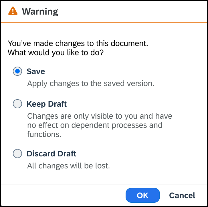
Unsaved Changes Warning Default for the main object page in draft-enabled applications when the user navigates to:

  • Another application without saving changes. You can turn it off.
  • The previous page without saving changes.

Feature Details

Unsaved Changes Warning

By default, in draft-enabled applications, on the main object page, a message warns users of unsaved changes when the users navigate:

  • Forward to another application without saving changes in edit mode or without entering data for a new object in create mode.

You can ask the application developers to turn the message off for forward navigation. The draft is kept for the user to return to later.

  • Backward to the previous page without saving changes in edit mode or the data entered for a new object in create mode.
Information
No message is displayed when the user navigates backward without entering data for a new object in create mode. The object is discarded.

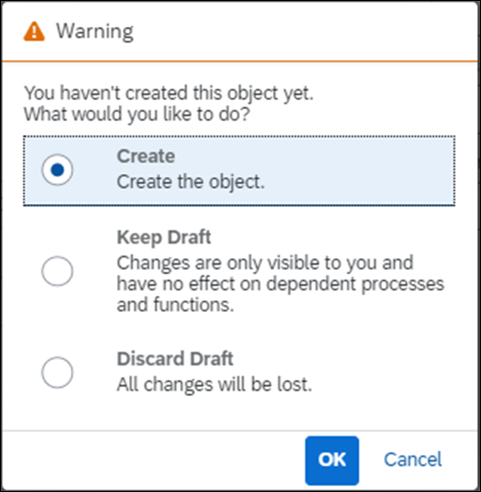
Depending on whether the object page is in edit or create mode, the message lets the users opt to:

  • Save changes in edit mode
  • Create the object in create mode
  • Keep the draft
  • Discard the draft
  • Cancel the navigation
Warning for unsaved changes in edit mode
Warning for unsaved changes in create mode

Calendar Card

Information
The calendar card is already available in SAPUI5, but cannot currently be consumed in the SAP S/4HANA environments (on premise and cloud).

Intro

The calendar card is an interactive calendar for a single entity, such as a person. It shows a chronological list of appointments for the selected date.

The calendar card is an integration card that uses the generic structure of the sap.f.card control.

When to Use

You can use the calendar card to show a calendar for one person, based on the single planning calendar.

Do not use it to show multiple appointments/calendars. Use the planning calendar instead.

Components


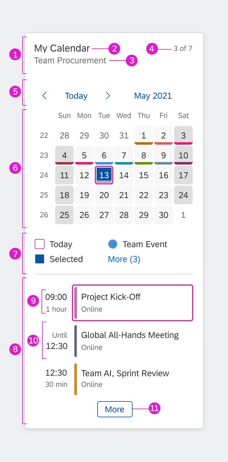
  1. Header: Basic information about the calendar card, including the title, subtitle, and appointment counter.

You can define a navigation target for the header area (recommended). This is typically the underlying application containing the full calendar.

  1. Calendar title: Title set by the application team. Use a title that reflects the use of the calendar in your application context.
  1. Calendar subtitle: Subtitle set by the application team to further qualify the focus of the calendar.
  1. Counter: Indicates how many appointments are displayed on the card and how many exist for the selected day overall.
  1. Calendar navigation: Users can navigate to the previous/next period (for example previous/next month) or use the picker to select the month and year directly.
  1. Calendar with interactive days: Interactive calendar, showing the selected day, current day, and special days.
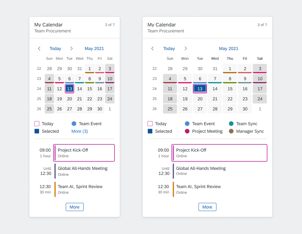
  1. Legend: In-place legend. You can specify the number of items that are shown. The More (x) text indicates how many legend items are hidden.

The different types of legend items are indicated by different shapes: Squares refer to highlighted days, circles refer to types of appointment.

Group titles from the planning calendar legend are not shown in the calendar card.

  1. Appointment list: Shows appointments for the selected day. You can define the number of visible appointments.
  1. Appointment duration: Indicates the duration using a dynamic combination of start date, duration, and end date. The format is determined automatically based on the user’s locale.
  1. Appointment: The appointment can have an icon, a title, and a subtitle.

The appointment title and subtitle do not wrap. If there is insufficient space on the card, the text is truncated.

  1. Indicator for more appointments: The More button indicates that additional appointments exist for the selected day.

You can define a navigation target for the button (recommended). This is typically the detail app containing all the appointments.

Guidelines

  • Define a suitable navigation target for the header area.
  • To give users easy access to the full list of appointments, define a suitable navigation target for the More button at the end of the appointment list.
  • To keep the calendar card simple, display only the most important legend items.

Components of a calendar card

Behavior and Interaction

Calendar Card Header

When a day is selected, the counter adapts to show the number of appointments for that day (visible appointments/total appointments).

If a navigation target has been defined, clicking the navigation header opens the corresponding application.

Selecting a Date

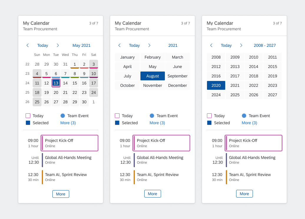
Instead of offering a date picker in a popover, the calendar card changes views in place and allows the user to drill in.

At each level, the user can select the relevant period, navigate back and forth using the Previous and Next arrows, or drill down to the next level using the date picker.

Drill-
down
Level
View Selection Previous/Next Arrows Date Picker Display View Opened by Date Picker Link
1 Days in the month Day Previous month, next month Selected month and year Months in the selected year
2 Months in the year Month Previous year, next year Selected year Years in a year interval
3 Years in a year interval Year Previous year interval, next year interval Selected year interval Set of year intervals
4 Set of year intervals Year interval Previous set of year intervals, next set of year intervals n/a n/a
Calendar card - Picker views

Appointment List

When a day is selected, the appointment list adapts to show the appointments for that day.

If a navigation target has been set for the appointment, clicking the appointment navigates to the corresponding application (one click area).

If additional appointments exist, and a navigation target has been defined, clicking More opens the corresponding application.

Responsiveness

The responsive behavior of the calendar card depends on the container control of the host environment (for example, SAP Fiori launchpad). The size of the card adapts dynamically to the size of the container.

Width

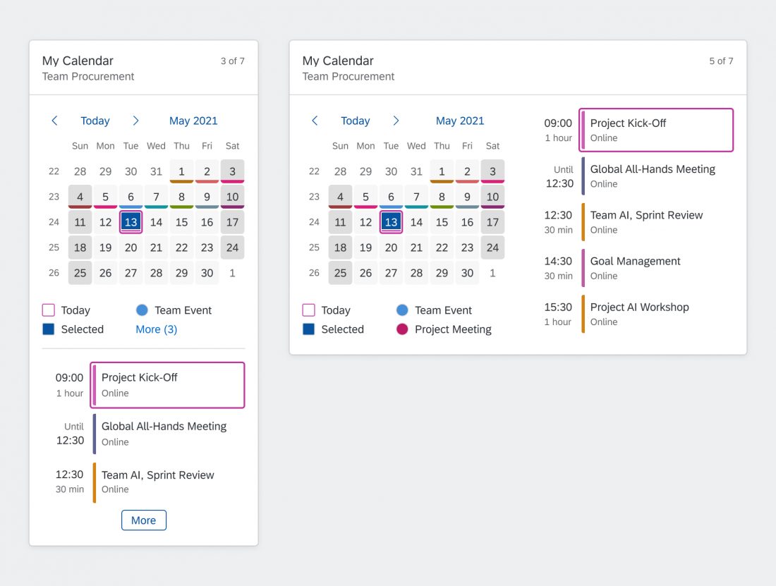
Calendar cards adapt to the available width. If the width exceeds 589 px, the card switches automatically from a 1-column layout to a 2-column layout.

Width Layout
295 px (minimum width) 1 column
295 – 589 px 1 column
> 589 px 2 columns

You configure the width of the calendar card by specifying the number of grid columns. The width of the card (and thus the breakpoint for the 2-column layout) is then determined by the grid.

1-column layout - wider card shows more legend items
Guidelines
When defining the number of grid columns for your calendar card:

  • Ensure a minimum width of 295 px (minimum size for the calendar).
  • To enable the two column layout on larger screens (recommended), allow more than 589 px.

1-column layout and corresponding 2-column layout showing more appointments

Height

The height of the calendar card is determined by the content (no scrolling possible). It depends on the number of appointments that exist for the selected day and the maximum number of visible appointments you have defined.

When the width exceeds 589px and the card rearranges into two columns, and the height of the card shrinks. The minimum number of rows is determined by the number of visible appointments.

Note: If the calendar card snaps to the grid row (depending on overall card snapping behavior), this will sometimes result in blank space in the card.

Guidelines
To prevent the card from becoming too tall, show only a reasonable number of appointments.

Top Tips

  • Keep the legend as simple as possible.
  • Consider the height of the card when you define the number of visible appointments.

Related Links

Elements and Controls

Implementation

Calendar Card (card explorer)

Scroll Container

The scroll container is an empty area that can be filled with content, such as other UI elements. The user can scroll through the content.

When to Use

Use a scroll container if:

  • You want to provide a content area that would otherwise be partly or completely covered or hidden.

Do not use a scroll container if:

  • A page uses a full screen element that can handle vertical scrolling.
  • You are using other controls that come with their own scroll container, such as a dialogtimeline, or panel.
  • You plan to nest different scroll containers that scroll in the same direction.
  • You plan to have several scroll containers with different scroll directions (horizontally and vertically) on one page. This may lead to confusion about when to use which scrolling direction and how it all fits together.

Behavior and Interaction

The scroll container displays a scrollbar on the side for vertical scrolling and on the bottom for horizontal scrolling.

In addition, the scroll container is also focusable.

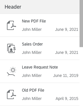
Vertical scrolling in a list

Responsiveness

The scroll container is responsive and adapts to the screen size. By default, the width consumes the complete available width and the height reflects the height of the content. You can also set a fixed width or height. Always use responsive controls for the content, so that they also adapt to the available width and height.

Guidelines
If you are only using horizontal scrolling, do not set the height, or ensure that the height of the container always exceeds the height of the content.

Related Links

Elements and Controls

Implementation