Evening Horizon Colors

Evening Horizon is an additional theme created for SAP Fiori applications to work in environments where low light is necessary or unavoidable. The dark theme also ensures a clean and lightweight design that is consistent and coherent across all SAP Fiori applications.

Usages of the Evening Horizon theme are based on user preference and could be working at night, in a factory or other environment with low light, or working outside at night using portable devices.

Be aware that Evening Horizon does not replace high-contrast themes and supports the minimal contrast requirements of the Web Contrast Accessibility Guidelines (WCAG) 2.2.
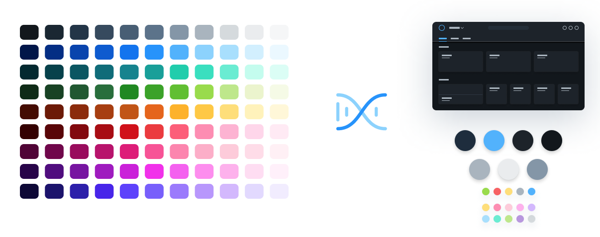
The DNA of Color

The Evening Horizon theme colors have been created from a set of vibrant colors with a strong connection to the SAP brand visual identity. They are the result of a collaborative effort from all of the SAP product and brand design teams. The colors are intended to provide a delightful and more visually accessible customer experience across SAP applications and maximize the product design possibilities, bringing more flexibility to the SAP design system. Furthermore, by applying a coherent SAP brand DNA we can promote a distinct and consistent look and feel throughout all SAP applications. From the values that are derived from the SAP brand colors as a central starting point, we then define a set of UI reference colors as the theme color base for SAP web applications.

  • The Evening Horizon theme background colors are subtle, calm, reduced, and minimalistic.
  • A reduced background color scheme ensures a stable base for any application content. Foreground colors are much more vibrant and friendly to support the importance, prominence, and visual connection of the information displayed.
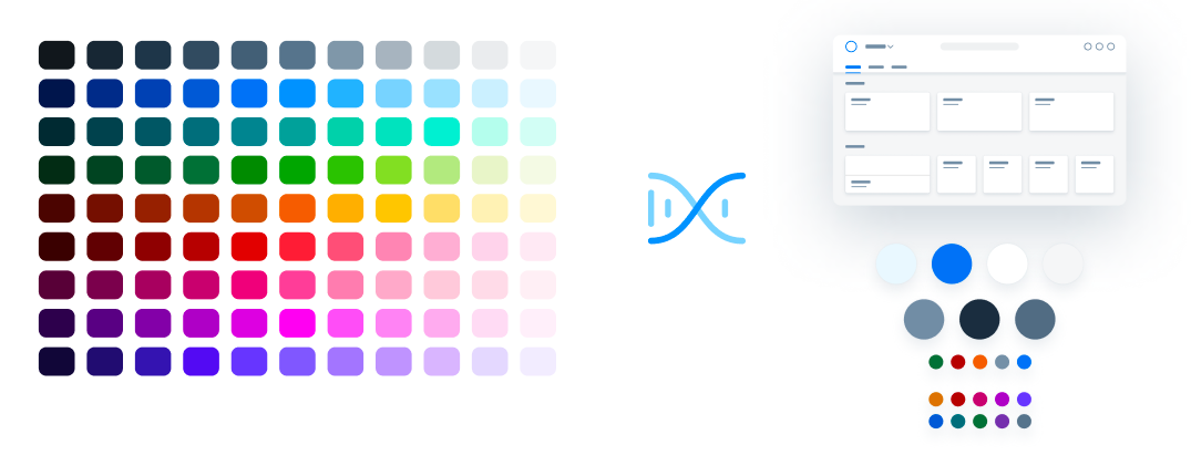
From DNA to UI reference colors (Evening Horizon)

Color Usage

Each theme is based on a set of individual base reference values. These are:

  • Primary (main user interface colors)
  • Secondary (accent colors)
  • Grayscale (neutral values)
  • Semantic (value state colors)

The reference colors listed on this page give a helpful indication as to where they are used in the UI controls and layouts. However, it is extremely important that reference values are not used directly in the control styling. The Evening Horizon reference color values are specific to this particular theme, but are assigned to control parameters.

The reference colors are used as base values, which are then distributed into the UI controls via a stable set of theme control parameters that are available in each theme. Theme control parameters represent semantically named parts of the controls. They are decoupled from the actual color values so that the color values can be easily replaced. The Theming guideline explains how these reference values are mapped to the user interface controls.

Primary Colors

The recommended primary colors leverage the uniqueness of SAP Fiori apps. The primary colors represent the overall look and feel.

Evening Horizon Theme Primary Colors

Primary 1
List Selection

#1D2D3E
rgb(29, 45, 62)

Primary 2
Brand / Links

#4DB1FF
rgb(77, 177, 255)

Primary 3
Base Color, App Headers and Containers

#1D232A
rgb(29, 35, 42)

Primary 4
Home / App Background Base

#12171C
rgb(18, 23, 28)

Primary 5
Borders and Derived Controls

#A9B4BE
rgb(169, 180, 190)

Primary 6
Text and Titles

#EAECEE
rgb(234, 236, 238)

Primary 7
Subtitles and Labels

#8396A8
rgb(131, 150, 168)

Accent Colors

Secondary colors can be applied to accentuate important elements. They make a vivid contribution to the overall UI. Accent colors should not be used directly within the control stylings because they may be different in other themes. For this reason the controls have their own semantically name theme parameters. For more information, see Theming.

Accent 1
Accent Colors

#FFDF72
rgb(255, 223, 114)

Accent 2
Accent Colors

#FF8CB2
rgb(255, 140, 178)

Accent 3
Accent Colors

#FECBDA
rgb(254, 203, 218)

Accent 4
Accent Colors

#FFAFED
rgb(255, 175, 237)

Accent 5
Accent Colors

#D3B6FF
rgb(211, 182, 255)

Accent 6
Accent Colors

#A6E0FF
rgb(166, 224, 255)

Accent 7
Accent Colors

#64EDD2
rgb(100, 237, 210)

Accent 8
Accent Colors

#BDE986
rgb(189, 233, 134)

Accent 9
Accent Colors

#B995E0
rgb(185, 149, 224)

Accent 10
Accent Colors

#D5DADD
rgb(213, 218, 221)

Grayscale

Grayscale areas play an important role in any SAP Fiori user interface. They minimize the risk of over-stimulation and foster simplicity. White and the light grays are mainly used for text. Darker gray shades are primarily used for areas in the background or for borders.

Text and Titles

#EAECEE
rgb(234, 236, 238)

Subtitles and Labels

#8396A8
rgb(131, 150, 168)

Prompt / Placeholder Text

#8396A8
rgb(131, 150, 168)

Borders and Derived Controls

#758ca4
rgb(117, 140, 164)

Header / Container Borders

#2e3742
rgb(46, 55, 66)

List / Table Borders

#2e3742
rgb(46, 55, 66)

Table Group Header Background

#171B21
rgb(23, 27, 33)

Header / Card / Container Background

#1D232A
rgb(29, 35, 42)

Home / Application Content Background

#12171C
rgb(18, 23, 28)

Semantic Colors

Semantic colors can be used to represent a negative, critical, positive, neutral, or information status. For more information, see How To Use Semantic Colors / Industry-Specific Colors.

Semantic Foreground Colors

Negative
Semantic Foreground Colors

#FA6161
rgb(250, 97, 97)

Critical
Semantic Foreground Colors

#FFDF72
rgb(255, 223, 114)

Positive
Semantic Foreground Colors

#97DD40
rgb(151, 221, 64)

Neutral
Semantic Foreground Colors

#A9B4BE
rgb(169, 180, 190)

Information
Semantic Foreground Colors

#4DB1FF
rgb(77, 177, 255)

Semantic Background Colors

Negative
Semantic Background Colors

#490000
rgb(73, 0, 0)

Critical
Semantic Background Colors

#382700
rgb(56, 39, 0)

Positive
Semantic Background Colors

#143E20
rgb(20, 62, 32)

Neutral
Semantic Background Colors

#242e38
rgb(36, 46, 56)

Information
Semantic Background Colors

#00144A
rgb(0, 20, 74)

Indication Colors

The indication color palette is used to follow the color conventions in a line of business or industry. All values are themeable and the meaning of each color depends on the business context. For more information, see How To Use Semantic Colors / Industry-Specific Colors.

sapIndicationColor_1
Indication Colors

#FD3535
rgb(253, 53, 53)

sapIndicationColor_2
Indication Colors

#FF8F8F
rgb(255, 143, 143)

sapIndicationColor_3
Indication Colors

#FFC933
rgb(255, 201, 51)

sapIndicationColor_4
Indication Colors

#BDE986
rgb(189, 233, 134)

sapIndicationColor_5
Indication Colors

#A6E0FF
rgb(166, 224, 255)

sapIndicationColor_6
Indication Colors

#64EDD2
rgb(100, 237, 210)

sapIndicationColor_7
Indication Colors

#D3B6FF
rgb(211, 182, 255)

sapIndicationColor_8
Indication Colors

#FF8AF0
rgb(255, 138, 240)

Accessibility

Color Contrast

Color usages for the Evening Horizon theme within SAP UI controls are checked against the WCAG 2.2 accessibility requirements.

Controls and colors are carefully selected to fulfill the minimum contrast requirements. Contrast ratios vary for different controls due to variations in size, weight, fill, or structure.

The minimum contrast thresholds for the standard SAP Fiori theme are as follows:


Minimum contrast ratio between background and… Minimum contrast
(standard themes)
Text 4:5:1
Large Scale Text
which is defined as 18 pt (24 px) regular or 14 pt (19 px) bold
3:1
Icons similar to Text 4.5:1
Icons similar to Bold Text 3:1
Graphical objects (like charts) as well as visual details which identify a UI element and its state 3:1

Exceptions

No special contrast needs to be measured for:

  • Disabled text and elements (not to be confused with read-only or editable: false)
  • Incidental (purely decorative) elements
  • Logos and brand names

Goals of Good Color Contrast

The user must be able to see everything that is needed to understand and operate the screen.

  • Texts are readable.
  • Icons are recognizable and distinguishable (unless they are purely decorative).
  • UI elements can be identified visually (not by trial and error).
  • Active elements can be recognized as such.
  • The focus indicator can be found quickly (on a 15″ monitor, a user with good vision should find it in less than a second from a distance of 2.5 meters).
  • Emphasized and selected controls are recognizable.
  • Scroll indicators are recognizable.
  • Groups and other structure elements can be recognized.
  • All other visual information can be recognized.

For the last two points, you can also use other options to make the visual elements easier to recognize, such as layout, spacing, or additional texts.

Related Links

Morning Horizon Colors

Evening Horizon is an additional theme created for SAP Fiori applications to work in environments where low light is necessary or unavoidable.

Theming

SAP Fiori uses a variety of colors. They are mapped to control parameters, thus allowing you to overwrite them easily in the UI Theme Designer.

Accessibility for SAP Themes

WCAG target versions for SAP’s visual themes.

Morning Horizon Colors

Morning Horizon is the latest visual theme that has been designed for SAP Fiori applications. Color communicates importance and association, and provides direction to users. By applying the color palette, user interfaces guarantee a clean and lightweight design that is consistent and coherent across all SAP Fiori applications.

The DNA of Color

The Morning Horizon theme colors have been created from a set of vibrant colors with a strong connection to the SAP brand visual identity. They are the result of a collaborative effort from all of the SAP product and brand design teams. The colors are intended to provide a delightful and more visually accessible customer experience across SAP applications and maximize the product design possibilities, bringing more flexibility to the SAP design system. Furthermore, by applying a coherent SAP brand DNA we can promote a distinct and consistent look and feel throughout all SAP applications. From the values that are derived from the SAP brand colors as a central starting point, we then define a set of UI reference colors as the theme color base for SAP web applications.

  • The Morning Horizon theme background colors are subtle, calm, reduced, and minimalistic.
  • A reduced background color scheme ensures a stable base for any application content. Foreground colors are much more vibrant and friendly to support the importance, prominence, and visual connection of the information displayed.
From DNA to UI reference colors (Morning Horizon)

Color Usage

Each theme is based on a set of individual base reference values. These are:

  • Primary (main user interface colors)
  • Secondary (accent colors)
  • Grayscale (neutral values)
  • Semantic (value state colors)

The reference colors listed on this page give a helpful indication as to where they are used in the UI controls and layouts. However, it is extremely important that reference values are not used directly in the control styling. The Morning Horizon reference color values are specific to this particular theme, but are assigned to control parameters.

The reference colors are used as base values, which are then distributed into the UI controls via a stable set of theme control parameters that are available in each theme. Theme control parameters represent semantically named parts of the controls. They are decoupled from the actual color values so that the color values can be easily replaced. The Theming guideline explains how these reference values are mapped to the user interface controls.

Primary Colors

The recommended primary colors leverage the uniqueness of SAP Fiori apps. The primary colors represent the overall look and feel.

Morning Horizon Theme Primary Colors

Primary 1
List Selection

#EBF8FF
rgb(235, 248, 255)

Primary 2
Brand / Links / Highlight

#0070F2
rgb(0, 112, 242)

Primary 3
Base Color, App Headers and Containers

#ffffff
rgb(255, 255, 255)

Primary 4
Home / App Background Base

#F5F6F7
rgb(245, 246, 247)

Primary 5
Borders and Derived Controls

#758ca4
rgb(117, 140, 164)

Primary 6
Text and Titles

#1D2D3E
rgb(29, 45, 62)

Primary 7
Subtitles and Labels

#556B82
rgb(85, 107, 130)

Accent Colors

Secondary colors can be applied to accentuate important elements. They make a vivid contribution to the overall UI. Accent colors shouldn’t be used directly within the control stylings because they may be different in other themes. For this reason, controls have their own semantically-named theme parameters. For more information, see Theming.

Accent 1
Accent Colors

#d27700
rgb(210, 119, 0)

Accent 2
Accent Colors

#AA0808
rgb(170, 8, 8)

Accent 3
Accent Colors

#BA066C
rgb(186, 6, 108)

Accent 4
Accent Colors

#A100C2
rgb(161, 0, 194)

Accent 5
Accent Colors

#5D36FF
rgb(93, 54, 255)

Accent 6
Accent Colors

#0057d2
rgb(0, 87, 210)

Accent 7
Accent Colors

#046C7A
rgb(4, 108, 122)

Accent 8
Accent Colors

#256F3A
rgb(37, 111, 58)

Accent 9
Accent Colors

#6C32A9
rgb(108, 50, 169)

Accent 10
Accent Colors

#5B738B
rgb(91, 115, 139)

Grayscale

Grayscale areas play an important role in any SAP Fiori user interface. They minimize the risk of over-stimulation and foster simplicity. White and the light grays are mainly used for areas in the background or for borders. Darker gray shades are primarily used for text.

Text and Titles

#1D2D3E
rgb(29, 45, 62)

Subtitles and Labels

#556B82
rgb(85, 107, 130)

Prompt / Placeholder Text

#556B82
rgb(85, 107, 130)

Borders and Derived Controls

#758ca4
rgb(117, 140, 164)

Header / Container Borders

#d9d9d9
rgb(217, 217, 217)

List / Table Borders

#e5e5e5
rgb(229, 229, 229)

Table Group Header Background

#EFF1F2
rgb(239, 241, 242)

Home / Application Content Background

#F5F6F7
rgb(245, 246, 247)

Header / Card / Container Background

#ffffff
rgb(255, 255, 255)

Semantic Colors

Semantic colors can be used to represent a negative, critical, positive, neutral, or information status. For more information, see How To Use Semantic Colors / Industry-Specific Colors.

Semantic Foreground Colors

Negative
Semantic Foreground Colors

#AA0808
rgb(170, 8, 8)

Critical
Semantic Foreground Colors

#e76500
rgb(231, 101, 0)

Positive
Semantic Foreground Colors

#256F3A
rgb(37, 111, 58)

Neutral
Semantic Foreground Colors

#788FA6
rgb(120, 143, 166)

Information
Semantic Foreground Colors

#0070F2
rgb(0, 112, 242)

Semantic Background Colors

Negative
Semantic Background Colors

#FFEAF4
rgb(255, 234, 244)

Critical
Semantic Background Colors

#FFF8D6
rgb(255, 248, 214)

Positive
Semantic Background Colors

#F5FAE5
rgb(245, 250, 229)

Neutral
Semantic Background Colors

#EFF1F2
rgb(239, 241, 242)

Information
Semantic Background Colors

#E1F4FF
rgb(225, 244, 255)

Indication Colors

The indication color palette is used to follow the color conventions in a line of business or industry. All values are themeable and the meaning of each color depends on the business context. For more information, see How To Use Semantic Colors / Industry-Specific Colors.

sapIndicationColor_1
Indication Colors

#840606
rgb(132, 6, 6)

sapIndicationColor_2
Indication Colors

#AA0808
rgb(170, 8, 8)

sapIndicationColor_3
Indication Colors

#B95100
rgb(185, 81, 0)

sapIndicationColor_4
Indication Colors

#256F3A
rgb(37, 111, 58)

sapIndicationColor_5
Indication Colors

#0070F2
rgb(0, 112, 242)

sapIndicationColor_6
Indication Colors

#046C7A
rgb(4, 108, 122)

sapIndicationColor_7
Indication Colors

#5D36FF
rgb(93, 54, 255)

sapIndicationColor_8
Indication Colors

#A100C2
rgb(161, 0, 194)

Accessibility

Color Contrast

Color usages for the Morning Horizon theme within SAP UI controls are checked against the WCAG 2.2 accessibility requirements.

Controls and colors are carefully selected to fulfill the minimum contrast requirements. Contrast ratios vary for different controls due to variations in size, weight, fill, or structure.

The minimum contrast thresholds for the standard SAP Fiori theme are as follows:

Minimum contrast ratio
between background and…
Minimum contrast
(standard themes)
Text 4:5:1
Large scale text
which is defined as 18 pt (24 px) regular or 14 pt (19 px) bold
3:1
Icons similar to text 4.5:1
Icons similar to bold text 3:1
Graphical objects (like charts) as well as visual details which identify a UI element and its state 3:1

Exceptions

No special contrast needs to be measured for:

  • Disabled text and elements (not to be confused with read-only or editable: false)
  • Incidental (purely decorative) elements
  • Logos and brand names

Goals of Good Color Contrast

The user must be able to see everything that is needed to understand and operate the screen.

  • Texts are readable.
  • Icons are recognizable and distinguishable (unless they are purely decorative).
  • UI elements can be identified visually (not by trial and error).
  • Active elements can be recognized as such.
  • The focus indicator can be found quickly (on a 15″ monitor, a user with good vision should find it in less than a second from a distance of 2.5 meters).
  • Emphasized and selected controls are recognizable.
  • Scroll indicators are recognizable.
  • Groups and other structure elements can be recognized.
  • All other visual information can be recognized.

For the last two points, you can also use other options to make the visual elements easier to recognize, such as layout, spacing, or additional texts.

Related Links

Evening Horizon Colors

Evening Horizon is an additional theme created for SAP Fiori applications to work in environments where low light is necessary or unavoidable.

Theming

SAP Fiori uses a variety of colors. They are mapped to control parameters, thus allowing you to overwrite them easily in the UI Theme Designer.

Accessibility for SAP Themes

WCAG target versions for SAP’s visual themes.

Typography – Horizon

SAP applications use SAP’s proprietary typeface 72, with a fallback to a sans-serif system font if 72 can’t be loaded.

Designing 72 from the ground up made it possible to meet SAP Fiori’s typographic requirements, including:

  • Legibility enhancements: Optimize for screen use.
  • Font styles: Support a robust typographic hierarchy.
  • Brand voice: Be credible and humane.
  • Character set: Accommodate complex content.
  • Language support: Support Windows Glyph List.
  • Accessibility: Improve character recognition.

Typography with 72

72” replaces the default system fonts to improve the typographic system for SAP applications. The design has been meticulously crafted to portray a look and feel that is more trustworthy, friendly and modern, communicating the visual language of SAP. The metrics of the system fonts have been kept, to ensure compatibility within all controls. Improvements of the individual characters have been made, which also means that less screen width is required, resulting in reduced truncation issues. With all these enhancements, along with the humanist influences within the fine details, 72 greatly improves the legibility of SAP applications.

72, a bespoke typeface created for SAP

Language Support and Fallback to System Font

Language coverage is one of the most important requirements of a typeface, depending on the number of countries in which your applications need to be available. Beyond the languages the font supports, fallback solutions need to be considered. If the defined fonts cannot be displayed when an application initially loads, a fallback font is defined in the style sheet. Defining a fallback to a sans-serif system font that is readily available on every user’s device is a simple solution to load applications in any language. The font stack that is used within the CSS includes 72 with a fallback to system fonts such as Arial and Helvetica in combination, or Roboto for Android.

Here is an example of how theme parameters are used to specify a font stack. Notice that there are two versions of the 72 font; the first is a smaller subset to help improve performance and the second is the full version:

sapFontFamily: “72”, “72full”, Arial, Helvetica, sans-serif;

The fallback system fonts also have the advantage of zero loading time, ensuring that there is always a consistent font available that works with the fresh, clean, and minimalist SAP visual style. The font stack used comes with a full Unicode solution when special characters are needed. For all the languages that SAP products will need to support, system fonts are available. 72 is integrated into the control set, making customization easy. The font stack can also be modified to achieve an individual result.

Accessibility

Optimized for screen consumption, 72’s design enhancements increase legibility, readability and ultimately, accessibility. A wider apex and open counters help with character recognition at smaller sizes. Differentiation of character details, such as the number “1” and the lower case “l” versus the capital “I”, makes the characters easier to distinguish and improves the overall reading experience.

Example of improved accessibility features

Headlines and Font Styles for UI Controls

  • Headlines 1 to 6: Titles are defined in several sizes and styles that help to visually identify the context of application pages or grouped content within the user interface. Examples of headlines include the page title, object header title, list, form, table, chart, timeline, and feed titles. Headlines generally use the 72 Bold font weight by default and 72 Black for the main titles in the Horizon theme, but this is flexible depending on the control component or product application context.
  • Small text: Used for exceptional use cases within controls, such as time stamps or a unit of measurement. We do not recommend using small text size as the main UI text size within controls.
  • Medium text: Default text size used in controls, such as buttons, inputs, tables, or a tree.
  • Large text: Stand-out text controls, such as the author name in a feed, or the file name for a collection of uploaded files.
  • Key performance indicators or custom display sizes: KPI numbers or custom display text sizes may have individually-specified sizes and font weights depending on the control component or application context. Consider visual accessibility and the typographic hierarchy before choosing any custom size or font weight. Light font weights are recommended only for large sizes that are clearly visible and should never be used for small textual information or labeling. If a UI is specially designed to be visible on very large displays from far away, consider emphasizing key information using a bold font weight.

These recommended sizes and weights are offered by default, however, SAP product lines have the flexibility to define their own type scale.

Header Scale

UI Control Text Sizes

72 Font Styles

Additional Styles

SAP can now benefit from the additional font styles that have been added to 72, such as 72 Semibold. These font styles help to expand the possibilities of how to best visualize the information hierarchy within products and websites.

New font styles
New font styles

72 Semibold Duplex

72 Semibold Duplex also enables additional accessibility improvements by providing a visual weight distinction to the regular font weight without any visual jump in the width of the letters. This helps bring more interactive affordance to the text used for general actions and also helps bring a more consistent weight when paired with the new stronger weight of the icon style for the Horizon theme.

72 Semibold Duplex
72 Semibold Duplex

Line Heights

In general, no line height is applied to text, since the line height affects the padding and leads to misaligned content.
If a more generous line height is required for long continuous text, a consistent line height of 1.5 is recommended:

  • Normal line height: This is the default auto line height used in bread and butter controls (such as buttons, inputs, lists, and tables with no wrapping text).
  • 1.5 line-height: Line height recommended by WCAG accessibility guidelines for long continuous or wrapped text (for example, text area or feed list item).

Related Links

Download Fonts

72 is now available to download as part of the UI kit.

SAP Theming Base Content

GitHub repository of SAP themes, including downloadable font files.

Iconography – Horizon

SAP icons have been redesigned for the Horizon visual themes with a fresh, friendly, yet bolder style that is consistent in terms of size, stroke, and balance. The SAP icon style forms part of the SAP brand visual identity. The icons are tailored for simple and direct user interaction, using metaphors that are easy to understand. Each icon has been hand-crafted and aligned in several formats used by SAP applications. The icons are essentially vector graphics that can be resized easily without compromising their appearance.

New SAP icon design for the Horizon visual theme

Design Language

The design language for Horizon-themed icons used within SAP products is created to work across all supported browsers, devices, and operating systems and is part of the SAP brand identity. The style can be described as:

  • Bold
  • Fresh
  • Simple
  • Friendly

This approach is meant to communicate simplicity and integrity with a modern, bold design to enhance SAP solutions. The style integrates basic geometric shapes in order to give a more prominent appearance.

Icon Formats

Icons can be supported in multiple file formats. However, SAP delivers icons in a font format by default. The SAP icon font contains multiple icons in one file with a small file size, making it convenient to deliver updates with each SAP product release. Custom icons can even replace the SAP icon font if an alternative format or style is desired. Additional icon font files can also be added to the SAPUI5 icon pool.

For more information on custom icons, see the development documentation.

SAP icons are also part of the theming base content, which is available for all technologies supported by SAP.

Vector based icons drawn with a flexible geometric grid system

Icon Semantics

Icon semantics are used to define a set of visual elements that indicate functions, objects, and states for iconographic communication.

Finding the right visual semantic to convey a consistent meaning to the user is based on the following essentials:

  • Take inspiration from the real world.
    An icon should be easily recognized by a user. (Note that this does not imply skeuomorphism.)
  • Make use of context.
    The context of an icon contributes to its meaning.
    A semantic element can have different meanings for the user depending on where it’s located (for example, within different labels).
  • Use clear, simple, and recognizable shapes.
    For accessibility reasons, visual elements should be drawn as clear shapes and should not rely upon colors or other means in order to be recognized.
  • Adhere to interaction design standards throughout the graphical user interface.
Simple geometric shapes
Simple and recognizable metaphor

The Geometric Icon Grid System

The simple geometric icon grid was created as the foundational anatomy of the icons. This ensures visual balance for circles and squares and brings the necessary consistency and stability to the shapes that form the structure of the icon metaphors.

SAP icon grid system preview
The anatomy of the geometric icon grid system

A Closer Look at 16px Icons

At 16px, the icons should still maintain a strong and bold look. To achieve this, the lines of the icons must always be perfectly pixel aligned on at least one side, similar to how a text font is pixel aligned. Each icon must be manually pixel aligned to the pixel grid to avoid any issues with blurriness on lower resolution screens.

Here is a closer look at how icons are designed using the grid system:

  • Circles: 16x16px.
  • Squares: 14x14px within a 16px grid.
  • Vertical rectangles: 16x12px within a 16px grid.
  • Horizontal rectangles: 12x16px within a 16px grid.
Details of 16px icons based on the icon grid system

Line Thickness and Border Radius

Line Thickness

In general, the base vector size created for SAP icons is 16px for icons used in most UI controls. Other listed sizes depend on individual control specifications. Icons can be constructed with the bolder line thickness of 1.6px within a 16px grid and, if necessary, scaled up proportionally (for example, to 20px with 2px line thickness). Similar to a text font, all lines are manually pixel aligned to ensure a crisp appearance.

Example of supported sizes

Corner Radius

The consistent regular corner radius is 2px for rounded shapes to match the line thickness. If the icon is scaled proportionally, the values used for the corner radius may vary depending on the intended shape and size. There may be details that require only a minimal radius or no radius value at all. Small details will require smaller values and larger details may require larger values to be consistent.

Recommended corner radius values for 16px icons:

  • Regular: 2px
  • Small: 1px
  • Large: 5px
Left to right: Regular, small, and large corner radius examples

SAP Icon Font

To ensure the availability of SAP icons for all technologies supported by SAP, the icons are part of the theming base content and also part of OpenUI5. SAP icons are made available under the Apache 2.0 license.

Related Links

Follow the links below to find out more about iconography.

OpenUI5 Icon Explorer

Explore icons in SAP Fiori with OpenUI5.

OpenUI5 Icons and Icon Pool

Find out more about using icons, adding icons, or replacing them with custom icons in OpenUI5 documentation.

Icon Font Files

Download SAP icon font files.

SAP Theming Base Content

SAP icons available for all technologies supported by SAP.