
Side Panel
Intro
The side panel is a feature located on the side of an app page, and provides quick access to frequently used actions and content without leaving the page. It can easily be expanded and collapsed, depending on the user’s needs.
The side panel is reserved for:
- Additional context and information related to the overall page content or to an item on the page.
- Interactive tools, such as actions and list elements.
The side panel can be positioned on the right or left side of the main page content. It can contain multiple tabs or a single tab. When expanded, the side panel pushes the main page content sideways.
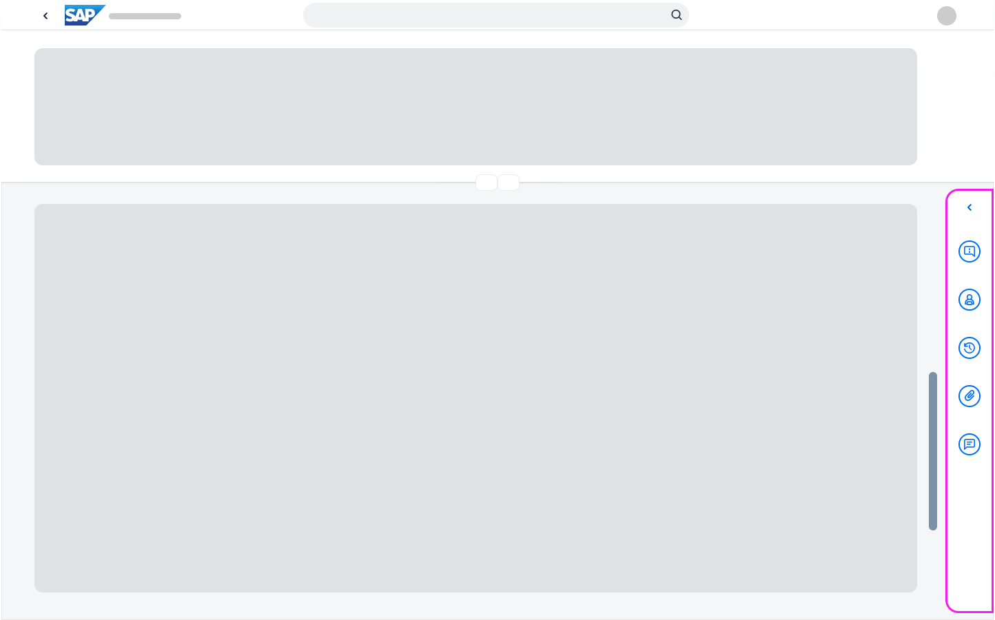
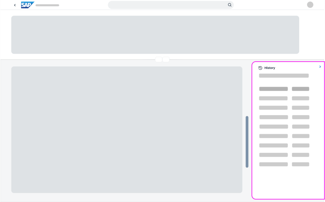
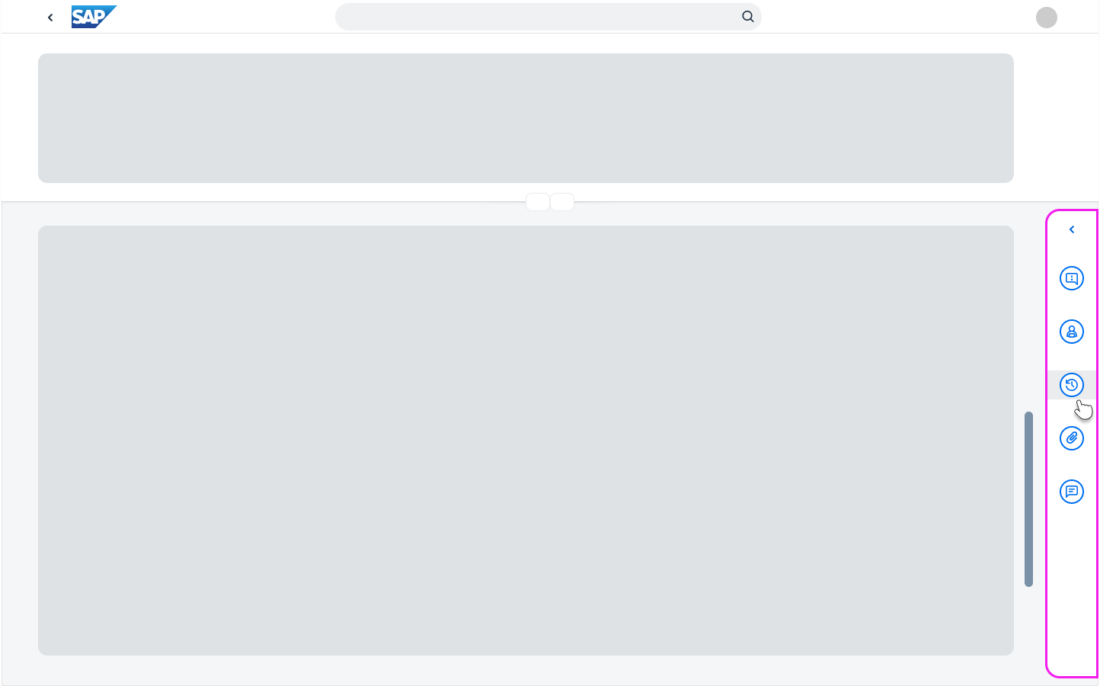
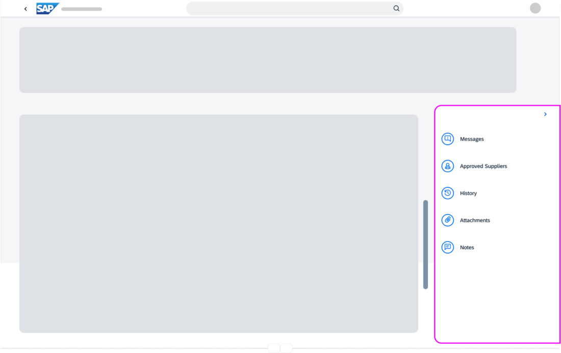
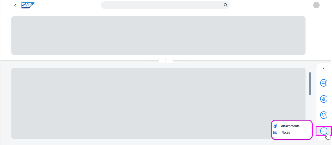
Collapsed side panel
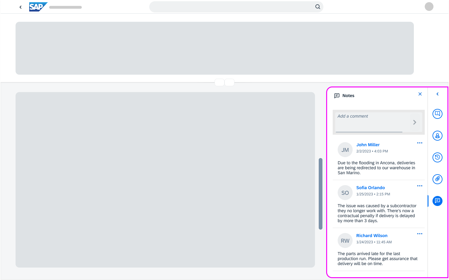
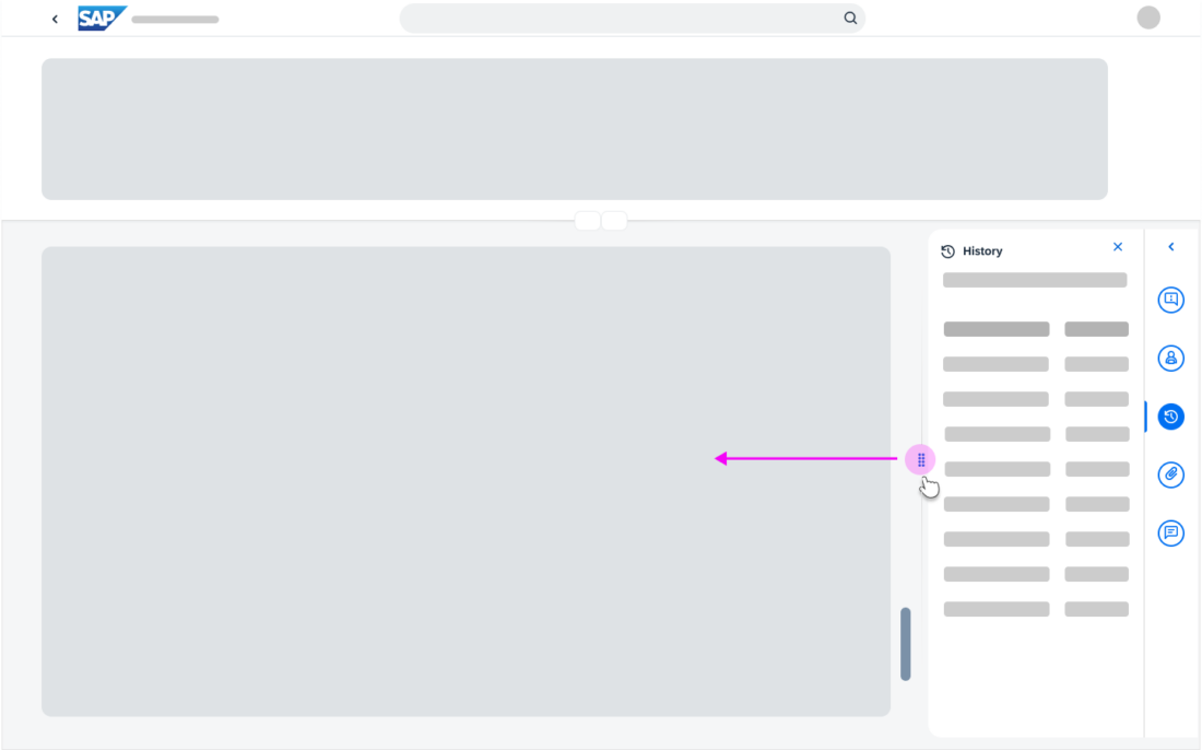
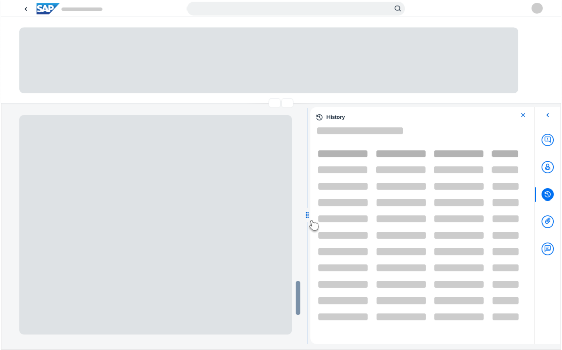
Expanded side panel
When to Use
You can use the side panel to give users easy access to information relating to the main content, such as comments, attachments, or a change log.
SAP S/4HANA Only
You can use the side panel together with a list report, worklist, or analytical list page.
Use the side panel only for the following use cases:
- Comments
- Attachments
- Table filter and layout for pivot tables
- Message handling and notifications
- Activity history / change log
Don’t use the side panel:
- In the object page floorplan. Use the dynamic side content instead.
- In the flexible column layout.
- As a navigation tool.
- To provide controls or information that are unrelated to the content of the app page.
Components
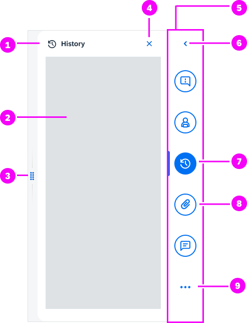
The side panel has the following components:
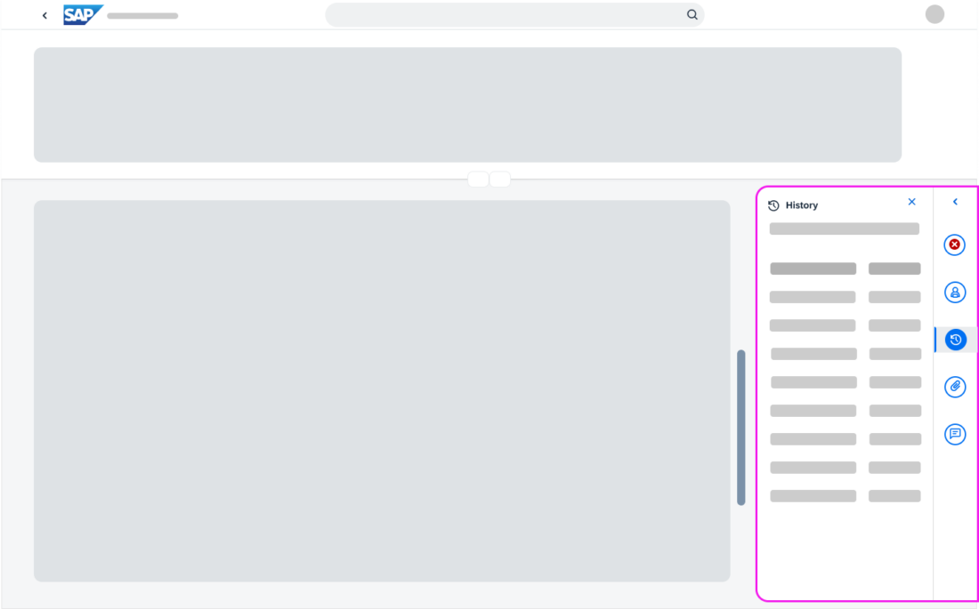
1. Content panel icon and title.
2. Content area
3. Resize handle (optional)
4. Close button
5. Side bar
6. Expand/Collapse side panel
7. Icon tab (selected)
8. Icon tab (not selected)
9. Overflow button. See Multiple actions with overflow.
Panel Width
By default, the side panel is 320 px wide when expanded. You change this setting as needed for your use case.
Side panel components
Behavior and Interaction
Side Bar and Content Panel Navigation
By default, the side panel is collapsed and no tabs are selected. You can change this as needed for your use case.
The interaction depends on how many actions you offer via the side panel.
Side bar with one action
If only one action is available, the side bar contains only the expand/collapse button.
The expand button opens the content panel. The collapse button closes it.
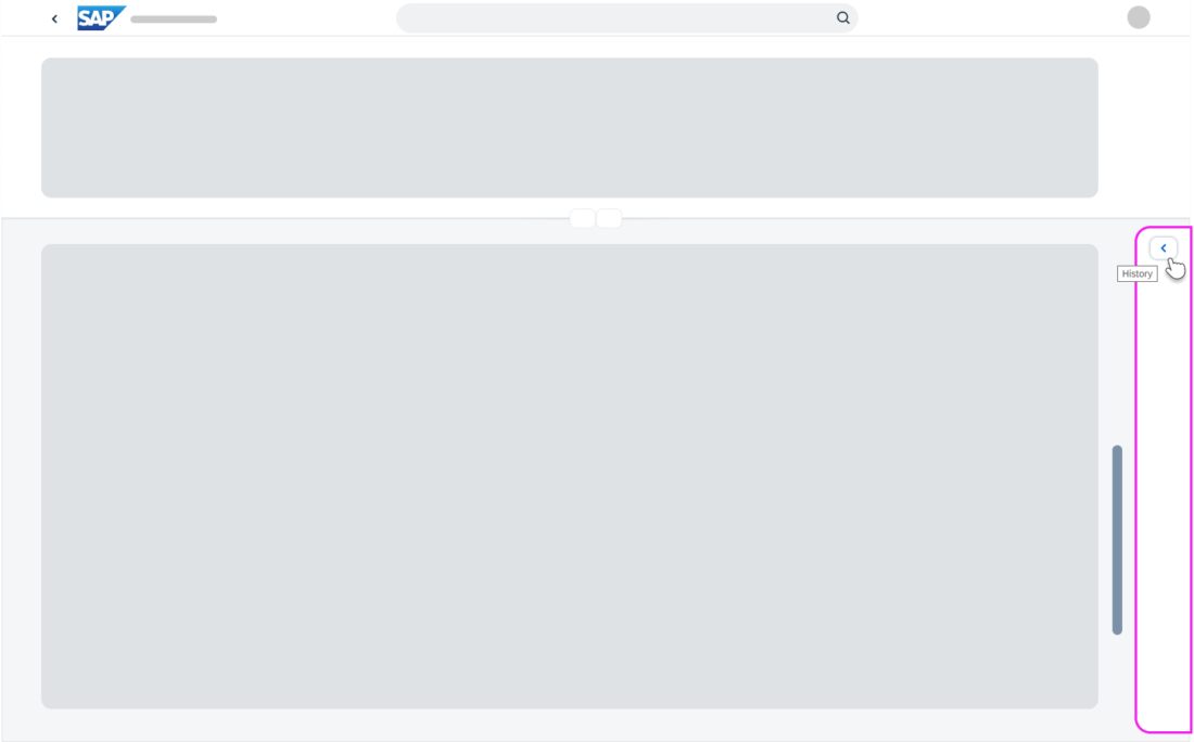
On mouseover, the expand button shows a tooltip with the name of the action.
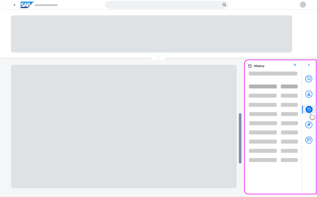
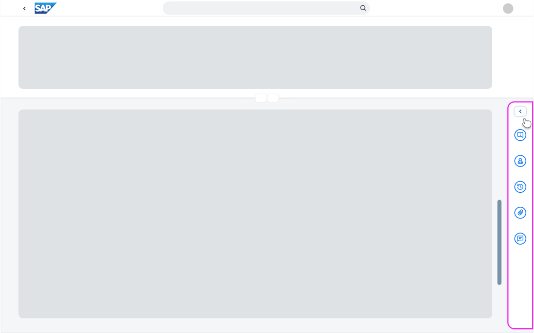
Side bar with multiple actions
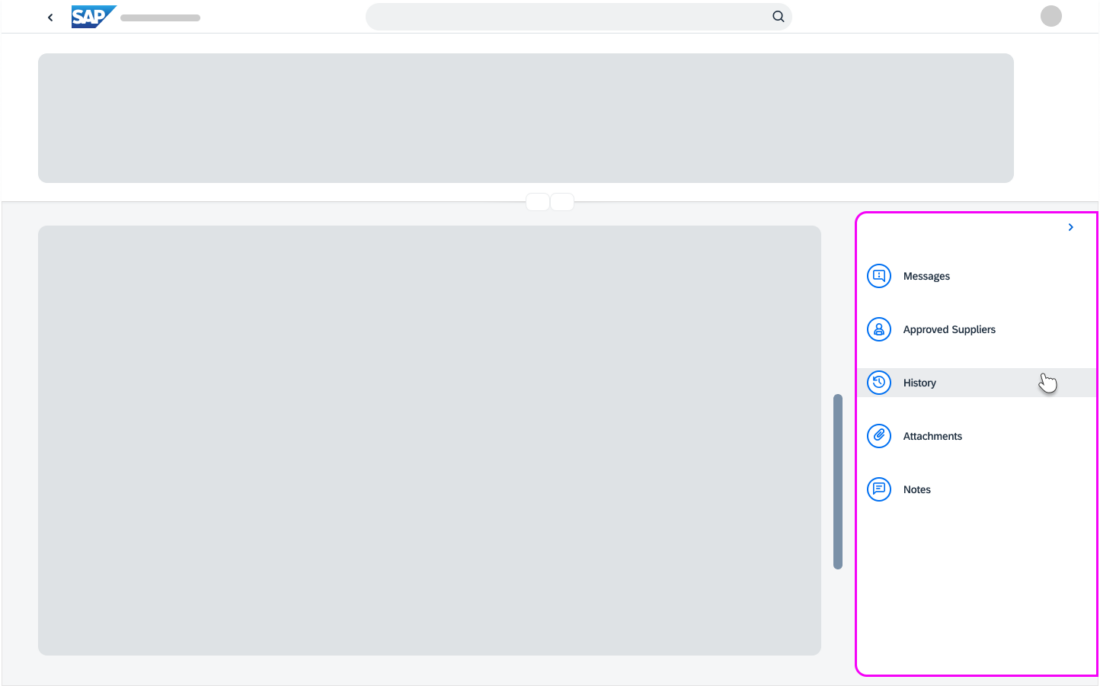
Clicking a tab in the side bar opens the corresponding content panel directly.
To close the content panel, users can either click the tab in the side bar again or use the Close button at the top of the content panel.

The Expand button at the top of the side bar expands the side bar. The available actions are now visible in full. The Collapse button collapses the side bar again.
From the list of actions, users can navigate to the individual content panels. Opening a content panel collapses the side bar and the tab displays as selected.
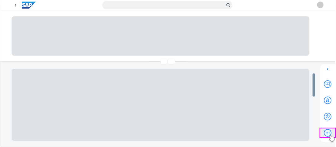
Multiple actions with overflow
If the side bar can’t accommodate all the available actions, or the screen size is reduced, an overflow button (…) appears as the last option.
Clicking the overflow button opens a list of additional actions.
Users can close the list by:
- Selecting an item
- Clicking the overflow button again
- Clicking anywhere else on the screen
Resizing the Content Panel
You can allow users to adjust the width of the content panel.
Mouse Interaction
- Click and drag the resize handle to the left or to the right.
- Double-click the resize handle to adjust the side panel width size as follows: Maximum width minimum width default width
- Right-click the resize handle or anywhere within the side panel to open the context menu with the following options:
- Expand to Maximum Width
- Collapse to Minimum Width
- Reset to Default Width
Keyboard Interaction
- Press Left Arrow or Right Arrow to expand or collapse the panel by 10 px.
- Press Shift+Left Arrow or Shift+Right Arrow to expand or collapse the panel by 100 px.
Screen Width Limits
For legibility, we recommend limiting the screen width allowed for the side panel display as follows:
- Maximum: 90% of the screen
- Minimum: 15% of the screen
You can change these values, depending on the use case.
If the app page contains two side panels – one to the left and one to the right of the screen – the expanded side panel is limited to 50% of the screen width. Users can only expand one panel at once.
Accessibility
Users can perform all the following actions with both a mouse and keyboard:
- Expand and collapse the side bar
- Select and deselect the tabs on the side bar to open and close the content panel
- Set the focus on a tab
- Move the focus from the side bar to the content panel
- Resize the side panel
Responsiveness
Information on the design for tablet and phone devices will be added soon.
 Your feedback has been sent to the SAP Fiori design team.