Segmented Button

A segmented button is a group of buttons that can be toggled. The group appears as one large button with multiple segments.

Segmented buttons – live examples

When to Use

Do

Use the segmented button:

  • To let users choose from a small group of options, such as “Year, Month, Day” or “Small, Medium, Large”.
Don't

Don’t use the segmented button:

  • If there are too many options. Consider using a split button or radio button group instead.
  • If multiple options can be active at once. Consider using a checkbox group instead.

Anatomy

  1. Background: Different background colors visualize the state of the button and indicate the interactive areas (segments).
  2. Text / Icon: Describes or visualizes the action that is triggered for each interactive segment.
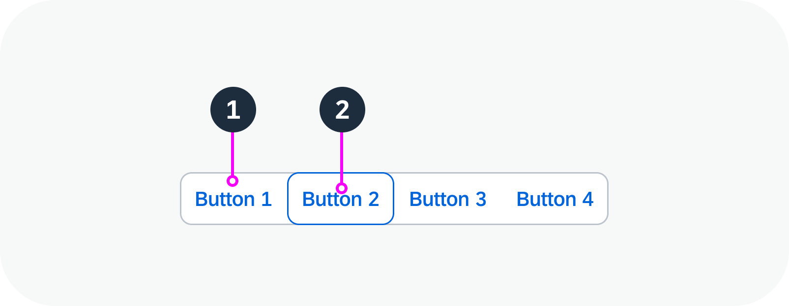
Anatomy of a segmented button

Variants

For visual representation:

  • Text only
  • Icon only
Text only – live example
Icon only – live example


For selection modes:

  • Single: Only one item is selectable. Selecting an item deselects the previous one.
  • Multi: Multiple items can be selected at once. All items ca be unselected.

Note: The segmented button can be configured to start with no items selected. However, additional customization is required to enable this functionality.

Single selection mode – live example
Multi selection mode – live example

Behavior and Interaction

The segmented button behaves differently in single and multi selection mode.

Single: When the user clicks one of the options, this option becomes active (pressed). All other options remain or become inactive (not pressed).

Multi: When the user clicks one of the options, this option toggles between active and inactive (pressed and not pressed), without affecting the other options. In multi selection mode, all options can be active or inactive simultaneously.

Behavior in single selection mode – live example


Behavior in multi selection mode – live example

Related Links

Implementation

Responsive Popover

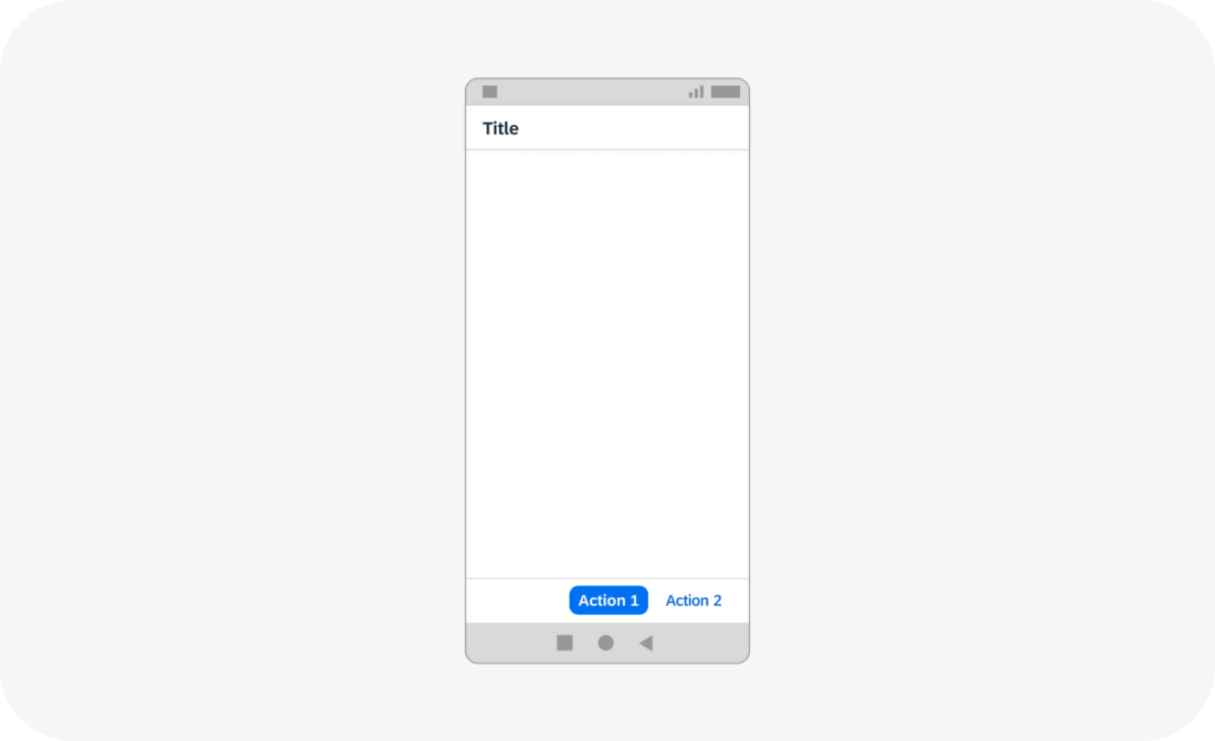
The responsive popover displays as a popover on desktop and tablet devices but as a dialog on phones.

Responsive popover – live example

When to Use

Do

Use the responsive popover:

  • To define your own structure.
  • To show a dialog on phones.
Don't

Don’t use the responsive popover:

  • To show a popover on phones. Use the popover component instead.

Anatomy

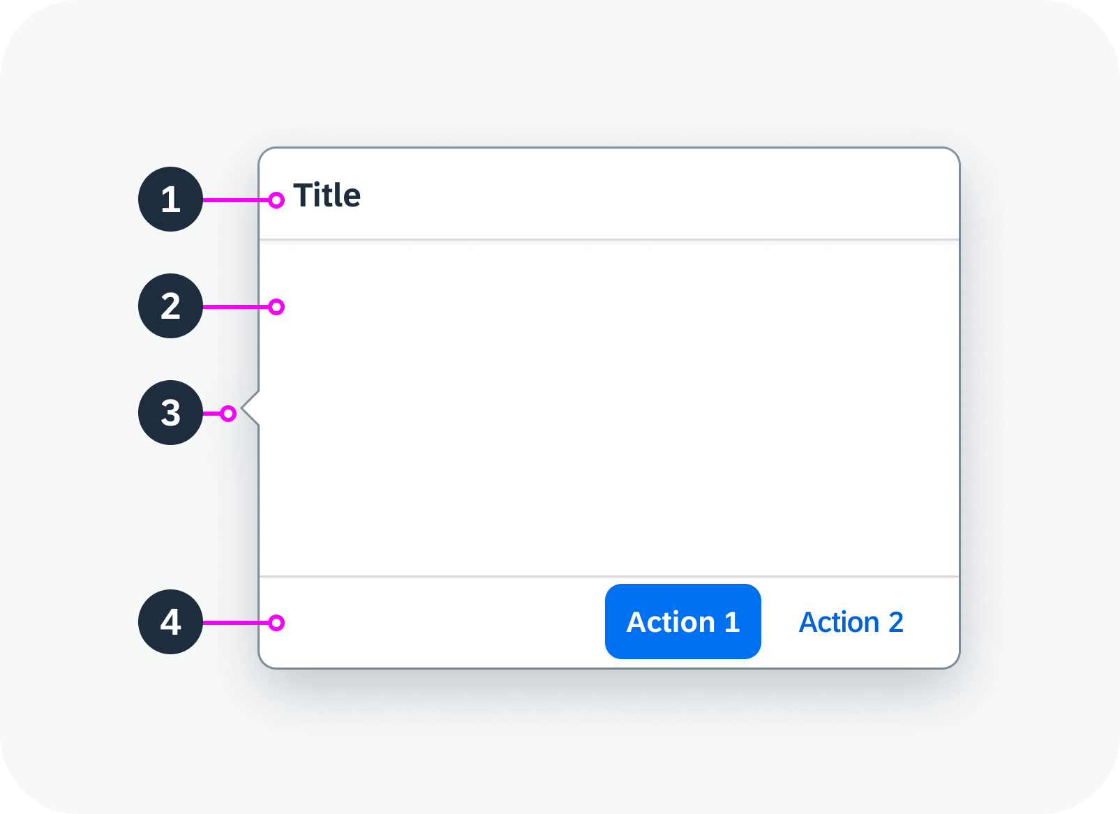
Popover (Desktop, Tablet)

  1. Title (optional): Including a title also improves accessibility for screen reader users.
  2. Content area:  Can contain any component. Ensure that the content has a basic design and shows only the most important information.
  3. Arrow (optional, desktop/tablet only): By default, the popover has an arrow that connects it visually to the triggering component. You can opt to hide the arrow.
  4. Footer (optional): Contains one or more actions.
Anatomy of a responsive popover

Behavior and Interaction

Responsive Behavior

On a phone, the responsive popover displays as a dialog.

The responsive popover is shown as a dialog on a phone.

Related Links

Components

Implementation

Range Slider

A range slider enables the user to select a value range within a given numeric interval.

Range slider – live example

When to Use

Do

Use the range slider:

  • To provide graphical support for selecting a value range within a given numeric interval.
Don't

Don’t use the range slider:

  • If the user only needs to select a single value within a predefined range. Use the slider instead.

Anatomy

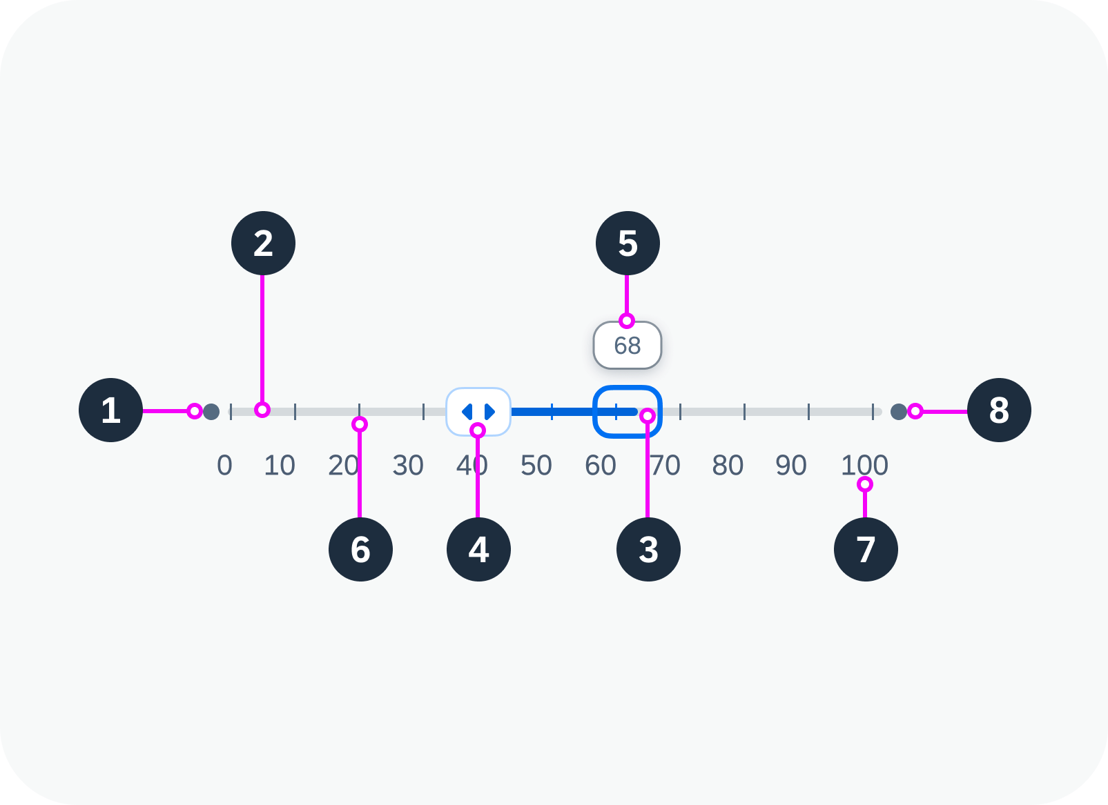
1. Start point: Minimum value of the slider range.

2. Track (active or inactive)

3. Focused slider handle: Active handle for setting the value in focus.

4. Non-focused slider handle: Inactive handle indicating the other selected value.

5. Tooltip (optional): Displays a tooltip with the current value above the handle.

6. Tick marks (optional): Visualize the value intervals (steps). Each tick mark represents a selectable value.

7. Labels (optional): Labels some or all of the tick marks with their values.

8. End point: Maximum value of the slider range.

Anatomy of a range slider

Variants

The following range slider variants are available:


Basic range slider
Disabled range slider
Range slider with tooltip
Range slider with tooltip, tick marks, and labels

Behavior and Interaction

Changing the Value Range

If the range slider is editable, the hand cursor appears when the user hovers over the range slider. If tooltips have been activated, hovering over the slider also displays tooltips showing the current values for each handle. The handles move together with the corresponding tooltips.

The user can change the value range on the slider:

  • By using drag and drop to adjust the handles. The handle snaps to the nearest incremental value.
  • By clicking the track outside the selected value range. The corresponding handle then moves to the new position.
  • By using the key combination Ctrl/Cmd + Arrow keys.
Range slider with tooltip, tick marks, and labels – live example

Moving the Entire Range

Users can move the entire value range by dragging and dropping the active segment of the track.

Equal Values

The handles of the range slider can be positioned on the same value.

Overlapping

The handles of the range slider can be moved across each other. The minimum can become the maximum, and vice versa.

Responsive Behavior

The range slider itself is not responsive. It adjusts to the responsiveness of its parent container by recalculating and resizing the width of the component.

Related Links

Components

Implementation

Radio Button

Radio buttons provide users with a set of mutually exclusive options. They allow users to select only one option from two or more choices. Each option is represented by a radio button.

Different radio button states – live examples

When to Use

Do

Use radio buttons:

  • To choose quickly between at least two clearly distinct alternatives.
  • For single-selection scenarios only.
Don't

Don’t use radio buttons:

  • For multiple-selection scenarios. Use checkboxes instead.
  • To select list items.
  • To offer more than 8 options. Use a dropdown box or list view instead.
  • To offer only two mutually exclusive options. In this case, combine them into a single checkbox or toggle button. For example, use a checkbox for “I agree”.
  • To offer options that are numbers with fixed intervals. Use a slider instead.

Anatomy

The radio button comprises two parts:

  1. Button: Indicates whether the option is selected.
  2. Text: Describes the purpose of the radio button. The text is optional if the purpose of the radio button is already indicated by other elements.
Anatomy of the radio button

Behavior and Interaction

The user can select a radio button by clicking on the button or the content. Note that clicking again on a checked option does not uncheck it. However, clicking on a different option transfers selection to that option. The user can select only one option from a group of radio buttons.

Radio button – live example

Related Links

Implementation

Progress Indicator

The progress indicator visualizes the current advancement of a process or a degree of accomplishment.

Progress indicator (progress at 0%, 60%, and 100%)

When to Use

Do

Use the progress indicator:

  • To show an ongoing process and provide an estimate of how long it will still take.
  • To show the current status visually.
  • To emphasize the current status visually.
  • To help users compare different states easily on the fly.
  • To show custom values or percentages.
Don't

Don’t use the progress indicator:

  • If visual feedback is needed for an ongoing operation. Use a busy indicator instead.

  • If the progress is indeterminate. Use a busy indicator instead.

Anatomy

The progress indicator component consists of the following parts:

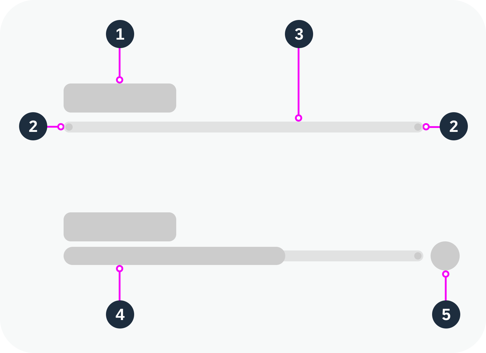
  1. Text: Describes the current status. If no specific text is provided, the percentage value is displayed by default. You can also opt to hide the text.
  2. Start/end indicator: Indicates the start and end points of the progression.
  3. Track: Track representing the entire progression from start to finish.
  4. Progress bar: Bar representing the current progress, based on the percentage value.
  5. Icon (semantic states only): Additional indicator showing the value state as an icon.
Anatomy of the progress indicator

Semantic States

Use the progress indicator to add clarity and weight to an important state that needs to be perceived very quickly.

Progress indicator used to display a status


The progress indicator can be used with value state to indicate the semantic meaning.

Progress Indicator value states (from top to bottom: None, Error, Warning, Success, Information)

Related Links

Components

Implementation

Popover

A popover is a small overlay window that appears on top of the existing content. It is used to provide additional information and options without requiring the user to navigate away from the current page or interrupt their workflow.

Popover –  live example

When to Use

Do

Use a popover:

  • If you need to define your own structure.
  • If you have very little content.
Don't

Don’t use a popover:

  • If the content takes up more than a third of the screen real estate on phones. Use the responsive popover instead.
  • To show details for a list item in list-detail layouts.
  • If a user action or confirmation is required before processing can continue. In this case, use a dialog.

Anatomy

  1. Title (optional): Including a title also improves accessibility for screen reader users.
  2. Content area:  Can contain any component. Ensure that the content has a basic design and shows only the most important information.
  3. Arrow (optional): By default, the popover has an arrow that connects it visually to the triggering component. You can opt to hide the arrow.
  4. Footer (optional): Contains one or more actions.
Anatomy of a popover

Behavior and Interaction

Opening and Closing a Popover

The popover opens when the user clicks on a triggering text link or button. The popover appears next to the trigger component, but doesn’t obscure it.

The popover closes when the user clicks outside the popover or selects an action within the popover.

Opening and closing a popover – live example

Placement Types

You can define how the popover is positioned in relation to its trigger.

Available options:

  • Left
  • Right (default)
  • Top
  • Bottom

The position and direction of the arrow adapt to the placement type.

Popover to the right of the trigger (default), arrow hidden – live example


Popover beneath the trigger, with arrow – live example

Responsive Behavior

The popover component always shows a popover, regardless of the form factor. Only use a non-responsive popover if it has very little content. On smartphones, the popover should not use more than a third of the phone’s real estate. If you need to include more content, use a responsive popover.

Related Links

Implementation

  • Popover
    (UI5 Web Components documentation)

Panel

The panel is a responsive container for grouping and displaying information. You can use it to structure content on a page. To save space, you can make the content area collapsible.


Expandable panel – live example

When to Use

Do

Use the panel:

  • To group information.
  • To give users the option of hiding this information.
  • To show additional information on demand.
Don't

Don’t:

  • Nest panels.
  • Stack too many panels on one page.

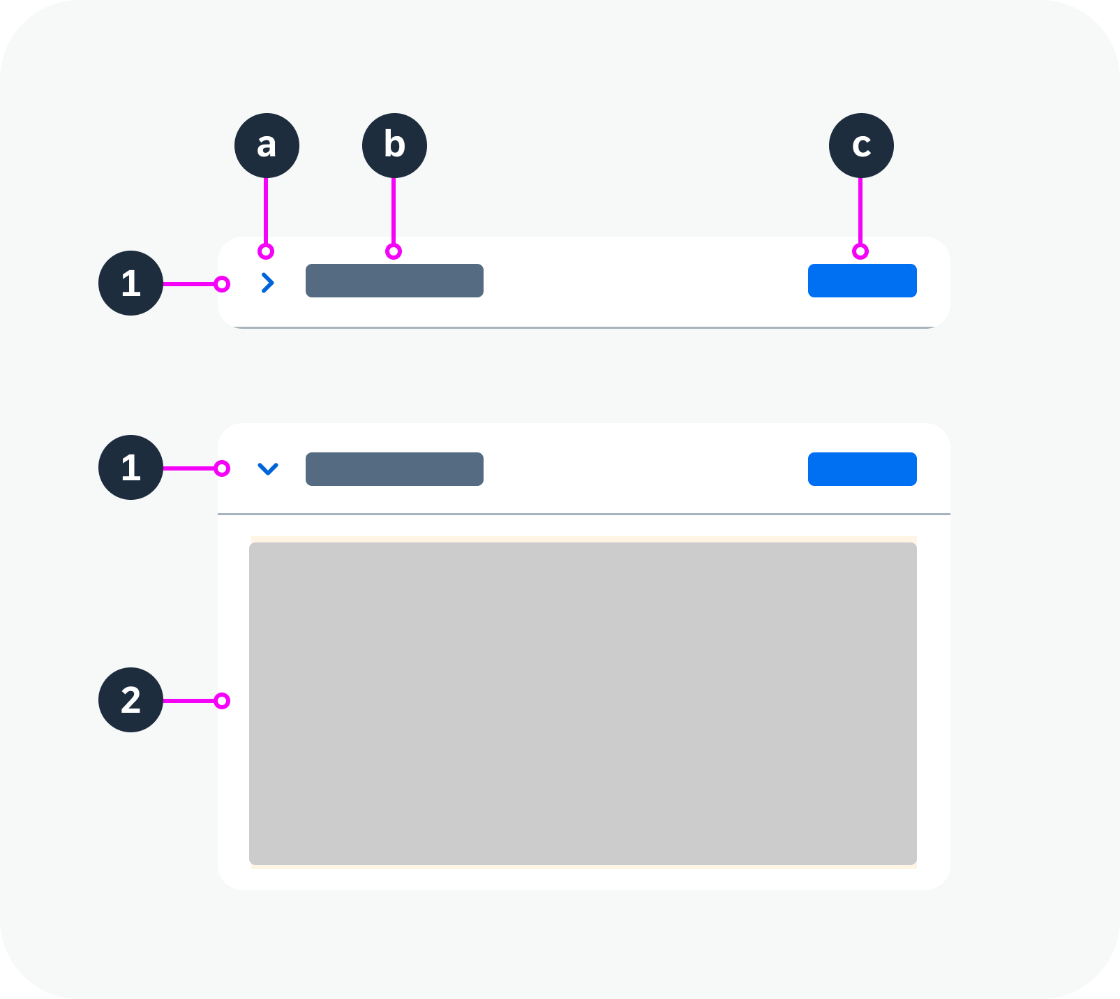
Anatomy

  1. Header area: By default, the header is clickable and can be used to toggle between the expanded and collapsed state.
    1. Icon: Used to expand and collapse the content area. The icon rotates when the panel is expanded (arrow points down) or collapsed (arrow points right).
      Note: If the panel is fixed, no icon is shown.
    1. Title: Title bar with a header text or custom header.
    1. Custom header (optional): Title, buttons or any other HTML elements.
  1. Content area: The content area can contain any component or set of components.
Anatomy of a panel
Anatomy of a panel

Variants

Standard Panel

By default, the panel is expandable.

Clicking anywhere on the title bar expands or collapses the content area.

Panel with list – live example

Panel with Custom Header

Use this variant if you want to add actions to the panel header.

If a panel has a custom header, the arrow icon must be used to expand and collapse the panel. Clicking on other parts of the header has no effect on the expand/collapse behavior.

Panel with custom header – live example

Fixed Panel

Use this variant if you want the content to be visible at all times.

Fixed panel – live example

Behavior and Interaction

See the variants for the standard panel and panel with custom header.

Responsive Behavior

If the width of the panel is set to 100% (default), the panel and its contents are resized responsively, depending on its parent container.

If the panel has a fixed height, it will take up the designated space even if the panel is collapsed.


Truncation

When the space for the header title is not enough, the title truncates. The content wraps.

Panel with truncated title

Related Links

Components

Implementation

  • Panel
    (UI5 Web Components documentation)

Page

The page is a container component for a full application screen comprising a header, content area, and footer.

Page – live example

When to Use

Use the page as a base for any screen you need for your application.

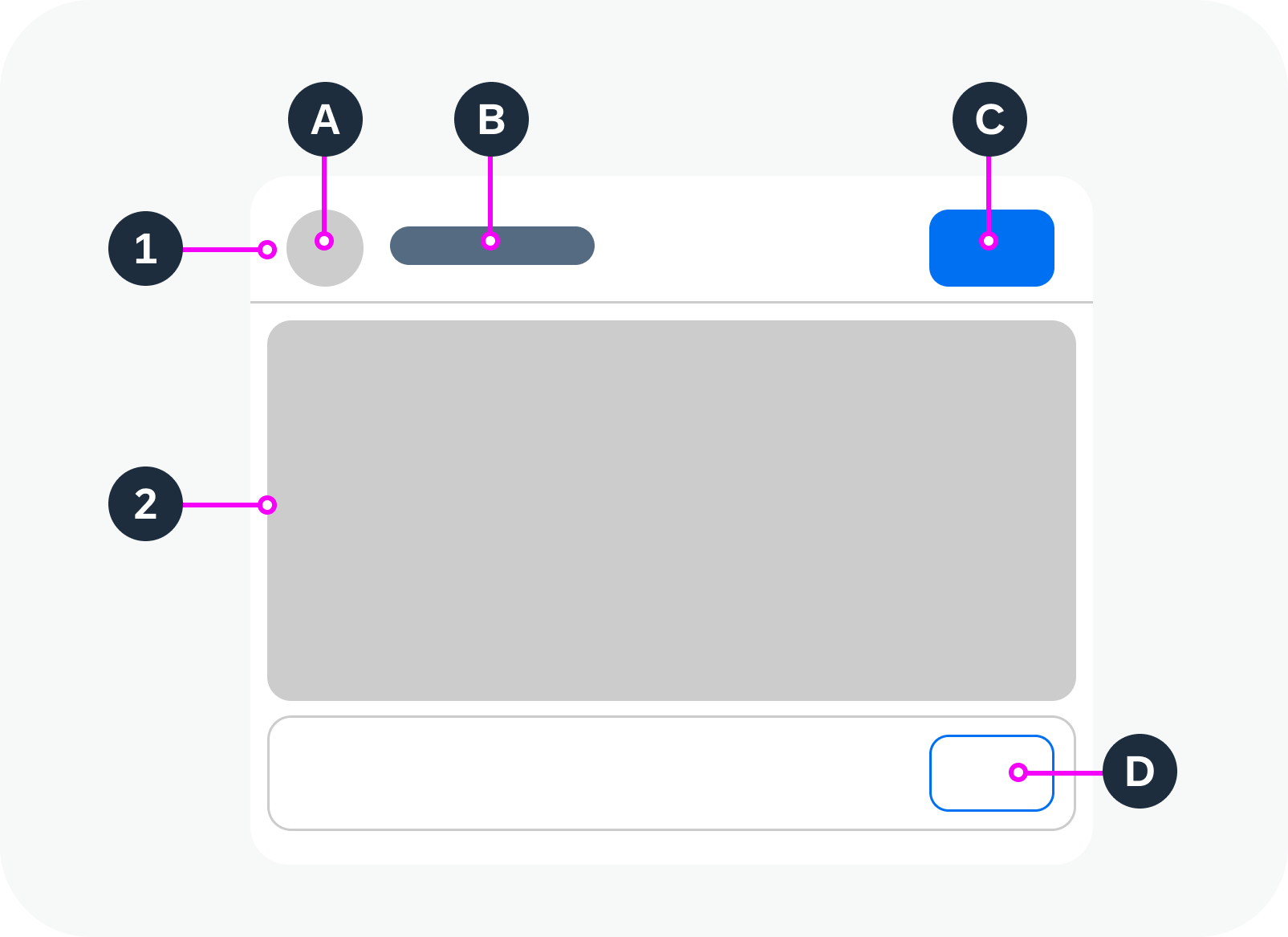
Anatomy

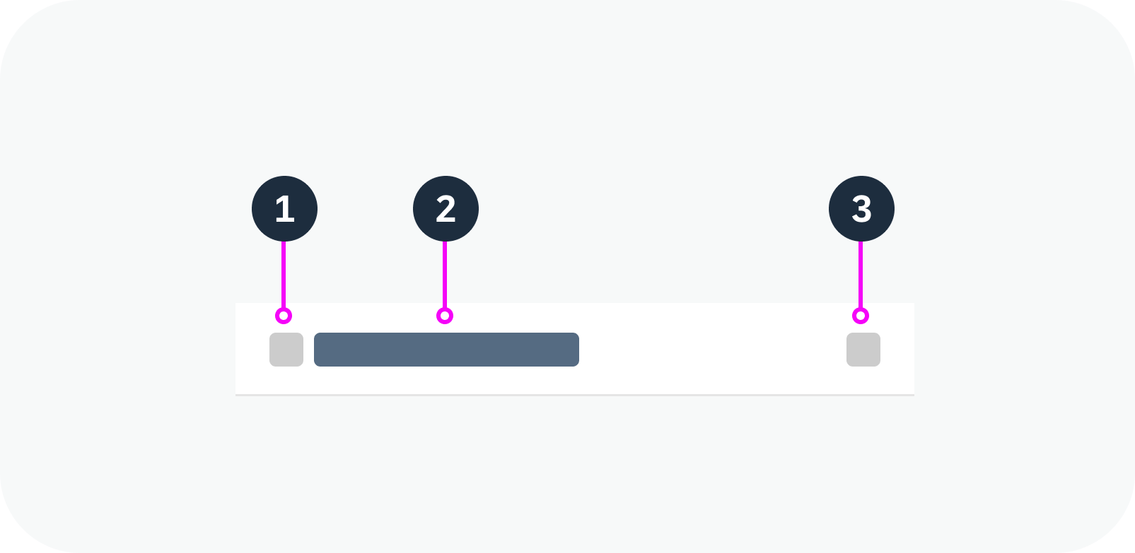
  1. Header
    1. Home icon
    2. Title
    3. Button
  2. Content
  3. Footer (optional). The footer can float or be fixed at the bottom of the page.
    1. Button
Anatomy of a page
Anatomy of a page

Variants

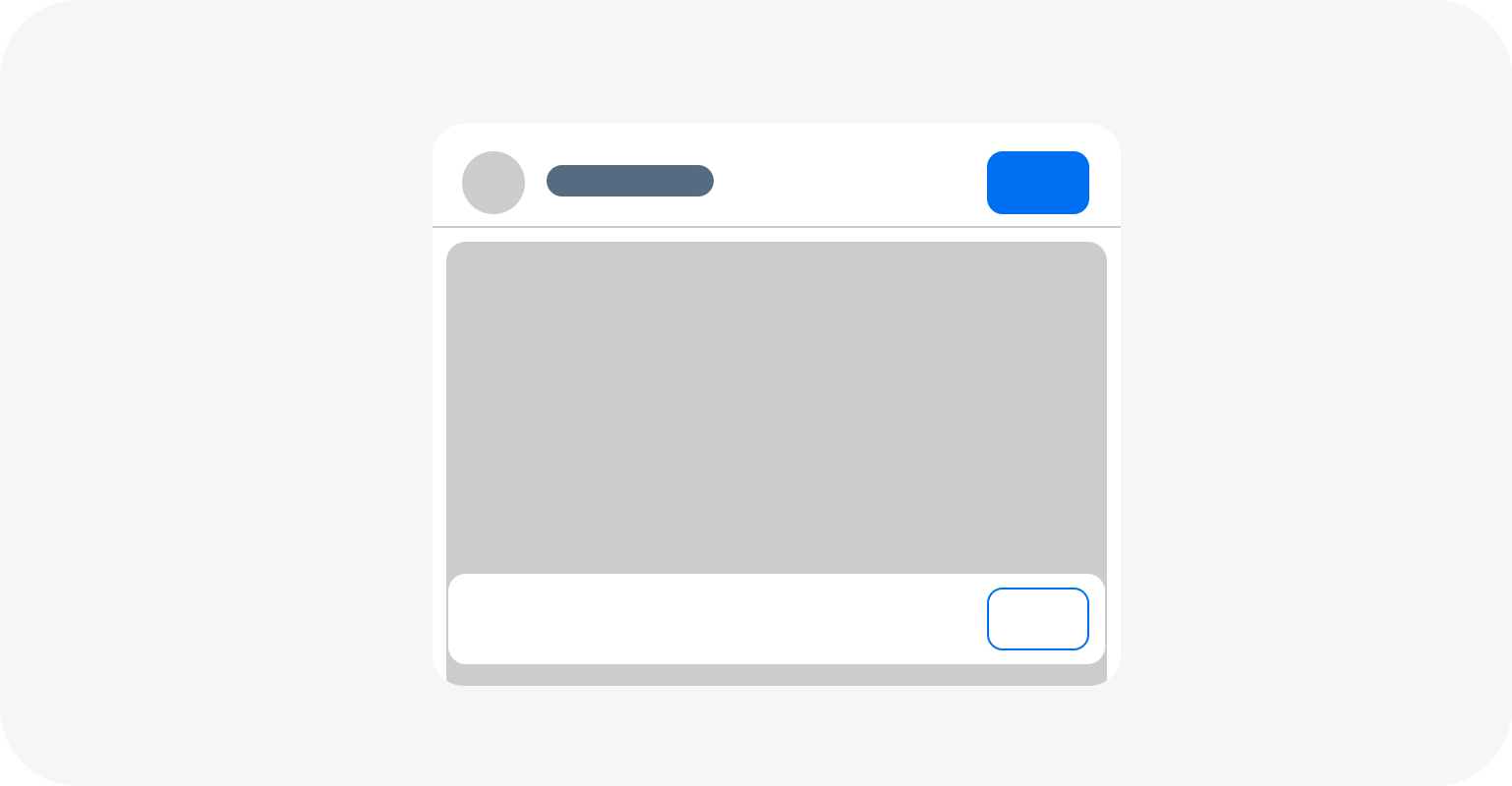
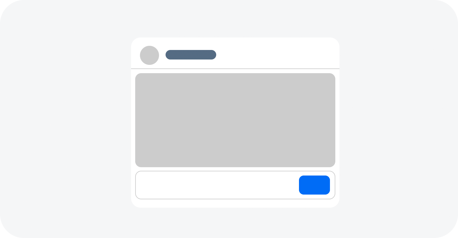
The page can have a floating or fixed footer bar.

Page with floating footer bar
Page with fixed footer bar

Behavior and Interaction

The page itself has no specific interactions. All interactions belong to the components within the page container and depend on the application use case.

For details, see the guidelines for the individual components, such as the button.

Example: Using a button in the header to navigate between pages

Responsive Behavior

The page offers considerable freedom and flexibility and the page header and the footer are designed to adapt automatically to small, medium, and large screen sizes.

  • The title truncates if needed.
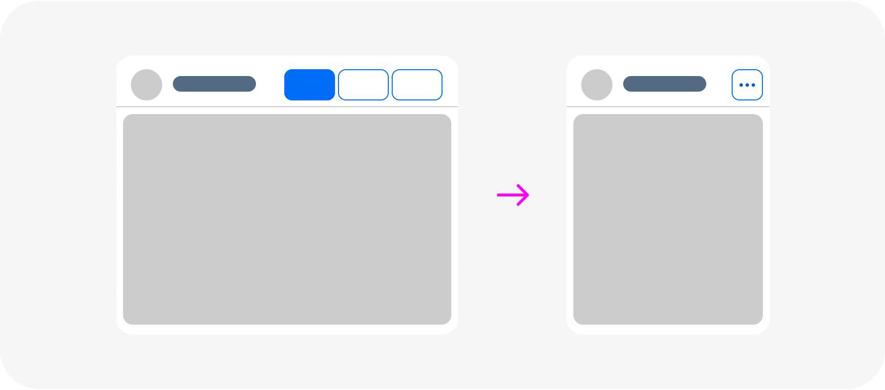
  • The actions in the header and in the footer should stay as long as possible but when the space is not enough, they should transform to an overflow menu from right to left.
  • If a priority is set to the actions, the highest priority button is the last to move to the overflow menu.
  • It is also possible to assign one button never to move to the overflow menu.

Letterboxing is used to limit the width of the content area to 1280 px. This prevents the app content from becoming too “stretched” on wide screens, and optimises readability. Letterboxing can be used if the use case requires it. However, most business apps offer so much content that the page is typically shown across the entire screen, without letterboxing.

The page supports both cozy and compact mode.

Toolbar actions move to an overflow menu if there is not enough space

Globalization and Localization

When designing an application, have in mind that this component also can be used with languages that use right-to-left direction for writing and reading. In this case the UI should be mirrored in order to be more convenient for the users to interact with it.

Page in RTL mode – live example

Related Links

Components

Implementation

  • Page
    (UI5 Web Components documentation)

Multi Combobox

The multi combobox component enables users to select options from a predefined list or enter a custom text.

It provides an editable input field to filter the list and a dropdown arrow to open the list of available options. The select options in the list have checkboxes that permit multiple selection.

Multi combobox – live example

When to Use

Do

Use the multi combobox:

  • To select one or more options from a long list of options (no more than ~200).
  • If the values in the option list contain secondary information that doesn’t need to be displayed right away.
Don't

Don’t use the multi combobox:

  • To select multiple ranges.
  • To select or search multiple business objects.
  • To select an item from a short list of items.
  • If you want to let users add custom values. Consider using the multi input instead.
  • If the list contains more than ~200 items.

Anatomy

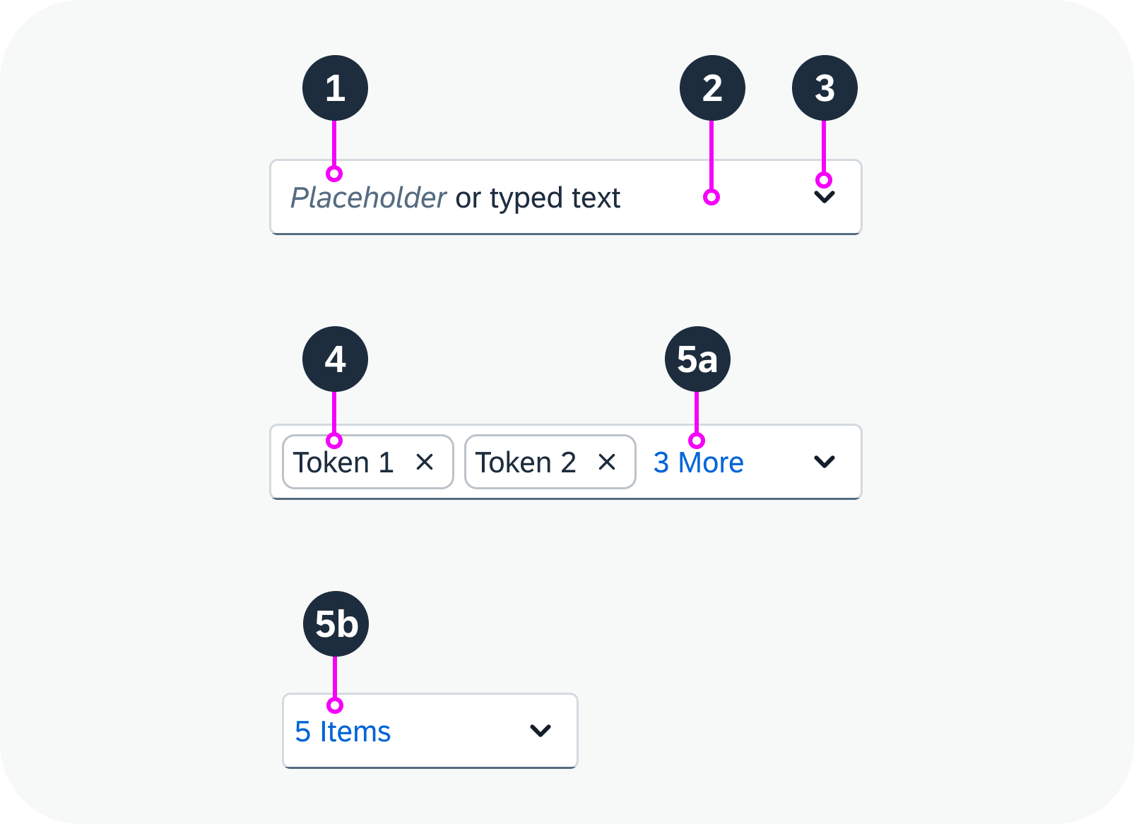
  1. Text: Placeholder or typed text
  2. Input field: Area for displaying tokens and typing text.
  3. Arrow button: Opens a dropdown list with the values that can be added as tokens.
  4. Tokens: Show individual selected values.
  5. Overflow button: Show all selected values.
    1. n More: Appears after the last visible token. The count n indicates how many other values are selected.
    1. n Items: Appears if no tokens fit into the input field. The count n indicates how many values are selected overall.
 Anatomy of a multi combobox
Anatomy of a multi combobox

Variants

Grouped Items

Multi combobox with grouped items

Predefined Options Only

The user can only write text that matches a predefined value in the list. The text must start with the first letter of a value. If the user types something that doesn’t match one of the options, the multi combobox switches to an error state.

Multi combobox with predefined options only – live example

With Free Text Input

The user also has the option of entering a freestyle text. If the text doesn’t match one of the available options, no token is created and the text is displayed directly in the input field.


Multi combobox with free text input – live example

Behavior and Interaction

Select

To select values, users can:

  • Click the dropdown arrow and select the relevant options from the list.
  • Start to type a value and then select the proposed option.

The selected options then appear as tokens in the input field. If there isn’t enough space to display all the tokens, an overflow button appears (n More, or n Items).

Empty multi combobox – live example

Adjust Selection

To view the selected options, users can:

  • Click the arrow button to display the full selection list (both selected and non-selected items).
  • Click the overflow button n More or n Items (if shown) to view all the selected items.

To remove an item from the selection, users can

  • Click the “X” icon in the token.
  • Focus on the token to select it and use the keyboard delete key to remove the token.

Multi combobox with multiple tokens – live example

Globalization and Localization

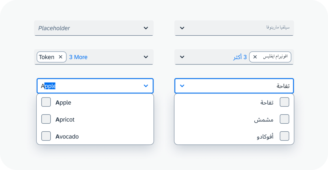
The multi combobox supports left-to-right (LTR) and right-to-left (RTL) reading directions.

Multi combobox with left-to-right and right-to-left reading directions

Related Links

Implementation

Menu

A menu offers the user a list of alternative actions. The actions can also be grouped in submenus.

Menu – live example

When to Use

Do

Use the menu:

  • If you need to offer more than one action.
  • If users need to stay in a certain context.
  • If there are only a small number of actions.
Don't

Don’t use the menu:

  • To provide only one option. Use a button instead.
  • If users would benefit more from a split button, which offers an easy-to-access default action, with the option to select other actions.

Anatomy

Menu

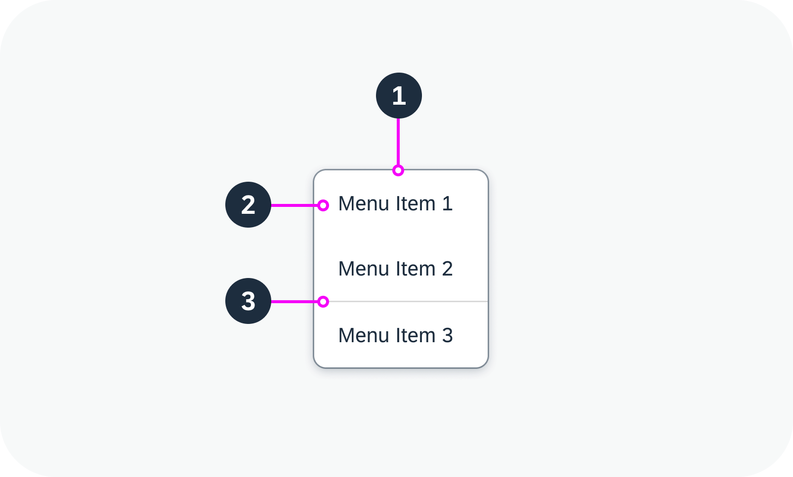
  1. Menu: Container that is shown as an overlay.
  2. Menu item: List item inside the menu that represents an action.
  3. Separator (optional): Horizontal line that groups the menu items visually.
Anatomy of a menu
Anatomy of a menu

Menu Item

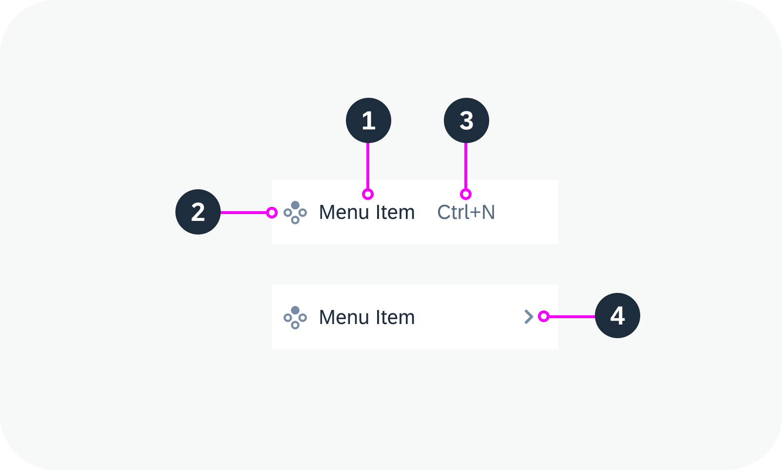
  1. Text: Describes the action that is triggered by the menu item. The text is mandatory.
  2. Icon (optional): Visualizes the action that is triggered by the menu item.
  3. Additional text (optional): Provides additional information relating to the menu item (such as shortcuts).
  4. Navigation indicator: Indicates that a submenu is available for the menu item.

The visualization of the menu item adapts automatically, depending on which elements are included.

Anatomy of a menu item

Variants

The menu can be basic, with only a single list of options, or can contain menu items with submenus.

The elements within a menu item can be combined in various ways. The minimal variant is to show only a text. If a menu item has subitems, an additional text won’t be shown, since the space is needed for the navigation indicator.

Variants Without Icons

  • Text only
  • Text and additional text
  • Text and navigation indicator (subitems)
Menu item variants without icons – live examples
(from top to bottom: text only, with additional text, with navigation indicator)

Variants with Icons

  • Icon and text
  • Icon, text, and additional text
  • Icon, text, and navigation indicator (subitems)
Menu item variants with icons – live examples
(from top to bottom: icon and text only, with additional text, with navigation indicator)

Behavior and Interaction

Initially, the menu is closed and therefore not visible.

  • Clicking the reference control opens the menu (for example, a menu button).
  • Clicking a menu item without submenu indicator triggers the respective action.
  • Clicking a menu item with a submenu indicator opens the submenu next to the main menu. The cursor can now be moved to the submenu while all other levels remain open. For each submenu, the same navigation principles apply as for the main menu. Multiple submenus are possible.
  • Clicking outside the component closes the menu.
Menu behavior and interaction – live example

Related Links

Implementation

  • Menu
    (UI5 Web Components documentation)

Message Strip

The message strip component allows you to embed application-related messages on the UI. It draws the user’s attention to information that is important in the context of the page content. This could be a warning or a change of state that might otherwise be easy to miss.

Message strip – live example

When to Use

Do

Use the message strip:

  • To provide information related to the object as a whole in the object header, such as the object status.
  • To provide information within the detail area of an object.
  • To inform the user about a status of an object.
  • To warn the user about an issue.
Don't

Don’t use the message strip:

  • In the list of a list-detail layout.
  • Above the page header.

Anatomy

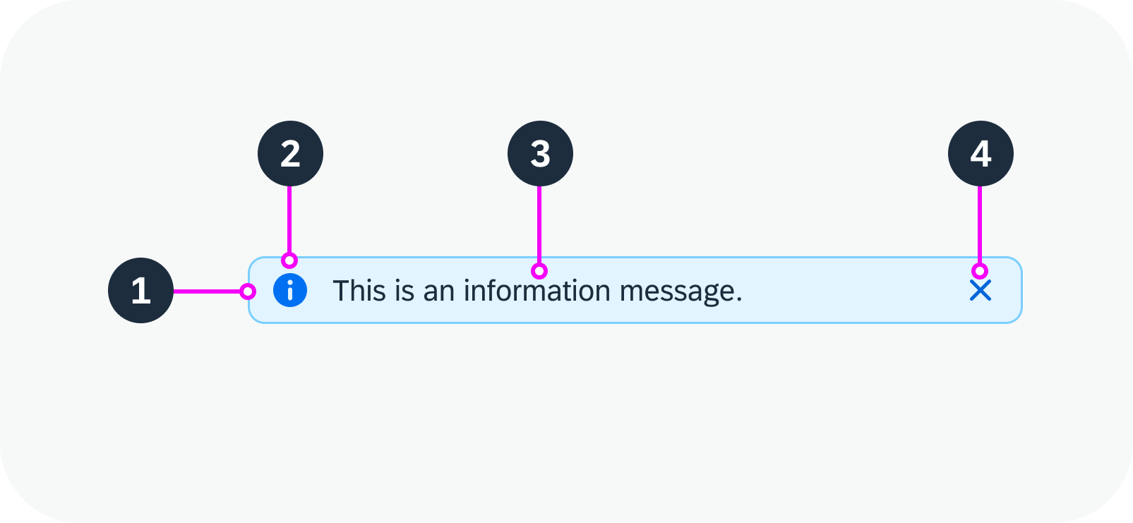
  1. Container: Holds the icon, message text, and Close button.
  2. Icon (optional): Visual indication of the message type. By default, the message strip uses standard icons for error, warning, success, and information messages.
    We strongly recommend displaying an icon. If you decide to remove it, include an additional text to indicate the message type.
  3. Text: Message text. To preserve the intended design, we strongly recommend using only text for the message itself.
  4. Close button (optional): Allows the user to remove the message strip from the UI.
Anatomy of a message strip

Variants

You can use the message strip with or without an icon or Close button. If necessary, you can also configure a custom message strip.

With Icon and Close Button

Message strip with icon and ‘Close’ button

With Icon, Without Close Button

Message strip with icon, without ‘Close’ button

Without Icon, With Close Button

Message strip without icon, with ‘Close’ button

Without Icon or Close Button

Message strip without an icon or ‘Close’ button

Custom MessageStrip

If the application needs a custom message strip, other than the standard semantic variations, use the colors defined for the inverted object status tag. You can use both sets of indication colors.

See all the available icons in the Icon Explorer (Horizon).

Custom message strip

Behavior and Interaction

Clicking or tapping the Close button removes the message strip from the UI.

Message strip – live example

Responsive Behavior

The message strip is fully responsive. Message type icons always display on the left, while the Close icon always displays on the right. Text that exceeds the available width wraps to the next line.

If you place the message within the detail area for an object, it always uses 100% of the available width and reacts to the responsiveness of the container.

Message strip examples with wrapped text

Content Density

The compact message strip is used for both cozy and compact form factors.

Globalization and Localization

For right-to-left languages, such as Arabic or Hebrew, the message strip is mirrored.

Message strip for left-to-right languages
Message strip for right-to-left languages

Related Links

Components

Implementation

List

You can use the list component to display different types of list item. Each list item can include an image, text, icon, or other HTML content. List items can also be grouped.

The list component comes with built-in selection and deletion modes, as well as configurable separators.


List – live example

When to Use

Do

Use the list:

  • To display a homogeneous set of basic data.
  • To display a single-level hierarchy.
  • If a table would be too complex.
Don't

Don’t use the list:

  • To manage complex datasets. In this case, use a table.
  • If you work with complex hierarchies. In this case, use a tree.

Anatomy

List

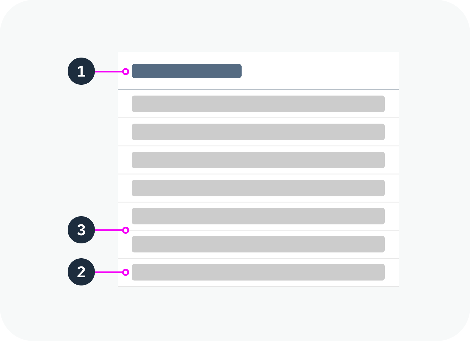
  1. Header: The first item of the list serves as a header. The header contains the title of the list.
  2. Footer: If the footer element is used, the footer is the last item in the list.
  3. Separator: The list item separators are customizable.
Anatomy of a list
Anatomy of a list

Standard List Item

The standard list item is the simplest type of list item. It provides elements for the most common use cases, such as image, text, and icon.

  1. Image
  2. Text
  3. Icon / additional text:
    a. Icon: You can use the iconEnd property to place an icon at the end of an item.
    b. Additional text: You can use the additionalText property to display an additional text at the end of a row. The additionalTextState property applies a semantic state to this text.

Anatomy of a standard list item

Custom List Item

You can use the custom list item component within the list in the same way as a standard list item. The custom list item component accepts arbitrary HTML content to allow full customization.

Anatomy of a custom list item

Group Header List Item

The group header list item is a special list item, used only to separate other list items into logical groups.

Anatomy of a group header list item

Variants

The following list variants are available to support different use cases:


Standard List

Use this variant as a starting point.

Standard list – live example

Growing List (Scroll)

Use this variant if there are too many list items to show in the visible space. You can display a More button or let the user scroll within the list to show more items. By default, growing is switched off.

Growing list with scrollbar – live example

List with Image Content

You can use the imageContent slot to add an image or avatar to the item.

List items using the image content slot to display avatars

List Item Separators

By default, horizontal separators are displayed between all list items. Alternatively, you can remove all separators, only show separators between items (inner separators).

List item separation types

List with Group Headers

Use this variant if you want to group items in the list.

List with group headers

Single Selection Mode

Allows users to select only one item at a time.

Single selection mode – live example

Multiple Selection Mode

Allows users select more than one item at once using the checkboxes on the left.

Multiple selection mode – live example

Delete Mode

Use this variant to show an icon for deleting or removing an item.

Delete mode with ‘X’ icon – live example

Busy List

Use this variant to indicate that the list is fetching data.

Busy list – live example

List with No Data

Use this variant to show a text when the list is empty.

List with no data

Behavior and Interaction

See the examples for the following variants:

Responsive Behavior

Wrapping and Truncation

By default, texts in a list item are truncated if there isn’t enough space.


List item with long title, description, and additional text

List item with truncated text

Related Links

Implementation

  • List
    (UI5 Web Components documentation)

Link

A link (also known as a hyperlink) is an interactive text element.

Visualization of different link types – live example

When to Use

Do

Use the link:

  • To navigate to another page.
  • To trigger an event.
Don't

Don’t use the link:

  • To trigger an action. Use a button instead.
  • If there is no link target.

Anatomy

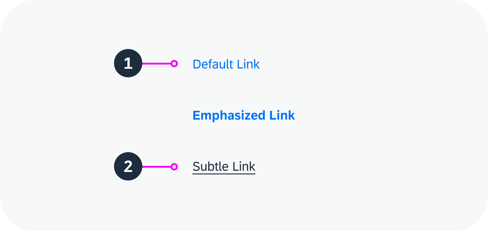
A link is an interactive element in text that is indicated by colored text or an underline.

  1. Text
  2. Underline
Anatomy of a link
Anatomy of a link

Variants

There are three different link variants:

  • Default: To display a simple link.
  • Emphasized: For very important links that need to attract the user’s attention quickly.
  • Subtle: To distinguish between more important (default) and less important (subtle) links when the app page contains a large number of links (10+). Subtle links allow you to improve the visual hierarchy in large lists and tables.
Link variants – live examples

Behavior and Interaction

To trigger the event or navigation, the user clicks the link.
If a link target has a specified URL, it can also be triggered via the context menu.

If the link can’t be triggered, display it in the disabled state. For example, if a content area is disabled, also show the links in this area as disabled.

A default link and a disabled link – live examples

Related Links

Components

Implementation

Link
(UI5 Web Components documentation)

Label

A label is the name assigned to a component or a group of related components. Alternatively, a label can describe the purpose of a component or group of related components.

   
Labels with input fields – live example

When to Use

Do

Use the label:

  • If you need a label for a component or group of components.
  • In forms.
Don't

Don’t use the label:

  • For the column header of a table. Use the title instead.

Anatomy

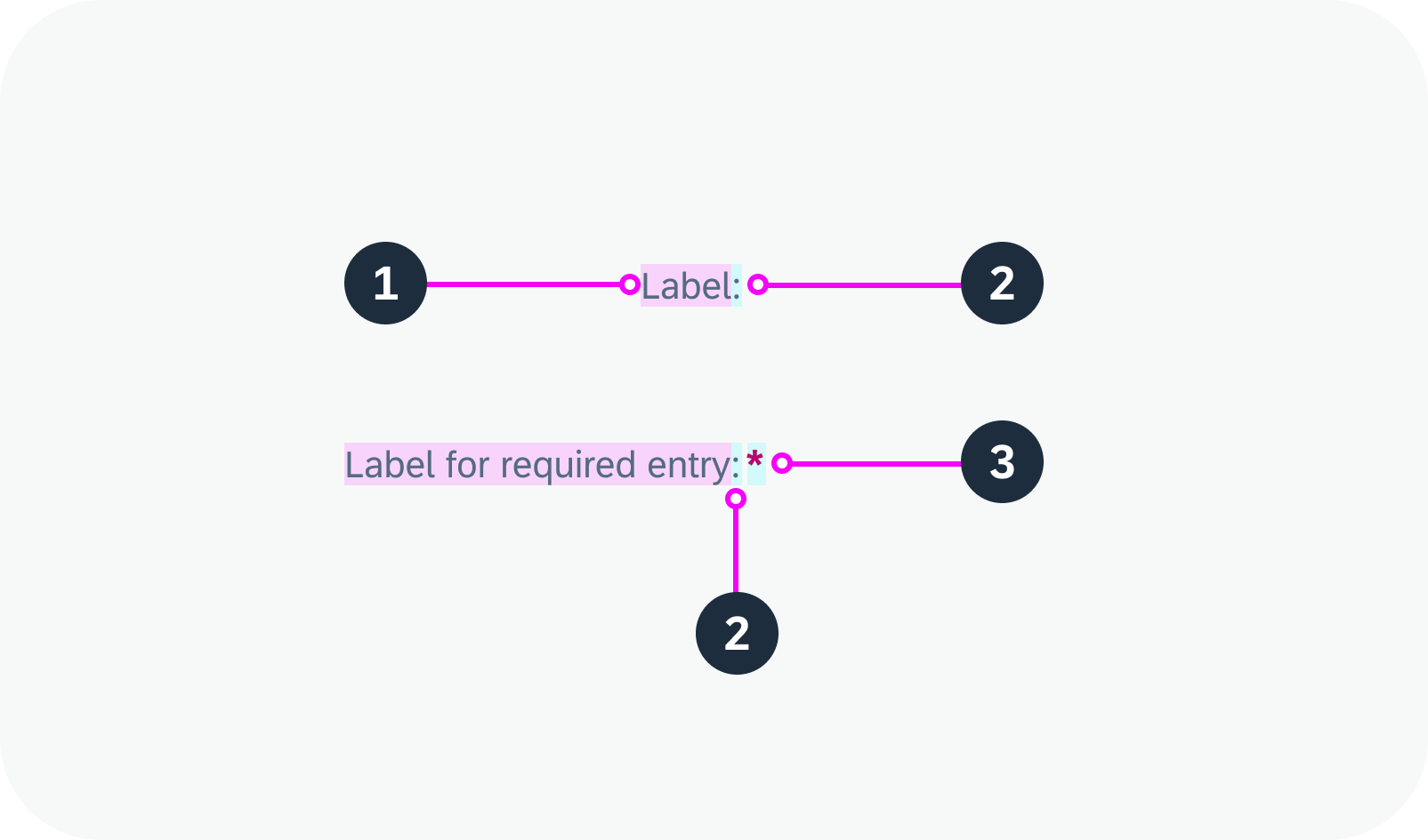
  1. Text: Describes the data displayed or expected in the corresponding component or group of components.
  2. Colon: The colon (:) follows the label text.
  3. Asterisk (optional): The asterisk (*) indicates that user input is required.
Anatomy of the label

Variants

Label: The default label comes without the optional “Required” indicator. The user can continue without providing input in the corresponding component or components.

Label for Required Entry (optional): The label shows the “Required” indicator (*) after the colon. To continue, the user must provide input in the corresponding component or components.

Default label, label for a required entry

Responsive Behavior

Wrapping and Truncation

Labels can be wrapped and truncated, depending on the use case.
For labels within forms, use wrapping instead of truncation.
Do not use wrapping to enable long labels. Instead, keep your labels short: a label is not a help text. It must be meaningful, succinct, short, and descriptive.

Labels in a form – live example

Related Links

Components

Implementation

  • Label
    (UI5 Web Components documentation)

Input

An input allows users to enter and edit text or numeric values in one line.

Input – live examples

When to Use

Do

Use the input component:

  • To enter a short, single-line text or number.
  • To enter a password, URL, phone number, or email address.
  • To select a single item from a large amount of data (for example, more than 200 items).
  • To find an object by searching for more than one attribute, such as an ID, city, and customer name.
Don't

Don’t use the input component:

  • To enter dates and times. Instead, use the date picker, date range selection, or date/time picker.
  • To enter long texts. Use the text area component instead.
  • To select multiple values. In this case, use the multi combobox (for fewer than 200 items) or the multi input component (for more than 200 items).

Anatomy

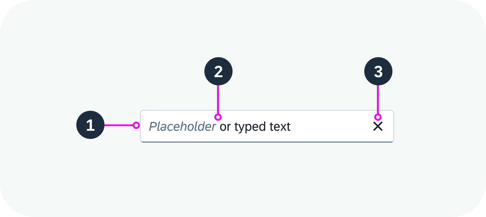
An input usually consists of a field that contains a text.

1. Field: Field container

2. Text: Placeholder or typed text

3. Icon (optional): For example, you can enable a Clear icon to remove the text that has been typed into the field.

Dropdown Areas

The input component provides two types of dropdown area:

  • An area for suggestions, which is triggered by typing.
  • An area for value help, which is triggered by the respective icon button.
Anatomy of an input
Anatomy of an input

Variants

Value Help

To help the user find the correct value, you can add a value help option. A small value help icon ( ) is then displayed in the input on the right. To give a better indication of the type of data that can be selected, you can exchange the value help icon.

Input with value help

Input with a Label

Always provide a meaningful label for any input. Labels are necessary to indicate the meaning of the input when the placeholders are no longer visible.

To indicate that a particular field is mandatory, set the “Required” indicator for the label. This displays an asterisk (*) next to the label associated with the field.

Input with a label

Input as a Search

An input component can be used as a search field (free text search). You can also use the search field to filter a set of data.

Input as a search field

Behavior and Interaction

Enabled, Read-Only, and Disabled States

An input can have three states:

Enabled

The input is currently active and allows user interaction. It can be empty, contain a placeholder text, or contain a value entered or selected by the user.

Input – enabled

Read Only

The input contains valid values and is visualized differently to indicate that editing isn’t possible. The read-only state is similar to the disabled state in that interactive functions are removed. However, a read-only input can still be focused on and recognized by screen readers. It also complies with visual contrast standards for readability.

Input – read only

Disabled

All interactive functions have been removed and the user is unable to interact with the input. The field can’t be focused on or recognized by screen readers, and doesn’t need to meet visual contrast requirements.

Input – disabled

Suggestions and Autocomplete

Using suggestions and autocomplete is the quickest way for users to discover and select relevant input terms and values.

  • The current typed term is always highlighted with bold text.
  • Only the characters entered in the input are highlighted, not the whole word.
  • All relevant instances are highlighted, even if they occur in one line item.
Input with suggestions

Clear

You can enable a Clear icon ( ) in the input. It appears as soon as the input has a value. Clicking the Clear icon removes the value from the field. If you use this option, make sure that the input is wide enough to show the Clear icon in addition to the value.

Input with ‘Clear’ icon – live example

Responsive Behavior

If the user clicks the input on a mobile device in cozy mode, a new full screen dialog opens.

Globalization and Localization

The input component supports left-to-right (LTR) and right-to-left (RTL) reading directions.

Input with right-to-left text display

Related Links

Implementation

  • Input
    (UI5 Web Components documentation)

Dynamic Side Content

The dynamic side content is a layout component that allows you to display additional content in a way that adapts flexibly to different screen sizes. The side content appears in a container next to or directly below the main content. The width or height of the main content area adapts accordingly.

Dynamic side content

When to Use

Do

Use the dynamic side content to display information that:

  • Enriches the main content and helps users perform their tasks
  • Only makes sense when displayed next to the main content (side by side)
  • Influences the main content (such as a filter for list, settings for chart, or details for map)

Important: Ensure that users have access to all of the key functions and critical information even if they don’t see the side content. It might not be easy for users to access the side content on smaller screens.

Don't

Don’t use dynamic side content:

  • If you want to display navigation or critical information that prevents users from completing a task when they have no access to the side content.
  • If the content doesn’t relate to the main content.

Anatomy

Dynamic side content is a layout container that can contain any type of component, such as lists, tables, form fields, and more.

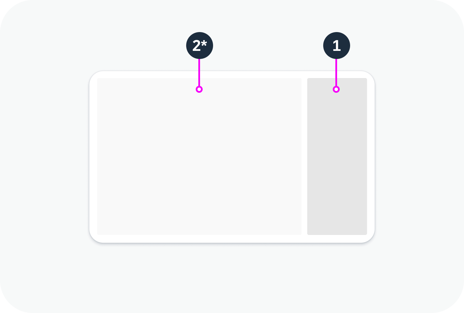
  1. Dynamic side content
  2. Main content*

* The main content is not part of the dynamic side content component. It is included here to illustrate how the side content appears in relation to the rest of the page.

Layout with dynamic side content

Variants

The size and position of the dynamic side content depend on the configuration and the available screen width. The following variants are available:

Size

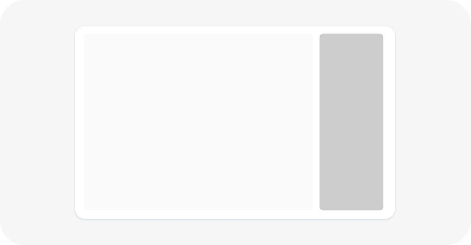
Default split – 25% or 30% of the total screen width, depending on the resolution.

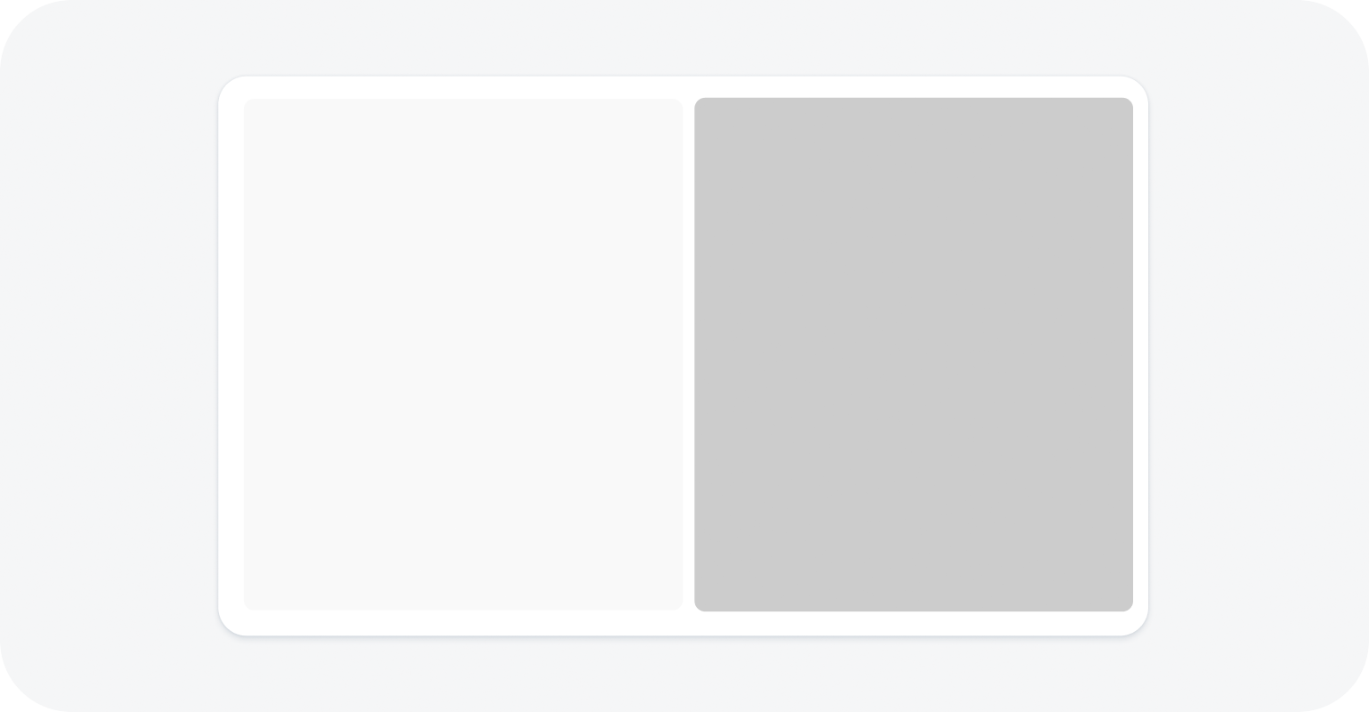
Equal split – 50% of the total screen width.

Default split
Default split

Equal split
Equal split

Position

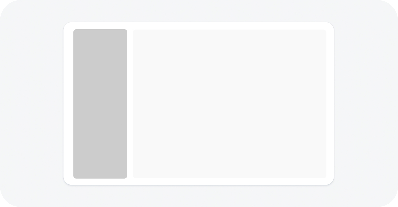
You can specify whether the side content is shown on the right or on the left. At certain breakpoints, the side content slides below the main content (see Responsive Behavior).

Left

Dynamic side content on the left

Right 

Dynamic side content on the right

Below main content

Dynamic side content below the main content

Behavior and Interaction

Whether the side content is displayed or hidden depends on the current visibility setting and the screen size (see Responsive Behavior). To enable users to display the supplementary content as needed, it is important to provide options for opening and closing the side content.

Default State

By default, the side content is initially visible, but you can opt to hide it.

Opening the Dynamic Side Content

Add a trigger for opening the side content. This is typically a button in the main content area with a meaningful label. We recommend that you always place the trigger for the side content in the same location.

Closing the Dynamic Side Content

Enable users to close the side panel from the side panel header. Since the dynamic side panel doesn’t have a built-in header, we strongly recommend adding a toolbar with a title, a transparent Close button, and a spacer in between.

Responsive Behavior

Screen width > 1440 px

  • The ratio of the main content to side content is 3:1 (with a minimum of 320 px each).
  • If you define a trigger, the side content can be hidden.

Screen width <= 1440 px and > 1024 px

  • The ratio of the main content to side content is 2:1 (with a minimum of 320 px each). If the width of the side content falls below 320 px, it automatically slides under the main content, unless you specify that it should disappear.

Screen width <= 1024 px and > 720 px

  • The side content ratio is fixed at 340 px and the remaining width is used for the main content.
  • If you opt to move the component below the main content, and screen width is <= 960 px and >720 px, the side content drops below the main content.

Screen width <= 720 px (for example, on a mobile device)

  • The side content automatically disappears from the screen, unless you specify that it should stay below the main content. The side content is opened by the trigger you offer in the main content. When the side content is triggered, it replaces the main content. For the triggering action, use a label that indicates the type of content shown in the side panel.

Special case: comparison mode

If you opt to split the screen equally for comparisons (50% each for the main and side content), the responsive behaviour is the same as for the standard view. If the screen width falls below 720 px, the side content disappears and can only be viewed if it’s actively triggered.

Dynamic side content on a mobile device – live example

Related Links

Demo Systems

Dialog

The dialog component is a modal window that appears temporarily on top of the main screen. It interrupts the current app process to prompt the user for a response. While the dialog is open, the main screen is dimmed and blocked. A user action or confirmation is required to return to the main window.

Standard dialog – live example

When to Use

Do

Use the dialog:

  • To display information temporarily.
  • To prompt the user for an action or a confirmation.
  • To display an additional step or process that needs to be confirmed by a user action.
Don't

Don’t use the dialog:

  • If you don’t want to interrupt the user.
  • In another dialog. Avoid nesting dialogs within each other.

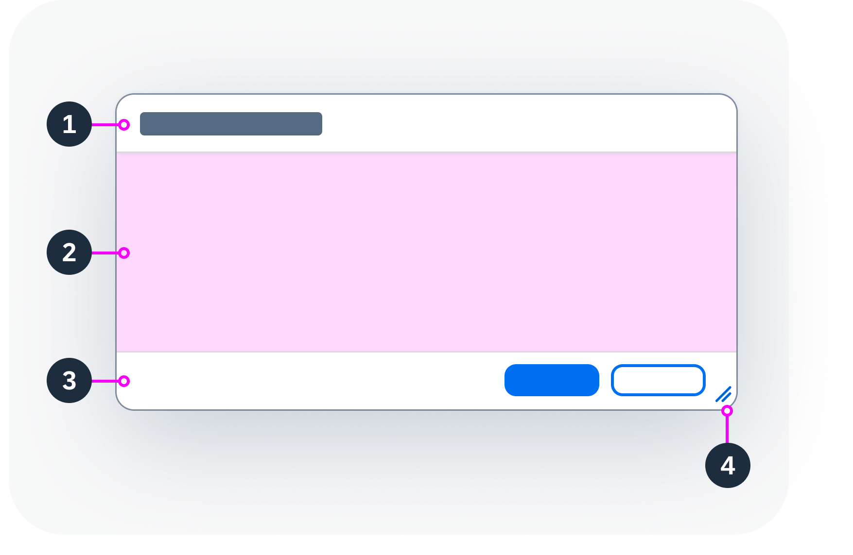
Anatomy

  1. Header: Contains the title of the dialog.
  2. Content: Can contain any component.
  3. Footer: The footer can contain actions.
    By default, the dialog can have one or two actions. The action buttons on a desktop device are right-aligned.
  4. Resize handle (optional): If enabled, the resize handle lets users stretch and shrink the dialog. The resize handle is only available on desktop devices.
Anatomy of a dialog
Anatomy of a dialog

Behavior and Interaction

The dialog opens in a modal window at the center of the screen. Completing an action or closing the dialog returns the user to the main screen.

Additional Options

Resizable Dialog (desktop only)

You can let desktop users change the size of the dialog. If this feature is switched on, a resize handle appears in the bottom-right corner.

Resizable dialog

Draggable Dialog (desktop only)

If you switch on the “draggable” feature, users can move the dialog around by clicking and holding on the header.

Draggable dialog

Responsive Behavior

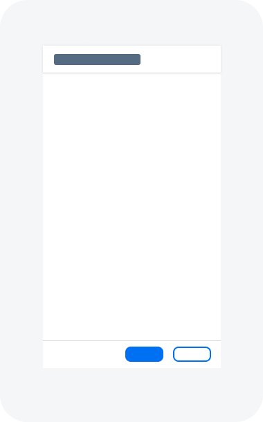
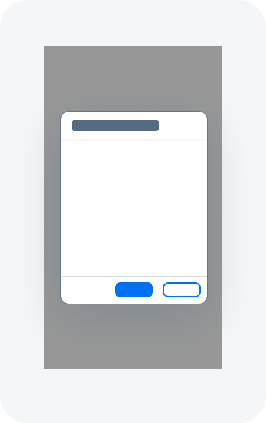
By default, dialogs appear as modal windows. On mobile devices, you can use the stretch property to show a dialog in full screen mode.

  • On small devices, you can use the regular dialog or the full screen dialog.
  • On smartphones, we recommend using the full screen dialog.
Full screen dialog on smartphone
Regular dialog on smartphone

Related Links

Components

Implementation

  • Dialog
    (UI5 Web Components documentation)

Checkbox

A checkbox allows users to set a binary value to “true” or “false”, indicating whether or not an item has been chosen. If a checkbox acts as a parent for a group of checkboxes (for example, Select All), it can also display an indeterminate state to indicate that not all subitems have been checked.

Different checkbox states – live examples

When to Use

Do

Use the checkbox to:

  • Select or deselect. Use it only if the meaning is obvious.
  • Offer a list of options that can be selected independently of each other.
  • Group multiple suboptions under a parent option that requires an indeterminate selection state.
Don't

Don’t use the checkbox:

  • To offer multiple selection for a large list of options that don’t need to be displayed permanently on the UI. Consider using a multi combobox instead.
  • To choose only one option from a list. For a small list, use a radio button group instead. For a large list, use the select component.
  • To perform an instantaneous action that doesn’t need reviewing or confirming. Consider using the switch instead.
  • If there is not enough space available on the screen. Use a combobox instead.

Anatomy

The checkbox component has two parts:

  1. Box: Checkbox with 3 possible settings: checked, unchecked, or indeterminate.
  2. Text: Describes the purpose of checkbox.
    If the purpose of the checkbox is already described by other elements, the checkbox text is optional.
Anatomy of a checkbox

Behavior and Interaction

Clicking a checkbox toggles the state of the checkbox between checked and unchecked. Checked means that the state described by the checkbox text applies, or that the item has been chosen. Unchecked means that it doesn’t apply.

Clicking a checkbox triggers a visual indication of focus: a solid line surrounds the entire component.

A parent checkbox can also display an indeterminate, partially selected state, indicating that some but not all of the dependent input fields are selected. This state is commonly used for a group of checkboxes and is only a visual, non-interactive state. If all dependent checkboxes are checked, the parent checkbox is also checked automatically, and vice versa.

Checkbox group – live example

Related Links

Implementation

  • Checkbox
    (UI5 Web Components documentation)

Carousel

The carousel allows users to browse through a set of items by swiping right or left. The component is mostly used for showing a gallery of images, but can hold any other HTML element. It can display a single content element or show several content elements at once. Users can cycle through the content using navigation buttons and the paginator.

Carousel – live example

When to Use

Do

Use the carousel:

  • To let users browse through a set of items by paging back and forth.
  • To display items sequentially.
  • To display items side by side.
Don't

Don’t use the carousel:

  • If the items you want to display need to be visible at the same time.
  • If the items you want to display are very similar.

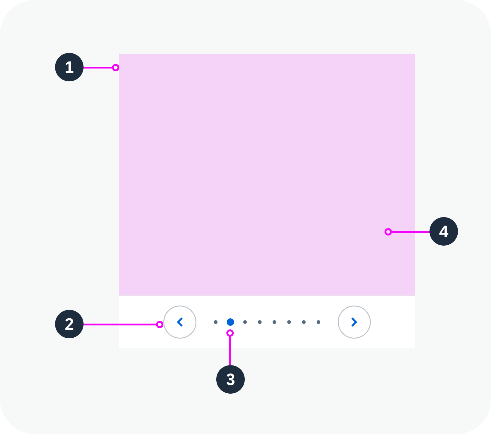
Anatomy

1. Container: Holds the content, navigation buttons, and page indicator.

2. Navigation buttons: Allow users to page backward and forward between items. You can place the navigation buttons either in the content area or on each side of the page indicator.

3. Page indicator: Indicates the current page in the sequence. If there are fewer than 9 pages, the page indicator is visualized as a series of dots by default. For more information, see Show/Hide Page Indicator and Page Indicator Style.

4. Content: Can contain any component.

Anatomy of a carousel

Variants

You can adapt the following carousel parameters:

  • Position and visibility of the navigation buttons
  • Visibility of the page indicator
  • Style of the page indicator
  • Looping behavior
  • Number of items per page

Navigation Buttons

You can configure the navigation buttons in three ways:

  • Show in the content area
  • Show with the page indicator
  • Hide completely

By default, navigation buttons are never shown on touch devices.

In the Content Area

If you place the navigation buttons in the content area, they are initially hidden. They only become visible when the user hovers over the carousel content.

Navigation buttons on top of the content – live example

With the Page Indicator

The navigation buttons appear on each side of the indicator.

Navigation buttons with the page indicator

Hidden

You can opt to hide the navigation buttons on all types of device. In this case, desktop users navigate through the pages using the keyboard.

Hidden navigation buttons

Show/Hide Page Indicator

By default, the page indicator is located below the content. You can also hide it.

Page indicator below the content

Hidden page indicator

Page Indicator Style

You can display the page indicator as a series of dots or numerically.

Dot Style

The page indicator shows a horizontal series of dots, each of which represents a page in the carousel. The dot for the current page is highlighted.

By default, the page indicator uses the dot style if there are fewer than 9 pages.

Page indicator – dot style

Numeric Style

The numeric page indicator shows the current page and the total number of pages (for example, “2 of 4”).

By default, the page indicator switches to the numeric style if there are 9 pages or more.

Page indicator – numeric style

Cyclic

You can set the carousel to loop. Navigating forward on the last page then returns the user to the first page, and vice versa.

Non-cyclic carousel
Cyclic carousel

Multiple Items Per Page

You can display multiple items at once. The page navigation buttons then have the following effect:

  • Previous Page: The previous item slides into view on the left. The right-most item slides out of view on the right.
  • Next Page: The next item slides into view on the right. The left-most item slides out of view on the left.

Carousel with multiple items per page – live example

Behavior and Interaction

Click

The user can click the arrow buttons to go to the previous or next page.
Carousel – live example

Hover

If navigation arrows are placed in the content area: When the user hovers over the page, the navigation buttons appear.

Navigation in the content area – navigation buttons appear on hover – live example

Touch Enablement

On touch devices, the carousel component makes use of the swipe gesture to page through the items. The navigation buttons are not displayed on touch devices.

Responsive Behavior

Responsive Behaviour

  • If the width and height of the carousel is set to 100% (default), the component content area is adjusted automatically, depending on the amount of space available.
  • On touch devices, users can navigate through the pages by swiping or by tapping the arrow buttons, which are always visible. The tap interaction is required as an alternative to swiping to comply with accessibility standards.
  • The paging indicator wraps if it is too long to fit onto one line.

Content Density

The content inside the carousel can appear in two different sizes:

  • The cozy size uses component dimensions large enough to enable fingertip interaction. This factor is ideal for devices operated by touch.
  • The compact size reduces the component dimensions, allowing more information to be displayed on the UI. This factor is ideal for devices operated by mouse and keyboard.

The page indicator (when activated) shows on all form factors.

Carousel in compact mode
Carousel in cozy mode

Globalization and Localization

When using the carousel, bear in mind that it may be used with languages that read and write from right to left.

The arrow navigation and looping behavior (if activated) adapt accordingly.

Carousel in left-to-right mode
Carousel in right-to-left mode

Related Links

Components

Implementation

  • Carousel
    (UI5 Web Components documentation)

Avatar Group

The avatar group displays several avatars together, indicating that more than one person or business entity is associated with an item.

Avatar group (group view) – live example

Avatar group (individual view) – live example

When to Use

Do

Use the avatar group:

  • To display a group of at least two people or items.
  • To display several people or items that have something in common (such as people in the same team or project).
Don't

Don’t use the avatar group:


  • To display a gallery for simple images. Use the carousel instead.
  • To display a single avatar.
  • To show visual content other than avatars.

Anatomy

  1. Avatar group (type: individual or group)
  2. Avatar
  3. Overflow button
Anatomy of an avatar group (type: individual)
Anatomy of an avatar group (type: group)

Variants

There are two types of avatar group:

  • Group: Combined focus for all avatars in the group (default)
  • Individual: Focus on each avatar

Both types are always displayed horizontally.

You can adjust the order of the avatars. For example, the sequence can be alphabetical, history-based, or random.

Note: The avatar group reuses the avatar component and its logic. If a person’s image isn’t available, the avatar displays the person’s initials. If there are more than 3 initials or the language system doesn’t support initials, the avatar displays a gender-neutral person icon.

Avatar group (type: group) – live example with slider

Avatar group (type: individual) – live example with slider

Behavior and Interaction

The avatar and avatar group support click events.

Individual type (focus on one avatar):

  • Clicking an avatar displays a popover with the details for that avatar.
  • Clicking the overflow icon displays a popover showing the avatars hidden in the overflow.

Details for an individual avatar / avatars in the overflow – live example

Group type (focus on the entire avatar group):

  • Clicking the group displays a popover showing all the individual avatars.
Details for a group of avatars (“group” type) – live example

Responsive Behavior

Content Density

The avatar group supports the different sizes of the avatar component.

Avatar group sizes (XS, S, M, L, XL)

Overflow Button

If there is not enough space to display all the avatars in a group, an overflow button appears and one or more avatars move into the overflow popover.

The overflow displays as a shape containing a count. The count indicates how many avatars can’t be displayed on the screen. If the number is too large to fit into the shape, the shape grows to accommodate the number.

It is possible to have a custom overflow.

Avatar group overflow – live example

Globalization and Localization

The avatar group supports left-to-right (LTR) and right-to-left (RTL) reading directions.

Avatar group – left-to-right
Avatar group – right-to-left

Related Links

Components

Implementation

Card

Cards are containers for different types of app content. They provide an entry-level view of the most pertinent app data for a given topic or issue.

Cards allow users to get direct insights without leaving the current screen. A card can also offer further navigation options or actions.

Card with interactive header – live example
Card with icon and button in header – live example

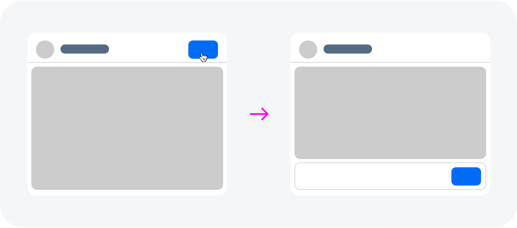
There are some predefined elements for the card header like an image (avatar component), a counter or a button, whereas the card content area can be filled with any component(s). It is also possible to show the card header only, or no header at all.

Card example with list items – live example
Card example with table – live example
Card example with image – live example
Card examples with header only – live example

When to Use

Do

Use cards:

  • As an entry point to an app.
  • If you want the user to focus on a single object or topic, or on a group of objects.
Don't

Don’t use cards:

  • For decoration only.

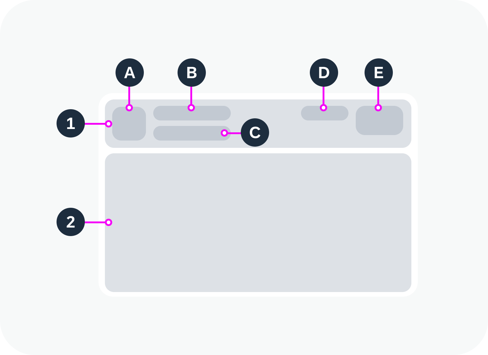
Anatomy

A card comprises two components: a header area and a content area. Both areas are optional.

1. Card Header

The card header consists of the following elements:

  1. Avatar (optional): An image.
  2. Title: Describes the card content.
  3. Subtitle (optional): You can use the subtitle to qualify the title, offer an explanation, or show a status. The use of the subtitle can differ, depending on the card type.
  4. Counter (optional): Displays how many items are on the card in relation to the total number of relevant items.
    Format: [Items on Card] of [Total Items]
    Example: 5 of 40
  5. Button (optional): An action.

2. Card Content

You can use other web components inside the content area, such as a list, table, timeline, or the components of a form. The structure of the card depends on the type of information it contains.

Anatomy of a card
Anatomy of a card

Behavior and Interaction

You can opt to make the header interactive and specify a click event.

Within the card content area, all the interactions depend on the components used.

Card with a static header and header action button – live example
Card with an interactive header – live example

Globalization and Localization

When designing an application, bear in mind that cards can also be used with right-to-left languages, such as Arabic or Hebrew. In this case, the UI of the card header is mirrored in both display and edit modes.

The globalization and localization behavior for the component within the card content area is defined by the guideline of corresponding component itself.

RTL view for card  with list items – live example

Related Links

Components

Implementation

  • Card
    (UI5 Web Components documentation)

Calendar

The calendar shows time-related data at a glance. It allows the user to select a single day, multiple days, or date ranges and to navigate through different months and years.

Calendar – live example

When to Use

Do

Use the calendar:

  • To select a single date, multiple days, or a date range.
  • To enable date selection independently of the specific date format.
  • To enable context-based selection (such as a specific day of the week).
  • If you need to keep the calendar visible and prominent.
Don't

Don’t use the calendar:

  • Тo enter a lot of data quickly or primarily using the keyboard. Use the date picker instead.
  • To primarily select date ranges. Use the date range picker instead.
  • If the available screen space is limited.
  • To select a combination of date and time values. Use the date/time picker instead.

Anatomy

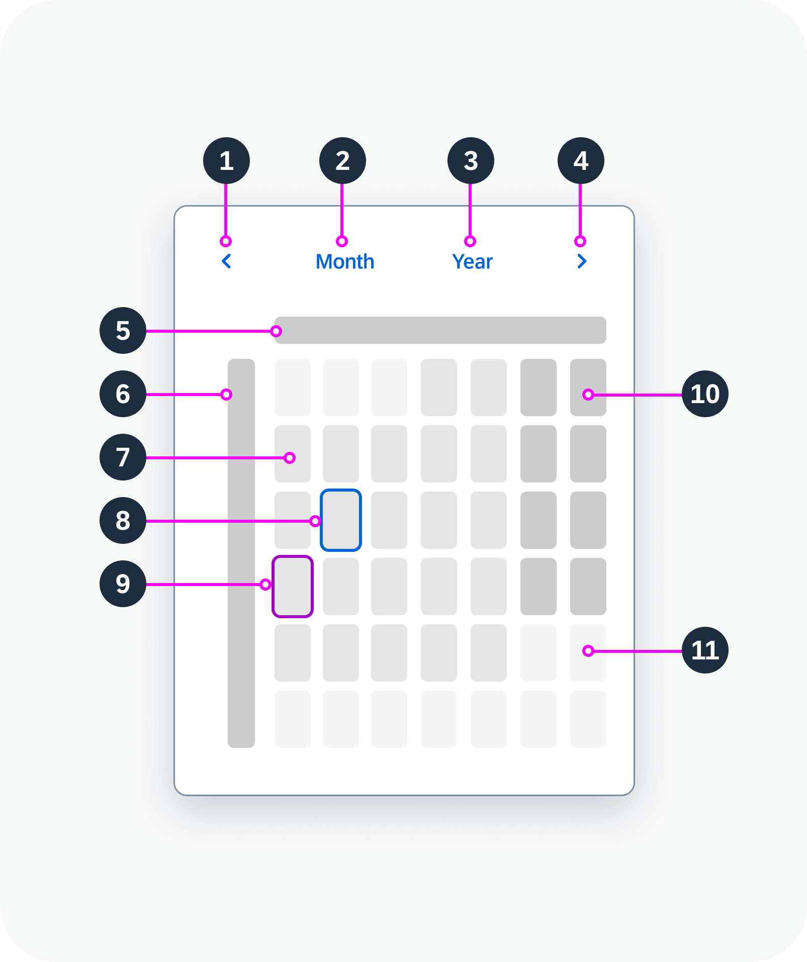
  1. Previous button: Navigates back to previous month.
  2. Month view button: Opens the view for month selection.
  3. Year view button: Opens the view for year selection.
  4. Next button: Navigates to next month.
  5. Days of the week
  6. Calendar weeks: Gregorian calendar type only. Can be hidden.
  7. Working day
  8. Selected day
  9. Today
  10. Non-working day
  11. Days from next month
Calendar anatomy
Calendar anatomy

Variants

You can show one calendar type or two:

  • Single calendar type: Gregorian, Japanese, Buddhist, Islamic, or Persian
  • Two calendar types: A primary and a secondary calendar
Islamic calendar – live example
Calendar with a secondary calendar type – live example


You can hide the calendar weeks. They are hidden by default for all calendar types except the Gregorian calendar.

Calendar with hidden calendar weeks

Behavior and Interaction

Selection

The calendar supports different types of selection:

  • Single day: The user can select a single day at a time.
  • Multiple days: The user can select multiple days, which do not have to be next to each other. Navigating to other months doesn’t cancel the selection.
  • Range: The user can select multiple days from a start date to an end date.

Selection of a single day – live example
Selection of multiple days – live example
Range selection – live example


Navigation

To change the month, the user can either use the previous/next arrows or select a specific month in the month view.

To change the year, the user can either scroll through the months with the previous/next arrows or select a specific year in the year view.

Calendar – month view
Calendar – year view


Minimum and Maximum Dates

You can define the earliest and latest valid dates for the calendar (minimum and maximum dates). Selection and navigation are then disabled for dates outside this range.

Calendar with minimum and maximum dates

Responsive Behavior

Use the calendar within a responsive layout container. The calendar itself is not responsive.

Related Links

Components

Implementation

  • Calendar
    (UI5 Web Components documentation)

Button

Buttons allow users to trigger an action and come in a variety of shapes and colors.

Buttons – live examples
Buttons with semantics – live examples
Disabled buttons

When to Use

Do

Use the button:

  • To offer a single action, such as:
    Create, Edit, Save, Delete, Approve, Reject, Add, Remove, Cancel
Don't

Don’t use the button:

Anatomy

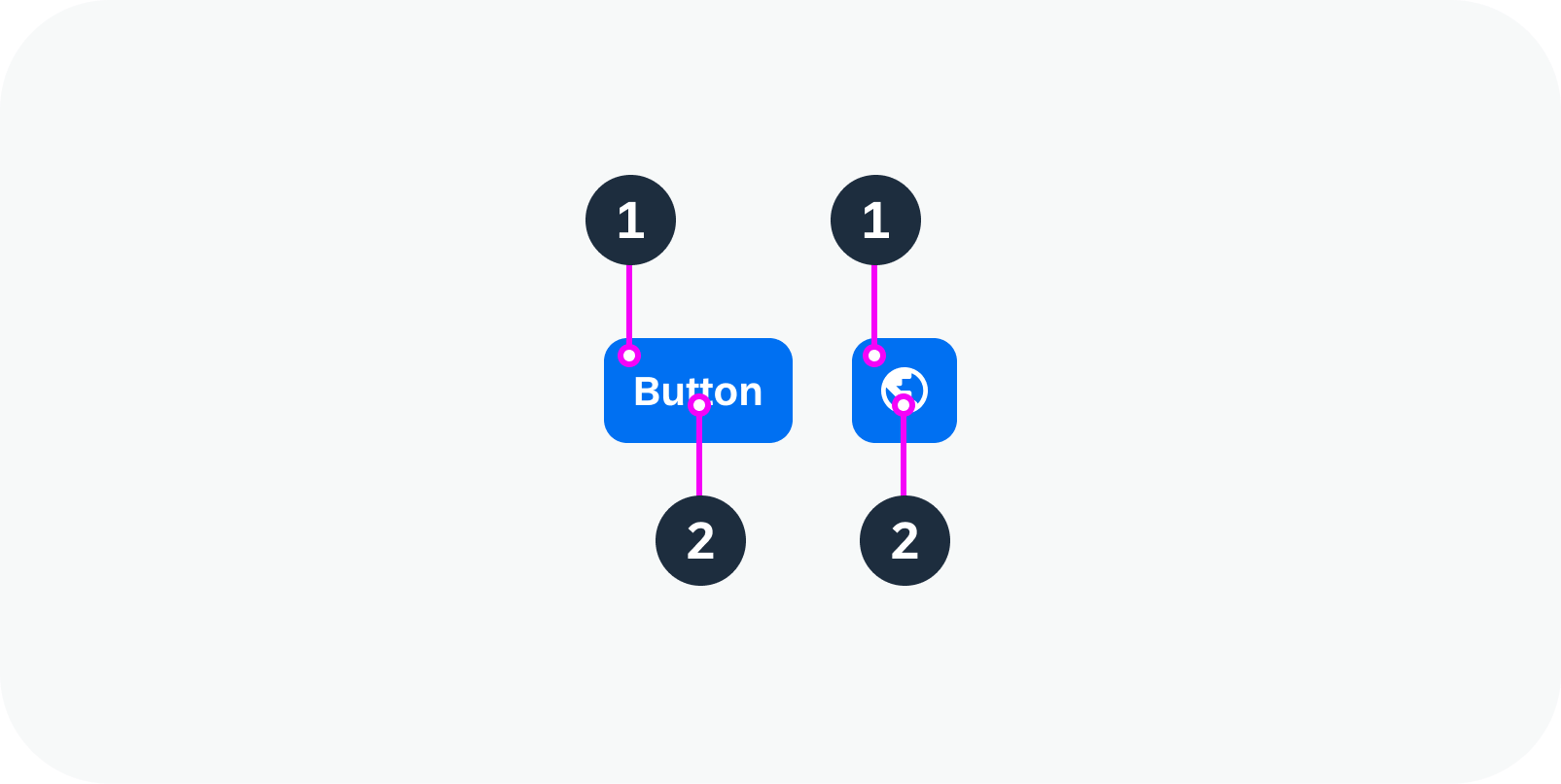
  1. Background: Different background colors visualize the state of the button.
  2. Text / Icon: Describes or visualizes the action that is triggered by the button.
Anatomy of a button
Anatomy of a button

Variants

Three button variants are available to indicate the action:

  • Text only
  • Icon only
  • Text and icon

Button variants to visualize actions – live examples
(from top to bottom: text only, icon only, text and icon)


The button also visualizes the priority of the action. Three variants are available:

  • Primary
  • Secondary (= standard)
  • Tertiary
Button variants for prioritization – live examples
(from top to bottom: primary, secondary, tertiary)

Related Links

Implementation

Button
(UI5 Web Components documentation)

Busy Indicator

The busy indicator informs the user about an ongoing operation.

Large busy indicator

When to Use

Do

Use the busy indicator:

  • To indicate an unspecified amount of wait time that is longer than 1 second.
  • If progress isn’t detectable, or it’s not necessary to indicate how long an activity will take.
  • If only part of the application or a particular component is affected.
Don't

Don’t use the busy indicator:

  • If the operation takes less than 1 second.
  • If the progress can be measured. In this case, use the progress indicator instead.
  • To indicate that a larger part of the screen is loading (for example on page load). Use a placeholder loading animation instead.

Anatomy

The busy indicator component consists of two parts:

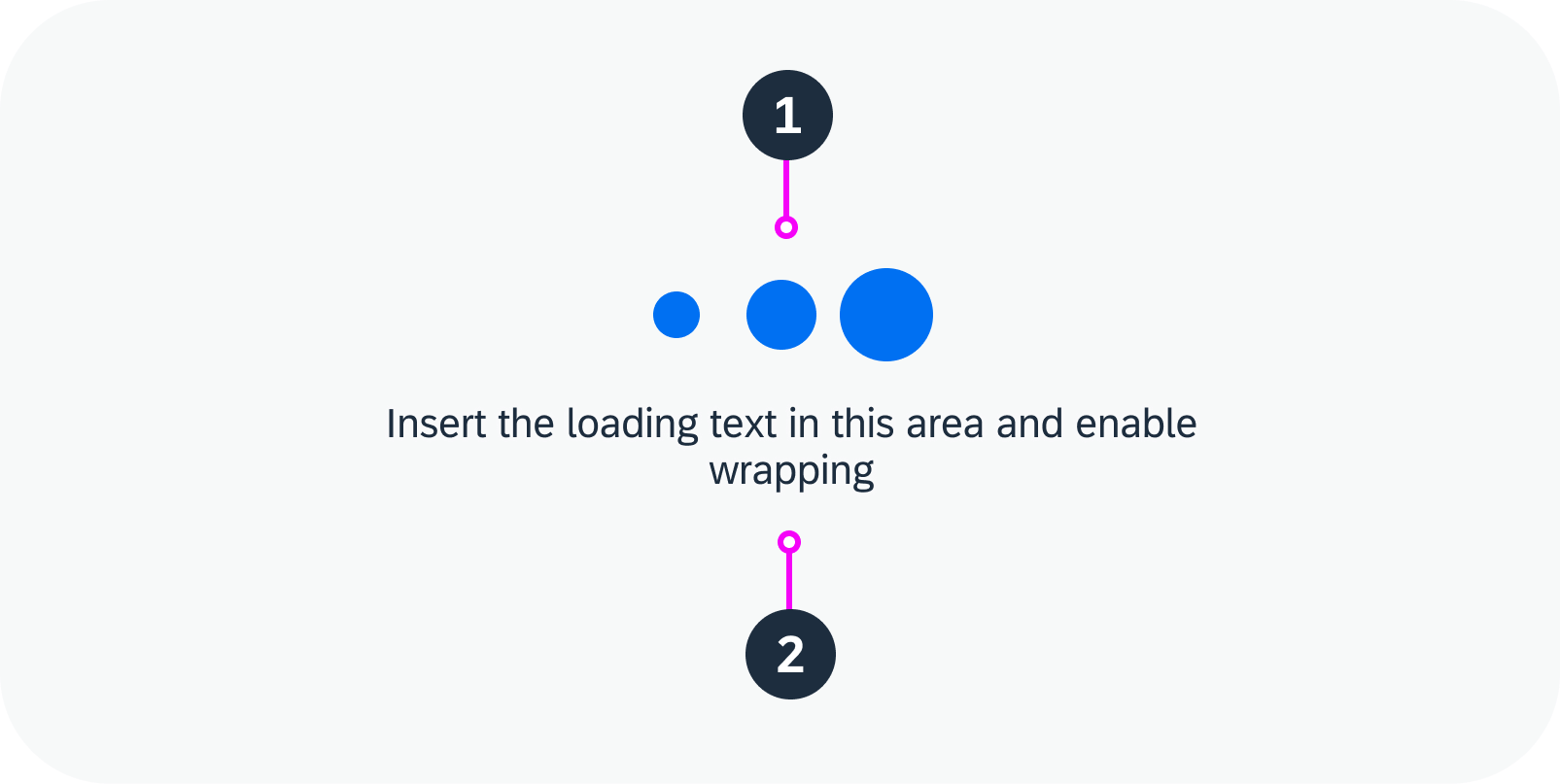
  1. Busy icon: Animated dots that indicate the ongoing operation.
  2. Text (optional): Provides additional information about the ongoing operation.

Note:

If the space where the busy indicator is to be placed is limited, avoid using a busy icon text. For example, don’t show a text if the busy indicator appears near a button in a small area. This can result in the busy indicator text appearing on top of the button text.

If you opt to display a text, place the busy indicator within a container, such as a toast or dialog, and allow it to wrap. This ensures that the text is always readable.

Anatomy of the busy indicator

Size Variants

The busy indicator comes with three predefined sizes:

  • Small: Use inside areas smaller than 3×3 rem (for example, when reloading images or inside small components like compact table rows).
  • Medium: Use inside areas larger than 3×3 rem (for example, inside a list item, tile, dialog, or a block overlay within a component).
  • Large: Use inside a full screen block overlay.

Small, medium, and large busy indicators

Related Links

Components

Implementation

Avatar

The avatar is a component for displaying images. Typically, it represents a person in a user profile, a product on a product page, or items/people in a list.

In addition to images, avatars can also display placeholders, such as icons or user initials.

Avatar variants for a user – live examples
Avatar variants for a product – live examples

When to Use

Do

Use the avatar:

  • To display an image, initials, or placeholder icon for a user.
  • To display an image or placeholder icon for business-related content, such as products, parts, or a company logo.
Don't

Don’t use the avatar:

  • For decorative images or images that support the page content, but don’t represent a specific person, product, or other business entity. Use an image instead.
  • To display a series of images. Use the carousel instead.
  • To show an interactive icon. Use a button with an icon instead.

Anatomy

  1. Avatar: Main avatar component with different display options. See Variants.
  2. Badge (optional): Visualizes the action triggered by clicking the avatar.
  3. Border (optional): An avatar can have a very subtle border.
Anatomy of an avatar

Variants

Avatar Type

An avatar can be visualized in three ways:

  • Image: Specific image of a person or business object/entity.
  • Icon: Placeholder image for a person or business object/entity.
  • Initials: Up to 3 alphabetical characters that usually stand for a person’s first and last name(s). Also see Responsive Behavior – Globalization and Localization.

Avatar Shape

An avatar can be circular or square.

Use a circle for people and a square for product or business-related images.

Background Color

You can specify the background color for avatars with initials or placeholder icons.

User avatars – circular

Business avatars – square

Avatar Size

The avatar component has five predefined sizes. These are the same for both compact and cozy form factors:

  • XS – mainly used in table list items, card list items
  • Small – mainly used in card headers, card list items
  • Medium – mainly used in app headers for small screen sizes
  • Large – mainly used in app headers for normal screen sizes
  • XL – mainly used in app headers for large screen sizes
  • Custom (if required by the use case)

If a display shape is applied, the avatar component acts adaptively based on the defined display sizes. The app developer can set a certain avatar size for particular breakpoints.


Predefined avatar sizes: XS, S, M, L, XL

Badge

If the avatar is clickable, you can show a badge with an icon.

  • The badge indicates that the avatar is interactive.
  • The icon indicates the action that is triggered by clicking the avatar (for example, edit images, take a picture, zoom in).

Business avatars with badges – live examples

Scale Type

You can specify how the original image fits into the avatar:

  • Cover (default): The size of the image is scaled up to completely cover the avatar area. As a result, parts of the image may be outside the avatar shape. Use the “cover” fit type if the focal point is in the center of the image.
  • Contain – The image is scaled down to fit into the component area. The entire image is displayed, but might not fully fill the shape. In this case, the avatar displays a default background color. The image itself is always centered inside the shape. Use the “contain” fit type for images that need to be displayed in full.
Scale type – cover
Scale type – contain

Behavior and Interaction

Clicking an avatar or selecting it via the keyboard activates its focus state, visualized with a solid line surrounding the avatar.

Interactive avatars – live examples

Globalization and Localization

Initials

By default, initials are restricted to 3 letters. If more than 3 letters are required for longer names (such as Anna María Agustí Suárez), the gender-neutral placeholder icon is displayed instead. The placeholder is also used if the three letters don’t fit into the circle (for example, WWW).

Some languages are not built on an alphabet or simply don’t use initials at all. In this case, the gender-neutral placeholder icon is used by default.

Avatar with initials – 2 initials / 3 initials / placeholder if initials don’t fit

Related Links

Components

Implementation

  • Avatar
    (UI5 Web Components documentation)

SAP Web Components

Intro

Welcome to the design guidelines for SAP Web Components!

In this section you’ll find the first set of design guidelines for SAP Web Components. SAP Web Components are framework-agnostic and can be easily integrated into different web development environments.

The articles for each component provide a basic design overview with interactive examples. You can also navigate to the developer documentation.

Approach

Why separate guidelines for SAP Web Components?

Although the basic design of SAP Web Components is aligned with the design for SAPUI5 controls, they can still differ in scope. As of today, SAPUI5 controls typically offer a richer set of features out of the box.

These guidelines are intended as a dedicated resource for all teams who use SAP Web Components in their products or frameworks.

Focus on “common components”

The design guidelines currently focus only on SAP Web Components that have been identified as common components. These are components that we expect to be used broadly across all SAP products.

Beta version

This is a first beta version of the web component design guidelines. Feel free to share your feedback to help us meet your expectations.

Related Links

Introducing SAP Web Components (SAP Community)
In this blog, Oliver Graeff (Director of Product Management for SAPUI5) explains SAP’s strategy for web components.

Exploring the Guidelines

You can access the web component guidelines and foundation topics:

  • Via the navigation menu under UI Elements – SAP Web Components
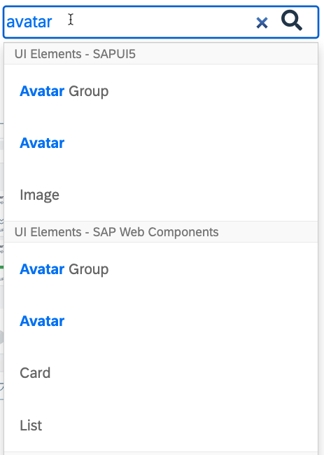
  • Via the search. All SAP Web Components appear in a separate section in the search suggestions and results.
  • Via the component overview on this page.
Guideline search - separate results for SAP Web Components

Versioning

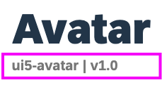
The version you see in the web component guideline is the interaction design version. It is shown in the guideline subtitle. Version 1.0 (v1.0) is the initial design version.

Subtitle with technical name and interaction design version

Interactive examples

The live examples in the SAP web component guidelines reflect the implementation status on:

August 2, 2024 (UI5 Web Components Release Version 1.24.8)


Component Overview

The list below provides an overview of all the web component guidelines currently available with this beta version.


Share Your Feedback

Do you have questions or feedback on the SAP Web Component guidelines? Feel free to contact us via the SAP Fiori Community.

Contact Us

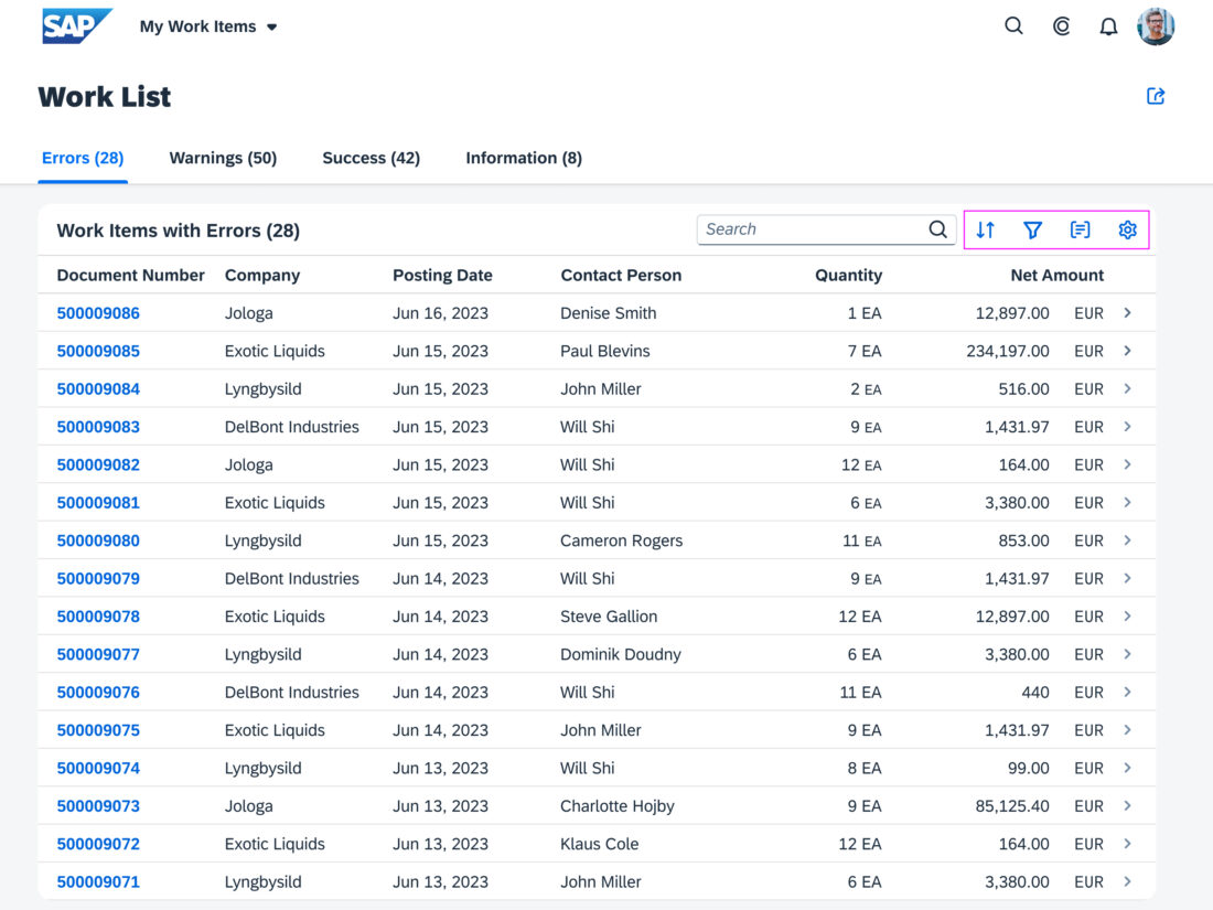
P13n Dialog

The P13n dialog control tabs allow users to personalize table and smart chart attributes.

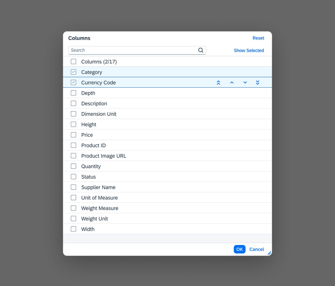
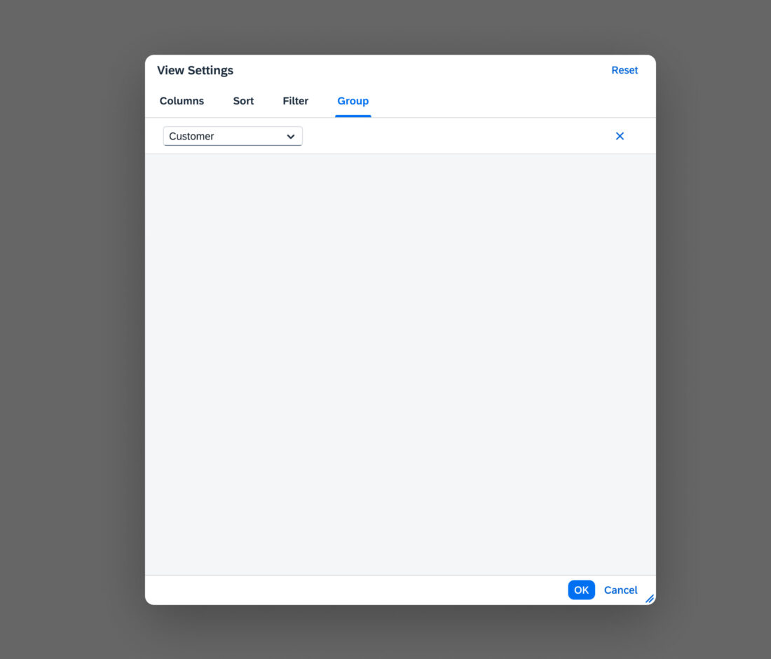
Table Personalization Tabs

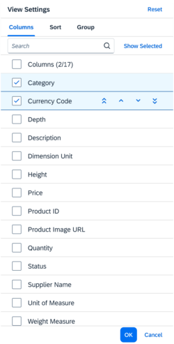
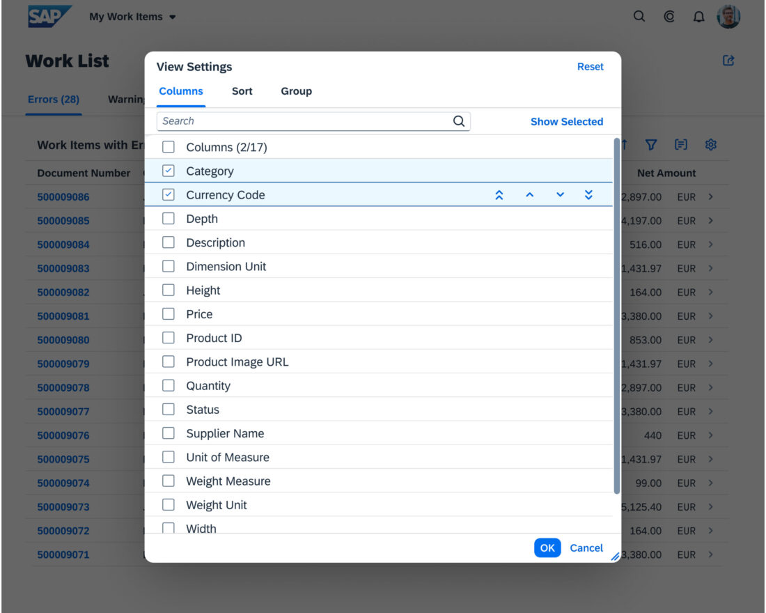
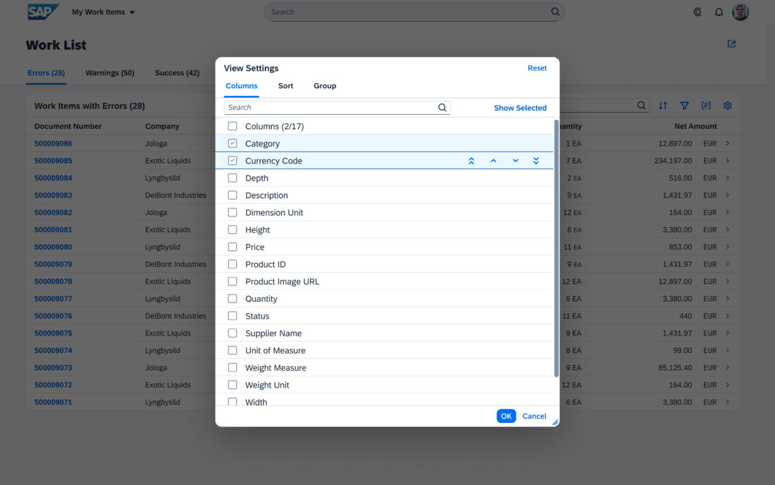
  • Columns: Visibility and order of columns
  • Sort: Sort criteria for table items
  • Filter: Filter criteria for table items
  • Group: Grouping table items by specific attributes

The tabs can be shown in any combination, as required by the use case.

The P13n dialog is intended for complex tables that have a large number of columns and require complex queries for sorting, grouping, and filtering.
For simple tables, see the view settings dialog and table personalization dialog.

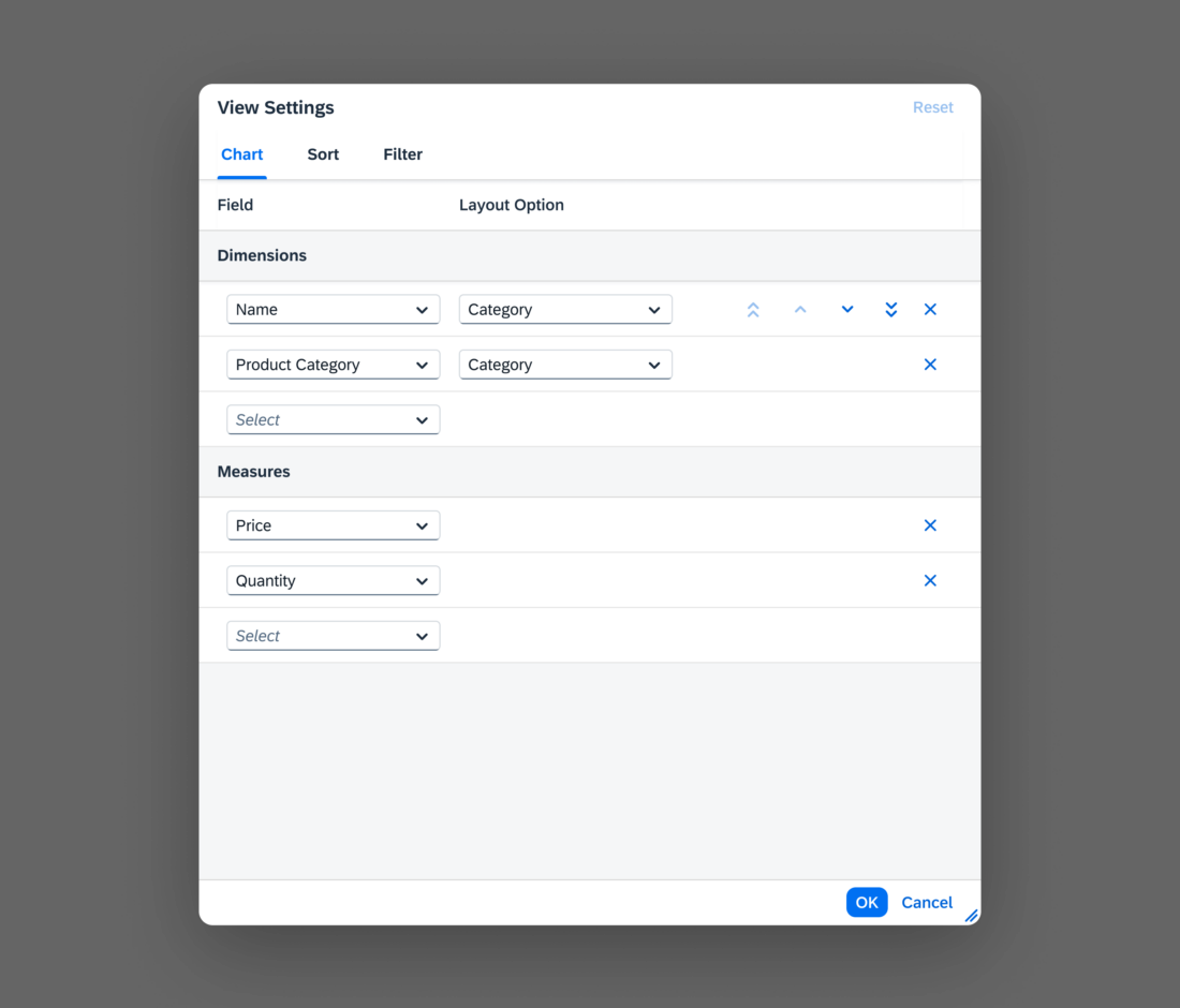
Smart Chart Personalization Tabs

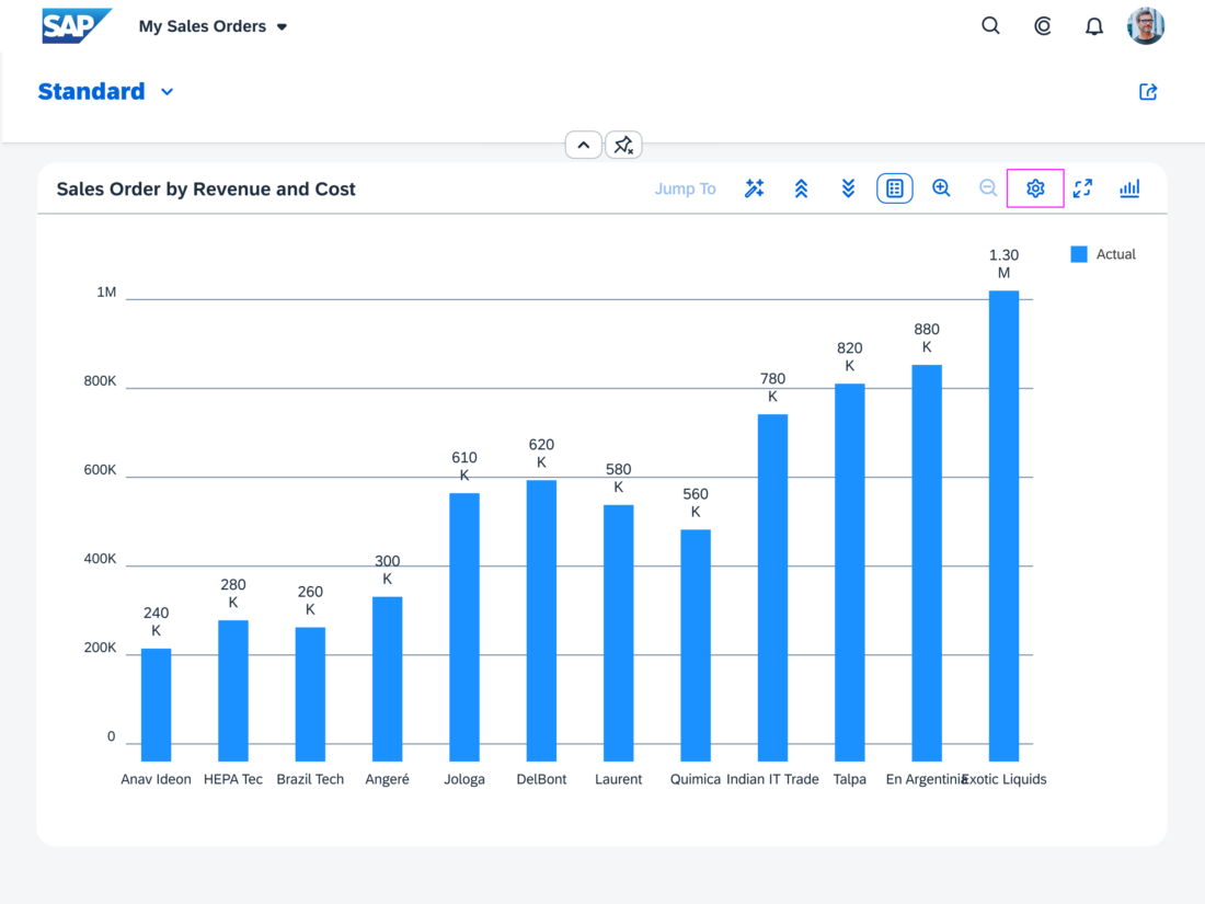
In addition to the Sort and Filter tabs, the P13n dialog for smart charts can include the Chart tab to allow users to set the visibility of chart dimensions and measures.

The P13n dialog is opened using the corresponding buttons on the right-hand side of the table or chart toolbar, as shown below.

Usage

Use the P13n dialog if:

  • Users can personalize more than ~20 columns.
  • You need multiple personalization functions (columns, sorting, filtering, grouping, …)
  • You are using the analytical table.
  • Complex queries have to be built for the table.

Do not use the P13n dialog if:

  • Users can personalize fewer than ~20 columns.
  • You only need a simple feature to show/hide columns.

Responsiveness

The P13n dialog is available for all display sizes. For sizes L/XL (desktop) and M (tablet), it shows as a centered dialog. For size S (smartphones), it displays as a full screen dialog.

Size S – Columns
Size S – Columns
Size M
Size M
Size L
Size L

Components

The P13n dialog can include the following tabs, separately or combined, as required by the use case:

  • Sort
  • Filter
  • Columns (available only for tables)
  • Group (available only for tables)
  • Chart (available only for the Smart Chart)

App developers can add more tabs manually.

Behavior and Interaction

Sort

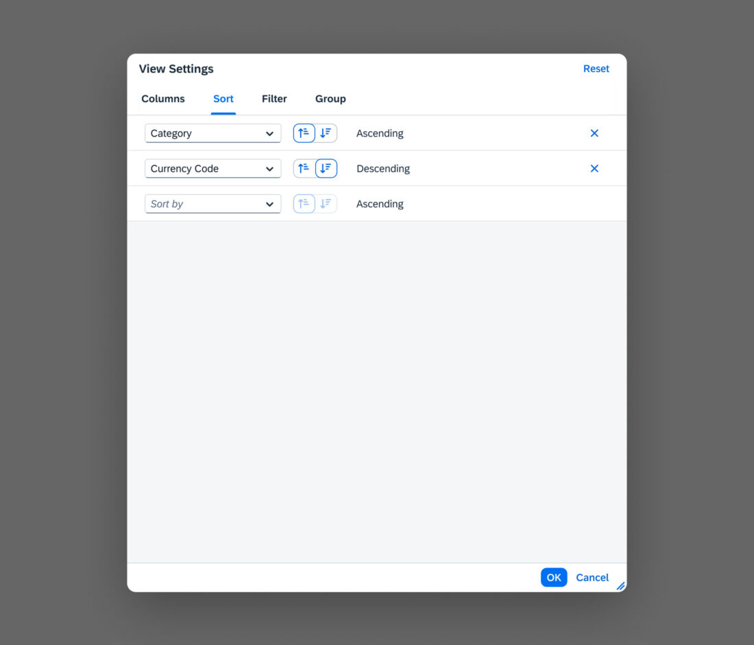
On the Sort tab, the user can specify the sort criteria and sort order (ascending or descending).

Each entry has two input fields:

  • One for choosing the sort column in a table or the sort dimension or measure in a smart chart
  • The second for choosing the sort order.

Users can enter multiple sort criteria. Once a sort criterion is entered, a new line appears for entering another one.

The order of the sort criteria reflects the order in which they are applied to the table or smart chart.

Information

  • The new P13n panels from the SmartTable (ColumnsSortGroup) are now available for freestyle application development.
  • Using the sort feature for column headers replaces ALL sort options in the dialog!

Sort settings in the P13n dialog

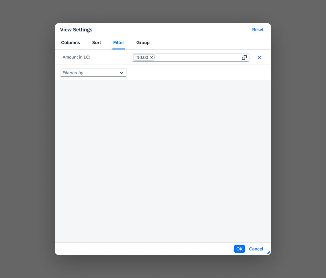
Filter

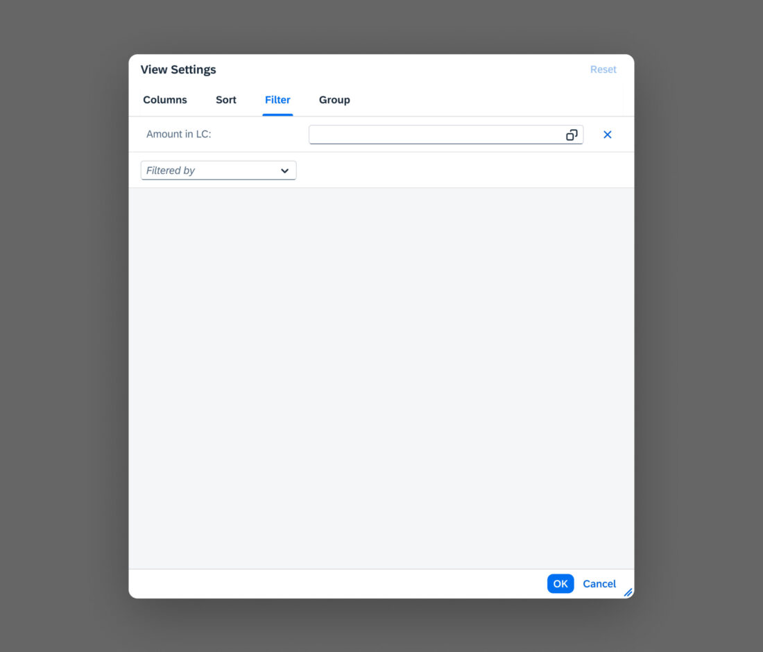
The Filter tab allows users to filter the table or chart information according to specific criteria.

Once a filter criterion is entered, a new line appears for entering another one. Users can remove filters by clicking the   (Remove Filter) icon at the end of each filter item.

Filter Criterion

In the first input field, the user selects the column (for tables) or the dimension/measure (for charts) to be filtered. Any column or dimension/measure can be selected, including columns and dimensions/measures that are not currently visible.

Define Conditions

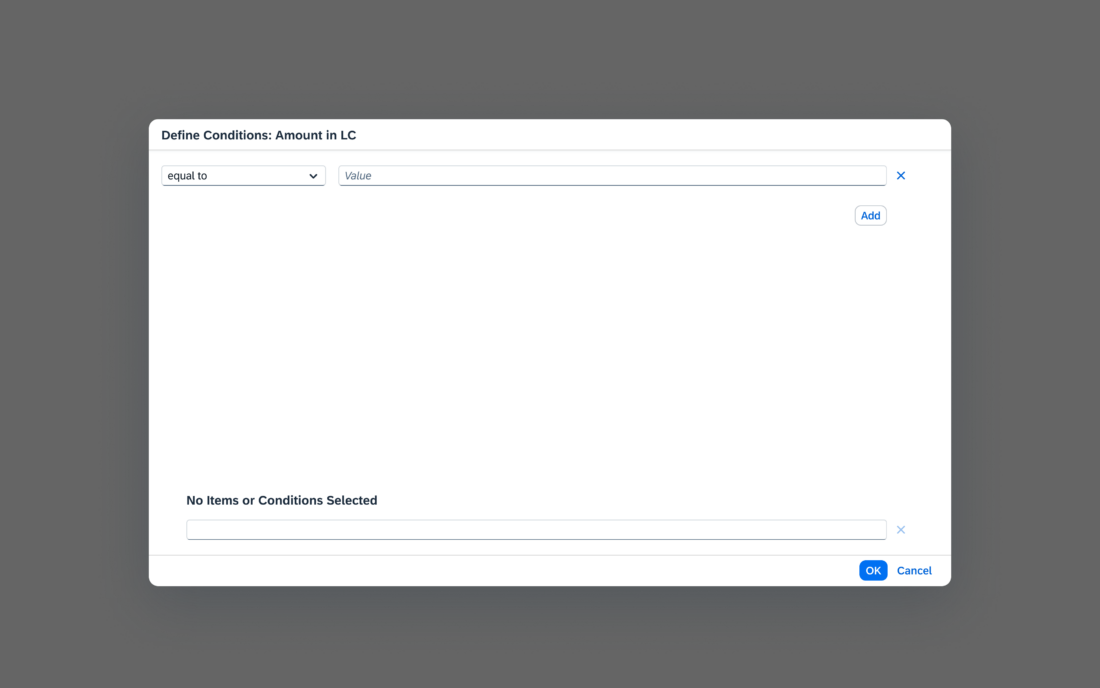
The second field is an input field which calls a Value Help Dialog when the user clicks the selection icon (value help icon) in the input field.

The first input field in the value help dialog contains the operator that is applied to the filter value (such as greater than or not before).

To include or exclude filter criteria, the user selects the relevant operator from the Include or Exclude section of the dropdown list. For example, equal to to include a value, or not equal to to exclude it.

If individual filter criteria have Boolean values, the operator is always “equal to” and the operator dropdown is disabled.

Available operators:

String (Text)

  • between
  • contains
  • equal to
  • begins with
  • ends with
  • greater than
  • greater than or equal to
  • less than
  • less than or equal to

Number

  • between
  • equal to
  • greater than
  • greater than or equal to
  • less than
  • less than or equal to

Date

  • between
  • equal to
  • after
  • on or after
  • before
  • before or on

Boolean (true/false)

  • equal to

Value

The second field in the value help dialog contains the value by which the selected column is filtered. The kind of input field that is provided depends on the data type of the selected column and the selected operator. For example, the value field for fixed or Boolean values could be a dropdown list, an input field with suggestions, or a date picker. You can also offer two or even more fields if the use case requires it.

The above mentioned guidance for filtering is applied to both the table and chart personalization.

Information
If there is a filter bar, use the filter bar functionality and deactivate the filter feature of the P13n dialog.

Columns

The Columns tab allows users to change the visible table columns and the order in which they are displayed.

The available columns are shown as list items with checkboxes. The checkboxes for the columns that are currently being displayed are selected.

The Show Selected / Show All button toggles the display between all columns and only those that are currently selected.

Show/Hide

To show or hide a column, users select or deselect the column checkbox.

Reorder

To change the order of the columns, users focus on a list item and use the buttons on the right-hand side of the table toolbar to move it up or down. The order of the columns from top to bottom corresponds to the order on the table from left to right.

Search

The search field in the table toolbar enables users to find a specific column more quickly. Matching columns are displayed as soon as the user starts to type.

Information
The new P13n panels from the SmartTable (ColumnsSortGroup) are now available for freestyle application development.
Column settings in the P13n dialog

Group

The Group tab allows users to group the table data.

In the select control, they can select a grouping criterion from a list of all available columns.

For analytical tables, users can define more complex grouping scenarios. Once a grouping criterion is entered, a new line appears for entering another one. In addition, the Show Field As Column checkbox allows users to decide whether or not to display the corresponding column.

The grouped table shows the individual values for the selected field as the group headers. Expanding the group shows all the corresponding table items.

If you have defined multiple groups, the grouped table shows the individual values for the first selected field. Expanding the groups shows the subgroups and items in an expandable hierarchy.

Information
The new P13n panels from the SmartTable (ColumnsSortGroup) are now available for freestyle application development.
Warning
Only columns marked as visible on the Columns tab can be used for grouping!
Group tab in the P13n dialog

Chart

The Chart tab allows users to set the visibility of chart dimensions and measures and to change the order in which they are displayed.

Users can add dimensions and measures with the select control or remove them by clicking the  (Remove dimension/measure) icon at the end of each chart item.

They can enter multiple dimensions and measures. Once a dimension or measure is entered, a new line appears for entering another one.

The order of the entered dimensions and measures reflects the order in which they are applied to the chart.

Dimensions

Each entry has two select controls: one for choosing the dimension, and one for choosing the layout option. The dialog is adapted to the currently selected chart type and shows layout options that work on the selected chart type.

Measures

In the select control, the user can select a needed measure from a list of all available measures.

Reorder

To change the order of the dimensions and measures, users focus on the list item and use the buttons on the right-hand side of the table toolbar to move it up or down or by dragging the dimension/measure to the desired location.

Warning
Users can select or change a chart type via the Smart Charts toolbar!
Chart settings in the P13n dialog

Resources

Elements and Controls

Implementation