
Toast
A toast is a small, non-disruptive popup for a non-semantic success message that disappears automatically after a few seconds.
Toast triggered by clicking a button – live example
When to Use
Use the toast:
- If you want to display a short, non-semantic success message to confirm that an action was performed.
- If you don’t want to interrupt users.
- If you want to confirm a successful action.
Don’t use the toast:
- To display an error or warning message.
- If you need to interrupt the user (for example, to prompt a user action or confirmation).
- If you want to make sure that users read the message before they leave the page.
- If you want users to be able to copy the message content to the clipboard (such as a product or transaction number). In this case, use a success message dialog or dialog instead.
- If you need positive semantic styling for a success statement. In this case, use the message strip or message dialog instead.
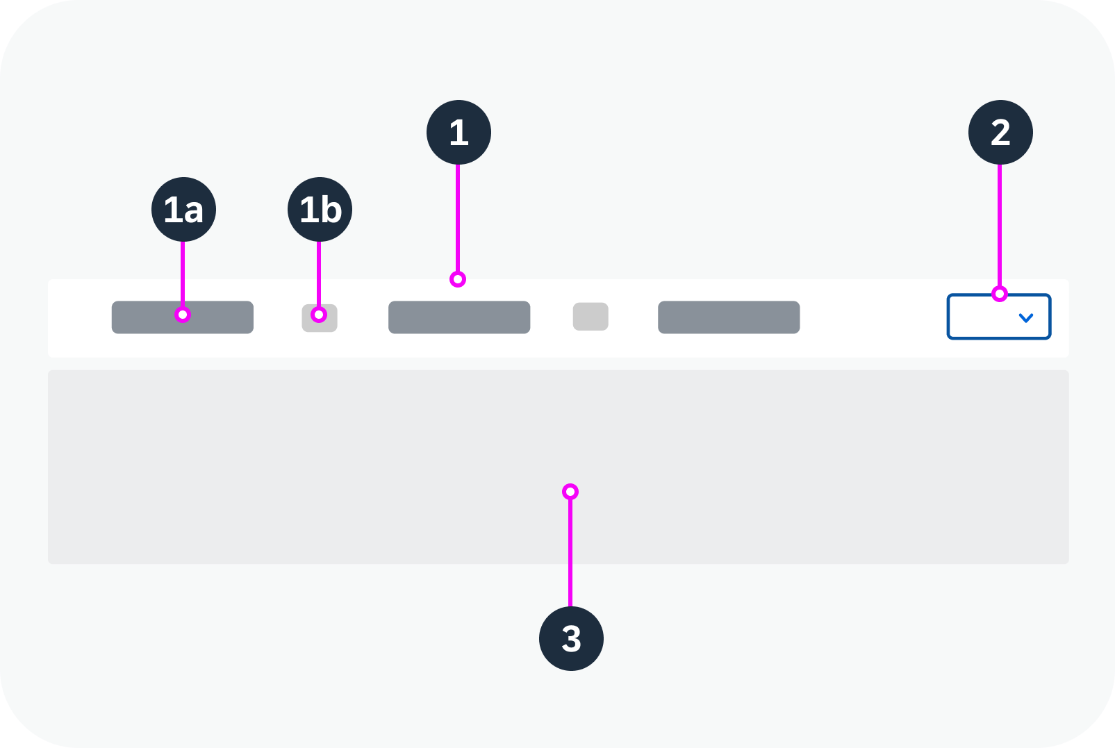
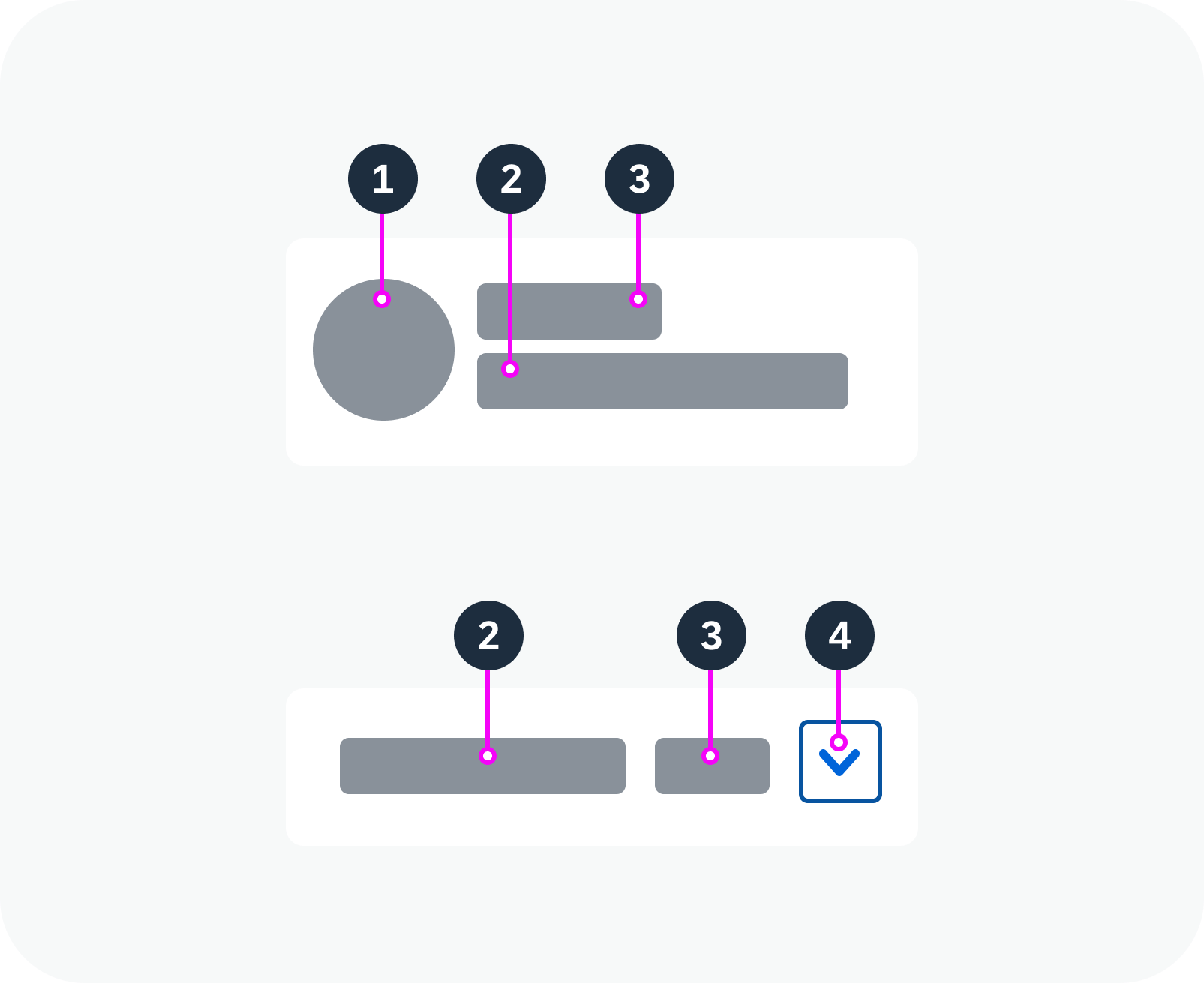
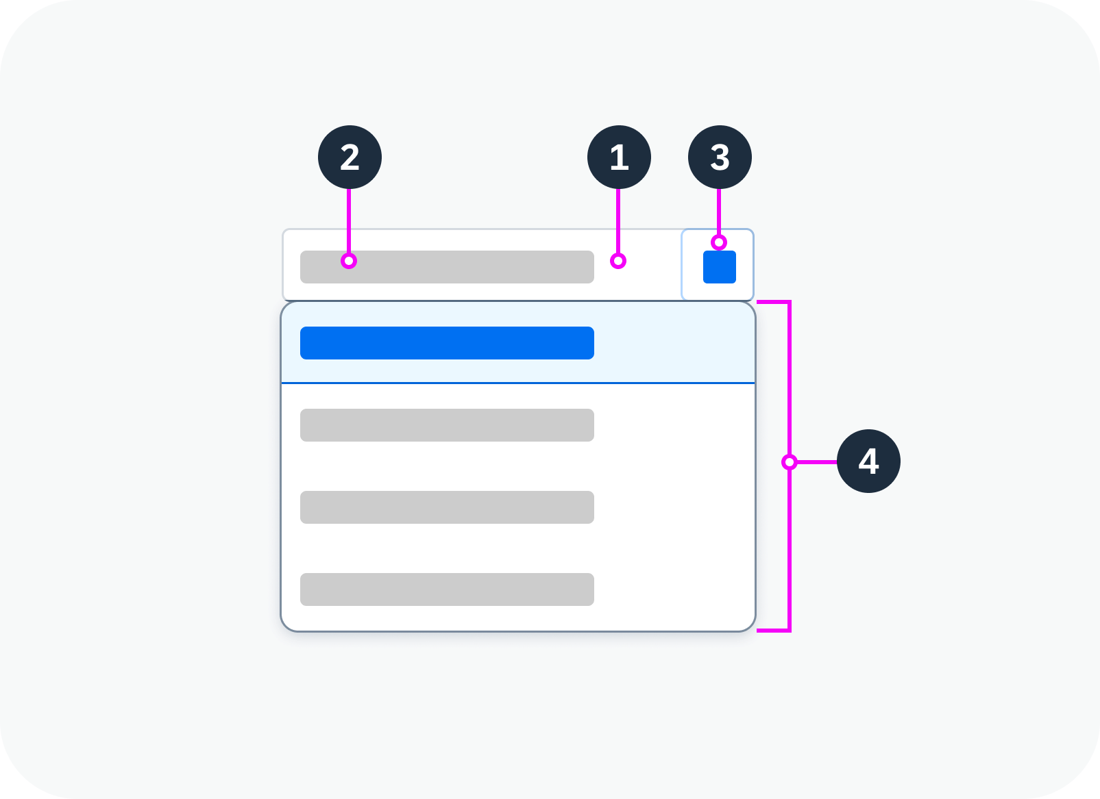
Anatomy
- Text
- Container
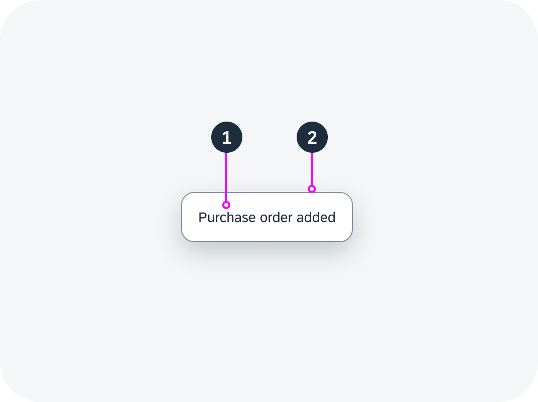
Toast anatomy
Behavior and Interaction
Placement
You can define the position of the toast on the screen. By default, it is centered horizontally at the bottom of the display.
Placement of a toast – live example
Triggering a Toast
When an action is successful, a toast automatically fades in and out. You can specify how long the toast remains visible. Set a longer duration for longer message texts.
Toast with different durations – live example
Message Text
To make the toast message easy to scan, keep the text as short as possible. Remember that the user will not have time to take in very much detail.
Don’t use the word “successfully” in the message text. This is implicit in a success message.
Toast without ID
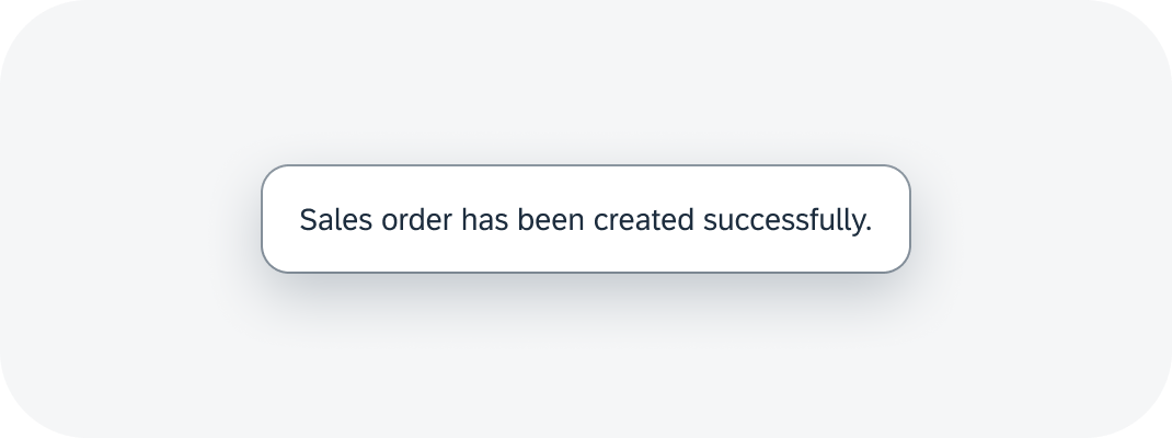
Don't use "successfully"
Patterns
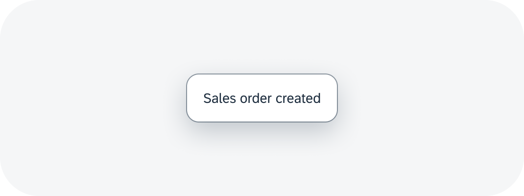
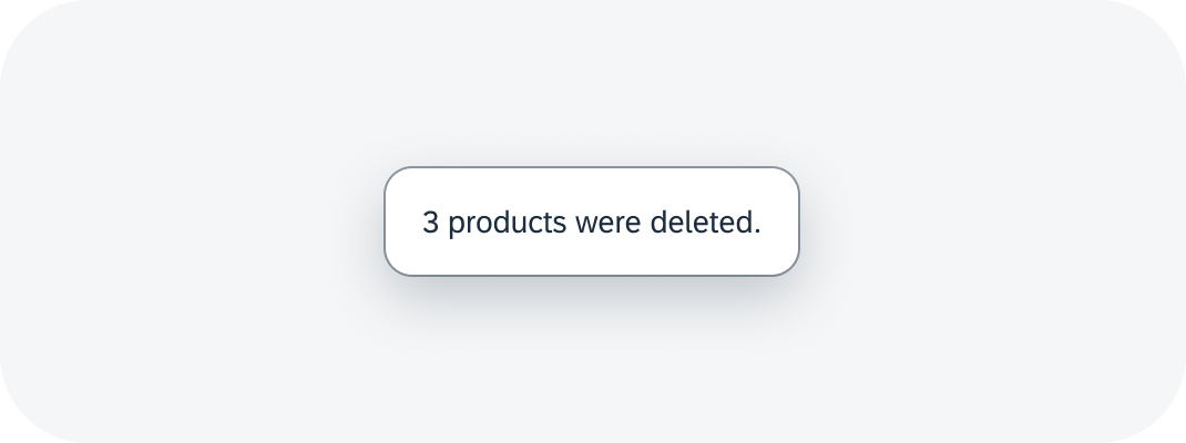
For standard actions (such as create, save, delete, or send), we recommend using the following patterns, depending on your use case.
| Use Case | Use Case Variant | Pattern (EN) | Example (EN) |
| Single item | Object name is not needed. Hint: If the name or ID is not crucial feedback in your context, leave it out. |
[object] [action taken] | Sales order created |
| Object name is needed. Hint: If you mention the object name, you can often leave out the object type (usually obvious in the context). |
[name] [action taken] | SAP added to customer group | |
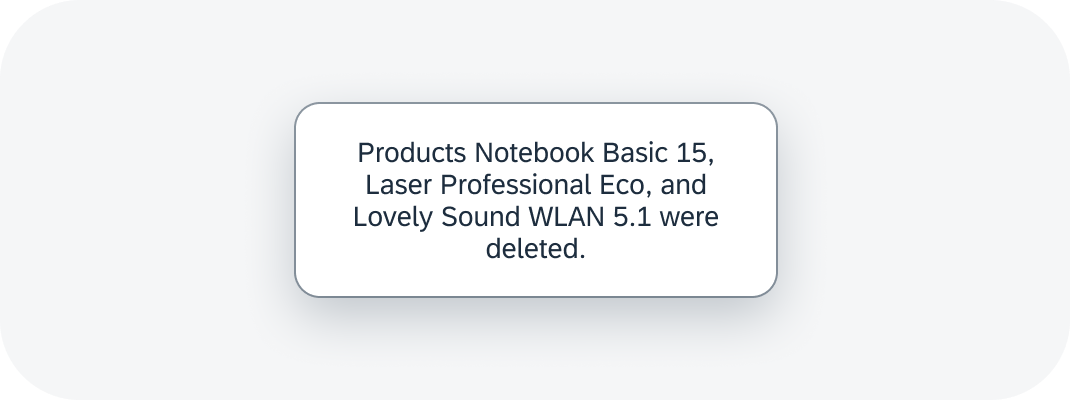
| Multiple items | [item count] [objects] [action taken] | 2 sales orders were deleted. | |
| Multiple actions | Single items, object names are not needed | 1 [object] [1st action taken], 1 [object] [2nd action taken] | 1 product added, 1 product removed |
| Single items, object names are needed. Hint: Only include object names if the user really needs the specific feedback |
[object] [name] [1st action taken], [object] [name] [2nd action taken] | Product A was added, product B was removed. | |
| Multiple items | [item count] [objects] [1st action taken], [item count] [objects] [2nd action taken] | 2 products added, 3 products removed |
Notes:
- The exact phrasing will depend on your target audience and the conventions in your app family. If an action is repeated regularly by a heavy users, be as brief as possible (for example, Order deleted). If your app is typically for occasional users, a full sentence might be more appropriate (for example, Your request has been sent to the support team.).
- Bear in mind that long object names can increase the length of the message toast. Remember to allow for this when defining the toast duration. If long or multiple object names make the toast too cumbersome to read, leave them out. If you really need to list them in a success message, use the success message box instead.
- Use periods only for complete sentences. See UI Text Guidelines for SAP Fiori – Punctuation – Period.
Toast with item count


 Your feedback has been sent to the SAP Fiori design team.