
The rating indicator can be used to rate content or to indicate a rating. It enables users to rate an item on a numeric scale. The most popular scale is 1 (lowest) to 5 (highest).
Month: October 2023
Rating Indicator
Rating Indicator – live example
When to Use
Do
Use the rating indicator:
- If you want to collect user feedback in the form of star ratings (for example, for user satisfaction surveys or product reviews).
- If you need a visually appealing way to showcase the popularity or quality of items, products, or content.
Don't
Don’t use the rating indicator:
- If the content you’re presenting doesn’t lend itself to user ratings (for example, legal documents, terms of service, or non-interactive content). In such cases, using a rating indicator doesn’t add value.
- If adding a rating indicator introduces unnecessary complexity to your UI, especially when you don’t anticipate much user interaction.
Anatomy
- Selected icon: Indicates the rating. At least one element must be selected.
- Icon not selected: Indicates non-active rating states.

Anatomy of a rating indicator
Variants
Required
You can require users to enter a rating. If you use this option, we recommend using a label together with the rating indicator to indicate that the rating is mandatory.
Rating indicator with “required” label
Number of Symbols
You can specify the number of rating symbols (property:
max). We recommend using a maximum of 7 symbols, though 5 symbols are preferred.Examples: Rating indicators with 4, 5, and 7 symbols
Behavior and Interaction
The behavior and interaction depends on the control state:
- In the enabled state, users can enter a rating.
- In the disabled state, the component is non-interactive.
- The read-only state provides visual feedback upon user interaction. In this state, you can use a half star to show average ratings.
Rating indicator states
(from top to bottom: enabled, read-only, disabled, read-only with half-star)
Responsive Behavior
The rating indicator runs on all form factors and therefore works on all devices.
Related Links
Date Range Picker
The date range picker allows users to enter a date range by either typing two dates in the input field or selecting a date range in the calendar.
The date range picker can also be used to enter a single date.
Basic date range picker – live example
When to Use
Do
Use the date range picker if:
- Users need to enter a date range and you know that the keyboard is not the primary device used for navigating the app.
Don't
Don’t use the date range picker if:
- Users need to enter a date and a time. In this case, use the date picker or time picker instead.
- Selecting ranges is not the user’s primary goal. In this case, use the simple date picker.
- If the keyboard is the primary device used for navigating the app, use two inputs. This allows the user to jump quickly from field to field.
Anatomy
- Date input field: Field for typing in dates directly. It contains a mask.
- Text: A placeholder or the selected/typed text.
- Date range picker button: Button that opens the calendar.
- Calendar: See the calendar guideline for more details.
- Current date
- Selected date range
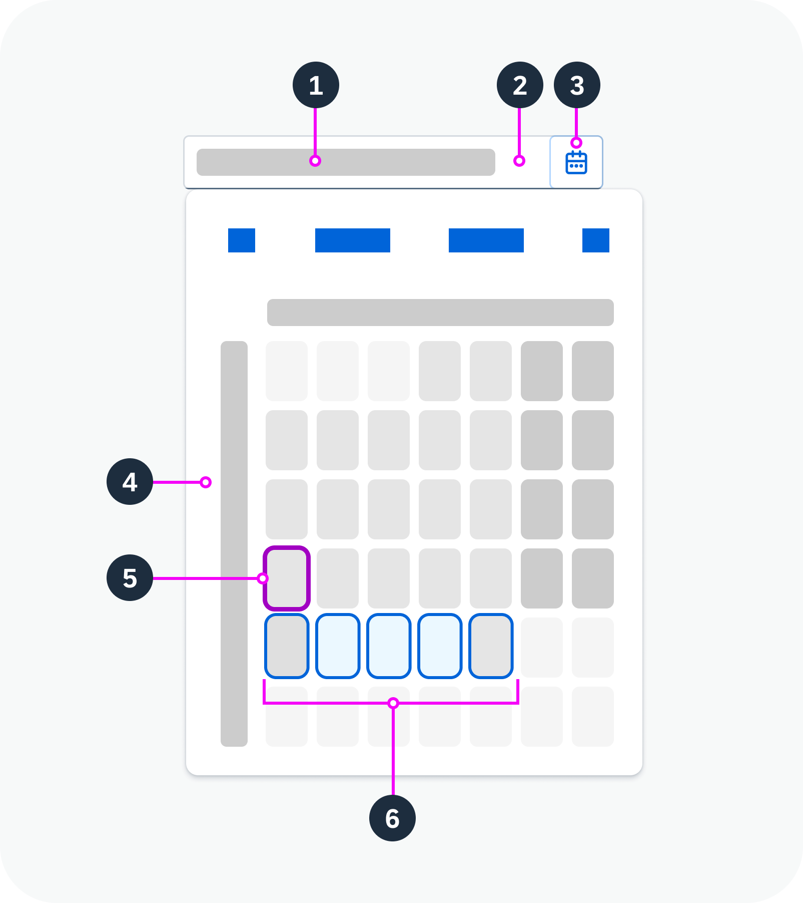
Anatomy of the date range picker
Variants
Restricted Date Range
You can set minimum and maximum dates. In this case, the user can only select dates within the approved range.
Predefined Date Range
You can set a predefined date range that is selected by default when the user opens the calendar. The user can still change the dates.
Date Display in the Input Field
You can specify the format of the dates in the input field. Supported formats are based on the Unicode Locale Data Markup Language (LDML) date format notation.
You can also specify the symbol that separates the start and end dates.
Minimum/maximum dates, specific date format – live example
Predefined date range, custom delimiter – live example
Behavior and Interaction
Selection
Date range: After selecting a start date, hovering over another date turns the dates in between to light blue, indicating that they are in the selected range. When the user selects an end date, the calendar closes and the range appears in the date input field.
Single date: To enter a single date, the user can type one date into the input field, or select the same day as the start and end date in the calendar.
Shortcuts
The following shortcuts are available for entering specific dates:
- “today”
- “yesterday”
- “in x days”
- “x days ago”
- “yesterday – today”
- “x days ago – in x days”
Restricted Date Range
If minimum and maximum dates have been set, selection and navigation to dates outside this range is disabled.
Formatting
If the user types the date in the input field, it must fit the required date format. For example, if the format pattern is “yyyy-MM-dd”, a valid user input would be “2023-07-30”.
Related Links
Implementation
- Date Range Picker
(UI5 Web Components documentation) - Date Picker
(UI5 Web Components documentation)
Text Area
The text area is an input component that allows the user to enter several lines of text.
Basic text area – live example
When to Use
Do
Use the text area:
- If users need to enter more than one line of text.
Don't
Don’t use the text area:
- If you only want users to enter a single line of text. Use the input component instead.
Anatomy
- Input field: Container in which a user enters text.
- Text: Placeholder or typed text. The placeholder is an optional prompt text that is displayed when the input field is empty.
- Scrollbar
- Counter: If you have set a character limit without restricting text input, the counter indicates how many characters are left, or how many characters exceed the limit.
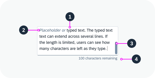
Anatomy of the text area
Variants
Text Area with Character Limit
You can set a character limit for the text. In this case, you have two options for handling the text input:
Text is cut off after the character limit
Once the character limit has been reached, users can no longer type or enter additional text. Pasted text is cut off. This is the default setting.
No text entry after 20-character limit is reached – live example
Text can exceed the character limit
You can allow the user to enter text that exceeds the character limit. We strongly recommend using this variant because it offers users much better orientation:
- A character counter indicates how many characters are can still be entered, or how many characters are over the limit.
- If the text exceeds the limit, you can show a warning state and a message that explains the limit.
- If users type or paste a longer text, they can see the full text while they decide on how to best shorten it.
Text entered can exceed 20-character limit – live example
Text Area with a Label
You can add a label to the text area.
Text area with a label – live example
Behavior and Interaction
Fixed Height
You can configure the height of the text area to fit the space available on your UI. If the text doesn’t fit into the available space, a scrollbar appears.
Text area with a fixed height
Growing Behaviour
The text area component offers a growing property. If growing is active, the input container grows and shrinks automatically as the user types.
You can configure the minimum and maximum number of lines to be shown. If the text exceeds the maximum number of lines, the text area stops growing and a scrollbar appears.
Growing behavior (minimum 2 lines, maximum 5 lines) – live example
Text Area Counter
If you have set a character limit for the text area but don’t restrict text entry, a character counter is displayed below the text.
If the text is over the limit:
- The user can continue typing.
- The counter indicates how many characters are over the limit.
- We recommend changing the text area to a warning state and displaying an appropriate message.
If the text is pasted into the field, any excess characters are selected automatically.
Show a warning state when the text exceeds the character limit
Responsive Behavior
You can set the maximum number of lines to be shown. The amount of text depends on the size of the screen. On smaller screens, the user can scroll down the text area to see the entire text. To indicate that the text continues, the component shows only half of the last line. This also applies for mobile devices.
Related Links
Icon
An icon is a symbol that is used to depict an item, action, or status. It represents an embedded icon font or a resizable vector graphic. Icons can be purely decorative or used within interactive elements.
Icons used in buttons
Icons used in avatars
When to Use
Do
Use the icon:
- To label actions when space is limited.
- To add value for users by conveying semantic information in a standardized visual form.
Anatomy
All icons are based on a geometric grid system.
For more information, see Iconography – The Geometric Icon Grid System.
Variants
Icon Collections / Font Formats
The icon component can consume any of the SAP icon fonts below.
| Icon Font | Usage |
| SAP Icons | The default icon set. |
| SAP Business Suite | Icons tailored to SAP S/4HANA application scenarios. |
| SAP Fiori Tools | Icons created for SAP BTP applications. |
Semantic Icon Design
You can apply a value state to display the icon in the corresponding semantic color.
Icons with different semantic colors
Behavior and Interaction
Responsive Behavior
The icon component does not have its own responsive or adaptive behavior. It follows the responsive or adaptive behavior of the surrounding layout container or component, such as a form or table.
Inclusive Design
Only use icons that are universally understood or known in your business domain.
Be aware that metaphors and symbols can have local meanings that may differ from your intended meaning. A well-chosen, well-designed icon must be able to convey its meaning to all users – regardless of their country, culture, or individual background.
Related Links
Implementation
- Icon
(UI5 Web Components documentation) - Button
(UI5 Web Components documentation) - Icon Explorer
Breadcrumbs
A breadcrumb is a type of secondary navigation that indicates the position of a page in its application hierarchy. It enables users to navigate between items by providing a list of links to previous steps in the user’s navigation path.
Basic breadcrumb
When to Use
Do
Use the breadcrumbs component:
- To show secondary navigation on an object page.
- To show navigation in a table.
- To show navigation in charts.
Don't
Don’t use the breadcrumbs component:
- If your hierarchy contains only one level.
- To navigate to pages that are not part of the application hierarchy (for example, navigation to an object page in another application).
Anatomy
- Parent page: The first link in the breadcrumb (the point of origin).
- Child pages
- Current page: The page the user is looking at.
- Dropdown
- First link in the hierarchy
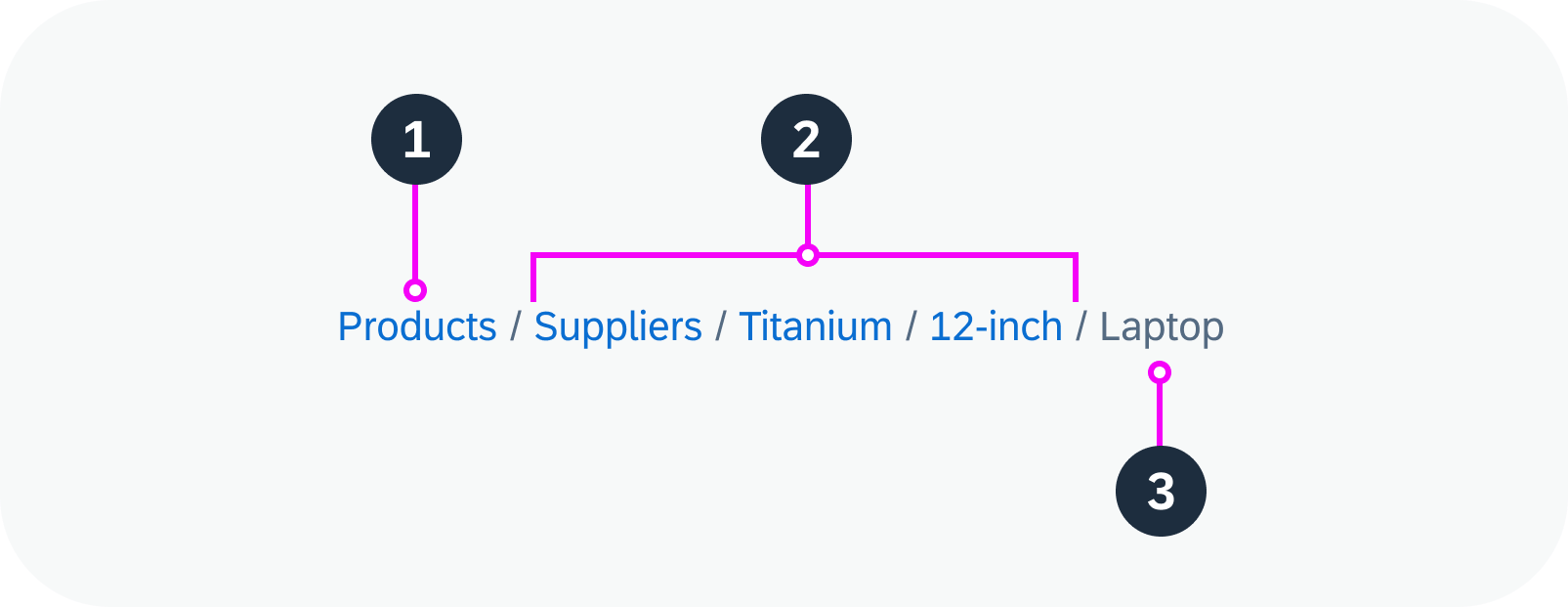
Anatomy of a breadcrumb
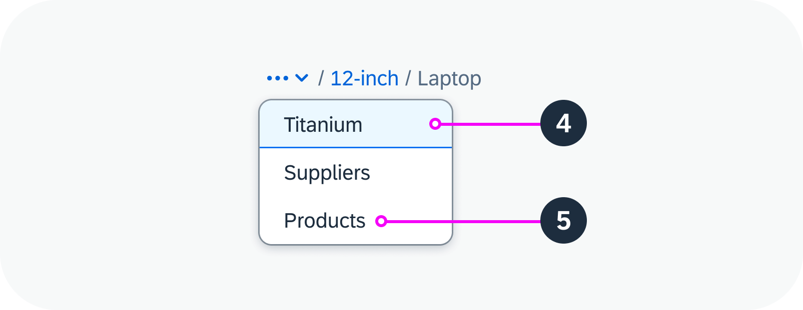
Anatomy of a breadcrumb - dropdown
Variants
Without Current Page
You can opt to show the breadcrumb without the current page. By default, the breadcrumb shows the current page.
Breadcrumb without the current page
Separator Style
You can set the separator style. The the following options are available:
- Slash (default)
- Backslash
- Double slash
- Double backslash
- Greater than
- Double greater than
Examples of different breadcrumb separators
Behavior and Interaction
To navigate to a previous page, the user clicks the respective link in the trail.
Responsive Behavior
Breadcrumbs are responsive. If there is insufficient horizontal space, the links in the breadcrumb trail collapse into a dropdown menu:
- The first link in the breadcrumb (the point of origin) collapses first, followed by the next link in the hierarchy.
- The last element in the breadcrumb is always visible and doesn’t collapse into the dropdown menu.
- If there isn’t enough horizontal space, the last element is truncated.
Related Links
Value States
Value states show the semantic meaning of a UI element in a specific use case and context. A UI element can have only one value state at any given time.
By default, the value states are depicted using the standard semantic colors for the respective theme (such as Morning Horizon).
None
This is the default state of an element. It means that no semantic or industry-specific meaning is assigned to it.
Use:
- Before validation is triggered.
- After successful validation.
Don’t Use:
- After validation with problems.
- For information messages. In this case, use the information value state.
“None” state for an input field – live example
Positive
Use this status to convey that the displayed element or value has a positive meaning for the given use case.
Use:
- If an action or validation was successful.
- If a message indicates that a process was finalized without any issues.
Don’t Use:
- If issues occurred while finalizing a process.
- If issues occurred during validation.
“Positive” state for an input field – live example
Negative
This status is used for elements that carry negative meaning, such as errors. It indicates a bad or negative status or consequence and prevents users from continuing their work.
Use:
- If users need to be prevented from finalizing the current mode or page.
- If validation for the user input failed and the problem must be fixed before the user can continue.
- If a message contains information about an error.
- If the component carries information that requires the user’s immediate attention.
Don’t Use:
- If the user input was validated successfully.
- If the user input was validated and only minor problems occurred.
“Negative” state for an input field – live example
Critical
This state identifies a minor problem or warning that the user should take into consideration. Users can carry on working, but might run into an error later on.
Use:
- If the current content can be finalized, but doing so might lead to an error later on.
- If the user input was validated and a minor problem occurred. It is possible to continue without fixing the problem, but doing so might lead to an error later on.
- If a message contains information about a warning.
Don’t Use:
- If the input was validated successfully.
- If the user input was validated and a major problem occurred.
“Critical” state for an input field – live example
Information
Depending on the component, this state can be enabled for the following cases:
- If used with inputs and any other form components, this state can indicate an AI suggestion.
- If used in a list, as a text, or in any type of dialog, it can indicate an information message or highlighted element.
Use:
- If you need to display an information message.
- If you want to draw attention to a component (for example, to highlight that recommendations are available for a field).
Don’t Use:
- If the user input was validated successfully.
- If the user input was validated and a major problem occurred.
“Information” state for an input field – live example
Custom
If there is no suitable semantic state, a custom state can be offered. The exact visualization depends on the colors set (custom state) or what is inherited (Inherit state).
Use:
- If additional states are required to support a special business use case.
- If the value states required have different semantics or no semantics.
Don’t Use:
- If one of the value states already provided fits the use case.
Semantic and Industry-Specific Colors
Semantic Colors
Semantic colors denote standard value states (such as positive, negative, and critical). Each color has the same basic meaning in all contexts.
Industry-Specific Colors (Indication Colors)
Industry-specific colors reflect the color conventions in a line of business or industry (technical name: indication colors). The meaning of each color depends on the business context.
To apply the industry-specific colors, you can use the custom state.
Related Links
Design System Foundations
- Semantic Colors (Morning Horizon)
- Indication Colors (Morning Horizon)
- States
 Your feedback has been sent to the SAP Fiori design team.