
Color Palette Popover
The color palette popover encapsulates the color palette and the color picker within a popover.
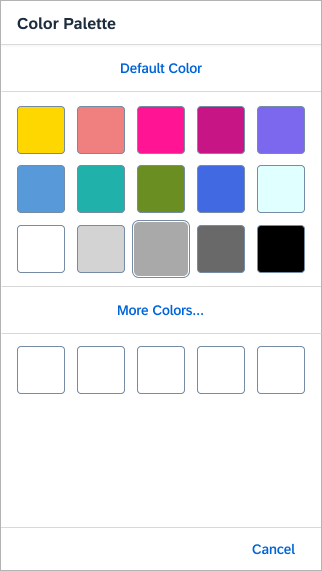
Color palette popover – live example
When to Use
Do
Use the color palette popover:
- To let users select a color from a predefined palette (typical use case).
- If users typically select a predefined color, but may also need to define their own colors.
- If you need to offer color selection as an action in a toolbar.
Don't
Don’t use the color palette popover:
- For selecting a color directly on the page. Use the color palette or the color picker instead.
- If users will nearly always define a color of their own, and rarely use the predefined palette. In this case, use the color picker instead.
Anatomy
- Color palette container: Contains all activated elements.
- “Default Color” button (optional): This button allows users to select or revert to a predefined default color.
For the default color, use one of the predefined colors in the swatch container. - Swatch container: A set of predefined colors for easy selection.
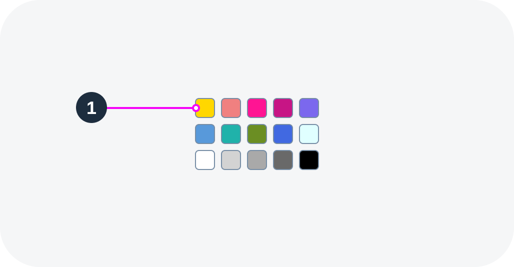
You can define between 2 and 15 colors. - Swatch: Single color, part of the palette.
- “More Colors…” button (optional): Opens the color picker.
- Recent colors (optional): Section displaying the last 5 colors picked.
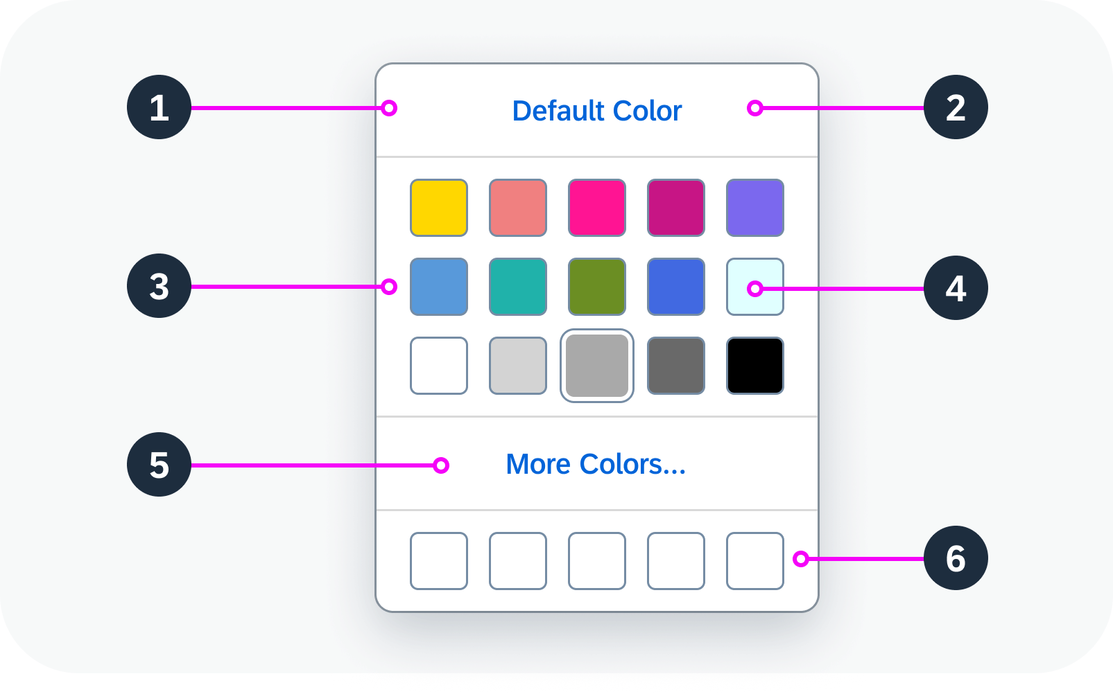
Anatomy of a color palette popover
Behavior and Interaction
Opening and Closing a Color Palette Popover
The color palette popover opens when the user clicks on a triggering text link or button.
The color palette popover closes when the user clicks outside the popover or selects a color within the popover.
Selecting a Color
The user can select a color in the following ways:
- Click Default Color to select the predefined default color.
- Select a color from the predefined color palette.
- Click More Colors… to select a color using the color picker.
- Select one of the the recent colors.
Color palette popover – live example
Responsive Behavior
On a phone, the color palette popover turns into a full screen dialog.

 Your feedback has been sent to the SAP Fiori design team.