Bar

The bar is a container that can hold text, titles, buttons, and input elements.

Bar used as a title bar or page header
Bar used as title bar/page header and as a subheader

When to Use

Do

Use the bar:

  • For page headers, subheaders, footers, and floating footers used on a page, dialog, or popover.
  • If you only need to include a small number of components.
Don't

Don’t use the bar:

  • If you need a container for a larger number of components, with a built-in overflow menu. Use the toolbar instead.

Anatomy

1. Bar container

The bar container provides slots:

A. Start content: Defines the content at the start of the bar.
B. End content: Defines the content at the end of the bar.

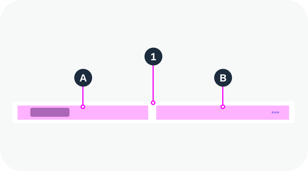
Anatomy of a bar container

Variants

Title Bar

The bar container is used as a page header.


Title Bar with Subheader

The bar container is used as a page header with a subheader.


Page Footer Bar

The bar container is used as a page footer.


Floating Footer Bar

The bar container is used as a floating footer.


Behavior and Interaction

Within the bar container, all the interactions depend on the components used.

Responsive Behavior

The bar doesn’t have a built-in overflow menu. If there isn’t enough space to show all the elements on the title bar, add a subheader.

Globalization and Localization

The bar container supports left-to-right (LTR) and right-to-left (RTL) reading directions.

Left-to-right (LTR)
Right-to-left (RTL)

Related Links

Components

Implementation

  • Bar (UI5 Web Components documentation)

Tree

Trees provide a way to display and work with basic hierarchical data. They offer a clear representation of structured information and are typically used in the main list for list-detail scenarios, popovers, or dialogs.

Tree – live example

When to Use

Do

Use the tree component:

  • To display hierarchically structured items.
  • To enable selection of one or more items from a set of hierarchically structured items.
Don't

Don’t use the tree component:

  • To display items that are not structured hierarchically. In this case, use the list component.
  • To select one item from a very small number of non-hierarchical items. A select or combo box might be more appropriate.
  • The hierarchy turns out to have only two levels. In this case, use a list with group items.

Anatomy

Tree

  1. Header (optional): The first item of the tree serves as a header, and contains the title of the tree.
  2. Node: Item that contains additional items.
  3. Root: Single topmost node (level 1).
  4. Leaf: Item that doesn’t contain any other items.
  5. Expand/collapse icon: An icon for expanding and collapsing the node is provided automatically for each node that has child nodes.
  6. Footer (optional): The last item of the tree can serve as a footer.
Anatomy of a tree
Anatomy of a tree

Standard Tree Item

The standard tree item (ui5-tree-item) is the simplest type of tree item. It provides the most common features, such as text, icon, and a checkbox or radio button.

  1. Checkbox / radio button:
    • In multiple selection mode, a checkbox is displayed.
    • In single selection mode, a radio button is displayed.
  2. Icon (optional): You can place an icon at the beginning of an item (before the text).
  3. Text
  4. Additional text (optional): The tree item can have an additional text located on the far right of the row (property: additionalText). You can also apply a semantic value to this text (property: additionalTextState property).
  5. Delete button
Anatomy of a standard tree item

Custom Tree Item

If additional components are needed, use a custom tree item. The custom tree item allows you to use any combination of components inside the tree.

We recommend sticking with the intended tree design and only inserting additional components within the given tree structure.

Variants

Standard Tree

Use this variant as a starting point.

Standard tree – live example

Single Selection

One item in the tree can be selected. To select an item, you can click anywhere on the item. For single selection, this is the preferred mode.

Always keep one item selected. The basic single selection mode doesn’t add any visual indication to the tree. If no item is selected, it can’t be differentiated from trees without selection.

Single selection – live example

Single Selection with Radio Button

One item in the tree can be selected. For this, the tree provides radio buttons on the left or right side of each line item. Use this selection mode only if clicking on the item triggers something else, such as navigation.

Ideally, always keep one item selected, even in the initial state.

Single selection with radio button – live example

Multiple Selection

Allows selection of one or more items. For this, the tree provides checkboxes on the left side of each line item. Each item is selected independently of the others.
Multiple selection – live example

Delete

To allow deletion of single items, use the tree in “Delete” mode. This adds a Delete button  to each item.
Do not use this mode if deleting multiple items at once is the main use case. Delete cannot be used together with single selection or multiple selection.
Delete – live example

Behavior and Interaction

The tree is like a list containing hierarchical data. It acts as a container for items, with the possibility to expand and collapse nodes. In addition, the tree changes the indentation per level dynamically when the user expands a node, based on number of levels currently showing.

See the examples for the following variants:

Responsive Behavior

When the width is reduced, item texts can truncate or wrap to ensure that the tree adapts to the new size. For more information, see Wrapping and Truncation.

Related Links

Implementation

  • Tree
    (UI5 Web Components documentation)

Menu Button

The menu button offers a set of options for an action, displayed in a menu.

Menu buttons – live examples
Menu buttons with semantics – live examples
Disabled menu buttons

When to Use

Do

Use the menu button:

  • To offer a group of options when there is no obvious default action.
Don't

Don’t use the menu button:

  • To switch between different states. Use the toggle button or the switch instead.
  • For individual actions without variants. Use the simple button instead.
  • To offer a default action alongside a group of alternative options. Use the split button instead.

Anatomy

  1. Background: Visualizes the state of the button using different colors.
  2. Text: Describes the group of actions that can be triggered by the menu button.
  3. Arrow: Indicates that clicking this button opens a menu with a group of options.
Anatomy of a menu button

Variants

Three variants visualize different priorities of the menu button and its action:

  • Primary
  • Secondary (= regular)
  • Tertiary
Primary menu button
Secondary menu button
Tertiary menu button

Behavior and Interaction

The menu button has only one interactive area. Clicking the menu button opens the menu with the possible actions.

Related Links

Implementation

  • Menu
    (UI5 Web Components documentation)