Flexible Column Layout

The flexible column layout is a pattern for displaying multiple floorplans on a single page. The flexible column layout is not restricted to a specific floorplan, as long as it is responsive down to phone size.


Flexible column layout – live example

When to Use

Do

Use the flexible column layout:

  • To create a list-detail or list-detail-detail layout, in which the user can drill down or navigate.
Don't

Don’t use the flexible column layout:

  • To display additional content to enrich the main content. Use the dynamic side content instead.
  • To create a dashboard with context-independent pages.
  • To open multiple instances of the same object type.
  • To split a single object into multiple columns.
  • To display only a small amount of information.

Anatomy

  1. Columns: Depending on the current layout and display size, the flexible column layout consists of one, two, or three horizontally-aligned columns. Each column contains content that is not provided by the flexible column layout itself.
  2. Layout Arrow: The layout arrows allow users to expand the width of a given column and change the current layout.
  3. Actions (Enter/Exit Full Screen, Close): The layout actions are always displayed as the last actions in the respective layout action section, in the last column (rightmost for left-to-right orientation). They never overflow and are always in the same order. The actions are not available for phone sizes, which display only a single column.
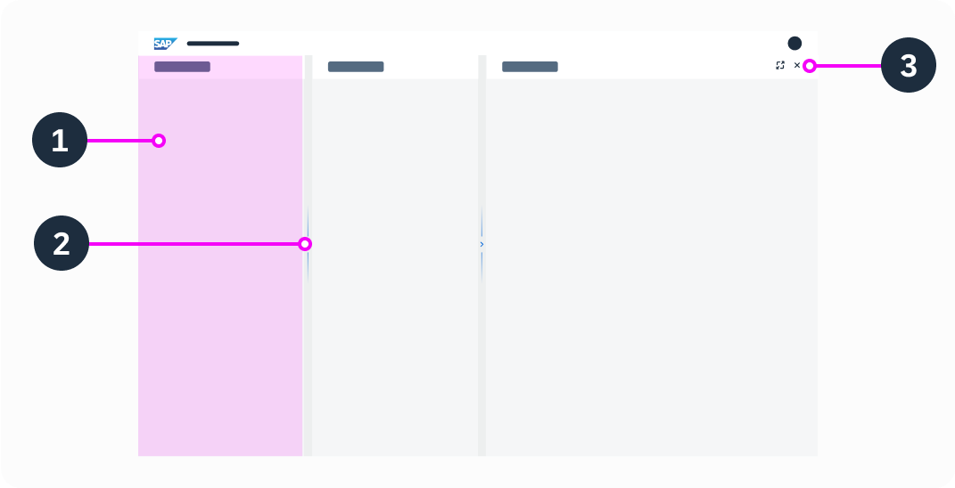
Anatomy of the flexible column layout

Behavior and Interaction

Expanding the Column

With the layout arrows, users can expand the width of a given column and change the current layout.
The layout arrow points in the direction in which a column can be expanded.

Full Screen Mode

The  Enter Full Screen button switches the rightmost column to full screen mode.
The  Exit Full Screen button switches back to the multi-column view. This action is only available in full screen mode.

After switching a column to full screen mode, selecting the Back button also exits the full screen mode.

If the screen is in full screen mode, and the user navigates forward, the next column shows in full screen mode. If the user navigates backward, all screens show in full screen mode until the point where the user initially switched to full screen. If the user then clicks Back again, they return to the multi-column mode.

Closing the Last Column

The  Close button closes the last column. Back navigation doesn’t restore a column that was previously closed with the Close button .

If the last column was in full screen mode when it was closed, the second column is displayed full screen mode.

Vertical Size / Scrolling

The height of each floorplan is defined by the screen size.

Each column inside the flexible column layout contains an independent floorplan with its own scrolling behavior. There is no scrollbar to scroll all columns simultaneously.

Minimized Third Column

When the user expands the first column in a 3-column layout, the third column is minimized.  Close Enter Full Screen, and layout arrow actions also appear on the right-hand border of the second column to allow the user to return to the original 3-column layout.

When the user clicks    Enter Full Screen, the second column switches to full screen mode. The third column remains open (but not visible), and closes as soon as the user selects another item in the second column, or uses the  Close action in the second column. If the user selects the same item in the second column, it opens in the same state as before it was minimized.

Selecting a Different Item

If the user selects a different item in the list-detail or list-detail-detail layout, the content of the details column changes to reflect the data of the newly selected item. If the item is selected in the first column, and the last column was open before the new item was selected, selecting the item closes the last column.

Deleting an Item

When an item is deleted, there are two options for handling the content of the details columns:

Option 1: Selecting the next item and changing the content in the details column. If the user deletes the last item, the previous item is selected.

Option 2: Not selecting an item and closing the other columns.

Behavior on Filtering

Filtering in one of the columns doesn’t affect the content in the other columns.

When a filter is applied, the results are shown in the same column. The content in the remaining columns doesn’t change, unless another item is selected.

Tab/Anchor Navigation

Tabs and anchors are used for navigation within an object or as a filter (for example, in object pages). They affect only the respective column and don’t close or change the content in the other columns.

Dialogs

Dialogs triggered in one of the columns are centered over the entire screen.

Footer Toolbar

Each column of the flexible column layout can have its own footer toolbar. There is no overall footer toolbar that spans several columns.

Responsive Behavior

The flexible column layout is responsive. It changes its behavior in real time when the user resizes the screen. For any size, the default layout appears automatically.

Size L and XL (screen width > 1024 px)

There are five different layouts: a full screen layout, a 2-column layout, and a 3-column layout.

Size M (screen width between 600 px and 1023 px)

There are two different layouts: a full screen layout and a two 2-column layout.

For example, if the flexible column layout was initially loaded in size S and the user then navigates to the second column and changes the browser window to size M, the default 2-column layout for size M will show.

Three columns in size M

To offer a desktop-like experience in size M, the flexible column layout displays either the first and second or the second and third column. The user can switch between these views by using the layout arrow on the left or right side of the flexible column layout. This behavior is only intended for size M.

Size S (screen width < 599 px)

Because of the limited width, there is no multi-column layout for small screens. Instead, the rightmost column is shown in full screen mode.

Related Links

Components

Implementation

Date/Time Picker

The date/time picker allows users to select both the date (day, month, and year) and time (hours, minutes, and seconds).

Basic date/time picker – live example

When to Use

Do

Use the date/time picker:

  • If you need a combined date and time input component.
Don't

Don’t use the date/time picker:

  • If you need to keep the calendar visible and prominent. In this case, use the calendar.
  • If users typically need to enter a date. Use the date picker instead.
  • If users typically need to enter a time. Use the time picker instead.
  • If users typically need to enter a date range. Use the date range picker instead.

Anatomy

  1. Date input field: Field for entering and displaying the date and time. It contains a mask.
  2. Date/time button: Button that opens the date/time dialog.
  3. Date picker: Used to select a localized date.
  4. Time picker: Used to select a localized time.
  5. Dialog footer with OK and Cancel buttons.
Anatomy of the date/time picker

Variants

The date/time picker supports Gregorian, Japanese, Buddhist, Islamic, and Persian calendars.

Basic Date Time Picker

Basic date/time picker – live example

Date/Time Format

Empty input field showing the date/time format – live example

Restricted Date Range

Date/time picker with a restricted date range – live example

Behavior and Interaction

Selecting a Date and Time

If the date/time picker is editable, the user can select a date and time in two ways:

  • By typing in the input field.
  • By choosing a date from the calendar and time from the clock. After selection, the date/time picker closes and the date and time appear in the date input field.

Navigation

  • To change the month, the user can either use the Previous/Next arrows or select a specific month in the month view.
  • To change the year, the user can either scroll through the months with the Previous/Next arrows or select a specific year in the year view.
  • To change the time, the user can either choose a time on the clock or type in the specific time in time picker input field above the clock.

Shortcuts

By default, the system enters the current time.

The following shortcuts are available for entering specific dates:

  • “today”
  • “yesterday”
  • “in x days”
  • “x days ago”
  • “yesterday – today”
  • “x days ago – in x days”

Restricted Date Range

If minimum and maximum dates have been set, selection and navigation to dates outside this range are disabled.

Formatting

If the user types the date in the input field, it must fit the required date format. For example, if the format pattern is “yyyy-MM-dd”, a valid user input would be “2015-07-30”.

The supported format options are pattern-based, and use the Unicode Locale Data Markup Language (LDML) date format notation.

Related Links

Implementation

Wrapping and Truncation

Wrapping and truncation define how text behaves when the length of the text exceeds the available space. The responsive behavior is device-independent and is the same on all form factors. Different controls make use of wrapping and/or truncation. This article provides an overview of best practices.

Variants

Wrapping

Wrapping automatically moves text at the end of a line to a new line to keep the text within a preset space. When a word no longer fits at the end of a line, either the whole word shifts down to the next line, or only certain syllables.

Wrapped text in a message strip

Truncation

Truncation shortens a word or text by cutting it off. Excess text is no longer visible. Usually, a truncation indicator appears at the end of the truncated text (…), but this depends on the browser support.

Truncated text in a dialog header

Combination of Wrapping and Truncation

Wrapping and truncation can be combined. For example, a text might wrap over two lines and then truncate.

Card title wraps over 3 lines and then truncates

Usage

Always check the responsive behavior of text, even if the text appears to fit at first glance. Issues often arise when text is translated into another language, or when the text container is resized. Choose the most appropriate text display variant for your use case.

In general, wrapping is the default way to design the responsive behavior of text. Always consider using wrapping unless there are specific requirements otherwise.


Use wrapping if:

  • The information is crucial for the user.
  • The user is required to read the full text (for example, in consent forms).
  • You are uncertain about how important the text is for the user.
  • You want to display numbers in a piece of continuous text.
  • The text for a list item is crucial for the user.
  • You are displaying a label, object status, link, or title. For these components, use a short, precise text.
Guidelines
Although wrapped text may not always provide the best visual design, it is important to prioritize the user experience when crucial information is involved. By using wrapping, you can ensure that users can access the information they need without requiring additional interaction.

Use truncation if:

  • The component is designed to save vertical space, and only allows one line of text with a limited width (for example, the title of a toolbar).
  • The text contains only secondary information. For example, the text in a table cell could use truncation if the corresponding column is resizable or uses a custom display concept to provide an additional interaction.
Guidelines
If you need to use truncation, provide a way for users to view the full text with a single interaction. For more information, see Displaying Truncated Text.

Use a combination of wrapping and truncation if:

  • The text is a teaser or serves as an appetizer for a longer text, such as an article. In this case, you can define the maximum number of lines shown.
  • The component is designed to save vertical space, and only allows a limited number of lines, with a limited width (for example, tiles with two lines for the title).

Don’t use wrapping, truncation, or a combination of both if:

  • You want to show a standalone numeric value, such as 1,000.00 EUR.
  • The text is inside another UI element that is not intended to wrap (such as a button).

Displaying Truncated Text

It is important to provide users with a quick way to see the full text with a single interaction. This can be achieved with the existing interactions for a component, via navigation to a detail view, or by implementing a custom display concept.

Built-In Display Mechanism

The component already has an interaction mechanism that reveals the full text.

Full text is visible in the dropdown list – live example

Display via Detail View

The full text becomes visible once the user navigates to the detail view in the user flow. Typically, the user navigates to a different screen or opens a popover or dialog.

The full card title is visible after navigating to the detail page

Custom Display Concept: Expandable Text

If the component has no built-in mechanism or navigation option to display the full text, implement a custom solution using expandable text.

Expandable text allows the user to display the full text with a single interaction on an additional element, such as a link. The text can be expanded in place or displayed in a separate popover.

Guidelines
Ensure that users can interact with the truncated text on interactive components, not only using a mouse, but also with a keyboard or touchscreen.

The order of tabs on a tab bar must always remain consistent. The tab order should not be affected by truncation or by a custom solution to display the full tab text.

Example 1: Expanded text in place (live example)


Clicking the link expands/collapses the text

Example 2: Full text in a popover (live example)

Clicking the link opens/closes a popover with the full text

Usage Overview

Pattern Use Case Guideline
Built-in display mechanism The truncated text is located inside a component for which a built-in display mechanism is available. This is an automatic display mechanism. No other solution is needed when the full text is readily available via a single interaction within the component.
Display via detail view The truncated text is part of an interactive element, and the full text is available after navigating to the detail view in the user flow. For example, the full text can be viewed on a detail dialog or on a follow-on page. This optional display mechanism needs to be evaluated by the application team to determine if it sufficiently meets the needs of their users based on specific use cases.

No other solution is required if:

  • The full text is readily available through a single interaction.

However, consider using an additional custom display concept if:

  • The full text is not visible directly in detail view.
  • Navigating to the detail view to display the full text would disrupt the user’s flow.
Custom display concept: expandable text There is no built-in mechanism or navigation option to display the full text.

or

The truncated text is a longer text.

Allow users to expand the truncated text with a single click on an additional element, such as a text link.

This custom solution must be implemented by the application team.

Illustrated Message

An illustrated message is a combination of a solution-oriented message, engaging illustration, and conversational tone to better communicate an empty state than just a message alone.

Illustrated message – live example

When to Use

Do

Use the illustrated message:

  • To improve the user experience for one or more empty states or message states in your application.
Don't

Don’t use the illustrated message:

  • For decoration purposes or as a simple image.
  • If you want to display a person or a product image. Use the avatar instead.
  • To display problem-oriented messages.

Anatomy

  1. Illustration: Helps clarify the situation. The illustration must always be paired with a message.
  2. Headline: Explains the reason for the empty state, preferably in a single line.
  3. Description: Adds details and, where appropriate, tells the user what to do next, in three lines or less.
  4. Button (optional): If there is a clear next step, include a call to action (CTA) button.
 Anatomy of an illustrated message
Anatomy of an illustrated message

Variants

An illustrated message has a set of five UX illustrations per use case: scene, dialog, spot, dot, and base. Each variant has a different size and level of detail. The illustration sizes are used at different breakpoints to ensure that the illustration is always appealing, regardless of the container size.

Information
The dot size is not yet available for web components, but will be added soon.

Scene

Illustrated message - scene size in an empty page

Dialog

Illustrated message - dialog size

Spot

Illustrated message - spot size for small containers, such as cards

Dot

Illustrated message - dot size for small cards or tiles

Base

Illustrated message - base size with no image (for example, in a table cell)

Behavior and Interaction

The illustrated message uses a button for the call to action.

Illustrated message – live example

Globalization and Localization

The illustrated message supports left-to-right (LTR) and right-to-left (RTL) reading directions.

Illustrated message – left-to-right
Illustrated message – right-to-left

Related Links

Components

Implementation