
The component state determines the interactivity and the visibility of the component. A component can have only one component state at any given time.
Month: May 2024
Component States
Enabled
An enabled component can be interactive and can be used to perform the action. Usually, this is the default state for all components. The component is focusable, visible, and – if applicable – editable.
Use:
- If a component can currently be used.
Don’t Use:
- If a component can’t currently be used.
- If a component can’t be used at all. Hide it instead.
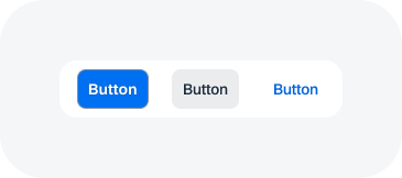
Button - enabled
Checkbox and radio button - enabled

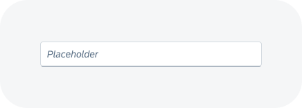
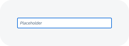
Input - enabled
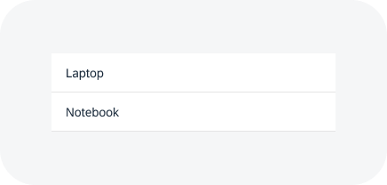
List - enabled
Disabled
A disabled component can’t currently be used. Disabled components have reduced visibility and aren’t focusable or editable.
Use:
- If a component can’t currently be used, but it’s obvious how to enable it.
Don’t Use:
- If the user can never enable the component. Hide it instead.
- If it wouldn’t be clear why a component is disabled. In this case, keep the component enabled and provide a message if it is used incorrectly.
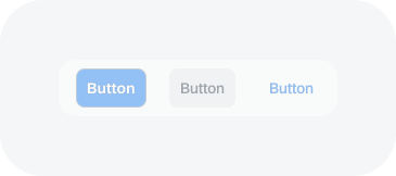
Button - disabled
Checkbox and radio button - disabled
Input - disabled
List - disabled
Read Only
Read-only components are displayed in edit mode, but aren’t editable. The component is fully legible and focusable. The value can be recognized and selected, but not changed.
Use:
- If a page or a part of it is in edit mode, and a component is currently not editable or changeable.
- If an input value must be readable.
Don’t Use:
- If a component can never become editable. Use alternatives instead (such as text, or display only).
Checkbox and radio button - read only
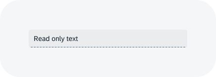
Input - read only
Text area - read only
Hidden
Hidden components are not visible, not focusable, and not editable. The component doesn’t take up any space.
Use:
- If a component can never be used (for example, because the role or group assigned to the user doesn’t include the necessary authorization).
- If hiding the component is a meaningful form of responsive behavior. Example: A column of a table isn’t needed on phones.
- If the component isn’t available for the current context.
- If parts of the UI are changed based on a setting.
Don’t Use:
- If a component can’t currently be used, but can be enabled by user actions.
Related Links
Text
Intro
You can use the text component to display a given text.
When to Use
Do
Use the text component if you want to display text inside a form, table, or other content area.
Don't
Don’t use the text component if you want to label another component (such as an input field). Use the label instead.
Behavior and Interaction
Wrapping and Truncation
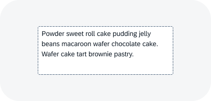
A text can wrap, truncate, or combine wrapping and truncation. In the combined variant, you define a maximum number of lines. The text wraps until the last line is reached and truncates at the end of the last line.
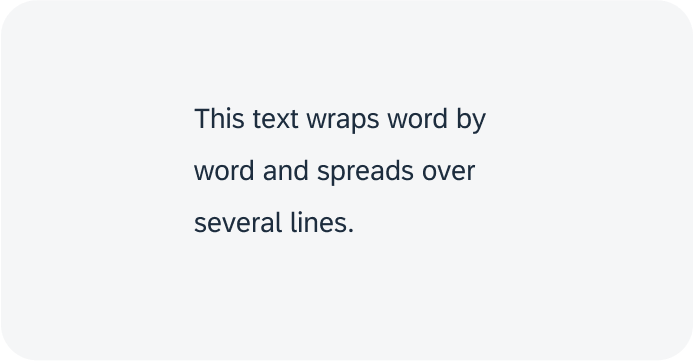
Text wraps
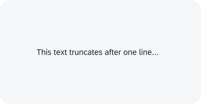
Text truncates
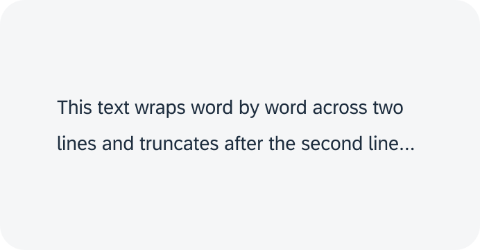
Combined wrapping and truncation with 2 lines
Wrapping with Hyphenation
Text can wrap with or without hyphenation. If you activate hyphenation, words that no longer fit into the current line are split in to syllables. Syllables that don’t fit into the current line are wrapped to the next line. The breakpoint is marked with a hyphen.
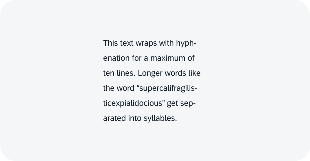
Text wraps with hyphenation
Preserve White Space
Some text formats can include spaces (such as ID formats with spaces and tabs). To ensure that these texts are displayed accurately, you can configure the text component to preserve white space within the text.
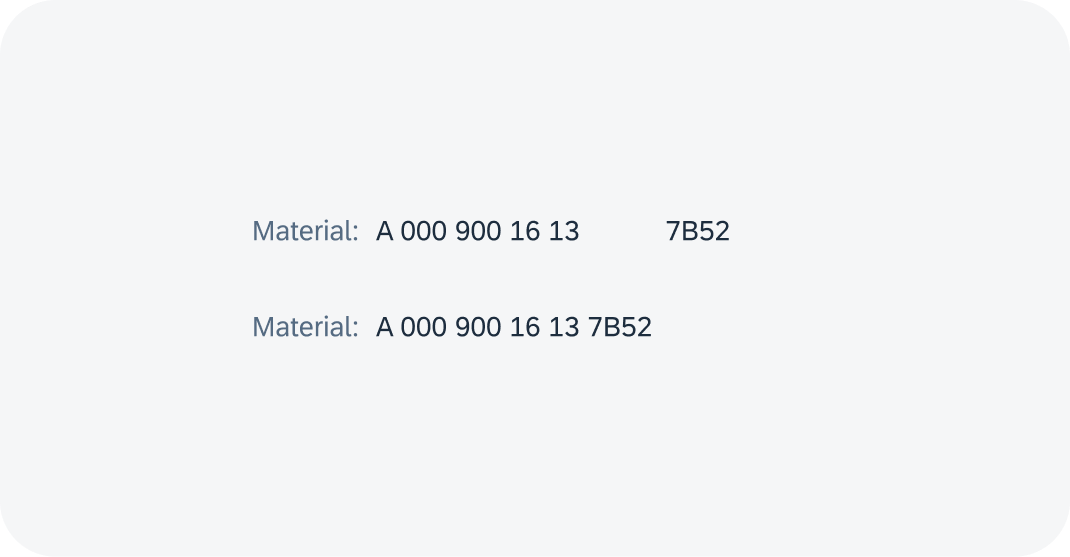
Text with and without preserved white space
Empty Indicator Mode
You can display an n-dash (“–”) to denote an empty text. This can make information easier for users to scan, such as empty values in forms.
Depending on the user’s language, the symbol may vary.
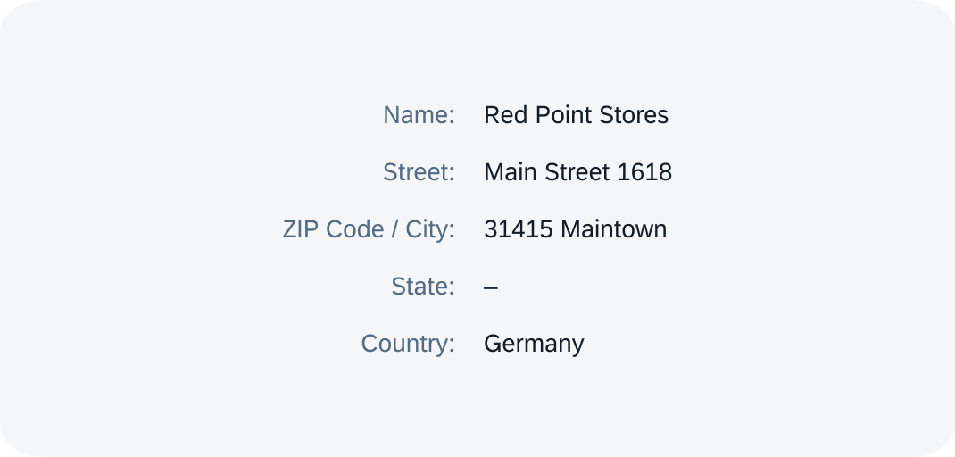
Empty text indicator in a form
Related Links
State Combinations
Some of the states can be used together with other states.
Permitted Combinations
Enabled components can be combined with the selection state, value state, and interaction state.
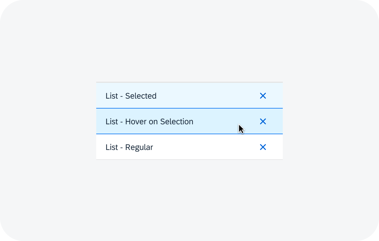
List - enabled state and selection state
The focus state can be combined with an interactive enabled or read-only component. At the same time, you can use other states like value states, selection states, or interaction states.
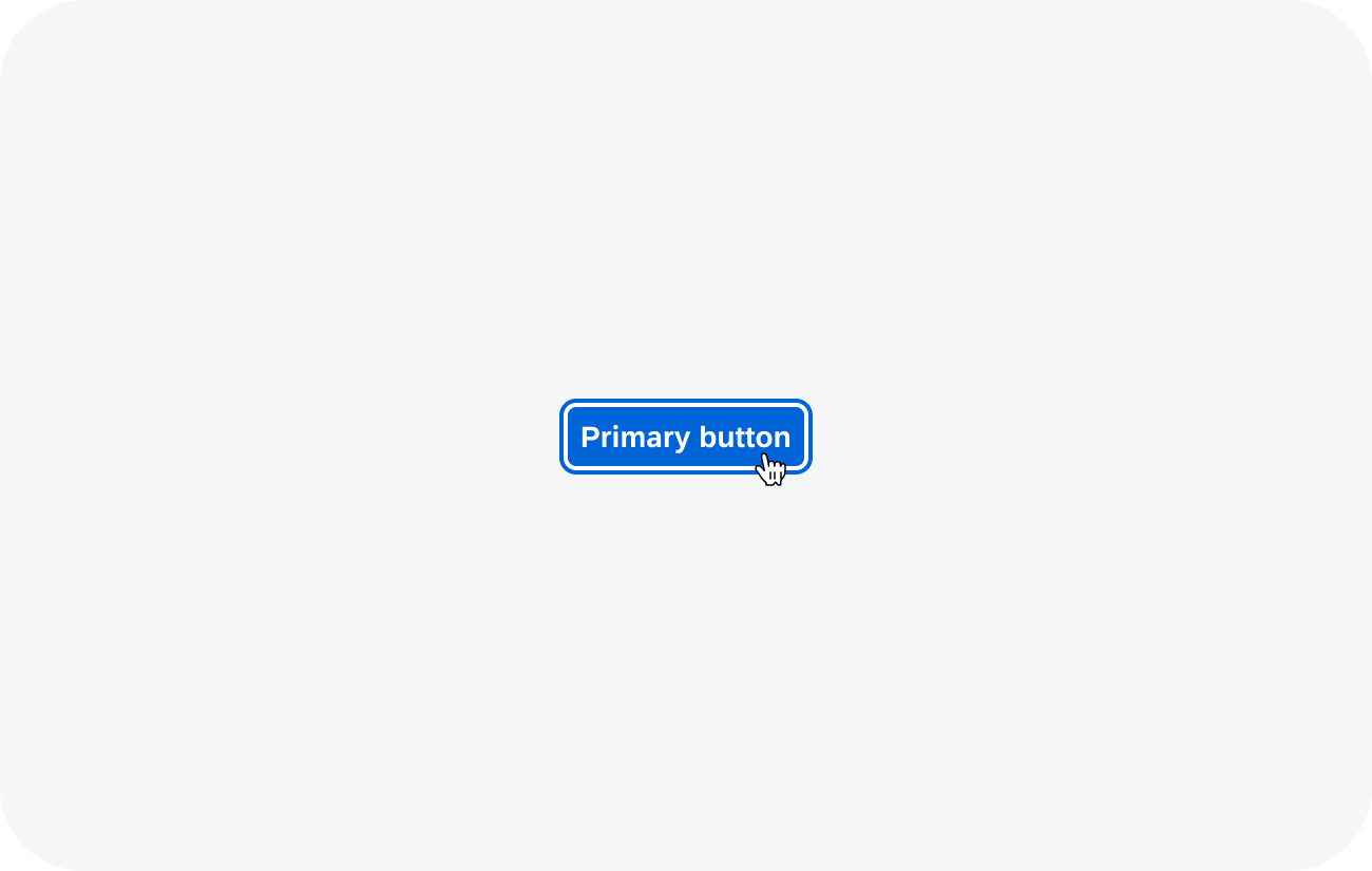
Button - interaction state (hover) and focus state
Read-only components can be combined with the down state (toggle only) and with the selected state.
Non-Permitted Combinations
Hidden and disabled components cannot be combined with any other state.
Related Links
Selection States
The selection state is applied after the user has selected the element. The selected element should be clearly distinguishable from the other elements.
Variants
The following selection states variants are available:
- Selected
- Unselected
- Indeterminate (partially selected)
Selected
The selected state shows that the UI element is currently selected.
It is only available for selectable components, such as checkboxes, radio buttons, items, switch, segmented buttons, toggle button, or tokenizer.
Use:
- If an item is selected.
- If the component can be “checked”.
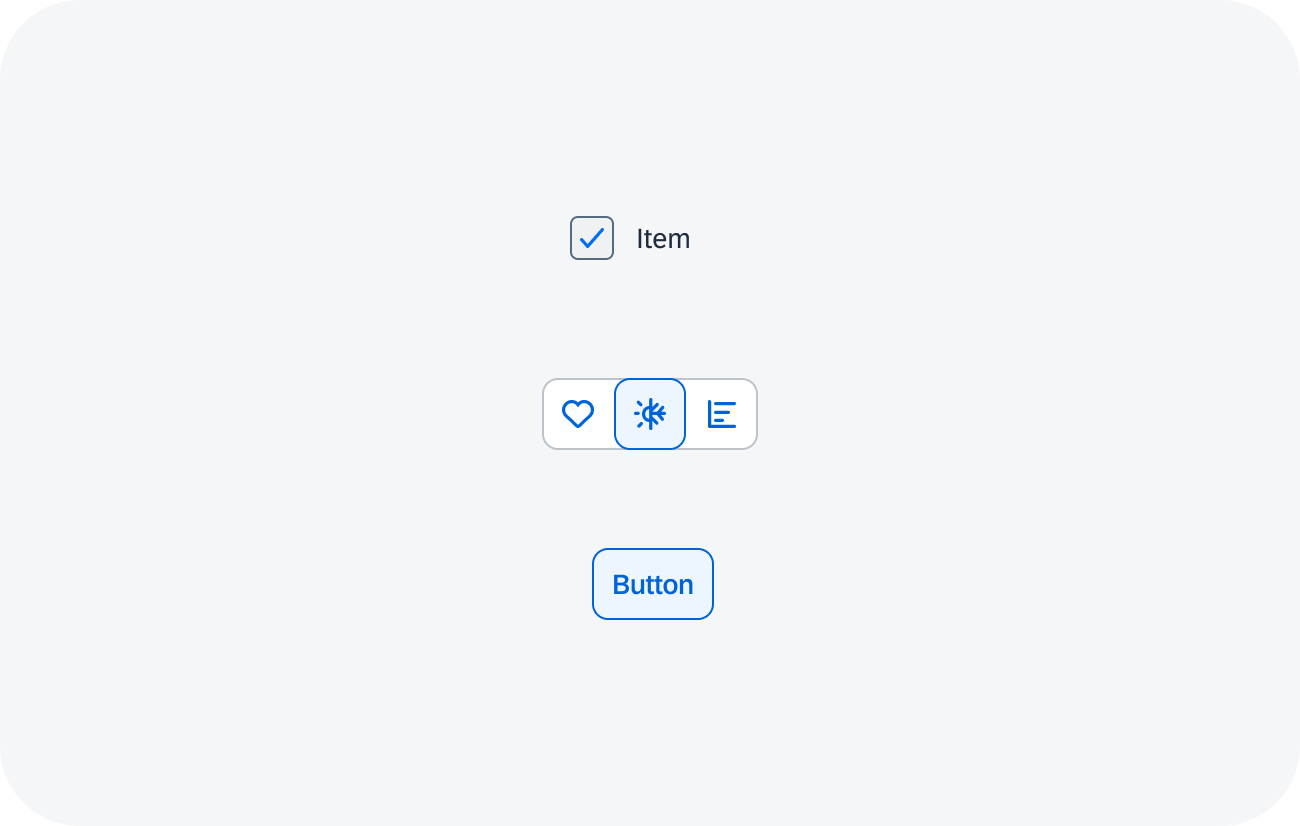
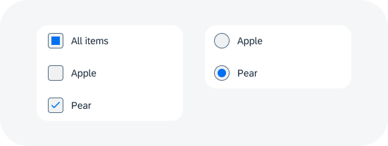
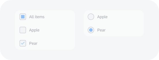
Checkbox, segmented button, and toggle button - selected state
Unselected
The unselected state is applied when the element is not selected – the element is in its regular state.
Use:
- If a UI element is not selected.
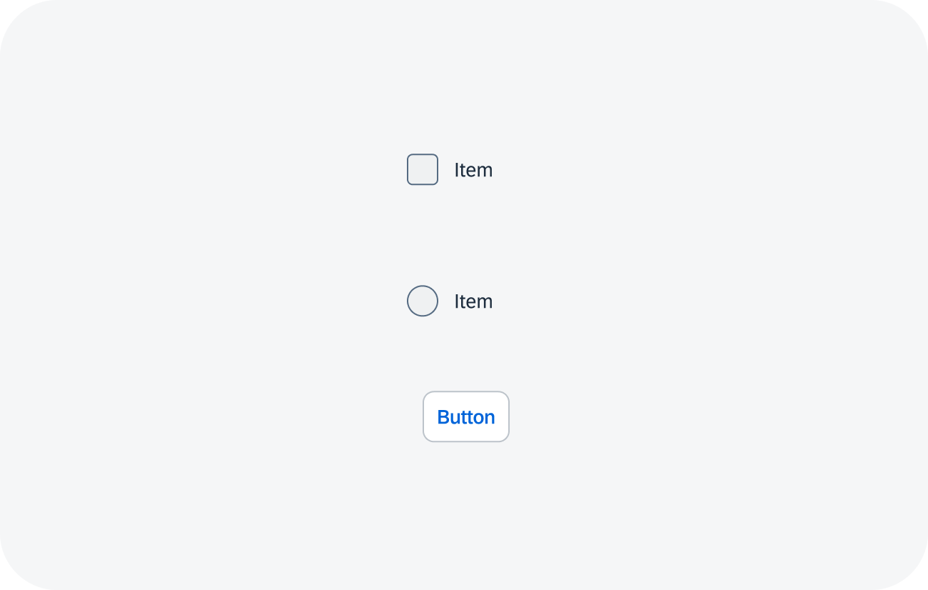
Checkbox, radio button, and toggle button - unselected state
Indeterminate
The indeterminate state is specific to multi-selection cases. It shows a state where no selection has been made, or the accumulated state for a list of checkboxes when only some of them are checked.
Use:
- If the parent in a tree has a mix of selected and unselected children, show the parent in the indeterminate state.
Don’t Use:
- If the use case requires the element to be either selected or not.
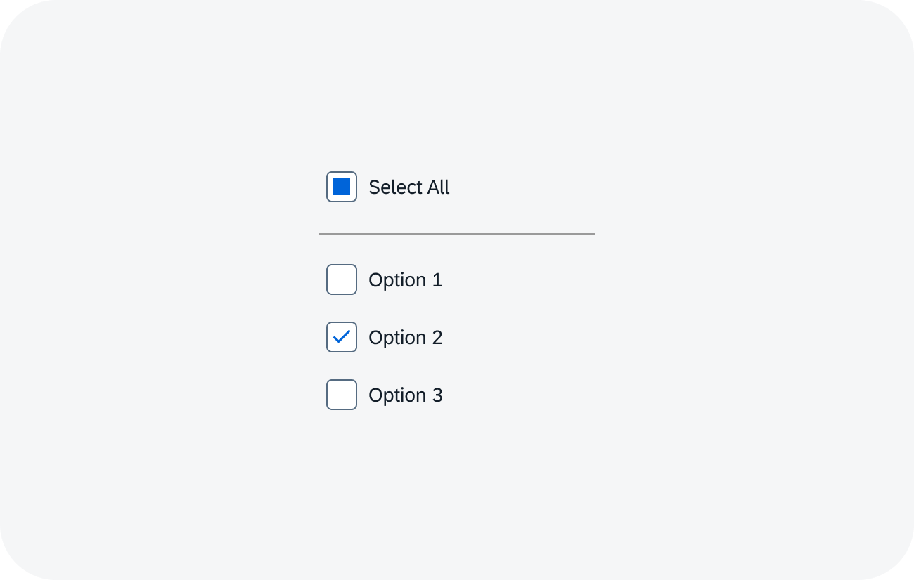
Checkbox - indeterminate state
Related Links
Focus States
Focus states determine which component receives the user‘s input when the input doesn’t supply positioning information. The focus state is most important for keyboard users.
Focused
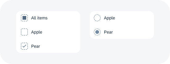
The component shows the focus state when it receives user input. If a keyboard is available, all interactive elements must provide a focus state.
Only one element can be focused at a time. If another element is focused, the previously focused element becomes unfocused.
Use:
- If an element is interactive.
- If a device has a remote control attached that allows users to move the focus (similar to remote controls for TVs or TV devices).
Don’t Use:
- If the component is disabled or hidden.
Exceptions are allowed for a few special cases, such as a disabled menu item.
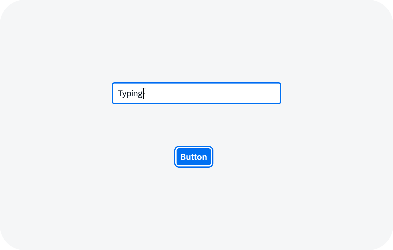
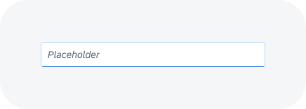
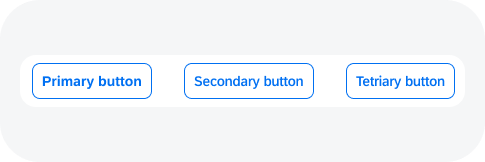
Input and button - focused state
Unfocused
The unfocused state is applied to all elements that aren’t focused.
Input and button - unfocused state
Related Links
Interaction States
Interaction states are handled by the corresponding component directly. A component can have only one interaction state at any given time.
Regular
The regular state is the default state. The component is shown in the regular visual state if the user isn’t interacting with it. It can also be focusable.
Button - regular state
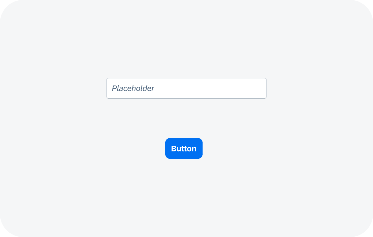
Input - regular state
Hover
The hover state shows that the cursor of a pointing device is currently placed on a component that is in an enabled state.
The hover state isn’t available if the component is used with keyboard and touch devices.
Don’t Use:
- If you need to provide additional information for a component. The hover state is only available for some interaction devices. When using other devices, the information is lost.
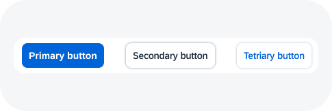
Button - hover state
Input - hover state
Down
The down state is displayed while the user is activating or triggering the element. The down state is only applied while the user is clicking and has not yet released the mouse. After the action has been performed and the user has released the mouse, the down state is removed.
Down, pressed, or active states are similar in meaning and are used in different contexts, depending on the component.
Button - down state
 Your feedback has been sent to the SAP Fiori design team.