
- Version 1.126
- SAPUI Version 1.124
- SAPUI5 Version 1.122
- SAPUI5 Version 1.120
- SAPUI5 Version 1.118
- SAPUI5 Version 1.116
- SAPUI5 Version 1.114
- SAPUI5 Version 1.112
- SAPUI5 Version 1.110
- SAPUI5 Version 1.108
- SAPUI5 Version 1.106
- SAPUI5 Version 1.104
- SAPUI5 Version 1.102
- SAPUI5 Version 1.100
- SAPUI5 Version 1.98
- SAPUI5 Version 1.96
- SAPUI5 Version 1.94
- SAPUI5 Version 1.92
- SAPUI5 Version 1.90
- SAPUI5 Version 1.88
- SAPUI5 Version 1.86
- SAPUI5 Version 1.84
- SAPUI5 Version 1.82
- SAPUI5 Version 1.80
- SAPUI5 Version 1.78
- SAPUI5 Version 1.76
- SAPUI5 Version 1.74
- SAPUI5 Version 1.72
- SAPUI5 Version 1.70
- SAPUI5 Version 1.68
- SAPUI5 Version 1.66
- SAPUI5 Version 1.64
- SAPUI5 Version 1.62
- SAPUI5 Version 1.60
- SAPUI5 Version 1.58
- SAPUI5 Version 1.56
- SAPUI5 Version 1.54
- SAPUI5 Version 1.52
- SAPUI5 Version 1.50
- SAPUI5 Version 1.48
- SAPUI5 Version 1.46
- SAPUI5 Version 1.44
- SAPUI5 Version 1.42
- SAPUI5 Version 1.40
- SAPUI5 Version 1.38
- SAPUI5 Version 1.36
- SAPUI5 Version 1.34
- SAPUI5 Version 1.32
- SAPUI5 Version 1.30
- SAPUI5 Version 1.28
- SAPUI5 Version 1.26
- Latest Version 1.128
- Version 1.126
- SAPUI Version 1.124
- SAPUI5 Version 1.122
- SAPUI5 Version 1.120
- SAPUI5 Version 1.118
- SAPUI5 Version 1.116
- SAPUI5 Version 1.114
- SAPUI5 Version 1.112
- SAPUI5 Version 1.110
- SAPUI5 Version 1.108
- SAPUI5 Version 1.106
- SAPUI5 Version 1.104
- SAPUI5 Version 1.102
- SAPUI5 Version 1.100
- SAPUI5 Version 1.98
- SAPUI5 Version 1.96
- SAPUI5 Version 1.94
- SAPUI5 Version 1.92
- SAPUI5 Version 1.90
- SAPUI5 Version 1.88
- SAPUI5 Version 1.86
- SAPUI5 Version 1.84
- SAPUI5 Version 1.82
- SAPUI5 Version 1.80
- SAPUI5 Version 1.78
- SAPUI5 Version 1.76
- SAPUI5 Version 1.74
- SAPUI5 Version 1.72
- SAPUI5 Version 1.70
- SAPUI5 Version 1.68
- SAPUI5 Version 1.66
- SAPUI5 Version 1.64
- SAPUI5 Version 1.62
- SAPUI5 Version 1.60
- SAPUI5 Version 1.58
- SAPUI5 Version 1.56
- SAPUI5 Version 1.54
- SAPUI5 Version 1.52
- SAPUI5 Version 1.50
- SAPUI5 Version 1.48
- SAPUI5 Version 1.46
- SAPUI5 Version 1.44
- SAPUI5 Version 1.42
- SAPUI5 Version 1.40
- SAPUI5 Version 1.38
- SAPUI5 Version 1.36
- SAPUI5 Version 1.34
- SAPUI5 Version 1.32
- SAPUI5 Version 1.30
- SAPUI5 Version 1.28
- SAPUI5 Version 1.26
Table Toolbar
Intro
The SAP Fiori elements templates support the features and settings for the table toolbar detailed below.
For design information, see the guidelines starting with Table Overview, and see the links below.
Feature Availability
List Report and Object Page Features |
Availability |
| Title | Visible by default.
You can hide it. You can show the table row count next to the title. |
| Infobar | Default for all table types, the infobar summarizes the filter criteria applied to the table data. It is displayed below the table toolbar and above the column headings when at least one filter is set. |
| Order of Toolbar Actions | With SAP Fiori elements for OData V4, you can order the toolbar actions according to their importance, starting with the most frequently-used action and ending with the most seldom-used action, regardless of whether the action is a custom or standard one. |
| Table Personalization Actions | Default, you can turn them off. |
| Show/Hide Details | Available in responsive tables |
| Mass Edit | Available in draft-enabled applications:
|
| Export | With SAP Fiori elements for OData V4:
With SAP Fiori elements for OData V2, Export to Excel is enabled by default in:
|
| Copy to Clipboard | The Copy button is displayed in the table toolbar by default. |
| Paste from Clipboard | The Paste icon is displayed only if the table supports the paste action. |
| Application-Specific Actions | Available |
| Actions Disabled Before Row Selection | Available |
| Conditional Enablement of Navigation Buttons | Available with SAP Fiori elements for OData V4
Requires an extension with SAP Fiori elements for OData V2 |
| Messages for Critical Actions | Available |
| Messages for Destructive Actions | Available |
| Multiple Views on a Table | Available |
List Report Only Features |
Availability |
| Toolbar Sticky Behavior | Default, you can turn it off. |
| Standard Actions: Create and Delete | Default, you can turn them off. |
| Object Creation via an Object Page | Default, you can change it. |
| Object Creation via a Dialog | Available in certain conditions |
| Object Creation with Reference to Another Object | Available as a custom create with SAP Fiori elements for OData V4 |
| Copy Object | Available
You determine the label on the action button. |
| Hiding Actions in Multiple Content Layout | Available |
| Message Strip for the Table | Available, a message strip can display all the messages related to the table in their order of severity. |
| Add Card to Insights | Default when My Home in SAP S/4HANA Cloud is enabled.
You can turn it off. |
Object Page Only Features |
Availability |
| Search | Available, when the data allows it. |
| Edit | Default, when the data allows it. |
| Delete | Default, when the data allows it. |
| Subobject Creation via Subobject Page | Default, you can change it. |
| Subobject Creation via Dialog | Available for applications that are not draft-enabled in certain conditions |
| Create Not Visible | In certain conditions |
| Inline Creation | Available, in draft-enabled applications for grid and responsive tables |
| Prefilling Fields for New Object Creation | Available, in draft-enabled applications |
| Full Screen Mode for Table Display | Available, not recommended |
| Segmented Button for Switching Table Views | Default for a table with a maximum of three views |
| Select Control for Switching Table Views | Default for a table with four or more views |
List Report and Object Page Features
The information below relates to table toolbar actions and settings in both the list report and object page floorplans.
Table Personalization Actions
By default, Sort, Group and Order actions are enabled for the table. They are available in the Personalization dialog as tabs. Users open the dialog via the Settings icon button.
For specific use cases, you can disable the actions.
Table-level view management is not a prerequisite for personalization.
For more information, see Table Personalization (Overview).
Show / Hide Details
The responsive table toolbar displays the Show Details action when at least one column is hidden from the screen because of limited onscreen space.
After the user clicks Show Details, the the table displays the hidden information in the pop-in area, and the action changes to Hide Details.
The importance assigned to a column determines whether or not the table displays its values onscreen when screen space is limited:
- The values from high importance columns are always displayed onscreen — as columns or in the pop-in area, depending on the screen size.
- The values in columns with low importance are first to be hidden.
By default in responsive tables:
- Key fields have the importance set to high in list reports.
- Other columns have the importance set to none and are handled like columns assigned medium importance.
You can change the level of importance.
Mass Edit
You can enable mass edit in responsive tables and grid tables for applications with draft handling in the:
- List report with SAP Fiori elements for OData V2
- List report and object page with SAP Fiori elements for OData V4
List Report
Users cannot apply the mass edit to a draft record.
The edit is applied to all the objects selected that don’t return errors or warnings during the update. When they do return an error or warning, none of their fields are updated.
Object Page
With SAP Fiori elements for OData V4, you can enable the mass edit for a table in the object page. When the object page is in display mode, users can apply the mass edit to the subobjects in a table.
Fields Displayed in the Edit Dialog
By default, the Edit dialog contains all the table columns that are currently visible and editable.
The application team can define the fields that display in the dialog, by both:
- Including fields in the dialog that are not displayed in the table
- Excluding fields from the dialog fields that are displayed in the table
Export
The export action exports the values in a table. When enabled, it is displayed in the table toolbar.
- With SAP Fiori elements for OData V4:
- Export to Spreadsheet is enabled by default.
- Export to PDF is available.
- By default, a maximum of 1000 rows can be exported. The application development team can change the limit.
- Columns that contain a multi-input field (1:N) are not exported.
- With SAP Fiori elements for OData V2 Export to Excel is enabled by default in:
- A list report table
- An object page table if the Paste icon is available
For more information see Export to Spreadsheet.
Copy and Paste
Users can copy data from external applications — such as Microsoft Excel or Microsoft Word — or from other SAP Fiori elements applications to the clipboard, and then paste the data from the clipboard to tables in SAP Fiori elements applications that are editable.
Copy to Clipboard
By default, the Copy action is displayed in the table toolbar.
With it, users can copy multiple rows or ranges of rows and columns to the clipboard.
They can select a range of cells in rows or columns:
- With their mouse, by clicking and holding the mouse button while they select the cells
- With the key combinations, described in Copying Multiple Rows and Range Selections
Paste from Clipboard
The Paste action is displayed in the table toolbar if the table supports it.
After users copy data from another SAP Fiori elements application or an external application, they can paste it to:
- The table
Users set the focus on the table or select an empty row before pasting the data. One or more new rows are created for the pasted data.
This feature is available only for draft-enabled applications and for tables where inline creation or the insertion of empty rows has been enabled.
- A cell or range of cells, only in grid and responsive tables
Users select a cell or cell range within the table and paste the data. If the selected cell or cells are in:
-
- Active or draft rows, the pasted data replaces the values in those rows.
- An empty row, new rows are created for the pasted data.
To paste, they can use the Paste action in the toolbar or use a keyboard shortcut (Ctrl+V for Microsoft Windows, Cmd+V for MacOS).
Limitations
- Pasting is supported only for fields that contain a single value, not for complex fields, such as smart links and images.
- If there are validation errors, a dialog displays an error message so the user can take remedial action.
- The greater the number of records copied, the longer the paste operation takes.
- The order of the of the data copied from the spreadsheet can differ from the order in the table in the application after the paste. SAP Fiori elements cannot control this.
- Users cannot paste data into custom columns of tables.
- This feature is not supported for custom tables.
Application-Specific Actions
You can define these actions and the text displayed on the buttons.
The application team can control when the action button is displayed and enabled.
For application-specific actions, application teams can define custom keyboard shortcuts.
For more information, see:
Actions Disabled Until the User Selects a Row
You can set actions in the table toolbar to display as disabled until the user selects one or more table rows for the action.
Note that the development team may call actions that require selection “context-dependent” actions and actions that are enabled without a selection “context-independent” actions.
For more information, see UI Element States.
Conditional Enablement of Navigation Buttons
With SAP Fiori elements for OData V4, you can enable buttons that navigate the user to another page or application based on the value of a specific field.
With SAP Fiori elements for OData V2, this feature requires extensions.
For example, you can enable the Generate Purchase Order button only for sales orders with the completed status.
Messages for Critical Actions
For actions that you set as critical, you can display one of the following after the user triggers the action:
- A message toast confirmation
- A confirmation message box to ensure the user wants to proceed with specific critical actions
Also, the backend can require a confirmation on some actions. In this case, the confirmation message is always shown in a message box.
Example
| SAP Fiori elements for OData V2 | SAP Fiori elements for OData V4 | |
| Default Text | “Do you really want to execute the action <Action Label>?”
<Action Label> is the label shown on the button. |
“Do you really want to perform this action? |
| Replacement Text | “Are you sure you really want to activate this product?” | “Are you sure you really want to activate this product?” |
For more information, see:
Messages for Destructive Actions
By default, a message is displayed for confirmation of an action that will delete or destroy important data.
Example
| SAP Fiori elements for OData V2 | SAP Fiori elements for OData V4 | |
| Default Text | The default message reuses the title and the description defined for the object in the table.
|
“Do you really want to perform this action? |
| Replacement Text | “Are you sure you really want to delete this product?” | “Are you sure you really want to delete this product?” |
For more information, see:
Multiple Views for a Table
You can display a table with multiple views, for example, each view of the same table can display different columns or prefiltered states.
For a maximum of three views, a segmented button is displayed. For four or more, the select control is displayed.
With SAP Fiori elements for V4, you can also display the row count for each view next to the view name.
List Report Only Features
The information below relates only to table toolbar actions and settings in the list report floorplan.
Standard Actions
By default, Create and Delete are enabled.
You can disable them.
You can also enable or disable the Delete button based on conditions specified in the backend.
Example
You can disable deletion for a sales order that has already been paid. When a user selects an item that cannot be deleted, the Delete button is disabled. In addition, if the user navigates from this item in the list report to the object page, the Delete button is hidden.
Create Object Actions
By default, the create via the object page feature is enabled. The create action opens the object page in create mode so the user can enter the data. Alternatively, you can enable object creation as described the sections below:
Via a Dialog
The action opens a dialog in modal view so the user can enter the data.
With SAP Fiori elements for OData V2, you can:
- Include a maximum of eight fields in the dialog
- Enable filter values saved in the filter bar to prefill fields in the dialog
With Default Values That Prefill Fields for the New Object
This feature is available with:
- SAP Fiori elements for OData V2 for applications without draft handling
- SAP Fiori elements for OData V4
Via a Dialog with a Reference to an Existing Object of the Same Type
With SAP Fiori elements for OData V4, application developers can build a custom create action via a dialog that lets the user create a new object with a reference to an existing object of the same type.
The user:
- Clicks the action button.
You can name the button to suit your use case. - Selects the value of the existing object to reference in the dialog.
- Completes the fields for the new object by selecting one or more values to copy from the existing one.
- Completes additional fields for the new object in the object page.
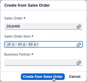
Create from existing object
Copy Object
You can place a copy action button in the table toolbar to let the user to create a new object with the same data as the selected object.
You set the label for the button according to your use case. Otherwise, the default label is Copy.
In the toolbar, the Copy button is displayed after the Create button.
Hiding Actions in Multiple Content Layout
You can hide an action from a toolbar for a specific table when the list report contains multiple views with multiple tables.
For more information, see:
Add Card to Insights
By default, the Add Card to Insights option is displayed in the overflow toolbar of list report tables with the single content layouts when My Home in SAP S/4HANA Cloud is enabled.
You can ask the application development team to turn the option off.
For more information, see: Simple Content Layout.
Object Page Only Features
The information below relates only to table toolbar actions and settings in the object page floorplan.
Search
You can enable a search on the table.
The limit for search strings is 1000 characters.
For more information, see Search.
Edit
By default, Edit is displayed when the business object shown in the table is editable.
Delete
By default, Delete is displayed in edit mode when the business object shown in the table is deletable.
You can enable or disable the Delete action to allow users to delete only in certain conditions.
For example, after the sales items for a Sales Order have shipped, you can hide the Delete action for the items. When a user selects an item that cannot be deleted, the Delete action is disabled.
When multiple selection is enabled for the table, the Delete action is enabled if at least one selected item is deletable.
Subobject Creation
By default:
- Create is displayed in edit mode when the business object shown in the table is editable. For specific circumstances when the Create button is disabled, see Create Action Visibility below.
- The default creation action is via the suboject page — the action opens the subobject page in create mode so the user can enter the data.
You can:
- Enable or disable the Create action to allow users to create subobjects only in certain conditions. For example, after a sales order reaches the Delivery is Shipped status, you can hide the Create Sales Item action.
- Enable creation of a subobject via a dialog with 8 fields maximum. The action opens a dialog in modal view so the user can enter the data. The dialog must contain all the mandatory fields for the subobject. With SAP Fiori elements for OData V2, you can enable filter values saved in the filter bar to prefill fields in the Create dialog.
- Enable inline create for draft-enabled applications in grid and responsive tables with SAP Fiori elements for V4. See Inline Creation below.
- Enable default values to prefill the fields for the new object. This feature is available with SAP Fiori elements for OData V4, and with SAP Fiori elements for OData V2 for applications without draft handling.
For more information, see:
Create Action Visibility
Whether or not the Create action is visible in the table toolbar depends on:
- The object page mode.
- Whether the flow is global or local.
- Where the user enters the data for the new subobject — in the subobject page or directly in the table with the inline edit.
| Flow Type | Read Mode for All Tables | Edit Mode for Tables with Subobject Pages | Edit Mode for Tables with Inline Edit |
Global Flow for Draft-EnabledApplications with Fiori Elements for OData V2 |
|
|
|
Local Flow for Non-Draft Enabled Applications |
|
|
Not Supported. |
Inline Creation
You can enable inline creation of entries for applications with draft handling enabled. The Create action is displayed in the table toolbar in edit mode.
The inline creation adds a new row to the table where the users can enter the subobject data.
By default, the new row is highlighted in blue and displayed at the top of the table. The highlighting disappears after the users save the data.
You can:
- Work with the development team to define a custom sort order.
- Enable default values to prefill the fields for the new object.
For more information, see Add Items.
Prefilling Fields for a New Object
You can turn this on in draft-enabled applications for the default create action via the object page, where the user navigates to another application to enter the data in the new object page.
The new object must be the main object on the object page.
You determine both the fields to prefill and the default values for the fields.
Full Screen Mode for Table Display
You can enable full screen mode for a table. However, it is generally not recommended.
Users click the Maximize action in the toolbar to display to the table in a dialog. They can return to the object page by clicking either the Minimize or Close action.
For more information on the restrictions for this feature, see Maximize/Minimize.
Content Switch for Table Views
The number of views defined for a table determines the UI control that lets users switch the table views:
- A segmented button for a maximum of three views
- A select control for four or more views.
By default, the count or number of records in the view is not displayed next to the title of the content switch for table views for performance reasons. Talk to the development team about how displaying the counts impacts performance for your use case.
Related Links
Elements and Controls
- Table Overview (guidelines)
- Table Personalization (Overview) (guidelines)
- List Report Floorplan (guidelines)
- Object Page Floorplan (guidelines)
- Infobar (guidelines)
 Your feedback has been sent to the SAP Fiori design team.