
Updated: July 16, 2024
Latest Version 1.128
- Version 1.126
- SAPUI Version 1.124
- SAPUI5 Version 1.122
- SAPUI5 Version 1.120
- SAPUI5 Version 1.118
- SAPUI5 Version 1.116
- SAPUI5 Version 1.114
- SAPUI5 Version 1.112
- SAPUI5 Version 1.110
- SAPUI5 Version 1.108
- SAPUI5 Version 1.106
- SAPUI5 Version 1.104
- SAPUI5 Version 1.102
- SAPUI5 Version 1.100
- SAPUI5 Version 1.98
- SAPUI5 Version 1.96
- SAPUI5 Version 1.94
- SAPUI5 Version 1.92
- SAPUI5 Version 1.90
- SAPUI5 Version 1.88
- SAPUI5 Version 1.86
- SAPUI5 Version 1.84
- SAPUI5 Version 1.82
- SAPUI5 Version 1.80
- SAPUI5 Version 1.78
- SAPUI5 Version 1.76
- SAPUI5 Version 1.74
- SAPUI5 Version 1.72
- SAPUI5 Version 1.70
- SAPUI5 Version 1.68
- SAPUI5 Version 1.66
- SAPUI5 Version 1.64
- SAPUI5 Version 1.62
- SAPUI5 Version 1.60
- SAPUI5 Version 1.58
- SAPUI5 Version 1.56
- SAPUI5 Version 1.54
- SAPUI5 Version 1.52
- SAPUI5 Version 1.50
- SAPUI5 Version 1.48
- SAPUI5 Version 1.46
- SAPUI5 Version 1.44
- SAPUI5 Version 1.42
- SAPUI5 Version 1.40
- SAPUI5 Version 1.38
- SAPUI5 Version 1.36
- SAPUI5 Version 1.34
- SAPUI5 Version 1.32
- SAPUI5 Version 1.30
- SAPUI5 Version 1.28
- SAPUI5 Version 1.26
- Latest Version 1.128
- Version 1.126
- SAPUI Version 1.124
- SAPUI5 Version 1.122
- SAPUI5 Version 1.120
- SAPUI5 Version 1.118
- SAPUI5 Version 1.116
- SAPUI5 Version 1.114
- SAPUI5 Version 1.112
- SAPUI5 Version 1.110
- SAPUI5 Version 1.108
- SAPUI5 Version 1.106
- SAPUI5 Version 1.104
- SAPUI5 Version 1.102
- SAPUI5 Version 1.100
- SAPUI5 Version 1.98
- SAPUI5 Version 1.96
- SAPUI5 Version 1.94
- SAPUI5 Version 1.92
- SAPUI5 Version 1.90
- SAPUI5 Version 1.88
- SAPUI5 Version 1.86
- SAPUI5 Version 1.84
- SAPUI5 Version 1.82
- SAPUI5 Version 1.80
- SAPUI5 Version 1.78
- SAPUI5 Version 1.76
- SAPUI5 Version 1.74
- SAPUI5 Version 1.72
- SAPUI5 Version 1.70
- SAPUI5 Version 1.68
- SAPUI5 Version 1.66
- SAPUI5 Version 1.64
- SAPUI5 Version 1.62
- SAPUI5 Version 1.60
- SAPUI5 Version 1.58
- SAPUI5 Version 1.56
- SAPUI5 Version 1.54
- SAPUI5 Version 1.52
- SAPUI5 Version 1.50
- SAPUI5 Version 1.48
- SAPUI5 Version 1.46
- SAPUI5 Version 1.44
- SAPUI5 Version 1.42
- SAPUI5 Version 1.40
- SAPUI5 Version 1.38
- SAPUI5 Version 1.36
- SAPUI5 Version 1.34
- SAPUI5 Version 1.32
- SAPUI5 Version 1.30
- SAPUI5 Version 1.28
- SAPUI5 Version 1.26
Illustrated Message
ui5-illustrated-message | v1.0
Intro
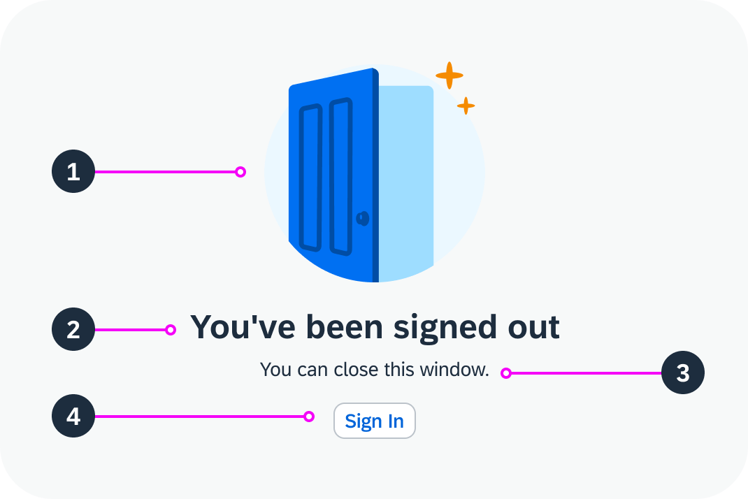
An illustrated message is a combination of a solution-oriented message, engaging illustration, and conversational tone to better communicate an empty state than just a message alone.
Illustrated message – live example
When to Use
Do
Use the illustrated message:
- To improve the user experience for one or more empty states or message states in your application.
Don't
Don’t use the illustrated message:
- For decoration purposes or as a simple image.
- If you want to display a person or a product image. Use the avatar instead.
- To display problem-oriented messages.
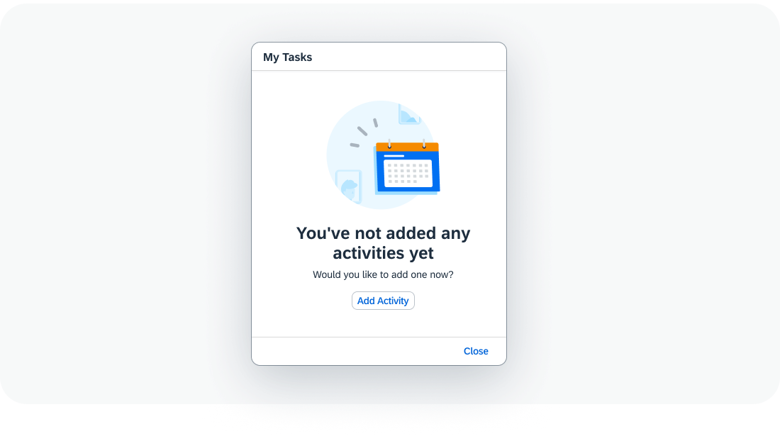
Anatomy
- Illustration: Helps clarify the situation. The illustration must always be paired with a message.
- Headline: Explains the reason for the empty state, preferably in a single line.
- Description: Adds details and, where appropriate, tells the user what to do next, in three lines or less.
- Button (optional): If there is a clear next step, include a call to action (CTA) button.
Anatomy of an illustrated message
Variants
An illustrated message has a set of five UX illustrations per use case: scene, dialog, spot, dot, and base. Each variant has a different size and level of detail. The illustration sizes are used at different breakpoints to ensure that the illustration is always appealing, regardless of the container size.
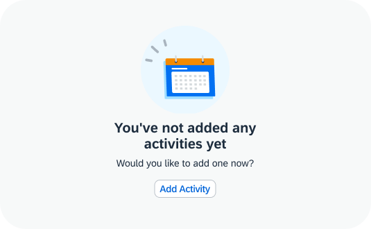
Scene
Illustrated message - scene size in an empty page
Dialog
Illustrated message - dialog size
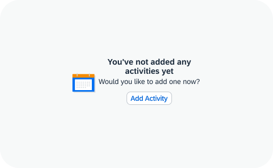
Spot
Illustrated message - spot size for small containers, such as cards
Dot
Illustrated message - dot size for small cards or tiles
Base
Illustrated message - base size with no image (for example, in a table cell)
Behavior and Interaction
The illustrated message uses a button for the call to action.
Illustrated message – live example
Globalization and Localization
The illustrated message supports left-to-right (LTR) and right-to-left (RTL) reading directions.
 Your feedback has been sent to the SAP Fiori design team.