
- Version 1.126
- SAPUI Version 1.124
- SAPUI5 Version 1.122
- SAPUI5 Version 1.120
- SAPUI5 Version 1.118
- SAPUI5 Version 1.116
- SAPUI5 Version 1.114
- SAPUI5 Version 1.112
- SAPUI5 Version 1.110
- SAPUI5 Version 1.108
- SAPUI5 Version 1.106
- SAPUI5 Version 1.104
- SAPUI5 Version 1.102
- SAPUI5 Version 1.100
- SAPUI5 Version 1.98
- SAPUI5 Version 1.96
- SAPUI5 Version 1.94
- SAPUI5 Version 1.92
- SAPUI5 Version 1.90
- SAPUI5 Version 1.88
- SAPUI5 Version 1.86
- SAPUI5 Version 1.84
- SAPUI5 Version 1.82
- SAPUI5 Version 1.80
- SAPUI5 Version 1.78
- SAPUI5 Version 1.76
- SAPUI5 Version 1.74
- SAPUI5 Version 1.72
- SAPUI5 Version 1.70
- SAPUI5 Version 1.68
- SAPUI5 Version 1.66
- SAPUI5 Version 1.64
- SAPUI5 Version 1.62
- SAPUI5 Version 1.60
- SAPUI5 Version 1.58
- SAPUI5 Version 1.56
- SAPUI5 Version 1.54
- SAPUI5 Version 1.52
- SAPUI5 Version 1.50
- SAPUI5 Version 1.48
- SAPUI5 Version 1.46
- SAPUI5 Version 1.44
- SAPUI5 Version 1.42
- SAPUI5 Version 1.40
- SAPUI5 Version 1.38
- SAPUI5 Version 1.36
- SAPUI5 Version 1.34
- SAPUI5 Version 1.32
- SAPUI5 Version 1.30
- SAPUI5 Version 1.28
- SAPUI5 Version 1.26
- Latest Version 1.128
- Version 1.126
- SAPUI Version 1.124
- SAPUI5 Version 1.122
- SAPUI5 Version 1.120
- SAPUI5 Version 1.118
- SAPUI5 Version 1.116
- SAPUI5 Version 1.114
- SAPUI5 Version 1.112
- SAPUI5 Version 1.110
- SAPUI5 Version 1.108
- SAPUI5 Version 1.106
- SAPUI5 Version 1.104
- SAPUI5 Version 1.102
- SAPUI5 Version 1.100
- SAPUI5 Version 1.98
- SAPUI5 Version 1.96
- SAPUI5 Version 1.94
- SAPUI5 Version 1.92
- SAPUI5 Version 1.90
- SAPUI5 Version 1.88
- SAPUI5 Version 1.86
- SAPUI5 Version 1.84
- SAPUI5 Version 1.82
- SAPUI5 Version 1.80
- SAPUI5 Version 1.78
- SAPUI5 Version 1.76
- SAPUI5 Version 1.74
- SAPUI5 Version 1.72
- SAPUI5 Version 1.70
- SAPUI5 Version 1.68
- SAPUI5 Version 1.66
- SAPUI5 Version 1.64
- SAPUI5 Version 1.62
- SAPUI5 Version 1.60
- SAPUI5 Version 1.58
- SAPUI5 Version 1.56
- SAPUI5 Version 1.54
- SAPUI5 Version 1.52
- SAPUI5 Version 1.50
- SAPUI5 Version 1.48
- SAPUI5 Version 1.46
- SAPUI5 Version 1.44
- SAPUI5 Version 1.42
- SAPUI5 Version 1.40
- SAPUI5 Version 1.38
- SAPUI5 Version 1.36
- SAPUI5 Version 1.34
- SAPUI5 Version 1.32
- SAPUI5 Version 1.30
- SAPUI5 Version 1.28
- SAPUI5 Version 1.26
Component States
Intro
The component state determines the interactivity and the visibility of the component. A component can have only one component state at any given time.
Enabled
An enabled component can be interactive and can be used to perform the action. Usually, this is the default state for all components. The component is focusable, visible, and – if applicable – editable.
Use:
- If a component can currently be used.
Don’t Use:
- If a component can’t currently be used.
- If a component can’t be used at all. Hide it instead.
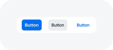
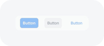
Button - enabled
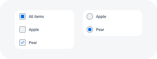
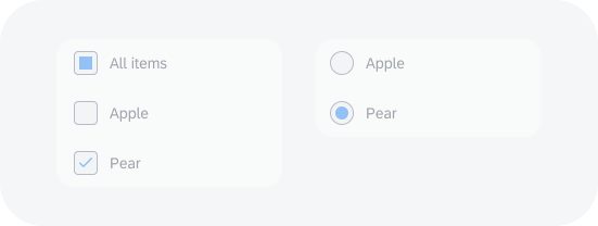
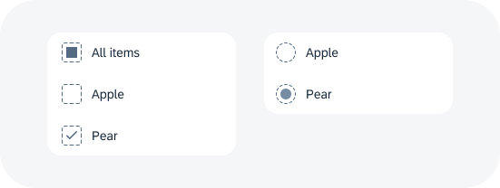
Checkbox and radio button - enabled
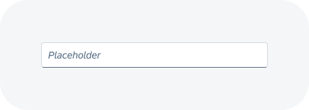
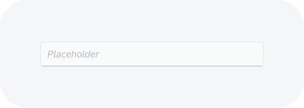
Input - enabled
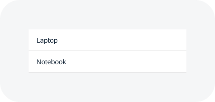
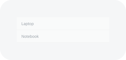
List - enabled
Disabled
A disabled component can’t currently be used. Disabled components have reduced visibility and aren’t focusable or editable.
Use:
- If a component can’t currently be used, but it’s obvious how to enable it.
Don’t Use:
- If the user can never enable the component. Hide it instead.
- If it wouldn’t be clear why a component is disabled. In this case, keep the component enabled and provide a message if it is used incorrectly.
Button - disabled
Checkbox and radio button - disabled
Input - disabled
List - disabled
Read Only
Read-only components are displayed in edit mode, but aren’t editable. The component is fully legible and focusable. The value can be recognized and selected, but not changed.
Use:
- If a page or a part of it is in edit mode, and a component is currently not editable or changeable.
- If an input value must be readable.
Don’t Use:
- If a component can never become editable. Use alternatives instead (such as text, or display only).
Checkbox and radio button - read only
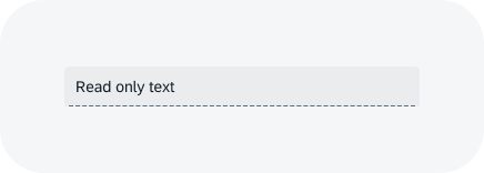
Input - read only
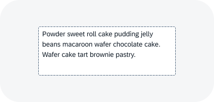
Text area - read only
Hidden
Hidden components are not visible, not focusable, and not editable. The component doesn’t take up any space.
Use:
- If a component can never be used (for example, because the role or group assigned to the user doesn’t include the necessary authorization).
- If hiding the component is a meaningful form of responsive behavior. Example: A column of a table isn’t needed on phones.
- If the component isn’t available for the current context.
- If parts of the UI are changed based on a setting.
Don’t Use:
- If a component can’t currently be used, but can be enabled by user actions.
 Your feedback has been sent to the SAP Fiori design team.