Download Fonts

You can use the links below to download the following SAP fonts:

Installing the 72 font family and the SAP icon font are prerequisites for using SAP web UI kits, such as the SAP S/4HANA Web UI Kit.

Font 72


Font 72 is SAP’s proprietary typeface and is the standard typeface for SAP Fiori apps.

Procedure

  1. Download the desktop or web font families.
  2. Unpack the relevant ZIP files: 72_Desktop / 72_Web 72Mono_desktop 72Mono_webfonts.
  3. For desktop fonts: Double-click each .ttf file and click Install.

The 72 font download is made available under the Apache 2.0 license.

SAP Icon Font

To use the UI kit, you need to install the standard SAP icon font. You’ll also need to install this font locally if you want to display SAP Fiori icons in other applications, such as PowerPoint. For more information about the SAP icon font, see the iconography guidelines for the Horizon and Quartz themes.

SAP Icon Font Versions

Separate icon font versions are available for the Horizon theme (version 5.10) and the Quartz theme (version 4.22). Both overwrite the standard sap-icons font file.

If you need to work with both icon fonts in parallel, you can use the version 4 preview (instead of version 4.22) to install the Quartz icon font alongside the Horizon icon font. The icons are then stored in separate font files:

  • Horizon icon font: sap-icons.ttf
  • Quartz icon font: SAP-icons-v4-preview.ttf

Procedure

  1. Depending on your operating system, we recommend uninstalling any previous SAP icon font version and rebooting your system before installing the latest icon font.
  2. Download and install the icon font version(s) you need:
    a) Unpack the ZIP file sap-icons… .zip.
    b) Double-click the SAP-icons… .ttf file and click Install.

SAP Business Suite Icon Font (Optional)

In some application areas, you may also need to use the SAP Business Suite Icon Font (BusinessSuiteInAppSymbols). This icon font contains application-specific icons primarily used in SAP S/4HANA apps.

Separate icon font versions are available for Horizon theme (version 2.086) and the Quartz theme (version 1.086). Both overwrite the standard BusinessSuiteInAppSymbolsfont file.

Important: To use the SAP Business Suite icon font in your app, it must be registered as a custom font in sap.ui.core.IconPool.

Procedure

  1. Download and unpack the ZIP file BusinessSuiteInAppSymbols_...zip.
  2. Install the SAP Business Suite icon font: Double-click the BusinessSuiteInAppSymbols.ttf file and click Install.

Related Links

User Research Resources

At SAP, user research is an important aspect of product development. It helps identify user pain points, preferences, and behaviors. It is a crucial phase in creating a product that is user-friendly and meets the needs of the end user.

User Research within Design-Led Development

By incorporating user research throughout the entire product development process, teams can ensure that they are building products and services that truly meet the needs and expectations of their users.

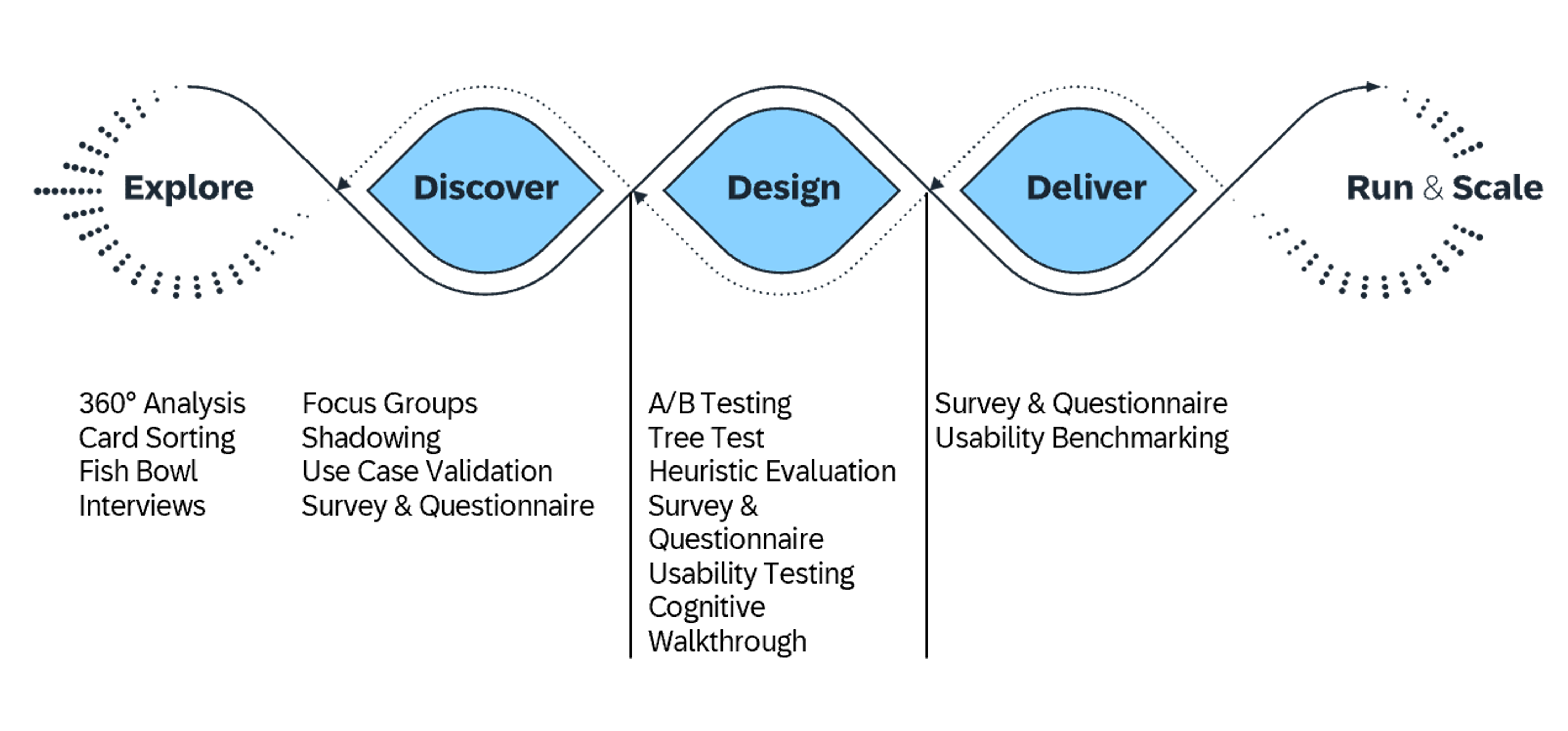
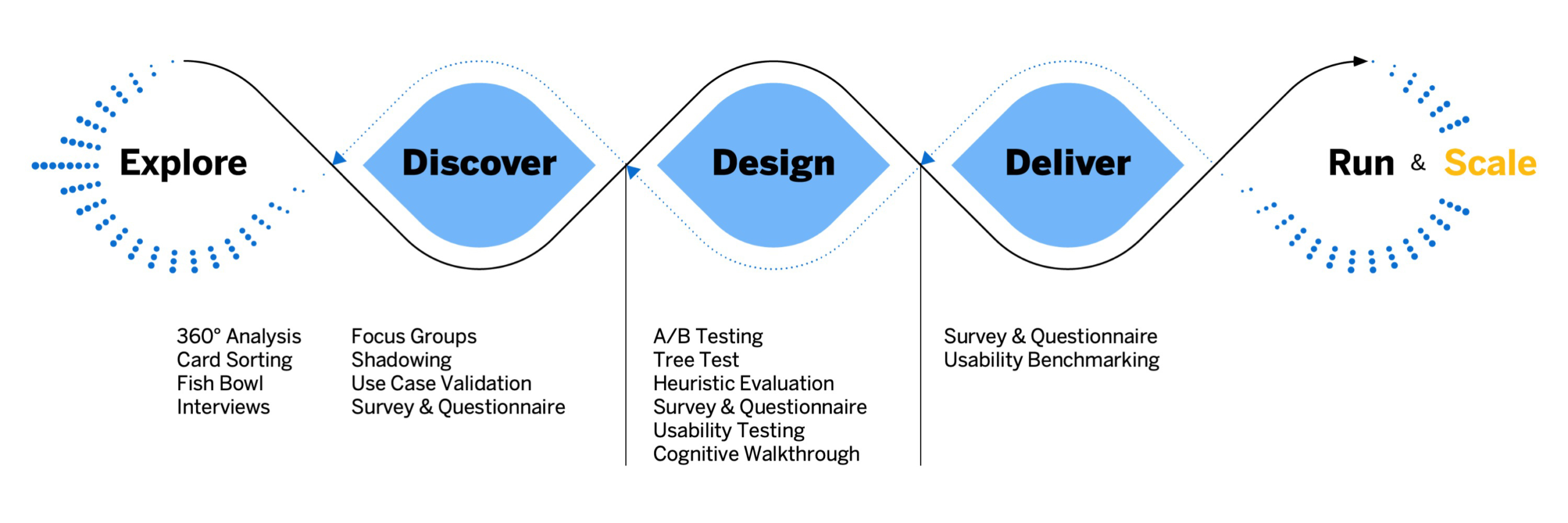
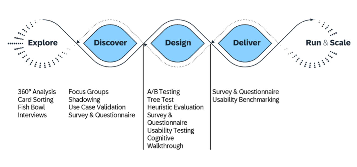
User research is practiced in three phases of SAP’s design-led development process: Discover, Design, and Deliver. The graphic below shows 14 user research methods typically used in each phase.


User research methods along the design-led development process

In the Discover phase, user research helps to understand the needs, behaviors, and pain points of the target users. This can be done through methods such as interviews, surveys, and shadowing to gather insights into user preferences and expectations.

In the Design phase, user research helps to validate design decisions and ensure that the product or service meets the needs of the users. This can involve usability testing to gather feedback on the design and iterate on it based on user input.

In the Deliver phase, user research helps to evaluate the effectiveness of the product or service and to identify areas for improvement. This can involve methods like usability benchmarking and other feedback mechanisms to gather data on how users are using the product and adjust to their behavior.

SAP User Research Panel

The SAP User Research Panel is an opportunity for SAP end-users to have a direct impact on the development and enhancement of our products. By participating in the panel, end-users can share their opinions, suggestions, and concerns with product teams, ultimately helping us create user experiences aligning with their needs.

We encourage all SAP end-users to join the SAP User Research Panel to contribute to the evolution of SAP products. To invite your customers and SAP end-users, please direct them to the external webpage and panel registration.

Available for Download

User Research Method Cards

decorative image of user researcher

The SAP UX User Research Method Cards are a valuable resource for anyone looking to improve their user research skills. These cards provide a convenient way to learn and select from the 14 most effective user research methods used at SAP.

For more information, have a look at the respective blog.


Inclusive Research Handbook


The Inclusive Research Handbook offers advice, tools, and templates for conducting research in an inclusive way.

Scenes Toolkit

The Scenes toolkit includes pre-defined illustrations that can be physically or digitally combined to create storyboards, humanizing research insights.

Further Resources

Take a look at our user research content on the SAP Community for all the latest news and updates. To dive deeper into user research case studies, approaches, and stories from behind the scenes, check out our blog collection.

SAP Fiori for Web UI Kit

Intro

The SAP Fiori for Web UI Kit contains UI common components, patterns, and foundation elements, such as colors and typography. It helps accelerate design and development processes and encourages consistency.

Prerequisites

72 Typeface

Make sure you that you have the latest version of the 72 typeface installed.

Icon Font

This UI Kit offers all icons as vectors.
If you need the latest icon font version, you can download it here.

Using the SAP Fiori for Web UI Kit

Duplicate a file to add a copy of it to your drafts folder. This duplicate is an entirely new file. Changes made to the original file are not reflected in duplicated files.

  1. Click Open in Figma.
  2. Select the account where you want to add the file.
  3. A copy of the file is added to your drafts. Every file you duplicate from the Community will have “(Community)” appended to the file name.

Related Links

Figma Community

  • SAP Community
    Find other SAP UI kits for web and mobile in the SAP space in the Figma Community.

SAP Fiori for Web UI Kit

SAP Fiori for Web UI Kit cover

Intro

The SAP Fiori for Web UI Kit contains UI common components, patterns, and foundation elements, such as colors and typography. It helps accelerate design and development processes and encourages consistency.

Prerequisites

72 Typeface

Make sure you that you have the latest version of the 72 typeface installed.

Icon Font

This UI Kit offers all icons as vectors.
If you need the latest icon font version, you can download it here.

Using the SAP Fiori for Web UI Kit

Duplicate a file to add a copy of it to your drafts folder. This duplicate is an entirely new file. Changes made to the original file are not reflected in duplicated files.

  1. Click Open in Figma.
  2. Select the account where you want to add the file.
  3. A copy of the file is added to your drafts. Every file you duplicate from the Community will have “(Community)” appended to the file name.

Related Links

Figma Community

  • SAP Community
    Find other SAP UI kits for web and mobile in the SAP space in the Figma Community.

Download Fonts

You can use the links below to download the following SAP fonts:

Installing the 72 font family and the SAP icon font are prerequisites for using SAP web UI kits, such as the SAP S/4HANA Web UI Kit.

Font 72


Font 72 is SAP’s proprietary typeface and is the standard typeface for SAP Fiori apps.

Procedure

  1. Download the desktop or web font families.
  2. Unpack the relevant ZIP files: 72_Desktop / 72_Web 72Mono_desktop 72Mono_webfonts.
  3. For desktop fonts: Double-click each .ttf file and click Install.

The 72 font download is made available under the Apache 2.0 license.

SAP Icon Font

To use the UI kit, you need to install the standard SAP icon font. You’ll also need to install this font locally if you want to display SAP Fiori icons in other applications, such as PowerPoint. For more information about the SAP icon font, see the iconography guidelines for the Horizon and Quartz themes.

SAP Icon Font Versions

Separate icon font versions are available for the Horizon theme (version 5.9) and the Quartz theme (version 4.21). Both overwrite the standard sap-icons font file.

If you need to work with both icon fonts in parallel, you can use the version 4 preview (instead of version 4.21) to install the Quartz icon font alongside the Horizon icon font. The icons are then stored in separate font files:

  • Horizon icon font: sap-icons.ttf
  • Quartz icon font: SAP-icons-v4-preview.ttf

Procedure

  1. Depending on your operating system, we recommend uninstalling any previous SAP icon font version and rebooting your system before installing the latest icon font.
  2. Download and install the icon font version(s) you need:
    a) Unpack the ZIP file sap-icons… .zip.
    b) Double-click the SAP-icons… .ttf file and click Install.

SAP Business Suite Icon Font (Optional)

In some application areas, you may also need to use the SAP Business Suite Icon Font (BusinessSuiteInAppSymbols). This icon font contains application-specific icons primarily used in SAP S/4HANA apps.

Separate icon font versions are available for Horizon theme (version 2.084) and the Quartz theme (version 1.084). Both overwrite the standard BusinessSuiteInAppSymbolsfont file.

Important: To use the SAP Business Suite icon font in your app, it must be registered as a custom font in sap.ui.core.IconPool.

Procedure

  1. Download and unpack the ZIP file BusinessSuiteInAppSymbols_...zip.
  2. Install the SAP Business Suite icon font: Double-click the BusinessSuiteInAppSymbols.ttf file and click Install.

Related Links

SAP S/4HANA Web UI Kit

Intro

The SAP S/4HANA Web UI Kit enables you to create high-fidelity SAP Fiori for Web designs using Figma. Intended for designers, this kit is tailored specifically to the Morning Horizon theme and helps you rapidly prototype and design SAP Fiori for Web applications with ease.

The kit includes a set of elements for conceptual design purposes. These elements may not fully represent the exact visual design specifications or implementation details. For implementation guidelines, explore the SAP UI5 Demo Kit.

What’s in the Kit?

The kit offers both compact (non-touch screen) and cozy (touch screen) form factors to suit various device interfaces. It includes a comprehensive collection of web components, icons, layouts, and floorplans. The kit is regularly updated and published to ensure you have access to the latest SAP Fiori for Web design elements and standards.

Getting Started

1. Install the SAP 72 Font Family

Begin by installing the SAP 72 Font Family on your computer. This font is meticulously designed to align with SAP’s visual identity and readability standards, ensuring consistency across SAP interfaces.

2. Install Icon Fonts

Install both the SAP Icon Font and the SAP Business Suite Icon Font on your computer.

3. Enable the UI Kit

Visit the SAP Community in Figma to access the SAP S/4HANA Web UI Kit. Open the kit and start dragging components directly into your design.

Reach Out & Support

Need Help or Have Questions?

The SAP S/4HANA Web UI Kit team is here to assist you with any questions or concerns you may have. Whether you’re experiencing technical difficulties, seeking design advice, or simply want to provide feedback, we’re ready to support.

Contact Us

Email: s4hana_webuikit@sap.com

Community Forum

Get Involved

We value your feedback and input! Share your ideas and suggestions for improvement with us. Your input helps us continuously enhance our products.

Related Links

Related Guidelines

  • Download Fonts
    Download files for font 72, SAP icon font, and SAP Business Suite font.

Download Fonts

You can use the links below to download the following SAP fonts:

Installing the 72 font family and the SAP icon font are prerequisites for using SAP web UI kits, such as the SAP S/4HANA Web UI Kit.

Font 72


Font 72 is SAP’s proprietary typeface and is the standard typeface for SAP Fiori apps.

Procedure

  1. Download the desktop or web font families.
  2. Unpack the relevant ZIP files: 72_Desktop / 72_Web 72Mono_desktop 72Mono_webfonts.
  3. For desktop fonts: Double-click each .ttf file and click Install.

The 72 font download is made available under the Apache 2.0 license.

SAP Icon Font

To use the UI kit, you need to install the standard SAP icon font. You’ll also need to install this font locally if you want to display SAP Fiori icons in other applications, such as PowerPoint. For more information about the SAP icon font, see the iconography guidelines for the Horizon and Quartz themes.

SAP Icon Font Versions

Separate icon font versions are available for the Horizon theme (version 5.8) and the Quartz theme (version 4.20). Both overwrite the standard sap-icons font file.

If you need to work with both icon fonts in parallel, you can use the version 4 preview (instead of version 4.20) to install the Quartz icon font alongside the Horizon icon font. The icons are then stored in separate font files:

  • Horizon icon font: sap-icons.ttf
  • Quartz icon font: SAP-icons-v4-preview.ttf

Procedure

  1. Depending on your operating system, we recommend uninstalling any previous SAP icon font version and rebooting your system before installing the latest icon font.
  2. Download and install the icon font version(s) you need:
    a) Unpack the ZIP file sap-icons… .zip.
    b) Double-click the SAP-icons… .ttf file and click Install.

SAP Business Suite Icon Font (Optional)

In some application areas, you may also need to use the SAP Business Suite Icon Font (BusinessSuiteInAppSymbols). This icon font contains application-specific icons primarily used in SAP S/4HANA apps.

Separate icon font versions are available for Horizon theme (version 2.084) and the Quartz theme (version 1.084). Both overwrite the standard BusinessSuiteInAppSymbolsfont file.

Important: To use the SAP Business Suite icon font in your app, it must be registered as a custom font in sap.ui.core.IconPool.

Procedure

  1. Download and unpack the ZIP file BusinessSuiteInAppSymbols_...zip.
  2. Install the SAP Business Suite icon font: Double-click the BusinessSuiteInAppSymbols.ttf file and click Install.

Related Links

SAP S/4HANA Web UI Kit

Intro

You can use this web UI kit to create high-fidelity SAP Fiori designs using Figma.

Theme

The latest UI kit uses the Morning Horizon theme.

Other Design Tools

For information on how to use the UI kit with Sketch, Axure RP, or Adobe XD, see Using Figma UI Kits with Other Design Tools.

Disclaimer

The design assets in the UI kit are high-definition mock-ups and may not represent the exact visual design specification or implementation.

For the implementation, check out the SAPUI5 samples.

The instructions provided in this article are up-to-date. The associated images of the Figma interface may not be.

What’s in the UI Kit?


Libraries

We provide two separate Figma libraries for compact and cozy form factors:


Library Device Type Screen Sizes
S/4HANA Web UI Kit – Compact Non-touch L (1024 px)
XL (1440 px)
S/4HANA Web UI Kit – Cozy Touch S (414 px)
M (600 px and 834 px)

The library includes components (controls), layouts, floorplans, and interaction elements (such as cursors and touch visualizations). It always contains the latest work-in-progress design components.


Download Package

In addition to the compact and cozy libraries, the download package includes:

  • Style libraries for the Morning Horizon and Evening Horizon themes (colors, shadow levels, and more)
  • The standard SAP icon font (Horizon and Quartz themes)
  • The SAP Business Suite icon font (Horizon and Quartz themes)
  • The 72 font family (web, desktop, mono webfonts, mono desktop)

Prerequisites

To use the UI kit, you need to install SAP’s 72 font family and the SAP icon font on your machine.

Information
Depending on your operating system, we recommend uninstalling any previous SAP icon font version and rebooting your system before installing the latest version.

Download and Installation


Disclaimer:

Some assets in the UI kit may differ from the SAPUI5 implementation.


  1. Install the Figma software here: www.figma.com
  2. Download the latest S/4HANA Web UI Kit.
  3. Install font 72*.
    1. Choose the folder Font 72 /  72_Desktop.
    2. Double-click each .ttf file and click Install.
  4. Install the SAP icon font.
    1. Remove any former versions of the SAP icon font.
    2. Choose the folder Icon Fonts / …final icon package / Fonts
    3. Double-click the SAP-icons.ttf file and click Install.
  5. Optional: Install the SAP Business Suite icon font.
    1. Remove any former versions of the SAP Business Suite icon font.
    2. Choose the folder Icon Fonts / …final icon package / Fonts
    3. Double-click the BusinessSuiteInAppSymbols.ttf file and click Install.

*The 72 font download is made available under the Apache 2.0 license.

Activating the Figma Library

The procedure for using the Figma library depends your Figma license plan. Follow the link for your license plan below.

Option A: With a Figma Professional Plan

  1. Import the two .fig files S/4HANA Web UI Kit Compact and S/4HANA Web UI Kit Cozy into Figma and publish them as libraries.
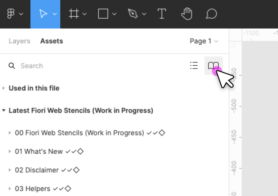
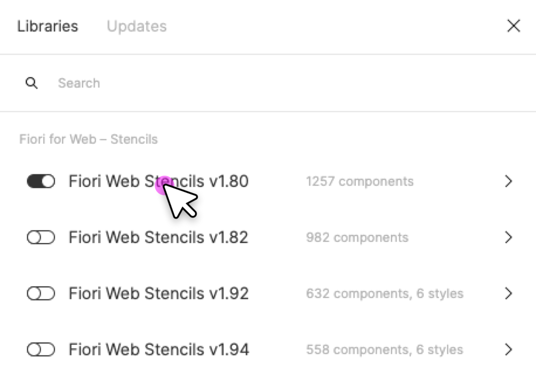
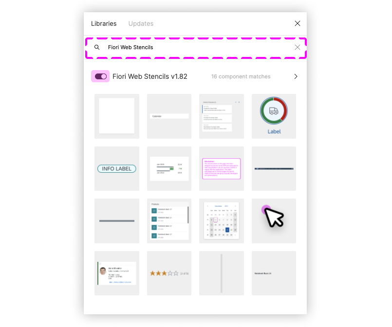
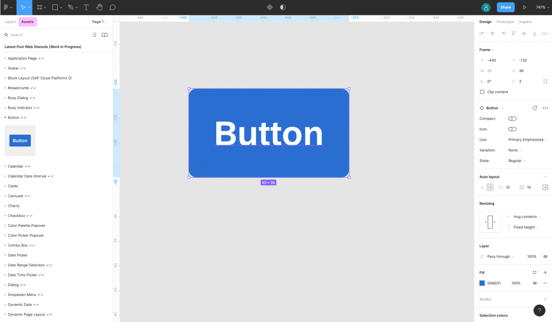
  1. Create a new design file and activate the published libraries in the asset panel on the left. To do this, click the library icon on the top right of the asset panel and activate the libraries using the switch in the dialog.
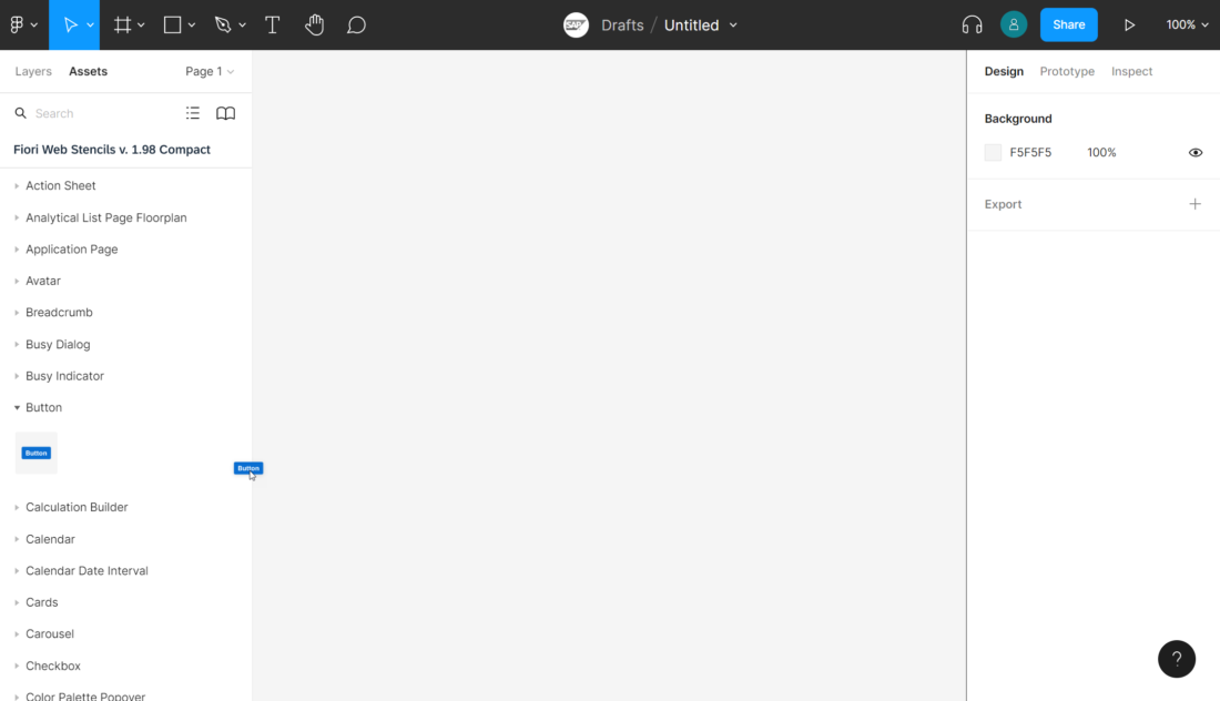
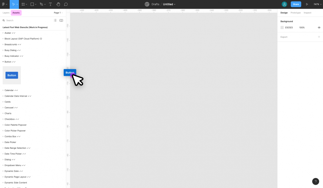
  1. After activating a library, you’ll see all the activated libraries as a list within the asset panel on the left. From there, you can easily drag and drop the asset you need to your canvas.

Option B: Without a Figma Professional Plan

  1. Import the two .fig files S/4HANA Web UI Kit Compact and S/4HANA Web UI Kit Cozy into Figma.
  1. You are now able to copy and paste the design component you need from the two files into your project file.

Top Tips

Variants

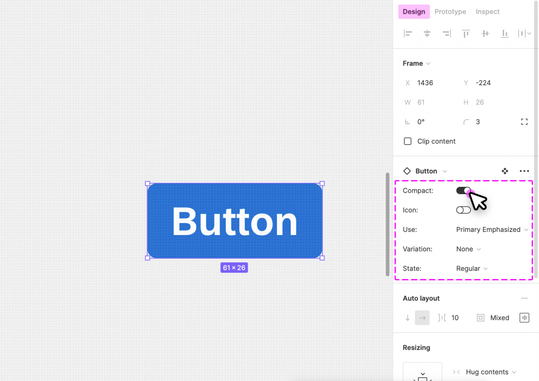
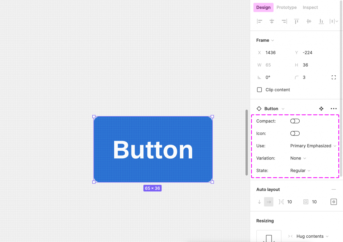
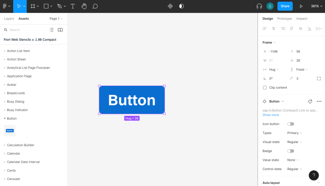
Check out the variants section within the design panel on the right to adapt the design component as needed. Possible settings include:

  • Form Factor
  • Screen Size
  • Content Type

For more information, see Create and use variants on the Figma website.

Swap Instances (Figma Professional Plan Only)

You can easily switch between instances of a component (for example, to switch a “button” component to a “menu button” component). You do this via the instance menu in the design panel on the right.

Map Components to Other Libraries (Figma Professional Plan Only)

If a component has the same name in different libraries, you can swap instances manually (in other words, map components to the components of a different library). For example, you can swap a button from an unavailable library (e.g. “Fiori Web Stencils v1.96”) to a button from the library “S/4HANA Web UI Kit“. Simply choose the component you want to swap and search for the same component name within the Swap Instance popup.

Important: If the component doesn’t seem to be available any more, please do not click on “Restore Component”.

For more information, see Swap between component instances in a file on the Figma website.

Swap Library (Figma Professional Plan Only)

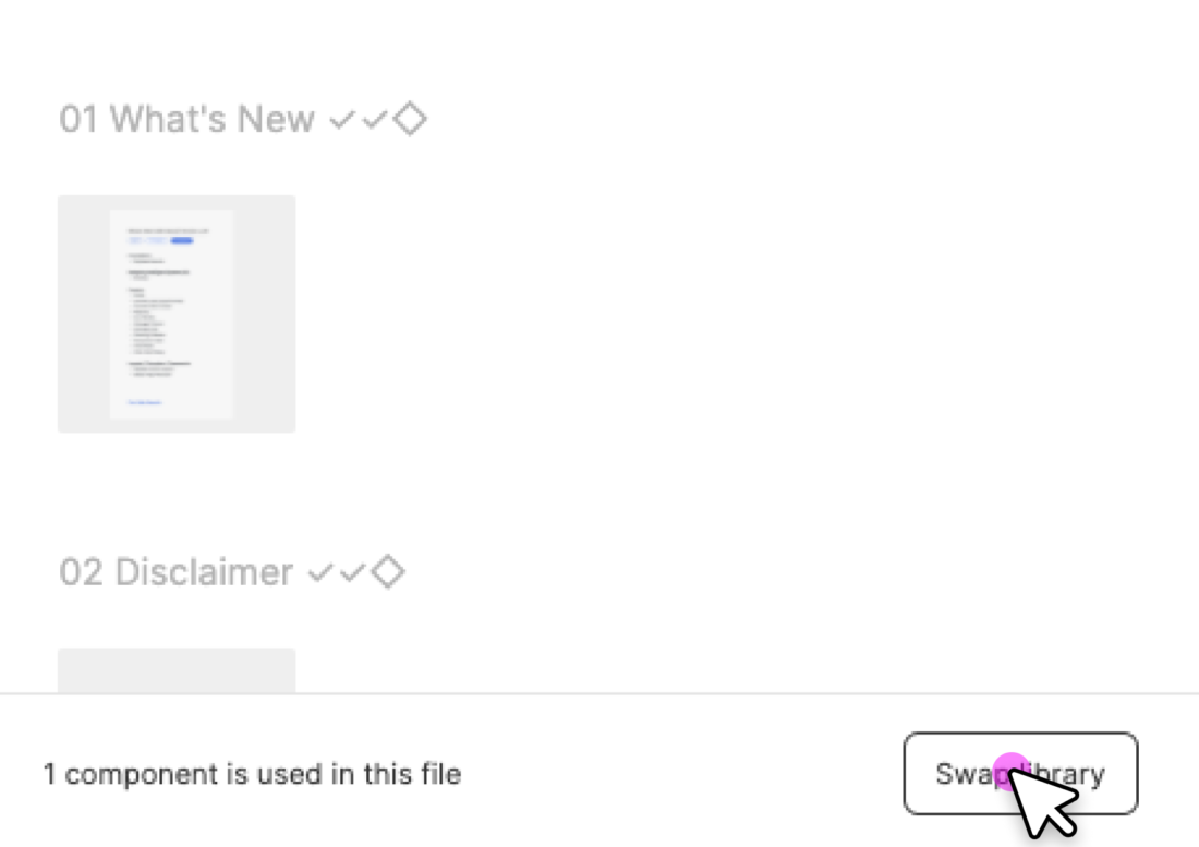
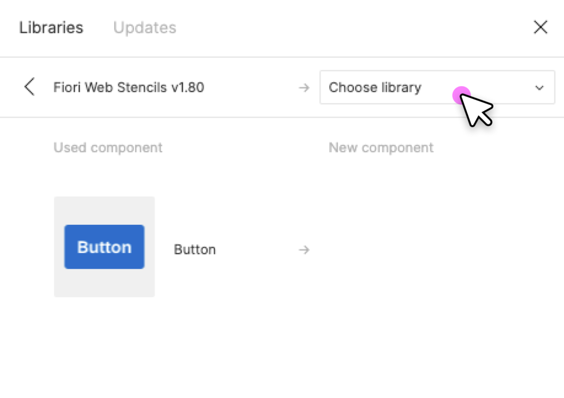
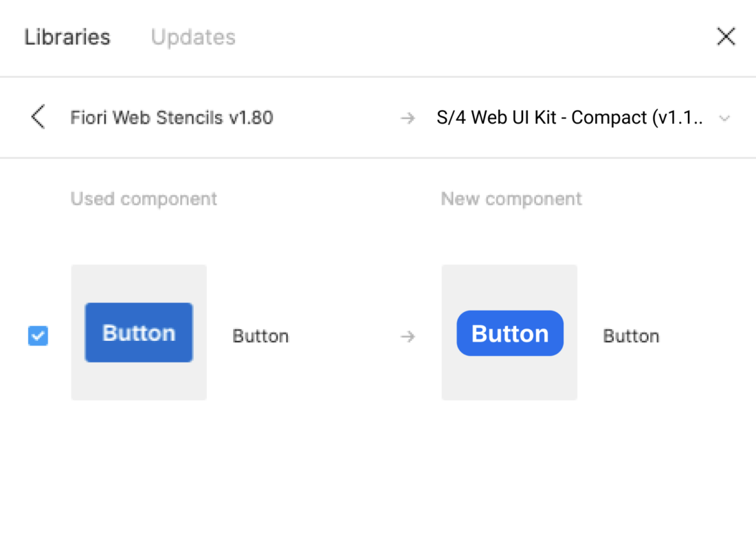
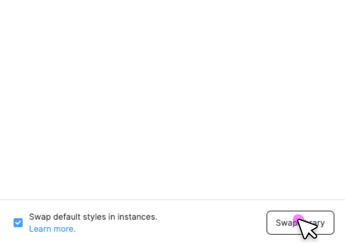
You can use the “Swap library” function to update all instances in your file (for example, to update your components from an older UI kit version to the latest version).

Procedure:

  1. In the asset panel, open the library dialog.
  2. Choose the library you activated for the file by clicking on the line item.
  3. Click the Swap library button.
  4. Choose the library you want to use to update your components.
  5. Confirm by clicking the Swap library button again.

Whenever the selected target library matches the style and component naming, it is applied automatically.

Figma doesn’t swap unmatched assets. These stay connected to the original library. If needed, you can swap individual instances manually using the swap instances function.

For more information, see Swap style and component libraries on the Figma website.

Using Style Libraries

You can use different style libraries in order to get the latest styles for themes available in Figma.

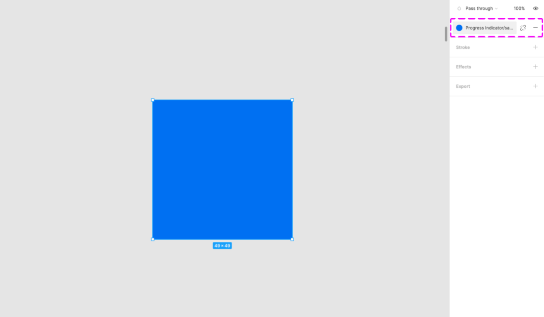
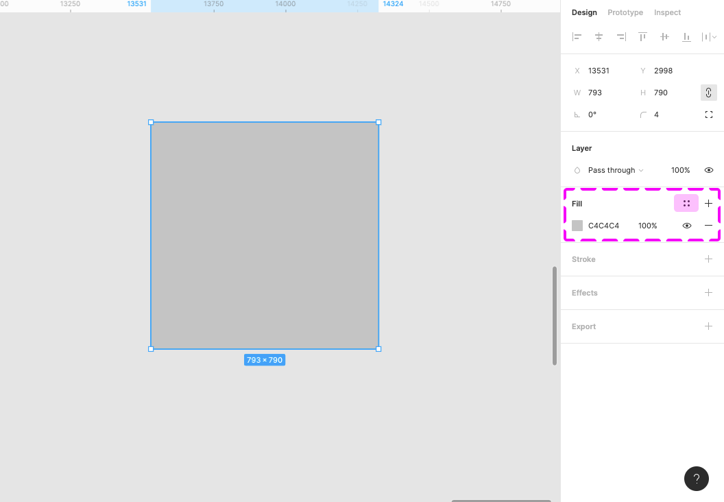
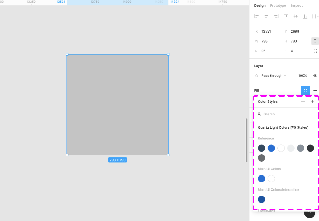
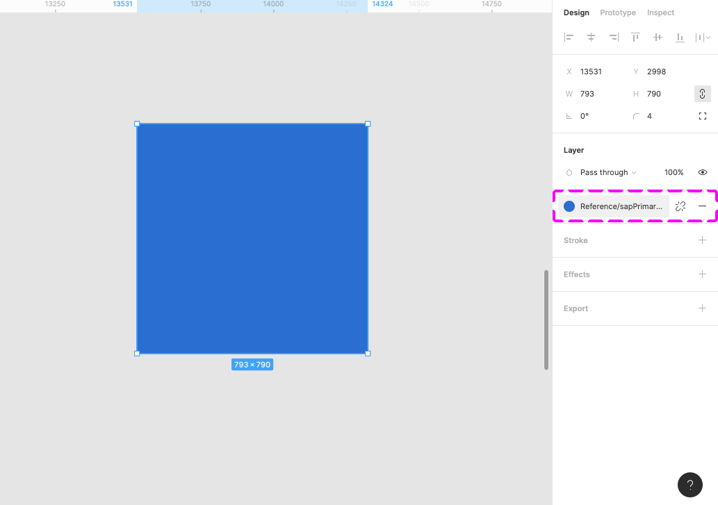
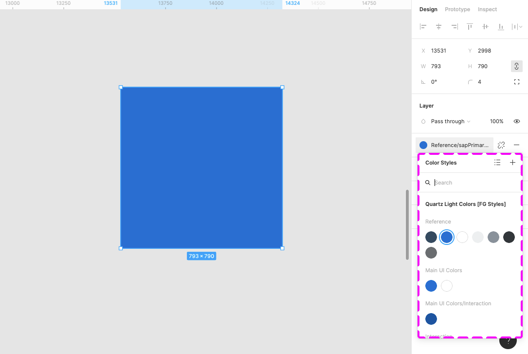
For the Horizon theme, activate the Morning Horizon Styles MAIN [Resource] library. You’ll find the menu in the right-hand panel within the “Fill”, “Stroke”, and “Effects” sections. The styles are structured in groups, such as “Reference”, “Main UI Colors”, and many more.

To use the Quartz Light Colors, activate the Quartz Light Colors MASTER [Resource] library.

Auto Layout

Auto layout is a feature that enables a container to adapt dynamically to the elements inside it.

  • Everything adjusts automatically when an element within the component is shown or hidden.
  • If a text is changed within the component, everything adjusts automatically to the new text length.
  • The padding is managed dynamically and always remains correct.

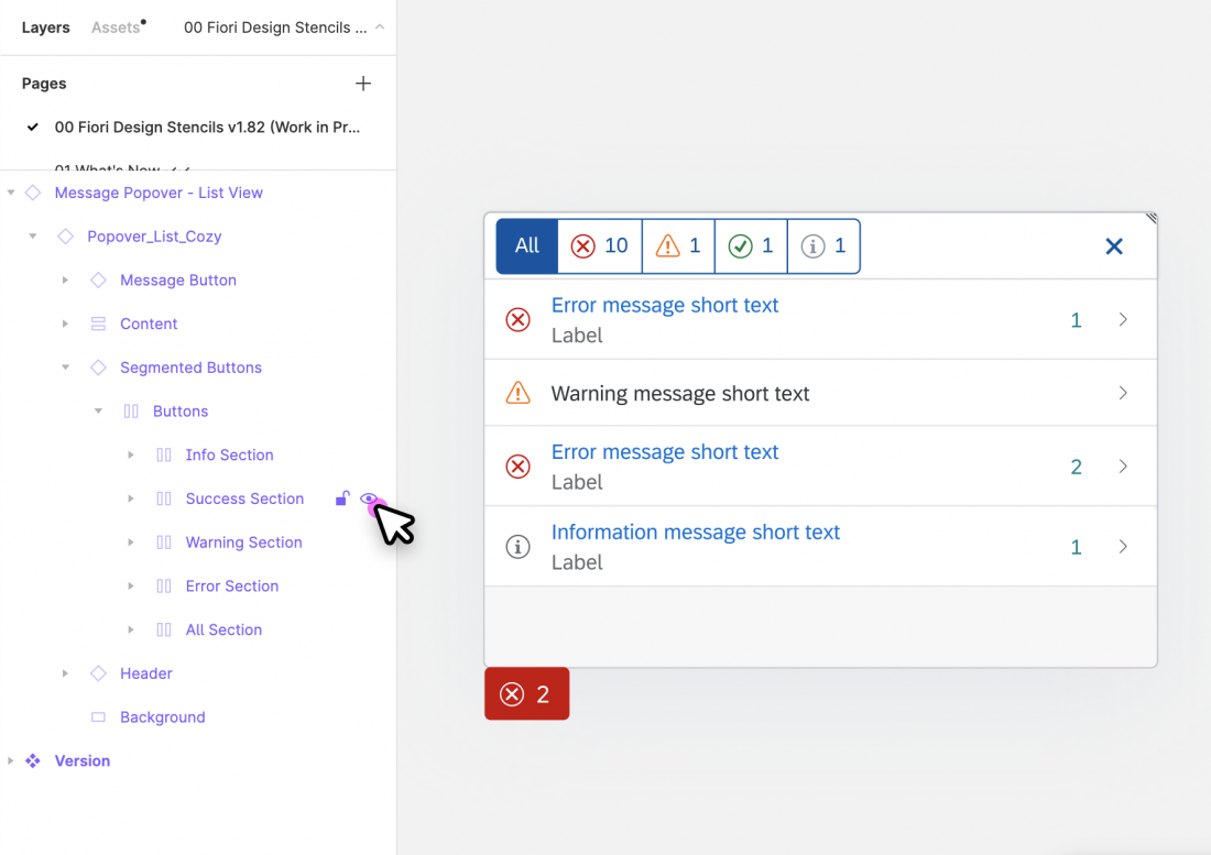
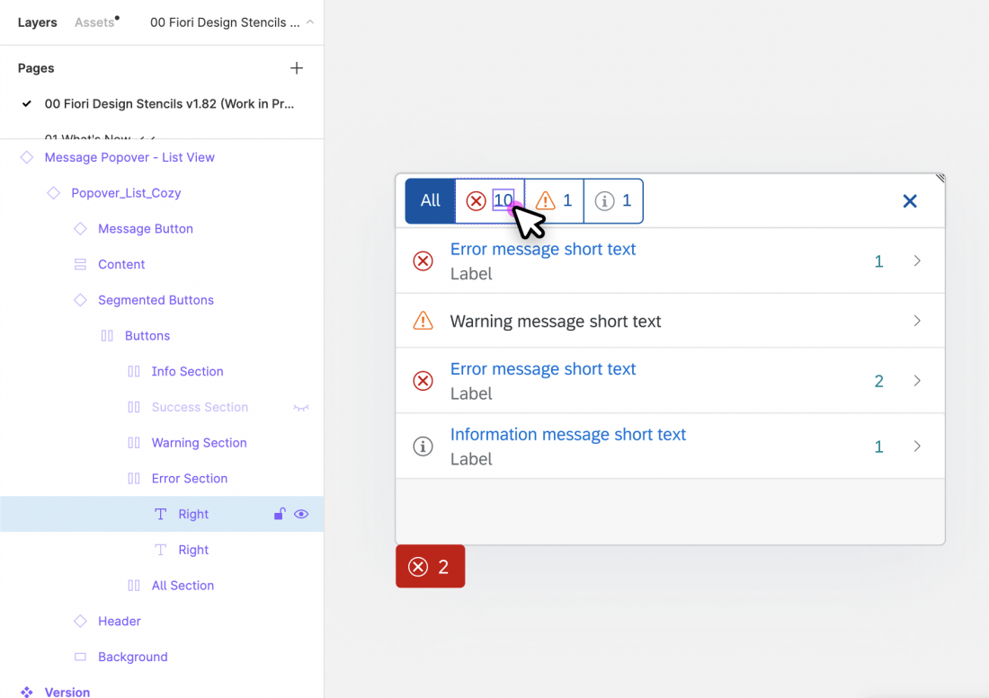
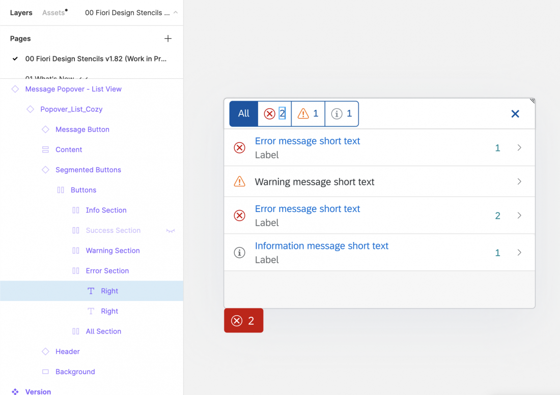
You can show/hide elements within components easily using the layer panel on the left.

For more information, see Create dynamic designs with Auto layout on the Figma website.

How to Use SAP Icons

You can copy and paste any SAP icon from the Icon Explorer to Figma:

  1. Make sure that you have installed the icon font you want to use properly. For more information, see Download Fonts.
  2. In the Icon Explorer, select the icon you want to use and copy the icon to the clipboard (at the top of the right-hand panel).
  3. In Figma, within a text element, select the “SAP-icons” font as font.
  4. In Figma, simply paste the icon from the clipboard.

Note: If you switch between different icon fonts, you may need to restart Figma for the new setting in the Text element to take effect.

Related Links

User Research Method Cards

User research helps you to better understand end user needs, expectations, and typical working processes as you follow SAP’s design-led development process. This easy-to-use card deck provides an overview of the 14 most commonly practiced user research methods at SAP and how to apply them. Most of the methods can be used both physically and virtually.

User research is frequently confused with usability testing, which is just one of the methods. While there are similarities between the methods, each one has its own goals, strengths, and weaknesses. The card deck gives you guidance on how to select the right method for your needs.

User Research Within Design-Led Development

Ideally, user research is practiced in all the three phases of SAP’s design-led development process: Discover, Design, and Deliver. The graphic below shows which of the 14 user research methods are typically used in each phase.

User research methods along the design-led development process

During the Discover phase, user research focuses on learning about the stakeholder and end user requirements. This includes their responsibilities, tasks and activities, typical use cases, workflows, and other software and resources they need to perform their jobs.

Once you have a sufficient understanding of their needs, you move on to the Design phase, where the research focus shifts to getting end user feedback about design ideas and artifacts. Here, different methods are available for validating high-fidelity and low-fidelity prototypes. In the Deliver phase, usability benchmarking and surveys help to evaluate the product.

Download

Download the card deck with the 14 most commonly practiced user research methods at SAP.

SAP S/4HANA Web UI Kit

Intro

You can use this web UI kit to create high-fidelity SAP Fiori designs using Figma.

The UI kit is based on components that are available in the SAPUI5 framework. It reflects the designs used in SAP S/4HANA.

Theme

The latest UI kit uses the Morning Horizon theme.

An older version is available for the Quartz Light theme (see version 1.96). However, this UI kit is not as extensive and is no longer updated.

Other Design Tools

For information on how to use the UI kit with Sketch, Axure RP, or Adobe XD, see Using Figma UI Kits with Other Design Tools.

You can still download older design stencils for Sketch, Axure RP, and Adobe XD (guideline version 1.90), but these are no longer updated.

Disclaimer

The design assets in the UI kit are high-definition mock-ups and may not represent the exact visual design specification or implementation.

For the implementation, check out the SAPUI5 samples.

What’s in the UI Kit?


We provide two separate Figma libraries for compact and cozy form factors:


Library Device Type Screen Sizes
S/4HANA Web UI Kit – Compact Non-touch L (1024 px)
XL (1440 px)
S/4HANA Web UI Kit – Cozy Touch S (414 px)
M (600 px and 834 px)

Each library includes components (controls), layouts, floorplans, and interaction elements (such as cursors and touch visualizations).


Download Package

In addition to the compact and cozy libraries, the download package includes:

  • Style libraries for the Morning Horizon and Evening Horizon themes (colors, shadow levels, and more)
  • The standard SAP icon font (Horizon and Quartz themes)
  • The SAP Business Suite icon font (Horizon and Quartz themes)
  • The 72 font family (web, desktop, mono webfonts, mono desktop)

Prerequisites

To use the UI kit, you need to install SAP’s 72 font family and the SAP icon font on your machine.

Information
Depending on your operating system, we recommend uninstalling any previous SAP icon font version and rebooting your system before installing the latest version.

Download and Installation


Disclaimer:

Some assets in the UI kit may differ from the SAPUI5 implementation.


  1. Install the Figma software here: www.figma.com
  2. Download the latest S/4HANA Web UI Kit.
  3. Install font 72*.
    1. Choose the folder Font 72 /  72_Desktop.
    2. Double-click each .ttf file and click Install.
  4. Install the SAP icon font.
    1. Remove any former versions of the SAP icon font.
    2. Choose the folder Icon Fonts / …final icon package / Fonts
    3. Double-click the SAP-icons.ttf file and click Install.
  5. Optional: Install the SAP Business Suite icon font.
    1. Remove any former versions of the SAP Business Suite icon font.
    2. Choose the folder Icon Fonts / …final icon package / Fonts
    3. Double-click the BusinessSuiteInAppSymbols.ttf file and click Install.

*The 72 font download is made available under the Apache 2.0 license.

Activating the Figma Library

The procedure for using the Figma library depends your Figma license plan. Follow the link for your license plan below.

Option A: With a Figma Professional Plan

  1. Import the two .fig files S/4HANA Web UI Kit Compact and S/4HANA Web UI Kit Cozy into Figma and publish them as libraries.
  1. Create a new design file and activate the published libraries in the asset panel on the left. To do this, click the library icon on the top right of the asset panel and activate the libraries using the switch in the dialog.
  1. After activating a library, you’ll see all the activated libraries as a list within the asset panel on the left. From there, you can easily drag and drop the asset you need to your canvas.

Option B: Without a Figma Professional Plan

  1. Import the two .fig files S/4HANA Web UI Kit Compact and S/4HANA Web UI Kit Cozy into Figma.
  1. You are now able to copy and paste the design component you need from the two files into your project file.

Top Tips

Variants

Check out the variants section within the design panel on the right to adapt the design component as needed. Possible settings include:

  • Content Density
  • Size
  • Visual State
  • Value State
  • Actions

For more information, see Create and use variants on the Figma website.

Swap Instances (Figma Professional Plan Only)

You can easily switch between instances of a component (for example, to switch a “button” component to a “menu button” component). You do this via the instance menu in the design panel on the right.

Map Components to Other Libraries (Figma Professional Plan Only)

If a component has the same name in different libraries, you can swap instances manually (in other words, map components to the components of a different library). For example, you can swap a button from an unavailable library (e.g. “Fiori Web Stencils v1.96”) to a button from the library “S/4HANA Web UI Kit – Compact“. Simply choose the component you want to swap and search for the same component name within the Swap Instance popup.

Important: If the component doesn’t seem to be available any more, please do not click on “Restore Component”.

For more information, see Swap between component instances in a file on the Figma website.

Swap Library (Figma Professional Plan Only)

You can use the “Swap library” function to update all instances in your file (for example, to update your components from an older UI kit version to the latest version).

Procedure:

  1. In the asset panel, open the library dialog.
  2. Choose the library you activated for the file by clicking on the line item.
  3. Click the Swap library button.
  4. Choose the library you want to use to update your components.
  5. Confirm by clicking the Swap library button again.

Whenever the selected target library matches the style and component naming, it is applied automatically.

Figma doesn’t swap unmatched assets. These stay connected to the original library. If needed, you can swap individual instances manually using the swap instances function.

For more information, see Swap style and component libraries on the Figma website.

Using Style Libraries

You can use different style libraries in order to get the latest styles for themes available in Figma.

For the Horizon theme, activate the Morning Horizon MASTER [Resource] library. You’ll find the menu in the right-hand panel within the “Fill”, “Stroke”, and “Effects” sections. The styles are structured in groups, such as “Reference”, “Main UI Colors”, and many more.

To use the Quartz Light Colors, activate the Quartz Light Colors MASTER [Resource] library.

Auto Layout

Auto layout is a feature that enables a container to adapt dynamically to the elements inside it.

  • Everything adjusts automatically when an element within the component is shown or hidden.
  • If a text is changed within the component, everything adjusts automatically to the new text length.
  • The padding is managed dynamically and always remains correct.

You can show/hide elements within components easily using the layer panel on the left.

For more information, see Create dynamic designs with Auto layout on the Figma website.

How to Use SAP Icons

You can copy and paste any SAP icon from the Icon Explorer to Figma:

  1. Make sure that you have installed the icon font you want to use properly. For more information, see Download Fonts.
  2. In the Icon Explorer, select the icon you want to use and copy the icon to the clipboard (at the top of the right-hand panel).
  3. In Figma, within a text element, select the “SAP-icons” font as font.
  4. In Figma, simply paste the icon from the clipboard.

Note: If you switch between different icon fonts, you may need to restart Figma for the new setting in the Text element to take effect.

Related Links

Using Figma UI Kits with Other Design Tools

You can transfer design components from the Figma UI kit to other design tools. This article outlines how to do this for Sketch, Axure RP, and Adobe XD.

Information
You can copy assets between the design tools without a Figma license.

Step 1: Open the UI Kit in Figma

  1. Go to www.figma.com, and sign up for a starter account (free).
  2. Import the UI kit file using the button in the top right corner.
  3. Select the design component you need (see the design components within the layers panel on the left side).

Step 2: Export/Copy to Your Tool

Sketch

  1. Select the design component.
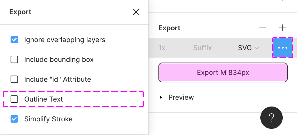
  2. Set up the export:
    1. In design panel on the right, go to the Export section and click the “+” icon.
    2. Choose SVG as the export file.
    3. In the overflow menu (), deselect “Outline Text”.
       If you don’t deselect “Outline Text”, you won’t be able to change text afterwards in your design tool.
  3. Click Export to export the selection.
  4. In Sketch, open the exported SVG file via File / Open Local Document… .

Axure RP

  1. Install the Axure RP Plugin.
  2. Select the design component on the canvas.
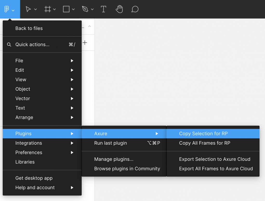
  3. Under the main menu on the top left go to Plugins / Axure / Copy Selection for RP.
  4. Open Axure RP and paste the design component to your canvas.

Adobe XD

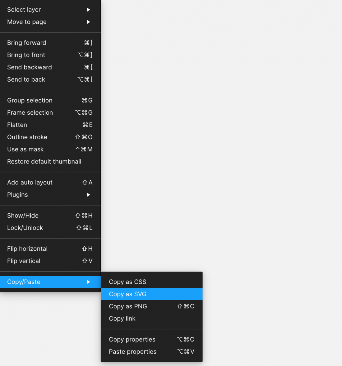
  1. Right click on the design component and use the Copy as SVG option.
  2. Open Adobe XD and paste the SVG directly to your canvas.

Related Links

Download Fonts

You can use the links below to download the following SAP fonts:

Installing the 72 font family and the SAP icon font are prerequisites for using SAP web UI kits, such as the SAP S/4HANA Web UI Kit.

Font 72


Font 72 is SAP’s proprietary typeface and is the standard typeface for SAP Fiori apps.

Procedure

  1. Download the desktop or web font families.
  2. Unpack the relevant ZIP files: 72_Desktop / 72_Web 72Mono_desktop 72Mono_webfonts.
  3. For desktop fonts: Double-click each .ttf file and click Install.

The 72 font download is made available under the Apache 2.0 license.

SAP Icon Font

To use the UI kit, you need to install the standard SAP icon font. You’ll also need to install this font locally if you want to display SAP Fiori icons in other applications, such as PowerPoint. For more information about the SAP icon font, see the iconography guidelines for the Horizon and Quartz themes.

SAP Icon Font Versions

Separate icon font versions are available for the Horizon theme (version 5.7) and the Quartz theme (version 4.19). Both overwrite the standard sap-icons font file.

If you need to work with both icon fonts in parallel, you can use the version 4 preview (instead of version 4.19) to install the Quartz icon font alongside the Horizon icon font. The icons are then stored in separate font files:

  • Horizon icon font: sap-icons.ttf
  • Quartz icon font: SAP-icons-v4-preview.ttf

Procedure

  1. Depending on your operating system, we recommend uninstalling any previous SAP icon font version and rebooting your system before installing the latest icon font.
  2. Download and install the icon font version(s) you need:
    a) Unpack the ZIP file sap-icons… .zip.
    b) Double-click the SAP-icons… .ttf file and click Install.

SAP Business Suite Icon Font (Optional)

In some application areas, you may also need to use the SAP Business Suite Icon Font (BusinessSuiteInAppSymbols). This icon font contains application-specific icons primarily used in SAP S/4HANA apps.

Separate icon font versions are available for Horizon theme (version 2.084) and the Quartz theme (version 1.084). Both overwrite the standard BusinessSuiteInAppSymbolsfont file.

Important: To use the SAP Business Suite icon font in your app, it must be registered as a custom font in sap.ui.core.IconPool.

Procedure

  1. Download and unpack the ZIP file BusinessSuiteInAppSymbols_...zip.
  2. Install the SAP Business Suite icon font: Double-click the BusinessSuiteInAppSymbols.ttf file and click Install.

Related Links

SAP Fiori Design Stencils

Intro

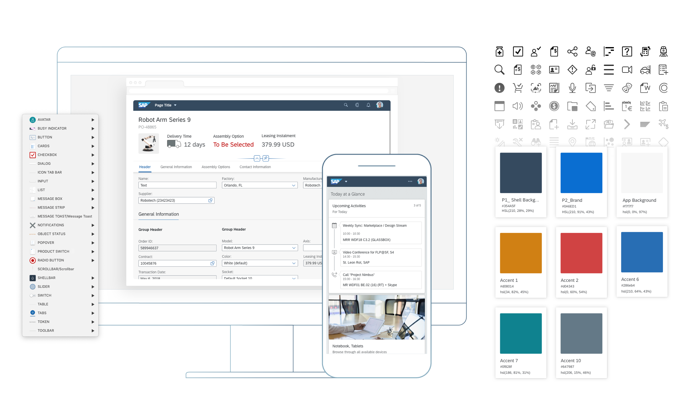
Design stencils are ready-to-use, high-fidelity drafts of SAP Fiori UI components. You can use them to visualize SAP Fiori apps and to get a realistic impression of your final design.

Stencil sets are available for Figma, Sketch, Axure RP, and Adobe XD.

Warning
Design stencils are high-definition mock-ups and do not represent the exact visual design specifications.

What’s in the Stencil Set?

The SAP Fiori design stencils include:

  • Patterns for foundation topics, such as shadow levels, grid, colors, and more
  • Page types (floorplans)
  • Controls
  • Helper tools, such as rem squares or px spacings to build your app according to the current specifications and implementations. We’ve also included interaction tools, such as like cursors and touch visualizations.

The following stencil sizes are available for your mockups:

  • S (414 px)
  • M (600 px and 834 px)
  • L (1024 px)
  • XL (1440 px)

In addition, each stencil set includes download files for:

  • Font 72, the standard typeface for SAP Fiori apps
  • The standard SAP icon font and the SAP Business Suite icon font

Download Stencils

You can download stencil packages for your preferred tool (Figma, Sketch, Axure RP, or Adobe XD).

For download and installation instructions, see the pages below for each tool.

Design Stencils for Figma | up to version 1.114

Design Stencils for Sketch | up to version 1.90

Design Stencils for Axure RP | up to version 1.90

Design Stencils for Adobe XD | up to version 1.90

Information
The design stencils for Sketch, Axure RP, and Adobe XD are no longer being updated. For the latest stencils, see the SAP Fiori stencil set for Figma.
If you want to stay with Sketch, Axure RP, or Adobe XD, check out how to use Figma stencils with other design tools.
The existing stencil files will remain available.

Download Font 72


Font 72 is SAP’s proprietary typeface and is the standard typeface for SAP Fiori apps. You can download the font separately here or download one of the tool-based stencil sets above, which all include the font.

Procedure

  1. Download the desktop and web font families.
  2. Unpack the ZIP files 72_Desktop / 72_Web 72Mono_desktop 72Mono_webfonts.
  3. Double-click each .ttf file and click Install.

The 72 font download is made available under the Apache 2.0 license.

Download Icon Font


SAP Icon Font

To use the stencils, you need to install the standard SAP icon font. You’ll also need to install this font locally if you want to display SAP Fiori icons in other applications, such as PowerPoint. For more information about the SAP icon font, see the iconography guidelines for the Horizon and Quartz themes.

SAP Icon Font Versions

Separate icon font versions are available for the Horizon theme (version 5.05) and the Quartz theme (version 4.17). Both overwrite the standard sap-icons font file.

If you need to work with both icon fonts in parallel, you can use the version 4 preview (instead of version 4.17) to install the Quartz icon font alongside the Horizon icon font. The icons are then stored in separate font files:

  • Horizon icon font: sap-icons.ttf
  • Quartz icon font: SAP-icons-v4-preview.ttf

Procedure

  1. Depending on your operating system, we recommend uninstalling any previous SAP icon font version and rebooting your system before installing the latest icon font.
  2. Download and install the icon font version(s) you need:
    a) Unpack the ZIP file sap-icons… .zip.
    b) Double-click the SAP-icons… .ttf file and click Install.

SAP Business Suite Icon Font (Optional)

In some application areas, you may also need to use the SAP Business Suite Icon Font (BusinessSuiteInAppSymbols). This icon font contains application-specific icons primarily used in SAP S/4HANA apps.

Separate icon font versions are available for Horizon theme (version 2.084) and the Quartz theme (version 1.084). Both overwrite the standard BusinessSuiteInAppSymbolsfont file.

Important: To use the SAP Business Suite icon font in your app, it must be registered as a custom font in sap.ui.core.IconPool.

Procedure

  1. Download and unpack the ZIP file BusinessSuiteInAppSymbols_...zip.
  2. Install the SAP Business Suite icon font: Double-click the BusinessSuiteInAppSymbols.ttf file and click Install.

Related Links

Design Stencils for Figma (Mac and Windows)

Intro

You can use this stencil set to create high-fidelity SAP Fiori designs using Figma.

For more information about SAP Fiori design stencils in general, see Design Stencils.

For information on how to use the Figma stencils with Sketch, Axure RP, or Adobe XD, see Using Figma Stencils with Other Design Tools.

Prerequisites

To use the SAP Fiori stencils, you need to install SAP’s 72 font family and the SAP icon font on your machine.

Information
Depending on your operating system, we recommend uninstalling any previous SAP icon font version and rebooting your system before installing the latest version.

Download and Installation


Disclaimer:

Some stencils may differ from the SAPUI5 implementation.


  1. Install the Figma software here: www.figma.com
  2. Download the latest Figma SAP Fiori Design Stencils.
  3. Install font 72*.
    1. Choose the folder Font 72 /  72_Desktop.
    2. Double-click each .ttf file and click Install.
  4. Install the SAP icon font.
    1. Remove any former versions of the SAP icon font.
    2. Choose the folder Icon Fonts / …final icon package / Fonts
    3. Double-click the SAP-icons.ttf file and click Install.
  5. Optional: Install the SAP Business Suite icon font.
    1. Remove any former versions of the SAP Business Suite icon font.
    2. Choose the folder Icon Fonts / …final icon package / Fonts
    3. Double-click the BusinessSuiteInAppSymbols.ttf file and click Install.

*The 72 font download is made available under the Apache 2.0 license.

Activating the Figma Library

The procedure for using the Figma library depends your Figma license plan. Follow the link for your license plan below.

Option A: With a Figma Professional Plan

Information
From stencil version 1.98, there are two separate libraries per stencil version: a compact library and a cozy library.

If you already use one of the older Fiori Web Stencil (Quartz Web UI Kit) libraries (v1.80 – v1.96), please use the swap library feature to swap the old library to one of the new files – either compact or cozy, depending on the form factor you are using in your file. If you are using both form factors in one design file, please swap to the library for the most-used form factor.

With this, most components in your file will be swapped. You’ll be able to update any remaining components manually later on using the swap instance function for your file.

  1. Import the two .fig files S/4HANA Web UI Kit Compact and S/4HANA Web UI Kit Cozy into Figma and publish them as libraries.
  1. Create a new design file and activate the published libraries in the asset panel on the left. To do this, click the library icon on the top right of the asset panel and activate the libraries using the switch in the dialog.
  1. After activating a library, you’ll see all the activated libraries as a list within the asset panel on the left. From there, you can easily drag and drop the stencil you need to your canvas.

Option B: Without a Figma Professional Plan

  1. Import the two .fig files S/4HANA Web UI Kit Compact and S/4HANA Web UI Kit Cozy into Figma.
  1. You are now able to copy and paste the stencil you need from the two files into your project file.

Top Tips

Variants

Check out the variants section within the design panel on the right to adapt the stencil as needed. Possible settings include:

  • Content Density
  • Size
  • Visual State
  • Value State
  • Actions

For more information, see Create and use variants on the Figma website.

Swap Instances (Figma Professional Plan Only)

You can easily switch between instances of a component (for example, to switch a “button” component to a “menu button” component). You do this via the instance menu in the design panel on the right.

Map Components to Other Libraries (Figma Professional Plan Only)

If a component has the same name in different libraries, you can swap instances manually (in other words, map components to the components of a different library). For example, you can swap a button from an unavailable library (e.g. “Fiori Web Stencils v1.96”) to a button from the library “Fiori Web Stencils v1.98 Compact“. Simply choose the component you want to swap and search for the same component name within the Swap Instance popup.

Important: If the component doesn’t seem to be available any more, please do not click on “Restore Component”.

For more information, see Swap between component instances in a file on the Figma website.

Swap Library (Figma Professional Plan Only)

You can use the “Swap library” function to update all instances in your file (for example, to update your components from an older stencil version to the latest version).

Procedure:

  1. In the asset panel, open the team library dialog.
  2. Choose the library you activated for the file by clicking on the line item.
  3. Click the Swap library button.
  4. Choose the library you want to use to update your components.
  5. Confirm by clicking the Swap library button again.

Whenever the selected target library matches the style and component naming, it is applied automatically.

Figma doesn’t swap unmatched assets. These stay connected to the original library. If needed, you can swap individual instances manually using the swap instances function.

For more information, see Swap style and component libraries on the Figma website.

Using Style Libraries

You can use different style libraries in order to get the latest styles for themes available in Figma.

For the Horizon theme, activate the Morning Horizon MASTER [Resource] library. You’ll find the menu in the right-hand panel within the “Fill”, “Stroke”, and “Effects” sections. The styles are structured in groups, such as “Reference”, “Main UI Colors”, and many more.

To use the Quartz Light Colors, activate the Quartz Light Colors MASTER [Resource] library.

Auto Layout

Auto layout is a feature that enables a container to adapt dynamically to the elements inside it.

  • Everything adjusts automatically when an element within the component is shown or hidden.
  • If a text is changed within the component, everything adjusts automatically to the new text length.
  • The padding is managed dynamically and always remains correct.

You can show/hide elements within components easily using the layer panel on the left.

For more information, see Create dynamic designs with Auto layout on the Figma website.

How to Use SAP Icons

You can copy and paste any SAP icon from the Icon Explorer to Figma:

  1. Make sure that you have installed the icon font you want to use properly. For more information, see Download Icon Font.
  2. In the Icon Explorer, select the icon you want to use and copy the icon to the clipboard (at the top of the right-hand panel).
  3. In Figma, within a text element, select the “SAP-icons” font as font.
  4. In Figma, simply paste the icon from the clipboard.

Note: If you switch between different icon fonts, you may need to restart Figma for the new setting in the Text element to take effect.

Related Links

SAP Fiori Design Stencils

Intro

Design stencils are ready-to-use, high-fidelity drafts of SAP Fiori UI components. You can use them to visualize SAP Fiori apps and to get a realistic impression of your final design.

Stencil sets are available for Figma, Sketch, Axure RP, and Adobe XD.

Warning
Design stencils are high-definition mock-ups and do not represent the exact visual design specifications.

What’s in the Stencil Set?

The SAP Fiori design stencils include:

  • Patterns for foundation topics, such as shadow levels, grid, colors, and more
  • Page types (floorplans)
  • Controls
  • Helper tools, such as rem squares or px spacings to build your app according to the current specifications and implementations. We’ve also included interaction tools, such as like cursors and touch visualizations.

The following stencil sizes are available for your mockups:

  • S (414 px)
  • M (600 px and 834 px)
  • L (1024 px)
  • XL (1440 px)

In addition, each stencil set includes download files for:

  • Font 72, the standard typeface for SAP Fiori apps
  • The standard SAP icon font and the SAP Business Suite icon font

Download Stencils

You can download stencil packages for your preferred tool (Figma, Sketch, Axure RP, or Adobe XD).

For download and installation instructions, see the pages below for each tool.

Design Stencils for Figma | up to version 1.114

Design Stencils for Sketch | up to version 1.90

Design Stencils for Axure RP | up to version 1.90

Design Stencils for Adobe XD | up to version 1.90

Information
The design stencils for Sketch, Axure RP, and Adobe XD are no longer being updated. For the latest stencils, see the SAP Fiori stencil set for Figma.
If you want to stay with Sketch, Axure RP, or Adobe XD, check out how to use Figma stencils with other design tools.
The existing stencil files will remain available.

Download Font 72


Font 72 is SAP’s proprietary typeface and is the standard typeface for SAP Fiori apps. You can download the font separately here or download one of the tool-based stencil sets above, which all include the font.

Procedure

  1. Download the desktop and web font families.
  2. Unpack the ZIP files 72_Desktop / 72_Web 72Mono_desktop 72Mono_webfonts.
  3. Double-click each .ttf file and click Install.

The 72 font download is made available under the Apache 2.0 license.

Download Icon Font


SAP Icon Font

To use the stencils, you need to install the standard SAP icon font. You’ll also need to install this font locally if you want to display SAP Fiori icons in other applications, such as PowerPoint. For more information about the SAP icon font, see the iconography guidelines for the Horizon and Quartz themes.

SAP Icon Font Versions

Separate icon font versions are available for the Horizon theme (version 5.04) and the Quartz theme (version 4.16). Both overwrite the standard sap-icons font file.

If you need to work with both icon fonts in parallel, you can use the version 4 preview (instead of version 4.16) to install the Quartz icon font alongside the Horizon icon font. The icons are then stored in separate font files:

  • Horizon icon font: sap-icons.ttf
  • Quartz icon font: SAP-icons-v4-preview.ttf

Procedure

  1. Depending on your operating system, we recommend uninstalling any previous SAP icon font version and rebooting your system before installing the latest icon font.
  2. Download and install the icon font version(s) you need:
    a) Unpack the ZIP file sap-icons… .zip.
    b) Double-click the SAP-icons… .ttf file and click Install.

SAP Business Suite Icon Font (Optional)

In some application areas, you may also need to use the SAP Business Suite Icon Font (BusinessSuiteInAppSymbols). This icon font contains application-specific icons primarily used in SAP S/4HANA apps.

Separate icon font versions are available for Horizon theme (version 2.083) and the Quartz theme (version 1.083). Both overwrite the standard BusinessSuiteInAppSymbolsfont file.

Important: To use the SAP Business Suite icon font in your app, it must be registered as a custom font in sap.ui.core.IconPool.

Procedure

  1. Download and unpack the ZIP file BusinessSuiteInAppSymbols_...zip.
  2. Install the SAP Business Suite icon font: Double-click the BusinessSuiteInAppSymbols.ttf file and click Install.
Related Links

Design Stencils for Figma (Mac and Windows)

Intro

You can use this stencil set to create high-fidelity SAP Fiori designs using Figma.

For more information about SAP Fiori design stencils in general, see Design Stencils.

For information on how to use the Figma stencils with Sketch, Axure RP, or Adobe XD, see Using Figma Stencils with Other Design Tools.

Prerequisites

To use the SAP Fiori stencils, you need to install SAP’s 72 font family and the SAP icon font on your machine.

Information
Depending on your operating system, we recommend uninstalling any previous SAP icon font version and rebooting your system before installing the latest version.

Download and Installation


Disclaimer:

Some stencils may differ from the SAPUI5 implementation.


  1. Install the Figma software here: www.figma.com
  2. Download the latest Figma SAP Fiori Design Stencils.
  3. Install font 72*.
    1. Choose the folder Font 72 /  72_Desktop.
    2. Double-click each .ttf file and click Install.
  4. Install the SAP icon font.
    1. Remove any former versions of the SAP icon font.
    2. Choose the folder Icon Fonts / …final icon package / Fonts
    3. Double-click the SAP-icons.ttf file and click Install.
  5. Optional: Install the SAP Business Suite icon font.
    1. Remove any former versions of the SAP Business Suite icon font.
    2. Choose the folder Icon Fonts / …final icon package / Fonts
    3. Double-click the BusinessSuiteInAppSymbols.ttf file and click Install.

*The 72 font download is made available under the Apache 2.0 license.

Activating the Figma Library

The procedure for using the Figma library depends your Figma license plan. Follow the link for your license plan below.

Option A: With a Figma Professional Plan

Information
From stencil version 1.98, there are two separate libraries per stencil version: a compact library and a cozy library.

If you already use one of the older Fiori Web Stencil (Quartz Web UI Kit) libraries (v1.80 – v1.96), please use the swap library feature to swap the old library to one of the new files – either compact or cozy, depending on the form factor you are using in your file. If you are using both form factors in one design file, please swap to the library for the most-used form factor.

With this, most components in your file will be swapped. You’ll be able to update any remaining components manually later on using the swap instance function for your file.

  1. Import the two .fig files S/4HANA Web UI Kit Compact and S/4HANA Web UI Kit Cozy into Figma and publish them as libraries.
  1. Import the two .fig files S/4HANA Web UI Kit Compact and S/4HANA Web UI Kit Cozy into Figma and publish them as libraries.
  1. Create a new design file and activate the published libraries in the asset panel on the left. To do this, click the library icon on the top right of the asset panel and activate the libraries using the switch in the dialog.
  1. After activating a library, you’ll see all the activated libraries as a list within the asset panel on the left. From there, you can easily drag and drop the stencil you need to your canvas.

Option B: Without a Figma Professional Plan

  1. Import the two .fig files S/4HANA Web UI Kit Compact and S/4HANA Web UI Kit Cozy into Figma.
  1. You are now able to copy and paste the stencil you need from the two files into your project file.

Top Tips

Variants

Check out the variants section within the design panel on the right to adapt the stencil as needed. Possible settings include:

  • Content Density
  • Size
  • Visual State
  • Value State
  • Actions

For more information, see Create and use variants on the Figma website.

Swap Instances (Figma Professional Plan Only)

You can easily switch between instances of a component (for example, to switch a “button” component to a “menu button” component). You do this via the instance menu in the design panel on the right.

Map Components to Other Libraries (Figma Professional Plan Only)

If a component has the same name in different libraries, you can swap instances manually (in other words, map components to the components of a different library). For example, you can swap a button from an unavailable library (e.g. “Fiori Web Stencils v1.96”) to a button from the library “Fiori Web Stencils v1.98 Compact“. Simply choose the component you want to swap and search for the same component name within the Swap Instance popup.

Important: If the component doesn’t seem to be available any more, please do not click on “Restore Component”.

For more information, see Swap between component instances in a file on the Figma website.

Swap Library (Figma Professional Plan Only)

You can use the “Swap library” function to update all instances in your file (for example, to update your components from an older stencil version to the latest version).

Procedure:

  1. In the asset panel, open the team library dialog.
  2. Choose the library you activated for the file by clicking on the line item.
  3. Click the Swap library button.
  4. Choose the library you want to use to update your components.
  5. Confirm by clicking the Swap library button again.

Whenever the selected target library matches the style and component naming, it is applied automatically.

Figma doesn’t swap unmatched assets. These stay connected to the original library. If needed, you can swap individual instances manually using the swap instances function.

For more information, see Swap style and component libraries on the Figma website.

Using Style Libraries

You can use different style libraries in order to get the latest styles for themes available in Figma.

For the Horizon theme, activate the Morning Horizon MASTER [Resource] library. You’ll find the menu in the right-hand panel within the “Fill”, “Stroke”, and “Effects” sections. The styles are structured in groups, such as “Reference”, “Main UI Colors”, and many more.

To use the Quartz Light Colors, activate the Quartz Light Colors MASTER [Resource] library.

Auto Layout

Auto layout is a feature that enables a container to adapt dynamically to the elements inside it.

  • Everything adjusts automatically when an element within the component is shown or hidden.
  • If a text is changed within the component, everything adjusts automatically to the new text length.
  • The padding is managed dynamically and always remains correct.

You can show/hide elements within components easily using the layer panel on the left.

For more information, see Create dynamic designs with Auto layout on the Figma website.

How to Use SAP Icons

You can copy and paste any SAP icon from the Icon Explorer to Figma:

  1. Make sure that you have installed the icon font you want to use properly. For more information, see Download Icon Font.
  2. In the Icon Explorer, select the icon you want to use and copy the icon to the clipboard (at the top of the right-hand panel).
  3. In Figma, within a text element, select the “SAP-icons” font as font.
  4. In Figma, simply paste the icon from the clipboard.

Note: If you switch between different icon fonts, you may need to restart Figma for the new setting in the Text element to take effect.

Related Links

SAP Fiori Design Stencils

Intro

Design stencils are ready-to-use, high-fidelity drafts of SAP Fiori UI components. You can use them to visualize SAP Fiori apps and to get a realistic impression of your final design.

Stencil sets are available for Figma, Sketch, Axure RP, and Adobe XD.

Warning
Design stencils are high-definition mock-ups and do not represent the exact visual design specifications.

What’s in the Stencil Set?

The SAP Fiori design stencils include:

  • Patterns for foundation topics, such as shadow levels, grid, colors, and more
  • Page types (floorplans)
  • Controls
  • Helper tools, such as rem squares or px spacings to build your app according to the current specifications and implementations. We’ve also included interaction tools, such as like cursors and touch visualizations.

The following stencil sizes are available for your mockups:

  • S (414 px)
  • M (600 px and 834 px)
  • L (1024 px)
  • XL (1440 px)

In addition, each stencil set includes download files for:

  • Font 72, the standard typeface for SAP Fiori apps
  • The standard SAP icon font and the SAP Business Suite icon font

Download Stencils

You can download stencil packages for your preferred tool (Figma, Sketch, Axure RP, or Adobe XD).

For download and installation instructions, see the pages below for each tool.

Design Stencils for Figma | up to version 1.112

Design Stencils for Sketch | up to version 1.90

Design Stencils for Axure RP | up to version 1.90

Design Stencils for Adobe XD | up to version 1.90

Information
The design stencils for Sketch, Axure RP, and Adobe XD are no longer being updated. For the latest stencils, see the SAP Fiori stencil set for Figma.
If you want to stay with Sketch, Axure RP, or Adobe XD, check out how to use Figma stencils with other design tools.
The existing stencil files will remain available.

Download Font 72


Font 72 is SAP’s proprietary typeface and is the standard typeface for SAP Fiori apps. You can download the font separately here or download one of the tool-based stencil sets above, which all include the font.

Procedure

  1. Download the desktop and web font families.
  2. Unpack the ZIP files 72_Desktop / 72_Web 72Mono_desktop 72Mono_webfonts.
  3. Double-click each .ttf file and click Install.

The 72 font download is made available under the Apache 2.0 license.

Download Icon Font


SAP Icon Font

To use the stencils, you need to install the standard SAP icon font. You’ll also need to install this font locally if you want to display SAP Fiori icons in other applications, such as PowerPoint. For more information about the SAP icon font, see the iconography guidelines for the Horizon and Quartz themes.

SAP Icon Font Versions

Separate icon font versions are available for the Horizon theme (version 5.04) and the Quartz theme (version 4.16). Both overwrite the standard sap-icons font file.

If you need to work with both icon fonts in parallel, you can use the version 4 preview (instead of version 4.16) to install the Quartz icon font alongside the Horizon icon font. The icons are then stored in separate font files:

  • Horizon icon font: sap-icons.ttf
  • Quartz icon font: SAP-icons-v4-preview.ttf

Procedure

  1. Depending on your operating system, we recommend uninstalling any previous SAP icon font version and rebooting your system before installing the latest icon font.
  2. Download and install the icon font version(s) you need:
    a) Unpack the ZIP file sap-icons… .zip.
    b) Double-click the SAP-icons… .ttf file and click Install.

SAP Business Suite Icon Font (Optional)

In some application areas, you may also need to use the SAP Business Suite Icon Font (BusinessSuiteInAppSymbols). This icon font contains application-specific icons primarily used in SAP S/4HANA apps.

Separate icon font versions are available for Horizon theme (version 2.083) and the Quartz theme (version 1.083). Both overwrite the standard BusinessSuiteInAppSymbolsfont file.

Important: To use the SAP Business Suite icon font in your app, it must be registered as a custom font in sap.ui.core.IconPool.

Procedure

  1. Download and unpack the ZIP file BusinessSuiteInAppSymbols_...zip.
  2. Install the SAP Business Suite icon font: Double-click the BusinessSuiteInAppSymbols.ttf file and click Install.

Related Links

Design Stencils for Figma (Mac and Windows)

Intro

You can use this stencil set to create high-fidelity SAP Fiori designs using Figma.

For more information about SAP Fiori design stencils in general, see Design Stencils.

For information on how to use the Figma stencils with Sketch, Axure RP, or Adobe XD, see Using Figma Stencils with Other Design Tools.

Prerequisites

To use the SAP Fiori stencils, you need to install SAP’s 72 font family and the SAP icon font on your machine.

Information
Depending on your operating system, we recommend uninstalling any previous SAP icon font version and rebooting your system before installing the latest version.

Download and Installation


Disclaimer:

Some stencils may differ from the SAPUI5 implementation.


  1. Install the Figma software here: www.figma.com
  2. Download the latest Figma SAP Fiori Design Stencils.
  3. Install font 72*.
    1. Choose the folder Font 72 /  72_Desktop.
    2. Double-click each .ttf file and click Install.
  4. Install the SAP icon font.
    1. Remove any former versions of the SAP icon font.
    2. Choose the folder Icon Fonts / …final icon package / Fonts
    3. Double-click the SAP-icons.ttf file and click Install.
  5. Optional: Install the SAP Business Suite icon font.
    1. Remove any former versions of the SAP Business Suite icon font.
    2. Choose the folder Icon Fonts / …final icon package / Fonts
    3. Double-click the BusinessSuiteInAppSymbols.ttf file and click Install.

*The 72 font download is made available under the Apache 2.0 license.

Activating the Figma Library

The procedure for using the Figma library depends your Figma license plan. Follow the link for your license plan below.

Option A: With a Figma Professional Plan

Information
From stencil version 1.98, there are two separate libraries per stencil version: a compact library and a cozy library.

If you already use one of the older Fiori Web Stencil (Quartz Web UI Kit) libraries (v1.80 – v1.96), please use the swap library feature to swap the old library to one of the new files – either compact or cozy, depending on the form factor you are using in your file. If you are using both form factors in one design file, please swap to the library for the most-used form factor.

With this, most components in your file will be swapped. You’ll be able to update any remaining components manually later on using the swap instance function for your file.

  1. Import the two .fig files S/4HANA Web UI Kit Compact and S/4HANA Web UI Kit Cozy into Figma and publish them as libraries.
  1. Import the two .fig files S/4HANA Web UI Kit Compact and S/4HANA Web UI Kit Cozy into Figma and publish them as libraries.
  1. Create a new design file and activate the published libraries in the asset panel on the left. To do this, click the library icon on the top right of the asset panel and activate the libraries using the switch in the dialog.
  1. After activating a library, you’ll see all the activated libraries as a list within the asset panel on the left. From there, you can easily drag and drop the stencil you need to your canvas.

Option B: Without a Figma Professional Plan

  1. Import the two .fig files S/4HANA Web UI Kit Compact and S/4HANA Web UI Kit Cozy into Figma.
  1. You are now able to copy and paste the stencil you need from the two files into your project file.

Top Tips

Variants

Check out the variants section within the design panel on the right to adapt the stencil as needed. Possible settings include:

  • Content Density
  • Size
  • Visual State
  • Value State
  • Actions

For more information, see Create and use variants on the Figma website.

Swap Instances (Figma Professional Plan Only)

You can easily switch between instances of a component (for example, to switch a “button” component to a “menu button” component). You do this via the instance menu in the design panel on the right.

Map Components to Other Libraries (Figma Professional Plan Only)

If a component has the same name in different libraries, you can swap instances manually (in other words, map components to the components of a different library). For example, you can swap a button from an unavailable library (e.g. “Fiori Web Stencils v1.96”) to a button from the library “Fiori Web Stencils v1.98 Compact“. Simply choose the component you want to swap and search for the same component name within the Swap Instance popup.

Important: If the component doesn’t seem to be available any more, please do not click on “Restore Component”.

For more information, see Swap between component instances in a file on the Figma website.

Swap Library (Figma Professional Plan Only)

You can use the “Swap library” function to update all instances in your file (for example, to update your components from an older stencil version to the latest version).

Procedure:

  1. In the asset panel, open the team library dialog.
  2. Choose the library you activated for the file by clicking on the line item.
  3. Click the Swap library button.
  4. Choose the library you want to use to update your components.
  5. Confirm by clicking the Swap library button again.

Whenever the selected target library matches the style and component naming, it is applied automatically.

Figma doesn’t swap unmatched assets. These stay connected to the original library. If needed, you can swap individual instances manually using the swap instances function.

For more information, see Swap style and component libraries on the Figma website.

Using Style Libraries

You can use different style libraries in order to get the latest styles for themes available in Figma.

For the Horizon theme, activate the Morning Horizon MASTER [Resource] library. You’ll find the menu in the right-hand panel within the “Fill”, “Stroke”, and “Effects” sections. The styles are structured in groups, such as “Reference”, “Main UI Colors”, and many more.

To use the Quartz Light Colors, activate the Quartz Light Colors MASTER [Resource] library.

Auto Layout

Auto layout is a feature that enables a container to adapt dynamically to the elements inside it.

  • Everything adjusts automatically when an element within the component is shown or hidden.
  • If a text is changed within the component, everything adjusts automatically to the new text length.
  • The padding is managed dynamically and always remains correct.

You can show/hide elements within components easily using the layer panel on the left.

For more information, see Create dynamic designs with Auto layout on the Figma website.

How to Use SAP Icons

You can copy and paste any SAP icon from the Icon Explorer to Figma:

  1. Make sure that you have installed the icon font you want to use properly. For more information, see Download Icon Font.
  2. In the Icon Explorer, select the icon you want to use and copy the icon to the clipboard (at the top of the right-hand panel).
  3. In Figma, within a text element, select the “SAP-icons” font as font.
  4. In Figma, simply paste the icon from the clipboard.

Note: If you switch between different icon fonts, you may need to restart Figma for the new setting in the Text element to take effect.

Related Links

Design Stencils for Figma (Mac and Windows)

Intro

You can use this stencil set to create high-fidelity SAP Fiori designs using Figma.

For more information about SAP Fiori design stencils in general, see Design Stencils.

For information on how to use the Figma stencils with Sketch, Axure RP, or Adobe XD, see Using Figma Stencils with Other Design Tools.

Prerequisites

To use the SAP Fiori stencils, you need to install SAP’s 72 font family and the SAP icon font on your machine.

Information
Depending on your operating system, we recommend uninstalling any previous SAP icon font version and rebooting your system before installing the latest version.

Download and Installation


  1. Install the Figma software here: www.figma.com
  2. Download the latest Figma SAP Fiori Design Stencils.
  3. Install font 72*.
    1. Choose the folder Font 72 /  72_Desktop.
    2. Double-click each .ttf file and click Install.
  4. Install the SAP icon font.
    1. Remove any former versions of the SAP icon font.
    2. Choose the folder Icon Fonts / …final icon package / Fonts
    3. Double-click the SAP-icons.ttf file and click Install.
  5. Optional: Install the SAP Business Suite icon font.
    1. Remove any former versions of the SAP Business Suite icon font.
    2. Choose the folder Icon Fonts / …final icon package / Fonts
    3. Double-click the BusinessSuiteInAppSymbols.ttf file and click Install.

*The 72 font download is made available under the Apache 2.0 license.

Activating the Figma Library

The procedure for using the Figma library depends your Figma license plan. Follow the link for your license plan below.

Option A: With a Figma Professional Plan

Information
From stencil version 1.98, there are two separate libraries per stencil version: a compact library and a cozy library.

If you already use one of the older Fiori Web Stencil (Quartz Web UI Kit) libraries (v1.80 – v1.96), please use the swap library feature to swap the old library to one of the new files – either compact or cozy, depending on the form factor you are using in your file. If you are using both form factors in one design file, please swap to the library for the most-used form factor.

With this, most components in your file will be swapped. You’ll be able to update any remaining components manually later on using the swap instance function for your file.

  1. Import the two .fig files S/4HANA Web UI Kit Compact and S/4HANA Web UI Kit Cozy into Figma and publish them as libraries.
  1. Create a new design file and activate the published libraries in the asset panel on the left. To do this, click the library icon on the top right of the asset panel and activate the libraries using the switch in the dialog.
  1. After activating a library, you’ll see all the activated libraries as a list within the asset panel on the left. From there, you can easily drag and drop the stencil you need to your canvas.

Option B: Without a Figma Professional Plan

  1. Import the two .fig files S/4HANA Web UI Kit Compact and S/4HANA Web UI Kit Cozy into Figma.
  1. You are now able to copy and paste the stencil you need from the two files into your project file.

Top Tips

Variants

Check out the variants section within the design panel on the right to adapt the stencil as needed. Possible settings include:

  • Content Density
  • Size
  • Visual State
  • Value State
  • Actions

For more information, see Create and use variants on the Figma website.

Swap Instances (Figma Professional Plan Only)

You can easily switch between instances of a component (for example, to switch a “button” component to a “menu button” component). You do this via the instance menu in the design panel on the right.

Map Components to Other Libraries (Figma Professional Plan Only)

If a component has the same name in different libraries, you can swap instances manually (in other words, map components to the components of a different library). For example, you can swap a button from an unavailable library (e.g. “Fiori Web Stencils v1.96”) to a button from the library “Fiori Web Stencils v1.98 Compact“. Simply choose the component you want to swap and search for the same component name within the Swap Instance popup.

Important: If the component doesn’t seem to be available any more, please do not click on “Restore Component”.

For more information, see Swap between component instances in a file on the Figma website.

Swap Library (Figma Professional Plan Only)

You can use the “Swap library” function to update all instances in your file (for example, to update your components from an older stencil version to the latest version).

Procedure:

  1. In the asset panel, open the team library dialog.
  2. Choose the library you activated for the file by clicking on the line item.
  3. Click the Swap library button.
  4. Choose the library you want to use to update your components.
  5. Confirm by clicking the Swap library button again.

Whenever the selected target library matches the style and component naming, it is applied automatically.

Figma doesn’t swap unmatched assets. These stay connected to the original library. If needed, you can swap individual instances manually using the swap instances function.

For more information, see Swap style and component libraries on the Figma website.

Using Style Libraries

You can use different style libraries in order to get the latest styles for themes available in Figma.

For the Horizon theme, activate the Morning Horizon MASTER [Resource] library. You’ll find the menu in the right-hand panel within the “Fill”, “Stroke”, and “Effects” sections. The styles are structured in groups, such as “Reference”, “Main UI Colors”, and many more.

To use the Quartz Light Colors, activate the Quartz Light Colors MASTER [Resource] library.

Auto Layout

Auto layout is a feature that enables a container to adapt dynamically to the elements inside it.

  • Everything adjusts automatically when an element within the component is shown or hidden.
  • If a text is changed within the component, everything adjusts automatically to the new text length.
  • The padding is managed dynamically and always remains correct.

You can show/hide elements within components easily using the layer panel on the left.

For more information, see Create dynamic designs with Auto layout on the Figma website.

How to Use SAP Icons

You can copy and paste any SAP icon from the Icon Explorer to Figma:

  1. Make sure that you have installed the icon font you want to use properly. For more information, see Download Icon Font.
  2. In the Icon Explorer, select the icon you want to use and copy the icon to the clipboard (at the top of the right-hand panel).
  3. In Figma, within a text element, select the “SAP-icons” font as font.
  4. In Figma, simply paste the icon from the clipboard.

Note: If you switch between different icon fonts, you may need to restart Figma for the new setting in the Text element to take effect.

Related Links

SAP Fiori Design Stencils

Intro

Design stencils are ready-to-use, high-fidelity drafts of SAP Fiori UI components. You can use them to visualize SAP Fiori apps and to get a realistic impression of your final design.

Stencil sets are available for Figma, Sketch, Axure RP, and Adobe XD.

Warning
Design stencils are high-definition mock-ups and do not represent the exact visual design specifications.

What’s in the Stencil Set?

The SAP Fiori design stencils include:

  • Patterns for foundation topics, such as shadow levels, grid, colors, and more
  • Page types (floorplans)
  • Controls
  • Helper tools, such as rem squares or px spacings to build your app according to the current specifications and implementations. We’ve also included interaction tools, such as like cursors and touch visualizations.

The following stencil sizes are available for your mockups:

  • S (414 px)
  • M (600 px and 834 px)
  • L (1024 px)
  • XL (1440 px)

In addition, each stencil set includes download files for:

  • Font 72, the standard typeface for SAP Fiori apps
  • The standard SAP icon font and the SAP Business Suite icon font

Download Stencils

You can download stencil packages for your preferred tool (Figma, Sketch, Axure RP, or Adobe XD).

For download and installation instructions, see the pages below for each tool.

Design Stencils for Figma | up to version 1.110

Design Stencils for Sketch | up to version 1.90

Design Stencils for Axure RP | up to version 1.90

Design Stencils for Adobe XD | up to version 1.90

Information
The design stencils for Sketch, Axure RP, and Adobe XD are no longer being updated. For the latest stencils, see the SAP Fiori stencil set for Figma.
If you want to stay with Sketch, Axure RP, or Adobe XD, check out how to use Figma stencils with other design tools.
The existing stencil files will remain available.

Download Font 72


Font 72 is SAP’s proprietary typeface and is the standard typeface for SAP Fiori apps. You can download the font separately here or download one of the tool-based stencil sets above, which all include the font.

Procedure

  1. Download the desktop and web font families.
  2. Unpack the ZIP files 72_Desktop / 72_Web 72Mono_desktop 72Mono_webfonts.
  3. Double-click each .ttf file and click Install.

The 72 font download is made available under the Apache 2.0 license.

Download Icon Font


SAP Icon Font

To use the stencils, you need to install the standard SAP icon font. You’ll also need to install this font locally if you want to display SAP Fiori icons in other applications, such as PowerPoint. For more information about the SAP icon font, see the iconography guidelines for the Quartz and Horizon themes.

SAP Icon Font Versions

Separate icon font versions are available for the Quartz theme (version 4.15) and the Horizon theme (version 5.03). Both overwrite the standard sap-icons font file.

If you need to work with both icon fonts in parallel, you can use the version 4 preview (instead of version 4.15) to install the Quartz icon font alongside the Horizon icon font. The icons are then stored in separate font files:

  • Horizon icon font: sap-icons.ttf
  • Quartz icon font: SAP-icons-v4-preview.ttf

Procedure

  1. Depending on your operating system, we recommend uninstalling any previous SAP icon font version and rebooting your system before installing the latest icon font.
  2. Download and install the icon font version(s) you need:
    a) Unpack the ZIP file sap-icons… .zip.
    b) Double-click the SAP-icons… .ttf file and click Install.

SAP Business Suite Icon Font (Optional)

In some application areas, you may also need to use the SAP Business Suite Icon Font (BusinessSuiteInAppSymbols). This icon font contains application-specific icons primarily used in SAP S/4HANA apps.

Separate icon font versions are available for the Quartz theme (version 1.081) and the Horizon theme (version 2.081). Both overwrite the standard BusinessSuiteInAppSymbolsfont file.

Important: To use the SAP Business Suite icon font in your app, it must be registered as a custom font in sap.ui.core.IconPool.

Procedure

  1. Download and unpack the ZIP file BusinessSuiteInAppSymbols_...zip.
  2. Install the SAP Business Suite icon font: Double-click the BusinessSuiteInAppSymbols.ttf file and click Install.
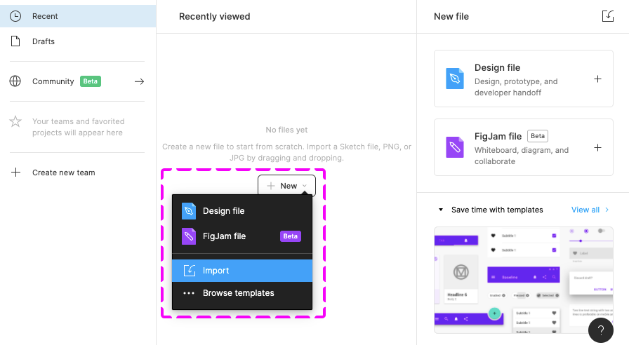
Related Links

Design Stencils for Figma (Mac and Windows)

Intro

You can use this stencil set to create high-fidelity SAP Fiori designs using Figma.

For more information about SAP Fiori design stencils in general, see Design Stencils.

For information on how to use the Figma stencils with Sketch, Axure RP, or Adobe XD, see Using Figma Stencils with Other Design Tools.

Prerequisites

To use the SAP Fiori stencils, you need to install SAP’s 72 font family and the SAP icon font on your machine.

Information
Depending on your operating system, we recommend uninstalling any previous SAP icon font version and rebooting your system before installing the latest version.

Download and Installation


Disclaimer:

Some stencils may differ from the SAPUI5 implementation.


  1. Install the Figma software here: www.figma.com
  2. Download the latest Figma SAP Fiori Design Stencils.
  3. Install font 72*.
    1. Choose the folder Font 72 /  72_Desktop.
    2. Double-click each .ttf file and click Install.
  4. Install the SAP icon font.
    1. Remove any former versions of the SAP icon font.
    2. Choose the folder Icon Fonts / …final icon package / Fonts
    3. Double-click the SAP-icons.ttf file and click Install.
  5. Optional: Install the SAP Business Suite icon font.
    1. Remove any former versions of the SAP Business Suite icon font.
    2. Choose the folder Icon Fonts / …final icon package / Fonts
    3. Double-click the BusinessSuiteInAppSymbols.ttf file and click Install.


*The 72 font download is made available under the Apache 2.0 license.

Activating the Figma Library

The procedure for using the Figma library depends your Figma license plan. Follow the link for your license plan below.

Option A: With a Figma Professional Plan

Information
From stencil version 1.98, there are two separate libraries per stencil version: a compact library and a cozy library.

If you already use one of the older Fiori Web Stencil (Quartz Web UI Kit) libraries (v1.80 – v1.96), please use the swap library feature to swap the old library to one of the new files – either compact or cozy, depending on the form factor you are using in your file. If you are using both form factors in one design file, please swap to the library for the most-used form factor.

With this, most components in your file will be swapped. You’ll be able to update any remaining components manually later on using the swap instance function for your file.

  1. Import the two .fig files S/4HANA Web UI Kit Compact and S/4HANA Web UI Kit Cozy into Figma and publish them as libraries.
  1. Create a new design file and activate the published libraries in the asset panel on the left. To do this, click the library icon on the top right of the asset panel and activate the libraries using the switch in the dialog.
  1. After activating a library, you’ll see all the activated libraries as a list within the asset panel on the left. From there, you can easily drag and drop the stencil you need to your canvas.

Option B: Without a Figma Professional Plan

  1. Import the two .fig files S/4HANA Web UI Kit Compact and S/4HANA Web UI Kit Cozy into Figma.
  1. You are now able to copy and paste the stencil you need from the two files into your project file.

Top Tips

Variants

Check out the variants section within the design panel on the right to adapt the stencil as needed. Possible settings include:

  • Content Density
  • Size
  • Visual State
  • Value State
  • Actions

For more information, see Create and use variants on the Figma website.

Swap Instances (Figma Professional Plan Only)

You can easily switch between instances of a component (for example, to switch a “button” component to a “menu button” component). You do this via the instance menu in the design panel on the right.

Map Components to Other Libraries (Figma Professional Plan Only)

If a component has the same name in different libraries, you can swap instances manually (in other words, map components to the components of a different library). For example, you can swap a button from an unavailable library (e.g. “Fiori Web Stencils v1.96”) to a button from the library “Fiori Web Stencils v1.98 Compact“. Simply choose the component you want to swap and search for the same component name within the Swap Instance popup.

Important: If the component doesn’t seem to be available any more, please do not click on “Restore Component”.

For more information, see Swap between component instances in a file on the Figma website.

Swap Library (Figma Professional Plan Only)

You can use the “Swap library” function to update all instances in your file (for example, to update your components from an older stencil version to the latest version).

Procedure:

  1. In the asset panel, open the team library dialog.
  2. Choose the library you activated for the file by clicking on the line item.
  3. Click the Swap library button.
  4. Choose the library you want to use to update your components.
  5. Confirm by clicking the Swap library button again.

Whenever the selected target library matches the style and component naming, it is applied automatically.

Figma doesn’t swap unmatched assets. These stay connected to the original library. If needed, you can swap individual instances manually using the swap instances function.

For more information, see Swap style and component libraries on the Figma website.

Auto Layout

Auto layout is a feature that enables a container to adapt dynamically to the elements inside it.

  • Everything adjusts automatically when an element within the component is shown or hidden.
  • If a text is changed within the component, everything adjusts automatically to the new text length.
  • The padding is managed dynamically and always remains correct.

You can show/hide elements within components easily using the layer panel on the left.

For more information, see Create dynamic designs with Auto layout on the Figma website.

How to Use SAP Icons

You can copy and paste any SAP icon from the Icon Explorer to Figma:

  1. Make sure that you have installed the icon font you want to use properly. For more information, see Download Icon Font.
  2. In the Icon Explorer, select the icon you want to use and copy the icon to the clipboard (at the top of the right-hand panel).
  3. In Figma, within a text element, select the “SAP-icons” font as font.
  4. In Figma, simply paste the icon from the clipboard.

Note: If you switch between different icon fonts, you may need to restart Figma for the new setting in the Text element to take effect.

Related Links

SAP Fiori Design Stencils

Intro

Design stencils are ready-to-use, high-fidelity drafts of SAP Fiori UI components. You can use them to visualize SAP Fiori apps and to get a realistic impression of your final design.

Stencil sets are available for Figma, Sketch, Axure RP, and Adobe XD.

Warning
Design stencils are high-definition mock-ups and do not represent the exact visual design specifications.

What’s in the Stencil Set?

The SAP Fiori design stencils include:

  • Patterns for foundation topics, such as shadow levels, grid, colors, and more
  • Page types (floorplans)
  • Controls
  • Helper tools, such as rem squares or px spacings to build your app according to the current specifications and implementations. We’ve also included interaction tools, such as like cursors and touch visualizations.

The following stencil sizes are available for your mockups:

  • S (414 px)
  • M (600 px and 834 px)
  • L (1024 px)
  • XL (1440 px)

In addition, each stencil set includes download files for:

  • Font 72, the standard typeface for SAP Fiori apps
  • The standard SAP icon font and the SAP Business Suite icon font

Download Stencils

You can download stencil packages for your preferred tool (Figma, Sketch, Axure RP, or Adobe XD).

For download and installation instructions, see the pages below for each tool.

Design Stencils for Figma | up to version 1.106

Design Stencils for Sketch | up to version 1.90

Design Stencils for Axure RP | up to version 1.90

Design Stencils for Adobe XD | up to version 1.90

Information
The design stencils for Sketch, Axure RP, and Adobe XD are no longer being updated. For the latest stencils, see the SAP Fiori stencil set for Figma.
If you want to stay with Sketch, Axure RP, or Adobe XD, check out how to use Figma stencils with other design tools.
The existing stencil files will remain available.

Download Font 72


Font 72 is SAP’s proprietary typeface and is the standard typeface for SAP Fiori apps. You can download the font separately here or download one of the tool-based stencil sets above, which all include the font.

Procedure

  1. Download the desktop and web font families.
  2. Unpack the ZIP files 72_Desktop / 72_Web 72Mono_desktop 72Mono_webfonts.
  3. Double-click each .ttf file and click Install.

The 72 font download is made available under the Apache 2.0 license.

Download Icon Font


SAP Icon Font

To use the stencils, you need to install the standard SAP icon font. You’ll also need to install this font locally if you want to display SAP Fiori icons in other applications, such as PowerPoint. For more information about the SAP icon font, see the Iconography guidelines for the Quartz and Horizon themes.

SAP Icon Font Versions

Separate icon font versions are available for the Quartz theme (version 4.14) and the Horizon theme (version 5.02). Both overwrite the standard sap-icons font file.

If you need to work with both icon fonts in parallel, you can use the version 4 preview (instead of version 4.14) to install the Quartz icon font alongside the Horizon icon font. The icons are then stored in separate font files:

  • Horizon icon font:sap-icons.ttf
  • Quartz icon font: SAP-icons-v4-preview.ttf

Procedure

    1. Depending on your operating system, we recommend uninstalling any previous SAP icon font version and rebooting your system before installing the latest icon font.
    2. Download and install the icon font version(s) you need:
      a) Unpack the ZIP file sap-icons… .zip.
      b) Double-click the SAP-icons… .ttf file and click Install.

SAP Business Suite Icon Font (Optional)

In some application areas, you may also need to use the SAP Business Suite Icon Font (BusinessSuiteInAppSymbols). This icon font contains application-specific icons primarily used in SAP S/4HANA apps.

Separate icon font versions are available for the Quartz theme (version 1.079) and the Horizon theme (version 2.079). Both overwrite the standard BusinessSuiteInAppSymbolsfont file.

Important: To use the SAP Business Suite icon font in your app, it must be registered as a custom font in sap.ui.core.IconPool.

Procedure

  1. Download and unpack the ZIP file BusinessSuiteInAppSymbols_...zip.
  2. Install the SAP Business Suite icon font: Double-click the BusinessSuiteInAppSymbols.ttf file and click Install.
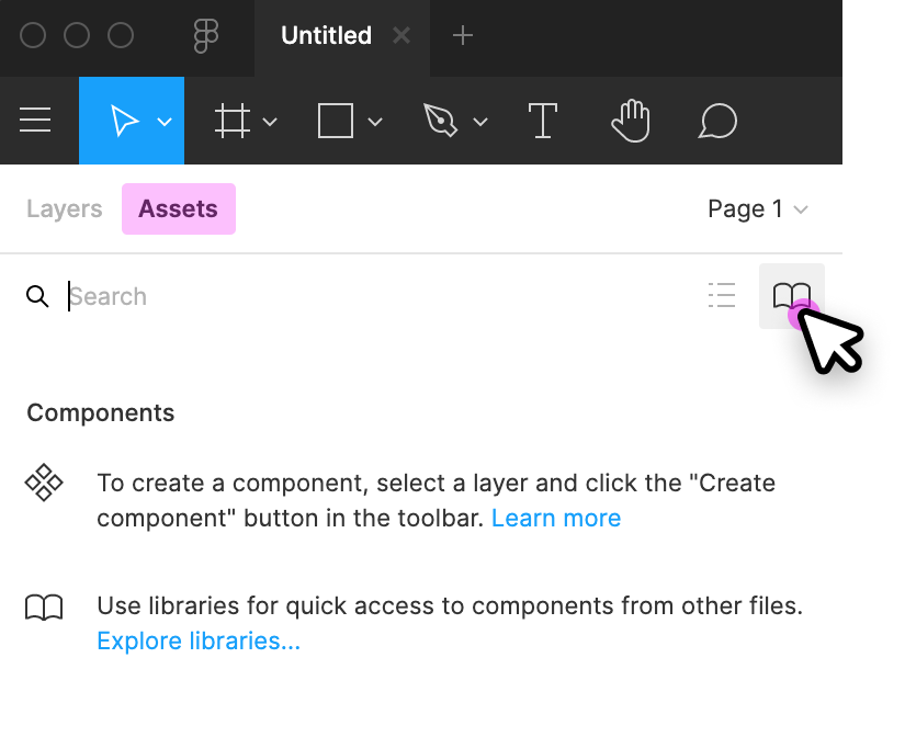
Related Links

SAP Fiori Design Stencils

Intro

Design stencils are ready-to-use, high-fidelity drafts of SAP Fiori UI components. You can use them to visualize SAP Fiori apps and to get a realistic impression of your final design.

Stencil sets are available for Figma, Sketch, Axure RP, and Adobe XD.

Warning
Design stencils are high-definition mock-ups and do not represent the exact visual design specifications.

What’s in the Stencil Set?

The SAP Fiori design stencils include:

  • Patterns for foundation topics, such as shadow levels, grid, colors, and more
  • Page types (floorplans)
  • Controls
  • Helper tools, such as rem squares or px spacings to build your app according to the current specifications and implementations. We’ve also included interaction tools, such as like cursors and touch visualizations.

The following stencil sizes are available for your mockups:

  • S (414 px)
  • M (600 px and 834 px)
  • L (1024 px)
  • XL (1440 px)

In addition, each stencil set includes download files for:

  • Font 72, the standard typeface for SAP Fiori apps
  • The standard SAP icon font and the SAP Business Suite icon font

Download Stencils

You can download stencil packages for your preferred tool (Figma, Sketch, Axure RP, or Adobe XD).

For download and installation instructions, see the pages below for each tool.

Design Stencils for Figma | up to version 1.98

Design Stencils for Sketch | up to version 1.90

Design Stencils for Axure RP | up to version 1.90

Design Stencils for Adobe XD | up to version 1.90

Information
The design stencils for Sketch, Axure RP, and Adobe XD are no longer being updated. For the latest stencils, see the SAP Fiori stencil set for Figma.
If you want to stay with Sketch, Axure RP, or Adobe XD, check out how to use Figma stencils with other design tools.
The existing stencil files will remain available.

Download Font 72


Font 72 is SAP’s proprietary typeface and is the standard typeface for SAP Fiori apps. You can download the font separately here or download one of the tool-based stencil sets above, which all include the font.

Procedure

  1. Download the desktop and web font families.
  2. Unpack the ZIP files 72_Desktop / 72_Web 72Mono_desktop 72Mono_webfonts.
  3. Double-click each .ttf file and click Install.

The 72 font download is made available under the Apache 2.0 license.

Download Icon Font


SAP Icon Font

To use the stencils, you need to install the standard SAP icon font. You’ll also need to install this font locally if you want to display SAP Fiori icons in other applications, such as PowerPoint. For more information about the SAP icon font, see the Iconography guidelines for the Quartz and Horizon themes.

SAP Icon Font Versions

Separate icon font versions are available for the Quartz theme (version 4.14) and the Horizon theme (version 5.02). Both overwrite the standard sap-icons font file.

If you need to work with both icon fonts in parallel, you can use the version 4 preview (instead of version 4.14) to install the Quartz icon font alongside the Horizon icon font. The icons are then stored in separate font files:

  • Horizon icon font:sap-icons.ttf
  • Quartz icon font: SAP-icons-v4-preview.ttf

Procedure

    1. Depending on your operating system, we recommend uninstalling any previous SAP icon font version and rebooting your system before installing the latest icon font.
    2. Download and install the icon font version(s) you need:
      a) Unpack the ZIP file sap-icons… .zip.
      b) Double-click the SAP-icons… .ttf file and click Install.


SAP Business Suite Icon Font (Optional)

In some application areas, you may also need to use the SAP Business Suite Icon Font (BusinessSuiteInAppSymbols). This icon font contains application-specific icons primarily used in SAP S/4HANA apps.

Important: To use the SAP Business Suite icon font in your app, it must be registered as a custom font in sap.ui.core.IconPool.

Procedure

  1. Download and unpack the ZIP file BusinessSuiteInAppSymbols_...zip.
  2. Install the SAP Business Suite icon font: Double-click the BusinessSuiteInAppSymbols.ttf file and click Install.
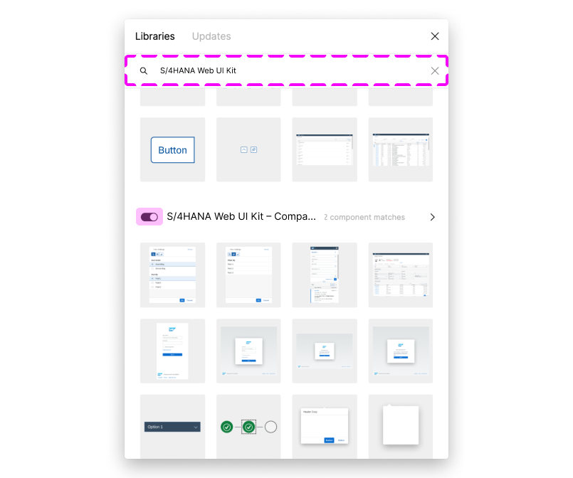
Related Links

Design Stencils for Figma (Mac and Windows)

Intro

You can use this stencil set to create high-fidelity SAP Fiori designs using Figma.

For more information about SAP Fiori design stencils in general, see Design Stencils.

For information on how to use the Figma stencils with Sketch, Axure RP, or Adobe XD, see Using Figma Stencils with Other Design Tools.

Prerequisites

To use the SAP Fiori stencils, you need to install SAP’s 72 font family and the SAP icon font on your machine.

Information
Depending on your operating system, we recommend uninstalling any previous SAP icon font version and rebooting your system before installing the latest version.

Download and Installation


Information
We’re currently working on a new stencil library for the upcoming Horizon visual theme. The Quartz Light stencil library will remain available but is no longer being updated. For the latest SAPUI5 control implementations, check out the samples.
  1. Install the Figma software here: www.figma.com
  2. Download the latest Figma SAP Fiori Design Stencils.
  3. Install font 72*.
    1. Choose the folder Font 72 /  72_Desktop.
    2. Double-click each .ttf file and click Install.
  4. Install the SAP icon font.
    1. Remove any former versions of the SAP icon font.
    2. Choose the folder Icon Fonts / …final icon package / Fonts
    3. Double-click the SAP-icons.ttf file and click Install.
  5. Optional: Install the SAP Business Suite icon font.
    1. Remove any former versions of the SAP Business Suite icon font.
    2. Choose the folder Icon Fonts / …final icon package / Fonts
    3. Double-click the BusinessSuiteInAppSymbols.ttf file and click Install.

*The 72 font download is made available under the Apache 2.0 license.

Activating the Figma Library

The procedure for using the Figma library depends your Figma license plan. Follow the link for your license plan below.

Option A: With a Figma Professional Plan

Information
From stencil version 1.98, there are two separate libraries per stencil version: a compact library and a cozy library.

If you already use one of the older Fiori Web Stencil libraries (v1.80 – v1.96), please use the swap library feature to swap the old library to one of the new files – either compact or cozy, depending on the form factor you are using in your file. If you are using both form factors in one design file, please swap to the library for the most-used form factor.

With this, most components in your file will be swapped. You’ll be able to update any remaining components manually later on using the swap instance function for your file.

  1. Import the two .fig files Fiori Web Stencils Compact and Fiori Web Stencils Cozy as well as the .fig file Quartz Light Colors MASTER into Figma and publish them as libraries.
  1. Create a new design file and activate the published Fiori Web Stencil libraries and Quartz Light Colors library in the asset panel on the left. To do this, click the library icon on the top right of the asset panel and activate the libraries using the switch in the dialog.
  1. After activating a library, you’ll see all the activated libraries as a list within the asset panel on the left. From there, you can easily drag and drop the stencil you need to your canvas.

Option B: Without a Figma Professional Plan

  1. Import the two .fig files Fiori Web Stencils Compact and Fiori Web Stencils Cozy as well as the .fig file Quartz Light Colors MASTER [Resource] into Figma and publish the styles of the Quartz Light Colors MASTER [Resource].
  1. Create a new design file and activate the published Quartz Light Color library in the asset panel on the left. To do this, click the library icon on the top right of the left side panel and activate the library using the switch in the dialog.
  1. You are now able to copy and paste the stencil you need from the two Fiori Web Stencil files into your project file and change the styles of your own elements to the Figma Quartz Light Color Styles via the design panel on the right.

Top Tips

Variants

Check out the variants section within the design panel on the right to adapt the stencil as needed. Possible settings include:

  • Content Density
  • Size
  • Visual State
  • Value State
  • Actions

For more information, see Create and use variants on the Figma website.

Swap Instances (Figma Professional Plan Only)

You can easily switch between instances of a component (for example, to switch a “button” component to a “menu button” component). You do this via the instance menu in the design panel on the right.

Map Components to Other Libraries (Figma Professional Plan Only)

If a component has the same name in different libraries, you can swap instances manually (in other words, map components to the components of a different library). For example, you can swap a button from an unavailable library (e.g. “Fiori Web Stencils v1.96”) to a button from the library “Fiori Web Stencils v1.98 Compact“. Simply choose the component you want to swap and search for the same component name within the Swap Instance popup.

Important: If the component doesn’t seem to be available any more, please do not click on “Restore Component”.

For more information, see Swap between component instances in a file on the Figma website.

Swap Library (Figma Professional Plan Only)

You can use the “Swap library” function to update all instances in your file (for example, to update your components from an older stencil version to the latest version).

Procedure:

  1. In the asset pane, open the team library dialog.
  2. Choose the library you activated for the file by clicking on the line item.
  3. Click the Swap library button.
  4. Choose the library you want to use to update your components.
  5. Confirm by clicking the Swap library button again.

Whenever the selected target library matches the style and component naming, it is applied automatically.

Figma doesn’t swap unmatched assets. These stay connected to the original library. If needed, you can swap individual instances manually using the swap instances function.

For more information, see Swap style and component libraries on the Figma website.

Using the Style Library

You can use the Quartz Light Colors by activating the Quartz Light Colors MASTER [Resource] library. You’ll find the menu in the right-hand panel within the “Fill”, “Stroke”, and “Effects” sections. The styles are structured in groups, such as “Reference”, “Main UI Colors”, and many more.

Auto Layout

Auto layout is a feature that enables a container to adapt dynamically to the elements inside it.

  • Everything adjusts automatically when an element within the component is shown or hidden.
  • If a text is changed within the component, everything adjusts automatically to the new text length.
  • The padding is managed dynamically and always remains correct.

You can show/hide elements within components easily using the layer panel on the left.

For more information, see Create dynamic designs with Auto layout on the Figma website.

How to Use SAP Icons

You can copy and paste any SAP icon from the Icon Explorer to Figma:

  1. Make sure that you have installed the icon font you want to use properly. For more information, see Download Icon Font.
  2. In the Icon Explorer, select the icon you want to use.
  3. Select the relevant icon font in the Figma Text element (for example, SAP-icons).
  4. In the Copy section at the top of the right-hand panel, copy the icon to the clipboard (copy the second item with the icon and icon name).
  5. In Figma, simply paste the icon from the clipboard.

Note: If you switch between different icon fonts, you may need to restart Figma for the new setting in the Text element to take effect.

Related Links

SAP Fiori Design Stencils

Intro

Design stencils are ready-to-use, high-fidelity drafts of SAP Fiori UI components. You can use them to visualize SAP Fiori apps and to get a realistic impression of your final design.

Stencil sets are available for Figma, Sketch, Axure RP, and Adobe XD.

Warning
Design stencils are high-definition mock-ups and do not represent the exact visual design specifications.

What’s in the Stencil Set?

The SAP Fiori design stencils include:

  • Patterns for foundation topics, such as shadow levels, grid, colors, and more
  • Page types (floorplans)
  • Controls
  • Helper tools, such as rem squares or px spacings to build your app according to the current specifications and implementations. We’ve also included interaction tools, such as like cursors and touch visualizations.

The following stencil sizes are available for your mockups:

  • S (414 px)
  • M (600 px and 834 px)
  • L (1024 px)
  • XL (1440 px)

In addition, each stencil set includes download files for:

  • Font 72, the standard typeface for SAP Fiori apps
  • The standard SAP icon font and the SAP Business Suite icon font

Download Stencils

You can download stencil packages for your preferred tool (Figma, Sketch, Axure RP, or Adobe XD).

For download and installation instructions, see the pages below for each tool.

Design Stencils for Figma | up to version 1.98

Design Stencils for Sketch | up to version 1.90

Design Stencils for Axure RP | up to version 1.90

Design Stencils for Adobe XD | up to version 1.90

Information
The design stencils for Sketch, Axure RP, and Adobe XD are no longer being updated. For the latest stencils, see the SAP Fiori stencil set for Figma.
If you want to stay with Sketch, Axure RP, or Adobe XD, check out how to use Figma stencils with other design tools.
The existing stencil files will remain available.

Download Font 72


Font 72 is SAP’s proprietary typeface and is the standard typeface for SAP Fiori apps. You can download the font separately here or download one of the tool-based stencil sets above, which all include the font.

Procedure

  1. Download the desktop and web font families.
  2. Unpack the ZIP files 72_Desktop / 72_Web 72Mono_desktop 72Mono_webfonts.
  3. Double-click each .ttf file and click Install.

The 72 font download is made available under the Apache 2.0 license.

Download Icon Font


SAP Icon Font

To use the stencils, you need to install the standard SAP icon font. You’ll also need to install this font locally if you want to display SAP Fiori icons in other applications, such as PowerPoint. For more information about the SAP icon font, see Iconography.

The SAP icon font is also included in the stencil sets for Figma, Sketch, Axure RP, and Adobe XD.

Procedure

  1. Depending on your operating system, we recommend uninstalling any previous SAP icon font version and rebooting your system before installing the latest icon font.
  2. Download and unpack the ZIP file sap-icons_… .zip .
  3. Double-click the SAP-icons.ttf file and click Install.


SAP Business Suite Icon Font (Optional)

In some application areas, you may also need to use the SAP Business Suite Icon Font (BusinessSuiteInAppSymbols). This icon font contains application-specific icons primarily used in SAP S/4HANA apps.

Important: To use the SAP Business Suite icon font in your app, it must be registered as a custom font in sap.ui.core.IconPool.

Procedure

  1. Download and unpack the ZIP file BusinessSuiteInAppSymbols_...zip.
  2. Install the SAP Business Suite icon font: Double-click the BusinessSuiteInAppSymbols.ttf file and click Install.
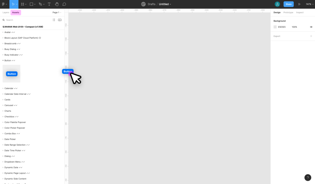
Related Links

Using Figma Stencils with Other Design Tools

You can transfer SAP Fiori design stencils from Figma to other design tools. This article outlines how to do this for Sketch, Axure RP, and Adobe XD.

Information
You can copy assets between the design tools without a Figma license.

Step 1: Open Stencils in Figma

  1. Go to www.figma.com, and sign up for a starter account (free).
  2. Import the stencil file using the button in the top right corner.
  3. Select the stencil you need (see the stencils within the layers panel on the left side).

Step 2: Export/Copy to Your Tool

Sketch

  1. Select the stencil.
  2. Set up the export:
    1. In design panel on the right, go to the Export section and click the “+” icon.
    2. Choose SVG as the export file.
    3. In the overflow menu (), deselect “Outline Text”.
       If you don’t deselect “Outline Text”, you won’t be able to change text afterwards in your design tool.
  3. Click Export to export the selection.
  4. In Sketch, open the exported SVG file via File / Open Local Document… .

Axure RP

  1. Install the Axure RP Plugin.
  2. Select the stencil on the canvas.
  3. Under the main menu on the top left go to Plugins / Axure / Copy Selection for RP.
  4. Open Axure RP and paste the component to your canvas.

Adobe XD

  1. Right click on the stencil and use the Copy as SVG option.
  2. Open Adobe XD and paste the SVG directly to your canvas.

Design Stencils for Figma (Mac and Windows)

Intro

You can use this stencil set to create high-fidelity SAP Fiori designs using Figma.

For more information about SAP Fiori design stencils in general, see Design Stencils.

For information on how to use the Figma stencils with Sketch, Axure RP, or Adobe XD, see Using Figma Stencils with Other Design Tools.

Prerequisites

To use the SAP Fiori stencils, you need to install SAP’s 72 font family and the SAP icon font on your machine.

Information
Depending on your operating system, we recommend uninstalling any previous SAP icon font version and rebooting your system before installing the latest version.

Download and Installation


Information
We’re currently working on a new stencil library for the upcoming Horizon visual theme. The Quartz Light stencil library will remain available but is no longer being updated. For the latest SAPUI5 control implementations, check out the samples.
  1. Install the Figma software here: www.figma.com
  2. Download the latest Figma SAP Fiori Design Stencils.
  3. Install font 72*.
    1. Choose the folder Font 72 /  72_Desktop.
    2. Double-click each .ttf file and click Install.
  4. Install the SAP icon font.
    1. Remove any former versions of the SAP icon font.
    2. Choose the folder Icon Fonts / …final icon package / Fonts
    3. Double-click the SAP-icons.ttf file and click Install.
  5. Optional: Install the SAP Business Suite icon font.
    1. Remove any former versions of the SAP Business Suite icon font.
    2. Choose the folder Icon Fonts / …final icon package / Fonts
    3. Double-click the BusinessSuiteInAppSymbols.ttf file and click Install.

*The 72 font download is made available under the Apache 2.0 license.

Activating the Figma Library

The procedure for using the Figma library depends your Figma license plan. Follow the link for your license plan below.

Option A: With a Figma Professional Plan

Information
From stencil version 1.98, there are two separate libraries per stencil version: a compact library and a cozy library.

If you already use one of the older Fiori Web Stencil libraries (v1.80 – v1.96), please use the swap library feature to swap the old library to one of the new files – either compact or cozy, depending on the form factor you are using in your file. If you are using both form factors in one design file, please swap to the library for the most-used form factor.

With this, most components in your file will be swapped. You’ll be able to update any remaining components manually later on using the swap instance function for your file.

  1. Import the two .fig files Fiori Web Stencils Compact and Fiori Web Stencils Cozy as well as the .fig file Quartz Light Colors MASTER into Figma and publish them as libraries.
  1. Create a new design file and activate the published Fiori Web Stencil libraries and Quartz Light Colors library in the asset panel on the left. To do this, click the library icon on the top right of the asset panel and activate the libraries using the switch in the dialog.
  1. After activating a library, you’ll see all the activated libraries as a list within the asset panel on the left. From there, you can easily drag and drop the stencil you need to your canvas.

Option B: Without a Figma Professional Plan

  1. Import the two .fig files Fiori Web Stencils Compact and Fiori Web Stencils Cozy as well as the .fig file Quartz Light Colors MASTER [Resource] into Figma and publish the styles of the Quartz Light Colors MASTER [Resource].
  1. Create a new design file and activate the published Quartz Light Color library in the asset panel on the left. To do this, click the library icon on the top right of the left side panel and activate the library using the switch in the dialog.
  1. You are now able to copy and paste the stencil you need from the two Fiori Web Stencil files into your project file and change the styles of your own elements to the Figma Quartz Light Color Styles via the design panel on the right.

Top Tips

Variants

Check out the variants section within the design panel on the right to adapt the stencil as needed. Possible settings include:

  • Content Density
  • Size
  • Visual State
  • Value State
  • Actions

For more information, see Create and use variants on the Figma website.

Swap Instances (Figma Professional Plan Only)

You can easily switch between instances of a component (for example, to switch a “button” component to a “menu button” component). You do this via the instance menu in the design panel on the right.

Map Components to Other Libraries (Figma Professional Plan Only)

If a component has the same name in different libraries, you can swap instances manually (in other words, map components to the components of a different library). For example, you can swap a button from an unavailable library (e.g. “Fiori Web Stencils v1.96”) to a button from the library “Fiori Web Stencils v1.98 Compact“. Simply choose the component you want to swap and search for the same component name within the Swap Instance popup.

Important: If the component doesn’t seem to be available any more, please do not click on “Restore Component”.

For more information, see Swap between component instances in a file on the Figma website.

Swap Library (Figma Professional Plan Only)

You can use the “Swap library” function to update all instances in your file (for example, to update your components from an older stencil version to the latest version).

Procedure:

  1. In the asset pane, open the team library dialog.
  2. Choose the library you activated for the file by clicking on the line item.
  3. Click the Swap library button.
  4. Choose the library you want to use to update your components.
  5. Confirm by clicking the Swap library button again.

Whenever the selected target library matches the style and component naming, it is applied automatically.

Figma doesn’t swap unmatched assets. These stay connected to the original library. If needed, you can swap individual instances manually using the swap instances function.

For more information, see Swap style and component libraries on the Figma website.

Using the Style Library

You can use the Quartz Light Colors by activating the Quartz Light Colors MASTER [Resource] library. You’ll find the menu in the right-hand panel within the “Fill”, “Stroke”, and “Effects” sections. The styles are structured in groups, such as “Reference”, “Main UI Colors”, and many more.

Auto Layout

Auto layout is a feature that enables a container to adapt dynamically to the elements inside it.

  • Everything adjusts automatically when an element within the component is shown or hidden.
  • If a text is changed within the component, everything adjusts automatically to the new text length.
  • The padding is managed dynamically and always remains correct.

You can show/hide elements within components easily using the layer panel on the left.

For more information, see Create dynamic designs with Auto layout on the Figma website.

How to Use SAP Icons

You can copy and paste any SAP icon from the Icon Explorer to Figma:

  1. Make sure that you have installed the icon font you want to use properly. For more information, see Download Icon Font.
  2. In the Icon Explorer, select the icon you want to use.
  3. Select the relevant icon font in the Figma Text element (for example, SAP-icons).
  4. In the Copy section at the top of the right-hand panel, copy the icon to the clipboard (copy the second item with the icon and icon name).
  5. In Figma, simply paste the icon from the clipboard.

Note: If you switch between different icon fonts, you may need to restart Figma for the new setting in the Text element to take effect.

Related Links

Design Stencils for Figma (Mac and Windows)

Intro

You can use this stencil set to create high-fidelity SAP Fiori designs using Figma.

For more information about SAP Fiori design stencils in general, see Design Stencils.

For information on how to use the Figma stencils with Sketch, Axure RP, or Adobe XD, see Using Figma Stencils with Other Design Tools.

Prerequisites

To use the SAP Fiori stencils, you need to install SAP’s 72 font family and the SAP icon font on your machine.

Information
Depending on your operating system, we recommend uninstalling any previous SAP icon font version and rebooting your system before installing the latest version.

Download and Installation

Information
From stencil version 1.98, there are two separate libraries per stencil version: a compact library and a cozy library.
  1. Install the Figma software here: www.figma.com
  2. Download the latest Figma SAP Fiori Design Stencils.
  3. Install font 72*.
    1. Choose the folder Font 72 /  72_Desktop.
    2. Double-click each .ttf file and click Install.
  4. Install the SAP icon font.
    1. Remove any former versions of the SAP icon font.
    2. Choose the folder Icon Fonts / …final icon package / Fonts
    3. Double-click the SAP-icons.ttf file and click Install.
  5. Optional: Install the SAP Business Suite icon font.
    1. Remove any former versions of the SAP Business Suite icon font.
    2. Choose the folder Icon Fonts / …final icon package / Fonts
    3. Double-click the BusinessSuiteInAppSymbols.ttf file and click Install.

*The 72 font download is made available under the Apache 2.0 license.

Activating the Figma Library

The procedure for using the Figma library depends your Figma license plan. Follow the link for your license plan below.

Option A: With a Figma Professional Plan

Information
If you already use one of the older Fiori Web Stencil libraries (v1.80 – v1.96), please use the swap library feature to swap the old library to one of the new files – either compact or cozy, depending on the form factor you are using in your file. If you are using both form factors in one design file, please swap to the library for the most-used form factor.

With this, most components in your file will be swapped. You’ll be able to update any remaining components manually later on using the swap instance function for your file.

  1. Import the two .fig files Fiori Web Stencils Compact and Fiori Web Stencils Cozy as well as the .fig file Quartz Light Colors MASTER into Figma and publish them as libraries.
  1. Create a new design file and activate the published Fiori Web Stencil libraries and Quartz Light Colors library in the asset panel on the left. To do this, click the library icon on the top right of the asset panel and activate the libraries using the switch in the dialog.
  1. After activating a library, you’ll see all the activated libraries as a list within the asset panel on the left. From there, you can easily drag and drop the stencil you need to your canvas.

Option B: Without a Figma Professional Plan

  1. Import the two .fig files Fiori Web Stencils Compact and Fiori Web Stencils Cozy as well as the .fig file Quartz Light Colors MASTER [Resource] into Figma and publish the styles of the Quartz Light Colors MASTER [Resource].
  1. Create a new design file and activate the published Quartz Light Color library in the asset panel on the left. To do this, click the library icon on the top right of the left side panel and activate the library using the switch in the dialog.
  1. You are now able to copy and paste the stencil you need from the two Fiori Web Stencil files into your project file and change the styles of your own elements to the Figma Quartz Light Color Styles via the design panel on the right.

Top Tips

Variants

Check out the variants section within the design panel on the right to adapt the stencil as needed. Possible settings include:

  • Content Density
  • Size
  • Visual State
  • Value State
  • Actions

For more information, see Create and use variants on the Figma website.

Swap Instances (Figma Professional Plan Only)

You can easily switch between instances of a component (for example, to switch a “button” component to a “menu button” component). You do this via the instance menu in the design panel on the right.

Map Components to Other Libraries (Figma Professional Plan Only)

If a component has the same name in different libraries, you can swap instances manually (in other words, map components to the components of a different library). For example, you can swap a button from an unavailable library (e.g. “Fiori Web Stencils v1.96”) to a button from the library “Fiori Web Stencils v1.98 Compact“. Simply choose the component you want to swap and search for the same component name within the Swap Instance popup.

Important: If the component doesn’t seem to be available any more, please do not click on “Restore Component”.

For more information, see Swap between component instances in a file on the Figma website.

Swap Library (Figma Professional Plan Only)

You can use the “Swap library” function to update all instances in your file (for example, to update your components from an older stencil version to the latest version).

Procedure:

  1. In the asset pane, open the team library dialog.
  2. Choose the library you activated for the file by clicking on the line item.
  3. Click the Swap library button.
  4. Choose the library you want to use to update your components.
  5. Confirm by clicking the Swap library button again.

Whenever the selected target library matches the style and component naming, it is applied automatically.

Figma doesn’t swap unmatched assets. These stay connected to the original library. If needed, you can swap individual instances manually using the swap instances function.

For more information, see Swap style and component libraries on the Figma website.

Using the Style Library

You can use the Quartz Light Colors by activating the Quartz Light Colors MASTER [Resource] library. You’ll find the menu in the right-hand panel within the “Fill”, “Stroke”, and “Effects” sections. The styles are structured in groups, such as “Reference”, “Main UI Colors”, and many more.

Auto Layout

Auto layout is a feature that enables a container to adapt dynamically to the elements inside it.

  • Everything adjusts automatically when an element within the component is shown or hidden.
  • If a text is changed within the component, everything adjusts automatically to the new text length.
  • The padding is managed dynamically and always remains correct.

You can show/hide elements within components easily using the layer panel on the left.

For more information, see Create dynamic designs with Auto layout on the Figma website.

How to Use SAP Icons

You can copy and paste any SAP icon from the Icon Explorer to Figma:

  1. Make sure that you have installed the icon font you want to use properly. For more information, see Download Icon Font.
  2. In the Icon Explorer, select the icon you want to use.
  3. Select the relevant icon font in the Figma Text element (for example, SAP-icons).
  4. In the Copy section at the top of the right-hand panel, copy the icon to the clipboard (copy the second item with the icon and icon name).
  5. In Figma, simply paste the icon from the clipboard.

Note: If you switch between different icon fonts, you may need to restart Figma for the new setting in the Text element to take effect.

Related Links

SAP Fiori Design Stencils

Intro

Design stencils are ready-to-use, high-fidelity drafts of SAP Fiori UI components. You can use them to visualize SAP Fiori apps and to get a realistic impression of your final design.

Stencil sets are available for Figma, Sketch, Axure RP, and Adobe XD.

Warning
Design stencils are high-definition mock-ups and do not represent the exact visual design specifications.

What’s in the Stencil Set?

The SAP Fiori design stencils include:

  • Patterns for foundation topics, such as shadow levels, grid, colors, and more
  • Page types (floorplans)
  • Controls
  • Helper tools, such as rem squares or px spacings to build your app according to the current specifications and implementations. We’ve also included interaction tools, such as like cursors and touch visualizations.

The following stencil sizes are available for your mockups:

  • S (414 px)
  • M (600 px and 834 px)
  • L (1024 px)
  • XL (1440 px)

In addition, each stencil set includes download files for:

  • Font 72, the standard typeface for SAP Fiori apps
  • The standard SAP icon font and the SAP Business Suite icon font

Download Stencils

You can download stencil packages for your preferred tool (Figma, Sketch, Axure RP, or Adobe XD).

For download and installation instructions, see the pages below for each tool.

Design Stencils for Figma | up to version 1.98

Design Stencils for Sketch | up to version 1.90

Design Stencils for Axure RP | up to version 1.90

Design Stencils for Adobe XD | up to version 1.90

Information
The design stencils for Sketch, Axure RP, and Adobe XD are no longer being updated. For the latest stencils, see the SAP Fiori stencil set for Figma.
If you want to stay with Sketch, Axure RP, or Adobe XD, check out how to use Figma stencils with other design tools.
The existing stencil files will remain available.

Download Font 72


Font 72 is SAP’s proprietary typeface and is the standard typeface for SAP Fiori apps. You can download the font separately here or download one of the tool-based stencil sets above, which all include the font.

Procedure

  1. Download the desktop and web font families.
  2. Unpack the ZIP files 72_Desktop / 72_Web 72Mono_desktop 72Mono_webfonts.
  3. Double-click each .ttf file and click Install.

The 72 font download is made available under the Apache 2.0 license.

Download Icon Font


SAP Icon Font

To use the stencils, you need to install the standard SAP icon font. You’ll also need to install this font locally if you want to display SAP Fiori icons in other applications, such as PowerPoint. For more information about the SAP icon font, see Iconography.

The SAP icon font is also included in the stencil sets for Figma, Sketch, Axure RP, and Adobe XD.

Procedure

  1. Depending on your operating system, we recommend uninstalling any previous SAP icon font version and rebooting your system before installing the latest icon font.
  2. Download and unpack the ZIP file sap-icons_… .zip .
  3. Double-click the SAP-icons.ttf file and click Install.


SAP Business Suite Icon Font (Optional)

In some application areas, you may also need to use the SAP Business Suite Icon Font (BusinessSuiteInAppSymbols). This icon font contains application-specific icons primarily used in SAP S/4HANA apps.

Important: To use the SAP Business Suite icon font in your app, it must be registered as a custom font in sap.ui.core.IconPool.

Procedure

  1. Download and unpack the ZIP file BusinessSuiteInAppSymbols_...zip.
  2. Install the SAP Business Suite icon font: Double-click the BusinessSuiteInAppSymbols.ttf file and click Install.
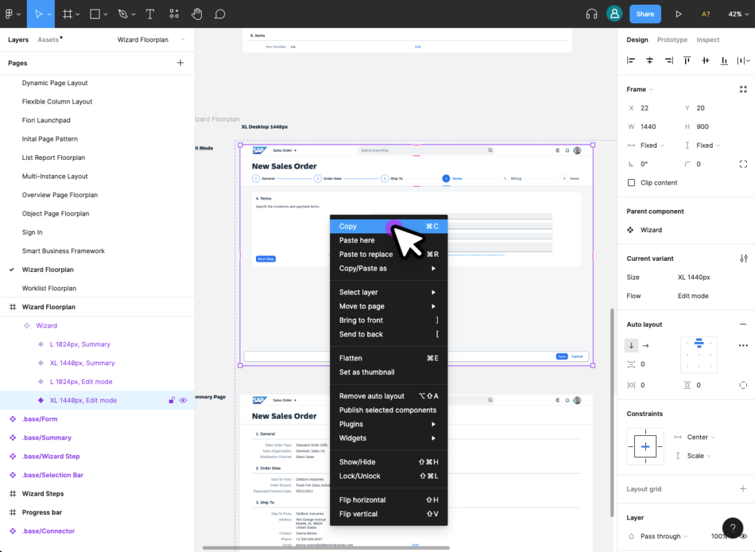
Related Links

Design Stencils for Figma (Mac and Windows)

Intro

You can use this stencil set to create high-fidelity SAP Fiori designs using Figma.

For more information about SAP Fiori design stencils in general, see Design Stencils.

For information on how to use the Figma stencils with Sketch, Axure RP, or Adobe XD, see Using Figma Stencils with Other Design Tools.

Prerequisites

To use the SAP Fiori stencils, you need to install SAP’s 72 font family and the SAP icon font on your machine.

Information
Depending on your operating system, we recommend uninstalling any previous SAP icon font version and rebooting your system before installing the latest version.

Download and Installation

  1. Install the Figma software here: www.figma.com
  2. Download the latest Figma SAP Fiori Design Stencils.
  3. Install font 72*.
    1. Choose the folder Font 72 /  72_Desktop.
    2. Double-click each .ttf file and click Install.
  4. Install the SAP icon font.
    1. Remove any former versions of the SAP icon font.
    2. Choose the folder Icon Fonts / …final icon package / Fonts
    3. Double-click the SAP-icons.ttf file and click Install.
  5. Optional: Install the SAP Business Suite icon font.
    1. Remove any former versions of the SAP Business Suite icon font.
    2. Choose the folder Icon Fonts / …final icon package / Fonts
    3. Double-click the BusinessSuiteInAppSymbols.ttf file and click Install.

*The 72 font download is made available under the Apache 2.0 license.

Activating the Figma Library

Option A: With a Figma Professional Plan

  1. Import the Figma SAP Fiori Design Stencils as well as the Figma Quartz Light Colors MASTER into Figma and publish them as a library.
  1. Create a new design file and activate the published Fiori Web Stencil library and Quartz Light Colors library in the asset panel on the left. To do this, click the library icon on the top right of the left side panel and activate the libraries using the switch in the dialog.
  1. After activating a library, you’ll see all the activated libraries as a list within the asset panel on the left. From there, you can easily drag and drop the stencil you need to your canvas.

Option B: Without a Figma Professional Plan

  1. Import the Figma SAP Fiori Design Stencils as well as the Figma Quartz Light Color Styles into Figma and publish the styles of the Figma Quartz Light Color Styles.
  1. Create a new design file and activate the published Quartz Light Color library in the asset panel on the left. To do this, click the library icon on the top right of the left side panel and activate the library using the switch in the dialog.
  1. You are now able to copy and paste the stencil you need from the Figma SAP Fiori Design Stencils file into your project file and change the styles of your own elements to the Figma Quartz Light Color Styles via the design panel on the right.

Top Tips

Variants

Check out the variants section within the design panel on the right to adapt the stencil as needed. Possible settings include:

  • Content Density
  • Size
  • Visual State
  • Value State
  • Actions

For more information, see Create and use variants on the Figma website.

Swap Instances (Figma Professional Plan Only)

You can easily switch between instances of a component using the instance menu in the design panel on the right.

For more information, see Swap between component instances in a file on the Figma website.

Swap Library (Figma Professional Plan Only)

You can use the “Swap library” function to update all instances in your file (for example, to update your components from an older stencil version to the latest version).

Procedure:

  1. In the asset pane, open the team library dialog.
  2. Choose the library you activated for the file by clicking on the line item.
  3. Click the Swap library button.
  4. Choose the library you want to use to update your components.
  5. Confirm by clicking the Swap library button again.

Whenever the selected target library matches the style and component naming, it is applied automatically.

Figma doesn’t swap unmatched assets. These stay connected to the original library. If needed, you can swap individual instances manually using the swap instances function.

For more information, see Swap style and component libraries on the Figma website.

Use the Style Library

You can use the Quartz Light Colors by activating the Quartz Light Colors MASTER [Resource] library. You’ll find the menu in the right-hand panel within the sections “Fill”, “Stroke” and “Effects”. The styles are structured in groups, such as “Reference”, “Main UI Colors”, and many more.

Auto Layout

Auto layout is a feature that enables a container to adapt dynamically to the elements inside it.

  • Everything adjusts automatically when an element within the component is shown or hidden.
  • If a text is changed within the component, everything adjusts automatically to the new text length.
  • The padding is managed dynamically and always remains correct.

You can show/hide elements within components easily using the layer panel on the left.

For more information, see Create dynamic designs with Auto layout on the Figma website.

How to Use SAP Icons

You can copy and paste any SAP icon from the Icon Explorer to Figma:

  1. Make sure that you have installed the icon font you want to use properly. For more information, see Download Icon Font.
  2. In the Icon Explorer, select the icon you want to use.
  3. Select the relevant icon font in the Figma Text element (for example, SAP-icons).
  4. In the Copy section at the top of the right-hand panel, copy the icon to the clipboard (copy the second item with the icon and icon name).
  5. In Figma, simply paste the icon from the clipboard.

Note: If you switch between different icon fonts, you may need to restart Figma for the new setting in the Text element to take effect.

Related Links

SAP Fiori Design Stencils

Intro

Design stencils are ready-to-use, high-fidelity drafts of SAP Fiori UI components. You can use them to visualize SAP Fiori apps and to get a realistic impression of your final design.

Stencil sets are available for Figma, Sketch, Axure RP, and Adobe XD.

Warning
Design stencils are high-definition mock-ups and do not represent the exact visual design specifications.

What’s in the Stencil Set?

The SAP Fiori design stencils include:

  • Patterns for foundation topics, such as shadow levels, grid, colors, and more
  • Page types (floorplans)
  • Controls
  • Helper tools, such as rem squares or px spacings to build your app according to the current specifications and implementations. We’ve also included interaction tools, such as like cursors and touch visualizations.

The following stencil sizes are available for your mockups:

  • S (414 px)
  • M (600 px and 834 px)
  • L (1024 px)
  • XL (1440 px)

In addition, each stencil set includes download files for:

  • Font 72, the standard typeface for SAP Fiori apps
  • The standard SAP icon font and the SAP Business Suite icon font

Download Stencils

You can download stencil packages for your preferred tool (Figma, Sketch, Axure RP, or Adobe XD).

For download and installation instructions, see the pages below for each tool.

Design Stencils for Figma | up to version 1.96

Design Stencils for Sketch | up to version 1.90

Design Stencils for Axure RP | up to version 1.90

Design Stencils for Adobe XD | up to version 1.90

Information
The design stencils for Sketch, Axure RP, and Adobe XD are no longer being updated. For the latest stencils, see the SAP Fiori stencil set for Figma.
If you want to stay with Sketch, Axure RP, or Adobe XD, check out how to use Figma stencils with other design tools.
The existing stencil files will remain available.

Download Font 72


Font 72 is SAP’s proprietary typeface and is the standard typeface for SAP Fiori apps. You can download the font separately here or download one of the tool-based stencil sets above, which all include the font.

Procedure

  1. Download the desktop and web font families.
  2. Unpack the ZIP files 72_Desktop / 72_Web 72Mono_desktop 72Mono_webfonts.
  3. Double-click each .ttf file and click Install.

The 72 font download is made available under the Apache 2.0 license.

Download Icon Font


SAP Icon Font

To use the stencils, you need to install the standard SAP icon font. You’ll also need to install this font locally if you want to display SAP Fiori icons in other applications, such as PowerPoint. For more information about the SAP icon font, see Iconography.

The SAP icon font is also included in the stencil sets for Figma, Sketch, Axure RP, and Adobe XD.

Procedure

  1. Depending on your operating system, we recommend uninstalling any previous SAP icon font version and rebooting your system before installing the latest icon font.
  2. Download and unpack the ZIP file sap-icons_… .zip .
  3. Double-click the SAP-icons.ttf file and click Install.


SAP Business Suite Icon Font (Optional)

In some application areas, you may also need to use the SAP Business Suite Icon Font (BusinessSuiteInAppSymbols). This icon font contains application-specific icons primarily used in SAP S/4HANA apps.

Important: To use the SAP Business Suite icon font in your app, it must be registered as a custom font in sap.ui.core.IconPool.

Procedure

  1. Download and unpack the ZIP file BusinessSuiteInAppSymbols_...zip.
  2. Install the SAP Business Suite icon font: Double-click the BusinessSuiteInAppSymbols.ttf file and click Install.
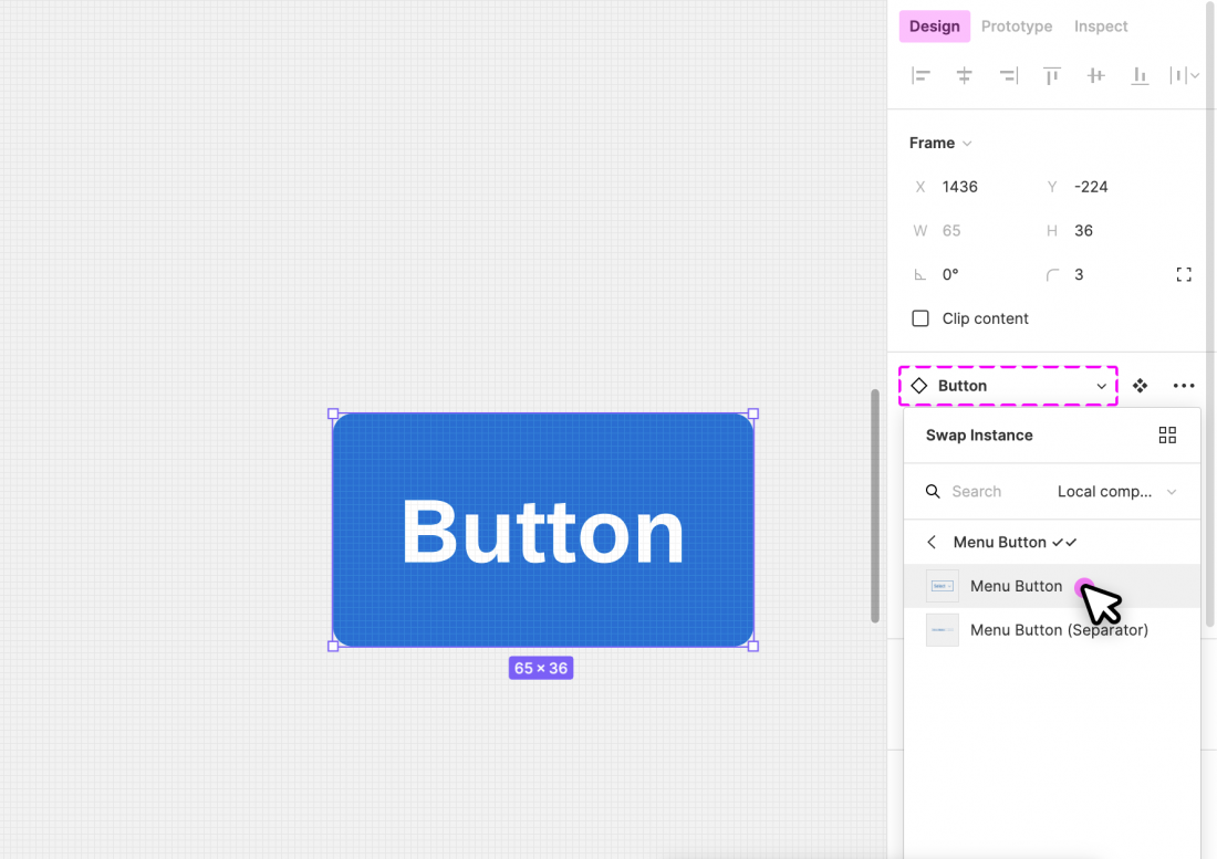
Related Links

Design Stencils for Figma (Mac and Windows)

Intro

You can use this stencil set to create high-fidelity SAP Fiori designs using Figma.

For more information about SAP Fiori design stencils in general, see Design Stencils.

For information on how to use the Figma stencils with Sketch, Axure RP, or Adobe XD, see Using Figma Stencils with Other Design Tools.

Prerequisites

To use the SAP Fiori stencils, you need to install SAP’s 72 font family and the SAP icon font on your machine.

Information
Depending on your operating system, we recommend uninstalling any previous SAP icon font version and rebooting your system before installing the latest version.

Download and Installation

  1. Install the Figma software here: www.figma.com
  2. Download the latest Figma SAP Fiori Design Stencils.
  3. Install font 72*.
    1. Choose the folder Font 72 /  72_Desktop.
    2. Double-click each .ttf file and click Install.
  4. Install the SAP icon font.
    1. Remove any former versions of the SAP icon font.
    2. Choose the folder Icon Fonts / …final icon package / Fonts
    3. Double-click the SAP-icons.ttf file and click Install.
  5. Optional: Install the SAP Business Suite icon font.
    1. Remove any former versions of the SAP Business Suite icon font.
    2. Choose the folder Icon Fonts / …final icon package / Fonts
    3. Double-click the BusinessSuiteInAppSymbols.ttf file and click Install.

*The 72 font download is made available under the Apache 2.0 license.

Activating the Figma Library

Option A: With a Figma Professional Plan

  1. Import the Figma SAP Fiori Design Stencils as well as the Figma Quartz Light Color Styles into Figma and publish them as a library.
  1. Create a new design file and activate the published Fiori Web Stencil library and Quartz Light Color library in the asset panel on the left. To do this, click the library icon on the top right of the left side panel and activate the libraries using the switch in the dialog.
  1. After activating a library, you’ll see all the activated libraries as a list within the asset panel on the left. From there, you can easily drag and drop the stencil you need to your canvas.

Option B: Without a Figma Professional Plan

  1. Import the Figma SAP Fiori Design Stencils as well as the Figma Quartz Light Color Styles into Figma and publish the styles of the Figma Quartz Light Color Styles.
  1. Create a new design file and activate the published Quartz Light Color library in the asset panel on the left. To do this, click the library icon on the top right of the left side panel and activate the library using the switch in the dialog.
  1. You are now able to copy and paste the stencil you need from the Figma SAP Fiori Design Stencils file into your project file and change the styles of your own elements to the Figma Quartz Light Color Styles via the design panel on the right.

Top Tips

Variants

Check out the variants section within the design panel on the right to adapt the stencil as needed. Possible settings include:

  • Content Density
  • Size
  • Visual State
  • Value State
  • Actions

For more information, see Create and use variants on the Figma website.

Swap Instances (Figma Professional Plan Only)

You can easily switch between instances of a component using the instance menu in the design panel on the right.

For more information, see Swap between component instances in a file on the Figma website.

Use the Style Library

You can use the Quartz Light Styles by activating the Quartz Light Colors [FG Styles] library. You’ll find the menu in the right-hand panel within the sections “Fill”, “Stroke” and “Effects”. The styles are structured in groups, such as “Reference”, “Main UI Colors”, and many more.

Auto Layout

Auto layout is a feature that enables a container to adapt dynamically to the elements inside it.

  • Everything adjusts automatically when an element within the component is shown or hidden.
  • If a text is changed within the component, everything adjusts automatically to the new text length.
  • The padding is managed dynamically and always remains correct.

You can show/hide elements within components easily using the layer panel on the left.

For more information, see Create dynamic designs with Auto layout on the Figma website.

How to Use SAP Icons

You can copy and paste any SAP icon from the Icon Explorer to Figma:

  1. Make sure that you have installed the icon font you want to use properly. For more information, see Download Icon Font.
  2. In the Icon Explorer, select the icon you want to use.
  3. Select the relevant icon font in the Figma Text element (for example, SAP-icons).
  4. In the Copy section at the top of the right-hand panel, copy the icon to the clipboard (copy the second item with the icon and icon name).
  5. In Figma, simply paste the icon from the clipboard.

Note: If you switch between different icon fonts, you may need to restart Figma for the new setting in the Text element to take effect.

Related Links

SAP Fiori Design Stencils

Intro

Design stencils are ready-to-use, high-fidelity drafts of SAP Fiori UI components. You can use them to visualize SAP Fiori apps and to get a realistic impression of your final design.

Stencil sets are available for Figma, Sketch, Axure RP, and Adobe XD.

Warning
Design stencils are high-definition mock-ups and do not represent the exact visual design specifications.

What’s in the Stencil Set?

The SAP Fiori design stencils include:

  • Patterns for foundation topics, such as shadow levels, grid, colors, and more
  • Page types (floorplans)
  • Controls
  • Helper tools, such as rem squares or px spacings to build your app according to the current specifications and implementations. We’ve also included interaction tools, such as like cursors and touch visualizations.

The following stencil sizes are available for your mockups:

  • S (414 px)
  • M (600 px and 834 px)
  • L (1024 px)
  • XL (1440 px)

In addition, each stencil set includes download files for:

  • Font 72, the standard typeface for SAP Fiori apps
  • The standard SAP icon font and the SAP Business Suite icon font

Download Stencils

You can download stencil packages for your preferred tool (Figma, Sketch, Axure RP, or Adobe XD).

For download and installation instructions, see the pages below for each tool.

Design Stencils for Figma | up to version 1.94

Design Stencils for Sketch | up to version 1.90

Design Stencils for Axure RP | up to version 1.90

Design Stencils for Adobe XD | up to version 1.90

Information
The design stencils for Sketch, Axure RP, and Adobe XD are no longer being updated. For the latest stencils, see the SAP Fiori stencil set for Figma.
If you want to stay with Sketch, Axure RP, or Adobe XD, check out how to use Figma stencils with other design tools.
The existing stencil files will remain available.

Download Font 72


Font 72 is SAP’s proprietary typeface and is the standard typeface for SAP Fiori apps. You can download the font separately here or download one of the tool-based stencil sets above, which all include the font.

Procedure

  1. Download the desktop and web font families.
  2. Unpack the ZIP files 72_Desktop / 72_Web 72Mono_desktop 72Mono_webfonts.
  3. Double-click each .ttf file and click Install.

The 72 font download is made available under the Apache 2.0 license.

Download Icon Font


SAP Icon Font

To use the stencils, you need to install the standard SAP icon font. You’ll also need to install this font locally if you want to display SAP Fiori icons in other applications, such as PowerPoint. For more information about the SAP icon font, see Iconography.

The SAP icon font is also included in the stencil sets for Figma, Sketch, Axure RP, and Adobe XD.

Procedure

  1. Depending on your operating system, we recommend uninstalling any previous SAP icon font version and rebooting your system before installing the latest icon font.
  2. Download and unpack the ZIP file sap-icons_… .zip .
  3. Double-click the SAP-icons.ttf file and click Install.


SAP Business Suite Icon Font (Optional)

In some application areas, you may also need to use the SAP Business Suite Icon Font (BusinessSuiteInAppSymbols). This icon font contains application-specific icons primarily used in SAP S/4HANA apps.

Important: To use the SAP Business Suite icon font in your app, it must be registered as a custom font in sap.ui.core.IconPool.

Procedure

  1. Download and unpack the ZIP file BusinessSuiteInAppSymbols_...zip.
  2. Install the SAP Business Suite icon font: Double-click the BusinessSuiteInAppSymbols.ttf file and click Install.
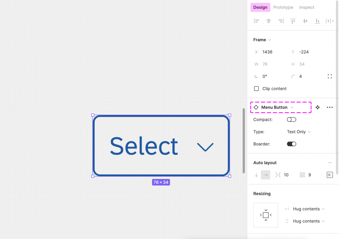
Related Links

Designer Toolkit

The designer toolkit is your one-stop destination for all of our design resources and services. Here, you’ll find:

  • UI kit, including font 72 and icon fonts.
  • User research method cards describing the most commonly practiced user research methods.
  • Our design community, where you can ask questions and post design ideas.

Using Figma Stencils with Other Design Tools

You can transfer SAP Fiori design stencils from Figma to other design tools. This article outlines how to do this for Sketch, Axure RP, and Adobe XD.

Information
You can copy assets between the design tools without a Figma license.

Step 1: Open Stencils in Figma

  1. Go to www.figma.com, and sign up for a starter account (free).
  2. Import the stencil file using the button in the top right corner.
  3. Select the stencil you need (see the stencils within the layers panel on the left side).

Step 2: Export/Copy to Your Tool

Sketch

  1. Select the stencil.
  2. Set up the export:
    1. In design panel on the right, go to the Export section and click the “+” icon.
    2. Choose SVG as the export file.
    3. In the overflow menu (), deselect “Outline Text”.
       If you don’t deselect “Outline Text”, you won’t be able to change text afterwards in your design tool.
  3. Click Export to export the selection.
  4. In Sketch, open the exported SVG file via File / Open Local Document… .

Axure RP

  1. Install the Axure RP Plugin.
  2. Select the stencil on the canvas.
  3. Under the main menu on the top left go to Plugins / Axure / Copy Selection for RP.
  4. Open Axure RP and paste the component to your canvas.

Adobe XD

  1. Right click on the stencil and use the Copy as SVG option.
  2. Open Adobe XD and paste the SVG directly to your canvas.

SAP Fiori Design Stencils

Intro

Design stencils are ready-to-use, high-fidelity drafts of SAP Fiori UI components. You can use them to visualize SAP Fiori apps and to get a realistic impression of your final design.

Stencil sets are available for Figma, Sketch, Axure RP, and Adobe XD.

Warning
Design stencils are high-definition mock-ups and do not represent the exact visual design specifications.

What’s in the Stencil Set?

The SAP Fiori design stencils include:

  • Patterns for foundation topics, such as shadow levels, grid, colors, and more
  • Page types (floorplans)
  • Controls
  • Helper tools, such as rem squares or px spacings to build your app according to the current specifications and implementations. We’ve also included interaction tools, such as like cursors and touch visualizations.

The following stencil sizes are available for your mockups:

  • S (414 px)
  • M (600 px and 834 px)
  • L (1024 px)
  • XL (1440 px)

In addition, each stencil set includes download files for:

  • Font 72, the standard typeface for SAP Fiori apps
  • The standard SAP icon font and the SAP Business Suite icon font

Download Stencils

You can download stencil packages for your preferred tool (Figma, Sketch, Axure RP, or Adobe XD).

For download and installation instructions, see the pages below for each tool.

Design Stencils for Figma | up to version 1.92

Design Stencils for Sketch | up to version 1.90

Design Stencils for Axure RP | up to version 1.90

Design Stencils for Adobe XD | up to version 1.90

Information
The design stencils for Sketch, Axure RP, and Adobe XD are no longer being updated. For the latest stencils, see the SAP Fiori stencil set for Figma.
If you want to stay with Sketch, Axure RP, or Adobe XD, check out how to use Figma stencils with other design tools.
The existing stencil files will remain available.

Download Font 72


Font 72 is SAP’s proprietary typeface and is the standard typeface for SAP Fiori apps. You can download the font separately here or download one of the tool-based stencil sets above, which all include the font.

Procedure

  1. Download the desktop and web font families.
  2. Unpack the ZIP files 72_Desktop / 72_Web 72Mono_desktop 72Mono_webfonts.
  3. Double-click each .ttf file and click Install.

The 72 font download is made available under the Apache 2.0 license.

Download Icon Font


SAP Icon Font

To use the stencils, you need to install the standard SAP icon font. You’ll also need to install this font locally if you want to display SAP Fiori icons in other applications, such as PowerPoint. For more information about the SAP icon font, see Iconography.

The SAP icon font is also included in the stencil sets for Figma, Sketch, Axure RP, and Adobe XD.

Procedure

  1. Depending on your operating system, we recommend uninstalling any previous SAP icon font version and rebooting your system before installing the latest icon font.
  2. Download and unpack the ZIP file sap-icons_… .zip .
  3. Double-click the SAP-icons.ttf file and click Install.


SAP Business Suite Icon Font (Optional)

In some application areas, you may also need to use the SAP Business Suite Icon Font (BusinessSuiteInAppSymbols). This icon font contains application-specific icons primarily used in SAP S/4HANA apps.

Important: To use the SAP Business Suite icon font in your app, it must be registered as a custom font in sap.ui.core.IconPool.

Procedure

  1. Download and unpack the ZIP file BusinessSuiteInAppSymbols_...zip.
  2. Install the SAP Business Suite icon font: Double-click the BusinessSuiteInAppSymbols.ttf file and click Install.
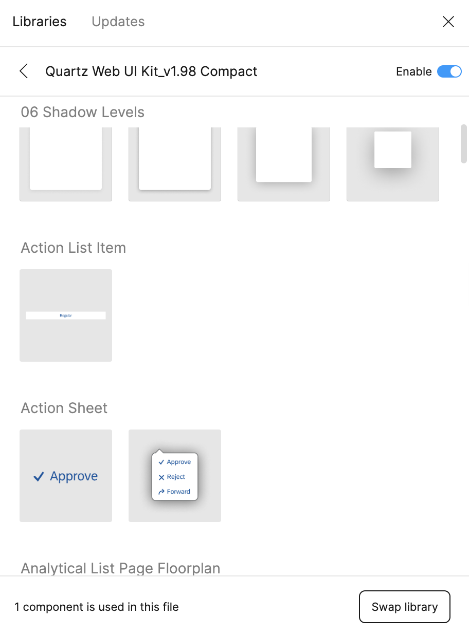
Related Links

Design Stencils for Figma (Mac and Windows)

Intro

You can use this stencil set to create high-fidelity SAP Fiori designs using Figma.

For more information about SAP Fiori design stencils in general, see Design Stencils.

For information on how to use the Figma stencils with Sketch, Axure RP, or Adobe XD, see Using Figma Stencils with Other Design Tools.

Prerequisites

To use the SAP Fiori stencils, you need to install SAP’s 72 font family and the SAP icon font on your machine.

Information
Depending on your operating system, we recommend uninstalling any previous SAP icon font version and rebooting your system before installing the latest version.

Download and Installation

  1. Install the Figma software here: www.figma.com
  2. Download the latest Figma SAP Fiori Design Stencils.
  3. Install font 72*.
    1. Choose the folder Font 72 /  72_Desktop.
    2. Double-click each .ttf file and click Install.
  4. Install the SAP icon font.
    1. Remove any former versions of the SAP icon font.
    2. Choose the folder Icon Fonts / …final icon package / Fonts
    3. Double-click the SAP-icons.ttf file and click Install.
  5. Optional: Install the SAP Business Suite icon font.
    1. Remove any former versions of the SAP Business Suite icon font.
    2. Choose the folder Icon Fonts / …final icon package / Fonts
    3. Double-click the BusinessSuiteInAppSymbols.ttf file and click Install.

*The 72 font download is made available under the Apache 2.0 license.

Activating the Figma Library

Option A: With a Figma Professional Plan

  1. Import the Figma SAP Fiori Design Stencils as well as the Figma Quartz Light Color Styles into Figma and publish them as a library.
  1. Create a new design file and activate the published Fiori Web Stencil library and Quartz Light Color library in the asset panel on the left. To do this, click the library icon on the top right of the left side panel and activate the libraries using the switch in the dialog.
  1. After activating a library, you’ll see all the activated libraries as a list within the asset panel on the left. From there, you can easily drag and drop the stencil you need to your canvas.

Option B: Without a Figma Professional Plan

  1. Import the Figma SAP Fiori Design Stencils as well as the Figma Quartz Light Color Styles into Figma and publish the styles of the Figma Quartz Light Color Styles.
  1. Create a new design file and activate the published Quartz Light Color library in the asset panel on the left. To do this, click the library icon on the top right of the left side panel and activate the library using the switch in the dialog.
  1. You are now able to copy and paste the stencil you need from the Figma SAP Fiori Design Stencils file into your project file and change the styles of your own elements to the Figma Quartz Light Color Styles via the design panel on the right.

Top Tips

Variants

Check out the variants section within the design panel on the right to adapt the stencil as needed. Possible settings include:

  • Content Density
  • Size
  • Visual State
  • Value State
  • Actions

For more information, see Create and use variants on the Figma website.

Swap Instances (Figma Professional Plan Only)

You can easily switch between instances of a component using the instance menu in the design panel on the right.

For more information, see Swap between component instances in a file on the Figma website.

Use the Style Library

You can use the Quartz Light Styles by activating the Quartz Light Colors [FG Styles] library. You’ll find the menu in the right-hand panel within the sections “Fill”, “Stroke” and “Effects”. The styles are structured in groups, such as “Reference”, “Main UI Colors”, and many more.

Auto Layout

Auto layout is a feature that enables a container to adapt dynamically to the elements inside it.

  • Everything adjusts automatically when an element within the component is shown or hidden.
  • If a text is changed within the component, everything adjusts automatically to the new text length.
  • The padding is managed dynamically and always remains correct.

You can show/hide elements within components easily using the layer panel on the left.

For more information, see Create dynamic designs with Auto layout on the Figma website.

How to Use SAP Icons

You can copy and paste any SAP icon from the Icon Explorer to Figma:

  1. Make sure that you have installed the icon font you want to use properly. For more information, see Download Icon Font.
  2. In the Icon Explorer, select the icon you want to use.
  3. Select the relevant icon font in the Figma Text element (for example, SAP-icons).
  4. In the Copy section at the top of the right-hand panel, copy the icon to the clipboard (copy the second item with the icon and icon name).
  5. In Figma, simply paste the icon from the clipboard.

Note: If you switch between different icon fonts, you may need to restart Figma for the new setting in the Text element to take effect.

Related Links

Using Figma Stencils with Other Design Tools

You can transfer SAP Fiori design stencils from Figma to other design tools. This article outlines how to do this for Sketch, Axure RP, and Adobe XD.

Information
You can copy assets between the design tools without a Figma license.

Step 1: Open Stencils in Figma

  1. Go to www.figma.com, and sign up for a starter account (free).
  2. Import the stencil file using the button in the top right corner.
  3. Select the stencil you need (see the stencils within the layers panel on the left side).

Step 2: Export/Copy to Your Tool

Sketch

  1. Select the stencil.
  2. Set up the export:
    1. In design panel on the right, go to the Export section and click the “+” icon.
    2. Choose SVG as the export file.
    3. In the overflow menu (), deselect “Outline Text”.
       If you don’t deselect “Outline Text”, you won’t be able to change text afterwards in your design tool.
  3. Click Export to export the selection.
  4. In Sketch, open the exported SVG file via File / Open Local Document… .

Axure RP

  1. Install the Axure RP Plugin.
  2. Select the stencil on the canvas.
  3. Under the main menu on the top left go to Plugins / Axure / Copy Selection for RP.
  4. Open Axure RP and paste the component to your canvas.

Adobe XD

  1. Right click on the stencil and use the Copy as SVG option.
  2. Open Adobe XD and paste the SVG directly to your canvas.

SAP Fiori Design Stencils

Intro

Design stencils are ready-to-use, high-fidelity drafts of SAP Fiori UI components. You can use them to visualize SAP Fiori apps and to get a realistic impression of your final design.

Stencil sets are available for Sketch, Axure RP, and Adobe XD.

Warning
Design stencils are high-definition mock-ups and do not represent the exact visual design specifications.

What’s in the Stencil Set?

The SAP Fiori design stencils include:

  • Patterns for foundation topics, such as shadow levels, grid, colors, and more
  • Page types (floorplans)
  • Controls
  • Helper tools, such as rem squares or px spacings to build your app according to the current specifications and implementations. We’ve also included interaction tools, such as like cursors and touch visualizations.

The following stencil sizes are available for your mockups:

  • S (414 px)
  • M (600 px and 834 px)
  • L (1024 px)
  • XL (1440 px)

In addition, each stencil set includes download files for:

  • Font 72, the standard typeface for SAP Fiori apps
  • The standard SAP icon font and the SAP Business Suite icon font

Download Stencils

You can download stencil packages for your preferred tool (Sketch, Axure RP, or Adobe XD).

For download and installation instructions, see the pages below for each tool.

Download Font 72


Font 72 is SAP’s proprietary typeface and is the standard typeface for SAP Fiori apps. You can download the font separately here or download one of the tool-based stencil sets above, which all include the font.

Procedure

  1. Download the desktop and web font families.
  2. Unpack the ZIP files 72_Desktop / 72_Web 72Mono_desktop 72Mono_webfonts.
  3. Double-click each .ttf file and click Install.

The 72 font download is made available under the Apache 2.0 license.

Download Icon Font


SAP Icon Font

To use the stencils, you need to install the standard SAP icon font. You’ll also need to install this font locally if you want to display SAP Fiori icons in other applications, such as PowerPoint. For more information about the SAP icon font, see Iconography.

The SAP icon font is also included in the stencil sets for Axure RP and Sketch.

Procedure

  1. Depending on your operating system, we recommend uninstalling any previous SAP icon font version and rebooting your system before installing the latest icon font.
  2. Download and unpack the ZIP file sap-icons_… .zip .
  3. Double-click the SAP-icons.ttf file and click Install.


SAP Business Suite Icon Font (Optional)

In some application areas, you may also need to use the SAP Business Suite Icon Font (BusinessSuiteInAppSymbols). This icon font contains application-specific icons primarily used in SAP S/4HANA apps.

Important: To use the SAP Business Suite icon font in your app, it must be registered as a custom font in sap.ui.core.IconPool.

Procedure

  1. Download and unpack the ZIP file BusinessSuiteInAppSymbols_...zip.
  2. Install the SAP Business Suite icon font: Double-click the BusinessSuiteInAppSymbols.ttf file and click Install.

Related Links

Design Stencils for Sketch (Mac)

You can use this stencil set to create high-fidelity SAP Fiori designs using Sketch.

For more information about SAP Fiori design stencils in general and other tool options, see Design Stencils.

Prerequisites

To use the SAP Fiori stencils, you need to install SAP’s 72 font family and the SAP icon font on your machine.

These fonts are provided as part of the stencil download package. See Download and Installation below.

Information
Depending on your operating system, we recommend uninstalling any previous SAP icon font version and rebooting your system before installing the latest icon font.

Download and Installation


  1. Install the Sketch software.
  2. Download and unpack the ZIP file.
  3. Save the the Fiori3_Stencils_Master.sketch file to a dedicated folder on your machine.
    When you download an updated version in future, make sure that the new file replaces the existing file. This enables Sketch to identify the update automatically.
  4. Use the SAP Fiori master file as a library within your own Sketch file. To do so, open Sketch, go to Sketch / Preferences / Libraries, and add the library to the list.

  1. Install font 72.*
    1. Choose the folder Font 72 /  72_Desktop.
    2. Double-click each .ttf file and click Install.
  2. Install the SAP icon font.
    1. Remove any former versions of the SAP icon font.
    2. Choose the folder Icon Fonts / …final icon package / Fonts
    3. Double-click the SAP-icons.ttf file and click Install.
  3. Optional: Install the SAP Business Suite icon font.
    1. Remove any former versions of the SAP Business Suite icon font.
    2. Choose the folder Icon Fonts / …final icon package / Fonts
    3. Double-click the BusinessSuiteInAppSymbols.ttf file and click Install.

*The 72 font download is made available under the Apache 2.0 license.

Using the Sketch Stencils

Symbols

All the available stencils are now available as “symbols” within your file in the Symbols menu. To use a stencil, pull it to your canvas board.

Adding a symbol/stencil to the canvas board (1)

Text and Layer Styles

In addition, you can choose from all appearances (text styles and layer styles) that are offered in the Insert menu or in the navigation panel on the right of your Sketch file.

Text style popup
Text style popup

Top Tips

Customize your Sketch toolbar

Customize your toolbar within Sketch based on your personal preferences. To do this, right-click on the toolbar in Sketch and choose Customize Toolbar…. You can now pull any menu you want to the highlighted empty boxes.

Recommended menus for working effectively:

  • Artboard
  • Symbols
  • Text Styles

Stay up-to-date

Always download updated files to a specific folder. As soon as a new version is released, put it into your stencil folder by overwriting the old file. This ensures that your working files files are updated to the latest version (find the hint in the top right of Sketch).

Don’t change symbols

Don’t overwrite symbols within the original document. This changes the symbol in all the places where a symbol is consumed. Instead, change the symbol using the Overrides panel on the right. In the Overrides panel you can change all elements within the object you selected.

Let symbols be symbols

Don’t detach elements from symbols. This ensures that your file stays up-to-date with the latest symbols from the SAP Fiori stencil set for Sketch.

Design Stencils for Axure RP (Mac and Windows)

Intro

You can use this stencil set to create high-fidelity SAP Fiori designs using Axure RP.

For more information about SAP Fiori design stencils in general and other tool options, see Design Stencils.

Prerequisites

  • Axure RP 9 is required to use the stencils.
  • To use the SAP Fiori stencils, you need to install SAP’s 72 font family and the SAP icon font on your machine. These fonts are provided as part of the stencil download package. See Download & Installation below.

Download & Installation


  1. Install the Axure RP software.
  2. Download the design stencil set: Download the ZIP file and unzip it.
  3. Install font 72.
    1. Choose the folder Font 72 /  72_Desktop.
    2. Double-click each .ttf file and click Install.
  4. Open Axure RP and change the default font within Axure RP to font 72 by using the Widget Style Manager (Project / Widget Style Manager / Default / change font to “72”).
  5. Install the SAP icon font.
    1. Remove any former versions of the SAP icon font.
    2. Choose the folder Icon Fonts / …final icon package / Fonts
    3. Double-click the SAP-icons.ttf file, and click Install.
  6. Load the libraries in Axure RP: Open Axure RP and load the libraries for the stencils and icon font (tutorial).
  7. Optional: Install and load the SAP Business Suite icon font.
 Loading libraries (1)
Loading libraries (1)
Loading libraries (2)
Loading libraries (3)

All the available stencils are now displayed in the library panel on the left and you can easily pull the stencil you need to your canvas board.

Pulling a stencil to the canvas board

Embedding Fonts into HTML Exports (Optional)

You can use a simplified method to embed fonts in Axure RP. These include:
  • SAP-icons
  • SAP-icons-TnT
  • BusinessSuiteInAppSymbols
  • 72
Tip: You can browse the three icon fonts in the Icon Explorer.

Online Usage

Follow the steps below:

  1. In Axure RP, choose Publish and Generate HTML Files….
  2. In the subsequent dialog, open the other options (settings wheel) and choose the Fonts tab. If the tab is empty, choose Add Font.
  3. Under WEB FONTS, enter a font label, such as all SAP fonts (or similar).
  4. Choose Link to .css file and enter the following URL:
    https://experience.sap.com/fonts/all_fonts.css
Embedding web fonts for online usage

You can now export your mock-ups, and everyone with internet access sees all icons and the 72 font right away.
These settings are saved only for your current Axure RP project. Repeat this procedure for every Axure RP project you want to share with others.

Offline Usage

If you are heading to usability tests with new or re-imaged laptops, or if you don’t have an internet connection, you’ll need to make sure that all icon fonts used in your prototype are installed on the devices. Alternatively, you can just use the fonts package:

  1. In Axure RP, choose Publish and Generate HTML Files….
  2. In the subsequent dialog, open the other options (settings wheel) and choose the Fonts tab. If the tab is empty, choose Add Font.
  3. Under WEB FONTS, enter a font name, such as all SAP fonts (or similar).
  4. Choose Link to .css file and enter the following URL:
    all_fonts.css
  1. Download the following file:
    https://experience.sap.com/files/prototypes/public/fonts/all_fonts.zip
  2. Unpack the file to the directory to which you also generate your HTML files (where the index.html is).

All icons are now available offline, without installing fonts.

SAP Business Suite Icon Font (Optional)

The SAP Business Suite Icon Font (BusinessSuiteInAppSymbols) contains application-specific icons primarily used in SAP S/4HANA apps.

Important! To use this font in your app, it must be registered as a custom font in sap.ui.core.IconPool.

Procedure

To add Business Suite icons to your Axure RP mockup, proceed as follows:

  1. Remove any former versions of the SAP Business Suite icon font.
  2. In the download files for the standard SAP Fiori design stencils, unpack the ZIP file IconHTMLTemplate_InAppSymbols_….zip.
  3. Open the Fonts folder and install the BusinessSuiteInAppSymbols.ttf file.
  4. Load the widget library BusinessSuiteIcons_…rplib file into Axure’s Libraries panel.

Design Stencils for Adobe XD

You can use this stencil set to create high-fidelity SAP Fiori designs using Adobe XD.

For more information about SAP Fiori design stencils and other tool options, see Design Stencils.

Prerequisites

To use the SAP Fiori stencils, you need to install SAP’s 72 font family and the SAP icon font on your machine.

These fonts are provided as part of the stencil download package. See Download and Installation below.

Download & Installation


  1. Install the Adobe XD software.
  2. Download and unpack the ZIP file in the download box.
  3. Install font 72.*
    1. Choose the folder Font 72 /  72_Desktop.
    2. Double-click each .ttf file and click Install.
  4. Install the SAP icon font.
    1. Remove any former versions of the SAP icon font.
    2. Choose the folder Icon Fonts / …final icon package / Fonts
    3. Double-click the SAP-icons.ttf file, and click Install.
  5. Optional: Install the SAP Business Suite icon font.
    1. Remove any former versions of the SAP Business Suite icon font.
    2. Choose the folder Icon Fonts / …final icon package / Fonts
    3. Double-click the BusinessSuiteInAppSymbols.ttf file, and click Install.
  6. Open the Adobe XD stencil file and save it as a duplicate.
    The duplicate is your working document for visualizing your SAP Fiori app. All the available stencils are now available as assets in the sidebar on the left, including character styles, and components (stencils).
Searching for an object page in the asset panel

*The 72 font download is made available under the Apache 2.0 license.

Design Stencils for Axure RP (Mac and Windows)

Intro

You can use this stencil set to create high-fidelity SAP Fiori designs using Axure RP.

For more information about SAP Fiori design stencils in general and other tool options, see Design Stencils.

Prerequisites

  • Axure RP 9 is required to use the stencils.
  • To use the SAP Fiori stencils, you need to install SAP’s 72 font family and the SAP icon font on your machine. These fonts are provided as part of the stencil download package. See Download & Installation below.

Download & Installation


  1. Install the Axure RP software.
  2. Download the design stencil set: Download the ZIP file and unzip it.
  3. Install font 72.
    1. Choose the folder Font 72 /  72_Desktop.
    2. Double-click each .ttf file and click Install.
  4. Open Axure RP and change the default font within Axure RP to font 72 by using the Widget Style Manager (Project / Widget Style Manager / Default / change font to “72”).
  5. Install the SAP icon font.
    1. Remove any former versions of the SAP icon font.
    2. Choose the folder Icon Fonts / …final icon package / Fonts
    3. Double-click the SAP-icons.ttf file, and click Install.
  6. Load the libraries in Axure RP: Open Axure RP and load the libraries for the stencils and icon font (tutorial).
  7. Optional: Install and load the SAP Business Suite icon font.
 Loading libraries (1)
Loading libraries (1)
Loading libraries (2)
Loading libraries (3)

All the available stencils are now displayed in the library panel on the left and you can easily pull the stencil you need to your canvas board.

Pulling a stencil to the canvas board

Embedding Fonts into HTML Exports (Optional)

You can use a simplified method to embed fonts in Axure RP. These include:
  • SAP-icons
  • SAP-icons-TnT
  • BusinessSuiteInAppSymbols
  • 72
Tip: You can browse the three icon fonts in the Icon Explorer.

Online Usage

Follow the steps below:

  1. In Axure RP, choose Publish and Generate HTML Files….
  2. In the subsequent dialog, open the other options (settings wheel) and choose the Fonts tab. If the tab is empty, choose Add Font.
  3. Under WEB FONTS, enter a font label, such as all SAP fonts (or similar).
  4. Choose Link to .css file and enter the following URL:
    https://experience.sap.com/files/prototypes/public/fonts/all_fonts.css
You can now export your mock-ups, and everyone with internet access sees all icons and the 72 font right away.
These settings are saved only for your current Axure RP project. Repeat this procedure for every Axure RP project you want to share with others.

Offline Usage

If you are heading to usability tests with new or re-imaged laptops, or if you don’t have an internet connection, you’ll need to make sure that all icon fonts used in your prototype are installed on the devices. Alternatively, you can just use the fonts package:

  1. In Axure RP, choose Publish and Generate HTML Files….
  2. In the subsequent dialog, open the other options (settings wheel) and choose the Fonts tab. If the tab is empty, choose Add Font.
  3. Under WEB FONTS, enter a font name, such as all SAP fonts (or similar).
  4. Choose Link to .css file and enter the following URL:
    all_fonts.css
  1. Download the following file:
    https://experience.sap.com/files/prototypes/public/fonts/all_fonts.zip
  2. Unpack the file to the directory to which you also generate your HTML files (where the index.html is).

All icons are now available offline, without installing fonts.

SAP Business Suite Icon Font (Optional)

The SAP Business Suite Icon Font (BusinessSuiteInAppSymbols) contains application-specific icons primarily used in SAP S/4HANA apps.

Important! To use this font in your app, it must be registered as a custom font in sap.ui.core.IconPool.

Procedure

To add Business Suite icons to your Axure RP mockup, proceed as follows:

  1. Remove any former versions of the SAP Business Suite icon font.
  2. In the download files for the standard SAP Fiori design stencils, unpack the ZIP file IconHTMLTemplate_InAppSymbols_….zip.
  3. Open the Fonts folder and install the BusinessSuiteInAppSymbols.ttf file.
  4. Load the widget library BusinessSuiteIcons_…rplib file into Axure’s Libraries panel.

Design Stencils for Sketch (Mac)

You can use this stencil set to create high-fidelity SAP Fiori designs using Sketch.

For more information about SAP Fiori design stencils in general and other tool options, see Design Stencils.

Prerequisites

To use the SAP Fiori stencils, you need to install SAP’s 72 font family and the SAP icon font on your machine.

These fonts are provided as part of the stencil download package. See Download and Installation below.

Information
Depending on your operating system, we recommend uninstalling any previous SAP icon font version and rebooting your system before installing the latest icon font.

Download and Installation


  1. Install the Sketch software.
  2. Download and unpack the ZIP file.
  3. Save the the Fiori3_Stencils_Master.sketch file to a dedicated folder on your machine.
    When you download an updated version in future, make sure that the new file replaces the existing file. This enables Sketch to identify the update automatically.
  4. Use the SAP Fiori master file as a library within your own Sketch file. To do so, open Sketch, go to Sketch / Preferences / Libraries, and add the library to the list.

  1. Install font 72.*
    1. Choose the folder Font 72 /  72_Desktop.
    2. Double-click each .ttf file and click Install.
  2. Install the SAP icon font.
    1. Remove any former versions of the SAP icon font.
    2. Choose the folder Icon Fonts / …final icon package / Fonts
    3. Double-click the SAP-icons.ttf file and click Install.
  3. Optional: Install the SAP Business Suite icon font.
    1. Remove any former versions of the SAP Business Suite icon font.
    2. Choose the folder Icon Fonts / …final icon package / Fonts
    3. Double-click the BusinessSuiteInAppSymbols.ttf file and click Install.

*The 72 font download is made available under the Apache 2.0 license.

Using the Sketch Stencils

Symbols

All the available stencils are now available as “symbols” within your file in the Symbols menu. To use a stencil, pull it to your canvas board.

Adding a symbol/stencil to the canvas board (1)

Text and Layer Styles

In addition, you can choose from all appearances (text styles and layer styles) that are offered in the Insert menu or in the navigation panel on the right of your Sketch file.

Text style popup
Text style popup

Top Tips

Customize your Sketch toolbar

Customize your toolbar within Sketch based on your personal preferences. To do this, right-click on the toolbar in Sketch and choose Customize Toolbar…. You can now pull any menu you want to the highlighted empty boxes.

Recommended menus for working effectively:

  • Artboard
  • Symbols
  • Text Styles

Stay up-to-date

Always download updated files to a specific folder. As soon as a new version is released, put it into your stencil folder by overwriting the old file. This ensures that your working files files are updated to the latest version (find the hint in the top right of Sketch).

Don’t change symbols

Don’t overwrite symbols within the original document. This changes the symbol in all the places where a symbol is consumed. Instead, change the symbol using the Overrides panel on the right. In the Overrides panel you can change all elements within the object you selected.

Let symbols be symbols

Don’t detach elements from symbols. This ensures that your file stays up-to-date with the latest symbols from the SAP Fiori stencil set for Sketch.

Design Stencils for Adobe XD

You can use this stencil set to create high-fidelity SAP Fiori designs using Adobe XD.

For more information about SAP Fiori design stencils and other tool options, see Design Stencils.

Prerequisites

To use the SAP Fiori stencils, you need to install SAP’s 72 font family and the SAP icon font on your machine.

These fonts are provided as part of the stencil download package. See Download and Installation below.

Download & Installation


  1. Install the Adobe XD software.
  2. Download and unpack the ZIP file in the download box.
  3. Install font 72.*
    1. Choose the folder Font 72 /  72_Desktop.
    2. Double-click each .ttf file and click Install.
  4. Install the SAP icon font.
    1. Remove any former versions of the SAP icon font.
    2. Choose the folder Icon Fonts / …final icon package / Fonts
    3. Double-click the SAP-icons.ttf file, and click Install.
  5. Optional: Install the SAP Business Suite icon font.
    1. Remove any former versions of the SAP Business Suite icon font.
    2. Choose the folder Icon Fonts / …final icon package / Fonts
    3. Double-click the BusinessSuiteInAppSymbols.ttf file, and click Install.
  6. Open the Adobe XD stencil file and save it as a duplicate.
    The duplicate is your working document for visualizing your SAP Fiori app. All the available stencils are now available as assets in the sidebar on the left, including character styles, and components (stencils).
Searching for an object page in the asset panel

*The 72 font download is made available under the Apache 2.0 license.

SAP Fiori Design Stencils

Intro

Design stencils are ready-to-use, high-fidelity drafts of SAP Fiori UI components. You can use them to visualize SAP Fiori apps and to get a realistic impression of your final design.

Stencil sets are available for Sketch, Axure RP, and Adobe XD.

Warning
Design stencils are high-definition mock-ups and do not represent the exact visual design specifications.

What’s in the Stencil Set?

The SAP Fiori design stencils include:

  • Patterns for foundation topics, such as shadow levels, grid, colors, and more
  • Page types (floorplans)
  • Controls
  • Helper tools, such as rem squares or px spacings to build your app according to the current specifications and implementations. We’ve also included interaction tools, such as like cursors and touch visualizations.

The following stencil sizes are available for your mockups:

  • S (414 px)
  • M (600 px and 834 px)
  • L (1024 px)
  • XL (1440 px)

In addition, each stencil set includes download files for:

  • Font 72, the standard typeface for SAP Fiori apps
  • The standard SAP icon font and the SAP Business Suite icon font

Download Stencils

You can download stencil packages for your preferred tool (Sketch, Axure RP, or Adobe XD).

For download and installation instructions, see the pages below for each tool.

Download Font 72


Font 72 is SAP’s proprietary typeface and is the standard typeface for SAP Fiori apps. You can download the font separately here or download one of the tool-based stencil sets above, which all include the font.

Procedure

  1. Download the desktop and web font families.
  2. Unpack the ZIP files 72_Desktop / 72_Web 72Mono_desktop 72Mono_webfonts.
  3. Double-click each .ttf file and click Install.

The 72 font download is made available under the Apache 2.0 license.

Download Icon Font


SAP Icon Font

To use the stencils, you need to install the standard SAP icon font. You’ll also need to install this font locally if you want to display SAP Fiori icons in other applications, such as PowerPoint. For more information about the SAP icon font, see Iconography.

The SAP icon font is also included in the stencil sets for Axure RP and Sketch.

Procedure

  1. Depending on your operating system, we recommend uninstalling any previous SAP icon font version and rebooting your system before installing the latest icon font.
  2. Download and unpack the ZIP file sap-icons_… .zip .
  3. Double-click the SAP-icons.ttf file and click Install.


SAP Business Suite Icon Font (Optional)

In some application areas, you may also need to use the SAP Business Suite Icon Font (BusinessSuiteInAppSymbols). This icon font contains application-specific icons primarily used in SAP S/4HANA apps.

Important: To use the SAP Business Suite icon font in your app, it must be registered as a custom font in sap.ui.core.IconPool.

Procedure

  1. Download and unpack the ZIP file BusinessSuiteInAppSymbols_...zip.
  2. Install the SAP Business Suite icon font: Double-click the BusinessSuiteInAppSymbols.ttf file and click Install.
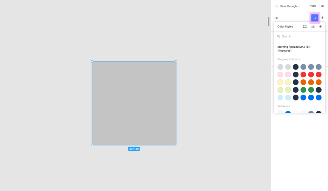
Related Links

Designer Toolkit

The designer toolkit is your one-stop destination for all of our design resources and services. Here, you’ll find:
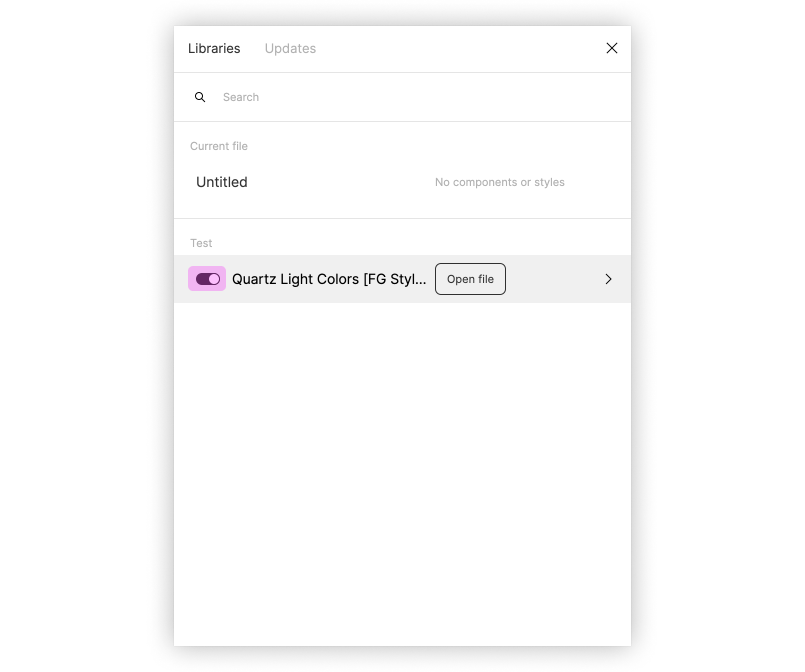
  • Stencil sets, including font 72 and icon fonts.
  • User research method cards describing the most commonly practiced user research methods.
  • Our design community, where you can ask questions and post design ideas.

User Research Method Cards

User research helps you to better understand end user needs, expectations, and typical working processes as you follow SAP’s design-led development process. This easy-to-use card deck provides an overview of the 14 most commonly practiced user research methods at SAP and how to apply them. Most of the methods can be used both physically and virtually.

User research is frequently confused with usability testing, which is just one of the methods. While there are similarities between the methods, each one has its own goals, strengths, and weaknesses. The card deck gives you guidance on how to select the right method for your needs.

User Research Within Design-Led Development

Ideally, user research is practiced in all the three phases of SAP’s design-led development process: Discover, Design, and Deliver. The graphic below shows which of the 14 user research methods are typically used in each phase.

User research methods along the design-led development process

During the Discover phase, user research focuses on learning about the stakeholder and end user requirements. This includes their responsibilities, tasks and activities, typical use cases, workflows, and other software and resources they need to perform their jobs.

Once you have a sufficient understanding of their needs, you move on to the Design phase, where the research focus shifts to getting end user feedback about design ideas and artifacts. Here, different methods are available for validating high-fidelity and low-fidelity prototypes. In the Deliver phase, usability benchmarking and surveys help to evaluate the product.

Download

Download the card deck with the 14 most commonly practiced user research methods at SAP.