
Navigating the Guidelines
Once you’re ready to take a more in-depth look at the SAP Fiori web design guidelines, you’ll want to get acquainted with our navigation structure (visible on the left of the screen, or by clicking the icon on the top left).
The guidelines cover a large number of topics, which are divided into different categories. The sections below summarize what you can expect to find under each category. Since we only mention the most important articles, be sure to check the navigation structure for a complete overview.
SAP Fiori Design System
What is SAP Fiori?
Learn about the new user experience for SAP software.
Design Principles
Learn about the five core principles that underpin the SAP Fiori design philosophy.
Design-Led Development Process
Get to know the SAP Fiori design-led development process and the key milestones and activities.
Responsiveness
SAP Fiori apps work on various devices. Check out SAP Fiori's focus on responsive and adaptive design.
Accessibility in SAP Fiori
Learn how SAP Fiori supports you in designing accessible products.
Look, Feel, and Wording
Theming
SAP Fiori user interfaces are constructed using SAPUI5 control sets that are meticulously styled with CSS.
Colors
Get to know the SAP Fiori color palette, including colors for different semantic states, such as 'critical' or 'positive'.
Iconography
Learn about the visual design of SAP icons and access SAP icon font files and related resources.
Motion Design
Learn about the different motion design principles, such as duration and direction, and their choreography.
UI Texts
Check out our conventions for UX writing, including which words to use for actions and how to write message texts.
SAP Fiori Launchpad
Overview Launchpad
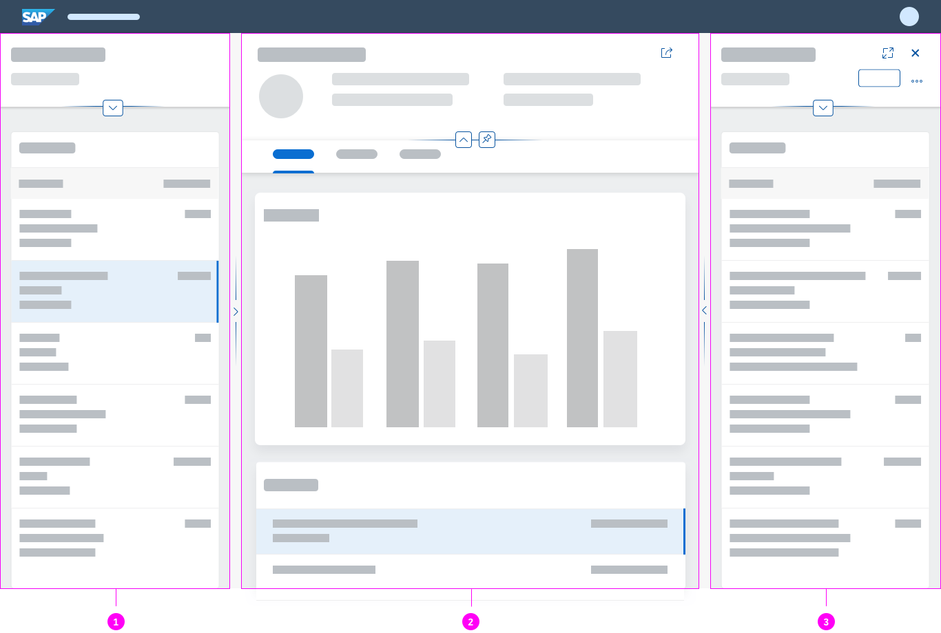
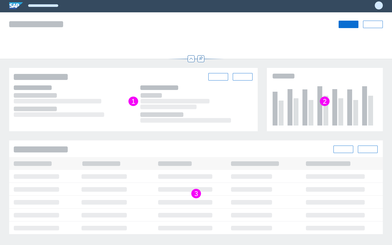
The SAP Fiori launchpad is the main entry point to SAP Fiori apps on mobile and desktop devices.
Shell Bar
The shell bar on top is always visible and hosts a logo, navigation options, enterprise search, notifications, and other services.
Designing Intelligent Systems
Basics
Get to know the core concepts and guiding principles for building intelligence into enterprise software.
General AI Patterns
Find out about the different design patterns for intelligent business systems and machine learning.
General Patterns
Action Placement
Get to know where actions can be placed (typically in toolbars), and how to order and style them.
Draft Handling
Learn about the draft handling concept for SAP Fiori, including auto-save, locking, and preventing data loss.
Message Handling
Learn about common messaging patterns and the message components they use.
Navigation
Navigation in SAP Fiori follows the standard navigation paradigms of various web applications.
Object Handling
Find out about the different interaction flows for objects, including create, edit, and delete.
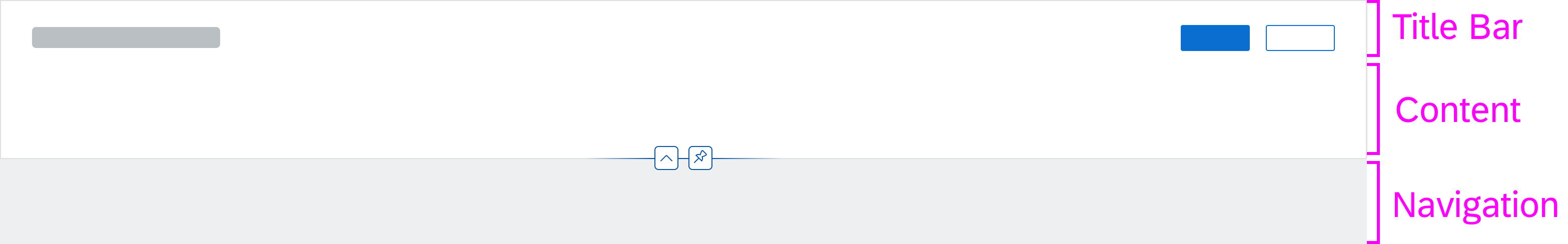
Layouts and Floorplans
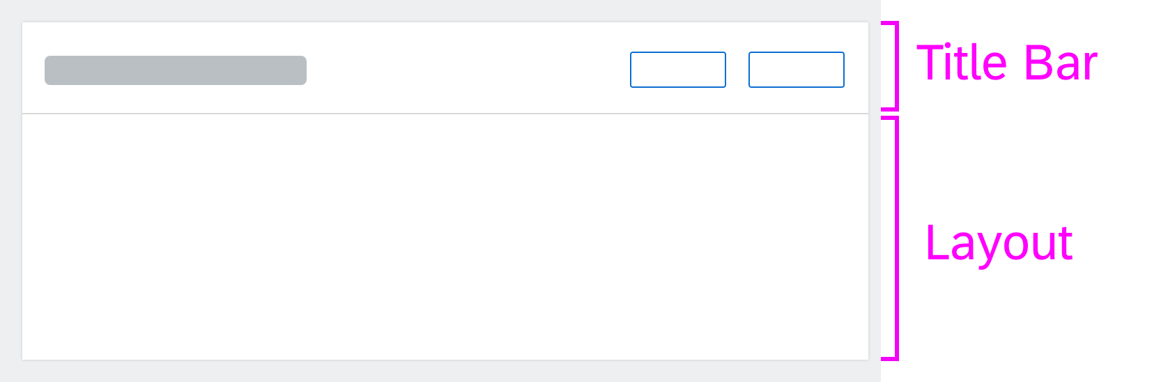
Page Layouts
Get to know the two basic page layouts used for most app designs, and check out other layout options.
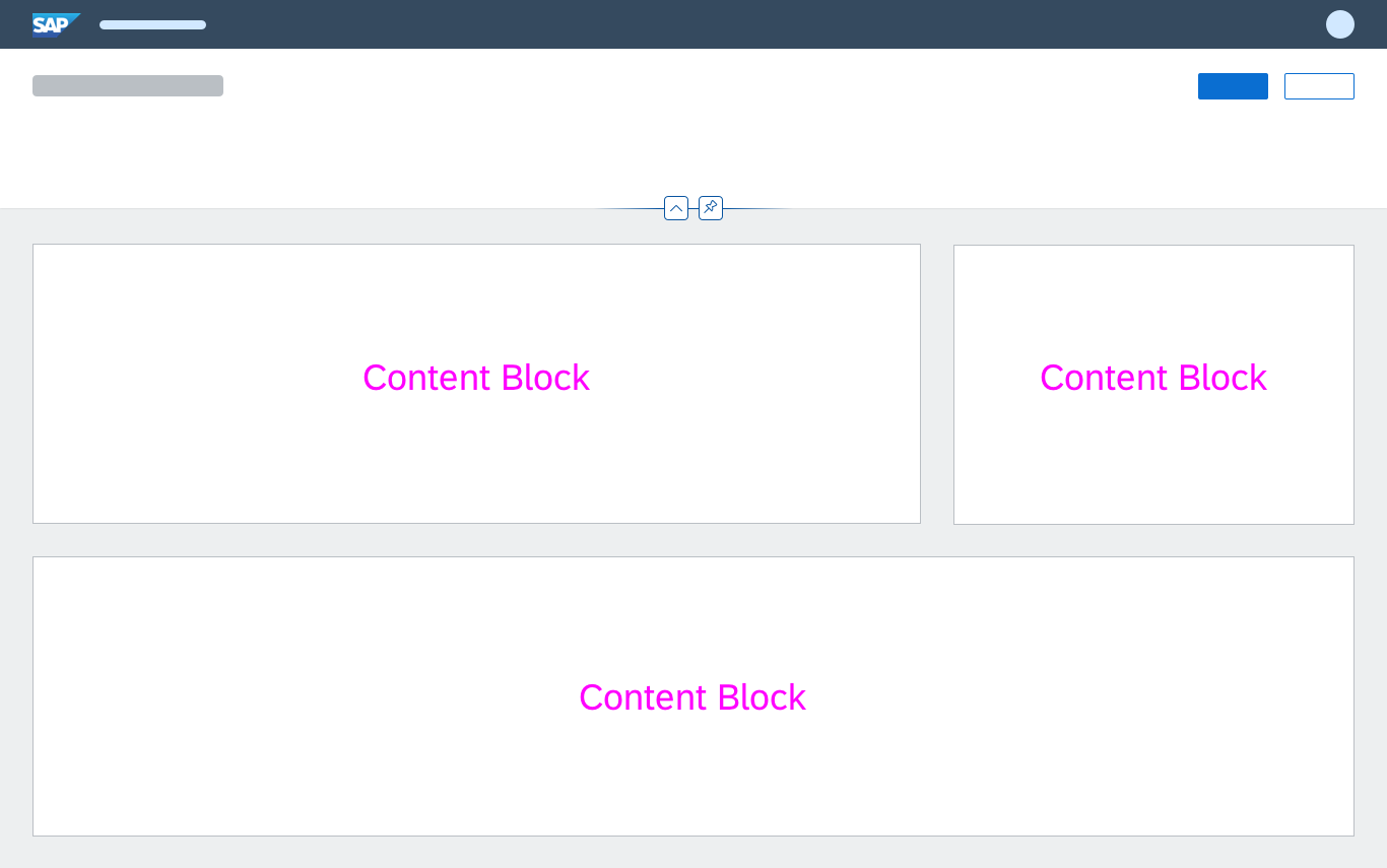
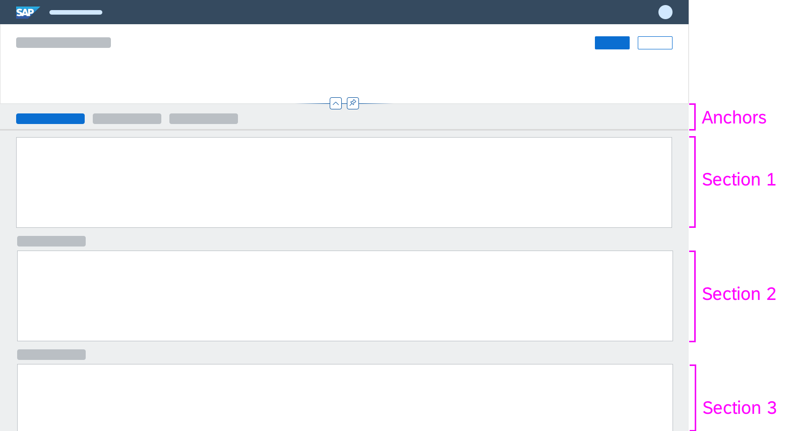
Floorplans
Explore the predefined page layouts for specific use cases, known as 'floorplans' in SAP Fiori.
UI Elements
'Explore' Page
Get an overview of all the UI elements available in SAP Fiori.
Learn More
To learn more, check out the UI Elements category in the navigation menu on the left.
Frameworks
SAP Fiori Elements Framework
Learn about the technical capabilities and design options for apps developed with the SAP Fiori elements framework. Predefined templates are available for the most common floorplans.
Analytical Frameworks
Get insights into the analytical frameworks used by SAP Fiori.
Designer Toolkit
Design Stencils
Download the design stencils and start designing your own SAP Fiori app.
SAP Icon Font
Download and install the SAP icon font to create true-to-life mockups.
SAP Fiori Community
Ask questions on SAP Fiori design and share your design ideas in our SAP Fiori community.


 Your feedback has been sent to the SAP Fiori design team.