
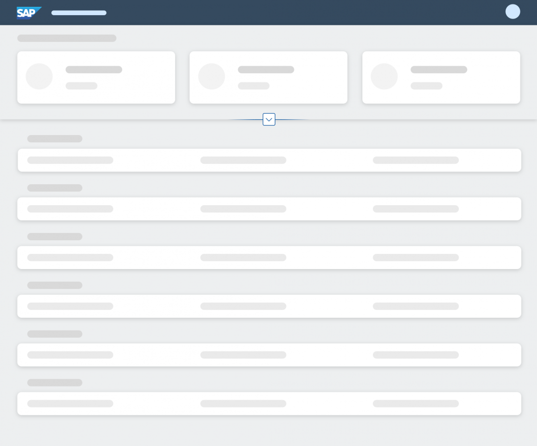
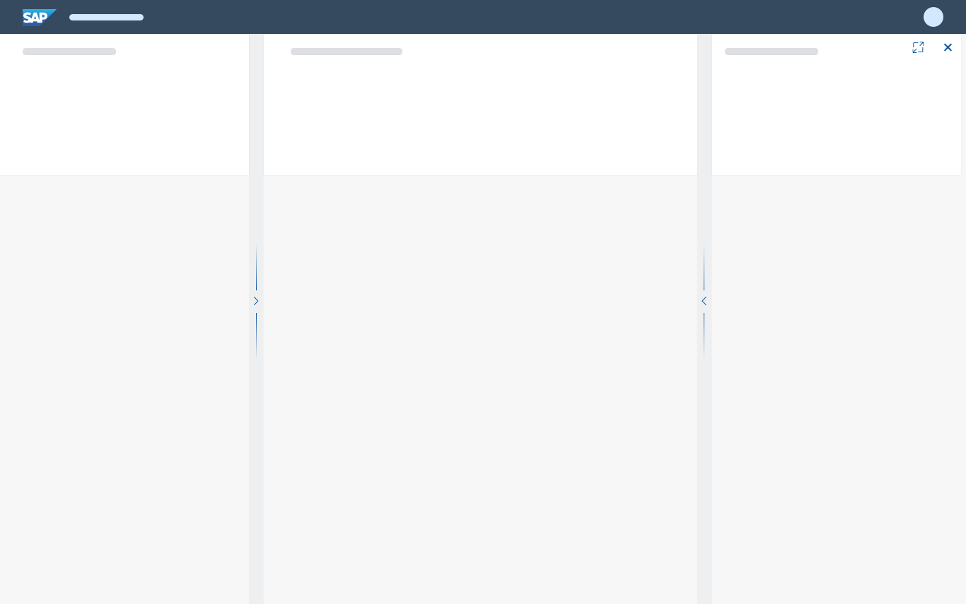
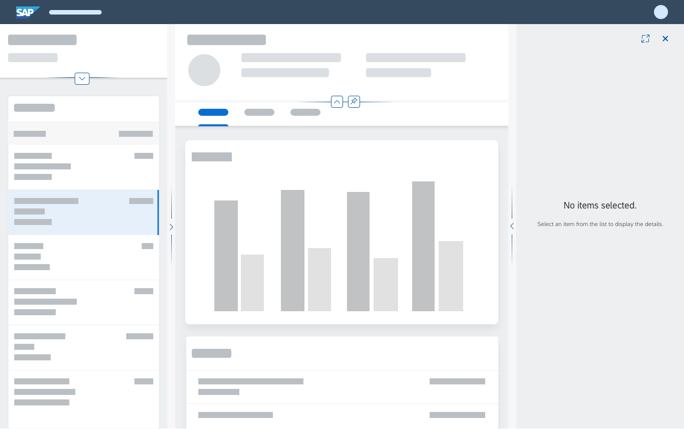
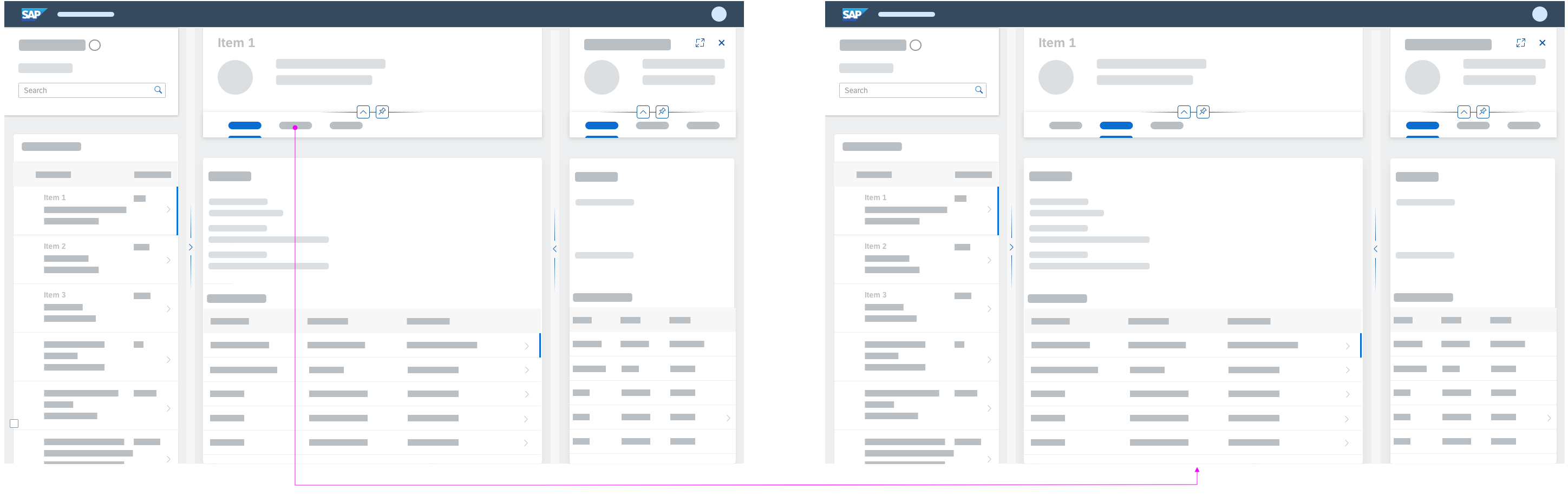
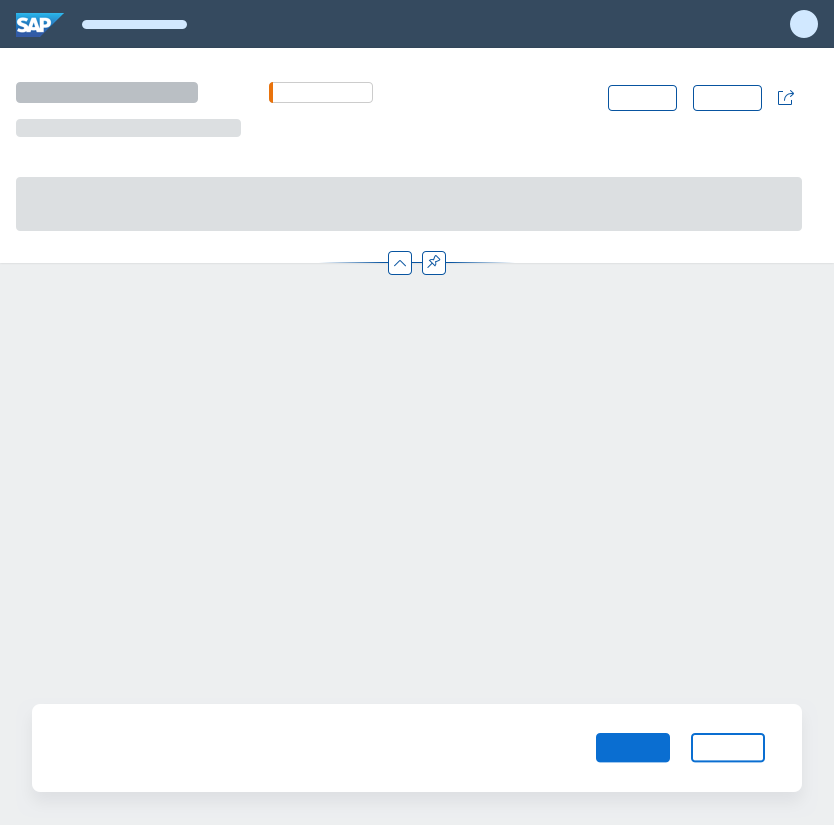
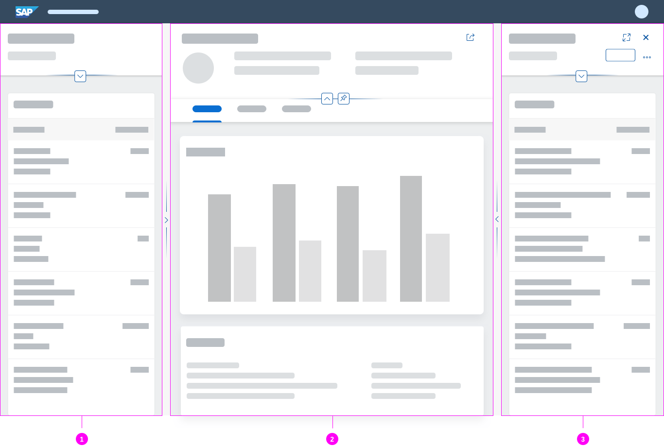
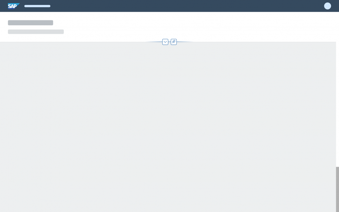
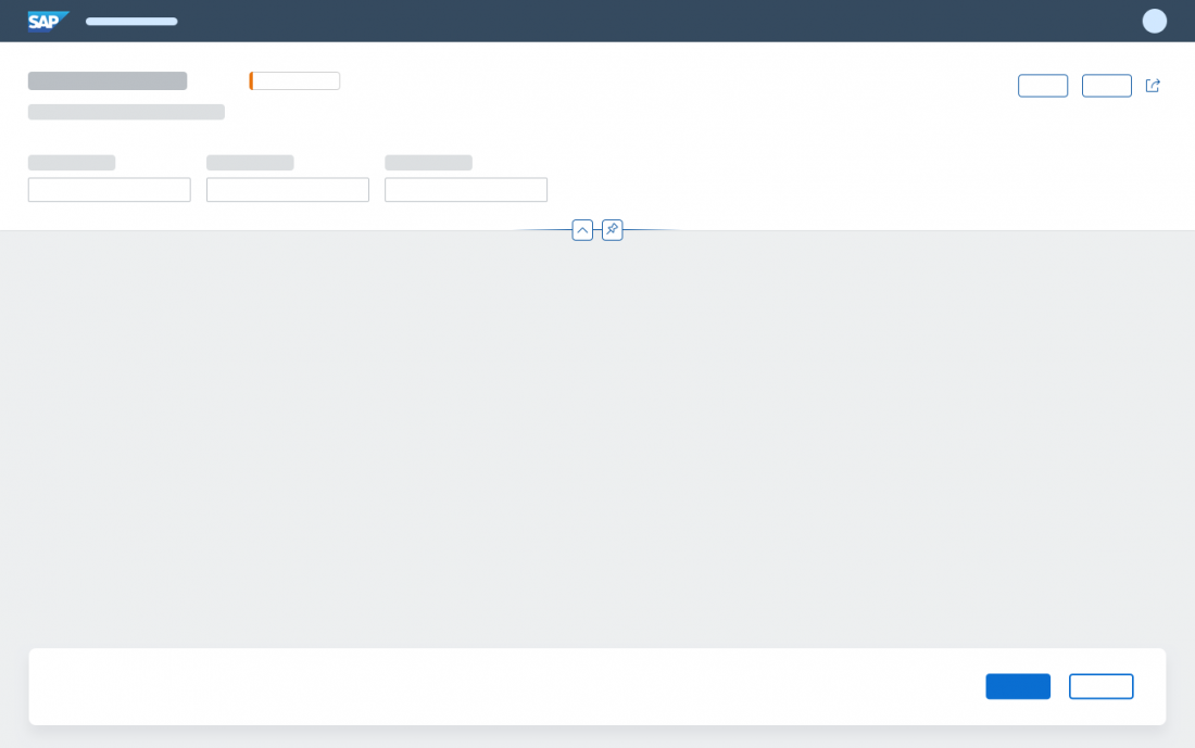
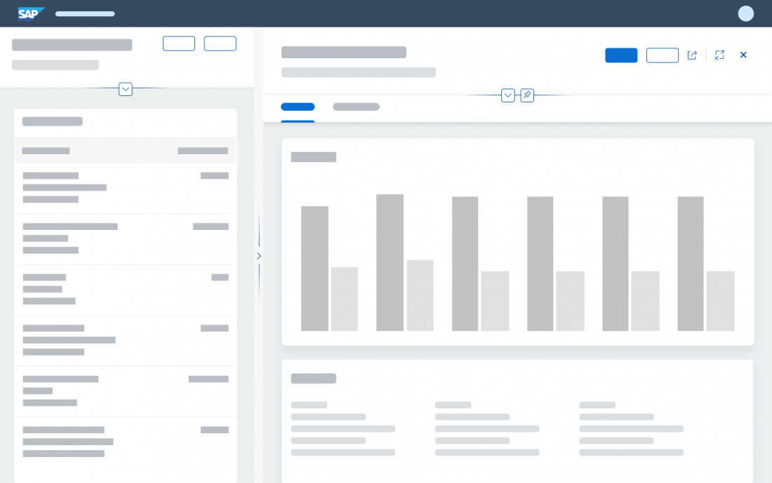
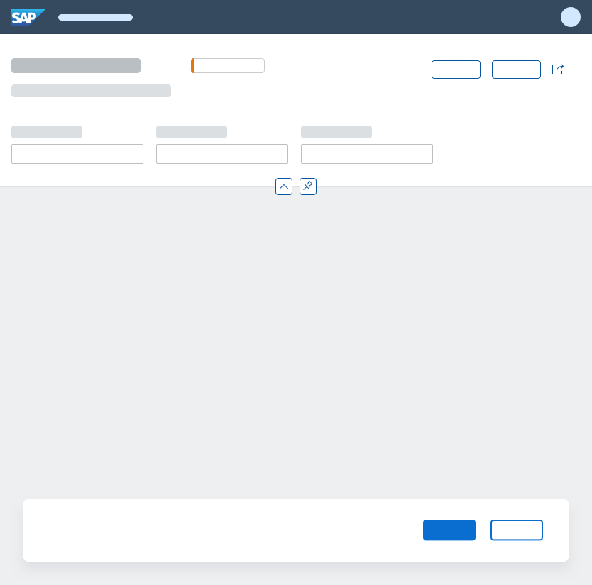
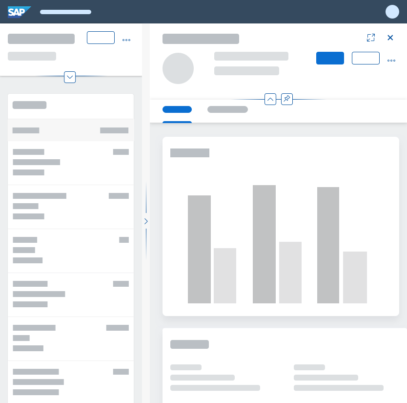
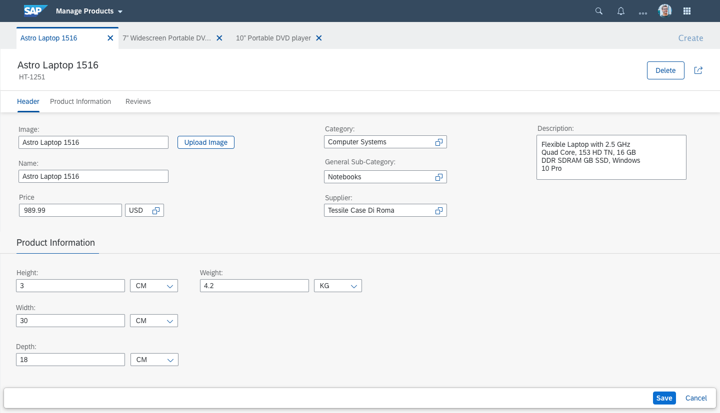
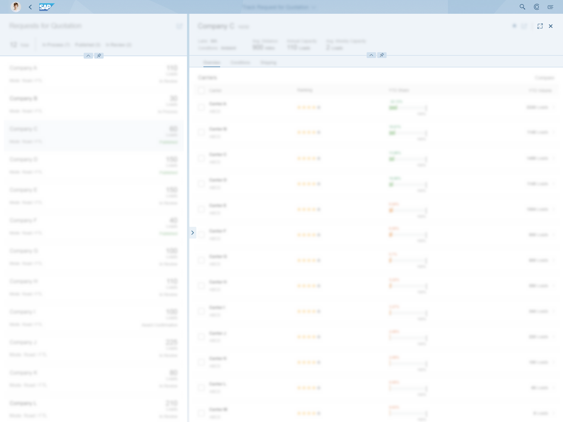
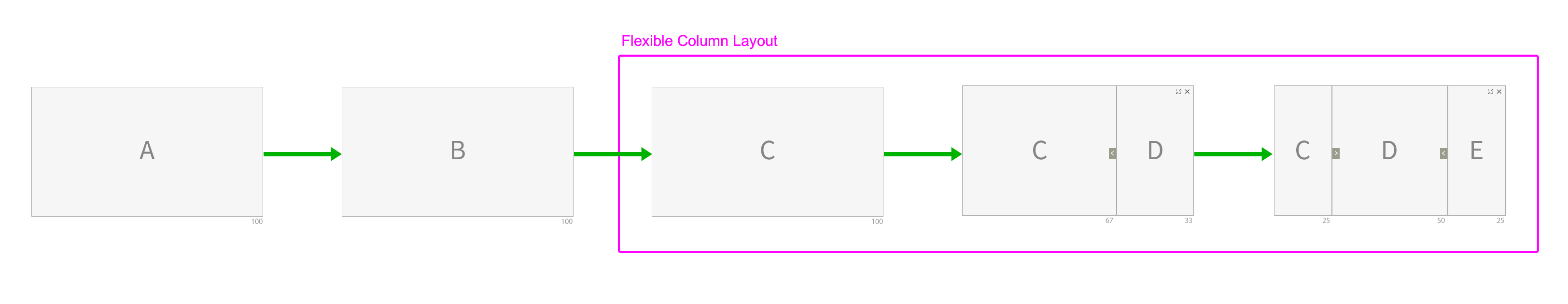
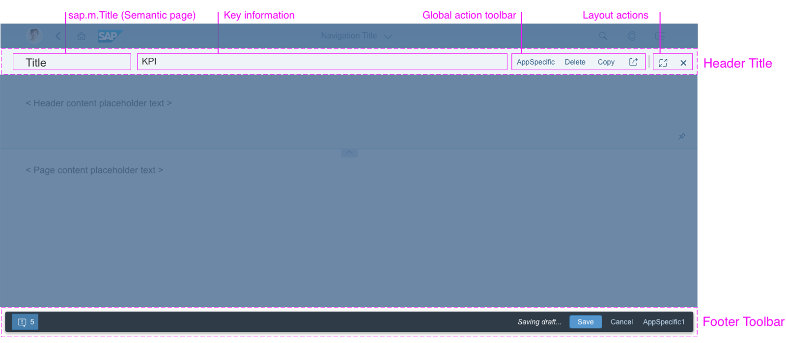
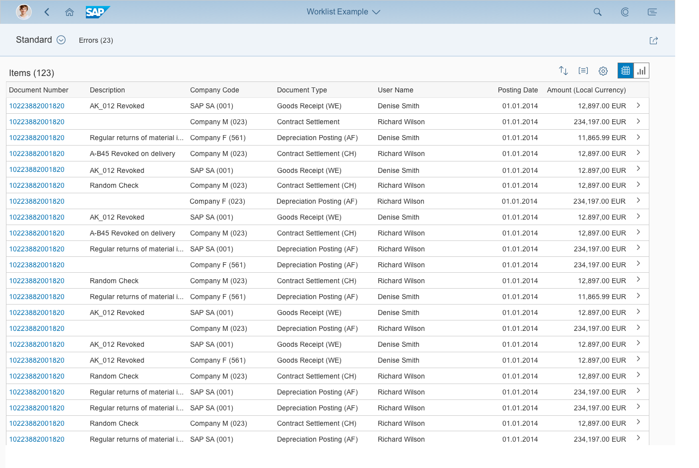
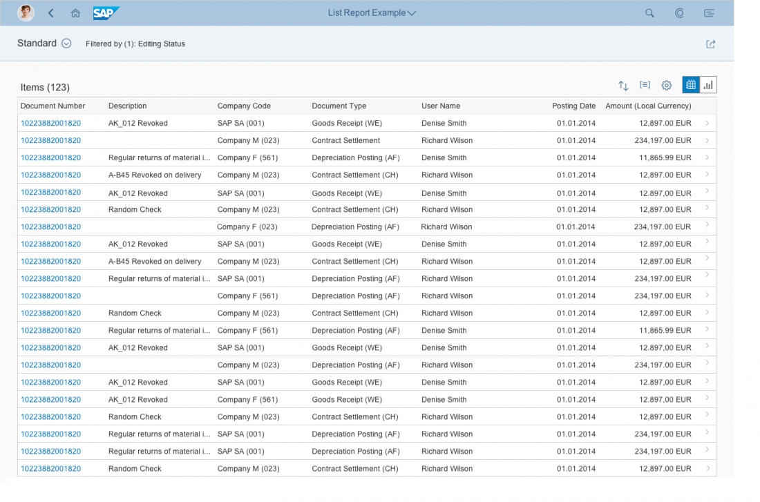
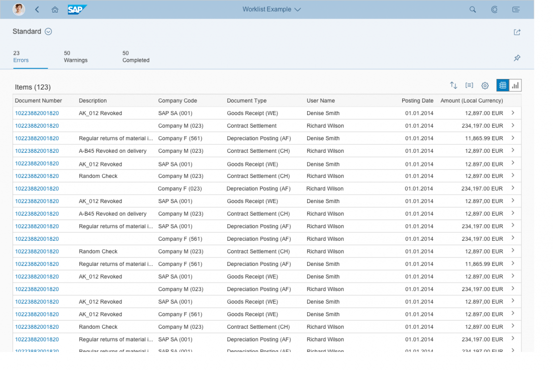
Flexible Column Layout
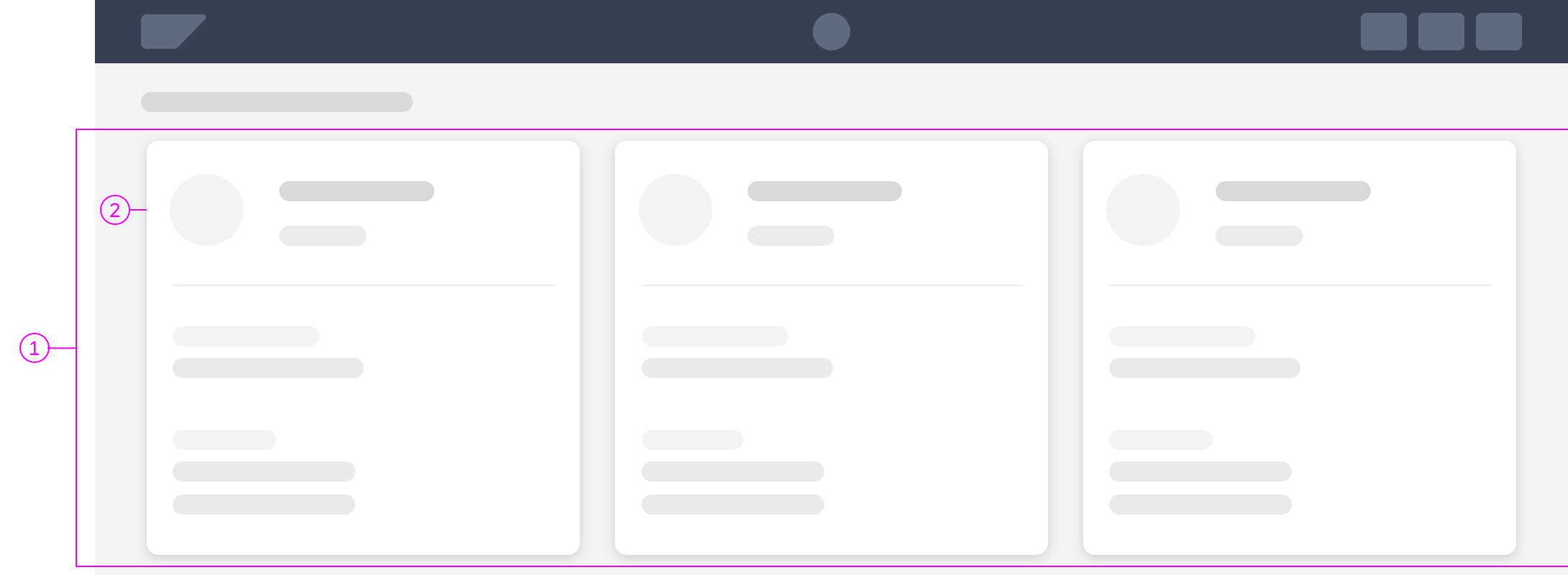
The flexible column layout is a layout control that displays multiple floorplans on a single page. This allows faster and more fluid navigation between multiple floorplans than the usual page-by-page navigation. The flexible column layout offers different layouts with up to three columns (1, 2, 3). Users can freely resize the columns, switch between different layouts, and view the rightmost column in full screen mode.
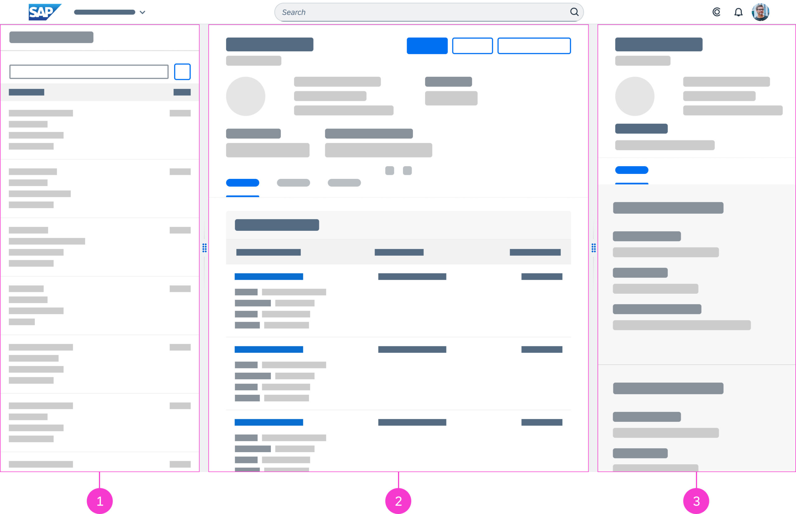
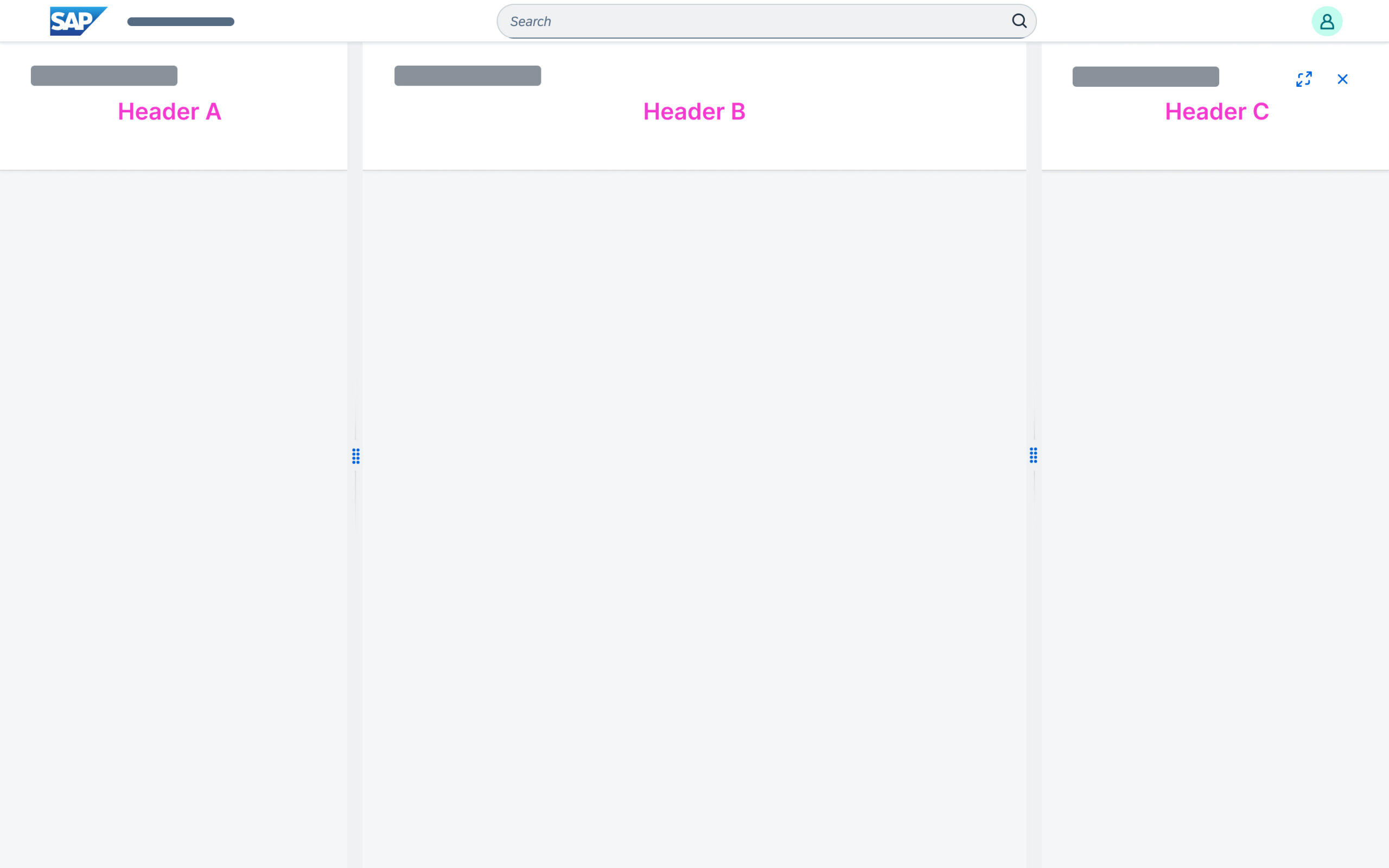
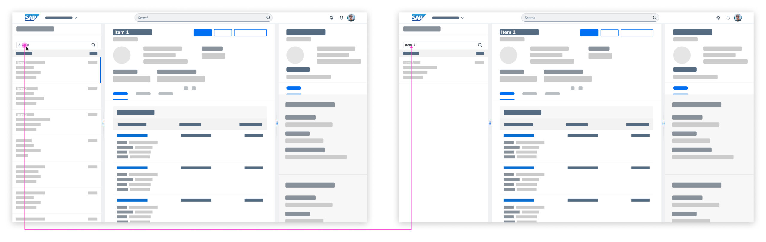
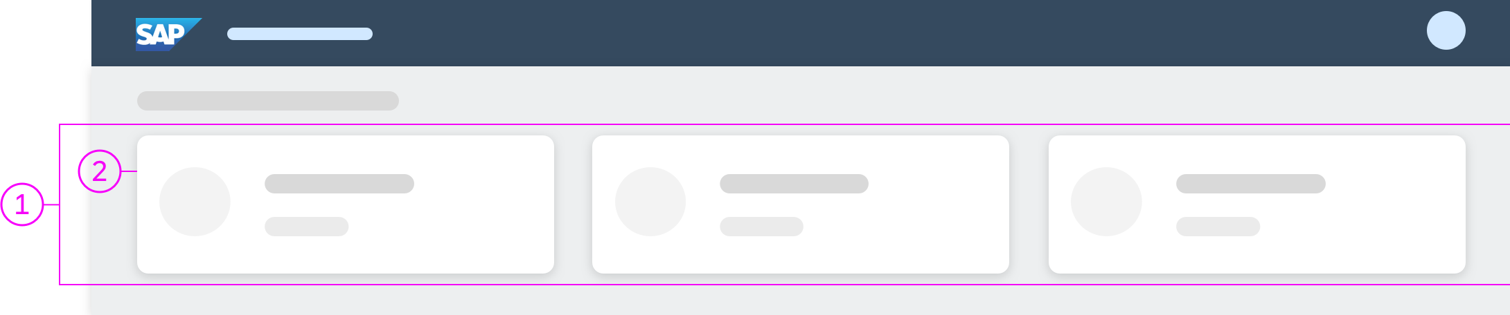
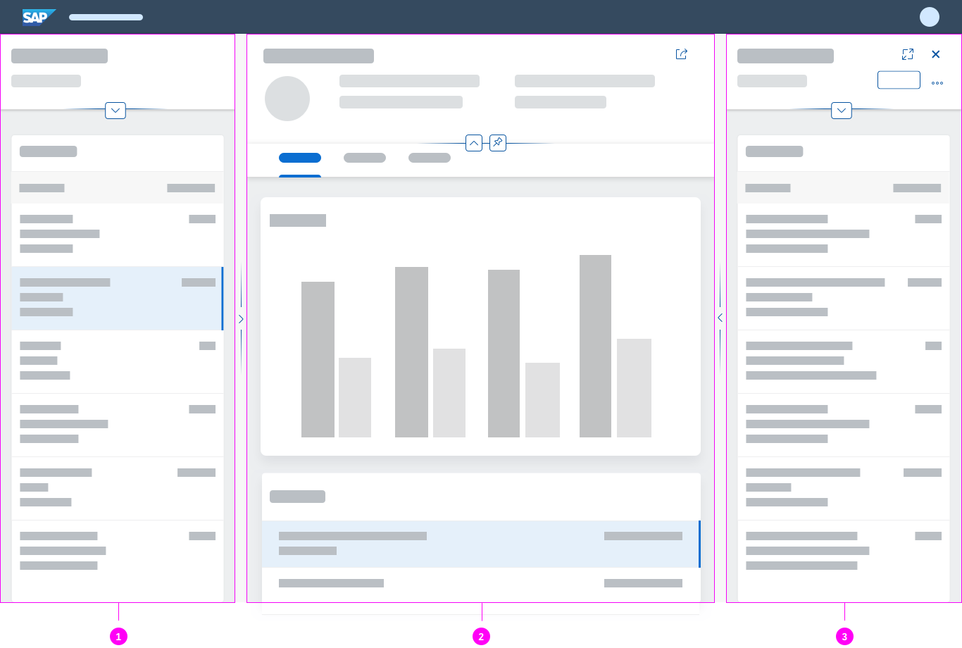
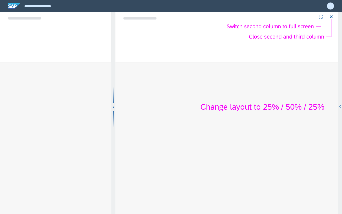
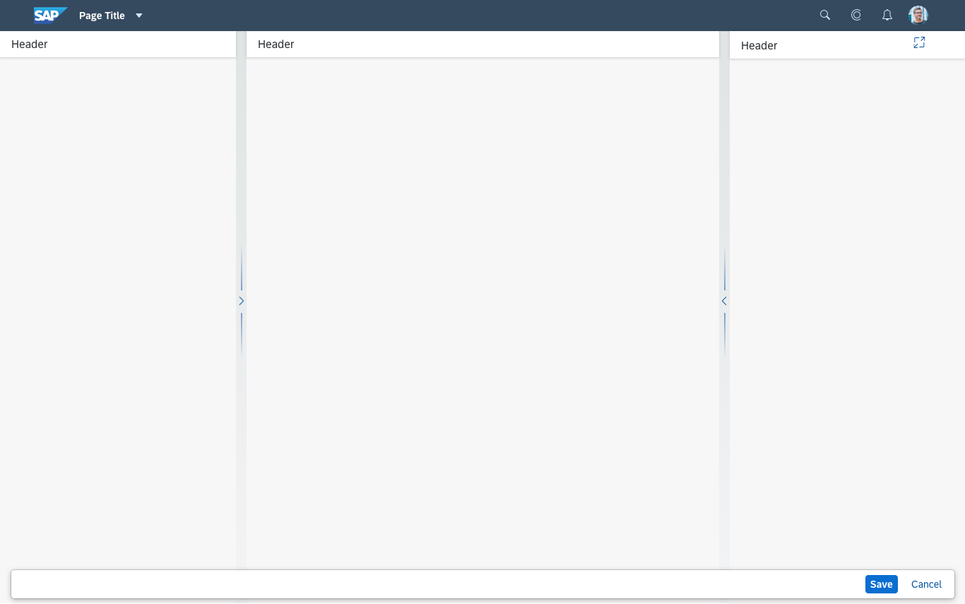
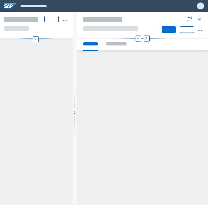
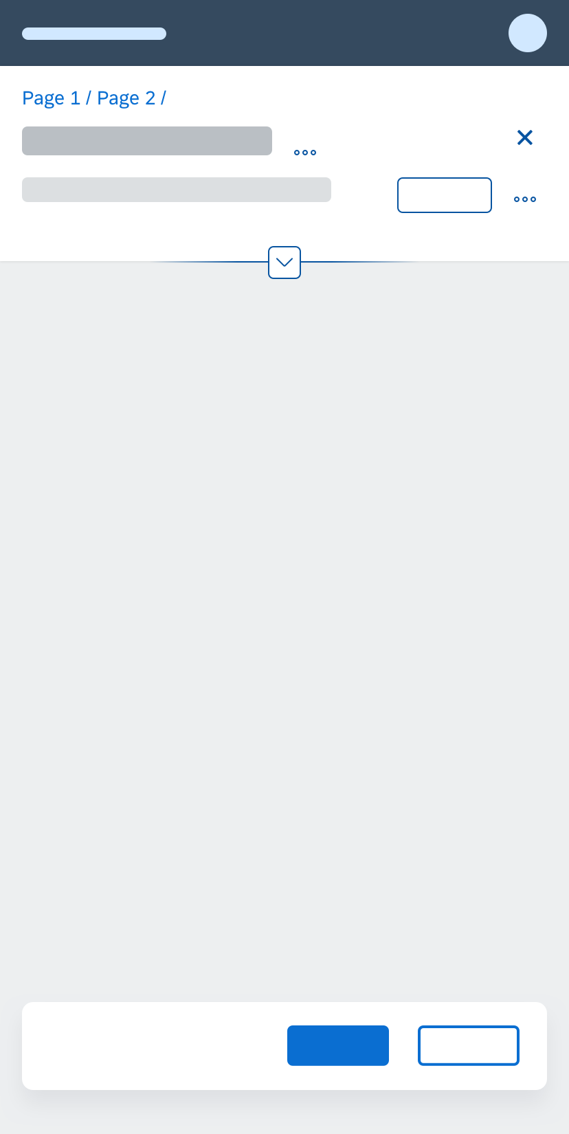
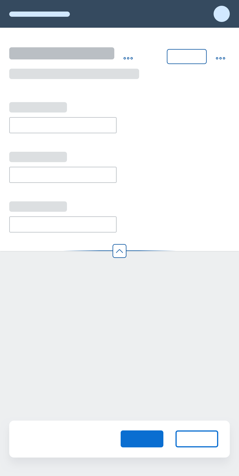
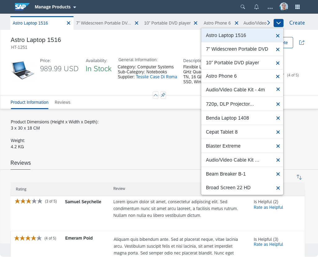
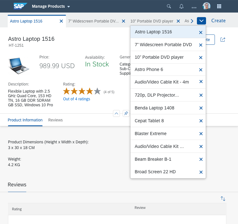
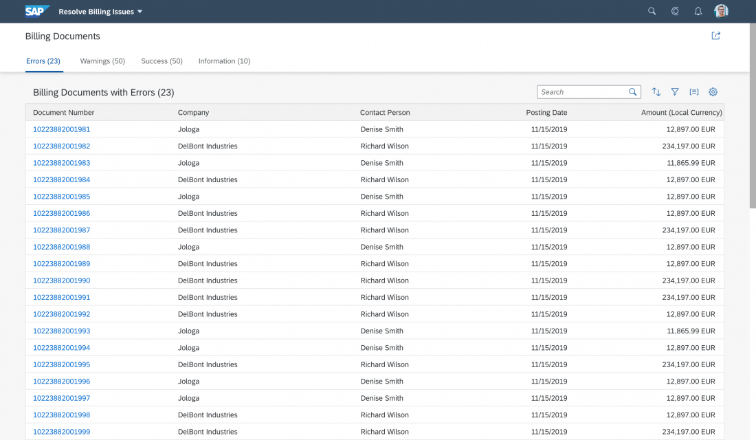
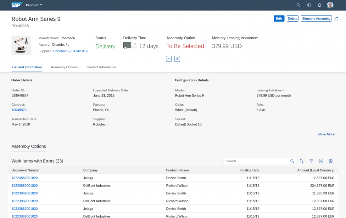
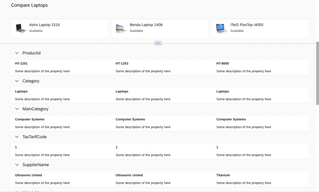
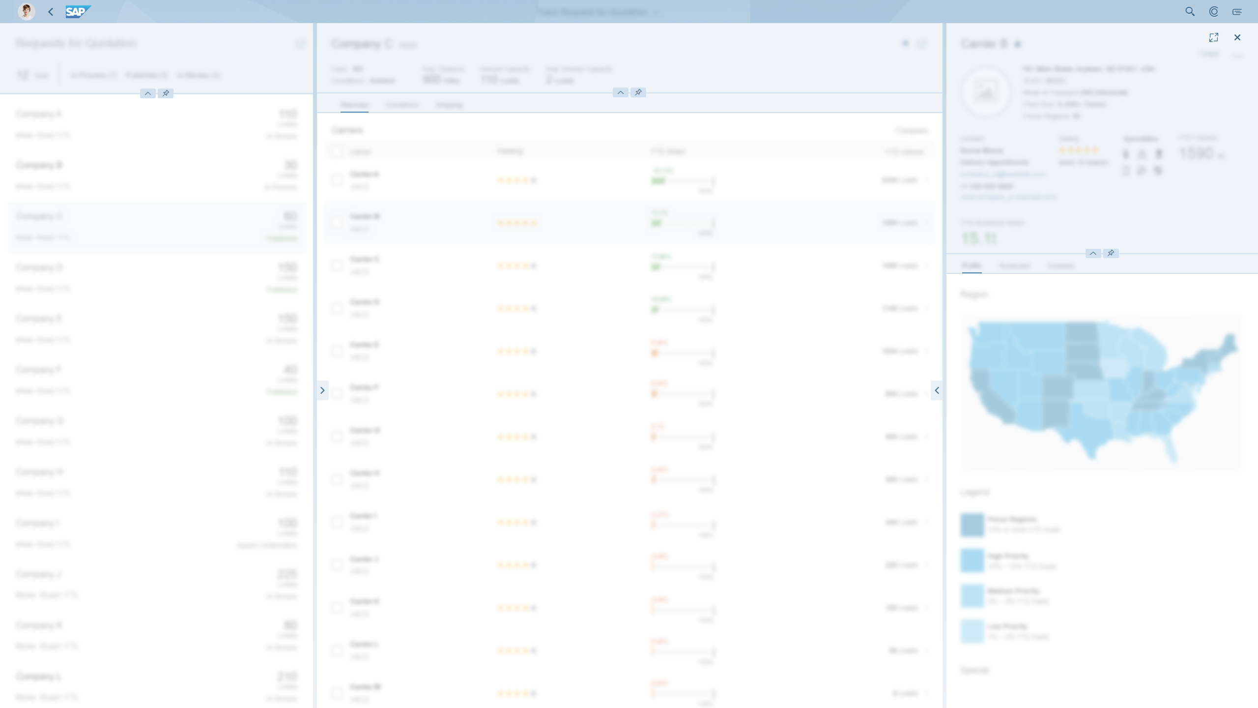
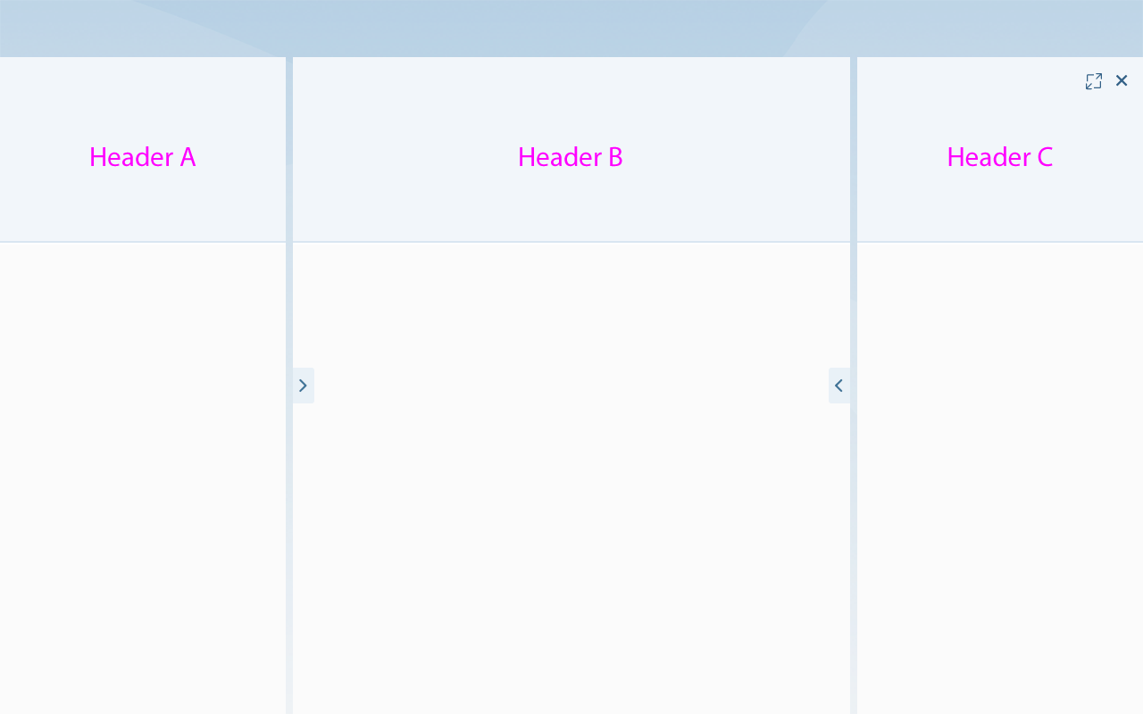
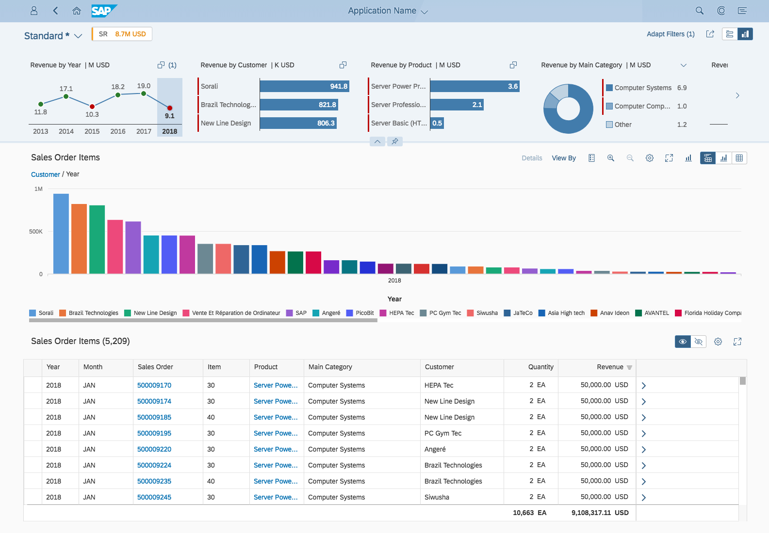
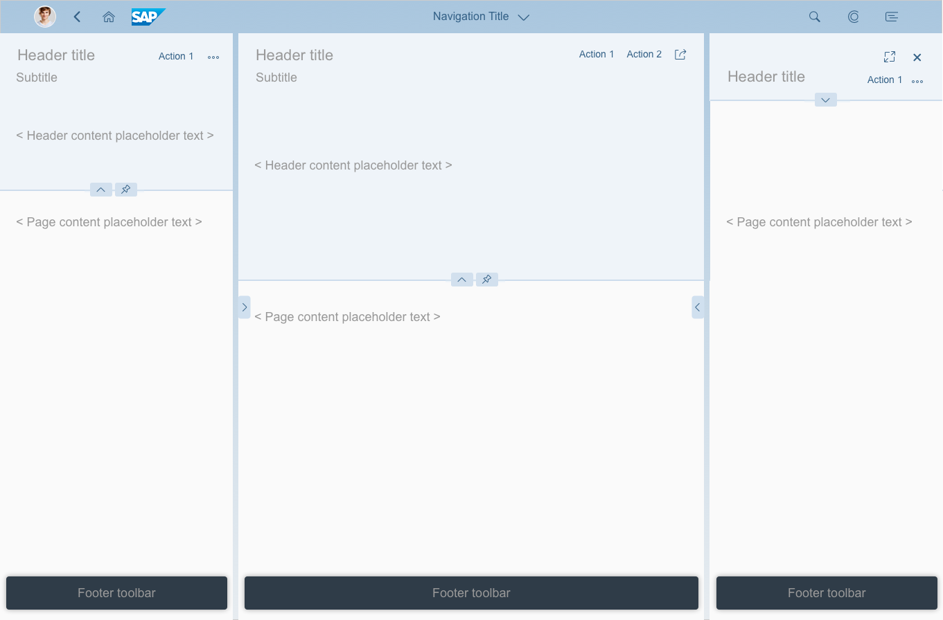
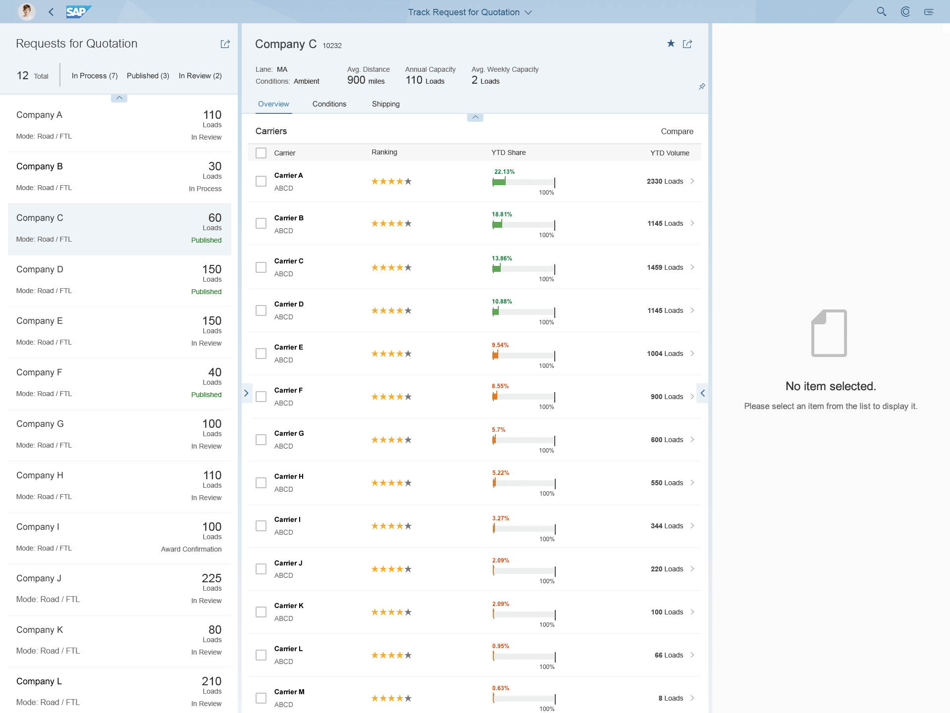
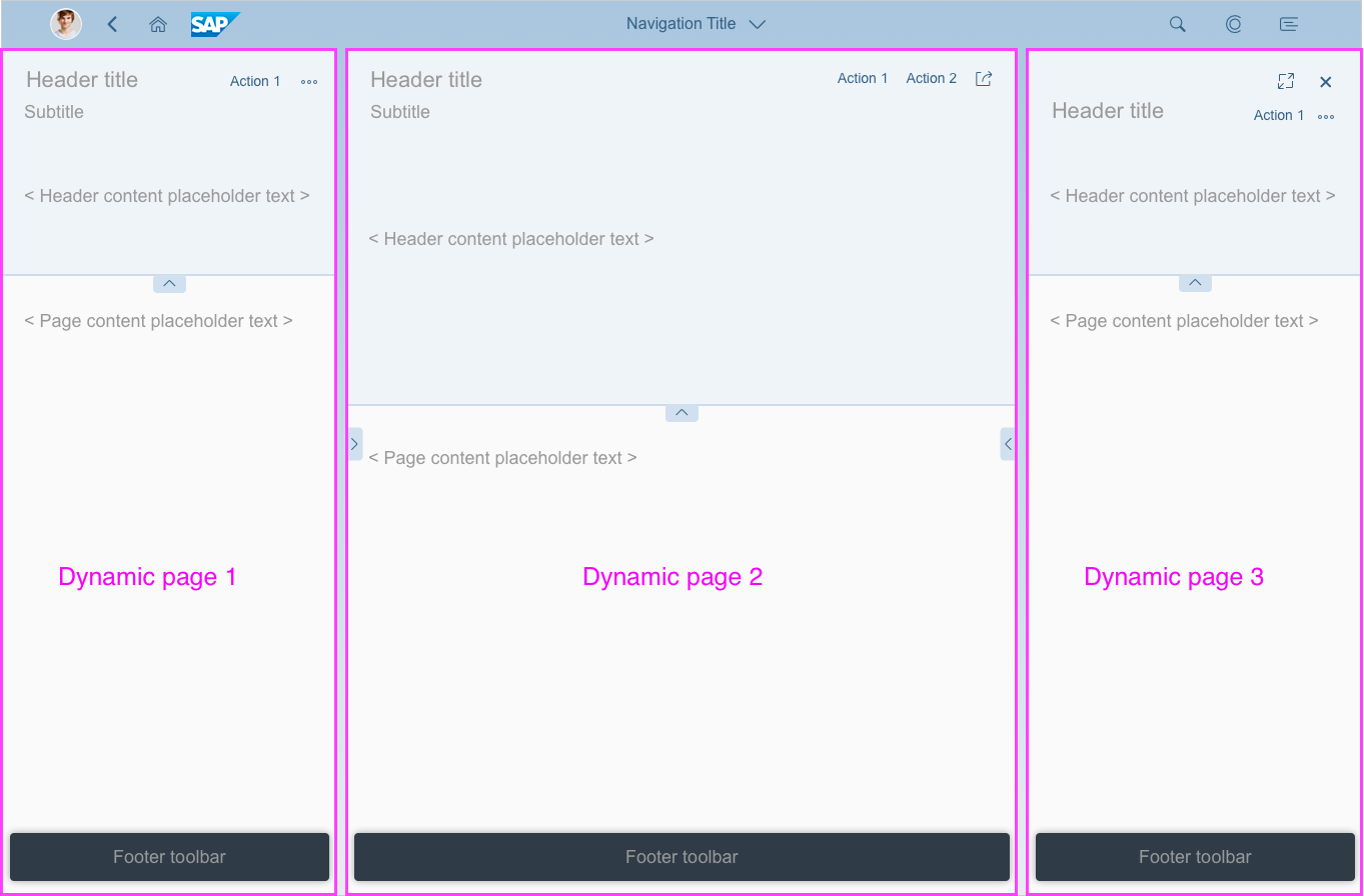
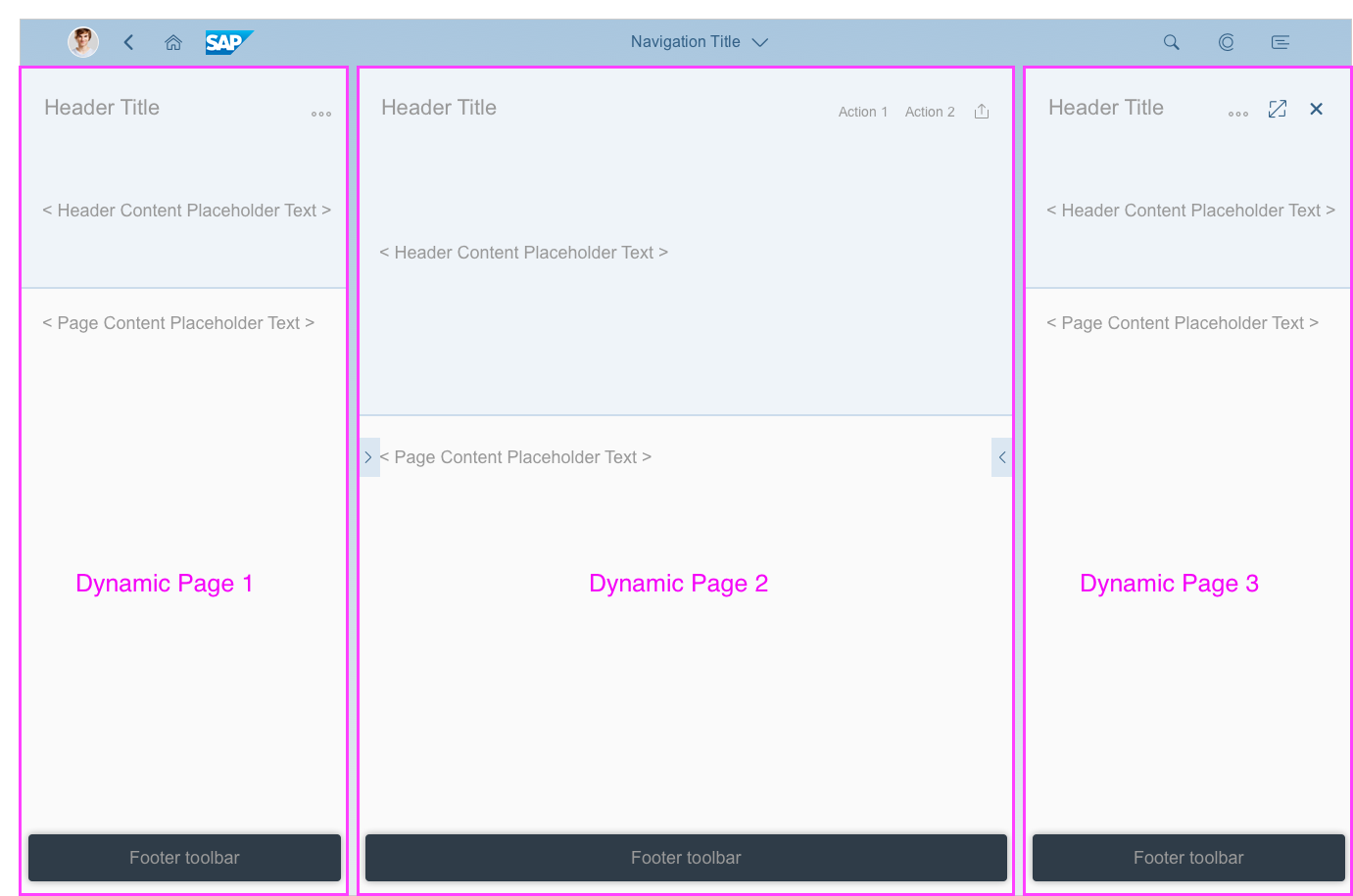
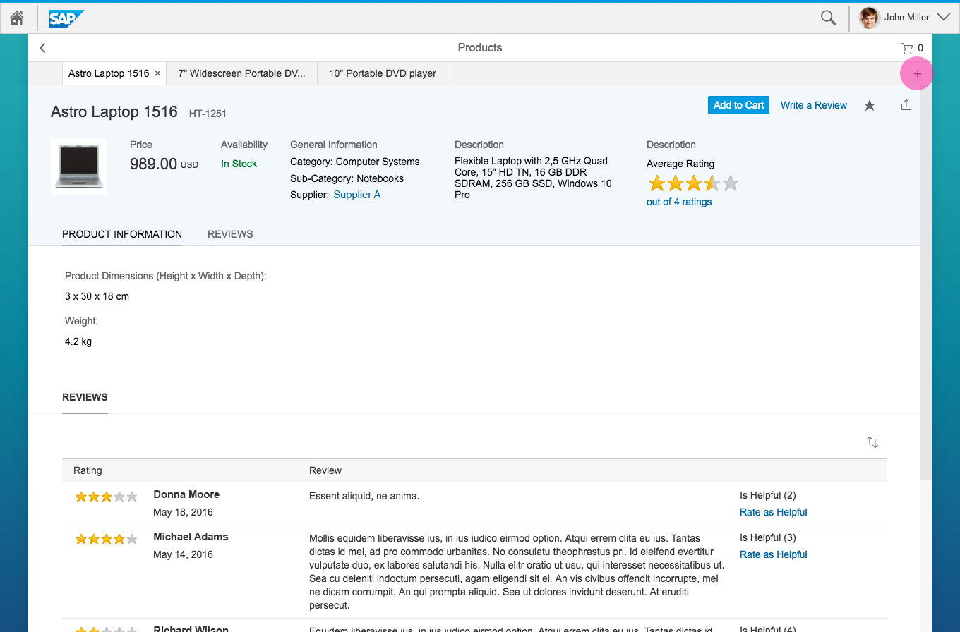
Flexible column layout - Example with three columns
The flexible column layout behaves responsively, which makes it suitable for both desktop and mobile devices. Depending on the available screen width, an optimized layout is loaded to ensure the best possible user experience on each device. The flexible column layout is a generic control. As a layout container, it does not provide any content itself.
The flexible column layout is already incorporated within SAP Fiori elements.
Usage
Use the flexible column layout if:
- You want to create a list-detail or list-detail-detail layout, in which the user can drill down or navigate.
Do not use the flexible column layout if:
- You want to build a workbench or tools layout. The flexible column layout is not meant to provide a main column with additional side columns on the left and/or right. If you want to display additional content to enrich the main content and to help users better perform their tasks, use the dynamic side content instead.
- You want to create a dashboard with context-independent pages.
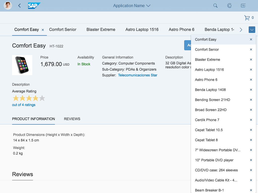
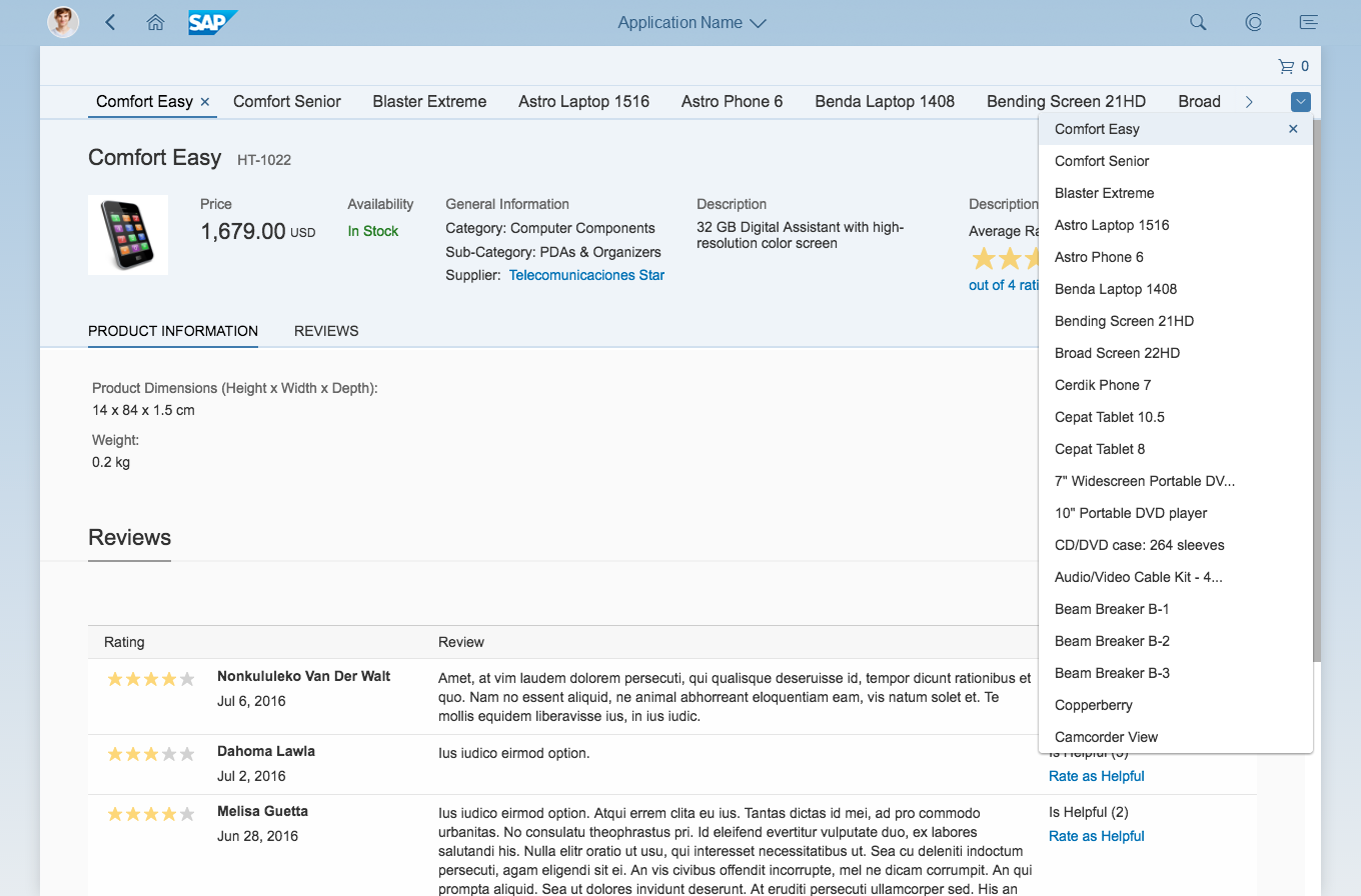
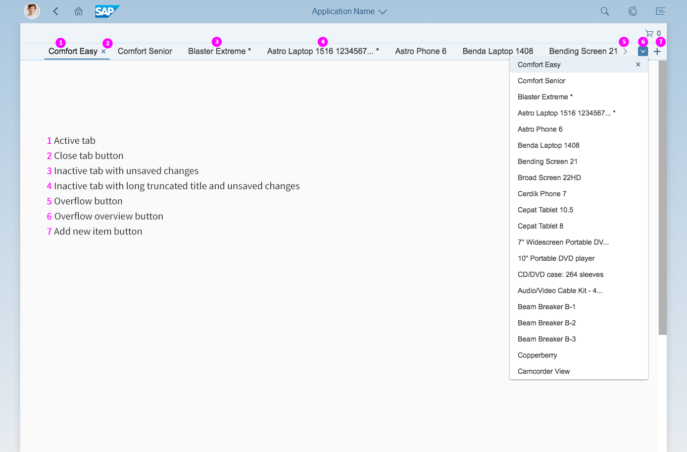
- You want to open multiple instances of the same object type. Use the multi-instance handling floorplan instead.
- You want to split a single object into multiple columns, or display only a small amount of information.
- You want to embed the SAP Fiori launchpad or overview page into one of the columns.
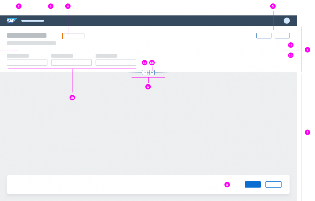
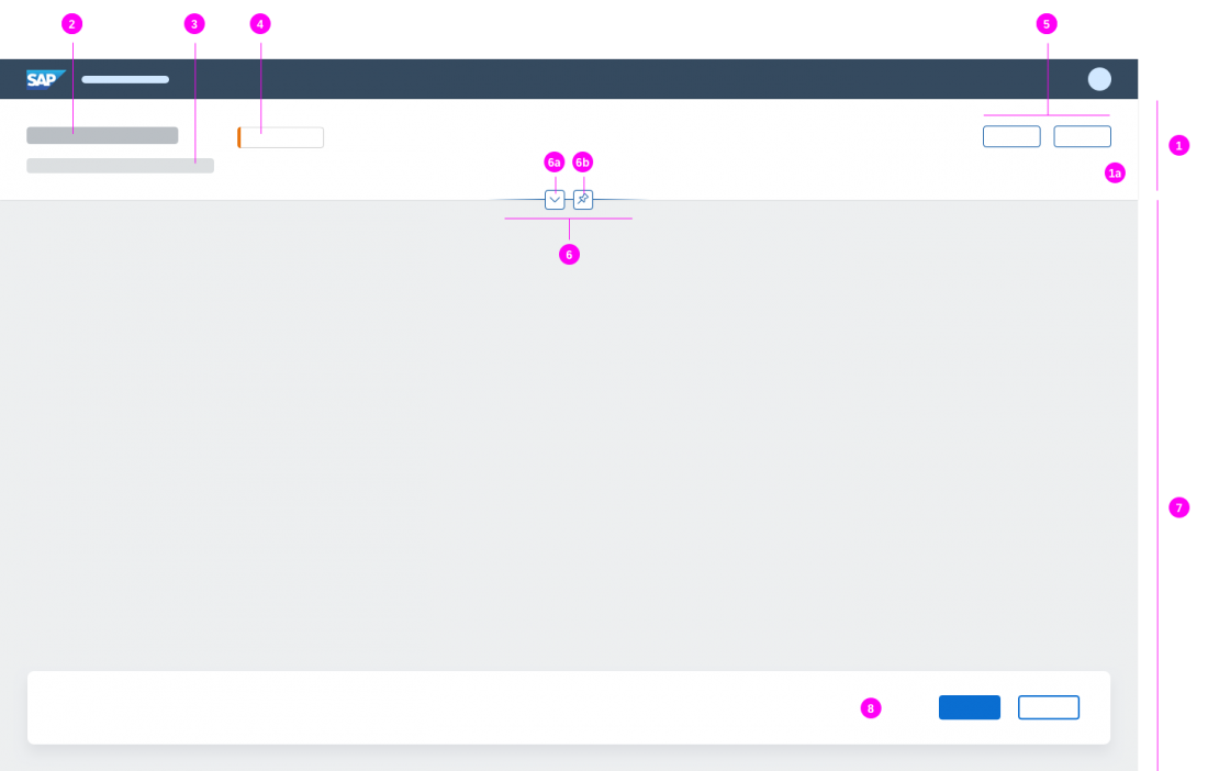
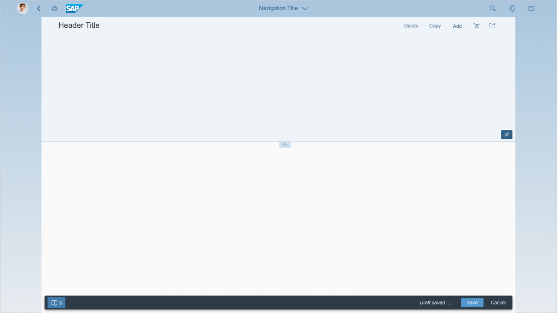
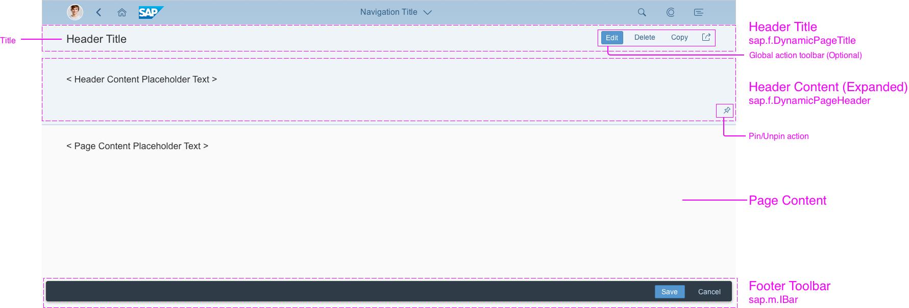
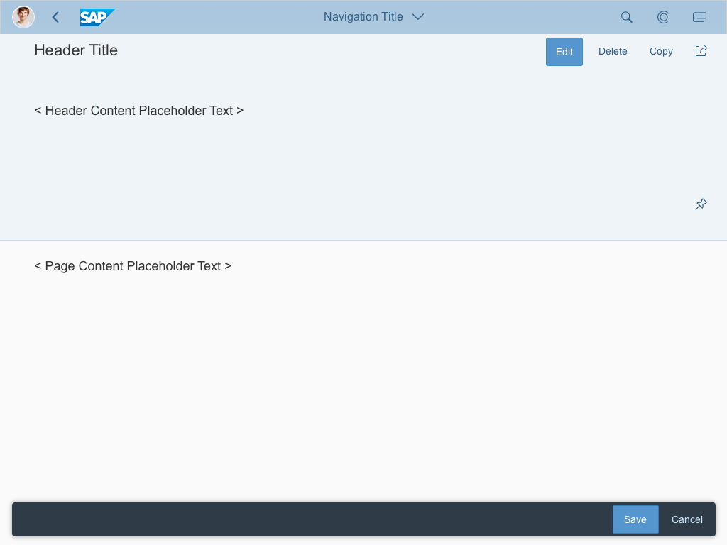
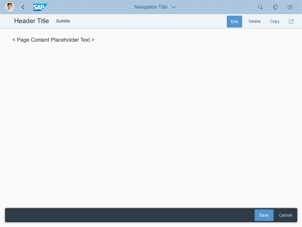
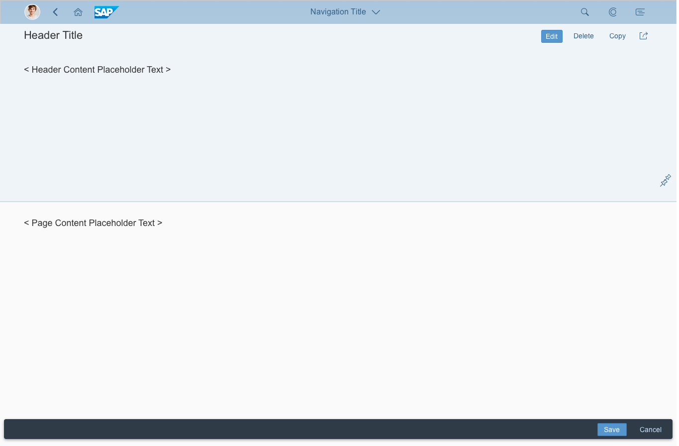
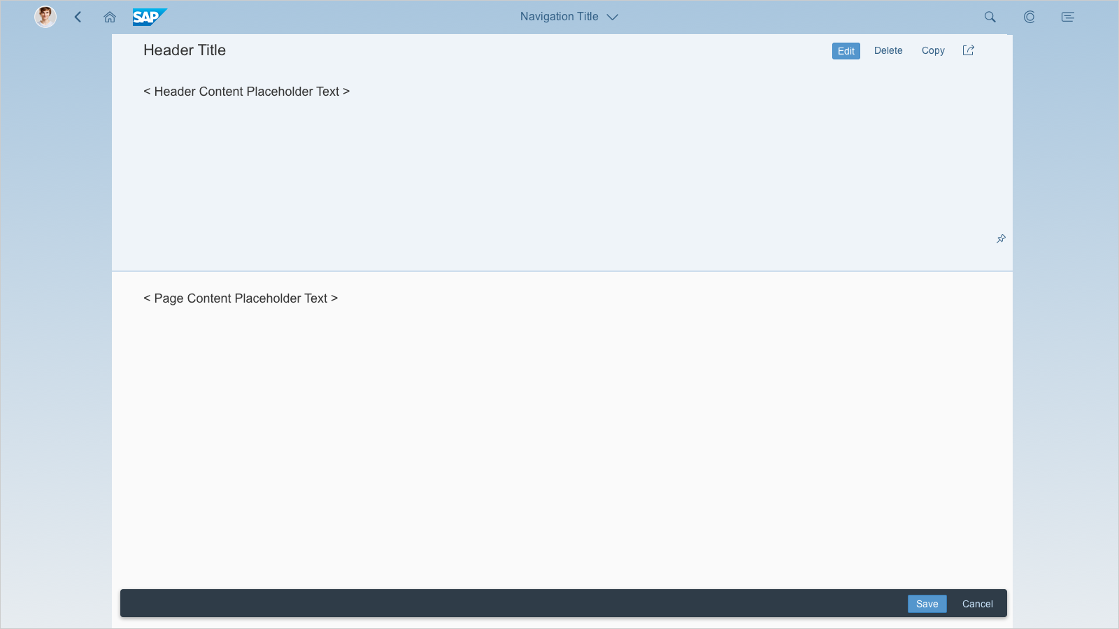
Structure
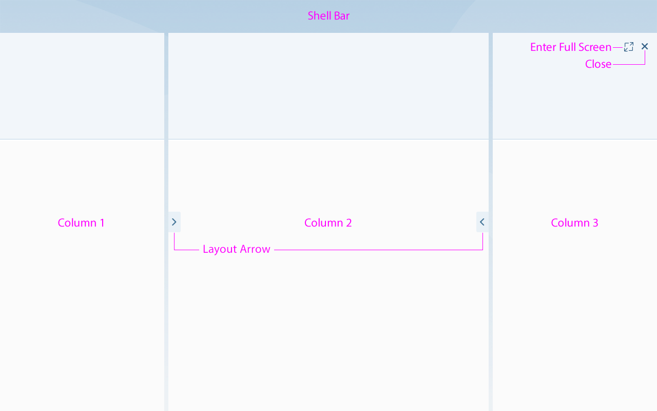
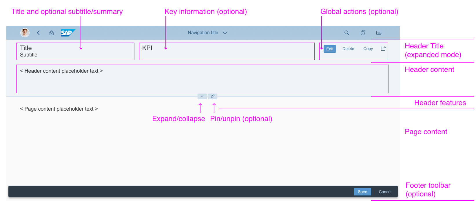
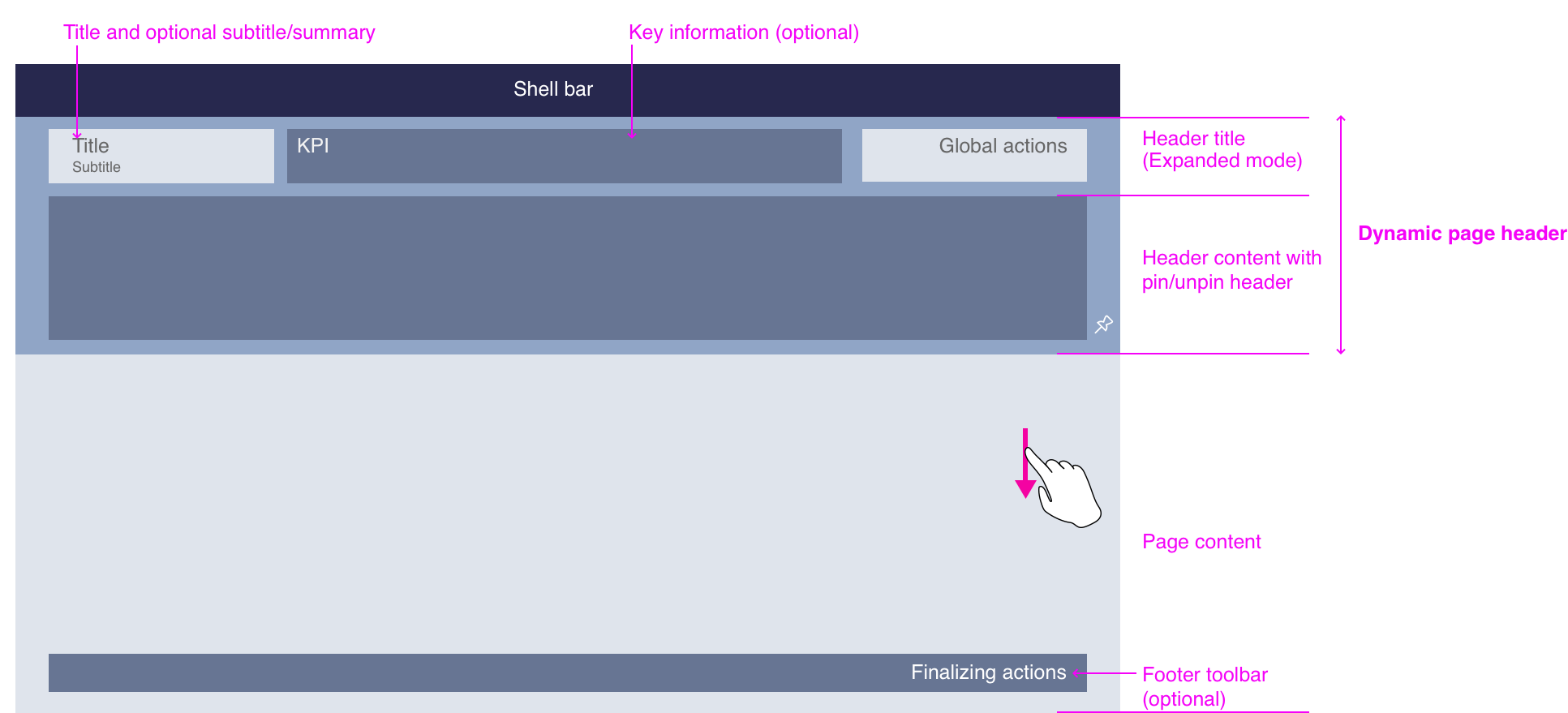
As with all layouts, the flexible column layout is embedded in the shell bar of the SAP Fiori launchpad. From the shell bar, users have access to the launchpad services, including the home page, search, settings, and help. Apps are embedded in the shell and have little influence over its features. The shell bar also provides the back navigation and the app title, including the navigation menu.
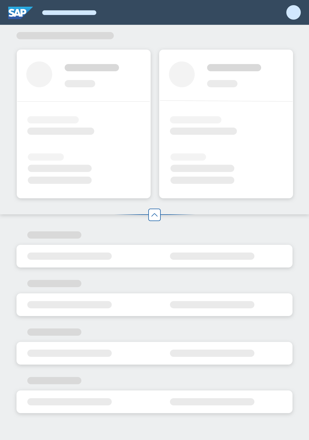
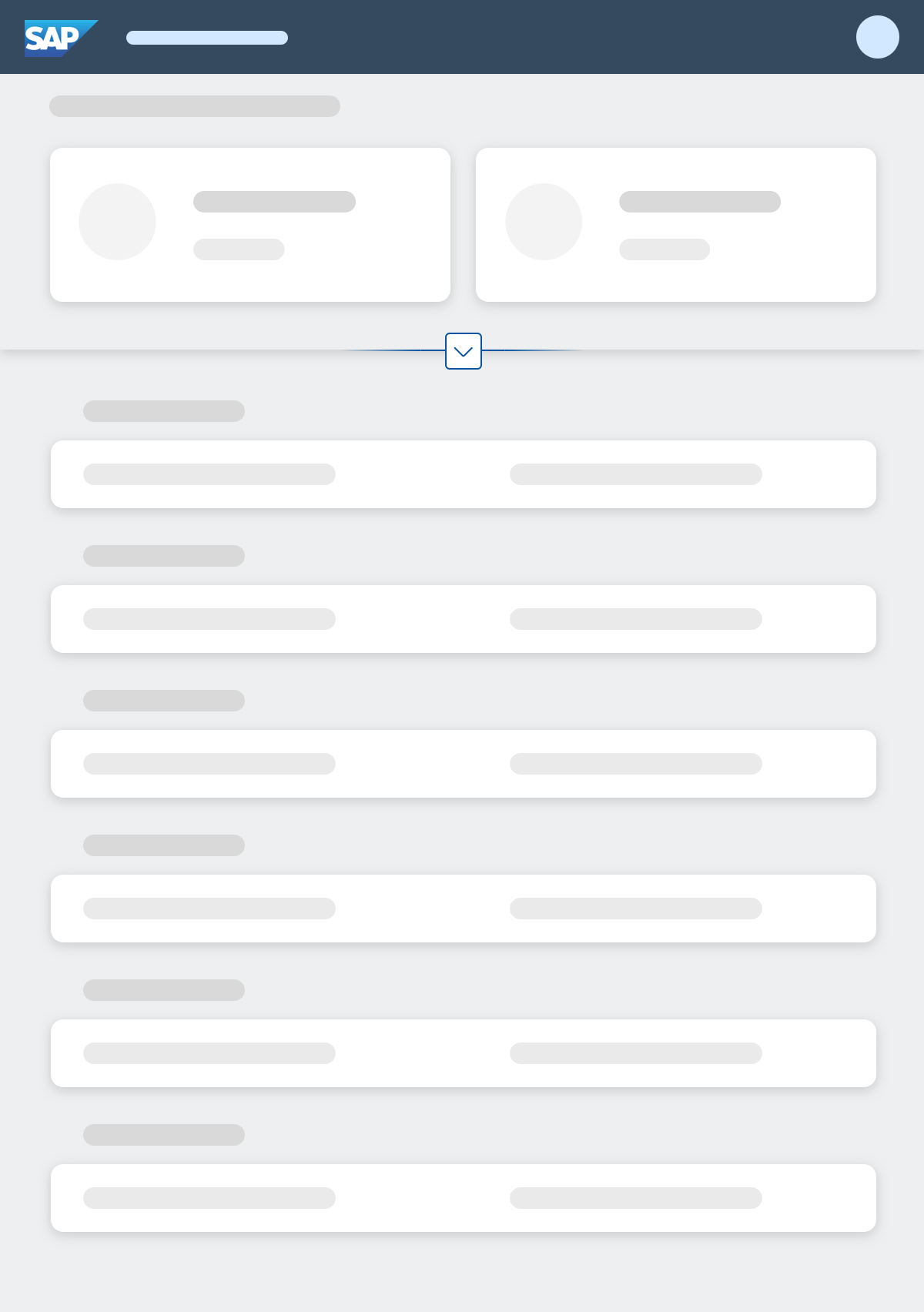
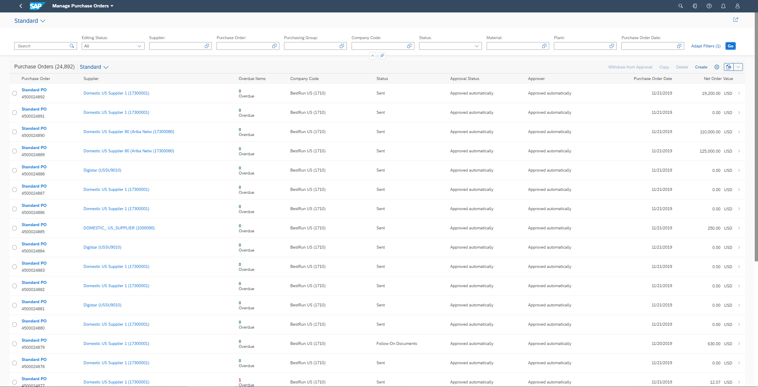
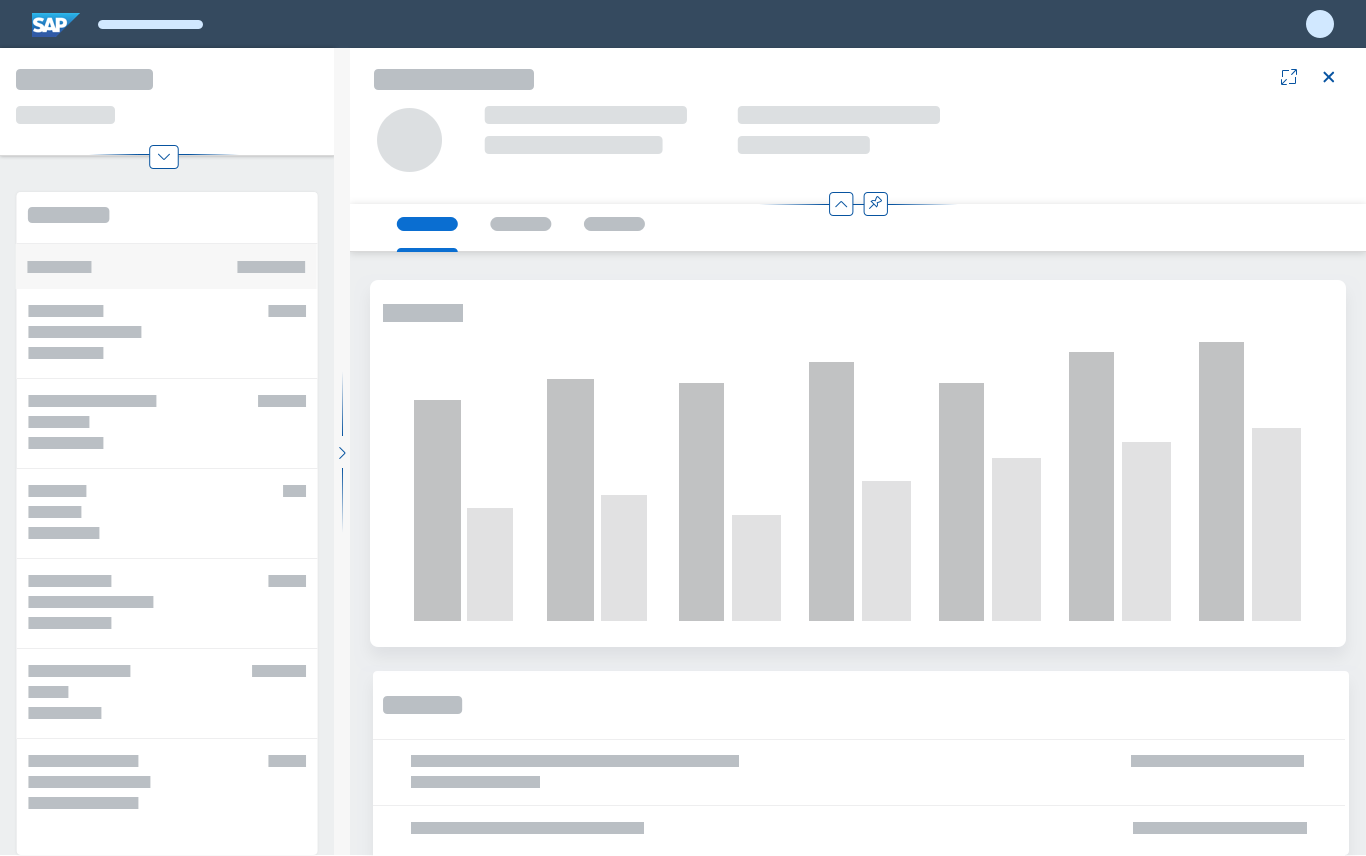
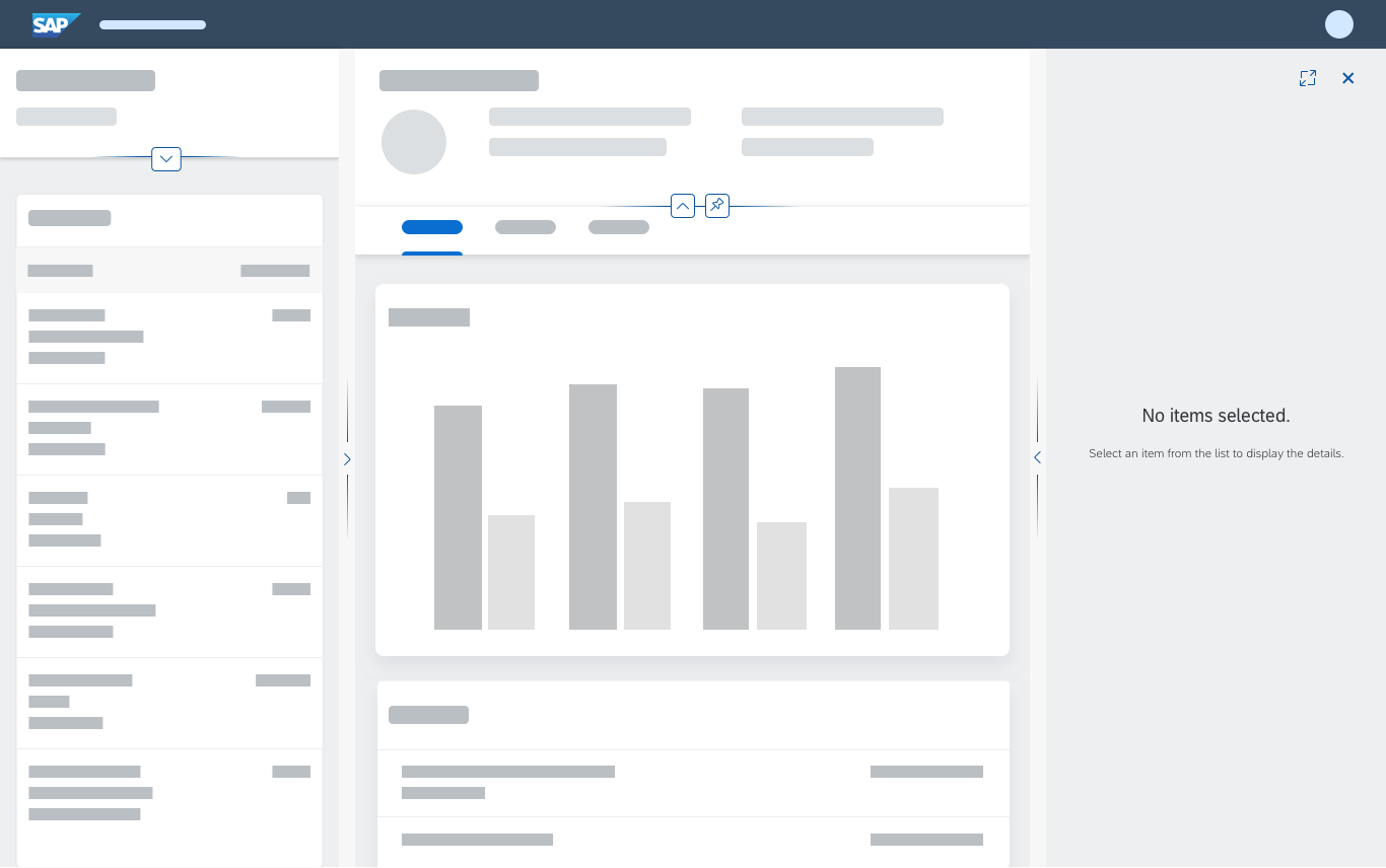
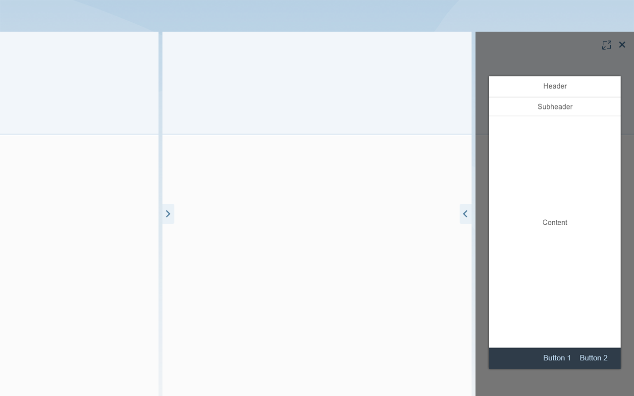
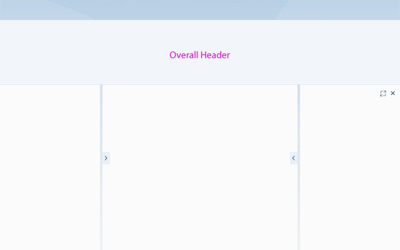
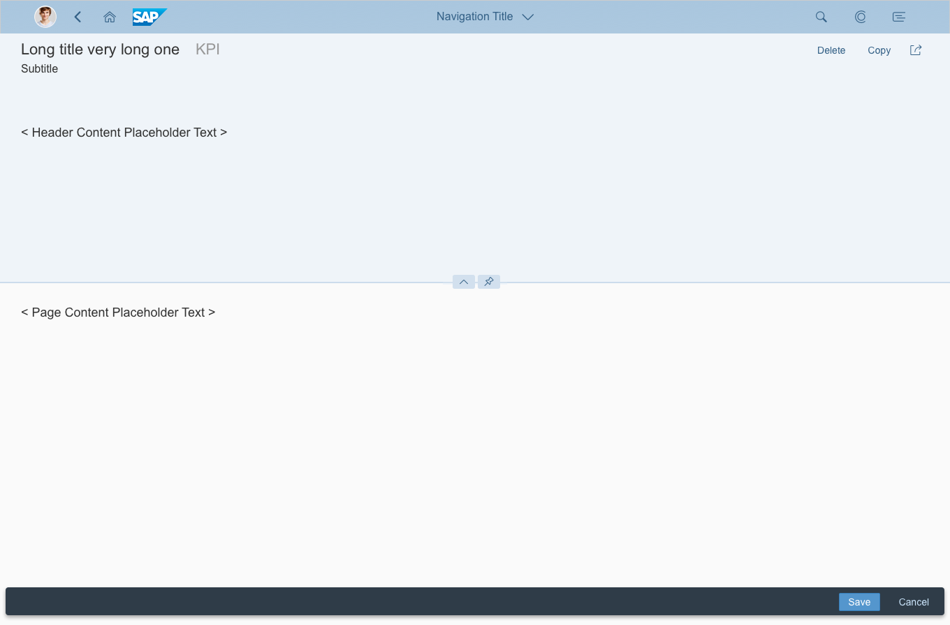
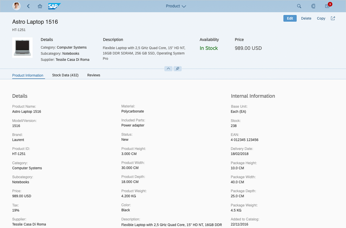
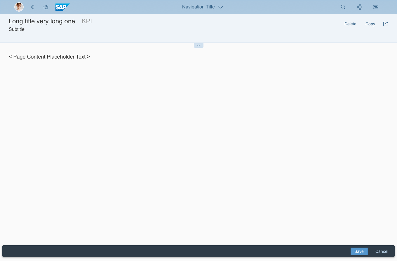
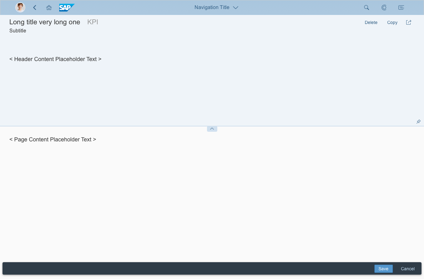
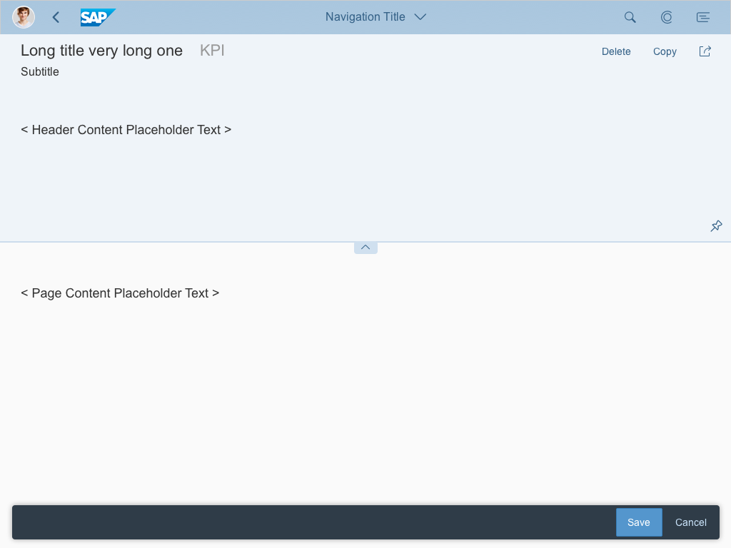
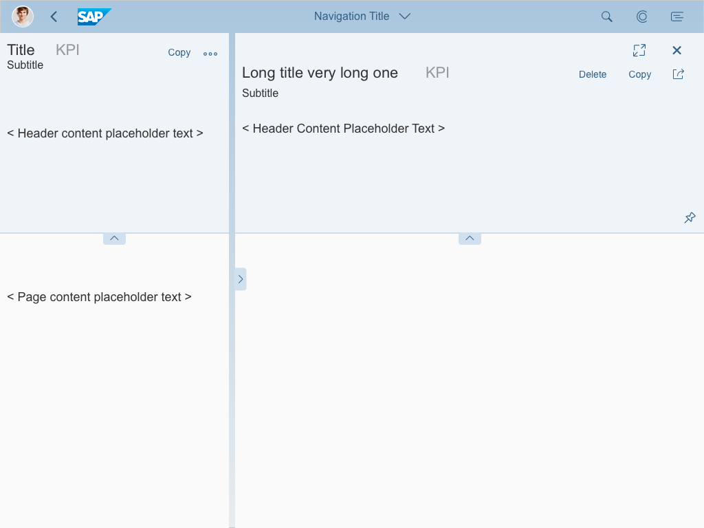
Depending on the current layout and display size, the flexible column layout consists of one, two, or three horizontally-aligned columns. Each column contains content that is not provided by the flexible column layout itself. The flexible column layout is not restricted to a specific floorplan, as long as the floorplan you use is responsive down to phone size. However, we recommend using the dynamic page.
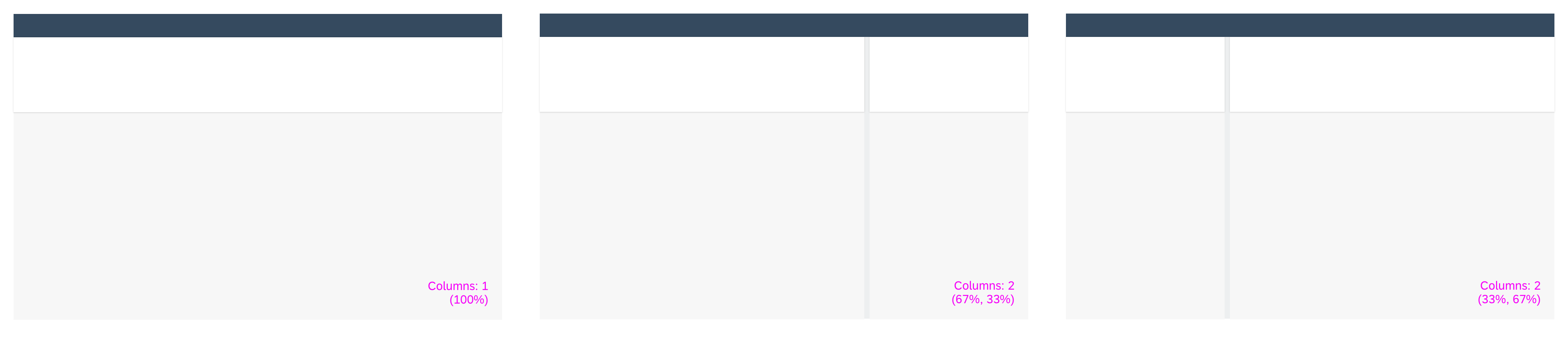
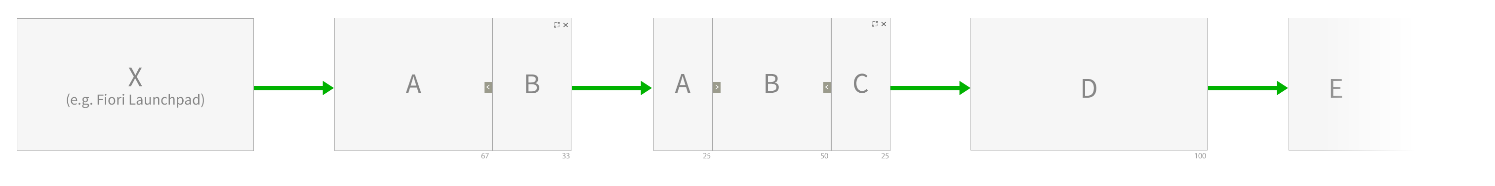
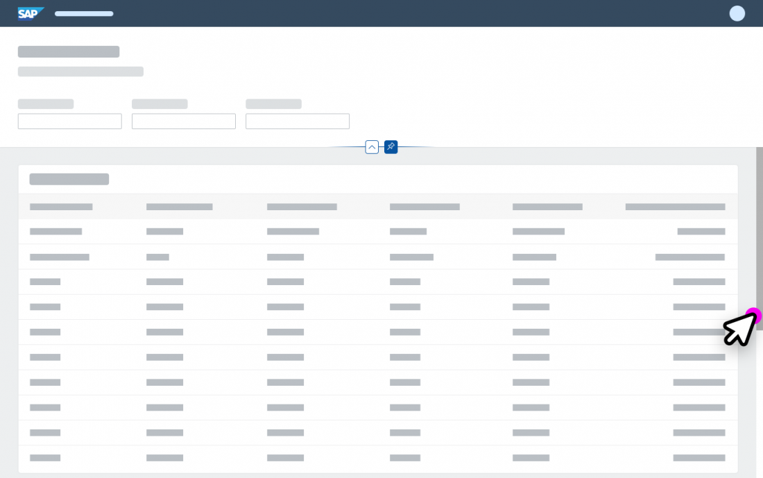
Possible Layouts
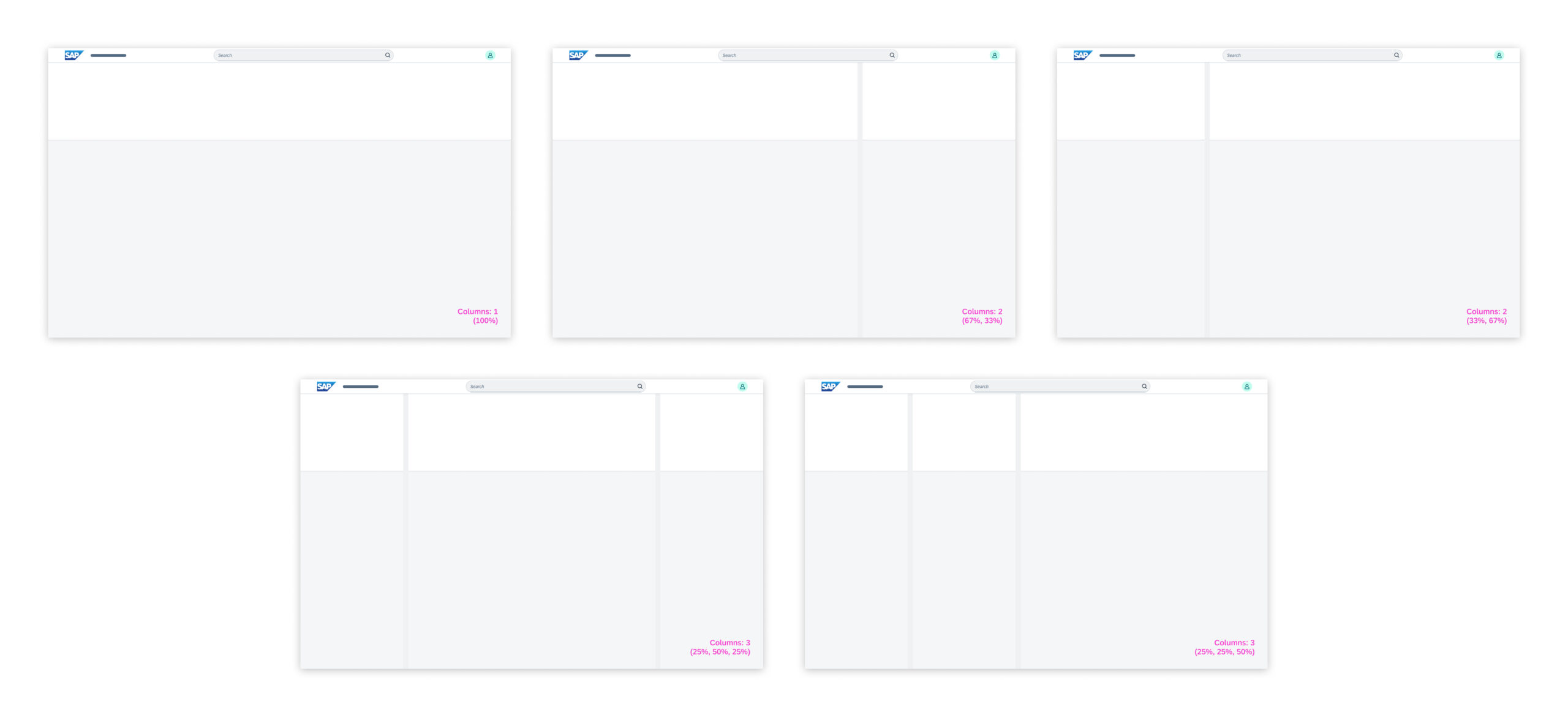
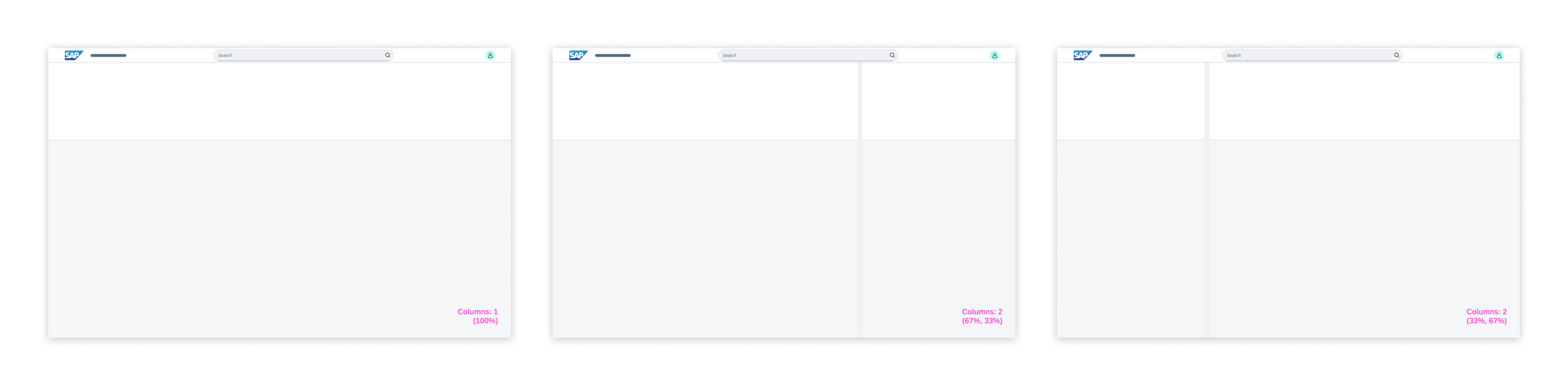
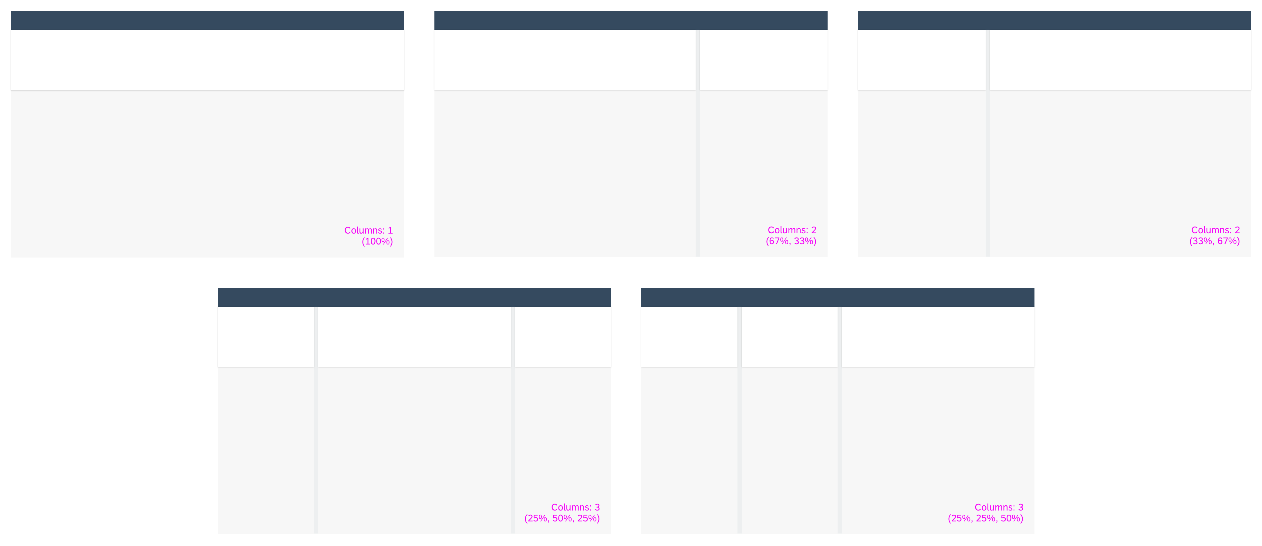
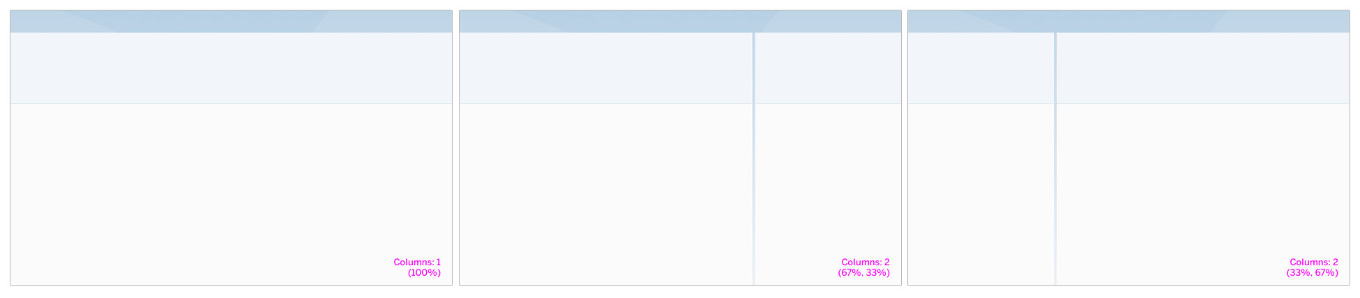
To give users a better overview, the flexible column layout offers different layouts with one, two, or three columns. Depending on the screen size, up to five alternative default layouts are available.
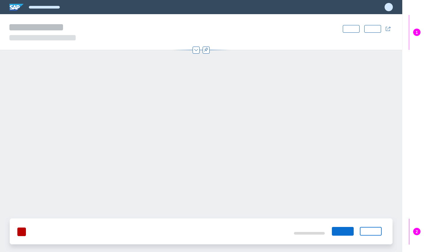
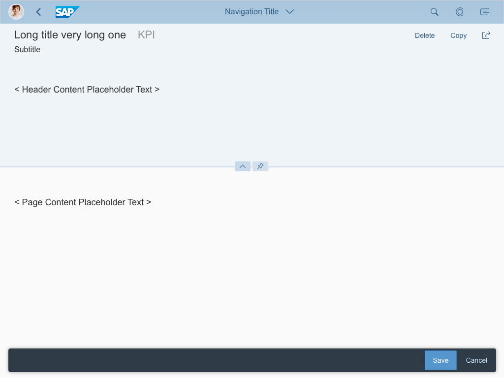
By default, the ratio is fixed:
- 33% : 66% or 66% : 33% for 2 columns
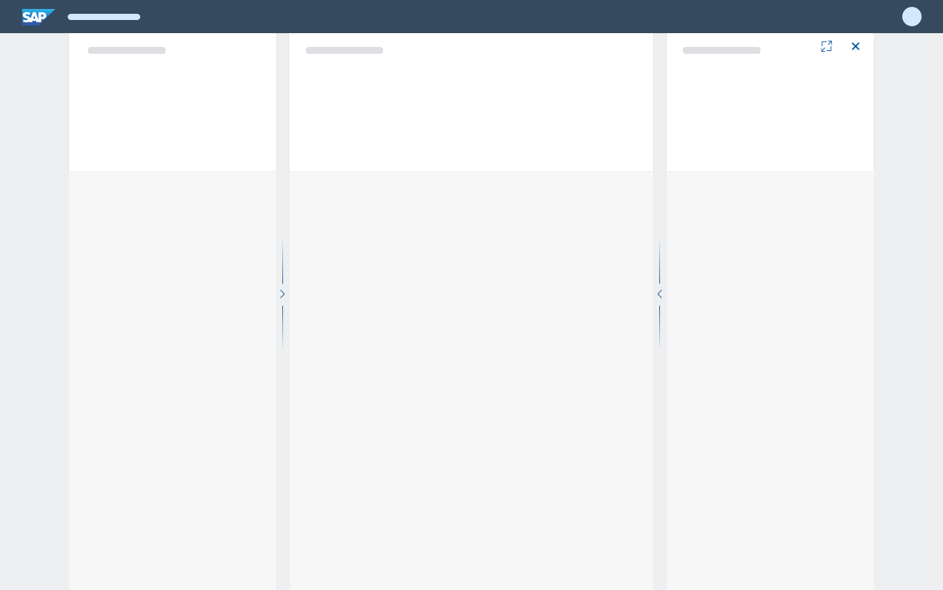
- 25% : 25% : 50%, 25% : 50% : 25%, or 50% : 25% : 25% for 3 columns
The user can also change the size of a column freely by dragging the splitter (for example, 15% : 85%).
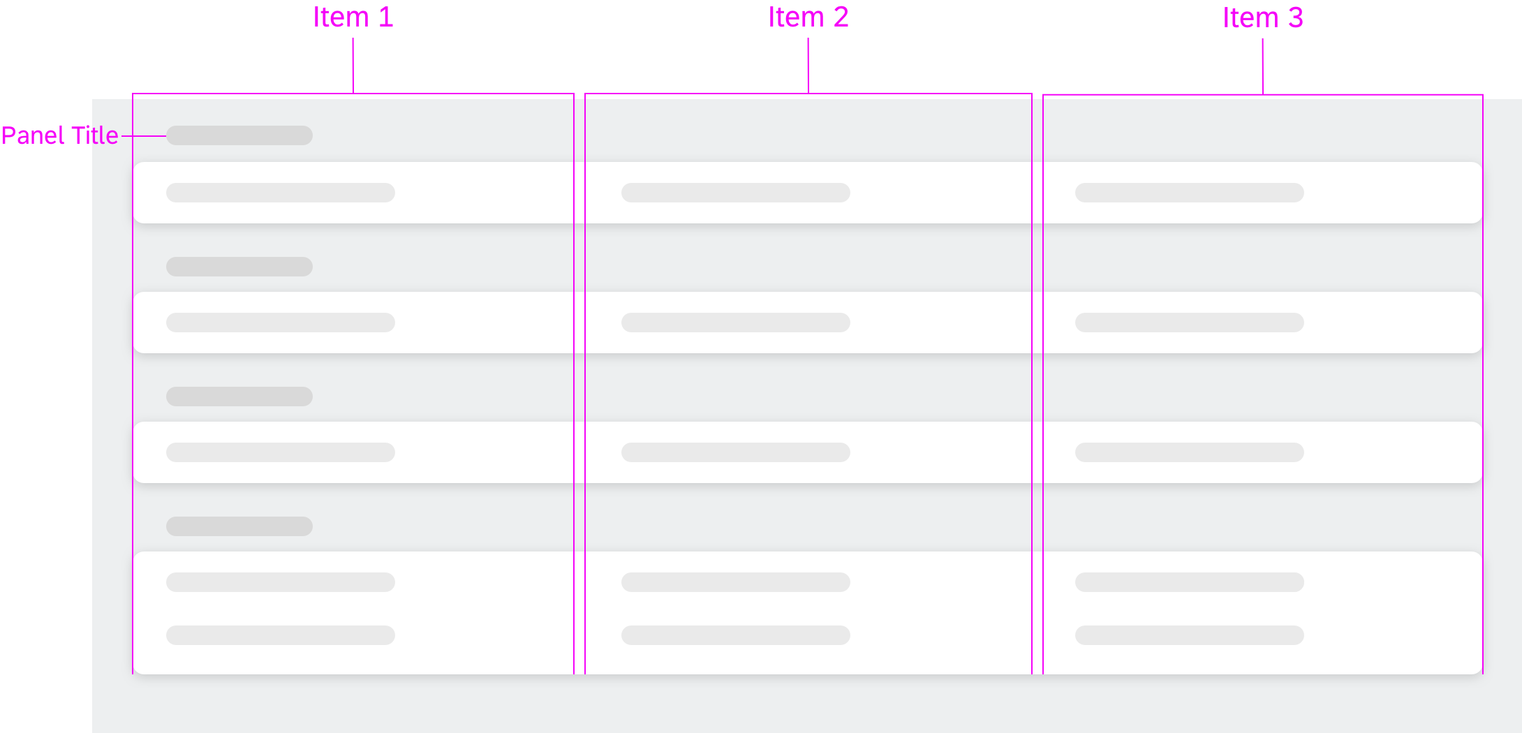
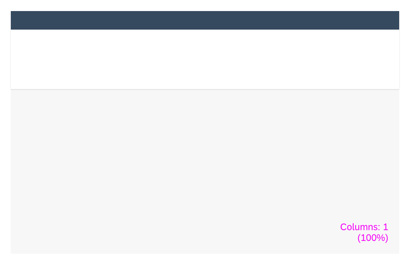
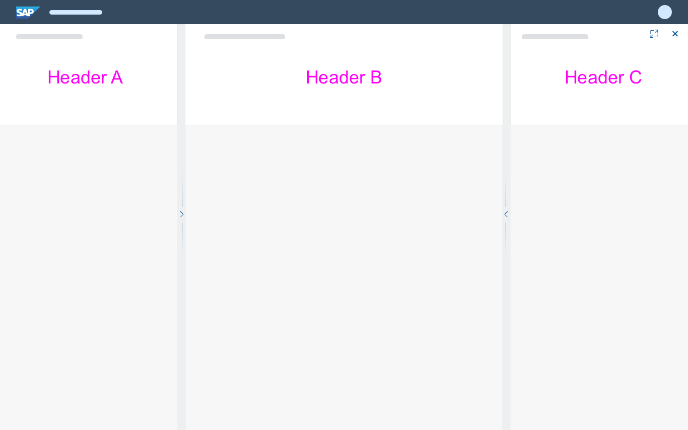
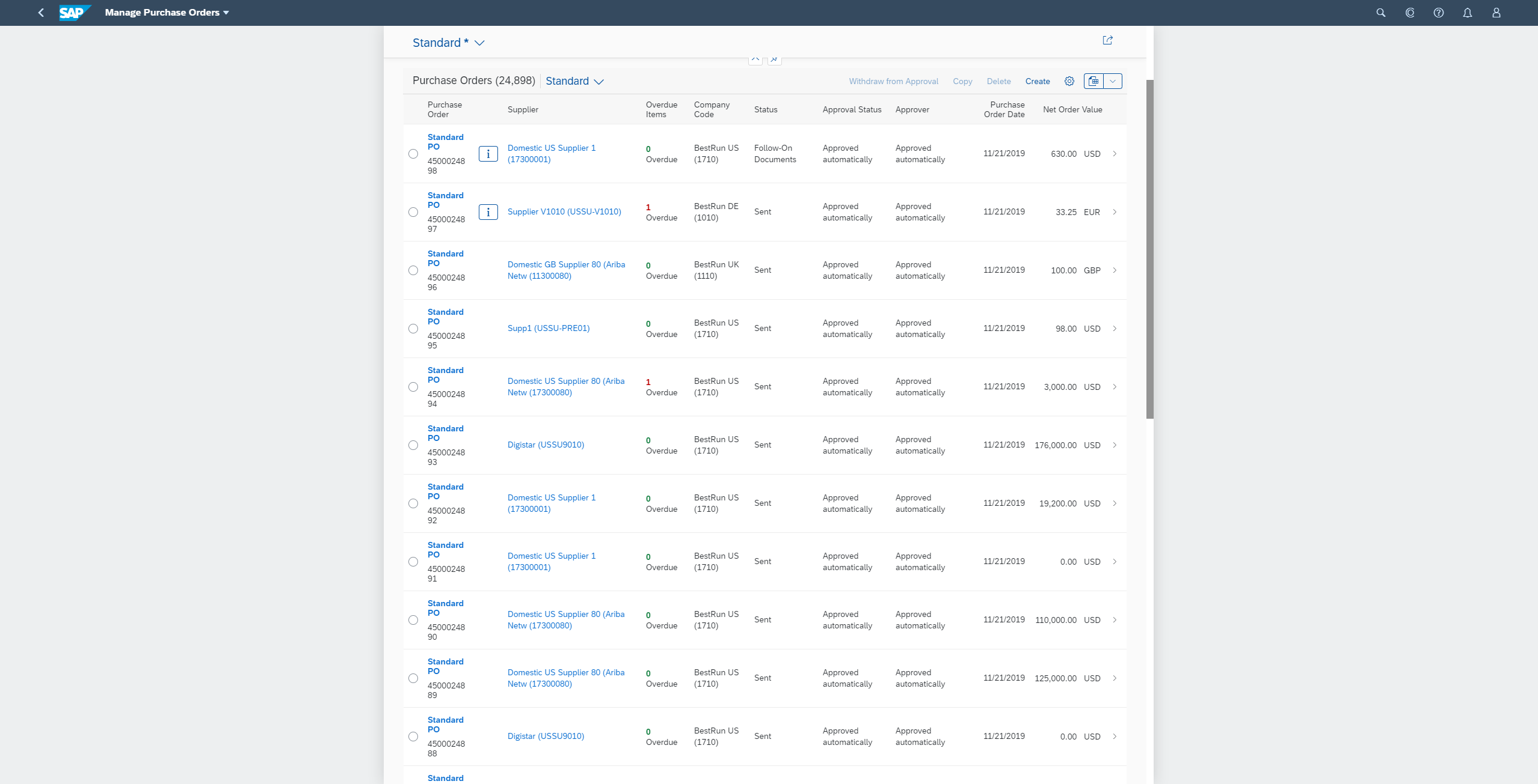
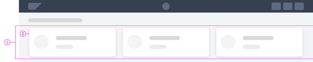
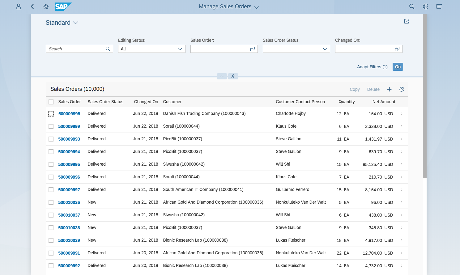
Flexible column layout - Structure example (25% : 50% : 25%)
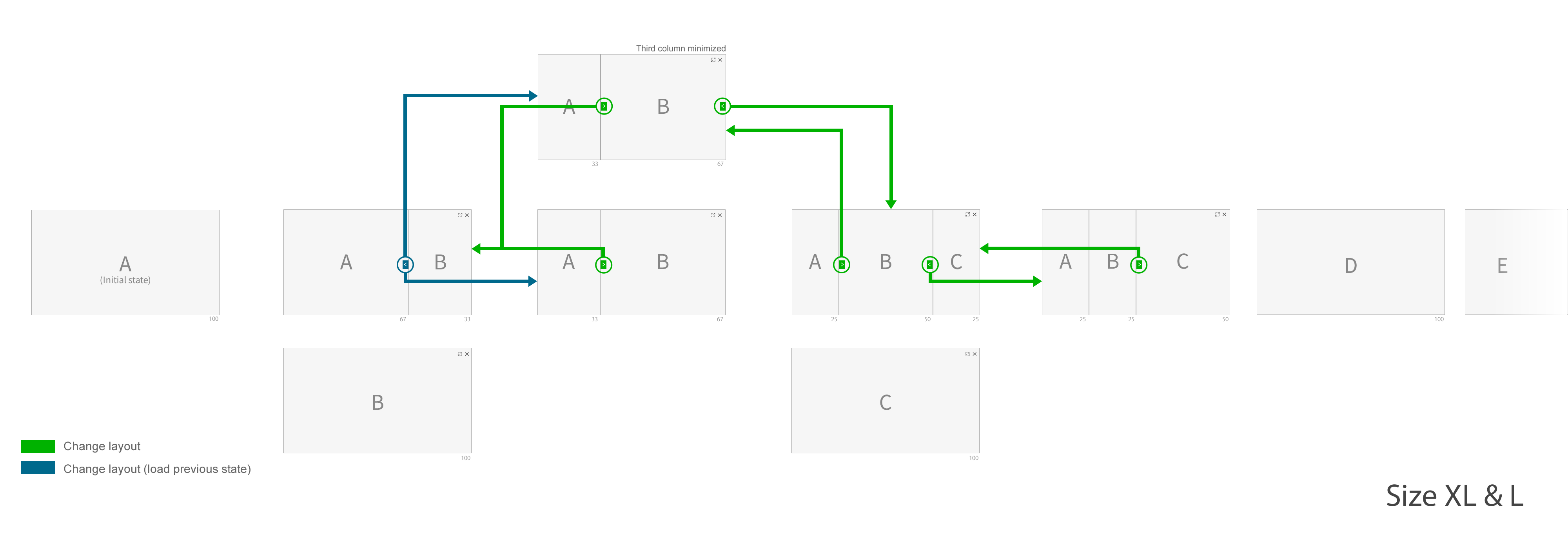
Size L and XL (Desktop)
There are five different default layouts in sizes L and XL: a full screen layout, as well as two different 2-column and 3-column layouts.
Available layouts in sizes L and XL
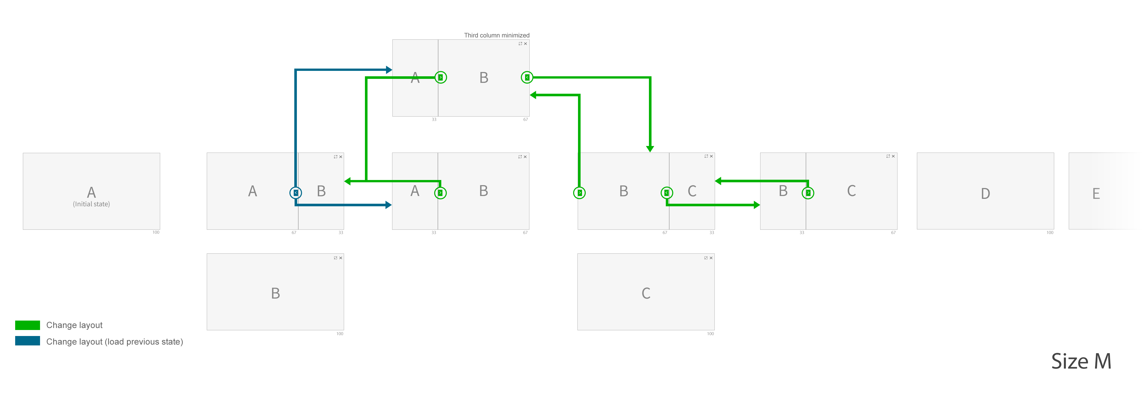
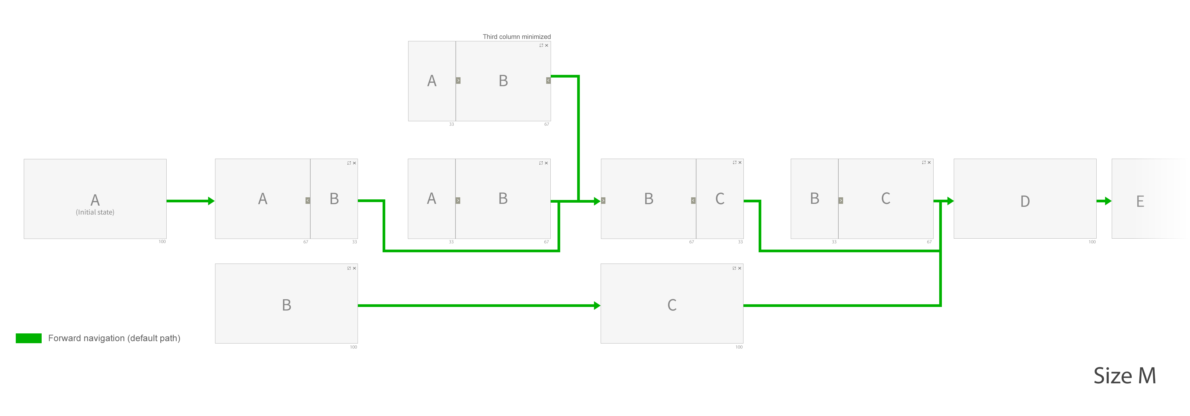
Size M (Tablet)
There are three different default layouts in size M: a full screen layout and two different 2-column layouts. There is no 3-column layout due to the limited width. However, you can still load 3 pages in size M. Instead of showing them all side-by-side, the user can switch between columns 1/2 and 2/3.
Available layouts in size M
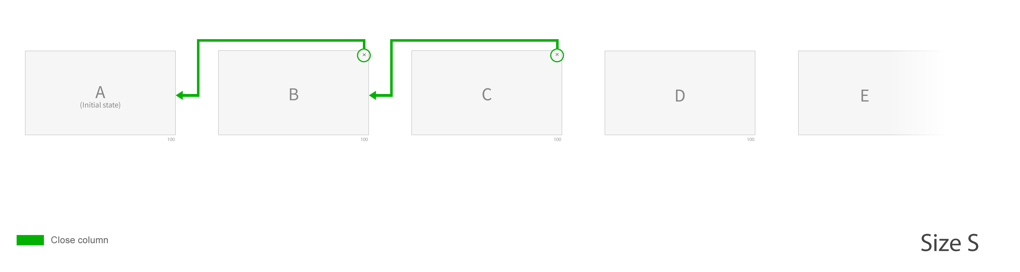
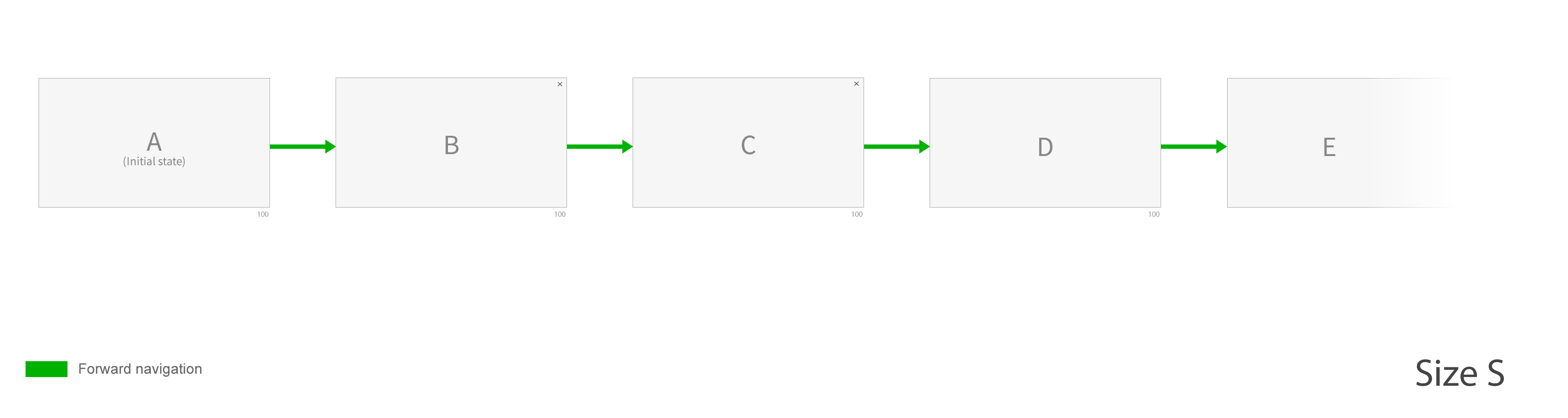
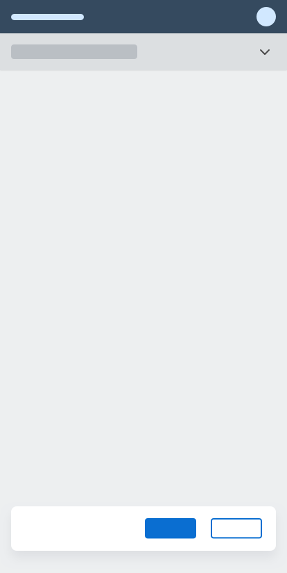
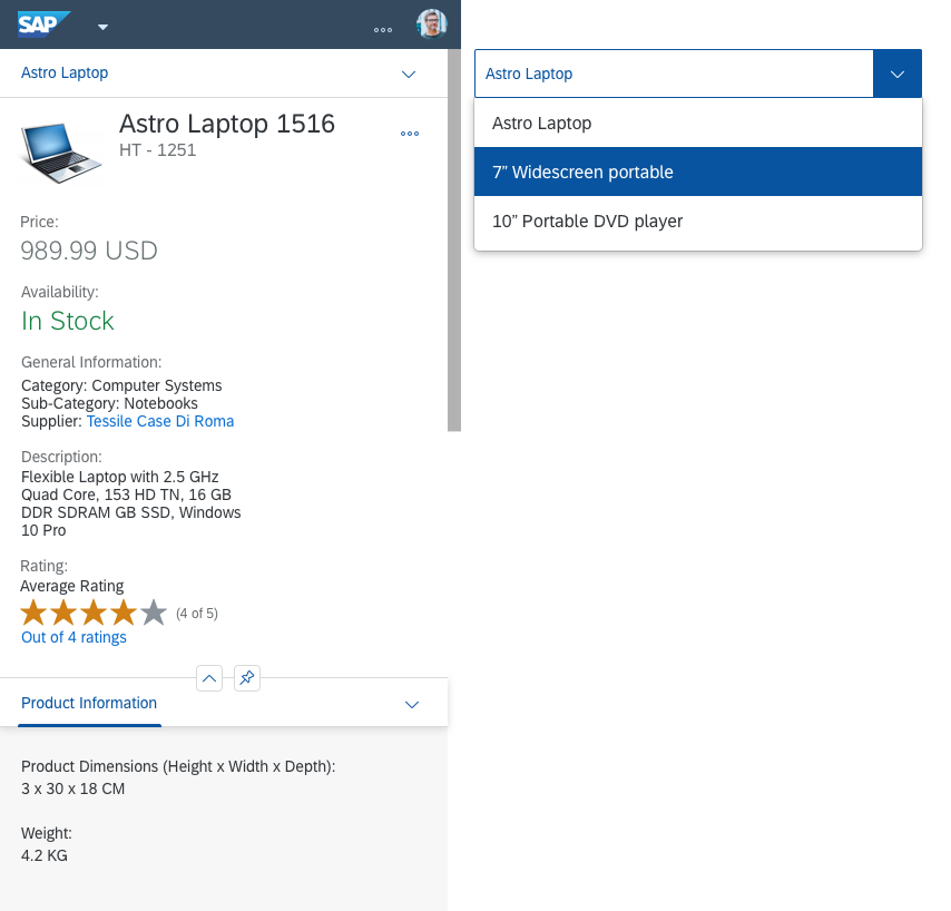
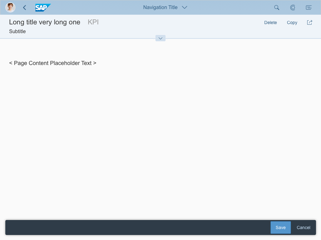
Size S (Phone)
Because of the limited width, there is no multi-column layout for Size S. Instead, the rightmost column is shown in full screen mode.
Available layout in size S
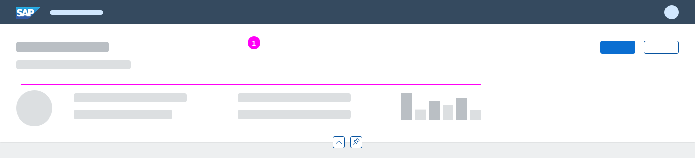
Components
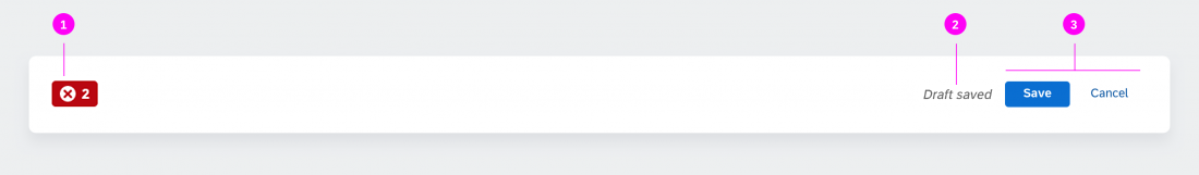
The flexible column layout offers a few simple actions that allow users to adapt the current layout according to their needs.
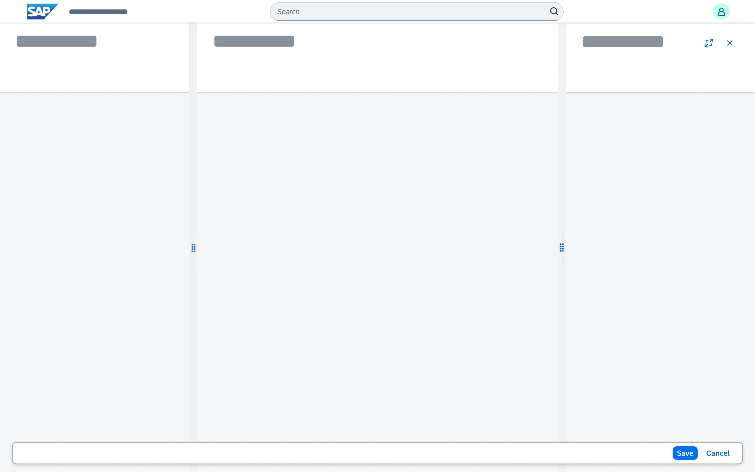
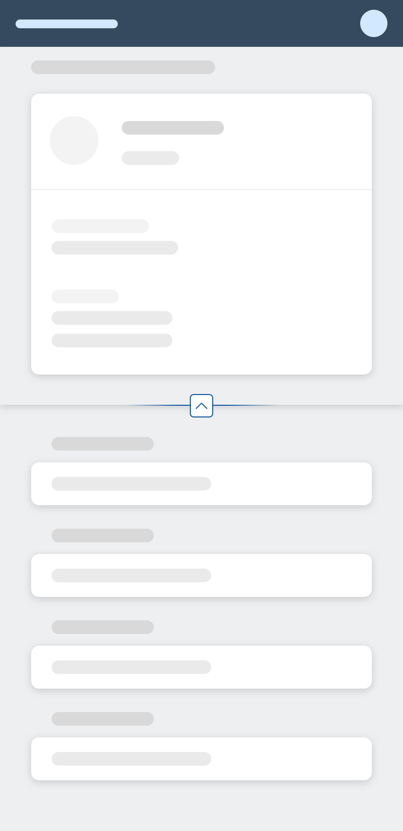
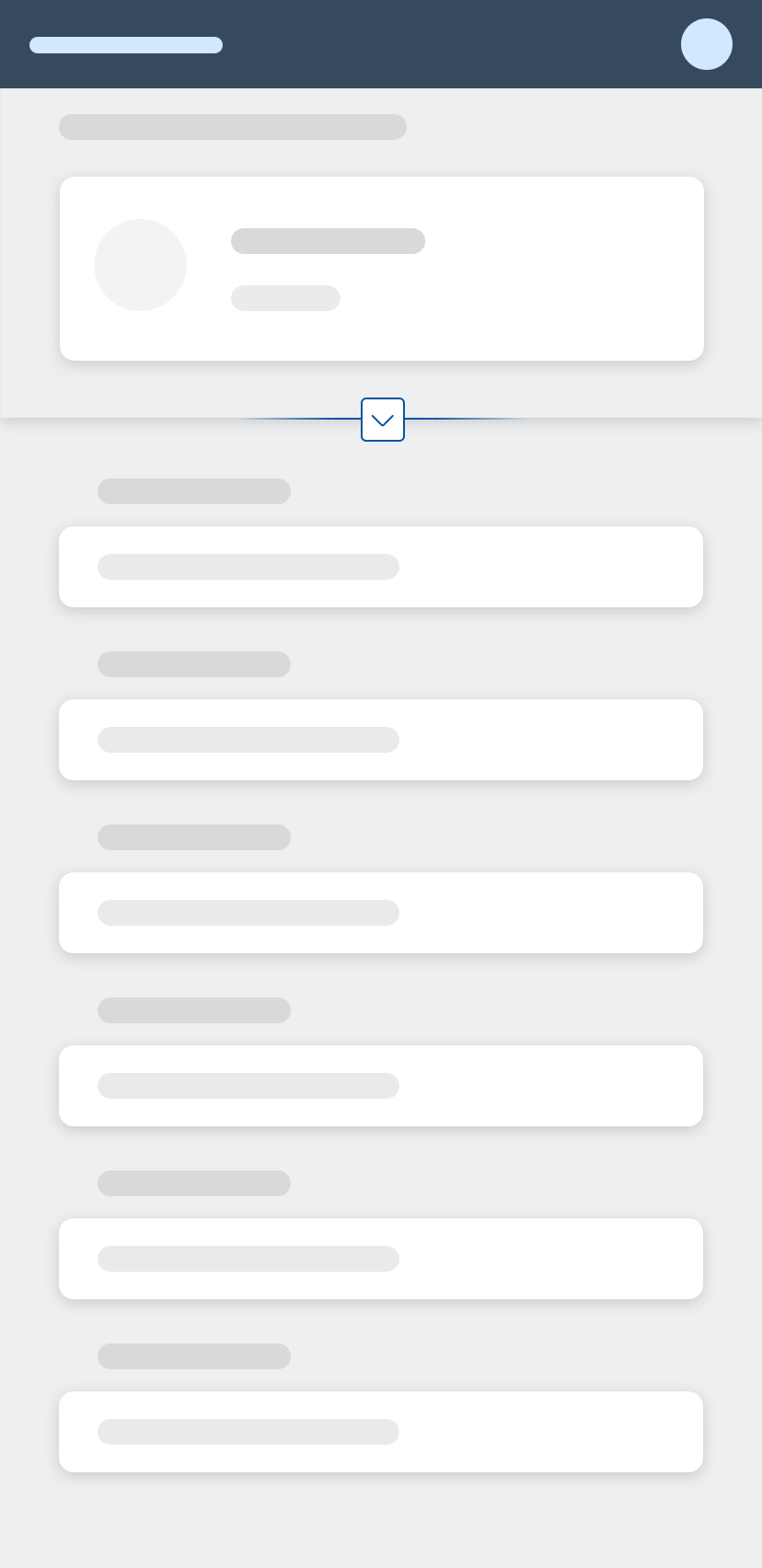
Note: Some of the actions (illustrated by blue lines in the image below) recover the last state of the layout to which they refer. In other words, the result of the action depends on the previous state of the layout.
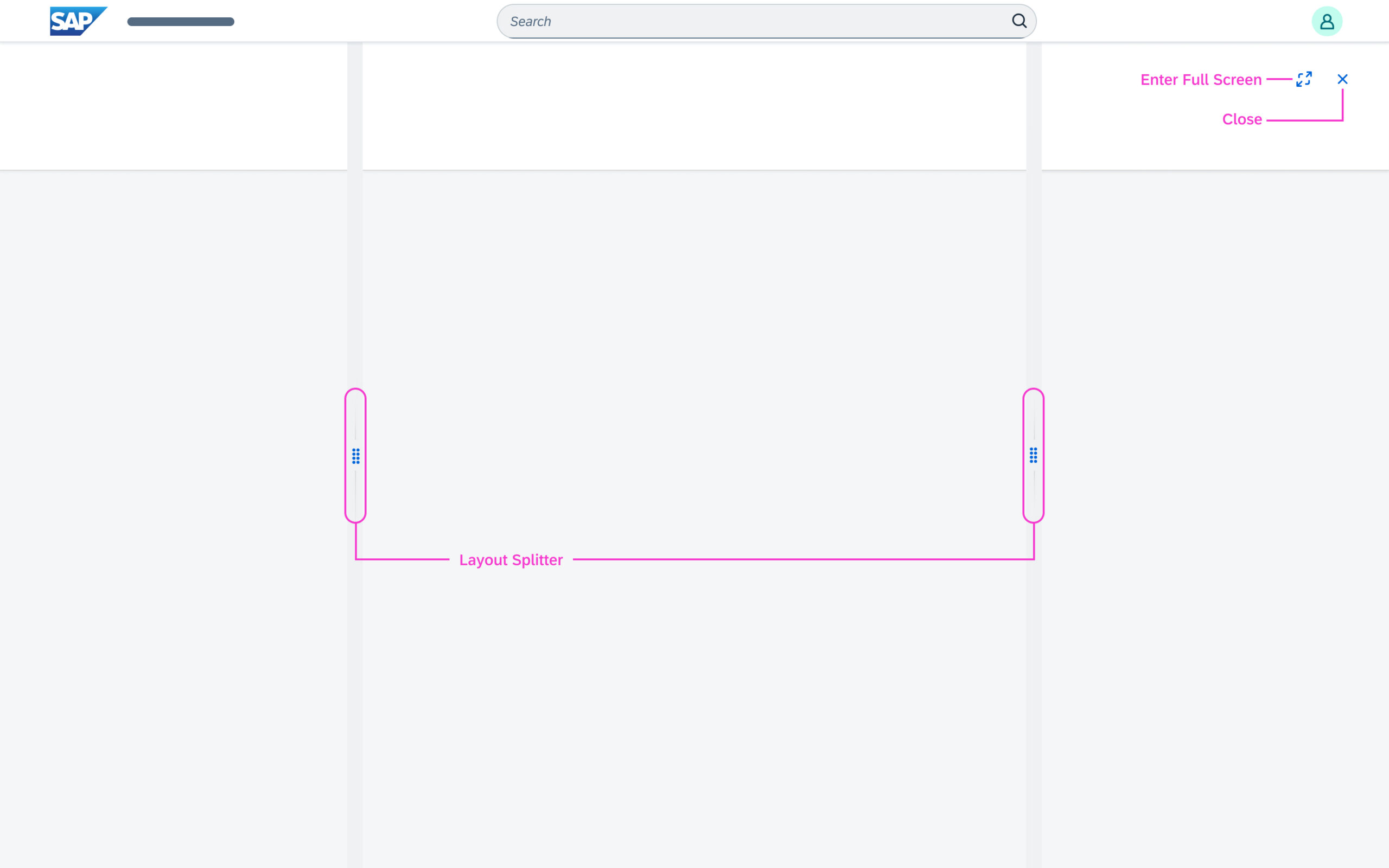
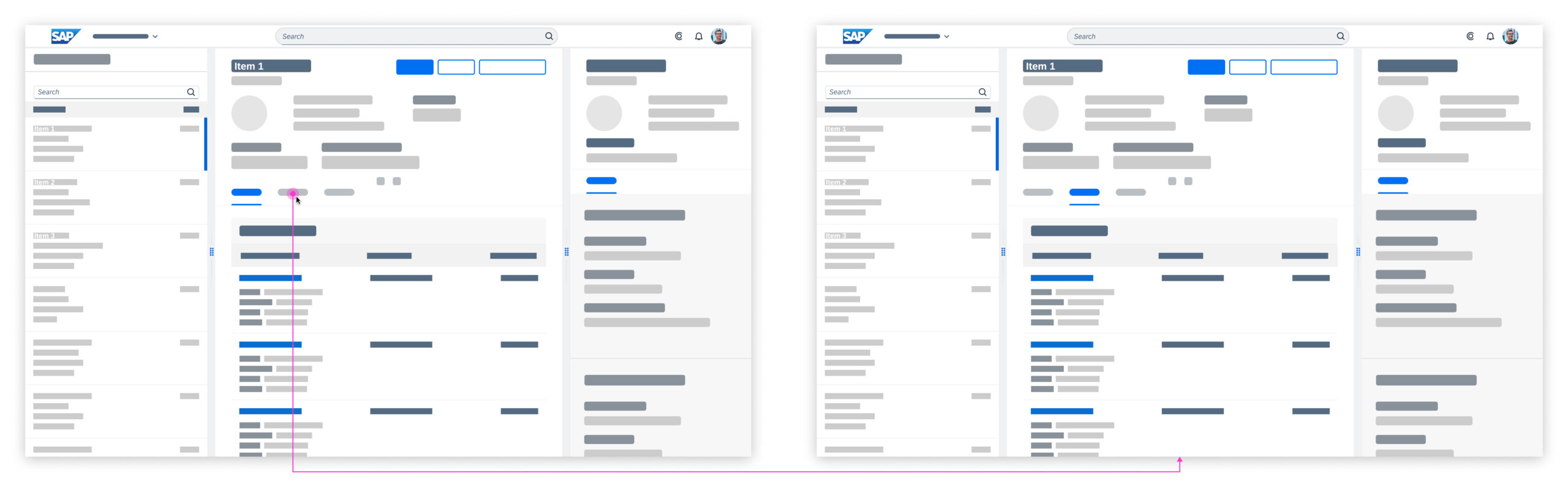
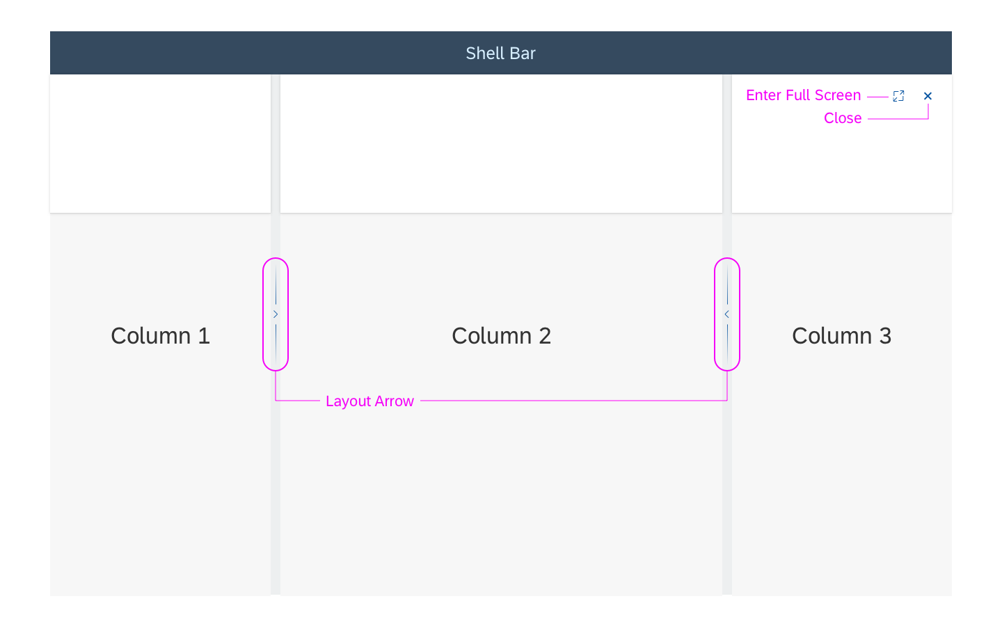
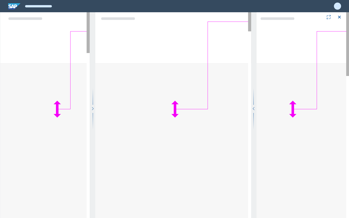
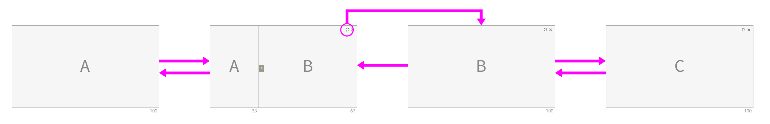
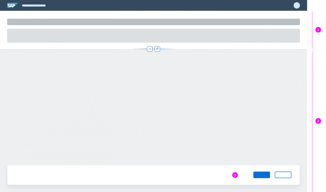
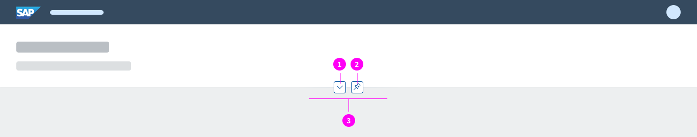
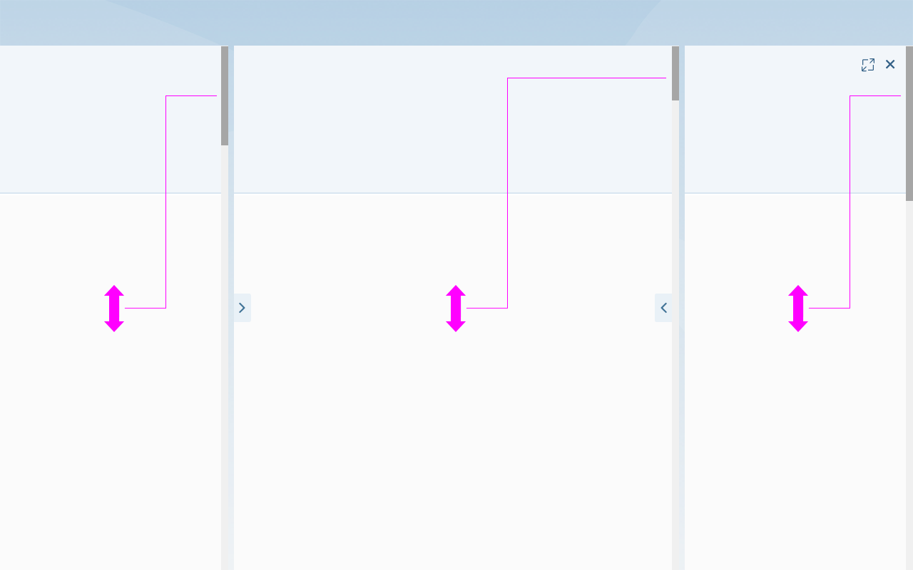
Layout Splitter
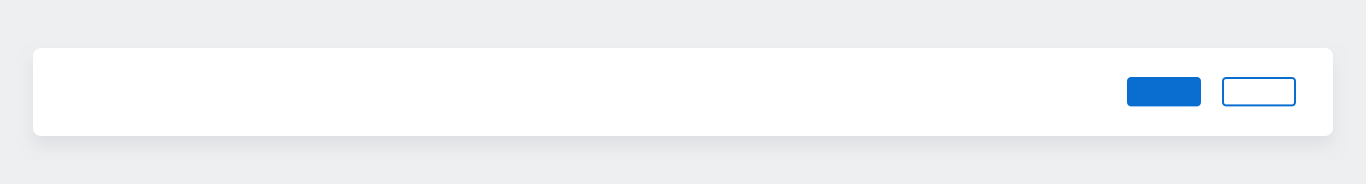
The layout splitter is a control that allows users to freely resize the columns by dragging the splitter, thereby changing the layout. However, this action cannot be used to expand a column to full screen mode. There is a separate action for that purpose.
The layout splitter is next to the divider between the columns. If a column cannot be resized any further, the layout splitter is hidden.
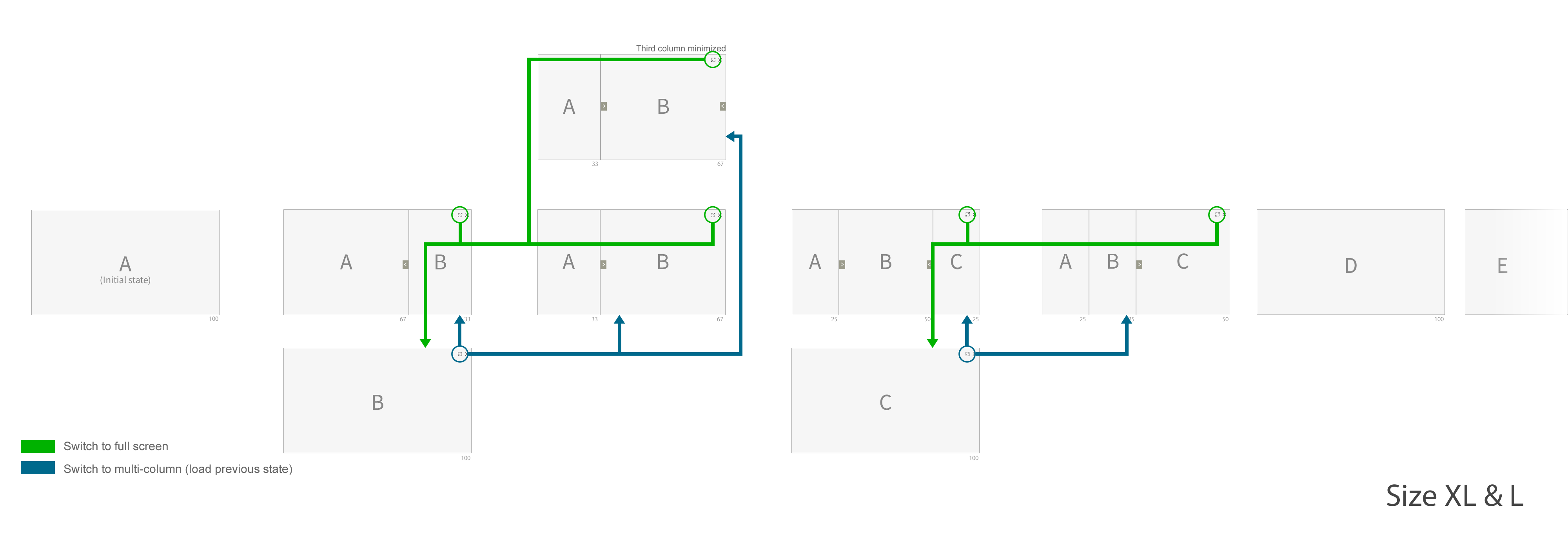
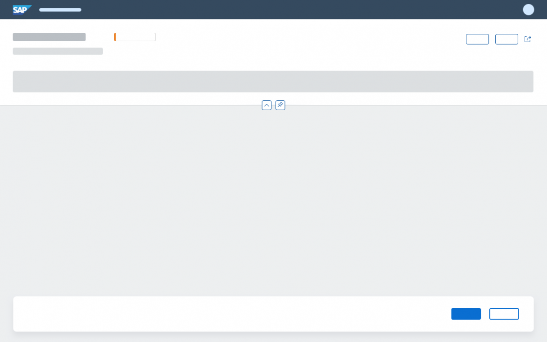
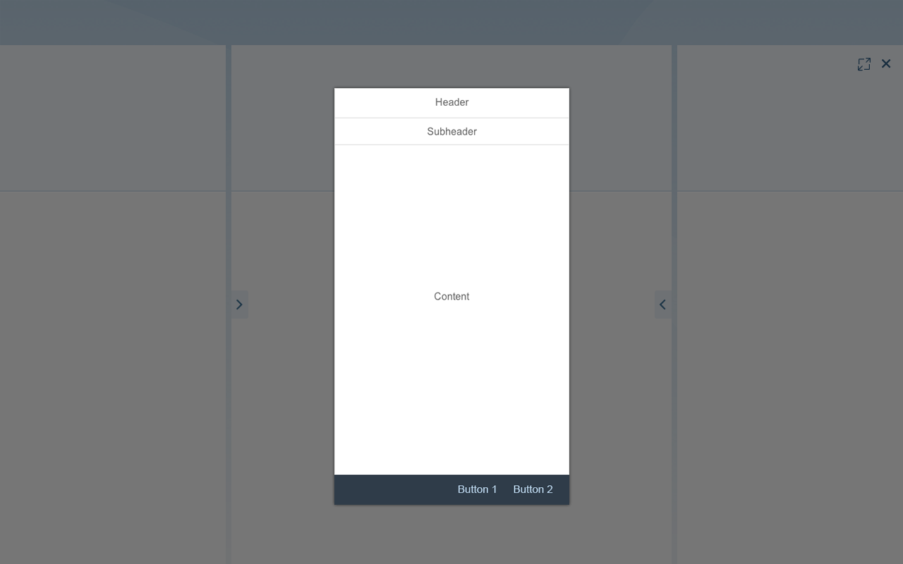
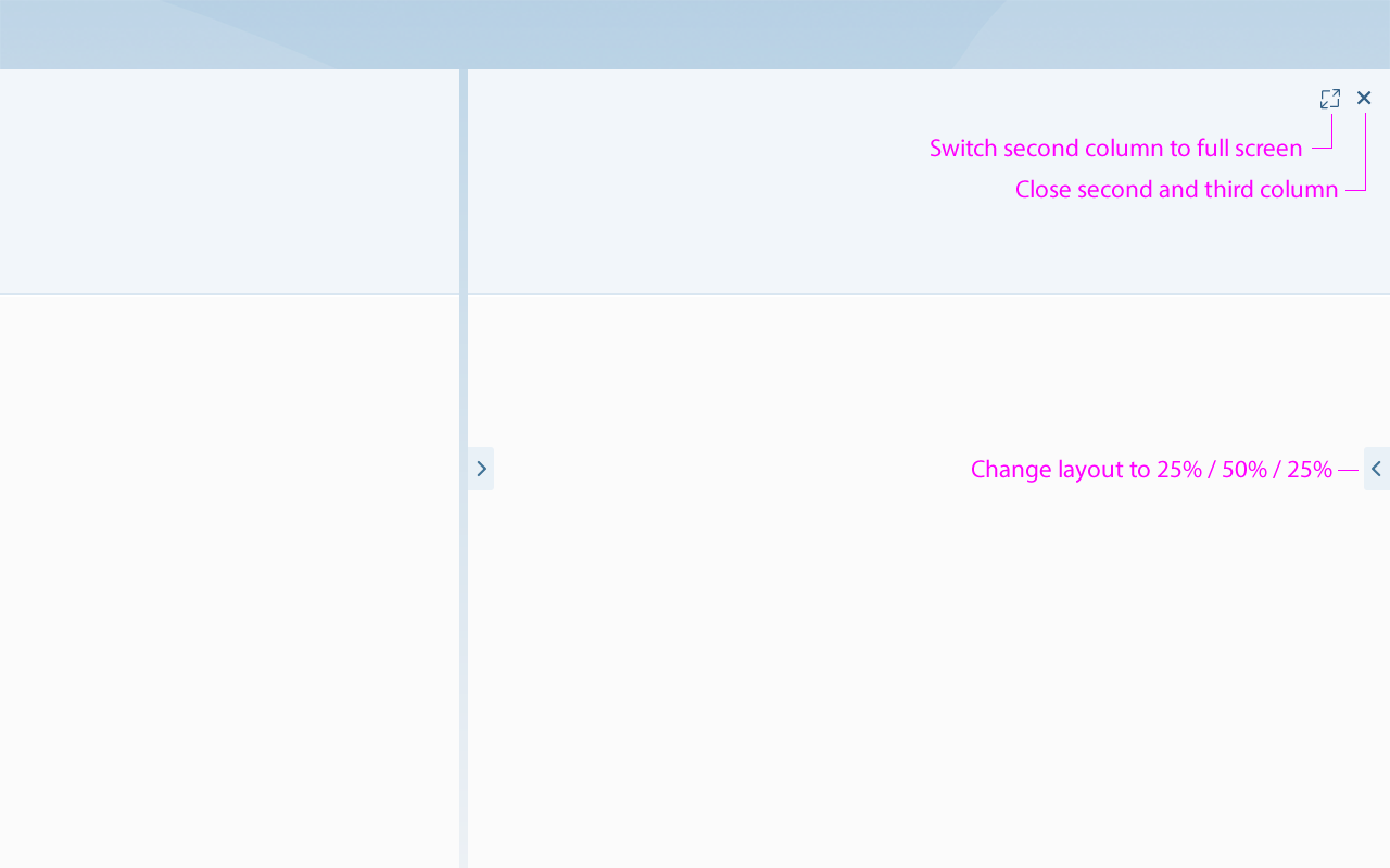
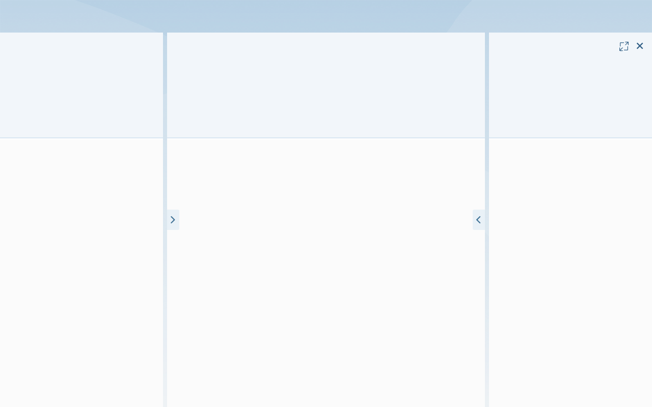
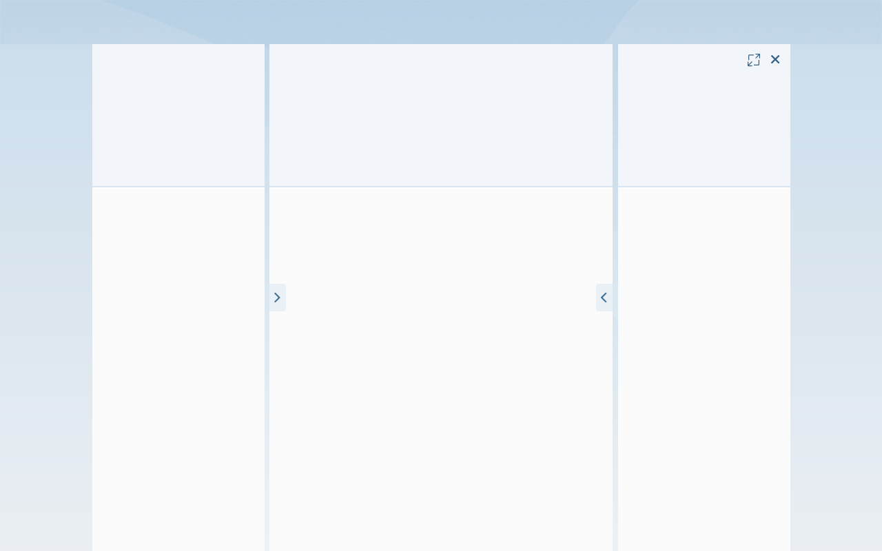
Enter Full Screen Mode
With the Full Screen icon , the user can switch the rightmost column to full screen mode. The action is located in the rightmost column, and is only offered if there is more than one column.
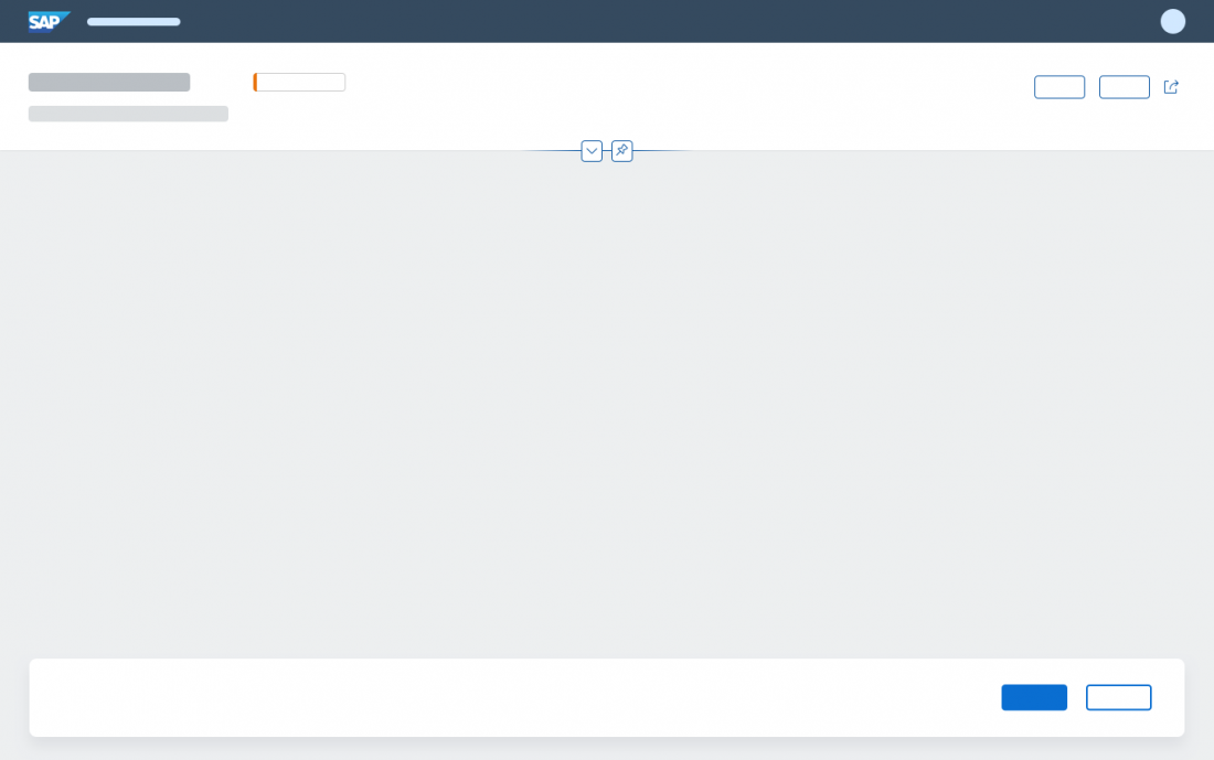
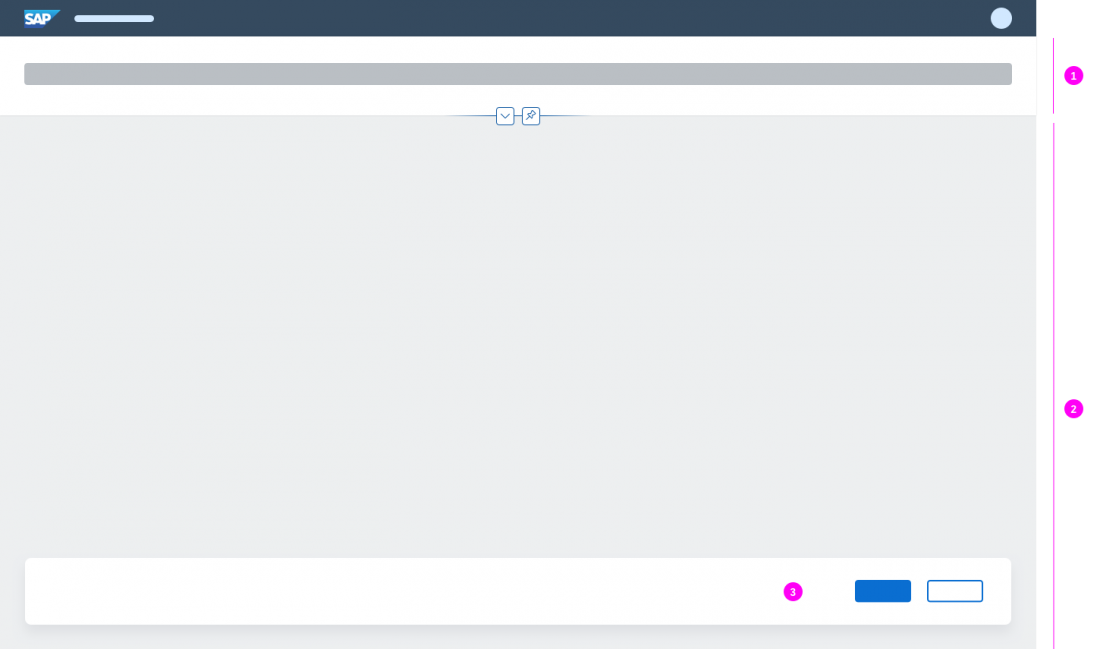
Exit Full Screen Mode
By selecting the Exit Full Screen icon , the user can exit the full screen and switch back to the multi-column (side-by-side) view. The action is only available while in full screen mode.
Entering and Exiting Full Screen Mode
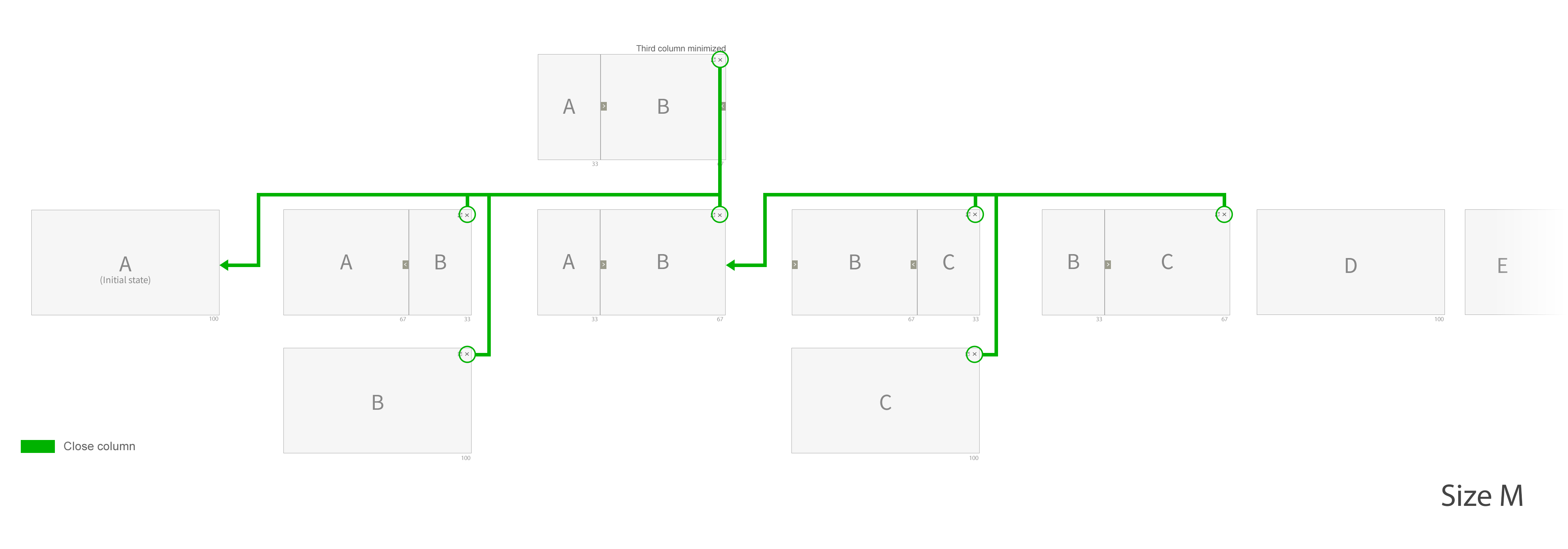
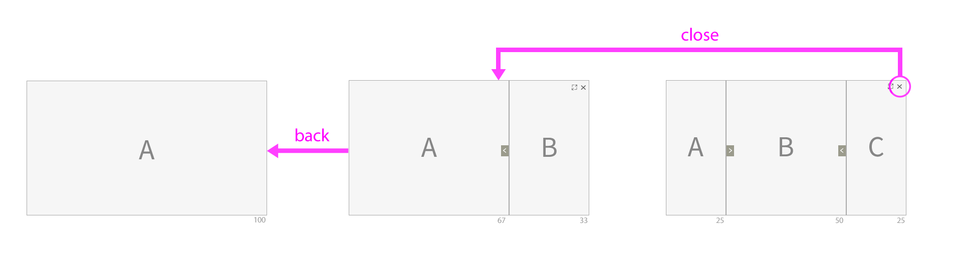
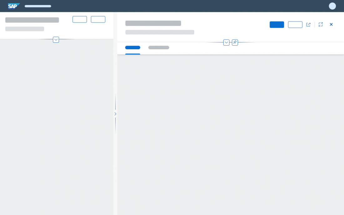
Close
With the Close icon , the user can close the last (rightmost) column. If the user selects this action in the second column while the third column is minimized, both columns are closed. Close is also available in full screen mode, and in the second/third column for size S.
Close Action
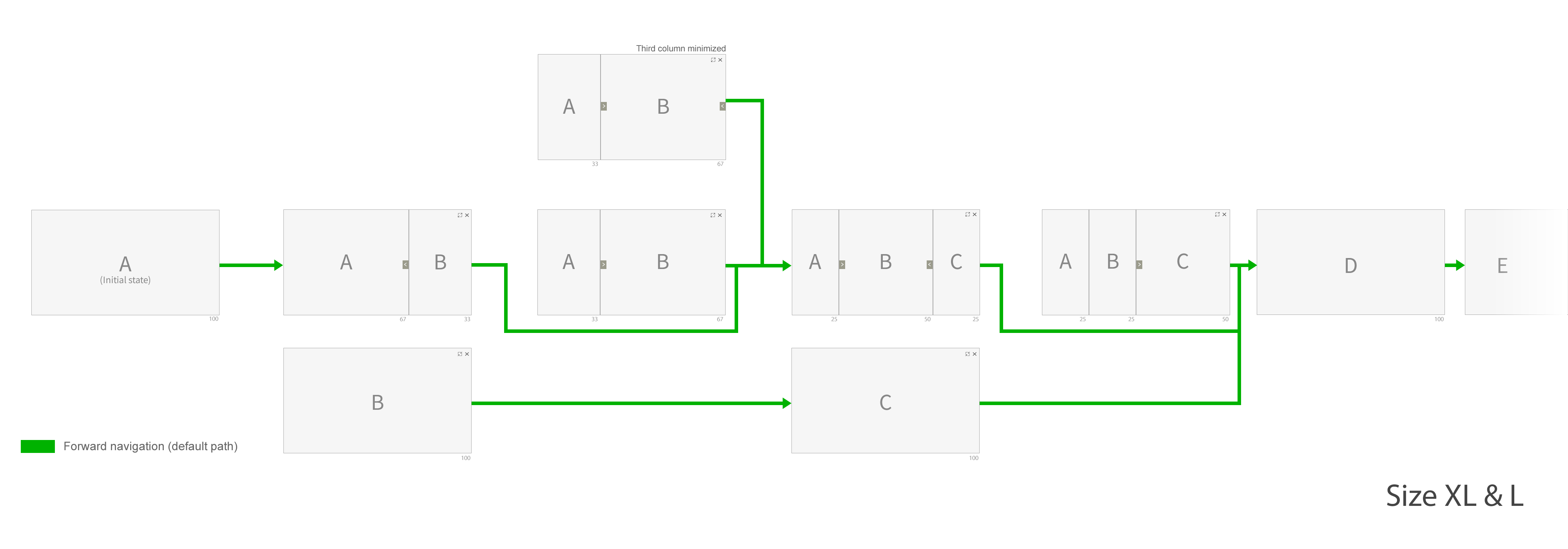
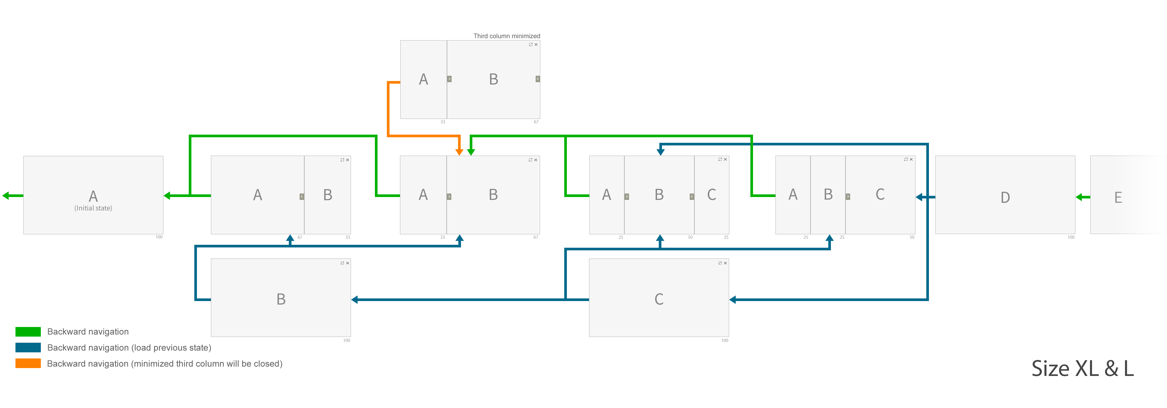
Navigation
In addition to the actions specific to the flexible column layout, the user can also use the forward and backward navigation to navigate through the flexible column layout. Drilling in or navigating forward opens a new column, while Back closes a column or exits the full screen mode (depending on what the last action was).
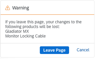
Please note: Back does not restore layout changes (such as switching from 33% : 67% to 67% : 33%). It also doesn’t reopen columns that were closed previously using the Close button ( ).
Because the flexible column layout only supports a maximum of 3 columns, any follow-on pages are loaded in full screen mode. These pages do not contain Close or Enter Full Screen / Exit Full Screen actions.
By default, the width is initially 33% for the second column and 25% for the third column. You can also set the width of the second column to 67%, or the third to 50% if your use case requires it.
Forward Navigation
Backward Navigation
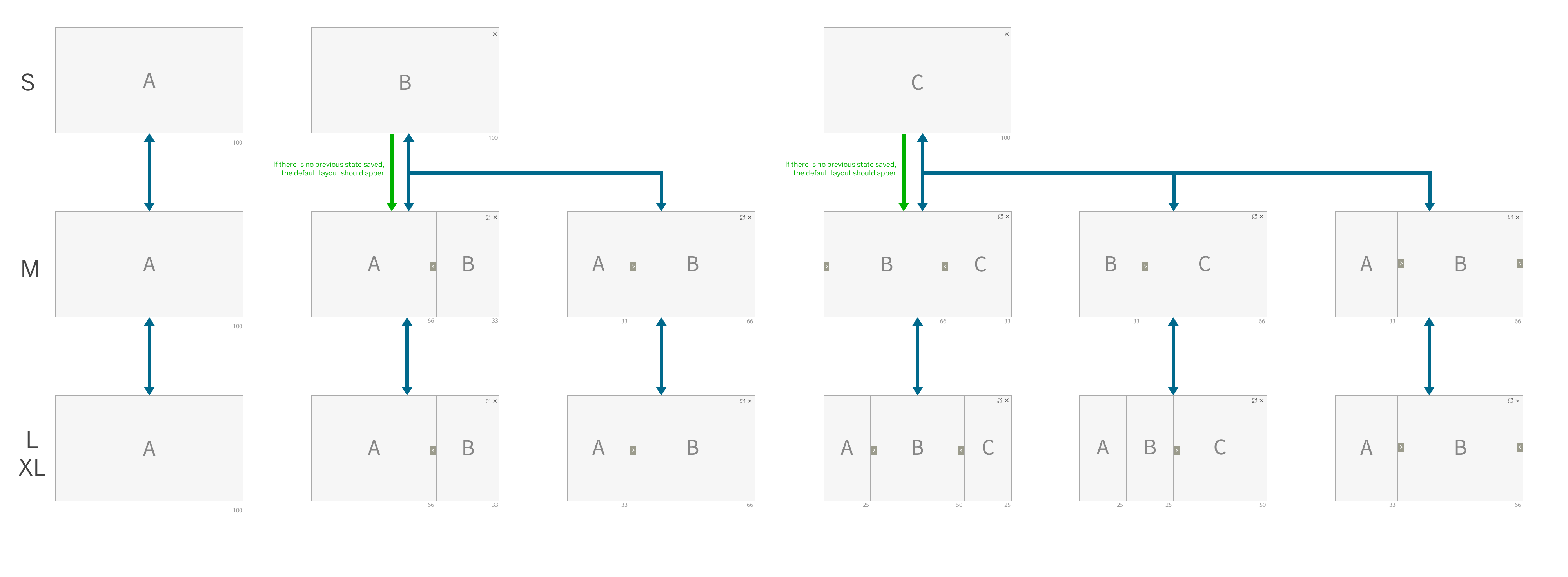
Responsiveness
The flexible column layout changes its behavior for sizes XL, L, M and S in real time whenever the user resizes the screen.
If no previous state has been saved, ensure that the default layout appears automatically. For example, if the flexible column layout was initially loaded in size S and then, the user navigates to the second column and changes the browser window to size M, the default 2-column layout for size M (67% : 33%) should be shown.
Responsiveness of the flexible column layout
Behavior and Interaction
Dialogs
Dialogs triggered in one of the columns are centered over the entire screen.
Center dialogs triggered in a column
Do not right-align dialogs triggered in a column
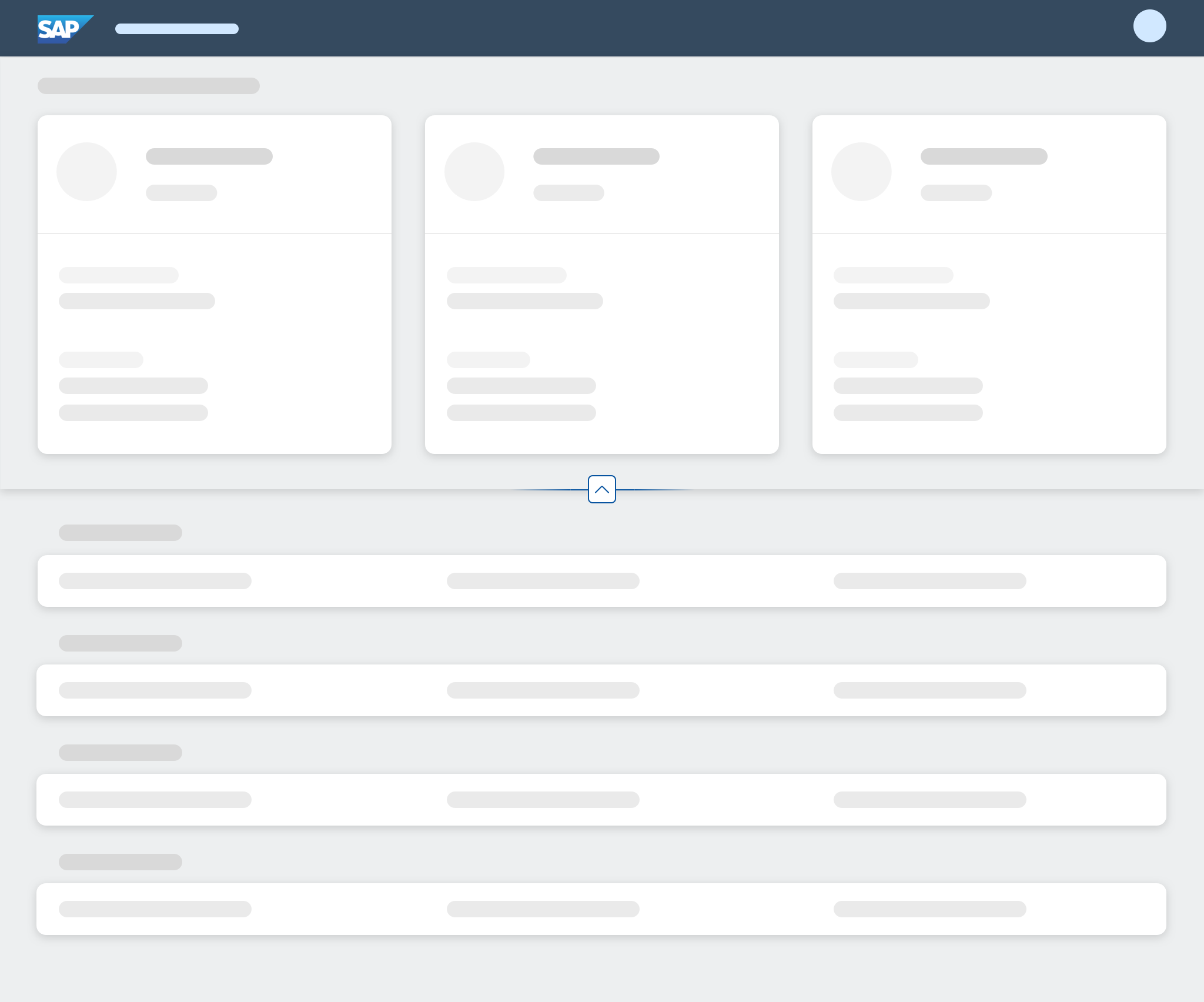
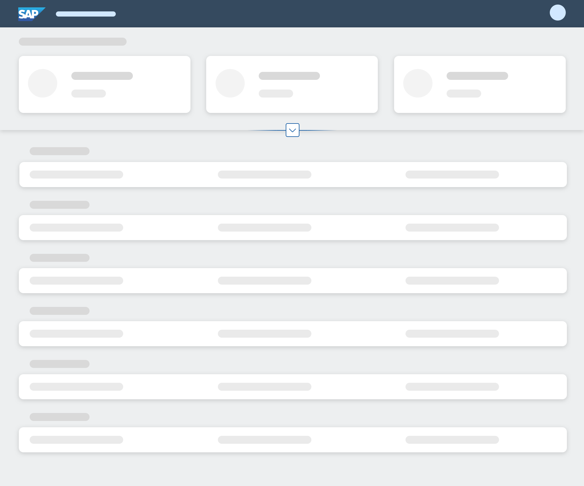
Vertical Size / Scrolling
Each column inside the flexible column layout contains an independent floorplan with its own scrolling behavior. There is no “all-encompassing” scrollbar which scrolls all columns simultaneously. The height of each floorplan is defined by the screen size.
Give each column its own scrollbar
There is no universal scrollbar for all columns
Scroll Position
During column resizing, the navigated item in the list column may no longer be in the visible screen area. In such cases, we recommend setting the scroll position to the item currently open in the details column (“navigated” item). This allows the user to see at a glance which item from the list or table is being displayed in the details column.
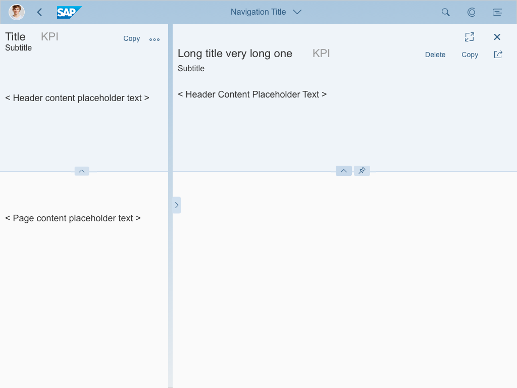
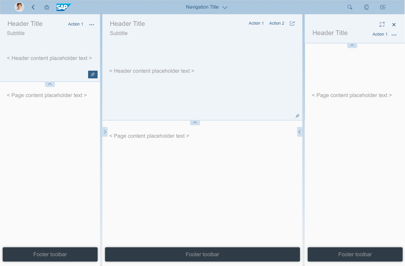
Two Columns (List-Detail Mode)
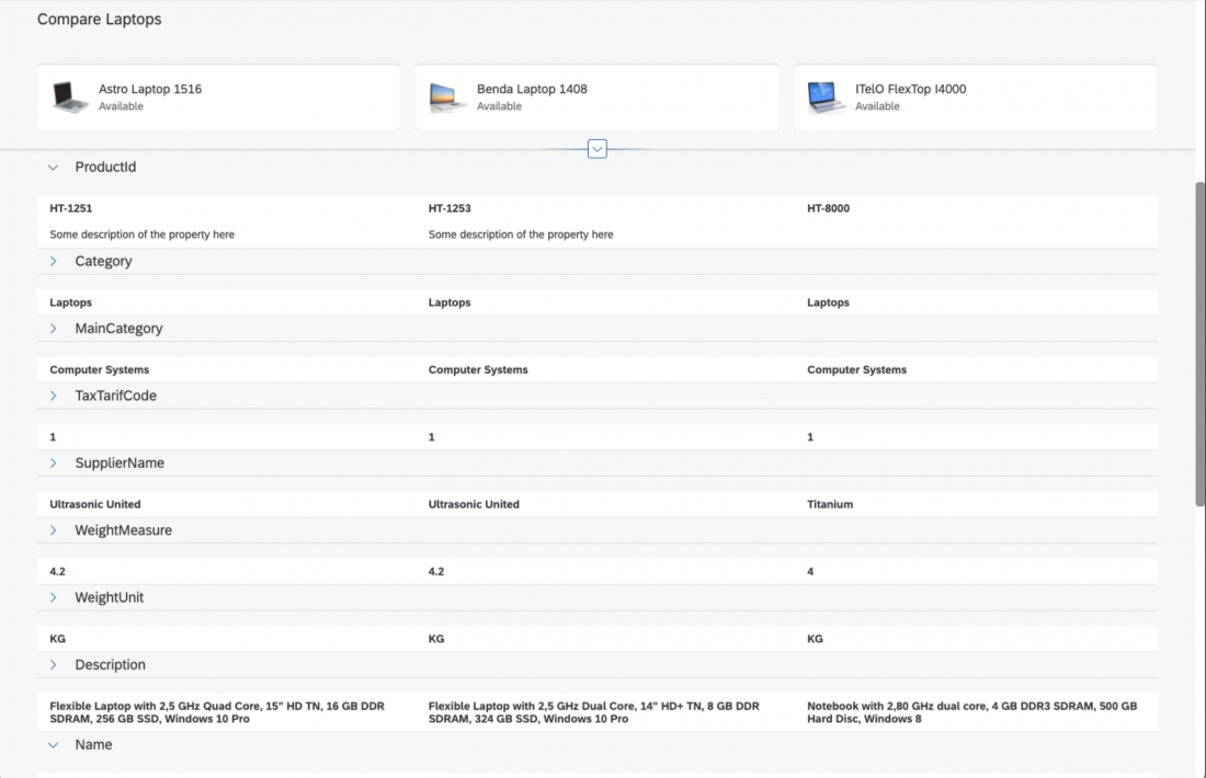
By default, the flexible column layout starts off with one column. The user opens new columns by navigating forward. Since the flexible column layout is the successor of the split-screen layout, you can also use just two columns if your use case requires it. Do not start your application with three columns. Too much information at the beginning can confuse users.
Note:
- If you start with two columns, make sure that size S shows the first column. Otherwise, users see the second column first, which might be confusing. (Showing the second column is the normal responsive behavior of the flexible column layout, which always shows the last column in size S.)
- Even if you start with two columns, offer the layout splitter and the Close action in the second column.
Examples: Starting with two columns (sizes L and XL)
Titles / Breadcrumbs / Up and Down Arrows
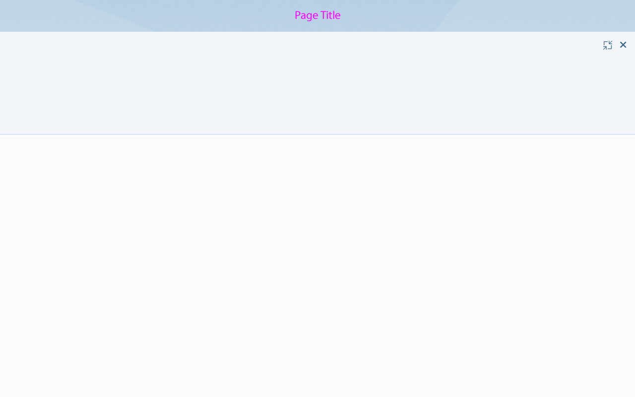
If more than one column is visible, show the application title in the shell bar. If the user switches to full screen mode, show the page title. Also show the page title for size S, where only one column is visible.
If multiple columns are visible, hide the breadcrumbs and up/down arrows.
Application title in the shell bar
Page title in the shell bar
Bookmarks
Every layout inside the flexible column layout can be bookmarked. For example, if the user bookmarks a 3-column layout set to 25% : 50% : 25%, load this layout when the user opens the bookmark.
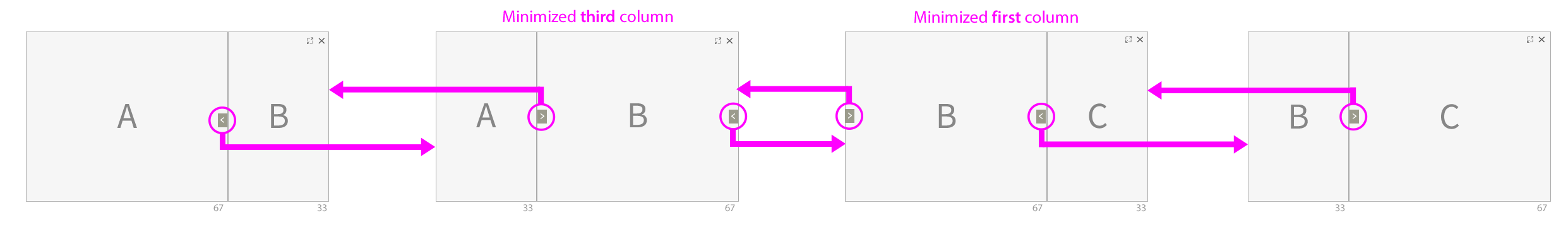
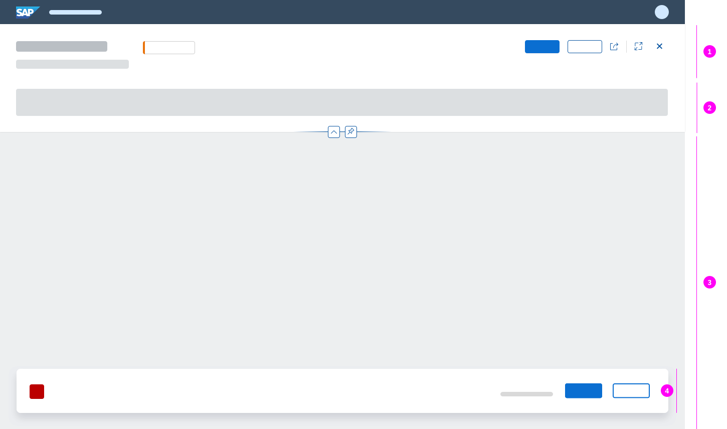
Minimized Third Column
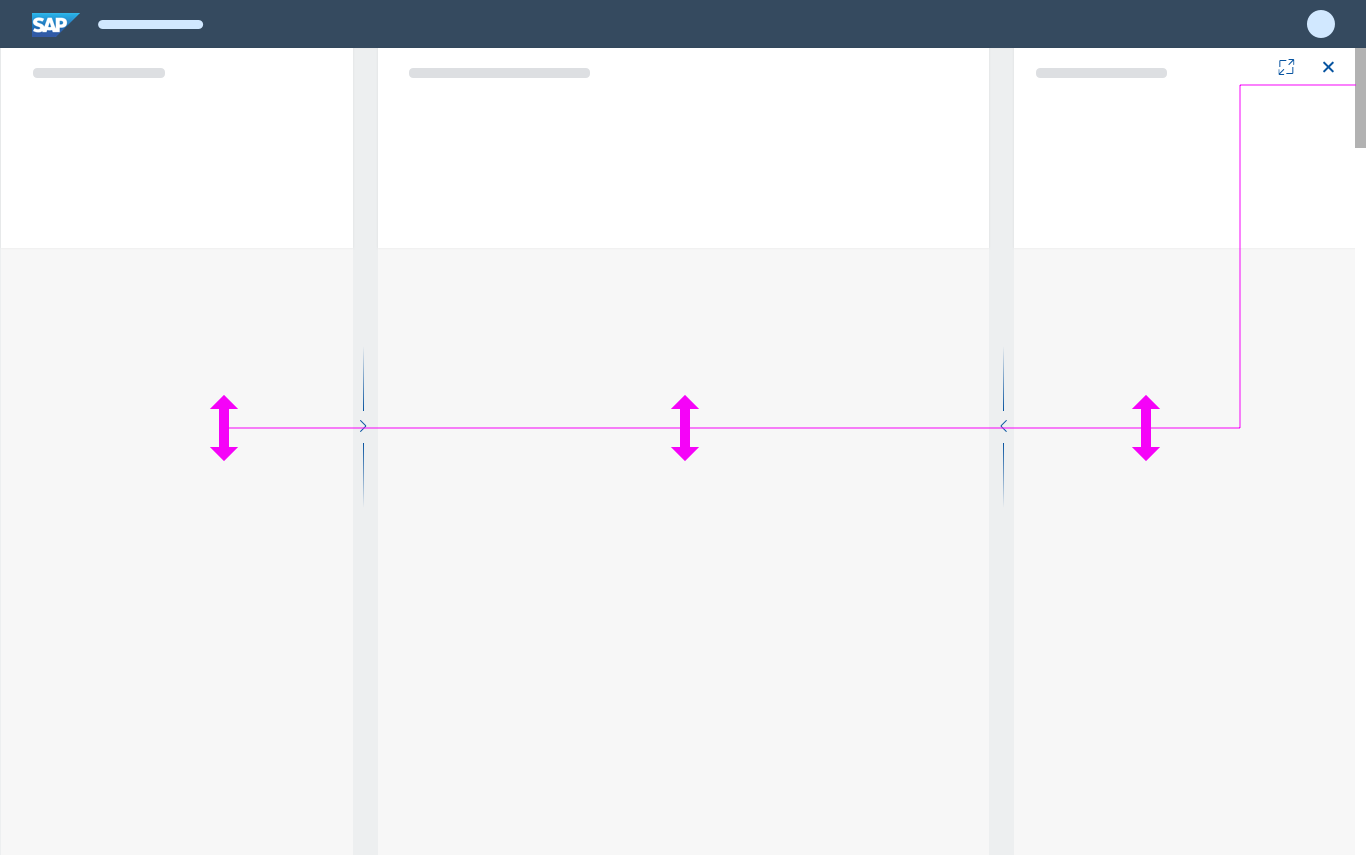
When the user expands the first column in a 3-column layout, the third column is minimized. Close, Enter Full Screen, and layout splitter actions also appear on the right-hand border of the second column to allow the user to return to the original 3-column layout.
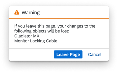
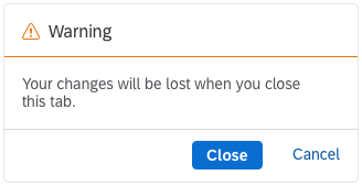
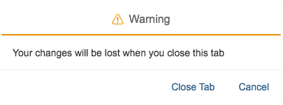
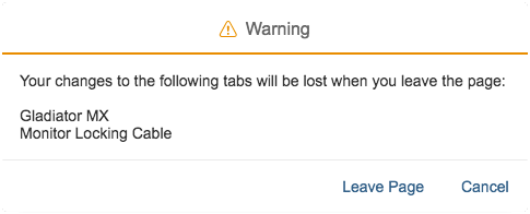
Close: The second and third (minimized) columns close. A dialog can appear to warn the user about any unsaved data in the third column.
Full screen: When the user clicks the Enter Full Screen icon, the second column switches to full screen mode. The third column remains open (but not visible), and closes as soon as the user selects another item in the second column, or uses the Close action in the second column. If the user selects the same item in the second column, it opens in the same state as before it was minimized.
Example of a minimized third column (33% : 67%)
Layout splitter: When the third column is minimized, the second splitter is only available when the second column is bigger than the first column (by default 33% : 67%). Otherwise, the second splitter is hidden.
Example of a second splitter interaction
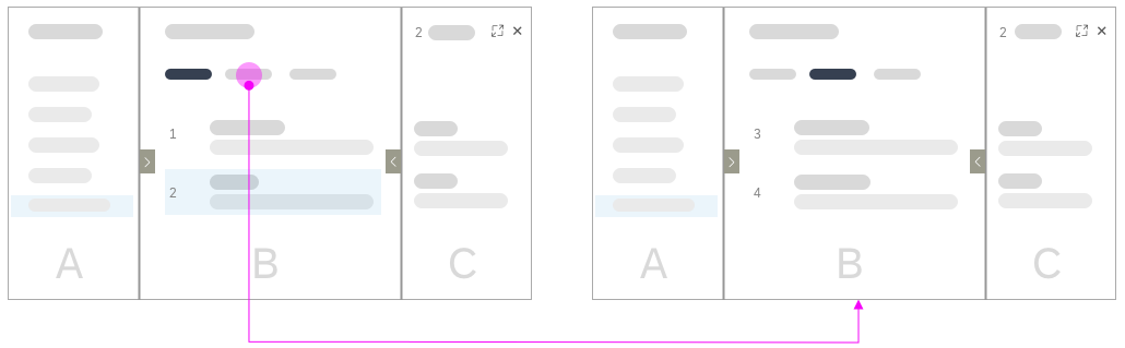
Using Close in Combination with Back Navigation
The back navigation must not restore a column that was previously closed with the Close icon .
Example: The user closes the third column by clicking the Close icon in the upper-right corner. If the user then navigates back (UI or browser), the second column closes.
Using 'Close' in combination with back navigation
3 Columns in Size M
To offer a desktop-like experience in size M, the flexible column layout displays either the first and second or the second and third columns. The user can switch between these views by dragging the layout splitter to the left or right side of the flexible column layout. Note: This behavior is only intended for size M. Do not use it for sizes L or XL.
3-column interaction in size M
Letterboxing
Do not use letterboxing in combination with the flexible column layout, as it will reduce the size of the usable screen area.
Proper use of usable screen area
Improper use of usable screen area with letterboxing
Full Screen Navigation
After switching a column to full screen mode, selecting the Back icon exits the full screen mode.
If the screen is in full screen mode, and the user navigates forward, also show the next column in full screen mode. If the user navigates backward, go back in full screen mode until the point where the user initially switched to full screen. If the user then clicks Back again, return to the multi-column mode.
Using full screen mode in combination with navigation
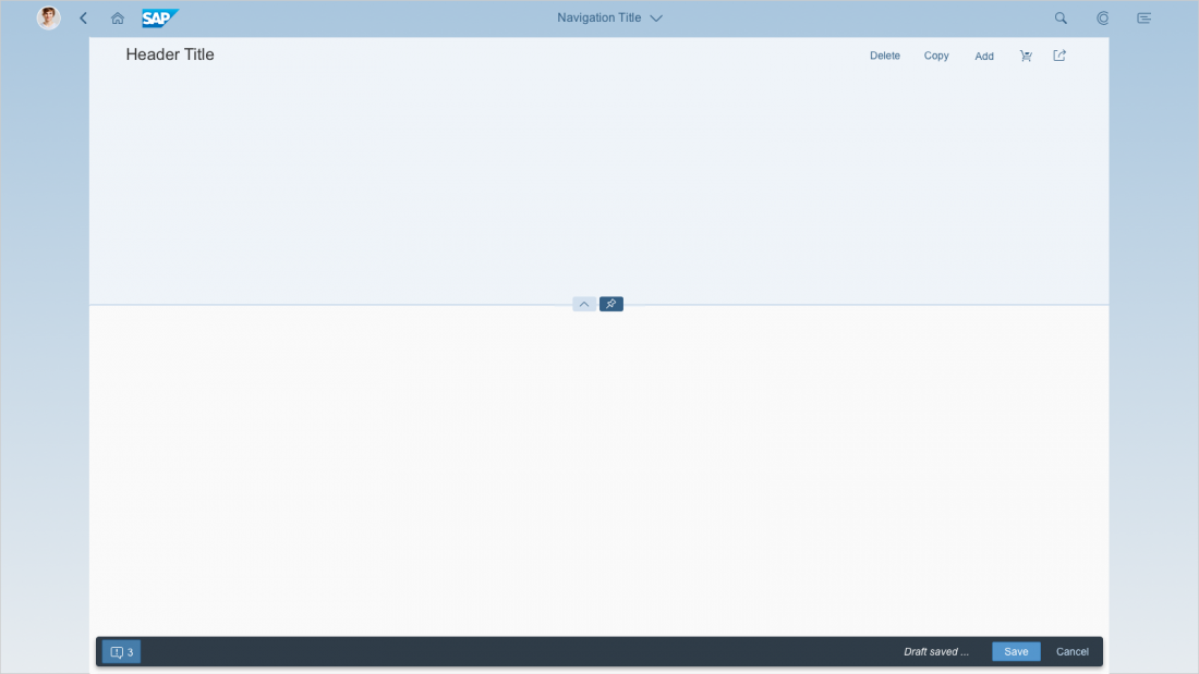
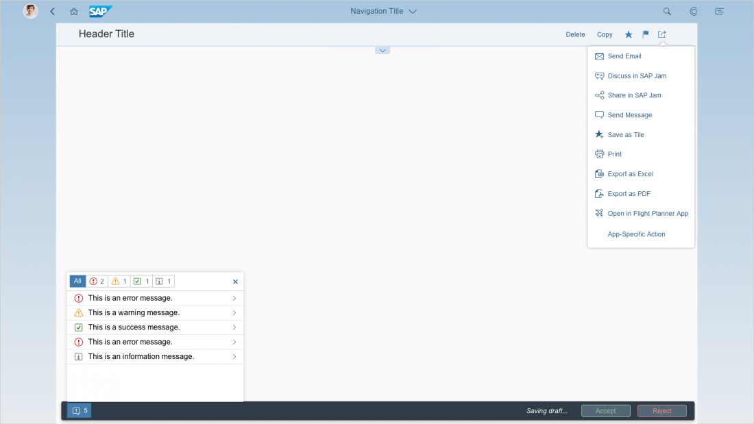
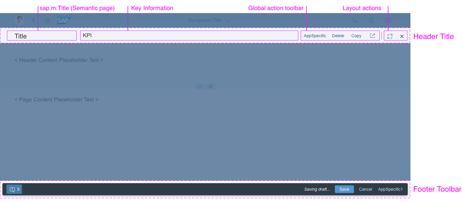
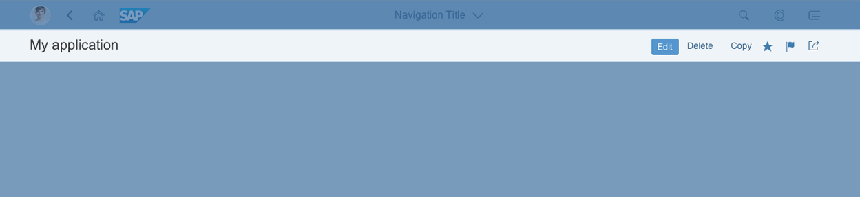
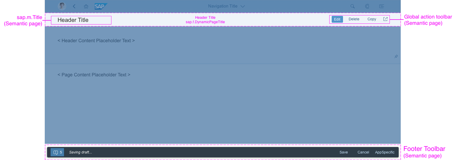
Footer Toolbar
Each column of the flexible column layout can have its own footer toolbar. There is no overall footer toolbar that spans several columns.
Give each column its own footer toolbar
There is no overall footer toolbar spanning several columns
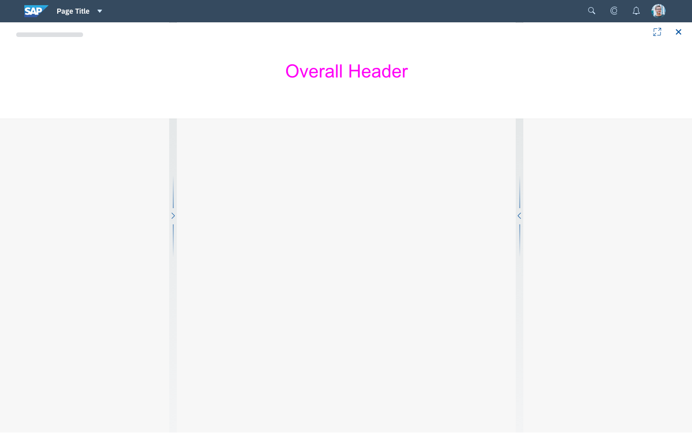
Overlapping Header
The flexible column layout can display multiple floorplans side-by-side. However, it is not designed for splitting a single floorplan into several columns. As a result, there is no overall header that spans several columns. If you need to show additional content within a floorplan, use the dynamic side content.
Each column has its own header
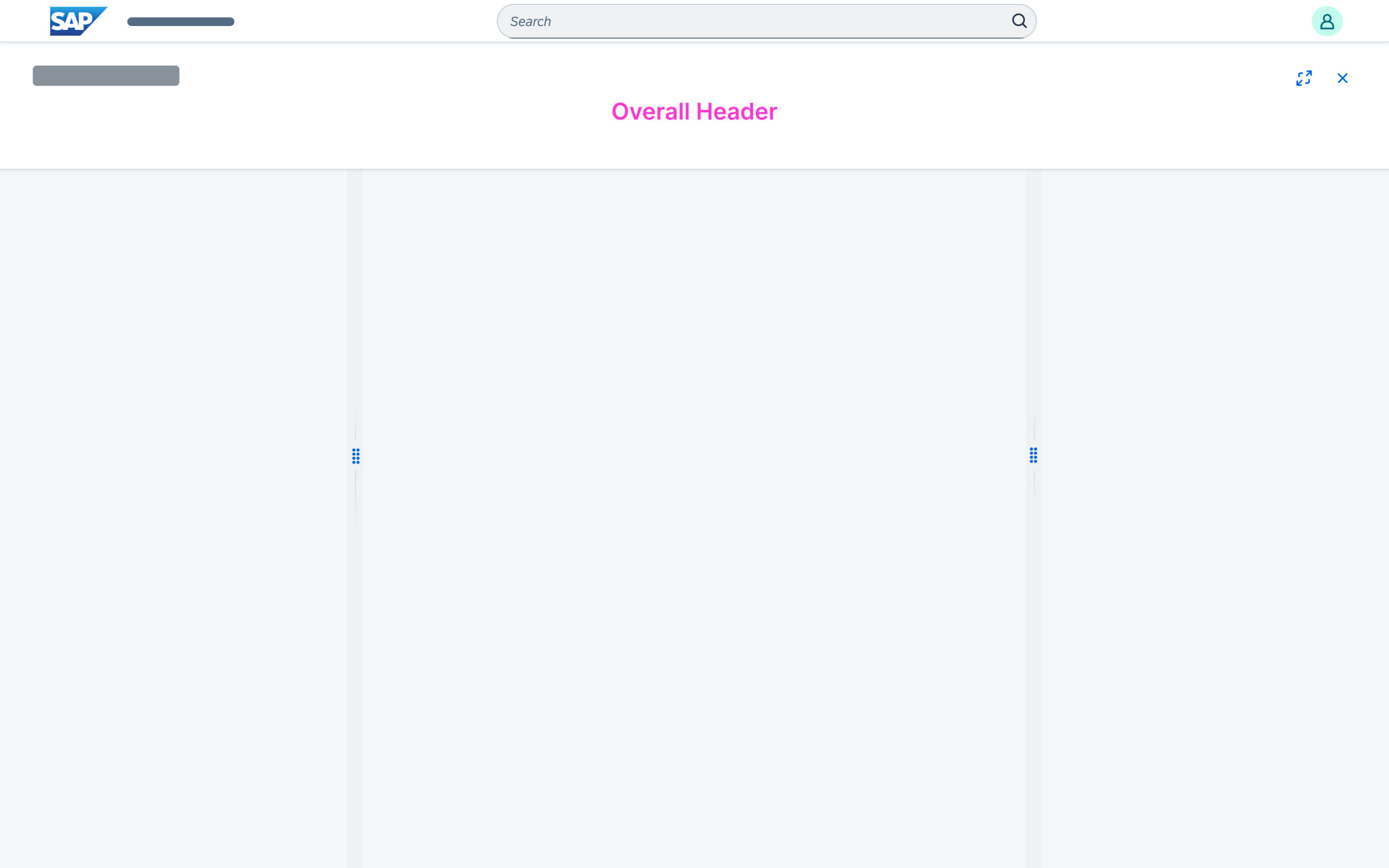
There is no overall header
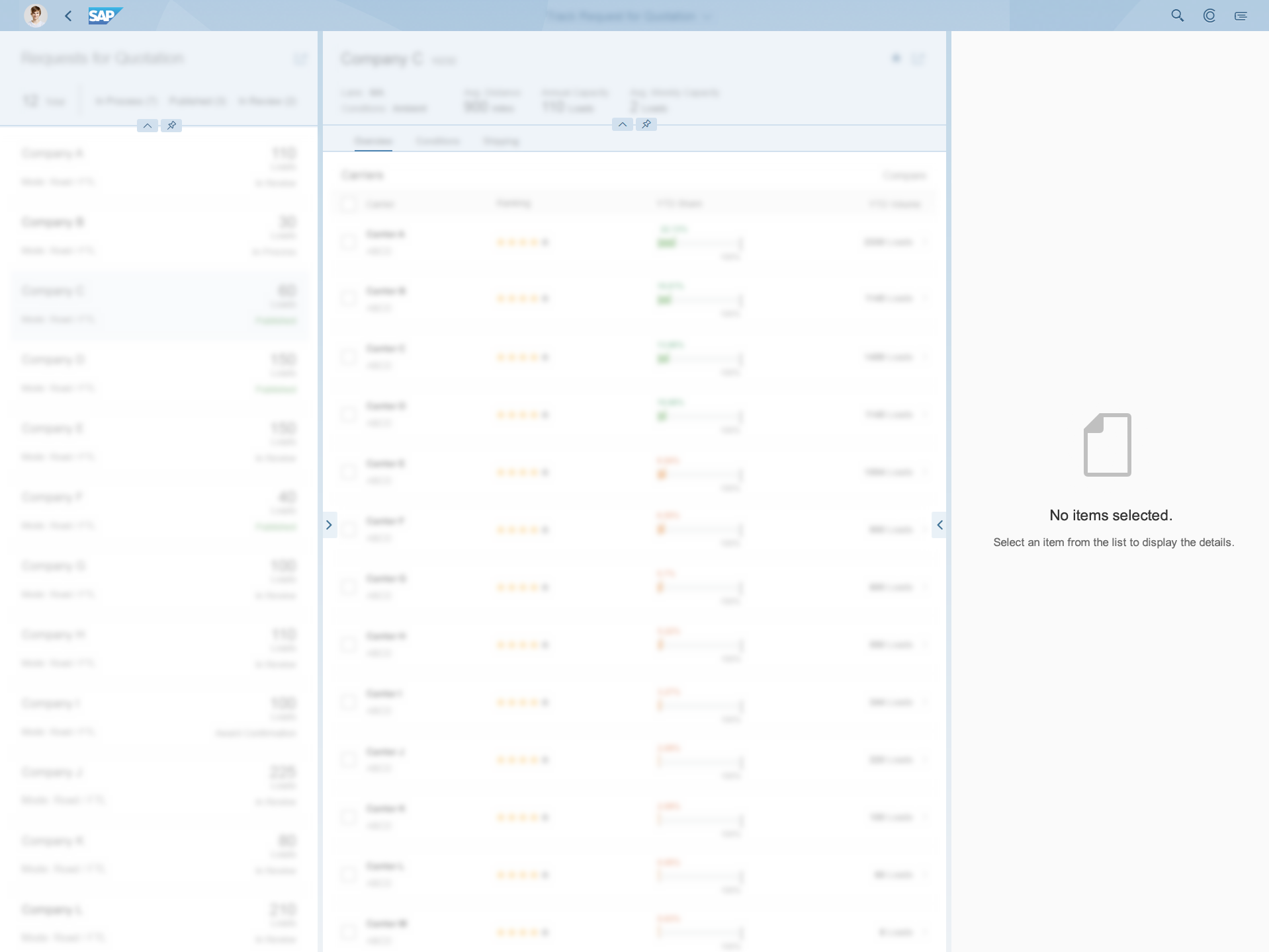
Empty Details Column
Do not display an empty details column when using the flexible column layout. For example, if no items have been selected in the second column, do not show an empty third column.
If no items are selected in the 2nd column, show only 2 columns
Do not show an empty 3rd column
Usage With One or Several Initial Full Screen Pages
Some use cases require starting an application with one or more full screen pages. You can do this by using the first column of the flexible column layout in full screen mode. This allows you to show one or several initial full screen pages with different content. Because of technical constraints, you must always use the flexible column layout to show this initial content.
Using the flexible column layout with initial full screen pages
Content Padding Inside Columns
The flexible column layout doesn’t provide additional paddings around the content area. Since some controls have different internal paddings, please ensure that they are aligned correctly.
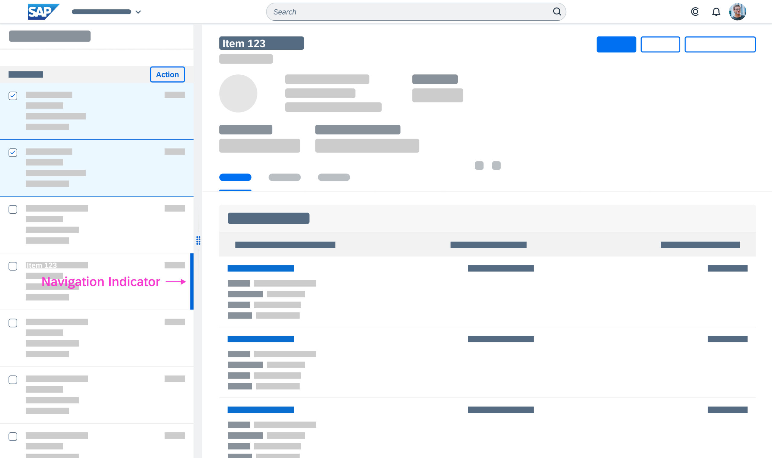
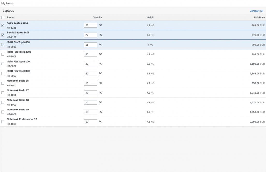
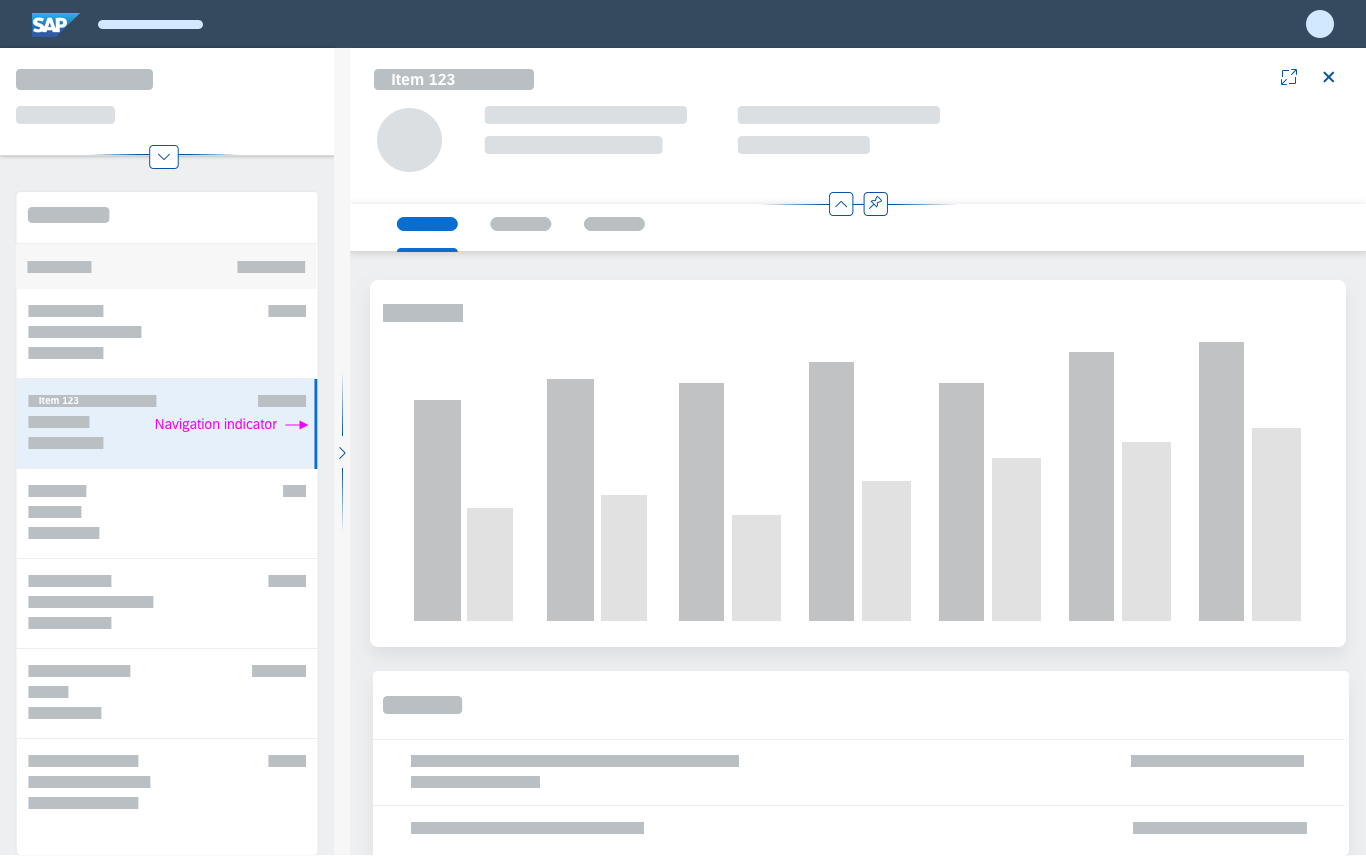
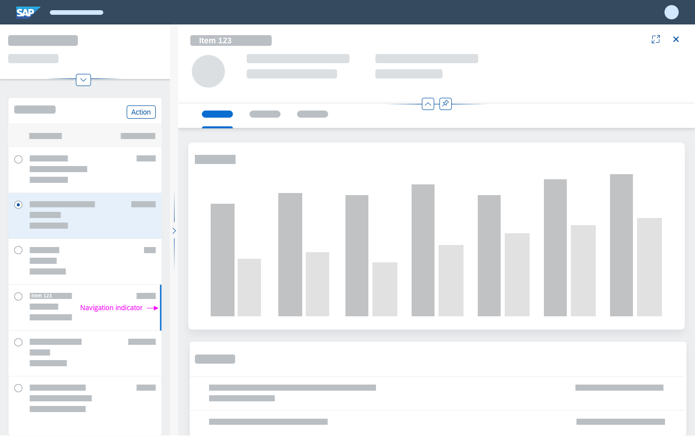
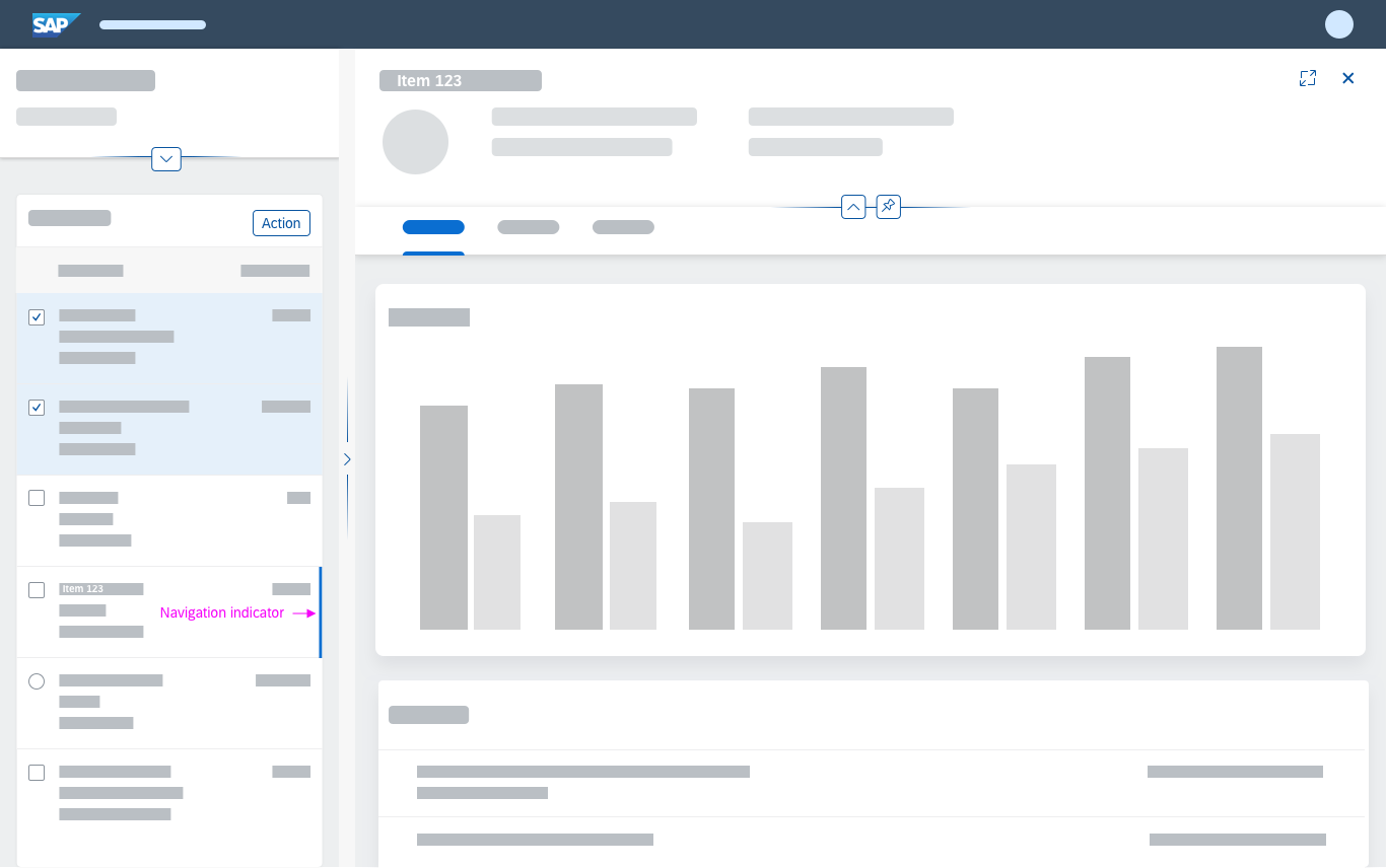
Navigation Indicator
It is important for users to be able to scan through the list and quickly identify the item for which the details are being shown in the second or third column. This is especially important for large lists. For this case, you can enable a “navigated” indicator for tables and lists to mark the item that was last opened.
If there are several tables/lists on one page, ensure that the indicator shows only for the last navigated item. There should never be two navigation indicators on one page.
Navigation indicator and list without actions
Navigation indicator and list with single selection
Navigation indicator and list with multiple selection
Content Interaction
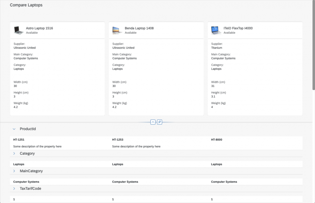
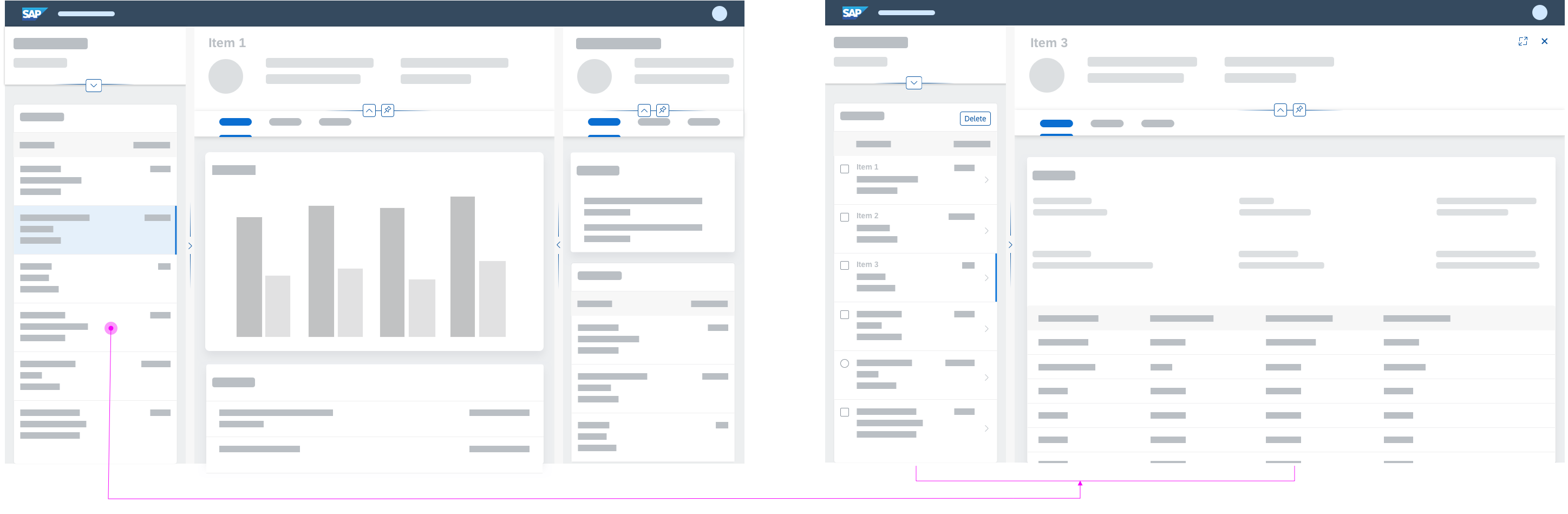
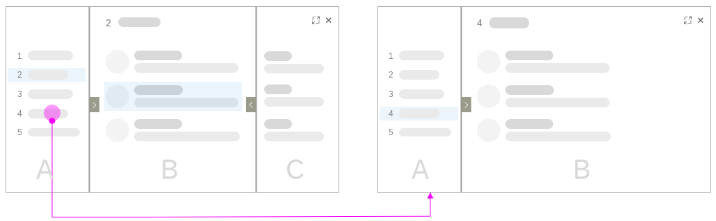
Selecting a Different Item
If the user selects a different item in the list-detail or list-detail-detail layout, the content of the details column changes to reflect the data of the newly selected item. If the item is selected in the first column, and the last column was open before the new item was selected, selecting the item closes the last column.
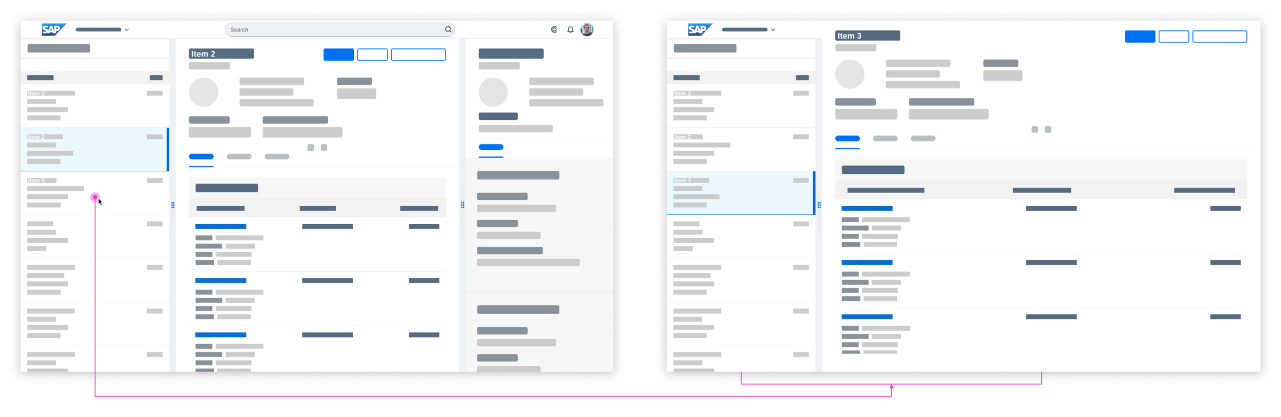
Selecting a different item
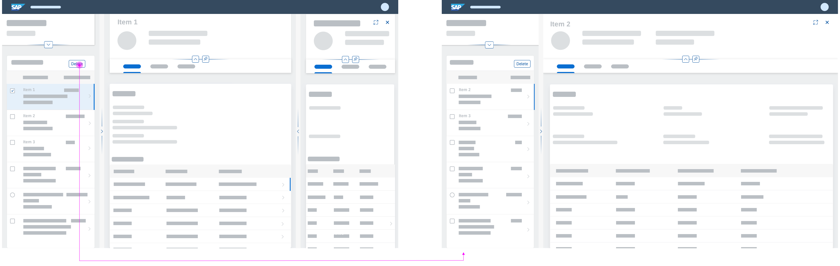
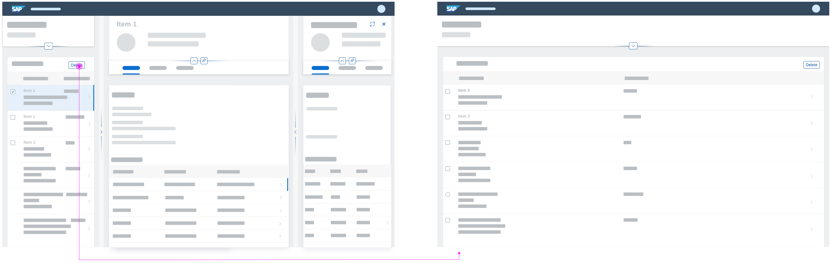
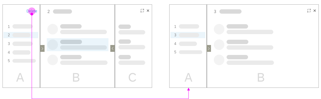
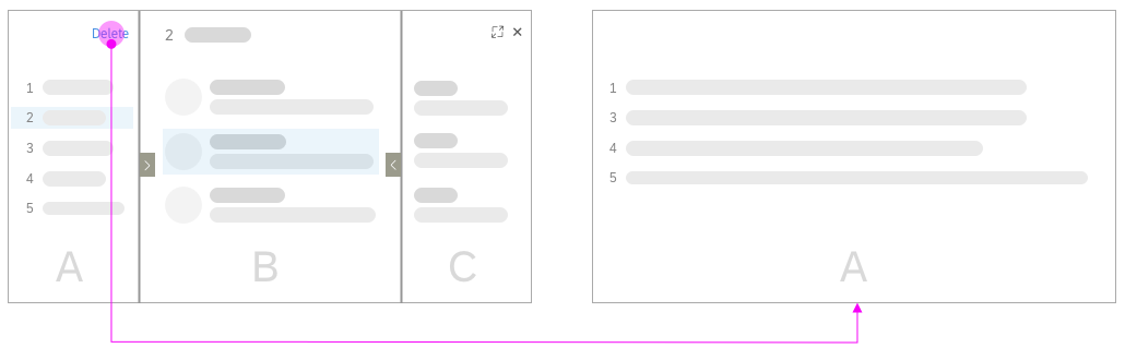
Deleting an Item
When an item is deleted, there are two options for handling the content of the details columns:
- Select the next item and change the content in the details column.
If the user deletes the last item, you can opt to either select the previous item or close the details column(s). If the user deletes all the objects, always close all columns, since there is no content to display.
- Do not select an item and close the other columns.
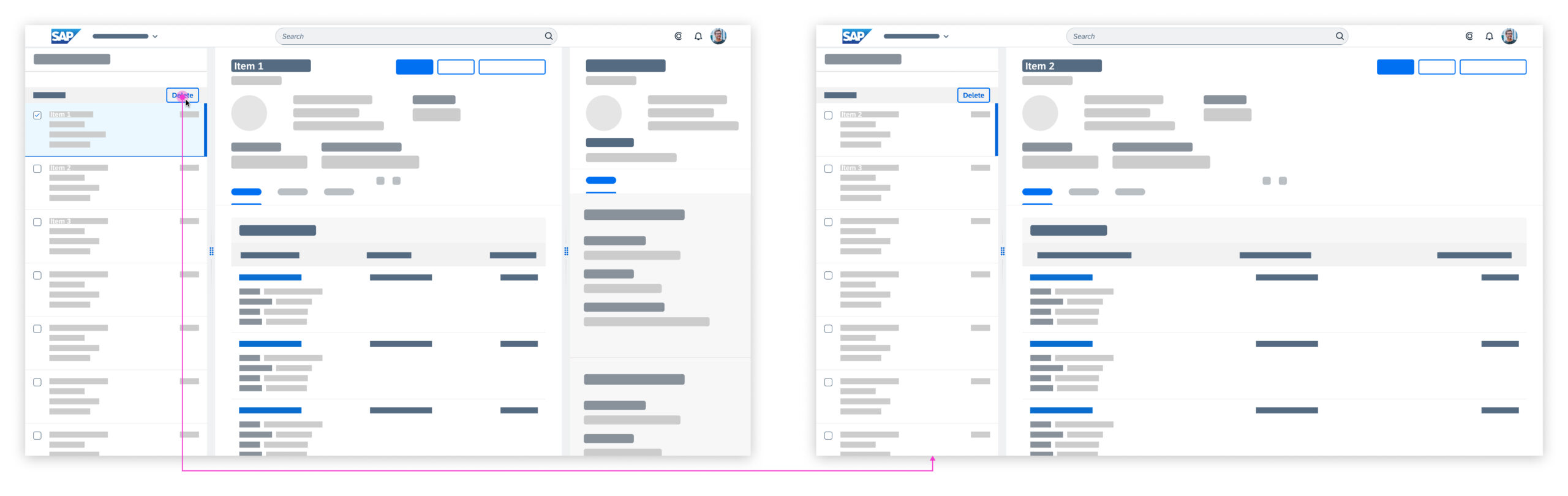
Deleting and selecting the next item
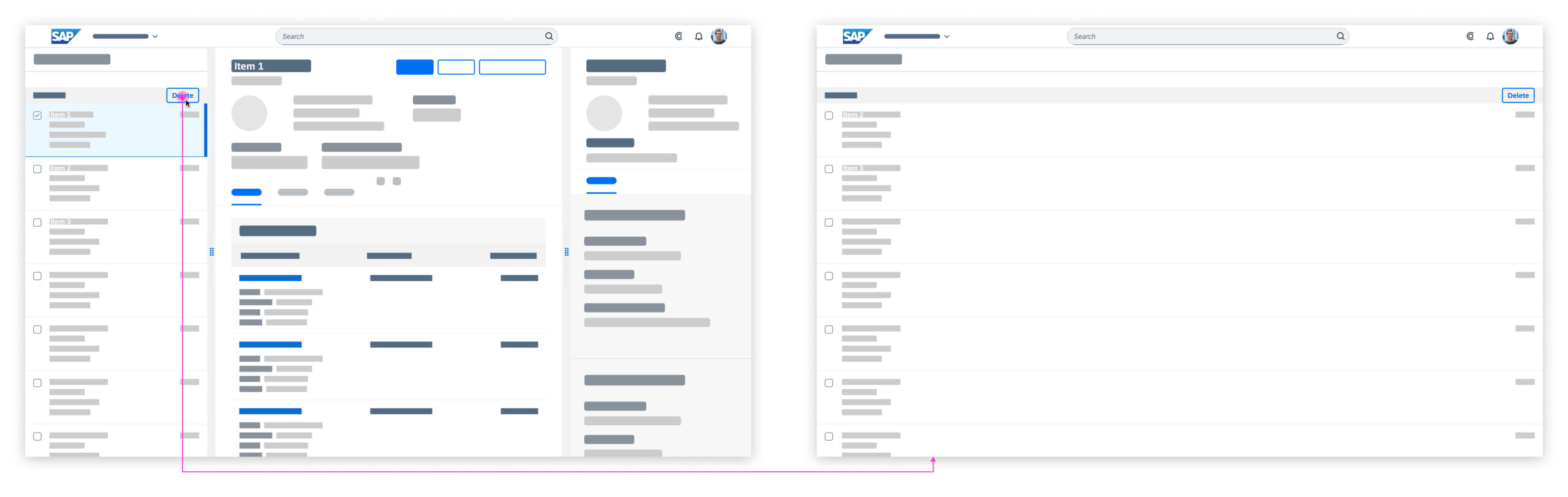
Deleting and closing the other columns
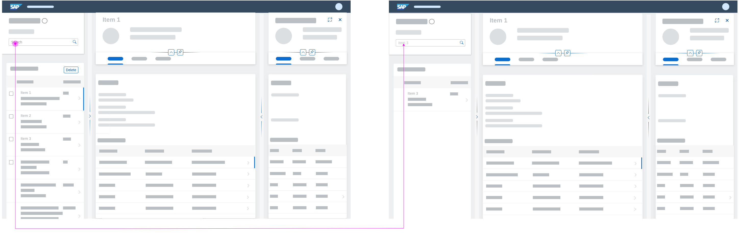
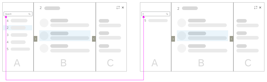
Behavior on Filtering
Filtering in one of the columns does not affect the content in the other columns.
Once a filter is applied, the results are shown in the same column. The content in the remaining columns does not change, unless another item is selected.
Filtering does not affect the other columns
Tab/Anchor Navigation
Tabs and anchors are used for navigation within an object or as a filter (for example, in object pages). They affect only the respective column and do not close or change the content in the other columns.
Tab/anchor navigation does not affect the other columns
SAP Fiori Elements
The flexible column layout is available in SAP Fiori elements for scenarios that use draft handling. If you use draft handling, we strongly recommend using the SAP Fiori elements implementation, wherever possible. The implementation already includes the navigation and routing behavior, as well as the Close and Full Screen actions, for example. Starting the application with two columns is also supported by SAP Fiori elements.
Resources
Want to dive deeper? Follow the links below to find out more about related controls, the SAPUI5 implementation, and the visual design.
Implementation
- Flexible Column Layout (SAPUI5 samples)
- Flexible Column Layout (SAPUI5 API reference)
- Flexible Column Layout – Semantic Helper (SAPUI5 API reference)
- Flexible Column Layout Semantic Helper (SAPUI5 documentation)


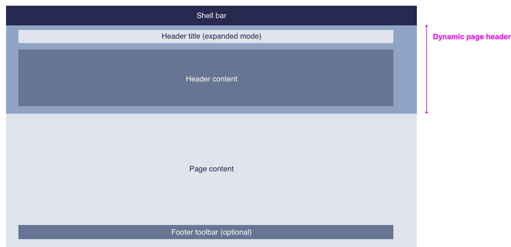

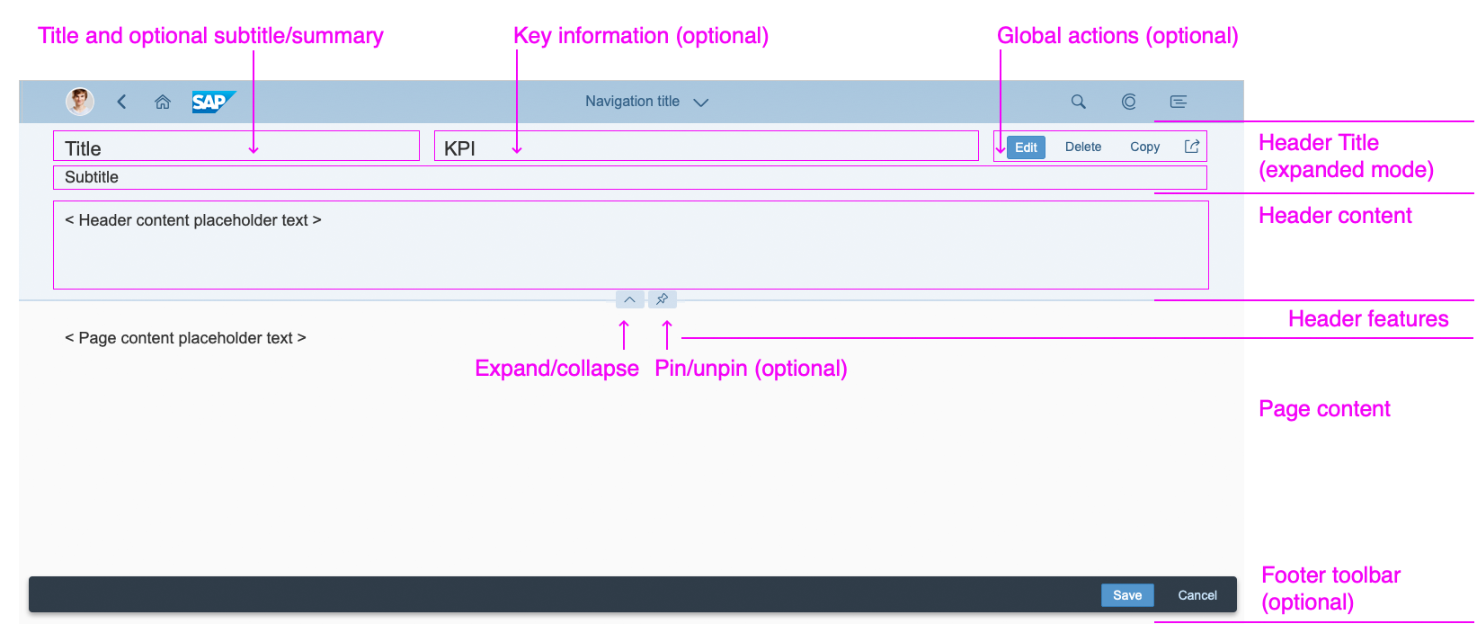


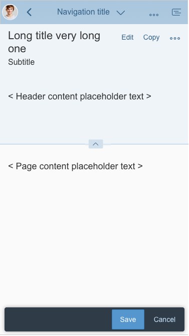

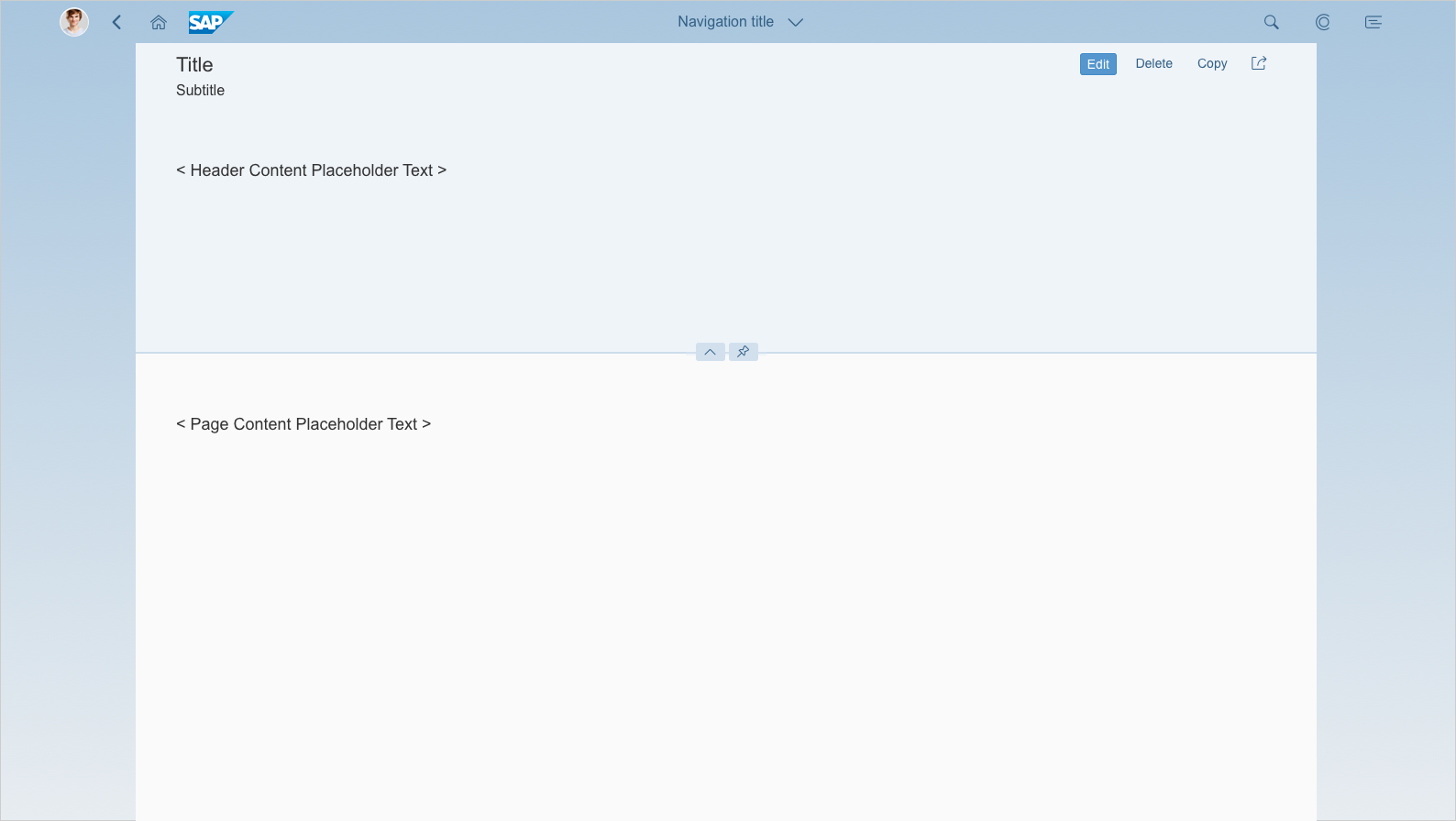


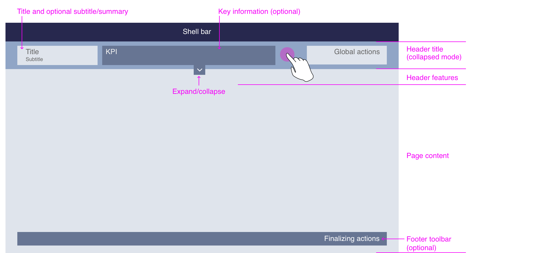
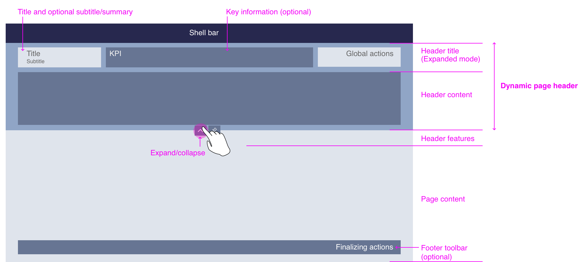

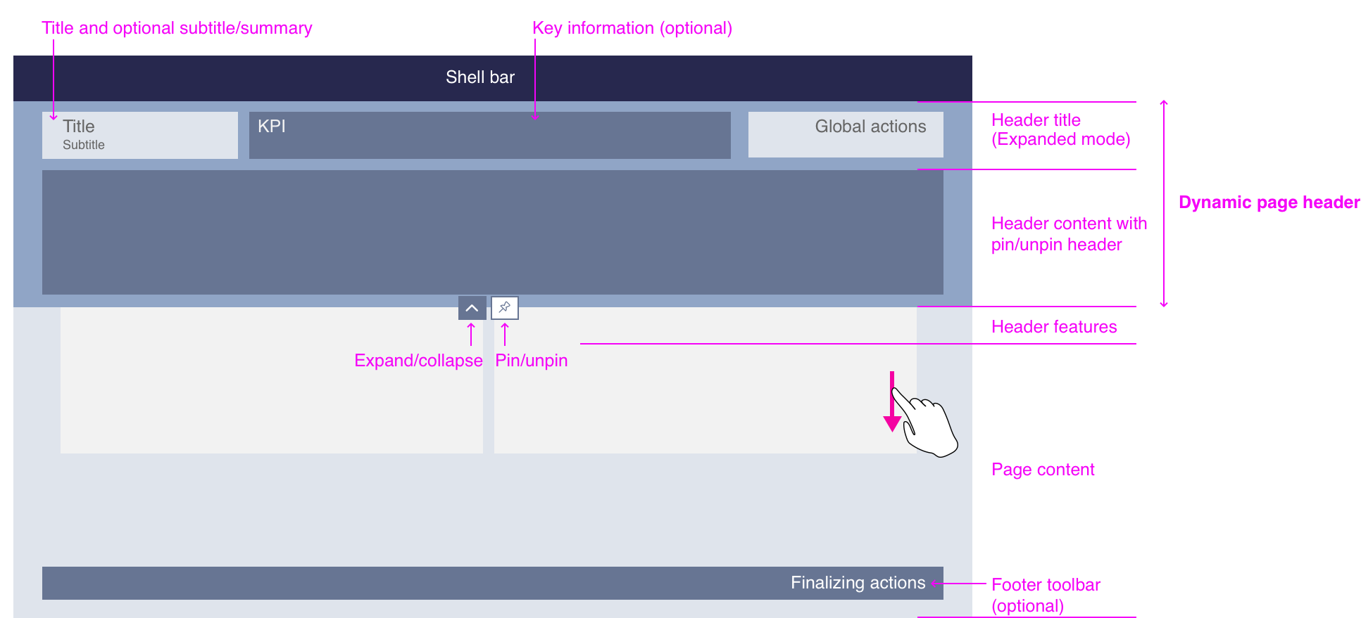
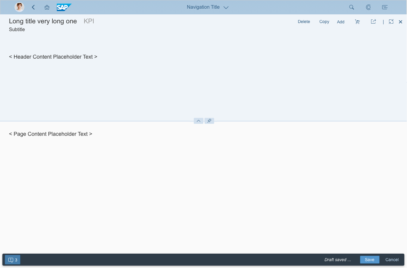


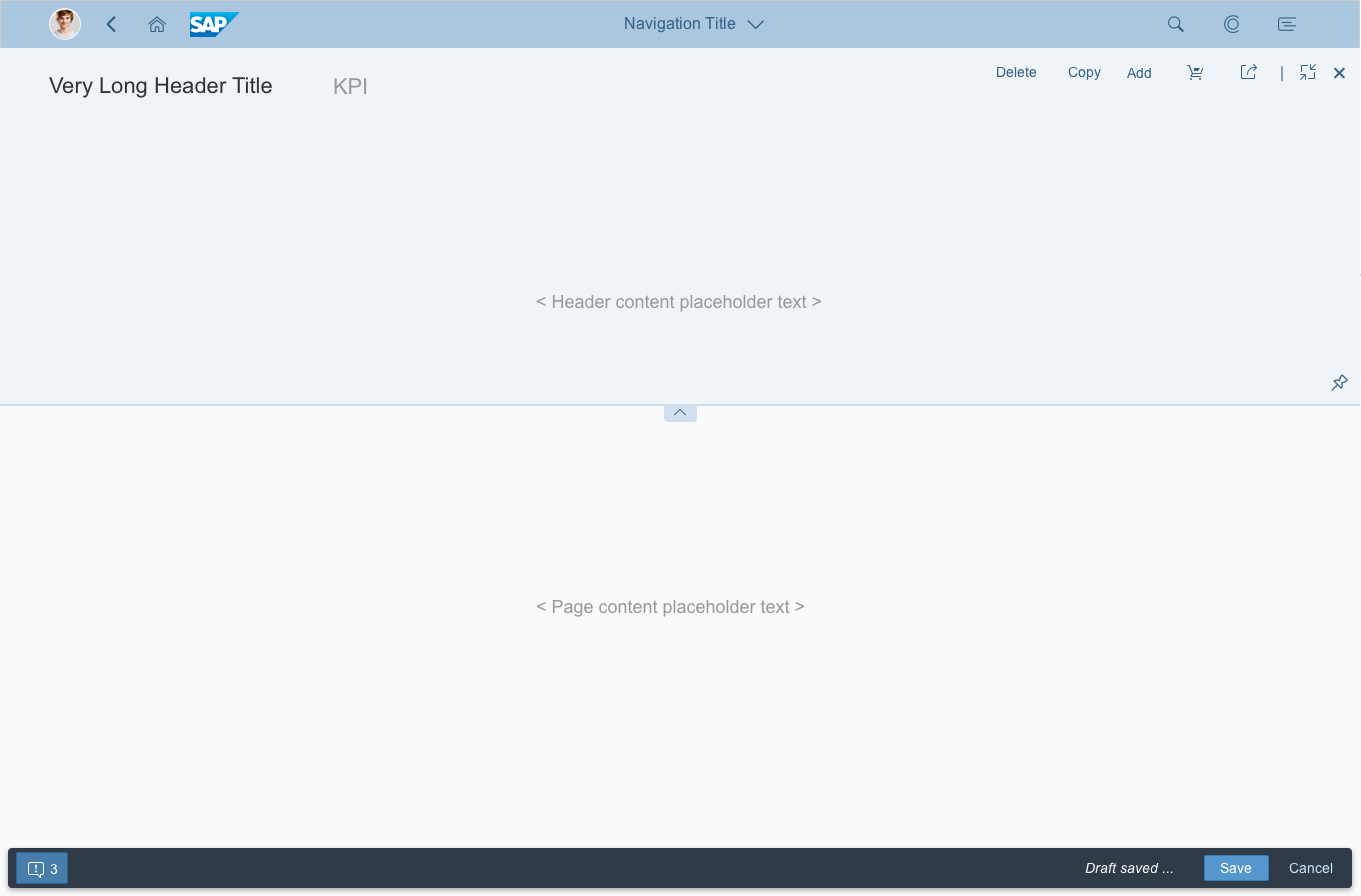


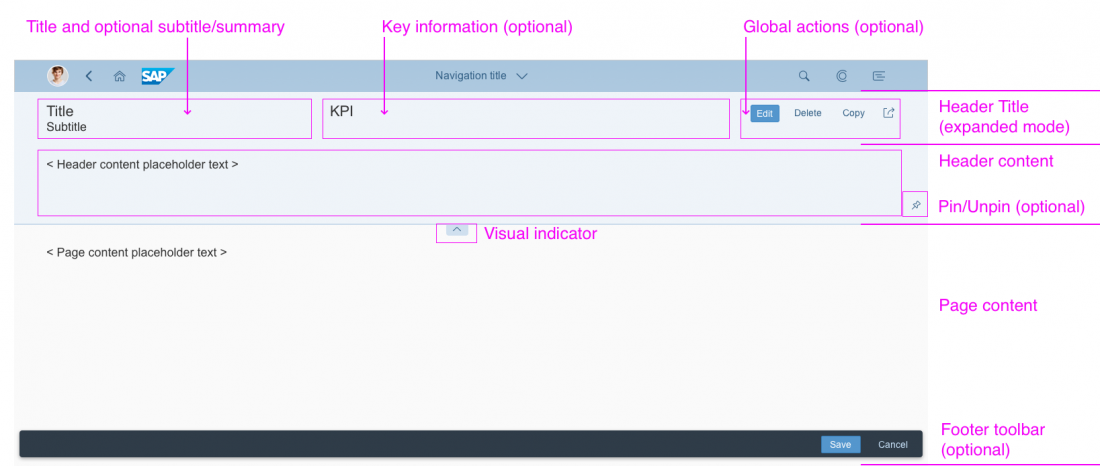


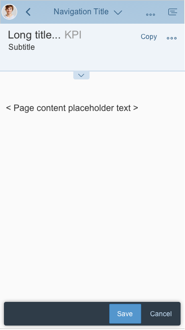


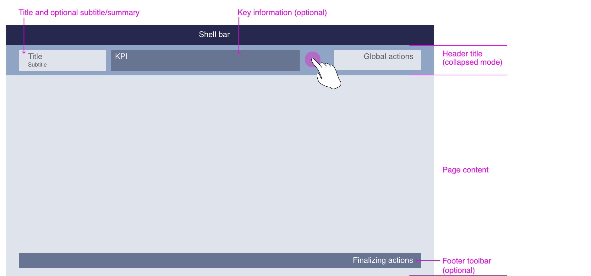
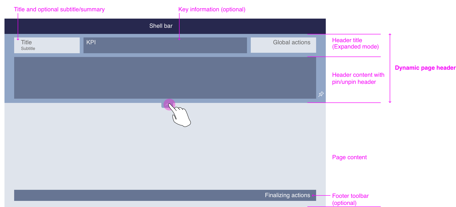

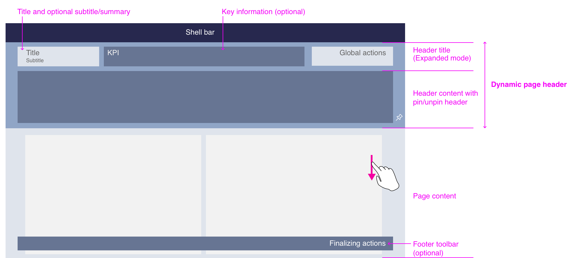
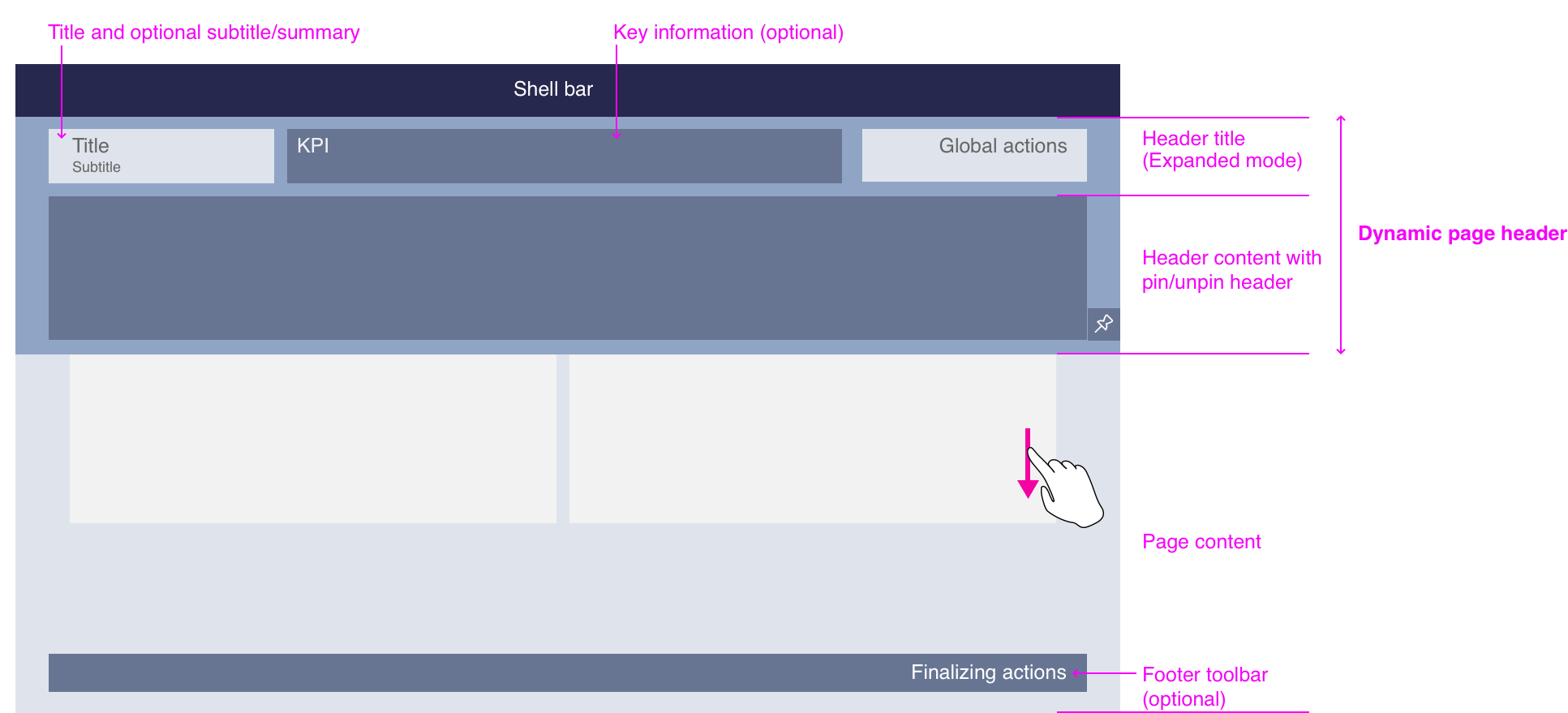
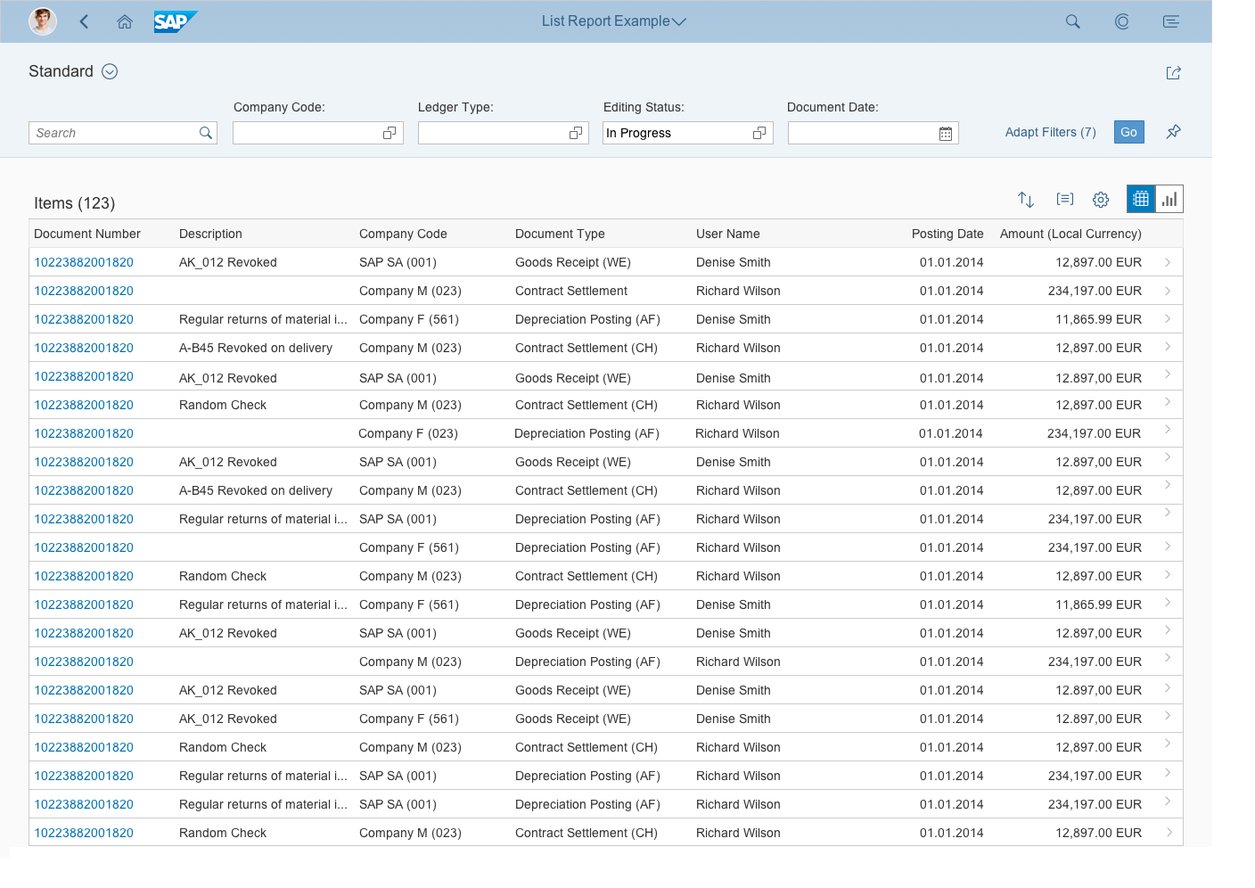


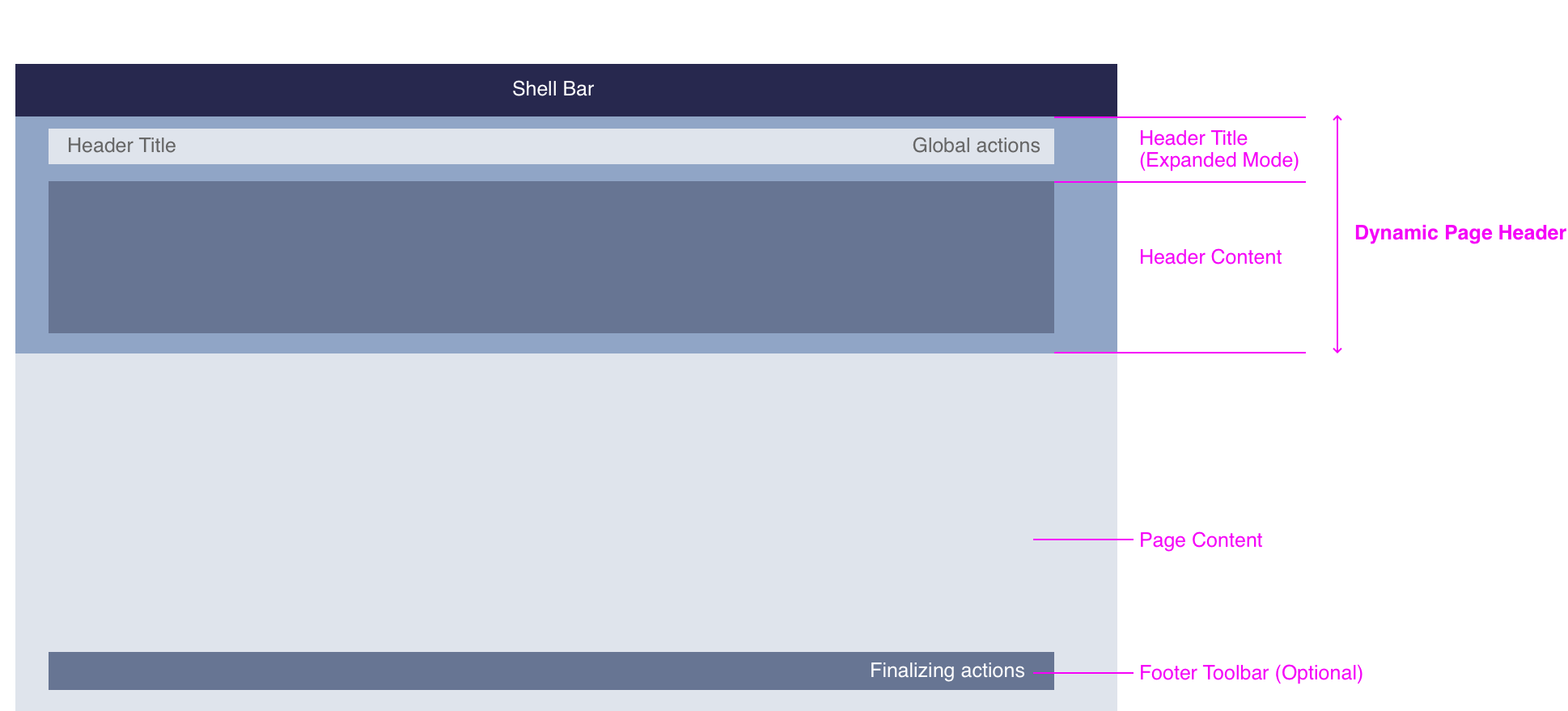
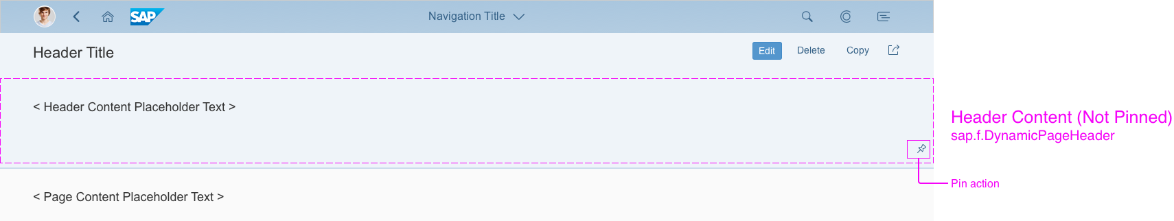

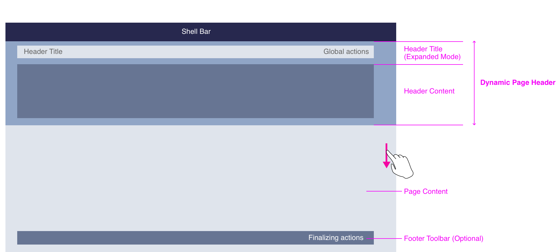
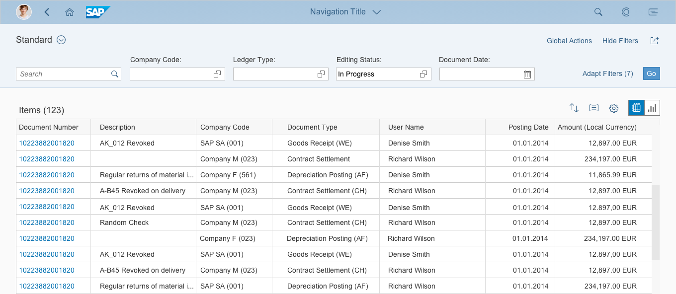


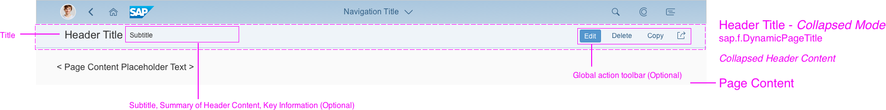
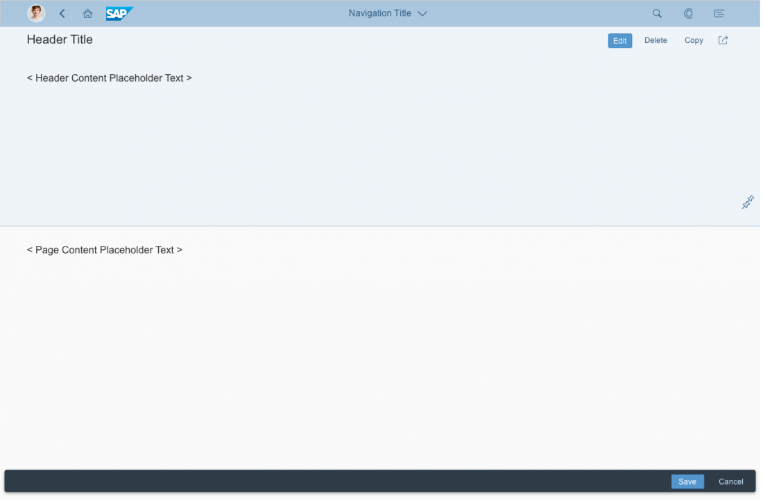
![Dynamic Page Layout - Structure [Expanded Mode]](https://experience.sap.com/fiori-design-web/wp-content/uploads/sites/5/2016/09/high_level_expanded-1-1100x543.png)
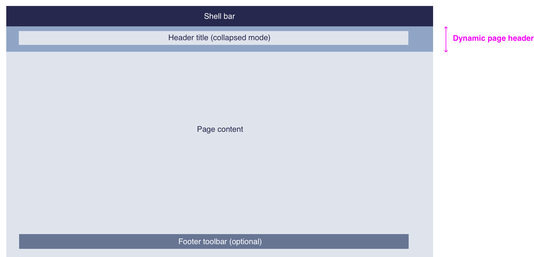
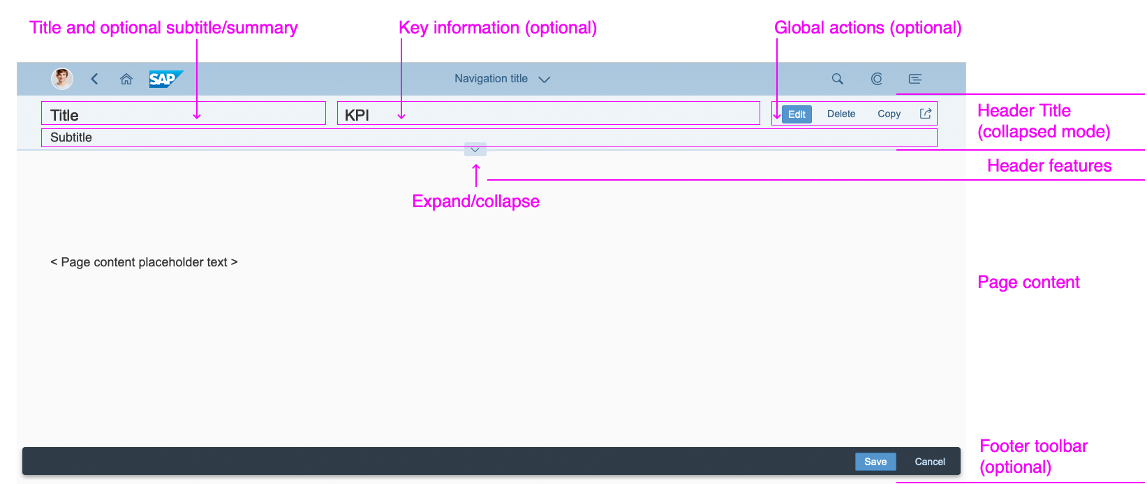
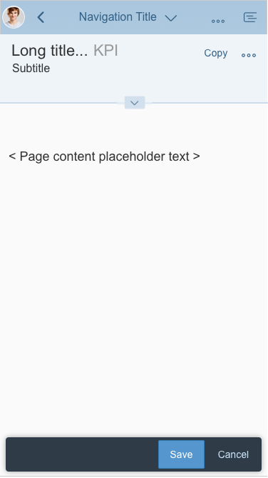
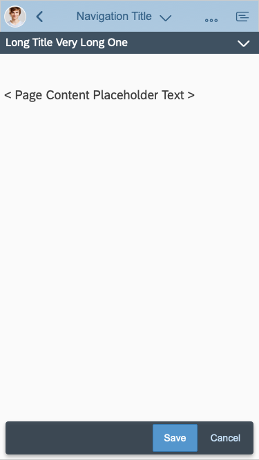
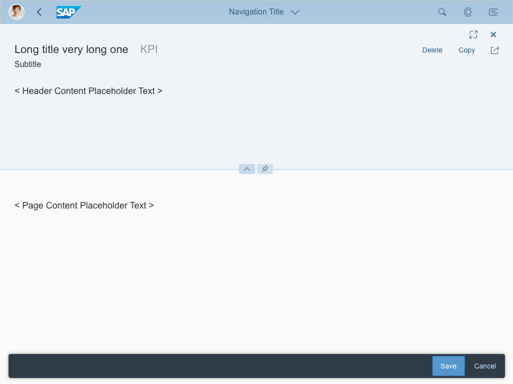
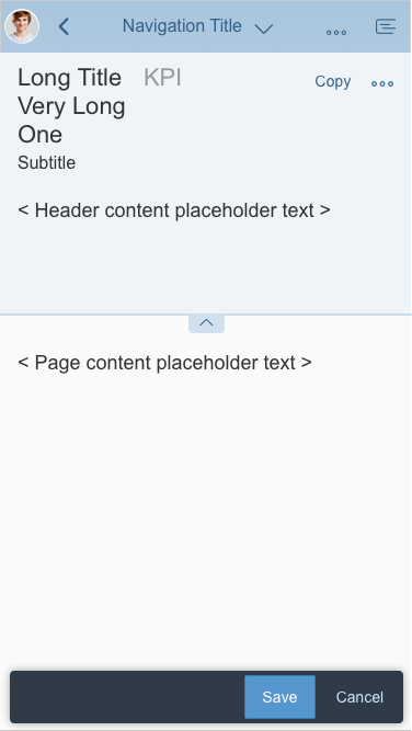
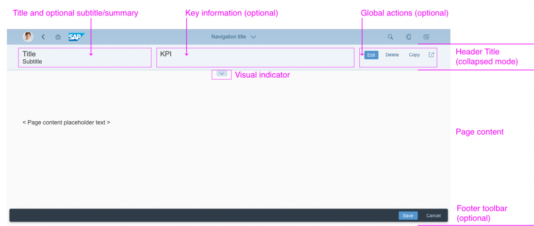
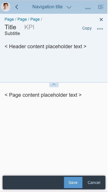
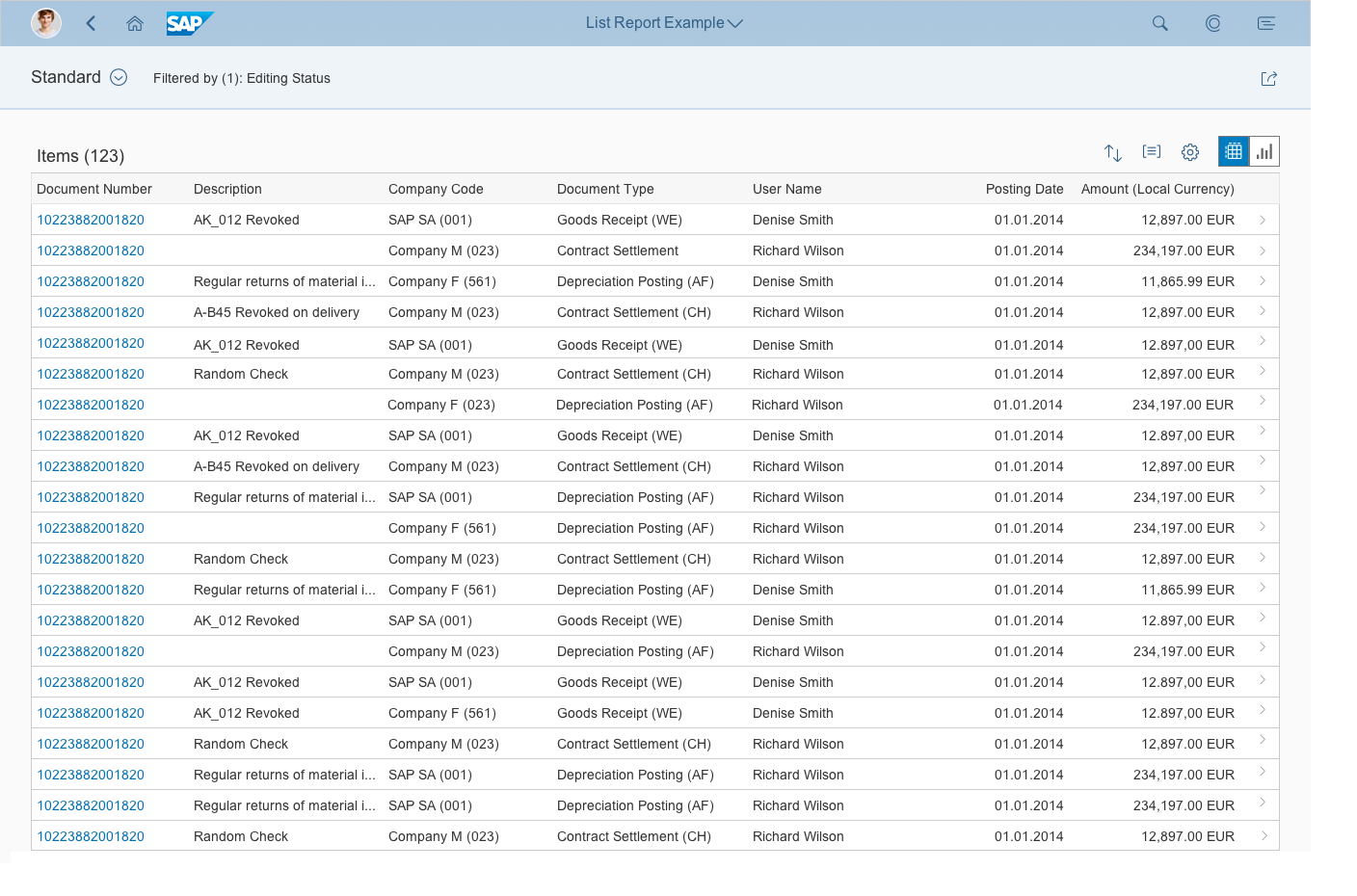
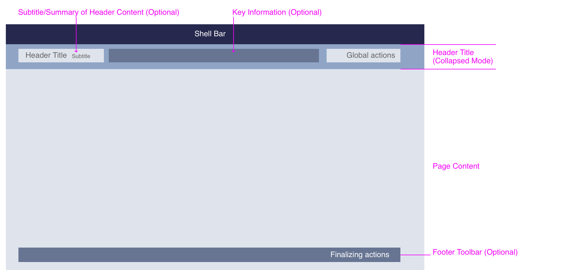
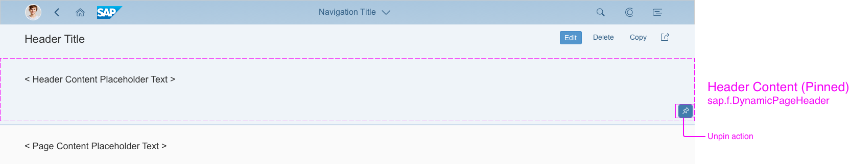
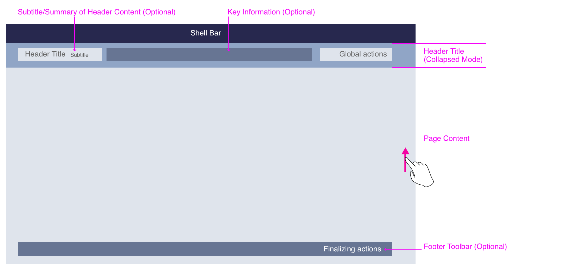
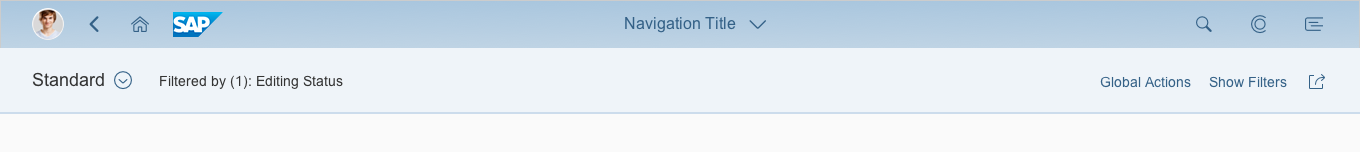
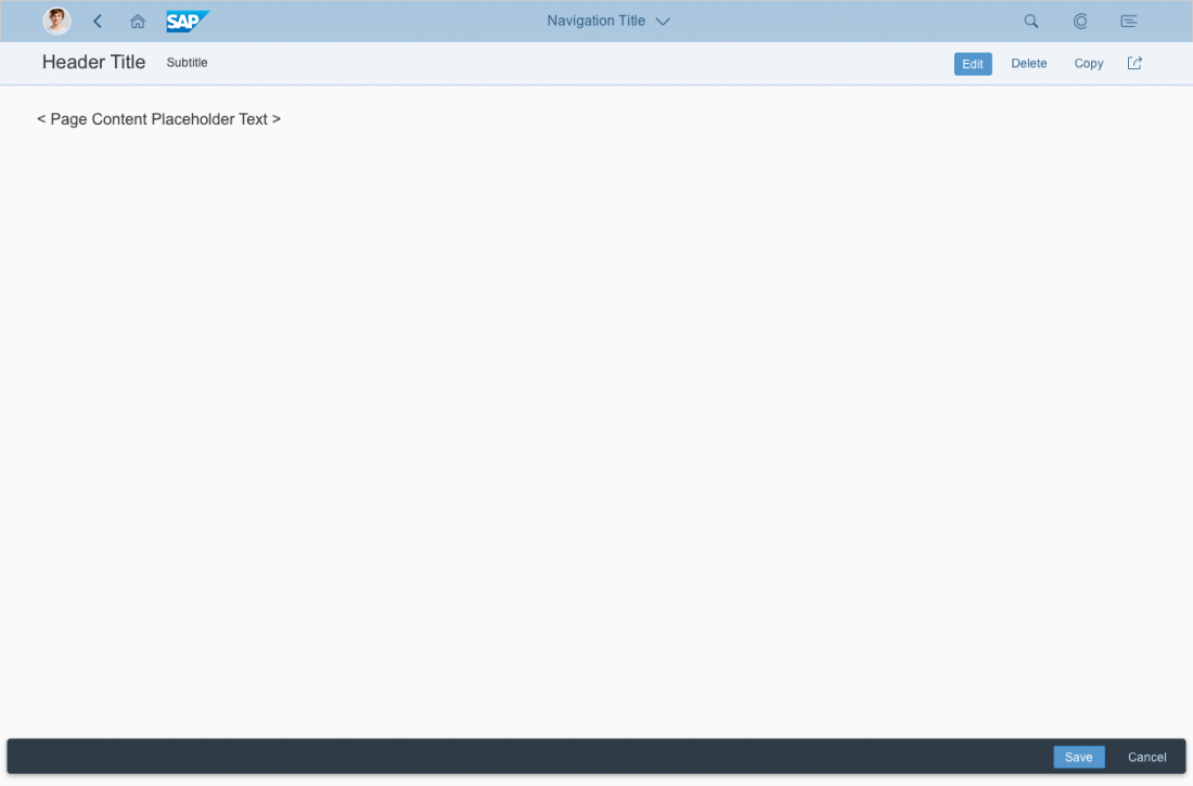
![Dynamic Page Layout - Structure [Collapsed Mode]](https://experience.sap.com/fiori-design-web/wp-content/uploads/sites/5/2016/09/high_level_snapped-1100x539.png)
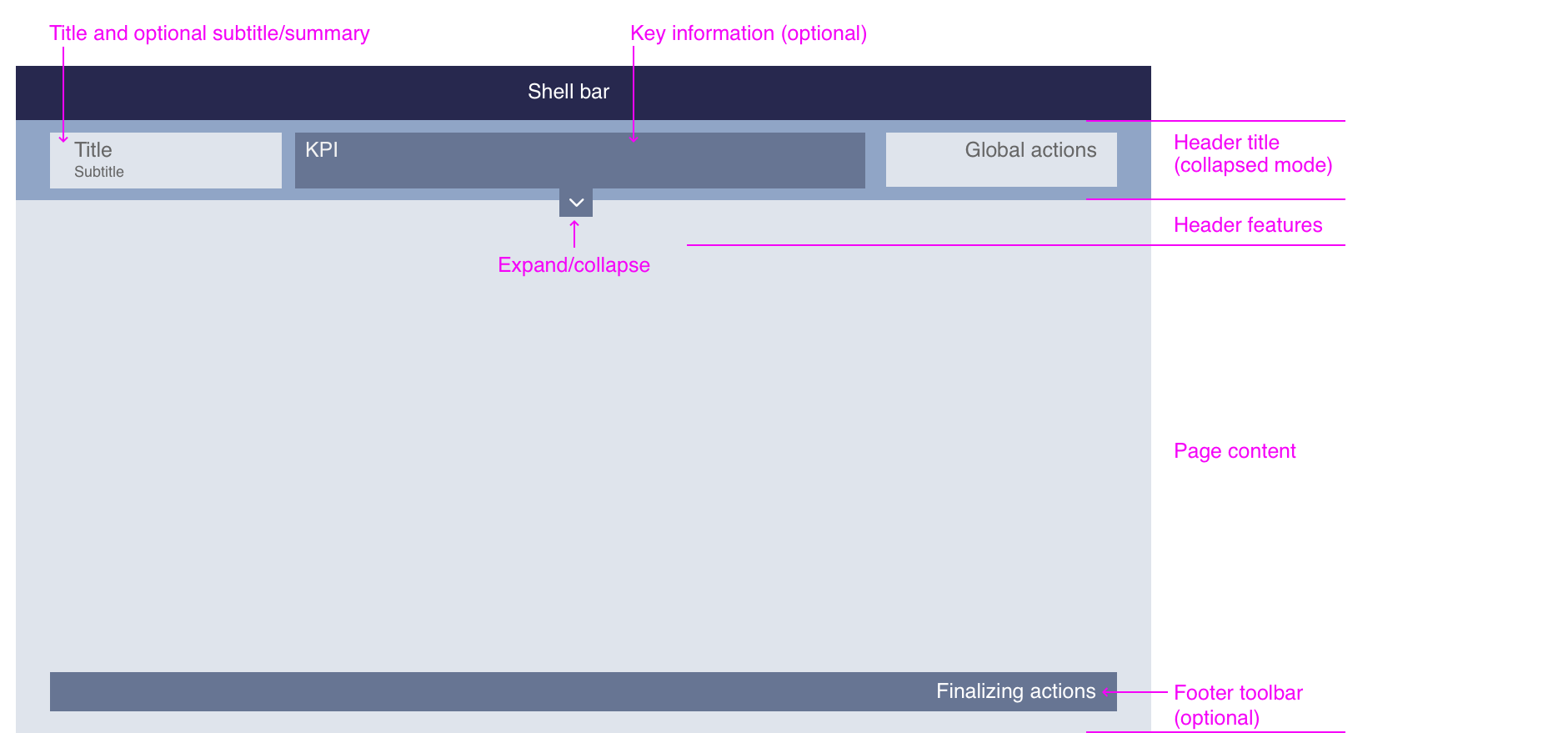
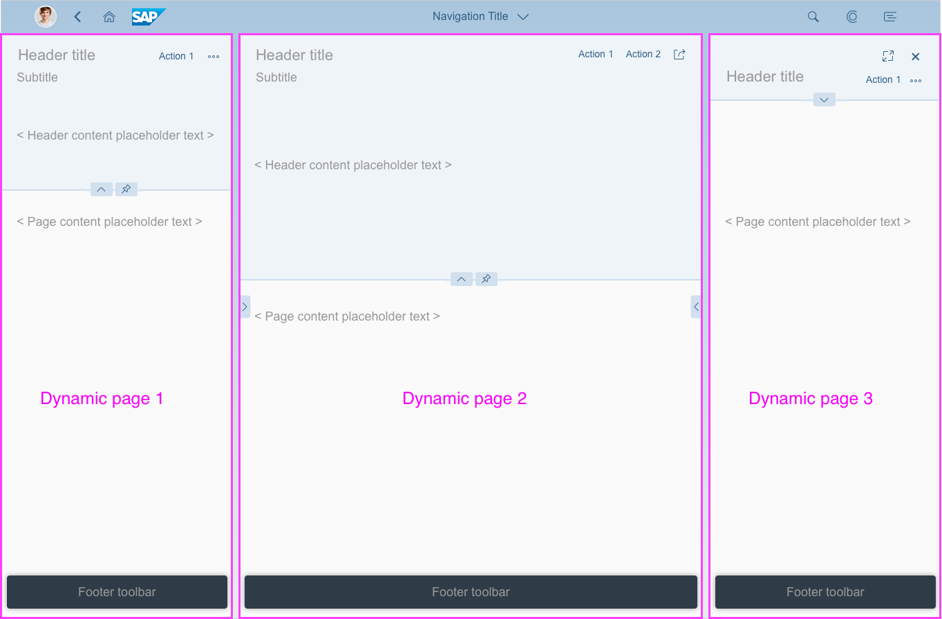
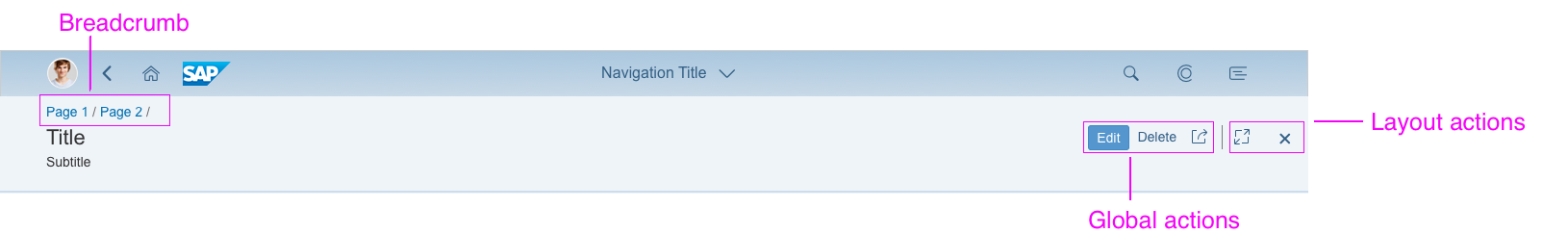
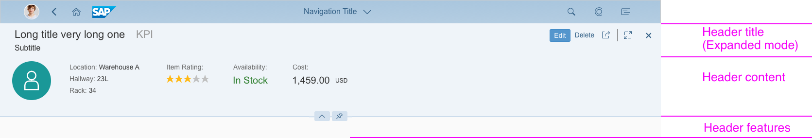
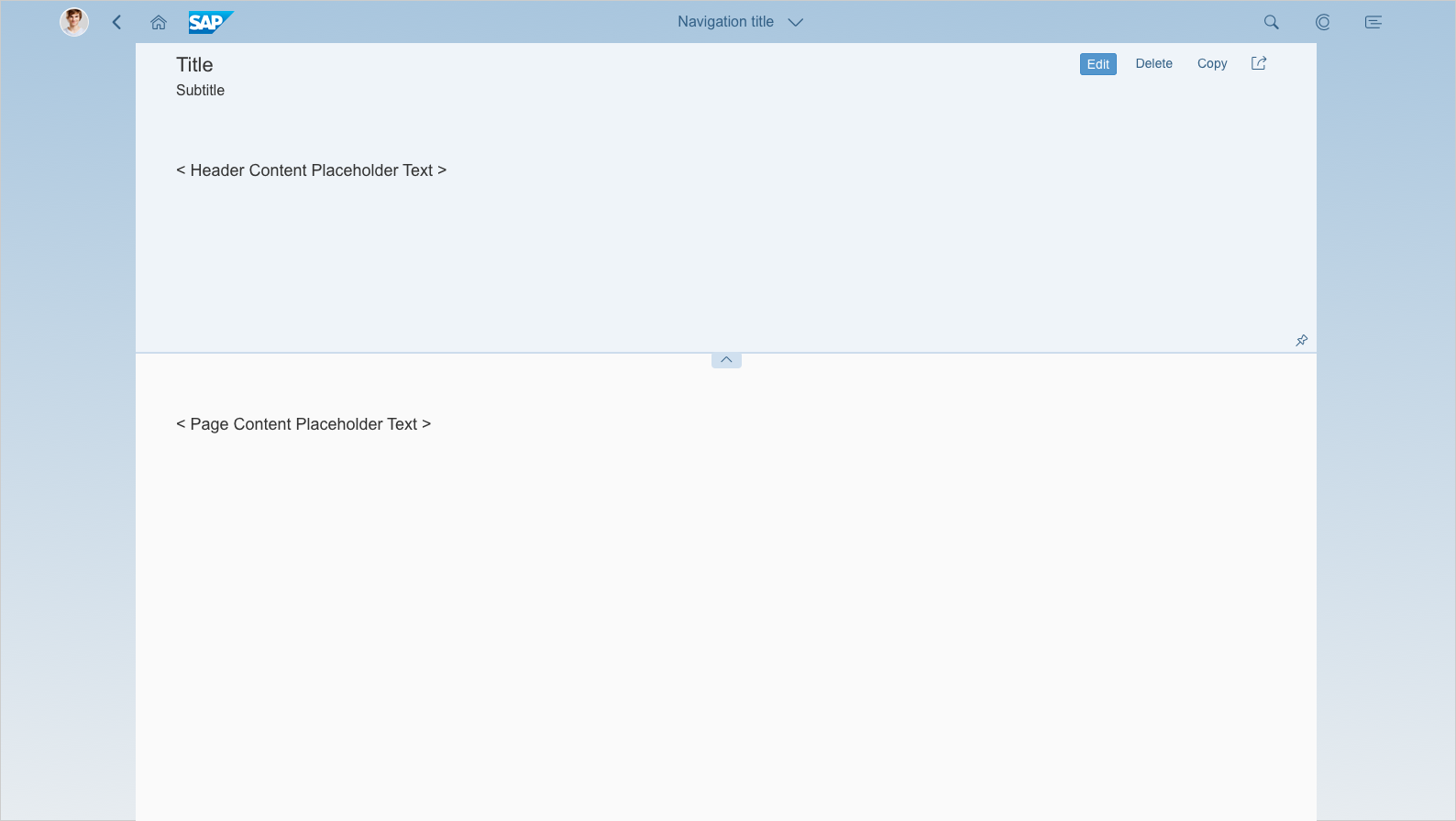
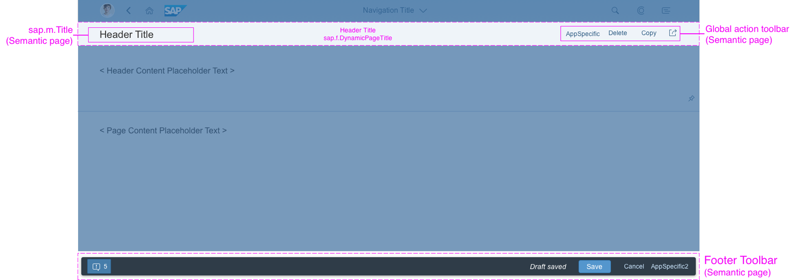
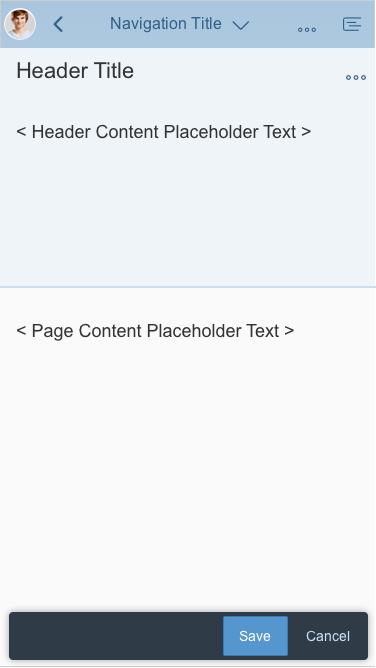
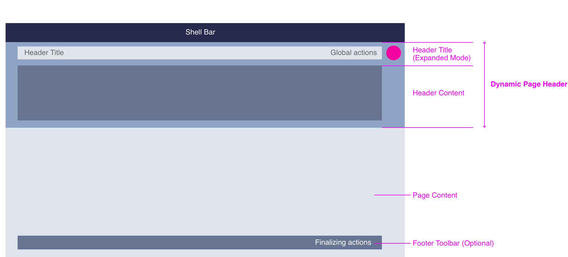
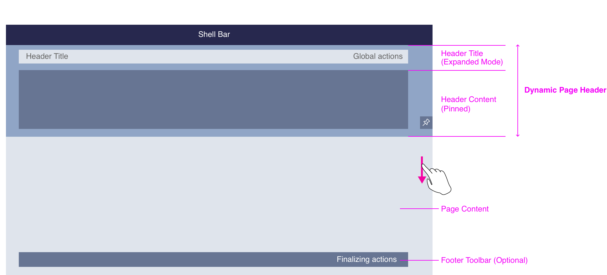
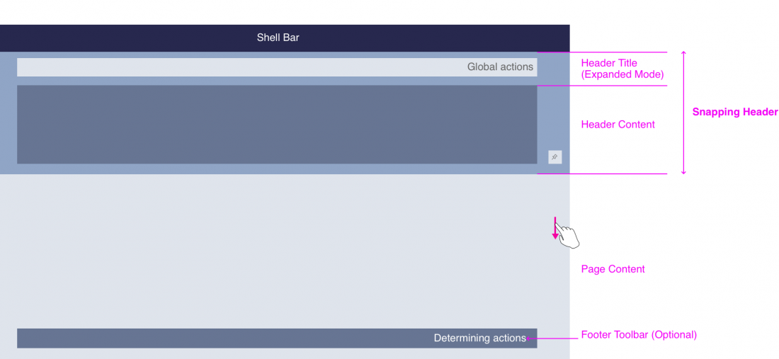
![Dynamic Page Layout - Structure Components [Expanded Mode]](https://experience.sap.com/fiori-design-web/wp-content/uploads/sites/5/2016/09/expanded-1100x504.png)
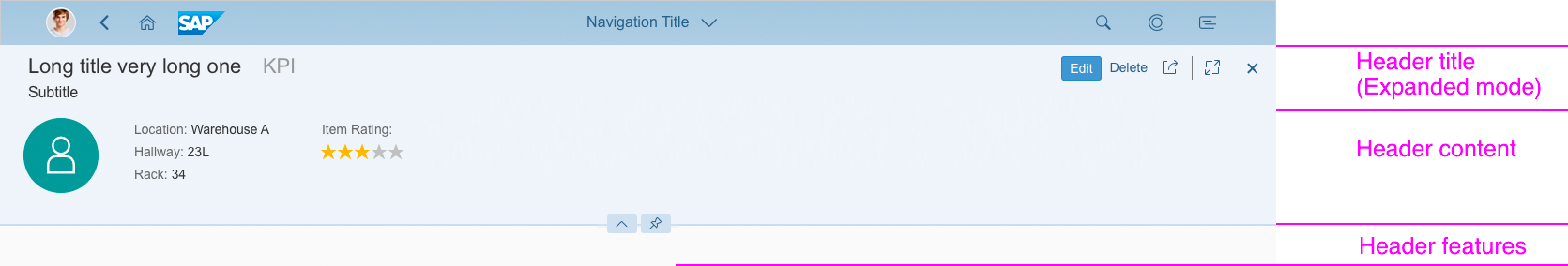
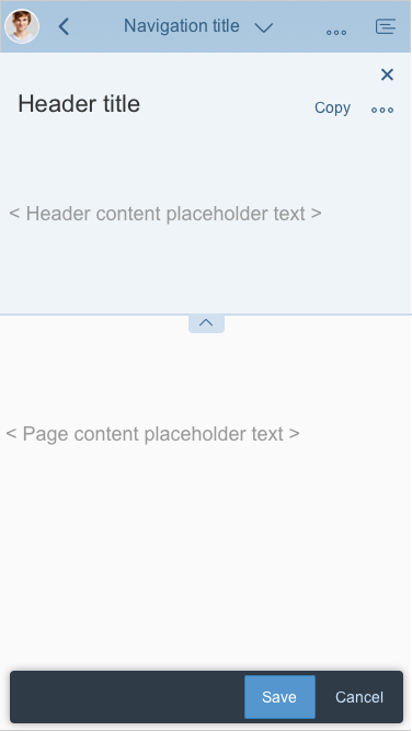
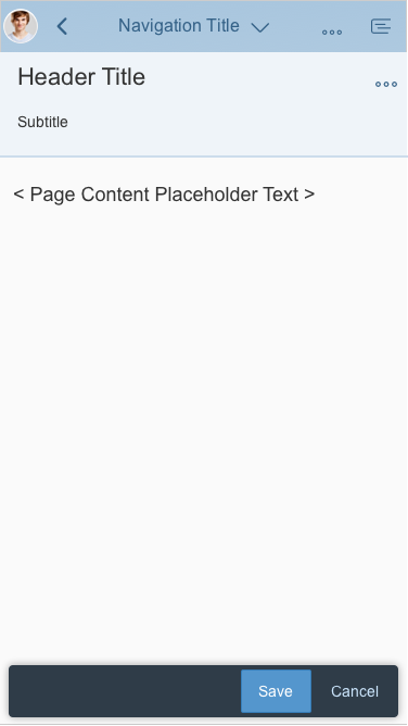
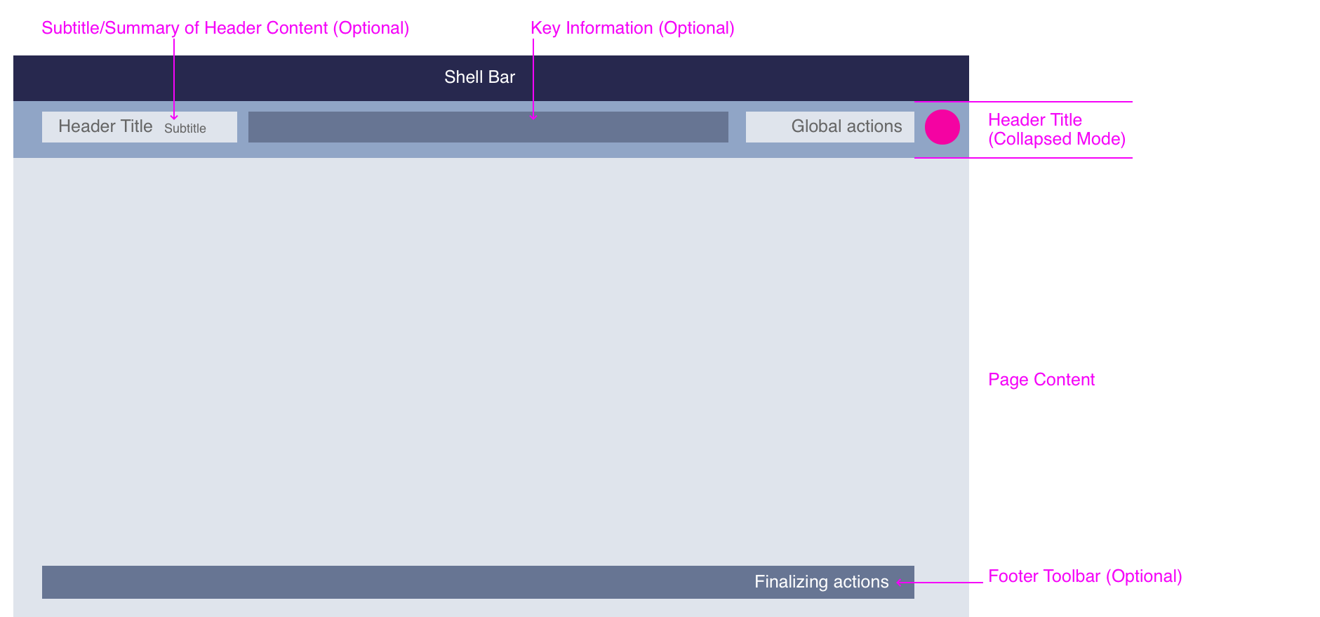
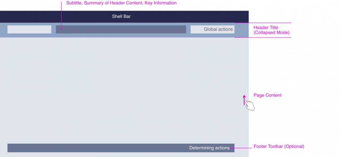
![Dynamic Page Layout - Structure Components [Collapsed Mode]](https://experience.sap.com/fiori-design-web/wp-content/uploads/sites/5/2016/09/snapped-1100x505.png)


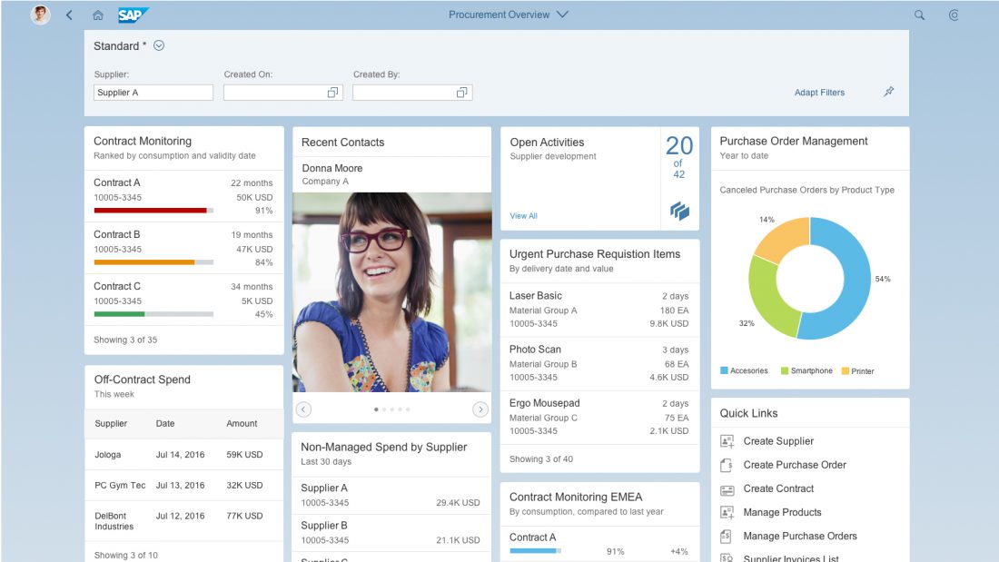
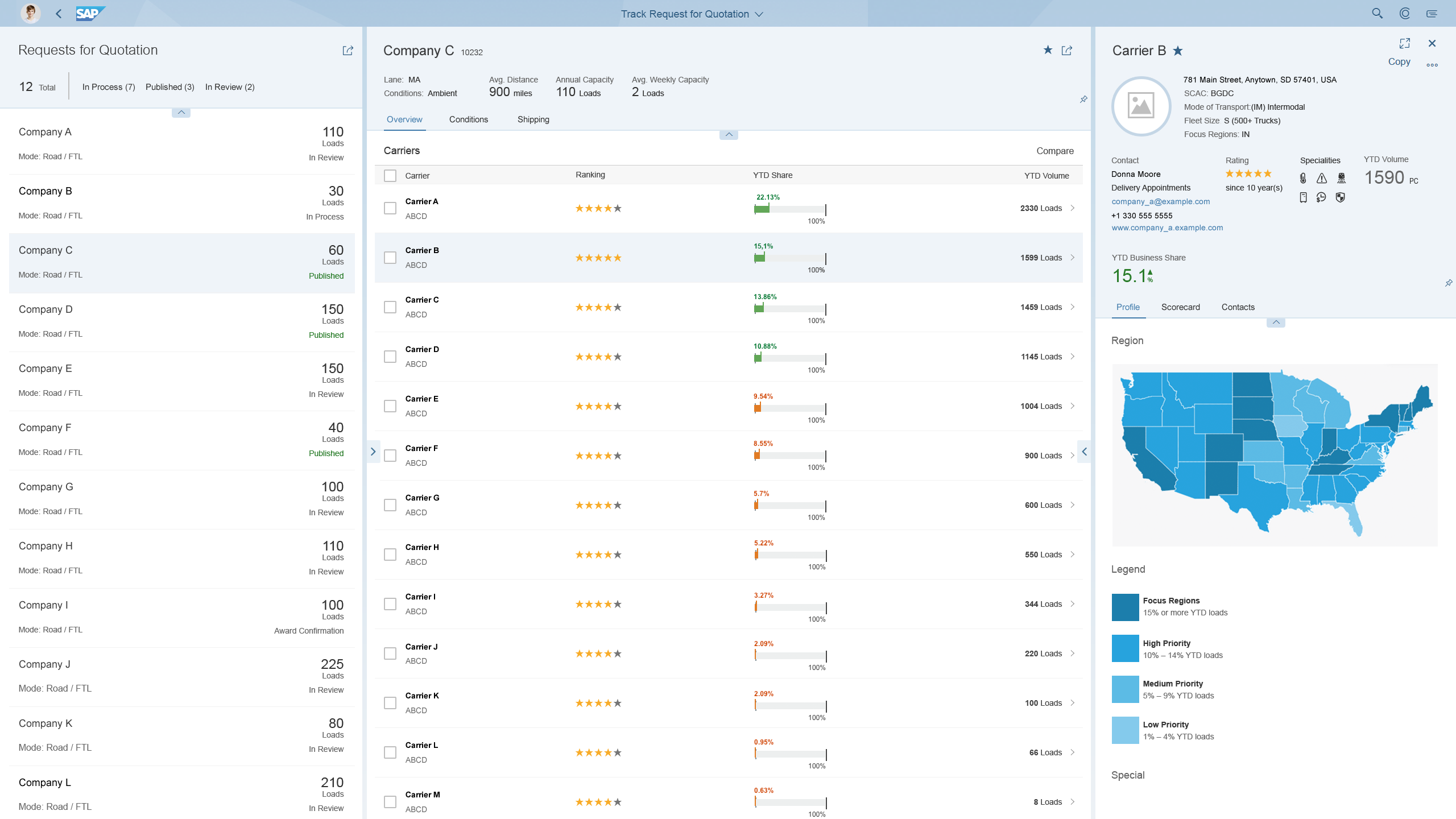
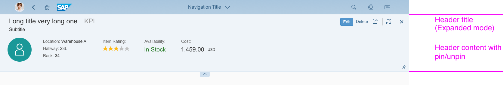
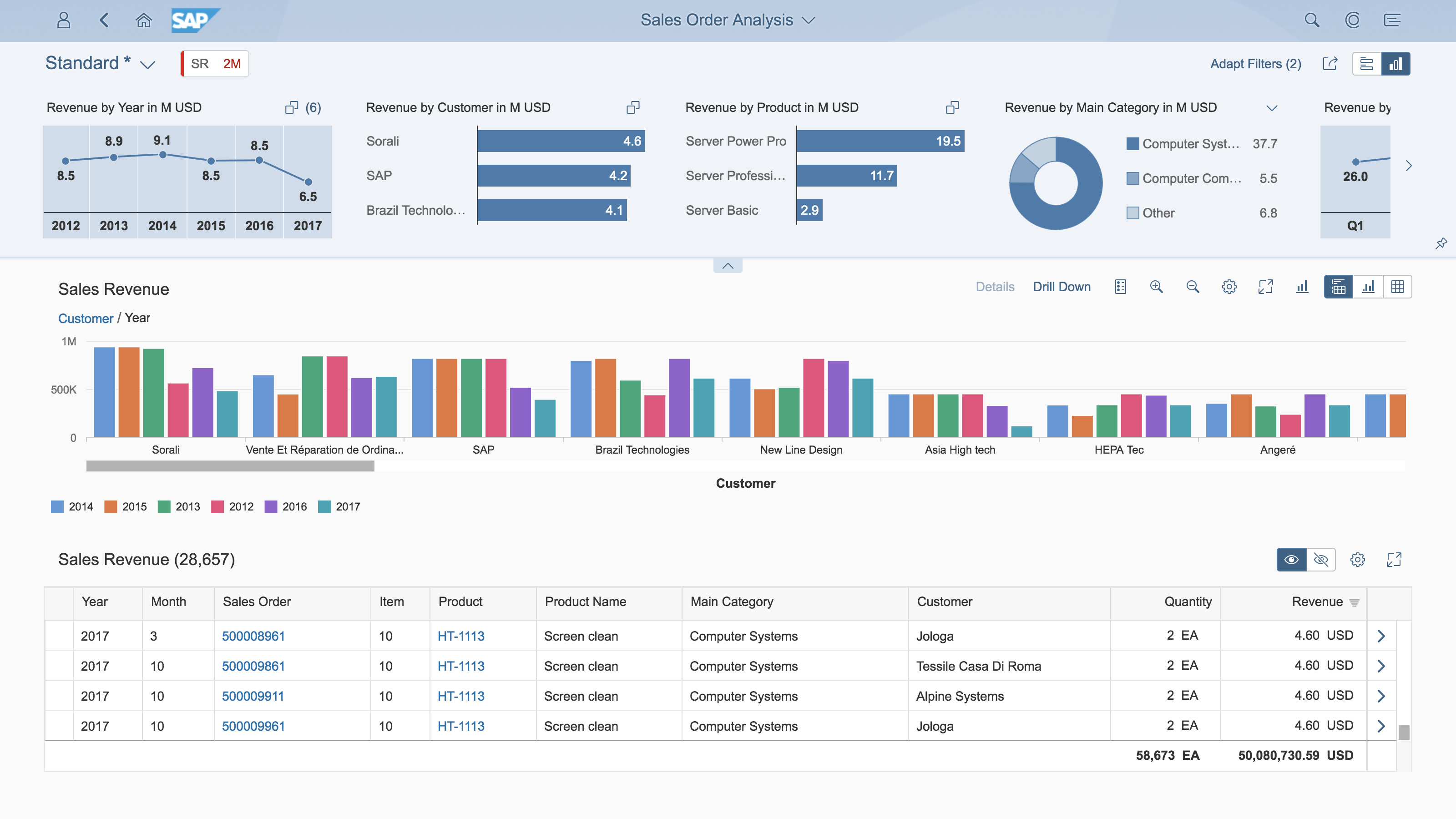
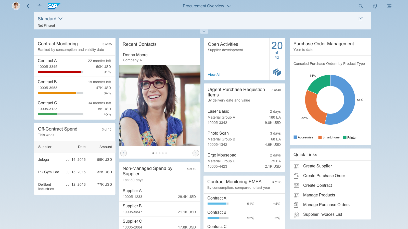
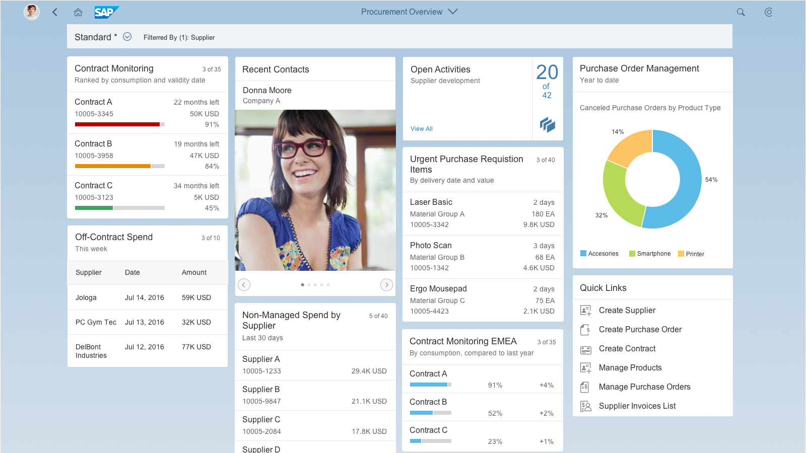
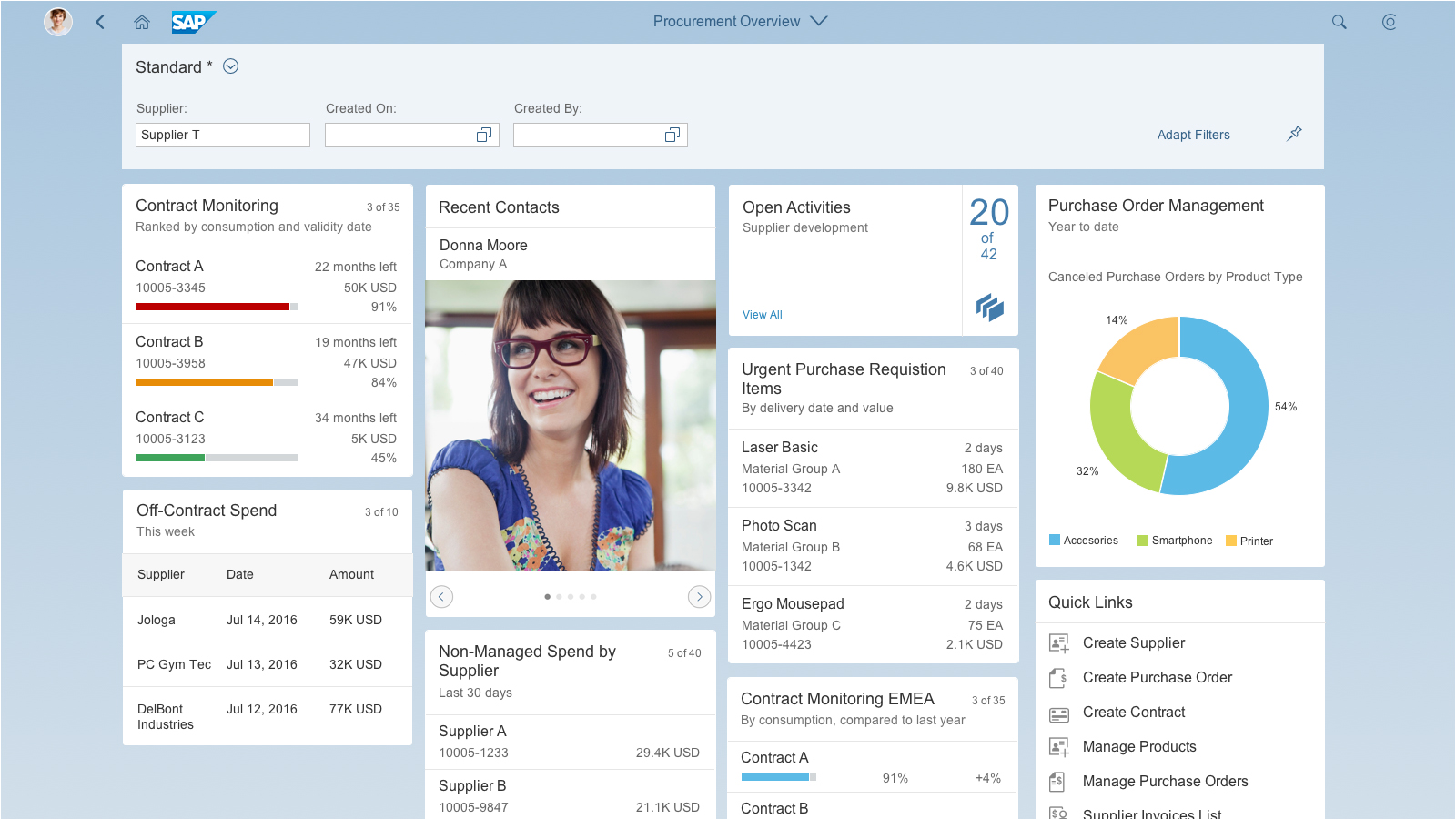
![Dynamic Page Layout - Overview Page [Expanded Mode]](https://experience.sap.com/fiori-design-web/wp-content/uploads/sites/5/2016/09/OverviewPage_Example_Expanded-1100x619.png)
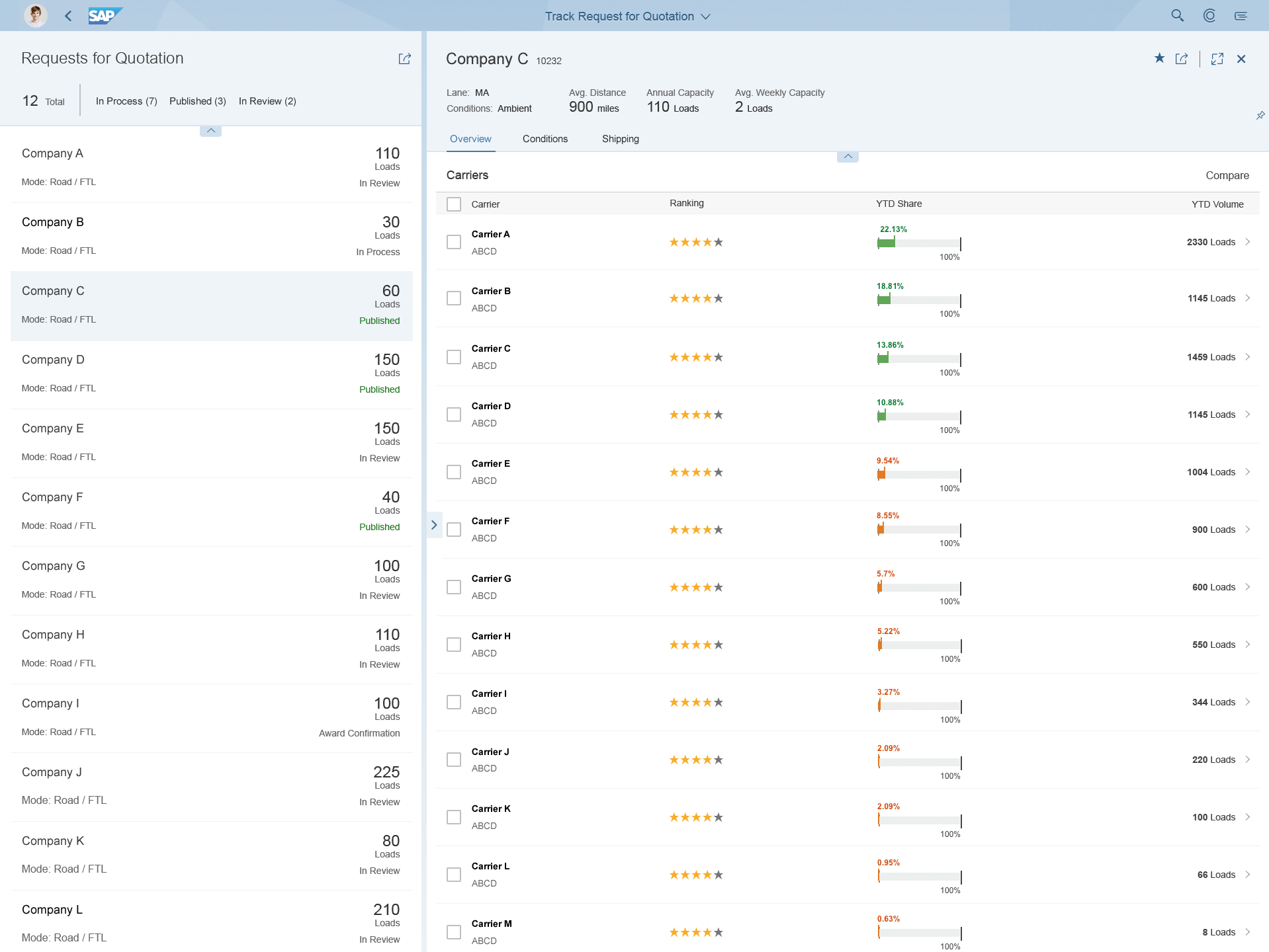
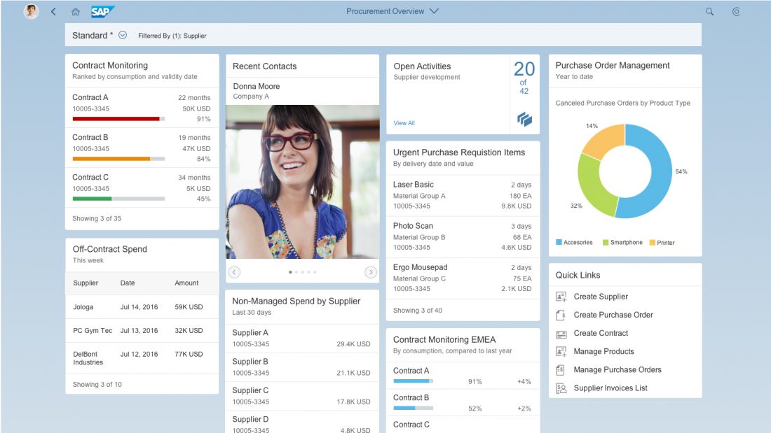
![Dynamic Page Layout - Overview Page [Snapped Mode]](https://experience.sap.com/fiori-design-web/wp-content/uploads/sites/5/2016/09/OverviewPage_Example_Snapped-1100x619.png)
 Your feedback has been sent to the SAP Fiori design team.