SAP Fiori Client

Warning
SAP plans to remove the SAP Fiori Client app from the Apple App Store and Google Play Store in the first quarter of 2021. For details, see SAP Note 2992772.

Intro

SAP Fiori Client is a native application runtime for running the SAP Fiori launchpad and applications on Android and iOS devices. It can be downloaded from the Apple App Store or Google Play Store, or installed automatically by a system administrator. Entering the URL establishes the connection to the SAP Fiori server. SAP Fiori can then be used in the same way as in the browser.

Using the SAP Fiori Client is an alternative to using the browser on mobile devices.

Advantages of the SAP Fiori Client:

  • Better performance through enhanced cache management.
  • Use of mobile qualities: barcode scanner, camera, geolocation. (Note that contacts, calendar, data storage, notifications, notes, tasks, and audio are not covered in the current release.)
  • Use of an app passcode to meet security requirements: This passcode may be enforced by an administrator or set individually.
  • Full screen mode for all mobile devices.
  • Easier onboarding with URL or email (with SAP Mobile Secure).

Which Devices are Supported?

SAP Fiori Client version 1.2 supports devices running Android 4.1.3 or higher, and iOS 7.1 or higher.

SAP Fiori Client and App Design

SAP Fiori Client displays the SAP Fiori launchpad and SAP Fiori apps in full screen mode (as when shown in a browser). This means that most of the aspects of app design and implementation will remain consistent regardless of whether the user is using the SAP Fiori Client or a mobile browser.

Only when using native mobile features such as barcode scanning, camera, or geolocation, will the app need to ensure that it reacts properly if the device does not offer the specific feature. For example, an app using barcode scanning can offer this feature when running in SAP Fiori Client, while it will not be available when running in a browser.

SAP Fiori Client Icon

Download

For iOS devices, the SAP Fiori Client can be downloaded in the Apple App Store.

For Android devices, the SAP Fiori Client can be downloaded from Google Play Store.

Resources

For more information, go to SAP Help Portal and search for “SAP Fiori Client”.

Design Stencils

Design Stencils (Axure RP)

Design stencils are ready-to-use drafts of SAP Fiori layouts, patterns and controls. You are welcome to use the design stencils to visualize your SAP Fiori app ideas in Axure RP. They are easy to use and give you a realistic impression of your final design. The download package also includes the SAPUI5 icon font.

Variants

The following variants are available for your Axure RP mockups:

  • Compact: Desktop (L)
  • Cozy: Tablet (M), Smartphone (S)
  • Image version: Shows different states of the control as an image, such as “Regular” and “Hover”.
  • Interactive version: Shows interaction built in Axure RP. Most interactions are based on dynamic panels.


Note: The design stencils are high-fidelity mockups and do not represent the exact visual design.

Brief Introduction to Axure RP

Wireframing. Prototyping. Documentation.

You can use the Axure RP tool to:

  • Make low-fi and hi-fi wireframes with dynamic interactions, or build fast mockups without interactions.
  • Save time by using masters and widgets/stencils.
  • Visualize interactive mockups for all form factors (desktop, tablet, and smartphone) using adaptive views. Interactive prototypes can be tested on all devices.
  • Create a prototype without any coding. Axure RP can be used by designers, or by anyone needing a proof of concept.

If you are looking for an easy way to learn Axure RP, take a look at the tutorials at www.axure.com/learn.

How do I load the stencils in Axure RP?

To load the SAP Fiori design stencils, please follow the instructions on the Axure RP website: http://www.axure.com/support/reference/widget-libraries (section: Loading and Unloading Libraries).

Design Stencils (Microsoft Powerpoint®)

The Microsoft PowerPoint® design stencils are ready-to-use drafts of the most essential SAP Fiori floorplans and UI elements.

We provide a limited set of Microsoft PowerPoint® stencils: the stencils are targeted at product owners and other non-design roles. You can use them for quickly visualizing your first design ideas. Only common floorplans and UI elements are available. The stencils come in two variants:

  • Compact: Desktop (L)
  • Cozy: Tablet (M), Smartphone (S)

The design stencils do not represent the exact visual design.

Overview Page – UI Text Guidelines

Texts for the overview page include:

The sections below describe the guidelines for each of these texts.

Note: These guidelines do not cover the texts for imported elements shown on the card body, such as tables or graphics.

Basics

  • Ensure that the card texts on the overview page are easy to read. Users need to grasp the information on each card at a glance.
  • Be clear. If necessary, provide context for the information you are showing, such as an explanation or filter criteria.
  • Be consistent. When you work on an overview page, always consider the texts for each card in the context of the overview page as a whole.
  • Bear in mind that other languages may need more space.

Guidelines by Text Type

Page Title

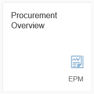
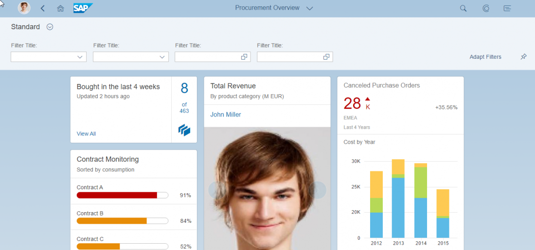
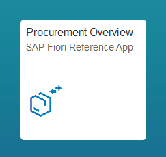
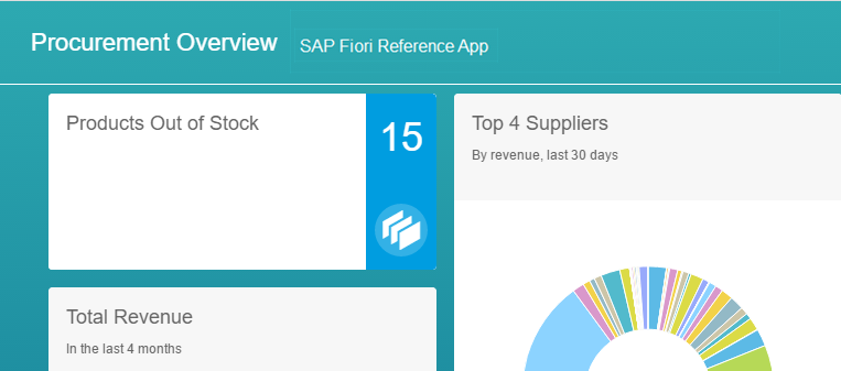
The page title appears on the launchpad tile and in the application header for the overview page itself. Where possible, use the same text for both.

Guidelines

  • Use a noun-based name (for example, “Procurement Center”).
  • Use title case.
  • Choose a name that best fits your use case and the conventions in your business.
    For example, do your users think in terms of the role, or the business area? What terms are they most familiar with? Look for a name that fits for all the cards you are including. Also consider the terms already used in your application area.
  • Do not use the term “Overview Page”. This is just the name of the floorplan. However, it’s OK to use “Overview” on its own.
Launchpad tile for overview page
Overview page title in the launchpad shell bar

Card Title

The title is the top element on all cards and is always required. The title for a stack of cards is also used as the heading for the detail view.

Guidelines

  • Use title case.
  • Be concise. Aim for one-line texts, which are easier to scan. If you need more space, try not to exceed 2 lines.
Concise title (eyecatcher)
  • Don’t overload the title with too much information.
    If the title is short, consider including qualifying information in the title.
    If the title is longer, or the qualifying information is more complex, use a subtitle for the qualifier.
  • Recommended: Use a consistent pattern across all the cards on your overview page.
Titles can also include qualifiers - if they are not too long

Card Subtitle

The subtitle is optional. You can use it to qualify the title, offer an explanation, or show a status. The use of the subtitle can differ, depending on the card type.

Guidelines

  • Use title case.
    Exception: Use sentence style for longer explanations, or statuses involving time periods or numbers.
  • If you have a mixture of subtitles in sentence style and title case, consider changing them all to sentence style.
Subtitle with simple qualifier
Explantory subtitle (sentence style)
Subtitle with relative time period (sentence style)
  • If your subtitle contains multiple qualifiers, separate them with commas.
Multiple qualifiers
Multiple qualifiers
  • If you need to qualify amounts (unit, currency), use the following format:
    (<Unit> <Currency>)
  • Place this information at the end of the subtitle.
Subtitle with scaling factor and currency

Actions

Actions can appear at the bottom of the quick view card.

Guidelines

The action buttons on cards follow the same text conventions as all other action buttons:

  • Use title case.
  • Start with a verb.
  • Keep the text as short as possible.

Resources

Want to dive deeper? Follow the links below to find out more about related resources.

Elements and Controls

Implementation

No links

Design Stencils

Design Stencils (Axure RP)

Design stencils are ready-to-use drafts of SAP Fiori layouts, patterns and controls. You are welcome to use the design stencils to visualize your SAP Fiori app ideas in Axure RP. They are easy to use and give you a realistic impression of your final design. The download package also includes the SAPUI5i icon font.

Variants

The following variants are available for your Axure RP mockups:

  • Compact: Desktop (L)
  • Cozy: Tablet (M), Smartphone (S)
  • Image version: Shows different states of the control as an image, such as “Regular” and “Hover”.
  • Interactive version: Shows interaction built in Axure RP. Most interactions are based on dynamic panels.

Note: The design stencils are high-fidelity mockups and do not represent the exact visual design.

Brief Introduction to Axure RP

Wireframing. Prototyping. Documentation.

You can use the Axure RP tool to:

  • Make low-fi and hi-fi wireframes with dynamic interactions, or build fast mockups without interactions.
  • Save time by using masters and widgets/stencils.
  • Visualize interactive mockups for all form factors (desktop, tablet, and smartphone) using adaptive views. Interactive prototypes can be tested on all devices.
  • Create a prototype without any coding. Axure RP can be used by designers, or by anyone needing a proof of concept.

If you are looking for an easy way to learn Axure RP, take a look at the tutorials at www.axure.com/learn.

How do I load the stencils in Axure RP?

To load the SAP Fiori design stencils, please follow the instructions on the Axure RP website: http://www.axure.com/support/reference/widget-libraries (section: Loading and Unloading Libraries).

Design Stencils (Microsoft Powerpoint®)

Warning
The Microsoft Powerpoint® design stencils were last updated with guideline release 1.36, and do not yet use the Belize theme.

The Microsoft PowerPoint® design stencils are ready-to-use drafts of the most essential SAP Fiori floorplans and UI elements.

We provide a limited set of Microsoft PowerPoint® stencils: the stencils are targeted at product owners and other non-design roles. You can use them for quickly visualizing your first design ideas. Only common floorplans and UI elements are available. The stencils come in two variants:

  • Compact: Desktop (L)
  • Cozy: Tablet (M), Smartphone (S)

Note: The design stencils do not represent the exact visual design.

Design Stencils

Design Stencils (Axure RP)

Design stencils are ready-to-use drafts of SAP Fiori layouts, patterns and controls. You are welcome to use the design stencils to visualize your SAP Fiori app ideas in Axure RP. They are easy to use and give you a realistic impression of your final design. The download package also includes the SAPUI5i icon font.

Variants

The following variants are available for your Axure RP mockups:

  • Compact: Desktop (L)
  • Cozy: Tablet (M), Smartphone (S)
  • Image version: Shows different states of the control as an image, such as “Regular” and “Hover”.
  • Interactive version: Shows interaction built in Axure RP. Most interactions are based on dynamic panels.
Note: The design stencils are high-fidelity mockups and do not represent the exact visual design.

Brief Introduction to Axure RP

Wireframing. Prototyping. Documentation.

You can use the Axure RP tool to:

  • Make low-fi and hi-fi wireframes with dynamic interactions, or build fast mockups without interactions.
  • Save time by using masters and widgets/stencils.
  • Visualize interactive mockups for all form factors (desktop, tablet, and smartphone) using adaptive views. Interactive prototypes can be tested on all devices.
  • Create a prototype without any coding. Axure RP can be used by designers, or by anyone needing a proof of concept.

If you are looking for an easy way to learn Axure RP, take a look at the tutorials at www.axure.com/learn.

How do I load the stencils in Axure RP?

To load the SAP Fiori design stencils, please follow the instructions on the Axure RP website: http://www.axure.com/support/reference/widget-libraries (section: Loading and Unloading Libraries).

Design Stencils (Microsoft Powerpoint®)

The Microsoft PowerPoint® design stencils are ready-to-use drafts of the most essential SAP Fiori floorplans and UI elements.

We provide a limited set of Microsoft PowerPoint® stencils: the stencils are targeted at product owners and other non-design roles. You can use them for quickly visualizing your first design ideas. Only common floorplans and UI elements are available. The stencils come in two variants:

  • Compact: Desktop (L)
  • Cozy: Tablet (M), Smartphone (S)

The design stencils do not represent the exact visual design.

Design Stencils

Design Stencils (Axure RP)

Design stencils are ready-to-use drafts of SAP Fiori layouts, patterns and controls. You are welcome to use the design stencils to visualize your SAP Fiori app ideas in Axure RP. They are easy to use and give you a realistic impression of your final design. The download package also includes the SAPUI5i icon font.

Variants

The following variants are available for your Axure RP mockups:

  • Compact: Desktop (L)
  • Cozy: Tablet (M), Smartphone (S)
  • Image version: Shows different states of the control as an image, such as “Regular” and “Hover”.
  • Interactive version: Shows interaction built in Axure RP. Most interactions are based on dynamic panels.

Note: The design stencils are high-fidelity mockups and do not represent the exact visual design.

Brief Introduction to Axure RP

Wireframing. Prototyping. Documentation.

You can use the Axure RP tool to:

  • Make low-fi and hi-fi wireframes with dynamic interactions, or build fast mockups without interactions.
  • Save time by using masters and widgets/stencils.
  • Visualize interactive mockups for all form factors (desktop, tablet, and smartphone) using adaptive views. Interactive prototypes can be tested on all devices.
  • Create a prototype without any coding. Axure RP can be used by designers, or by anyone needing a proof of concept.

If you are looking for an easy way to learn Axure RP, take a look at the tutorials at www.axure.com/learn.

How do I load the stencils in Axure RP?

To load the SAP Fiori design stencils, please follow the instructions on the Axure RP website: http://www.axure.com/support/reference/widget-libraries (section: Loading and Unloading Libraries).

Design Stencils (Microsoft Powerpoint®)

The Microsoft PowerPoint® design stencils are ready-to-use drafts of the most essential SAP Fiori floorplans and UI elements.

We provide a limited set of Microsoft PowerPoint®  stencils: the stencils are targeted at product owners and other non-design roles. You can use them for quickly visualizing your first design ideas. Only common floorplans and UI elements are available. The stencils come in two variants:

  • Compact: Desktop (L)
  • Cozy: Tablet (M), Smartphone (S)

Note: The design stencils do not represent the exact visual design.

Design Stencils

Design Stencils (Axure RP)

Design stencils are ready-to-use drafts of SAP Fiori layouts, patterns and controls. You are welcome to use the design stencils to visualize your SAP Fiori app ideas in Axure RP. They are easy to use and give you a realistic impression of your final design. The download package also includes the SAPUI5 icon font.

Variants

The following variants are available for your Axure RP mockups:

  • Compact: Desktop (L)
  • Cozy: Tablet (M), Smartphone (S)
  • Image version: Shows different states of the control as an image, such as “Regular” and “Hover”.
  • Interactive version: Shows interaction built in Axure RP. Most interactions are based on dynamic panels.

Note: The design stencils are high-fidelity mockups and do not represent the exact visual design.

Brief Introduction to Axure RP

Wireframing. Prototyping. Documentation.

You can use the Axure RP tool to:

  • Make low-fi and hi-fi wireframes with dynamic interactions, or build fast mockups without interactions.
  • Save time by using masters and widgets/stencils.
  • Visualize interactive mockups for all form factors (desktop, tablet, and smartphone) using adaptive views. Interactive prototypes can be tested on all devices.
  • Create a prototype without any coding. Axure RP can be used by designers, or by anyone needing a proof of concept.

If you are looking for an easy way to learn Axure RP, take a look at the tutorials at www.axure.com/learn.

How do I load the stencils in Axure RP?

To load the SAP Fiori design stencils, please follow the instructions on the Axure RP website: http://www.axure.com/support/reference/widget-libraries (section: Loading and Unloading Libraries).

Design Stencils (Microsoft Powerpoint®)

The Microsoft PowerPoint® design stencils are ready-to-use drafts of the most essential SAP Fiori floorplans and UI elements.

We provide a limited set of Microsoft PowerPoint® stencils: the stencils are targeted at product owners and other non-design roles. You can use them for quickly visualizing your first design ideas. Only common floorplans and UI elements are available. The stencils come in two variants:

  • Compact: Desktop (L)
  • Cozy: Tablet (M), Smartphone (S)

The design stencils do not represent the exact visual design.

Design Stencils

Design Stencils (Axure RP)

Design stencils are ready-to-use drafts of SAP Fiori layouts, patterns and controls. You are welcome to use the design stencils to visualize your SAP Fiori app ideas in Axure RP. They are easy to use and give you a realistic impression of your final design. The download package also includes the SAPUI5i icon font.

Variants

The following variants are available for your Axure RP mockups:

  • Compact: Desktop (L)
  • Cozy: Tablet (M), Smartphone (S)
  • Image version: Shows different states of the control as an image, such as “Regular” and “Hover”.
  • Interactive version: Shows interaction built in Axure RP. Most interactions are based on dynamic panels.

Note: The design stencils are high-fidelity mockups and do not represent the exact visual design.

Brief Introduction to Axure RP

Wireframing. Prototyping. Documentation.

You can use the Axure RP tool to:

  • Make low-fi and hi-fi wireframes with dynamic interactions, or build fast mockups without interactions.
  • Save time by using masters and widgets/stencils.
  • Visualize interactive mockups for all form factors (desktop, tablet, and smartphone) using adaptive views. Interactive prototypes can be tested on all devices.
  • Create a prototype without any coding. Axure RP can be used by designers, or by anyone needing a proof of concept.

If you are looking for an easy way to learn Axure RP, take a look at the tutorials at www.axure.com/learn.

How do I load the stencils in Axure RP?

To load the SAP Fiori design stencils, please follow the instructions on the Axure RP website: http://www.axure.com/support/reference/widget-libraries (section: Loading and Unloading Libraries).

Design Stencils (Microsoft Powerpoint®)

The Microsoft PowerPoint® design stencils are ready-to-use drafts of the most essential SAP Fiori floorplans and UI elements.

We provide a limited set of Microsoft PowerPoint® stencils: the stencils are targeted at product owners and other non-design roles. You can use them for quickly visualizing your first design ideas. Only common floorplans and UI elements are available. The stencils come in two variants:

  • Compact: Desktop (L)
  • Cozy: Tablet (M), Smartphone (S)

The design stencils do not represent the exact visual design.

Design Stencils

Design Stencils (Axure RP)

Design stencils are ready-to-use drafts of SAP Fiori layouts, patterns and controls. You are welcome to use the design stencils to visualize your SAP Fiori app ideas in Axure RP. They are easy to use and give you a realistic impression of your final design. The download package also includes the SAPUI5 icon font.

Variants

The following variants are available for your Axure RP mockups:

  • Compact: Desktop (L)
  • Cozy: Tablet (M), Smartphone (S)
  • Image version: Shows different states of the control as an image, such as “Regular” and “Hover”.
  • Interactive version: Shows interaction built in Axure RP. Most interactions are based on dynamic panels.
Note: The design stencils are high-fidelity mockups and do not represent the exact visual design.

Brief Introduction to Axure RP

Wireframing. Prototyping. Documentation.

You can use the Axure RP tool to:

  • Make low-fi and hi-fi wireframes with dynamic interactions, or build fast mockups without interactions.
  • Save time by using masters and widgets/stencils.
  • Visualize interactive mockups for all form factors (desktop, tablet, and smartphone) using adaptive views. Interactive prototypes can be tested on all devices.
  • Create a prototype without any coding. Axure RP can be used by designers, or by anyone needing a proof of concept.

If you are looking for an easy way to learn Axure RP, take a look at the tutorials at www.axure.com/learn.

How do I load the stencils in Axure RP?

To load the SAP Fiori design stencils, please follow the instructions on the Axure RP website: http://www.axure.com/support/reference/widget-libraries (section: Loading and Unloading Libraries).

Design Stencils

Design Stencils (Axure RP)

Design stencils are ready-to-use drafts of SAP Fiori layouts, patterns and controls. You are welcome to use the design stencils to visualize your SAP Fiori app ideas in Axure RP. They are easy to use and give you a realistic impression of your final design. The download package also includes the SAPUI5i icon font.

Variants

The following variants are available for your Axure RP mockups:

  • Compact: Desktop (L)
  • Cozy: Tablet (M), Smartphone (S)
  • Image version: Shows different states of the control as an image, such as “Regular” and “Hover”.
  • Interactive version: Shows interaction built in Axure RP. Most interactions are based on dynamic panels.
Note: The design stencils are high-fidelity mockups and do not represent the exact visual design.

Brief Introduction to Axure RP

Wireframing. Prototyping. Documentation.

You can use the Axure RP tool to:

  • Make low-fi and hi-fi wireframes with dynamic interactions, or build fast mockups without interactions.
  • Save time by using masters and widgets/stencils.
  • Visualize interactive mockups for all form factors (desktop, tablet, and smartphone) using adaptive views. Interactive prototypes can be tested on all devices.
  • Create a prototype without any coding. Axure RP can be used by designers, or by anyone needing a proof of concept.

If you are looking for an easy way to learn Axure RP, take a look at the tutorials at www.axure.com/learn.

How do I load the stencils in Axure RP?

To load the SAP Fiori design stencils, please follow the instructions on the Axure RP website: http://www.axure.com/support/reference/widget-libraries (section: Loading and Unloading Libraries).

Design Stencils (Microsoft Powerpoint®)

The Microsoft PowerPoint® design stencils are ready-to-use drafts of the most essential SAP Fiori floorplans and UI elements.

We provide a limited set of Microsoft PowerPoint® stencils: the stencils are targeted at product owners and other non-design roles. You can use them for quickly visualizing your first design ideas. Only common floorplans and UI elements are available. The stencils come in two variants:

  • Compact: Desktop (L)
  • Cozy: Tablet (M), Smartphone (S)

The design stencils do not represent the exact visual design.

Design Stencils

Design Stencils (Axure RP)

Design stencils are ready-to-use drafts of SAP Fiori layouts, patterns and controls. You are welcome to use the design stencils to visualize your SAP Fiori app ideas in Axure RP. They are easy to use and give you a realistic impression of your final design. The download package also includes the SAPUI5 icon font.

Variants

The following variants are available for your Axure RP mockups:

  • Compact: Desktop (L)
  • Cozy: Tablet (M), Smartphone (S)
  • Image version: Shows different states of the control as an image, such as “Regular” and “Hover”.
  • Interactive version: Shows interaction built in Axure RP. Most interactions are based on dynamic panels.
Note: The design stencils are high-fidelity mockups and do not represent the exact visual design.

Brief Introduction to Axure RP

Wireframing. Prototyping. Documentation.

You can use the Axure RP tool to:

  • Make low-fi and hi-fi wireframes with dynamic interactions, or build fast mockups without interactions.
  • Save time by using masters and widgets/stencils.
  • Visualize interactive mockups for all form factors (desktop, tablet, and smartphone) using adaptive views. Interactive prototypes can be tested on all devices.
  • Create a prototype without any coding. Axure RP can be used by designers, or by anyone needing a proof of concept.

If you are looking for an easy way to learn Axure RP, take a look at the tutorials at www.axure.com/learn.

How do I load the stencils in Axure RP?

To load the SAP Fiori design stencils, please follow the instructions on the Axure RP website: http://www.axure.com/support/reference/widget-libraries (section: Loading and Unloading Libraries).

SAPUI5 Planning & Development

Do you want to find out more about SAPUI5? Check out the links below.

SAPUI5 Development Toolkit

This toolkit gives you access to further SAP Fiori development resources, including:

  • Developer guide
  • Controls
  • SAPUI5 samples
  • API references
  • Demo apps
  • Icons

Overview Page – UI Text Guidelines

Texts for the overview page include:

The sections below describe the guidelines for each of these texts.

Note: These guidelines do not cover the texts for imported elements shown on the card body, such as tables or graphics.

Basics

  • Ensure that the card texts on the overview page are easy to read. Users need to grasp the information on each card at a glance.
  • Be clear. If necessary, provide context for the information you are showing, such as an explanation or filter criteria.
  • Be consistent. When you work on an overview page, always consider the texts for each card in the context of the overview page as a whole.
  • Bear in mind that other languages may need more space.

Guidelines by Text Type

Page Title

The page title appears on the launchpad tile and in the application header for the overview page itself. Where possible, use the same text for both.

Guidelines

  • Use a noun-based name (for example, “Procurement Center”).
  • Use title case.
  • Choose a name that best fits your use case and the conventions in your business.
    For example, do your users think in terms of the role, or the business area? What terms are they most familiar with? Look for a name that fits for all the cards you are including. Also consider the terms already used in your application area.
  • Do not use the term “Overview Page”. This is just the name of the floorplan. However, it’s OK to use “Overview” on its own.
Launchpad tile for overview page
Overview page title and subtitle

Page Subtitle

The page subtitle is optional. You can use it to provide additional information that is not supplied by the title or the selected filter.

Guidelines

  • Use title case.
  • If possible, avoid using the subtitle to differentiate between similar overview pages. The subtitle is not as prominent as the main title and might not be seen right away. Instead, include the differentiator in the main title, or use variants to differentiate the page view.

Card Title

The title is the top element on all cards and is always required. The title for a stack of cards is also used as the heading for the detail view.

Guidelines

  • Use title case.
  • Be concise. Aim for one-line texts, which are easier to scan. If you need more space, try not to exceed 2 lines.
Concise title (eyecatcher)
  • Don’t overload the title with too much information.
    If the title is short, consider including qualifying information in the title.
    If the title is longer, or the qualifying information is more complex, use a subtitle for the qualifier.
  • Recommended: Use a consistent pattern across all the cards on your overview page.
Titles can also include qualifiers - if they are not too long

Card Subtitle

The subtitle is optional. You can use it to qualify the title, offer an explanation, or show a status. The use of the subtitle can differ, depending on the card type.

Guidelines

  • Use title case.
    Exception: Use sentence style for longer explanations, or statuses involving time periods or numbers.
  • If you have a mixture of subtitles in sentence style and title case, consider changing them all to sentence style.
Subtitle with simple qualifier
Explantory subtitle (sentence style)
Subtitle with relative time period (sentence style)
  • If your subtitle contains multiple qualifiers, separate them with commas.
Multiple qualifiers
Multiple qualifiers
  • If you need to qualify amounts (unit, currency), use the following format:
    in <Unit> <Currency>
  • Place this information at the end of the subtitle.
Subtitle with scaling factor and currency

Actions

Actions can appear at the bottom of the quick view card.

Guidelines

The action buttons on cards follow the same text conventions as all other action buttons:

  • Use title case.
  • Start with a verb.
  • Keep the text as short as possible.

Resources

Want to dive deeper? Follow the links below to find out more about related resources.

Elements and Controls

Implementation

No links

Overview Page – UI Text Guidelines

Texts for the overview page include:

The sections below describe the guidelines for each of these texts.

Note: These guidelines do not cover the texts for imported elements shown on the card body, such as tables or graphics.

Basics

  • Ensure that the card texts on the overview page are easy to read. Users need to grasp the information on each card at a glance.
  • Be clear. If necessary, provide context for the information you are showing, such as an explanation or filter criteria.
  • Be consistent. When you work on an overview page, always consider the texts for each card in the context of the overview page as a whole.
  • Bear in mind that other languages may need more space.

Guidelines by Text Type

Page Title

The page title appears on the launchpad tile and in the application header for the overview page itself. Where possible, use the same text for both.

Guidelines

  • Use a noun-based name (for example, “Procurement Center”).
  • Use title case.
  • Choose a name that best fits your use case and the conventions in your business.
    For example, do your users think in terms of the role, or the business area? What terms are they most familiar with? Look for a name that fits for all the cards you are including. Also consider the terms already used in your application area.
  • Do not use the term “Overview Page”. This is just the name of the floorplan. However, it’s OK to use “Overview” on its own.
Launchpad tile for overview page
Overview page title in the launchpad shell bar

Card Title

The title is the top element on all cards and is always required. The title for a stack of cards is also used as the heading for the detail view.

Guidelines

  • Use title case.
  • Be concise. Aim for one-line texts, which are easier to scan. If you need more space, try not to exceed 2 lines.
Concise title (eyecatcher)
  • Don’t overload the title with too much information.
    If the title is short, consider including qualifying information in the title.
    If the title is longer, or the qualifying information is more complex, use a subtitle for the qualifier.
  • Recommended: Use a consistent pattern across all the cards on your overview page.
Titles can also include qualifiers - if they are not too long

Card Subtitle

The subtitle is optional. You can use it to qualify the title, offer an explanation, or show a status. The use of the subtitle can differ, depending on the card type.

Guidelines

  • Use title case.
    Exception: Use sentence style for longer explanations, or statuses involving time periods or numbers.
  • If you have a mixture of subtitles in sentence style and title case, consider changing them all to sentence style.
Subtitle with simple qualifier
Explantory subtitle (sentence style)
Subtitle with relative time period (sentence style)
  • If your subtitle contains multiple qualifiers, separate them with commas.
Multiple qualifiers
Multiple qualifiers
  • If you need to qualify amounts (unit, currency), use the following format:
    in <Unit> <Currency>
  • Place this information at the end of the subtitle.
Subtitle with scaling factor and currency

Actions

Actions can appear at the bottom of the quick view card.

Guidelines

The action buttons on cards follow the same text conventions as all other action buttons:

  • Use title case.
  • Start with a verb.
  • Keep the text as short as possible.

Resources

Want to dive deeper? Follow the links below to find out more about related resources.

Elements and Controls

Implementation

No links

Contact Us

Contact Us
Contact Us

Do you have design-related questions that you would like to discuss with us?

You are welcome to use the experience.sap.com forum to ask design questions and post your design ideas.

We look forward to hearing from you!