Accessibility in SAP Fiori

Accessibility refers to the possibility for everyone, including and especially people with disabilities, to access and use information and communication technology. It is an integral part of the SAP Fiori design system and SAPUI5.

Accessibility support is incorporated at two levels:

  • Framework level: Many fundamental accessibility features are built into the core design elements up front and are available to app teams out of the box. This ensures consistency across all products.
  • App level: Some accessibility features need to be added or adapted to reflect app-specific context. These need to be considered whenever you design an app.

This article outlines how accessibility requirements are handled in the SAPUI5 reference framework:

Accessibility Provided at Framework Level

Visualization

Minimum contrast: Following the requirements of the international Web Content Accessibility Guidelines WCAG 2.2, SAP Fiori’s default theme was designed to fulfill the requirements for minimum color contrast. In addition, we provide high-contrast themes that support the required contrast ratio of 7:1 for texts. They can be chosen in the user settings. The individual theme choice is saved as a preference until the user changes it again.

More information:

Consistency of icons: A comprehensive icon library ensures consistent icon usage within a product and also across products. The icon library includes predefined descriptions. This enables the development teams not only to use consistent icons, but also to implement meaningful descriptions for tooltips as a textual alternative for graphical representation. However, in some cases you may need to adapt these descriptions to the specific use case.

For more information, see Iconography.

Keyboard focus visualization design: Focus visualization is very important for user efficiency. SAP Fiori uses a contrast ratio that makes the current focus stand out in all themes.

Layout adaptation for different devices: Since SAP Fiori can run on various devices, it comes with a responsive layout that adapts to the display resolution parameters of the individual device.

For more information, see Multi-Device Support: Responsive vs. Adaptive.

Support for text resizing: Users can adjust the font size themselves using the browser zoom. The responsive layout adapts to these manual adjustments automatically.

For more information, see Multi-Device Support: Responsive vs. Adaptive.


Keyboard Support

Keyboard navigation and control interaction: All standard UI elements and controls are designed to be keyboard-enabled. All suitable input channels (such as mouse, keyboard, or touch) are treated equally according to the capabilities of the device or the individual preferences of the user. For example, some users may prefer using the keyboard instead of a mouse, which lets them work faster.

For more information, see SAPUI5 keyboard support on SAP Help Portal.

Tab order of controls: According to the placement of controls on the screen, SAPUI5 supports keyboard navigation with a predefined tab order sequence. This includes the tab order for the floorplan, the sequence of accessing individual applications, and the navigation in the application itself. According to control containers and layout, the application needs to be designed to support this order (left-right-top-bottom for western languages, for example).


Messaging Patterns

Standard messaging patterns (busy, errors, notifications): In SAP Fiori, a message system is implemented. This ensures that system messages appear at predefined locations with a consistent design.

For more information, see Message Handing.

Screen Reader Enablement

Screen readers retrieve visible and invisible textual information, as well as structural information from the user interface, in order to provide it as speech output or braille output to the end user. The SAPUI5 framework is technically prepared for screen reader support. This means that all the structural information and texts needed are handed over to assistive technology. Nevertheless, the actual structure, as well as the actual visible and invisible texts, need to be defined at application level.

Supporting Accessibility at App Level

Many requirements are already covered by the technology framework, but design aspects that are related to the individual purpose of the application still need to be implemented by the individual design teams. Here are some examples:

Understanding

Status updates, messages, error handling: Although the shape and appearance of system messages is predefined, ensure that the message content is clear and easy to understand. For error messages, indicate the location of the error and how to fix it.

Labels, tooltips, and placeholders: Define meaningful labels. Use tooltips according to the guideline, and ensure that they are relevant. Define clear placeholders in input fields where appropriate. For more information on placeholders, see Mask Input and Input Field.

Keyboard Operation

Initial focus position: To enable users to work through a task efficiently, always set an initial focus for the task. Set the focus to either the first logical interaction element or the first element in the task.

Structure and fast navigation: Ensure that the navigation within your application is logical and follows the task structure for the intended purpose. When designing apps with a large set of functions or information blocks, always form logical groups to help users navigate efficiently. You can form logical groups using a container, a toolbar, or other grouping elements. To enable faster navigation, SAPUI5 allows users to skip groups (with F6 or Shift+F6). Also, enable direct keyboard navigation to logical groups, such as working areas or navigation areas.

Keyboard shortcuts (hot keys): While some keyboard shortcuts are supported at framework level (such as Ctrl+A to select all items), others must be defined at application level (a common one is Ctrl+S to save the current object). Support for keyboard shortcuts in SAP Fiori differs from the default browser behavior: all keyboard shortcut commands are captured by the application except Ctrl-L, which is needed to jump to the browser address bar. From there, all browser keyboard shortcuts are available. Observe industry standards and de-facto standards.

Screen Reader Support

Although screen reader support is technically prepared at framework level, it is still the developer’s task to arrange the individual UI elements in relationships that are needed for a screen reader. This is done by using appropriate floorplans, layouts, and controls for the respective use cases.

Alternative texts: Images need alternative texts and descriptions, unless they are purely decorative. Also, the default texts for icons, image placeholders, and other graphical elements may not be available or suitable for your application use case. Always review these texts, and replace or redefine them where necessary.

Landmarks: Landmarks are used by assistive technologies (such as screen readers) to provide a meaningful overview of a page or specific parts of a page. Define landmarks when you use an object page, dynamic page, or panel, for example.

For more information, see the landmark options in the corresponding API documentation:

Changes That Impair Accessibility

Be aware that any changes in the framework definitions can impair accessibility support.

Custom controls: SAP Fiori and SAPUI5 comprise an extensive set of controls. These controls come with numerous features that support accessible implementation, including keyboard enablement, resizing behavior, or support for theme changes. If you think that your use case requires a custom control, think twice. A custom control needs to fit into the interaction concept, and all the features must be coded by the app team. This includes accessibility requirements, but also many other aspects, such as globalization and writing modes (left-to-right or right-to-left), security, performance, maintenance, or documentation. Before developing a custom control, always check if your use case can be handled by existing controls. However, it is important to use controls only for their intended purpose.

For more information, see the SAPUI5 documentation.

Custom colors: Change individual colors only in exceptional cases and after very careful consideration. Bear in mind that any color changes must also be applied to the different UI element states (such as active, hovered, or inactive buttons). Additionally, these changes may not work with theme changes or high-contrast modes of the underlying operating system. When changing a single color, you may need to create an entirely new theme to ensure that the appearance of your app remains coherent and consistent.

Fixed width or height:  If you set a fixed width or height, your app will no longer be responsive and adaptive. Information might get lost if the user resizes the application window, zooms, or changes the device, for example.

Embedded third party objects: An application is only as accessible as each of its parts. Embedded objects like (third party) maps or PDF forms (see PDF Viewer) often have accessibility issues. You need to either fix these issues or provide an alternative, accessible alternative way to retrieve the information and complete the task.

Related Links

Multi-Device Support: Responsive vs. Adaptive

For our typical users who work on-the-go, the ability to switch between desktop and mobile devices is critical. As users increasingly come to expect consistent performance and a coherent look and feel across their devices, how can we make sure that we deliver a great user experience with our Fiori apps? The answer is through responsive and adaptive design.

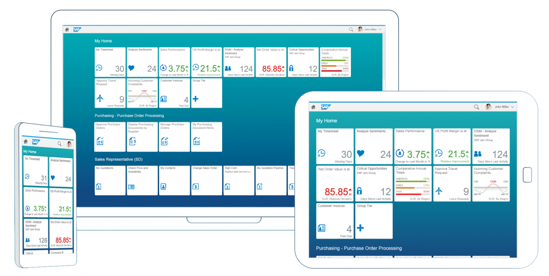
Responsive and adaptive design allow Fiori apps to run on desktops, tablets, smartphones, and hybrid devices. As users switch across devices, our apps automatically accommodate the resolution, image size, and scripting. This way, our users can work how and where they want, regardless of device.

Responsive Design

One of the most compelling factors of SAP Fiori is that our applications need to be developed, configured and maintained only once for all changes to become effective across all devices. This way, the end users gets a consistent experience no matter which device they use. SAPUI5 makes responsive design easy by offering a wide range of UI controls that automatically adjust to different form factors and interaction styles. Additionally, SAPUI5 lets you adjust the size of the controls to match the type of interaction (such as touch device or keyboard/mouse). The advantage of responsive design is that apps can adjust to different screen sizes without requiring additional coding and maintenance efforts.

Responsive Grid

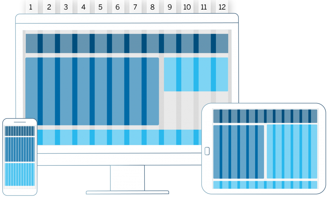
Responsive design is supported by a responsive grid.

The responsive grid positions UI elements in a 12-column flow layout. It can be configured to display a variable number of columns depending on available screen size. With this control, it is possible to achieve flexible layouts and line breaks for large, medium, and small-sized screens, such as desktop, tablet, and mobile.

Adaptive Design

There are certain use cases where a responsive approach may not be appropriate. For instance, users would probably prefer to enter large amounts of data on your desktop. At the same time, they may only want to view the data entered or perhaps enter a small subset of data on their tablet or smartphone. In such cases, it makes sense to design for different devices and adapt the complexity of the use case to the specific device. This is what we call adaptive design. This approach requires app developers to manually define specific designs for the different form factors. It means slightly more effort, but also allows for more targeted support of device-specific use cases.

Examples of Responsive Design

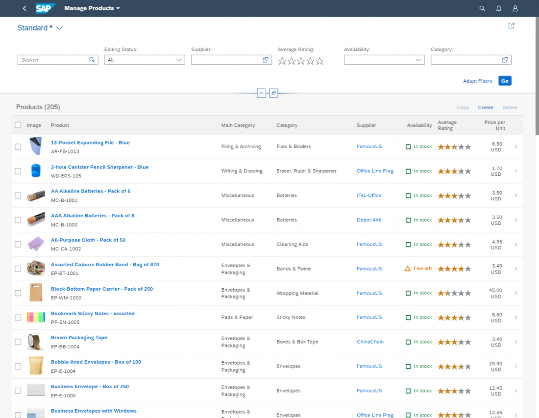
The examples in this section show how a standard list report floorplan would translate to different devices in a (semi-)responsive way.

For these examples, the following responsive design concepts apply:

  • Content density: Compact content density mode is activated on desktop mode. On touch devices, the finger-friendly cozy mode is activated. Read more about content density.
  • Filters: On a desktop, the filter fields are fully displayed. On a tablet or phone, the filter bar should be collapsed as default. Read more about filters.
(1) Example of the list report floor plan on a desktop device. The filter bar is displayed and all the table columns show side by side.
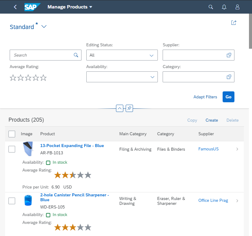
(2) Example of the list report floor plan on the screen size of a tablet. The size of the controls is increased to allow for interaction by touch. The filter fields are hidden, and some table columns move into the pop-in area.
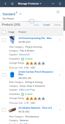
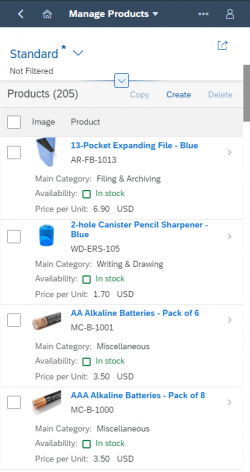
(3) Example of the list report floorplan on a smartphone. Nearly all table columns move into the pop-in area.

Example of Adaptive Design

Sometimes, less is more. For the same app above, the smartphone version might simply show fewer columns per item by default – enabling the user to see more items at once.

Fewer default columns on a smartphone

Implementation

Think “mobile first”: Starting with mobile design first helps you stay focused. Begin with the core functionality and progressively enhance features for larger devices.

  • If you are using desktop controls, replace them with responsive controls for a mobile device. However, we do not recommend using the sap.ui.commons library.
  • Analytical table, tree table and grid table are not fully responsive. They are available only for desktops and tablets, so when you use them you will need to take an adaptive approach by offering an additional UI for smartphones.

Use responsive controls: Most SAPUI5 controls are based on mobile controls. This means that they work on touch devices, or with a mouse and keyboard.

Properly configure the controls: Follow the guidelines to configure the responsive settings for the different controls.

Use the correct size settings: Set your apps to “large” on touch devices and to “medium” for devices operated by mouse or keyboard.

Use responsive layouts: There are several layout options available, which allow you to adjust to different sizes.

Use letterboxing: Many of the worklist apps do not have much content. By letterboxing them (restricting their width to a maximum of 1280 px), you can optimize the layout of the app and achieve a more compact look.

Too many functions? If the desktop app has too much functionality and is too complex to be used on a tablet or smartphone, you might have to switch off some functionality on your mobile device:

  • Hide editing functionality and focus on display
  • Hide functions from toolbar
  • Hide alternative columns and views in tables

Summary and Quick Guidelines

  • SAP Fiori apps must be able to run on all three major device types: desktop, tablet, and smartphone.
  • If app functionality and information can be offered equally on all device types, responsive methods should be used to automatically adjust the app.
  • If app functionality and/or information cannot be offered unaltered on different device types (due to the use case, the available screen real estate, or the device capabilities), the app should be adjusted manually according to device-specific requirements.
  • Adaptive and responsive methods can be mixed.

SAP Fiori

SAP Fiori is a design system that provides a consistent user experience for SAP software across platforms and devices. It is at the core of SAP’s product experience and design strategy.

With SAP Fiori we offer design solutions that are usable, robust, scalable, and of enterprise-grade quality – implemented in several reference technologies.

The SAP Fiori design system:

  • Accelerates and scales the design and development of enterprise software.
  • Follows a modular design approach based on business roles, moving away from traditional monolithic transactions.
  • Redefines the enterprise user experience by focusing on user tasks and workflows.

Components of the SAP Fiori Design System

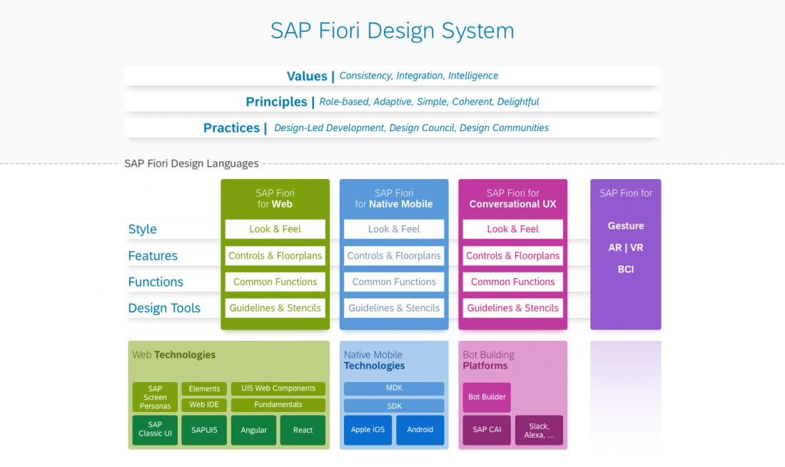
The SAP Fiori design system provides three different platform-specific design languages

The SAP Fiori design system operates on two levels:

  • Universal values, principles, and practices apply across all technology platforms.
  • SAP Fiori design languages provide standardized design guidance across multiple platforms.

Universal Values, Principles, and Practices

The following fundamental values, principles, and practices inform the SAP Fiori Design:

Values Consistency Offer design solutions that can be adopted by all UI technologies and scenarios across the entire range of the SAP portfolio, leveraging the expertise of the entire SAP design community.
Integration Provide solutions to integrate different independent products and technologies into an environment that is coherent and easy to use.
Intelligence Establish machine learning and artificial intelligence as an integral part of the user experience, with a focus on enabling the user rather than taking away control.
See also: Designing Intelligent Systems
Principles Role-based Provide the right information at the right time.
Adaptive Enable users to work where they want, on the device of their choice.
Simple Help users focus on what is important.
Coherent Provide the same intuitive and consistent experience across the enterprise.
Delightful Enrich the user’s work experience.
Practices Design-led development Put user experience at the heart of the product lifecycle.

See also: Design-Led Development Process


SAP Fiori Design Languages

The SAP Fiori design system supports multiple technology platforms – web, native mobile, and conversational UX. We refer to the variants for each platform as SAP Fiori design languages.

While the fundamental design approach is standardized across all platforms, the design languages cater for the specifics of the respective technology platforms. Each design language details out the look and feel, the available controls and floorplans/pages, and common functions like navigation and search.

The SAP Fiori design languages are already implemented in key reference technologies, including SAPUI5 for browser-based applications and SAP Cloud Platform Software Development Kits (SDK) for native Apple iOS and Android. This is complemented by comprehensive design guidelines and UI kits for app designers.

With this parallel approach, designing interactions for enterprise business scenarios can be simplified, accelerated, and unified across multiple platforms.

Using the SAP Fiori Design System

The SAP Fiori design system has been developed primarily to support internal development of SAP business applications.

However, we also make it available to our customers and partners to share the experience we have gained in more than 40 years as the leader in enterprise software.

We provide public access to the following resources:

SAP Fiori Evolution

SAP Fiori has evolved out of a small initiative into an industry-scale design system for all SAP products. The latest evolution is the new Horizon theme, which introduces an enhanced visual experience across all platforms, with improved accessibility, focus, and branding options. It’s designed to help users get even more out of the consistency, integration and intelligence features that came with Fiori 3. Read on to find out more about the key milestones.


SAP Fiori 1.0

SAP Fiori started in 2013 as an initiative to re-imagine business software by applying a “mobile first” design approach to the most frequently used use cases. Based on the principles of role-based, simple, responsive, coherent and delightful apps, this laid the foundation for a new design system.

With the first version of SAP Fiori we started breaking down large and monolithic business transactions into focused, task-based apps. Starting with a core feature set suitable for smartphones, the design process was geared towards offering more comprehensive functionality when moving up to larger devices, such as tablets or desktop computers. All aspects of the new Fiori for Web design language had to be carefully designed to adjust to any device, regardless of whether it was operated with a mouse and keyboard or by touch. This first version of SAP Fiori was implemented and evolved in our reference technology for browser-based applications SAPUI5 (versions 1.26 – 1.38), which is also available open source under the name OpenUI5. 

Key features of SAP Fiori 1.0

  • Break down monolithic transactions into role-based and task-focused apps. 
  • Enable a responsive experience across all devices. 
  • Make use of modern and mobile-inspired interaction patterns.  

SAP Fiori 2.0

Following the success of the initial version of SAP Fiori, we needed to introduce new capabilities to ready SAP Fiori as a design system for all the scenarios SAP software addresses. With SAP Fiori 2.0, the design grew into a system that would not only be able to address simple use cases, but that would offer intuitive solutions for even the most complex business scenarios. As the new face for SAP’s flagship product SAP S/4HANA, SAP Fiori 2.0 introduced new floorplans that could accommodate large amounts of information and complex functionality in an intuitive and responsive way. Moreover, SAP Fiori 2.0 came with a new integrated and powerful user environment, based in the SAP Fiori launchpad, which introduced productivity features like notifications and improved navigation. With its second iteration, SAP Fiori introduced a new productivity tool, which evolved over time into the conversational digital assistant SAP CoPilot. 

Awarded with the prestigious Red Dot Award, SAP Fiori 2.0 was launched in October 2016. Soon after that, an additional award honored the innovative approach for integrating transactional and analytical features to leverage the possibilities of SAP’s in-memory technologiesAgain, SAP Fiori 2.0 was implemented in SAPUI5 as the primary reference technology (version 1.42 – 1.70). In addition to this, SAP Fiori 2.0 was applied to a redesign of classic UI technologies like SAP GUI for Web, WebDynpro and CRM WebClient to offer a more coherent experience across technologies. Other product areas started adopting aspects of SAP Fiori 2.0, such as the new Belize theme to better integrate with SAP S/4HANA. With SAP Fiori for iOS, the first version of the SAP Fiori design system for native mobile platforms was released in partnership with Apple. Two years later, SAP Fiori for Android was announced as a result of a partnership with Google. 

Key features of SAP Fiori 2.0

  • Scale the role-based and task-focused design approach to complex enterprise scenarios and native mobile platforms. 
  • Offer a powerful productivity environment for business users with new scalable floorplans and patterns, including embedded analytics, notifications, search, and improved navigation. 
  • Introduce conversational interaction and machine intelligence. 

SAP Fiori 3

The third iteration of SAP Fiori was announced in 2018. The continued success and its proven ability to scale and integrate latest trends and requirements already had established SAP Fiori as the design system for the intelligent enterprise. All product areas committed to work towards the adoption of SAP Fiori 3 as the design system that would integrate the experience of all SAP products. This decision was operationalized in a newly established product standard for UX consistency. 

As well as a new Quartz theme, SAP Fiori 3 introduced a number of new features that facilitate the integration of all SAP products to provide one coherent and consistent user experience. Some of the most important aspects are: 

  • The top-most screen area, referred to as shell bar, has been redesigned to support all navigation and functional requirements found in the different products, and will include the possibility to switch between independent products. 
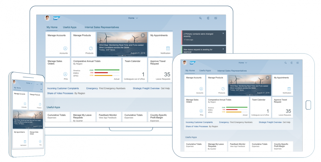
  • Home pages are being redesigned to offer greater flexibility in terms of the level of detail offered. Simple navigation links complement the tiles provided in earlier versions, and we are working on detail cards to offer more information at a glance.
  • A user can have multiple home pages, known as spaces. These can be provided by the organization to offer access to various domains and contexts, integrating the powerful possibilities of overview pages into the same lifecycle as the home pages. 

SAP Fiori 3 also takes a huge stride forward in integrating machine intelligence into the business environment by offering a more integrated experience for conversational interaction, machine-generated ratings and recommendations, and a whole set of design principles that ensure a human-centric approach to the interaction design for intelligent systems. With the concept of business situations, the system now can detect critical business contexts independently of predefined processes and workflows and recommend possible solutions to resolve them. 

The number of technologies supporting the Fiori 3 design system has been extended beyond the established reference technology SAPUI5 and the classic UI technologies to include the latest web technologies based on frameworks like Angular, React or Vue, and Web Components 

Key features of SAP Fiori 3

  • Establishes basic rules for consistency across all SAP products
  • New Quartz theme
  • New aligned shell bar for all SAP products
  • Greater flexibility for home pages
  • Integration of machine intelligence, focusing on a human-centric approach
  • Adoption across a broader range of technologies 

SAP Fiori with Horizon

The new Horizon theme is an evolution of the SAP Fiori design system. The theme offers a modern and fresh look with a new vibrant color palette, rounded corners, and softer shapes. The Horizon theme also comes with a new Horizon icon font and optimized typography.

All elements have been designed with accessibility in mind, and the Horizon theme follows the recommendations for the W3C Web Content Accessibility Guidelines WCAG 2.2. (“Perceivable” principle). Stronger contrasts, improved spacing, and a clearer visual hierarchy make it easier for everyone to work intuitively.

Four Horizon themes are available:

  • Morning Horizon (light version)
  • Evening Horizon (dark version)
  • High Contrast White (accessibility version)
  • High Contrast Black (accessibility version)

Horizon is generally available for productive use by customer and partner development teams using SAP’s UI technologies for developing web-apps as well as native mobile apps. For web apps developed with SAP Business Technology Platform, Horizon was made generally available for productive use with SAPUI5 version 1.102.

SAP Fiori with Morning Horizon theme

Key features of SAP Fiori with the Horizon theme

  • New vibrant color palette that meets WCAG AA accessibility standards
  • Enhanced customer branding options
  • New icon set across all platforms
  • Enhanced focus with more contrast, space, and visual hierarchy
  • Two flavors (light and dark), plus two high-contrast accessibility themes

Related Links

SAP Fiori

SAP Fiori is a design system that provides a consistent user experience for SAP software across platforms and devices. It is at the core of SAP’s product experience and design strategy.

With SAP Fiori we offer design solutions that are usable, robust, scalable, and of enterprise-grade quality – implemented in several reference technologies.

The SAP Fiori design system:

  • Accelerates and scales the design and development of enterprise software.
  • Follows a modular design approach based on business roles, moving away from traditional monolithic transactions.
  • Redefines the enterprise user experience by focusing on user tasks and workflows.

Components of the SAP Fiori Design System

The SAP Fiori design system provides three different platform-specific design languages

The SAP Fiori design system operates on two levels:

  • Universal values, principles, and practices apply across all technology platforms.
  • SAP Fiori design languages provide standardized design guidance across multiple platforms.

Universal Values, Principles, and Practices

The following fundamental values, principles, and practices inform the SAP Fiori Design:

Values Consistency Offer design solutions that can be adopted by all UI technologies and scenarios across the entire range of the SAP portfolio, leveraging the expertise of the entire SAP design community.
Integration Provide solutions to integrate different independent products and technologies into an environment that is coherent and easy to use.
Intelligence Establish machine learning and artificial intelligence as an integral part of the user experience, with a focus on enabling the user rather than taking away control.
See also: Designing Intelligent Systems
Principles Role-based Provide the right information at the right time.
Adaptive Enable users to work where they want, on the device of their choice.
Simple Help users focus on what is important.
Coherent Provide the same intuitive and consistent experience across the enterprise.
Delightful Enrich the user’s work experience.
Practices Design-led development Put user experience at the heart of the product lifecycle.

See also: Design-Led Development Process


SAP Fiori Design Languages

The SAP Fiori design system supports multiple technology platforms – web, native mobile, and conversational UX. We refer to the variants for each platform as SAP Fiori design languages.

While the fundamental design approach is standardized across all platforms, the design languages cater for the specifics of the respective technology platforms. Each design language details out the look and feel, the available controls and floorplans/pages, and common functions like navigation and search.

The SAP Fiori design languages are already implemented in key reference technologies, including SAPUI5 for browser-based applications and SAP Cloud Platform Software Development Kits (SDK) for native Apple iOS and Android. This is complemented by comprehensive design guidelines and stencils for app designers.

With this parallel approach, designing interactions for enterprise business scenarios can be simplified, accelerated, and unified across multiple platforms.

Using the SAP Fiori Design System

The SAP Fiori design system has been developed primarily to support internal development of SAP business applications.

However, we also make it available to our customers and partners to share the experience we have gained in more than 40 years as the leader in enterprise software.

We provide public access to the following resources:

SAP Fiori Evolution

SAP Fiori has evolved out of a small initiative into an industry-scale design system for all SAP products. The latest evolution is the new Horizon theme, which introduces an enhanced visual experience across all platforms, with improved accessibility, focus, and branding options. It’s designed to help users get even more out of the consistency, integration and intelligence features that came with Fiori 3. Read on to find out more about the key milestones.


SAP Fiori 1.0

SAP Fiori started in 2013 as an initiative to re-imagine business software by applying a “mobile first” design approach to the most frequently used use cases. Based on the principles of role-based, simple, responsive, coherent and delightful apps, this laid the foundation for a new design system.

With the first version of SAP Fiori we started breaking down large and monolithic business transactions into focused, task-based apps. Starting with a core feature set suitable for smartphones, the design process was geared towards offering more comprehensive functionality when moving up to larger devices, such as tablets or desktop computers. All aspects of the new Fiori for Web design language had to be carefully designed to adjust to any device, regardless of whether it was operated with a mouse and keyboard or by touch. This first version of SAP Fiori was implemented and evolved in our reference technology for browser-based applications SAPUI5 (versions 1.26 – 1.38), which is also available open source under the name OpenUI5. 

Key features of SAP Fiori 1.0

  • Break down monolithic transactions into role-based and task-focused apps. 
  • Enable a responsive experience across all devices. 
  • Make use of modern and mobile-inspired interaction patterns.  

SAP Fiori 2.0

Following the success of the initial version of SAP Fiori, we needed to introduce new capabilities to ready SAP Fiori as a design system for all the scenarios SAP software addresses. With SAP Fiori 2.0, the design grew into a system that would not only be able to address simple use cases, but that would offer intuitive solutions for even the most complex business scenarios. As the new face for SAP’s flagship product SAP S/4HANA, SAP Fiori 2.0 introduced new floorplans that could accommodate large amounts of information and complex functionality in an intuitive and responsive way. Moreover, SAP Fiori 2.0 came with a new integrated and powerful user environment, based in the SAP Fiori launchpad, which introduced productivity features like notifications and improved navigation. With its second iteration, SAP Fiori introduced a new productivity tool, which evolved over time into the conversational digital assistant SAP CoPilot. 

Awarded with the prestigious Red Dot Award, SAP Fiori 2.0 was launched in October 2016. Soon after that, an additional award honored the innovative approach for integrating transactional and analytical features to leverage the possibilities of SAP’s in-memory technologiesAgain, SAP Fiori 2.0 was implemented in SAPUI5 as the primary reference technology (version 1.42 – 1.70). In addition to this, SAP Fiori 2.0 was applied to a redesign of classic UI technologies like SAP GUI for Web, WebDynpro and CRM WebClient to offer a more coherent experience across technologies. Other product areas started adopting aspects of SAP Fiori 2.0, such as the new Belize theme to better integrate with SAP S/4HANA. With SAP Fiori for iOS, the first version of the SAP Fiori design system for native mobile platforms was released in partnership with Apple. Two years later, SAP Fiori for Android was announced as a result of a partnership with Google. 

Key features of SAP Fiori 2.0

  • Scale the role-based and task-focused design approach to complex enterprise scenarios and native mobile platforms. 
  • Offer a powerful productivity environment for business users with new scalable floorplans and patterns, including embedded analytics, notifications, search, and improved navigation. 
  • Introduce conversational interaction and machine intelligence. 

SAP Fiori 3

The third iteration of SAP Fiori was announced in 2018. The continued success and its proven ability to scale and integrate latest trends and requirements already had established SAP Fiori as the design system for the intelligent enterprise. All product areas committed to work towards the adoption of SAP Fiori 3 as the design system that would integrate the experience of all SAP products. This decision was operationalized in a newly established product standard for UX consistency. 

As well as a new Quartz theme, SAP Fiori 3 introduced a number of new features that facilitate the integration of all SAP products to provide one coherent and consistent user experience. Some of the most important aspects are: 

  • The top-most screen area, referred to as shell bar, has been redesigned to support all navigation and functional requirements found in the different products, and will include the possibility to switch between independent products. 
  • Home pages are being redesigned to offer greater flexibility in terms of the level of detail offered. Simple navigation links complement the tiles provided in earlier versions, and we are working on detail cards to offer more information at a glance.
  • A user can have multiple home pages, known as spaces. These can be provided by the organization to offer access to various domains and contexts, integrating the powerful possibilities of overview pages into the same lifecycle as the home pages. 

SAP Fiori 3 also takes a huge stride forward in integrating machine intelligence into the business environment by offering a more integrated experience for conversational interaction, machine-generated ratings and recommendations, and a whole set of design principles that ensure a human-centric approach to the interaction design for intelligent systems. With the concept of business situations, the system now can detect critical business contexts independently of predefined processes and workflows and recommend possible solutions to resolve them. 

The number of technologies supporting the Fiori 3 design system has been extended beyond the established reference technology SAPUI5 and the classic UI technologies to include the latest web technologies based on frameworks like Angular, React or Vue, and Web Components 

Key features of SAP Fiori 3

  • Establishes basic rules for consistency across all SAP products
  • New Quartz theme
  • New aligned shell bar for all SAP products
  • Greater flexibility for home pages
  • Integration of machine intelligence, focusing on a human-centric approach
  • Adoption across a broader range of technologies 

SAP Fiori with Horizon

The new Horizon theme is an evolution of the SAP Fiori design system. The theme offers a modern and fresh look with a new vibrant color palette, rounded corners, and softer shapes. The Horizon theme also comes with a new Horizon icon font and optimized typography.

All elements have been designed with accessibility in mind, and the Horizon theme supports the W3C Web Content Accessibility Guidelines (WCAG) 2.2. Stronger contrasts, improved spacing, and a clearer visual hierarchy make it easier for everyone to work intuitively.

Four Horizon themes are available:

  • Morning Horizon (light version)
  • Evening Horizon (dark version)
  • High Contrast White (accessibility version)
  • High Contrast Black (accessibility version)

Horizon is generally available for productive use by customer and partner development teams using SAP’s UI technologies for developing web-apps as well as native mobile apps. For web apps developed with SAP Business Technology Platform, Horizon was made generally available for productive use with SAPUI5 version 1.102.

SAP Fiori with Morning Horizon theme

Key features of SAP Fiori with the Horizon theme

  • New vibrant color palette that meets WCAG AA accessibility standards
  • Enhanced customer branding options
  • New icon set across all platforms
  • Enhanced focus with more contrast, space, and visual hierarchy
  • Two flavors (light and dark), plus two high-contrast accessibility themes

Related Links

Design Principles

SAP Fiori provides a consistent and holistic user experience for SAP software. By creating visually pleasing designs with a strong focus on ease of use, the experience is intuitive and simple, across all devices. With effortless interaction patterns, the SAP Fiori UX is designed for a powerful impact across your enterprise.

Design Principles

The design philosophy of SAP Fiori is based on five core principles. SAP Fiori user experience is role-based, adaptive, simple, coherent, and delightful.

ROLE-BASED

SAP Fiori is designed for your business, your needs, and how you work. It draws from our broad insights on the multifaceted roles of today’s workforce. SAP Fiori provides the right information at the right time and reflects the way you actually work.

DELIGHTFUL

Apart from making you work smarter, SAP Fiori also enriches your work experience by allowing you to simply do your job.

COHERENT

Whether you fulfill a sales order, review your latest KPIs, or manage leave requests – SAP Fiori adheres to a consistent interaction and visual design language. Across the enterprise, you enjoy the same intuitive and consistent experience.

SIMPLE

With SAP Fiori, you can complete your job intuitively and quickly. SAP Fiori helps you focus on what is important – essential functions are easy to use and you can personalize the experience to focus on your relevant tasks and activities.

ADAPTIVE

SAP Fiori enables you to work how and where you want, regardless of the device you use. And, it provides relevant information that allows for instant insight.

Responsive Spacing System

The responsive spacing system uses responsive padding and margin style sheet classes to control and optimize padding between elements that are common to all SAP Fiori interfaces.

Responsive Padding and Margin Classes

Responsive padding and margin classes control:

  • The left and right spacing within the header and content areas
  • The space between components, such as tables and forms

These classes adapt to different screen sizes at specific breakpoints to ensure that no space is wasted on small screens and that content has more room to breathe on large screens:

  • Size S screen: Up to 599 pixels
  • Size M screen: Between 600 pixels and 1023 pixels
  • Size L screen: Between 1024 pixels and 1439 pixels
  • Size XL screen: 1440 pixels or more

The visual below illustrates how the padding adapts to different screen sizes.

Spacing adapts to different screen sizes
Developer Hint
The spacing system is built into SAP Fiori Elements, but it must be implemented manually in freestyle SAP Quartz-themed applications using the responsive margin and padding classes in SAPUI5. You can use individual spacing and padding classes to apply individual spacing inside or around controls.

More Information

Resources

Elements and Controls

Implementation

Multi-Device Support: Responsive vs. Adaptive

For our typical users who work on-the-go, the ability to switch between desktop and mobile devices is critical. As users increasingly come to expect consistent performance and a coherent look and feel across their devices, how can we make sure that we deliver a great user experience with our Fiori apps? The answer is through responsive and adaptive design.

Responsive and adaptive design allow Fiori apps to run on desktop, tablets, smartphones, and hybrid devices. As users switch across devices, our apps automatically accommodate the resolution, image size, and scripting. This way, our users can work how and where they want, regardless of device.

Responsive Design

One of the most compelling factors of SAP Fiori is that our applications need to be developed, configured and maintained only once for all changes to become effective across all devices. This way, the end user gets a consistent experience no matter which device he or she uses. SAPUI5 makes responsive design easy by offering a wide range of UI controls that automatically adjust to different form factors and interaction styles. Additionally, SAPUI5 lets you adjust the size of the controls to match the type of interaction (such as touch device or keyboard/mouse). The advantage of responsive design is that apps can adjust to different screen sizes without requiring additional coding and maintenance efforts.

Responsive Grid

Responsive design is supported by a responsive grid.

The responsive grid positions UI elements in a 12-column flow layout. It can be configured to display a variable number of columns depending on available screen size. With this control, it is possible to achieve flexible layouts and line breaks for large, medium, and small-sized screens, such as desktop, tablet, and mobile.

Adaptive Design

There are certain use cases where a responsive approach may not be appropriate. For instance, you would probably prefer to enter large amounts of data on your desktop. At the same time, you may only want to view the data you entered or perhaps enter a small subset of data on your tablet or smartphone. In such cases, it makes sense to design for different devices and adapt the complexity of the use case according to the specific device. This is what we call adaptive design. This approach requires app developers to manually define specific designs for the different form factors. It means slightly more effort, but also allows for more targeted support of device-specific use cases.

Examples of Responsive Design

The following 3 example shows how a standard list report floorplan would translate to different devices in a (semi-)responsive way.

For these examples, the following responsive design concepts apply:

  • Content density: Compact content density mode is activated on desktop mode. On touch devices, the finger-friendly cozy mode is activated. Read more about content density.
  • Filters: On a desktop, the filter fields are fully displayed. On a tablet or phone, the filter bar should be collapsed as default. Read more about filters.
(1) Example of a list report floor plan on a desktop device. The filter bar is displayed and all the table columns show side by side.
(2) The same application, this time adapted to the screen size of a tablet. The size of the controls is increased to allow for interaction by touch. The filter fields are hidden, and some table columns move into the pop-in area.
(3) The same application now displayed on a smartphone. Nearly all table columns move into the pop-in area.

Example of Adaptive Design

Sometimes, less is more. For the same app above, the smartphone version might simply show fewer columns per item by default – enabling the user to see more items at once.

Fewer default columns on a smartphone

Implementation

Think “mobile first”: Starting with mobile design first helps you stay focused. Begin with the core functionality and progressively enhance features when moving to larger devices.

  • If you are using desktop controls, replace them with responsive controls when running on a mobile device. You can still use the sap.ui.table library. However, we do not recommend using the sap.ui.commons library.
  • If you are using the ALV (analytical table), replace it with the responsive table (sap.m) or another specific solution for the use case (for example, charts, texts, and KPIs).

Use responsive controls: Most SAPUI5 controls are based on mobile controls. This means that they work on touch devices, or with a mouse and keyboard.

Properly configure the controls: Follow the guidelines to configure the responsive settings for the different controls.

Use the correct size settings: Set your apps to “large” on touch devices and to “medium” for devices operated by mouse or keyboard.

Use responsive layouts: There are several layout options available, which allow you to adjust to different sizes.

Use letterboxing: Many of the worklist apps do not have much content. By letterboxing them (restricting their width to a maximum of 1280 px), you can optimize the layout of the app and achieve a more compact look.

Too many functions? If the desktop app has too much functionality and is too complex to be used on a tablet or smartphone, you might have to switch off some functionality on your mobile device:

  • Hide editing functionality and focus on display
  • Hide functions from toolbar
  • Hide alternative columns and views in tables

Summary and Quick Guidelines

  • SAP Fiori apps must be able to run on all three major device types: desktop, tablet, and smartphone.
  • If app functionality and information can be offered equally on all device types, responsive methods should be used to automatically adjust the app.
  • If app functionality and/or information cannot be offered unaltered on different device types (due to the use case, the available screen real estate, or the device capabilities), the app should be adjusted manually according to device-specific requirements.
  • Adaptive and responsive methods can be mixed.

Accessibility in SAP Fiori

Accessibility refers to the possibility for everyone, including and especially people with disabilities, to access and use information and communication technology. It is an integral part of the SAP Fiori design system and SAPUI5.

Accessibility support is incorporated at two levels:

  • Framework level: Many fundamental accessibility features are built into the core design elements up front and are available to app teams out of the box. This ensures consistency across all products.
  • App level: Some accessibility features need to be added or adapted to reflect app-specific context. These need to be considered whenever you design an app.

This article outlines how accessibility requirements are handled in the SAPUI5 reference framework:

Accessibility Provided at Framework Level

Visualization

Minimum contrast: Following the requirements of the international Web Content Accessibility Guidelines WCAG 2.1, SAP Fiori’s default theme was designed to fulfill the requirements for minimum color contrast. In addition, we provide high-contrast themes that support the required contrast ratio of 7:1 for texts. They can be chosen in the user settings. The individual theme choice is saved as a preference until the user changes it again.

More information:

Consistency of icons: A comprehensive icon library ensures consistent icon usage within a product and also across products. The icon library includes predefined descriptions. This enables the development teams not only to use consistent icons, but also to implement meaningful descriptions for tooltips as a textual alternative for graphical representation. However, in some cases you may need to adapt these descriptions to the specific use case.

For more information, see Iconography.

Keyboard focus visualization design: Focus visualization is very important for user efficiency. SAP Fiori uses a contrast ratio that makes the current focus stand out in all themes.

Layout adaptation for different devices: Since SAP Fiori can run on various devices, it comes with a responsive layout that adapts to the display resolution parameters of the individual device.

For more information, see Multi-Device Support: Responsive vs. Adaptive.

Support for text resizing: Users can adjust the font size themselves using the browser zoom. The responsive layout adapts to these manual adjustments automatically.

For more information, see Multi-Device Support: Responsive vs. Adaptive.


Keyboard Support

Keyboard navigation and control interaction: All standard UI elements and controls are designed to be keyboard-enabled. All suitable input channels (such as mouse, keyboard, or touch) are treated equally according to the capabilities of the device or the individual preferences of the user. For example, some users may prefer using the keyboard instead of a mouse, which lets them work faster.

For more information, see SAPUI5 keyboard support on SAP Help Portal.

Tab order of controls: According to the placement of controls on the screen, SAPUI5 supports keyboard navigation with a predefined tab order sequence. This includes the tab order for the floorplan, the sequence of accessing individual applications, and the navigation in the application itself. According to control containers and layout, the application needs to be designed to support this order (left-right-top-bottom for western languages, for example).


Messaging Patterns

Standard messaging patterns (busy, errors, notifications): In SAP Fiori, a message system is implemented. This ensures that system messages appear at predefined locations with a consistent design.

For more information, see Message Handing.

Screen Reader Enablement

Screen readers retrieve visible and invisible textual information, as well as structural information from the user interface, in order to provide it as speech output or braille output to the end user. The SAPUI5 framework is technically prepared for screen reader support. This means that all the structural information and texts needed are handed over to assistive technology. Nevertheless, the actual structure, as well as the actual visible and invisible texts, need to be defined at application level.

Supporting Accessibility at App Level

Many requirements are already covered by the technology framework, but design aspects that are related to the individual purpose of the application still need to be implemented by the individual design teams. Here are some examples:

Understanding

Status updates, messages, error handling: Although the shape and appearance of system messages is predefined, ensure that the message content is clear and easy to understand. For error messages, indicate the location of the error and how to fix it.

Labels, tooltips, and placeholders: Define meaningful labels. Use tooltips according to the guideline, and ensure that they are relevant. Define clear placeholders in input fields where appropriate. For more information on placeholders, see Mask Input and Input Field.

Keyboard Operation

Initial focus position: To enable users to work through a task efficiently, always set an initial focus for the task. Set the focus to either the first logical interaction element or the first element in the task.

Structure and fast navigation: Ensure that the navigation within your application is logical and follows the task structure for the intended purpose. When designing apps with a large set of functions or information blocks, always form logical groups to help users navigate efficiently. You can form logical groups using a container, a toolbar, or other grouping elements. To enable faster navigation, SAPUI5 allows users to skip groups (with F6 or Shift+F6). Also, enable direct keyboard navigation to logical groups, such as working areas or navigation areas.

Keyboard shortcuts (hot keys): While some keyboard shortcuts are supported at framework level (such as Ctrl+A to select all items), others must be defined at application level (a common one is Ctrl+S to save the current object). Support for keyboard shortcuts in SAP Fiori differs from the default browser behavior: all keyboard shortcut commands are captured by the application except Ctrl-L, which is needed to jump to the browser address bar. From there, all browser keyboard shortcuts are available. Observe industry standards and de-facto standards.

Screen Reader Support

Although screen reader support is technically prepared at framework level, it is still the developer’s task to arrange the individual UI elements in relationships that are needed for a screen reader. This is done by using appropriate floorplans, layouts, and controls for the respective use cases.

Alternative texts: Images need alternative texts and descriptions, unless they are purely decorative. Also, the default texts for icons, image placeholders, and other graphical elements may not be available or suitable for your application use case. Always review these texts, and replace or redefine them where necessary.

Landmarks: Landmarks are used by assistive technologies (such as screen readers) to provide a meaningful overview of a page or specific parts of a page. Define landmarks when you use an object page, dynamic page, or panel, for example.

For more information, see the landmark options in the corresponding API documentation:

Changes That Impair Accessibility

Be aware that any changes in the framework definitions can impair accessibility support.

Custom controls: SAP Fiori and SAPUI5 comprise an extensive set of controls. These controls come with numerous features that support accessible implementation, including keyboard enablement, resizing behavior, or support for theme changes. If you think that your use case requires a custom control, think twice. A custom control needs to fit into the interaction concept, and all the features must be coded by the app team. This includes accessibility requirements, but also many other aspects, such as globalization and writing modes (left-to-right or right-to-left), security, performance, maintenance, or documentation. Before developing a custom control, always check if your use case can be handled by existing controls. However, it is important to use controls only for their intended purpose.

For more information, see the SAPUI5 documentation.

Custom colors: Change individual colors only in exceptional cases and after very careful consideration. Bear in mind that any color changes must also be applied to the different UI element states (such as active, hovered, or inactive buttons). Additionally, these changes may not work with theme changes or high-contrast modes of the underlying operating system. When changing a single color, you may need to create an entirely new theme to ensure that the appearance of your app remains coherent and consistent.

Fixed width or height:  If you set a fixed width or height, your app will no longer be responsive and adaptive. Information might get lost if the user resizes the application window, zooms, or changes the device, for example.

Embedded third party objects: An application is only as accessible as each of its parts. Embedded objects like (third party) maps or PDF forms (see PDF Viewer) often have accessibility issues. You need to either fix these issues or provide an alternative, accessible alternative way to retrieve the information and complete the task.

Related Links

Design Principles

SAP Fiori provides a consistent and holistic user experience for SAP software. By creating visually pleasing designs with a strong focus on ease of use, the experience is intuitive and simple, across all devices. With effortless interaction patterns, the SAP Fiori UX is designed for a powerful impact across your enterprise.

Design Principles

The design philosophy of SAP Fiori is based on five core principles. SAP Fiori user experience is role-based, adaptive, simple, coherent, and delightful.

ROLE-BASED

SAP Fiori is designed for your business, your needs, and how you work. It draws from our broad insights on the multifaceted roles of today’s workforce. SAP Fiori provides the right information at the right time and reflects the way you actually work.

DELIGHTFUL

Apart from making you work smarter, SAP Fiori also enriches your work experience by allowing you to simply do your job.

COHERENT

Whether you fulfill a sales order, review your latest KPIs, or manage leave requests – SAP Fiori adheres to a consistent interaction and visual design language. Across the enterprise, you enjoy the same intuitive and consistent experience.

SIMPLE

With SAP Fiori, you can complete your job intuitively and quickly. SAP Fiori helps you focus on what is important – essential functions are easy to use and you can personalize the experience to focus on your relevant tasks and activities.

ADAPTIVE

SAP Fiori enables you to work how and where you want, regardless of the device you use. And, it provides relevant information that allows for instant insight.

SAP Fiori

SAP Fiori is a design system that provides a consistent user experience for SAP software across platforms and devices. It is at the core of SAP’s product experience and design strategy.

With SAP Fiori we offer design solutions that are usable, robust, scalable, and of enterprise-grade quality – implemented in several reference technologies.

The SAP Fiori design system:

  • Accelerates and scales the design and development of enterprise software.
  • Follows a modular design approach based on business roles, moving away from traditional monolithic transactions.
  • Redefines the enterprise user experience by focusing on user tasks and workflows.

Components of the SAP Fiori Design System

The SAP Fiori design system provides three different platform-specific design languages

The SAP Fiori design system operates on two levels:

  • Universal values, principles, and practices apply across all technology platforms.
  • SAP Fiori design languages provide standardized design guidance across multiple platforms.

Universal Values, Principles, and Practices

The following fundamental values, principles, and practices inform the SAP Fiori Design:

Values Consistency Offer design solutions that can be adopted by all UI technologies and scenarios across the entire range of the SAP portfolio, leveraging the expertise of the entire SAP design community.
Integration Provide solutions to integrate different independent products and technologies into an environment that is coherent and easy to use.
Intelligence Establish machine learning and artificial intelligence as an integral part of the user experience, with a focus on enabling the user rather than taking away control.
See also: Designing Intelligent Systems
Principles Role-based Provide the right information at the right time.
Adaptive Enable users to work where they want, on the device of their choice.
Simple Help users focus on what is important.
Coherent Provide the same intuitive and consistent experience across the enterprise.
Delightful Enrich the user’s work experience.
Practices Design-led development Put user experience at the heart of the product lifecycle.

See also: Design-Led Development Process


SAP Fiori Design Languages

The SAP Fiori design system supports multiple technology platforms – web, native mobile, and conversational UX. We refer to the variants for each platform as SAP Fiori design languages.

While the fundamental design approach is standardized across all platforms, the design languages cater for the specifics of the respective technology platforms. Each design language details out the look and feel, the available controls and floorplans/pages, and common functions like navigation and search.

The SAP Fiori design languages are already implemented in key reference technologies, including SAPUI5 for browser-based applications and SAP Cloud Platform Software Development Kits (SDK) for native Apple iOS and Android. This is complemented by comprehensive design guidelines and stencils for app designers.

With this parallel approach, designing interactions for enterprise business scenarios can be simplified, accelerated, and unified across multiple platforms.

Using the SAP Fiori Design System

The SAP Fiori design system has been developed primarily to support internal development of SAP business applications.

However, we also make it available to our customers and partners to share the experience we have gained in more than 40 years as the leader in enterprise software.

We provide public access to the following resources:

SAP Fiori Evolution

SAP Fiori has evolved out of a small initiative into an industry-scale design system for all SAP products. The latest and third evolution of SAP Fiori focuses on consistency, integration and intelligence to ensure that SAP Fiori can be used to integrate all products into one intelligent enterprise suite. Read on to find out more about the key milestones.


SAP Fiori 1.0

SAP Fiori started in 2013 as an initiative to re-imagine business software by applying a “mobile first” design approach to the most frequently used use cases. Based on the principles of role-based, simple, responsive, coherent and delightful apps, this laid the foundation for a new design system.

With the first version of SAP Fiori we started breaking down large and monolithic business transactions into focused, task-based apps. Starting with a core feature set suitable for smartphones, the design process was geared towards offering more comprehensive functionality when moving up to larger devices, such as tablets or desktop computers. All aspects of the new Fiori for Web design language had to be carefully designed to adjust to any device, regardless of whether it was operated with a mouse and keyboard or by touch. This first version of SAP Fiori was implemented and evolved in our reference technology for browser-based applications SAPUI5 (versions 1.26 – 1.38), which is also available open source under the name OpenUI5. 

Key features of SAP Fiori 1.0

  • Break down monolithic transactions into role-based and task-focused apps. 
  • Enable a responsive experience across all devices. 
  • Make use of modern and mobile-inspired interaction patterns.  

SAP Fiori 2.0

Following the success of the initial version of SAP Fiori, we needed to introduce new capabilities to ready SAP Fiori as a design system for all the scenarios SAP software addresses. With SAP Fiori 2.0, the design grew into a system that would not only be able to address simple use cases, but that would offer intuitive solutions for even the most complex business scenarios. As the new face for SAP’s flagship product SAP S/4HANA, SAP Fiori 2.0 introduced new floorplans that could accommodate large amounts of information and complex functionality in an intuitive and responsive way. Moreover, SAP Fiori 2.0 came with a new integrated and powerful user environment, based in the SAP Fiori launchpad, which introduced productivity features like notifications and improved navigation. With its second iteration, SAP Fiori introduced a new productivity tool, which evolved over time into the conversational digital assistant SAP CoPilot. 

Awarded with the prestigious Red Dot Award, SAP Fiori 2.0 was launched in October 2016. Soon after that, an additional award honored the innovative approach for integrating transactional and analytical features to leverage the possibilities of SAP’s in-memory technologiesAgain, SAP Fiori 2.0 was implemented in SAPUI5 as the primary reference technology (version 1.42 – 1.70). In addition to this, SAP Fiori 2.0 was applied to a redesign of classic UI technologies like SAP GUI for Web, WebDynpro and CRM WebClient to offer a more coherent experience across technologies. Other product areas started adopting aspects of SAP Fiori 2.0, such as the new Belize theme to better integrate with SAP S/4HANA. With SAP Fiori for iOS, the first version of the SAP Fiori design system for native mobile platforms was released in partnership with Apple. Two years later, SAP Fiori for Android was announced as a result of a partnership with Google. 

Key features of SAP Fiori 2.0

  • Scale the role-based and task-focused design approach to complex enterprise scenarios and native mobile platforms. 
  • Offer a powerful productivity environment for business users with new scalable floorplans and patterns, including embedded analytics, notifications, search, and improved navigation. 
  • Introduce conversational interaction and machine intelligence. 

SAP Fiori 3

The third iteration of SAP Fiori was announced in 2018. The continued success and its proven ability to scale and integrate latest trends and requirements already had established SAP Fiori as the design system for the intelligent enterprise. All product areas committed to work towards the adoption of SAP Fiori 3 as the design system that would integrate the experience of all SAP products. This decision was operationalized in a newly established product standard for UX consistency. 

As well as a new Quartz theme, SAP Fiori 3 introduced a number of new features that facilitate the integration of all SAP products to provide one coherent and consistent user experience. Some of the most important aspects are: 

  • The top-most screen area, referred to as shell bar, has been redesigned to support all navigation and functional requirements found in the different products, and will include the possibility to switch between independent products. 
  • Home pages are being redesigned to offer greater flexibility in terms of the level of detail offered. Simple navigation links complement the tiles provided in earlier versions, and we are working on detail cards to offer more information at a glance.
  • A user can have multiple home pages, known as spaces. These can be provided by the organization to offer access to various domains and contexts, integrating the powerful possibilities of overview pages into the same lifecycle as the home pages. 

SAP Fiori 3 also takes a huge stride forward in integrating machine intelligence into the business environment by offering a more integrated experience for conversational interaction, machine-generated ratings and recommendations, and a whole set of design principles that ensure a human-centric approach to the interaction design for intelligent systems. With the concept of business situations, the system now can detect critical business contexts independently of predefined processes and workflows and recommend possible solutions to resolve them. 

The number of technologies supporting the Fiori 3 design system has been extended beyond the established reference technology SAPUI5 and the classic UI technologies to include the latest web technologies based on frameworks like Angular, React or Vue, and Web Components 

Key features of SAP Fiori 3

  • Establishes basic rules for consistency across all SAP products
  • New Quartz theme
  • New aligned shell bar for all SAP products
  • Greater flexibility for home pages
  • Integration of machine intelligence, focusing on a human-centric approach
  • Adoption across a broader range of technologies 

Resources

Design-Led Development Process

SAP is committed to designing role-based applications that address the needs of our end users across all lines of business, tasks, and devices. We believe this is the key to a great user experience (UX). But how do we guarantee a solid and consistent design for our customers and end users? The answer is SAP’s design-led development process.

Design-led development takes advantage of proven design thinking methods to achieve an optimal user experience. The process spans the entire development lifecycle, is simple and easy to follow, and provides a solid basis for scaling design as a whole. It fosters unity between designers and developers, while ensuring that the needs of the end user are addressed at every step along the way. Learn more about design-led development below. 

The Phases

Developing software is much more than just coding. It’s about building the right innovative solutions and putting the user first. That’s why exploring business challenges and innovation opportunities is your starting point. In the discover phase, you seek to understand your end users, their working methods, and their needs in more depth.

Only then do you move on to the design phase and create the initial prototypes for development. In the delivery phase, the app is implemented and tested. After that, it is ready to run at the customer site.

Of course, iterations are part of the approach and strongly recommended.

The design-led development process

It is essential to implement quality checkpoints to ensure that the product comes with the best possible UX. We recommend installing quality checkpoints for each phase. Depending on your setup, you might also consider reviewing related apps together to optimize the overall user experience.

Find out more about each process phase in the detail sections below:

Explore
Discover
Design
Deliver
Run & Scale

Explore

In the explore phase, you identify business challenges and innovation opportunities together with your customers and end users. The prioritized innovations then become part of the product roadmap.

Discover

Perhaps you already have a good idea of what your customers want and need, and what your end user’s tasks and challenges are. But what you really need is a holistic view of the business roles affected by your apps.

To get the relevant insights, you will need to visit your customers onsite, speak to everyone involved, and observe users doing their daily work. You should gain a clear understanding of all the business roles involved, their typical tasks and pain points, and the sequence of activities. By the end of the discover phase, you should know which apps need to be developed.

Take a look at our user research method cards to find the best method for your user research activities.

Design

Equipped with the findings from the discover phase, you’re now ready to start the design phase. Ideally, you can brainstorm in a multidisciplinary team, and come up with an initial prototype that you can validate with your end users.

Applying the SAP Fiori design guidelines during the design process will ensure that you build a consistent SAP Fiori user experience.

By the end of the design phase you will have a design that is ready to be implemented.

Deliver

Development can start once you’ve finished your initial design. During the deliver phase, you may still need to change some aspects of your design to incorporate ongoing user feedback, to optimize the app, or to allow for technical constraints.

Before you deploy your app, verify that the final implementation and design deliver the intended user experience to the targeted end users. For usability and consistency, also check that the final design and the implementation reflect the SAP Fiori design guidelines.

By the end of the deliver phase, you will be ready to run at the customer site.

Run & Scale

Now the app can be adopted: The system administrator makes the app available to the end users. During the run & deliver phase, you should find out how end users work with the app: Does the app make their work easier? Do they like using it? Do they find all the information they need? Are there any functions missing?

What you learn from the real-life user experience feeds back into the design-led development process and informs the next iteration of the solution.

It’s a Team Effort

Many different people contribute to the development process. Typically, these include:

  • The product owner, an area expert who is usually responsible for the whole family of apps in that area.
  • The user researcher, who drives the end user research and artifact consolidation.
  • The user experience designer, who creates mockups, prototypes, and design specifications.
  • The software developer, who implements the design.
  • The user assistance developer, who works on UI texts, terminology, and user assistance topics.
  • The quality expert, who sets up test activities and consolidates the results.

These are just the main roles. Depending on how you drive the process, you may need to extend this list.