
Invisible Message
The invisible message control provides a hidden message that can be used by assistive technologies, such as screen readers. Invisible messages provide information to users when the visible screen content changes dynamically (for example, when a page is refreshed).
When to Use
Use the invisible message if:
- You need to offer accessibility support to communicate dynamic changes on the interface that are visually perceptible.
- You need to provide a message for screen reader users independently of the focus position.
Do not use the invisible message if:
-
You want to provide static and visible, but non-focusable information for users of assistive technologies. Use the invisible text instead.
- You want to provide additional information for users of assistive technologies that is not available for sighted users. While you should not discriminate users of assistive technologies, you should also not give them “privileges” .
- You want to hide information. It might still be available for users of assistive technologies.
- You want to hide long texts. The information is probably important enough to be shown! Furthermore, short texts are far more convenient, even for users of assistive technologies.
Examples
The examples below show typical use cases for invisible messages.
Search
- Indicate when a results list is rendered following a search.
- Indicate the number of hits found.
- Provide a short hint on how to get to the result list.
Navigation within Dialogs
Indicate when the entire content of a dialog changes. Provide accessibility support for navigation in a dialog.
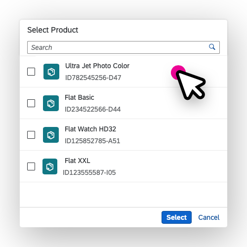
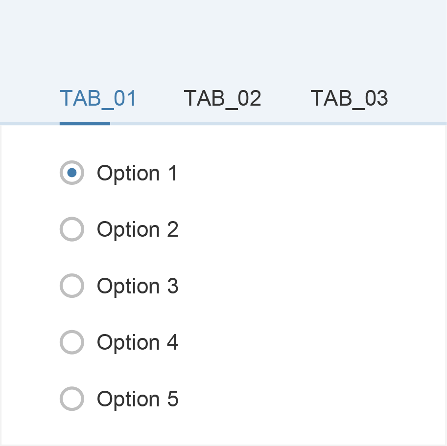
Dialog navigation - List
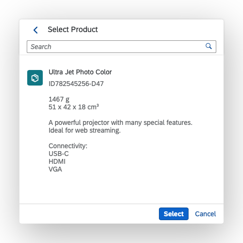
Dialog navigation - Details
Saving
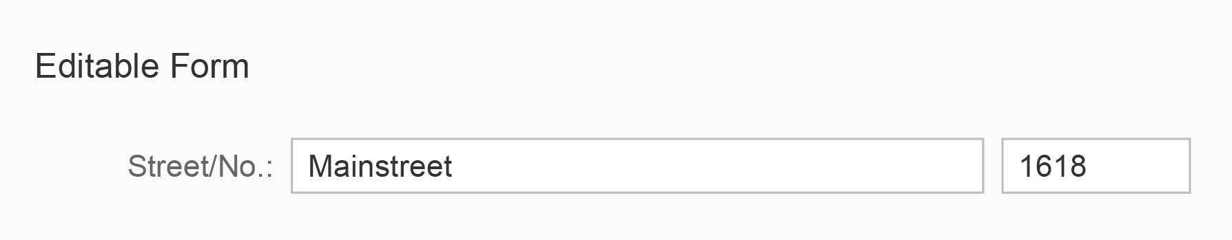
Indicate when the page or a form has been saved in apps with or without draft handling.
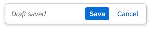
'Draft saved' indicator
Auto-Update
Use an invisible message to indicate:
- When a page has been refreshed
- When data on the page has been updated automatically
- When an entry in an input field has been corrected automatically
Deletion
Provide a success message when an item has been deleted. Refer to the UI text guidelines for message toasts.
Dynamic Messaging
Indicate when a message strip has appeared automatically and provide its content.

Information message strip
Dynamic Change in a Control
Indicate when a user action has changed the appearance of a control (for example, if pressing a button changes the button text or icon tooltip).

Toggle button with label change
Top Tips
- Provide short and meaningful texts.
- Avoid mentioning system or configuration details.
Related Links
Elements and Controls
- Invisible Text (Guidelines)
- Draft Handling (guidelines)
- Message Toast (guidelines)
- Message Strip (guidelines)


 Your feedback has been sent to the SAP Fiori design team.