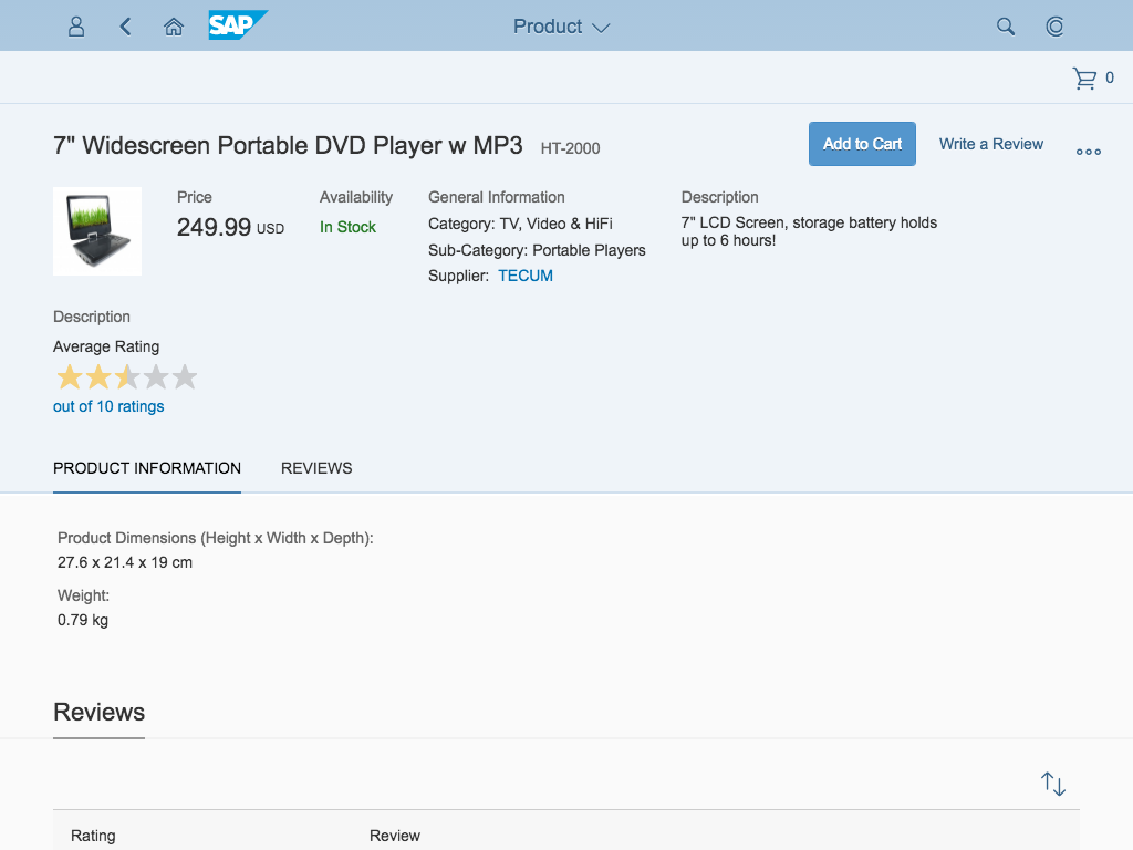
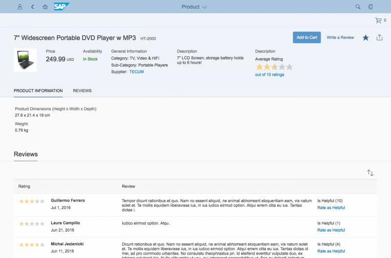
Carousel

The carousel allows the user to browse through a set of items. It always displays one item at a time. From the displayed item, the user can navigate to either the next or the previous item. The interaction resembles browsing through the pages of a book.

Optionally, a paging indicator displays the user’s current position inside the set of items.

The control is best known for browsing through a set of images, as it works best when the single items are represented in a way that the user can easily distinguish. Nonetheless, the carousel is not limited to displaying images; it can contain every sap.m control.

Usage

Use the carousel if:

  • You have strong visual representations of the items you want to display.
  • You want to display the items one after the other.

Do not use the carousel if:

  • The items you want to display need to be visible at the same time.
  • The items you want to display are uniform.

Responsiveness

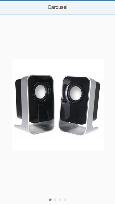
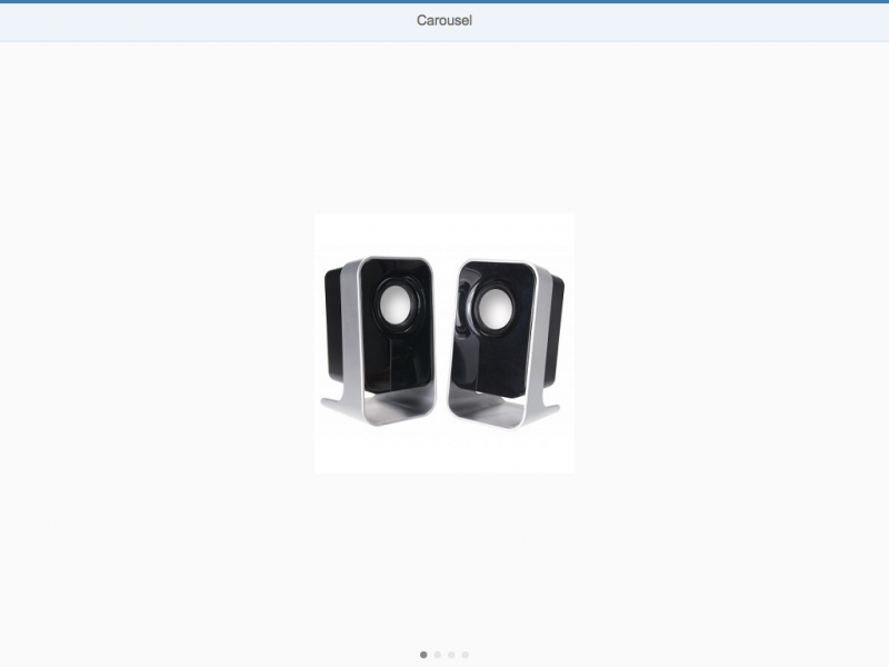
The size of the control’s content area is automatically adjusted to the amount of space available.

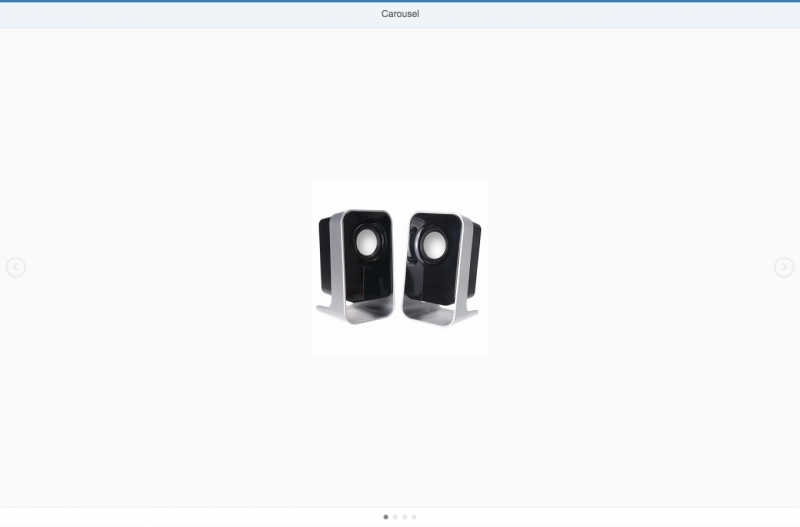
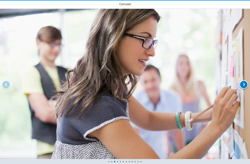
When used in non-touch mode, the user can navigate with forward and backward icons displayed on the left and right side of the control.

On touch devices, the carousel control makes use of the swipe gesture to navigate through the items. Therefore, the forward and backward icons are not displayed on touch devices.

The paging indicator (when activated) is visible on each form factor. The paging indicator wraps if not all items fit in one line.

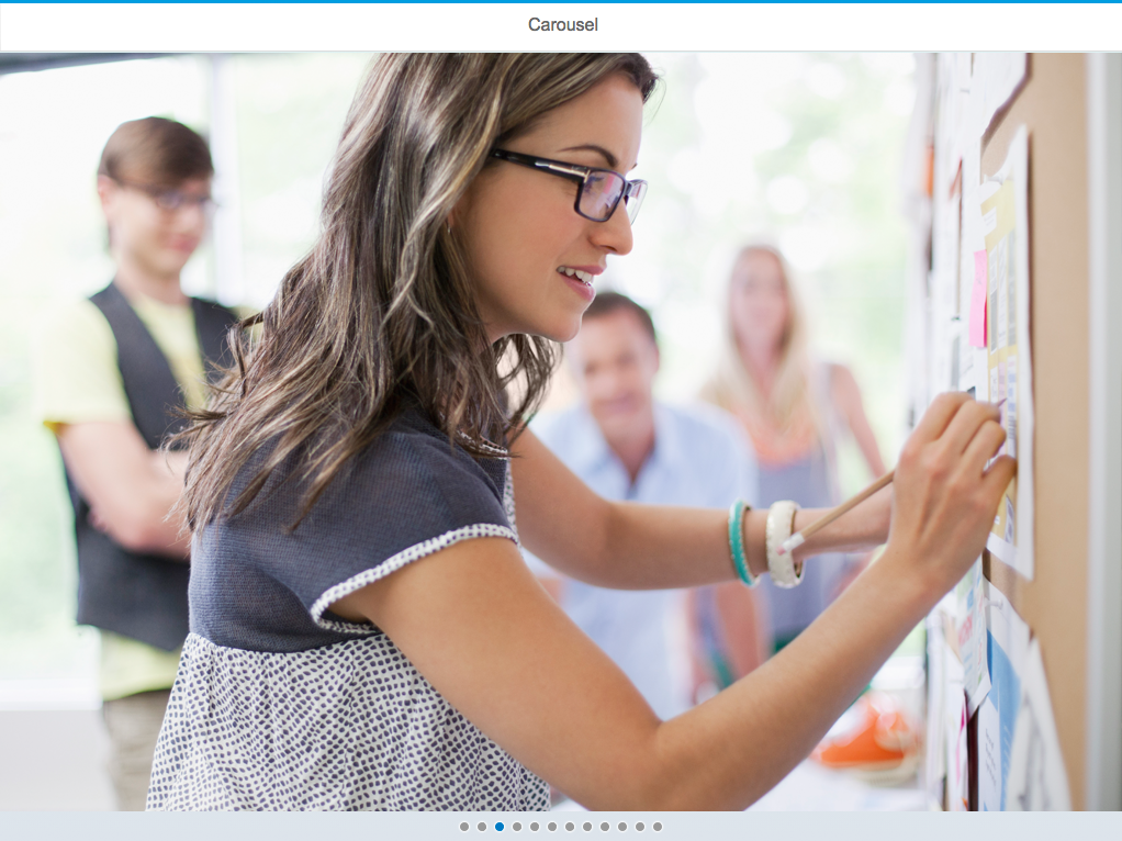
Carousel (size S)
Carousel (size S)

Carousel (size M)
Carousel (size M)

Carousel (size L)
Carousel (size L)

Layout

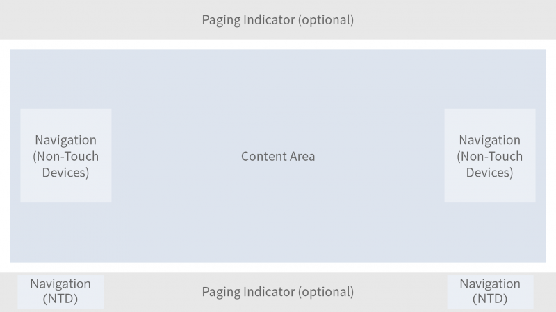
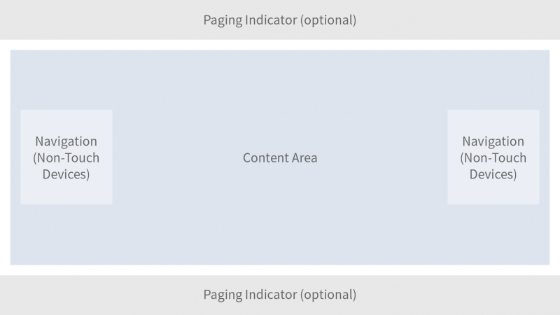
The carousel control mainly consists of a content area in which the different items are displayed and cycled through.

Optionally, a paging indicator can be displayed floating either above the top or at the bottom of the content area.

On non-touch devices, icons for navigating to the next or previous item are displayed either floating above the left and right side of the content area or in the paging indicator area. This is controlled by the arrowsPlacement property.

Schematic layout of carousel

Behavior and Interaction

The current item is displayed in the content area.

Navigating

When the user navigates from a displayed item to another item, the item is moved out of the content area and the next or previous item (depending on the direction of navigation) appears with a sliding transition.

On touch devices, navigation is performed with swipe gestures (swipe right or swipe left).

On non-touch devices, navigation is provided by icons.

When the item set contains only one item, the navigation is deactivated.

Navigation – Previous
Navigation – Next (hover)

Looping

The carousel can be set to loop (property: loop). In this case, the carousel jumps back to the first item once all items have been displayed. If looping is not enabled, there is no forward navigation on the last item.

Paging

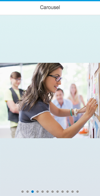
The current position inside the set of items is displayed using an optional paging indicator (properties: showPageIndicator, pageIndicatorPlacement).

Paging indicator
Paging indicator

If there are more than 8 pages, the paging indicator changes from icons to numbers.

Paging indicator
Paging indicator

Resources

Want to dive deeper? Follow the links below to find out more about related controls, the SAPUI5 implementation, and the visual design.

Elements and Controls

Image (guidelines)

Implementation

Lightbox

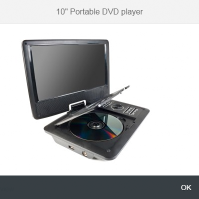
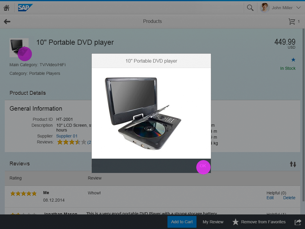
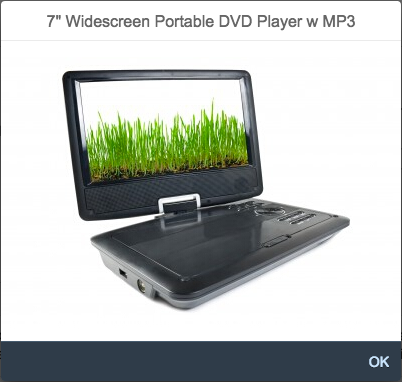
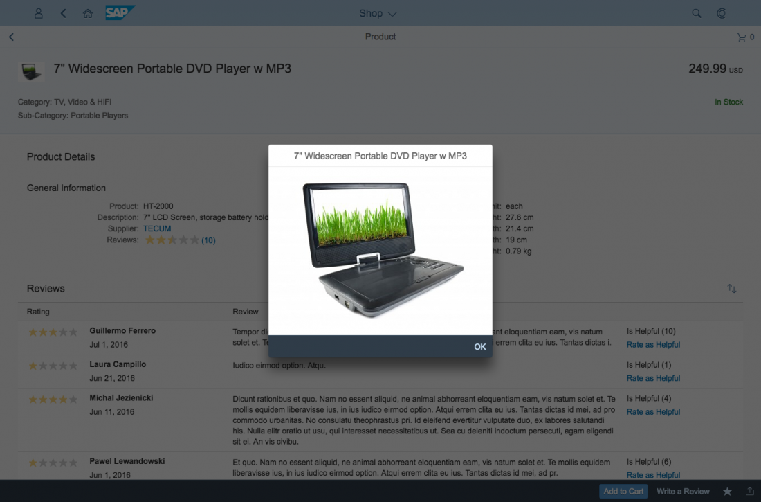
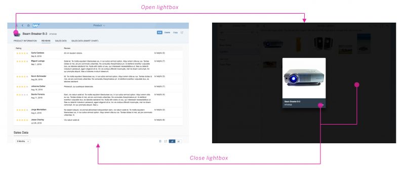
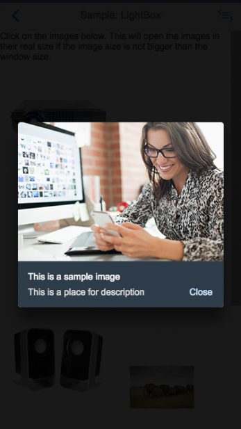
The lightbox control allows the user to view an image in its original size. This control displays the image in a popup while dimming the rest of the screen.

Usage

Use the lightbox if:

  • The thumbnail view is not detailed enough, and it would help the user to see the image in its original size.
  • The original size of the image is bigger than the thumbnail.

Do not use the lightbox if:

  • The image you are using is smaller than or as big as the thumbnail.
  • There is another click event attached to the image control.
  • You are using an image placeholder to display the object.

Responsiveness

The lightbox container is displayed in the middle of the screen.

The image is displayed in its original size unless the original image size is bigger than the size of the screen. In this case, the image is resized proportionally in order to be fully visible and fit on the screen.

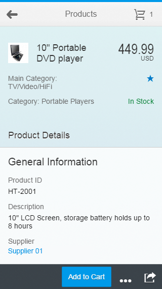
On a mobile device, flipping the device to landscape mode will flip the lightbox. The image will then be adjusted to fit the new dimensions.

Lightbox - Size S
Lightbox - Size S
Lightbox - Size M
Lightbox - Size M
Lightbox - Size L
Lightbox - Size L

Components

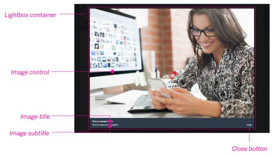
The lightbox contains the following components:

  • Lightbox container: This is the main container that holds all other components.
  • Image: This component is an embedded image control that displays the image file with the maximum available size. The size of the image should not exceed the original size and it should fit within the screen.
  • Image title: This component is mandatory and is used to describe the object to which the image is attached.
  • Image subtitle: This component is optional and is used to give additional information about the object.
  • Close button: This is a mandatory component and is used to close the lightbox container.
The components of the lightbox

Behavior and Interaction

Basic Interactions

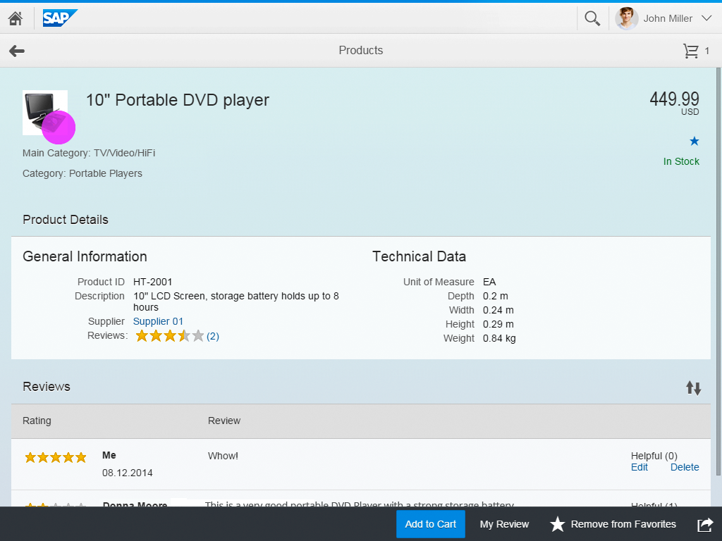
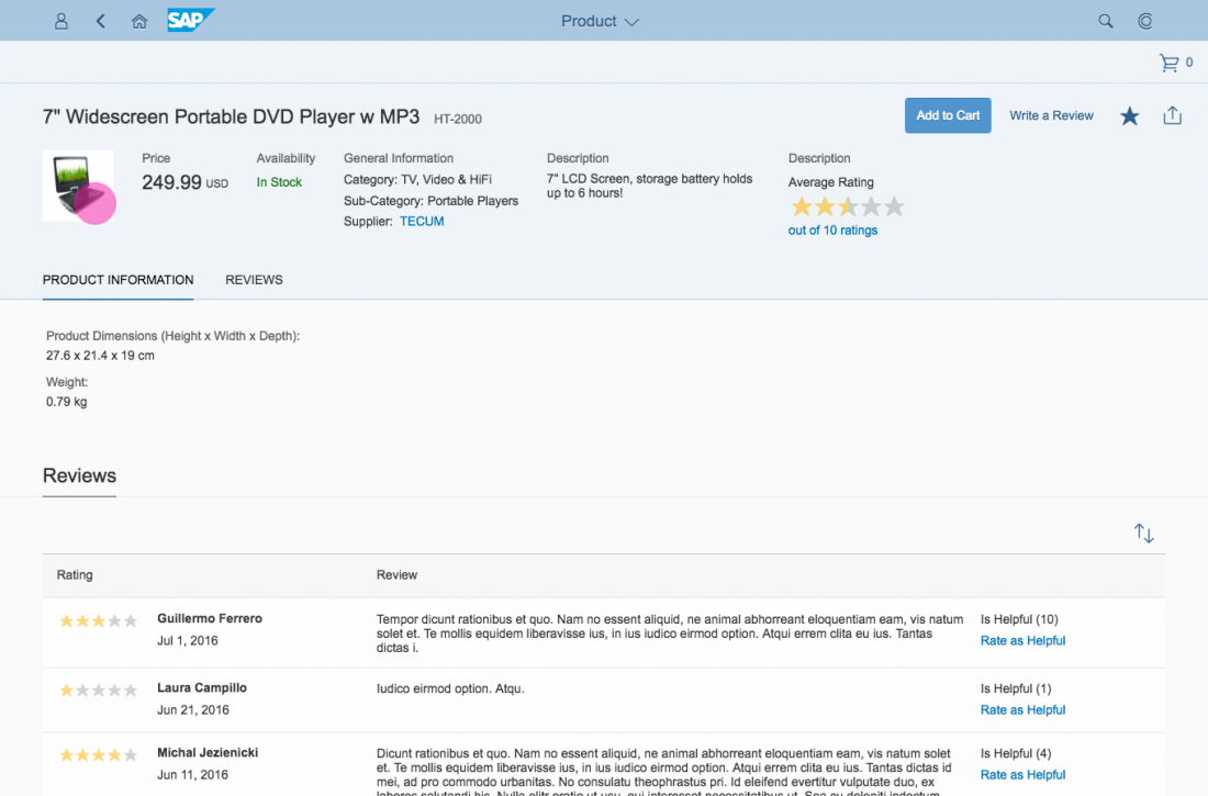
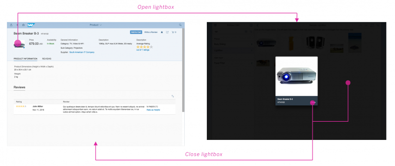
The lightbox control is attached to the press event of the image control. To trigger the lightbox, the user should click an image. Every image with an attached lightbox control is indicated with a zoom icon on the bottom right.

Lightbox - Zoom icon

When the lightbox control is triggered, the lightbox overlays the page content and the rest of the screen is dimmed out.

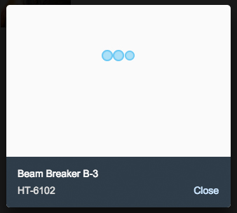
If it takes more than one second to load the original image, a busy indicator is shown inside the lightbox container.

The user can close the lightbox by clicking the Close button or by clicking outside of the lightbox container.

Lightbox - Basic interactions
Lightbox - Image loading

Error Handling

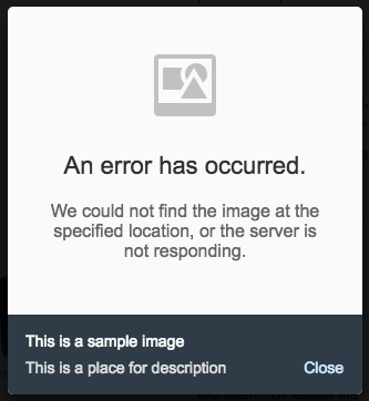
An error message is displayed inside the lightbox when:

  • The original file is missing or the connection to the server is lost.
  • The image takes more than 10 seconds to load due to a server error or the size of the image.
Developer Hint
The URL of the image is mandatory. If it is not specified, the lightbox will not be triggered.
Lightbox - error message

Resources

Want to dive deeper? Follow the links below to find out more about related controls, the SAPUI5 implementation, and the visual design.
Elements and Controls

Implementation

Text

The text control is used to display text. It generally contains the text that developers want apps to display (property: text).

Text used within a form

Usage

Use the text control if you want to display text inside a form, table, or any other content area. Do not use the text control if you need a label, or vice versa.

Responsiveness

The text control is fully adaptive to all screen sizes. You can also set a specific width and overwrite the default value. The resizing behavior depends on the settings that the apps use for the text.

Properties

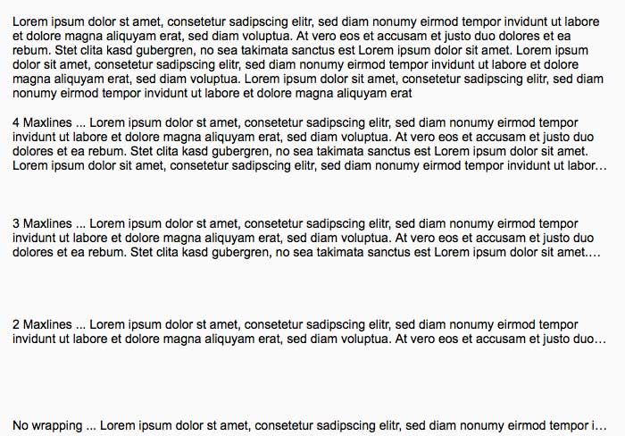
You can define whether the text should wrap or directly truncate (property: wrapping).

You can also define how often the text should wrap before it truncates (property: maxLines).


Note: The truncation indicator for multiple lines depends on the browser line clamping support. For browsers that support it, this will be shown as ellipsis (…), whereas in other browsers, the overflowing text will just be cut off.

Text – Maximum line examples

Resources

Want to dive deeper? Follow the links below to find out more about related controls, the SAPUI5 implementation, and the visual design.
Elements and Controls

Implementation

  • Text (SAPUI5 samples)
  • Text (SAPUI5 API reference)

Carousel

The carousel is a control for browsing through a set of items. It always displays one item at a time. From the displayed item, the user can navigate to either the next or the previous item. The interaction resembles browsing through the pages of a book.

Optionally, a paging indicator displays the user’s current position inside the set of items.

The control is best known for browsing through a set of images, as it works best when the single items are represented in a way that the user can easily distinguish. Nonetheless, the carousel is not limited to displaying images; it can contain every sap.m control.

Usage

Use the carousel if:

  • You have strong visual representations of the items you want to display.
  • You want to display the items one after the other.

Do not use the carousel if:

  • The items you want to display need to be visible at the same time.
  • The items you want to display are uniform.

Responsiveness

The size of the control’s content area is automatically adjusted to the amount of space available.

When used in non-touch mode, the user can navigate with forward and backward icons displayed on the left and right side of the control.

On touch devices, the carousel control makes use of the swipe gesture to navigate through the items. Therefore, the forward and backward icons are not displayed on touch devices.

The paging indicator (when activated) is visible on each form factor. The paging indicator wraps if not all items fit in one line.

Carousel (size S)
Carousel (size S)

Carousel (size M)
Carousel (size M)

Carousel (size L)
Carousel (size L)

Layout

The carousel control mainly consists of a content area in which the different items are displayed and cycled through.

Optionally, a paging indicator can be displayed floating either above the top or at the bottom of the content area.

On non-touch devices, icons for navigating to the next or previous item are displayed floating above the left and right side of the content area.

Schematic layout of carousel

Behavior and Interaction

The current item is displayed in the content area.

Navigating

When the user navigates from a displayed item to another item, the item is moved out of the content area and the next or previous item (depending on the direction of navigation) appears with a sliding transition.

On touch devices, navigation is performed with swipe gestures (swipe right or swipe left).

On non-touch devices, navigation is provided by icons.

When the item set contains only one item, the navigation is deactivated.

Navigation to previous item
Forward navigation
Forward navigation

Looping

The carousel can be set to loop (property: loop). In this case, the carousel jumps back to the first item once all items have been displayed. If looping is not enabled, there is no forward navigation on the last item.

Paging

The current position inside the set of items is displayed using an optional paging indicator (properties: showPageIndicator, pageIndicatorPlacement).

Paging indicator
Paging indicator

Resources

Want to dive deeper? Follow the links below to find out more about related controls, the SAPUI5 implementation, and the visual design.
Elements and Controls

  • No links

Implementation

Carousel

The carousel is a control for browsing through a set of items. It always displays one item at a time. From the displayed item, the user can navigate to either the next or the previous item. The interaction resembles browsing through the pages of a book.

Optionally, a paging indicator displays the user’s current position inside the set of items.

The control is best known for browsing through a set of images, as it works best when the single items are represented in a way that the user can easily distinguish. Nonetheless, the carousel is not limited to displaying images; it can contain every sap.m control.

Usage

Use the carousel if:

  • You have strong visual representations of the items you want to display.
  • You want to display the items one after the other.

Do not use the carousel if:

  • The items you want to display need to be visible at the same time.
  • The items you want to display are uniform.

Responsiveness

The size of the control’s content area is automatically adjusted to the amount of space available.

When used in non-touch mode, the user can navigate with forward and backward icons displayed on the left and right side of the control.

On touch devices, the carousel control makes use of the swipe gesture to navigate through the items. Therefore, the forward and backward icons are not displayed on touch devices.

The paging indicator (when activated) is visible on each form factor. The paging indicator wraps if not all items fit in one line.

Carousel (size S)
Carousel (size S)

Carousel (size M)
Carousel (size M)

Carousel (size L)
Carousel (size L)

Layout

The carousel control mainly consists of a content area in which the different items are displayed and cycled through.

Optionally, a paging indicator can be displayed floating either above the top or at the bottom of the content area.

On non-touch devices, icons for navigating to the next or previous item are displayed floating above the left and right side of the content area.

Schematic layout of carousel

Behavior and Interaction

The current item is displayed in the content area.

Navigating

When the user navigates from a displayed item to another item, the item is moved out of the content area and the next or previous item (depending on the direction of navigation) appears with a sliding transition.

On touch devices, navigation is performed with swipe gestures (swipe right or swipe left).

On non-touch devices, navigation is provided by icons.

When the item set contains only one item, the navigation is deactivated.

Navigation – Previous
Navigation – Next (hover)

Looping

The carousel can be set to loop (property: loop). In this case, the carousel jumps back to the first item once all items have been displayed. If looping is not enabled, there is no forward navigation on the last item.

Paging

The current position inside the set of items is displayed using an optional paging indicator (properties: showPageIndicator, pageIndicatorPlacement).

Paging indicator
Paging indicator

Resources

Want to dive deeper? Follow the links below to find out more about related controls, the SAPUI5 implementation, and the visual design.
Elements and Controls

  • No links

Implementation

Object Status

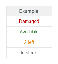
The object status is a short text that represents the semantic status of an object. It has a semantic color and an optional icon. As such, you will mostly find the object status in the object header and in the table as a status attribute of a line item.

Usage

Use the object status if:

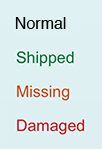
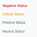
  • You need to display the semantic status of an object: negative (property: error), critical (property: warning), positive (property: success), or neutral (property: none).
  • You need to indicate that the current object instance is locked by another user.

Do not use the object status if:

  • You want to use it for decoration.
  • You want to display system messages.

Responsiveness

The object status wraps if it becomes too long for the screen width available.

Components

The object status consists of the following:

  • A semantically colored text (property: text)
  • An optional icon (property: icon)
  • A title that serves as a label (property: title)

It is mainly used with semantically colored text only.

Semantic colors
Semantic colors

Guidelines

  • Use semantic text only and avoid using it with an icon.
  • Use the following semantics to indicate the status: negative (property: error), critical (property: warning), positive (property: success), or neutral (property: none).
Use semantic text only
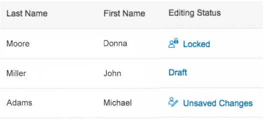
  • Only use icons that are unambiguous and easily understood, such as the locked item icon. If you think your icon would need a descriptive text to be understood, use text only.
  • In the case of locked items, you may add some information about who currently has access to the locked item in question.
Locked status
Locked status
Status indicating that the item is locked by a certain user
  • Do not use the title of the object status outside the object header. Even though both wrap, you should keep the text as short as possible.
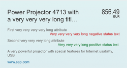
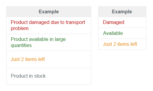
Avoid long titles and text if possible
  • When an object status is used in a table, it should be center-aligned. 

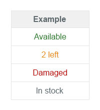
Object status should be aligned to the center

Resources

Want to dive deeper? Follow the links below to find out more about related controls, the SAPUI5 implementation, and the visual design.

Elements and Controls

No link

Implementation

Object Number

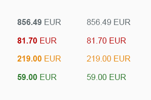
The object number is a short text that represents the numeric (key) attribute of an object and its unit. The number has a semantic color, and the unit inherits the same color from its number. The number can be displayed in emphasized format (default) when used for the key attribute, and non-emphasized when used for any other numeric attribute of the item.

The object number is mostly used to indicate the key attribute of an object in the object header and in the table as an attribute of a line item.

Usage

Use the object number if:

  • You want to display the key attribute of an object. (In this case, keep the emphasized  default setting (property: emphasized).)
  • You need to display one or more numeric attributes of an object that, for example, you want to compare (property: emphasized set to false).

Do not use the object number if:

  • You want to use it for decoration.
  • You want to display system messages.

Responsiveness

The object number does not wrap or truncate. For large numbers, you need to consider using the appropriate formatting.

Components

The object number consists of the following:

  • A semantically colored text (property: number), which can be set to non-emphasized when used in the content area (property: emphasized)
  • An optional unit (property: unit)
Example
Example

Guidelines

Use the following semantics to indicate the status: negative (property: error), critical (property: warning), positive (property: success), neutral (property: none).

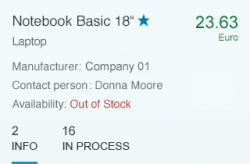
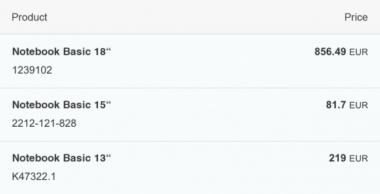
Neutral object number (856.74 euro) used as key attribute in the object header

If the object number is the key attribute of the object inside the content area, the number should be shown emphasized when used as line item status in a table.

Object number with key attribute

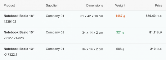
The object number can also be used to visualize other semantic numeric attributes. In that case they are not emphasized, unless they are the key attribute (e.g. a sum).

Object number used as attribute (weight) and as as key attribute (price)

Resources

Want to dive deeper? Follow the links below to find out more about related controls, the SAPUI5 implementation, and the visual design.

Elements and Controls

No link

Implementation

Object Header

Information
Do not use the object header control for the object page floorplan. For object pages, always use the snapping header control.

The object header usually represents an object instance. As such, it contains the most important information a user needs to see in order to understand what the object is about and what its status is. It is the first control on a page dedicated to a single object instance, usually the object view or flat object view.

The control can also be used as the header of other pages, such as a full screen. In that case, the object header contains the most important aggregated information of the items that are listed below.

Usage

Use the object header:

  • As the first component on a page that handles a single object instance (object view or flat object view) to enable the user identify it easily.
  • As the header of other pages, such as a full screen. In this case, the object header contains the most important aggregated information of the items that are listed below.

Do not use the object header:

  • Inside the content area as a work-around for visualizing something that is not possible with current means.

Responsiveness

The object header generally adjusts to different screen sizes. To achieve this, there is a built-in rule set that defines which content wraps or truncates when necessary, and how attributes and status texts are arranged depending on the screen size.

The object header has two flags that influence its appearance and resizing behavior: Responsive and FullScreenOptimized.
Object header – Split-screen layout (Responsive = true, FullScreenOptimized = false)

Responsive

As of SAPUI5 1.28, the app team should generally set the Responsive flag to ‘true’. In this case, the attributes are the first set of entries in the header, followed by the second set of statuses. The on-screen distribution differs from previous SAPUI5 versions. Even if there are many attributes and only a few statuses, use of the space is now optimized as the entries fill the respective columns equally.

Object header – Smartphone size (Responsive = true, FullScreenOptimized = false)

Full Screen Optimized

The second attribute, FullScreenOptimized, should be activated when the header makes full use of the screen width and is not used in a split-screen layout.

Object header – Full screen optimized (responsive = true, FullScreenOptimized = true)

Attribute/Status Distribution

The following table shows how the attributes are distributed automatically when the Responsive flag is set to ‘true’ on various screen sizes.

Screen Size 2 Attributes 3 Attributes 4 Attributes 5+ Attributes
Desktop (full screen) Next to the title area (1 column of 1-2 attributes) Next to the title area (1 column of 3 attributes) Underneath the title area (4 columns split by 1/1/1/1) Underneath the title area (4 columns split by 2/1/1/1)
Desktop (split screen layout) Underneath (2 columns split by 1/1 Underneath (2 columns split by 2/1) Underneath (2 columns split by 2/2) Underneath (3 columns split by 2/2/1)
Tablet (full screen – landscape) Underneath (2 columns split by 1/1) Underneath (3 columns split by 1/1/1) Underneath (3 columns split by 2/1/1) Underneath (3 columns split by 2/2/1)
Tablet (split screen layout) or Tablet (full screen – portrait) Underneath (2 columns split by 1/1) Underneath (2 columns split by 2/1) Underneath (2 columns split by 2/2) Underneath (2 columns split by 3/2)
Smartphone Underneath (1 column of 1-2 attributes) Underneath (1 column of 3 attributes) Underneath (1 column of 4 attributes) Underneath (1 column of 5+ attributes)

Prior to SAPUI5 1.28 (Responsive Set to ‘False’)

The Responsive flag is deactivated by default in apps that were built before SAPUI5 1.28. As mentioned above, this mainly impacts the attributes and status arrangement. If the Responsive flag is turned off, all attributes are left-aligned in the object header and all statuses are right-aligned, regardless of their individual number.
The object header still reacts correctly to resizing, but does not make optimal use of the space available.

For example, three attributes and one status with Responsive and FullScreenOptimized both set to ‘false’ results in two columns: the first (left) column contains three attributes, and the other column (right) has one status.  Altogether, this is three rows in height, whereas the same number of entries on a desktop full screen with the two flags set to ‘true’ results in a height of just one row (spread over four columns).

Components

Title

  • The object header has a mandatory title that serves as the key identifier of the object instance (property: title).
  • Long titles wrap once before they truncate on the second line.
  • A title can be actionable (property: titleActionable), in which case, it looks like a link and triggers an event, which usually results in a quick view.
  • An additional icon or image that identifies the object (property: icon) can be shown in front of the title. The icon or image can also be set to actionable (property: IconActionable).
  • Additionally, the title can show a title selector (which is visualized like a menu). It is mainly used to provide navigation targets, allowing the object to be opened in a different app.
Object header (Responsive=false) – Title not actionable
Object header (Responsive=false) – Title actionable
Object header (Responsive=false) – Title selector

Object Number

  • The object number contains the key attribute of the object instance.
  • The object number consists of text that represents the key attribute of an object, usually a number (property: number) and its unit (property: numberUnit). The object number has a semantic color (property: state). The unit inherits the semantic color of its number.
  • As usual in SAP Fiori, the semantic colors available are negative (property: error), critical (property: warning), positive (property: success), and neutral (property: none).
Object header (Responsive=false) – Negative object number

Object Attribute

  • The object header can contain 0 to n attributes (property: objectAttribute).
  • The attributes are listed first in the list of attributes in the object header.
  • Attributes can be text (property: text) or actionable (property: actionable), in which case, they are rendered similar to links.
Object header (Responsive=false) – Attribute active

Object Status

  • The object header can contain a list of 0 to n object statuses (property: objectStatus).
  • The statuses are listed as the second set of attributes in the object header.
  • The status has a semantic color.
  • Statuses can be text or icons. A combination of the two is technically also possible, in which case, the icon is placed in front of the text. We generally recommend that you use text only (see guidelines below).
  • A progress indicator may also be shown as a status. If used, the progress indicator should be the last item in the list of statuses.

Object header (Responsive=true) – one object marker, three object attributes, and one object status

Object Marker

The object marker allows you to express the technical status of an object.

  • Objects can be flagged and marked as favorites. The object header provides flags for both (properties: markFavorite, markFlagged).
  • To show them in the object header, you also need to activate the respective flag (property: showMarkers).
  • When they are used and shown, they appear directly behind the title.

Object header (Responsive=false) – Two object markers, three object attributes, and one object status

Intro

  • As mentioned above, another component from the early days of SAP Fiori called the intro (property: intro) is available.
  • It is now shown directly below the title in a smaller font size.
  • The intro can call an event if it is set to actionable (property: introActionable).
  • Previously, the intro appeared above the title, and was used to indicate the origin of an object (for example, Forwarded by…, On behalf of …). It now tends to be used as a short subtitle.
Object header (Responsive=true) – Intro text used as subtitle
Object header (Responsive=false) – Intro text

Condensed

  • The object header provides a condensed flag for cases in which it is used as a page header with little information (property: condensed).
  • When turned on, the object header displays only the title, object number, and one attribute.
Object header – Condensed mode

Guidelines

Settings

  • Set the object header responsiveness flag to ‘true’ (property: responsive) to make optimal use of the screen real estate.
  • If your app runs in full-screen mode (not master/details), make optimal use of the header area by setting the respective property to ‘true’ (property: FullScreenOptimized).
  • If you need to enforce the sequence and stable display of the attributes independently of the screen size, such as for an address, you might still decide to set the Responsive property to ‘false’ as an exception.

Title

  • The object header contains a mandatory title, which serves as the key identifier of the object instance (property: title). The title should be easily readable text without any IDs. If an ID is essential to the user, for example, to distinguish between identical titles, it can be put in brackets, such as Product ABC (1234567). If it is usually a long number, you can also consider adding it as a first attribute. In that case, however, you must give it a label (property: title of the Object Attribute).
  • Although the title can be truncated, keep it as short as possible and only as long as necessary.
  • If you make the title actionable and use an image or icon as well, both should be actionable and trigger the same event.
  • If you do use a title selector, it should open an action sheet that allows the user to choose from different options.

Object Number

  • The object number contains the key attribute of the object instance, which is usually a numeric attribute. In rare cases, it can also be used with text if that is the key attribute of the item. Be careful when you use text because it often leads to issues during translation if the text is too long.
  • As usual with SAP Fiori, the semantic colors available are negative (property: error), critical (property: warning), positive (property: success), and neutral (property: none).
  • For very long numbers, use a formatter.
  • The object number can be left blank if there is no key attribute worth showing.

Object Attribute

  • These object attributes do not generally need a label if it is clear what they refer to. If attributes are not distinct, you can use a label (property: title).
  • To facilitate recognition of the object header, we recommend using no more than four attributes.

Object Status

  • Although it is technically possible to show icons together with text, we recommend using text only.
    • Only use icons that are clear and unambiguous. If you think your icon would need a descriptive text to be understood, use text only.
    • In the case of locked items, however, you may also add further information about who has locked the item (when available).
  • The same rule for choosing semantic colors as elsewhere in SAP Fiori applies for the statuses negative (property: error), critical (property: warning), positive (property: success), and neutral (property: none).
  • In terms of indicating status priority, the general guidance is: very high (property: error), high (property: warning), medium, low, or other (property: none).
  • You can also show a progress indicator as a status. If you use it, the progress indicator should be the last item in the list of statuses.
  • As with the attributes, statuses do not need a label if it is clear what they refer to. If statuses are not distinct, you can use a label (property: title).
  • Here, too, we recommend that you have no more than four entries in the status list (including progress indicators and flag or favorite).

Intro

  • The intro usually contains a short subtitle and should only be used when necessary.
  • Do not use the intro for standard attributes.

Master/Details

  • When used in the details area of the split screen (master/details) and the master list contains object list items, the object header should show the same information as the object list item, plus additional information if necessary.
  • Unlike the object list item, the object number uses large number formatting because the object header has more space for handling long text.

Resources

Want to dive deeper? Follow the links below to find out more about related controls, the SAPUI5 implementation, and the visual design.
Elements and Controls

Implementation

Object Identifier

The object identifier is a short text that represents the key identifier of an object.

You can find the object identifier in the table as the identifier of a line item.

Usage

Use the object identifier if:

  • You want to indicate the key identifier of the object.

Do not use the object identifier if:

  • You intend to use it for decoration.

Responsiveness

The object identifier text wraps when the screen size becomes too small to display the full text on one line.

Components

The object identifier is characterized by the following:

  • A title text (property: title)
Object identifier - Text only
  • An optional additional descriptive text (property: text)
Object identifier with subtitle
  • The title can be set to active, in which case, it looks like a link and can fire an event (property: titleActive).
Object identifier - Actionable
  • Both texts wrap if the space available becomes too limited.
Object identifier - Long texts wrap

Guidelines

  • The object identifier should be easily readable, preferably with just the display text but no ID. If the ID is necessary to distinguish between items that use the same title, it should appear in brackets, such as “Product ABC (1234567)”. Whether you include the ID in the text property can also depend on how long you expect the text to be.
  • The object identifier can also be represented as a link, in which case, the event would open the quick view of the object.

Resources

Want to dive deeper? Follow the links below to find out more about related controls, the SAPUI5 implementation, and the visual design.
Elements and Controls

No link

Implementation

Object Header

The object header usually represents an object instance. As such, it contains the most important information a user needs to see in order to understand what the object is about and what its status is. It is the first control on a page dedicated to a single object instance, usually the object view or flat object view.

The control can also be used as the header of other pages, such as a full screen. In that case, the object header contains the most important aggregated information of the items that are listed below.

Usage

Use the object header:

  • As the first component on a page that handles a single object instance (object view or flat object view) to enable the user identify it easily.
  • As the header of other pages, such as a full screen. In this case, the object header contains the most important aggregated information of the items that are listed below.

Do not use the object header:

  • Inside the content area as a work-around for visualizing something that is not possible with current means.

Responsiveness

In general, the object header adjusts to different screen sizes. In order to achieve this, there is a built-in rule set which defines which content wraps or truncates when necessary:

  • The object title wraps one time before it truncates.
  • The attributes wrap once and then get cut off in the second line.
  • The status is a single line and does not wrap.
Object header - Long text example (on large screen)
Object header - Long text example (on small screen)

Please note: The object header provides a responsive flag. However, we do not recommend turning this feature on at the present time. This is currently being fixed and we will update this article as soon as it is running properly.

Components

Title

  • The object header has a mandatory title that serves as key identifier of the object instance (property: title).
  • Very long titles wrap two times before they truncate in the third line.
  • A title can be actionable (property: titleActionable). In this case, it shows as a link and can trigger an event. Typically, the title links to a company or employee overview.
  • The title can show an additional icon or image in front of the title that identifies the object (property: icon). The icon/ image can be set to actionable as well (property: IconActionable).
  • The title can also show a title selector (which is visualized like a menu). It is mainly used to provide navigation targets allowing the object to be opened in a different app.
Object header - Title not actionable
Object header - Title actionable
Object header - Title selector

Object Number

  • The object number holds the key attribute of the object instance.
  • The object number consists of piece of text representing the key attribute of an object, usually a number (property: number), and its unit (property: numberUnit). The object number has a semantic color (property: state). The unit inherits the semantic color from its number.
  • As usual in SAP Fiori, available semantic colors are negative (property: error), critical (property: warning), positive (property: success), neutral (property:none).
Object header - Negative object number

Object Attribute

  • The object header can hold 0…n attributes (property: objectAttribute).
  • The attributes are listed on the left hand side of the object header.
  • Attributes can either be text (property: text) or actionable (property: actionable). In the latter case, the header renders like a link.
Object header - Attribute active

Object Status

  • The object header can hold a list of 0…n object status (property: objectStatus).
  • The status are listed on the right hand side in the object header
  • The status has a semantic color.
  • Status can be text or icons. Technically, a combination of the two is also possible, in that case the icon comes before the text. In general, we recommend using text only (see guidelines below).
  • It is also allowed to show a progress indicator as status. If used, the progress indicator should be the last item in the list of status.
Object header - Flag, favorite and two object status

Flag and Favorite

  • Objects can be shown flagged and marked as favorite. The object header provides flags for both (properties: markFavorite, markFlagged).
  • To show them in the object header the respective (property: showMarkers) flag needs to be turned on additionally.
  • When used and shown, they appear as the first entries in the list of status.

Intro

  • From the first SAP Fiori days, there is another component available called Intro (property: intro).
  • It is shown on top of the title
  • The intro can call an event when it is set to actionable (property: introActionable).
  • This component is used rather rarely nowadays. It was mainly used to indicate the origin of an object. As such it displayed information which forwarded the object, on behalf of whom I need to work on etc. on top of the object identifier.
Object header - Intro text

Condensed

  • The object header provides a condensed flag for cases where it is used as page header with very little information (property: condensed)
  • When turned on, the object header only displays the title, the object number and one attribute
Object header - Condensed mode

Guidelines

Title

  • The Object Header contains a mandatory title, that serves as key identifier of the object instance (property: title). The title should be in general a human readable text (no IDs). In case an ID is absolutely crucial to the user, e.g. to distinguish same named titles it can be put in brackets, e.g. “Product ABC (1234567)”. If this is usually a very long number you can also consider adding it as first attribute. But in that case give it a label (property: title of the Object Attribute).
  • Though the title can truncate you should keep the title as short as possible and only as long as needed.
  • In case you make the title actionable and use an image/icon as well, both should be actionable and in general trigger the same event.
  • If used at all, the title selector should usually opening an action sheet, allowing the user to choose from different options.

Object Number

  • The Object Number holds the key attribute of the Object Instance, which is usually a numeric attribute. In rare cases it can also be used with text, if that is the key attribute of the item. Be careful when using text, as it will usually cause issues during translation if the texts get to long.
  • As usual throughout SAP Fiori available semantic colors are Negative (property: error), Critical (property: warning), Positive (property: success), Neutral (property:none).
  • For very long numbers use a formatter.
  • The Object Number can be left blank in case there is no key attribute that makes sense to be shown.

Object Attribute

  • In general these object attributes do not need a label if it is clear what they are referring to. If attributes are not distinct, you can use a “label” (property: title).
  • In order to anticipate the Object Header fast, we do not recommend using more than 4 attributes.

Object Status

  • Though it is technically possible to show icons together with text, we recommend using text only.
    • Use icons only when they are obvious and understood. If you feel your icon would need a descriptive text in order to be understood, use text only.
    • In case of locked items it is though allowed to add the additional information who is currently locking the item (when available).
  • The same rule for choosing semantic color as elsewhere in SAP Fiori applies for the status:Negative (property: error), Critical (property: warning), Positive (property: success), Neutral (property:none).
  • For showing priorities within the status general guidance is: Very high (property: error) High (property: warning), Medium, Low, Other (property:none).
  • It is also allowed to show a progress indicator as status. If used the progress indicator should be the last item in the list of status.
  • Similar to the attributes, the status do not need a label if it is clear what they are referring to. If status are not distinct, you can use a “label” (property: title).
  • Also here in general it is not recommended having more than four entries in the status list (including Progress Indicators and Flag/Favorite).

Intro

  • The intro should not be used if not absolutely necessary. Usually it contains information in approvals about the origin (e.g. “Forwarded by XY”, “On behalf of YZ”).
  • Do not use the intro for standard attributes.

Master/Detail

  • When used in the Details Area of the Split Screen (Master/Detail), and the master list contains Object List Items, the Object Header should in general show the same information as the Object List Item plus additional information if necessary.
  • In contrary to the Object List Item, the Object Number would use large number formatting, as the Object Header has more space to handle long text.

Resources

Want to dive deeper? Follow the links below to find out more about related controls, the SAPUI5 implementation, and the visual design.
Object Header

The object header usually represents an object instance. As such, it contains the most important information a user needs to see in order to understand what the object is about and what its status is. It is the first control on a page dedicated to a single object instance, usually the object view or flat object view.

The control can also be used as the header of other pages, such as a full screen. In that case, the object header contains the most important aggregated information of the items that are listed below.

Usage

Use the object header:

  • As the first component on a page that handles a single object instance (object view or flat object view) to enable the user identify it easily.
  • As the header of other pages, such as a full screen. In this case, the object header contains the most important aggregated information of the items that are listed below.

Do not use the object header:

  • Inside the content area as a work-around for visualizing something that is not possible with current means.

Responsiveness

The object header generally adjusts to different screen sizes. To achieve this, there is a built-in rule set that defines which content wraps or truncates when necessary, and how attributes and status texts are arranged depending on the screen size.

The object header has two flags that influence its appearance and resizing behavior: Responsive and FullScreenOptimized.
Object header – Split-screen layout (Responsive = true, FullScreenOptimized = false)

Responsive

As of SAPUI5 1.28, the app team should generally set the Responsive flag to ‘true’. In this case, the attributes are the first set of entries in the header, followed by the second set of statuses. The on-screen distribution differs from previous SAPUI5 versions. Even if there are many attributes and only a few statuses, use of the space is now optimized as the entries fill the respective columns equally.

Object header – Smartphone size (Responsive = true, FullScreenOptimized = false)

Full Screen Optimized

The second attribute, FullScreenOptimized, should be activated when the header makes full use of the screen width and is not used in a split-screen layout.

Object header – Full screen optimized (responsive = true, FullScreenOptimized = true)

Attribute/Status Distribution

The following table shows how the attributes are distributed automatically when the Responsive flag is set to ‘true’ on various screen sizes.

Screen Size 2 Attributes 3 Attributes 4 Attributes 5+ Attributes
Desktop (full screen) Next to the title area (1 column of 1-2 attributes) Next to the title area (1 column of 3 attributes) Underneath the title area (4 columns split by 1/1/1/1) Underneath the title area (4 columns split by 2/1/1/1)
Desktop (split screen layout) Underneath (2 columns split by 1/1 Underneath (2 columns split by 2/1) Underneath (2 columns split by 2/2) Underneath (3 columns split by 2/2/1)
Tablet (full screen – landscape) Underneath (2 columns split by 1/1) Underneath (3 columns split by 1/1/1) Underneath (3 columns split by 2/1/1) Underneath (3 columns split by 2/2/1)
Tablet (split screen layout) or Tablet (full screen – portrait) Underneath (2 columns split by 1/1) Underneath (2 columns split by 2/1) Underneath (2 columns split by 2/2) Underneath (2 columns split by 3/2)
Smartphone Underneath (1 column of 1-2 attributes) Underneath (1 column of 3 attributes) Underneath (1 column of 4 attributes) Underneath (1 column of 5+ attributes)

Prior to SAPUI5 1.28 (Responsive Set to ‘False’)

The Responsive flag is deactivated by default in apps that were built before SAPUI5 1.28. As mentioned above, this mainly impacts the attributes and status arrangement. If the Responsive flag is turned off, all attributes are left-aligned in the object header and all statuses are right-aligned, regardless of their individual number.
The object header still reacts correctly to resizing, but does not make optimal use of the space available.

For example, three attributes and one status with Responsive and FullScreenOptimized both set to ‘false’ results in two columns: the first (left) column contains three attributes, and the other column (right) has one status.  Altogether, this is three rows in height, whereas the same number of entries on a desktop full screen with the two flags set to ‘true’ results in a height of just one row (spread over four columns).

Components

Title

  • The object header has a mandatory title that serves as the key identifier of the object instance (property: title).
  • Long titles wrap once before they truncate on the second line.
  • A title can be actionable (property: titleActionable), in which case, it looks like a link and triggers an event, which usually results in a quick view.
  • An additional icon or image that identifies the object (property: icon) can be shown in front of the title. The icon or image can also be set to actionable (property: IconActionable).
  • Additionally, the title can show a title selector (which is visualized like a menu). It is mainly used to provide navigation targets, allowing the object to be opened in a different app.
Object header (Responsive=false) – Title not actionable
Object header (Responsive=false) – Title actionable
Object header (Responsive=false) – Title selector

Object Number

  • The object number contains the key attribute of the object instance.
  • The object number consists of text that represents the key attribute of an object, usually a number (property: number) and its unit (property: numberUnit). The object number has a semantic color (property: state). The unit inherits the semantic color of its number.
  • As usual in SAP Fiori, the semantic colors available are negative (property: error), critical (property: warning), positive (property: success), and neutral (property: none).
Object header (Responsive=false) – Negative object number

Object Attribute

  • The object header can contain 0 to n attributes (property: objectAttribute).
  • The attributes are listed first in the list of attributes in the object header.
  • Attributes can be text (property: text) or actionable (property: actionable), in which case, they are rendered similar to links.
Object header (Responsive=false) – Attribute active

Object Status

  • The object header can contain a list of 0 to n object statuses (property: objectStatus).
  • The statuses are listed as the second set of attributes in the object header.
  • The status has a semantic color.
  • Statuses can be text or icons. A combination of the two is technically also possible, in which case, the icon is placed in front of the text. We generally recommend that you use text only (see guidelines below).
  • A progress indicator may also be shown as a status. If used, the progress indicator should be the last item in the list of statuses.

Object header (Responsive=true) – Favorite, three object attributes, and one object status

Flag and Favorite

  • Objects can be shown flagged and marked as favorites. The object header provides flags for both (properties: markFavorite, markFlagged).
  • To show them in the object header, you also need to activate the respective flag (property: showMarkers).
  • When they are used and shown, they appear directly behind the title.
Object header (Responsive=false) – Flag, favorite, two object attributes, and two object statuses

Intro

  • As mentioned above, another component from the early days of SAP Fiori called the intro (property: intro) is available.
  • It is now shown directly below the title in a smaller font size.
  • The intro can call an event if it is set to actionable (property: introActionable).
  • Previously, the intro appeared above the title, and was used to indicate the origin of an object (for example, Forwarded by…, On behalf of …). It now tends to be used as a short subtitle.
Object header (Responsive=true) – Intro text used as subtitle
Object header (Responsive=false) – Intro text

Condensed

  • The object header provides a condensed flag for cases in which it is used as a page header with little information (property: condensed).
  • When turned on, the object header displays only the title, object number, and one attribute.
Object header – Condensed mode

Guidelines

Settings

  • Set the object header responsiveness flag to ‘true’ (property: responsive) to make optimal use of the screen real estate.
  • If your app runs in full-screen mode (not master/details), make optimal use of the header area by setting the respective property to ‘true’ (property: FullScreenOptimized).
  • If you need to enforce the sequence and stable display of the attributes independently of the screen size, such as for an address, you might still decide to set the Responsive property to ‘false’ as an exception.

Title

  • The object header contains a mandatory title, which serves as the key identifier of the object instance (property: title). The title should be easily readable text without any IDs. If an ID is essential to the user, for example, to distinguish between identical titles, it can be put in brackets, such as Product ABC (1234567). If it is usually a long number, you can also consider adding it as a first attribute. In that case, however, you must give it a label (property: title of the Object Attribute).
  • Although the title can be truncated, keep it as short as possible and only as long as necessary.
  • If you make the title actionable and use an image or icon as well, both should be actionable and trigger the same event.
  • If you do use a title selector, it should open an action sheet that allows the user to choose from different options.

Object Number

  • The object number contains the key attribute of the object instance, which is usually a numeric attribute. In rare cases, it can also be used with text if that is the key attribute of the item. Be careful when you use text because it often leads to issues during translation if the text is too long.
  • As usual with SAP Fiori, the semantic colors available are negative (property: error), critical (property: warning), positive (property: success), and neutral (property: none).
  • For very long numbers, use a formatter.
  • The object number can be left blank if there is no key attribute worth showing.

Object Attribute

  • These object attributes do not generally need a label if it is clear what they refer to. If attributes are not distinct, you can use a label (property: title).
  • To facilitate recognition of the object header, we recommend using no more than four attributes.

Object Status

  • Although it is technically possible to show icons together with text, we recommend using text only.
    • Only use icons that are clear and unambiguous. If you think your icon would need a descriptive text to be understood, use text only.
    • In the case of locked items, however, you may also add further information about who has locked the item (when available).
  • The same rule for choosing semantic colors as elsewhere in SAP Fiori applies for the statuses negative (property: error), critical (property: warning), positive (property: success), and neutral (property: none).
  • In terms of indicating status priority, the general guidance is: very high (property: error), high (property: warning), medium, low, or other (property: none).
  • You can also show a progress indicator as a status. If you use it, the progress indicator should be the last item in the list of statuses.
  • As with the attributes, statuses do not need a label if it is clear what they refer to. If statuses are not distinct, you can use a label (property: title).
  • Here, too, we recommend that you have no more than four entries in the status list (including progress indicators and flag or favorite).

Intro

  • The intro usually contains a short subtitle and should only be used when necessary.
  • Do not use the intro for standard attributes.

Master/Details

  • When used in the details area of the split screen (master/details) and the master list contains object list items, the object header should show the same information as the object list item, plus additional information if necessary.
  • Unlike the object list item, the object number uses large number formatting because the object header has more space for handling long text.

Resources

Want to dive deeper? Follow the links below to find out more about related controls, the SAPUI5 implementation, and the visual design.
Elements and Controls

Implementation

Text

The text control is used to display text. It generally contains the text that developers want apps to display (property: text).

Text used within a form

Usage

Use the text control if you want to display text inside a form, table, or any other content area. However, do not use this control together with labels.

Responsiveness

The text control is fully adaptive to all screen sizes. You can also set a specific width and overwrite the default value. The resizing behavior depends on the settings that the apps use for the text.

Properties

You can define whether the text should wrap or directly truncate (property: wrapping).

You can also define how often the text should wrap before it truncates (property: maxLines).


Note: The truncation indicator for multiple lines depends on the browser line clamping support. For browsers that support it, this will be shown as an ellipsis (…), whereas in other browsers, the overflowing text will just be cut off.

Text – Maximum line examples

Resources

Want to dive deeper? Follow the links below to find out more about related controls, the SAPUI5 implementation, and the visual design.

Elements and Controls

Implementation

  • Text (SAPUI5 samples)
  • Text (SAPUI5 API reference)

Text

The text control is used to display text. It generally contains the text that developers want apps to display (property: text).

Text used within a form

Usage

Use the text control if you want to display text inside a form, table, or any other content area. However, do not use this control together with labels.

Responsiveness

The text control is fully adaptive to all screen sizes. You can also set a specific width and overwrite the default value. The resizing behavior depends on the settings that the apps use for the text.

Properties

You can define whether the text should wrap or directly truncate (property: wrapping).

You can also define how often the text should wrap before it truncates (property: maxLines).


Note: The truncation indicator for multiple lines depends on the browser line clamping support. For browsers that support it, this will be shown as ellipsis (…), whereas in other browsers, the overflowing text will just be cut off.

Text – Maximum line examples

Resources

Want to dive deeper? Follow the links below to find out more about related controls, the SAPUI5 implementation, and the visual design.
Elements and Controls

Implementation

  • Text (SAPUI5 samples)
  • Text (SAPUI5 API reference)

Label

A label is the name or title of a control or group of related controls.

Usage

Use the label control if:

  • You need a label for a control. We recommend that you always use labels for form controls.

Do not use the label control if:

  • You want to insert a heading in the column header of a table.
  • You want to use it as an alternative for the text control, such as in display-only forms; do not use the label to display the data.

Types

Required Labels

To indicate that a field is mandatory, you can set the property “required”. An asterisk will be automatically set in front of the label.

Note: A colon is automatically set in front of the label when used in forms.

Mandatory label in a form

Guidelines

  • Always use a label for form controls.
  • Use title case for labels.
  • Do not use a placeholder (input prompt) as a replacement for the label.
  • If a label is used within a form, the colon is set automatically; otherwise, you need to set it manually.
  • Do not use bold labels.

Exceptions

The layout can sometimes be simplified by using a placeholder instead of the label control. This exception can be applied in the following cases:

  • When the form pattern is easily understood, such as on a login screen. Since this screen consists of only two input controls (username and password), the labels do not have to be used.
  • When the form is extremely small and has fewer than three input fields, such as in messaging and small feedback forms.
  • In search fields. For more information, see search.

Resources

Want to dive deeper? Follow the links below to find out more about related controls, the SAPUI5 implementation, and the visual design.
Elements and Controls

Implementation

Label

A label is the name or title of a control or group of related controls.

Label
Label "Name:" in a form

Usage

Use the label control if:

  • You need a label for a control. We recommend that you always use labels for form controls.

Do not use the label control if:

  • You want to insert a heading in the column header of a table.
  • You want to use it as an alternative for the text control, such as in display-only forms; do not use the label to display the data.

Types

Required Labels

To indicate that a field is mandatory, you can set the property “required”. An asterisk will be automatically set in front of the label.

Note: A colon is automatically set in front of the label when used in forms.

Mandatory field (form - display mode)
Mandatory field (form - edit mode)
Label
Label "Name:" in a form (display mode - horizontal layout)
Label
Label "Name:" in a form (edit mode - horizontal layout)
Label
Label "Name:" in a form (display mode - vertical layout)
Label
Label "Name:" in a form (edit mode - vertical layout)

Guidelines

  • Always use a label for form controls.
  • Use title case for labels.
  • Do not use a placeholder (input prompt) as a replacement for the label.
  • If a label is used within a form, the colon is set automatically; otherwise, you need to set it manually.
  • Do not use bold labels.

Exceptions

The layout can sometimes be simplified by using a placeholder instead of the label control. This exception can be applied in the following cases:

  • When the form pattern is easily understood, such as on a login screen. Since this screen consists of only two input controls (username and password), the labels do not have to be used.
  • When the form is extremely small and has fewer than three input fields, such as in messaging and small feedback forms.
  • In search fields. For more information, see search.

Resources

Want to dive deeper? Follow the links below to find out more about related controls, the SAPUI5 implementation, and the visual design.
Elements and Controls

Implementation

  • Label (SAPUI5 samples)
  • Label (SAPUI5 API reference)

Image

Images are not only for decoration. They can be a powerful way to capture the user’s attention and communicate your message. You can use the image control to integrate images into your apps. Images are visual representations of objects or functions.

Responsiveness

The size of the image is simply adjusted to the amount of space available.

Size S (Smartphones)

Object view (size S)

Size M (Tablets)

Object view (size M)

Size L (Desktops)

Object view (size L)

Layout

Images can be used in various locations in the app, such as in a list cell or object header, and also in the content area. App developers determine the most appropriate area. See the examples below.

Images placed in a table

Image placed in the object header

Image placed in a carousel
Image placed in a dialog

Behavior and Interaction

Clicking/Tapping an Image (Optional)

Various options are available in terms of size setting, and the images can also be combined with actions. The most common behavior is clicking or tapping the image to enlarge it.

Properties

  • The original image size can be modified.
  • An image can be decorative only.
  • An image can be connected to an image map.
  • You can trigger an action for navigation.
  • Connection to an on-screen user assistance is supported.

Guidelines

  • For accessibility reasons, provide each image with an alternative text in case the image is not available or cannot be displayed.
  • Do not use placeholder images if you do not plan to replace them with real images.
  • Do not use icons as images. There is a separate icon font for such cases, which consists of more than 500 scalable pictograms in SAP’s illustrative style.
  • It is extremely important that you choose the right file format when saving your images. Three image formats are used consistently in browsers – PNG, JPG, and GIF.
  • When choosing the format for your image, you should always be conscious of the image quality and file size.
  • High-resolution images that are unnecessarily large in file size can drastically slow down page speed. Optimize your images in this case.
Good quality
Good quality
Poor quality
Poor quality

Resources

Want to dive deeper? Follow the links below to find out more about related controls, the SAPUI5 implementation, and the visual design.
Elements and Controls

Implementation

  • Image (SAPUI5 samples)
  • Image (SAPUI5 API reference)

Image

Images are not only for decoration. They can be a powerful way to capture the user’s attention and communicate your message. You can use the image control to integrate images into your apps. Images are visual representations of objects or functions.

Responsiveness

The size of the image is simply adjusted to the amount of space available.

Size S (Smartphones)

Object view (size S)

Size M (Tablets)

Object view (size M)

Size L (Desktops)

Object view (size L)

Layout

Images can be used in various locations in the app, such as in a list cell or object header, and also in the content area. App developers determine the most appropriate area. See the examples below.

Images placed in a table

Image placed in the object header

Image placed in a carousel
Image placed in a dialog

Behavior and Interaction

Clicking/Tapping an Image (Optional)

Various options are available in terms of size setting, and the images can also be combined with actions. The most common behavior is clicking or tapping the image to enlarge it.

Properties

  • The original image size can be modified.
  • An image can be decorative only.
  • An image can be connected to an image map.
  • You can trigger an action for navigation.
  • Connection to an on-screen user assistance is supported.

Guidelines

  • For accessibility reasons, provide each image with an alternative text in case the image is not available or cannot be displayed.
  • Do not use placeholder images if you do not plan to replace them with real images.
  • Do not use icons as images. There is a separate icon font for such cases, which consists of more than 500 scalable pictograms in SAP’s illustrative style.
  • It is extremely important that you choose the right file format when saving your images. Three image formats are used consistently in browsers – PNG, JPG, and GIF.
  • When choosing the format for your image, you should always be conscious of the image quality and file size.
  • High-resolution images that are unnecessarily large in file size can drastically slow down page speed. Optimize your images in this case.
Good quality
Good quality
Poor quality
Poor quality

Resources

Want to dive deeper? Follow the links below to find out more about related controls, the SAPUI5 implementation, and the visual design.
Elements and Controls

Implementation

  • Image (SAPUI5 samples)
  • Image (SAPUI5 API reference)

Image

Images are not only for decoration. They can be a powerful way to capture the user’s attention and communicate your message. You can use the image control to integrate images into your apps. Images are visual representations of objects or functions.

Responsiveness

The size of the image is simply adjusted to the amount of space available.

Size S (Smartphones)

Object view (size S)

Size M (Tablets)

Object view (size M)

Size L (Desktops)

Object view (size L)

Layout

Images can be used in various locations in the app, such as in a list cell or object header, and also in the content area. App developers determine the most appropriate area. See the examples below.

Images placed in a table

Image placed in the object header

Image placed in a carousel
Image placed in a dialog

Behavior and Interaction

Clicking/Tapping an Image (Optional)

Various options are available in terms of size setting, and the images can also be combined with actions. The most common behavior is clicking or tapping the image to enlarge it.

Properties

  • The original image size can be modified.
  • An image can be decorative only.
  • An image can be connected to an image map.
  • You can trigger an action for navigation.
  • Connection to an on-screen user assistance is supported.

Guidelines

  • For accessibility reasons, provide each image with an alternative text in case the image is not available or cannot be displayed.
  • Do not use placeholder images if you do not plan to replace them with real images.
  • Do not use icons as images. There is a separate icon font for such cases, which consists of more than 500 scalable pictograms in SAP’s illustrative style.
  • It is extremely important that you choose the right file format when saving your images. Three image formats are used consistently in browsers – PNG, JPG, and GIF.
  • When choosing the format for your image, you should always be conscious of the image quality and file size.
  • High-resolution images that are unnecessarily large in file size can drastically slow down page speed. Optimize your images in this case.
Good quality
Good quality
Poor quality
Poor quality

Resources

Want to dive deeper? Follow the links below to find out more about related controls, the SAPUI5 implementation, and the visual design.

Elements and Controls

Implementation

  • Image (SAPUI5 samples)
  • Image (SAPUI5 API reference)

Image

Images are not only for decoration. They can be a powerful way to capture the user’s attention and communicate your message. You can use the image control to integrate images into your apps. Images are visual representations of objects or functions.

Responsiveness

The size of the image is simply adjusted to the amount of space available.

Size S (Smartphones)

Object page (size S)

Size M (Tablets)

Object page (size M)

Size L (Desktops)

Object view (size L)

Layout

Images can be used in various locations in the app, such as in a list cell or object header, and also in the content area. App developers determine the most appropriate area. See the examples below.

Images placed in a table

Image placed in the object header

Image placed in a carousel
Image placed in a dialog

Behavior and Interaction

Clicking/Tapping an Image (Optional)

Various options are available in terms of size setting, and the images can also be combined with actions. The most common behavior is clicking or tapping the image to enlarge it.

Properties

  • The original image size can be modified.
  • An image can be decorative only.
  • An image can be connected to an image map.
  • You can trigger an action for navigation.
  • Connection to an on-screen user assistance is supported.

Guidelines

  • For accessibility reasons, provide each image with an alternative text in case the image is not available or cannot be displayed.
  • Do not use placeholder images if you do not plan to replace them with real images.
  • Do not use icons as images. There is a separate icon font for such cases, which consists of more than 500 scalable pictograms in SAP’s illustrative style.
  • It is extremely important that you choose the right file format when saving your images. Three image formats are used consistently in browsers – PNG, JPG, and GIF.
  • When choosing the format for your image, you should always be conscious of the image quality and file size.
  • High-resolution images that are unnecessarily large in file size can drastically slow down page speed. Optimize your images in this case.
Good quality
Good quality
Poor quality
Poor quality

Resources

Want to dive deeper? Follow the links below to find out more about related controls, the SAPUI5 implementation, and the visual design.

Elements and Controls

Implementation

  • Image (SAPUI5 samples)
  • Image (SAPUI5 API reference)

Token

Tokens are small items of information (similar to tags) that mainly serve to visualize previously selected items. The tokenizer is the container that handles the tokens. Tokens can be added, removed, selected, or deselected.

Token
Token

Usage

Use tokens only in the multi-combo boxmulti-input control, or value help dialog.

Components

The tokenizer is an invisible container that can display multiple tokens.

Tokens have the following properties:

  • They usually contain single text items.
  • They may also contain key-value pairs, such as John Miller (ID1234567).
  • They contain a Remove icon  , which is invisible if the token is in edit mode.
Tokens with a surrounding tokenizer

Behavior and Interaction

Interacting

Users can interact with tokens using a mouse, keyboard, and/or touch input. In size L (desktop) only, hovering with the mouse over the token produces a tooltip with the entire content of the token (on a maximum of two lines).

Selecting and Deselecting Tokens

Users can select tokens by clicking or tapping them, or by using the keyboard. The selected tokens are then indicated. Users can select multiple tokens separately by holding down the CTRL key and selecting the relevant tokens, for example, by clicking them.

The user can select a series of tokens by placing the cursor in an initial position (which can also be a token), holding down the SHIFT key, and clicking or tapping a new position. The tokens between these two cursor positions are then selected.

To replace a token, the user selects it and enters new characters.

Adding Tokens

The user can add tokens to the multi-combo box and multi-input control. New tokens are added in the order in which they are entered.

Information
For information on how to manage leading and treading whitespace (blanks) when copying and pasting text into input controls, please see removing leading and trailing whitespace.

Removing Tokens

The user can instantly remove tokens via the keyboard, or by clicking or tapping the Remove  icon .

Styles

There are three different styles of tokens: regularon hover, and selected. These styles correspond to the type of interaction being used.

Regular
Regular
On hover
On hover
Selected
Selected
Read only
Read only
Hover selected
Hover selected

Guidelines

  • The tokenizer can also be used as a tag container.

Resources

Want to dive deeper? Follow the links below to find out more about related controls, the SAPUI5 implementation, and the visual design.

Elements and Controls

Implementation

Token

Tokens are small items of information (similar to tags) that mainly serve to visualize previously selected items. The tokenizer is the container that handles the tokens. Tokens can be added, removed, selected, or deselected.

Token
Token

Usage

Use tokens only in the multi-combo boxmulti-input control, or value help dialog.

Components

The tokenizer is an invisible container that can display multiple tokens.

Tokens have the following properties:

  • They usually contain single text items.
  • They may also contain key-value pairs, such as John Miller (ID1234567).
  • They contain a Remove icon  , which is invisible if the token is in edit mode.
Tokens with a surrounding tokenizer

Behavior and Interaction

Interacting

Users can interact with tokens using a mouse, keyboard, and/or touch input. In size L (desktop) only, hovering with the mouse over the token produces a tooltip with the entire content of the token (on a maximum of two lines).

Selecting and Deselecting Tokens

Users can select tokens by clicking or tapping them, or by using the keyboard. The selected tokens are then indicated. Users can select multiple tokens separately by holding down the CTRL key and selecting the relevant tokens, for example, by clicking them.

The user can select a series of tokens by placing the cursor in an initial position (which can also be a token), holding down the SHIFT key, and clicking or tapping a new position. The tokens between these two cursor positions are then selected.

To replace a token, the user selects it and enters new characters.

Adding Tokens

The user can add tokens to the multi-combo box and multi-input control. New tokens are added in the order in which they are entered.

Removing Tokens

The user can instantly remove tokens via the keyboard, or by clicking or tapping the Remove  icon .

Styles

There are three different styles of tokens: regularon hover, and selected. These styles correspond to the type of interaction being used.

Regular
Regular
On hover
On hover
Selected
Selected

Guidelines

  • The tokenizer can also be used as a tag container.

Resources

Want to dive deeper? Follow the links below to find out more about related controls, the SAPUI5 implementation, and the visual design.
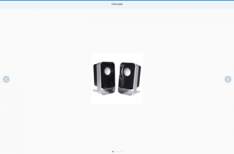
Elements and Controls

Implementation

Token

Tokens are small items of information (similar to tags) that mainly serve to visualize previously selected items. The tokenizer is the container that handles the tokens. Tokens can be added, removed, selected, or deselected.

Token
Token

Usage

Use tokens only in the multi-combo boxmulti-input control, or value help dialog.

Components

The tokenizer is an invisible container that can display multiple tokens.

Tokens have the following properties:

  • They usually contain single text items.
  • They may also contain key-value pairs, such as John Miller (ID1234567).
  • They contain a Remove icon  , which is invisible if the token is in edit mode.
Tokens with a surrounding tokenizer

Behavior and Interaction

Interacting

Users can interact with tokens using a mouse, keyboard, and/or touch input. In size L (desktop) only, hovering with the mouse over the token produces a tooltip with the entire content of the token (on a maximum of two lines).

Selecting and Deselecting Tokens

Users can select tokens by clicking or tapping them, or by using the keyboard. The selected tokens are then indicated. Users can select multiple tokens separately by holding down the CTRL key and selecting the relevant tokens, for example, by clicking them.

The user can select a series of tokens by placing the cursor in an initial position (which can also be a token), holding down the SHIFT key, and clicking or tapping a new position. The tokens between these two cursor positions are then selected.

To replace a token, the user selects it and enters new characters.

Adding Tokens

The user can add tokens to the multi-combo box and multi-input control. New tokens are added in the order in which they are entered.

Information
For information on how to manage leading and treading whitespace (blanks) when copying and pasting text into input controls, please see removing leading and trailing whitespace.

Removing Tokens

The user can instantly remove tokens via the keyboard, or by clicking or tapping the Remove  icon .

Styles

There are three different styles of tokens: regularon hover, and selected. These styles correspond to the type of interaction being used.

Regular
Regular
On hover
On hover
Selected
Selected

Guidelines

  • The tokenizer can also be used as a tag container.

Resources

Want to dive deeper? Follow the links below to find out more about related controls, the SAPUI5 implementation, and the visual design.
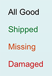
Elements and Controls

Implementation

Progress Indicator

The progress indicator visualizes the current advancement of a process or a degree of accomplishment. The inside of the progress indicator is filled with color to indicate the state of progress. The advancement depends on the specific process. The progress is shown either using absolute numbers or the current percentage of completion together with a progress bar.

Within SAP Fiori, the progress indicator is used as a “meter” or mini chart. It indicates a current object status and is not related to any process that is currently running.

Usage

Use the progress indicator if:

  • You need to visually show a current (static) status.
  • You need to visually strengthen a current (static) status.
  • You need to make different states comparable to each other at a higher level.

Do not use the progress indicator if:

  • Visual feedback is needed for an ongoing operation. In this case, use a busy indicator instead.

Responsiveness

The progress indicator itself is not responsive. It supports the cozy and compact form factors. The compact form factor is used for apps that run on a device operated by a mouse and keyboard. For more information, see Content Density (Cozy and Compact).

Progress indicator in compact mode
Progress indicator in cozy mode

Layout

Show the current progress as a percentage value between 0% and 100%. Property: percentValue.

Progress indicator displaying 10% progress
Progress indicator displaying 50% progress
Progress indicator displaying 80% progress

Alternatively, you can show the current progress as text in addition to the bar. In this case, the text is shown on the right of the bar if the progress is 50% or less. In all other cases, the progress is shown right-aligned on the bar itself. Property: showValue.

Textual presentation for progress of 50% or less
Textual presentation for progress of more than 50%
Progress indicator without textual representation

You also have the option of showing any application-specific text instead of a percentage. Property: displayValue.

App-specific textual representation of progress

Styles

The progress indicator can be enabled or disabled. Property: enabled.

Disabled progress indicator

The progress indicator can visualize different value states that are represented by various theme-dependent semantic colors. The states are: normal, success, warning, and error. Property: state.

Progress indicator in normal state
Progress indicator in success state
Progress indicator in warning state
Progress indicator in error state

Guidelines

Use the progress indicator to add clarity and weight to an important state that needs to be perceived very quickly.

Progress indicator used for status display

Always provide a label for the progress indicator.

Exception: If the progress indicator is used as a single control inside a cell of a responsive table, the column header text is used as a label.

Progress indicator in a responsive table

Use a group of up to five bars to help users compare different states at a high level. Note that in a group of more than five bars, slight differences are much harder to perceive than a numeric display.

If the user has to compare a group of values, be sure to use the same visual display for all of them (only bars or only numbers).

Group of progress indicators

Progress indicators are typically used within (but not restricted to) the following controls:

Do not disable a progress indicator. A progress indicator is not interactive, therefore disabling it has no effect.

Exception: The progress indicator is shown inside a disabled UI area, such as a completely disabled form or panel.

Properties

The following additional properties are available for the progress indicator:

  • The property “width” defines the width of the progress indicator. The property “height” defines the height of the progress indicator. Adapt it only if the default height does not fit into the surrounding context. Do not use a height below 1.5 rems if text is shown inside the progress indicator.
  • The property “textDirection” is used for localiaztion (right-to-left languages).
  • The property “busy” sets the progress indicator to busy state.
  • The property “visible” shows or hides the progress indicator.
  • The property “tooltip” does not have an effect.

Resources

Want to dive deeper? Follow the links below to find out more about related controls, the SAPUI5 implementation, and the visual design.

Elements and Controls

Implementation

Progress Indicator

The progress indicator visualizes the current advancement of a process or a degree of accomplishment. The inside of the progress indicator is filled with color to indicate the state of progress. The advancement depends on the specific process. The progress is shown either using absolute numbers or the current percentage of completion together with a progress bar.

Within SAP Fiori, the progress indicator is used as a “meter” or mini chart. It indicates a current object status and is not related to any process that is currently running.

Usage

Use the progress indicator if:

  • You need to visually show a current (static) status.
  • You need to visually strengthen a current (static) status.
  • You need to make different states comparable to each other at a higher level.

Do not use the progress indicator if:

  • Visual feedback is needed for an ongoing operation. In this case, use a busy indicator instead.

Responsiveness

The progress indicator itself is not responsive. It supports the cozy and compact form factors. The compact form factor is used for apps that run on a device operated by a mouse and keyboard. For more information, see Content Density (Cozy and Compact).

Progress indicator in compact mode
Progress indicator in cozy mode

Layout

Show the current progress as a percentage value between 0% and 100%. Property: percentValue.

Progress indicator displaying 10% progress
Progress indicator displaying 50% progress
Progress indicator displaying 80% progress

Alternatively, you can show the current progress as text in addition to the bar. In this case, the text is shown on the right of the bar if the progress is 50% or less. In all other cases, the progress is shown right-aligned on the bar itself. Property: showValue.

Textual presentation for progress of 50% or less
Textual presentation for progress of more than 50%
Progress indicator without textual representation

You also have the option of showing any application-specific text instead of a percentage. Property: displayValue.

App-specific textual representation of progress

Styles

The progress indicator can be enabled or disabled. Property: enabled.

Disabled progress indicator

The progress indicator can visualize different value states that are represented by various theme-dependent semantic colors. The states are: normal, success, warning, and error. Property: state.

Progress indicator in normal state
Progress indicator in success state
Progress indicator in warning state
Progress indicator in error state

Guidelines

Use the progress indicator to add clarity and weight to an important state that needs to be perceived very quickly.

Progress indicator used for status display

Always provide a label for the progress indicator.

Exception: If used as single control inside a cell of a responsive table, the column header text is used as a label.

Progress indicator in a responsive table

Use a group of up to five bars to help users compare different states at a high level. Note that in a group of more than five bars, slight differences are much harder to perceive than a numeric display.

If the user has to compare a group of values, be sure to use the same visual display for all of them (only bars or only numbers).

Group of progress indicators

Progress indicators are typically used within (but not restricted to) the following controls:

Progress indicator in a responsive table

Do not disable a progress indicator. A progress indicator is not interactive, therefore disabling it has no effect.

Exception: The progress indicator is shown inside a disabled UI area, such as a completely disabled form or panel.

Progress indicator in a responsive table

Properties

The following additional properties are available for the progress indicator:

  • The property “width” defines the width of the progress indicator. The property “height” defines the height of the progress indicator. Adapt it only if the default height does not fit into the surrounding context. Do not use a height below 1.5 rems if text is shown inside the progress indicator.
  • The property “textDirection” is used for localiaztion (right-to-left languages).
  • The property “busy” sets the progress indicator to busy state.
  • The property “visible” shows or hides the progress indicator.
  • The property “tooltip” does not have an effect.

Resources

Want to dive deeper? Follow the links below to find out more about related controls, the SAPUI5 implementation, and the visual design.

Elements and Controls

Implementation

Progress Indicator

The progress indicator visualizes the current advancement of a process or a degree of accomplishment. The inside of the progress indicator is filled with color to indicate the state of progress. The advancement depends on the specific process. The progress is shown either using absolute numbers or the current percentage of completion together with a progress bar.

Within SAP Fiori, the progress indicator is used as a “meter” or mini chart. It indicates a current object status and is not related to any process that is currently running.

Usage

Use the progress indicator if:

  • You need to visually show a current (static) status.
  • You need to visually strengthen a current (static) status.
  • You need to make different states comparable to each other at a higher level.

Do not use the progress indicator if:

  • Visual feedback is needed for an ongoing operation. In this case, use a busy indicator instead.

Responsiveness

The progress indicator itself is not responsive. It supports the cozy and compact form factors. The compact form factor is used for apps that run on a device operated by a mouse and keyboard. For more information, see Content Density (Cozy and Compact).

Progress indicator in compact mode
Progress indicator in cozy mode

Layout

Show the current progress as a percentage value between 0% and 100%. Property: percentValue.

Progress indicator displaying 10% progress
Progress indicator displaying 50% progress
Progress indicator displaying 80% progress

Alternatively, you can show the current progress as text in addition to the bar. In this case, the text is shown on the right of the bar if the progress is 50% or less. In all other cases, the progress is shown right-aligned on the bar itself. Property: showValue.

Textual presentation for progress of 50% or less
Textual presentation for progress of more than 50%
Progress indicator without textual representation

You also have the option of showing any application-specific text instead of a percentage. Property: displayValue.

App-specific textual representation of progress

Styles

The progress indicator can be enabled or disabled. Property: enabled.

Disabled progress indicator

The progress indicator can visualize different value states that are represented by various theme-dependent semantic colors. The states are: normal, success, warning, and error. Property: state.

Progress indicator in normal state
Progress indicator in success state
Progress indicator in warning state
Progress indicator in error state

Guidelines

Use the progress indicator to add clarity and weight to an important state that needs to be perceived very quickly.

Progress indicator used for status display

Always provide a label for the progress indicator.

Exception: If the progress indicator is used as a single control inside a cell of a responsive table, the column header text is used as a label.

Progress indicator in a responsive table

Use a group of up to five bars to help users compare different states at a high level. Note that in a group of more than five bars, slight differences are much harder to perceive than a numeric display.

If the user has to compare a group of values, be sure to use the same visual display for all of them (only bars or only numbers).

Group of progress indicators

Progress indicators are typically used within (but not restricted to) the following controls:

Progress indicator in a responsive table

Do not disable a progress indicator. A progress indicator is not interactive, therefore disabling it has no effect.

Exception: The progress indicator is shown inside a disabled UI area, such as a completely disabled form or panel.

Progress indicator in a responsive table

Properties

The following additional properties are available for the progress indicator:

  • The property “width” defines the width of the progress indicator. The property “height” defines the height of the progress indicator. Adapt it only if the default height does not fit into the surrounding context. Do not use a height below 1.5 rems if text is shown inside the progress indicator.
  • The property “textDirection” is used for localiaztion (right-to-left languages).
  • The property “busy” sets the progress indicator to busy state.
  • The property “visible” shows or hides the progress indicator.
  • The property “tooltip” does not have an effect.

Resources

Want to dive deeper? Follow the links below to find out more about related controls, the SAPUI5 implementation, and the visual design.

Elements and Controls

Implementation

Title

The title control is a simple, one-line text containing additional semantic information for accessibility purposes.

The difference between a title and a manually styled heading is that the title can be used by assistive technologies such as screen readers to create a hierarchical site map for faster navigation.

The title is used, for example, by paneltoolbar, or list components.

Table with title in toolbar and header

Usage

Use the title if:

  • You want to set the title above a table or form.
  • You want to show text in the page header.

Do not use the title if:

  • The text is inside a text block.
  • The text is inside a form element.

Responsiveness

Long titles can become truncated if the screen is smaller than the entire title.

A long title that is truncated on small screens

Styles

The actual appearance of the title and the different styles always depends on the theme being used.

The semantic level of the title can be set automatically or explicitly. With the automatic setting (property: level, value: Auto) no explicit level information is written (HTML5 header element). If you want to set it explicitly, use an HTML H1-H6 element (property: level, value: H1-H6).

The level (property: level, value: Auto, H1-H6) and title style (property: titleStyle, value: Auto, H1-H6) can be set independently.

Title with default level and style (H1)
Title with level H1 and default style
Title with level H2 and default style
Title with level H3 and default style
Title with level H4 and default style
Title with level H5 and default style
Title with level H6 and default style

Properties

The following properties are available:

  • The property text defines the text that should be displayed as a title.
  • The property level (default: auto) defines the semantic level used by assistive technology. The default level can be overridden with H1 to H6 to set the level explicitly.
  • The property titleStyle (default: auto) defines the actual appearance of the title. When you use automatic styling, the appearance of the title depends on the current position of the title and the defined level. This automatism can be overridden by explicitly setting a different style between H1 and H6.
  • The property width defines the width of the title.
  • The property textAlign (default: initial) defines the alignment of the text within the title. Note: This property only has an effect if the overall width of the title control is larger than the displayed text.

Resources

Want to dive deeper? Follow the links below to find out more about related controls, the SAPUI5 implementation, and the visual design.

Elements and Controls

Implementation

  • Title (SAPUI5 samples)
  • Title (SAPUI5 API reference)

Title

The title control is a simple, one-line text containing additional semantic information for accessibility purposes.

The difference between a title and a manually styled heading is that the title can be used by assistive technologies such as screen readers to create a hierarchical site map for faster navigation.

The title is used, for example, by paneltoolbar, or list components.

Table with title in toolbar and header

Usage

Use the title if:

  • You want to set the title above a table or form.
  • You want to show text in the page header.

Do not use the title if:

  • The text is inside a text block.
  • The text is inside a form element.

Responsiveness

Long titles can become truncated if the screen is smaller than the entire title.

A long title that is truncated on small screens

Styles

The actual appearance of the title and the different styles always depends on the theme being used.

The semantic level of the title can be set automatically or explicitly. With the automatic setting (property: level, value: Auto) no explicit level information is written (HTML5 header element). If you want to set it explicitly, use an HTML H1-H6 element (property: level, value: H1-H6).

The level (property: level, value: Auto, H1-H6) and title style (property: titleStyle, value: Auto, H1-H6) can be set independently.

Title with default level and style (H1)
Title with level H1 and default style
Title with level H2 and default style
Title with level H3 and default style
Title with level H4 and default style
Title with level H5 and default style
Title with level H6 and default style

Properties

The following properties are available:

  • The property text defines the text that should be displayed as a title.
  • The property level (default: auto) defines the semantic level used by assistive technology. The default level can be overridden with H1 to H6 to set the level explicitly.
  • The property titleStyle (default: auto) defines the actual appearance of the title. When you use automatic styling, the appearance of the title depends on the current position of the title and the defined level. This automatism can be overridden by explicitly setting a different style between H1 and H6.
  • The property width defines the width of the title.
  • The property textAlign (default: initial) defines the alignment of the text within the title. Note: This property only has an effect if the overall width of the title control is larger than the displayed text.

Resources

Want to dive deeper? Follow the links below to find out more about related controls, the SAPUI5 implementation, and the visual design.
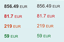
Elements and Controls

Implementation

  • Title (SAPUI5 samples)
  • Title (SAPUI5 API reference)

Infobar

The infobar is a type of toolbar that appears above a list or panel, and shows filter or selection settings:

  • Filter criteria: The infobar indicates the filter criteria that have been applied for a filter or contextual filter. Do not show the infobar if no filter is applied.
  • Selected items: In a multi-select dialog, the infobar shows the number of selected items.
Infobar is placed above the content and shows the applied filters.

Responsiveness

The bar has the same height, text size, and icon size in both cozy and compact format. Text inside the bar is truncated if there is not enough space.

Text is truncated on a small screen. Example shows infobar for contextual filter.

Types

There are three situations in which an infobar is shown:

  1. After a general filter has been applied.
  2. After a contextual filter has been applied.
  3. After the user has selected multiple items in a select dialog.

General Filter

All applied filters are shown as labels in the infobar.

Infobar after a filter has been applied

Contextual Filter

The contextual filter allows the user to see a prefiltered view of a list. The title on the left side and an icon on the right side display the filter criteria. The filter icon should represent the filter category. Do not use a generic filter icon, otherwise it may be confused with the user-triggered filters. For more information, see contextual filter.

Infobar after a contextual filter has been applied

Multiselection

If the user selects multiple items, the infobar shows the number of selected items. For more information, see select dialog.

Infobar after multiselection has been applied

Components

The infobar is a toolbar that consists of a label on the left side and an icon on the right side.

The label shows the filter criteria, and the icon selected depends on the use case.

General Filter and Multiselection

No icon is shown. The only exception is the Cancel icon, which is used to reset the current filter criteria.

Infobar with optional Cancel icon

Contextual Filter

The icon is mandatory and represents the current filter criterion.

There is one exception in which it is useful to be able to cancel the contextual filter. In this special case, the contextual filter is used to prefilter the listed items in a select dialog. For this case, use the Cancel icon instead of the Filter icon. For more information, see contextual filter.

In all other use cases, show an icon that represents the filter criterion.

Contextual filter with Filter icon

Behavior and Interaction

The bar can have two active areas: either the entire bar can be active, or if an icon is added, it creates a second active area. We recommend that you use the active behavior for the bar and the icon.

Bar Area

When the user clicks or taps the bar, the filter dialog from the view settings dialog is shown. If only one filter is applied, the filter can be changed directly in the detailed filter selection. If more than one filter is applied, the filter dialog shows a list with general filter categories.

Clicking the infobar with a single filter shows the detailed filter selection.
Clicking the infobar with multiple filters shows the filter categories.

Icon Area

  • Cancel: The user clicks or taps the icon to delete the current filter settings. We recommend that you use the cancel icon.
  • Filter (only contextual filter): Clicking the icon has the same effect as clicking the bar. The filter dialog is shown.

Properties

The contextual filter is not a separate control. If you want to build an infobar, you need to use the sap.m.toolbar control. To achieve the infobar design, set the design toolbar property to “info”.

Resources

Want to dive deeper? Follow the links below to find out more about related controls, the SAPUI5 implementation, and the visual design.
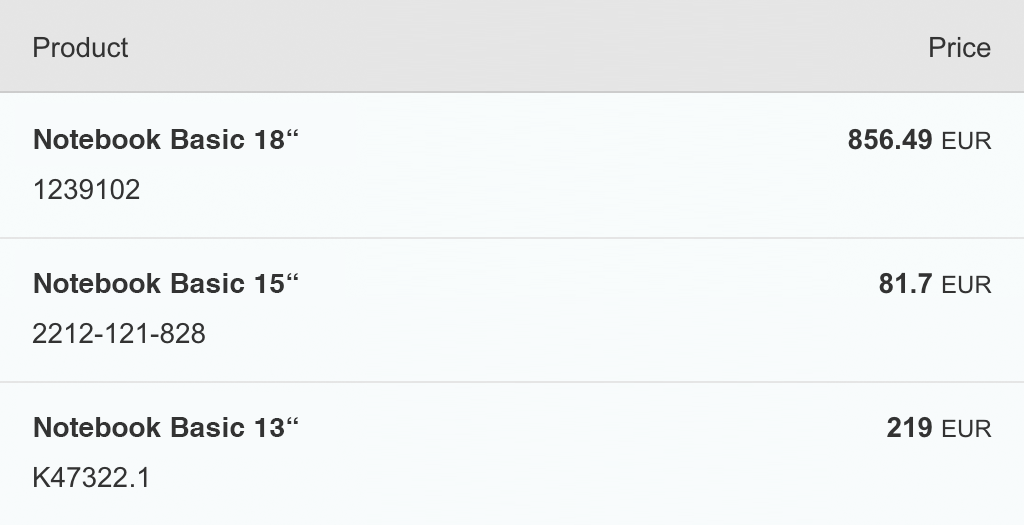
Elements and Controls

Implementation

  • No links

Object Display Components

There are three types of object display component: object status, object identifier and object number.

Object Status

The object status is a short text that represents the semantic status of an object. It has a semantic color and an optional icon. As such, you can generally find the object status in the object header and in the table as a status attribute of a line item.

Object Identifier

The object identifier is a short text that represents the key identifier of an object.

You can find the object identifier in a table as an identifier of the line item.

Object Number

The object number is a short text that represents the numeric (key) attribute of an object and its unit. The number has a semantic color, and the unit inherits the same color from its number. The number can be emphasized (default setting) when it is used for the key attribute, and non-emphasized when it is used for any other numeric attribute of the item.

The object number is generally used to indicate the key attribute of an object in the object header, and as an attribute of a line item in a table.

Object Marker

The object marker allows you to express the technical status of an object.

The technical status can be represented as icon, icon and text, or as text only, depending on the screen size. See the guidelines section below to find out when to use which visibility option.

Currently, the following technical statuses can be visualized by the object marker:

  • Flag
  • Favorite
  • Editing Status (Draft, Locked, Unsaved Changes)

Usage

Use the object status if:

  • You need to display the semantic status of an object: negative (property: error), critical (property: warning), positive (property: success), or neutral (property: none).
  • You need to show that the current object instance is locked by another user.

Use the object number if:

  • You want to display the key attribute of an object. In this case, keep the emphasized default setting (property: emphasized).
  • You need to display one or more numeric attributes of an object that, for example, you want to compare (property: emphasized set to “false”).

Use the object identifier if:

  • You want to indicate the key identifier of the object.

Do not use the object status or object number if:

  • You want to display system messages.

Do not use the object display components if:

  • They are for decoration purposes only.

Responsiveness

  • The object status wraps if it is too long for the screen width available.
  • The object identifier text wraps if the size of the screen becomes too small to display the entire text on one line.
  • The object number does not wrap or truncate. For large numbers, you need to consider using the appropriate formatting.

Components

Object Status

The object status consists of the following:

  • A semantically-colored text (property: text)
  • An optional icon (property: icon)
  • A title that serves as a label (property: title)

It is mainly used with semantically-colored text only.

Semantic colors for object status

Object Identifier

The object identifier has the following properties:

  • A title text (property: title)
Object identifier – Text only
  • An optional additional descriptive text (property: text)
Object identifier – With subtitle
  • The title can be set to active. In this case, it looks like a link and can fire an event (property: titleActive).
Object identifier – Actionable
  • Both texts wrap if the space available is insufficient to fit each of them on one line.
Object identifier – Long texts wrap

Object Number

The object number consists of the following:

  • A semantically-colored text (property: number), which can be set to non-emphasized when used in the content area (property: emphasized)
  • An optional unit (property: unit)
Object numbers
Object numbers

Guidelines

Object Status

  • Use semantic text only, and avoid using it with an icon.
  • Use the following semantics to indicate the status: negative (property: error), critical (property: warning), positive (property: success), and neutral (property: none).
Preferably use semantic text only
  • Only use icons if they are unambiguous and easily understood (such as a padlock for locked items). If you feel your icon would need a descriptive text to be understood, use text only.
  • For locked items, you may also add information about who is currently locking the item.
Status locked
Status locked
Status locked by a certain user
  • Do not use the title of the object status outside the object header. Even though the title and the status text wrap, keep them both as short as possible.
Avoid long title and text where possible
  • When used in a table, the object status should be center-aligned.
Object status should be center-aligned

Object Identifier

  • The object identifier should be easily readable (preferably the display text and not the ID). If the ID is necessary to distinguish between items that use the same title, it should appear in brackets, such as Product ABC (1234567). Whether you include the ID in the text property can also depend on how long you expect the text to be.
  • The object identifier can also be shown as a link. In this case, the event opens the quick view of the object.

Object Number

  • Use the following semantics to indicate the status: negative (property: error), critical (property: warning), positive (property: success), and neutral (property: none).
Neutral object number (856.49 EUR) used as a key attribute in the object header
  • If the object number is the key attribute of the object inside the content area, the number should be emphasized when it is used as a line item status in a table.
Object number with key attribute
  • The object number can also be used to visualize other semantic numeric attributes. In this case, they are not emphasized unless they are the key attribute, such as a sum.
Object number used as an attribute (weight) and as a key attribute (price)

Resources

Want to dive deeper? Follow the links below to find out more about related controls, the SAPUI5 implementation, and the visual design.
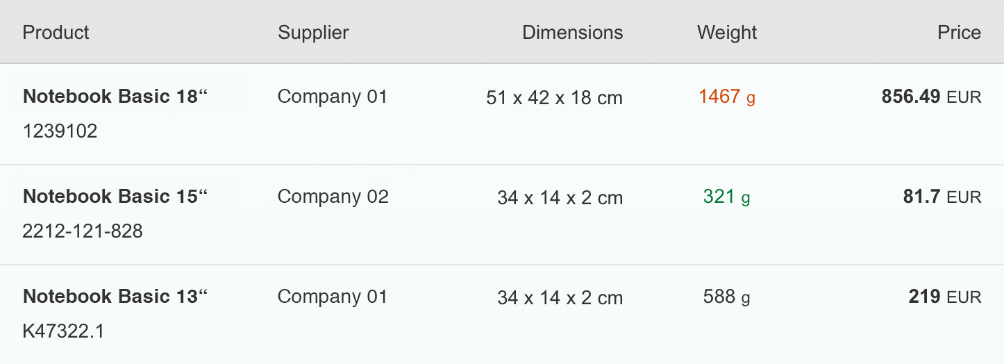
Elements and Controls

  • No link

Implementation

Object Display Components

Obje

There are four types of object display component: object status, object identifier, object number and object marker.

Object Status

The object status is a short text that represents the semantic status of an object. It has a semantic color and an optional icon. As such, you can generally find the object status in the object header and in the table as a status attribute of a line item.

Object Identifier

The object identifier is a short text that represents the key identifier of an object.

You can find the object identifier in a table as an identifier of the line item.

Object Number

The object number is a short text that represents the numeric (key) attribute of an object and its unit. The number has a semantic color, and the unit inherits the same color from its number. The number can be emphasized (default setting) when it is used for the key attribute, and non-emphasized when it is used for any other numeric attribute of the item.

The object number is generally used to indicate the key attribute of an object in the object header, and as an attribute of a line item in a table.

Object Marker

The object marker allows you to express the technical status of an object.

The technical status can be represented as icon, icon and text, or as text only, depending on the screen size. See the guidelines section below to find out when to use which visibility option.

Currently, the following technical statuses can be visualized by the object marker:

  • Flag
  • Favorite
  • Editing Status (Draft, Locked, Unsaved Changes)

Usage

Use the object status if:

  • You need to display the semantic status of an object: negative (property: error), critical (property: warning), positive (property: success), or neutral (property: none).
  • You need to show that the current object instance is locked by another user.

Use the object number if:

  • You want to display the key attribute of an object. In this case, keep the emphasized default setting (property: emphasized).
  • You need to display one or more numeric attributes of an object that, for example, you want to compare (property: emphasized set to “false”).

Use the object identifier if:

  • You want to indicate the key identifier of the object.

Use the object marker if:

  • You want to display the technical state (locked, draft, unsaved changes, favorite, flagged) of an object. If you want to display the status of the object in the business lifecycle, consider using the object status display component instead.

Do not use an object display components if:

  • You want to display system messages.
  • They are for decoration purposes only.

Responsiveness

  • The object status wraps if it is too long for the screen width available.
  • The object identifier text wraps if the size of the screen becomes too small to display the entire text on one line.
  • The object number does not wrap or truncate. For large numbers, you need to consider using the appropriate formatting.
  • The object marker does not wrap or truncate. It comes with different display options. Depending on the screen size and the selected visibility option the object marker behaves as follows:
    • On L/M size:
      • If the visibility is set to IconAndText is selected, both are displayed.
      • If the visibility is set to IconOnly is selected, only the icon is displayed.
      • If the visibility is set to Text is selected, only the text is displayed.
    • On S size:
      • If the visibility is set to IconAndText is available, only the icon is displayed.
      • If the visibility is set to Icon is available, only the icon is displayed.
      • If the visibility is set to Text is available, only the text is displayed.

Components

Object Status

The object status consists of the following:

  • A semantically-colored text (property: text)
  • An optional icon (property: icon)
  • A title that serves as a label (property: title)

It is mainly used with semantically-colored text only.

Semantic colors for object status

Object Identifier

The object identifier has the following properties:

  • A title text (property: title)
Object identifier – Text only
  • An optional additional descriptive text (property: text)
Object identifier – With subtitle
  • The title can be set to active. In this case, it looks like a link and can fire an event (property: titleActive).
Object identifier – Actionable
  • Both texts wrap if the space available is insufficient to fit each of them on one line.
Object identifier – Long texts wrap

Object Number

The object number consists of the following:

  • A semantically-colored text (property: number), which can be set to non-emphasized when used in the content area (property: emphasized)
  • An optional unit (property: unit)
Object numbers
Object numbers

Object Marker

The object marker comes with the following characteristics:

  • Icon only (visibility: IconOnly)
  • Text only (visibility: TextOnly)
  • Icon and text (visibility: IconAndText)
  • Interactive
  • Non-interactive

The object marker is able to fire an an event when it is pressed (interactive). If the control is interactive and displayed as icon with text, the icon and text are one click area.

Favorite
Favorite
Flagged
Flagged
Draft
Draft
Unsaved changes
Unsaved changes
Locked
Locked

Guidelines

Object Status

  • Use semantic text only, and avoid using it with an icon.
  • Use the following semantics to indicate the status: negative (property: error), critical (property: warning), positive (property: success), and neutral (property: none).
Preferably use semantic text only
  • Only use icons if they are unambiguous and easily understood (such as a padlock for locked items). If you feel your icon would need a descriptive text to be understood, use text only.
  • For locked items, you may also add information about who is currently locking the item.
Status locked
Status locked
Status locked by a certain user
  • Do not use the title of the object status outside the object header. Even though the title and the status text wrap, keep them both as short as possible.
Avoid long titles and long text where possible
  • When used in a table, the object status should be center-aligned.
Object status should be center-aligned

Object Identifier

  • The object identifier should be easily readable (preferably the display text and not the ID). If the ID is necessary to distinguish between items that use the same title, it should appear in brackets, such as Product ABC (1234567). The decision to include the ID in the text property can also depend on how long you expect the text to be.
  • The object identifier can also be shown as a link. In this case, the event opens the quick view of the object.

Object Number

  • Use the following semantics to indicate the status: negative (property: error), critical (property: warning), positive (property: success), and neutral (property: none).
Neutral object number (856.49 EUR) used as a key attribute in the object header
  • If the object number is the key attribute of the object inside the content area, the number should be emphasized when it is used as a line item status in a table.
Object number with key attribute
  • The object number can also be used to visualize other semantic numeric attributes. In this case, they are not emphasized unless they are the key attribute, such as a sum.
Object number used as an attribute (weight) and as a key attribute (price)

Object Marker

An object might contain multiple technical statuses at the same time. However, the editing statuses are mutually exclusive. As a result, an object can have a maximum of 3 technical status visible on the screen: Flag, Favorite and one Editing Status. The app developer is responsible for the technical statuses.

Every technical status has a default visualization that can be changed by the app developer depending on the usage context. See also “How to display the editing state” in the draft handling article.

Flag and Favorite are usually displayed as icon. The same applies to all screen sizes.

The default behavior for the editing status is as follows: 

On L/M size:

  • Locked and Unsaved Changes are displayed as icon and text, while Draft is displayed as text.
  • Flag and Favorite are displayed as icons.

On S size:

  • Locked and Unsaved Changes are displayed as icon, while Draft is displayed as text.
  • Flag and Favorite are displayed as icons.
Object marker
Object marker

Resources

Want to dive deeper? Follow the links below to find out more about related controls, the SAPUI5 implementation, and the visual design.

Elements and Controls

  • No link

Implementation

Object Display Components

There are four types of object display component: object status, object identifier, object number and object marker.

 Object Status

The object status is a short text that represents the semantic status of an object. It has a semantic color and an optional icon. As such, you can generally find the object status in the object header and in the table as a status attribute of a line item.

Object Identifier

The object identifier is a short text that represents the key identifier of an object.

You can find the object identifier in a table as an identifier of the line item.

Object Number

The object number is a short text that represents the numeric (key) attribute of an object and its unit. The number has a semantic color, and the unit inherits the same color from its number. The number can be emphasized (default setting) when it is used for the key attribute, and non-emphasized when it is used for any other numeric attribute of the item.

The object number is generally used to indicate the key attribute of an object in the object header, and as an attribute of a line item in a table.

Object Marker

The object marker allows you to express the technical status of an object.

The technical status can be represented as icon, icon and text, or as text only, depending on the screen size. See the guidelines section below to find out when to use which visibility option.

Currently, the following technical statuses can be visualized by the object marker:

  • Flag
  • Favorite
  • Editing Status (Draft, Locked, Unsaved Changes)

Usage

Use the object status if:

  • You need to display the semantic status of an object: negative (property: error), critical (property: warning), positive (property: success), or neutral (property: none).
  • You need to show that the current object instance is locked by another user.

Use the object number if:

  • You want to display the key attribute of an object. In this case, keep the emphasized default setting (property: emphasized).
  • You need to display one or more numeric attributes of an object that, for example, you want to compare (property: emphasized set to “false”).

Use the object identifier if:

  • You want to indicate the key identifier of the object.

Use the object marker if:

  • You want to display the technical state (locked, draft, unsaved changes, favorite, flagged) of an object. If you want to display the status of the object in the business lifecycle, consider using the object status display component instead.

Do not use an object display components if:

  • You want to display system messages.
  • They are for decoration purposes only.

Responsiveness

  • The object status wraps if it is too long for the screen width available.
  • The object identifier text wraps if the size of the screen becomes too small to display the entire text on one line.
  • The object number does not wrap or truncate. For large numbers, you need to consider using the appropriate formatting.
  • The object marker does not wrap or truncate. It comes with different display options. Depending on the screen size and the selected visibility option the object marker behaves as follows:
    • On L/M size:
      • If the visibility is set to IconAndText is selected, both are displayed.
      • If the visibility is set to IconOnly is selected, only the icon is displayed.
      • If the visibility is set to Text is selected, only the text is displayed.
    • On S size:
      • If the visibility is set to IconAndText is available, only the icon is displayed.
      • If the visibility is set to Icon is available, only the icon is displayed.
      • If the visibility is set to Text is available, only the text is displayed.

Components

Object Status

The object status consists of the following:

  • A semantically colored text (property: text)
  • An optional icon (property: icon)
  • A title that serves as a label (property: title)

It is mainly used with semantically-colored text only.

Semantic colors for object status

Object Identifier

The object identifier has the following properties:

  • A title text (property: title)
Object identifier – Text only
  • An optional additional descriptive text (property: text)
Object identifier – With subtitle
  • The title can be set to active. In this case, it looks like a link and can fire an event (property: titleActive).
Object identifier – Actionable
  • Both texts wrap if the space available is insufficient to fit each of them on one line.
Object identifier – Long texts wrap

Object Number

The object number consists of the following:

  • A semantically-colored text (property: number), which can be set to non-emphasized when used in the content area (property: emphasized)
  • An optional unit (property: unit)
Object numbers
Object numbers

Object Marker

The object marker comes with the following characteristics:

  • Icon only (visibility: IconOnly)
  • Text only (visibility: TextOnly)
  • Icon and text (visibility: IconAndText)
  • Interactive
  • Non-interactive

The object marker is able to fire an an event when it is pressed (interactive). If the control is interactive and displayed as icon with text, the icon and text are one click area.

Draft
Draft
Favorite
Favorite
Flagged
Flagged
Unsaved changes
Unsaved changes
Locked
Locked

Guidelines

Object Status

  • Use semantic text only, and avoid using it with an icon.
  • Use the following semantics to indicate the status: negative (property: error), critical (property: warning), positive (property: success), and neutral (property: none).
Preferably use semantic text only
  • Only use icons if they are unambiguous and easily understood (such as a padlock for locked items). If you feel your icon would need a descriptive text to be understood, use text only.
  • For locked items, you may also add information about who is currently locking the item.
Status locked
Status locked
Status locked by a certain user
  • Do not use the title of the object status outside the object header. Even though the title and the status text wrap, keep them both as short as possible.
Avoid long titles and long text where possible
  • When used in a table, center one-word information and icons. For the responsive table only, if status information is displayed as secondary information in a column, the status should follow the alignment of the main information.
Object Status in table with one-word center-aligned
  • Left-align the whole column if there is at least one status with more than two words in English.
Object Status in table with more than two words
  • Left-align status information containing an icon and a text.

Object Status in table with text and icon
  • Ascending tables should be sorted from positive to negative, with neutral last.
Sort - Ascending: From positive to negative
  • Descending tables should be sorted from negative to positive, with neutral first.

Sort - Descending: From negative to positive
  • Ascending tables should be sorted alphabetically within the states (from positive to negative, with neutral last).

Sort - Ascending alphabetically: From positive to negative
  • Descending tables should be sorted alphabetically within the states (from negative to positive, with neutral first).

Sort - Descending alphabetically: From negative to positive

Object Identifier

  • The object identifier should be easily readable (preferably the display text and not the ID). If the ID is necessary to distinguish between items that use the same title, it should appear in brackets, such as Product ABC (1234567). The decision to include the ID in the text property can also depend on how long you expect the text to be.
  • The object identifier can also be shown as a link. In this case, the event opens the quick view of the object.

Object Number

  • Use the following semantics to indicate the status: negative (property: error), critical (property: warning), positive (property: success), and neutral (property: none).
Neutral object number (856.49 EUR) used as a key attribute in the object header
  • If the object number is the key attribute of the object inside the content area, the number should be emphasized when it is used as a line item status in a table.
Object number with key attribute
  • The object number can also be used to visualize other semantic numeric attributes. In this case, they are not emphasized unless they are the key attribute, such as a sum.
Object number used as an attribute (weight) and as a key attribute (price)

Object Marker

An object might contain multiple technical statuses at the same time. However, the editing statuses are mutually exclusive. As a result, an object can have a maximum of 3 technical status visible on the screen: Flag, Favorite and one Editing Status. The app developer is responsible for the technical statuses.

Every technical status has a default visualization that can be changed by the app developer depending on the usage context. See also “How to display the editing state” in the draft handling article.

Flag and Favorite are usually displayed as icon. The same applies to all screen sizes.

The default behavior for the editing status is as follows: 

On L/M size:

  • Locked and Unsaved Changes are displayed as icon and text, while Draft is displayed as text.
  • Flag and Favorite are displayed as icons.

On S size:

  • Locked and Unsaved Changes are displayed as icon, while Draft is displayed as text.
  • Flag and Favorite are displayed as icons.
Object marker
Object marker

Resources

Want to dive deeper? Follow the links below to find out more about related controls, the SAPUI5 implementation, and the visual design.
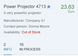
Elements and Controls

  • No link

Implementation

Currency

Use this control to display different currencies in a vertical layout, such as in a tablelist, or form. The control ensures that the amount is always aligned to the decimal point.

Usage

Use the currency control if:

  • You need to display amounts with different currencies in a vertical layout, such as in a table, list, or form, and it is important that the user is able to compare the amounts.

Do not use the currency control if:

  • You need to display amounts with the same currency in a table. Use an object number instead.
  • You need to display a number with a unit of measurement that is not a currency. Use an object number instead.
  • You need to display an amount in a structure other than a list, table, or form.

Responsiveness

The currency control supports amounts smaller than 100 trillion, which still fit on a smartphone screen in portrait mode. For larger amounts, the unit of measurement wraps to the next line, which makes it difficult to compare the amounts.

Components

The currency control consists of:

  • An amount, which is formatted automatically according to the user’s locale (using delimiter symbols for the decimal point and thousand separators) and to the currency set for this specific number (number of decimal places). Property: value.
  • A currency expressed as a three-letter code. Property: currency.
Examples of the currency control

Guidelines

  • When you display a unit of measurement, always show the corresponding three-letter code. (property: useSymbol)
  • Display amounts with a maximum of three decimal places. More than three simply increases the white space between other numbers and their units of measurement with no further benefit. Less than three does not work for all currencies. (property: maxPrecision)

Resources

Want to dive deeper? Follow the links below to find out more about related controls, the SAPUI5 implementation, and the visual design.

Elements and Controls

Implementation

  • No links

Currency

Use this control to display different currencies in a vertical layout, such as in a tablelist, or form. The control ensures that the amount is always aligned to the decimal point.

Usage

Use the currency control if:

  • You need to display amounts with different currencies in a vertical layout, such as in a table, list, or form, and it is important that the user is able to compare the amounts.

Do not use the currency control if:

  • You need to display amounts with the same currency in a table. Use an object number instead.
  • You need to display a number with a unit of measurement that is not a currency. Use an object number instead.
  • You need to display an amount in a structure other than a list, table, or form.

Responsiveness

The currency control supports amounts smaller than 100 trillion, which still fit on a smartphone screen in portrait mode. For larger amounts, the unit of measurement wraps to the next line, which makes it difficult to compare the amounts.

Components

The currency control consists of:

  • An amount, which is formatted automatically according to the user’s locale (using delimiter symbols for the decimal point and thousand separators) and to the currency set for this specific number (number of decimal places). Property: value.
  • A currency expressed as a three-letter code. Property: currency.
Examples of the currency control

Guidelines

  • When you display a unit of measurement, always show the corresponding three-letter code. (property: useSymbol)
  • Display amounts with a maximum of three decimal places. More than three simply increases the white space between other numbers and their units of measurement with no further benefit. Less than three does not work for all currencies. (property: maxPrecision)

Resources

Want to dive deeper? Follow the links below to find out more about related controls, the SAPUI5 implementation, and the visual design.

Elements and Controls

Implementation

  • No links

Lightbox

The lightbox control allows the user to view an imagine in its original size. This control displays the image in a popup while dimming the rest of the screen.

Usage

Use the lightbox if:

  • The thumbnail view is not detailed enough, and it would help the user to see the image in its original size.
  • The original size of the image is bigger than the thumbnail.

Do not use the lightbox if:

  • The image you are using is smaller than or as big as the thumbnail.
  • There is another click event attached to the image control.
  • You are using an image placeholder to display the object.

Responsiveness

The lightbox container is displayed in the middle of the screen.

The image is displayed in its original size unless the original image size is bigger than the size of the screen. In this case, the image is resized proportionally in order to be fully visible and fit on the screen.

On a mobile device, flipping the device to landscape mode will flip the lightbox. The image will then be adjusted to fit the new dimensions.

Lightbox - Size S
Lightbox - Size S
Lightbox - Size M
Lightbox - Size M
Lightbox - Size L
Lightbox - Size L

Components

The lightbox contains the following components:

  • Lightbox container: This is the main container that holds all other components.
  • Image: This component is an embedded image control that displays the image file with the maximum available size. The size of the image should not exceed the original size and it should fit within the screen.
  • Image title: This component is mandatory and is used to describe the object to which the image is attached.
  • Image subtitle: This component is optional and is used to give additional information about the object.
  • Close button: This is a mandatory component and is used to close the lightbox container.
The components of the lightbox

Behavior and Interaction

Basic Interactions

The lightbox control is attached to the press event of the image control. To trigger the lightbox, the user should click or tap on an image.

When the lightbox control is triggered, the lightbox overlays the page content and the rest of the screen is dimmed out.

If it takes more than one second to load the original image, a busy indicator is shown inside the lightbox container.

The user can close the lightbox by clicking or tapping the Close button or by clicking or tapping outside of the lightbox container.

Lightbox - Basic interactions
Lightbox - Image loading

Error Handling

An error message is displayed inside the lightbox when:

  • The original file is missing or the connection to the server is lost.
  • The image takes more than 10 seconds to load due to a server error or the size of the image.
Developer Hint
The URL of the image is mandatory. If it is not specified, the lightbox will not be triggered.
Lightbox - error message

Resources

Want to dive deeper? Follow the links below to find out more about related controls, the SAPUI5 implementation, and the visual design.

Elements and Controls

Implementation