
Calculation Builder
The calculation builder can be used to create complex expressions that combine numeric constants and variables with arithmetic and logical operators. The expressions can be entered using a visual editor or a text editor with three available layout options.
Usage
Use the calculation builder if:
- You need to create or edit complex arithmetic expressions.
- You need to define or modify business KPIs.
- You need to keep the dependencies of the underlying calculations and to be able to expand them.
Responsiveness
The calculation builder is fully responsive, and uses 100% of the width provided by the container in which it is embedded. For size S, it is mandatory to use 100% of the page width.
Depending on the available width, the calculation content is broken into separate lines in order to keep the native vertical scrolling for the whole page.
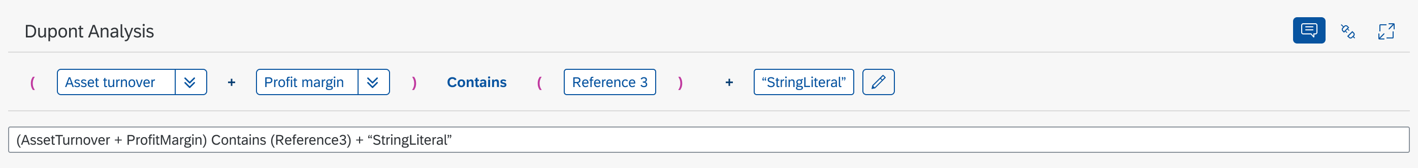
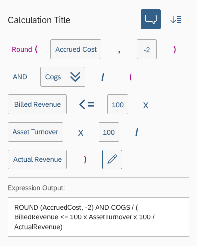
Calculation builder - Size L

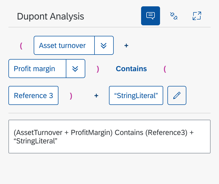
Calculation Builder - Size M
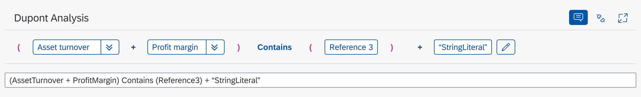
Calculation builder - Size S
Layout
The calculation builder provides three different types of layout:
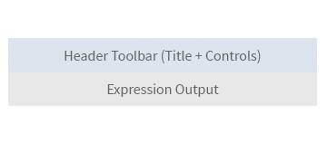
- By default, the header toolbar and both the visual and textual editors are displayed. The header toolbar includes a toggle button for hiding or displaying the textual editor.
- Only the header toolbar and the textual editor are displayed, making the calculation builder a text-only control.
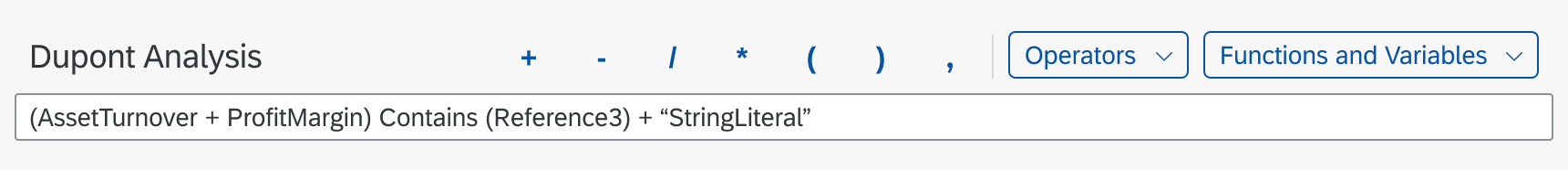
- The header toolbar and visual editor are displayed. The header toolbar includes buttons for arithmetic and logical operators, as well as variables. The toolbar buttons show the user which operations and variables are supported.

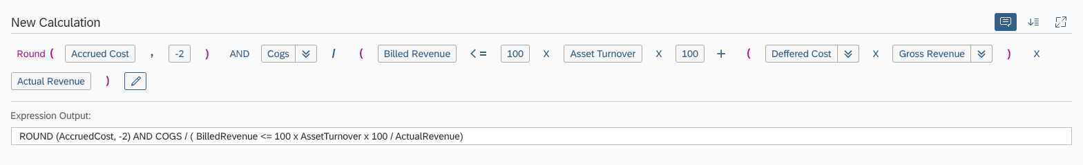
Header toolbar + visual editor + textual editor (default)

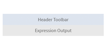
Header toolbar + textual editor only

Header toolbar (with operators and variables) + visual editor
Layout Examples
The following examples show how the different layout types appear on the UI.
Default layout
Header toolbar with expression operators and textual editor

Header toolbar with textual editor only
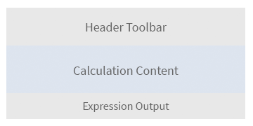
Components
The calculation builder can include thee components:
- A header toolbar
- A visual editor
- A textual editor
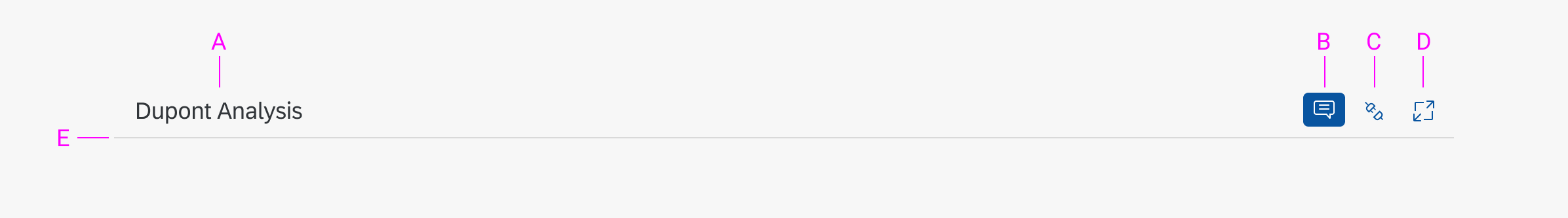
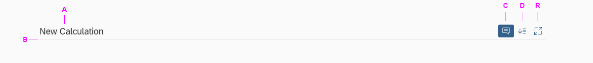
Header Toolbar
A – Title: Provides a short and meaningful summary of the expression.
B – Textual Editor Toggle: Enables the user to hide the Expression Output section and work with the visual editor only
C – Expand All Variables: Allows the user to expand all the variables included in the expression and see all the underlying calculations used to compose the variable.
D – Full Screen: Toggles the full screen view.
E – Divider Line: The divider separates the header toolbar from the content below.
Header toolbar
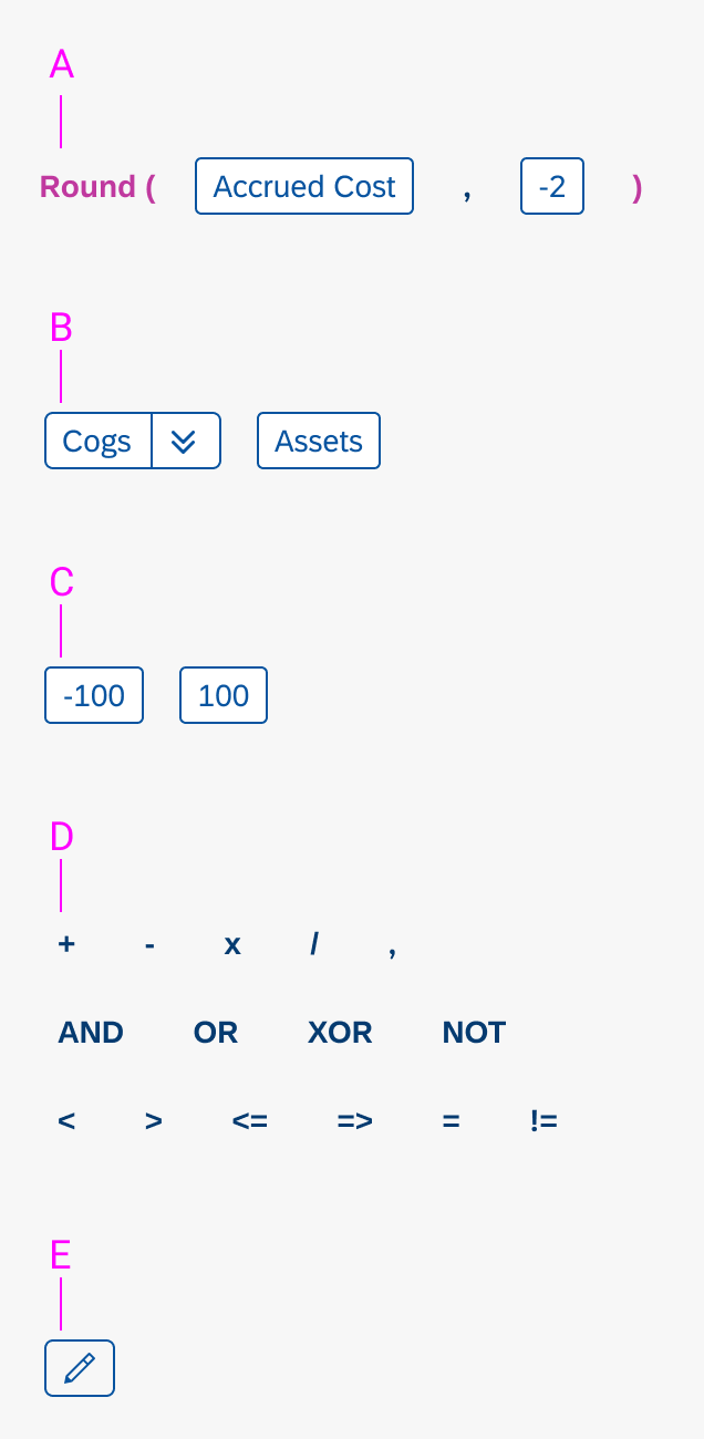
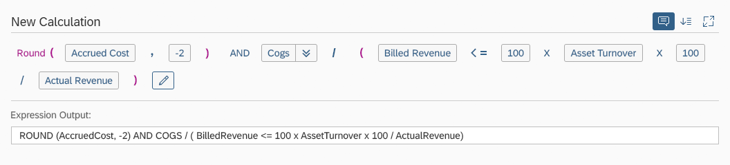
Visual Editor
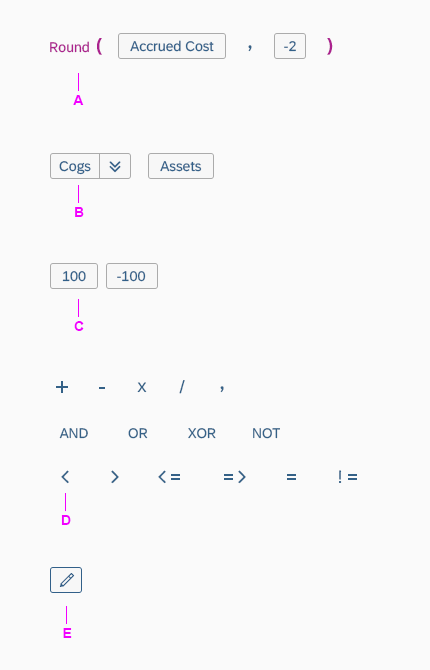
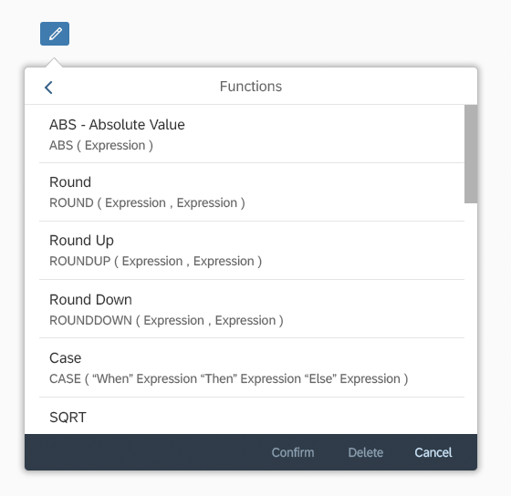
A – Functions: Functions require brackets. The initial bracket is automatically inserted after the function name. Only a limited subset of functions is supported by default. However, you can define any custom function you need using the API.
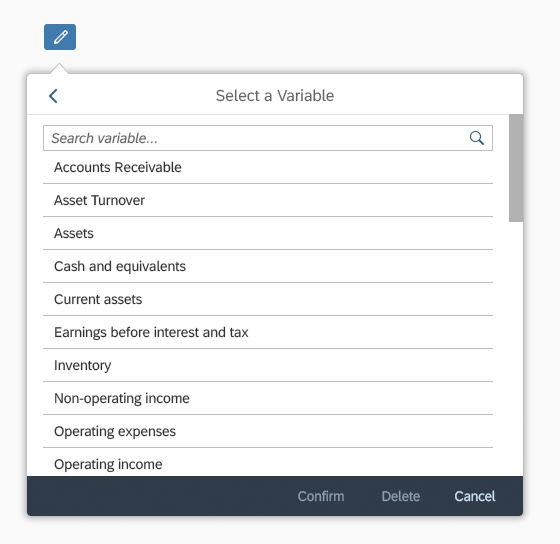
B – Variables: A custom set of available KPIs, such as revenue, assets, or expenses. KPIs are predefined by each application.
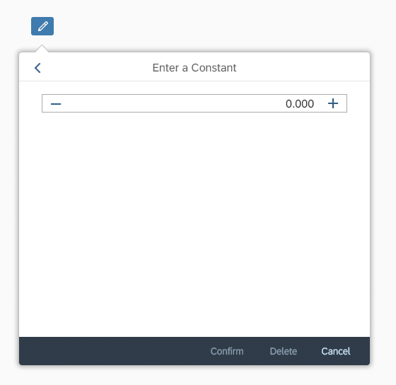
C – Constants: Enables user to type the values directly as standalone constants or as part of a function.
D – Operators: Arithmetic, logical, and comparison operators are available.
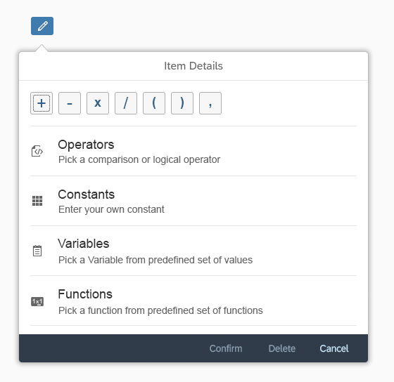
E – New Element: The default button of each expression triggers a dialog to add a new function, variable, operator, or constant.
Visual editor
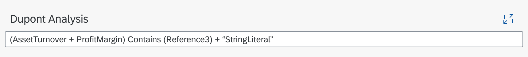
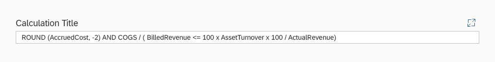
Textual Editor
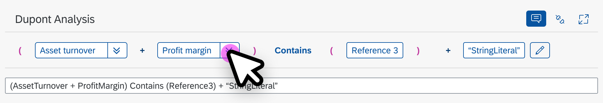
The textual editor contains a plain text representation of the expression entered in the visual editor.
If the user copies an arithmetic expression from an external application and pastes it to the textual editor, the expression displayed in the visual editor will be updated automatically. The same applies the other way round: if the user enters an expression using the visual editor, the textual editor gets updated, which can be used to copy the expression to an external application.
Textual editor
Behavior and Interaction
Inserting New Calculation Elements
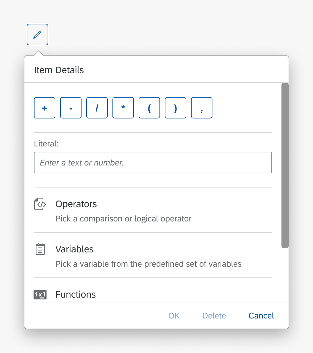
The user has two options for adding an operator, constant, variable, function, or reference to an expression:
- By clicking the New Element button
- By typing it directly into the textual editor field, which makes it appear in the visual editor as well.
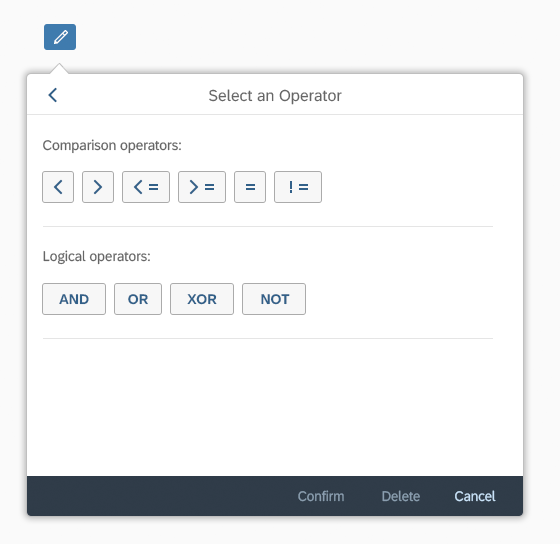
The New Element button triggers a dialog with the selection of all available calculation elements.

Selecting a reference
'New Element' dialog
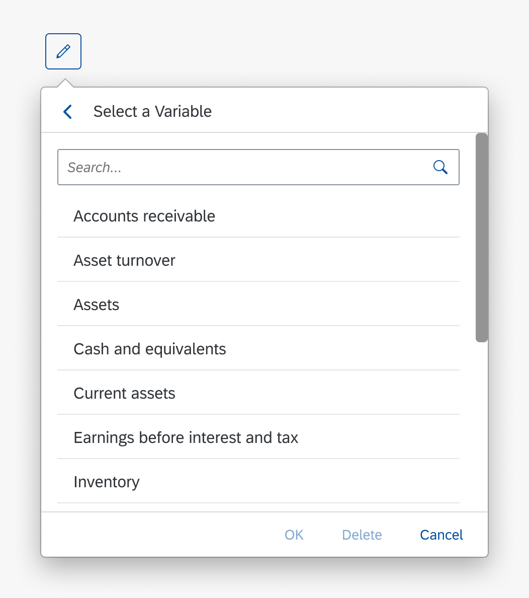
Selecting a variable
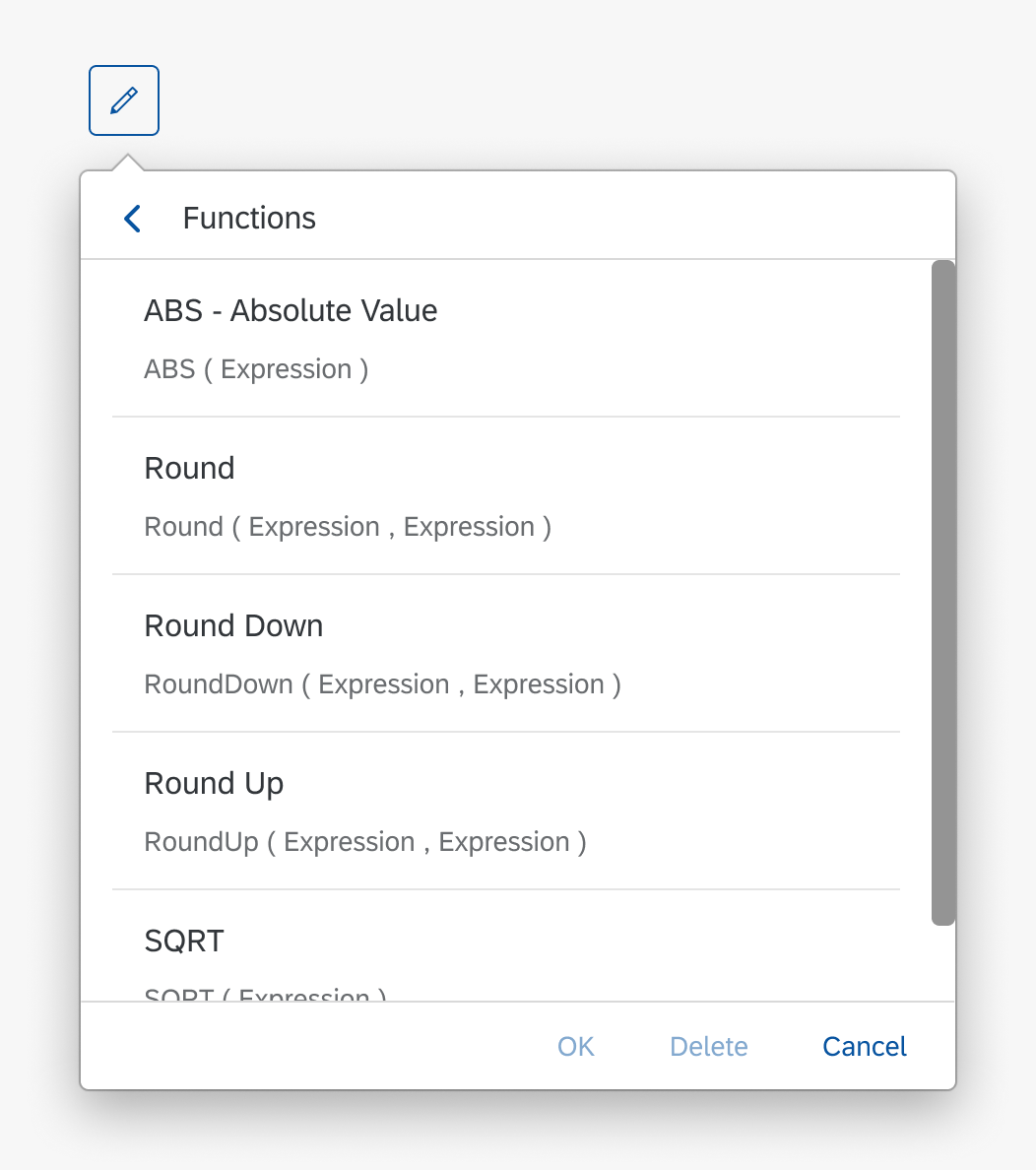
Selecting a function
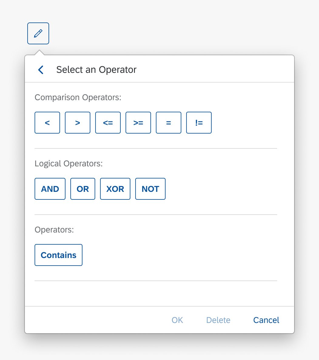
Selecting an operator
Expanding Variables
There are two ways a user can expand a variable to see the underlying structure of the variable.
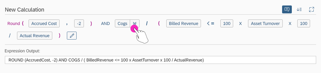
- Expand an individual variable by clicking the Expand Variable button.
- Expand all variables by clicking the Expand All Variables button in the header toolbar.
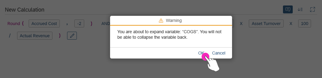
In both cases, a confirmation message is displayed warning the user that this action is irreversible and variables cannot be collapsed back.
When a variable is expanded, the user can also remove the dependency on the original variable, if needed.
Selecting a variable to expand

Confirming the variable expansion
Guidelines
When the default layout is used, displaying both the visual and textual editors, we advise against adding the editor buttons for operators, constants, functions, and variables to the header toolbar.
Resources
Want to dive deeper? Follow the links below to find out more about related controls, the SAPUI5 implementation, and the visual design.


 Your feedback has been sent to the SAP Fiori design team.