
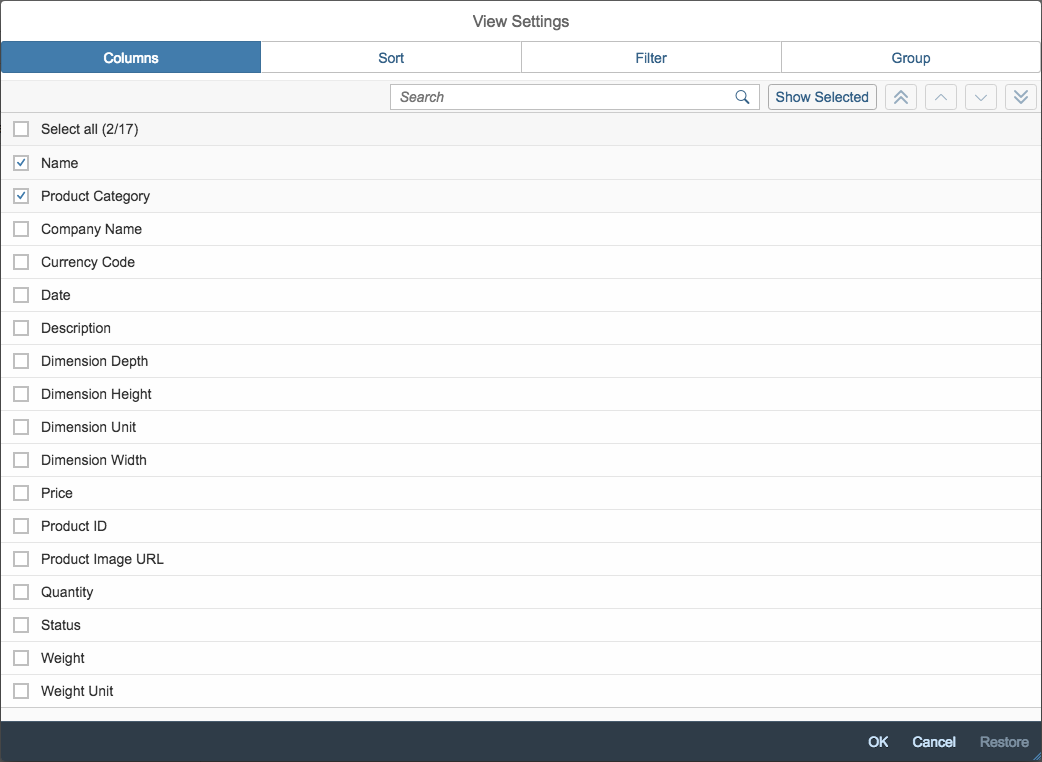
Smart Table
Intro
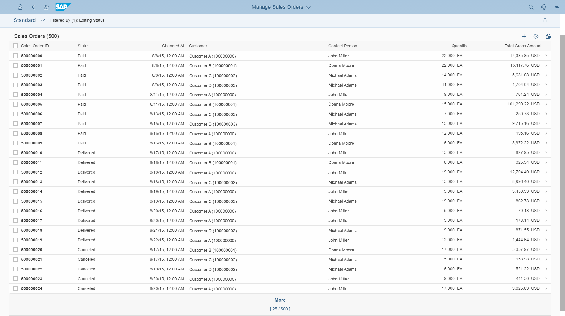
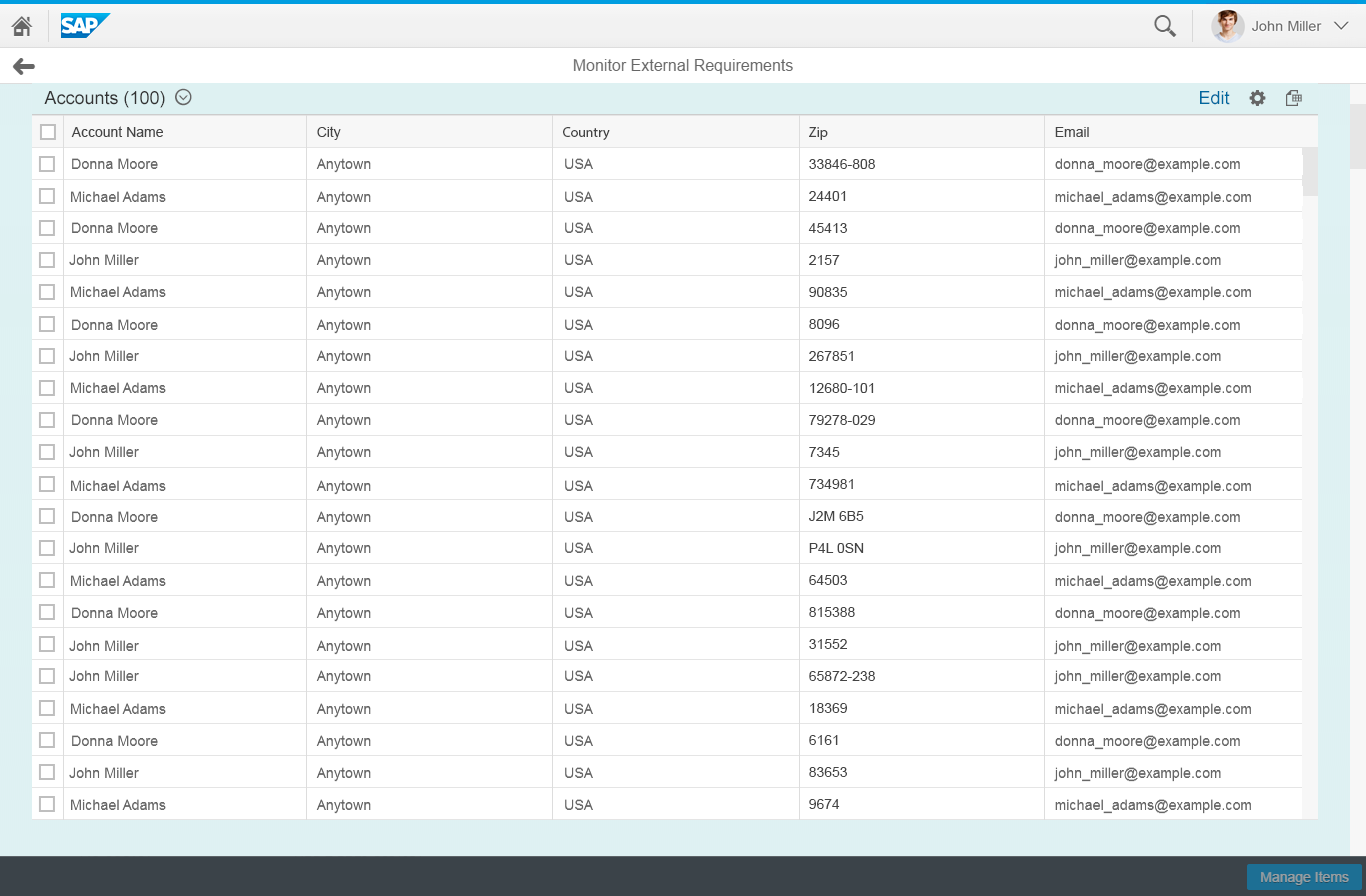
The smart table creates a responsive table, grid table, tree table, or analytical table based on an OData (Open Data Protocol) service and its annotations. The table toolbar comes with additional built-in features, such as personalization, export to spreadsheet, and variant management.
When to Use
Use the smart table if:
- You use an OData service for your app (OData version 2 only).
- The feature set of the smart table fits for your app. In this case, the smart table is faster to implement.
- You need more than one of the major features of the smart table. Otherwise, you might not benefit from a shorter implementation time. For example, if you just need the export to spreadsheet feature, creating a responsive table directly is usually faster than using the smart table.
Do not use the smart table if:
- You use a different technology to OData version 2. Use the corresponding table control directly.
- You need more flexibility in the content design, such as several different row templates or less complex personalization features. Use the responsive table directly.
- You do not have complex data. Another control like a select, combo box, list, grid list, tree, or smart list might do the job better.
- You have very complex data. Did you check the chart?
- Users need to switch between a chart and table. The smart table is not designed to work inside an existing chart container. In this case, use either the smart chart or the corresponding table directly.
- You need to layout different controls in a table-like grid. Use a flexible grid instead.
- You need to layout different input fields with labels. Use a form, simple form, or smart form.
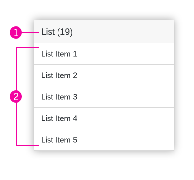
Components
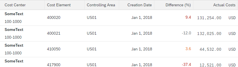
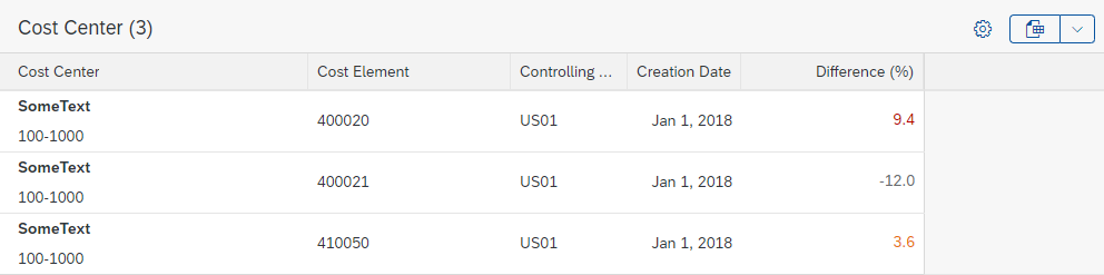
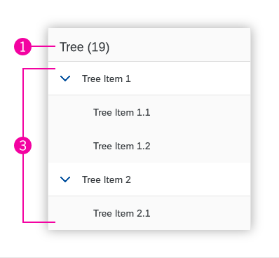
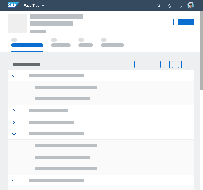
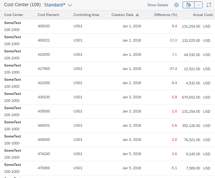
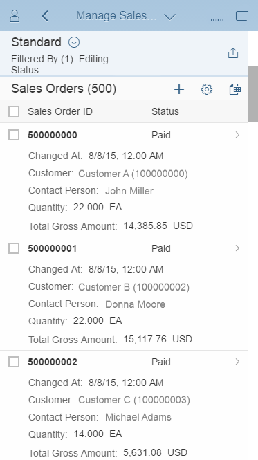
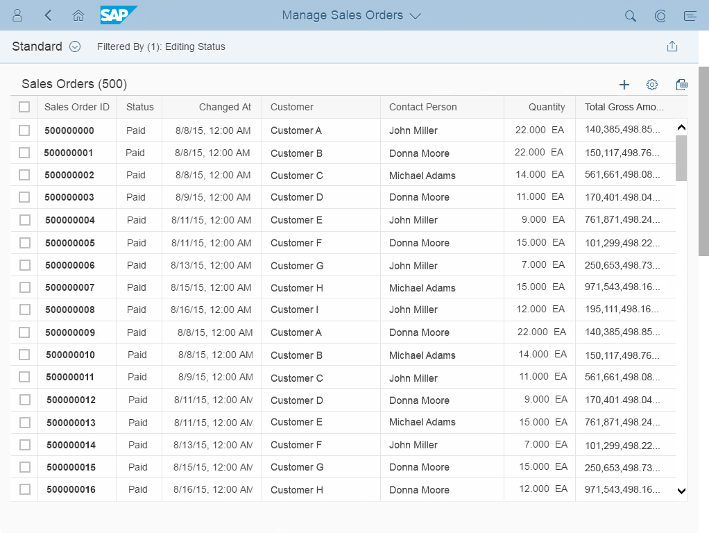
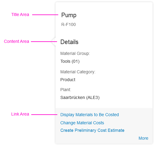
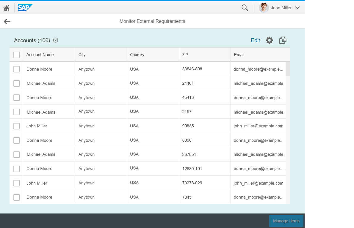
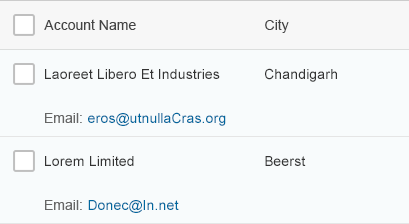
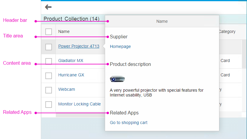
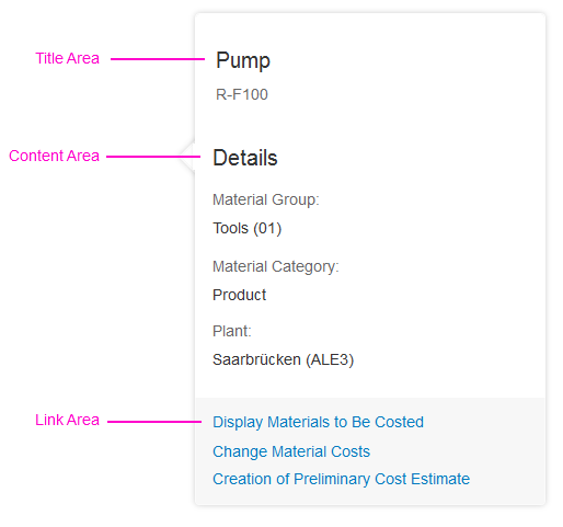
The smart table consists of a table toolbar (1), an infobar (2), and a table (3).
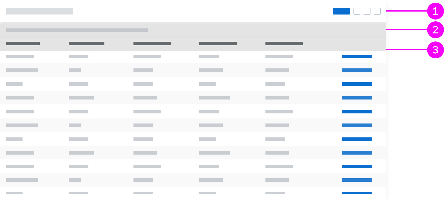
The components of a smart table
Table Toolbar
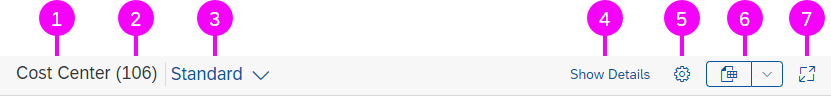
Toolbar with all features provided by the smart table out-of-the-box
The table toolbar is generated automatically. The following toolbar content is provided by the smart table out-of-the box:
- Title
- Item counter
- Variant management
- Show Details / Hide Details
- View Settings
- Export to Spreadsheet
- Maximize / Minimize
In addition, you can add app-specific actions.
Title
Displaying a title is optional (property: header).
Item Counter
The item counter is optional and only available if you show a title (property: showRowCount).
Variant Management
Variant management is optional (properties: persistencyKey, useVariantManagement, currentVariantID, association: smartVariant).
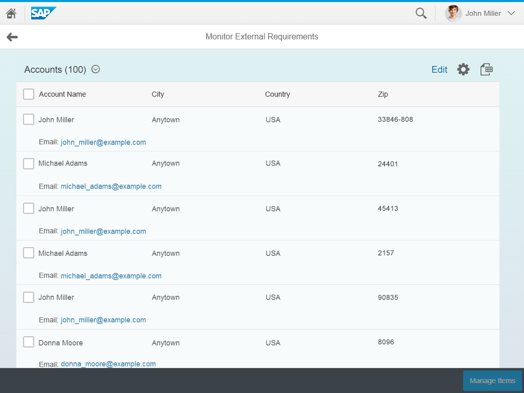
Show Details / Hide Details
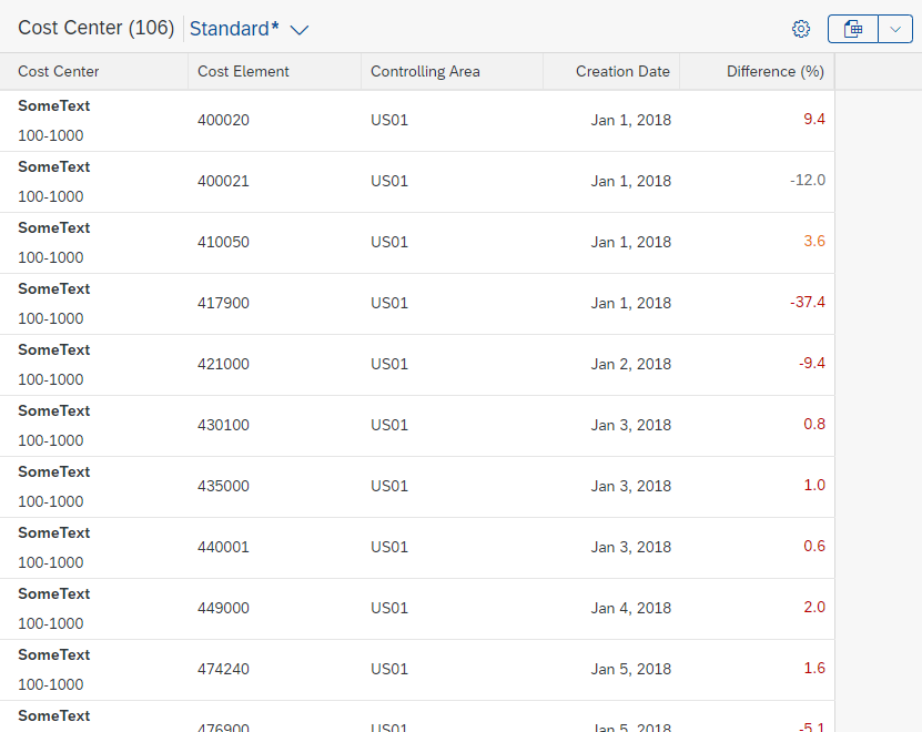
The Show Details / Hide Details button is mandatory with and only available for the responsive table. Columns with a low priority (low or medium priority on phones) are hidden in the pop-in area (properties: demandPopin, enableAutoColumnWidth, showDetailsButton, annotation: UI.Importance).
You can define which priority levels cause the columns to be hidden (property: detailsButtonSettings). The button only appears if there are columns that belong in the pop-in area. Columns disappear from right to left but columns with the priority “High”, are never hidden. They are shown in the pop-in area if they do not fit on the current screen size
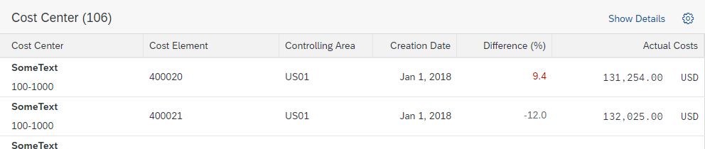
Details hidden
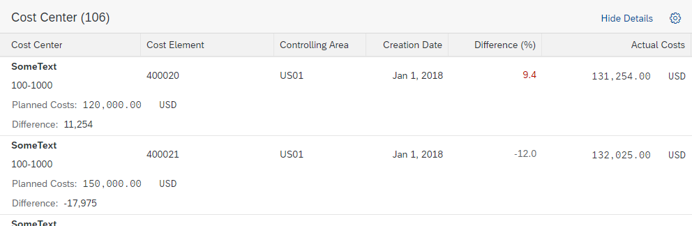
Details shown
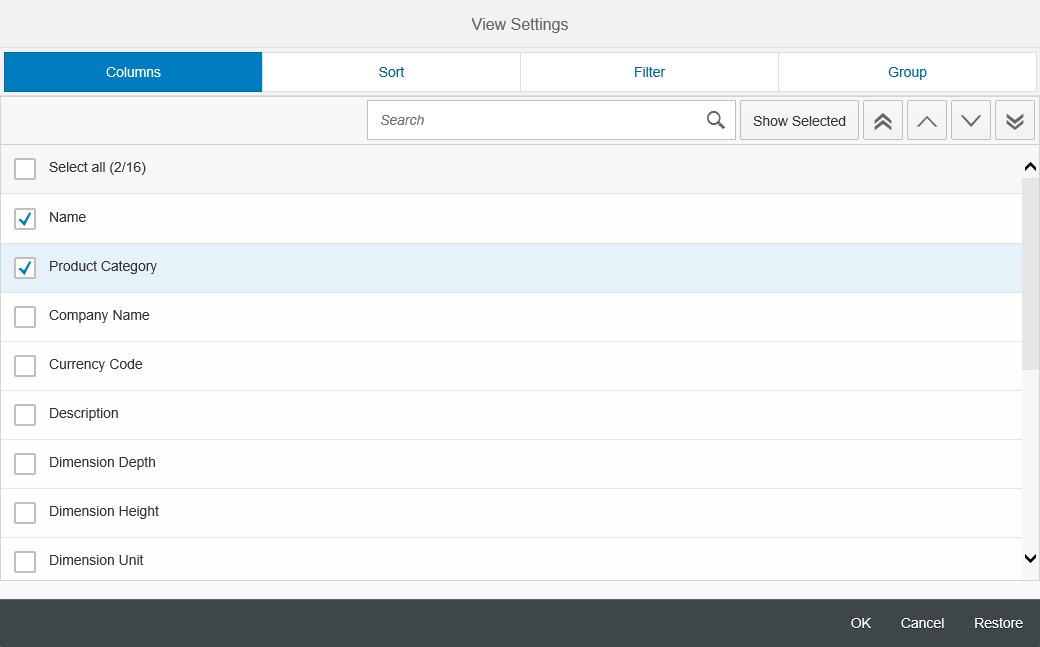
View Settings
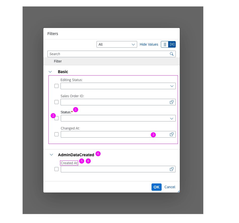
View Settings are optional. The button triggers a P13n Dialog (property: useTablePersonalisation). The View Settings dialog can also be opened with the shortcut Ctrl+Comma.
Sort and Filter
Sorting, filtering, and column settings are automatically available for all columns in all tables. For single columns, you can remove the sort and filter settings (annotations: SortRestrictions, FilterRestrictions).
- The current sort state and sort order is displayed as an icon in the column header of the sorted columns.
- The current filter state is displayed as follows:
- In the responsive table, an infobar is shown if filters have been set in the table personalization settings.
- For all other tables, filtering is indicated by an icon in the column header of each filtered column.
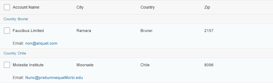
When amounts with different currencies appear in a single column, you can change the sort behavior to sort these columns first by currency, then by amount (annotation: ApplyMulitUnitBehaviorForSortingAndFiltering). This behavior is applied for all such columns in the smart table. It cannot be defined per column.
Group
Group settings are only available for the responsive table (all columns, one level only) and the analytical table (dimension columns only, multiple levels).
The following text is usually shown on the group header:
[Label of the grouped column]: [Grouping value]
Within the analytical table, the grouped column remains visible by default if it is grouped using the P13n Dialog. The column is hidden if it is grouped using the column header menu.
Column Settings
Column settings are used to show and hide columns. For the grid table, tree table, and analytical table, the column settings automatically enable resizing via the column header and size-to-fit for text-only columns (double-click on column separator line).
Export to Spreadsheet
Export to Spreadsheet is optional. The button triggers either a front-end export using the export to spreadsheet utility, or a back-end export via Gateway (properties: useExportToExcel, exportType). The front-end export allows for additional settings and can also be triggered with the shortcut Ctrl+Shift+E.
Maximize / Minimize
Maximize / Minimize is optional. It allows users to show the table in full screen mode and to exit full screen mode (property: showFullScreenButton).
App-Specific Actions
App-specific actions can only be added using a custom toolbar (aggregation: customToolbar).
Infobar

Infobar with filter information
The infobar is only available for the responsive table. It indicates which filter settings are currently active. If no filters are set, the infobar is hidden (property: useInfoToolbar, value: Auto).
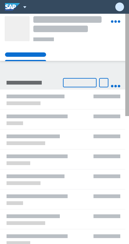
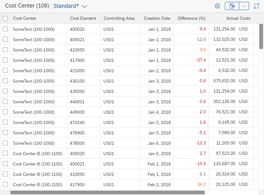
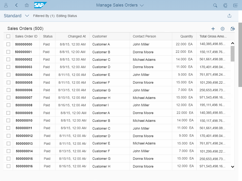
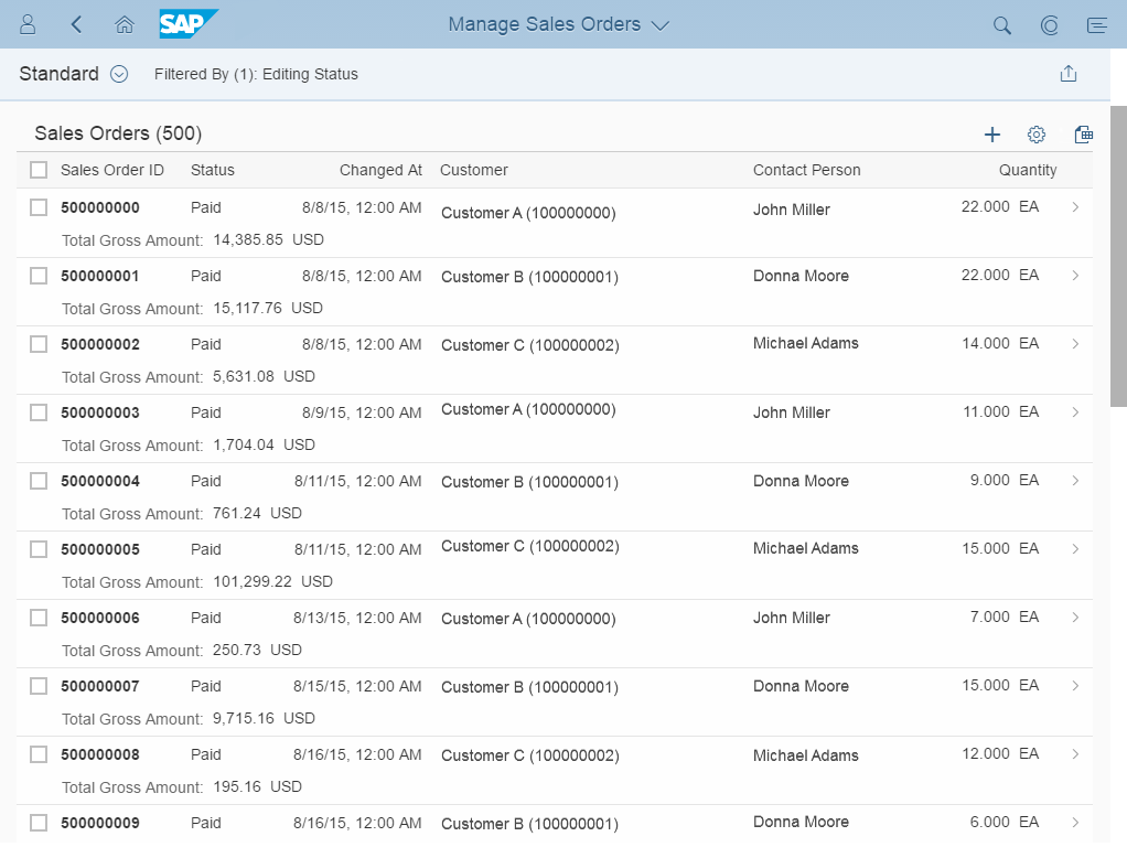
Table
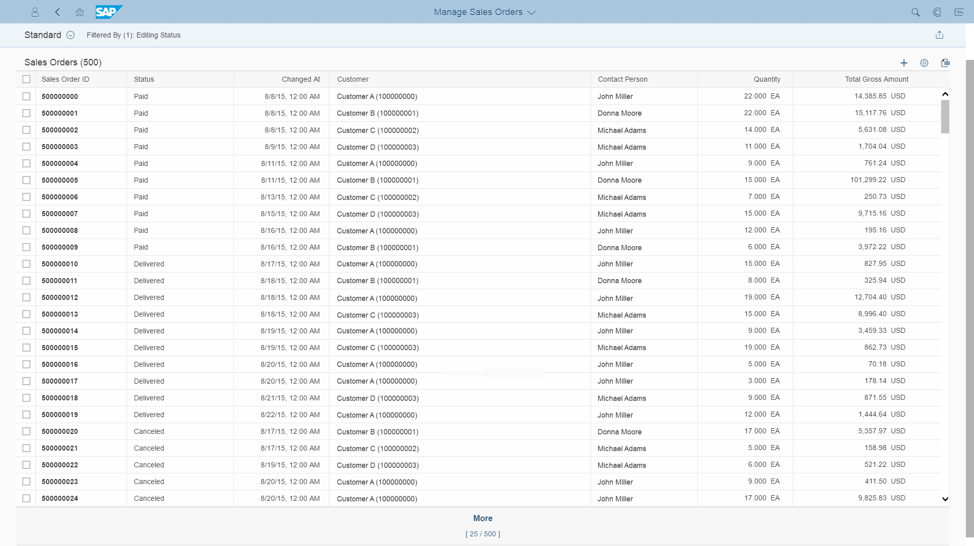
Responsive table within a smart table
The table is generated automatically. The sections below describe the behavior and different possibilities:
Table
The table provides the following features:
- You can use the responsive table, grid table, tree table, or analytical table within the smart table (property:
tableType).
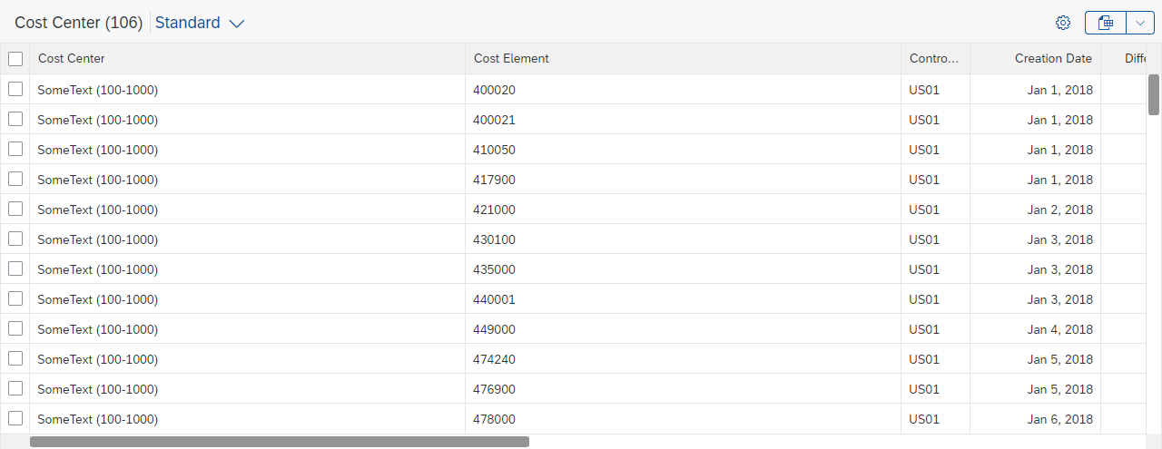
- While the grid table, analytical table, and tree table support multi-selection by default within the smart table, the responsive table does not offer any kind of selection. The selection mode can be changed.
Column Visibility
- Columns are created automatically. Items are rendered based on the properties and metadata of the underlying OData service (annotation:
LineItem, properties:entitySet,tableBindingPath,initiallyVisibleFields,ignoreFields). A column is generated for each OData entity property.
- You can define which columns are initially visible when the app is first launched. All other columns are initially hidden (annotation:
PresentationVariant/LineItem, property:initiallyVisibleFields).
- For each column that is initially visible, the
LineItemannotation includes aDataFieldrecord, which allows you to influence the content rendering of the smart table.
For columns that are initially invisible, the content rendering can also be influenced via the annotationDataFieldDefault.
Column Layout
- A default column width can be calculated for each column based on the data type, the column label, the edit/read-only state, and the annotations:
textArrangement,MaxLengthfor strings,PrecisionandScalefor numeric data (property:enableAutoColumnWidth).
The calculated width is between 3 rem and 20 rem. Apps can change this default width if needed (annotation:CSSDefaults).
If the combined width of all the columns is less than the width of the table, the remaining space stays empty.
- Columns can be resized by dragging the column separator. If the combined width of all columns is less than the width of the table, the remaining space stays empty. The smart table provides column resizing automatically in the following cases:
- Grid table / tree table / analytical table: Column resizing is automatically enabled with the column settings.
- Responsive table: Column resizing is automatically enabled with the automatically calculated default column width.
Responsive table with automatically calculated column widths, resizing, and remaining space
- If the automatically generated content does not fit for your use case, you can override the automatic behavior with your own column template.
You can also add further columns. This allows you to provide columns with app-specific or inline actions, columns which show calculated values (based on more than one OData entity property), or – for responsive tables – columns that show more than one control.
Column Headers
- You can specify a column header text for each column (annotation:
sap:label). - SAP S/4HANA Only:
Tooltips are available by default for smart table column headers.
In smart tables, texts that exceed the column width always truncate (see Column Layout). The tooltip allows users to read the full column header text without resizing.
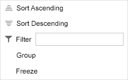
- The column headers contain the following settings:
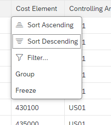
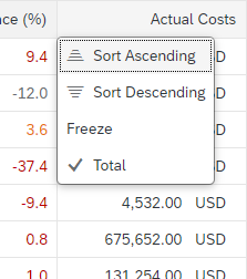
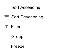
- Sort Ascending, Sort Descending
- Filter: Opens the P13n Dialog. If this does not fit for your use case, exchange this menu item (property:
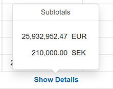
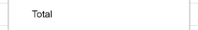
enableCustomFilter) - Group (only analytical table, only on dimension columns)
- Total (only analytical table, only on measure columns): This setting is not persisted (annotation:
sap:aggregation-role, value:measure).
If a column contains entries with different units of measurement, a Show Details link appears instead of the total. Clicking the link opens a popover showing the subtotals per unit of measurement. - Freeze (only available for grid table, tree table, and analytical table): Must be added manually.
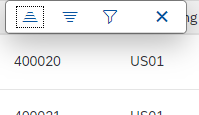
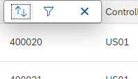
Clicking the column header reveals sort and filter options (responsive table)
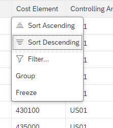
Column header menu for a dimension column of an analytical table within a smart table
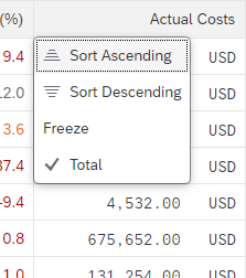
Column header menu for a measure column of an analytical table within a smart table
Content
The smart table offers the following options for creating columns automatically:
- You can render the smart table in either read-only or edit mode (with no option to switch), or allow users to switch between the two modes (properties:
editable,useSmartToggle). - In read-only or edit mode, the smart table renders the controls as listed in the table below, or uses the smart field for both modes. If you use smart fields together with the option to switch between read-only and edit mode, the smart table renders the read-only controls as in the list below, but uses the smart field for edit mode. The smart field limits the rendering options (aggregation:
customData, key:useSmartField), but also allows for:- Better control of the visibility of a field per row (smart field, annotation:
FieldControl) - Use of value help for input fields
- Better control of the visibility of a field per row (smart field, annotation:
| Read-only | Edit | Annotations / Edm type | Comment | |
| Static text | Text | Input field | Edm.String | |
| Decimal numbers | Text | Input field | Precision, Scale, Edm.Byte, Edm.Decimal, Edm.Double, Edm.Int16, Edm.Int32, Edm.Int64, Edm.SByte, Edm.Single | |
| Status information | Object status or Icon | Input field | Criticality, CriticalityType, CriticalityRepresentationType |
Do not use editable status information. |
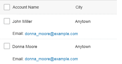
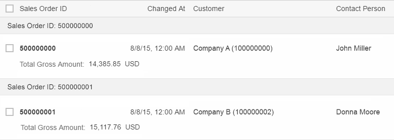
| Key identifier | Object identifier (responsive table) Text (all other tables) |
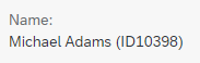
Input field for the ID | SemanticKey, Common.EditableFieldFor |
|
| Text and ID | Text, object status, or object identifier | Input field for the ID | TextArrangement | Use together with the annotation mentioned above for static text, status information, or key identifier.
Sorting, filtering, and grouping only works for the ID, even if the ID is not displayed. |
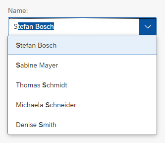
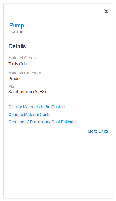
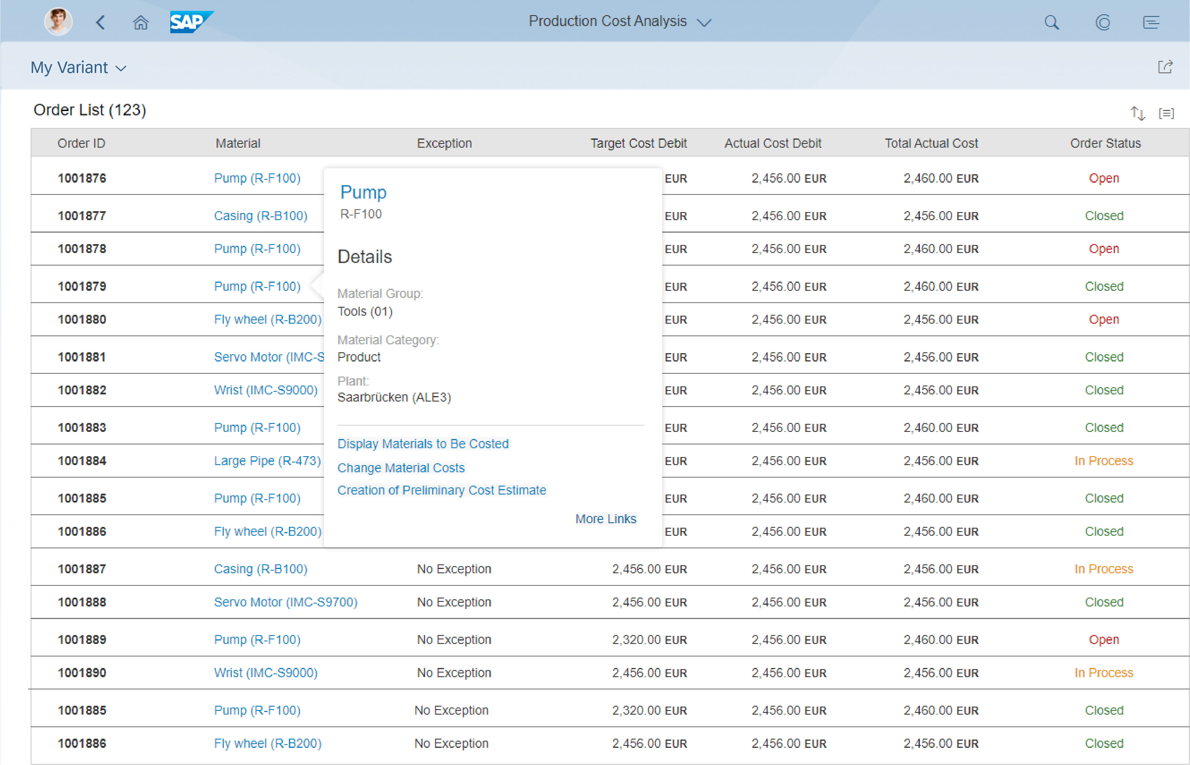
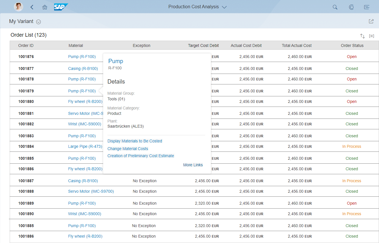
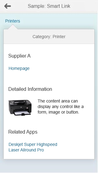
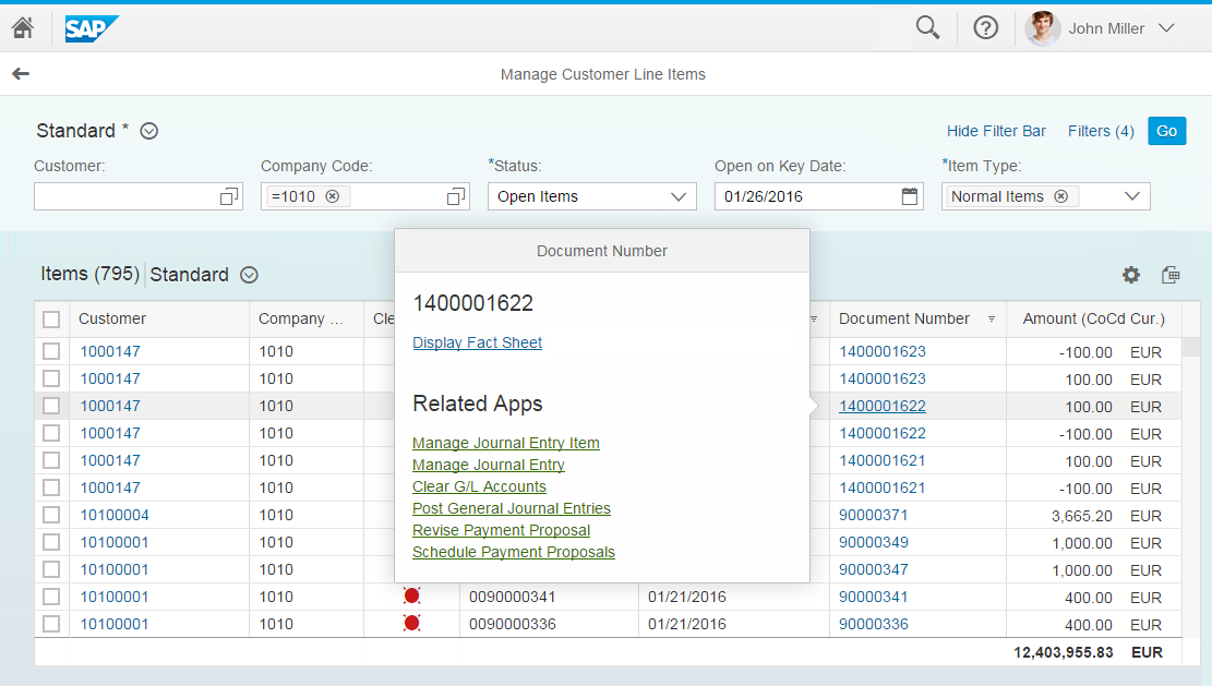
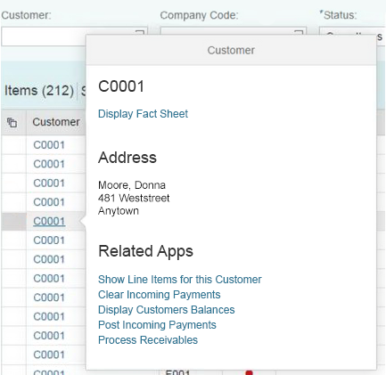
| Links with/without quick view | Smart link | Smart link | SemanticObject | Smart links can be customized using the aggregation: semanticObjectController |
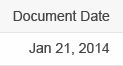
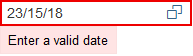
| Dates | Text | Date picker | Edm.DateTime, sap:display-format, value: date, IsCalendarDate | |
| Dates and times | Text | Date/time picker | Edm.DateTime, Edm.DateTimeOffset | |
| Times | Text | Time picker | Edm.Time | |
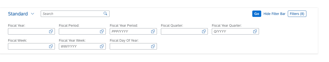
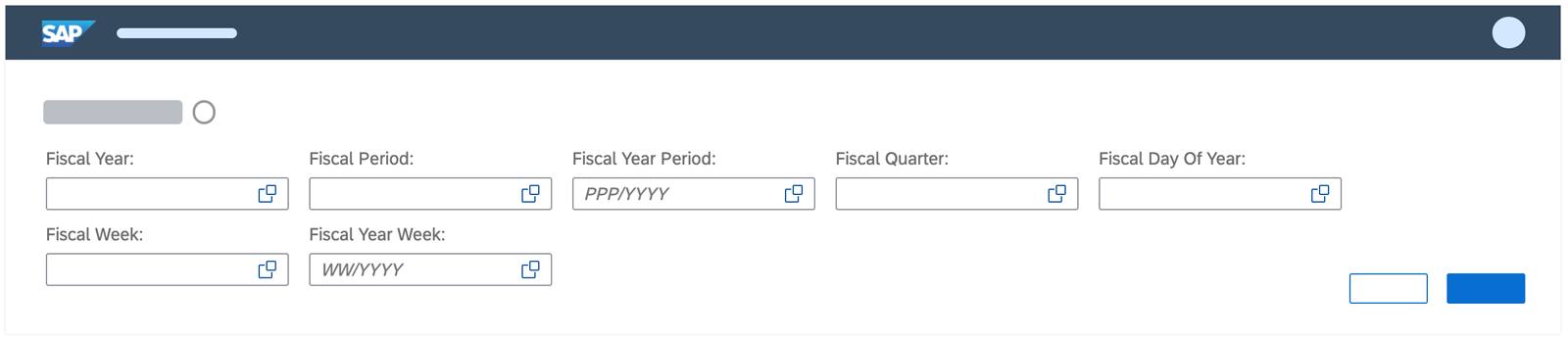
| Fiscal periods | Text | Input field | IsFiscalYear, IsFiscalPeriod, IsFiscalYearPeriod, IsFiscalQuarter, IsFiscalYearQuarter, IsFiscalWeek, IsFiscalYearWeek, IsDayOfFiscalYear | |
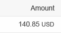
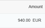
| Amounts with currencies | Two text controls | Input field for the amount | sap:semantics, value: currency-code | In edit mode, the currency is shown as static text next to the input field. |
| Phone numbers | Link | Input field | IsPhoneNumber | Opens the system application for making phone calls. |
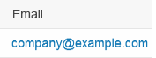
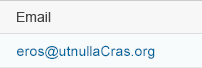
| Link | Input field | IsEmailAddress | Opens the system application for writing emails. | |
| Pictures | Image | Input field | IsImageURL | Only available for the responsive table. In edit mode, the input field contains the URL to the image. |
| Boolean | Text | Checkbox | Edm.Boolean | For read-only, the displayed text is Yes or No. |
In all cases, the smart table automatically takes care of the content alignment and formatting (except for custom columns).
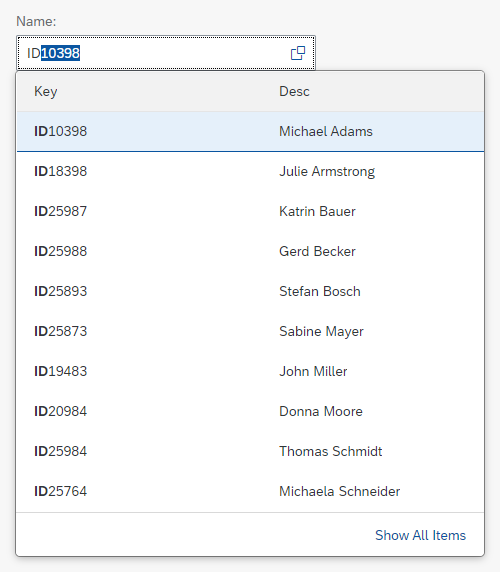
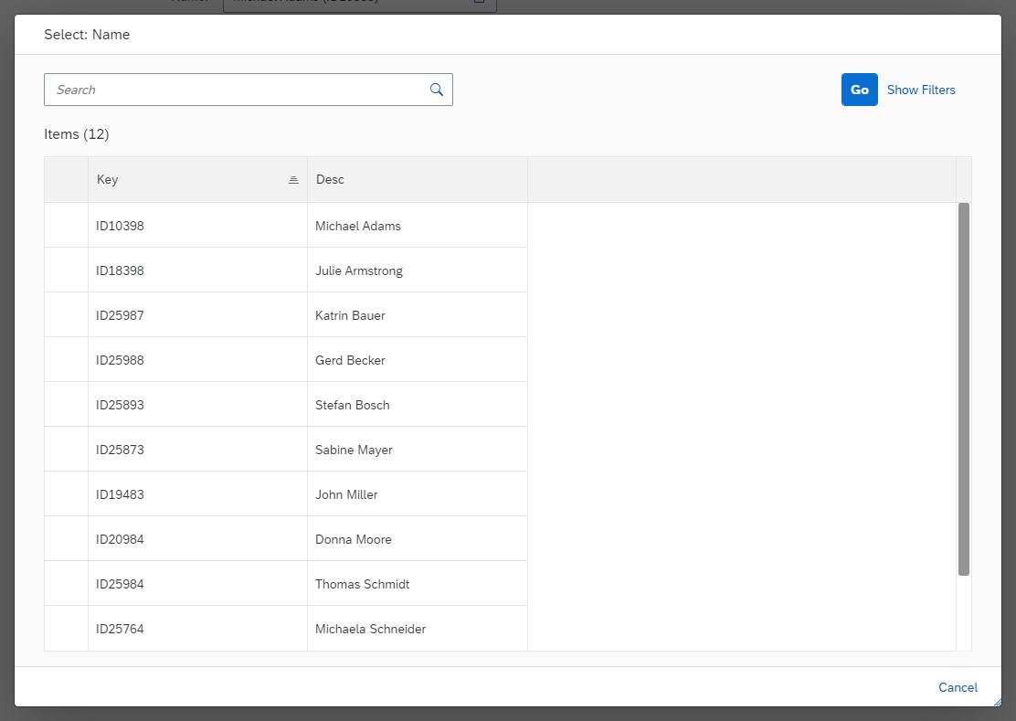
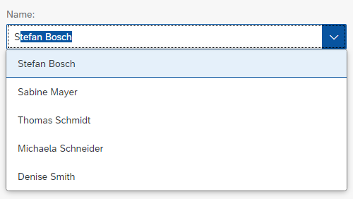
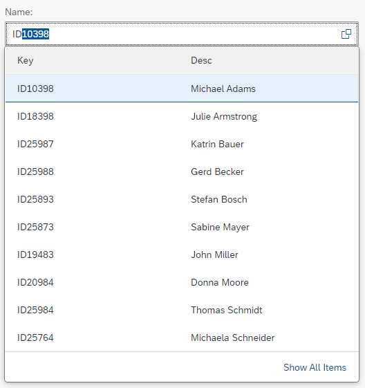
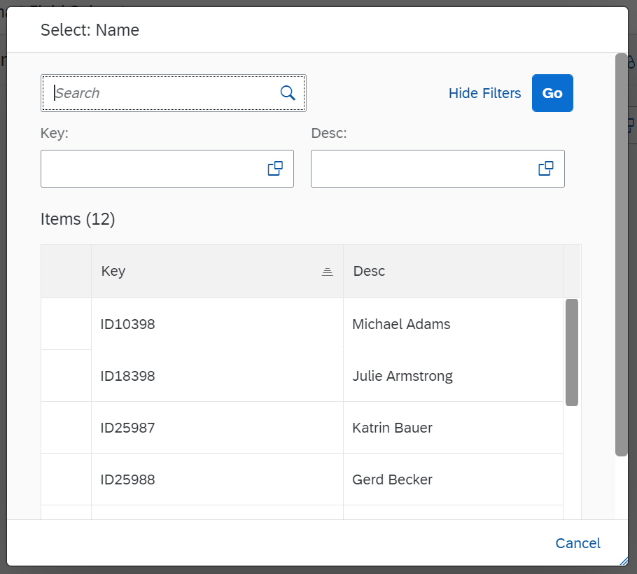
Input fields can be accompanied by a value help dialog (annotation: ValueList). If annotated, triggering the value help button opens a value help dialog. Within this dialog, you can provide a search field (annotation: ValueList, property: SearchSupported).
If no ValueList annotation is provided, you can restrict the number of characters for an input field (annotation: MaxLength).
You can provide additional controls, such as micro charts, rating indicators, progress indicators, and buttons, as custom columns (using an XML view). For custom columns, you must provide any read-only and editable content manually.
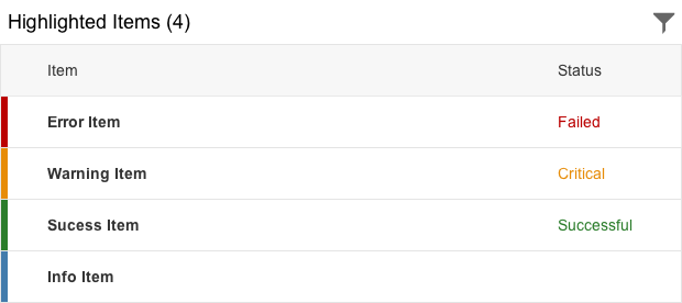
If the smart table is used with the responsive table, you can show the status of an item by displaying a highlight indicator on the left of the item (property: highlight).
Behavior and Interaction
The behavior is generally inherited from the underlying table, toolbar, variant management, export to spreadsheet, and P13n dialog (see the corresponding articles for details.) Note that the smart table provides limited options and not all settings of the underlying controls are available.
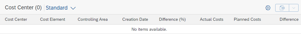
Empty Tables
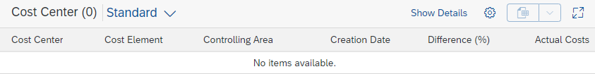
If there is no data to show, the smart table renders a default text. This text can be overwritten by the app development team. The default texts are:
- If a table is initially empty:
No items available.
Overwrite this whenever a hint can be provided on how to fill the table with data.
(property:initialNoDataText, value:$NO_FILTERBAR) - If a table is used together with a filter bar (as in the list report), and is initially empty, use the following text:
To start, set the relevant filters.
(property:initialNoDataText, value:$FILTERBAR) - If a table is used together with a filter bar and the filter does not return results, use the following text:
No data found. Try adjusting the filter settings.
(aggregation:noData, changeable at runtime) - If the user has hidden all of the columns in the personalization settings, the following text is shown:
Right now, there are no visible columns in the table. Please select the columns you need in the table settings.
This text cannot be changed.
An empty smart table
Errors and Warnings
To indicate that the table contains items with errors or warnings, the smart table can show a message strip above the table (aggregation: dataStateIndicator). On the message strip, information about errors or warnings is provided, as well as the possibility to filter down the table to the corresponding rows. When issues are solved or when new issues appear, the message strip is updated accordingly.
For details on displaying errors, warnings, and other messages, see Message Handling.
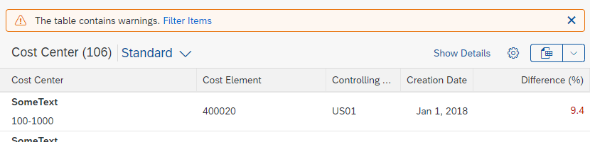
Table containing warnings
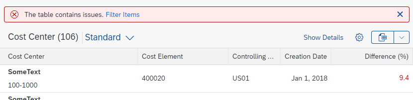
Table containing errors and warnings
Responsiveness
The smart table acts exactly like the embedded controls. For details see:
- Toolbar Overview
- Infobar
- Responsive Table via auto pop-in mode
(sap.ui.comp.smarttable.SmartTable, property:demandPopin, value:true).
You can use theUI.Importanceannotation to influence the priority of each column.
You can provide a Show Details button to let users show/hide columns with low importance (property:showDetailsButton). - Grid Table, Tree Table, Analytical Table are not fully responsive. They are available only for desktops and tablets. For smartphones, you need to take an adaptive approach by offering an additional UI.
Examples
Responsive table within a smart table
Grid table within a smart table
Top Tips
- If you are using the responsive table, enable and configure the auto pop-in mode and use the Show Details / Hide Details button.
- For custom columns, follow the guidelines of the respective table. If needed, use responsive paddings for aligning the content.
- Enable only the features that are needed for your use case. Very small tables do not need to be sorted, filtered, grouped, and rarely exported. Don’t just add unnecessary features for consistency purposes.
- If the page has a filter bar, don’t offer filtering for the table.
- If you are using custom columns, make sure that any export and personalization features you are using also work for these columns.
Properties
The following properties are available for sap.ui.comp.smarttable.SmartTable:
- The property:
toolbarStyleClassis deprecated. Do not use it. - The property:
useOnlyOneSolidToolbaris deprecated. Do not use it.
Related Links
Elements and Controls
- Responsive Table (guidelines)
- Grid Table (guidelines)
- Analytical Table (guidelines)
- Tree Table (guidelines)
- Table Overview (guidelines)
- Table Toolbar (guidelines)
- Variant Management (guidelines)
- P13n Dialog (guidelines)
- Export to Spreadsheet (guidelines)
- Action Placement (guidelines)
Implementation
- Smart Table (SAPUI5 samples)
- Smart Table (SAPUI5 API reference)
- Smart Table (Developer Guide)
- Toolbar (SAPUI5 samples)
- Smart Field (SAPUI5 samples)
- Smart Field (SAPUI5 API reference)
- Smart Field (SAPUI5 Developer Guide)
- Variant Management (SAPUI5 samples)
- P13n Dialog (SAPUI5 samples)
- P13n Dialog (SAPUI5 API reference)
- Spreadsheet Export (SAPUI5 samples)
- Spreadsheet Export (Developer Guide)


 Your feedback has been sent to the SAP Fiori design team.