
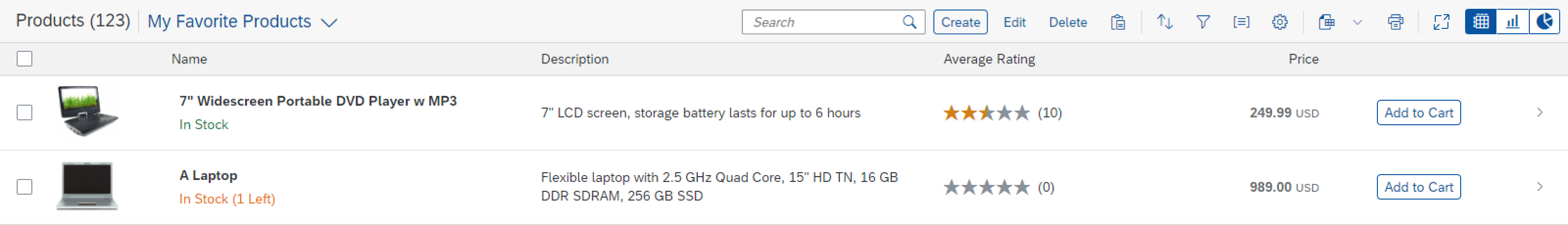
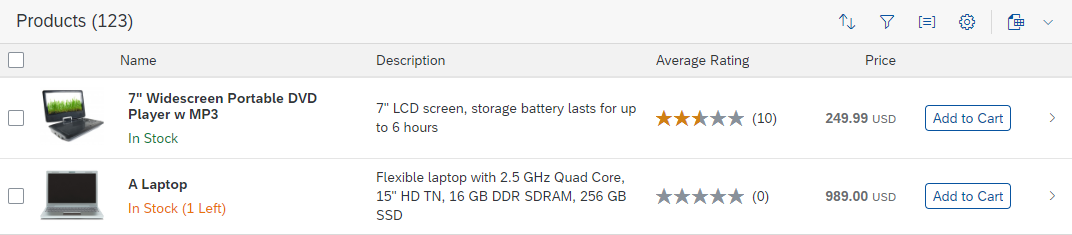
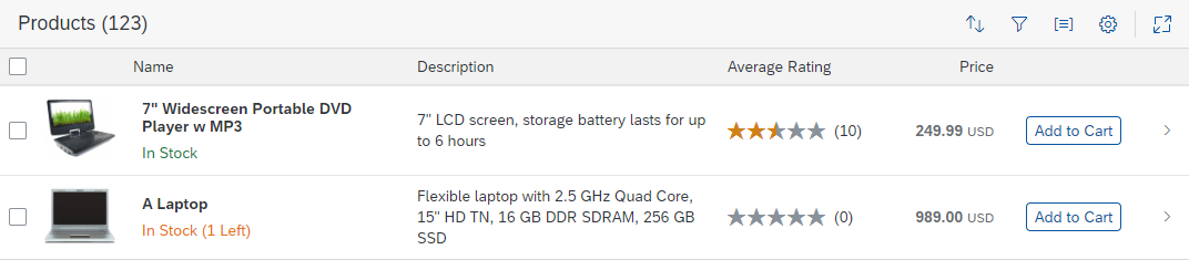
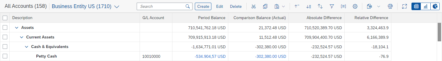
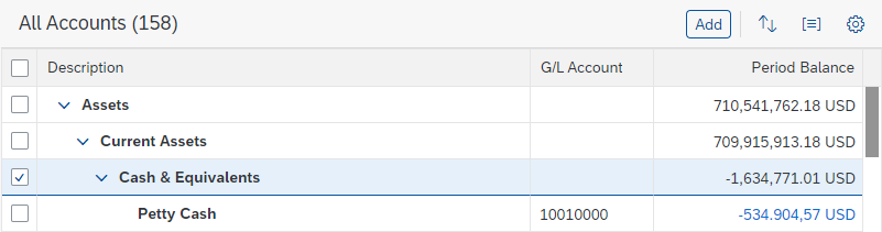
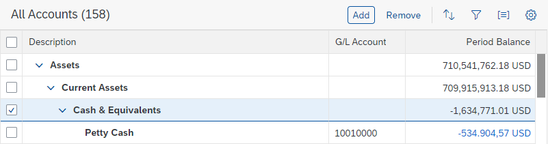
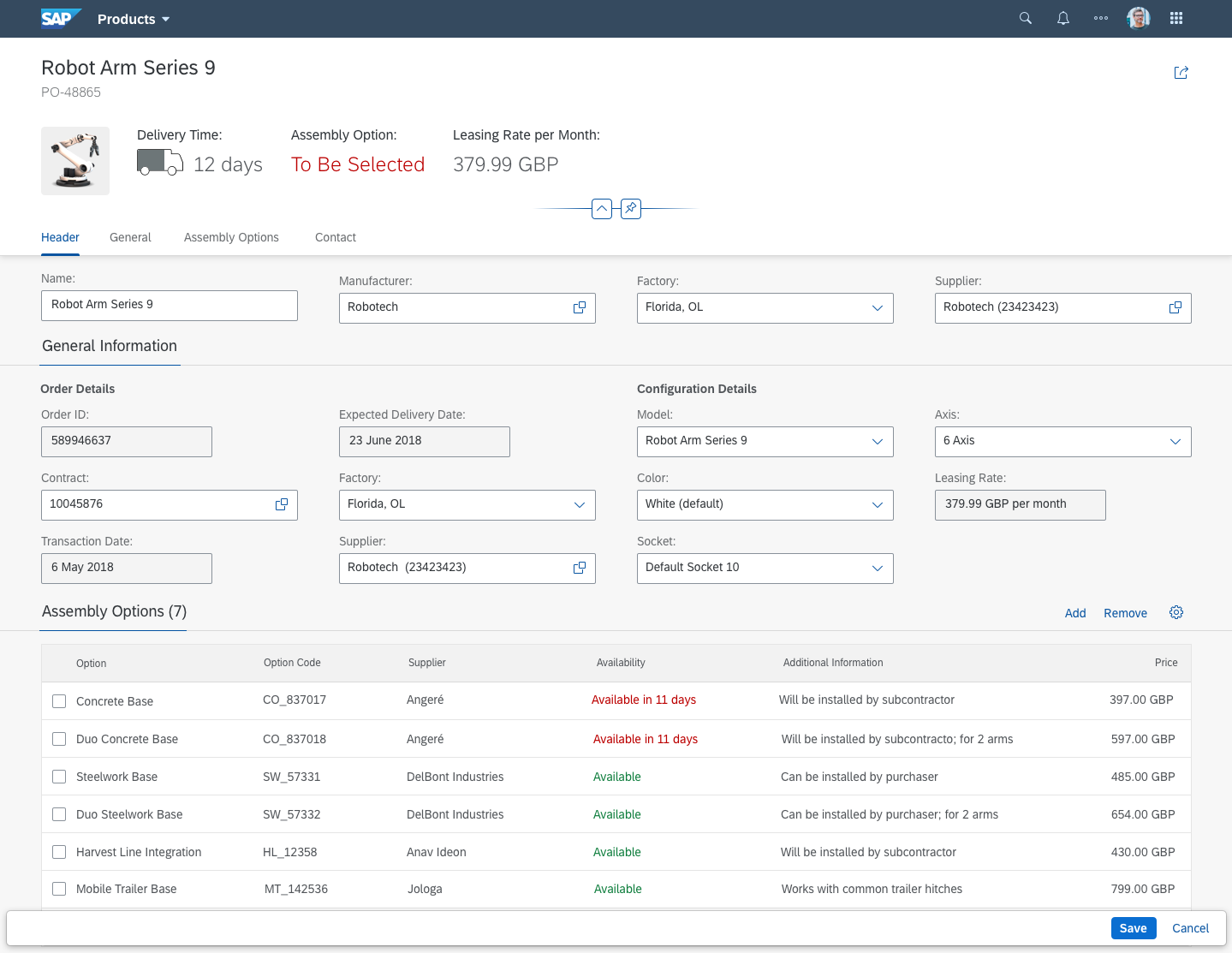
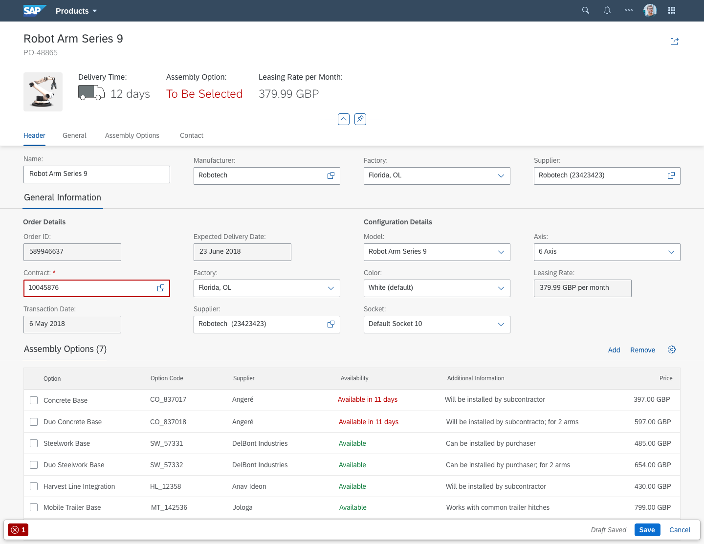
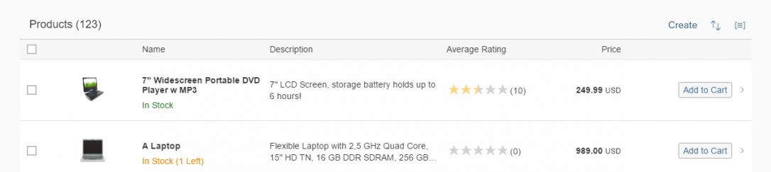
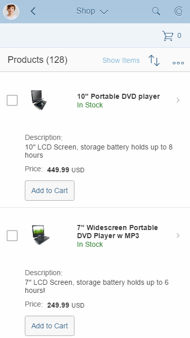
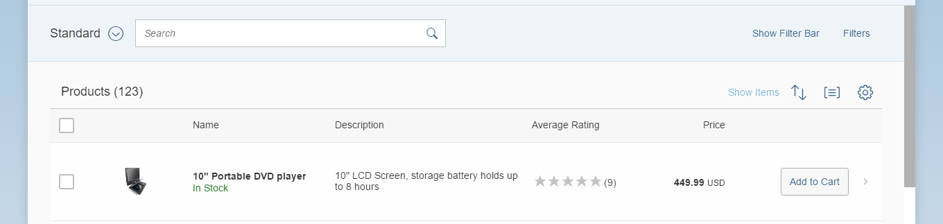
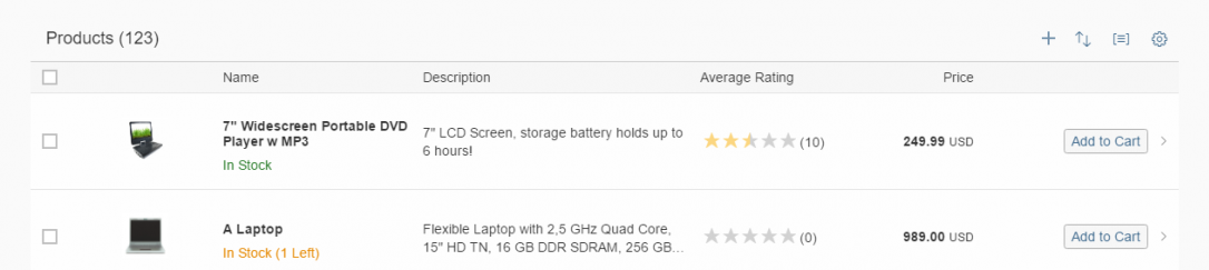
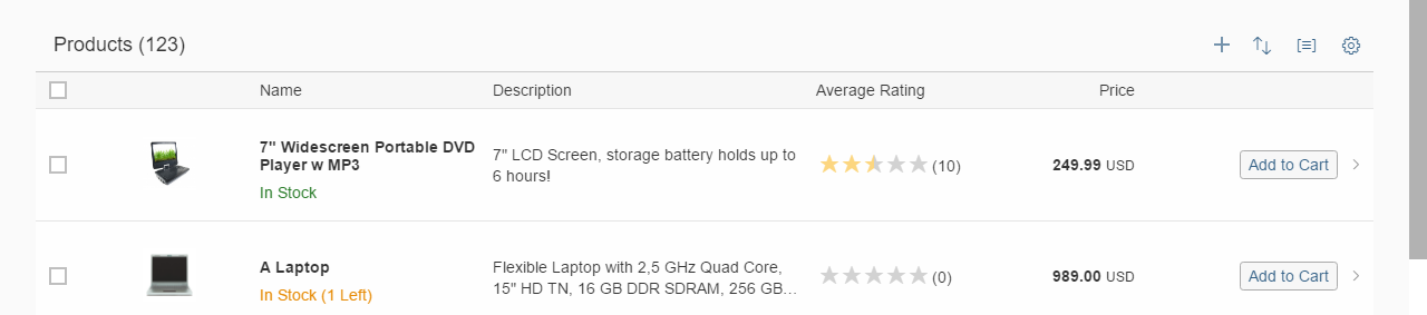
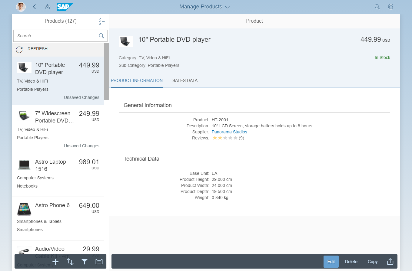
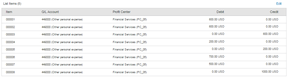
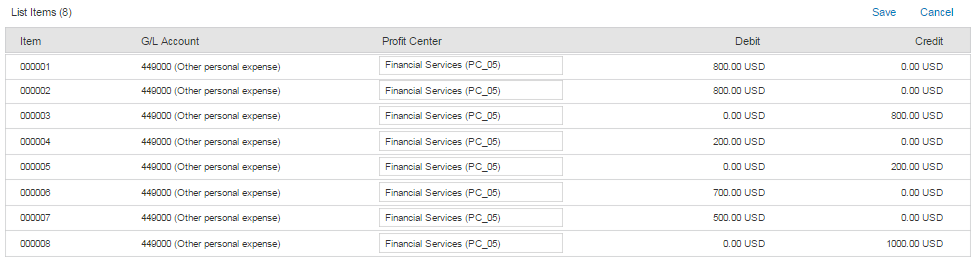
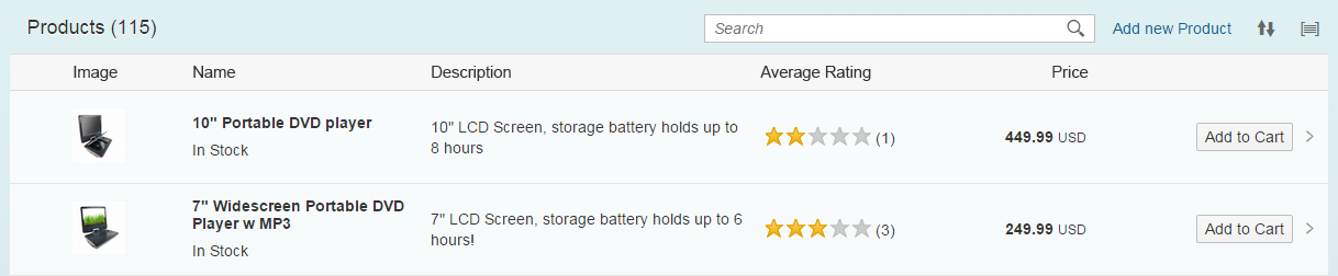
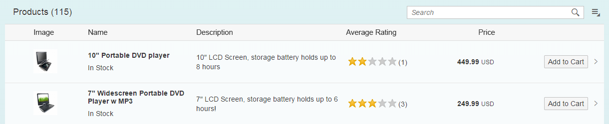
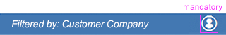
Toolbar
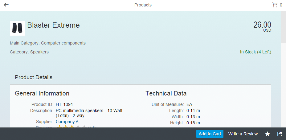
A toolbar is a flexible container that can hold various other components.
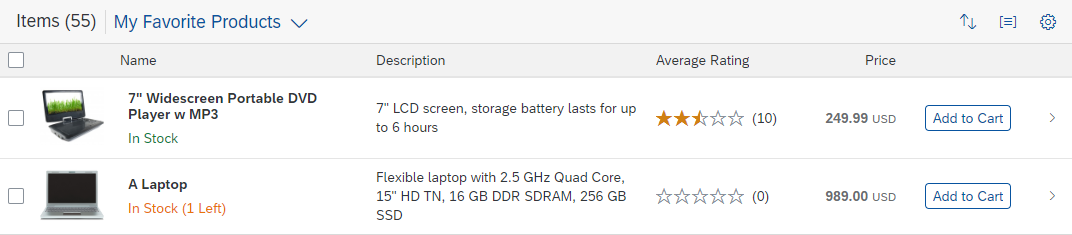
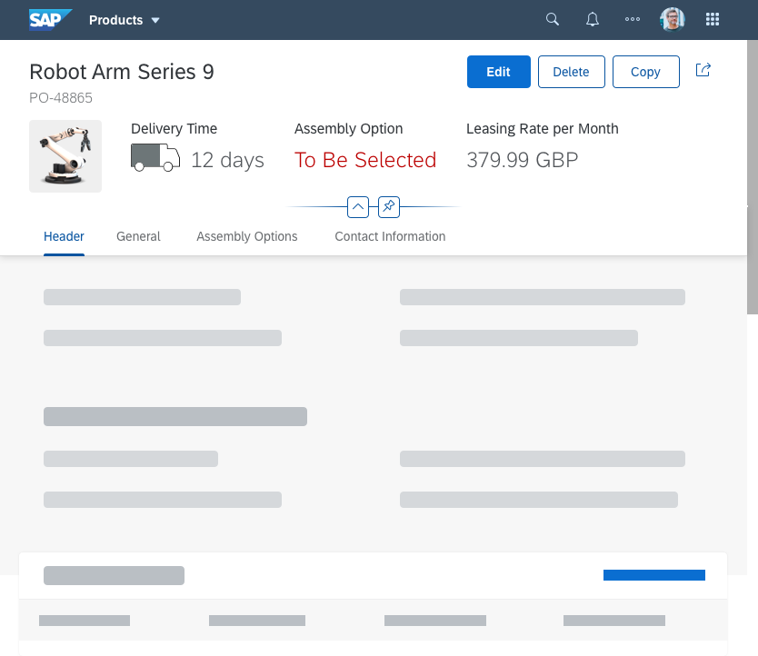
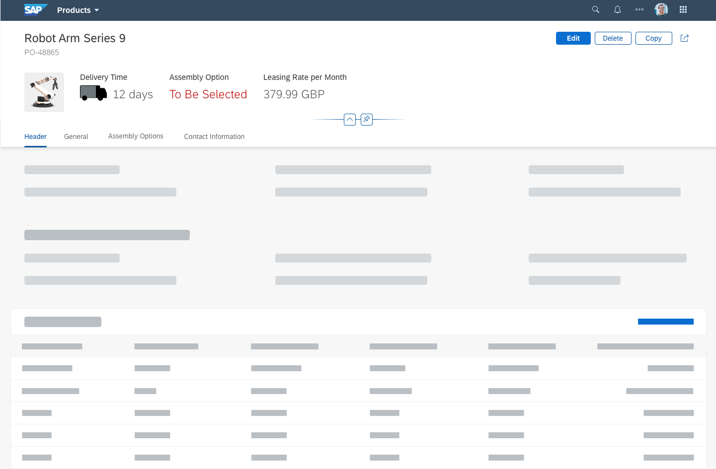
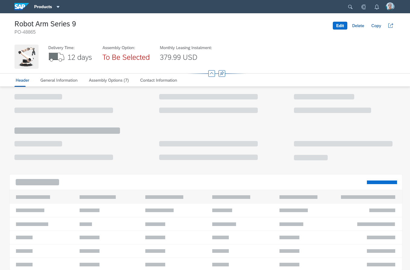
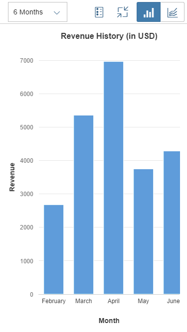
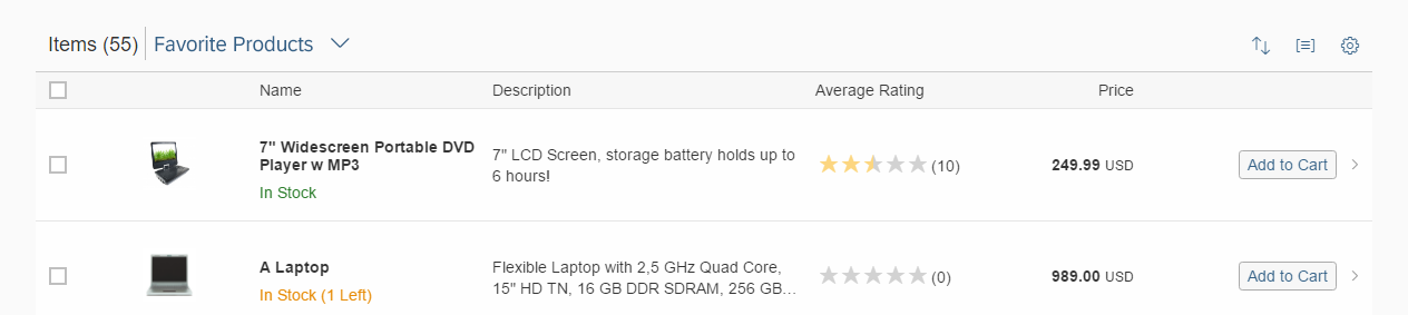
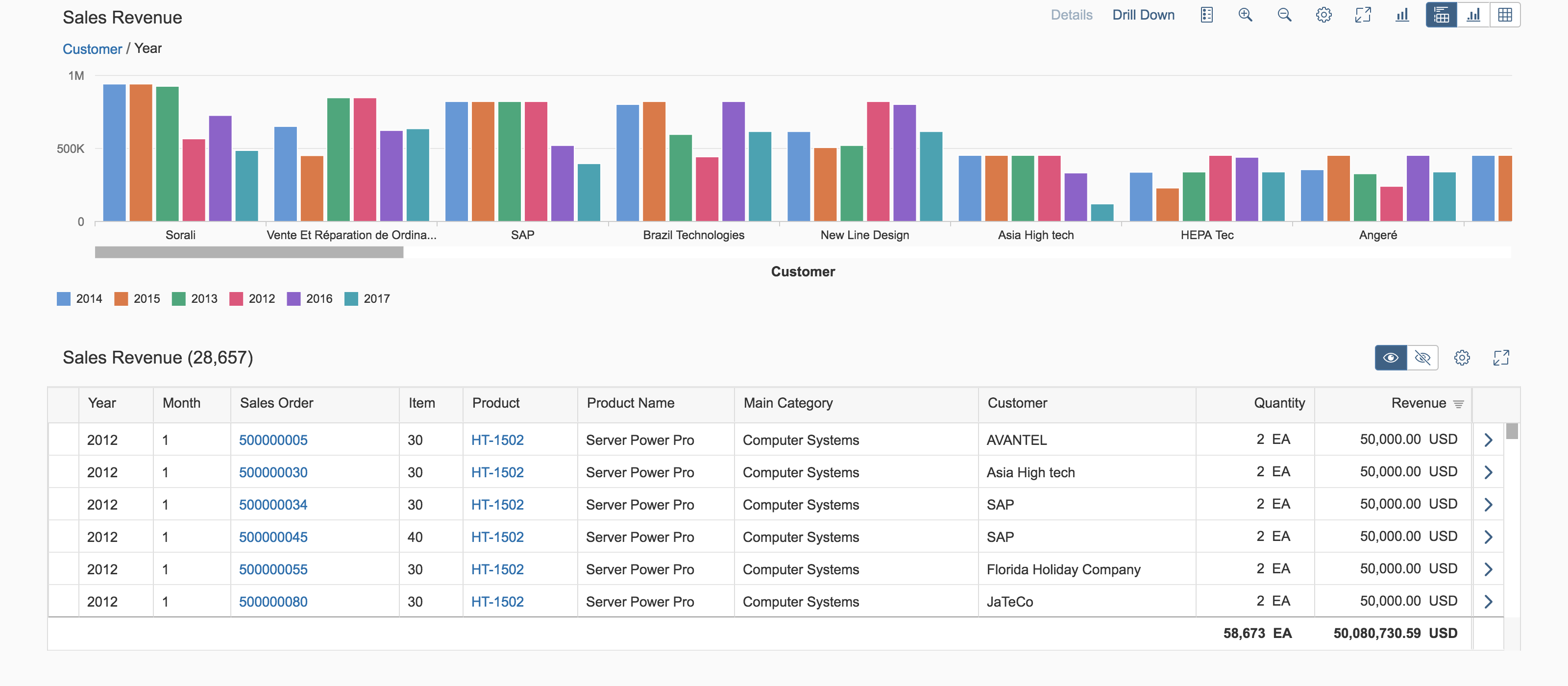
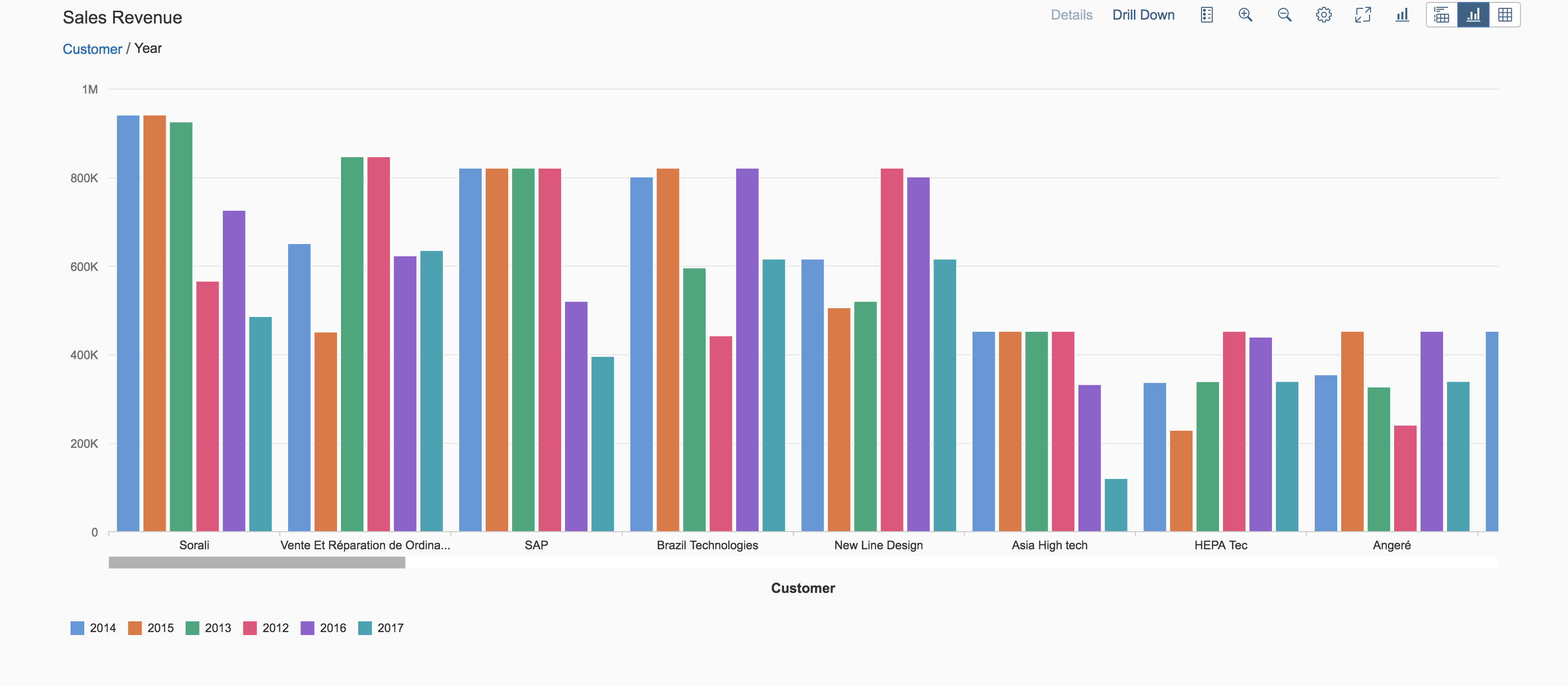
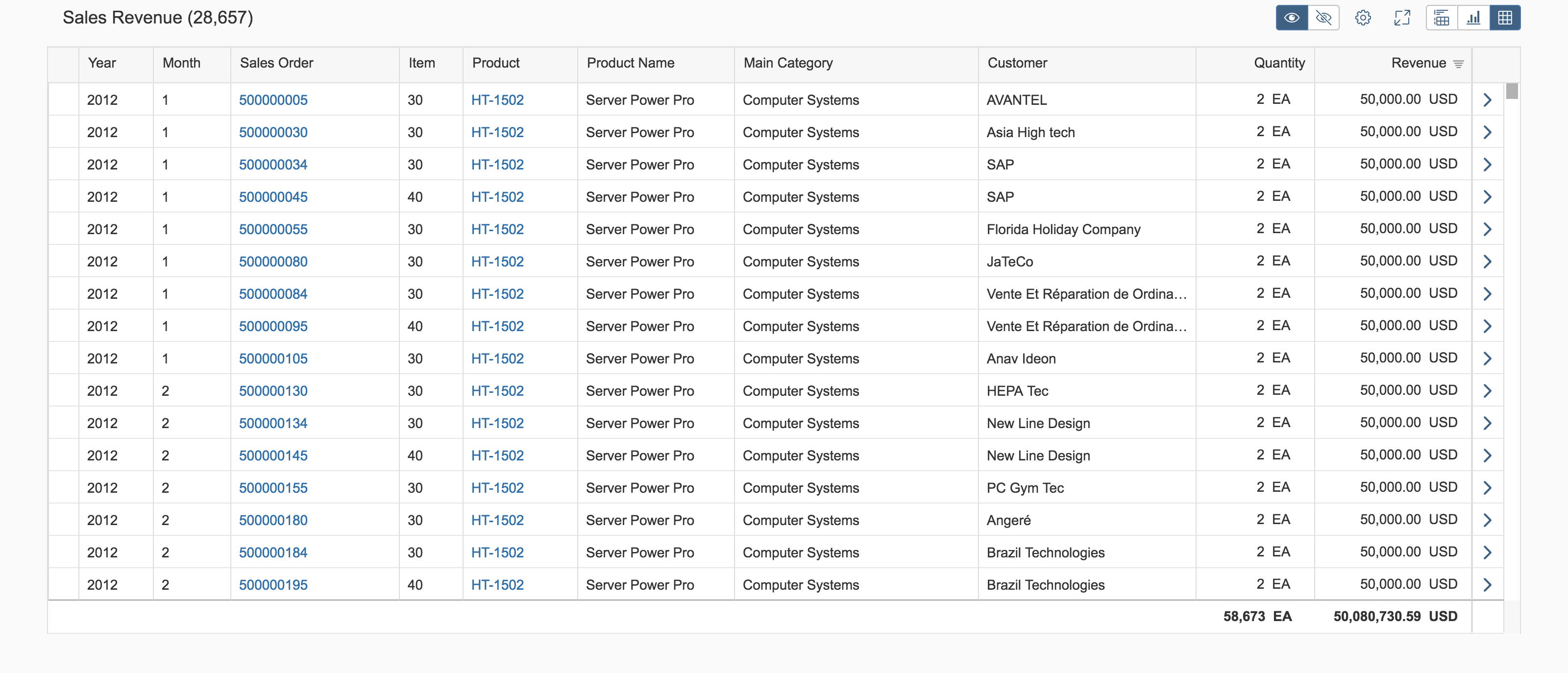
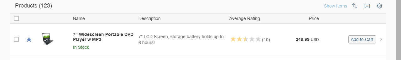
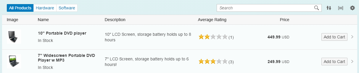
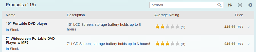
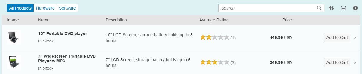
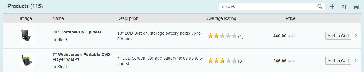
Toolbar – live example
When to Use
Do
Use the toolbar:
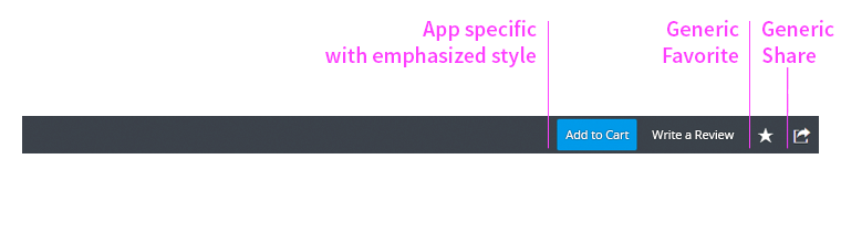
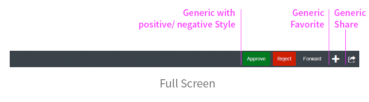
- For buttons with an icon or text.
- For user input elements.
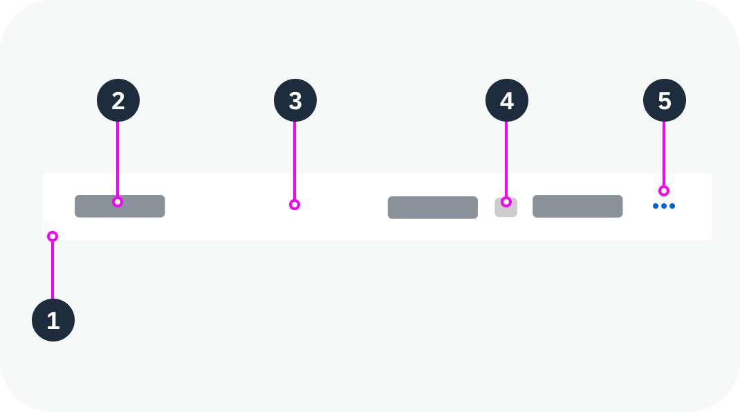
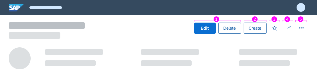
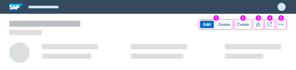
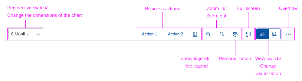
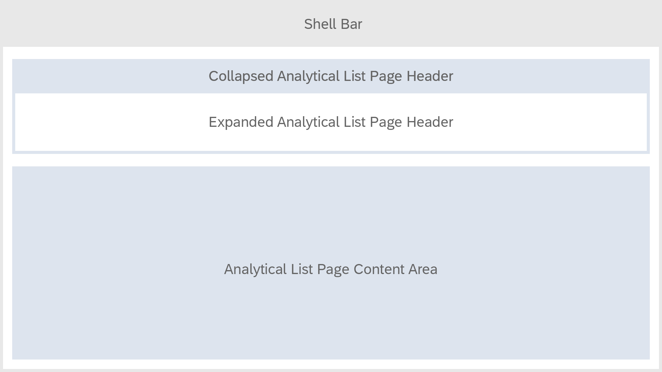
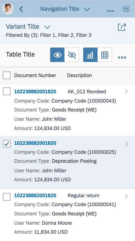
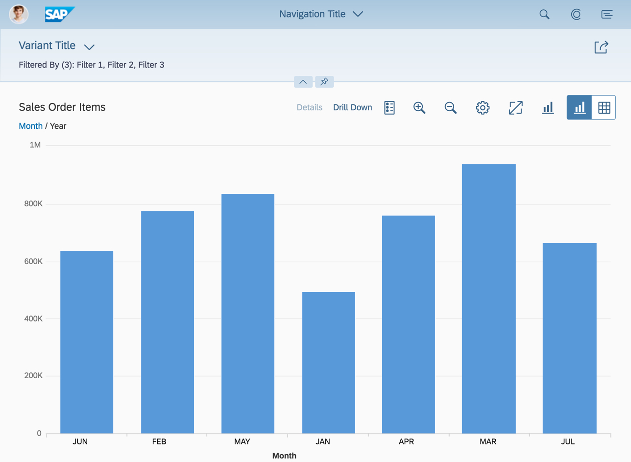
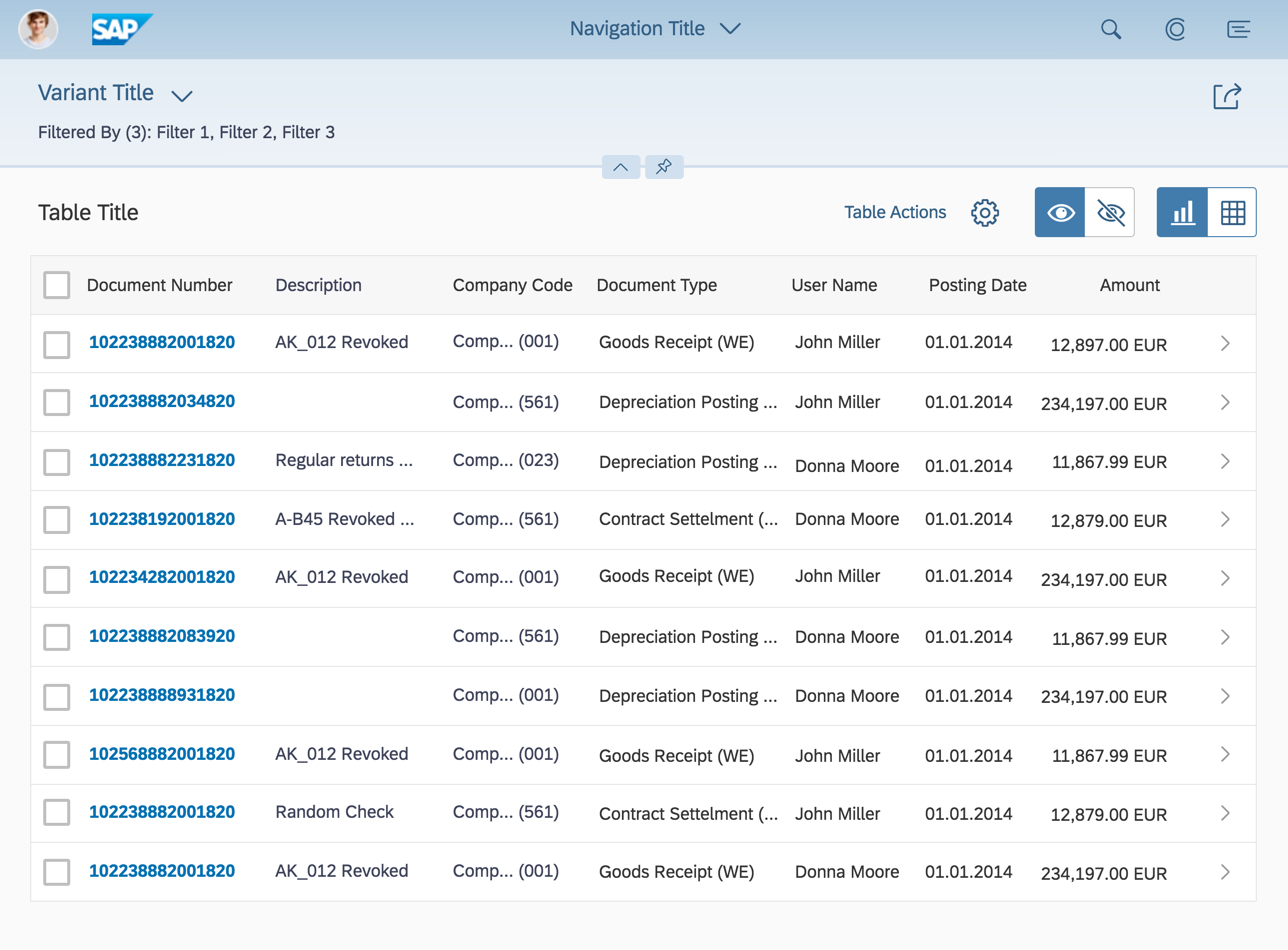
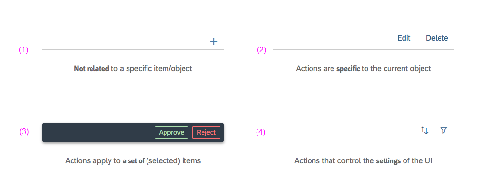
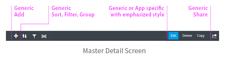
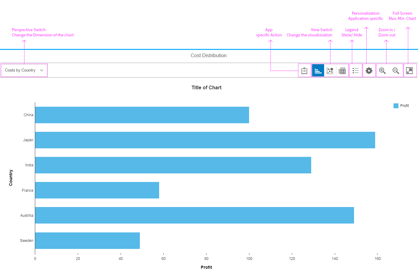
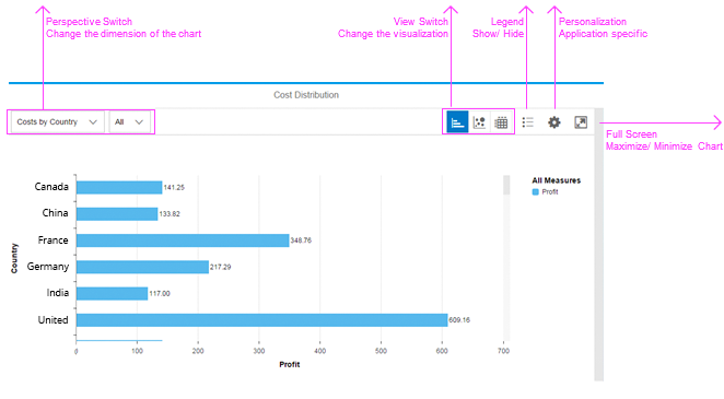
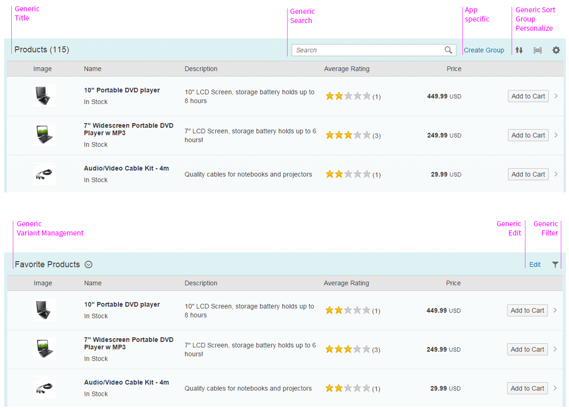
Anatomy
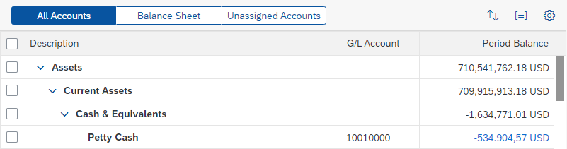
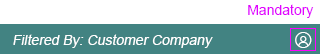
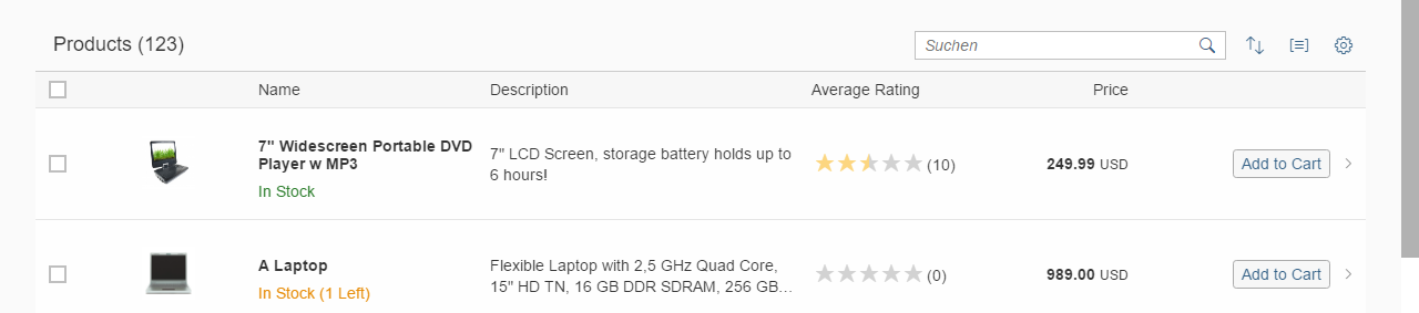
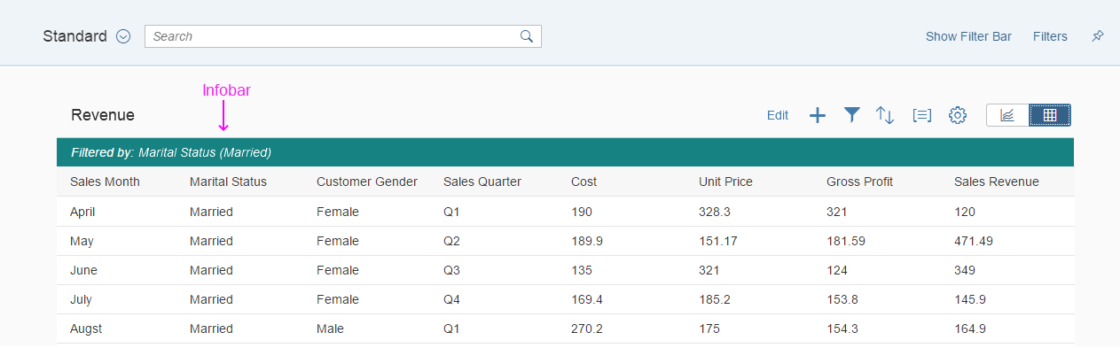
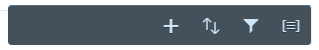
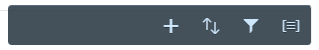
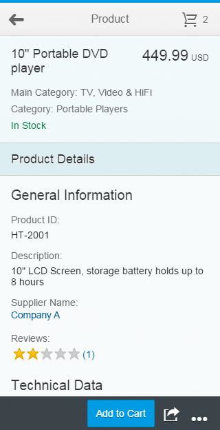
- Toolbar: Contains all toolbar elements.
- Content: Any toolbar elements that can be placed inside the toolbar.
- Spacer: Can be used to create space between groups of elements. It can either be a fixed value, or take up all remaining space.
- Separator: Separates two groups of elements without affecting their position.
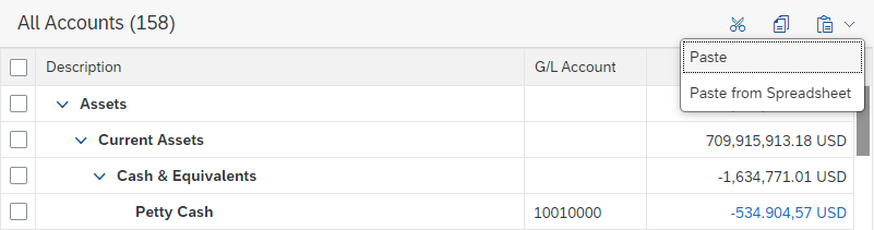
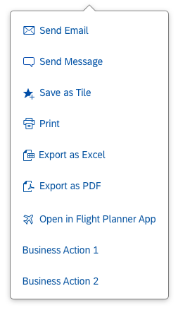
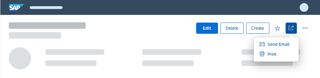
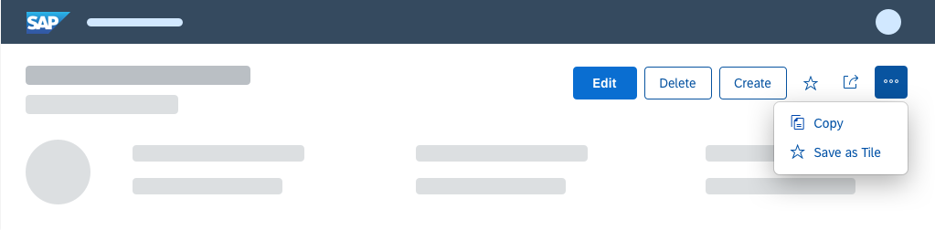
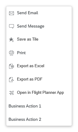
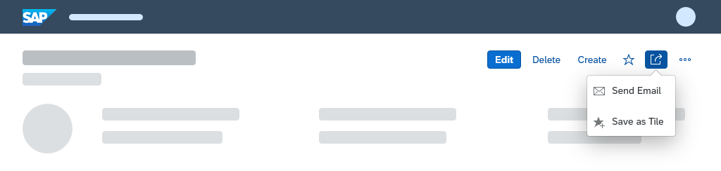
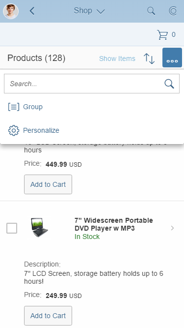
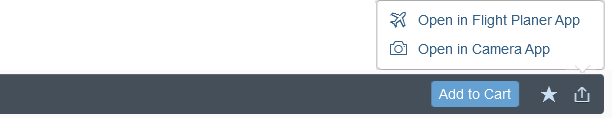
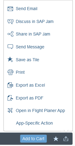
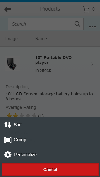
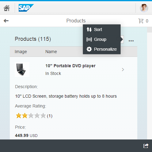
- Overflow menu: Contains remaining toolbar elements that cannot be displayed due to limited space.
Anatomy of a toolbar
Variants
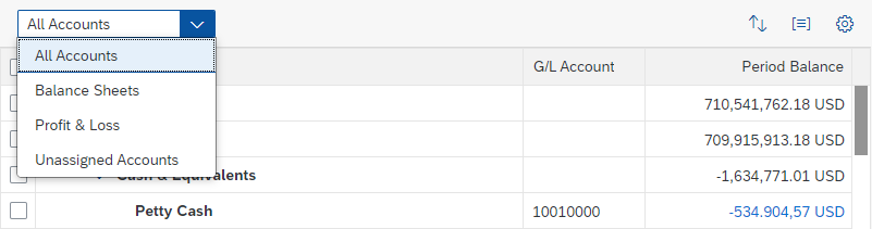
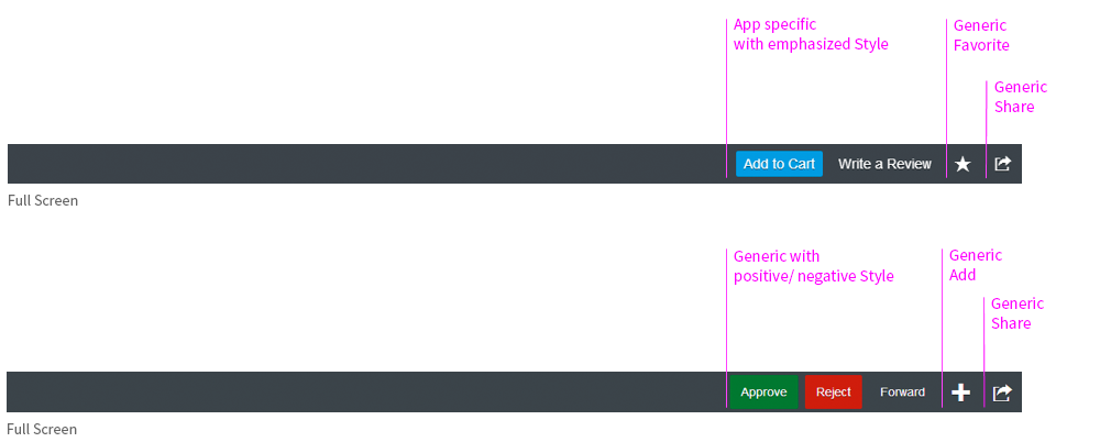
The toolbar elements can be aligned left (“Start”) or right (“End”) and used in conjunction with separators or spacers.
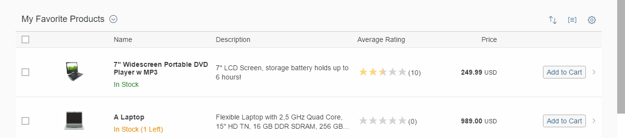
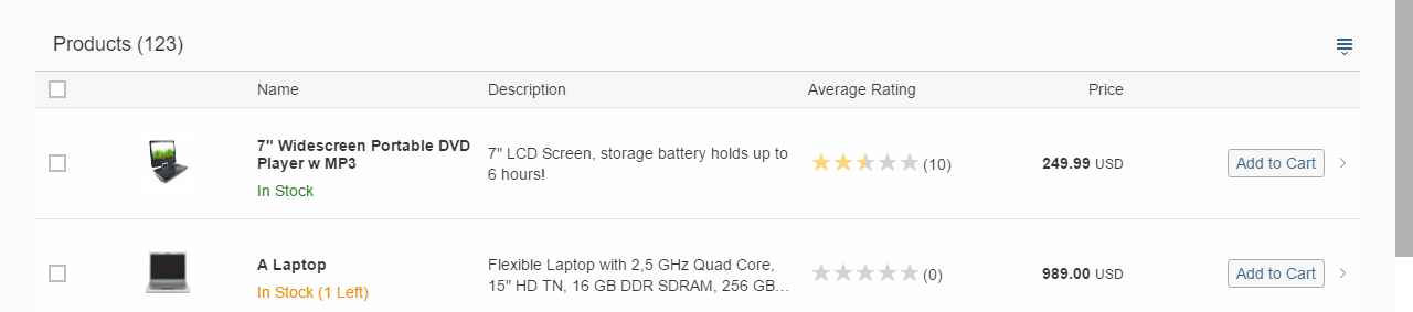
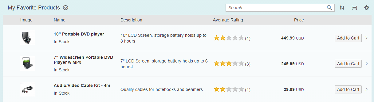
With Spacer
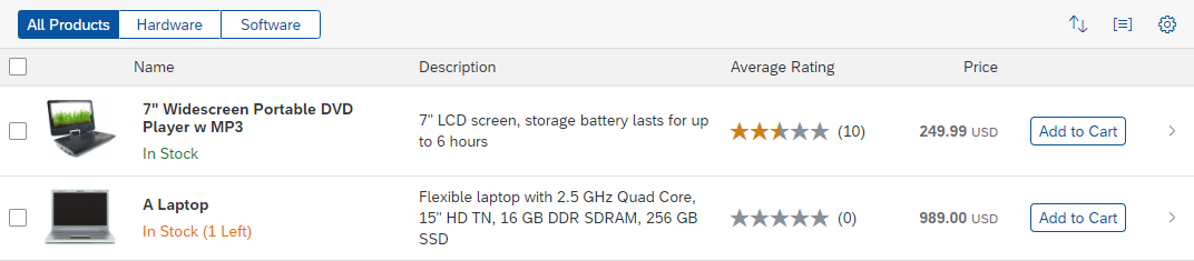
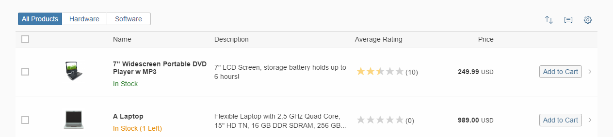
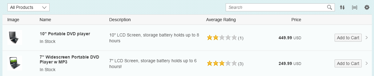
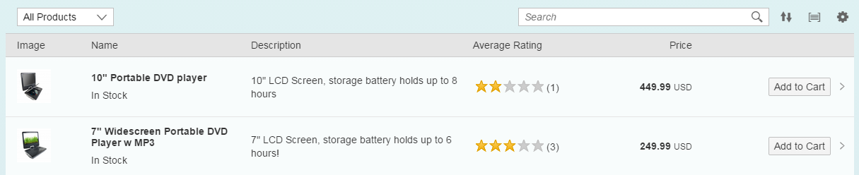
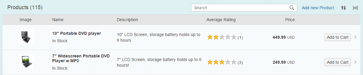
Toolbar with spacer – live example
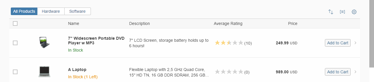
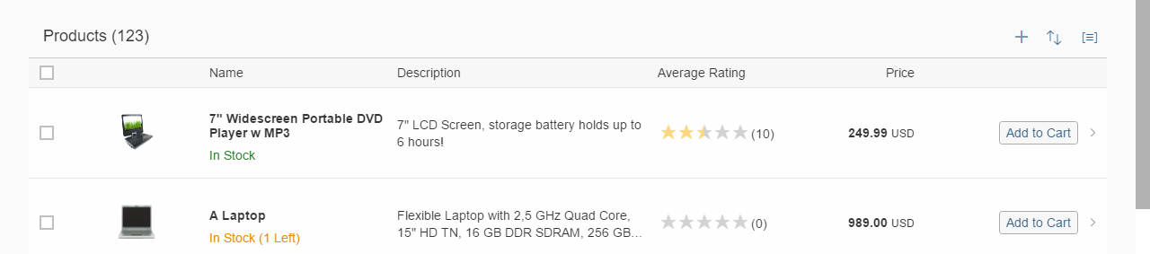
With Separator
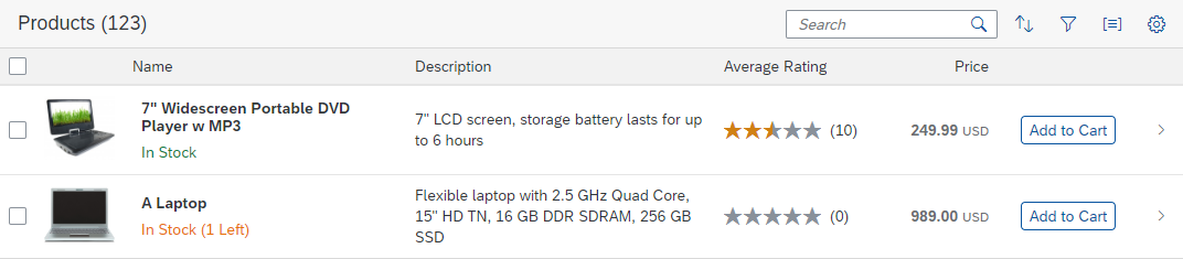
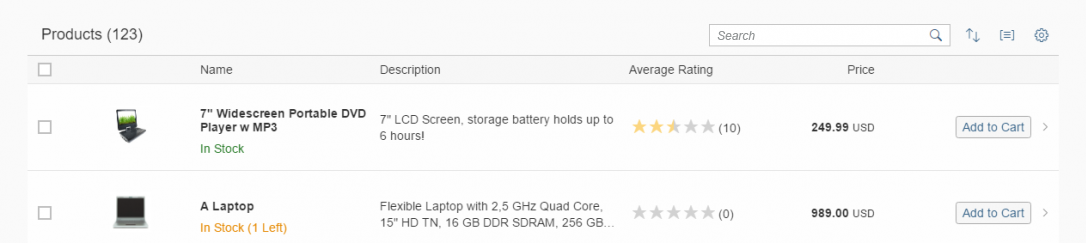
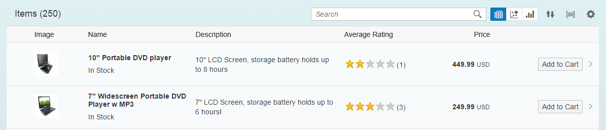
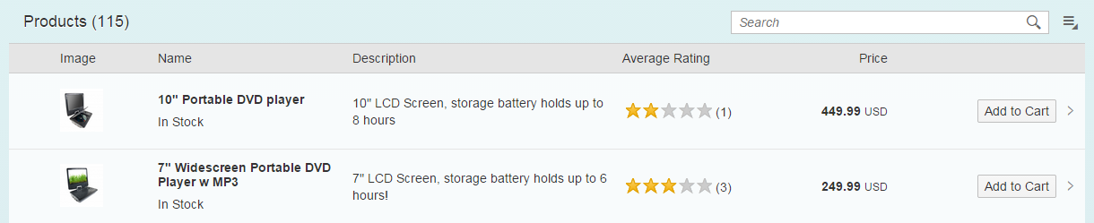
Toolbar with separator – live example
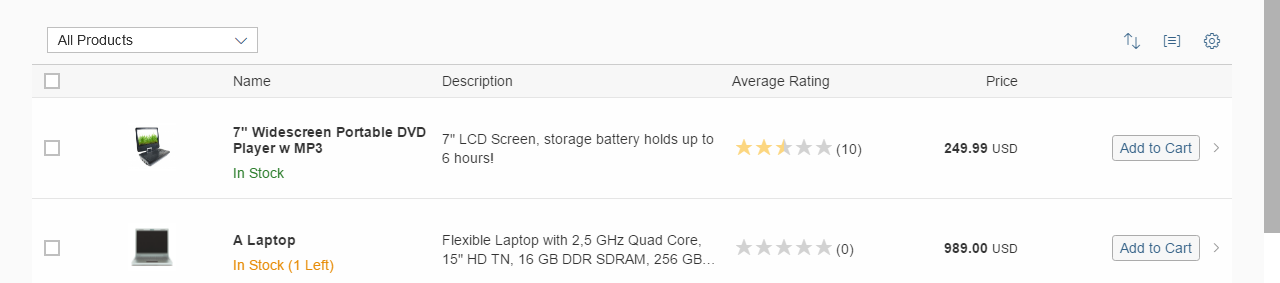
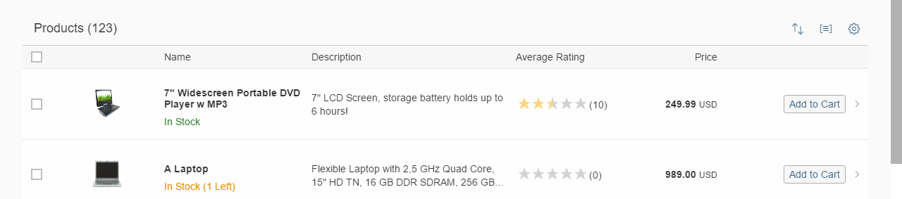
Left-Aligned
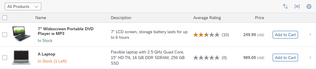
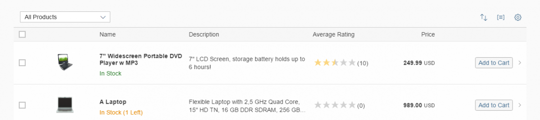
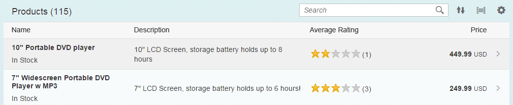
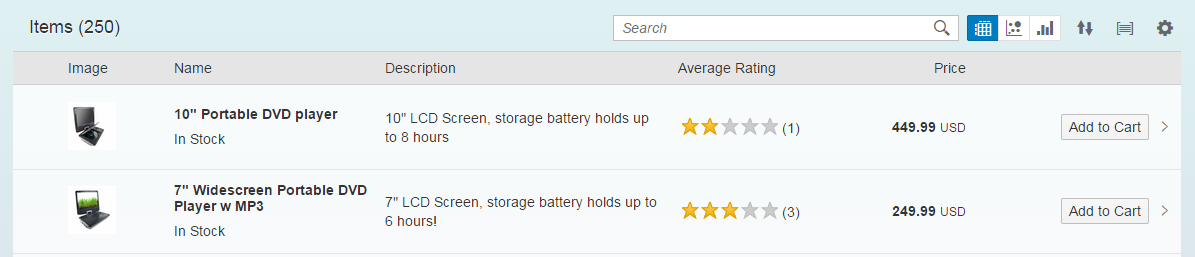
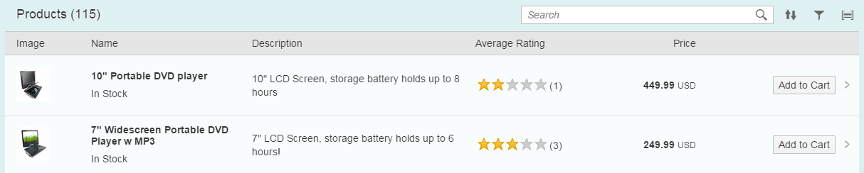
Toolbar aligned left (“Start”) – live example
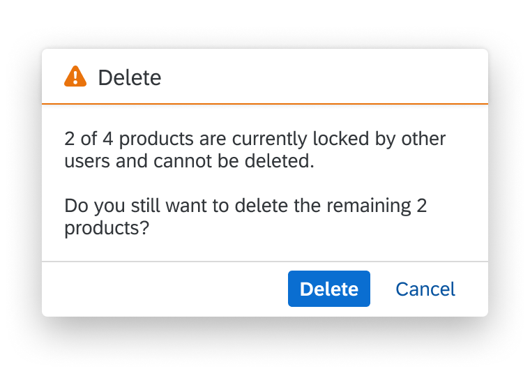
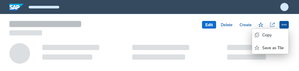
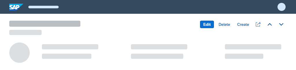
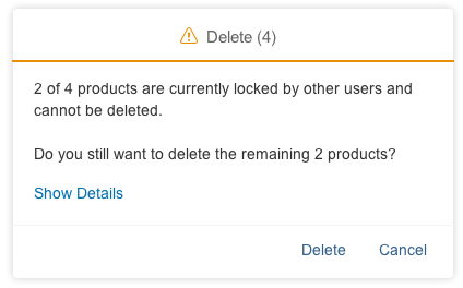
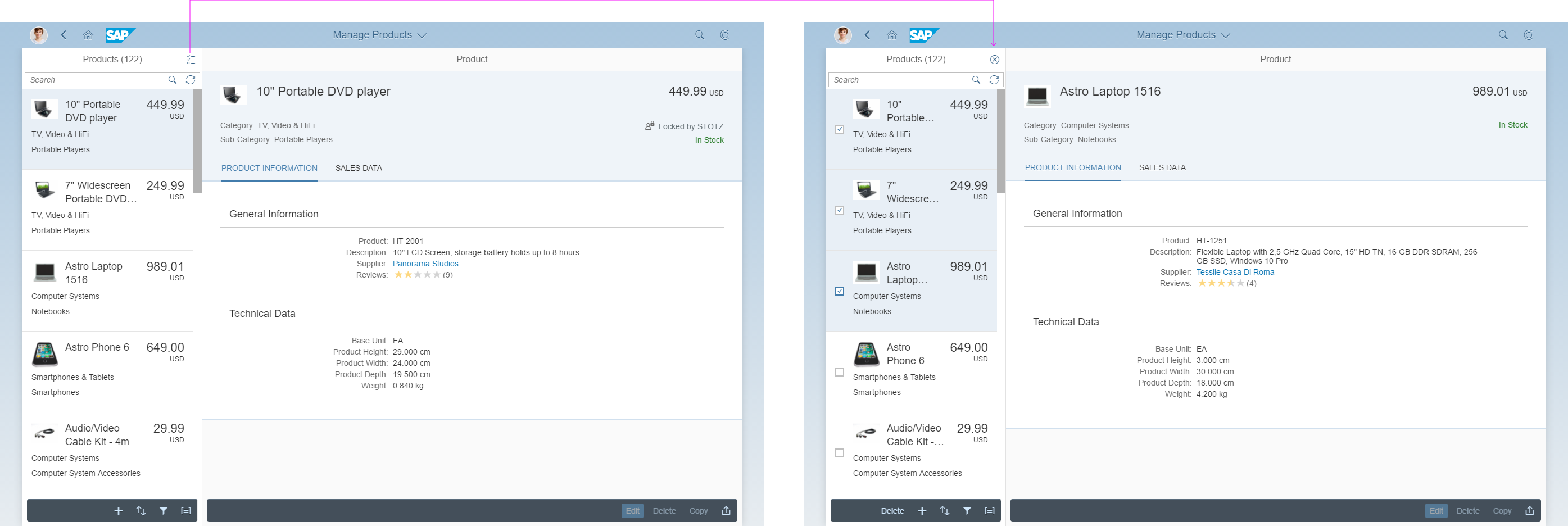
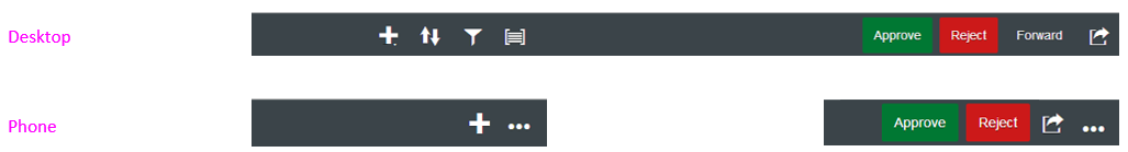
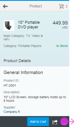
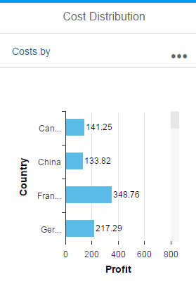
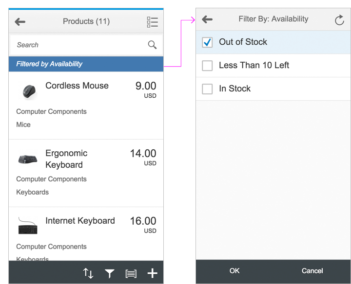
Responsive Behavior
Overflow
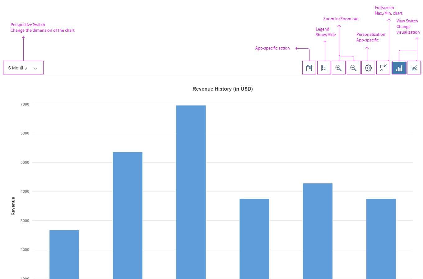
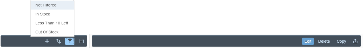
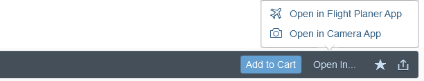
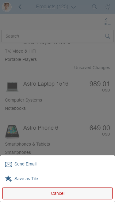
The toolbar’s overflow behavior can transition action elements into a popover when there is not enough space.
You can specify which elements can move into the overflow (overflow priority “AlwaysOverflow”) and which elements always stay on the toolbar (overflow priority “NeverOverflow”). This ensures that the most important toolbar elements remain when the screen size decreases.


 Your feedback has been sent to the SAP Fiori design team.