Archives
Mask Input
The mask input control (sap.m.MaskInput) governs what a user is permitted to enter in an input field. It allows users to easily enter data in a certain format and in a fixed-width input (such as a date, time, phone number, credit card number, currency, and IP address).
Usage
Use the mask input if:
- You have to govern what a user is allowed to enter in an input field.
- You have to enter data easily in a certain format and in a fixed-width input.
- You have to enter input such as a date, time, phone number, serial number, ISBN, or product activation key.
Do not use the mask input if:
- The mask prevents users from entering essential data.
- The users need to enter data in a format other than the one used by the mask (for example, if users have to enter a phone number with a format for a different region).
Responsiveness
The mask input extends the input control (sap.m.Input) and has all the normal properties of an input field.
Components
The mask input has a fixed length format based on instantiation, and the user’s input must conform to it. This may be particularly useful when the user needs to enter text or numbers with specific formatting, such as a phone number, postcal code, or credit card number.
Immutable Characters
When defining the mask format, the developer can place immutable characters, such as brackets and dashes, in specific positions. The format also specifies the range of valid characters for each separate position, thus preventing the user from entering invalid input.
For example, when the user enters a phone number, the area code in brackets and the space between the numbers are already present.
Note that the sap.m.MaskInput control extends sap.m.Input and has all the normal properties of an input field.
When creating a new mask, the developer can change the configuration of some default properties. For example, the default placeholder symbol “_” can be changed to something else.
Behavior and Interaction (incl. Gestures)
Entering Text
- Mask string appears in the input field in focus.
- The default placeholder symbol is “_” and can be changed to something else.
Copying and Pasting
Copying to a mask input field:
Users can copy both formatted and unformatted strings into a mask input field. When the texts are pasted, they take on the format defined for the mask input field.
Example: Mask input field for a number with the format: (000) 000 000000
| Copied source string | Value in mask input field after pasting |
| (555) 333 123456 | (555) 333 123456 |
| 555-333-123456 | (555) 333 123456 |
| 555 (333) 12 34 56 | (555) 333 123456 |
Copying from a mask input field:
If you copy a string from a mask input field and paste it elsewhere, the format of the mask input field is copied as well.
Deleting Content
- Select the entire string and delete it. The placeholders will reappear.
- Deleting a character from the string leaves the input information unchanged, except for the deleted character, which is replaced by a placeholder. (The mask does not shift if a character is deleted.)
Guidelines
Validation Rules
Another option is to define new validation rules, such as allowing lowercase characters from “a” to “e” only. This is particularly flexible because these rules are defined with regular expression syntax.
The mask comes with two predefined validation rules: one for all characters in the English alphabet, and one for the numbers from zero to ten.
Therefore, when the mask format is being defined, the alphabetic rule is represented by the letter “a”, and the numeric rule by the number “9”. For example, a numeric mask format with a length of five characters would be specified as “99999”, a mask that accepts only alphabetical characters would be specified as “aaaaa”, and a mixed mask could be “aaa99”. In the mixed mask example, the user would not be able to enter numeric characters anywhere other than in the last two positions.
When you create the MaskInput instance, you can specify the following settings:
- Mask: The format specification, such as (123) 999-999.
- PlaceholderSymbol: A single character used to represent empty positions in a mask value, such as _ _ _ _ _.
- Rules: A collection of sap.m.MaskInputRule instances.
Properties
Mask string
The mask is defined by its character type (or by its length, as applicable). You should consider the following important facts:
- The mask characters normally correspond to an existing rule (one rule per unique character). Characters that do not are considered immutable characters. For example, the mask ‘2099’, where ‘9’ corresponds to a rule for digits, has ‘2’ and ‘0’ as immutable characters.
- Adding a rule that corresponds to the symbol placeholder is not recommended and would lead to unpredictable behavior.
Placeholder symbol string “_”
This defines a placeholder symbol. It is shown in a position where there has not yet been any user input.
Resources
Want to dive deeper? Follow the links below to find out more about related controls, the SAPUI5 implementation, and the visual design.
Planning Calendar
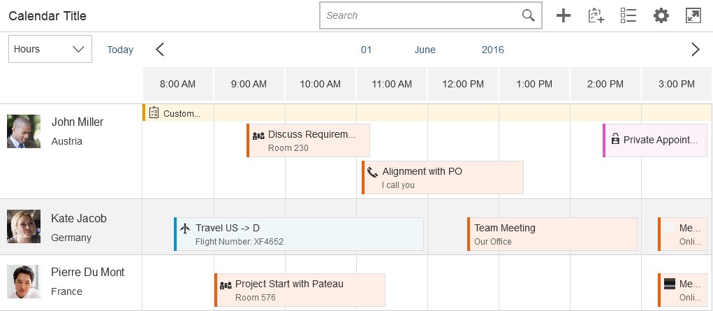
The planning calendar allows users to see different appointments at the same time and to create new events. It allows the user to display appointments for several objects, such as a team calendar, and compare them with each other.
Usage
Use the planning calendar if:
- You want to compare objects of the same type with each other over a period of time.
Do not use the planning calendar if:
- You want to show a calendar for one object and a detailed overview of appointments over a long time interval.
Responsiveness
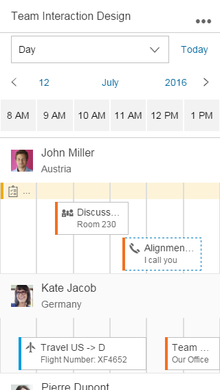
In size S, the control provides pop-in behavior, which allows the user to see as many appointments as possible and to connect them with the corresponding object. If the toolbar contains too many actions for the space available, the overflow icon (…) appears.
The interval section displaying the hours, days, and months is responsive and shows 12 values in large size, 8 values in medium size, and 6 values in small size. You can override this behavior, but you should then check that the responsiveness is still working.
Types
You can define what size of interval the calendar should show, and whether multi selection should be possible. Additionally, the row header and the interval appointments are optional.
The control allows multi-select mode to be shown for the list items. This can be used, for example, to delete multiple objects from the view.
The app development team must decide whether to show the planning calendar with or without multi-select mode, or whether users should be able to switch between the two modes. Hiding the interval appointments of every object is optional.
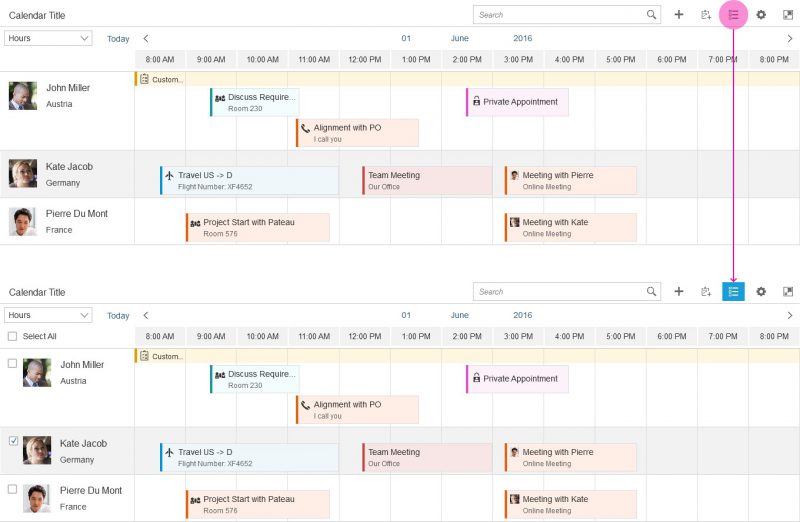
The example on the right shows what the interaction looks like if the user can trigger multi-select mode. When the user clicks or taps the button, a checkbox appears next to each list item and a Select All option is shown. Additional actions can appear or disappear in the calendar toolbar.
The planning calendar can also be shown in single-select mode. In this case, the row header disappears and only the appointments are visible. It can be used to show the calendar of one object. Note that the control was built mainly to compare time slots of different objects. For this reason, the time axis is shown horizontally and, depending on the interval, the appointments are truncated.
Components
This section describes the various components of the planning calendar.
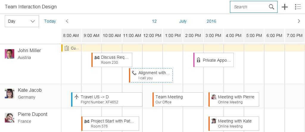
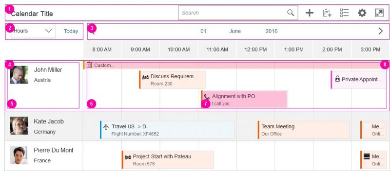
The control consists of different parts:
- Toolbar
- Header
- Calendar view
- List item
- Row header
- Row
- Appointment
- Interval appointment
1. Toolbar
The toolbar is optional and can contain a title as well as app-specific and generic actions.
If you have actions in the toolbar, we recommend that you use a title to describe the purpose of the planning calendar. For more information, check out the toolbar guideline article.
The generic actions are as follows:
- Search
- Add appointment (icon: add)
- Add new contact (icon: add-contact)
- Multi-select mode (icon: multi-select)
- Legend (icon: legend)
- Settings (icon: action-settings)
- Full screen (icon: full-screen/exit-full-screen)
2. Header
The calendar header comprises the left part, which includes an optional switch to see the calendar in a different view (day, month, year), and the right part, which contains the calendar view.
3. Calendar view
The calendar view defines the granularity of the appointments shown. You can decide what kind of view (hours, days, or months) they need and how many values are shown. There is a default value for the number of values to be shown. App developers can change this value, but they should then ensure that the app is still responsive.
Users can also navigate to the next or previous view, and switch easily to another year, month, or day.
4. List item
The list item contains the row header, row, appointments, and interval appointments. Each row can show different working and non-working days. This is useful if users want to view calendars from different countries that have different weekends.
5. Row header
This identifies the object for which the appointments are shown. The row header pops in if there is not enough space. It can contain a picture or icon, a title, and a subtitle.
6. Row
All appointments that appear for an object are shown here.
7. Appointment
Appointments enable an icon or picture, a title, and a subtitle to be shown. If events appear simultaneously, they are shown under each other. App developers can define the colors of different event types, and events can be shown as tentative. The control can register the click event, and the app development team must define what happens next.
If the view changes and there are too many small appointments at one time, an aggregation is shown. Otherwise, the click/touch area would be too small.
8. Interval appointment
Each row can also have interval appointments. These are smaller and always appear at the top of the row. They can be used to show events that last for a prolonged period of time, such as vacations or workshops.
Behavior and Interaction (incl. Gestures)
To create an event, the user must trigger an action by clicking the plus ( ) icon in the toolbar.
To see the details of an appointment, the user selects the appointment, thus triggering a click event. The app development team must define what kind of information is then shown.
A multi-select toggle can also be provided in the toolbar. This can be used, for example, to select multiple people to delete them from the planning calendar.
Various tooltips can be shown, but you should not use them to show additional information because users cannot access this functionality on touch devices.
Depending on the current time interval, appointments can become truncated. However, this should not be an issue because the main use case is to see whether there is a free time slot. Additionally, the user can click or tap the appointment to see the details.
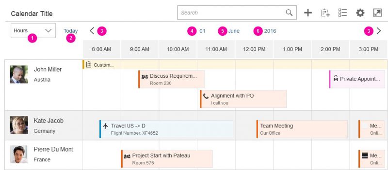
1. Switch
The switch is optional and allows users to switch between different views. For example, a user can get an overview of a whole year by selecting the year view.
The average length of appointments and the use case should decide which view is the most useful.
2. Today action
The user can trigger this action to go back to the current date.
3. Back and forward navigation
The arrows allow the user to navigate to the next or previous interval.
4. Day switch
The day switch is only available if the day view is selected. It enables the user to navigate to a different day.
5. Month switch
The month switch is available if the day or month view is selected. It allows the user to switch to a different month.
6. Year switch
Day, month, and year views enable the user to switch between different years.
Interaction Flow for Switching Days
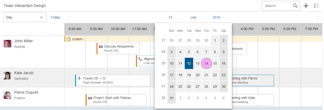
There are two ways in which the user can switch to a different day:
- Click or tap the arrows to navigate to the next or previous interval.
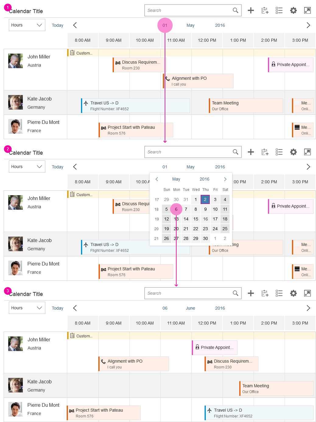
- Click or tap the current day to open the date picker. When the user selects a day, the picker closes and navigates the user to the selected value.
Resources
Want to dive deeper? Follow the links below to find out more about related controls, the SAPUI5 implementation, and the visual design.
Elements and Controls
- Overview Toolbar (guidelines)
- Calendar Date Interval (guidelines)
- Date Picker (guidelines)
Implementation
- Planning Calendar (SAPUI5 test suite)
- Planning Calendar Row (SAPUI5 API reference)
- Planning Calendar View (SAPUI5 API reference)
Planning Calendar
The planning calendar allows users to see different appointments at the same time and to create new appointments. It allows the user to display appointments for several objects, such as a team calendar, and compare them with each other.
Usage
Use the planning calendar if:
- You want to compare objects of the same type with each other over a period of time.
- You require responsive behavior.
- You have less than 100 lines in the calendar.
Do not use the planning calendar if:
- You want to show a calendar for one object and a detailed overview of appointments over a long time interval.
- You want to show a complex or graphical representation. In this case, please use the Gantt chart.
- You have more than 100 lines in the calendar. In this case, please use the Gantt chart.
Responsiveness
In size S, the control provides pop-in behavior, which allows the user to see as many appointments as possible and to connect them with the corresponding object. If the toolbar contains too many actions for the space available, the overflow icon appears.
The interval section displaying the hours, days, and months is responsive and shows 12 values in large size, 8 values in medium size, and 6 values in small size. You can override this behavior, but you should then check that the responsiveness is still working.
Types
You can define what size of interval the calendar should show, and whether multi selection should be possible. Additionally, the row header and the interval appointments are optional.
The control allows multi-select mode to be shown for the list items. This can be used, for example, to delete multiple objects from the view.
An app development team must decide whether to show the planning calendar with or without multi-select mode, or whether users should be able to switch between the two modes. Hiding the interval appointments of every object is optional.
The example opposite shows what the interaction looks like if the user can trigger multi-select mode. When the user clicks or taps the button, a checkbox appears next to each list item and a Select All option is shown. Additional actions can appear or disappear in the calendar toolbar.
The planning calendar can also be shown in single-select mode. In this case, the row header disappears and only the appointments are visible. It can be used to show the calendar of one object. Note that the control was built mainly to compare time slots of different objects. For this reason, the time axis is shown horizontally and, depending on the interval, the appointments are truncated.
Components
This section describes the various components of the planning calendar.
The control consists of different parts:
- Toolbar
- Header
- Calendar view
- List item
- Row header
- Row
- Appointment
- Interval appointment
1. Toolbar
The toolbar is optional and can contain a title as well as app-specific and generic actions.
If you have actions in the toolbar, we recommend that you use a title to describe the purpose of the planning calendar. For more information, check out the toolbar guideline article.
The generic actions are as follows:
- Search
- Add Appointment (icon: add)
- Add New Contact (icon: add-contact)
- Multi-select mode (icon: multi-select)
- Legend (icon: legend)
- Settings (icon: action-settings)
- Full Screen (icon: full-screen/exit-full-screen)
2. Header
The calendar header comprises the left part, which includes an optional switch to see the calendar in a different view (day, month, year), and the right part, which contains the calendar view.
3. Calendar view
The calendar view defines the granularity of the appointments shown. You can decide what kind of view (hours, days, or months) they need and how many values are shown. There is a default value for the number of values to be shown. App developers can change this value, but they should then ensure that the app is still responsive.
Users can also navigate to the next or previous view, and switch easily to another year, month, or day.
4. List item
The list item contains the row header, row, appointments, and interval appointments. Each row can show different working and non-working days. This is useful if users want to view calendars from different countries that have different weekends.
5. Row header
This identifies the object for which the appointments are shown. The row header pops in if there is not enough space. It can contain a picture or icon, a title, and a subtitle.
6. Row
All appointments that appear for an object are shown here.
7. Appointment
Appointments enable an icon or picture, a title, and a subtitle to be shown. If appointments appear simultaneously, they are shown under each other. App developers can define the colors of different appointment types, and appointments can be shown as tentative. The control can register the click event, and the app development team must define what happens next.
If the view changes and there are too many small appointments at one time, an aggregation is shown. Otherwise, the click/touch area would be too small.
8. Interval appointment
Each row can also have interval appointments. These are smaller and always appear at the top of the row. They can be used to show appointments that last for a prolonged period of time, such as vacations or workshops.
Behavior and Interaction
To create an appointment, the user must trigger an action by clicking the Add icon in the toolbar.
A user who wants to see the details of an appointment can click it, thus triggering a click event. The app development team must define what kind of information is then shown.
A multi-select toggle can also be provided in the toolbar. This can be used, for example, to select multiple people to delete them from the planning calendar.
Various tooltips can be shown, but you should not use them to show additional information because users cannot access this functionality on touch devices.
Depending on the current time interval, appointments can become truncated. However, this should not be an issue because the main use case is to see whether there is a free time slot. Additionally, the user can click or tap the appointment to see the details.
1. Switch
The switch is optional and allows users to switch between different views. For example, a user can get an overview of a whole year by selecting the year view. The average length of appointments and the use case should decide which view is the most useful.
2. Today action
The user can trigger this action to go back to the current date.
3. Back and forward navigation
The arrows allow the user to navigate to the next or previous interval.
4. Day switch
The day switch is only available if the day view is selected. It enables the user to navigate to a different day.
5. Month switch
The month switch is available if the day or month view is selected. It allows the user to switch to a different month.
6. Year switch
Day, month, and year views enable the user to switch between different years.
Interaction Flow for Switching Days
There are two ways in which the user can switch to a different day:
- Clicking or tapping the arrows to navigate to the next or previous interval.
- Clicking or tapping the current day to open the date picker. When the user selects a day, the picker closes and navigates the user to the selected value.
Resources
Want to dive deeper? Follow the links below to find out more about related controls, the SAPUI5 implementation, and the visual design.
Elements and Controls
- Overview Toolbar (guidelines)
- Calendar Date Interval (guidelines)
- Date Picker (guidelines)
Implementation
- Planning Calendar (SAPUI5 test suite)
- Planning Calendar Row (SAPUI5 API reference)
- Planning Calendar View (SAPUI5 API reference)
Planning Calendar
The planning calendar allows users to see different appointments at the same time and to create new appointments. It allows the user to display appointments for several objects, such as a team calendar, and compare them with each other.
Usage
Use the planning calendar if:
- You want to compare objects of the same type with each other over a period of time.
- You require responsive behavior.
- You have less than 100 lines in the calendar.
Do not use the planning calendar if:
- You want to show a calendar for one object and a detailed overview of appointments over a long time interval.
- You want to show a complex or graphical representation. In this case, please use the Gantt chart.
- You have more than 100 lines in the calendar. In this case, please use the Gantt chart.
Responsiveness
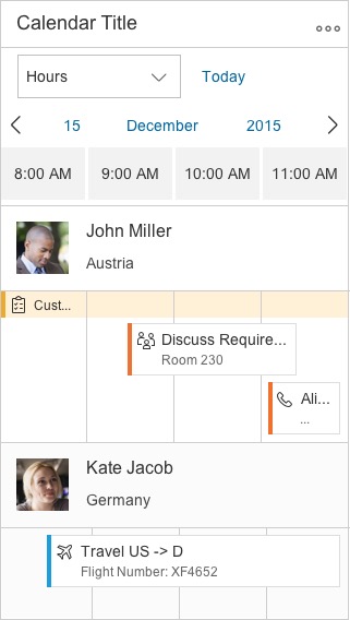
In size S, the control provides pop-in behavior, which allows the user to see as many appointments as possible and to connect them with the corresponding object. If the toolbar contains too many actions for the space available, the overflow icon appears.
The interval section displaying the hours, days, and months is responsive and shows 12 values in large size, 8 values in medium size, and 6 values in small size. You can override this behavior, but you should then check that the responsiveness is still working.
Types
You can define what size of interval the calendar should show, and whether multi selection should be possible. Additionally, the row header and the interval appointments are optional.
The control allows multi-select mode to be shown for the list items. This can be used, for example, to delete multiple objects from the view.
An app development team must decide whether to show the planning calendar with or without multi-select mode, or whether users should be able to switch between the two modes. Hiding the interval appointments of every object is optional.
The example opposite shows what the interaction looks like if the user can trigger multi-select mode. When the user clicks or taps the button, a checkbox appears next to each list item and a Select All option is shown. Additional actions can appear or disappear in the calendar toolbar.
The planning calendar can also be shown in single-select mode. In this case, the row header disappears and only the appointments are visible. It can be used to show the calendar of one object. Note that the control was built mainly to compare time slots of different objects. For this reason, the time axis is shown horizontally and, depending on the interval, the appointments are truncated.
Components
This section describes the various components of the planning calendar.
The control consists of different parts:
- Toolbar
- Header
- Calendar view
- List item
- Row header
- Row
- Appointment
- Interval appointment
1. Toolbar
The toolbar is optional and can contain a title as well as app-specific and generic actions.
If you have actions in the toolbar, we recommend that you use a title to describe the purpose of the planning calendar. For more information, check out the toolbar guideline article.
The generic actions are as follows:
- Search
- Add Appointment (icon: add)
- Add New Contact (icon: add-contact)
- Multi-sSelect Mode (icon: multi-select)
- Legend (icon: legend)
- Settings (icon: action-settings)
- Full Screen (icon: full-screen/exit-full-screen)
2. Header
The calendar header comprises the left part, which includes an optional switch to see the calendar in a different view (day, month, year), and the right part, which contains the calendar view.
3. Calendar view
The calendar view defines the granularity of the appointments shown. You can decide what kind of view (hours, days, or months) they need and how many values are shown. There is a default value for the number of values to be shown. App developers can change this value, but they should then ensure that the app is still responsive.
Users can also navigate to the next or previous view, and switch easily to another year, month, or day.
4. List item
The list item contains the row header, row, appointments, and interval appointments. Each row can show different working and non-working days. This is useful if users want to view calendars from different countries that have different weekends.
5. Row header
This identifies the object for which the appointments are shown. The row header pops in if there is not enough space. It can contain a picture or icon, a title, and a subtitle.
6. Row
All appointments that appear for an object are shown here.
7. Appointment
Appointments enable an icon or picture, a title, and a subtitle to be shown. If appointments appear simultaneously, they are shown under each other. App developers can define the colors of different appointment types, and appointments can be shown as tentative. Appointments are fully colored. The control can register the click event, and the app development team must define what happens next.
If the view changes and there are too many small appointments at one time, an aggregation is shown. Aggregations show a number indicating how many appointments are not fully visible in this view. This functionality will be improved in future releases. Otherwise, the click/touch area would be too small.
There are two sizes of appointments – regular and half size. The half-sized appointments can save space, but also note that they do not show a second line for details of the appointment.
8. Interval appointment
Each row can also have interval appointments. These are smaller and always appear at the top of the row. They can be used to show appointments that last for a prolonged period of time, such as vacations or workshops.
Behavior and Interaction
To create an appointment, the user must trigger an action by clicking the Add icon in the toolbar.
A user who wants to see the details of an appointment can click it, thus triggering a click event. The app development team must define what kind of information is then shown.
A multi-select toggle can also be provided in the toolbar. This can be used, for example, to select multiple people to delete them from the planning calendar.
Various tooltips can be shown, but you should not use them to show additional information because users cannot access this functionality on touch devices.
Depending on the current time interval, appointments can become truncated. However, this should not be an issue because the main use case is to see whether there is a free time slot. Additionally, the user can click or tap the appointment to see the details.
1. Switch
The switch is optional and allows users to switch between different views. For example, a user can get an overview of a whole year by selecting the year view. The average length of appointments and the use case should decide which view is the most useful.
2. Today action
The user can trigger this action to go back to the current date.
3. Back and forward navigation
The arrows allow the user to navigate to the next or previous interval.
4. Day switch
The day switch is only available if the day view is selected. It enables the user to navigate to a different day.
5. Month switch
The month switch is available if the day or month view is selected. It allows the user to switch to a different month.
6. Year switch
Day, month, and year views enable the user to switch between different years.
Interaction Flow for Switching Days
There are two ways in which the user can switch to a different day:
- Clicking or tapping the arrows to navigate to the next or previous interval.
- Clicking or tapping the current day to open the date picker. When the user selects a day, the picker closes and navigates the user to the selected value.
Behavior and Interaction
To create an appointment, the user must trigger an action by clicking the Add icon in the toolbar. Clicking directly on the row also created a new appointment.
The user can click on the appointment to see further details. The app development team must define what kind of information is then shown. For example, clicking on an appointment can trigger a popover with detailed information.
A multi-select toggle can also be provided in the toolbar. This can be used, for example, to select multiple people in order to delete them from the planning calendar.
Various tooltips can be shown, but you should not use them to show additional information because users cannot access this functionality on touch devices.
Depending on the current time interval, appointments can get truncated. However, this should not be an issue because the main use case is to see whether there is a free time slot. Additionally, the user can click or tap the appointment to see the details.
In the “months view”, appointments may appear as aggregations due to lack of space for detailed visualization. Aggregations show a number indicating how many appointments are not fully visible in this view. This functionality will be improved in future releases.
The “alternating rows” functionality gives users the possibility to row coloring on or off. By default, the alternating rows option is turned on.
Appointments in the calendar have two sizes, regular and half appointment. The exact sizes can be found in the visual specification. The app developer can choose the size that fits the use case, but keep in mind that the half-size appointment shows less information about the appointment.
With “hiding the interval header”, the user also has the option to hide the interval header and the space that is reserved for it. This option can be included as an icon in the toolbar.
1. Switch
The switch is optional and allows users to switch between different views. For example, a user can get an overview of a whole year by selecting the year view. The average length of appointments and the use case should decide which view is the most useful.
2. Today action
The user can trigger this action to go back to the current date.
3. Back and forward navigation
The arrows allow the user to navigate to the next or previous interval.
4. Day switch
The day switch is only available if the day view is selected. It enables the user to navigate to a different day.
5. Month switch
The month switch is available if the day or month view is selected. It allows the user to switch to a different month.
6. Year switch
Day, month, and year views enable the user to switch between different years.
Interaction Flow for Switching Days
There are two ways in which the user can switch to a different day:
- Clicking or tapping the arrows to navigate to the next or previous interval.
- Clicking or tapping the current day to open the date picker. When the user selects a day, the picker closes and navigates the user to the selected value.
Resources
Want to dive deeper? Follow the links below to find out more about related controls, the SAPUI5 implementation, and the visual design.
Elements and Controls
- Overview Toolbar (guidelines)
- Calendar Date Interval (guidelines)
- Date Picker (guidelines)
Implementation
- Planning Calendar (SAPUI5 test suite)
- Planning Calendar Row (SAPUI5 API reference)
- Planning Calendar View (SAPUI5 API reference)
Date/Time Picker
The date/time picker allows users to select date and time values in a combined input.
Usage
Use the date/time picker if:
- You need a combined date and time input control.
Do not use the date time picker if:
- You want to use either a date or a time value. In this case, use the date picker or the time picker instead.
Responsiveness
The date/time picker runs on all form factors and fully adapts to all devices.
Behavior and Interaction
Selecting Date and Time Values
Sizes M and L/XL
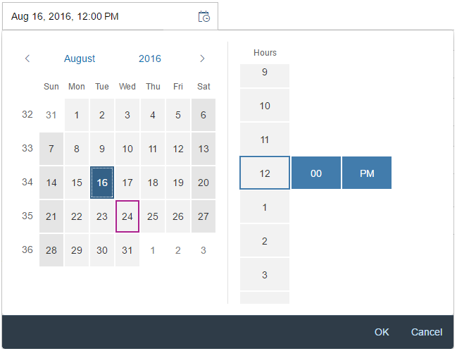
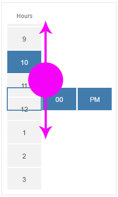
The date/time picker appears as a popover when the user clicks or taps a date (input field) on the calendar, The user can then select the desired date from the calendar, and the time from the rotating wheel.
When the user clicks or taps the OK button, the popover closes and the selected date and time appear in the input field. When the user selects Cancel, the action is aborted and the input field remains unchanged.
Size S and Mobile Size
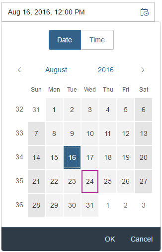
On smaller devices, the user can choose the date and time value in arbitrary order by tapping the segmented button on top of the screen. Be aware that the popover is superimposed on the input field during the selection process for mobile/S sizes.
The user can select the desired date from the calendar, and the time from the rotating time wheel. Clicking a date in the calendar automatically leads the user to the time selection screen.
When the user selects OK, the popover closes and the selected date and time appear in the input field. When the user selects Cancel, the action is aborted and the input field remains unchanged.
Guidelines
Date Picker and Time Picker
In general, we recommend separating the date/time picker controls as the time picker supports the mask input function and the date picker allows the user to enter date in different formats. This makes it easier and more convenient for the user to enter the desired values. For additional guidelines and information on the individual controls, see the resources section below.
Default Values
Independently of the chosen control, set the default values of the date/time picker carefully to avoid unnecessary scrolling. It often makes sense to set the default for the time to the full or half hour, setting the minutes to 00 or 30. Sometimes, it may also make sense to use the current time and date.
Formatting Dates and Times
For guidelines and information on the SAPUI5 date formatters, see formatting dates.
For guidelines and information on the SAPUI5 time formatters, see formatting times.
Properties
AM and PM are locale-dependent. The locale can be set using the property “localeId”.
You can set the display format (property: displayFormat) to define the format in which the time input field and the time picker dropdown display the time.
Resources
Want to dive deeper? Follow the links below to find out more about related controls, the SAPUI5 implementation, and the visual design.
Elements and Controls
- Time Picker (guidelines)
- Date Picker (guidelines)
- Formatting Time (guidelines)
- Formatting Dates (guidelines)








 Your feedback has been sent to the SAP Fiori design team.