A multi-input field allows the user to enter multiple values, which are displayed as tokens. To help the user enter a valid value, you can enable the suggestions feature and the value help option.
Month: November 2014
Multi-Input Field
Usage
Use the multi-input field if:
- You want the user to select multiple ranges (with the value help option and the value help dialog).
- The dataset to choose from is expected to increase over time (for example, to more than 200 values).
- You need to provide the value help option to help users select or search multiple business objects.
- You want to enable users to add custom values.
Do not use the multi-input field if:
- You want the user to select one entry only. In this case, use the input field or combo box instead.
- You want the user to select from a pre-defined set of options only. In this case, use the multi-combo box instead.
Responsiveness
Size S
- Cozy mode.
- When the user clicks the multi-input field, a new full screen dialog opens. After clicking the input field and typing, the suggestions can be selected. When the user makes a selection, the dialog closes and the token is displayed.
- The user can review the tokens by swiping them to the left or right.
Size M
- Cozy mode.
- The suggestions appear below or above the multi-input field.
- The user can review tokens by swiping them to the left or right.
Size L
- Compact mode.
- The suggestions appear below or above the multi-input field.
- The user can review tokens by pressing the right or left arrows on the keyboard.
Types
The input types of the multi-input field are identical to those of the input field.
Behavior and Interaction
Adding Tokens
A token can be added using suggestions or value help. As the user types, the first suggestion item that matches the characters entered is autocompleted in the input field. The typed characters are matched against the beginning of the suggestion items, based on the “starts with” filter. The user can accept the autocompleted value by pressing ENTER. The autocomplete property is set by default if suggestions are available, but can also be switched off.
When an item is selected from the suggestions dropdown, the corresponding token is created, and the input field is ready for the next entry. Tokens are placed next to each other on one line.
The suggestions dropdown can be wider than the input field itself, but not wider than the current browser window (property: maxSuggestionWidth).
Reviewing Tokens
If tokens have been selected, and the input field is not in focus, the input field displays as many tokens as possible in the available space. If more tokens have been selected, an [n] More label indicates the number of hidden tokens. The tokens in the input field appear in the order in which they were selected.
Clicking the [n] More label opens a popover below the input field, in which all selected items are shown. The user can deselect an item by clicking its delete icon.
If the length of the last selected token exceeds the width of the input field, a label [n] Item/s is shown when the field is not in focus.
Clicking the [n] Item/s label opens a popover below the input field, in which all selected items are shown. The user can deselect an item by clicking its delete icon.
If there is only one token in the input field and its length exceeds the width of the input field, the text is truncated. Clicking the token opens a popover below the input field, in which the full text of the token is shown.
Deleting Tokens
The user can delete tokens by pressing the Backspace or Del button (when selected) on a desktop’s keyboard, or by tapping the Delete icon on a mobile device.
Using Value Help
You can enable the value help option to provide a more advanced dialog for finding the relevant business object. Two dialogs can be used at present:
- Select dialog (simple)
- Value help dialog (complex)
Filtering
When the user starts typing in the input field, the list is filtered. Only items that match the character or characters entered are shown in the dropdown list. The default filtering method is “starts with per term”, which matches the beginning of each word in an item’s text.
In addition, application developers can set a custom filtering method “starts with” or “contains” (method: setFilterFunction). The “starts with” approach filters only for items where the beginning of the label matches the query entered. The “contains” approach searches the full label for a match.
As a visual hint for the user, the matched characters are highlighted (bold) in the option list items. The highlighting works on the basis of “starts with per term”, regardless of the filtering method.
Copying and Pasting Data from a Spreadsheet or Text File
The multi-input field can handle paste actions containing multiple items, such as items that have been selected in a column of a spreadsheet or text file. The user simply selects a whole column in the spreadsheet, copies it, and then pastes it from the clipboard into the multi-input field. Each item is represented as a token. If a single value is copied and pasted into the field, it is shown as a text value, as further editing might be required before it is converted into a token.
Grouping
You can group the items in a suggestion list by a specific attribute and separate each group visually with a group header. This feature is also available for tabular suggestion lists.
The group headers are not interactive.
The column headers within the tabular suggestion list remain in place when the list is scrolled (“sticky” behavior). Make sure the suggestion list has no more than 4 columns. If the columns don’t all fit on the screen or get too narrow on small screens, enable the responsive behavior to move columns into the pop-in area (property: enableTableAutoPopinMode).
Due to a technical limitation, the group headers are not visible when clicking on the n More text.
Clear
You can add a (Clear) icon to the input field (property: showClearIcon). The icon appears as soon as the multi-input field has non-tokenized text. Clicking the Clear icon removes the non-tokenized text from the field.
If you offer the Clear icon, make sure that the multi-input field is wide enough to show the icon in addition to the value.
Styles
The following images show how the states of the multi-input field are styled.
When an error, warning, or information value state is displayed, the details can be provided as text or formatted text. The text is shown when the corresponding control has the focus. If using a formatted text, you can include one or several links.
For details on the different states, see UI Element States.
For more information on semantic colors for value states, see How to Use Semantic Colors.
Guidelines
- Give the control a width that is appropriate for the range of values that are going to be entered. Try to avoid setting a fixed width on this control. Instead, embed it in a proper layout (such as a form, simple form, or grid layout) and work with the layout data property.
- Provide meaningful labels for all input fields. Do not use the placeholder as a replacement for the label. The placeholder should only provide an additional hint.
- The multi-input field can currently contain tokens and one free text value. If you allow only validated values, display an error or warning when the user tries to leave the field to indicate that the value entered is invalid, or remove the value.
- If users try to select an item that has been selected before, we recommend setting an error state and providing a meaningful message.
- You can use the layout options of the form to add the unit of measurement (UoM) after the multi-input control. Apps can use the label-field ratio to show the UoM after the field. However, you must make sure that the UoM is properly visualized and doesn’t wrap to the next row.
- The multi-input field can be used in the grid table, analytical table and tree table as well, as condensed mode is already supported, both for desktop and mobile (tablets).
- In display mode, use a text. Show the texts of the tokens, separated by bullet points. Provide an overflow for all texts that do not fit in one line.
- In display mode, consider the following alternatives:
- A bulleted list with a bullet per token text (for example, using formatted text)
- A horizontal list with bullet separators between the individual token texts (for example, using text or formatted text)
- If the display mode equivalent needs to be a single-line text (as required for the grid table, tree table, analytical table), provide an overflow for all texts that do not fit onto the line (for example, by adding a link, opening a popover, or using an expandable text).
Properties
Since the multi-input field is derived from the input field, refer to the properties in the input field article.
Resources
Want to dive deeper? Follow the links below to find out more about related controls, the SAPUI5 implementation, and the visual design.
Elements and Controls
- Multi-Combo Box (guidelines)
- Input (guidelines)
- Combo Box (guidelines)
- Select (guidelines)
- Select Dialog (guidelines)
- Value Help Dialog (guidelines)
- Tokenizer (guidelines)
Select Dialog
The select dialog enables users to select one or more items from a comprehensive list. The select dialog comes with a list of entries and a search field to filter the list.
A more enhanced dialog for single selection and multiselection is the value help dialog as it offers range selection and excluding functions.
Usage
Use the select dialog if:
- Users need to select one or more entries from a comprehensive list that contains multiple attributes or values.
Do not use the select dialog if:
- Users need to pick one item from a predefined set of options that contains one attribute or value only such as languages. In this case, consider using the combo box or select instead.
- Your use case requires more enhanced functionalities such as a selection based on ranges. For the selection of values, consider using the value help dialog instead.
- Your use case requires tabs, filters, or an Add New functionality in the select dialog. In this case, use a standard dialog instead.
Responsiveness
The display of the select control depends on the device. On phones, the selection list takes up the whole screen. On desktop and tablet devices it appears as a popover.
Size S
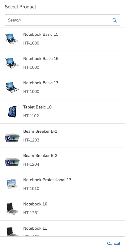
Single select dialog in full screen on smartphone
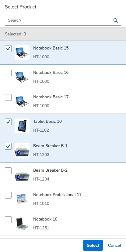
Multi-select dialog in full screen on smartphone
Components
Dialog Header
You need to set the title of the dialog header (1). We recommend the following form:
Single selection
Select
Example: Select Product
Multi-selection
Select
Example: Select Products
Search
The first element in the dialog is a standard search field (2).
Info Toolbar
The info toolbar (3) is only available in multi-selection mode. It shows the number of selected items in the following form:
Selected :
Example: Selected Products: 2
Content
The content area (4) can be filled with any list content inherited from the list item base, such as standard list items, display list items, and feed list items. You can set the content to be displayed as grouped.
Button Toolbar
Behavior and Interaction
The select dialog can be called from any control. The most common trigger is an input field with a selection icon, also known as a “value help field”, or F4. Alternative triggers are buttons or icons, which add items to an existing list.
Single Select
Once users select an entry, the select dialog is closed and the selected entry is taken over. If applicable, the entry is displayed in the field from which the dialog was triggered.
Multi-Select
In the multi-select version of the select dialog, checkboxes are provided for choosing multiple entries. The selection is taken over when the user chooses Select. Cancel closes the dialog without taking over the selected values. An infobar indicates the number of selected items.
Search
The user can search items.
Resize and Drag Dialog
You can make the select dialog resizable and draggable by setting the corresponding properties (also called resizable and draggable) to “true”.
A resizable dialog makes sense if the items inside have long names or descriptions.
A draggable dialog allows users to see the app content behind the dialog.
Guidelines
List Options
If you need to indicate that none of the selection options are selected, or you need to allow users to not select an option, offer an appropriate option, such as (Not Selected) or (No Values Selected). Show this option in parentheses and place it at the beginning of the list.
Examples:
(Not Selected)
(Not Assigned)
(No Product Selected)
(None)
When using the select dialog for selecting filters: If you need to indicate that all items apply as filter options, provide All as an option and place it at the beginning of the list.
Search Behavior
Two types of search behavior are available:
(1) A live search, also known as “search-as-you-type” (property: liveChange), which is triggered by each character that the user enters or deletes.
(2) A manual search, which is triggered explicitly after the user enters text in the search field and clicks the Search icon or presses the ENTER key.
Although app developers need to decide themselves which search to use, we recommend implementing the live search whenever possible. Use the manual search only if the amount of data is too large and your app would otherwise run into performance issues. For more information, check out the article on search.
Reset/Remember Selections
By default, the selection is reset when the dialog is closed. This allows users to make a new selection when they reopen the dialog and makes sense when users need to add multiple items to a table.
However, if your use case requires selections in a dialog to be remembered so that the user can make corrections, you can set the rememberSelections function in the select dialog to “true”. When users exit the dialog by clicking Cancel, the selection is then restored to the state it was in when the dialog was opened.
This also works in single-select dialogs. There, if users click the remembered item again, the dialog closes and they do not have to explicitly click Cancel.
Infobar
In multi-selection mode, an infobar shows the number of selected items. Use the following format:
Selected: [Number of selected items]
Example: Selected: 2
Note that the infobar is not “sticky”. When the user scrolls down the list, the infobar scrolls off the screen.
Infobar States
The infobar has two states – active and non-active (non-clickable). For more information see Infobar States.
“Clear” Button
The Clear button allows users to clear all the selected items. By default, the button is not shown. To display the button, set the showClearButton property to “true”.
Content
By default, the select dialog comes with a growing feature (property: growing = “true”). We recommend disabling the growing feature and setting this property to “false”. This ensures that all items in the table are loaded at once, and that the “Items selected” count, the search, and select/deselect features all work properly.
Resources
Want to dive deeper? Follow the links below to find out more about related controls, the SAPUI5 implementation, and the visual design.
Elements and Controls
- Combo Box (guidelines)
- Select (guidelines)
- Value Help (guidelines)
- Search (guidelines)
Action Sheet
Usage
Use the action sheet if:
- You need an option that provides more than one action.
- It is really important that the user stays in context on a phone.
- You only have a small number of actions.
Do not use the action sheet if:
- The menu provides only one option. In this case, consider using a button instead.
- You need to show a hierarchical menu. In this case, use the menu button instead.
- Your users would benefit more from a split button, which offers an easy-to-access default action, with the option to include additional actions.
Layout
All elements in the action sheet are left-aligned. Actions are always arranged in order of importance, from top to bottom. The Cancel button uses a negative button type and is centered to differentiate it from the other app actions. The cursor/focus area for buttons within the action spans the full width of the action sheet (which in turn depends on the longest button).
Behavior and Interaction
Clicking
A click on the overflow icon (“…”) opens either a popover or a dialog. The user can trigger an action or close the action sheet by clicking anywhere on the screen. On a smartphone, the dialog can be closed only with the Cancel button.
If the user triggers an action, the action sheet closes automatically and the system provides a message toast.
Guidelines
- Never use only icons in the action sheet. Display text only or a combination of icon and text.
- On smartphones, provide a Cancel button to enable the user to close the dialog without triggering an action.
- Avoid scrolling in action sheets. If you include too many buttons in an action sheet, users have to scroll to see all the actions in the list. Not only does it take users longer to distinguish between actions, but they also find it difficult to scroll without clicking a button by mistake.
Resources
Want to dive deeper? Follow the links below to find out more about related controls, the SAPUI5 implementation, and the visual design.
Elements and Controls
- Button (guidelines)
- Icon (guidelines)
- Popover (guidelines)
- Dialog (guidelines)
- Message Toast (guidelines)
Select
The select control (also known as a dropdown) is commonly used to enable users to select an item from a predefined list.
Usage
Use the select control if:
- Users need to select one item exclusively from a short list of options (usually between 2 and 12 items).
- The values of the option list are of secondary importance and do not need to be displayed right away.
Do not use the select control if:
- Users need to choose between two options, such as On or Off and Yes or No. In this case, consider using a switch control instead.
- Users need to pick one item from a very large set of options. In this case, consider using the combo box instead.
- You need to display more than one attribute. In this case, consider using the input field with a select dialog or a value help dialog instead.
- The user needs to search on multiple attributes. In this case, consider using the input field with select dialog or value help dialog instead.
- Your use case requires all available options to be displayed right away, without any user interaction. In this case, consider using radio buttons or a radio button group instead.
Responsiveness
The display of the select control depends on the device:
- On smartphones, the selection list takes up the whole screen.
- On desktop and tablet devices, it appears as a popover. If there is not enough space to show the option list below the field, it opens above the field.
Layout
The select control can be placed in toolbars, such as chart toolbars, footer toolbars, or header toolbars, as well as in forms or tables:
Components
Select Trigger
The trigger to open the option list is either the Select field (1), which also displays the current selection, or an icon (3).
Option List
The option list (2) displays all the items available to the user. The selection is always highlighted. Selecting another option from the list moves the highlight to the selected option.
Full Screen Title Bar for Size S
Opening the select control on a smartphone brings up the option list in full screen mode. The full screen mode can be closed using the icon on the top right corner (5).
You need to set a title for the full screen mode (4). We recommend the following format:
Single selection
Select [Entity]
Example: Select Product
Multi-selection
Select [Entities]
Example: Select Products
Behavior and Interaction
Clicking
The Select field always displays the current selection. The user clicks the field to display a list of options to choose from. Once the user selects an option, the list box closes and the selected option is displayed in the field. If there is no Select field but an icon, the user clicks the icon to open the list of options. The currently selected item is always highlighted in the list to help the user identify what has been selected.
Guidelines
Option List
The option list can contain either text-only values or text values with an icon in front. Keep the text values as short as possible.
Only use icons if they help users better identify or understand the options. To set icons, use the icon property for each list entry.
Do not disable values. In most cases, it is completely unclear how to enable them. Hide the values instead.
When using the select control to select filter values: If you need to indicate that all items apply, provide All as an option and place it at the beginning of the list.
If your use case requires a blank input field instead of (None), use a combo box instead.
If the select control is placed in a toolbar with an icon as a trigger for sorting, grouping or filtering a set of items, use the texts below for the “not selected” option.
Sort, Group, and Filter:
- (Not Sorted)
Note: In most cases, this option is not necessary; just show the default sort settings instead. - (Not Filtered)
- (Not Grouped)
For more information about the toolbar, see the toolbar overview.
Define a default selection whenever possible. If the selected item is not specified, the first one is selected.
Label
The select control can be displayed with or without a label. If the field is attached to another field, you do not need to define a second label.
Sorting
The sort option list contains all the items that are available to the user. Choose one of the following styles to order the content:
Logical: Sort items into a meaningful order. Group related options together and show the most common options first, followed by less common options. Sort the options alphabetically if more than eight select options are available. This helps the user find the right option quickly.
Width
The select control is usually used in forms, where the width is determined by the form element or container in which the select control is embedded.
If you need to restrict the width to a defined value, you can set the width accordingly. However, we do not recommend defining a fixed width. Where possible, use layout containers (such as a form, simple form, or responsive grid layout), and define the width via the layout data property.
Do not allow the control to auto-adjust based on the selection.
Width of the Option List
By default, the width of the option list adapts to the width of the longest entry. The maximum width of the option list is set to 600 px.
Text Wrap in the Option List
The option list doesn’t support horizontal scrolling. By default, entries that exceed the maximum width of 600 px for the dropdown are truncated. If you expect the dropdown to contain longer entries, we recommend wrapping items in the option list to enable users to read the full text, (property: wrapItemsText). If wrapping is enabled, the text can wrap to multiple lines.
Unit of Measurement
You can use the layout options of the form to can add the unit of measurement (UoM) after select. Apps can use the label-field ratio to show the UoM after the field. However, you must make sure that the UoM is properly visualized and doesn’t wrap to the next row.
Semantic Colors
Different value states or meanings can be indicated by using semantic colors. The visual states are shown below in their regular state (left) and focused (right). Note that the positive/success state does not show a message on focus.
For more details on the correct usage, see How To Use Semantic Colors.
Value State Text
The select control can display the value state text even if the dropdown is open. This ensures that the value states are shown in all situations and on all devices. When the user opens the dropdown, the value state sticks to the top and does not scroll away. The control also supports multi-line text for the value state.
Read-Only
The select control can be displayed as read-only (property: editable, default = “true”). If the editable property is set to “false”, the value of the select cannot be changed. The control remains focusable, but the background and border are changed to indicate that it is read-only.
Elements and Controls
- Combo Box (guidelines)
- Multi-Combo Box (guidelines)
- Input Field (guidelines)
- Form (guidelines)
- Radio Button (guidelines)
- Checkbox (guidelines)
- Toolbar (guidelines)
- How To Use Semantic Colors (guidelines)
Carousel
The carousel allows the user to browse through a set of items. It can display one or several items at a time. From the displayed item or items, the user can navigate to either the next or the previous item.
Optionally, a paging indicator displays the user’s current position inside the set of items.
The carousel control is best used for browsing through a set of images. Viewing images one by one helps users to distinguish between different items. In a comparison scenario, it can also be useful to display several items side by side. The carousel is not limited to displaying images; it can contain any sap.m control.
Usage
Use the carousel if:
- You have strong visual representations of the items you want to display.
- You want to display items sequentially or side by side.
Do not use the carousel if:
- The items you want to display are uniform.
Responsiveness
The size of the control’s content area is adjusted automatically, depending on the amount of space available.
On non-touch devices, the user can navigate with the paging buttons displayed on the left and right of the control.
On touch devices, users can navigate through the pages by swiping or by tapping the arrow buttons, which are always visible. The tap interaction is required as an alternative to swiping to comply with accessibility standards.
The paging indicator (when activated) shows on all form factors. The paging indicator wraps if it is too long to fit onto one line.
Layout
The main component of the carousel control is the content area in which the different items are displayed.
The (optional) paging indicator can float above or below the content area.
On non-touch devices, paging buttons either float above the left and right sides of the content area, or appear in the paging indicator area. This is controlled by the arrowsPlacement property.
Displaying multiple items
The layout of the carousel does not change when multiple items are displayed in the content area.
Behavior and Interaction
The content area contains either the current item or a set of items.
Navigation for Single Items
When the user navigates from the current item to another item, the current item is moved out of the content area, and the next or previous item slides in (depending on the direction of navigation).
On touch devices, users navigate with swipe gestures (swipe right or swipe left).
On non-touch devices, users navigate with paging buttons.
If the item set contains only one item, navigation is deactivated.

Paging button – Previous page

Paging button – Next page (hover)
Navigation for Multiple Items
When the user clicks one of the paging buttons, the rightmost or leftmost item is moved out of the content area, and the next or previous item slides in (depending on the navigation direction).
Looping
The carousel can be set to loop (property: loop). In this case, the carousel jumps back to the first item once all items have been displayed. If looping is not enabled, there is no forward navigation on the last item.
Paging
The current position inside the set of items is displayed using an optional paging indicator (properties: showPageIndicator, pageIndicatorPlacement).

Paging indicator - Icons
If there are more than 8 pages, the paging indicator changes from icons to numbers.

Paging indicator - Count
Resources
Want to dive deeper? Follow the links below to find out more about related controls, the SAPUI5 implementation, and the visual design.
Rating Indicator
Layout
Context
You can use the rating indicator in forms, tables, in a dialog box, or in the filter bar.
Behavior and Interaction
Hover
When the user hovers over the rating indicator, a different icon or image is shown (property: iconHovered). This is an orange star by default.
Select
If enabled for rating, the rating that the user previously selected is shown. When the user performs a rating, an event is triggered.
Properties
Rating Symbols
You can also specify the URLs for the images or icons that are used as rating symbols (property: iconUnselected). Five star symbols are used by default. Although you can use other images or icons, we generally recommend that you use the star symbol. You can only choose 1 symbol for the unselected and 1 for the hovered state.
Number of Rating Symbols
You can specify the number of rating symbols (property: maxValue). We recommend using a maximum of 7 symbols, although 5 symbols are preferred.
Visual Mode of Rating Symbols
The visual mode defines how float values are visualized: as a half or a full star (property: visualMode). A half star cannot be select by a user. Therefore, it can only be displayed in read-only mode. The main use case for this is to show average ratings.
Resources
Want to dive deeper? Follow the links below to find out more about related controls, the SAPUI5 implementation, and the visual design.
Input Field
A text input field allows users to enter and edit text or numeric values in one line. To help users enter a valid value, you can enable the autocomplete suggestion feature and the value help option.
Usage
Use the input field if:
- The user needs to enter a short, single-line text or number.
- The user needs to enter a password, URL, phone number, or email address.
- The user needs to select a single item from a large amount of data (for example, more than 200 items).
- The user needs to find an object by searching for more than one attribute, such as an ID, city, and customer name. Use this control in combination with the autocomplete suggestion feature and value help option. For a small set of values (for example, fewer than 20 items), consider using the select control. Otherwise, use the combo box (for 20-200 items).
Do not use the input field if:
- The user needs to enter dates and times. In this case, use the date picker, date range selection, or date/time picker.
- The user needs to enter long texts. In this case, use the text area.
- The user needs to carry out a search. In this case, use the search field.
- The user needs to select multiple values. In this case, use the multi-combo box (for fewer than 200 items) or the multi-input field (for more than 200 items).
Responsiveness
In the examples below, the input field is shown in combination with the tabular autocomplete feature for different device sizes.
Note that when tabular suggestions are used, the column headers stay sticky when scrolling within the suggestion list.
Size S (Smartphones)
When the user clicks the input field, a new full screen dialog opens in which suggested items can be selected. Here, the pop-in feature of the responsive table is used.
Size M (Tablets)
The pop-in feature of the responsive table is used here, and defined columns are wrapped into a new line due to the limited space available.
Size L (Desktops)
The full table is shown by the suggest feature.
Types
Six input types are currently supported (API). Be sure to select the correct type for your use case. Depending on the input type, a different keyboard layout is displayed on a mobile device (see some sample input types).
Note: The control does not provide validation based on the type. The app development team must implement format validation. If binding is used, validation is carried out by the model, but error handling must still be implemented on the UI side.
Some types, such as number or telephone number, can be used together with mask input for better guidance.
Behavior and Interaction
Entering Text Using the Autocomplete Feature
Have a look at the interaction flow below:
Entering Text Using the Value Help Dialog
Have a look at the interaction flow below:
Value Help Dialog on Mobile
Value Help Dialog on Desktop
Styles
An input field can have the following styles. For more information, see UI Element States.
Properties
Value State and Value State Message
The input control offers the four value states listed below, for which you can show an additional value state text message when the focus is on the input field.
- Error
- Warning
- Success (no message is available for this state)
- Information
For more guidance on when to use which state, see How to Use Semantic Colors.
The value state message can be either a plain text or a formatted text.
Enabled, Read-only and Disabled states
The input field has three states (see examples of input states):
- Enabled: This is the default setting.
- Read-only: The input field is shown in a read-only state, with a grey background.
- Disabled: The input field is shown with a visual indication that editing isn’t possible (for example, because the user isn’t authorized to make changes).
Required
Use this property to indicate that user input is required. Set the property for the specific input field to ensure that the asterisk is shown in front of the label.
Maximum Length
Use this property to set the maximum number of characters allowed. There is no limit by default.
Placeholder
The placeholder, or input prompt, is a short hint (a word or short phrase) to help the user with data entry. A hint can be a sample value or a brief description of the expected format.
Description
You can provide an additional description on the input field, for example, for units or currency. The width of the input field and description is distributed equally by default. Although the default setting is 50%, you can change this with the fieldWidth property.
Width
The width of the input field is set to 100% by default. Input fields are usually used in forms, where the width is determined by the form element or container that the input field is embedded in. Instead of defining a fixed width, we recommend working with proper layout containers, like the form, simple form, and responsive grid layout, and with the layout data property, where the width is defined by the 12-column approach.
Text Alignment
The input field offers six types of alignment for text values (API):
- Begin
- Center
- End
- Initial (default): Browser-configured alignment is used
- Left
- Right
Value Help
To help the user find the correct value, you can enable the value help option (property: showValueHelp). By enabling this option, a small value help icon ( )is displayed in the input field on the right-hand side. To give a better indication of the type of data that can be selected, you can exchange the value help icon (property: valueHelpIconSrc). Once the value help option is enabled, the click event can be registered and one of the following displayed:
- Select dialog (simple)
- Value help dialog (complex)
The values can also be pasted into the input field by copying and pasting, or dragging and dropping, if the user prefers. In this case, the values are automatically transformed into conditional expressions. For example: Copying values “1234” and “5678” leads to the token generation “=1234” and “=5678”. Additionally, these values are shown in the conditions tab of the value help dialog.
Input Assistance
Intelligent systems can help users by recommending appropriate content or suggesting an action or input the user may “prefer”. The system assists the user by entering data or filtering data. Typical examples might be a search phrase suggestion, an appropriate form template, or a set of suggested default values for certain fields, based on the user input and interaction history.
For more information, see Designing Intelligent Systems – Input Assistance.
Autocomplete Suggestions
The input control offers three different types of autocomplete suggestions: single, two-value, and tabular. By default, the width of the suggestion box is the same as the width of the input field. You can change it with the maxSuggestionWidth property.
Note: The maximum width of the suggestion box is always slightly smaller than the width of the screen or browser window (with 1 rem of free space on the left and right sides), regardless of the value you provide for maxSuggestionWidth.
The position of the suggestion box depends on the space available below the control. If there is not enough space, the suggestion box is shown above the control.
As the user types, the first suggestion item that matches the characters entered is autocompleted in the input field. The typed characters are matched against the beginning of the suggestion items, based on the “starts with” filter. As a visual hint for the user, the matched characters are highlighted (bold) in the option list items. The highlighting works on the basis of “starts with per term”, regardless of the filtering method. The user can accept the autocompleted value by pressing ENTER.
The autocomplete property is set by default if suggestions are available, but can also be switched off.
Single Value with Autocomplete
Single-value autocomplete displays a list of suggestions with one left-aligned value. As a base for the aggregation suggestionItems, sap.ui.core.Item is used.
Use the single-value autocomplete feature if you want to search by only one attribute, such as an ID or a customer name.
See this live example of single-value autocomplete suggestions.
Two Values with Autocomplete
The two-value autocomplete suggestion feature displays two attributes of a business object, such as a customer and an ID. As a base for the aggregation of suggestionItems, sap.ui.core.ListItem is used.
The text property is displayed first, and is left-aligned. The additionalText property is right-aligned. The first text property is autocompleted in the input field.
Use the two-value autocomplete feature if you want to search by two attributes. This ensures that the search is carried out for both attributes.
See this live example of two-value autocomplete suggestions.
Tabular Autocomplete
This autocomplete feature displays the values in a table layout. Use the tabular autocomplete feature if you need to display more than two attributes.
For input fields in a tabular view, we recommend using a maximum of 4 columns. Focus on columns that are really relevant for the use case. If there are too many columns for the available space, the width of the columns shrinks. Alternatively, you can enable the responsive behavior of the table (property: enableTableAutoPopinMode).
With the showTableSuggestionValueHelp property, you can offer a Show All Items button at the end of the suggest result list. Because the number of results in the suggest functionality is limited, this option helps the user find the relevant item via an alternative dialog:
- Select dialog (simple)
- Value help dialog (complex)
The width of the columns is distributed equally by default. To avoid truncation, accurately estimate the primary attribute length and set a minimum width for this column.
The column headers remain in place when the user scrolls through the suggestion list (“sticky” behavior).
See a live example of tabular autocomplete suggestions.
Grouping
You can group the items in a suggestion list by a specific attribute and separate each group visually with a group header. This feature is also available for tabular suggestion lists.
The group headers are not interactive.
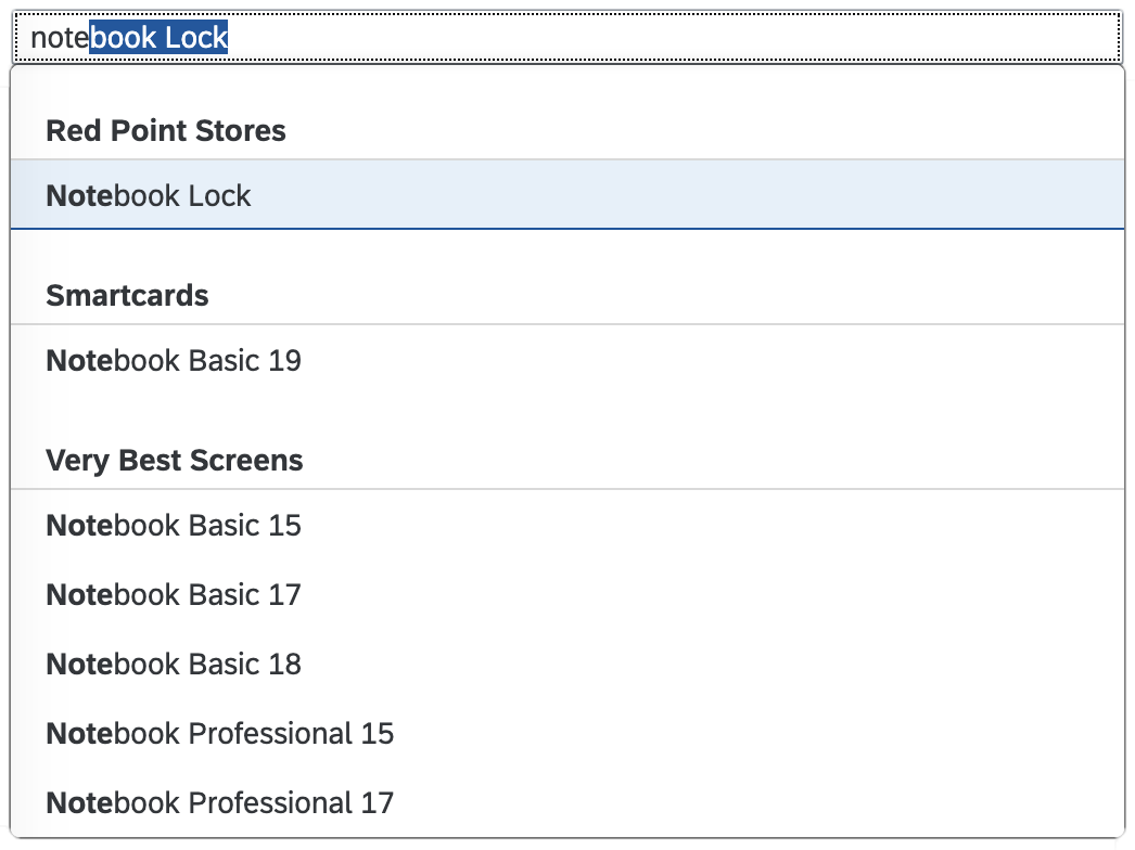
Input with grouped suggestions
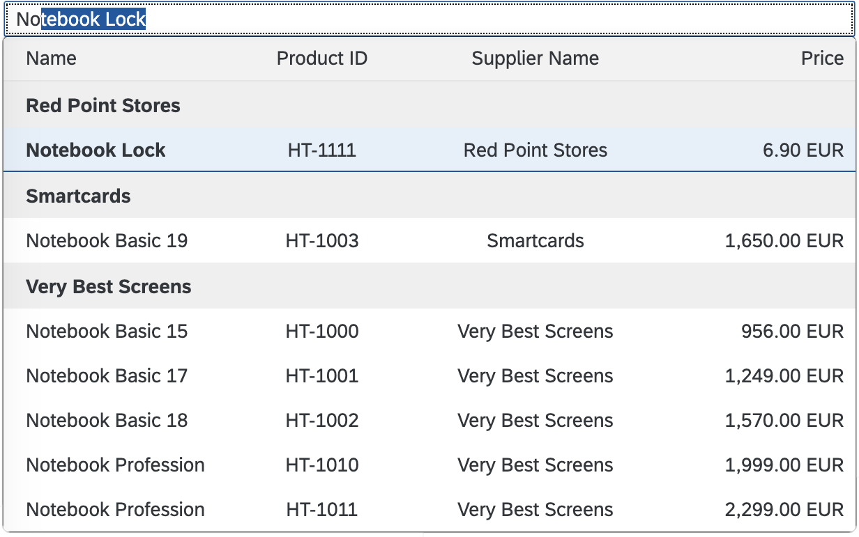
Input with grouped tabular suggestions
Clear
You can add a Clear icon to the input field (property: showClearIcon). It will appear as soon as the input field has a value. Clicking the Clear icon removes the value from the field. If used, make sure that the input field is wide enough to show the Clear icon in addition to the value.
'Clear' icon
Accessibility
- The property
ariaDescribedBylinks the input field to other controls to provide additional information for assistive technologies, such as screen readers. If you use this property, we recommend linking either to on-screen controls that provide additional context or to an invisible text.
Guidelines
Always provide a meaningful label for any input field, and use the least complex control (such as select instead of value help). Use more intricate controls only if the use case really requires it. Where appropriate, help users by providing mask input or placeholder texts.
Maximum Columns
For input fields in a tabular view, we recommend using a maximum of 4 columns.
Maximum Length
Limit the length of the input field. For example, if you don’t want users to enter more than 5 characters, set the maximum length to 5. The maximum permissible character length is not defined by default. If the back-end system has a limit, ensure that you set this property accordingly.
Note that this parameter is not compatible with the input type sap.m.InputType.Number. If the input type is set to Number, the value of the maxLength property is ignored.
Placeholder
Avoid using the placeholder attribute as an alternative to a label. This is important because the placeholder text is overwritten as soon as the form is filled out. Labels are necessary to indicate the meaning of the form fields when the placeholders are no longer visible.
Description
The description field should be used, for example, for displaying units or currency. Do not use a description for help text or as a label replacement. Note that the description is not placed in a new line in size S. Therefore, only use the description property for small input fields with a short description.
Width
- Avoid setting a fixed width, but rather embed it in a proper layout (such as a form, simple form, or grid layout) and use the layout data property to define the responsive behavior for sizes S, M, and L:
- Simple form – See a live example of a simple form.
- Form – See a live example of a form.
- Grid layout – See a live example of a grid layout.
- Ensure an appropriate width for the range of values to be entered for the sizes S, M, and L. Keep in mind that word length can vary between languages, so take localization into account.
Editable and Enabled States
Editable
Property settings: editable = true, enabled = true
The input control is enabled and editable by default. Set the control to editable to allow the user to enter a value.
Not Editable
Property settings: editable = false, enabled = true
Use this state, for example, to display data only.
Disabled
Property settings: editable = not relevant, enabled = false
Set the control to disabled in an edit scenario to indicate that the user cannot change the control, for example, due to missing access rights or previous conditions not having been fulfilled or selected.
Alignment
The alignment rules are the same for display mode and edit mode.
Align left if:
- Text is used. Also use left alignment for a phone number, URL, password, and email address.
Align right if:
- Amounts and decimal numbers are used.
- Values need to be added and compared.
Value Help
Show the value help option to help the user select the correct value (such as a customer ID) from a large dataset via the:
- Value help dialog (complex)
- Select dialog (simple)
- Custom dialog
Use this option in combination with the autocomplete suggestion feature.
The value help dialog should tell users what values have already been entered into an input field.
Creating and Editing Objects
Sometimes a new object needs to be created if the user cannot find a specific item via autocomplete or value help. In this case, we recommend that you place the New action next to the input field.
If you want the user to be able to edit a selected object directly, you should place the Edit link next to the input field.
If both actions are needed, they should be toggled based on the content of the input field. If a valid object is selected, you should display Edit. If the input field is empty or the object is not valid, you should display New. This pattern can also be applied for the multi-input field, combo box, multi-combo box, and select controls.
Resources
Want to dive deeper? Follow the links below to find out more about related controls, the SAPUI5 implementation, and the visual design.
Elements and Controls
- Select Dialog (guidelines)
- Value Help Dialog (guidelines)
- Combo Box (guidelines)
- Select (guidelines)
- Multi-Input Field (guidelines)
- Date Range (guidelines)
- Date/Time Picker (guidelines)
- Multi-Combo Box (guidelines)
- Dialog (guidelines)
- How To Use Semantic Colors (guidelines)
Dialog
The dialog control (sap.m.Dialog) interrupts the current app process to prompt the user for information or for a response. It forces a decision or a confirmation that needs to be signed off by the user.
Usage
Use the dialog if:
- You want to display complex content (that is not a floorplan), but don’t want the user to navigate away from the current page.
- You want to display an additional step or process that needs to be confirmed by a user action.
- You want to enable the user to create an object with a small number of fields.
Do not use the dialog if:
- You want to display a simple message. Use the message box instead.
- You just want to confirm a successful action.
- You do not want to interrupt the user.
- You want to enable users to create an object with a large number of fields. Use an object page instead.
- You want to display a floorplan. Floorplans are not meant to be displayed inside a dialog.
Responsiveness
The dialog provides different behavior on a smartphone than on a tablet or desktop. We distinguish between “cozy” and “compact” dialogs. For more information, see content density.
The buttons in the toolbar are aligned differently on the various devices. On a smartphone, they extend across the entire footer toolbar, but on a tablet or desktop device, they are right-aligned.
Size S (Smartphone)
Full Screen Dialog
We recommend displaying dialogs in S size in full screen mode to help users focus on the content of the dialog (property stretch = “true”). The toolbar containing the actions is positioned at the bottom of the dialog.
Position of the Action Buttons
On smartphones, a dialog can have one or two actions, which are located in the footer and right-aligned.
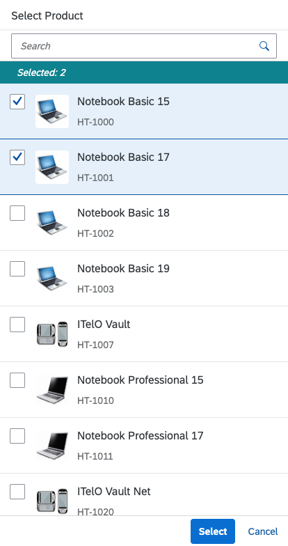
Full screen dialog - Size S
When to Open Full Screen or Modal
Always display message dialogs as modals. There is no need to display a simple message in a full screen dialog. If you want to display a simple message, use the message box instead.
If you use standard dialogs, such as value help, open them in full screen mode to help the user can focus on the content of the message. The dialog control offers a stretch property for full screen behavior.
Size M (Tablet)
By default, the dialog can have up to two action buttons in the footer. The action buttons in the toolbar are right-aligned. Use cozy mode on tablet devices.
If the content height increases or is set to more than the screen height, the dialog height stops at 4 rem from the top and bottom. The user can then scroll through the content area.
Size L (Desktop)
By default, the dialog can have one or two actions. The action buttons on a desktop device are right-aligned. Use compact mode to ensure that the padding and margins are optimized for desktop devices.
If the content height increases or is set to more than the screen height, the dialog height stops at 4 rem from the top and bottom. The user can then scroll through the content area.
Layout
Position on the Screen
The dialog is positioned in the center of the screen. It opens in a modal window to ensure that it attracts the user’s attention when it displays emergency states.
On a smartphone, the stretch property allows you to achieve full screen behavior.
Messaging Within a Dialog
If your dialog contains a scrollable form, use a message popover to help visualize any issues that are hidden when scrolling.
Editing and Saving Content
If a dialog is used for editing, keep it simple. If you need more a large number of editable fields, consider other solutions instead, such as navigation to a details page.
The data in the dialog is only saved when the user clicks Create or Save. Use form field validation within the dialog to make users aware of any errors.
The data in the dialog is lost if the page is refreshed during the editing process (also in the draft scenario), or if the user chooses Cancel.
Types
Standard Dialog
Use the standard dialog unless you need one of the specialized dialogs below. The standard dialog has a header with a grey background, and no icon.
Other Types of Dialogs
Message Box
The message box is a special type of dialog that is used to display messages quickly. For each type of message, you can decide when to use a dialog. Use the message toast (sap.m.MessageToast) for success messages. For more information, see Message Box.
Components
The dialog contains the following sections and options:
Title: The title text appears in the dialog header. By default, the title is left aligned.
Subheader (optional): Subheaders appear below the main header. Since the subheader is not part of the content area, it is not scrollable.
Content: This area contains the actual content of the dialog.
Footer with actions: The footer can contain up to two buttons (optional). If no buttons are defined, the default Close button is shown.
Emphasized Buttons in a Dialog
Always use an emphasized button for the the standard action. Emphasizing the main action in the dialog toolbar helps users to focus on the most likely choice. This saves users time and gives new users a sense of orientation.
Never use an emphasized button for Cancel.
Resources
Want to dive deeper? Follow the links below to find out more about related controls, the SAPUI5 implementation, and the visual design.
Search
A search is a means of accessing information quickly. If an amount of data is too large for users to find something just by scanning through it, you should consider providing a search function.

Search field
Usage
Use a search field (sap.m.SearchField) if you want to enable users to enter text to search for information. The search field is also the control of choice for filtering down a given amount of information.
Responsiveness
When suggestions are turned on, the suggestion list displays differently depending on the device type.
Size S (Smart Phones)
Clicking the search field opens a new full screen dialog in which items can be selected from a list of suggestions.
Types
SAP Fiori comes with two different search types.
- The manual search is triggered explicitly after the user enters text in the search field and clicks the Search button or presses the Enter key.
- The live search (also known as “incremental search” or “search-as-you-type”) is triggered by each character that the user enters or deletes. There is a default delay of 400 ms before sending the search data to the back end. This ensures better performance and optimizes user experience.
Queries that are entered are used to search the back-end data for term matches (not case-sensitive). While a live search uses a “contains” approach, a manual search uses a “starts with” approach. “Contains” means that the result needs to match the query only partly to be a valid result. “Starts with” means that full terms of the result need to start with the entered query to be visualized.
Layout
The search input field (or search box) consists of two parts:
- The text input, which is left-aligned. Initially, the field shows a placeholder (Search). As soon as the user enters a character, this prompt text disappears. It appears again if the user deletes the entry.
- If a manual search is to be implemented, a search button with a magnifier icon is placed on the right side of this input control. The user clicks this button to trigger the search. In live searches, the magnifier icon is also placed here, but it functions more like an additional indicator to signify that this is a search input field. It also functions as an explicit search button if the user wants to search again for a query that has already been entered.
All item attributes defined by the app development team are searched. When the results are displayed, the items found do not necessarily have to show the attribute through which the item was found. The results are displayed in the same list that contained the original item set. Initial grouping and the order of the list are not affected by the search.
When the flexible column layout is used to show a list-detail relationship, the search field appears at the top of the list. In full screen mode, the search field is placed at the top of the page.
Behavior and Interaction
Entering a Search Term
Search terms can be entered easily into the input field. The search box then displays all full-text search terms. There is no line break and no truncation if the query is longer than the input field. Results might also be displayed that do not match the query in their title or subtitle. This might be because details can also be searched for. The user can see the matching terms in the specific details section.
Deleting a Search Term
The user can click the “X” icon ( ) button to remove the text from the field. In the case of the live search, this also resets the search. In a manual search, deleting the search term and then triggering the search resets the search results.
Refreshing
If the Refresh button is available, the user can update the list without triggering a new search. This is usually needed when backend data changes quickly and often.
If the currently selected item is no longer available after the list has been refreshed, the next item in the line is selected. If no next item is available, the first item in the line should be selected next.
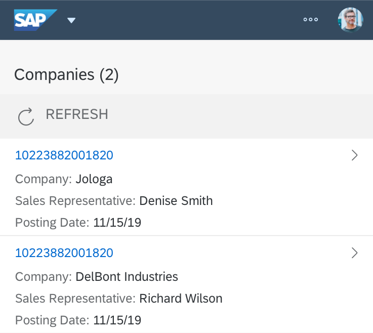
Search field with 'Refresh' button
On mobile phones and tablets, the Refresh icon is not visible in the search field. In this case, Pull Down to Refresh is used instead. The Pull Down to Refresh arrow icon is animated and spins to signal that the user should release it.
Pull to Refresh on a touch device
Properties
The following methods are important.
For the live search:
- attachLiveChange(oData?, fnFunction, oListener?) Attach event handler
fnFunctionto theliveChangeevent of thissap.m.SearchField. - detachLiveChange(fnFunction, oListener) Detach event handler
fnFunctionfrom theliveChangeevent of thissap.m.SearchField. - fireLiveChange(mArguments?) Fire
liveChangeevent to attached listeners.
For the manual search:
- attachSearch(oData?, fnFunction, oListener?) Attach event handler
fnFunctionto thesearchevent of thissap.m.SearchField. - detachSearch(fnFunction, oListener) Detach event handler
fnFunctionfrom thesearchevent of thissap.m.SearchField. - fireSearch(mArguments?) Fire
searchevent to attached listeners.
If a Refresh button is needed:
- getShowRefreshButton() Getter for property
showRefreshButton. - setShowRefreshButton(bShowRefreshButton) Setter for property
showRefreshButton.
To show the Search button:
- getShowSearchButton() Getter for property
showSearchButton. - setShowSearchButton(bShowSearchButton) Setter for property
showSearchButton.
To ensure the focus is set to input:
- setSelectOnFocus(bSelectOnFocus) Setter for property
selectOnFocus.
If the search is triggered automatically when the value of the field is changed (unlike the liveChange event, the change event is not fired for each key press):
- attachChange(oData?, fnFunction, oListener?) Attach event handler
fnFunctionto thechangeevent of thissap.m.SearchField. - detachChange(fnFunction, oListener) Detach event handler
fnFunctionfrom thechangeevent of thissap.m.SearchField. - fireChange(mArguments?) Fire
changeevent to attached listeners.
Guidelines
- Implement the live search whenever possible.
- Use a manual search only if the amount of data is too large and if your app would otherwise run into performance issues.
- Show an appropriate prompt text:Search if queries are sent to all connected services, or Search In: if the search is limited to a certain source or providing service.
Resources
Want to dive deeper? Follow the links below to find out more about related controls, the SAPUI5 implementation, and the visual design.
Elements and Controls
- Input Field (guidelines)
- Button (guidelines)
- Flexible Column Layout (guidelines)
- Split Screen (guidelines)
- Full Screen (guidelines)
- Enterprise Search (guidelines)
- Cozy/Compact (guidelines)
Chart – Value Display
This article describes how value labels are displayed and how to customize them.
Default Value Display
By default, values of the data points are automatically displayed close to the data point, so that the user does not have to select each point to check its value.
As a general rule:
- Values never overlap.
- Text can be truncated.
- Numeric values are never truncated.
Bubbles with Numeric Values
Values are displayed within the bubbles. If the numeric value does not fit in the bubble, it is hidden.
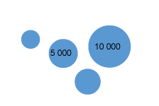
Value display in bubble charts
Bubbles with Text
Text are displayed within the bubbles. If the text does not fit in the bubble, it is truncated until a minimum of 3 characters. Below 3 characters, the text is hidden.
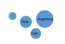
Value display in bubble charts
Line Chart
Values are displayed to avoid overlapping with the line and with the data point. In general, values are displayed above the data point, except when the line has a “V” shape (for example, when the values just before and after are larger than the current value). When the value is displayed above the data point, it can be slightly moved to the left or to the right to avoid overlapping.
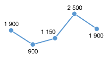
Value display in line charts
Custom Value Display
If there are too many data points, it is possible to hide all values or to hide some values.
Hide Values for a Series (Combined Chart)
When combining a line with bars, avoid displaying values for both series unless you are sure that both series will not overlap. Instead, please only show values for the most important series.

Combined chart
Hide Values of a Series (Clustered Bars)
In clustered bars, when a series is not the key focus of the chart, it may be better to hide its values.

Clustered column chart
Hide Values for a Series (Multiple Lines)
When multiple lines are displayed in a chart, avoid displaying values for all the lines. This leads to cluttered information. Instead, please show only values for the most important line.
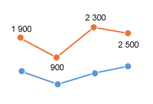
Line chart with multiple lines
Hide Values for Categories
If the focus of the chart is on one specific category and its comparison with other categories, it may be better to hide all the values except the key category.

Column chart
Hide Values Based on Condition (Min, Max)
It is also possible to highlight the first and last values of a series, or the minimum and maximum value of a series.

Maximum and minimum values are highlighted
Formatting Values
Quantity Formatters
When values use quantity formatters such as short format or percentage, always display the formatters in the data point. For example, display 30M or 12% in the data point.
When appropriate, also show the formatters in the vertical or horizontal axis. For example, the vertical axis will display 10%, 20%, 30%…10%.
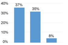
Quantity formatters
Locale
Be locale aware: Display numbers in the format corresponding to the user’s locale settings. For that purpose, use SAPUI5 number formatters.
Resources
Want to dive deeper? Follow the links below to find out more about related controls, the SAPUI5 implementation, and the visual design.
Multi-Combo Box
The multi-combo box control is commonly used to enable users to select one or more options from a predefined list. The control provides an editable input field to filter the list, and a dropdown arrow to open the list of available options. The select options in the list have checkboxes that permit multi-selection.
Usage
Use the multi-combo box if:
- The user needs to select one or more options from a long list of options (maximum of approximately 200).
- The values of the option list contain secondary information that does not need to be displayed right away.
Do not use the multi-combo box if:
- The user needs to choose between two options, such as ON or OFF and YES or NO. In this case, consider using a switch control instead.
- You need to display more than one attribute. In this case, consider using the select dialog or value help dialog instead.
- The user needs to search on multiple attributes. In this case, consider using the select dialog or value help dialog instead.
- Your use case requires all available options to be displayed right away, without any user interaction. In this case, consider using checkboxes instead.
- You want to enable users to add custom values. In this case, consider using the multi-input field.
- Your use case requires more options to choose from. In this case, consider using the multi-input field, either with the select dialog or value help dialog (for more than 1000 items).
Responsiveness
The multi-combo box is optimized for keyboard and mouse interaction.
Components
Input Field
The input field (2) can display a placeholder text (6) when it’s empty, or a token (1) if a value is selected.
Dropdown Trigger
The dropdown button (3) collapses and expands the dropdown list.
Option List
The option list (7) contains a list of selectable options (5). Clicking the label of an entry closes the option list and creates a token for the selected option. To enable multi-selection, every entry also has a checkbox (4). Clicking a checkbox creates a token. The option list remains open.
Behavior and Interaction
Select a Value
There are three ways to select an item from the list:
- Tick the checkbox (option list remains open).
- Click the label of a select option (option list is closed).
- Use the keyboard (space bar or Enter).
The user clicks the input field to place the cursor in the field (1). Clicking the down arrow displays the list (2). As the user types into the input field, the list is filtered accordingly (3). The arrow up and arrow down keys move the focus within the list (4), while the typed text remains in the input field. Selected options are automatically entered into the input field as tokens (5).
If the user selects items from the filtered option list (3) by clicking the checkbox or by pressing the space bar on the keyboard, the text entered in the input field remains. The option list stays open. If the user selects items by clicking the label or by pressing Enter, the entered text is cleared and the option list is closed.
The shift key can be used to select a range of items (shift+click marks the end of the range, shift+arrow up / shift+arrow down extends or narrows the selection range in the corresponding direction. Ctrl+A selects or deselects all items. If selecting all items is a common use case, you can also show a Select All checkbox at the top of the list (property: showSelectAll).
Input Field
Any character in the input field acts as a filter for the option list. The input field only allows users to type text that matches the items in the list. If the user tries to enter character combinations that are not in the option list, visual feedback is provided to indicate that the combination of characters is invalid, while the input field suppresses the characters entered.
Choose from Option List
The option list displays all the available items that the user can choose from. Clicking the arrow opens the option list below the field. If there is not enough space to display the dropdown list below the field, it is displayed above the field instead.
Reviewing Tokens
If tokens have been selected, and the multi-combo box is not in focus, the input field displays as many tokens as possible in the available space. If more tokens have been selected, an [n] More label indicates the number of hidden tokens. The tokens in the input field appear in the order in which they were selected.
Clicking the [n] More label opens a popover below the input field, in which all selected items are shown. The user can deselect an item by clicking its checkbox or label.
If the length of the last selected token exceeds the width of the input field, a label [n] Item/s is shown when the field is not in focus.
Clicking the [n] Item/s label opens a popover below the input field, in which all selected items are shown. The user can deselect an item by clicking its checkbox or label.
If there is only one token in the input field and its length exceeds the width of the input field, the text is truncated. Clicking the token opens a popover below the input field, in which the full text of the token is shown.
Filtering the Option List
When the user starts typing in the input field, the option list is filtered. Only items that match the characters entered are shown in the dropdown list. The default filtering method is “starts with per term”, which matches the beginning of each word in an item’s text.
In addition, application developers can set a custom filtering method “starts with” or “contains” (method: setFilterFunction). The “starts with” approach filters only for items where the beginning of the label matches the query entered. The “Contains” approach searches the full label for a match.
As a visual hint for the user, the matched characters are highlighted in the option list items. The highlighting works on the basis of “starts with per term”, regardless of the filtering method.
If the filtered option list contains items that start with the characters entered by the user, the first matching, unselected item is auto-completed in the input field.
Clear
You can add a (Clear) icon to the combo box (property: showClearIcon). The icon appears as soon as the combo box has non-tokenized text. Clicking the Clear icon removes the non-tokenized text from the field.
If you offer the Clear icon, make sure that the multi-combo box is wide enough to show the icon in addition to the value.
Behavior for Mobile Devices
The following sections describe how the multi-combo box interacts on mobile devices.
Clicking the Arrow
Clicking the arrow opens the option list in a full screen dialog (1) with a title displayed in the header (2). The Close button (3) closes the dialog and cancels any selection changes in the option list. Clicking the label of an entry (4) closes the option list and creates a token of the selected option. By selecting a checkbox (5), the option list remains open and allows multi-selection. The OK button (6) takes over the selection and closes the dialog.
As the user types into the input field (7), the list is filtered using the default “starts with per term” approach. Pressing the button next to the input field (8) toggles the view between all options and the selected options only.
Input Field on Collapsed List
If items have already been selected, the input field remains functional and the tokens remain visible (1). Clicking the Remove icon in a token removes it (2). When the user clicks the input field, the list opens in full screen (3). Clicking the input field sets the focus on it (4) and the mobile device keyboard opens (5). When the user starts typing, the list is filtered (6) using the “starts with per term” approach. The input field only lets the user type characters that match the items in the list.
Copying and Pasting Data from a Spreadsheet or Text File
The control for the multi-combo box can handle paste actions containing, for example, multiple items that have been selected in a column of a spreadsheet or text file. The user simply selects an entire column in the spreadsheet and copies it. When items are entered into the multi-combo box, the user just pastes them from the clipboard and each item is then represented as a token. Only items that are part of the list are displayed as tokens.
Styles
The following images show how the states of the multi-combo box are styled.
The multi-combo box offers four value states:
- Error
- Warning
- Success
- Information
For error, warning, and information states, you can show an additional value state text message when the focus is on the combo box. The message can either be a plain text or a formatted text.
For more guidance on when to use which state, see How to Use Semantic Colors.
Guidelines
Label
The multi-combo box control can be displayed with or without a label. If the field is attached to another field, you don’t need to define a second label. For more information about labels in SAP Fiori, see the label guidelines.
Placeholder
Don’t use the placeholder attribute as an alternative to a label. This is important because the placeholder text will be overwritten as soon as the form is filled out. Labels are necessary because they indicate the meaning of the form fields if the placeholders are no longer visible. Show a placeholder only if the user needs a hint about what data to enter. Don’t repeat the content of the label. A hint could be a sample value or a brief description of the expected format. For more information about how to use the placeholder, see input field.
Option List
Keep the label of an entry in the select option list as short as possible because the list uses single lines only. Values that are too long may be truncated. If you need to indicate that none of the selection options are selected, show a blank input field. Define a default selection whenever possible. The multi-combo box cannot display columns. If you want to show two values in the option list, show the leading information first, followed by the secondary information in parentheses, such as Walldorf (Germany).
Don’t disable items in the option list. If an item can’t be selected, hide it.
Sorting
The option list contains all available items that the user can choose from. Choose one of the following styles depending on how you want the content to be arranged:
- Logical: Sort items into a meaningful order. Group related options together and show the most common options first followed by less common options.
- Alphabetical: Sort currencies, names, and so on into alphabetical order. We recommend this for lists with more than eight items.
- Numeric: Sort numeric values into a sequential order with the lowest number first.
Width
You can adjust the width of the option list to some extent. The multi-combo box control is usually used in forms, where the width is determined by the form element or container in which it is embedded. Therefore, we don’t recommend defining a fixed width, but rather working with proper layout containers such as the form, simple form, or responsive grid layout, and with the layout data property, where the width is defined. If you need to restrict the width to a defined value, set the width accordingly. Keep in mind that there’s no horizontal scrolling in the option list. Entries that are too long are truncated and users won’t be able to read them. To avoid this, you can enable wrapping (property: wrapping).
Unit of Measurement
You can use the layout options of the form to add the unit of measurement (UoM) after the multi-combo box. Apps can use the label-field ratio to show the UoM after the field. However, you must make sure that the UoM is properly visualized and doesn’t wrap to the next row.
Multi-Combo Box in a Filter Scenario
The multi-combo box can serve as a filter. For example, if the multi-combo box is offered in a table toolbar, and is empty (no tokens selected), the table shows all items. If the user selects picks something in the multi-combo box, the table shows only the matching items.
Alternatives for Display Mode
If a form or table supports both display and edit mode, use the multi-combo box only in edit mode. In display mode, consider the following alternatives:
- A horizontal list with bullet separators between the individual token texts (for example, using text or formatted text).
- A bulleted list with a bullet per token text (for example, using formatted text).
If the display mode equivalent needs to be a single-line text (as required for the grid table, tree table, analytical table), provide an overflow for all texts that do not fit onto the line (for example, by adding a link, opening a popover, or using an expandable text).
Resources
Want to dive deeper? Follow the links below to find out more about related controls, the SAPUI5 implementation, and the visual design.
Elements and Controls
- Combo Box (guidelines)
- Select (guidelines)
- Input Field (guidelines)
- Form (guidelines)
- Radio Button (guidelines)
- Checkbox (guidelines)
- Toolbar (guidelines)
- Switch (guidelines)
Chart – Gestures
The following gestures are available in charts:
| Gesture | Associated action |
| Tap | Select a data point and display related information and actions |
| Press and drag | Lasso selection: When pressed outside a data point, select items by lassoing them |
| Drag or slide | Scroll the chart horizontally or vertically |
| Flick | Scroll quickly through the chart horizontally or vertically |
| Spread or pinch | Used for zooming in and out |
Resources
Want to dive deeper? Follow the links below to find out more about related controls, the SAPUI5 implementation, and the visual design.
Chart Popover
A chart popover is used to display information or an action related to the selected data points of a chart.
By default, the chart popover:
- Displays dimension members and measure values fed into the chart that relate to the data point.
- Displays the number of selected items when in multiselection mode.
- Does not display related actions.
The entire content of the popover can be changed or a related action can be added at the end.
Selection and Popover
The content displayed in the popover depends on the selection mode; in other words, whether the chart is in single-selection or multiselection mode.
In Single-Selection Mode
When the user clicks an item that is not selected, the popover appears with information about this selected item only. The item that was previously selected becomes deselected.
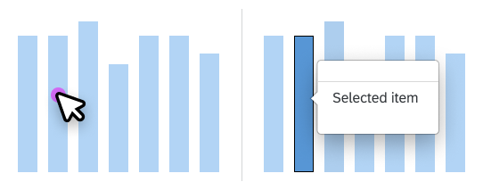
Popover in single-selection mode
In Multiselection Mode
When the user clicks an item that is not selected, the item is added to the selection. The popover appears with information about the last selected item and any other selected items. When the user clicks an item that is already selected, this item is removed from the selection. If there are no more selected items, the popover disappears.
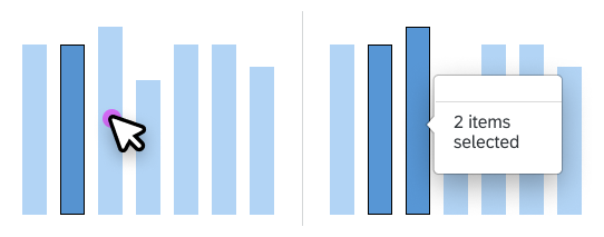
Popover in multiselection mode
| Section | Explanation | Provided by default | Customizable |
| Related information about last selected item | Contains all related information about the last selected item. In single-selection mode, this is the single selected item. In multiselection mode, this is the last item added to the selection. | Yes | Yes. If the app developer wants different information, this section should be replaced entirely. Text only cannot be changed and another value cannot be added. |
| Number of selected items | Displays the number of items in the selection. Only used when multiple items are selected. | Yes | No |
| Related actions | Displays actions that act on all selected items. | No | Yes. The app developer can add its own actions. See the section below about related actions. |
Default Information
With multiple dimensions, the dimension members are concatenated and displayed in the following order:
- Firstly, the dimensions displayed in the legend.
- Secondly, the dimension displayed in the axis. If there is more than one dimension in the axis, the dimension closest to the axis is displayed first.
The first row is wrapped if necessary.
Number of Selected Items
If multiselection is possible, the popover displays the number of items that have been selected. If multiple items have been selected, it is not possible to display the values of all selected items. If you need to display these values, you will have to develop your own solution. For example, you can add a Compare Values or Display Values button at the bottom of the popover. This button is only displayed when multiple items have been selected.
Related Actions
You can add related actions at the end of the popover. These related actions may vary depending on the current selection. Related actions can generally be used to do the following:
- Display more information.
- Display another type of visualization.
- Display another dataset.
- Navigate to another page or app.
If an action is dedicated to showing more detailed information about the selection, use the View Details label. Actions that are specific to the entire chart or to the app should not be provided in the popover. In this case, it is better to provide them at app level, such as in the app toolbar.
Group of Actions
Customization and UI Controls
The UI controls for customizing the popover are listed below.
sap.m.responsivePopover:
- Use SAPUI5-formatters (currency included)
sap.m.ActionListItem
In-Place Navigation:
sap.m.Listwithsap.m.StandardListItemtype=”Navigation”sap.m.NavContainerfor the animation (left to right and right to left)sap.m.Pagefor the scroll bar
Resources
Want to dive deeper? Follow the links below to find out more about related controls, the SAPUI5 implementation, and the visual design.
Chart – Selection
The user can select one or more data points. They are generally selected to display related information about the respective points or to trigger actions that relate to them. There are several ways in which the user can select items.
Default Selection
The charts provide three types of selections:
No Selection
In this mode, data points cannot be selected individually and therefore no actions can be triggered from a data point.
- When the user clicks a data point, nothing happens.
- When a user with a mouse device hovers the pointer over a data point, nothing happens.
Single Selection
Multiselection
Shortcut for Multiselection
The following actions are shortcuts for selecting multiple data points:
- Click a category label: All associated data points are selected.
- Click a legend item: All associated data points are selected.
- Rubber-band-like lasso selection: All data points within the lasso are selected.
Selection by API
The way in which data points are selected when they are clicked can also be changed through the vizSelection (aPoints, oAction) API.
Example: Category Selection
You can implement category selection by using the vizSelection (aPoints, oAction) API. When the user clicks a data point, all data points in the same category are selected.
Example: Series Selection
You can implement series selection by using the vizSelection (aPoints, oAction) API. When the user clicks a data point, all data points in the same series are selected.
Example with Line Chart:
When the user clicks a data point, all data points in the same line (series) are selected.
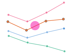
Example of series selection - First click
Deselection
Clicking a selected item deselects it again.
Clicking a blank area of the chart deselects all data points that are currently selected.
Appearance
Selected and non-selected items differ in terms of their appearance as follows:
- Selected items are highlighted by using a darker color.
- Non-selected items have a lighter color.
Resources
Want to dive deeper? Follow the links below to find out more about related controls, the SAPUI5 implementation, and the visual design.
Bullet Chart
The bullet chart is used to compare primary and secondary (comparison) values.
Encoded Values
Primary Values
Frequently used for actual values, primary values can also be used for any type of value that you want to compare to the secondary/comparison value.
Secondary/Comparison Values
Frequently used for target and plan values, comparison values can also be used to compare the primary value with any other value. There are use cases where the comparison value is used to express a forecast, a competitor, or a specific year.
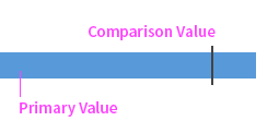
Additional Values
The bullet chart can also express an additional value so long as it’s directly related to the primary value.
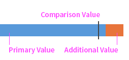
Orientation
The bullet chart can be orientated horizontally or vertically. It’s best to orientate it vertically for time series.
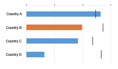
Horizontal bullet chart
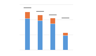
Vertical bullet chart
Color Palette
If nothing is customised, the bullet chart will automatically use colors from the qualitative palette.
However, it is also possible to customize the colors (for example, if you want to differentiate between categories). For more information, check out the article on bullet chart colors.
Selection and Popover
Unlike other charts, when the user clicks on a bullet, all the associated values are displayed in the popover – primary value, comparison value along with additional value, projected value, and qualitative ranges (if used). The popover can also be customized to display other information and actions if you wish.
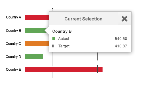
Popover
Legend
As with all other charts, when you customize the colors, the text of each legend item must also be manually maintained because the chart component cannot guess the meaning of each color.
For more information, see legend.
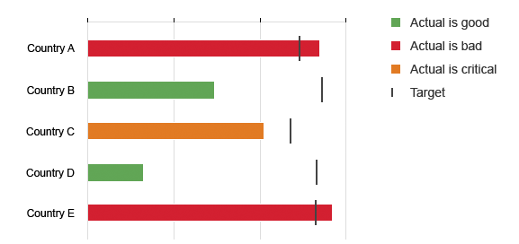
Legend
Negative Values
Resources
Want to dive deeper? Follow the links below to find out more about related controls, the SAPUI5 implementation, and the visual design.
Implementation
- Vertical Bullet Chart (SAPUI5 samples)
- Horizontal Bullet Chart (SAPUI5 samples)
- Bullet Chart with Negative Values (SAPUI5 samples)
- Popover (SAPUI5 samples)
Chart – Embedding
This article explains how to embed an SAP Fiori chart in an app in such a way that it has the correct size and scrolling behavior.
Page vs. Frame
The optimal way to embed a chart component in an app depends on the layout pattern of the app. Embedding a chart component in a split-screen layout is different from embedding one in a full screen layout. Two main layout patterns must be considered: vertically-scrolled page and frame.
Vertically Scrolling Page
In this layout pattern, the page scrolls vertically. If the page content cannot be seen in full, a vertical scrollbar appears.
Layout examples:
Frame
In this layout pattern, the page contains multiple frames and does not scroll horizontally or vertically. If the page content cannot be seen in full, the frames are resized so that they remain visible. Some frames may remain with a fixed size, while other frames are resized. When a chart is embedded in a frame, the frame is generally resized.
Layout examples:
Embedding in a Page
How you embed a chart component in a vertically-scrolled page depends on its scrolling direction. Embedding a chart that scrolls horizontally is different from embedding one that scrolls vertically.
Horizontally Scrolling Charts
Charts that scroll horizontally are charts that might contain a horizontal scrollbar when the width of the chart cannot display the entire set of values. Typical examples are the line chart or column chart.
When a chart that scrolls horizontally is embedded in a page, the height of the chart component must be defined by the app developer and remains fixed, even when the height of the page changes. That means we can have together the vertical scrollbar of the page and the horizontal scrollbar of the chart control.
Vertically Scrolling Charts
Charts that scroll vertically are charts that might have a vertical scrollbar when the height of the chart cannot display the entire set of values. Typical examples are bar chart or stacked bars.
When a chart that scrolls vertically is embedded in a page, avoid having together the vertical scrollbar of the page and the vertical scrollbar of the chart control. A good way to avoid the vertical scrollbar within the chart is to choose a height for the chart component relatively big to see all data points or to set a specific zoom in order to see all data point (use window.start and window.end properties).
Charts Scrolling in Both Directions
Charts that have no main scrolling direction should be managed on a case-by-case basis.
Embedding in a Frame
In this layout pattern, the screen contains multiple frames and does not scroll horizontally or vertically. The scrolling is instead managed by each of the frames. When the chart component is embedded in a frame, it is resized to occupy the full height and width of the frame.
The chart component manages the scrollbars as necessary and displays the appropriate data point correctly.
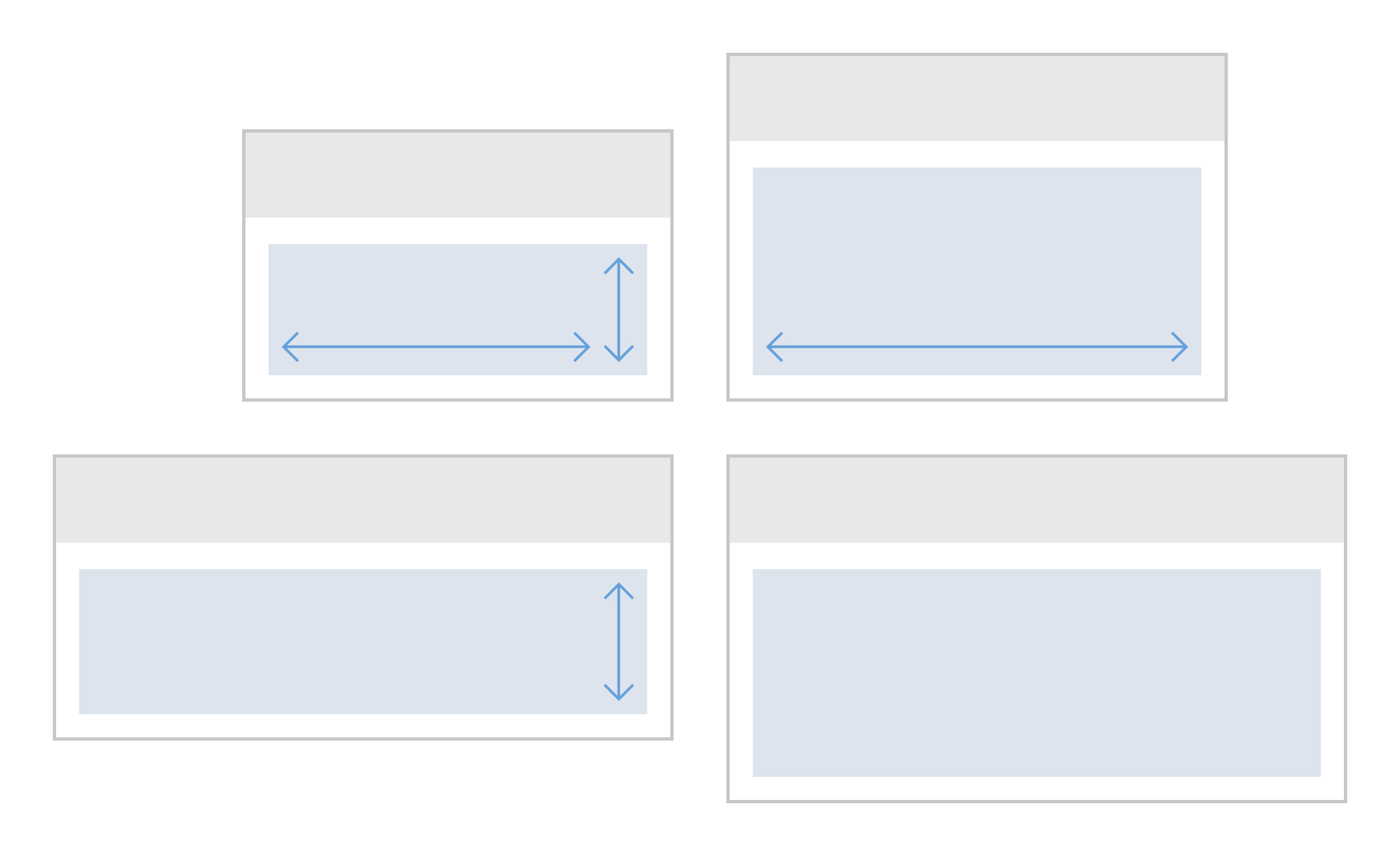
Charts embedded in a frame
Resources
Want to dive deeper? Follow the links below to find out more about related controls, the SAPUI5 implementation, and the visual design.
Chart (VizFrame)
Use the sap.viz.ui5.controls.VizFrame control to display different types of charts. The VizFrame control can display charts containing large sets of values in an interactively rich and responsive way, or it can display charts containing a small amount of data with no interaction.
You can put the VizFrame control inside the ChartContainer SAPUI5 control. This enables you to place a toolbar above the chart which gives users the ability to switch between a chart view and a table view, as well as switch to full screen mode.
Guidelines
Interactions:
Additional SAP Fiori Requirements:
Advanced Features:
Resources
Want to dive deeper? Follow the links below to find out more about related controls, the SAPUI5 implementation, and the visual design.
Elements and Controls
Implementation
- VizFrame (SAPUI5 samples)
- ChartContainer (SAPUI5 samples)
- VizFrame (SAPUI5 API reference)
- ChartContainer (SAPUI5 API reference)
Page Layouts and Floorplans
This article provides an overview of how SAP Fiori layouts and floorplans are used to build application pages.
Page Layouts vs. Floorplans
The standard page layout in SAP Fiori is the dynamic page, which is made up of a header, content area, and footer toolbar.
Floorplans are usually based on the dynamic page. Floorplans serve specific use cases and therefore come with a specific combination of UI elements in the header, content area, and footer toolbar.
The following visual shows the composition of the dynamic page layout and how the elements of a list report floorplan are built into it. Never insert a whole floorplan into just the content area of the dynamic page layout.
Full Screen vs. Flexible Column Layout
You can decide whether your app uses a full screen layout (one page at a time) or a flexible column layout for list-detail relationships (up to three pages side by side). The flexible column layout enables fast and fluid navigation between pages.
More Information
- For a general introduction, see Get to know the information architecture: Layouts, floorplans, UI elements.
- For a description of all floorplans, their characteristics, and when to use them, see When to use which floorplan.
- For structuring business data in the page header and content areas, SAP Fiori offers a variety of layouts and containers. Examples are forms and the dynamic side content.
Find more in the UI Elements section Form / Layout / Container.
Additional Layouts
The following layouts have been designed for special use cases:
| Layout | Use Case |
| Comparison | Allows users to select items from a list and display them side-by-side. This makes it easier to compare the characteristics of multiple items. |
| Multi Instance | Allows users to open multiple documents in a tabular view. After selecting items from a list, the user opens them in a tab container. |
Related Links
The following frameworks are also used to design pages:
| Framework | Characteristics |
| SAP Fiori elements | Generates the user interface automatically, thus making app development more efficient, available for nearly all floorplans (besides Wizard and Initial Page) |
| Analysis Path Framework | For creating interactive, chart-oriented analytical drilldown apps by configuration |
| SAP Smart Business | For viewing and analyzing the data for one key performance indicator (KPI) |


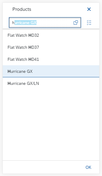
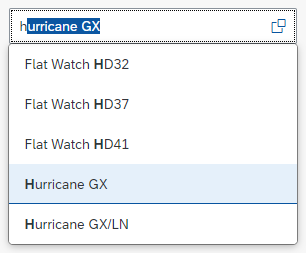
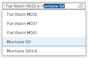


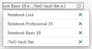
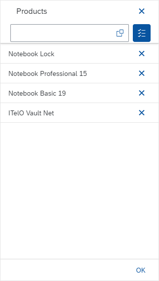


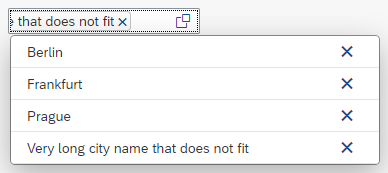


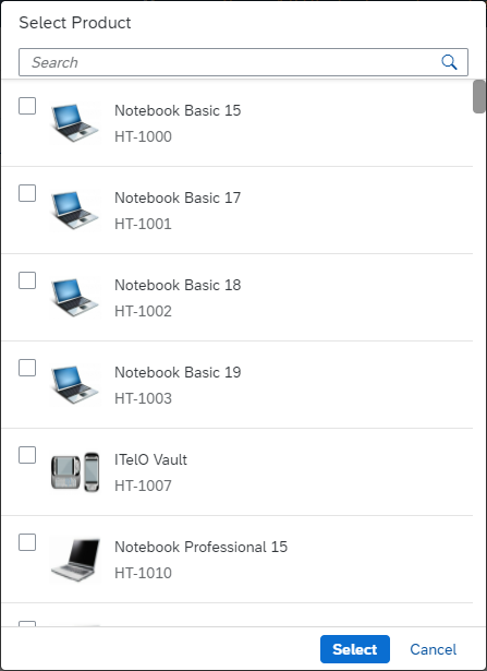
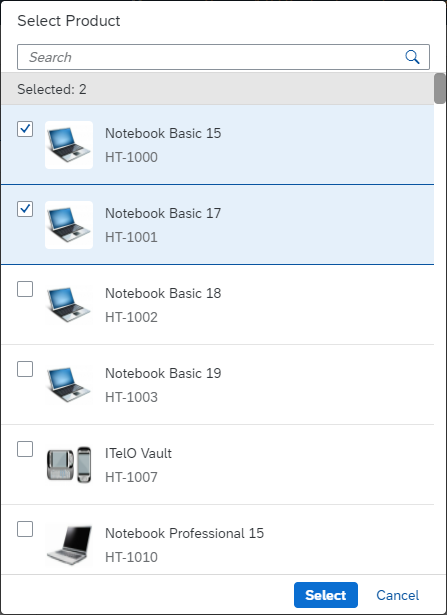

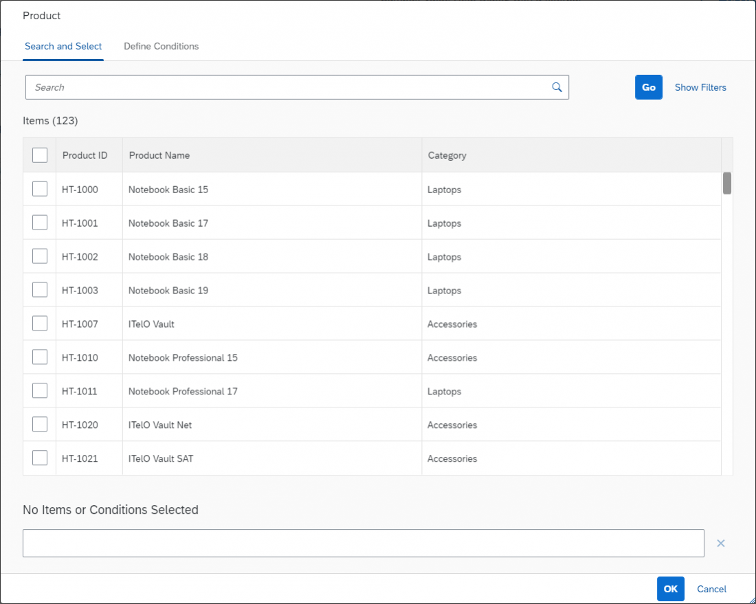
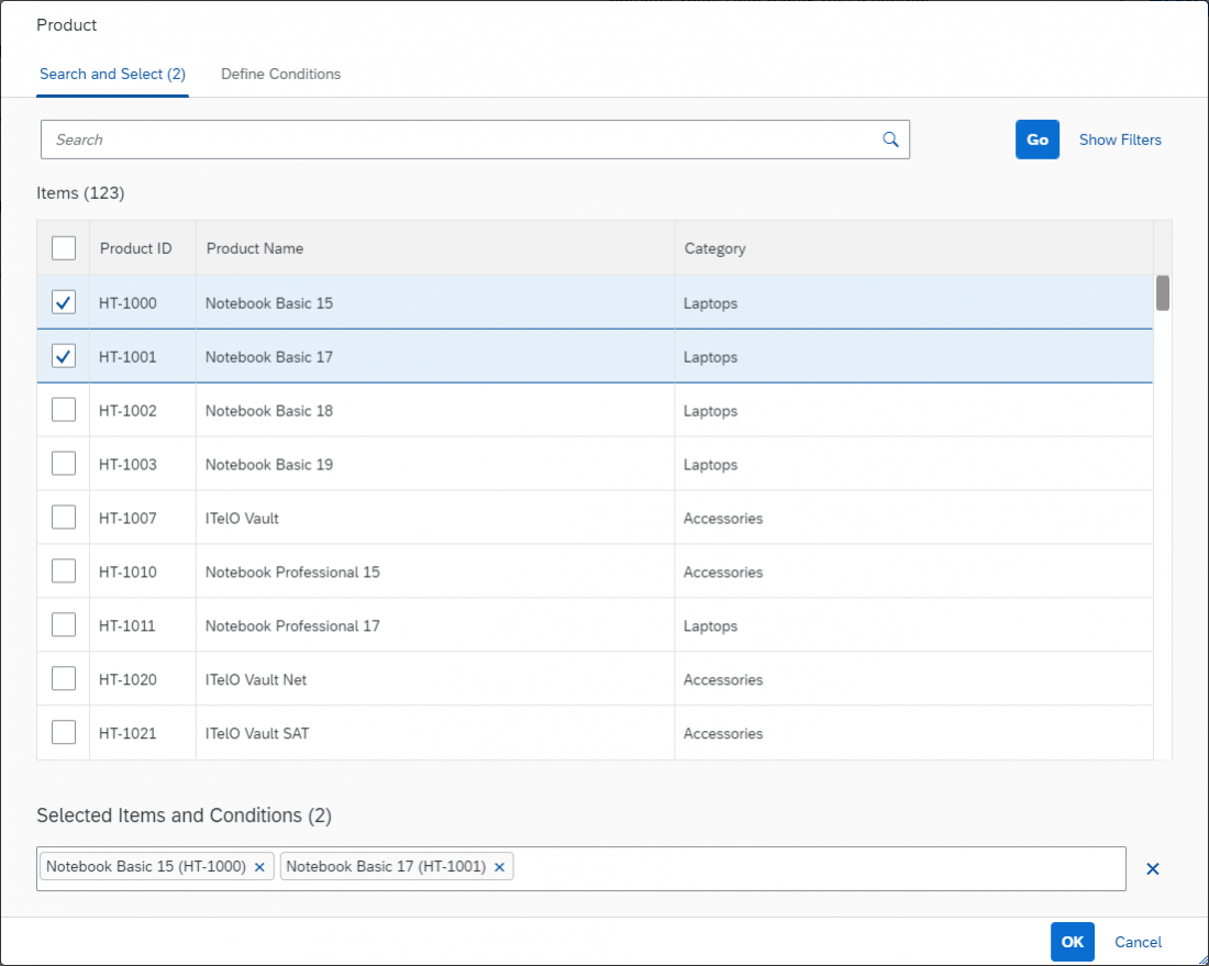
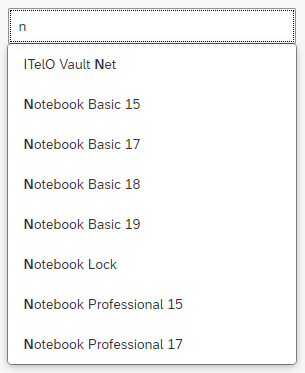
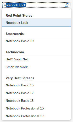
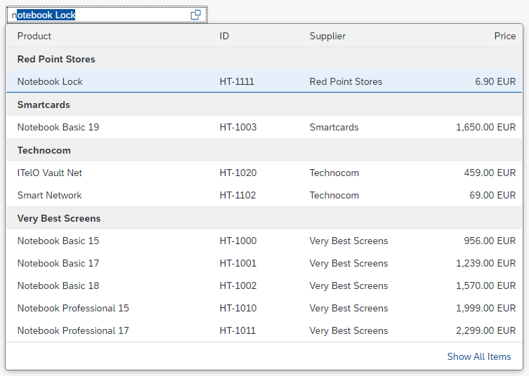
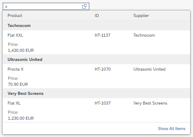


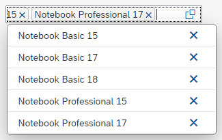


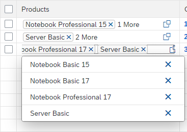


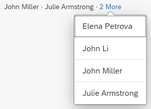
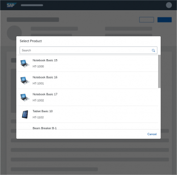
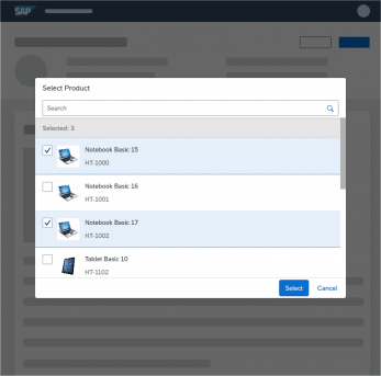
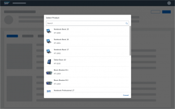
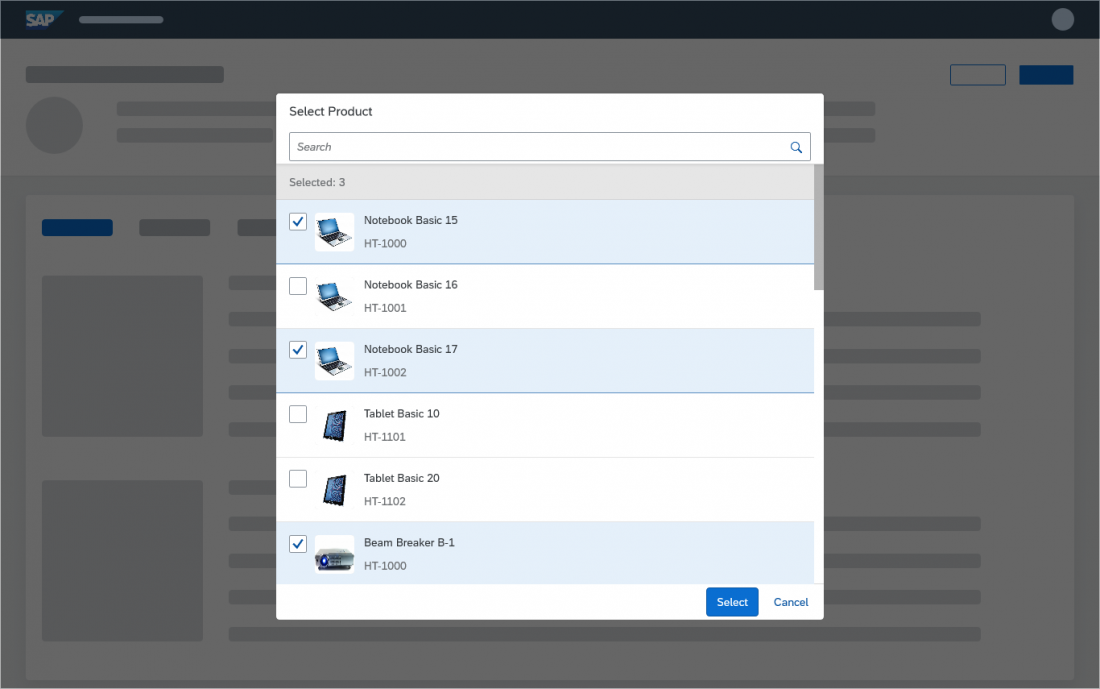
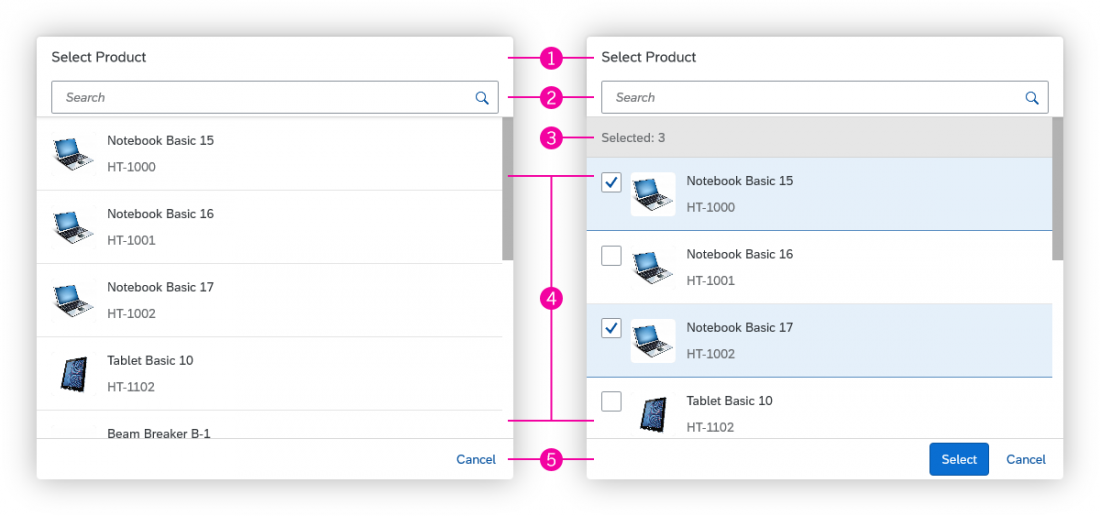
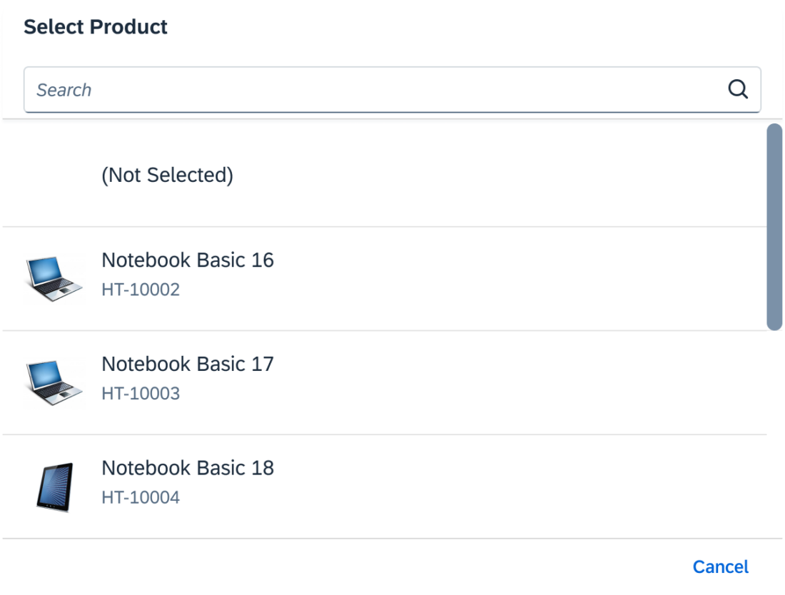
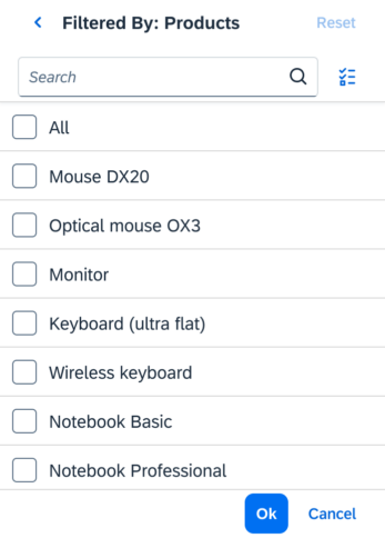
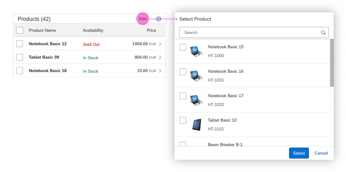
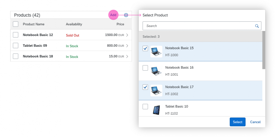


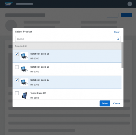
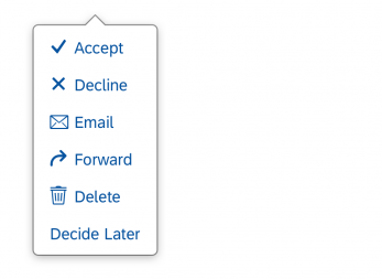

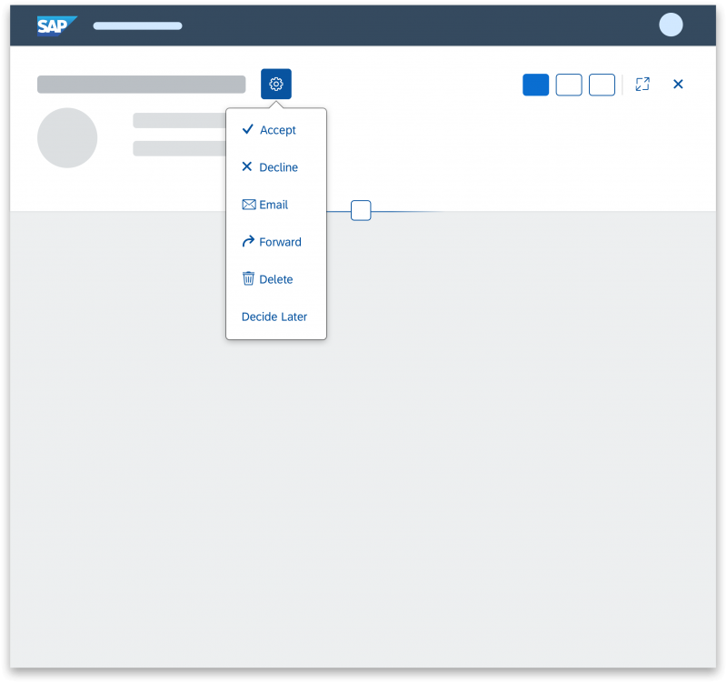
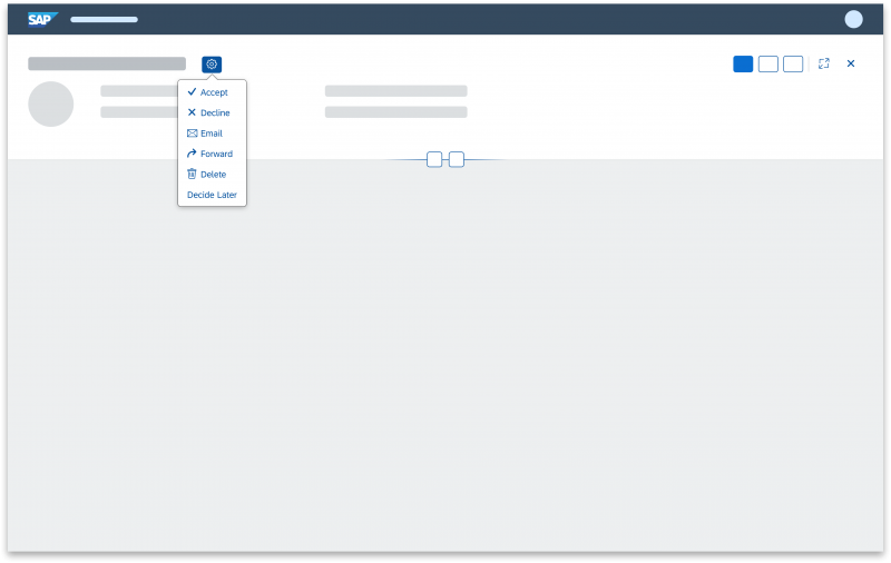

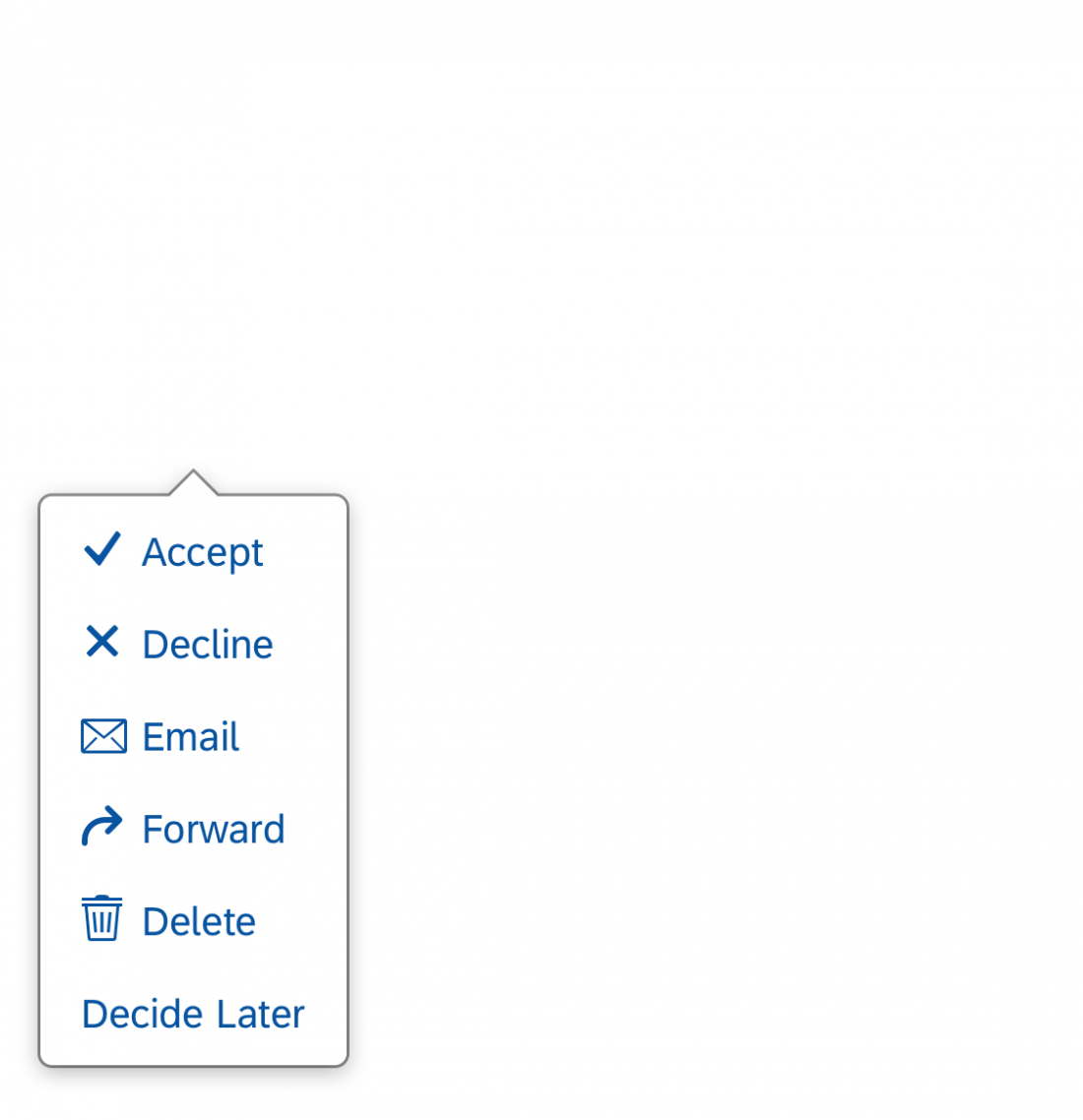
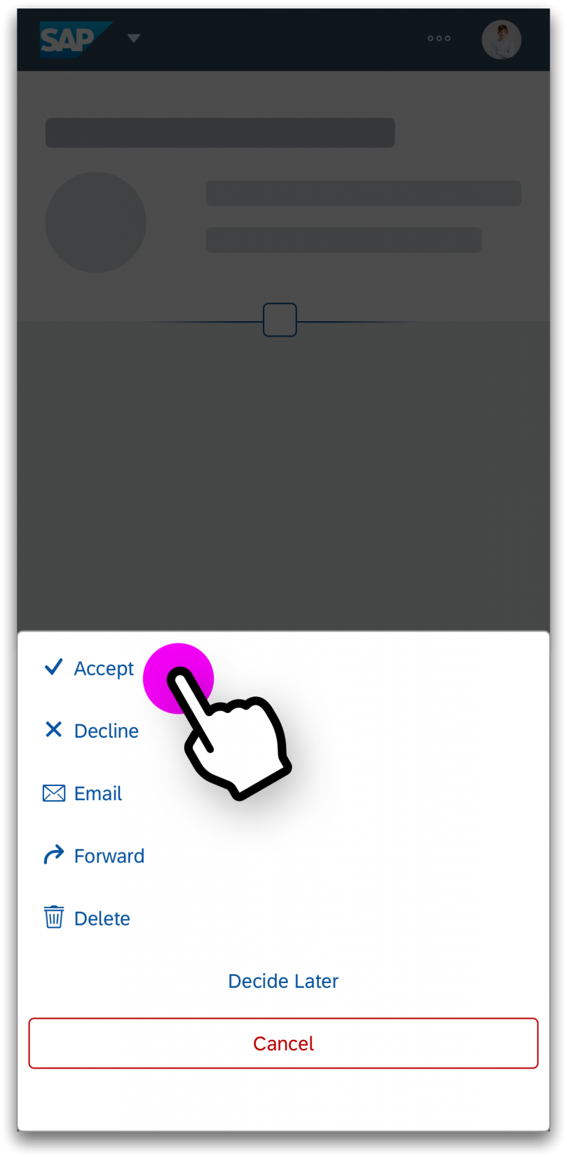
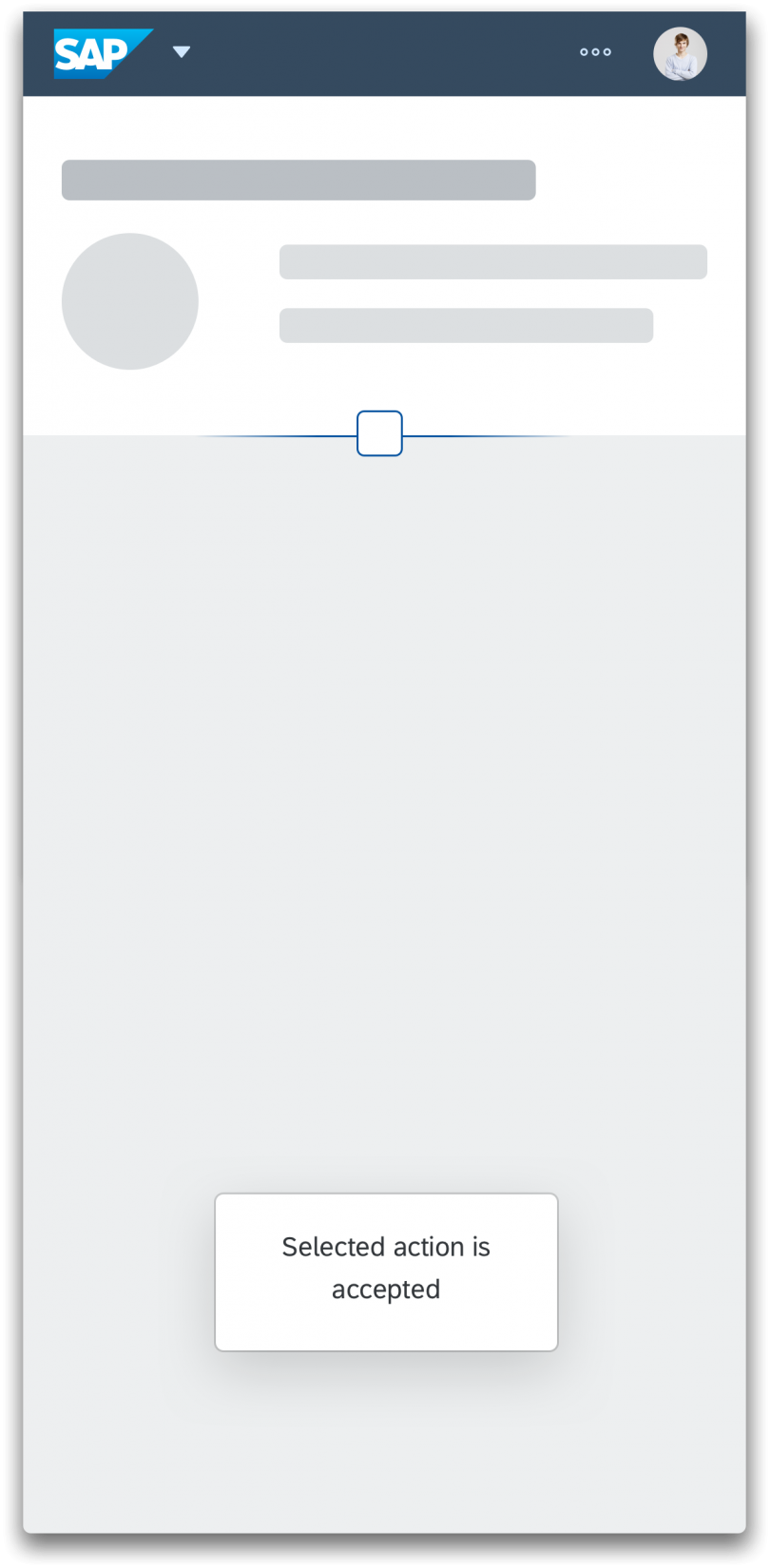
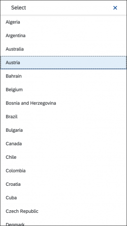
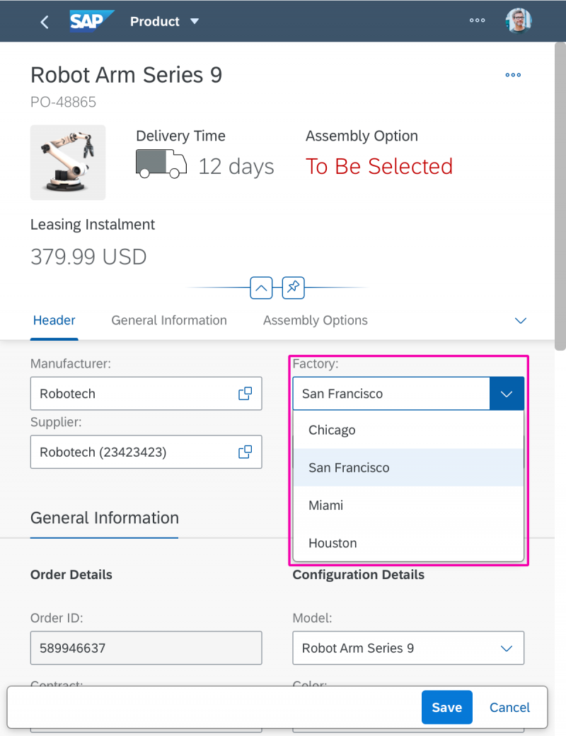
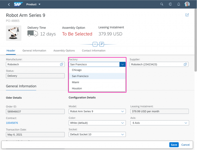
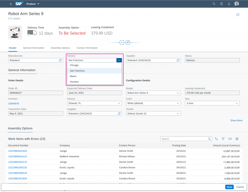
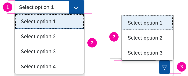
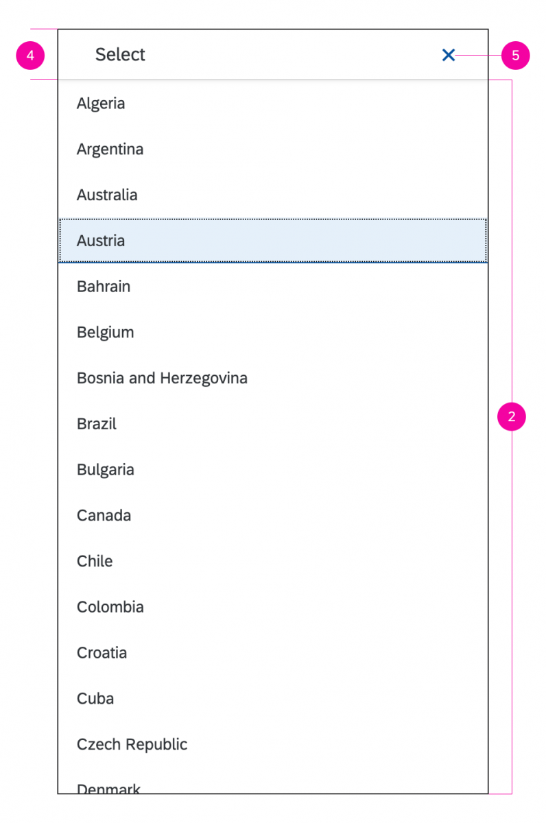
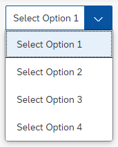
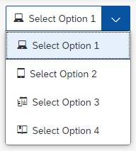
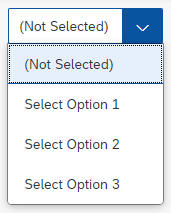
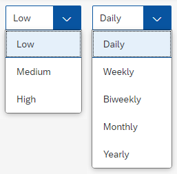
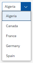
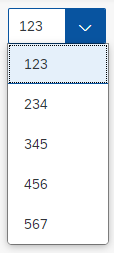
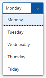
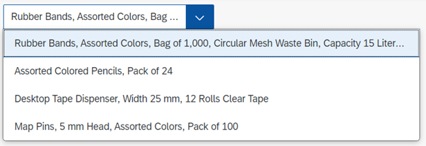
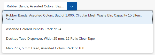


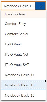


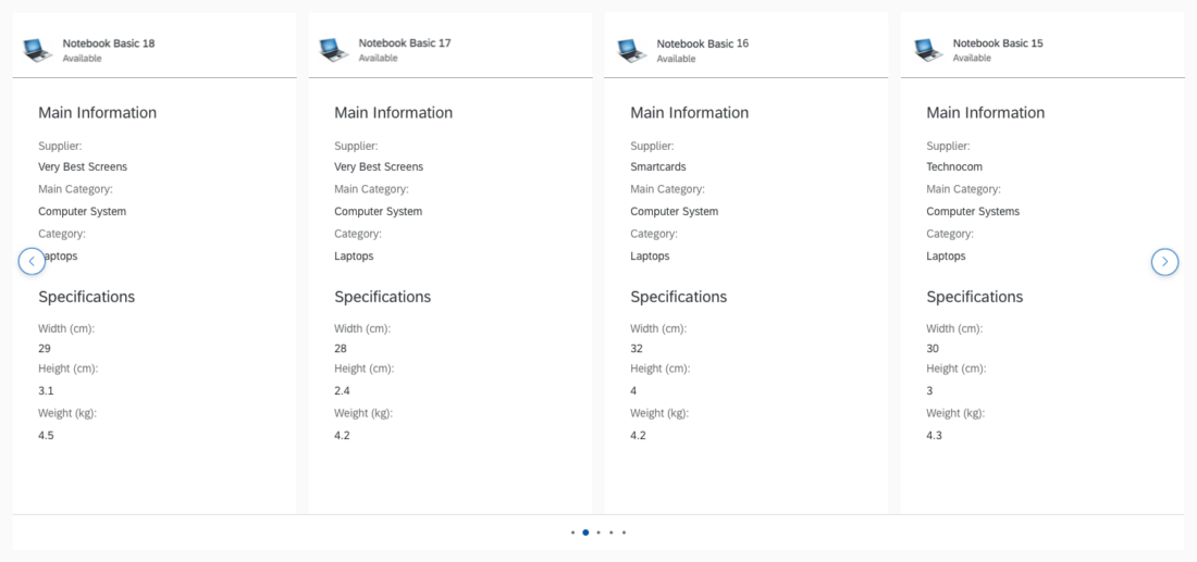


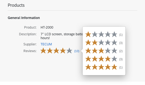
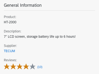
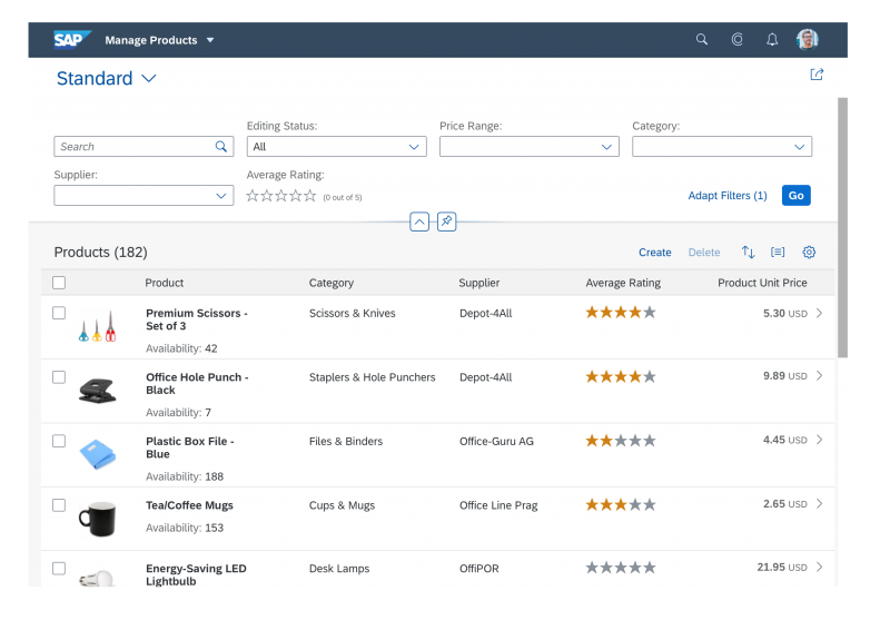
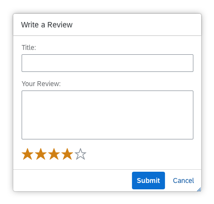


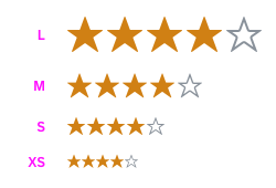
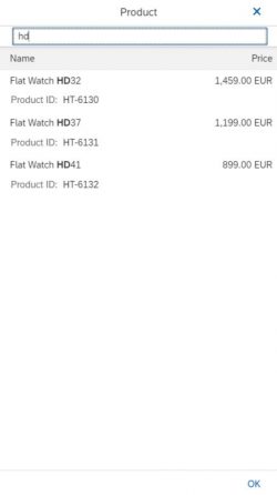
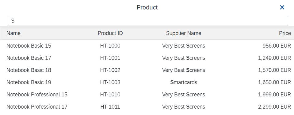
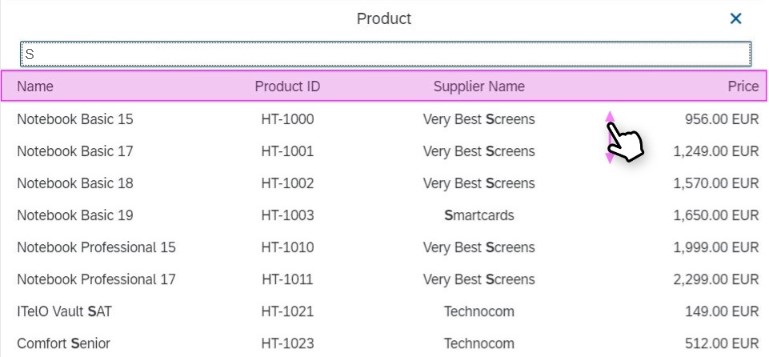

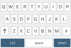
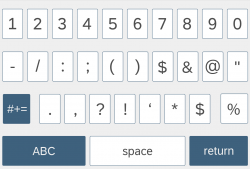
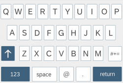
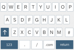
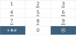
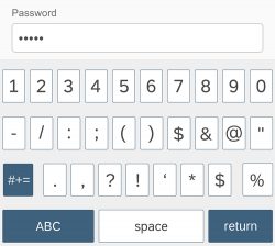
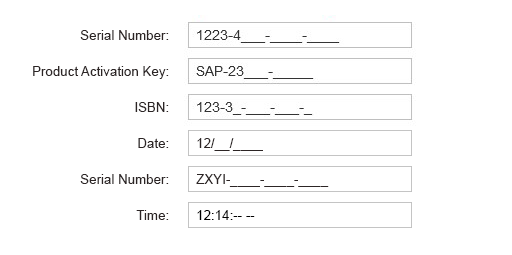

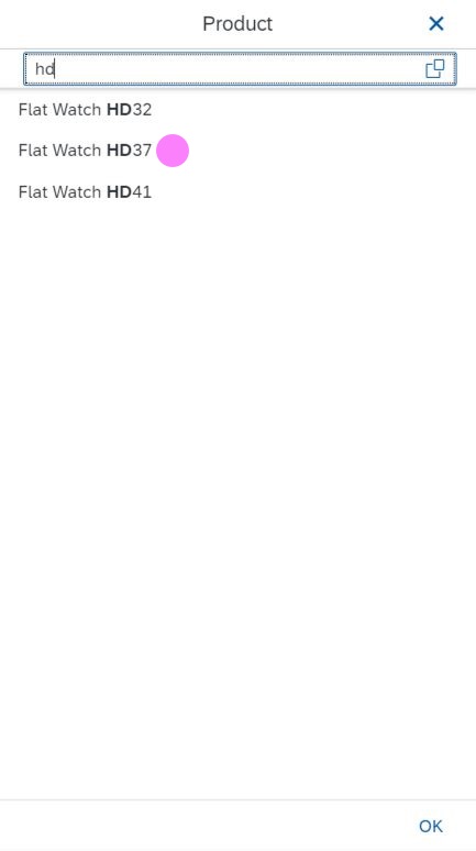
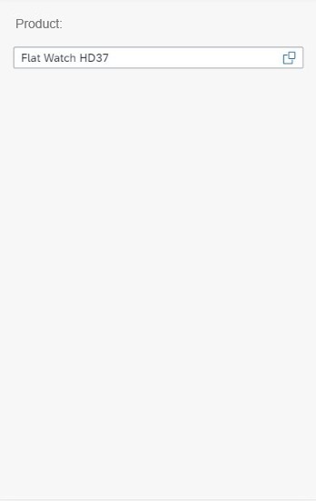
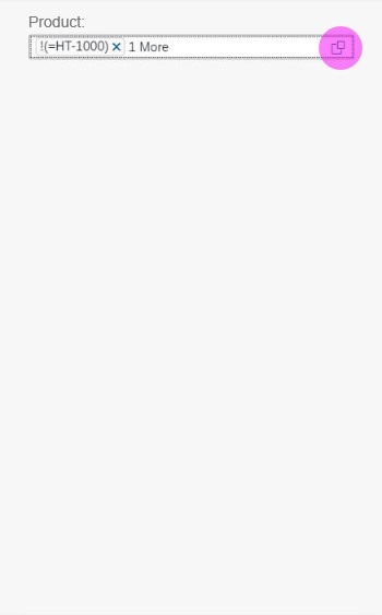
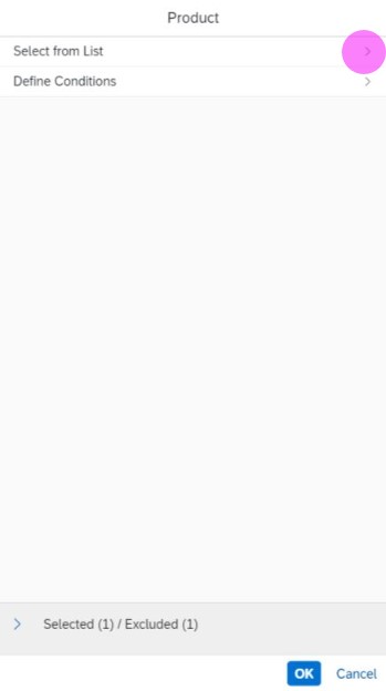
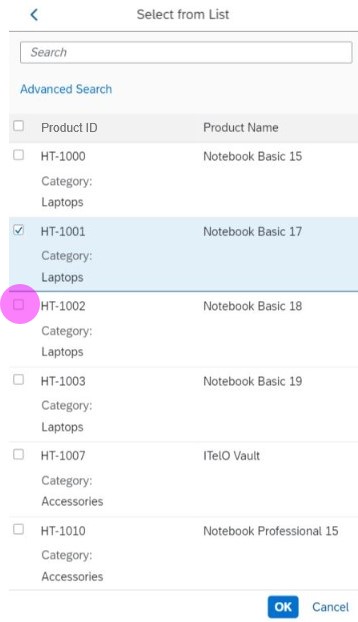
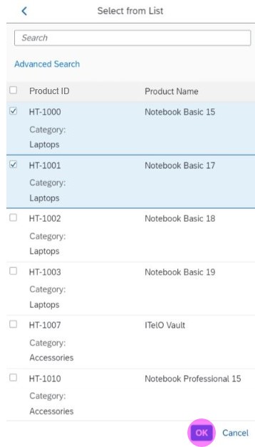
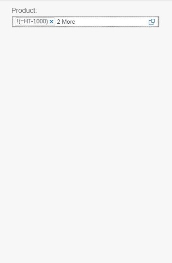
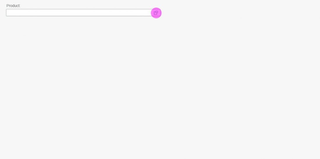
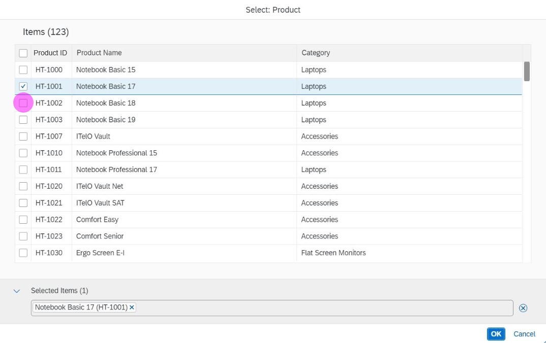

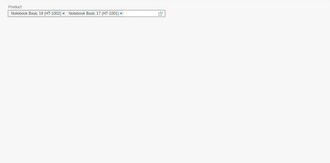
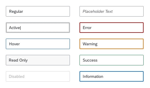
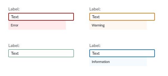


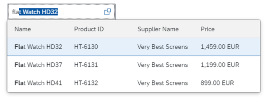


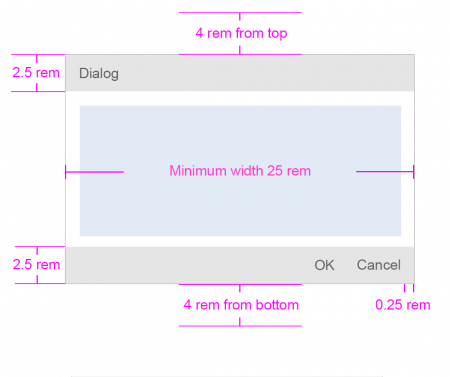
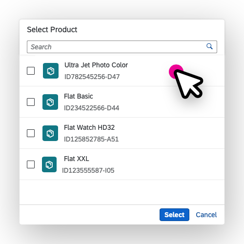
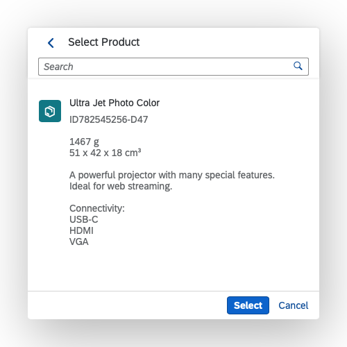
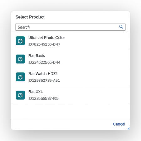
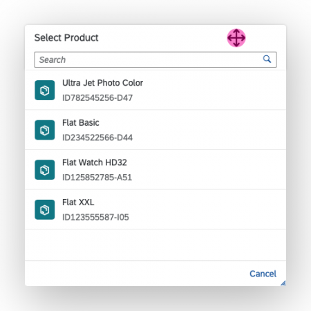
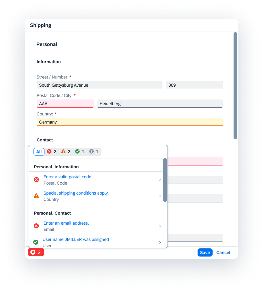
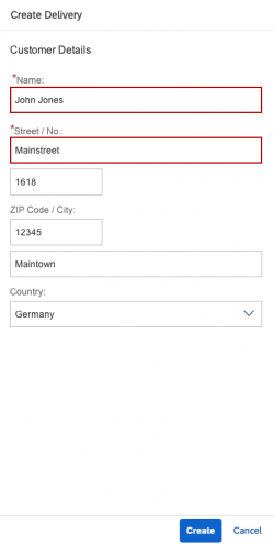
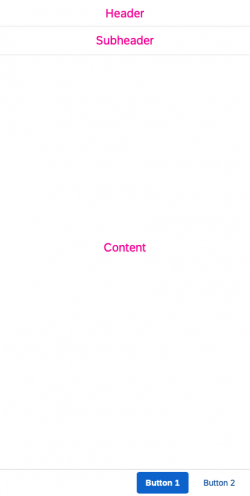
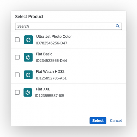
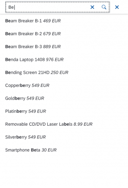
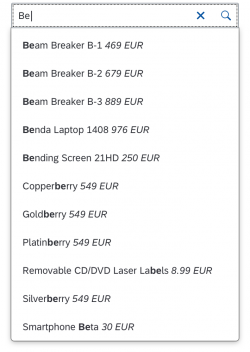
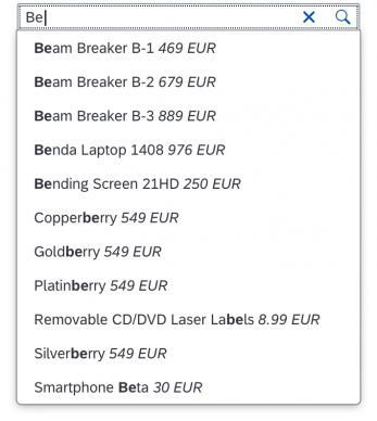
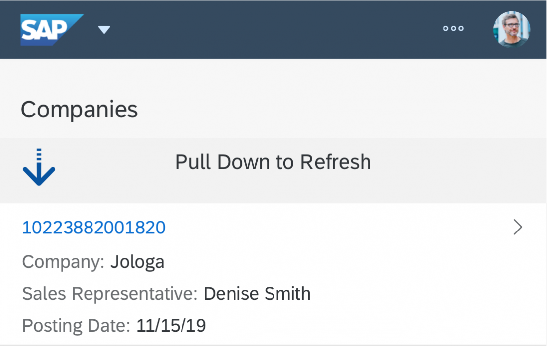
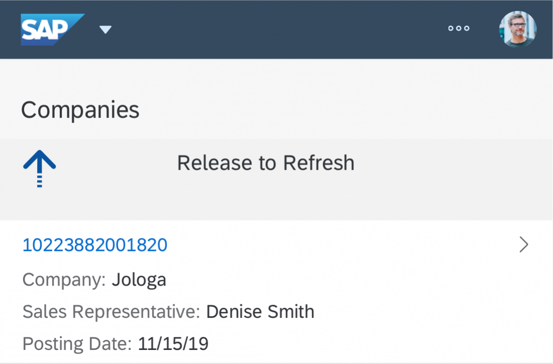
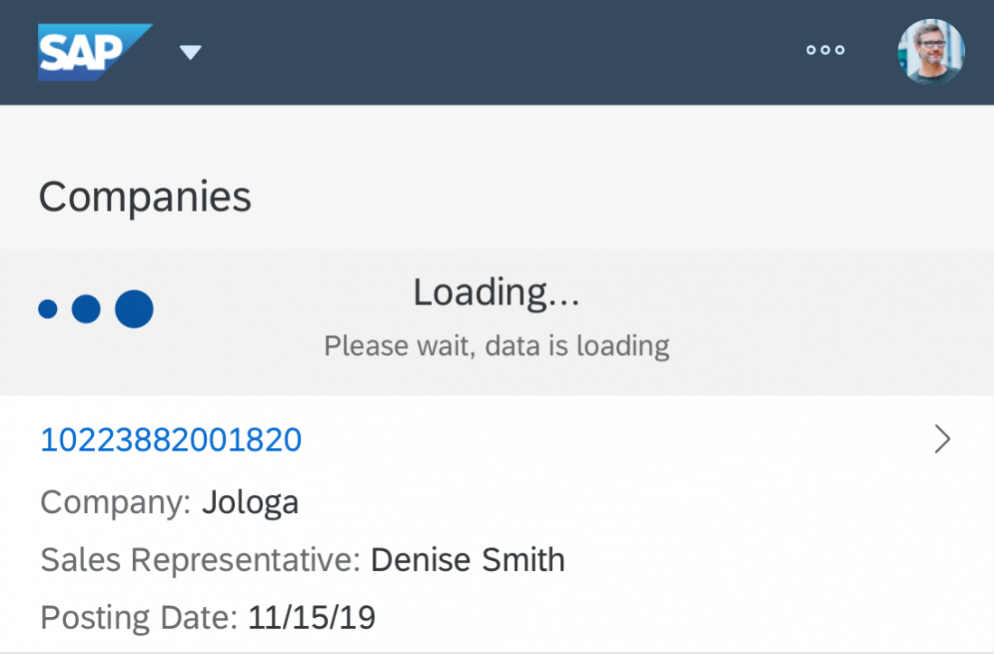


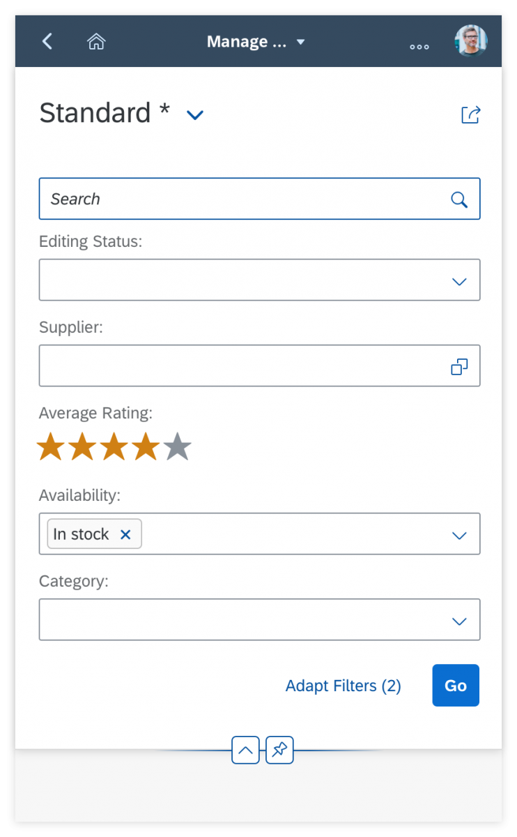
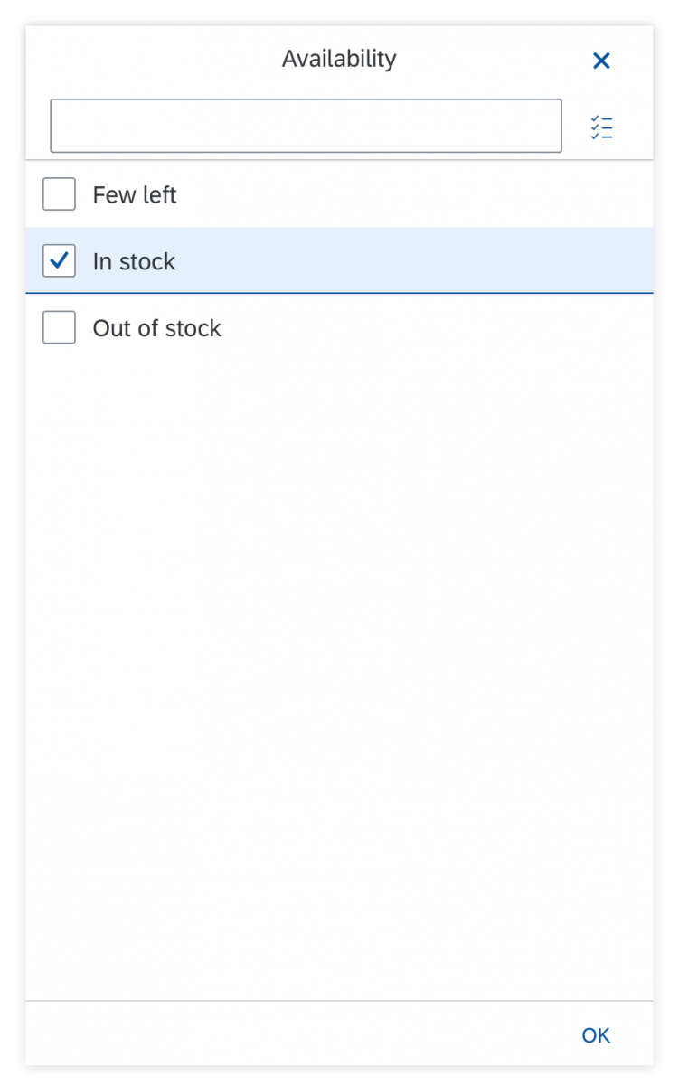
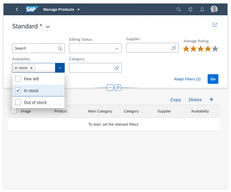
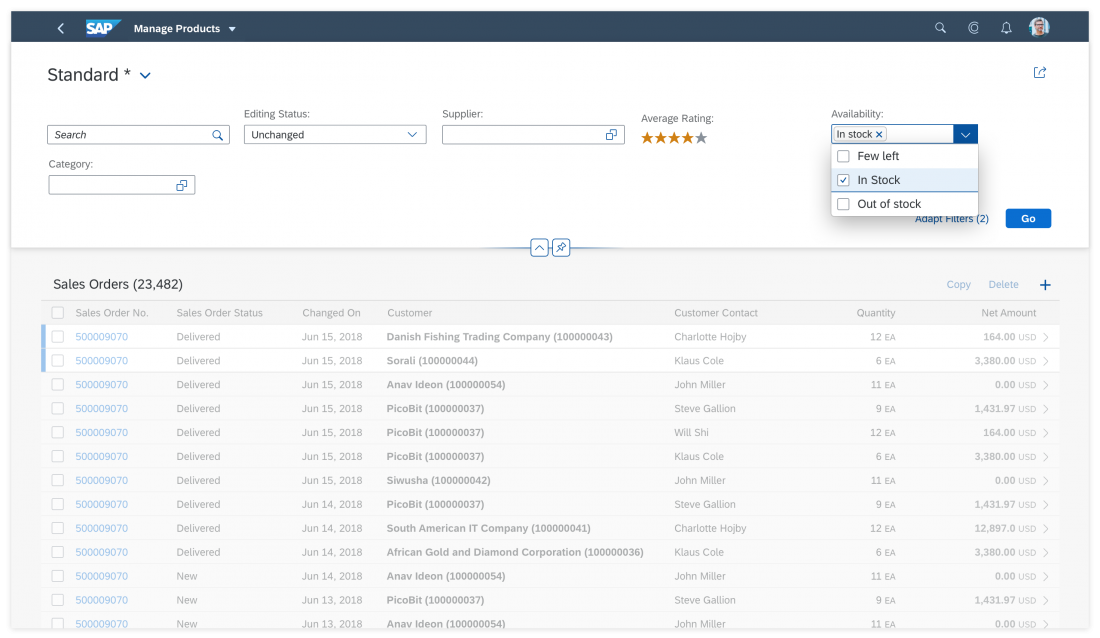
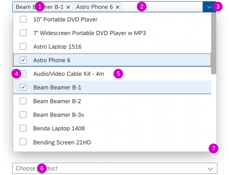
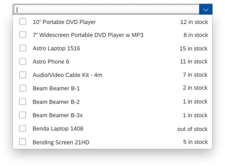
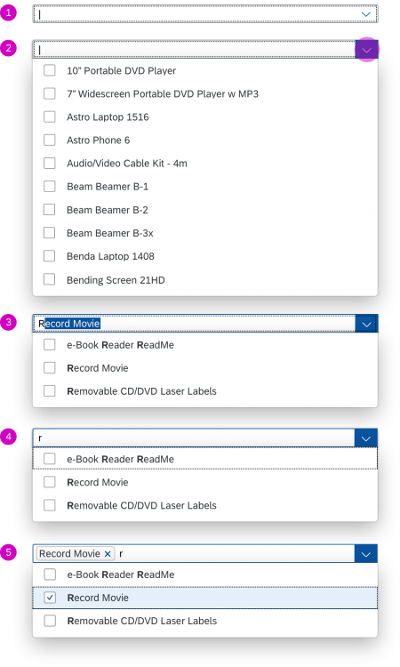
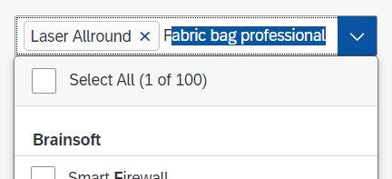
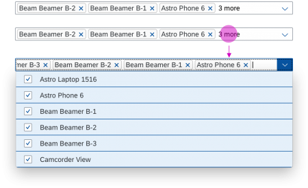

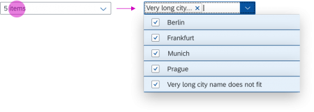

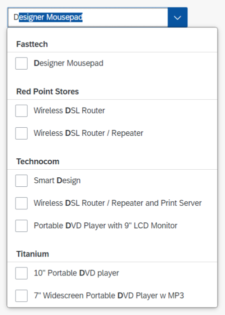
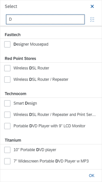
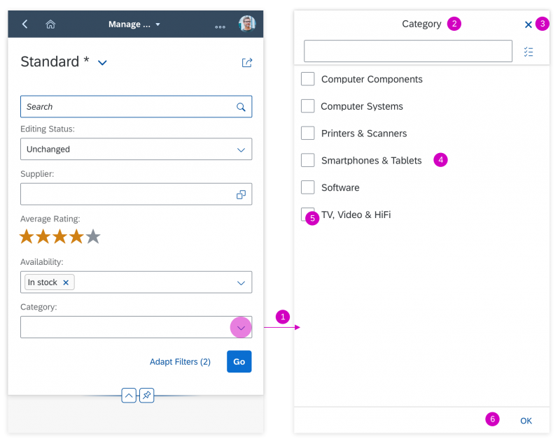
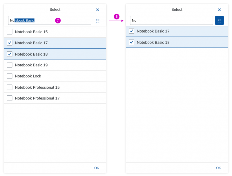
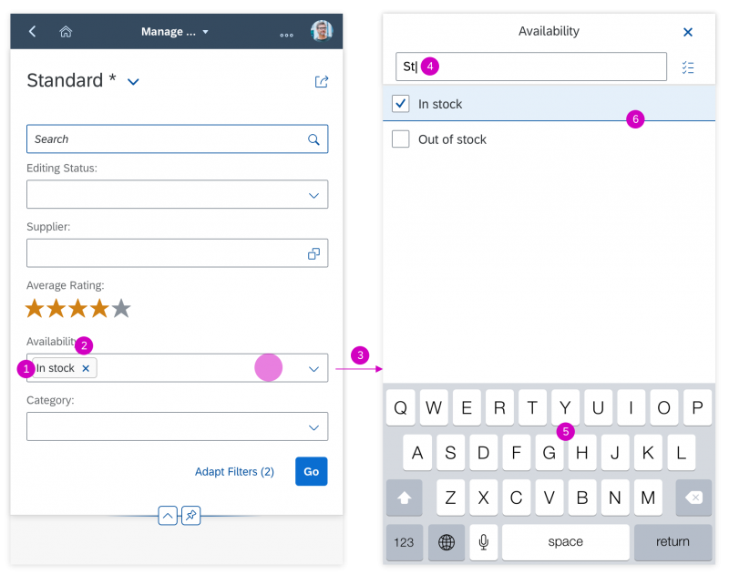


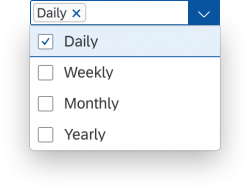
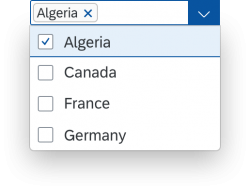
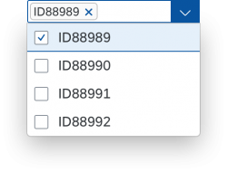
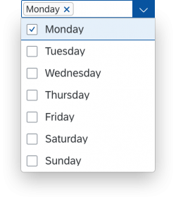
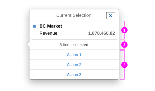
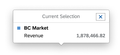
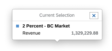
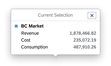
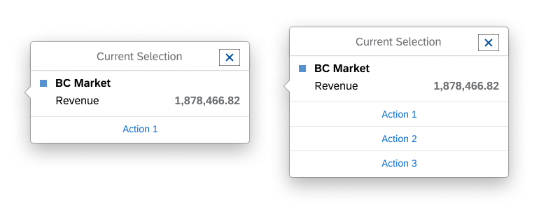
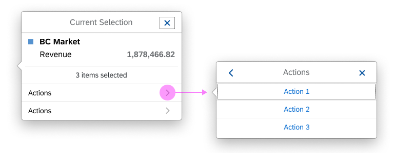
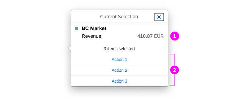
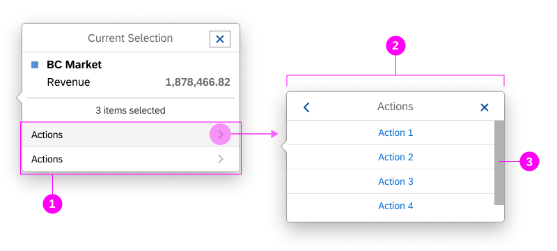
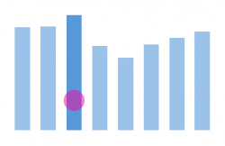
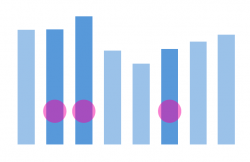
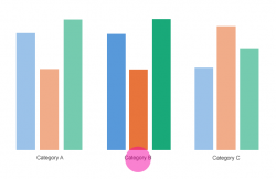
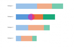
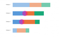
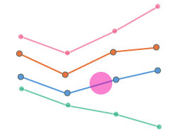
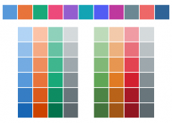
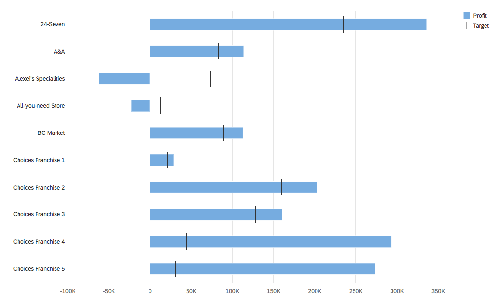
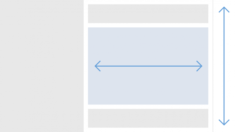
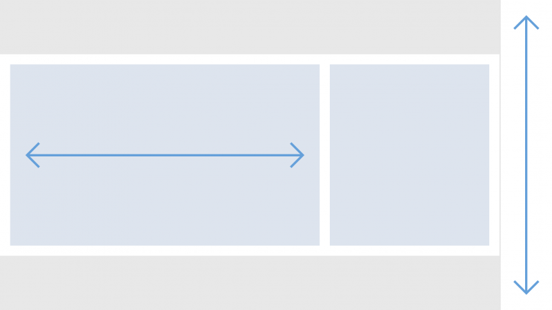


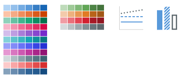


 Your feedback has been sent to the SAP Fiori design team.