
- SAPUI5 Version 1.122
- SAPUI5 Version 1.120
- SAPUI5 Version 1.118
- SAPUI5 Version 1.116
- SAPUI5 Version 1.114
- SAPUI5 Version 1.112
- SAPUI5 Version 1.110
- SAPUI5 Version 1.108
- SAPUI5 Version 1.106
- SAPUI5 Version 1.104
- SAPUI5 Version 1.102
- SAPUI5 Version 1.100
- SAPUI5 Version 1.98
- SAPUI5 Version 1.96
- SAPUI5 Version 1.94
- SAPUI5 Version 1.92
- SAPUI5 Version 1.90
- SAPUI5 Version 1.88
- SAPUI5 Version 1.86
- SAPUI5 Version 1.84
- SAPUI5 Version 1.82
- SAPUI5 Version 1.80
- SAPUI5 Version 1.78
- SAPUI5 Version 1.76
- SAPUI5 Version 1.74
- SAPUI5 Version 1.72
- SAPUI5 Version 1.70
- SAPUI5 Version 1.68
- SAPUI5 Version 1.66
- SAPUI5 Version 1.64
- SAPUI5 Version 1.62
- SAPUI5 Version 1.60
- SAPUI5 Version 1.58
- SAPUI5 Version 1.56
- SAPUI5 Version 1.54
- SAPUI5 Version 1.52
- SAPUI5 Version 1.50
- SAPUI5 Version 1.48
- SAPUI5 Version 1.46
- SAPUI5 Version 1.44
- SAPUI5 Version 1.42
- SAPUI5 Version 1.40
- SAPUI5 Version 1.38
- SAPUI5 Version 1.36
- SAPUI5 Version 1.34
- SAPUI5 Version 1.32
- SAPUI5 Version 1.30
- SAPUI5 Version 1.28
- SAPUI5 Version 1.26
- Latest SAPUI Version 1.124
- SAPUI5 Version 1.122
- SAPUI5 Version 1.120
- SAPUI5 Version 1.118
- SAPUI5 Version 1.116
- SAPUI5 Version 1.114
- SAPUI5 Version 1.112
- SAPUI5 Version 1.110
- SAPUI5 Version 1.108
- SAPUI5 Version 1.106
- SAPUI5 Version 1.104
- SAPUI5 Version 1.102
- SAPUI5 Version 1.100
- SAPUI5 Version 1.98
- SAPUI5 Version 1.96
- SAPUI5 Version 1.94
- SAPUI5 Version 1.92
- SAPUI5 Version 1.90
- SAPUI5 Version 1.88
- SAPUI5 Version 1.86
- SAPUI5 Version 1.84
- SAPUI5 Version 1.82
- SAPUI5 Version 1.80
- SAPUI5 Version 1.78
- SAPUI5 Version 1.76
- SAPUI5 Version 1.74
- SAPUI5 Version 1.72
- SAPUI5 Version 1.70
- SAPUI5 Version 1.68
- SAPUI5 Version 1.66
- SAPUI5 Version 1.64
- SAPUI5 Version 1.62
- SAPUI5 Version 1.60
- SAPUI5 Version 1.58
- SAPUI5 Version 1.56
- SAPUI5 Version 1.54
- SAPUI5 Version 1.52
- SAPUI5 Version 1.50
- SAPUI5 Version 1.48
- SAPUI5 Version 1.46
- SAPUI5 Version 1.44
- SAPUI5 Version 1.42
- SAPUI5 Version 1.40
- SAPUI5 Version 1.38
- SAPUI5 Version 1.36
- SAPUI5 Version 1.34
- SAPUI5 Version 1.32
- SAPUI5 Version 1.30
- SAPUI5 Version 1.28
- SAPUI5 Version 1.26
Chart – Semantic Patterns
Intro
This article explains how to use patterns like dashes, dots or hatches in order to distinguish:
- Actual Values: What values are (solid pattern).
- Projected Values: What values might be (dashed line, hatched areas).
- Reference Values: What values should be (dotted line with empty circles, empty areas).
Actual Values
Actual values register facts that happened in the past and utilize the solid pattern for areas and lines, as illustrated below.
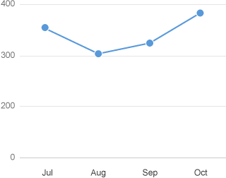
Line chart with actual values
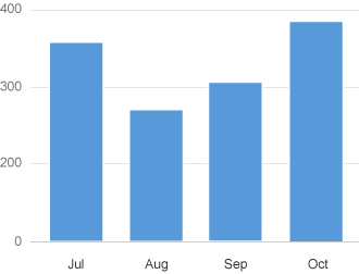
Column chart with actual values
Projected Values
Projected values are estimates of what might happen in the future such as a forecast, estimation or prediction. They indicate what the actual values will be in the future, and the projection can be calculated by the system, extrapolated from previous time periods, or entered manually by a user.
Example:
- Revenue forecast calculated from previous months.
- Adjusted revenue forecast that has been manually adjusted based on the current context.
- Cost for projects that are committed, but not yet delivered.
Dashed Line
Use dashed lines to show projected values as illustrated below.
Line chart with actual and forecast values
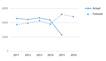
A line can change from solid to dashed when the line needs to display actual values followed by projected values. In the example below, the line connecting the last actual value (2015) to the first projected value (2016) is dashed to indicate that the line is a projection.
Line chart with actual values followed by forecast values
Hatched Area
Use the hatched pattern in columns and bars to display projected values, as illustrated below.
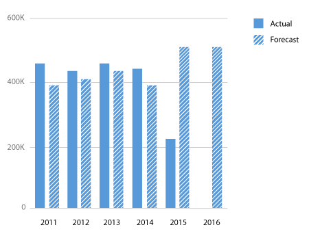
Column chart with actual and forecast values
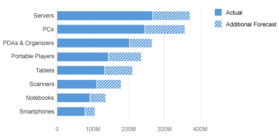
Stacked bar chart with actual and forecast values
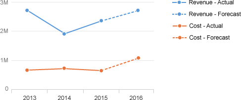
A series of columns with the solid pattern can be followed by a series of columns with the hatched pattern when a series displays actual values followed by projected values, as illustrated below.
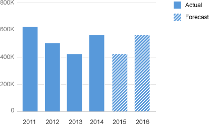
Column chart with actual values followed by forecast values
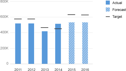
Bullet chart with actual values followed by forecast values
Reference Values
Some values represent a reference for other values (such as a threshold that should be reached or should not be reached) depending on the use case. Here are some examples:
- A target revenue that must be reached.
- An expense budget that should not be exceeded.
- The share price of a competitor to use as a benchmark.
- The number of new customers acquired last year that needs to be exceeded this year.
The bullet chart is the ideal chart to compare values with reference values. The reference value is displayed by the black horizontal lines as illustrated in the chart below.
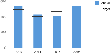
Bullet chart with actual and target values
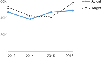
Dotted Line and Empty Circle
Reference values displayed as a line should use a dotted line and empty circles for the data points as illustrated below.
Line chart with actual and target values
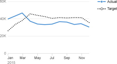
When there are many data points, the circles are automatically hidden, as illustrated below.
Line chart with plenty of actual and target values
When the chart contains one actual value and one reference value (such as a target), you should use color sapUiChartPaletteSequentialNeutralDark2 for the reference line and the first color from the qualitative palette for the actual value, as illustrated below.
Colors used in a line chart with actual and target values
When the chart combines a single reference value (such as a target) with multiple actual values, you should use color sapUiChartPaletteSequentialNeutralDark2 for the reference line and colors from the qualitative palette for the actual values, as illustrated below.
Line chart with one single target value for multiple actual values
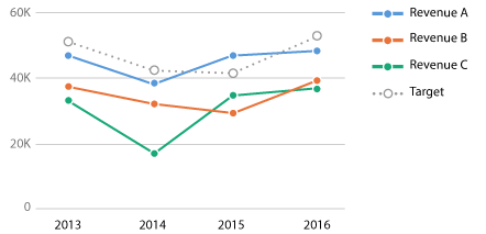
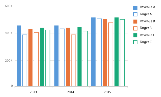
When the chart contains multiple pairs of actual values and reference values, you should use the same color for each pairs. The pattern will make the difference. Use the first colors of the qualitative palette:
sapUiChartPaletteQualitativeHue1, sapUiChartPaletteQualitativeHue2, sapUiChartPaletteQualitativeHue3…
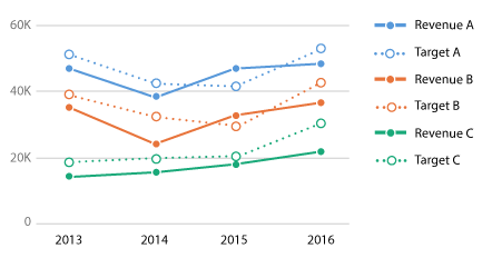
Line chart with multiple pairs of actual and target values
When the reference values and the actual values do not have a direct relationship, you should use colors from the qualitative palette and all the lines should all have different colors, as illustrated below.
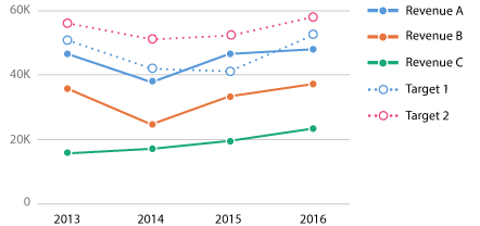
Line chart with multiple actual values and multiple target values
Empty Area
When columns or bars are used to display reference values (such as a target, plan or budget), you should use the empty pattern. You should also use the color sapUiChartPaletteSequentialNeutralDark2 for the reference value and the first color from the qualitative palette for the actual value as illustrated below.
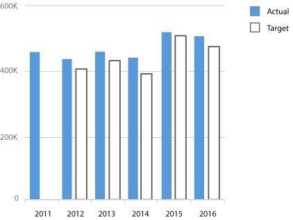
Column chart with actual values and target values
When the chart contains a reference value (like a target) for multiple actual values, you should use color sapUiChartPaletteSequentialNeutralDark2 for the reference value and colors from the qualitative palette for the actual values, as illustrated below.
Column chart with one single target value for multiple actual values
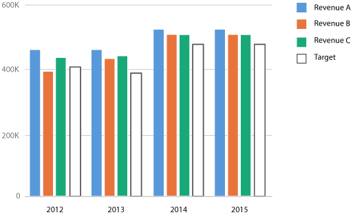
When the chart contains multiple sets of linked actual values and reference values, you should use the same color for each pairs. The pattern will make the difference. Use the first colors of the qualitative palette: sapUiChartPaletteQualitativeHue1, sapUiChartPaletteQualitativeHue2, sapUiChartPaletteQualitativeHue3…
Column chart with multiple pairs of actual and target values
When multiple reference values and multiple actual values do not have a direct relationship, you should use colors from the qualitative palette. Columns for the reference values and columns for the actual values should all have different colors, as illustrated below.
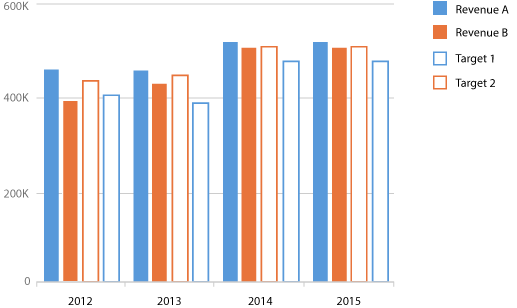
Column char with multiple actual vales and multiple target values
Resources
Want to dive deeper? Follow the links below to find out more about related controls, the SAPUI5 implementation, and the visual design.
 Your feedback has been sent to the SAP Fiori design team.