
Flag and Favorite
You can let users flag objects for follow-up, or mark frequently-used objects as favorites. When an object is flagged or marked as a favorite, the corresponding object marker appears next to it:
- A small flag indicates that the object is flagged.
- A small star indicates that the object is marked as a favorite.
"Flag" and "Favorite" icons
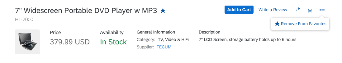
Object marked as a favorite
Usage
- Offer the Flag option if users need to flag objects for later reference and follow-up.
- Offer the Favorite option if users need to mark frequently-used objects.
Responsiveness
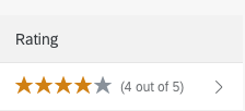
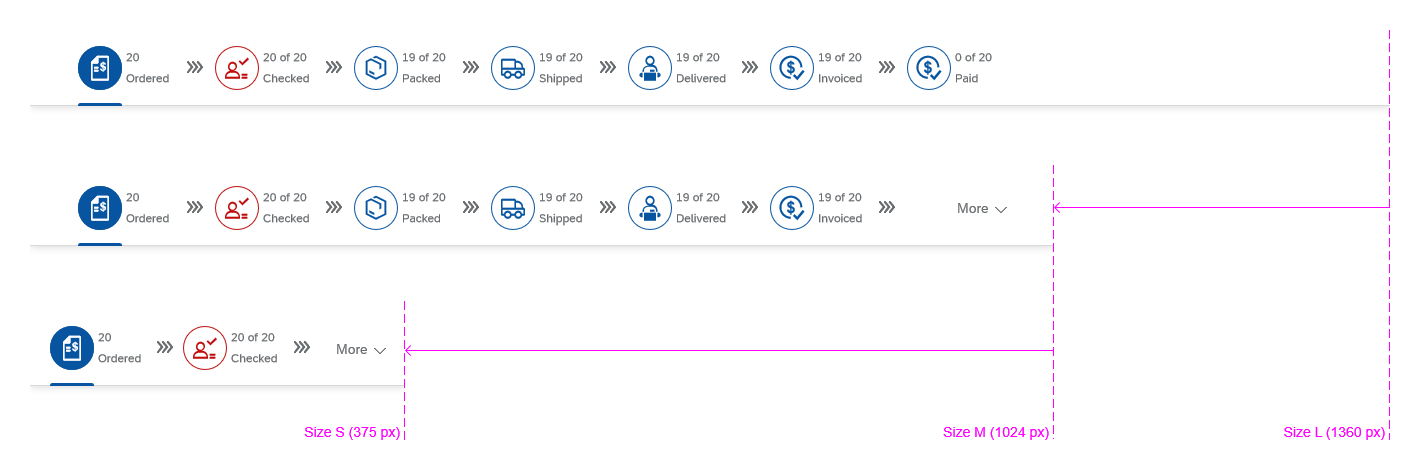
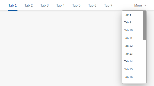
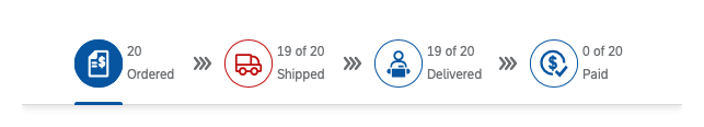
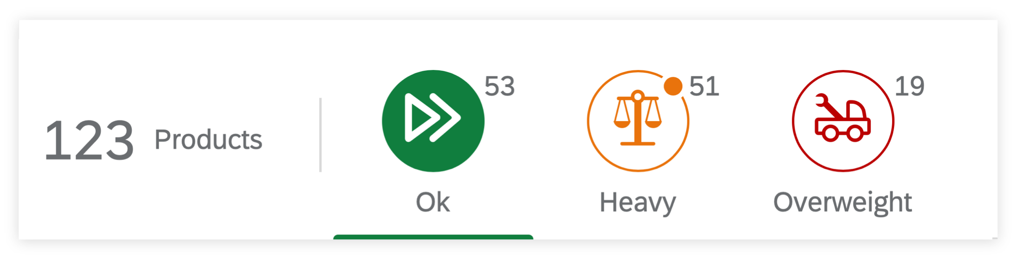
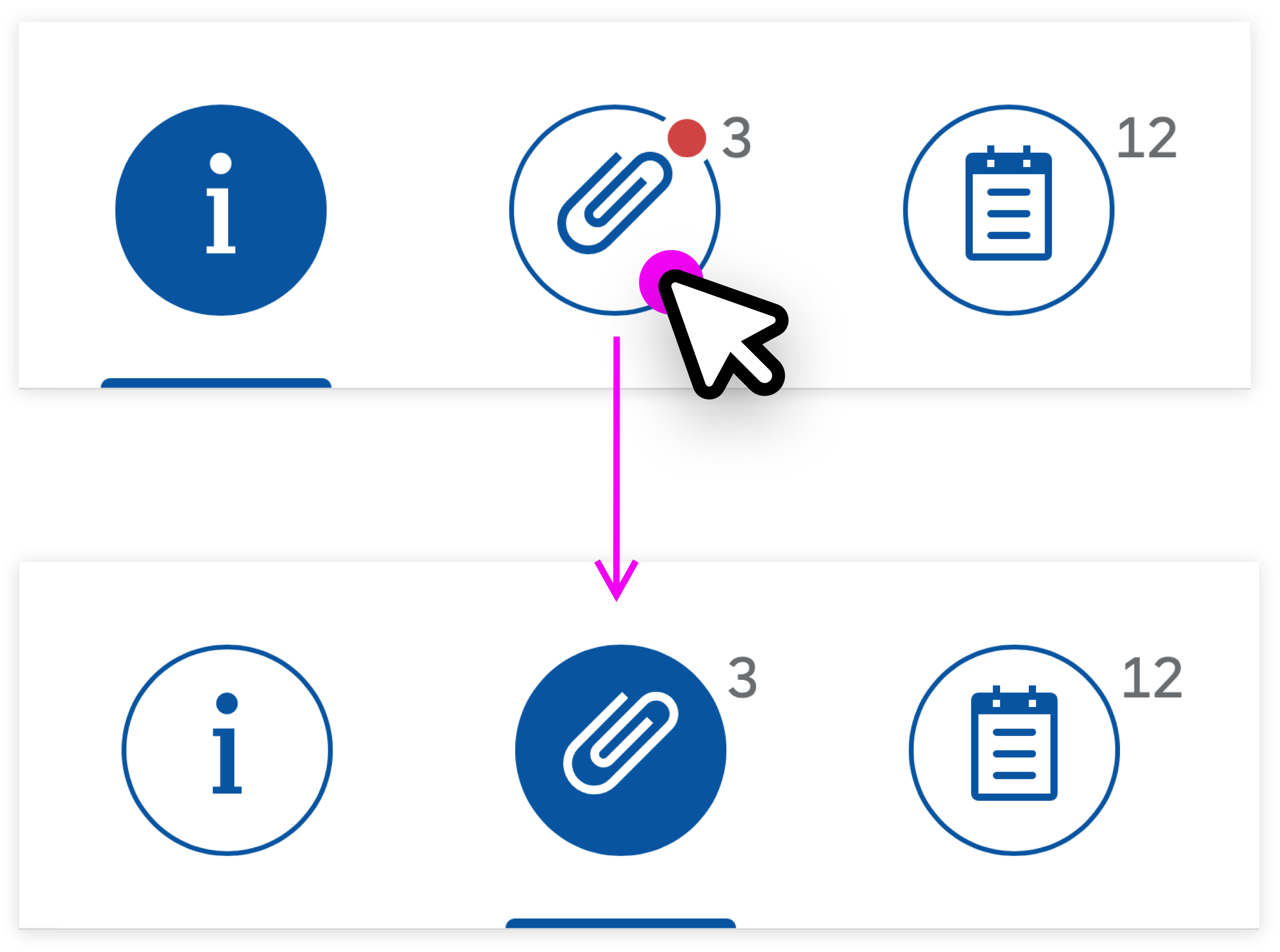
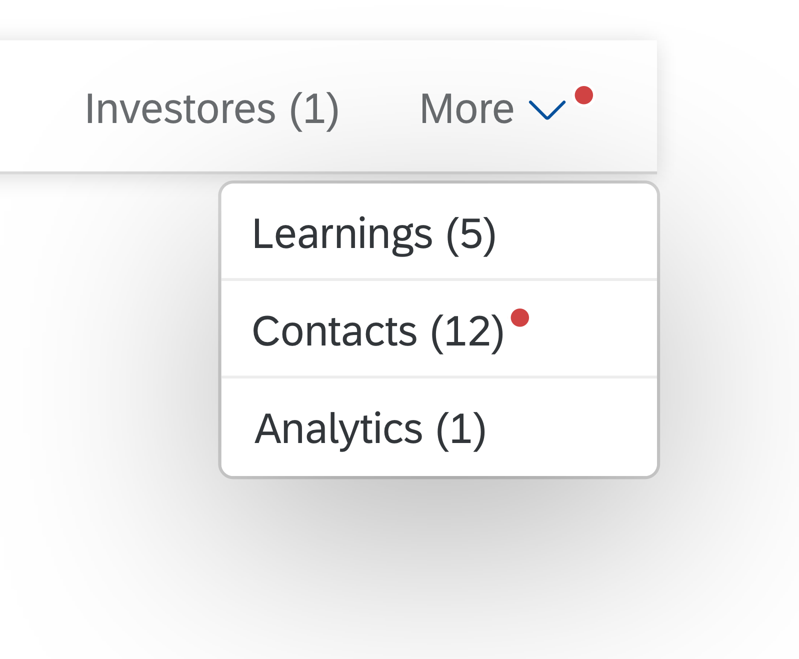
The Flag and Favorite markers are normally displayed as icons (rather than text) on all screen sizes. If you implement the overflow toolbar, you can specify how the Flag and Favorite actions are handled when there is a shortage of space on the toolbar (move to overflow menu as necessary, always show on toolbar, always show in the overflow menu). For more information, see the toolbar overview.
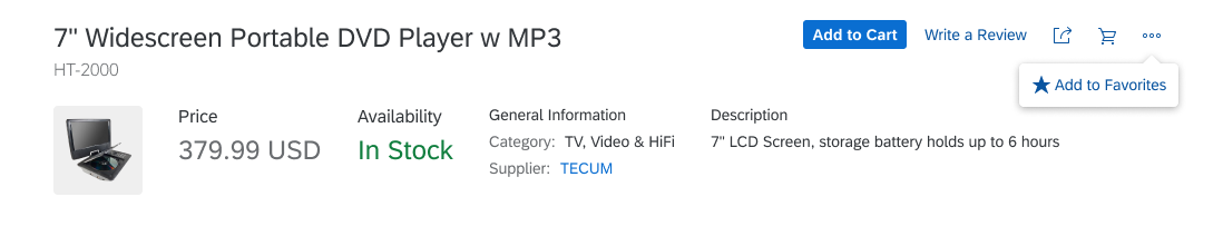
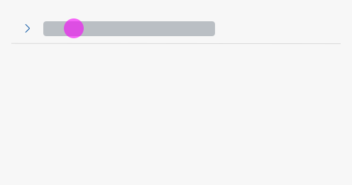
Favorite icon shown in the overflow
Layout
The position of the flag or favorite marker depends on the UI control or floorplan. The button for making the setting appears in the relevant toolbar.
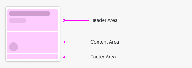
Object Header (Object Page)
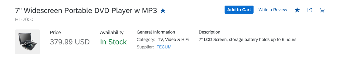
In the object header, the markers appear right next to object title. The icon button for setting the status appears in the header toolbar.
Object marked as a favorite in the object header
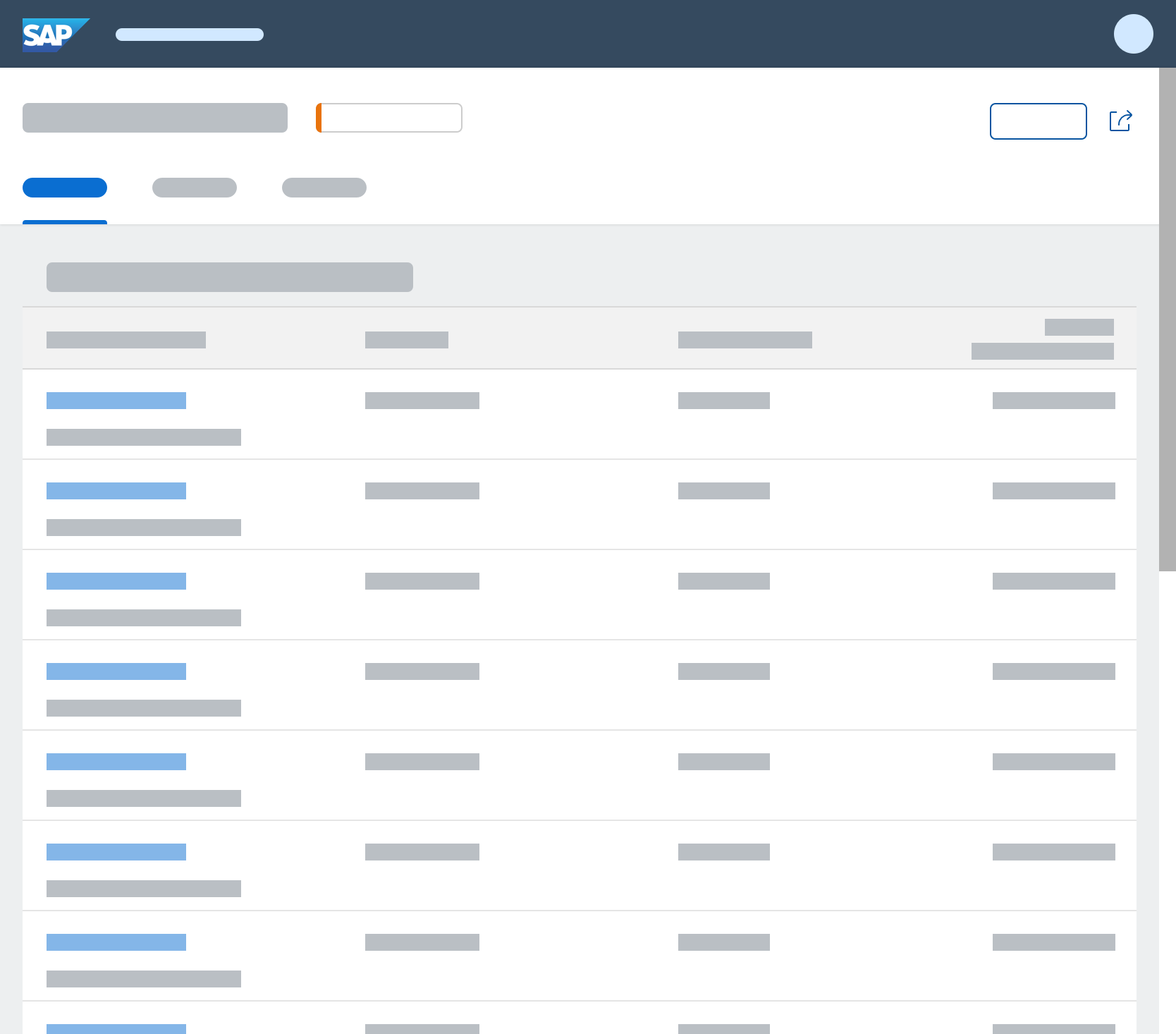
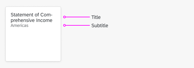
Object List item
In an object list item, the marker appears in the first status line.
Flagged item in an object list
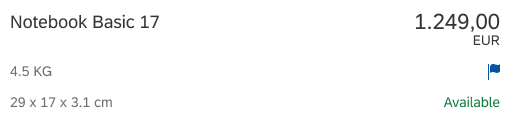
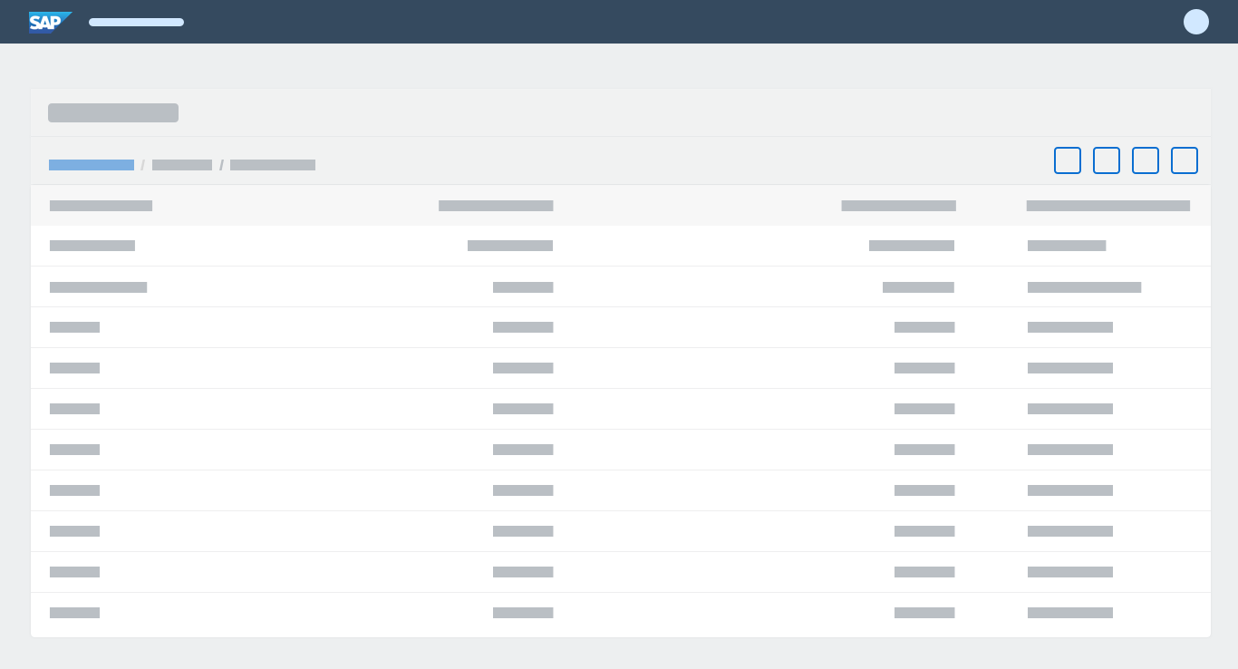
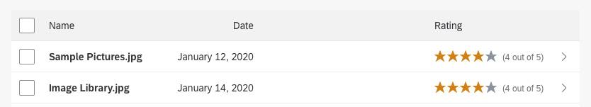
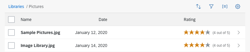
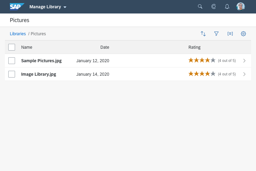
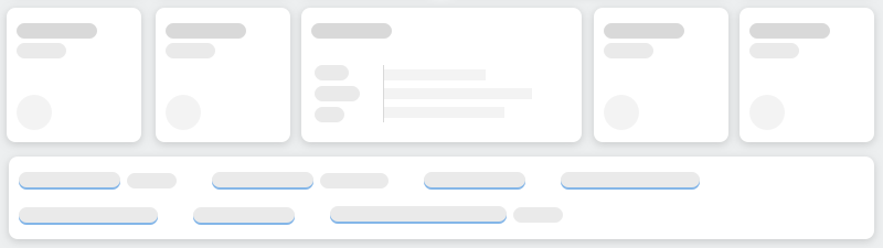
Tables
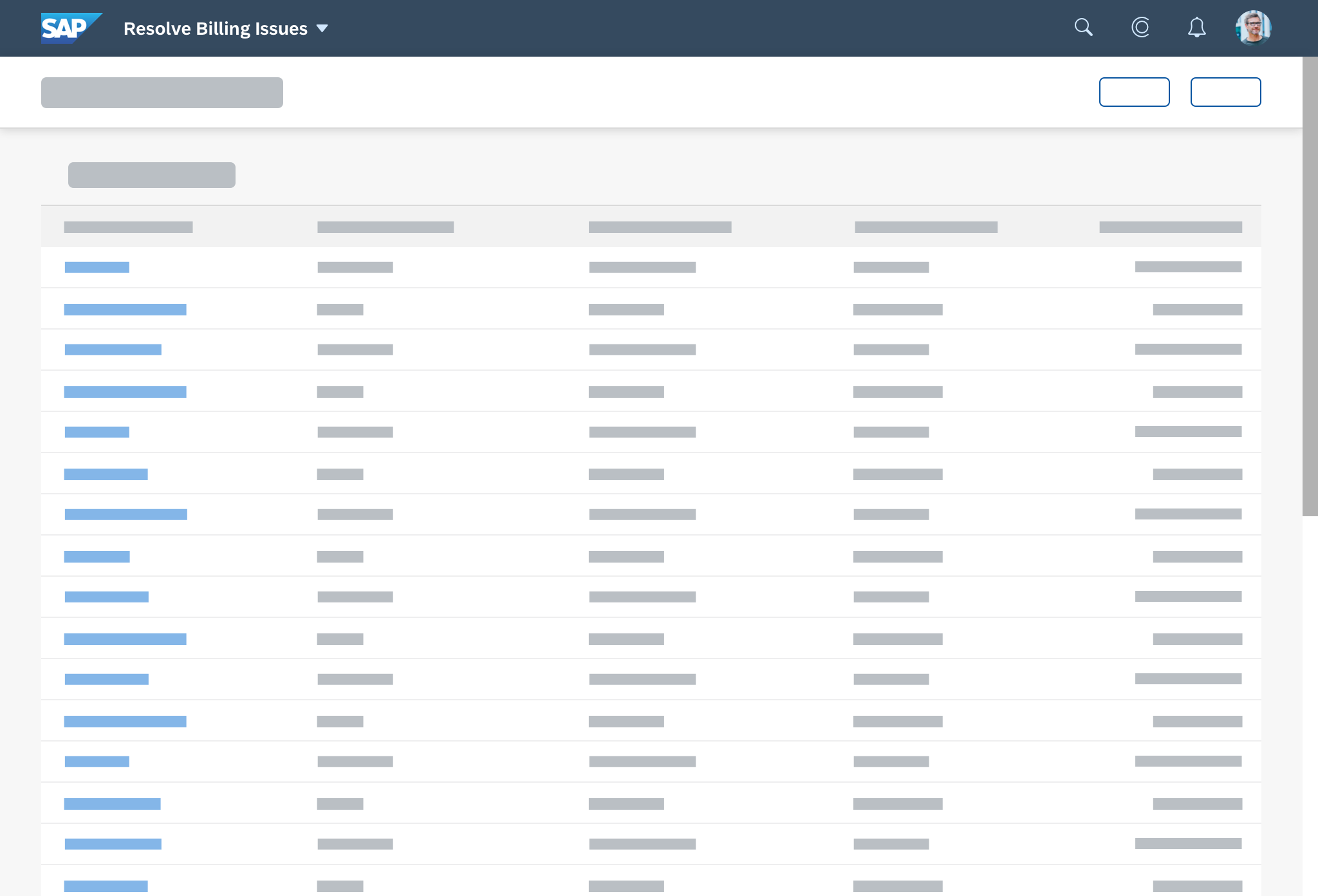
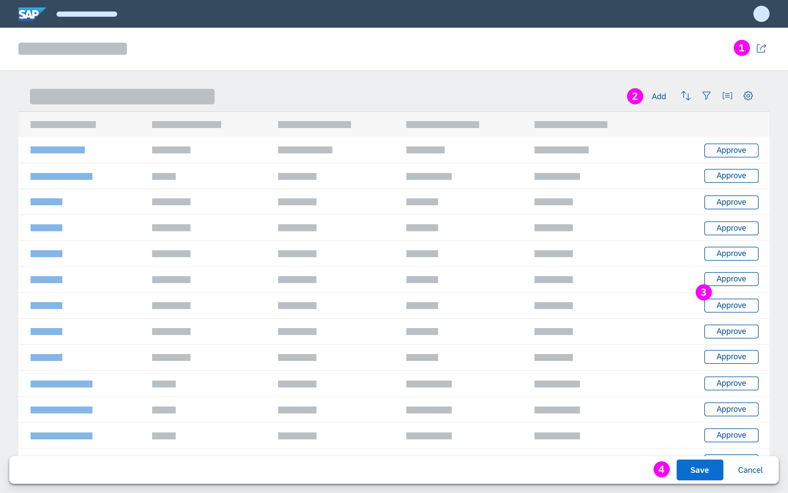
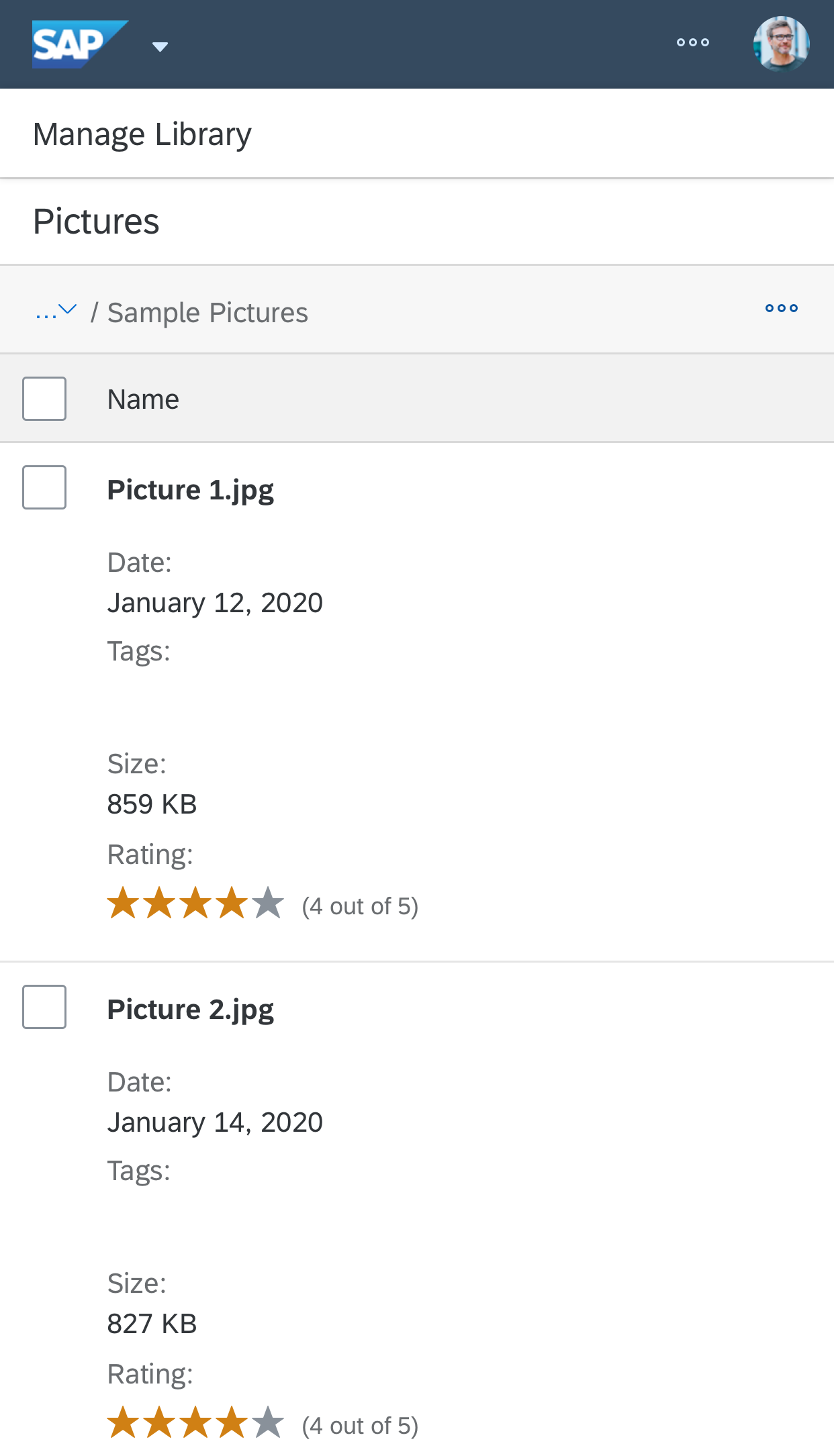
In tables and list reports, the marker for a line item shows right beside the checkbox. To make the settings, users need to drill down into the object itself.

List report item marked as a favorite
Custom List Item
In custom lists, the position of the Flag or Favorite icon depends on whether it is read-only or interactive:
- If the Flag or Favorite marker is read-only, place it after the text.
- If the Flag or Favorite marker is interactive, place it before the text.
Behavior and Interaction
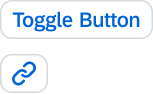
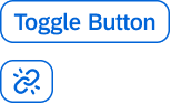
Users switch the setting on or off by clicking the Flag or Favorite button (icon), which behaves as a toggle.
Resources
Want to dive deeper? Follow the links below to find out more about related controls, the SAPUI5 implementation, and the visual design.
Elements and Controls
- Object display components (guidelines)
- Toggle button (guidelines)
- Object header (guidelines)
- Object list item (guidelines)
- List report (guidelines)
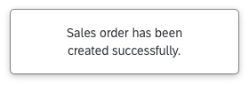
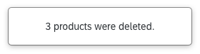
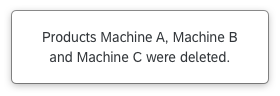
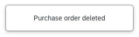
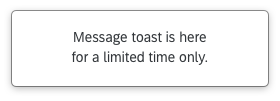
- Message toast (guideines)
Implementation
- Flag and favorite (SAPUI5 samples)
- Toggle button (SAPUI5 samples)
- Toggle button (SAPUI5 API reference)
- Message Toast (SAPUI5 samples)
- Object Marker (SAPUI5 samples)


 Your feedback has been sent to the SAP Fiori design team.