
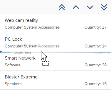
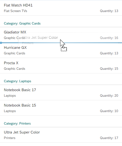
Object List Item
The object list item offers a quick overview of an object within a list. Typically, it is used in the list of a list-detail application using the flexible column layout. The object list items usually allow the user to navigate to the details of an object. Therefore, the object list item should only contain essential information that is necessary for the user to identify which object to work on first.
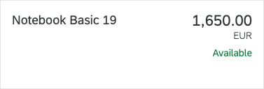
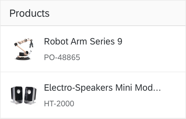
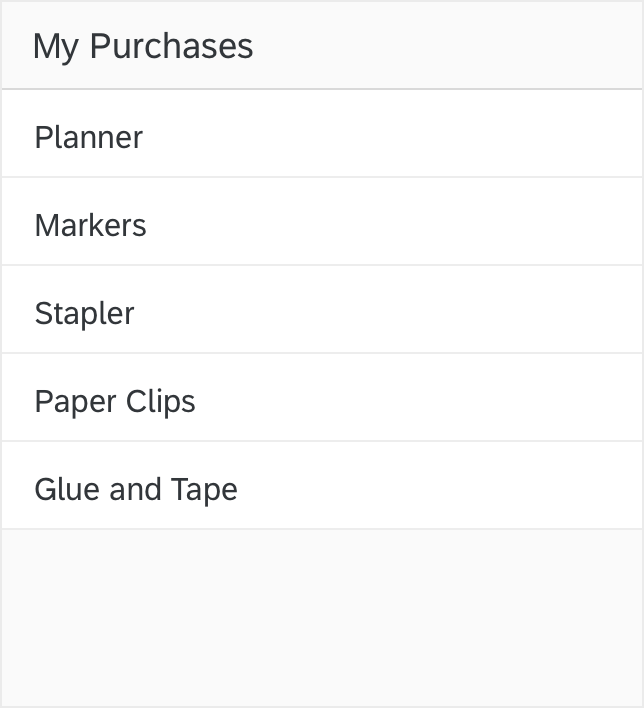
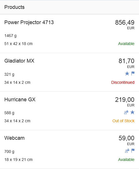
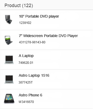
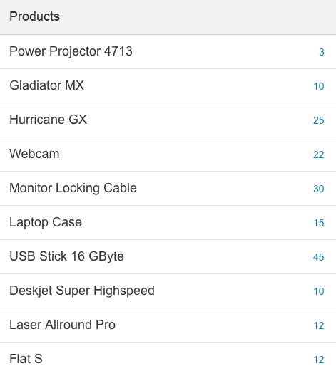
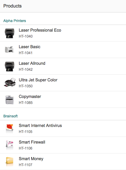
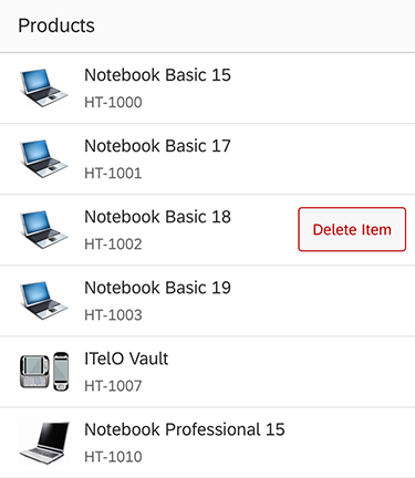
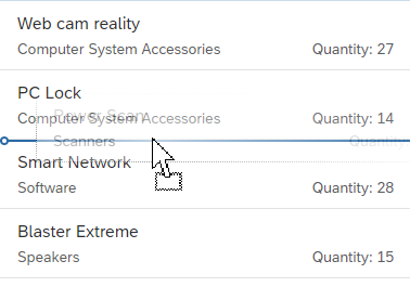
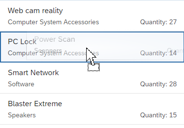
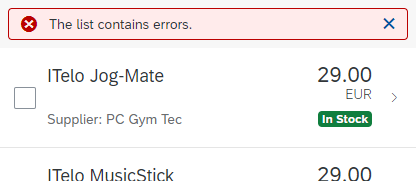
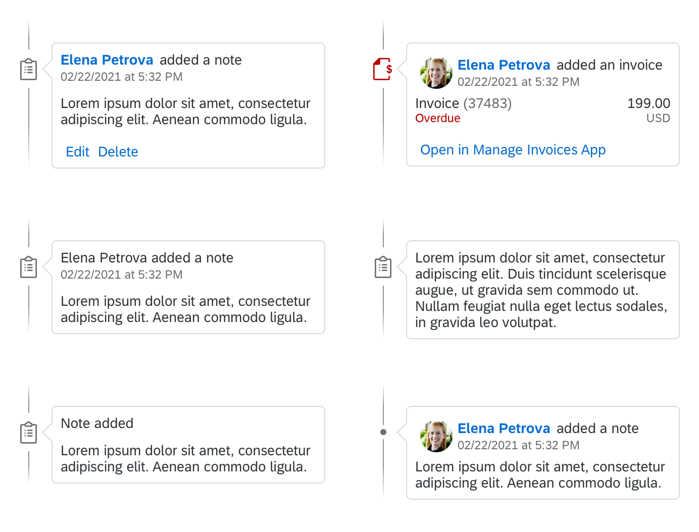
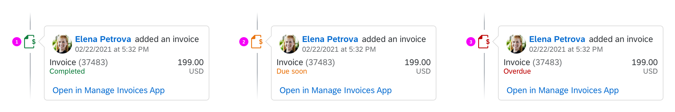
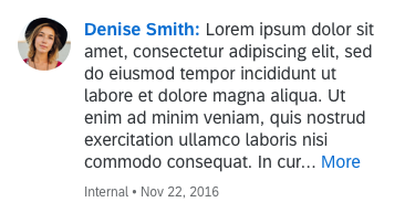
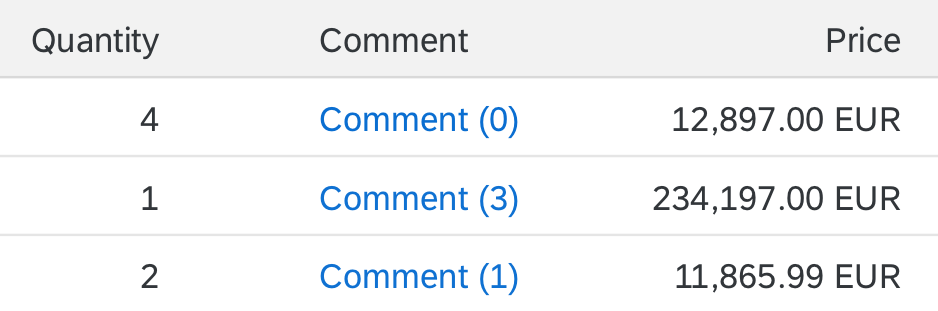
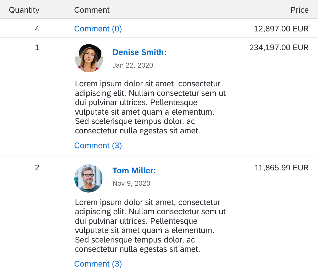
Object list item
Responsiveness
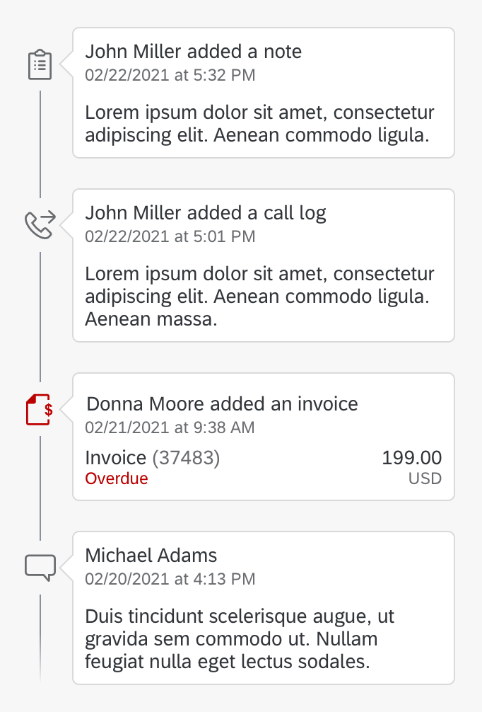
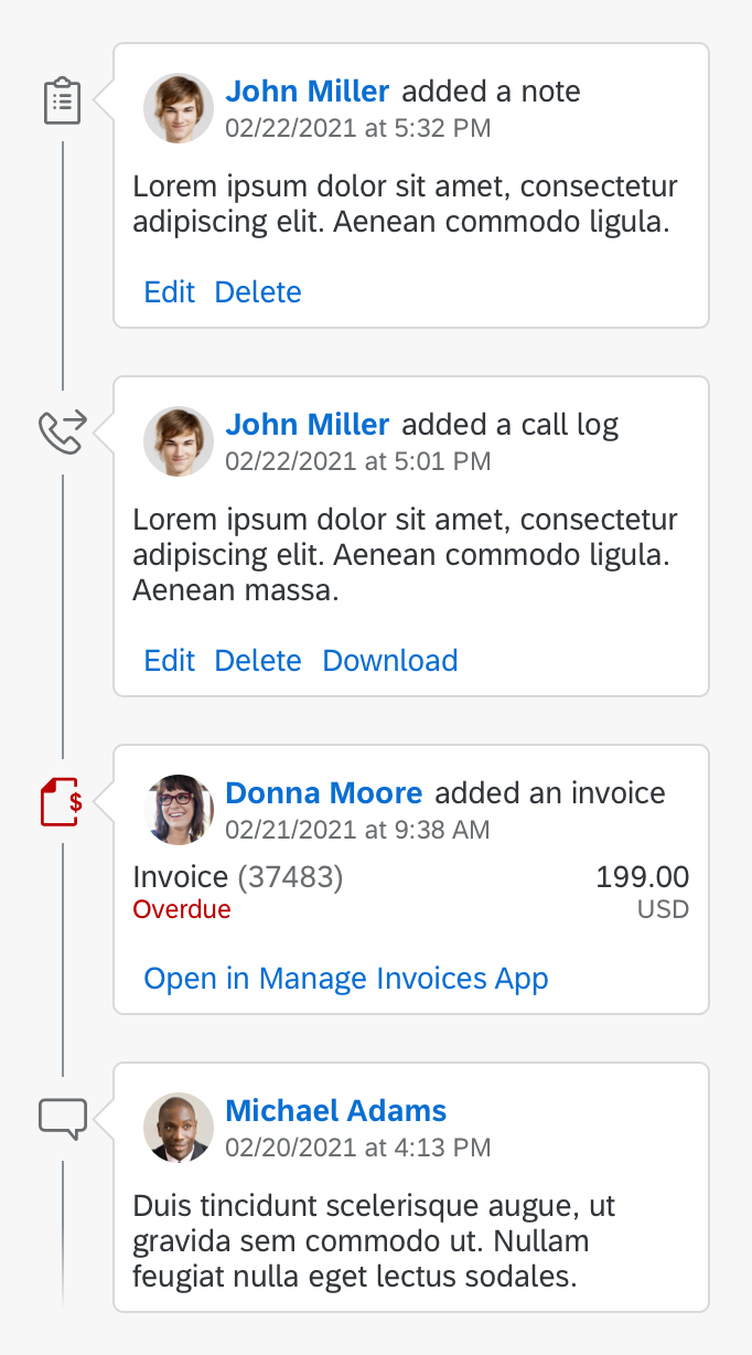
The object list item’s text sizes are limited due to truncation. The title wraps once and truncates after two lines. The key attribute also truncates if it does not have enough space. Apps therefore need to use formatters, for example, to transform 1,659,963,900.42 into 1.7 B. (Note that this transformation is language-specific.)
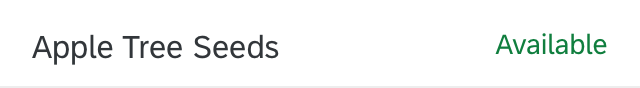
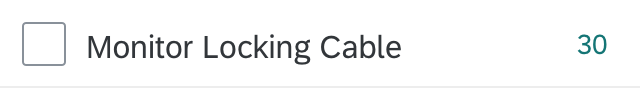
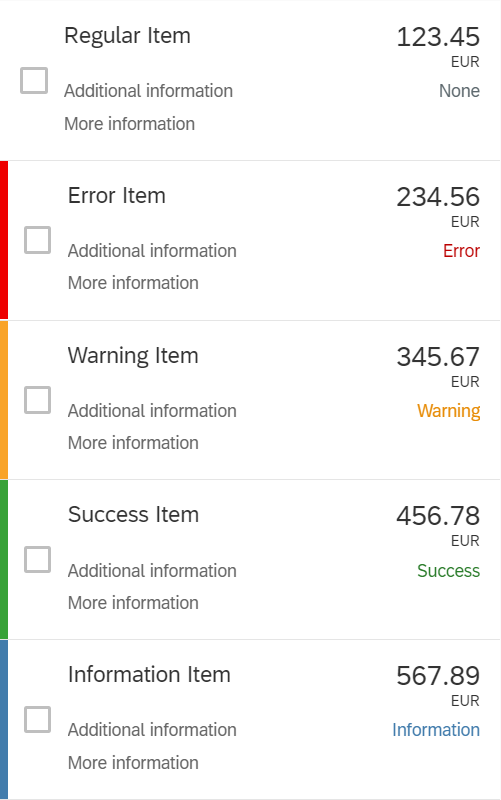
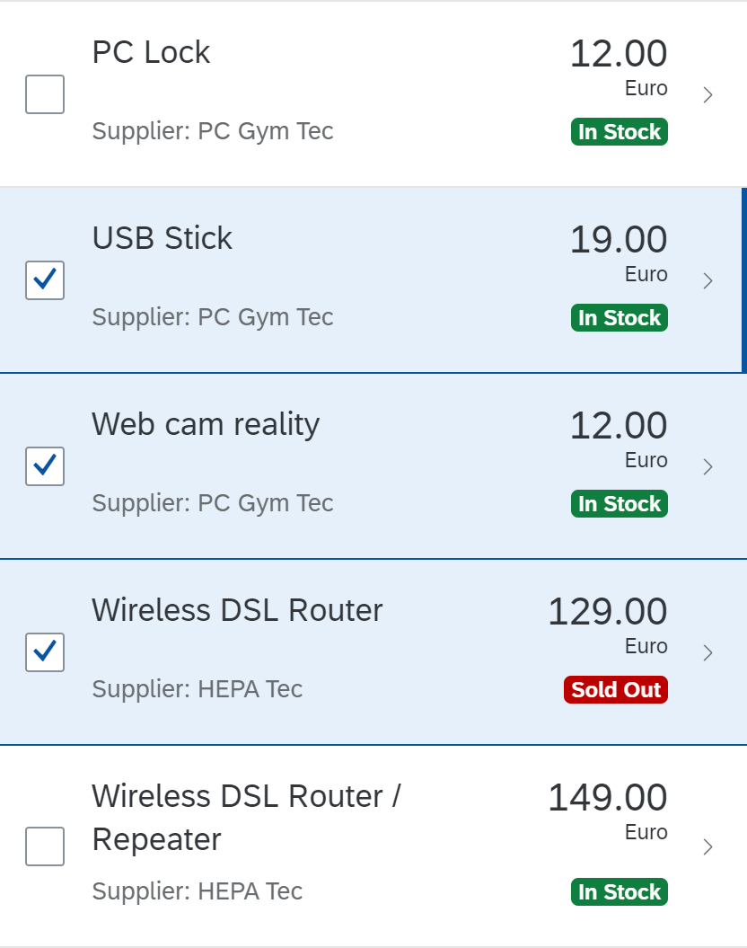
Status texts (on the right) and object attributes (on the left) do not wrap, but only truncate. Status texts can have a semantic color (to reflect the state) and an optional icon. The object attributes are placed next to the status texts. If they do not have a neighboring status text, they use the full width available for the list item.
Components
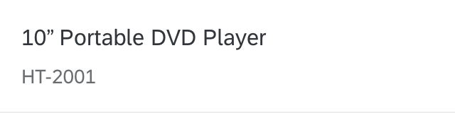
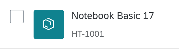
The object list item provides the following optional data:
- Title of the object instance, which acts as the main identifier (title)
- Key attribute (number) + unit (numberUnit)
- Object status (sap.m.ObjectStatus)
- List of object attributes (sap.m.ObjectAttribute)
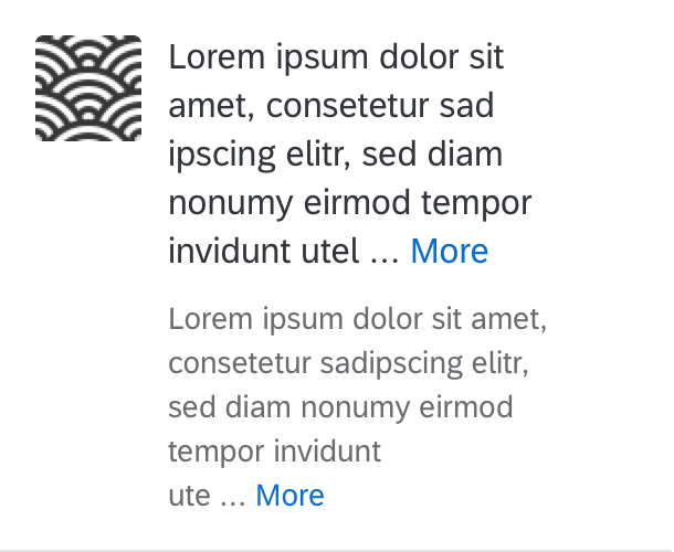
- Introductory text indicating the origin of the object, such as Forwarded by… or On Behalf of… (intro)
- Icon that identifies the object (icon)
The first status line can contain indicator icons for locked items, favorites, or items that have been flagged for follow-up.
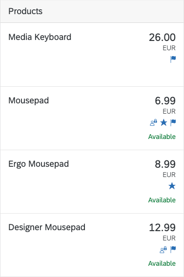
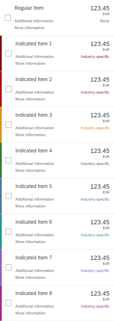
Object list item examples (with attributes, status, locking, flag, and favorites)
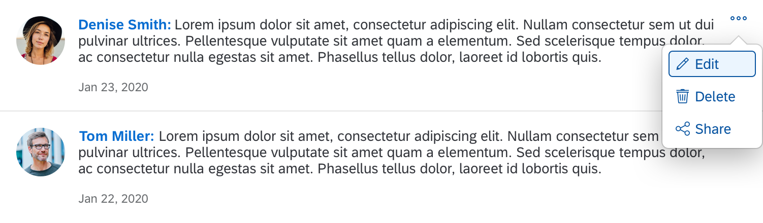
Behavior and Interaction
List item behavior and interaction is similar for all list item variants and is therefore described in the list overview article.
Guidelines
- An icon in front of the title requires a lot of space. Ensure there is sufficient space available if you are planning to use one.
- This control can only throw one event. Therefore, object list items cannot contain an additional link.
- Display the date within the title in the long format and within the attributes in the medium format.
- Avoid long descriptive texts. They may not be displayed due to truncation.
Resources
Want to dive deeper? Follow the links below to find out more about related controls, the SAPUI5 implementation, and the visual design.
Implementation
- Object List Item (SAPUI5 samples)
- List (SAPUI5 samples)
- Object List Item (SAPUI5 API reference)
- List (SAPUI5 API reference)


 Your feedback has been sent to the SAP Fiori design team.