
Multi-Instance Layout
The multi-instance layout allows the user to display and edit multiple objects within one page.
Beforehand, the user selects the objects from another page, usually a list report or a table. Each object then appears on a separate tab.
As a result, the user can work on several objects simultaneously and switch between them easily.
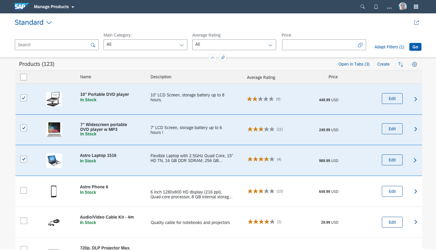
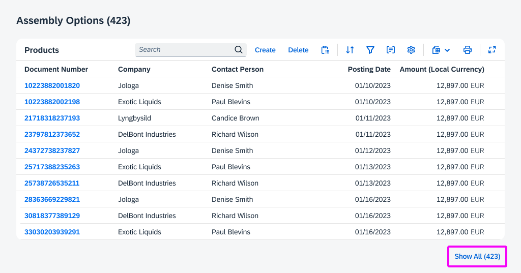
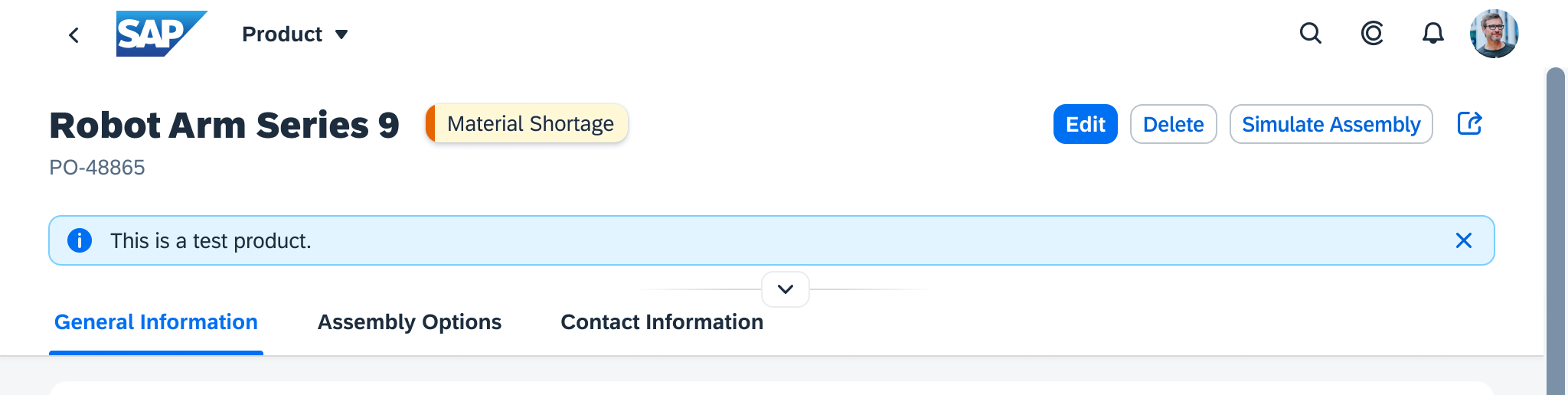
1. Select items in a list report

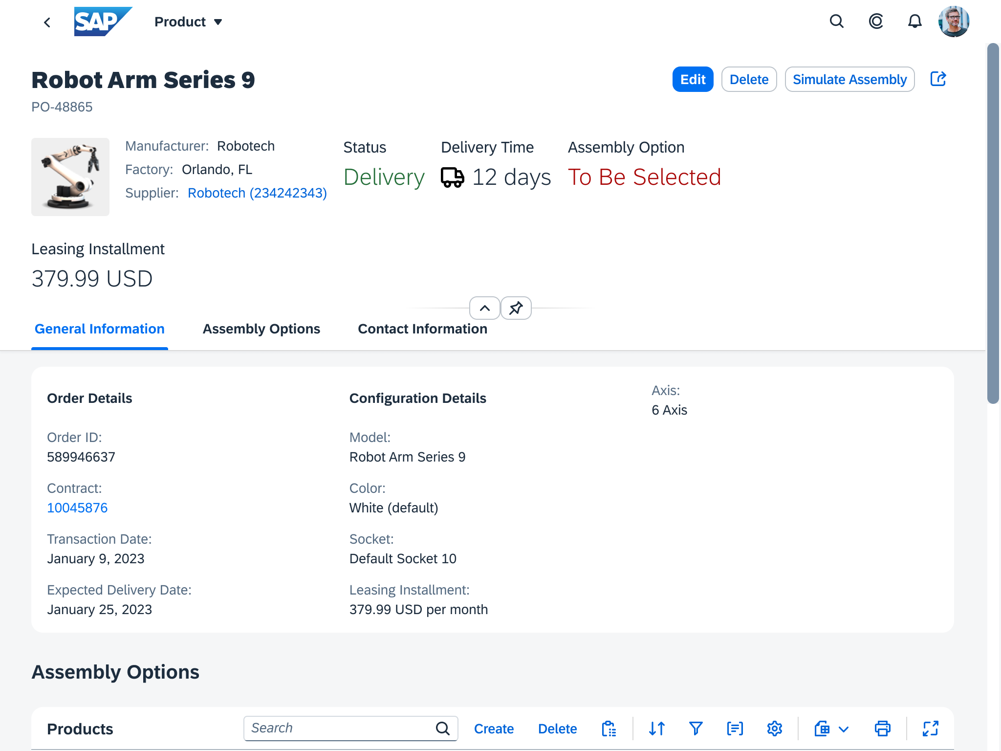
2. New page with several editable tabs
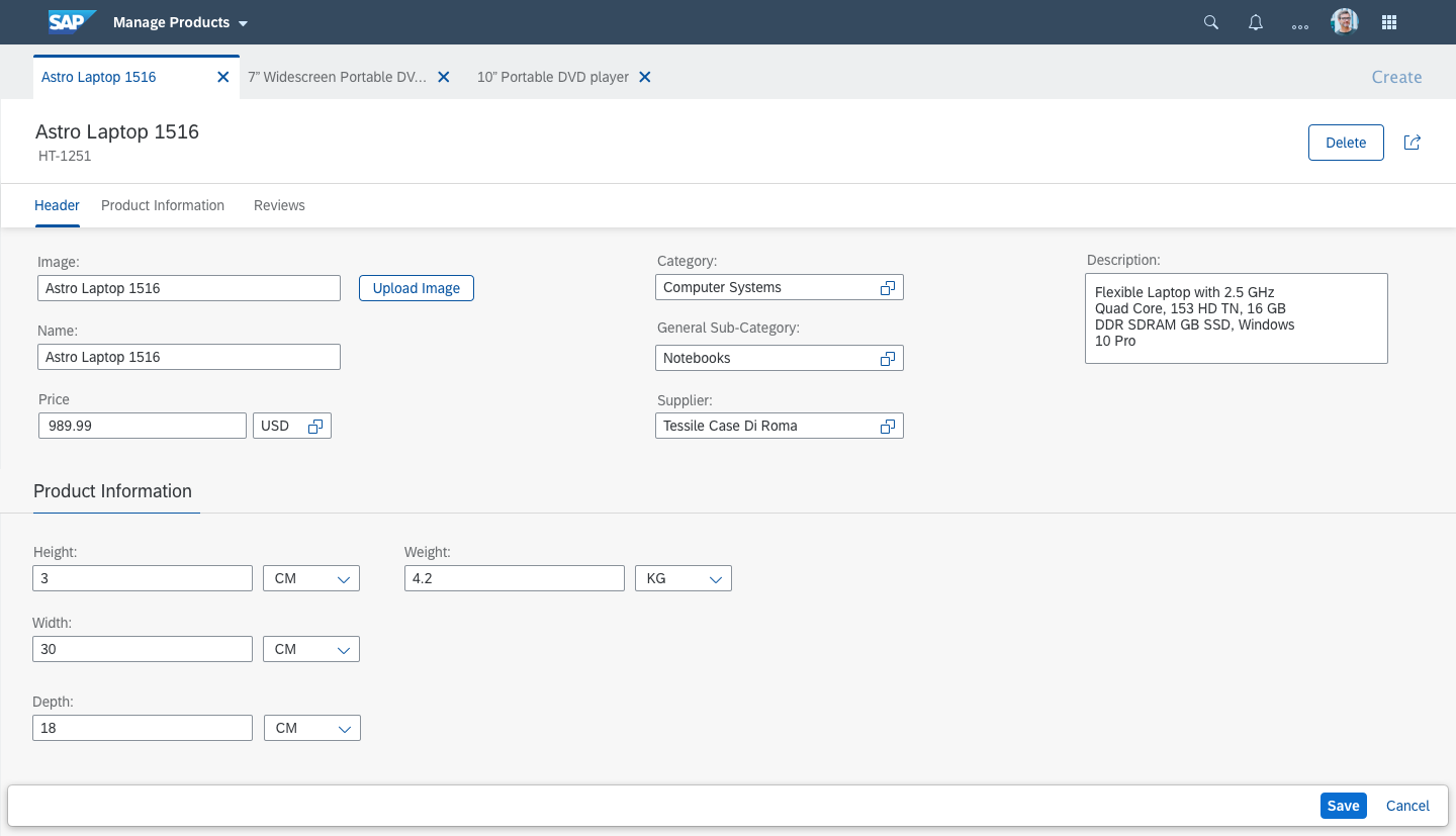
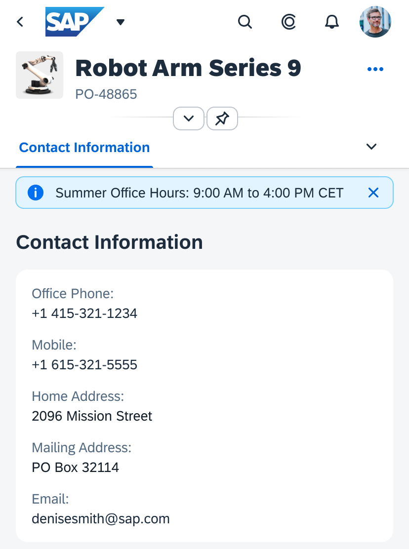
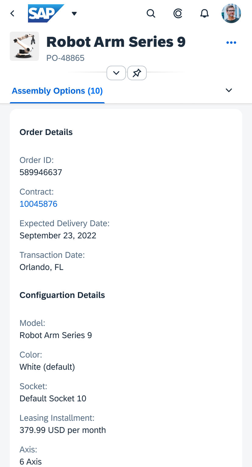
3. Tab in edit mode
Usage
Use the multi-instance layout if users need to open and edit multiple objects simultaneously.
Do not use this layout if your users need a side-by-side display on the same page. Use the comparison pattern instead.
Components
The multi-instance layout uses a tab container.
The content of each tab is managed using an embedded object page floorplan.
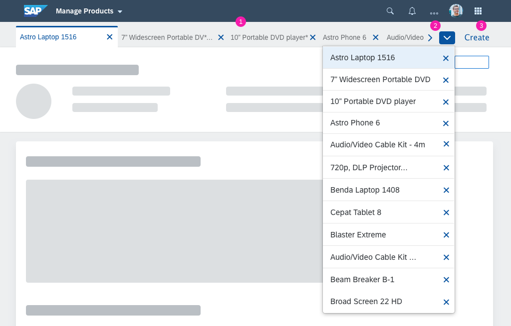
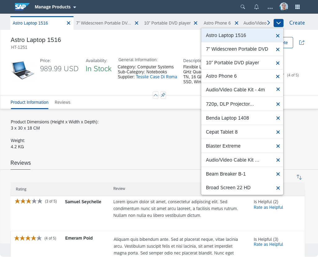
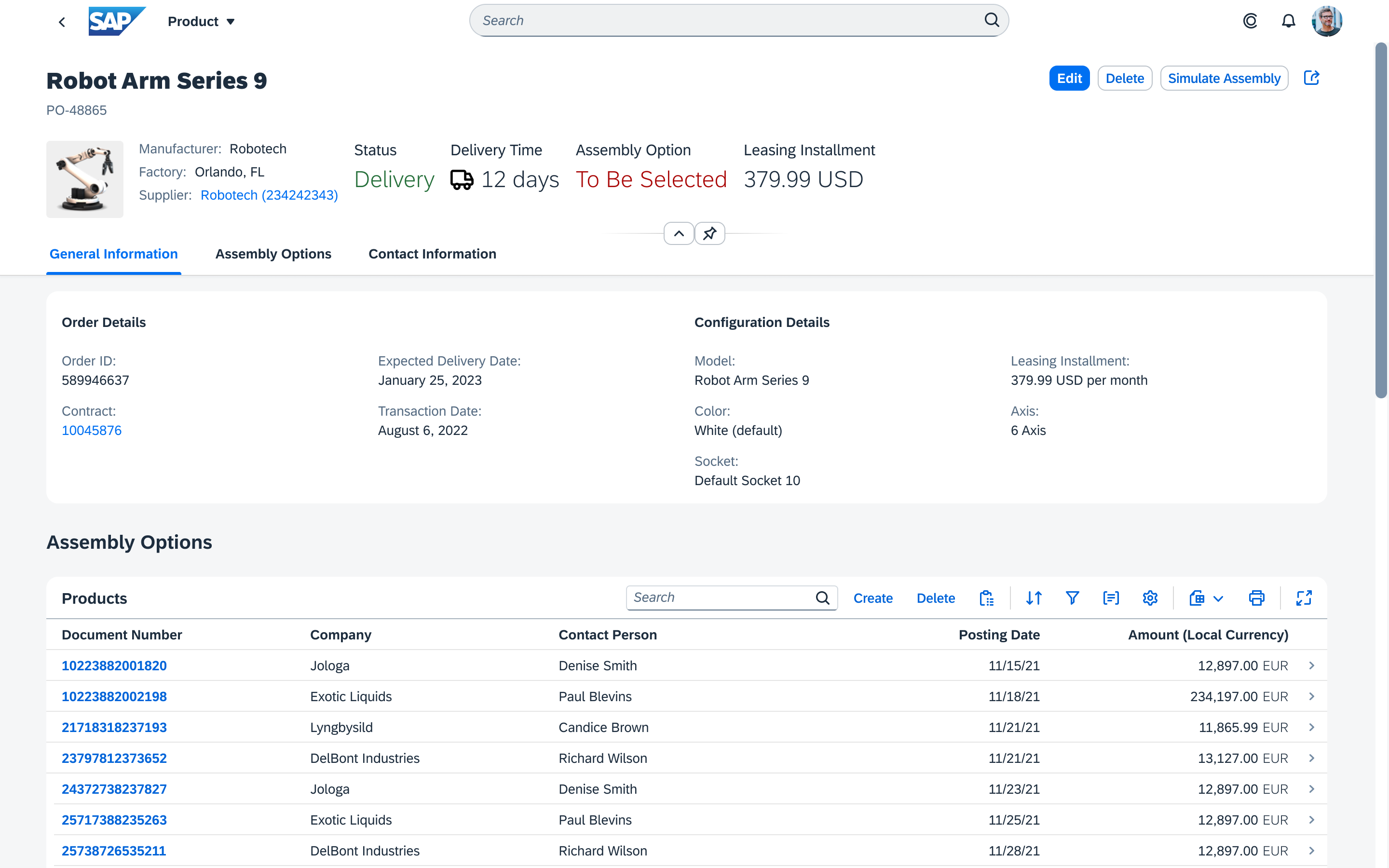
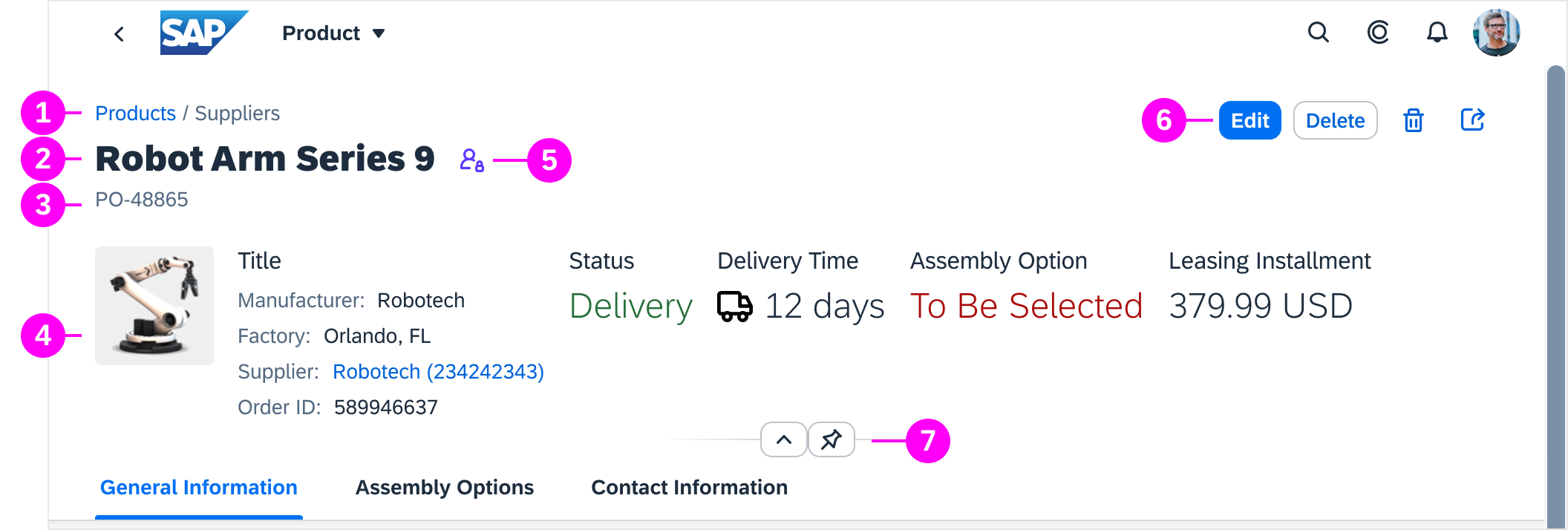
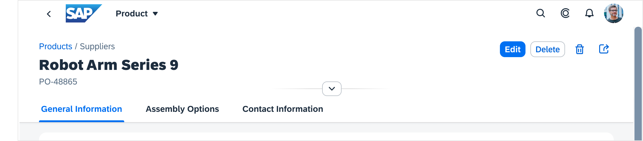
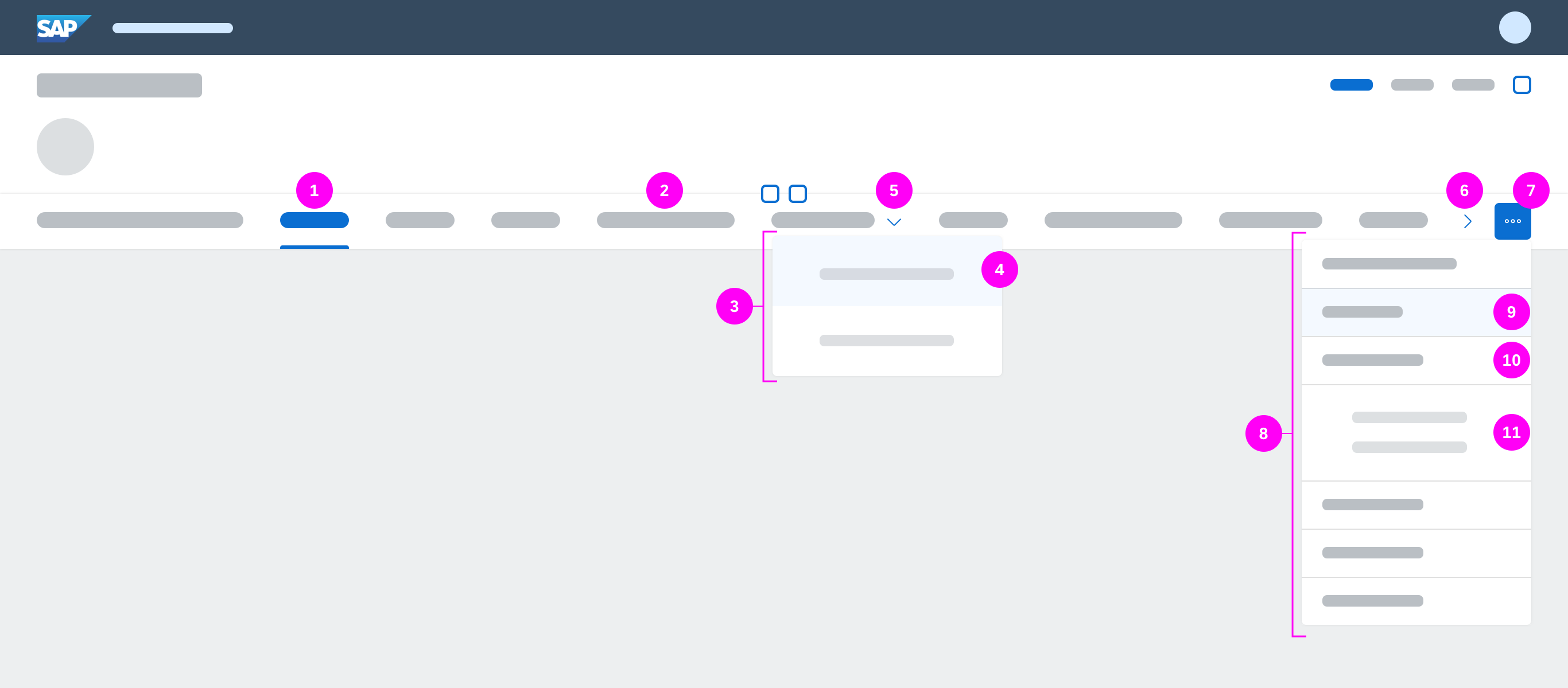
Components of the multi-instance layout
The tab container holds:
- Opened tabs
- Scroll buttons and overview list (if not all tabs can be shown on the screen)
- A Create button (optional)
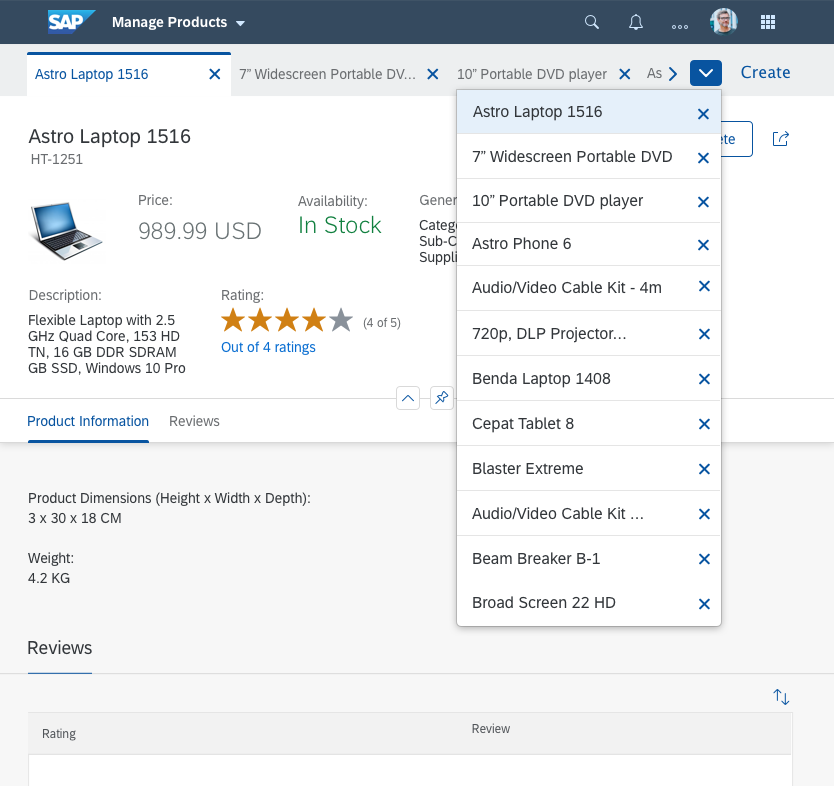
Tabs
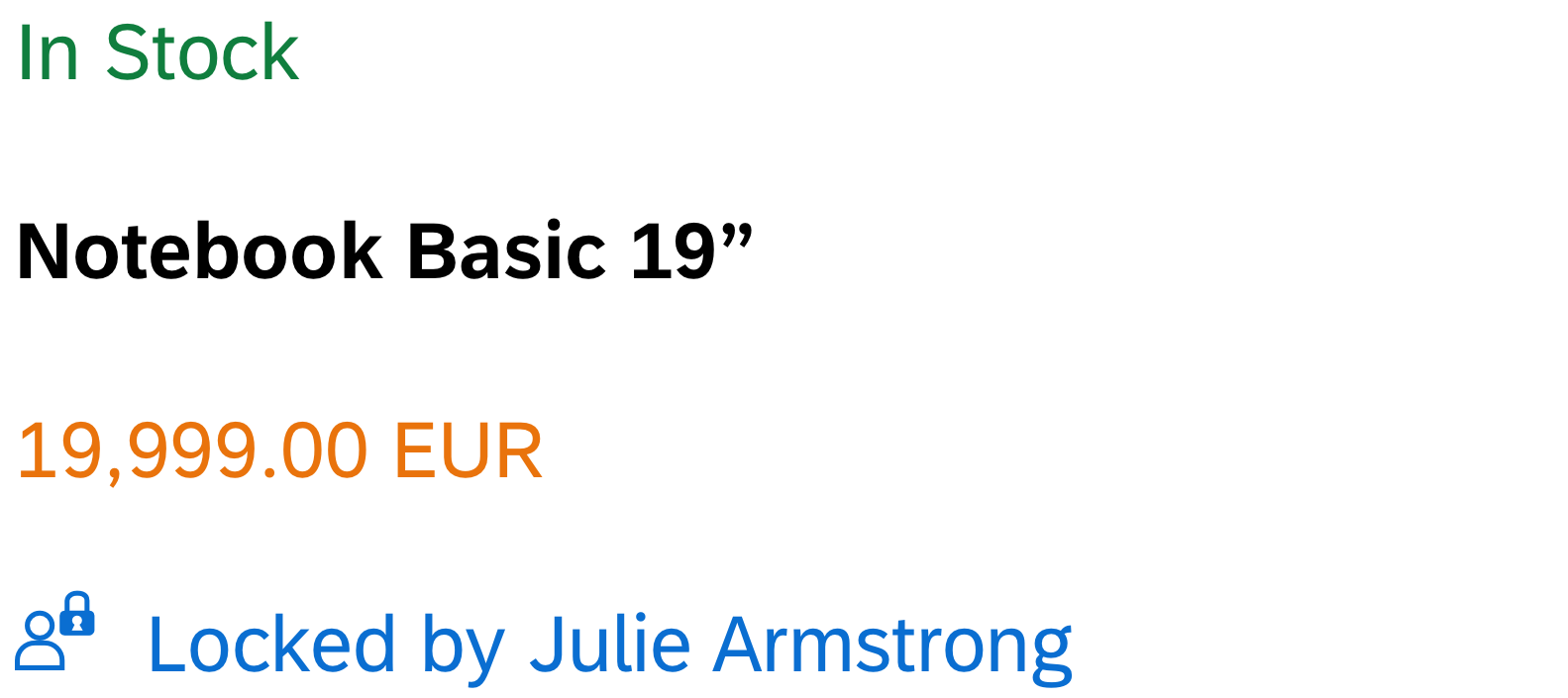
Each tab represents one object. One tab is always active, while the others are inactive.
The tab contains a title and a Close button:
- Title
ID or name of the object. If the title text exceeds 25 characters, it is truncated.
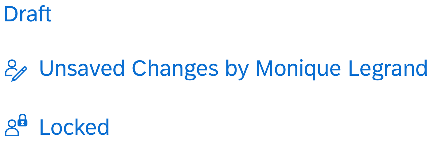
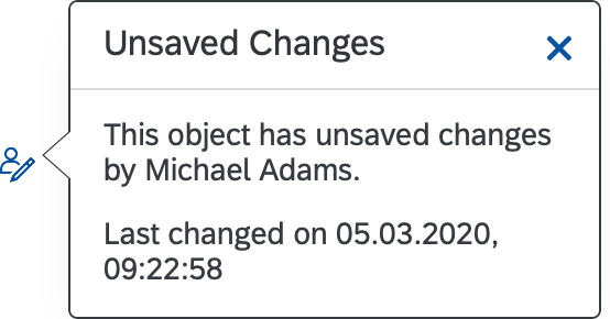
An asterisk next to the tab title indicates that the object was changed but not saved.
Guideline: Use the same title as in the object page. - Close button ( )
The Close button is shown on all tabs.
Guideline: If the user closes a tab without saving first, display a warning. See Handling Unsaved Changes.
Scroll Buttons and Overview List
The tab container has an overflow mechanism for cases where there are too many tabs to display on the screen:
- Horizontal scroll buttons ( and ) can be used to scroll back and forth through the tabs.
- An overflow menu lists all the tabs, including the hidden tabs.
“Create” Button
You can offer a Create button on the far right of the tab container. Selecting this button opens a new tab containing an empty object page.
Guideline: Only use this button if the application allows users to create new objects.
Behavior and Interaction
Opening Tabs
The multi-instance layout is always triggered from another page, such as a list report.
To work on multiple objects, users select the relevant objects and choose a triggering action, such as Open in Tabs (3). This opens a new page, in which the selected objects appear as tabs.
Closing Tabs
To close a tab, the user can click the Close ( ) button on the tab itself, or close the tab from the overflow menu.
Closing the Last Tab
When the last remaining tab is closed, the complete page is closed and the user is returned to the page from which the items were selected.
Handling Unsaved Changes
If objects have unsaved changes, the corresponding tabs show an asterisk (*) next to the title.
To prevent data loss, show a warning message in the following cases:
Case 1: The user tries to close a tab with unsaved changes.
Message type: Warning
Message text: Your changes will be lost when you close this tab.
Buttons: Close, Cancel
Warning: Closing a tab with unsaved changes
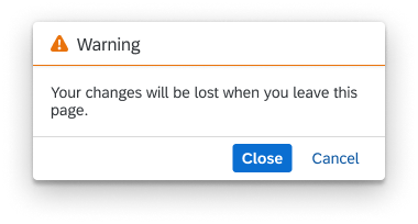
Case 2: The user tries to leave the page when one or more tabs have unsaved changes (by clicking the Back button or navigating to a different page).
Message type: Warning
Message text: If you leave this page, your changes to the following [objects] will be lost:
[Object 1]
[Object 2]
Buttons: Leave Page, Cancel
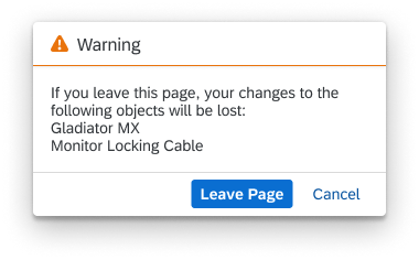
Warning: Leave page when tabs have unsaved changes
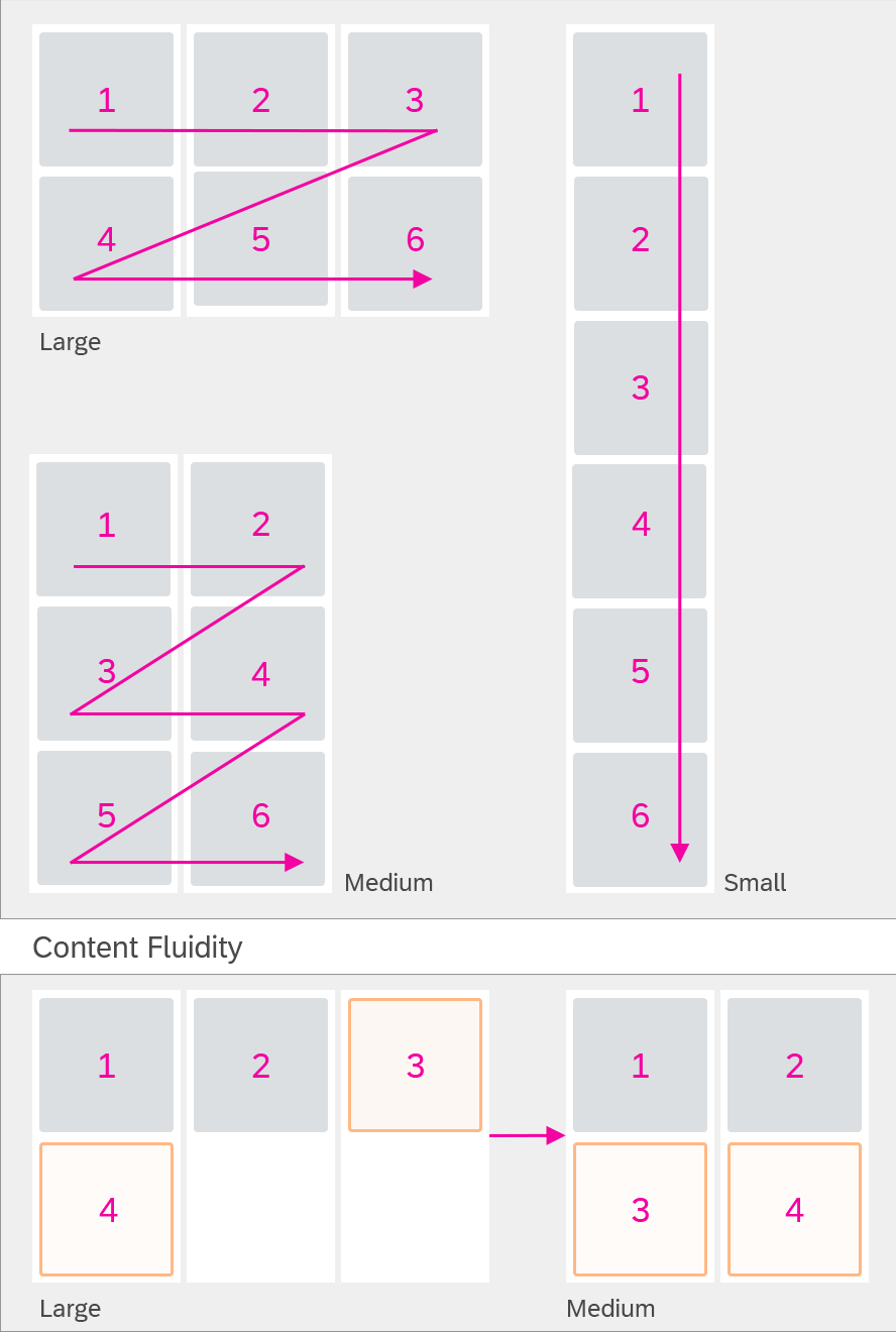
Responsiveness
The multi-instance layout is controlled by the sap.m.TabContainer control.
The tab container supports all three SAP Fiori responsive sizes: small, medium, and large.
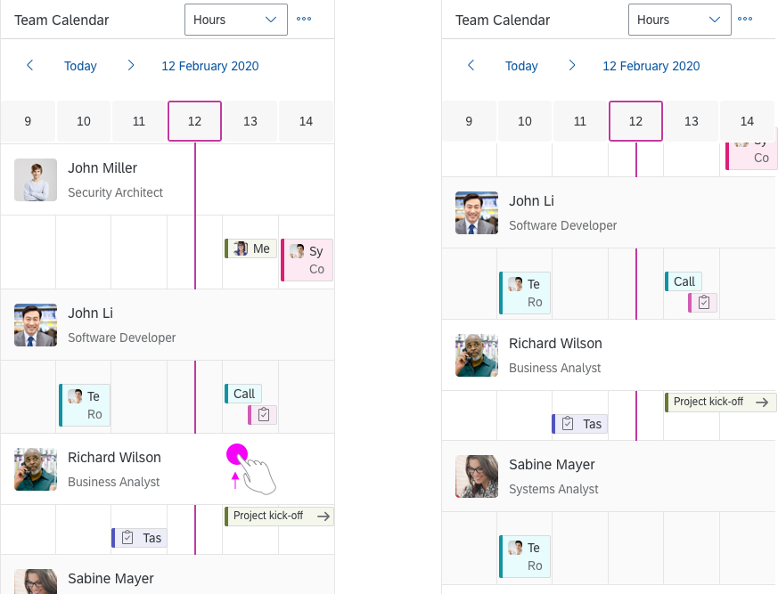
Size L
Size M
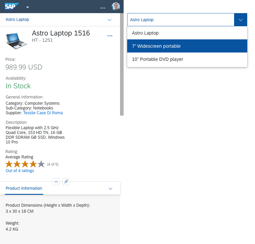
Size S
Top Tips
- To open the page containing the tabs, use a meaningful button text with the number of selected objects in brackets.
Recommended label: Open in Tabs (number of objects)
Example: Open in Tabs (3). - Use the same tab title as the object page title.
- Always use an object page floorplan to display the content of a tab.
- Only offer a Create button if the application allows users to create new objects.
Related Topics
Elements and Controls
- List Report Floorplan (guidelines)
- Object Page Floorplan (guidelines)
- Create Page Floorplan (guidelines)
- Message Handling (guidelines)


 Your feedback has been sent to the SAP Fiori design team.