Line Micro Chart

A line chart is a basic type of chart used in many fields. It displays information as a series of data points connected by a line. The chart is often used to visualize a trend over time.

The line micro chart supports up to three lines, but we recommend using only one. You can modify the color of each line using the qualitative color palette or semantic patterns for charts.

Line micro chart - Single line
Line micro chart - Multiple lines using semantic chart patterns
Line micro chart with semantic colors

Usage

Use the line micro chart if:

The line micro chart can be embedded into a tablelisttileor header.

  • You want to visualize the shape.

Use this option to show a trend or sparkline. By default, the chart is rendered in blue, but application developers can set any color for the chart using the names for semantic palette or names from the qualitative palette.

Line micro chart - Sparkline
  • You want to show data points that are above or below a certain threshold.

In addition to data points, you can use two different colors for the lines. When the micro chart displays only one line, we recommend that you use only semantic colors, such as green for values above the threshold, and red for values below the threshold. When two or three lines are displayed, on the other hand, we recommended that you use one color per line to ensure clarity and avoid visual clutter. Note that the threshold can also be set to zero.

Line micro chart - Data points above and below a threshold
  • You want to show focus points.

Use this option to display a trend or sparkline to focus on several special values, such as the first and/or last value of the chart. By default, the chart is rendered in blue, but application developers can choose another color for the chart line and data points from the qualitative palette. Note that the threshold can also be set to zero.

Line micro chart - 2 focus points
  • You want to show focus points with semantic colours.

Use this option to display a trend or sparkline to focus on several special values with a semantic meaning, such as the first and/or last value above or below a certain threshold. Note that the threshold can also be set to zero.

Line micro chart - 2 focus points with semantic colors

Do not use the line micro chart if:

  • You have scenarios that do not depict time periods.
  • You need to show more than three lines.

Responsiveness

The Line micro chart is fully responsive. The size adjusts dynamically based on the dimensions of the parent container. In addition, there are also four fixed sizes – L, M, S and XS. Each fixed size is a snapshot of the fully responsive micro chart for specific dimensions.

Line micro chart - Size L
Line micro chart - Size M
Line micro chart - Size S
Line micro chart - Size XS

You can use the smallest XS size to embed the line micro chart in table cells of the grid tableanalytical table, or tree table (also in condensed mode). When displayed in a table cell, the line micro chart should be left-aligned.

Line micro chart in XS size in the grid table

Maximum and Minimum Sizes

The line micro chart can have the following dimensions:

Width Height
Maximum 320 px 94 px
Minimum 64 px 18 px

If the height of the chart is less than 56 px, the labels are hidden.

Layout

Line Micro Chart in a Tile or Facet

You can embed the line microchart with all its features in a tile or header facet. The chart uses the full height and width of the control.

Note: If the threshold is not zero, the title of the tile or header facet should clearly express the value of the threshold (for example, “Values above/below 50”).

Line micro chart in a tile with data points above and below the zero threshold
Line micro chart (sparkline) in a tile with no semantic meaning
Line micro chart in a tile with focus on first and last data points
Line micro chart in a tile with a semantic focus point and KPI value

Line Micro Chart in a Table or List

You can embed a line micro chart with all its features in a table or list.

Note: If you intend to synchronize the chart visualization, use the manual scale.

Line micro chart in a table with values above and below a threshold
Line micro chart in a table - Smaller size
Line micro chart in a table with 4 focus points - First/last and min/max value
Line micro chart in a table with data points hidden

Components

To present the line micro chart in the most useful way, application developers can set several properties.

Data points

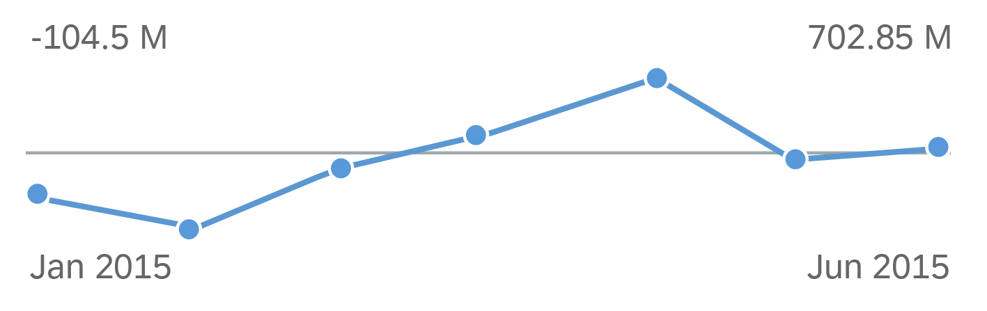
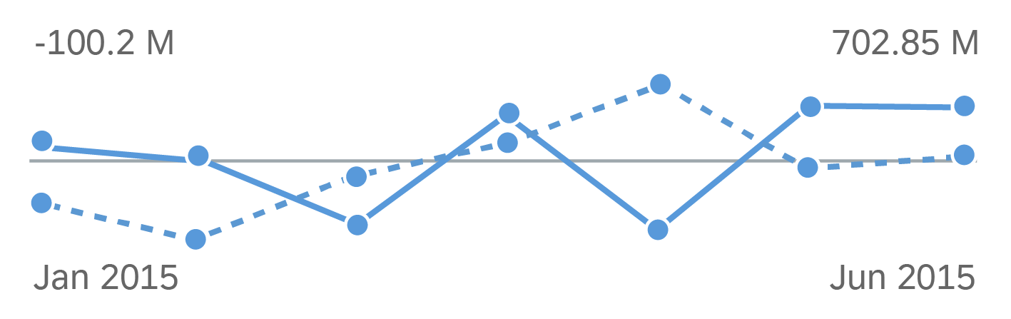
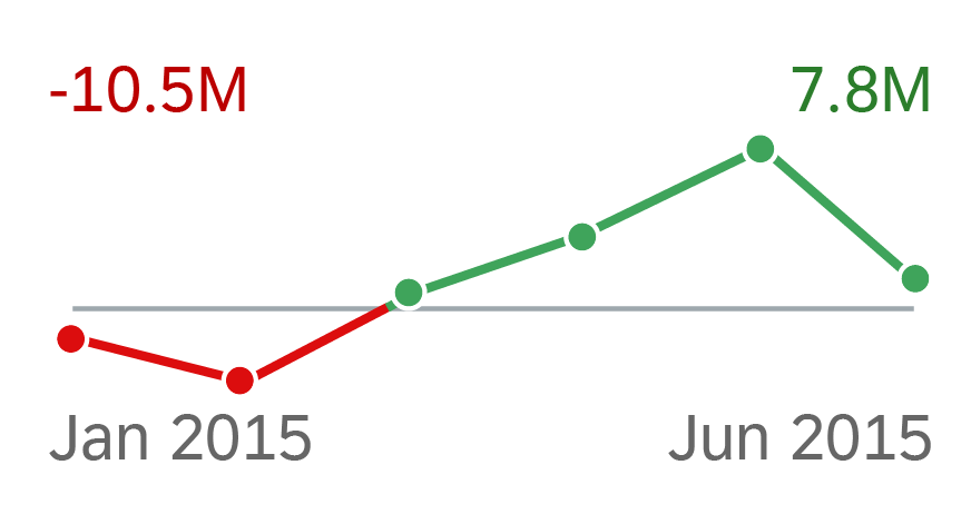
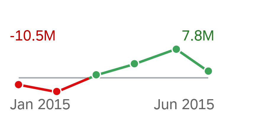
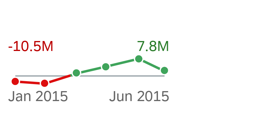
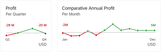
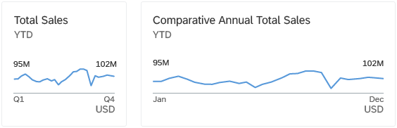
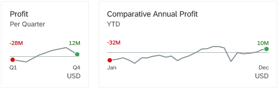
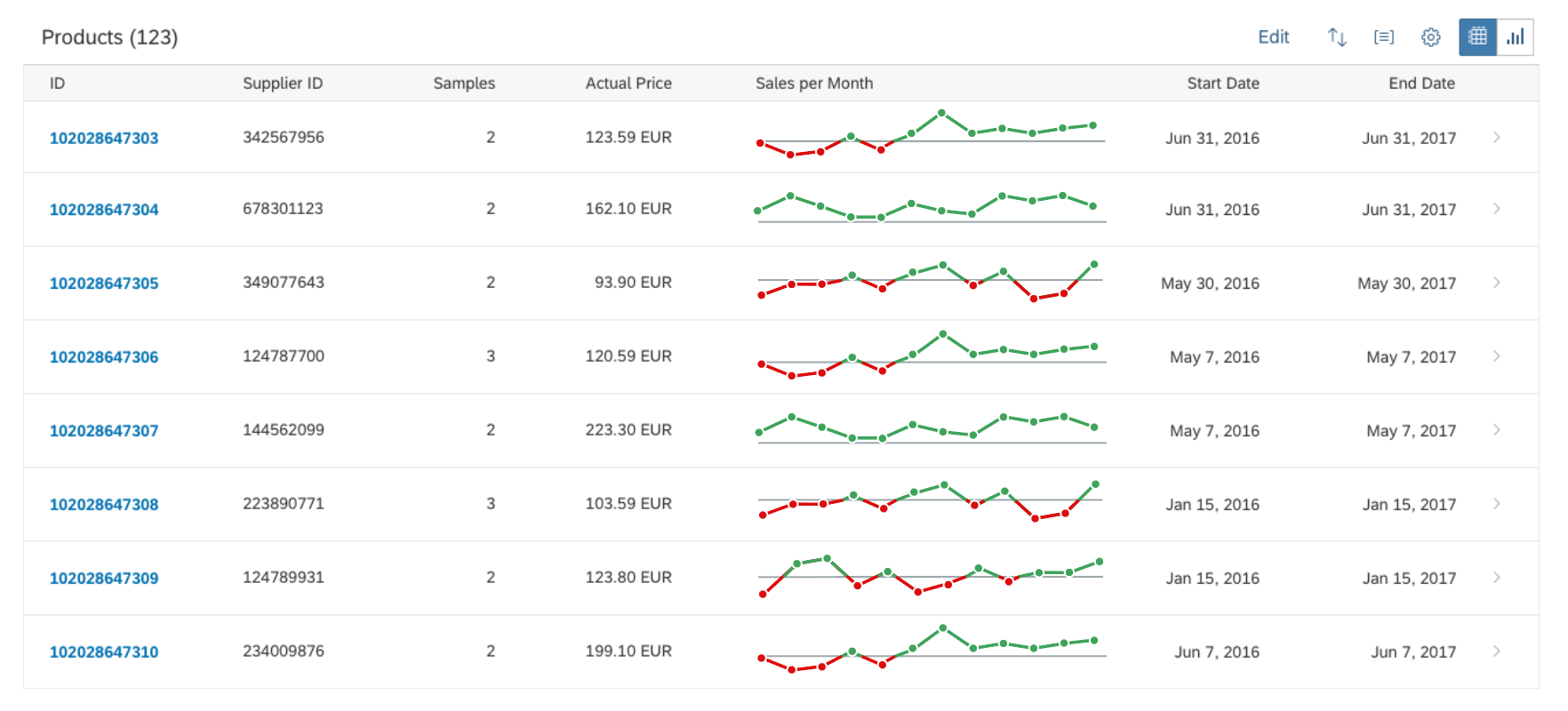
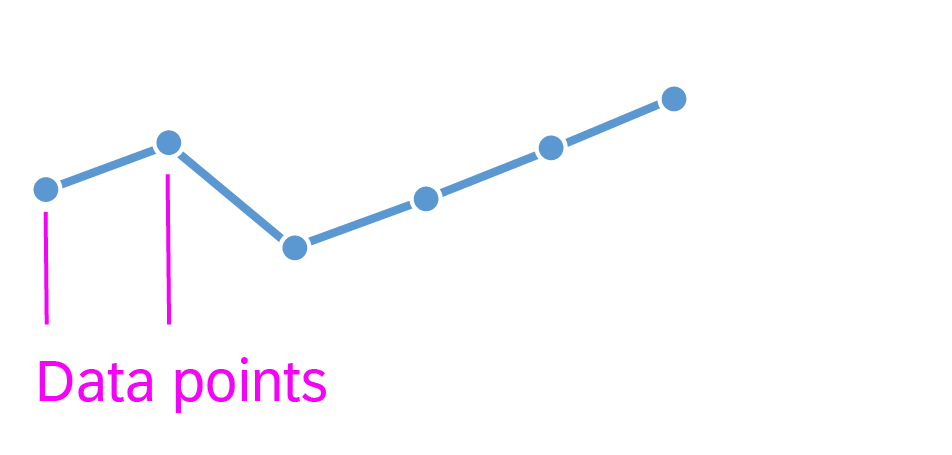
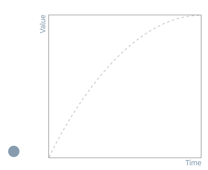
The line micro chart can display or hide data points. To display data points, we recommend that you use 4 (for quarters) to 12 (for months) data points per chart. The responsive behaviour of the chart hides data points if there is not enough space to display them (for XS size and smaller).

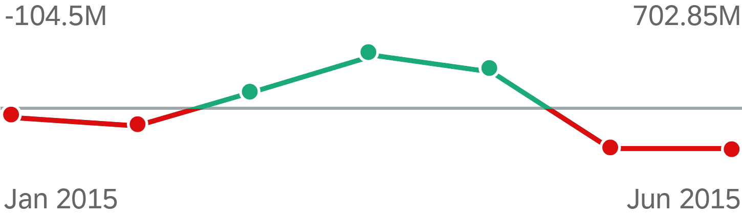
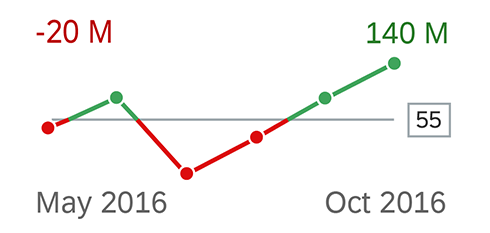
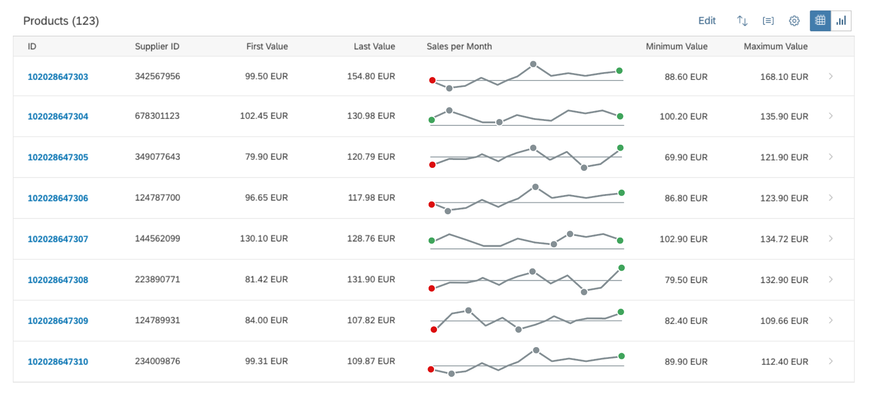
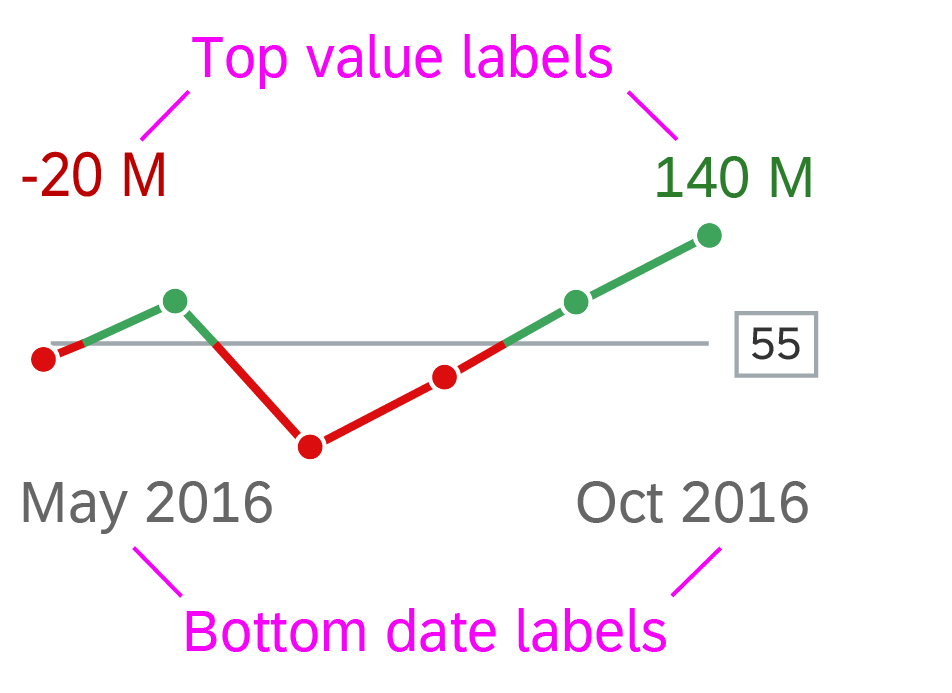
Data points with a semantic meaning can use colors defined by the semantic color palette (green, orange, or red).

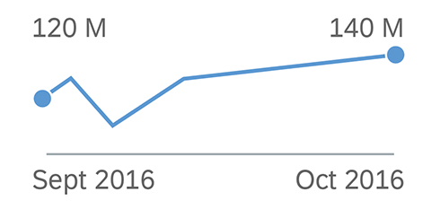
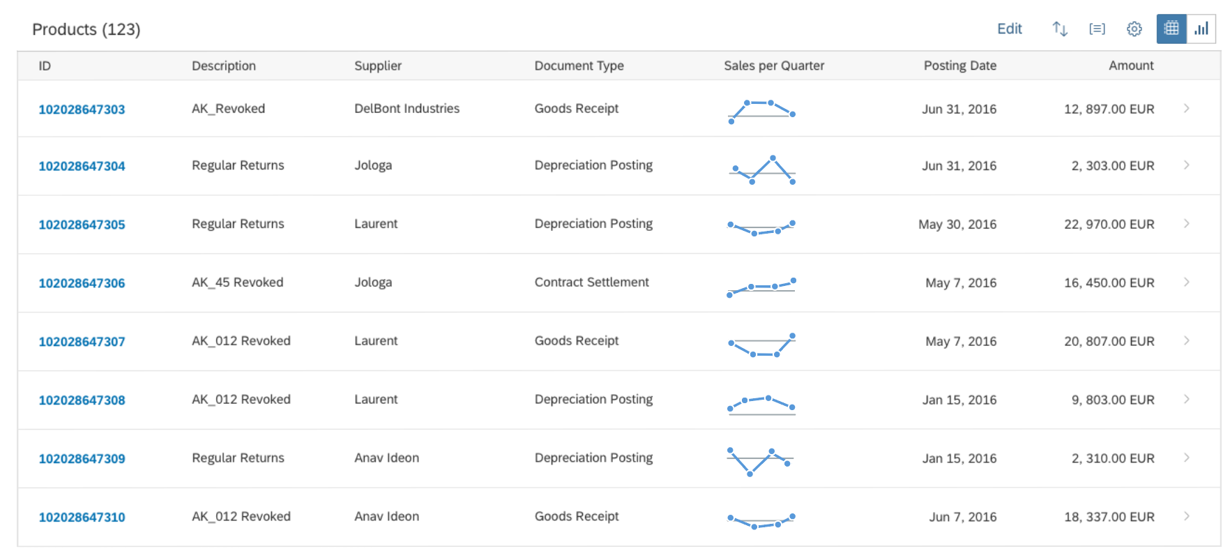
If data points do not have a semantic meaning, the line is colored blue by default, but application developers can assign any color from the qualitative palette.

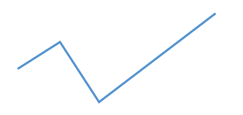
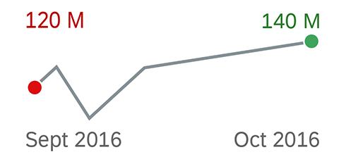
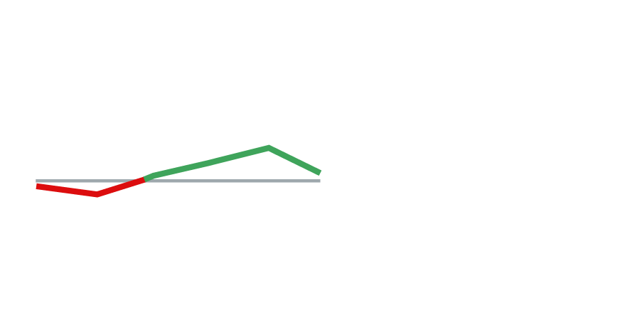
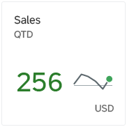
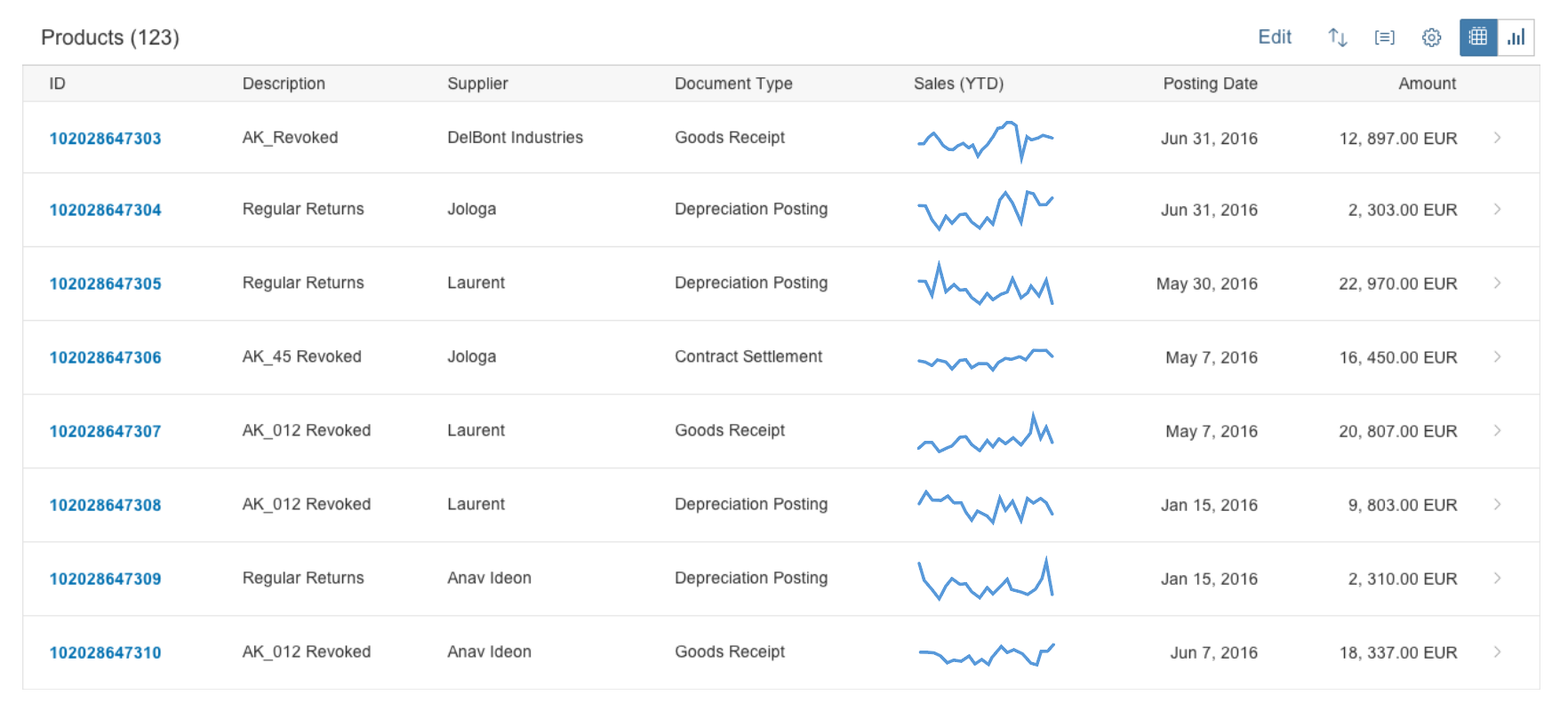
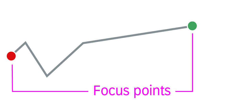
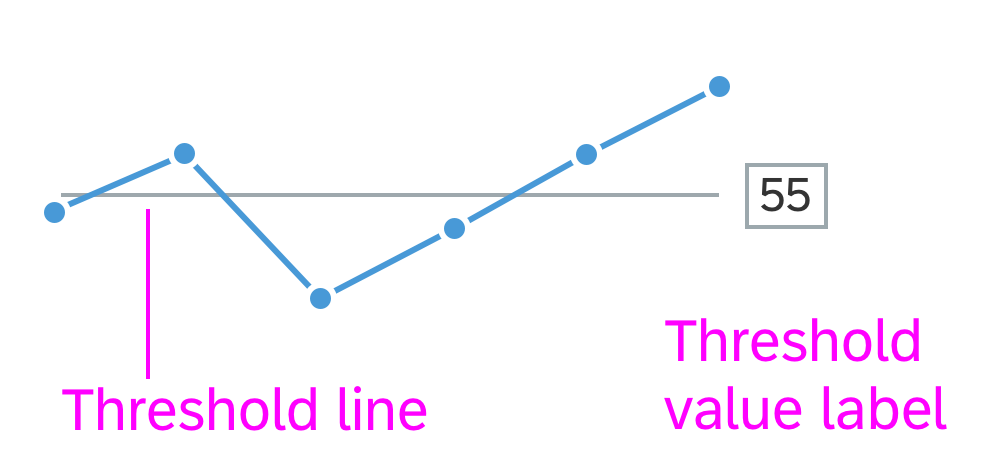
Alternatively, you can show a line-only chart, with all the data points hidden. In this case, you can use up to two colorper line in the chart. If the values relate to a threshold, we recommend using semantic colors for the line to highlight values above or below the threshold.

Line micro chart - Data points

Focus points

Unlike data points, focus points highlight specific values, such as the first and/or last value of a time series. Neutral focus points are coloured blue. Focus points with a semantic meaning can be colored using the semantic colors (green, orange, or red). The responsive behaviour of the chart hides focus points if there is not enough space to display them (for XS size and smaller).

Line micro chart - Focus points

Threshold

You can set a threshold line. If the threshold isn’t zero, include its value in the title of the tile, header facet, or column in lists and tables to ensure that the chart is not misleading for the user.

There is also an optional threshold value label. The threshold value is hidden if it takes more than 50% of the chart’s parent container. The threshold value is shown only when the threshold line is displayed.

Line micro chart with threshold line and threshold label

Labels

The labels for the line micro chart are optional. Use the bottom labels to indicate the beginning and the end of the time period. Use the top labels to show the corresponding values for the beginning and the end of the chart. When the chart includes more lines, the smallest values appear in the beginning and the largest values at the end of the chart (across lines). The responsive behaviour of the chart hides labels if there is not enough space to display them (for XS size and smaller or if If the chart height is less than 56 px). Ensure that the labels for the values are not truncated.

Line micro chart with labels

Resources

Want to dive deeper? Follow the links below to find out more about related controls, the SAPUI5 implementation, and the visual design.

Elements and Controls

Implementation

PDF Viewer

The PDF viewer control displays PDF documents within your app. It can be embedded in your page layout, or you can set it to open in a popup dialog. In addition, this control allows you to print and download the PDF documents it displays.

Usage

Use the PDF viewer control if:

  • You want your app to display PDF files on all devices and platforms.
  • You want the users of your app to be able to preview their documents as PDF files right inside your app.
  • You need to ensure the consistent behavior of PDF files across all SAP Fiori apps.
  • You need to work with events (loaded, validation, error) provided by the PDF viewer.

Do not use the PDF viewer if:

  • You need to provide an interactive PDF file (such as a data input form).

Responsiveness

The PDF viewer control is fully responsive on large-screen devices (size L). The range of responsive behavior available on desktop devices depends on the display mode.

  • When the PDF viewer opens in a dialog popup:
    By default, the dialog supports two or more actions, such as Close and Download. On large-screen (desktop) devices, the action buttons are right-aligned. Use compact mode to ensure optimal padding and margins on desktop devices.
    If the content height is increased beyond the screen height, the dialog height cannot go beyond 4 rem from the top and bottom of the screen.
    The dialog popup must be resized automatically and cannot support dragging or custom resizing.


  • When the PDF viewer is embedded in a container on the app page:
    The dimensions of the frame in which the PDF file is displayed are defined by the PDF viewer properties.
    The control in which the PDF viewer is embedded must have at least 1 rem (16 px) padding to set it apart from the rest of the content.
    Only vertical scrolling is allowed. The behavior of desktop touch devices should follow the default behavior of the device or platform.

On mobile devices (smartphones and tablets), the PDF viewer control renders a toolbar with the title and a download icon, which behaves as a standard device/browser file link.

If required, you can customize the behavior for mobile devices and trigger the default device action for the file link from a different anchor in the application.

Size L - Popup mode
Size L - Popup mode
Size L - Embedded mode
Size M - Tablet
Size M - Tablet
Size S - Mobile
Size S - Mobile

Layout

Displaying PDF Files in a Dialog

The dialog is positioned in the center of the screen. It opens in a modal window to attract the user’s attention when it displays emergency states. The dialog consists of:

  • A dialog header
  • A dialog PDF content
  • A dialog footer

Displaying Embedded PDF Files

The secondary mode of the PDF viewer displays PDF files directly on the page. The application owner, using the PDF viewer control, provides the dimensions of the frame in which the PDF file is embedded. The container should have at least 1 rem (16px) padding from the other content on the page to allow users to distinguish between the embedded PDF and the rest of the page’s content.

When the PDF viewer is embedded on the page, it comprises:

  • An overflow toolbar header
  • A container for rendering the PDF file (determined by the application owner)
Schematic visualization of popup mode
Schematic visualization of embedded mode
Developer Hint
The footer can be extended by any desired buttons. However, both the Close and Download buttons must be displayed. This is to ensure that the accessibility requirements are fulfilled. Additional information about action placement and order can be found in the Action Placement article.

Components

The PDF viewer in popup mode is rendered within a Dialog and consists of:

Title(Header): The title text appears in the dialog header.

Content: This area contains the actual PDF file displayed within the content of the dialog.

Footer with actions: The footer contains two mandatory buttons: Close and Download. Other actions can be added to the footer as well.


The PDF viewer in embedded mode can be rendered in any container desired by the application.

The title is displayed within the Toolbar (Overflow Toolbar).

Developer Hint
Use a Flexbox container to wrap the embedded mode of the PDF viewer inside the application.

Behavior and Interaction

All the interactions for the PDF files themselves must remain the same across platforms and browsers: paging, scrolling, zooming, and print must all be available.

Download – For accessibility reasons, the PDF viewer always provides an additional download button for downloading the displayed PDF file and gives users the option to download the embedded PDF renderer on a specific device or system (not all PDF reader plugins have their own download button).

Popup mode interactions:

  • No custom resizing of the dialog
  • No dragging of the dialog

Guidelines

To avoid the risk of performance issues, do not embed more than three instances of the PDF viewer per page. You may embed more instances of the PDF viewer in one page if the number of PDFs does not affect performance. Carry out benchmark tests to ensure that performance will not be affected.

The PDF viewer can be used within other sap.m components, such as carousel and panel, respecting the specific guidelines of these components.

The embedded mode of the PDF viewer can be used on the Object Page if the container is as wide as the object page. If this is not the case, use the popup mode of the PDF viewer instead.

The PDF viewer can provide accessibility options when used with screen readers and other accessibility software. To ensure that all the accessibility options are supported, you need to have Adobe PDF Reader installed.

Resources

Want to dive deeper? Follow the links below to find out more about related controls, the SAPUI5 implementation, and the visual design.

Elements and Controls

Implementation

Motion Design

Motion design is a design method that applies animation and visual effects to user interface design. It expands the conventional design space with a time dimension that makes it an ideal medium for storytelling. In the context of SAP Fiori, motion design and microinteractions work together to provide our users with a coherent user experience.

Starting with the big picture, and extending into the smaller details, motion design modernizes the SAP Fiori design language. It helps to make apps simpler, more effective, and more delightful to use, contributing to one look and feel across all SAP Fiori applications.

Motion Design Principles

We’ve established handy motion design principles to follow when designing animations in SAP Fiori:

We’ll look at each of these principles in turn in the sections below.

Duration

Based on research from previous studies and our findings from testing with prototypes, we have defined four duration classes for SAP Fiori animations:

Different animations are grouped in these classes to define the correct duration for each use case.

How do we define animation duration?

The average eye movement takes 230 ms (based on research ranging from 70-700 ms). We classify our generic animations on a scale from 0 ms to 500 ms. If the duration exceeds 500 ms, we speak of “continuous animation”.

Motion design animation durations for SAP Fiori

Immediate response (< 150 ms)

This duration applies when the user directly manipulates the content. If animation of this type is needed (for example, to show a hover effect, down state, or drag & drop), the device must react instantaneously and the animation should last no longer than 150 ms.

According to the Nielsen Norman Group, 0.1 s is the response time limit for users to feel like they are directly causing something to happen on the screen. For example, to give users the impression that they are manipulating the table directly, the time it takes between the user clicking a table column and the column being highlighted should be no more than 0.1s. Ideally, this would also be the response time for sorting the column. Users then feel that they are sorting the table, rather than ordering the computer to do the sorting for them.

Example: Drag and Drop on list

Small Moves (150 ms – 250 ms)

In some cases, the application responds to an interaction so fast that users can lose track of what’s happening on the screen. To present the feedback in a more natural way, we show short animations when elements move between positions or states.

It is important to keep these animations simple and short, because:

  • They reflect a small change on the screen.
  • The user should not have to wait.
  • It is very likely that the user will see these animations frequently.
  • The main purpose of the animation is to enable the user to track a change.
Example: Action sheet - Animations should not make users wait

Large Moves (250 ms – 500 ms)

If you need to depict a large movement on the screen, use a longer animation duration to avoid fast flashing movements.

Continuous Animations (500 ms – ∞)

The duration of these animations is unpredictable. Anything that takes less than a second should be reflected on the screen as fast as possible. However, some interactions have unknown response times. Placeholder animation is a typical example of a continuous animation.

Example: Placeholder for loading content

Easing

To enable natural movement for screen elements, most coding languages and animation tools offer functions for easing. To understand the term “easing”, we need to break down the main components of motion.

Motion or movement is described by the position and time. For a given initial position at time “0”, movement is the the change in the position value over time.

  • Position value: The position value is expressed numerically for a certain time, and can be one of the following properties:
    • Position (space)
    • Scaling
    • Rotation
    • Alpha
  • Time: To standardize motion for practical purposes, the time is generally measured in positive numbers. At any moment in time, there is a position value.

Curves and Transition Timing

The property for the transition timing function specifies the speed curve of the transition effect. This property allows a transition effect to change speed over its duration.

The duration defines the total duration of a transition from state A to state B, whether the transition involves scaling, distorting, rotating or modifying the style of an element. The transition timing function defines the rate at which the transition is carried out, which can involve speeding up and slowing down.

The transition timing function uses Bézier curves to describe how the animation will proceed over time. You can either use predefined easing settings for the common functions, or specify the control points for a cubic Bézier function to have full control over the transition function. CSS transitions and animations support easing, formally called a “timing function”. The common easing types are:

  • Ease-in
  • Ease-out
  • Ease-in-out
  • Linear

Ease-In

Easing Type Description Protocol
Ease-in The animation starts slowly and finishes at full speed. cubic-bezier (0.65, 0, 1, 1)


Ease-Out

Easing Type Description Protocol
Ease-out The animation starts at full speed and finishes slowly. cubic-bezier (0, 0, 0.35, 1)


Ease-In-Out

Easing Type Description Protocol
Ease-in-out The animation starts slowly, reaches its maximum speed in the middle of the animation, then finishes slowly. cubic-bezier (0.5, 0, 0.5, 1)

Linear

Easing Type Description Protocol
No easing No acceleration is used. Use this type only for changes in opacity. cubic-bezier(0, 0, 1, 1)

Direction and Orientation

The direction and orientation determine how elements behave within SAP Fiori.

  • Direction gives users the ultimate sense of where an object is coming from, and where it is going to.
  • Digital elements use 3-axis directions (x,y,z) to emulate real-life movement.
  • Spatial cases without direction, such as popups, use other animiation methods when rendered on the screen (for example, fading).

The examples below illustrate the principle of direction.

Move Elements

In this case, objects are repositioned. Elements enter, exit, or remain on the screen. The direction defines the spatial placement of the element according to its purpose.

  • Used for: Swipe, slide, switch, page/gallery indicators, saving elements.
  • Logical movement: Elements that come in and out of the screen should follow a consistent pattern.
    • If an element moves out, and then back in, it must come in from the place it initially moved out to.
    • If an element moves in, and then back out, it must return to the place it initially moved in from.

Stack Elements

When elements are stacked, one action is placed over another. Here, direction is used to help users follow the way elements are spread on the screen (spatial placement).

  • Used for: Elements that expand/spread or collapse/pile up, open/closed elements with a point of interest.
  • Logical movement: If elements come into the group of elements in a certain order from a certain place, they should leave the group in the same way.

Rotate Elements

Elements can rotate as long as this serves a meaningful purpose, and is not just a normal transition for showing content.

  • Used for: Rearranging elements on the screen, device rotation.
  • Elements that have a radial design can take advantage of this property, which uses direction to express values or states.
  • Logical movement:
    • For 2D rotation, use radial values appropriately (clockwise, anticlockwise).
    • Avoid 3D rotations (for example, flip or page turn).

Choreography

By combining easing, duration, and direction, you can design precise movement sequences. This is known as choreography.

Choreography relates to the sequential movements, steps, and patterns composed for a single element or set of elements on the screen. Elements on the screen appear, disappear, and behave in certain way, depending on their depth on the screen, their importance, and the message they convey. The word choreography literally means “dance-writing”. In the context of motion design, this refers to a series of planned situations that are linked to create consistency and harmony.

Entry and Exit Animations

Often, the entry behavior of a certain element will vary from the exit behavior of the same element. This is because entering the screen has one flow and purpose, and exiting may have another. For example, when a dialog is opened, the animation should last 150 ms, since the purpose of the animation is to reflect the change on the screen. However, closing the dialog should last only 50 ms to avoid waiting situations.

Example: Dialog container

Choreography Behaviors

The choreography behaviors below allow you to optimize your motion design.

Offset

Example: Dialog
Example: Dialog

Combining spatial offset and direction allows you to connect an element to the part of the screen it belongs to.

Objects can use animated offset to demonstrate their parent group or hierarchy, and to show where they are coming from and where they are going to.

Delay

Example: Notification cards with a delay of 50 ms

Delays support usability by visually separating one element (or set of elements) from another.

You can delay the duration of each single element in a group of elements by specifying a delay for the start of an animation. Animating each element with a slight of delay creates depth and a visual understanding that these elements, while still acting as a group, are independent of one another.

Conditional Delay

Example: Navigation container, slide in-out and fade animations

With a conditional delay, the system waits for a certain action or animation to complete (onComplete) before playing the next one.