
Overview Page – Resizable Card Layout
Unlimited Possibilities for Designing Cards
The resizable card layout is a layout for the overview page. It enables users to define a personalized card layout by changing not only the position of a card, but also its size, and thus how the card content is presented.
This layout gives users much greater flexibility in tailoring the overview page to their specific business needs. And it allows app teams to offer varying levels of detail for any given card. Whenever the size of a card changes, the content adapts automatically to show the most relevant information in the available space.
At a Glance
- Flexible card dimensions (grid-based)
- More flexibility to define individual card layouts
- Responsive and adaptive card content
- Applying progressive disclosure principles

Overview page – Resizable card layout
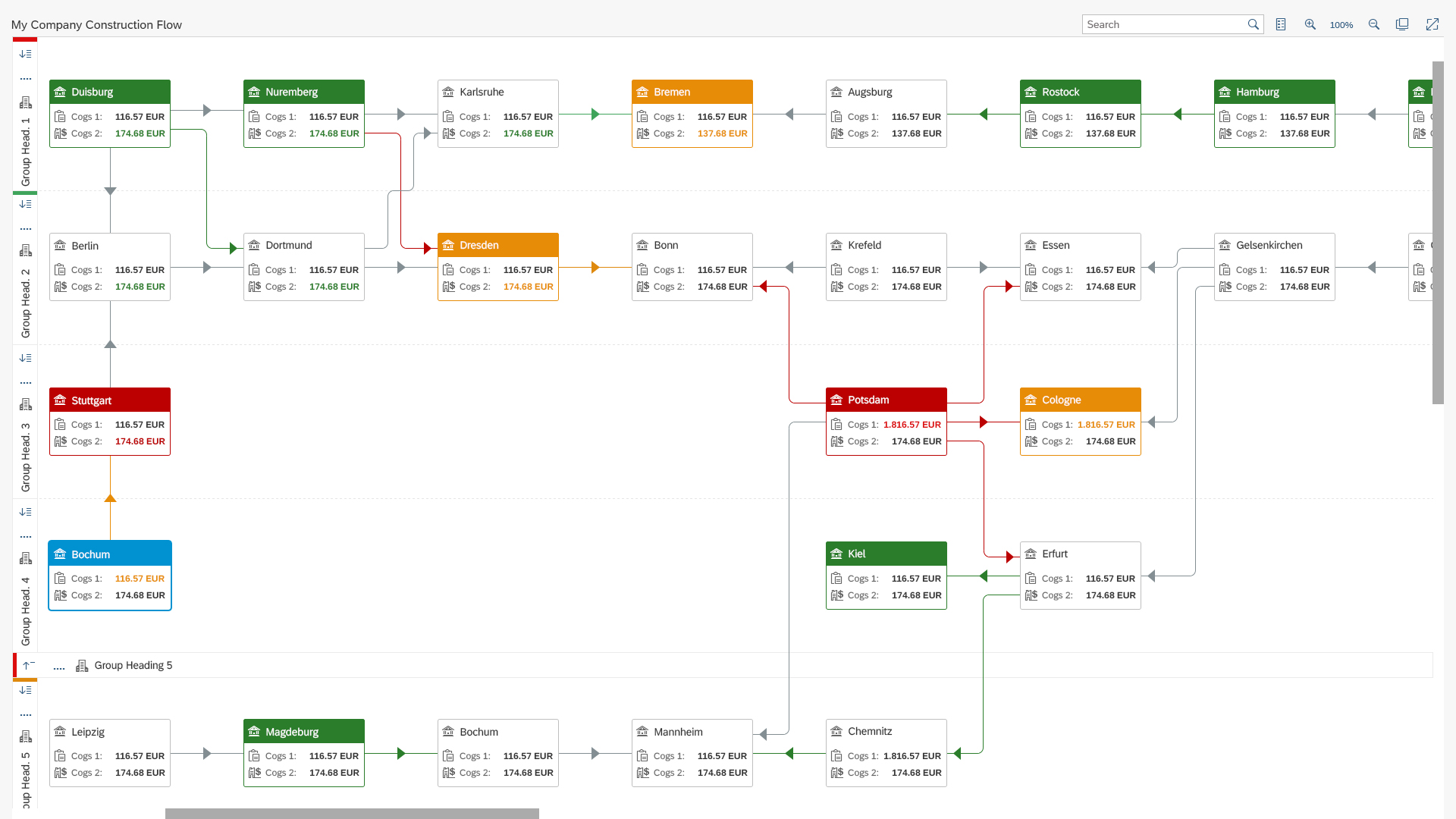
Unlike the fixed card layout, cards in the resizable card layout do not have fixed dimensions. In addition, the number of columns in the resizable layout is no longer limited (also see letterboxing).
The cards are positioned on an underlying grid, making it possible to arrange and resize cards in a flexible, yet guided manner. You can offer different views of the card content for different dimensions of the various card types. For example, you can show more items, zoom in or out, or change the granularity of a dataset.
The resizable card layout does not replace the fixed card layout.
Usage
Use the resizable card layout if:
- You want to give users the flexibility to rearrange and adapt their overview page as they need.
- You want to help users focus by applying progressive disclosure principles.
- You want to make use of different card sizes.
- You want to show more content (for example, more items or an additional level of detail)
Do not use the resizable card layout if:
- Your card content doesn’t react properly to a change in size. Use the fixed card layout instead.
- You are not able to invest UX and development resources for creating and prioritizing additional content. Use the fixed card layout instead.
- You want to use the resizing functionality on mobile devices. Resizing and rearranging cards is currently not possible on mobile devices.
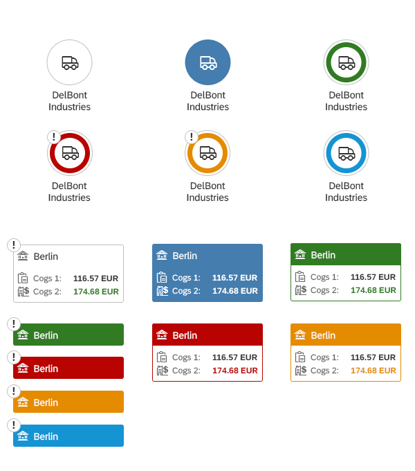
Flexible Card Sizes
Grid
Cards can be increased and decreased vertically in rows of 1 rem and horizontally in steps of 20 rem (minimum width). These dimensions facilitate both a high degree of flexibility and measured guidance. The card content responds immediately to a change in size.
The grid provides a guided resizing and repositioning experience. This ensures that the cards are always correctly aligned on the overview page as the user moves or resizes them.

Resizable card layout – Grid
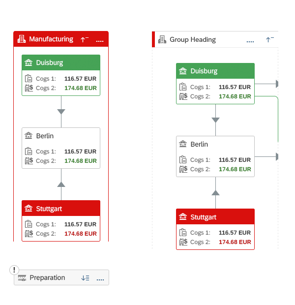
Card Anatomy
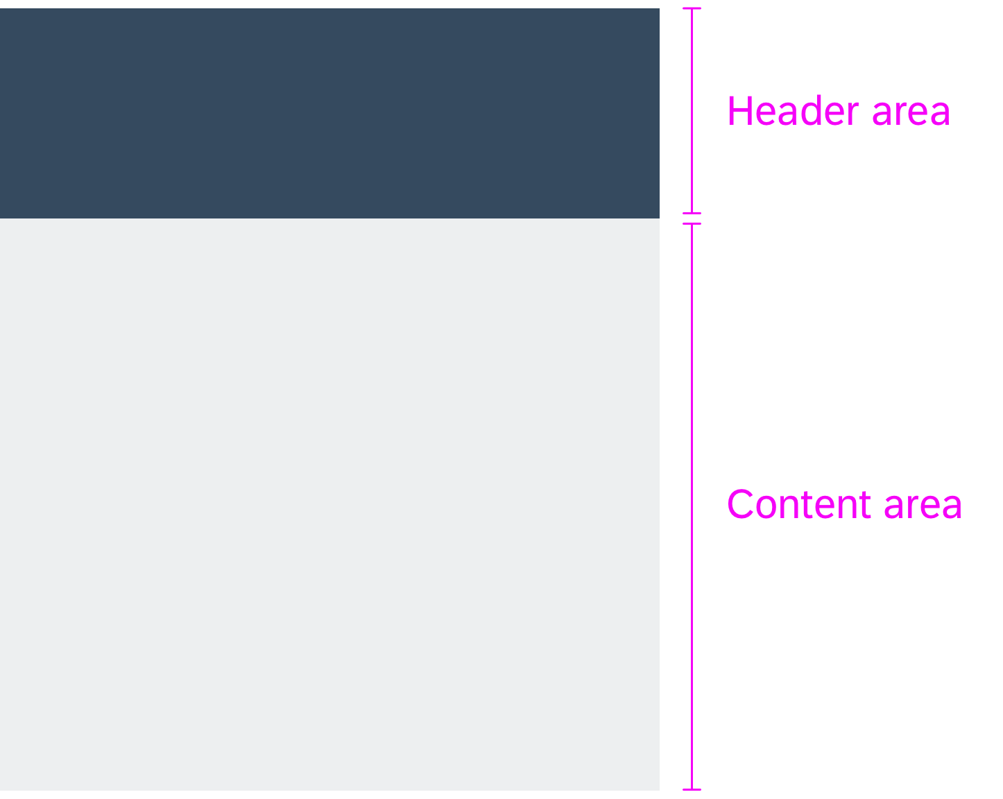
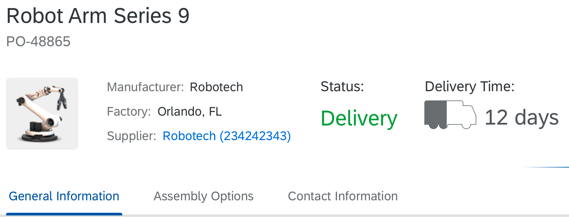
A card is made up of a mandatory header and a content area.
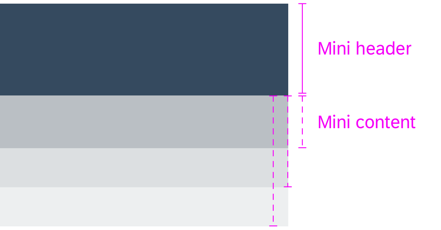
Mini Header
The smallest representation of the card is the header. The card can be collapsed to only its header height. We call this the “mini header” card height.
Mini Content
The “mini content” height of a card is defined by the next suitable size for a card when it is resized. The minimum height for the card content depends on the card type, and must be as high as the smallest representation of the content. In a list card, for example, first list item needs to fit in.
To avoid states with cut or unsubstantial content, there are no resizing steps between mini header and mini content.
Card anatomy
Minimum heights for a card in the resizable card layout

Example of Card Sizes
Dealing with White Space
If no additional content is available, the user still can make the card bigger, resulting in white space.
Resizing Parameters
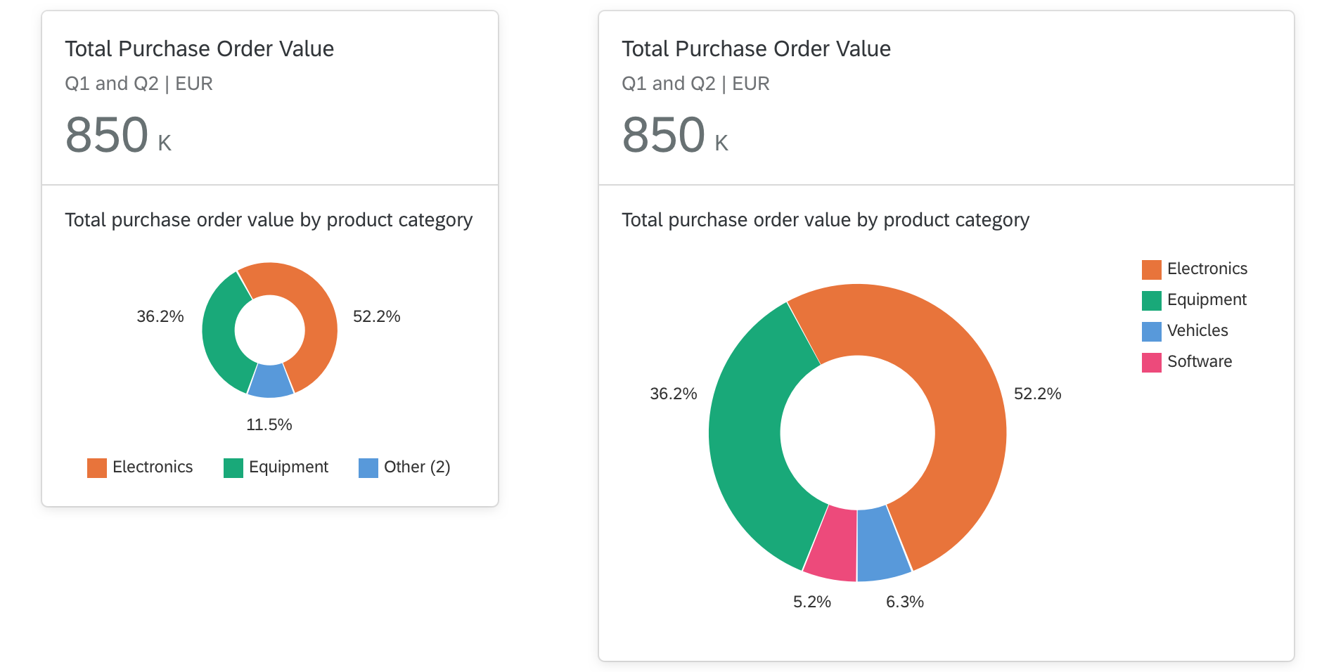
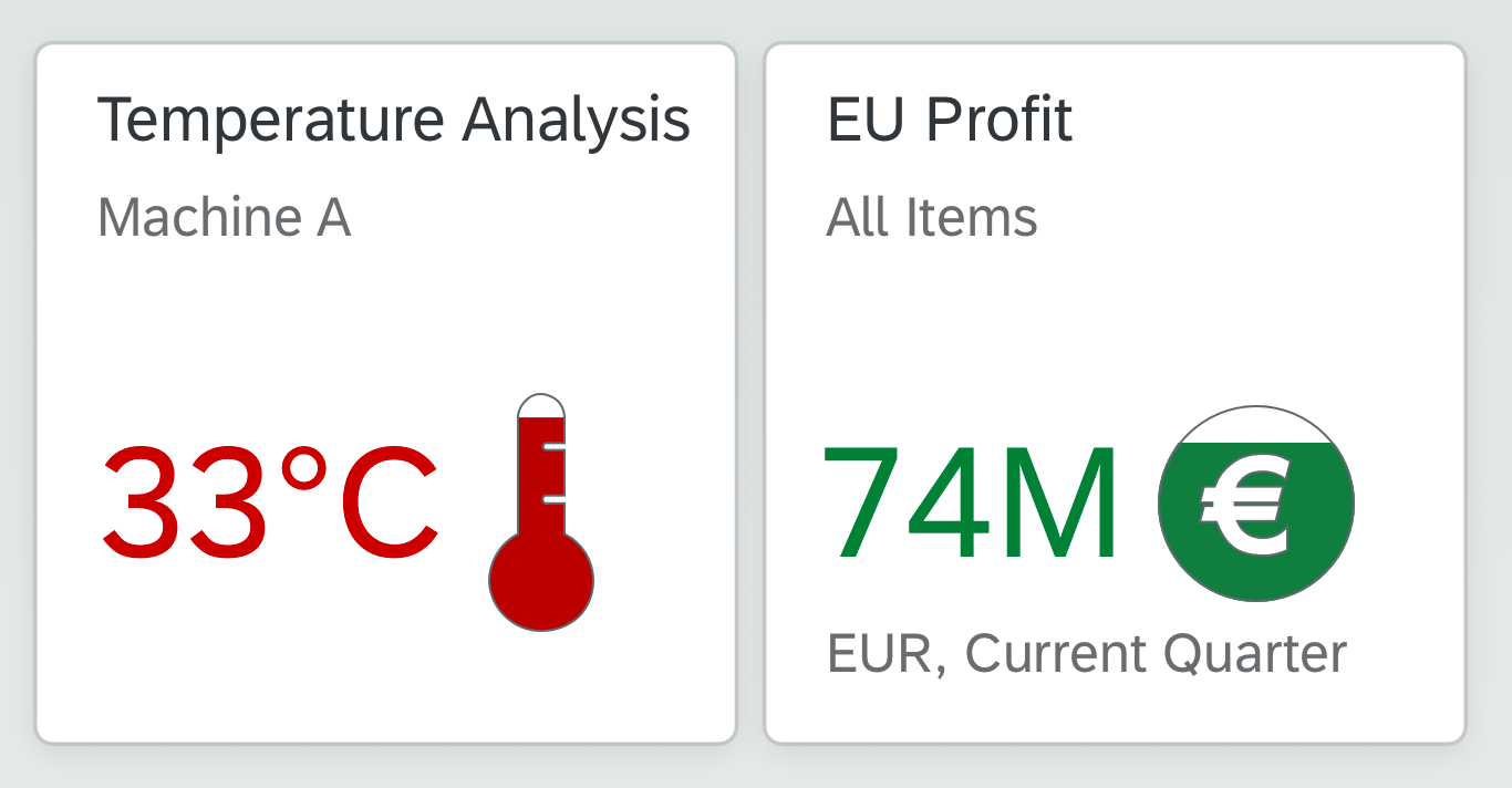
The card content depends on the available space, which in turn determines how many items are shown, how each item is displayed, and the level of detail (granularity). How the content is resized depends on the type of card. For example, table cards can have fewer columns when the size of the card is decreased. By contrast, the content shown for each item on list cards remains the same.
Space
When a card is resized, the content adapts responsively.
Example: List card
When the size of a card is reduced, texts might be truncated or wrapped. When the card size is increased again, the text is shown in full and previously wrapped text moves back onto one line. The line item content itself is unchanged.

Resizing for a list card

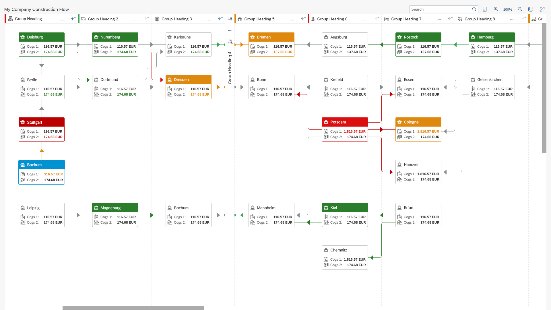
Rearranging Cards – Behavior
When a user long presses on a card instead of just clicking, the mouse cursor changes to indicate that the card can be dragged. Cards can be dragged from both the header and content areas.
Cards always strive towards the top of the page (uplift mode). When you move or stretch cards horizontally, the existing cards you displace are pushed downwards.

Resizing cards / rearranging cards using drag and drop
Getting Started
UX and DEV Investment Required
To enable users to benefit fully from the resizable card functionality, you need to define additional content that is revealed progressively as the card size grows. You will need to develop a content strategy to prioritize the chunks of information for each card type, and hence the order in which these additional chunks of information appear. For instance, the content strategy for a table card should answer the following questions:
- What should be the initial size of the card in the layout?
- Which table columns do you want to show in the card with the minimum width?
- Which table columns do you want to add when the card width is increased by one, two, three, … horizontal steps?
Keep in mind that the overview page is an SAP Fiori element.
Set Initial Card Sizes
Set an initial order and initial dimensions for each card as a default. Do this for the mini header, the mini content, and for bigger card sizes. In cards with content, define the exact number of items included in the content area.
Consider the best practices for designing an overview page and the principles for resizing the cards. It’s important to provide a meaningful starting point for users. If users change the card size or order, the initial app default can always be restored using the Manage Cards setting in the user actions menu.
Important: Do not provide only mini headers in the initial layout for your overview page.
Block Card Resizing
App teams can block the resize feature for each card individually. In this case, the cards can’t be resized by users and the resize icon is not shown on the card. Use this feature judiciously and only if you really have to. The majority of cards should be resizable. Otherwise, users are likely to be confused, and might feel driven to check the resizing behavior for each card.
Alternative approach
If you want to make use of the different card sizes, but don’t want to allow resizing for users at all, you can block the resizing function for all cards (independently of the initial card size). This allows you to use different card sizes and the same (limited) personalization features as in the fixed card layout. Because none of the cards are resizable, users won’t be confused.
Letterboxing
The resizable card layout uses different letterboxing behavior than the fixed card layout: to handle different card sizes more flexibly, the resizable card layout does not have a fixed number of columns. Cards take up the the available screen real estate and adapt accordingly (also see responsiveness). As a result, larger screens can be almost completely filled.
UI controls inside the cards react responsively when cards are resized. On mouse-release, additional content might be loaded, or content might be removed to reflect the new dimensions.
The number of grid columns in the layout is dependent on the width of the browser window. The breakpoints are defined as follows:
| Width of Browser Window | Number of Card Columns Displayed |
| Less than 656 px | 1 column |
| 656 – 975 px | 2 columns |
| 976 – 1359 px | 3 columns |
| 1360 – 1679 px | 4 columns |
| 1680 – 1999 px | 5 columns |
| More than 2000 px | 6 columns or more |
There is no limitation to the number of columns. You can also design for bigger screens.

Resizable card layout – Size L

Resizable card layout – Size M
Resizable card layout – Size S
Elements and Controls
- Introduction to SAP Fiori Elements (guidelines)
- Overview Page (guideline)
- Overview Page – UI Text Guidelines (guidelines)


 Your feedback has been sent to the SAP Fiori design team.