
- SAPUI5 Version 1.122
- SAPUI5 Version 1.120
- SAPUI5 Version 1.118
- SAPUI5 Version 1.116
- SAPUI5 Version 1.114
- SAPUI5 Version 1.112
- SAPUI5 Version 1.110
- SAPUI5 Version 1.108
- SAPUI5 Version 1.106
- SAPUI5 Version 1.104
- SAPUI5 Version 1.102
- SAPUI5 Version 1.100
- SAPUI5 Version 1.98
- SAPUI5 Version 1.96
- SAPUI5 Version 1.94
- SAPUI5 Version 1.92
- SAPUI5 Version 1.90
- SAPUI5 Version 1.88
- SAPUI5 Version 1.86
- SAPUI5 Version 1.84
- SAPUI5 Version 1.82
- SAPUI5 Version 1.80
- SAPUI5 Version 1.78
- SAPUI5 Version 1.76
- SAPUI5 Version 1.74
- SAPUI5 Version 1.72
- SAPUI5 Version 1.70
- SAPUI5 Version 1.68
- SAPUI5 Version 1.66
- SAPUI5 Version 1.64
- SAPUI5 Version 1.62
- SAPUI5 Version 1.60
- SAPUI5 Version 1.58
- SAPUI5 Version 1.56
- SAPUI5 Version 1.54
- SAPUI5 Version 1.52
- SAPUI5 Version 1.50
- SAPUI5 Version 1.48
- SAPUI5 Version 1.46
- SAPUI5 Version 1.44
- SAPUI5 Version 1.42
- SAPUI5 Version 1.40
- SAPUI5 Version 1.38
- SAPUI5 Version 1.36
- SAPUI5 Version 1.34
- SAPUI5 Version 1.32
- SAPUI5 Version 1.30
- SAPUI5 Version 1.28
- SAPUI5 Version 1.26
- Latest SAPUI Version 1.124
- SAPUI5 Version 1.122
- SAPUI5 Version 1.120
- SAPUI5 Version 1.118
- SAPUI5 Version 1.116
- SAPUI5 Version 1.114
- SAPUI5 Version 1.112
- SAPUI5 Version 1.110
- SAPUI5 Version 1.108
- SAPUI5 Version 1.106
- SAPUI5 Version 1.104
- SAPUI5 Version 1.102
- SAPUI5 Version 1.100
- SAPUI5 Version 1.98
- SAPUI5 Version 1.96
- SAPUI5 Version 1.94
- SAPUI5 Version 1.92
- SAPUI5 Version 1.90
- SAPUI5 Version 1.88
- SAPUI5 Version 1.86
- SAPUI5 Version 1.84
- SAPUI5 Version 1.82
- SAPUI5 Version 1.80
- SAPUI5 Version 1.78
- SAPUI5 Version 1.76
- SAPUI5 Version 1.74
- SAPUI5 Version 1.72
- SAPUI5 Version 1.70
- SAPUI5 Version 1.68
- SAPUI5 Version 1.66
- SAPUI5 Version 1.64
- SAPUI5 Version 1.62
- SAPUI5 Version 1.60
- SAPUI5 Version 1.58
- SAPUI5 Version 1.56
- SAPUI5 Version 1.54
- SAPUI5 Version 1.52
- SAPUI5 Version 1.50
- SAPUI5 Version 1.48
- SAPUI5 Version 1.46
- SAPUI5 Version 1.44
- SAPUI5 Version 1.42
- SAPUI5 Version 1.40
- SAPUI5 Version 1.38
- SAPUI5 Version 1.36
- SAPUI5 Version 1.34
- SAPUI5 Version 1.32
- SAPUI5 Version 1.30
- SAPUI5 Version 1.28
- SAPUI5 Version 1.26
Overview Page – Cards
Intro
Cards – Harmonized and Powerful Information
Each task or topic on an overview page is represented by a card. The overview page acts as a UI framework for organizing multiple cards for one role on a single page .
Cards are containers for app content, and represent an entry-level view of the most pertinent app data for a given topic or issue. Technically, a card is a smart component that uses UI annotations to render its content. Cards allow you to show application content from different sources side by side – without requiring the user to switch screens. Cards differ in the content they display: They can show a chart, a list, a table, informative text, or a combination of two elements. However, cards never have editable fields.
Cards can focus on a single object or topic, or on a group of objects. Cards can also vary in size, depending on the selected layout.
The overview page can contain several cards that reference the same (parent) application. However, each card must bring added value to the user, and not just repeat information already offered on another card.
Before you start designing cards for an overview page, see the best practices.
At a Glance
- Cards are small previews of application content.
- Each card represents a specific topic, task, or perspective.
- Cards help users to focus by applying progressive disclosure principles.
- Cards are powerful and beautiful.
- Cards offer a variety of visualizations.
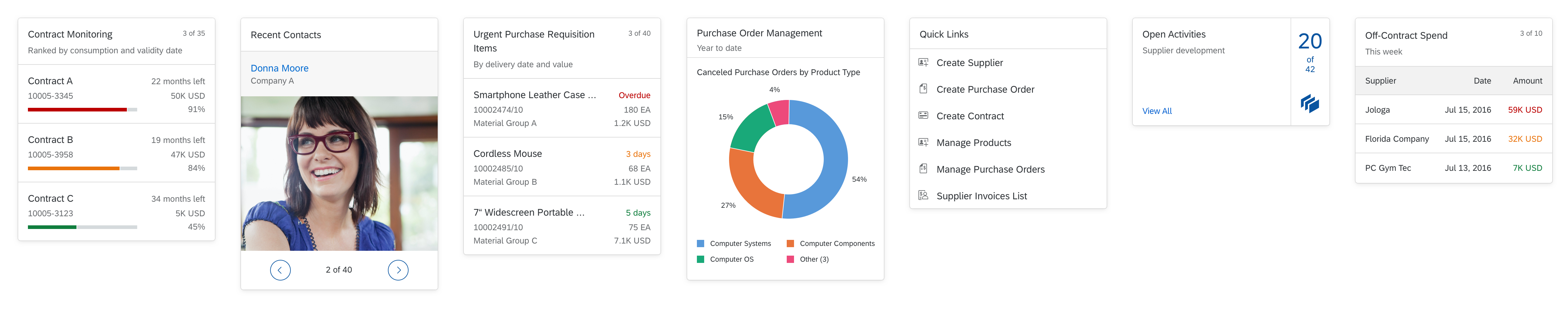
Overview page with different card types (extract)
Card Anatomy
Each card comprises two components: a header area and a content area. The header and content areas are mandatory. A footer area is only used for actions in the quick view card.
The interactive navigation in the header and content areas is represented by a hover effect.
When designing cards, make sure that you define and format the texts on all the cards consistently. For details , check out the UI text guidelines for the overview page.
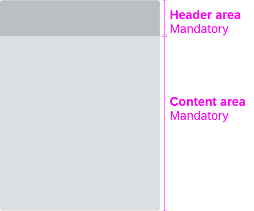
Card anatomy
Card Header
The card header area is mandatory, and serves the following purposes:
- It indicates what the card is about.
- It functions as a navigation area for opening the parent app, whereby the whole header area is clickable. We highly recommend offering this navigation to enable users to move seamlessly to the app details without losing focus on the task in hand (exception: link list card).
- A counter shows how many items are on the card in relation to the total number of relevant items.
- An overflow menu with options to add the card to the My Home page or to refresh only the data in the card, not the entire page.
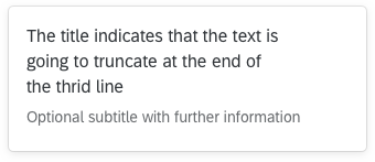
The height of the header area is variable; it expands vertically to accommodate the text. The header area can contain two text fields: a mandatory title, and an optional subtitle. The primary purpose of the header area is to identify the content source, summarize the focus of the card (title), show any relevant parameters (subtitle), and offer navigation to the content source (parent app).
Title
The title is mandatory and represents the card’s “point of view”. In one or two words, it explains why this card exists and why a user might want to use it. It is a natural language reflection of the annotated view. Titles that exceed three lines are truncated with the ellipsis (…).
Subtitle
The subtitle is optional. You can use it to qualify the title, offer an explanation, or show a status. The use of the subtitle can differ, depending on the card type. Subtitles that exceed one line are truncated with the ellipsis (…).
Card header with counter
Counter
The counter in the header area indicates how many items are showing on the card in relation to the total number of relevant items:
Format: [Items on Card] of [Total Items]
Example: 5 of 40
The counter is right-aligned and is never truncated (the title wraps instead). The width of the counter is flexible, depending on the amount of data. [Items on Card] can show a maximum three digits, and [Total Items] a maximum of four digits. For larger numbers, a scaling factor is shown. If all the relevant items are visible on the card, no counter is shown. There is also no counter if there is an issue loading a card, or no items are found for the filter criteria.
In the resizable card layout, the card counter adapts to the card size. If the user increases the size of a card with a scaled counter, the counter shows the exact number of items (without the scaling factor). The scaling factor appears when values exceed 1000.
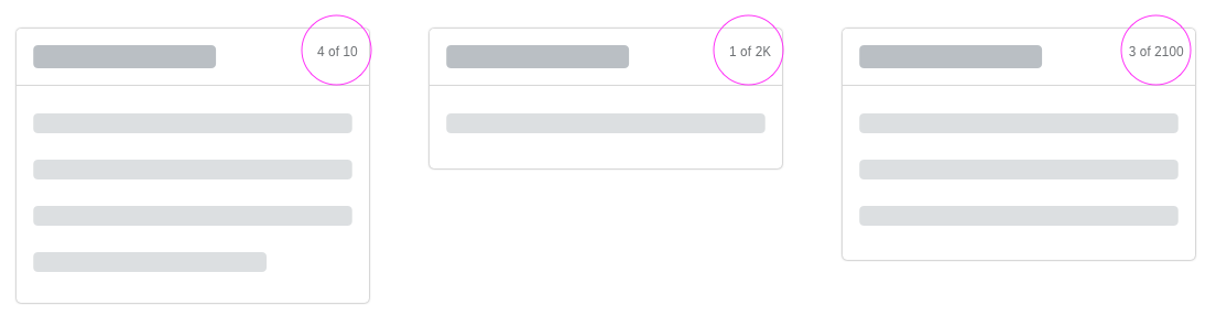
Card counter in different cases
Overflow Menu
The overflow menu lets users perform the following actions:
- Refresh: refresh only the data in the card, not the entire page.
- Add Card to My Home: add the card to the Insights area of the My Home page.
Card Content
The content area is mandatory and is reserved for application content. Content is currently displayed on cards by embedding SAPUI5 controls that specify the properties and data format. For example, an embedded standard list control provides formatting, such as row height, font sizes, and the number of text blocks.
The resizable card layout also has a special kind of the content area, called mini content. It describes the minimum height for the card content.
Card Types
The overview page supports the following standard card types:
- Analytical card
- List card
- Bar chart list card
- Link list card
- Table card
- Stack card | quick view card
You also have the option of creating custom cards. Custom cards allow you to define the appearance and the type of content within the content area of a card.
Important: Only use custom cards if the features required for your use case are not offered in any way by the standard cards for the overview page. If your basic requirements can be reasonably covered by one of the standard cards, always use the standard card, even if there are technical or visual limitations.
Appearance
Texts in Cards
Make sure that you define and format the texts on all the cards consistently. Check the UI text guidelines for the overview page for details.
Formatting Dates, Times, Amounts, and Currencies
Apply the following formats:
- Dates: The default is the relative date format (for example, Today). However, you can also use the medium date format (such as Aug 7, 2015).
- Times: Times are not visible by default, but if you need to show a time, use the short format (for example, 11:28 AM).
- Integers/Float/Currencies: Use the short format (for example, 1K for 1000).
Refresh Behavior
You can set a specific refresh interval for the card content. All cards are refreshed at once.
Keep the user in mind: the shorter the refresh interval, the more disruptive it is for users.
The navigation and interaction depends on the technical card type:
The view switch enables you to reduce the number of similar cards and avoid repeating information.
Single-Object Cards
Cards that feature content with a single focal point, detail, or entity are called single-object cards. An example is a quick view card with information about a particular product. Analytical cards are also single-object cards. The header area of this card type always navigates to this specific focal point, detail, or entity. The content area can also have interaction areas (for example, a section in a chart, or a telephone number for a contact). However, only quick view cards can have actions in the footer area.
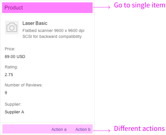
Interaction for a single-object card
Object Group Cards
Cards that feature a subset of items grouped by a common criterion are called object group cards. A typical example would be a list of purchase orders grouped by delivery date, amount, or supplier. The cards do not have actions, but each row or list item is selectable, thus providing direct navigation to the object details within the parent application. The header area of this card type always navigates to all items in the list or table. Object group cards include all types of list cards, bar chart list cards, and table cards.
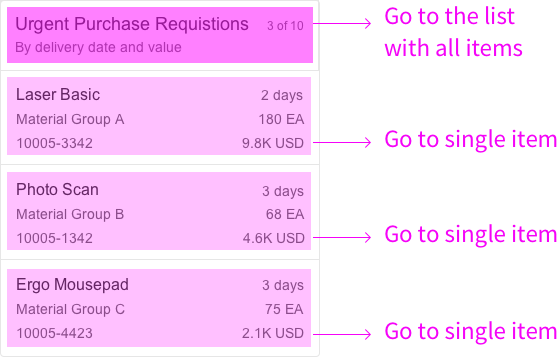
Interaction for an object group card
Link List Cards
Link list cards allow you to display a collection of links or images that can reference both internal and external targets.
- Links can navigate to a target or open a popover with additional information.
- Clicking an image opens an image carousel.
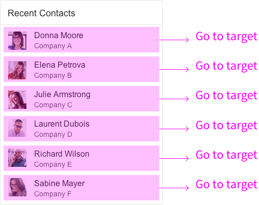
Interaction for a link list card
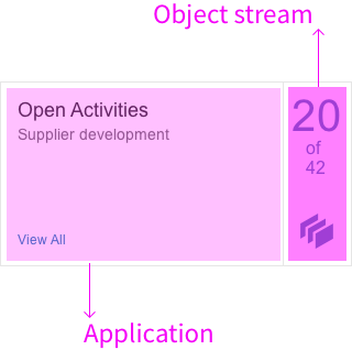
Stack Cards
A stack card is a special card type for showing a collection of single-object cards. Stack cards have 3 components with different navigation areas:
- The top-level stack card opens the collection and contains two clickable areas: the left area navigates to the parent app (with the list of all items), and the right area opens the object stream.
- The object stream shows individual cards that represent objects from the parent application. The object stream heading links to the parent application, while individual cards can contain links and actions relating to the respective object. A Close button returns the user to the stack card.
- The last card in the object stream is the placeholder card. The entire card is navigable and leads the user directly to the parent application.
Interaction for a stack card
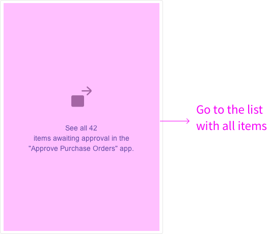
Interaction for a placeholder card
You can use a view switch to offer several different content areas on one card, which can help to reduce the number of cards on the overview page. The user chooses the view using a select control. You can only combine views that have a common denominator. The options offered by the select control merely offer different perspectives. For example, a card “Purchasing Spend” (title in the header area) could offer two views “By Material Group” and “By Supplier” (options in the select control). The view switch is located in the upper part of the content area.
You can use the view switch for the following cards:
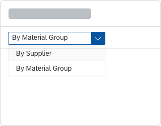
View switch
Resources
Want to dive deeper? Follow the links below to find out more about the SAP Fiori Overview Page.
Elements and Controls
- Introduction to SAP Fiori Elements (guidelines)
- Overview Page (guideline)
- Overview Page – UI Text Guidelines (guidelines)
 Your feedback has been sent to the SAP Fiori design team.