
Cloud File Browser
The cloud file browser is a tool that allows users to browse through a remote repository, export data to the cloud, or import files from the cloud to an SAP application.
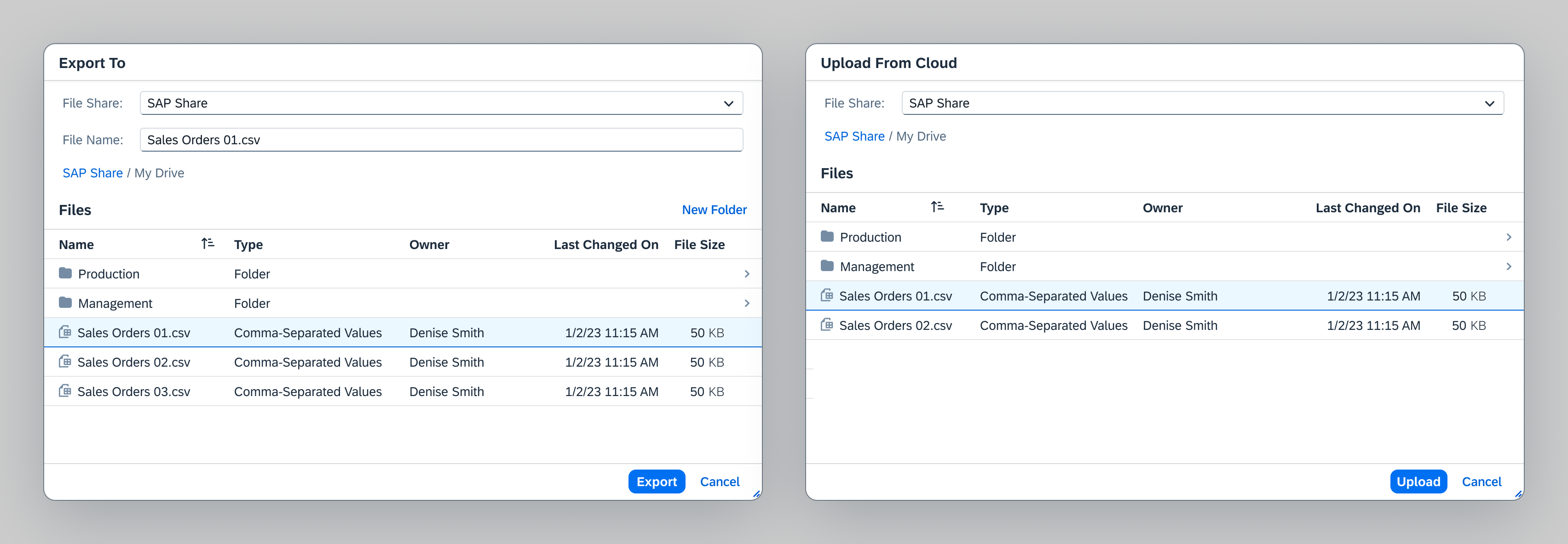
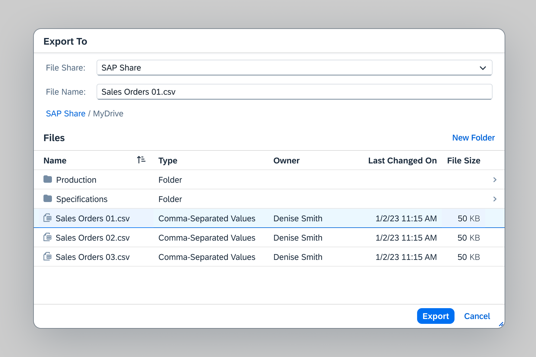
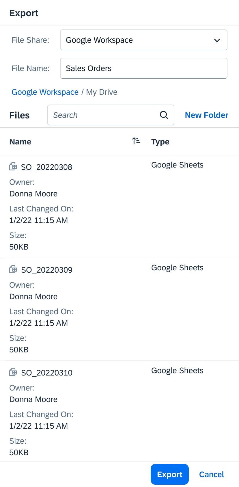
Cloud file browser - Export and import dialogs
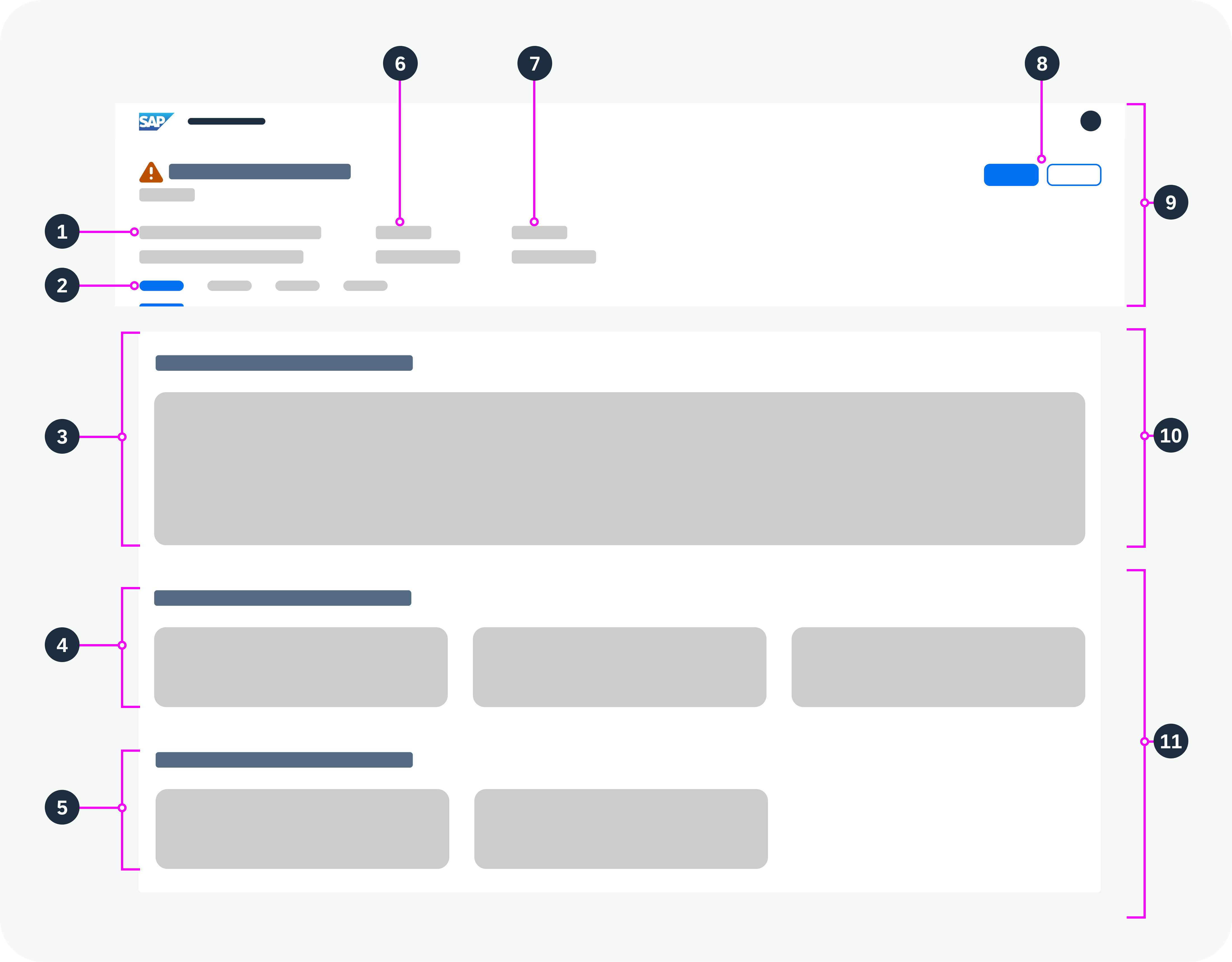
Components
The cloud file browser is composed of the following controls embedded in a dialog:
- A file share select field
- A file name field (export mode only)
- Breadcrumb navigation
- A New Folder button (export mode only)
- A responsive table with files and folders
- The finalizing and Cancel actions
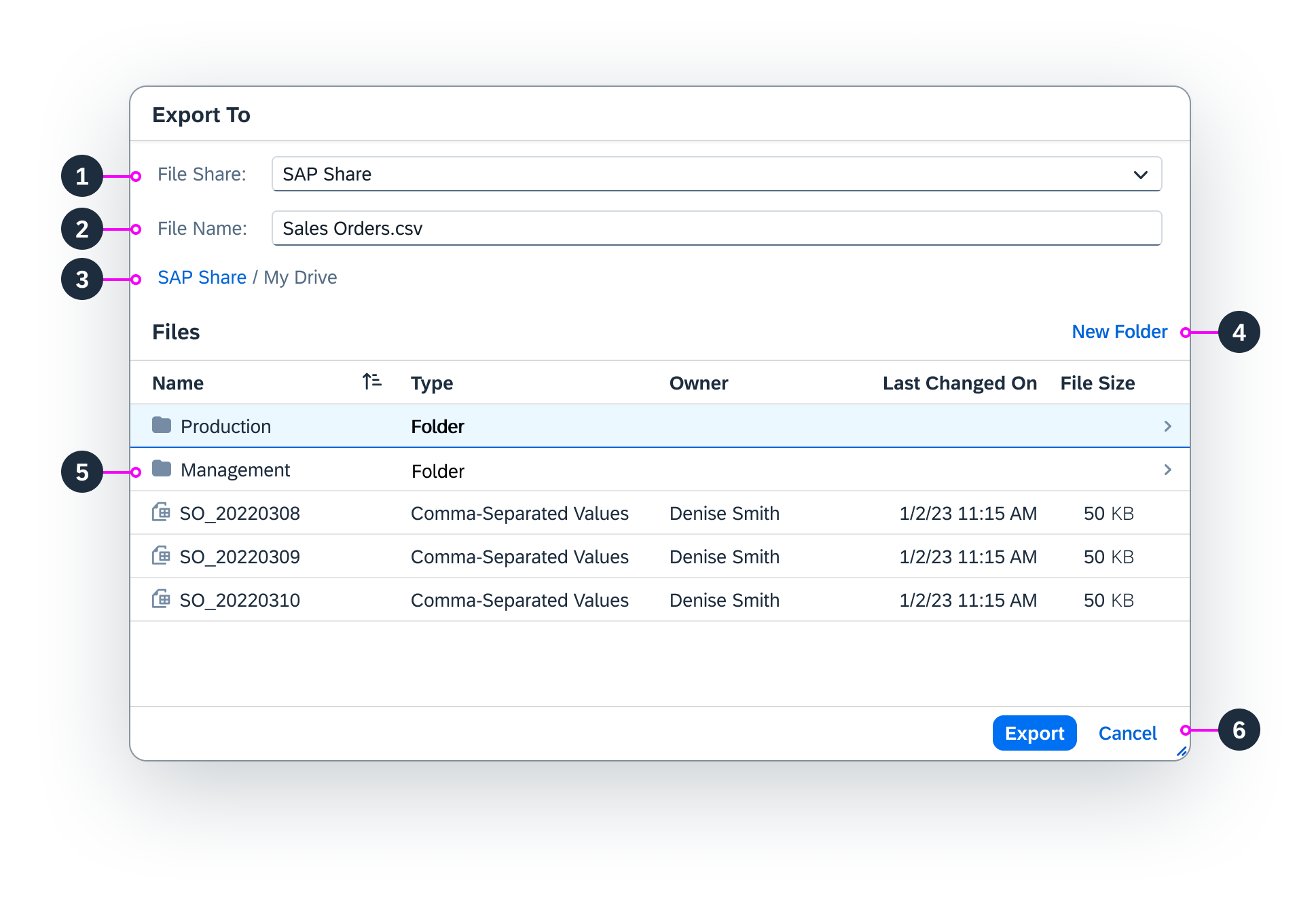
Cloud file browser components
Iconography
- Spreadsheet (Microsoft Excel, Google Sheets, CSV…)
Tooltip: Spreadsheet
sap-icon://excel-attachment - Text Document (Microsoft Word, Google Docs, RTF…)
Tooltip: Document
sap-icon://doc-attachment - Presentation (Microsoft Powerpoint, Google Slides…)
Tooltip: Presentation
sap-icon://ppt-attachment - Portable Document Format (PDF)
Tooltip: PDF
sap-icon://ppt-attachment - Plain Text
Tooltip: Text File
sap-icon://attachment-text-file - HTML File
Tooltip: HTML File
sap-icon://attachment-html - Image File, Photo
Tooltip: Image File
sap-icon://attachment-photo - Audio File
Tooltip: Audio File
sap-icon://attachment-audio - Video File
Tooltip: Video File
sap-icon://attachment-video - Archive (ZIP, RAR…)
Tooltip: Archive
sap-icon://attachment-zip-file - Unknown Format
Tooltip: File
sap-icon://document - Folder
Tooltip: Folder
sap-icon://folder-full - Locked Folder
Tooltip: Files can’t be exported to this folder.
sap-icon://locked
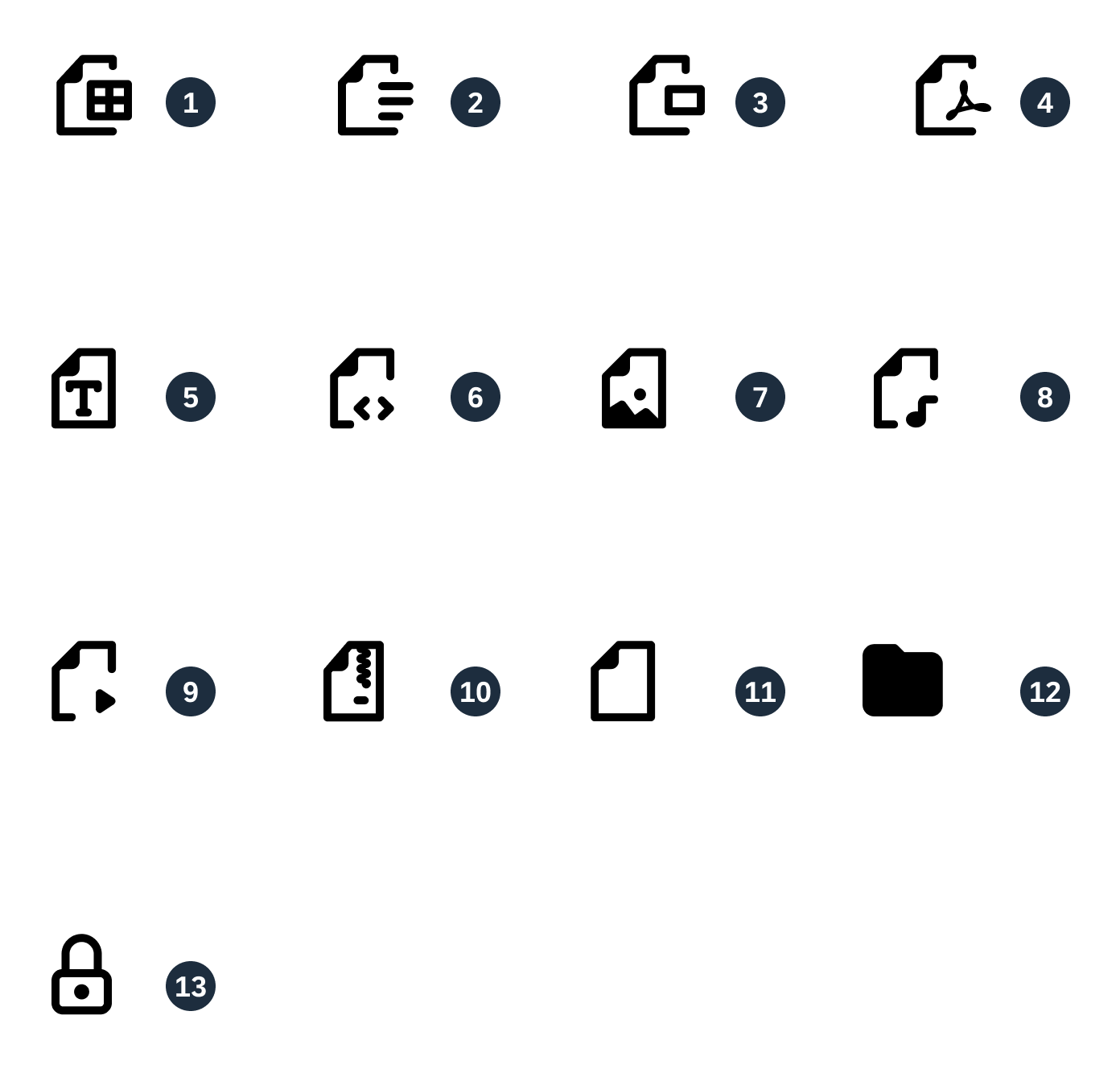
Cloud file browser icons
Behavior and Interaction
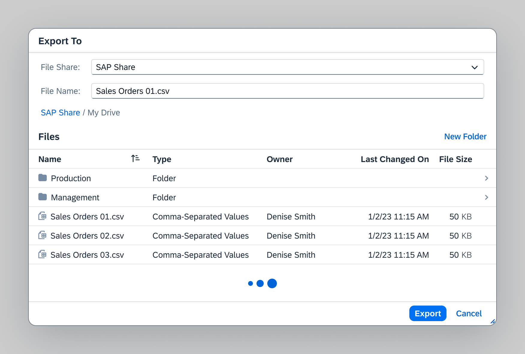
Export
When a data file is exported to the cloud, in the Export As dialog, the Destination field is set to the value Cloud and the finalizing action Export To… opens the cloud file browser.
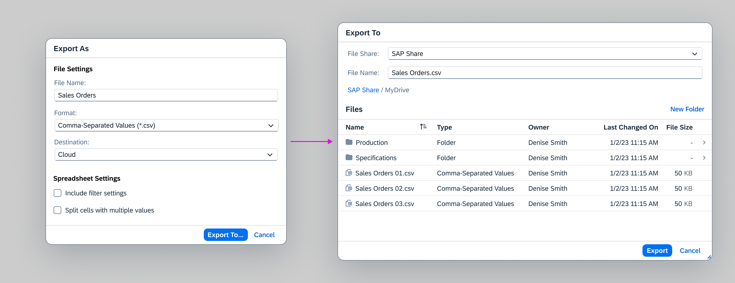
Export as dialog and cloud file browser
The spreadsheet or data file can be exported in various file types according to the client’s configuration and the remote file share type. For example, CSV, Google Sheets, or Microsoft Excel.
For more details, see: Export to Spreadsheet.
Accessibility
The initial focus is placed in the File Name field.
Users can trigger the primary action while the focus is inside other controls in the dialog by using one of the following key combinations:
- Enter
- Ctrl + Enter (Windows)
- Cmd + Enter (Mac)
Update / Overwrite a file
To update an existing file, users can select the file in the list and export the new version.
The version history stores all older versions of the file.
The user is free to change the exported file name via the File Name field. According to the file share rules, if the user enters unauthorized characters, the field changes the error state accordingly.
More details about field states.
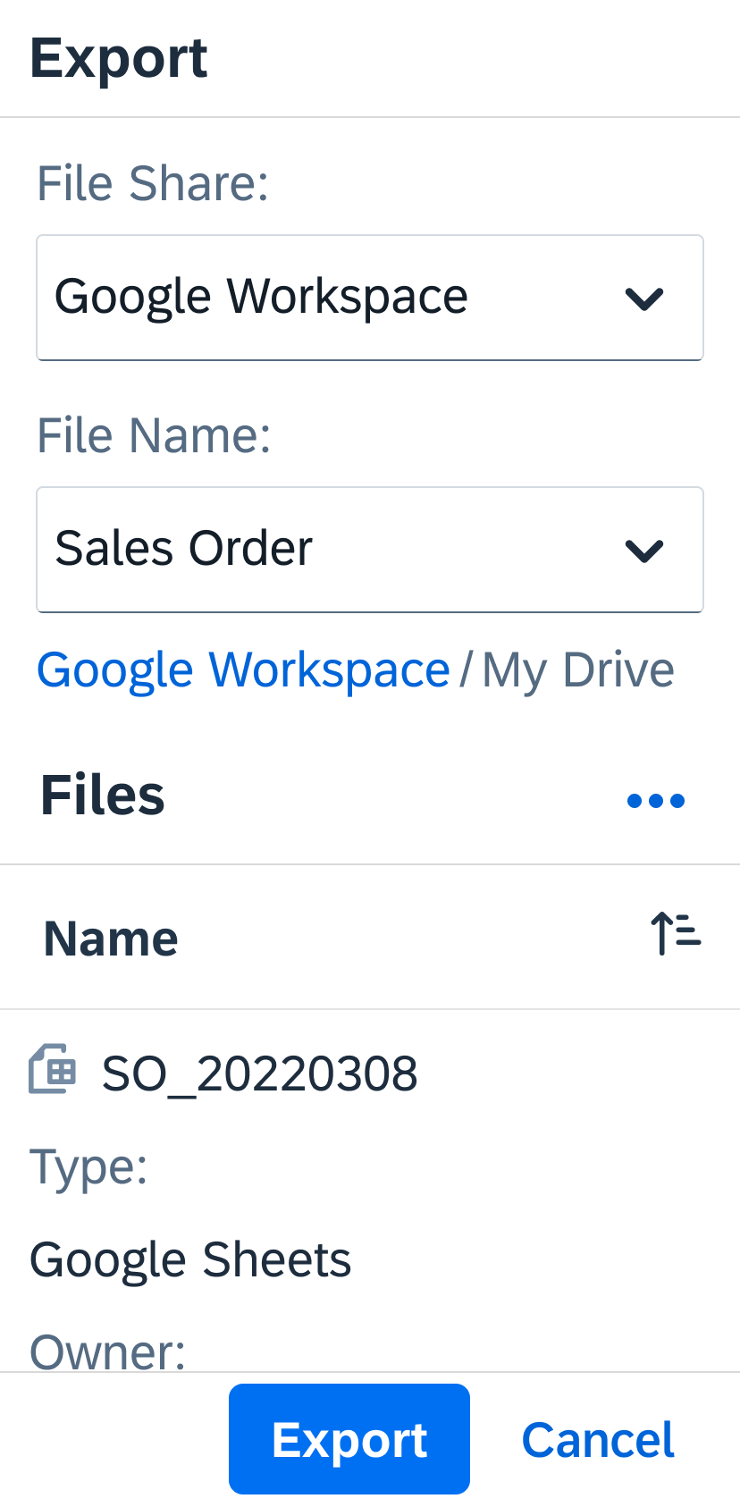
For error prevention, the cloud file browser should display only the files of the type that has been chosen in the Export As dialog.
After the user has chosen the file format in the Export As dialog, they cannot change it via the file browser. Instead, they need to cancel the file browser and return to the settings dialog.
Cloud file browser with file selected
Depending on the file type, a Warning may inform the users that the file already exists and request user confirmation of the export.
It also informs users that older versions of the file are available in the version history.
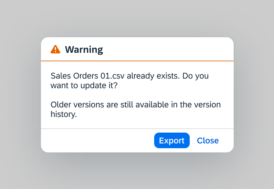
Warning message for file update
Create a Folder
The user can create a folder with the New Folder button or the keyboard shortcut Ctrl+B.
The folder is created when the users move the focus away from the Name input field or press the Enter key.
After the folder is created, provide a message toast to confirm the creation and open the new folder automatically.
Message text: The new folder was created.
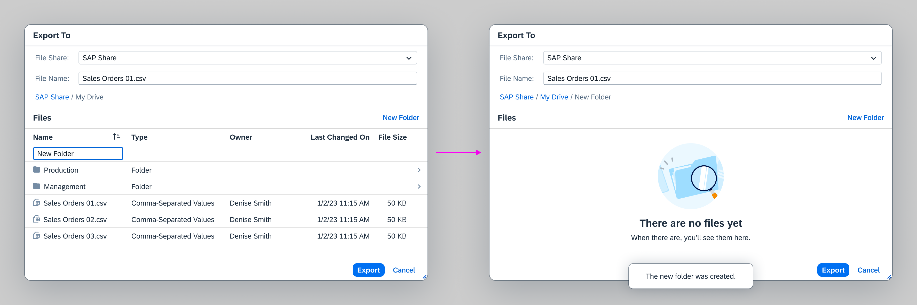
Folder creation
Locked Folders
Users can browse locked folders, but cannot export files to them. In such cases, the Locked icon replaces the Folder icon and the Export button remains disabled.
For more details, check Iconography.
Cloud file browser with locked folder
Import
The cloud file browser allows users to import files from the cloud to an SAP instance.
The Upload button is disabled until a file is selected for import.
Accessibility
The initial focus is placed on the first selectable item in the list.
The primary action can be triggered by a keyboard shortcut. For more details, see Export: Accessiblity.
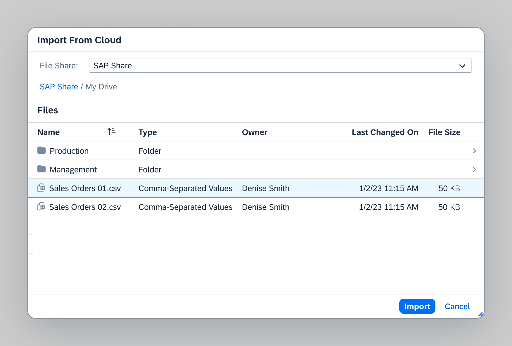
Import mode
Loading Data
Use the busy indicator to cover the table space during the initial content loading.
If there are too many items to load, a limited number of items is loaded and more items load when the scroll hits the bottom of the list. The busy indicator shows at the bottom of the list.
Busy indicator
Empty States
Use illustrated messages when the following cases arise:
No file share found
The default file share doesn’t load or there is no available file share.
Headline: No File Share found
Description: Try reloading the file browser. If that doesn’t help, contact your administrator.
Illustration: ErrorScreen
Disable New Folder and primary actions.
Provide a Reload button that attempts to reconnect to the file share.
Folder fails to load
Headline: Unable to load the folder
Description: Try reloading the file browser. If that doesn’t help, contact your administrator.
Disable New Folder and primary actions.
Empty folder
Headline: There are no files yet
Description: When there are, you’ll see them here.
Illustration: SearchFolder
The user doesn’t have permission to access the file share
Headline: Permission Denied
Description: You cannot access this file share. To get access, contact your administrator.
Disable New Folder and primary actions.
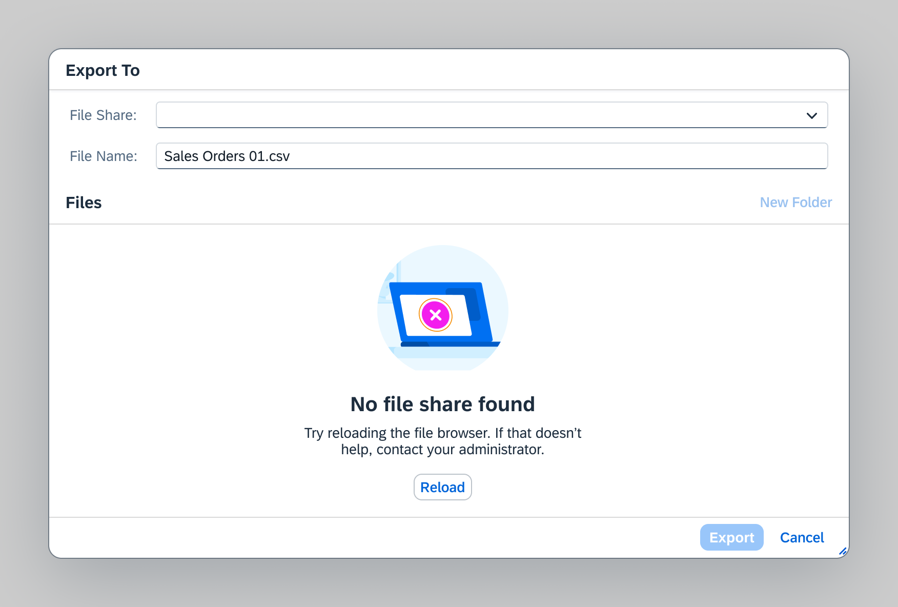
Empty state - No file share
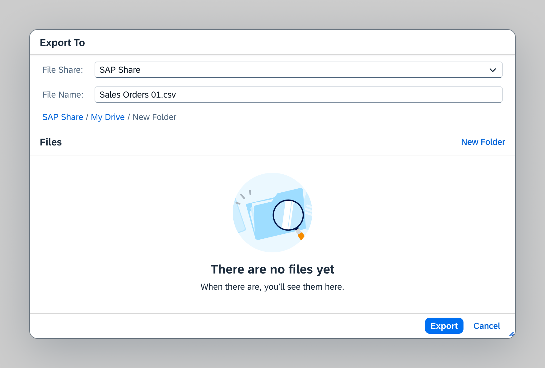
Empty state - Empty folder
Last Selected Location
When leaving the cloud file browser, the last selected folder and file share are remembered so the user can access it directly when coming back to the cloud file browser.
If the last selected file share is unavailable, an illustrated message shows in the cloud file browser (more details in Empty States).
If that last selected folder is inaccessible, the user is taken to the default location without warning.
Column sorting
The sorted column and the sort order is remembered when the user leaves the cloud file browser.
Responsiveness
The cloud file browser embedded components (responsive table, toolbar, form) respond to the browser size according to their individual specifications.
Mobile (size S)
Mobile (size S) with 200% zoom
Resources
Want to dive deeper? Follow the links below to find out more about related controls, the SAPUI5 implementation, and the visual design.
Implementation
- Export to Spreadsheet (SAPUI5 samples)
- Export to Spreadsheet (SAPUI5 API reference)
- Cloud File Browser (or Cloud File Picker) (SAPUI5 samples)


 Your feedback has been sent to the SAP Fiori design team.