
- SAPUI5 Version 1.122
- SAPUI5 Version 1.120
- SAPUI5 Version 1.118
- SAPUI5 Version 1.116
- SAPUI5 Version 1.114
- SAPUI5 Version 1.112
- SAPUI5 Version 1.110
- SAPUI5 Version 1.108
- SAPUI5 Version 1.106
- SAPUI5 Version 1.104
- SAPUI5 Version 1.102
- SAPUI5 Version 1.100
- SAPUI5 Version 1.98
- SAPUI5 Version 1.96
- SAPUI5 Version 1.94
- SAPUI5 Version 1.92
- SAPUI5 Version 1.90
- SAPUI5 Version 1.88
- SAPUI5 Version 1.86
- SAPUI5 Version 1.84
- SAPUI5 Version 1.82
- SAPUI5 Version 1.80
- SAPUI5 Version 1.78
- SAPUI5 Version 1.76
- SAPUI5 Version 1.74
- SAPUI5 Version 1.72
- SAPUI5 Version 1.70
- SAPUI5 Version 1.68
- SAPUI5 Version 1.66
- SAPUI5 Version 1.64
- SAPUI5 Version 1.62
- SAPUI5 Version 1.60
- SAPUI5 Version 1.58
- SAPUI5 Version 1.56
- SAPUI5 Version 1.54
- SAPUI5 Version 1.52
- SAPUI5 Version 1.50
- SAPUI5 Version 1.48
- SAPUI5 Version 1.46
- SAPUI5 Version 1.44
- SAPUI5 Version 1.42
- SAPUI5 Version 1.40
- SAPUI5 Version 1.38
- SAPUI5 Version 1.36
- SAPUI5 Version 1.34
- SAPUI5 Version 1.32
- SAPUI5 Version 1.30
- SAPUI5 Version 1.28
- SAPUI5 Version 1.26
- Latest SAPUI Version 1.124
- SAPUI5 Version 1.122
- SAPUI5 Version 1.120
- SAPUI5 Version 1.118
- SAPUI5 Version 1.116
- SAPUI5 Version 1.114
- SAPUI5 Version 1.112
- SAPUI5 Version 1.110
- SAPUI5 Version 1.108
- SAPUI5 Version 1.106
- SAPUI5 Version 1.104
- SAPUI5 Version 1.102
- SAPUI5 Version 1.100
- SAPUI5 Version 1.98
- SAPUI5 Version 1.96
- SAPUI5 Version 1.94
- SAPUI5 Version 1.92
- SAPUI5 Version 1.90
- SAPUI5 Version 1.88
- SAPUI5 Version 1.86
- SAPUI5 Version 1.84
- SAPUI5 Version 1.82
- SAPUI5 Version 1.80
- SAPUI5 Version 1.78
- SAPUI5 Version 1.76
- SAPUI5 Version 1.74
- SAPUI5 Version 1.72
- SAPUI5 Version 1.70
- SAPUI5 Version 1.68
- SAPUI5 Version 1.66
- SAPUI5 Version 1.64
- SAPUI5 Version 1.62
- SAPUI5 Version 1.60
- SAPUI5 Version 1.58
- SAPUI5 Version 1.56
- SAPUI5 Version 1.54
- SAPUI5 Version 1.52
- SAPUI5 Version 1.50
- SAPUI5 Version 1.48
- SAPUI5 Version 1.46
- SAPUI5 Version 1.44
- SAPUI5 Version 1.42
- SAPUI5 Version 1.40
- SAPUI5 Version 1.38
- SAPUI5 Version 1.36
- SAPUI5 Version 1.34
- SAPUI5 Version 1.32
- SAPUI5 Version 1.30
- SAPUI5 Version 1.28
- SAPUI5 Version 1.26
Chart – Deviation
Intro
This article explains how to visualize the deviation (difference or variance) between two measures, such as the difference between the product revenue streams over two years, or the difference between actual expenses and target expenses for different cost centers.
The first two sections address deviations within a non-time category. The last two sections are dedicated to time-category.
All figures that represent a deviation should include a + or – sign. They can appear in the value axis, close to the data points in the plot area, and in popovers.
Deviation Only
This section explains how to visualize the deviation (difference) between two measures, and only the deviation. The chart below shows the difference between the actual cost and budgeted cost for multiple cost centers.
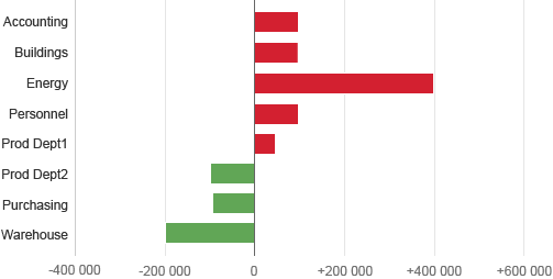
Bar chart - Deviation between two measures
Deviation in Percentage
It’s a good idea to consider whether the actual value can be given as a percentage when displaying a deviation. The chart below displays the same information as the chart above, but the deviation is expressed in percentage.
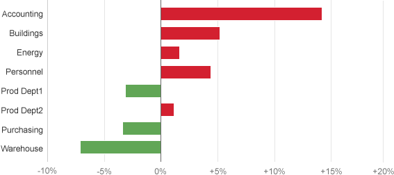
Bar chart - Deviation in percent between 2 measures
If the order is not important, you can also rank items to make the values easy to compare, as illustrated below.
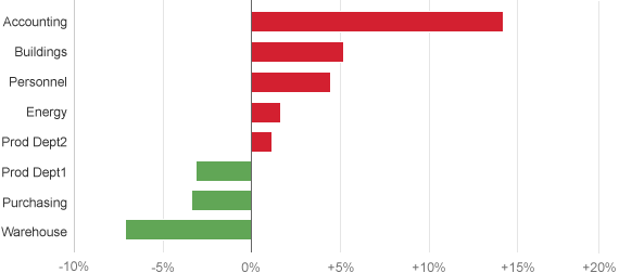
Bar chart - Ranked deviation in % between 2 measures
Deviation and Measures
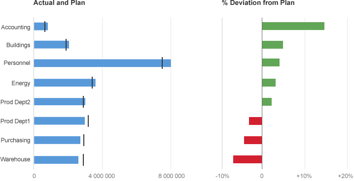
Sometimes you may want to display two measures and the variance (deviation) between them.
The best way to achieve this is by displaying two charts side-by-side: a bullet chart to display the two measures, and a bar chart to display the deviation. Placing the variance (deviation) in a separate chart makes it easy to compare the variance.
The chart below displays the variance between actual expenses and planned expenses for different cost centers and the deviation between them.
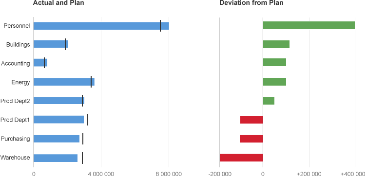
Actual and budget values and their deviations
For the same reason mentioned above, you should consider displaying the deviation in percentages as illustrated below:
Actual and budget values and their deviations in %
Time Deviation Only
This section explains how to show the deviation over time between two measures, and only the deviation. If you want to show the measures as well, please proceed to the the next section called ‘Time Deviation and Measures’.
Focus on Value
You can use a column chart when the value of the variance is more important than the trend of the variance.
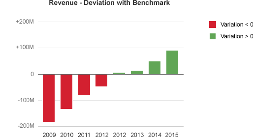
Deviation over time in a column chart
Focus on Trend
Use a line chart if you want to focus on the trend of the variation, as illustrated below.
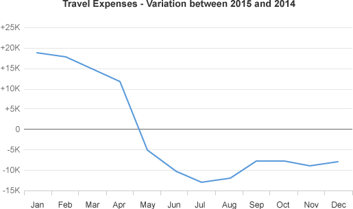
Trend of a deviation over time using actual values
Sometimes, it’s better to see the deviation as a percentage. In these circumstances, choose one measure as the reference and express the deviation as a percentage of the reference. The chart below contains the same information as the chart above, but with the variation expressed in percentage. You can now see that the deviation in March and June were very high.
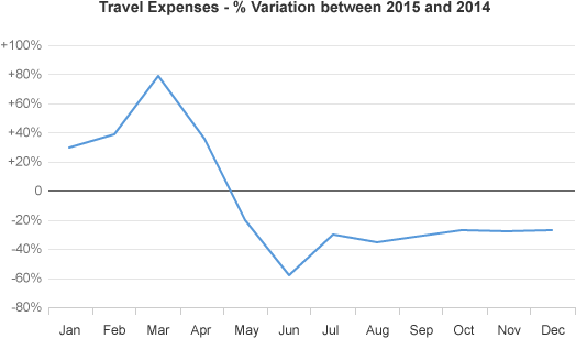
Trend of the deviation over time given as a percentage
Time Deviation and Measures
If you want to display two measures and the deviation in the same visualization, you can use two charts one above the other. And, if the trend of the measures and the variation is important, or if there are many data points, you can use two line charts as illustrated below.
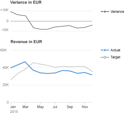
Deviation and measures over time - Deviation in a line
When the value of the variance is more important than the trend of the variance, you can use a bullet chart and a column chart side by side. The chart below displays actual and target values over time, as well as the deviation for each time period.
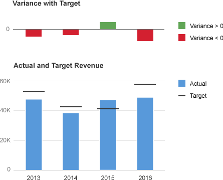
Actual and target values over time - Deviation in columns
Resources
Want to dive deeper? Follow the links below to find out more about related controls, the SAPUI5 implementation, and the visual design.
Elements and Controls
- Chart (guidelines)
- Line Chart (guidelines)
- Bullet Chart (guidelines)
- Column Chart (guidelines)
Implementation
- Bar Chart (SAPUI5 samples)
- Bullet Chart (SAPUI5 samples)
- Line Chart (SAPUI5 samples)
- Negative Values (SAPUI5 samples)
 Your feedback has been sent to the SAP Fiori design team.