
Table Rows
The SAP Fiori elements templates support the features and settings for table rows or inline items detailed below.
For design information see the table guidelines, starting with Table Overview, and the links below.
Feature Availability
Actions |
Availability |
| Empty Row for Data Entry in Create and Edit Modes | Available in an object page for responsive and grid tables: the table displays an empty row for data entry.
You can turn it off for edit mode. |
| Editable Multi-Input Fields | Available in an object page in edit mode for all tables. |
| Inline Actions | Available |
| Direct Edit | Available for responsive and grid tables with SAP Fiori elements for OData V2 |
| Conditional Enablement of Navigation Buttons | For list report and object pages:
|
| Single Item Selection | Default |
| Multiple Item Selection | Available |
| Item Limit for Multiple Selection | 200 by default for grid tables, analytical tables and tree tables. You can change the limit. |
| Delete | Available in responsive tables only |
| Custom Actions | Available |
| Messages for Critical Actions | Default, replace the generic placeholder text with meaningful text for the user. |
Display |
Availability |
| Restrict Field to Read Only in a Table | Available with SAP Fiori elements for OData V4 |
| Editing Status | For draft-enabled applications, displayed by default in the responsive table and grid table in a list report. With SAP Fiori elements for OData V4, it is also displayed by default in a tree table. |
| Rating Indicator | Available |
| Progress Indicator | Available |
| Quick Contact View | Available |
| Avatar | Available |
| Avatar Tooltip | Available |
| Other Images | Available with live box mode only |
| Table Cells with Multiple Values | Available with SAP Fiori elements for OData V4
In edit mode, the multiple values fields are editable in object page tables. The cells that displayed multiple values in the table onscreen are empty when exported to a spreadsheet. |
| Highlighting New Line Items | Available with SAP Fiori elements for OData V2
Default with SAP Fiori elements for OData V4 for grid and responsive tables in draft-enabled applications |
| Highlighting Line Items Based on Criticality | Available |
Responsive Table Only |
Availability |
| Multiple Fields in a Single Column | Available |
| Smart Micro Chart | Available |
Actions
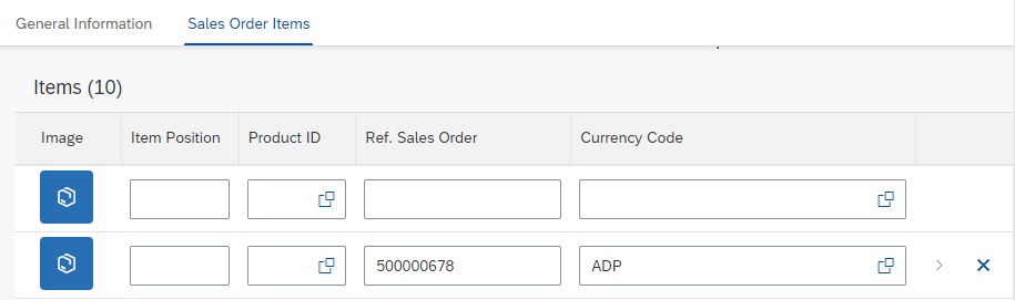
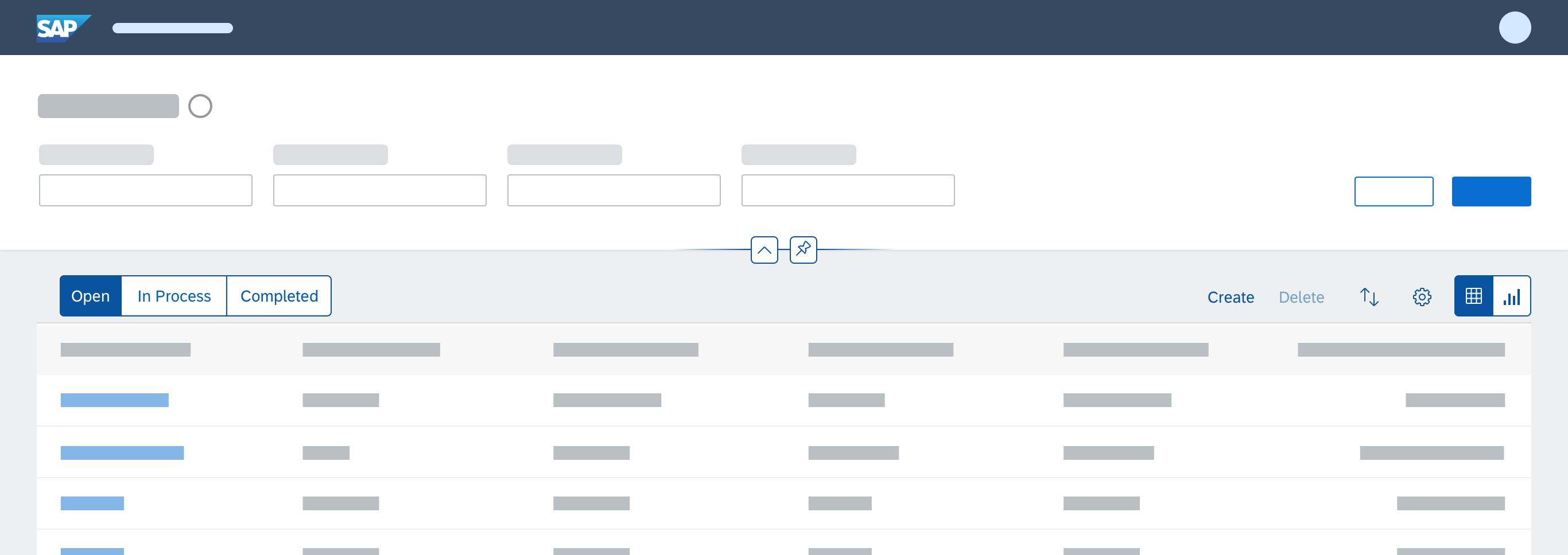
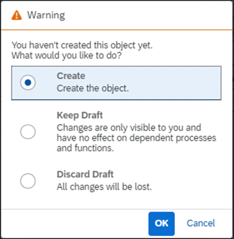
Empty Row for Data Entry in Create and Edit Modes
With this feature, when the object page is in create or edit mode, responsive tables and grid tables display one empty row where the users can enter data for a new subobject.
The empty row:
- Is displayed at the top of the responsive table.
The toolbar has no Create button. - Is displayed at the end of a grid table.
The Create button in the toolbar scrolls to the empty row at the end of the table and puts the focus on the first editable field.
- Has no inline navigation action to the item via the chevron.
- Cannot be sorted or grouped because it doesn’t exist in the table on the back end.
With SAP Fiori elements for OData V4, you can set the empty row to be deletable.
If the users delete all the empty rows in the table, a new one is added so they can continue data entry.
An empty row is displayed in the responsive table in create or edit mode
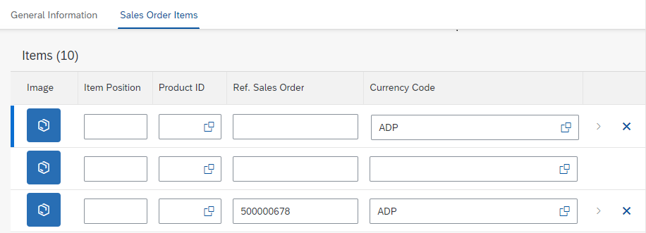
Automatic Creation of a New Empty Row
After users start to enter data in one field in the empty row, a new empty row is added underneath it so they can continue data entry for either one column or one row at a time.
The row with data in one field:
- Is highlighted with a blue line to its left to show it’s a newly created draft
- Displays the navigation chevron
- Can also display an inline delete action
- Displays error messages for mandatory fields without a value.
If users do not enter data in a new empty row, it is removed when the users save.
After the user starts entering data in the empty row, a new one is displayed
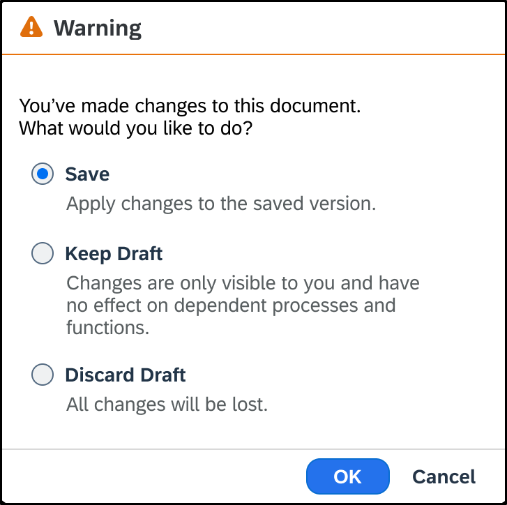
Drafts Saved for Rows
A draft for a once empty row is saved after the users:
- Shift the focus away from the input field in the row with SAP Fiori elements for OData V4
- Have shifted their focus away from the input field in the row and an interval of 20 seconds has passed with SAP Fiori elements for OData V2
Enablement Options
In draft-enabled applications, with both versions of SAP Fiori elements, you can enable or disable this feature for:
- An application so the setting applies to all grid tables and responsive tables in all object pages
- A table so it applies only to the table
When settings are made at both application and table levels, the table setting takes priority.
Additionally, with SAP Fiori elements for OData V2, you can enable or disable the feature at the object page level. When the settings are made at application, object page, and table levels, the setting at the most granular level takes priority, as follows: table, object page, application.
User-Enabled Creation of Empty Rows in Edit Mode
In edit mode, you can turn off the default creation of empty rows for tables whose maintenance mostly requires updating data in existing rows.
If the users want to create additional rows, the Create button lets them enable the automatic creation of one empty row.
On first click, the Create button creates the empty row. On subsequent clicks, the Create button moves the focus to the first editable field in the first empty table row. After the users save their changes, the automatic creation of empty rows is turned off.
Additional Settings
When you enable the empty row creation, for the empty row, you can also set:
- Mandatory fields
- Default values to populate fields
- Fields to be read-only at creation time and become editable only after the row is saved
Mandatory Fields
In create and edit modes, both versions of SAP Fiori elements guide users in completing the required fields for an empty row, as follows:
- With SAP Fiori elements for OData V4, a red asterisk (*) is displayed in the column header label for the mandatory fields.
- Both SAP Fiori elements for OData V2 and V4 show an error message strip above the table:
- When the table does not display mandatory columns. It instructs users to display the columns from the table settings.
- When mandatory fields are not filled. In addition to the message strip for the table, the mandatory field displays a value state message. “Enter a value” is the the placeholder message text.
Inline Actions
You can define actions for table rows or inline items. The action types can be:
- Actions that occur in the system while the user stays on the list report screen, for example Approve or Reject.
- Actions that navigate to a different application, for example, when the user can open a purchase requisition from a specific purchase order in the table.
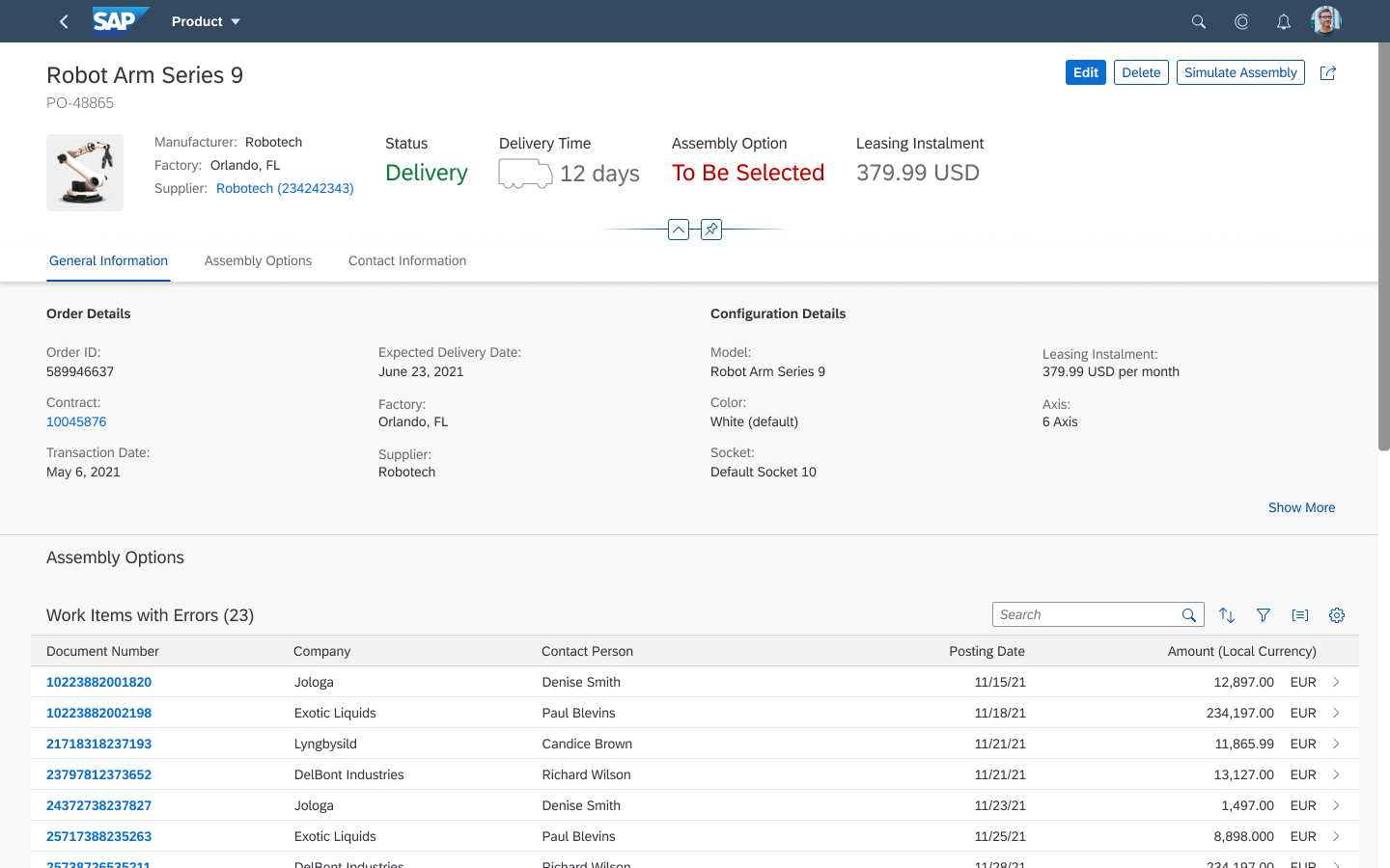
When a page contains a grid table, an analytical table, or tree table that leads to object or subobject pages, users can navigate to the object or subject page at row level. The Show Detail button is not displayed in these tables. Instead, users can click the navigation indicator: .
Direct Edit
You can enable this action to let users navigate from the table row to the corresponding object page in edit mode with the Edit icon with SAP Fiori elements for OData V2.
This feature is available for responsive and grid tables. When it’s enabled, the object page footer displays the Save and Next button.
For more information, see:
Conditional Enablement of Navigation Buttons
In list reports and object pages:
- With SAP Fiori elements for OData V4, you can enable buttons that navigate the user to another page or application based on the value of a specific field.
- With SAP Fiori elements for OData V2, this feature requires extensions.
For example, you can enable the Generate Purchase Order button only for sales orders with the completed status.
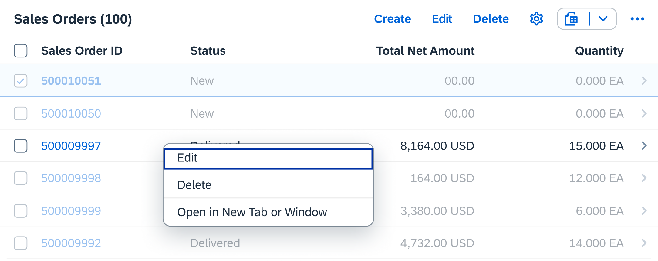
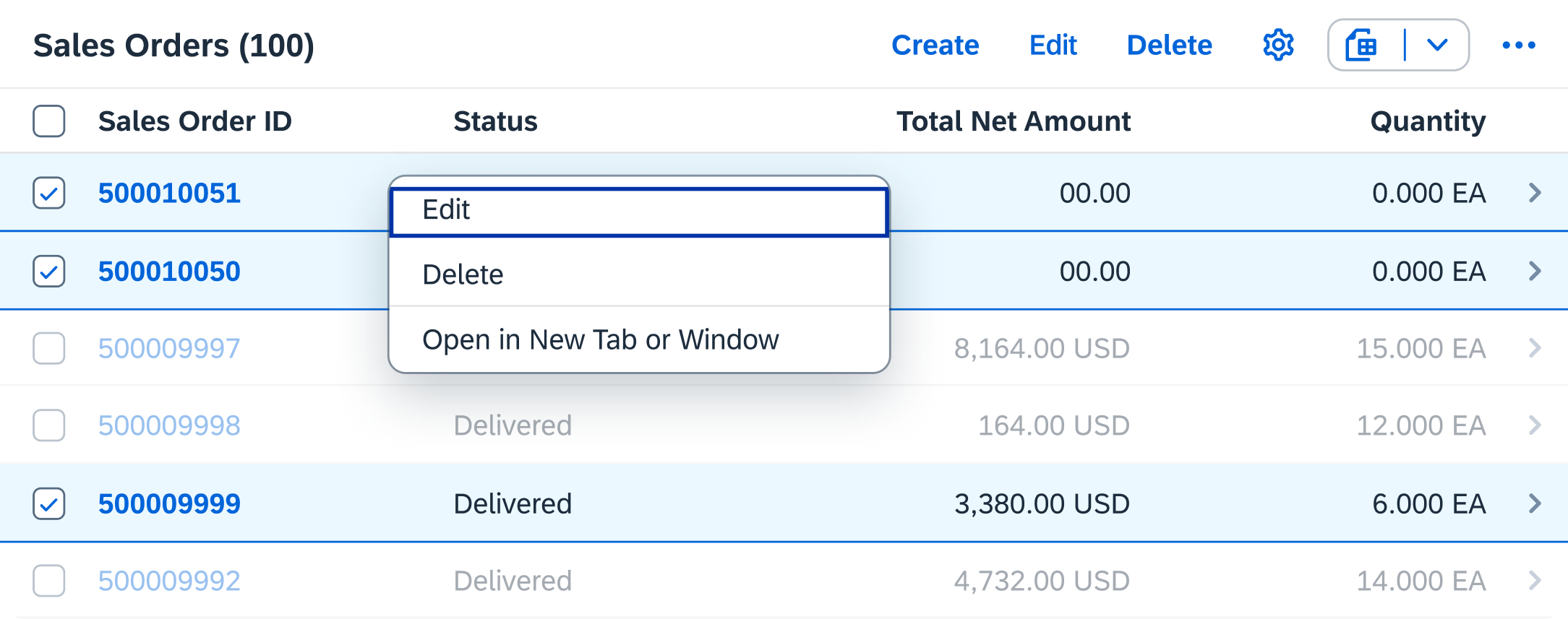
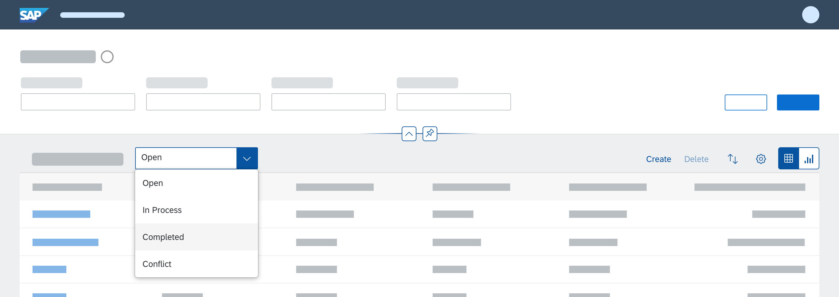
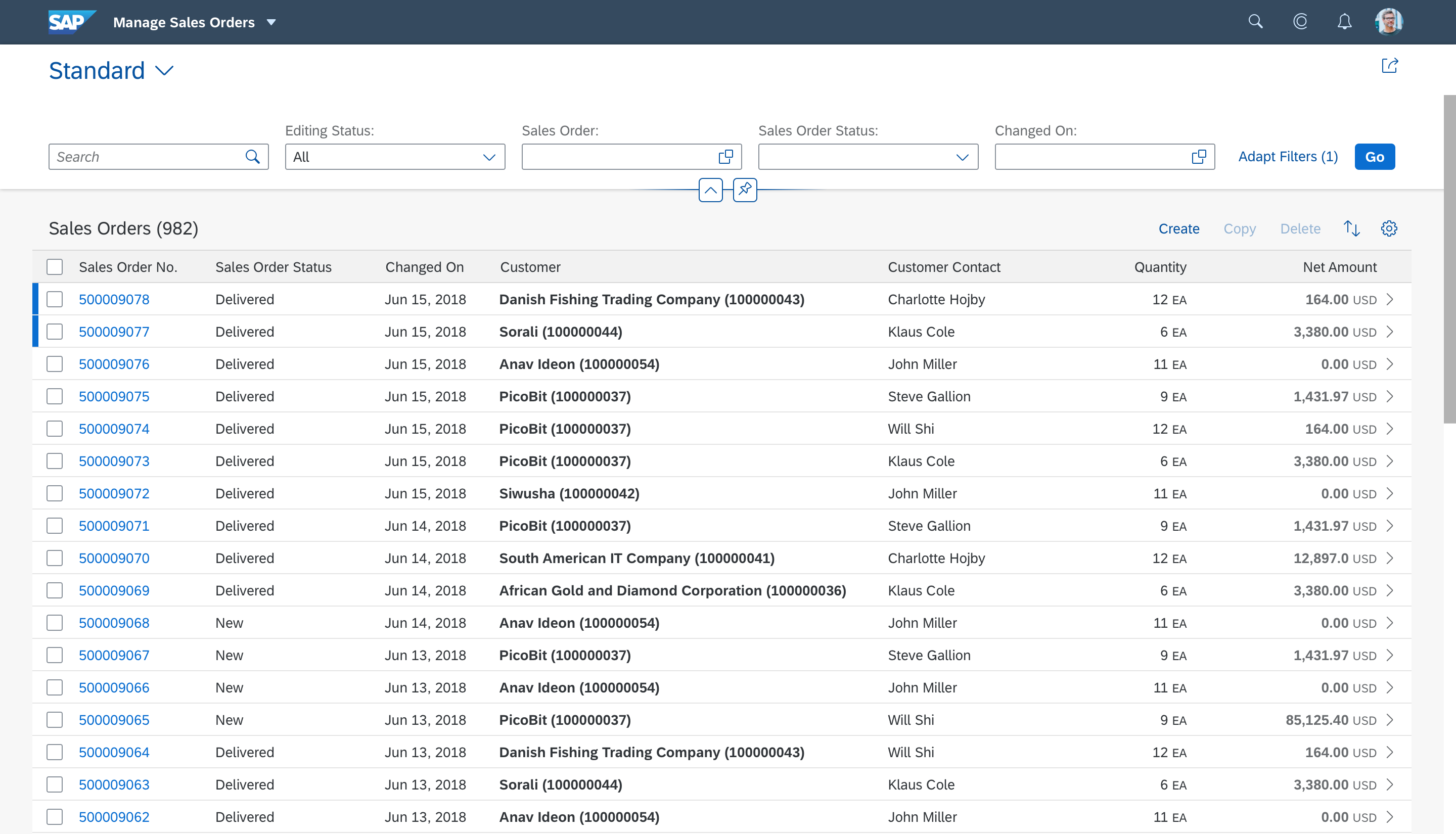
Item Selection
Both versions of SAP Fiori elements allow you to determine whether users can select:
- One table row for a toolbar action, using a radio button.
- Multiple table rows for a toolbar action, using checkboxes.
For an object page, you can enable selection of multiple rows for all the tables on the page, or for specific tables only.
For an analytical table, grid table, or tree table, ask the development team to use the Multi-Selection Plugin.
When the selection of multiple rows is enabled for a table, both versions of SAP Fiori elements have the following defaults that you can change:
- Display of either the Select All or Clear All checkbox in the header of the selection column. The two versions differ in the way they do this.
For complete information, see: Select All / Clear All. - A limit of 200 rows that the user can select at once for grid tables, analytical tables and tree tables.
You can change the limit. We recommend you consult the application team on how a change would impact performance.
SAP Fiori elements for OData V2
By default, single selection is enabled for a table. You can enable multiple item selection, known by application developers as multiselect.
SAP Fiori elements for OData V4
With the default auto mode, the application checks whether any table toolbar actions depend on item selection to be enabled. If not:
- In display mode, item selection is not possible.
- In edit mode, when the delete action is enabled, multiple selection is also enabled.
Instead, you can enable one of the following selection modes:
- None:
- Display mode allows no item selection.
- Edit mode allows multiple item selection when a Delete action is available in the table toolbar.
- Single: Both display and edit modes allow single item selection.
- Multi: Both display and edit modes allow multiple item selection.
For more information, see:
- Responsive Table: Select
- Analytical Table: Select
- Grid Table: Select
- Tree Table: Selection Modes
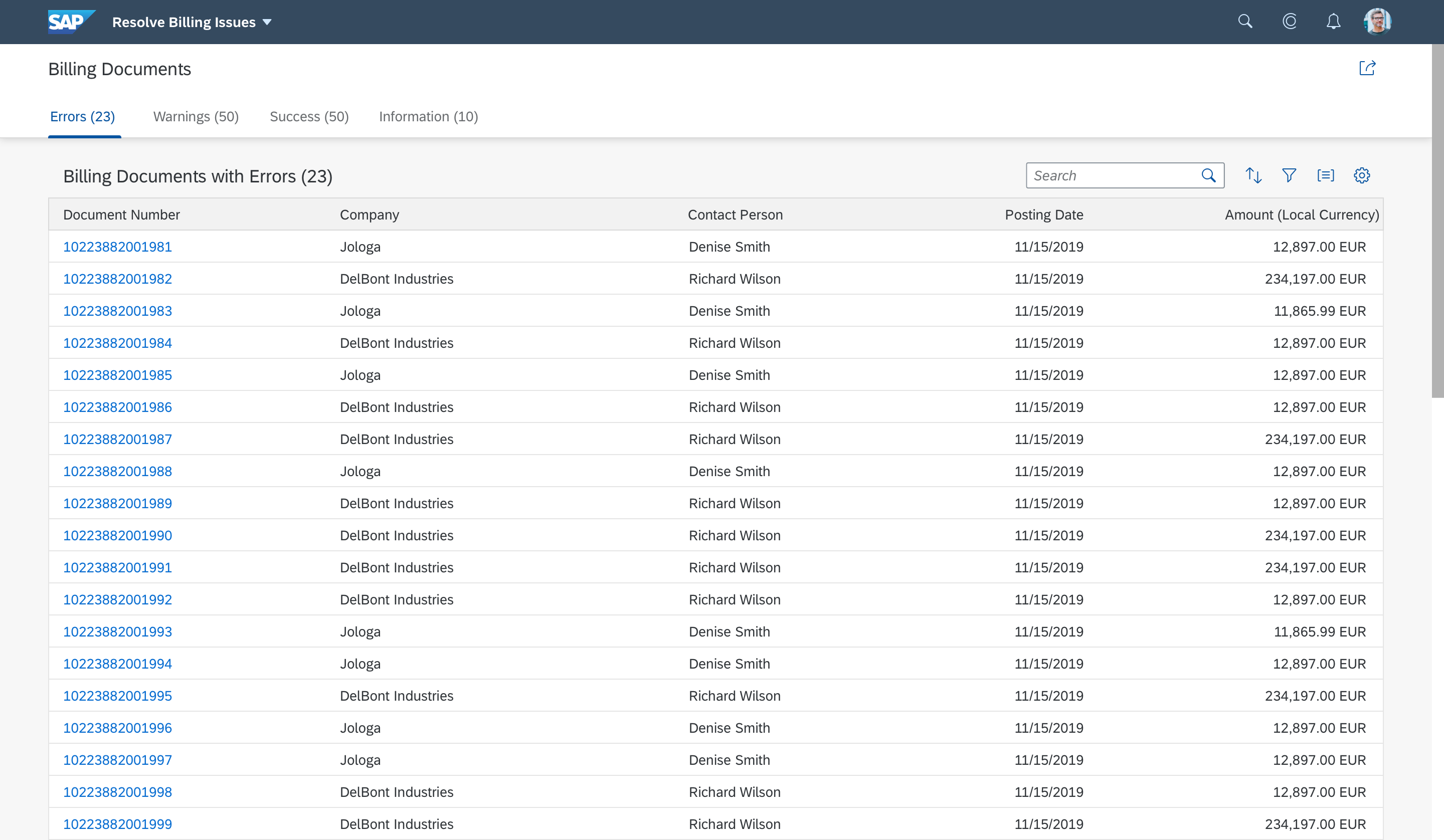
Delete
In responsive tables only, you can:
- Display an inline delete action.
- Prevent the deletion of certain rows.
In support of best design practices, SAP Fiori elements does not allow you to combine an inline delete action with a central delete action in the toolbar.
For more information, see Delete Single Item Rows.
Custom Actions
You can define custom inline actions.
Because custom inline actions are grouped, you cannot control their exact display order. However, you can control which columns display the groups.
Messages for Critical Actions
For actions that you set as critical, you can display one of the following after the user triggers the action:
- A message toast confirmation
- A confirmation message box to check the users want to proceed with specific critical actions
Also, the backend can require a confirmation on some actions. In this case, the confirmation message is always shown in a message box.
Example
| SAP Fiori elements for OData V2 | SAP Fiori elements for OData V4 | |
| Default Text | “Do you really want to execute the action <Action Label>?”
<Action Label> is the label shown on the button. |
“Do you really want to perform this action? |
| Replacement Text | “Are you sure you really want to activate this product?” | “Are you sure you really want to activate this product?” |
For more information, see UI Text Guidelines for SAP Fiori Apps.
Display
You can include the display features described below in a table row or inline item.
Read-Only Field
With SAP Fiori elements for OData V4, you can set a field to display as read-only in a table, but set it as editable in another place on the UI.
Editing Status
By default, for draft-enabled applications, in a list report, the editing status is displayed:
- In the first column of a responsive table
- In a separate column, next to the key column, in a grid table. The column is unlabeled. Users can hide or display it by deselecting or selecting Edit Status in the table personalization dialog.
You can also add the semantic key to the status.
The edit status reflects the state of the object or item in the processing cycle. For example, it can give the user information about the state of completion for the item or whether it’s currently available.
- For Unsaved Changes and Locked statuses, a popover displays the full name or technical name of the user who last changed the object when the name is available. “Another user” is displayed when it’s not.
- For Draft, Unsaved Changes and Locked statuses, a popover displays the user who last changed the item and the time of the change.
For more information, see Tables.
Rating Indicator
You can add an inline, read-only rating indicator and define a maximum rating of up to five stars. By default, five stars is the maximum.
The number of stars displayed depends on the value of a field in the backend. Decimal values are rounded up or down and when the value after the decimal point falls between x.25 and x.74, it is represented by a half star.
With extensions, you can enable editing of the rating indicator
For more information, see Rating Indicator.
Progress Indicator
You can:
- Enable an inline progress indicator to visually represent the level of completion of a project or goal, for example.
- Set the progress measure as a percentage or an absolute number, for example 3 or 8.
- Configure the progress bar to reflect the state of progress with color, based on the criticality of the progress.
For more information, see Progress Indicator.
Quick Contact View
You can add a quick view to a contact to display key contact details in a popover.
For applications with Microsoft Team integration, the contact quick view card displays options for starting an audio call, video call, or chat in with the contact in Microsoft Teams.
For more information, see Quickview.
Avatar and Other Images
You can display an avatar in the row and set a tooltip that displays when the focus is on the avatar.
For more information, see Avatar.
Highlighting Line Items
By default with SAP Fiori elements for OData V4, in draft-enabled applications, a newly created item in draft status is always highlighted in blue in grid and responsive tables.
Highlighting of new line items in draft-enabled applications is available with both SAP Fiori elements for OData V2 and V4.
You can also define highlighting and icons for line items based on their criticality.
After a newly created item is saved, it is highlighted according to the criticality, as follows:
- Green for success (criticality value 3)
- Yellow for warning (criticality value 2)
- Red for error (criticality value 1)
- No highlighting for no criticality (criticality value 0)
Responsive Table Only
In a responsive table, you can include the display features described below in a table row or inline item.
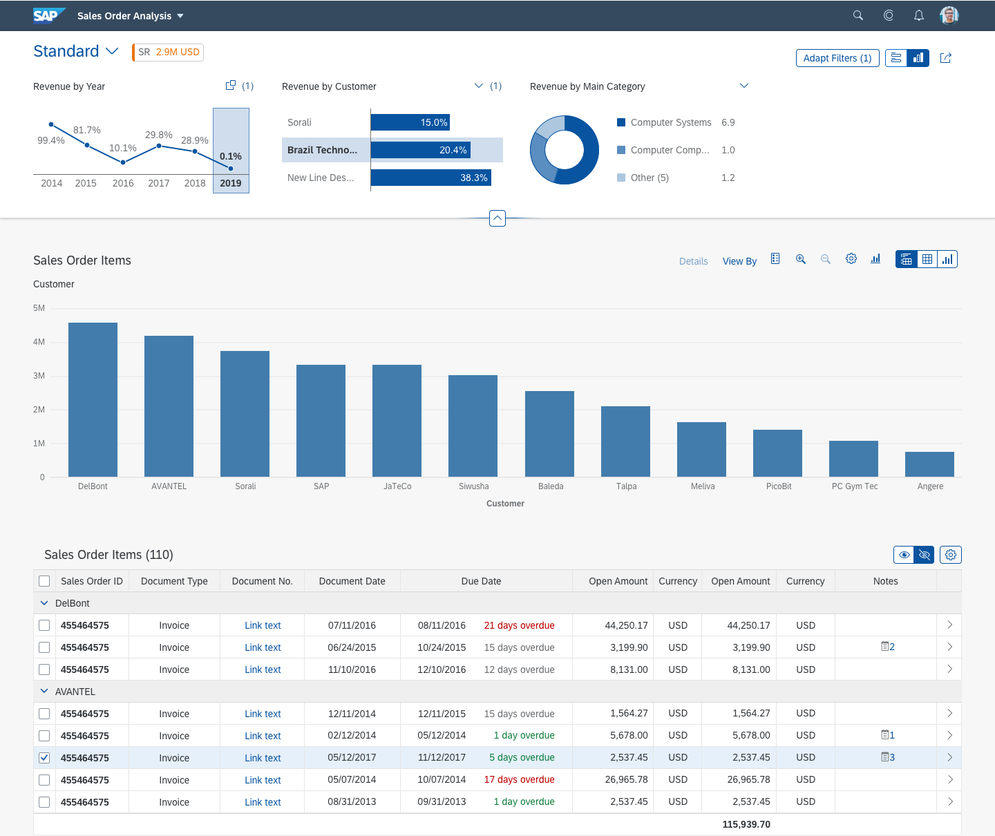
Multiple Fields in a Single Column
You can combine multiple IDs, descriptions, and action buttons in a single column in a responsive table.
For example, you can display the following in a single column:
- Company name
- Company ID
- Items in Stock
- Progress Indicator for Items in Stock
- Overall value of the Items
- Multiple Action buttons that allow the user to both:
- Execute an action while staying on the list report page
- Navigate to other objects and applications
The visibility and position in the table of a column that combines multiple fields can be changed.
Field Labels
By default, with SAP Fiori elements for OData V4, when a column contains a field group with more than one field, the labels for those fields are not displayed.
You can enable the display of a label for each field. Then, the field group label is displayed as the column title in the header.
Limitation on Export to Spreadsheet
When users export a table with a column that contains multiple fields to a spreadsheet, only the first piece of information displayed in the column is exported.
Related Links
Elements and Controls
- Table Overview (guidelines)
- List Report Floorplan (guidelines)
- Object Page Floorplan (guidelines)


 Your feedback has been sent to the SAP Fiori design team.