
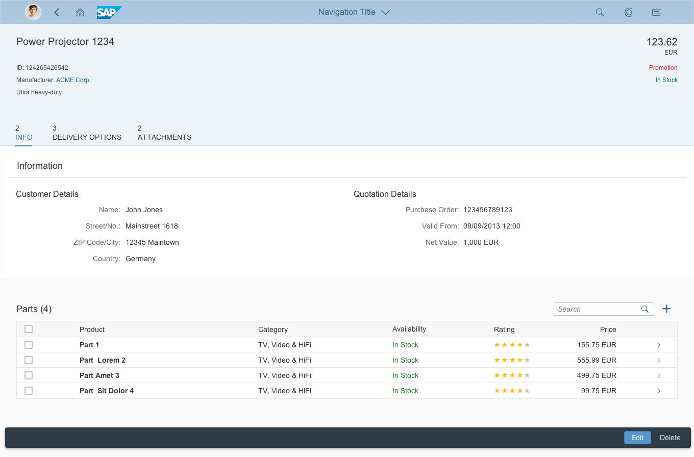
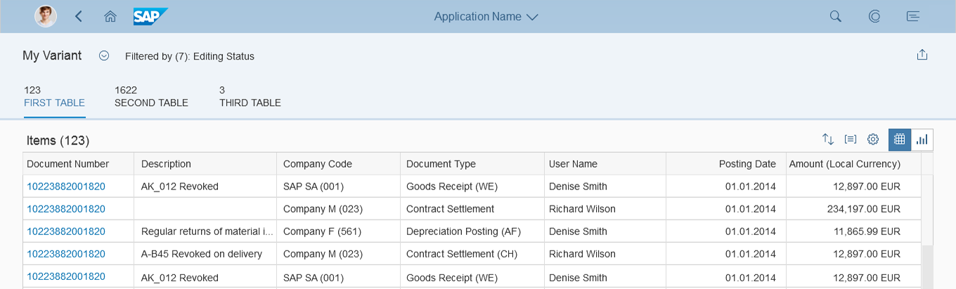
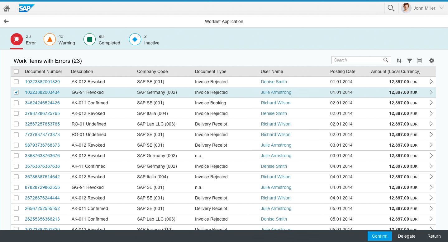
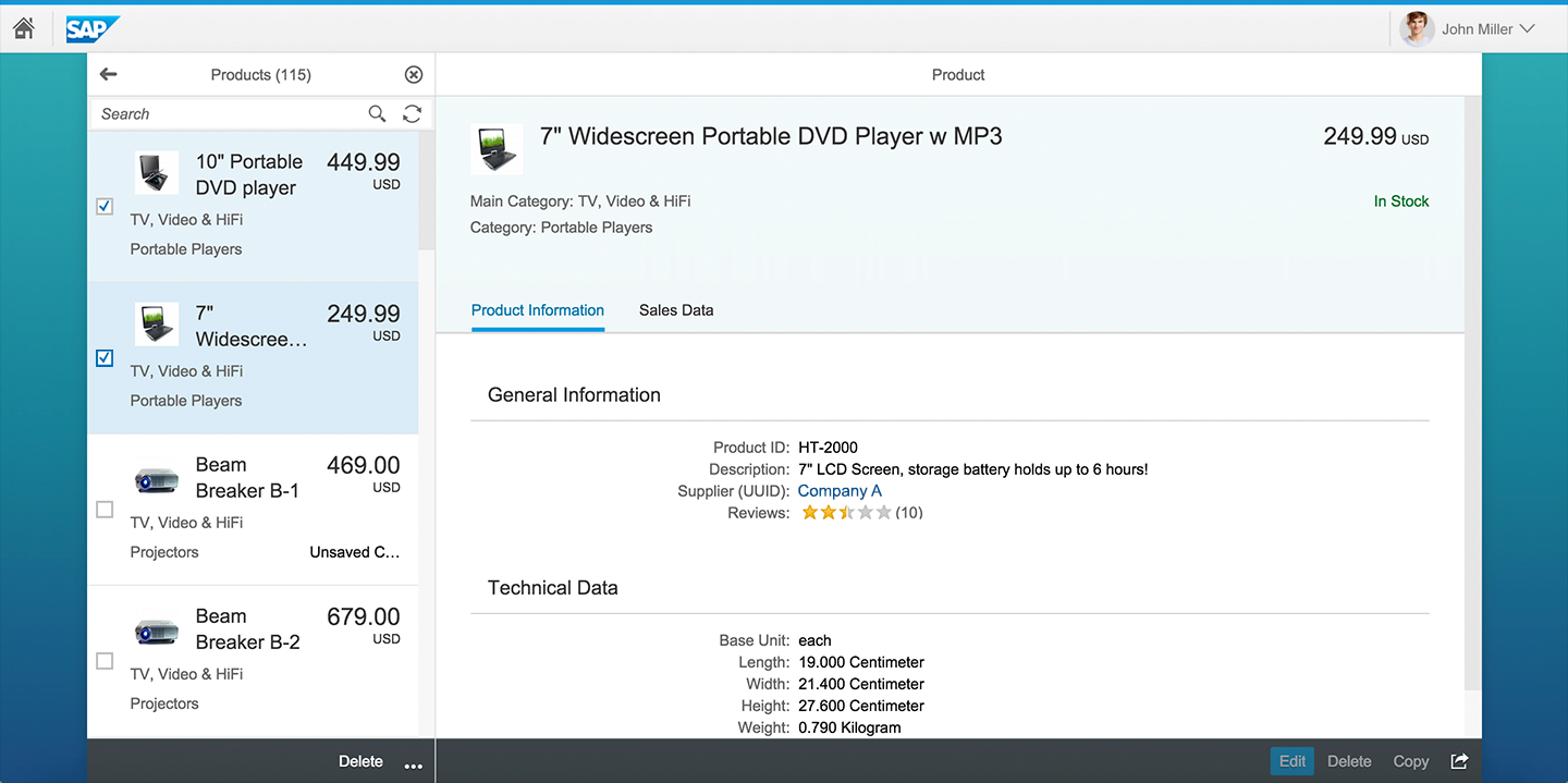
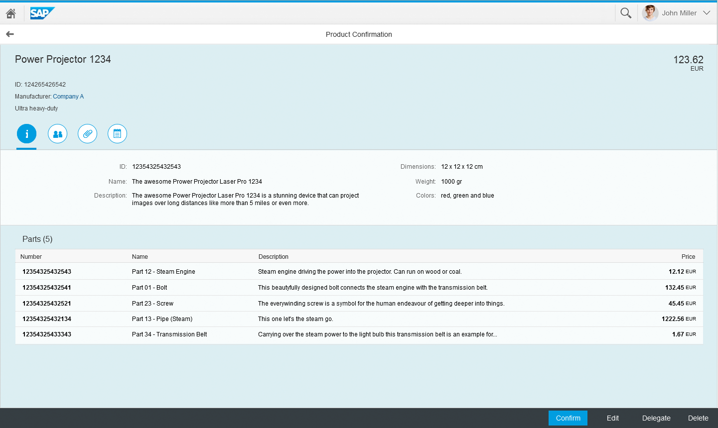
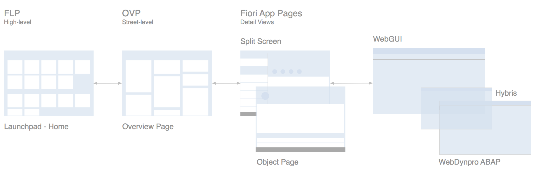
Object View Floorplan
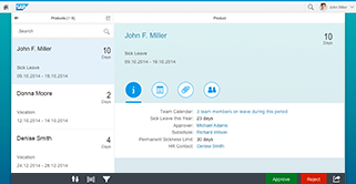
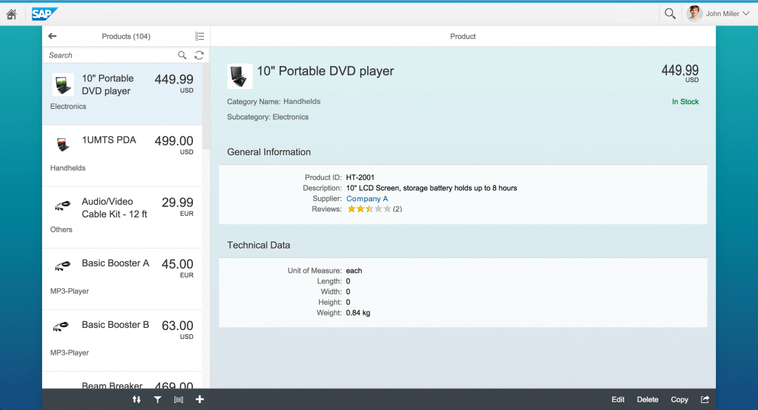
The object view is a floorplan for displaying objects in SAP Fiori. It can either be embedded in a master-detail app (as in typical approval apps) or shown as a full-screen page. This floorplan offers optimal support for multiple devices.
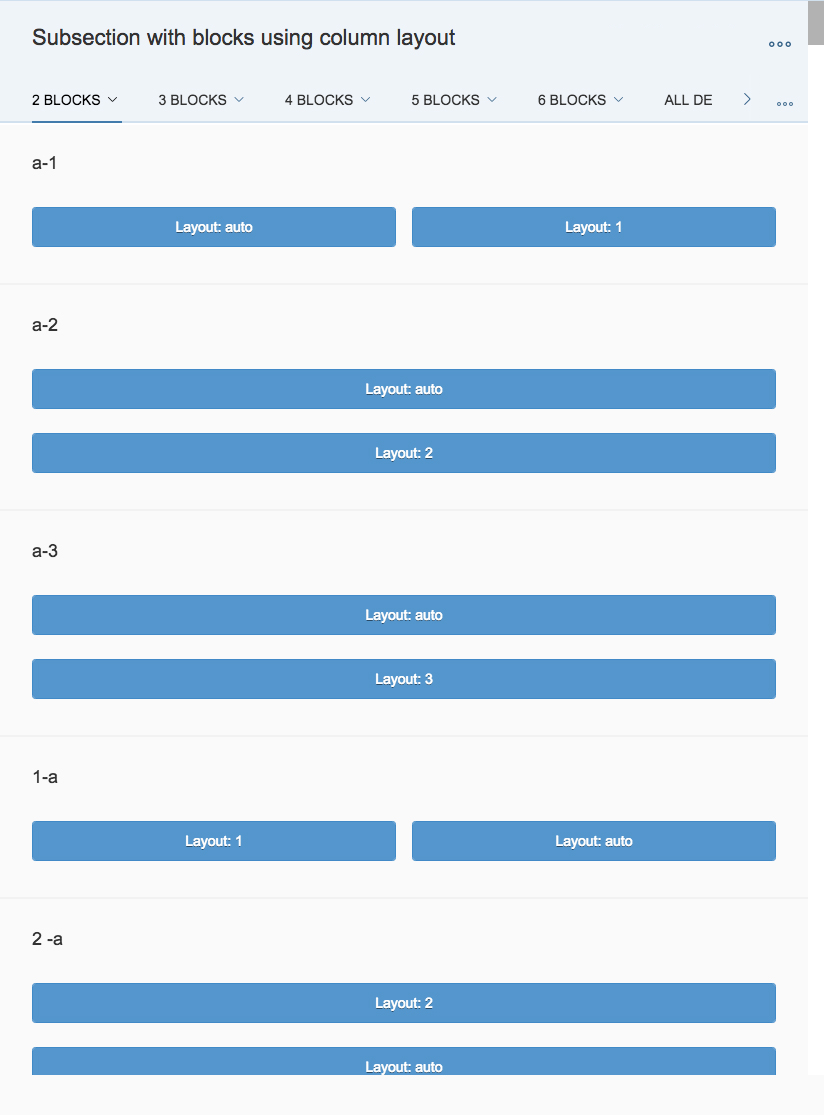
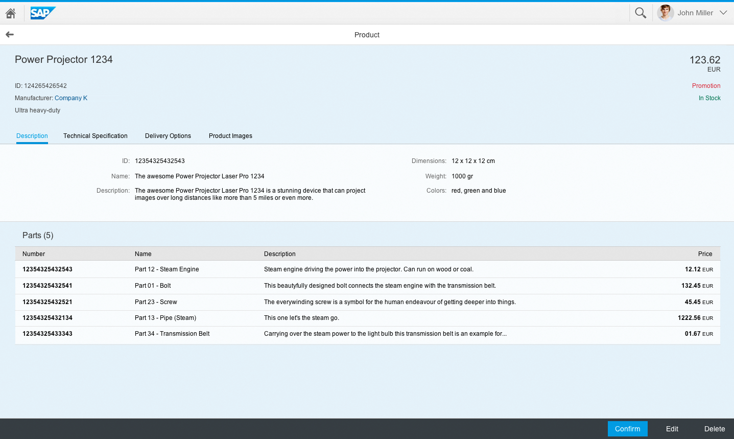
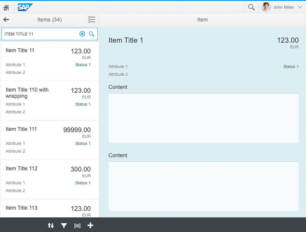
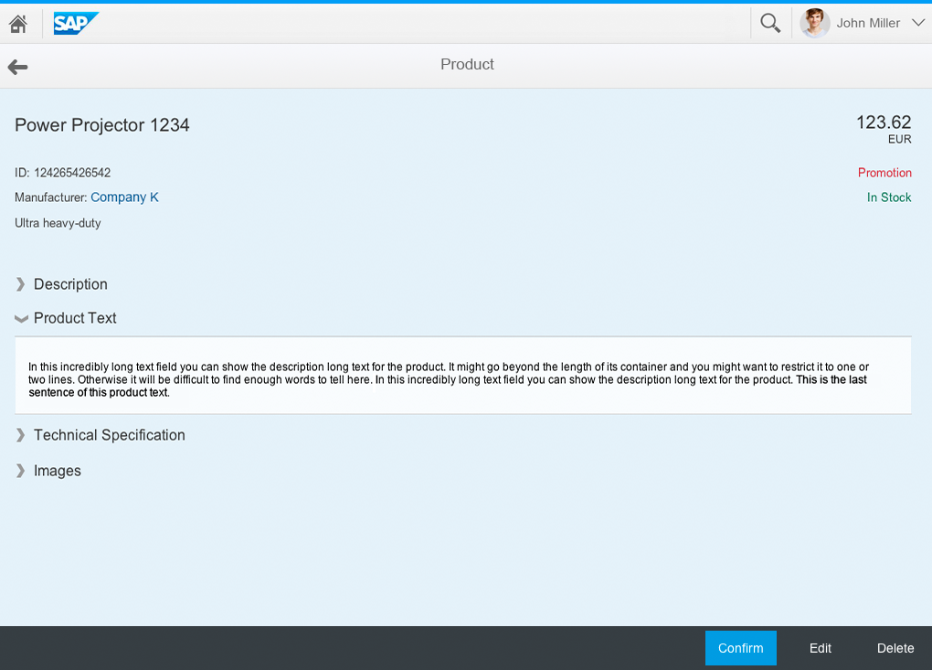
The object view is suitable for both simple objects and more complex, multi-faceted objects. You can use a tab container to present the information in different categories.
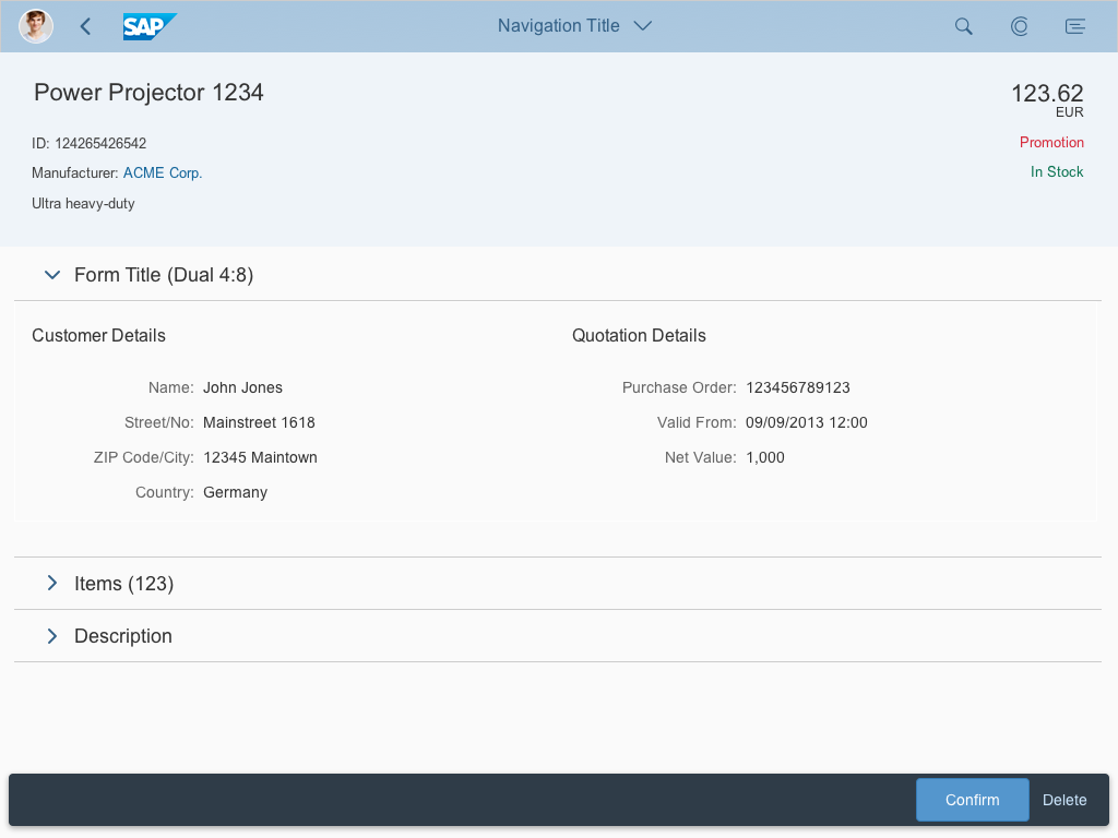
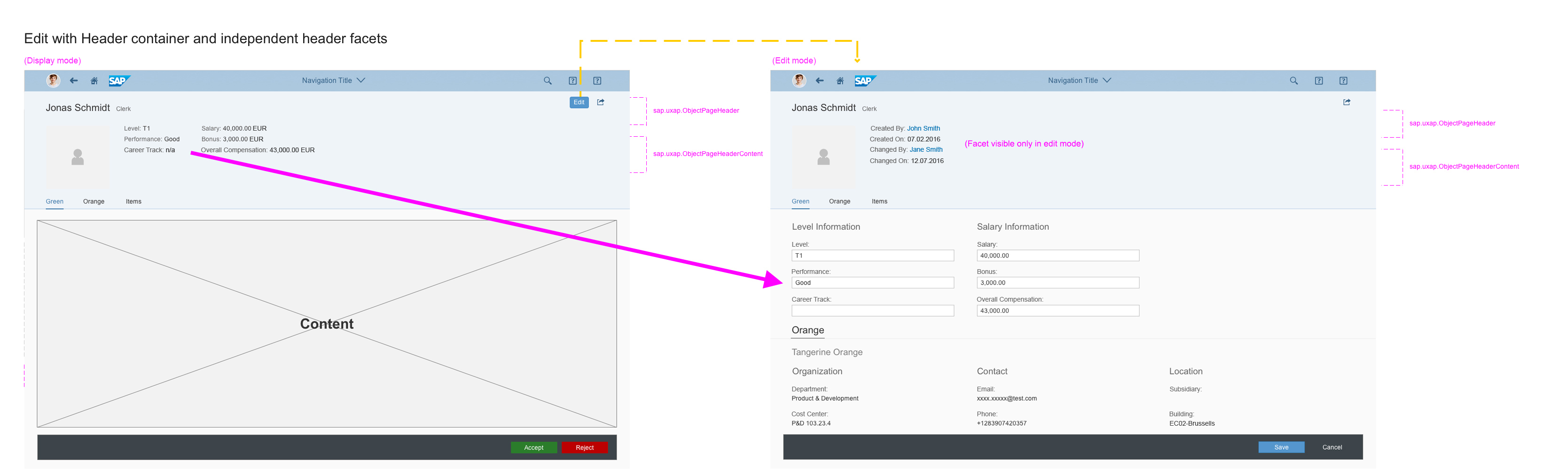
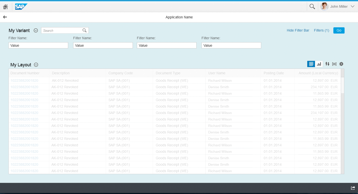
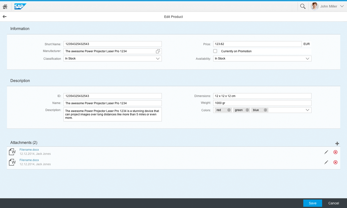
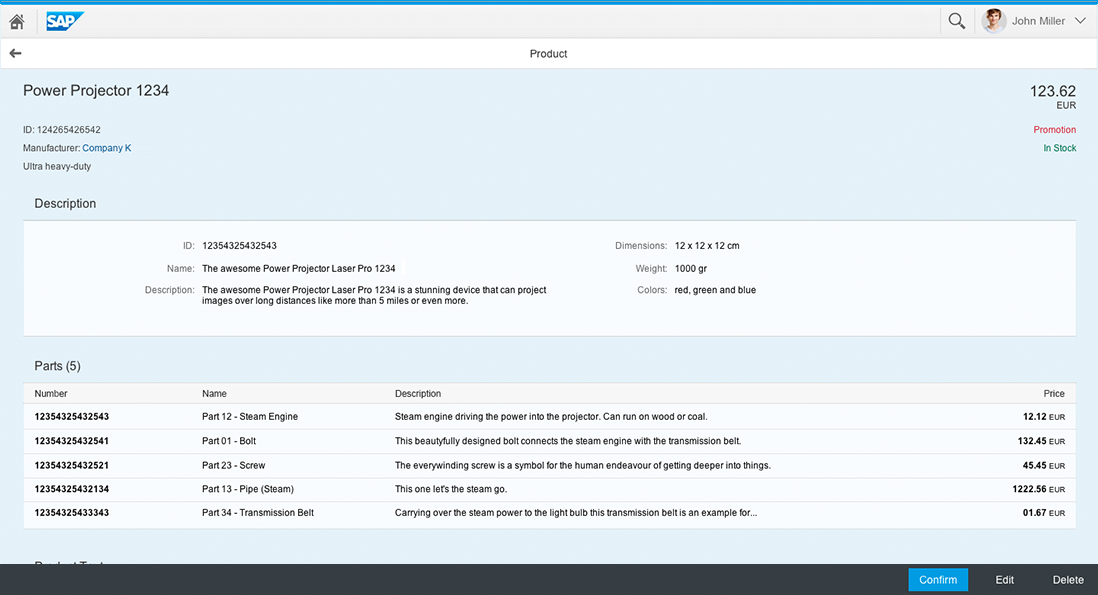
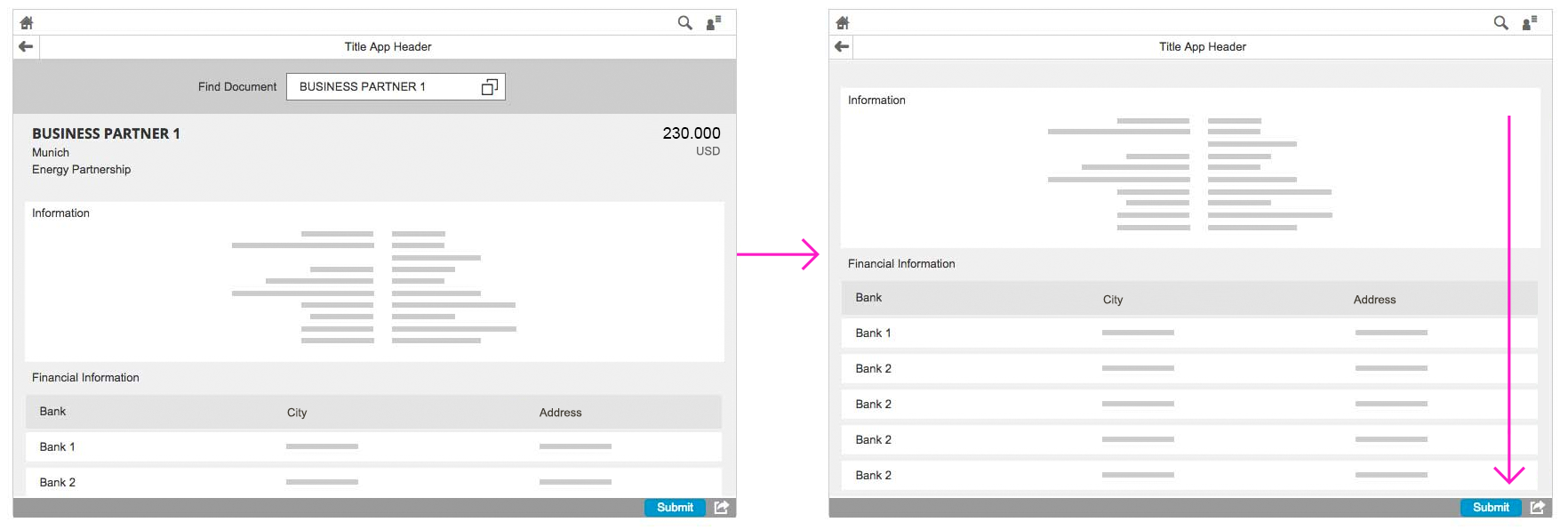
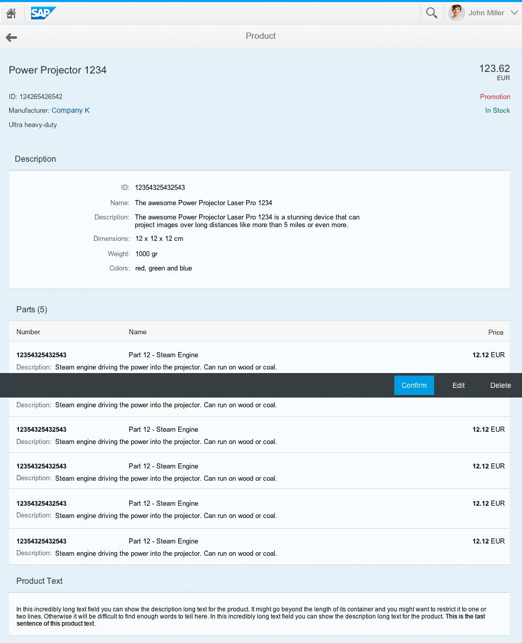
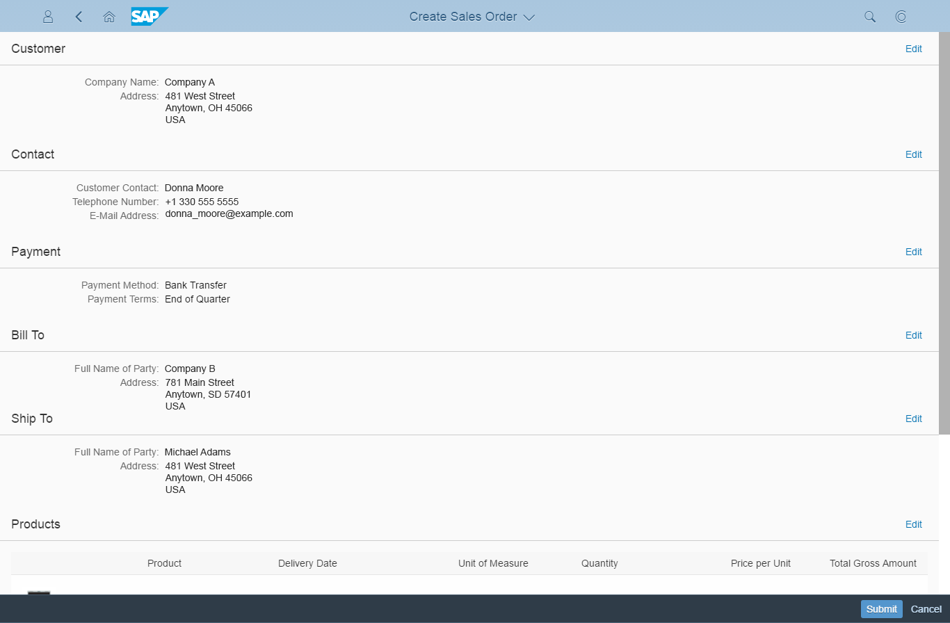
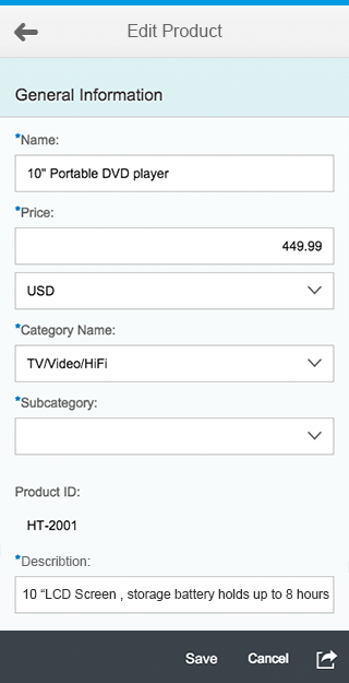
For editing, the layout switches to a flat object view. In other words, all the sections that were presented as tabs appear together on one long page. Switching to this flat layout prevents user input and validation errors from being scattered across multiple tabs.

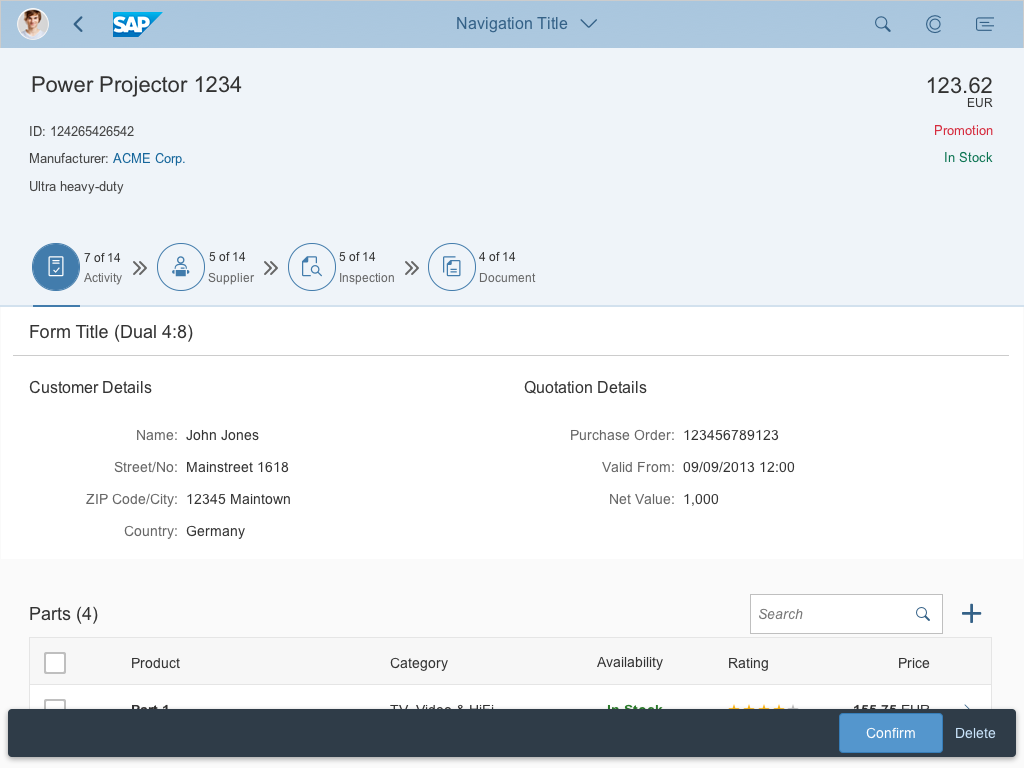
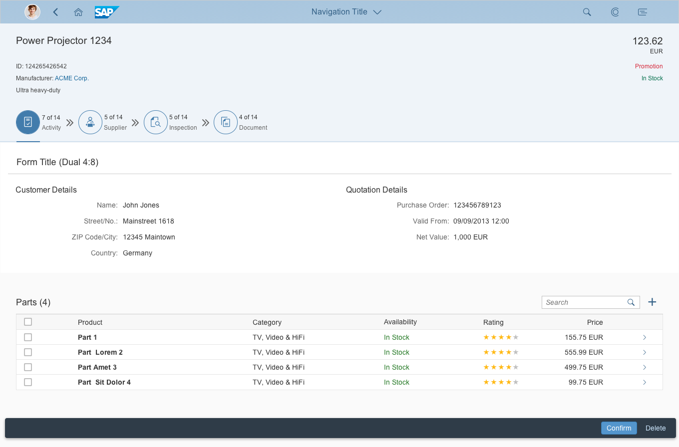
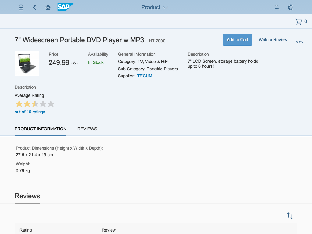
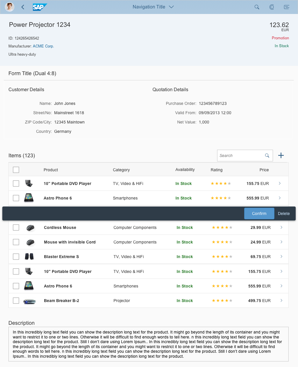
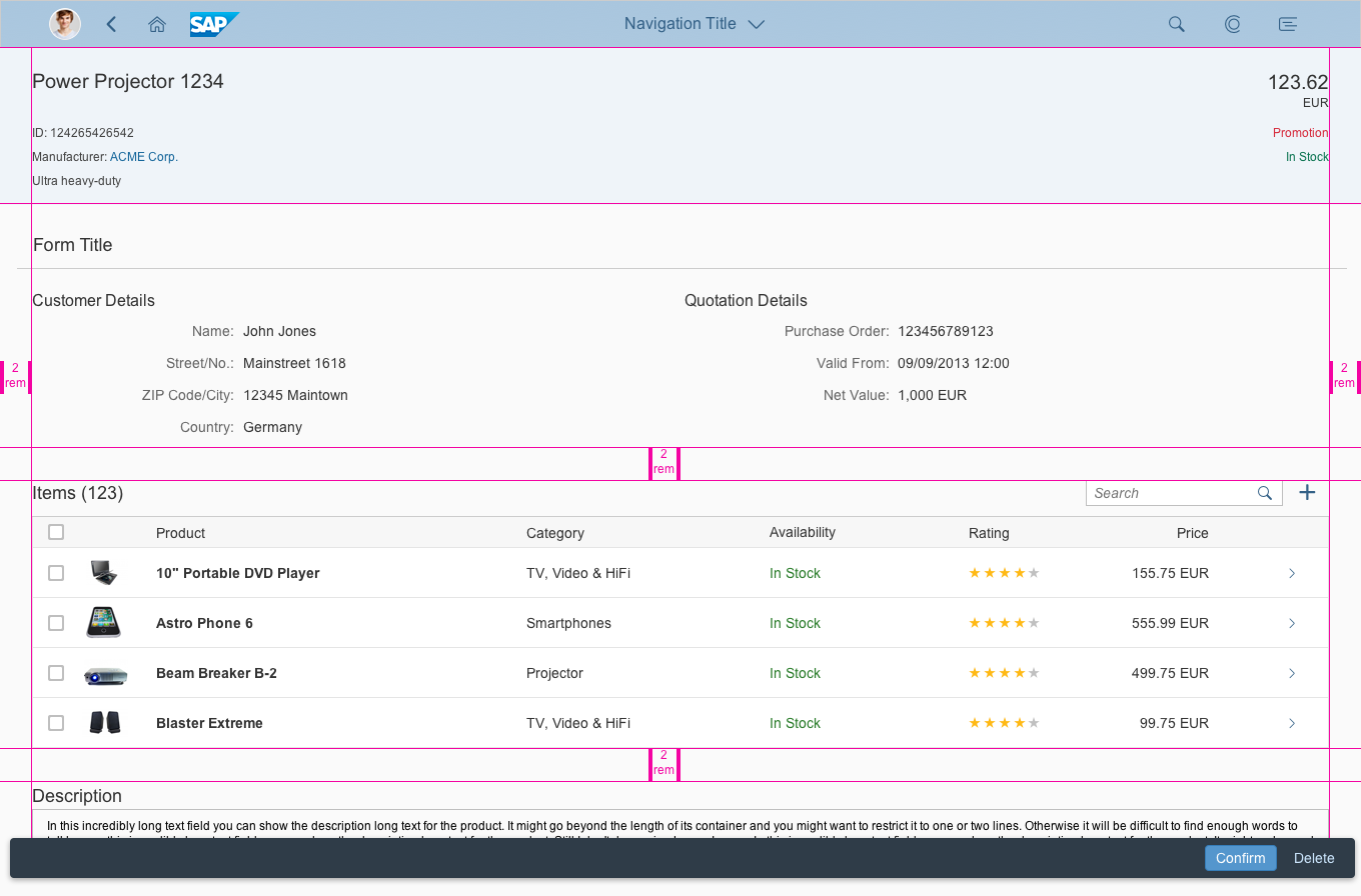
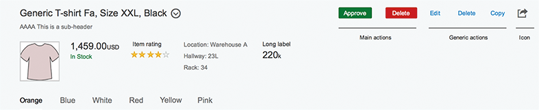
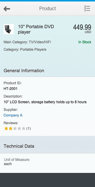
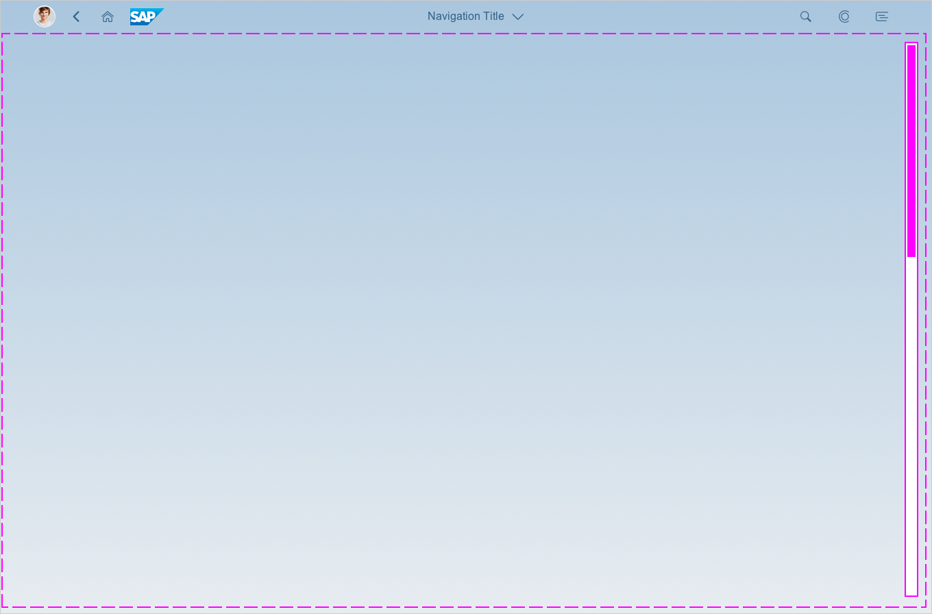
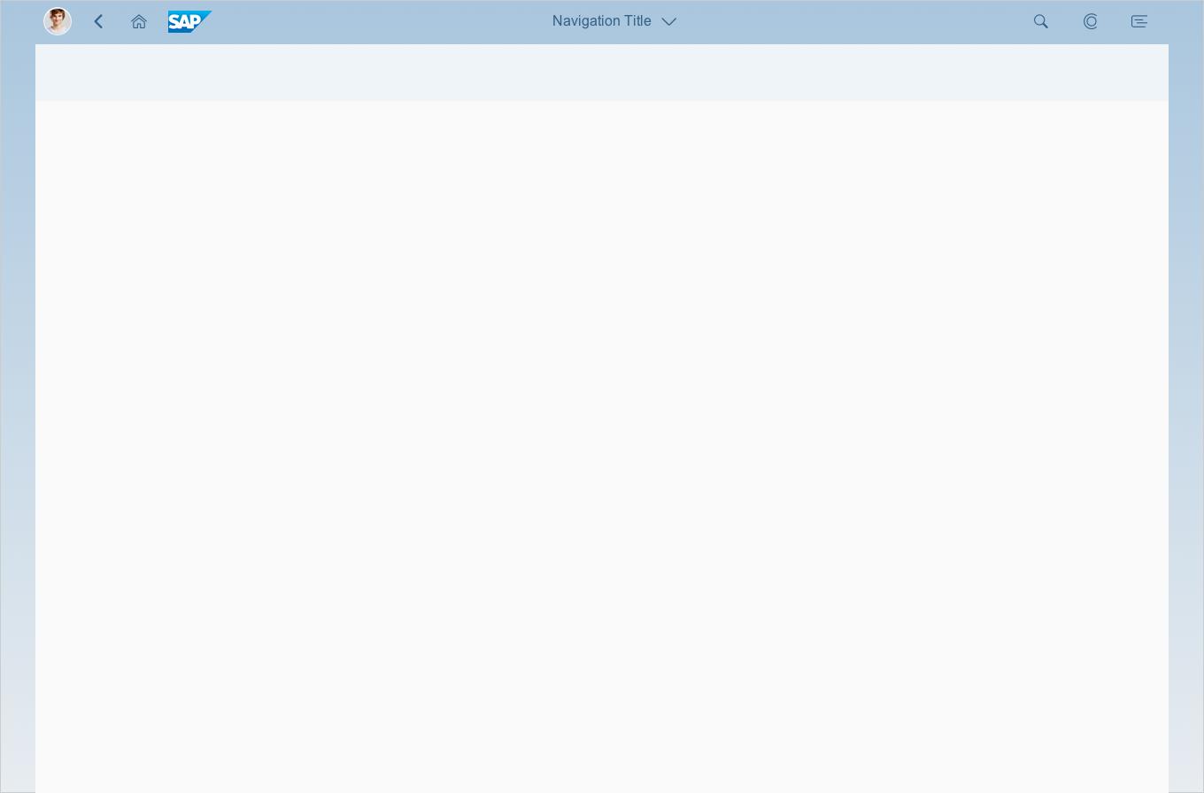
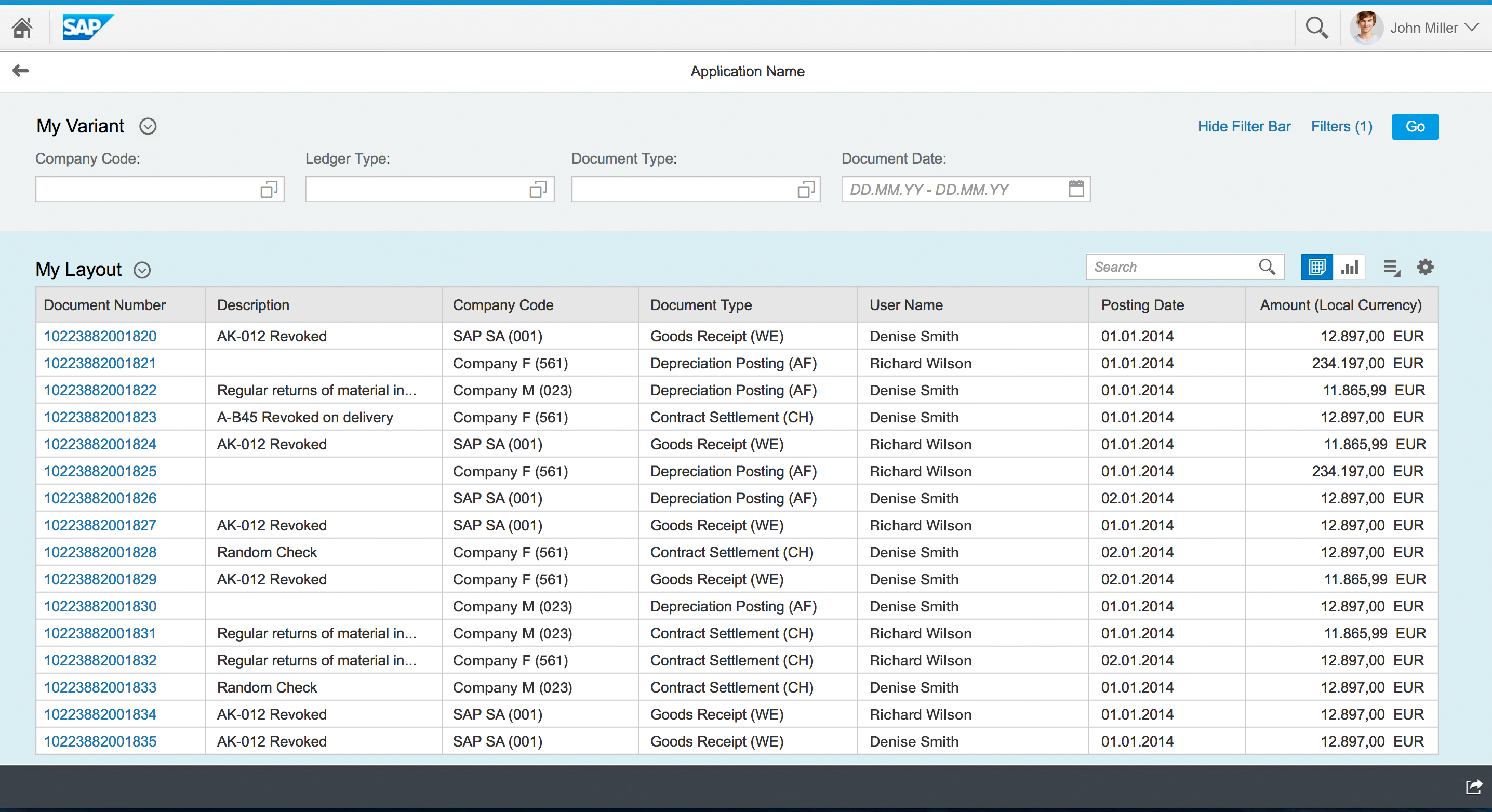
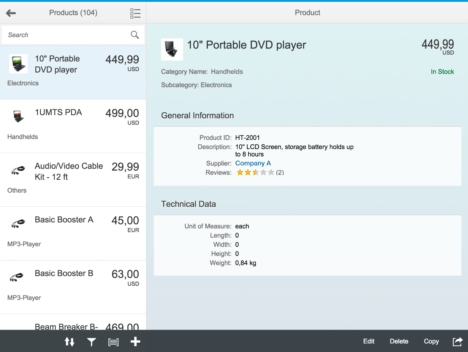
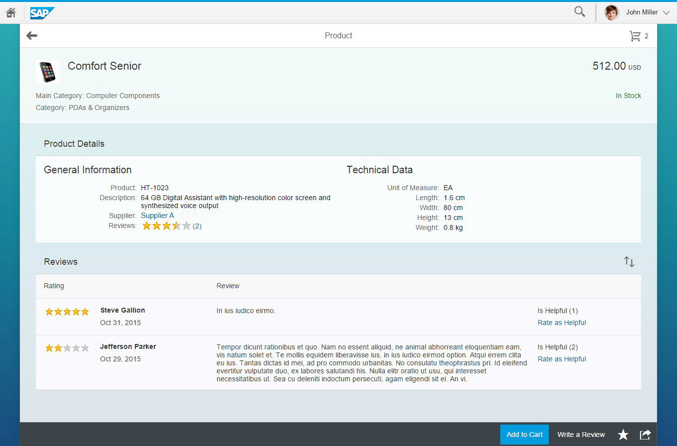
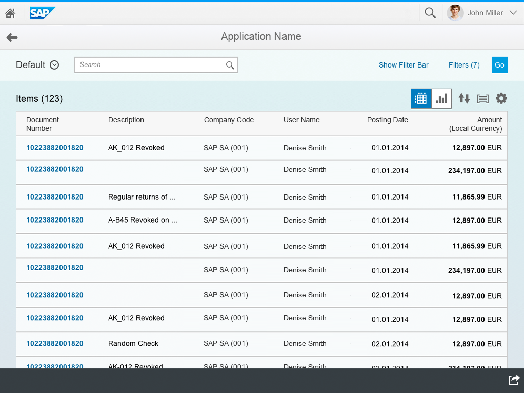
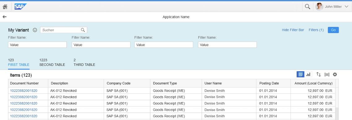
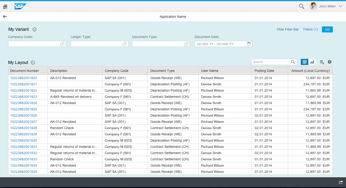
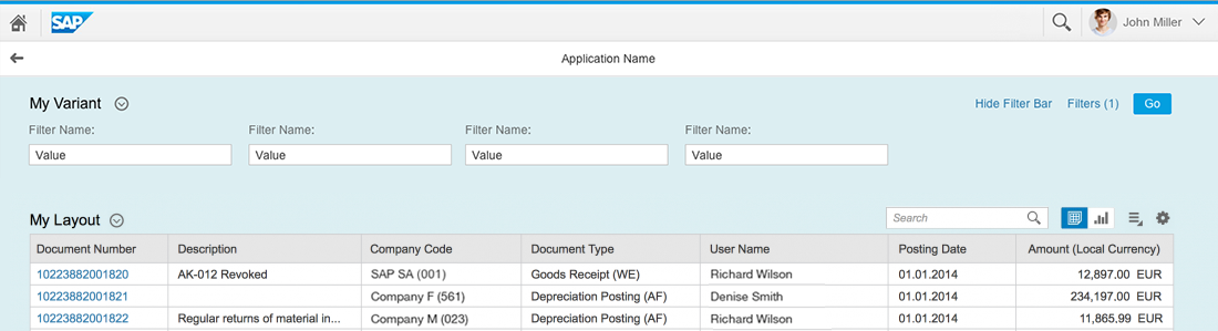
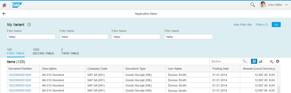
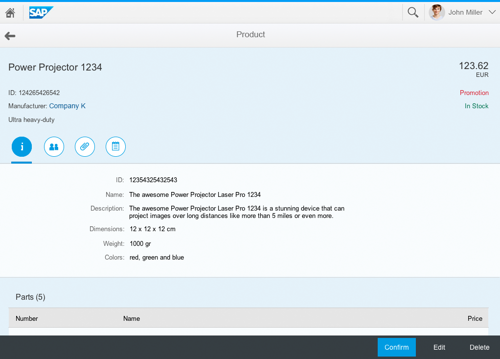
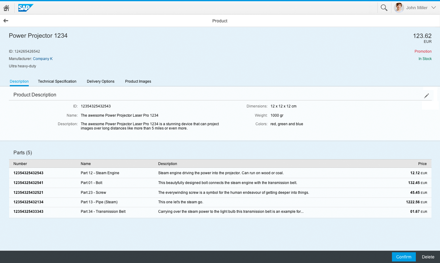
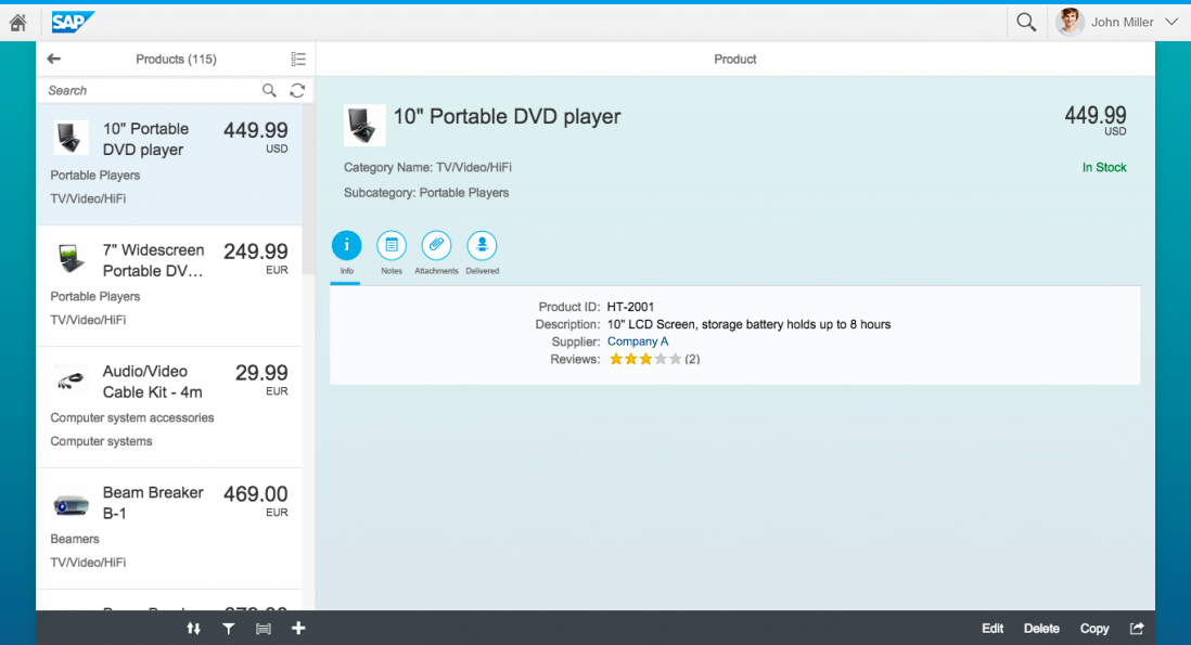
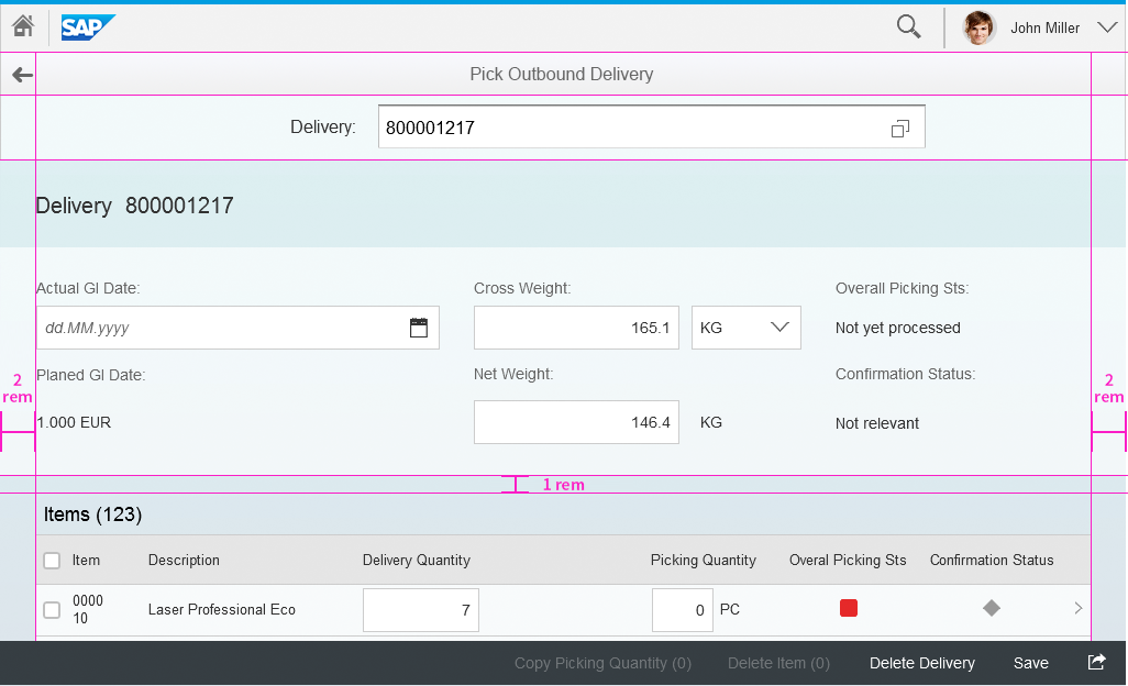
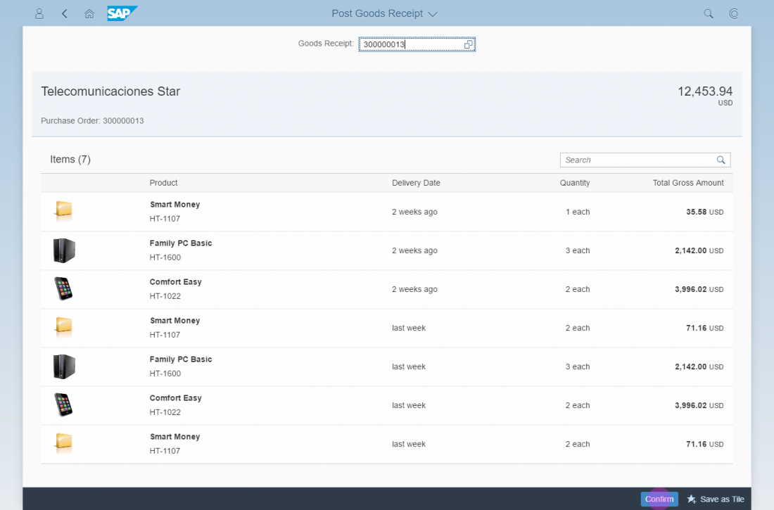
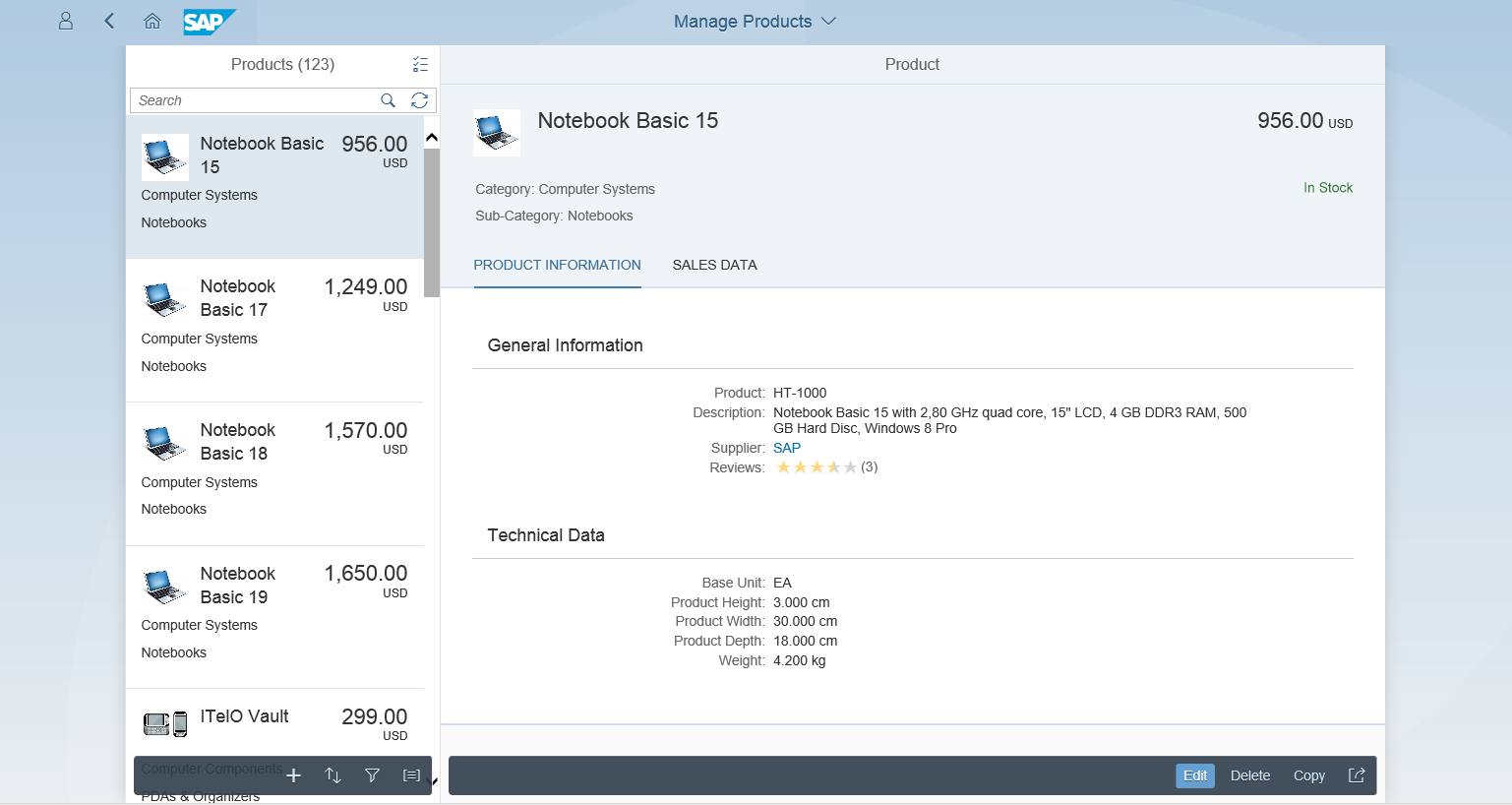
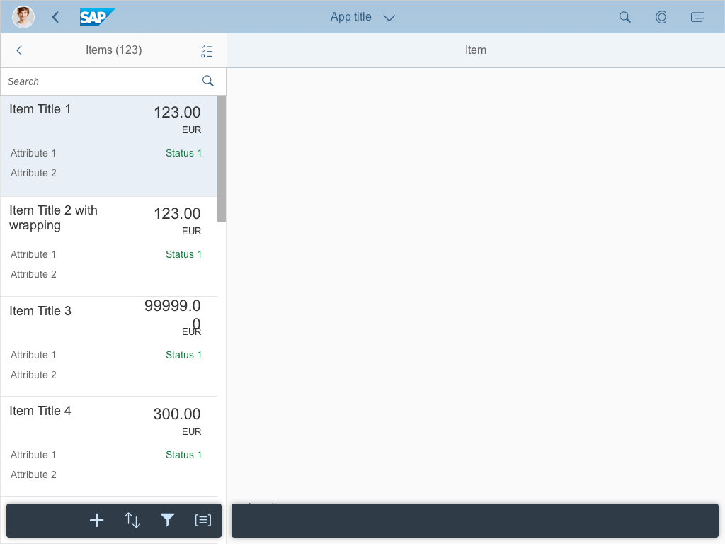
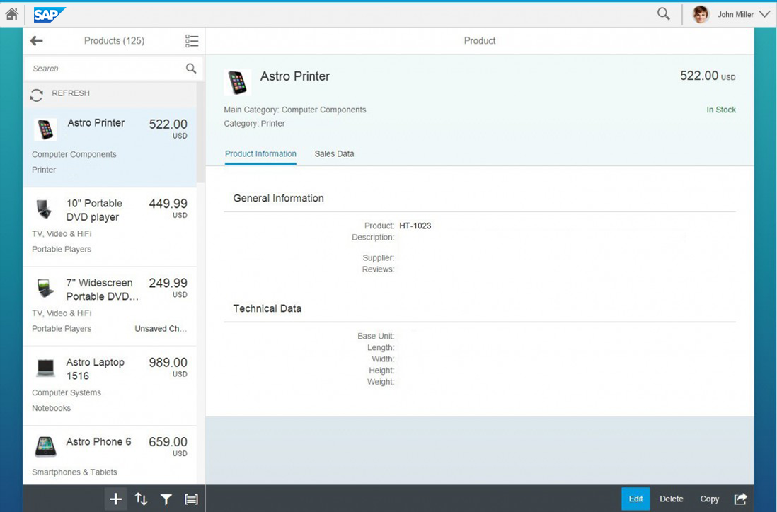
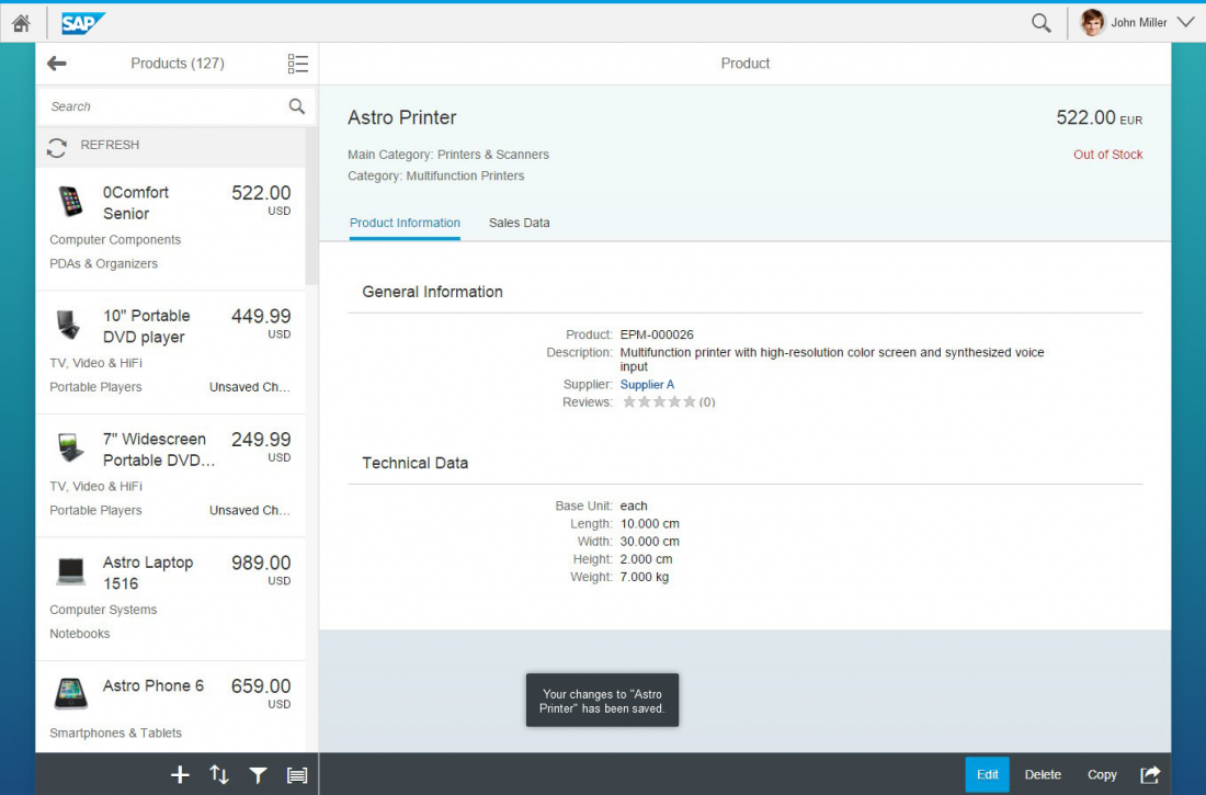
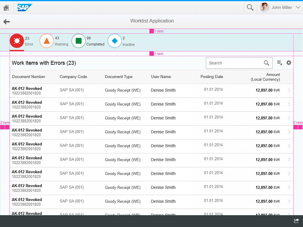
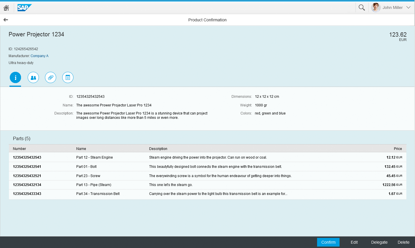
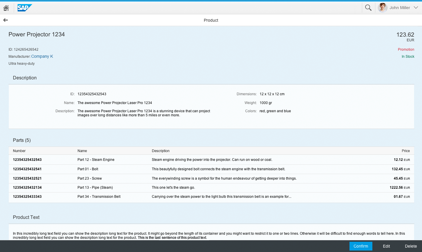
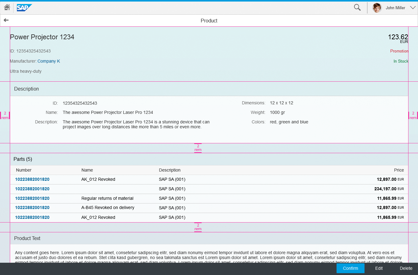
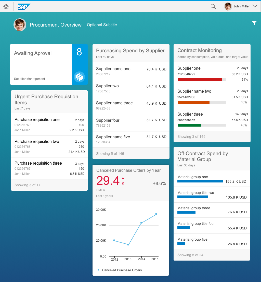
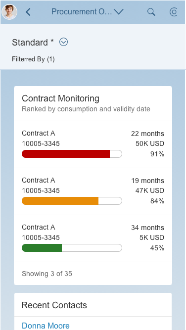
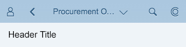
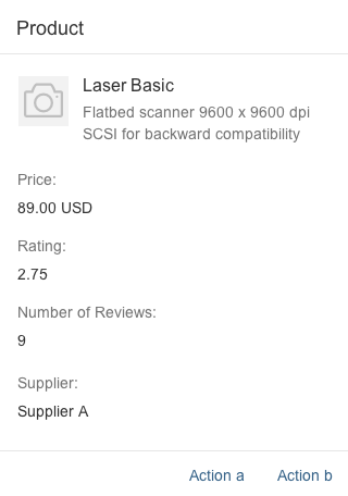
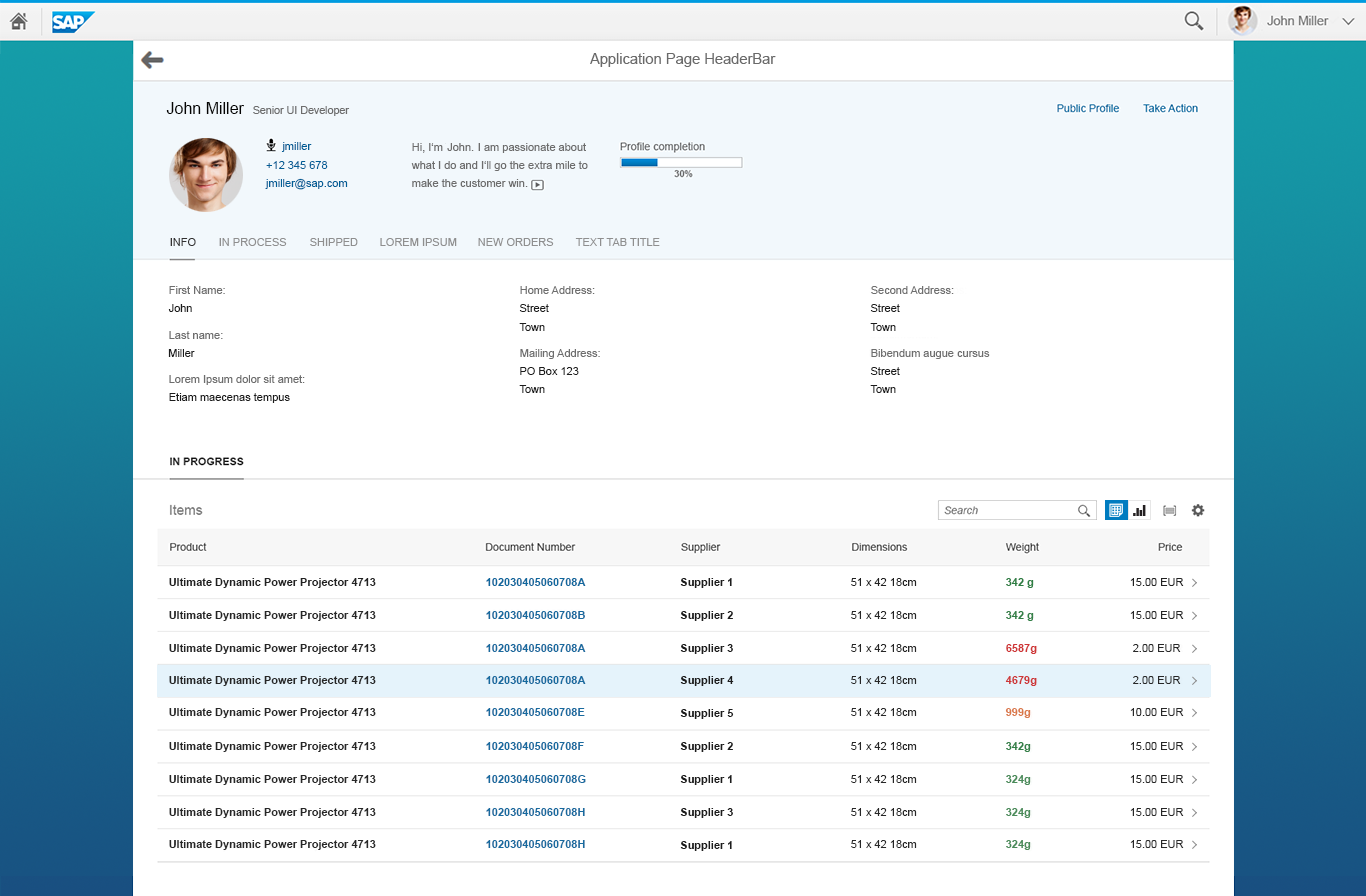
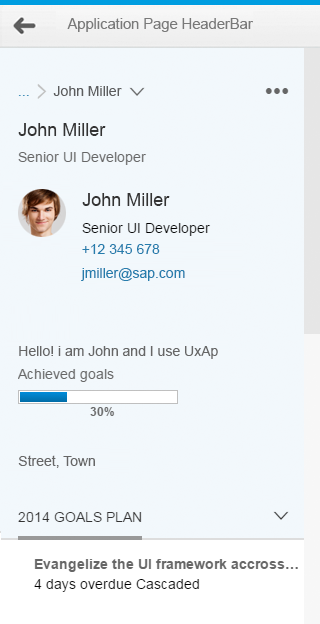
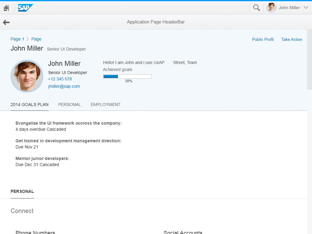
Object view on a desktop device
Usage
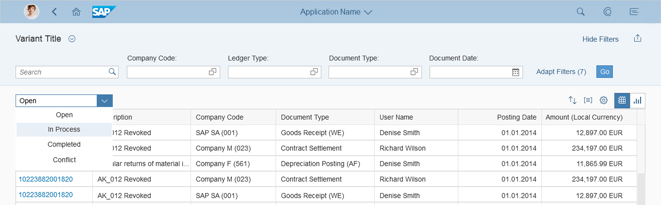
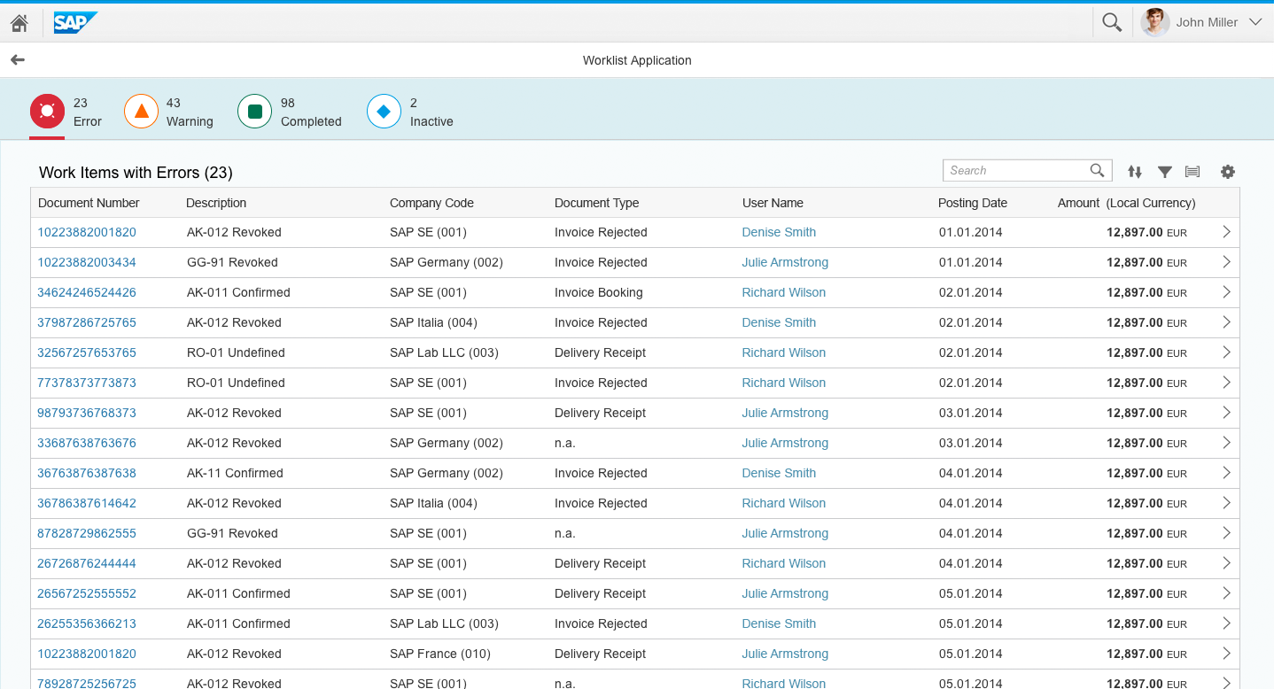
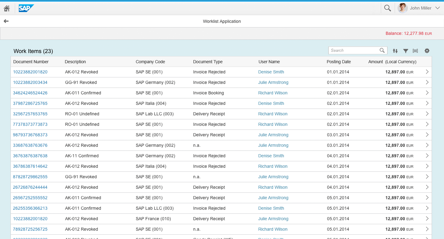
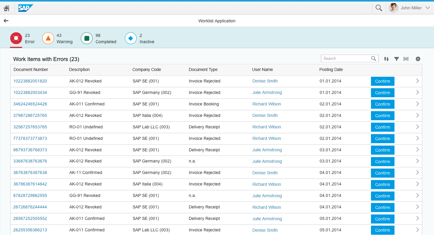
Use the object view floorplan if:
- You have objects with up to 5-7 facets.
- You want to display complex objects with minimal navigation.
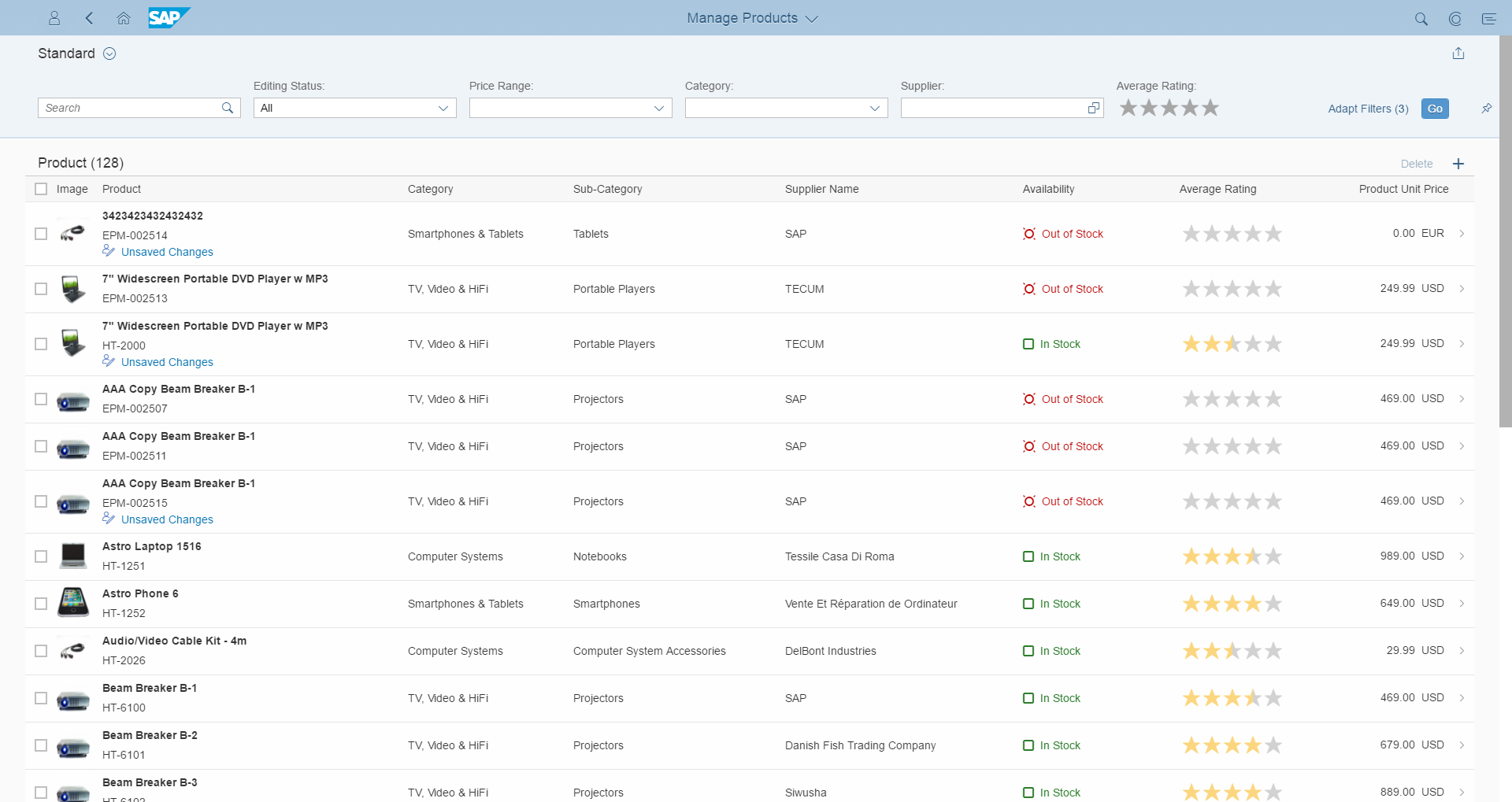
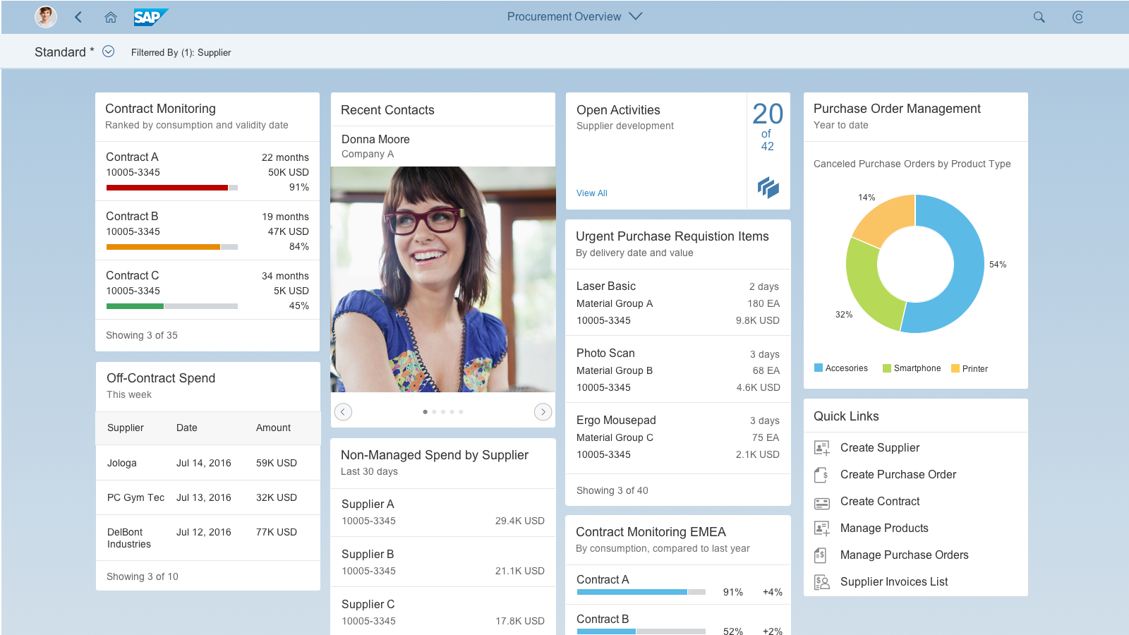
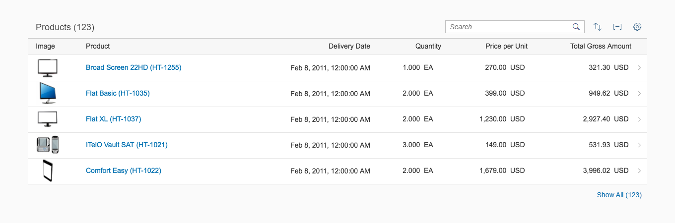
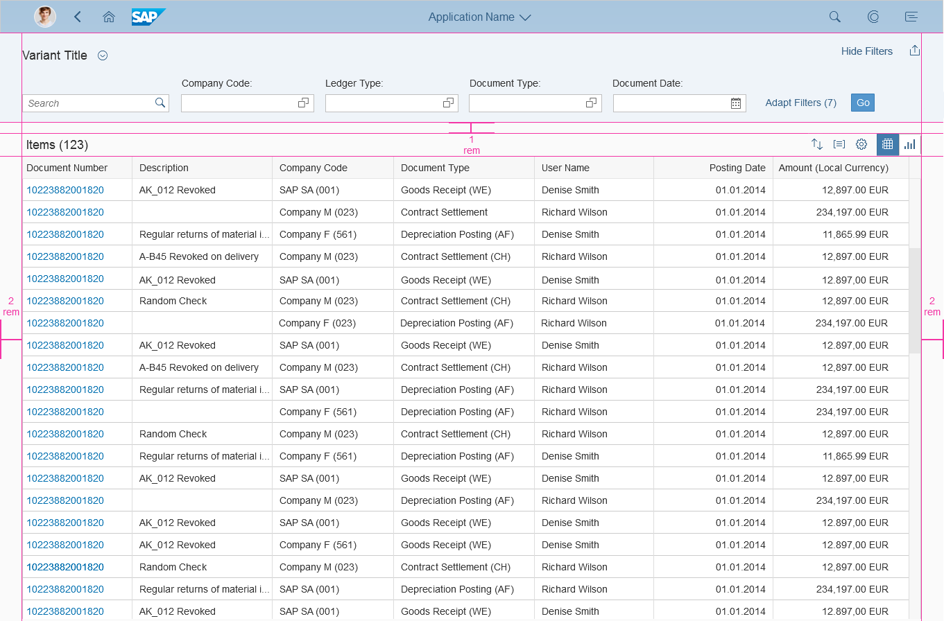
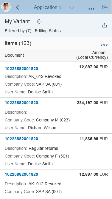
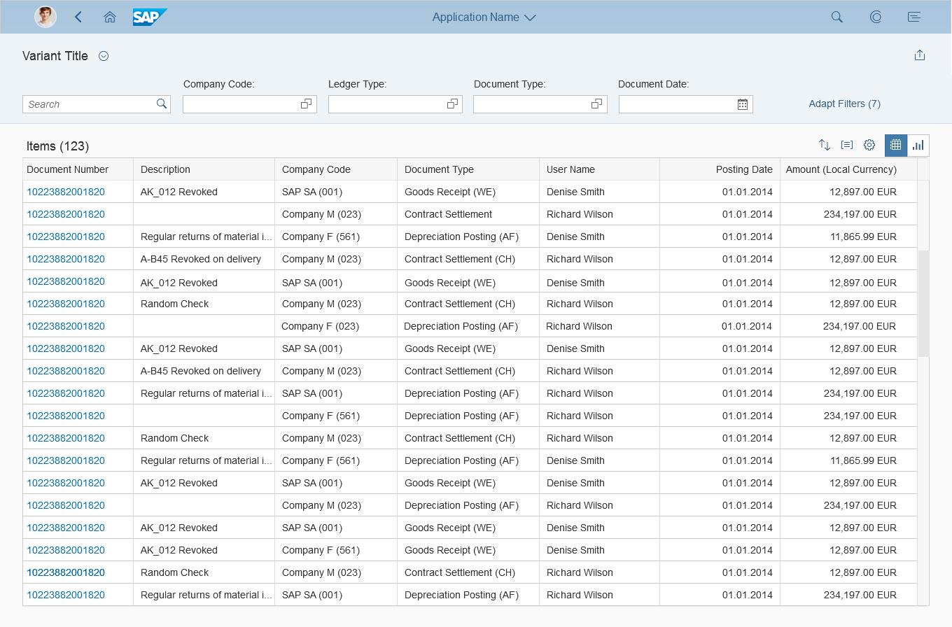
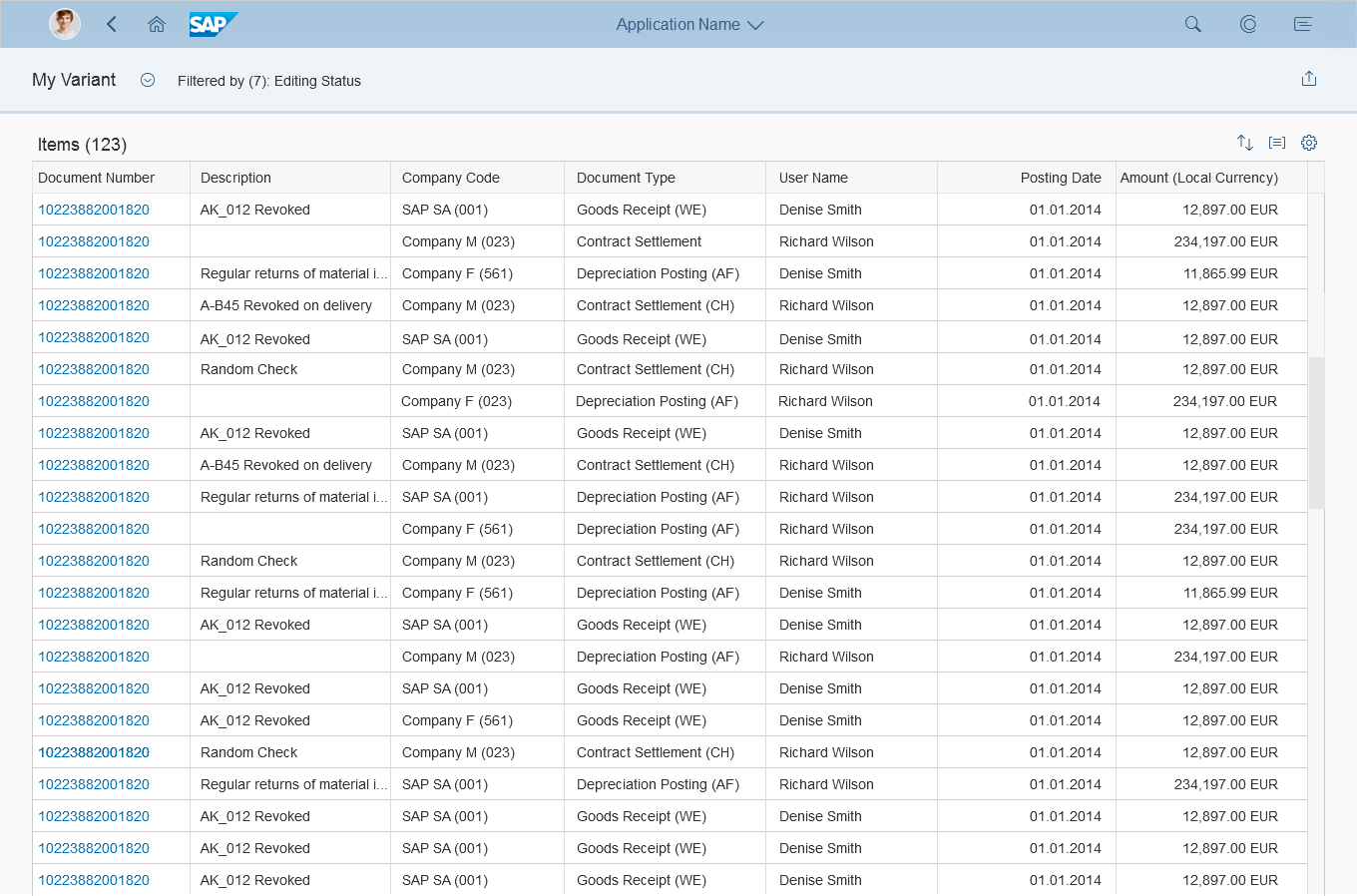
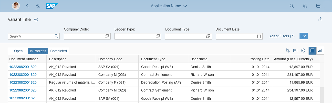
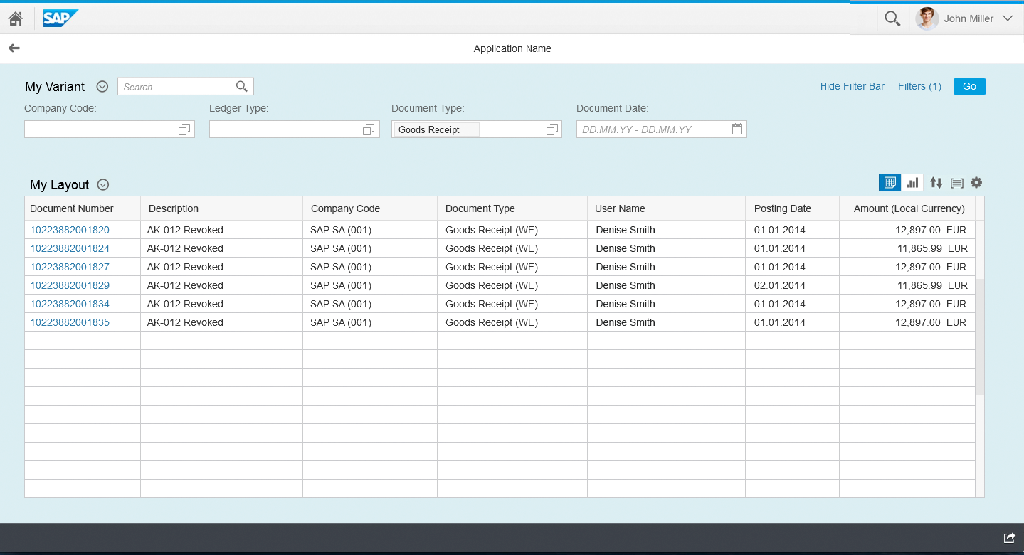
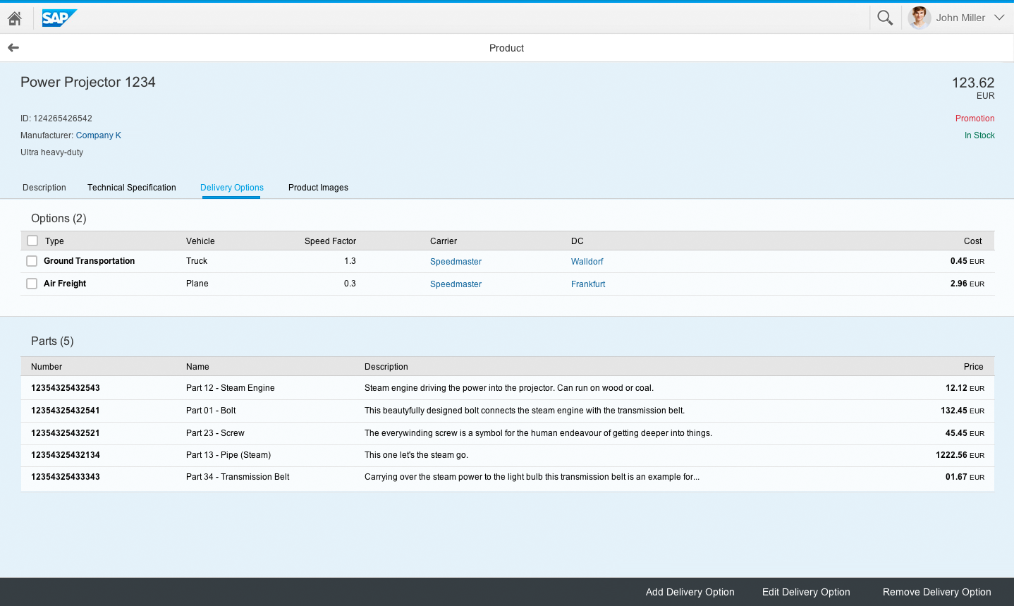
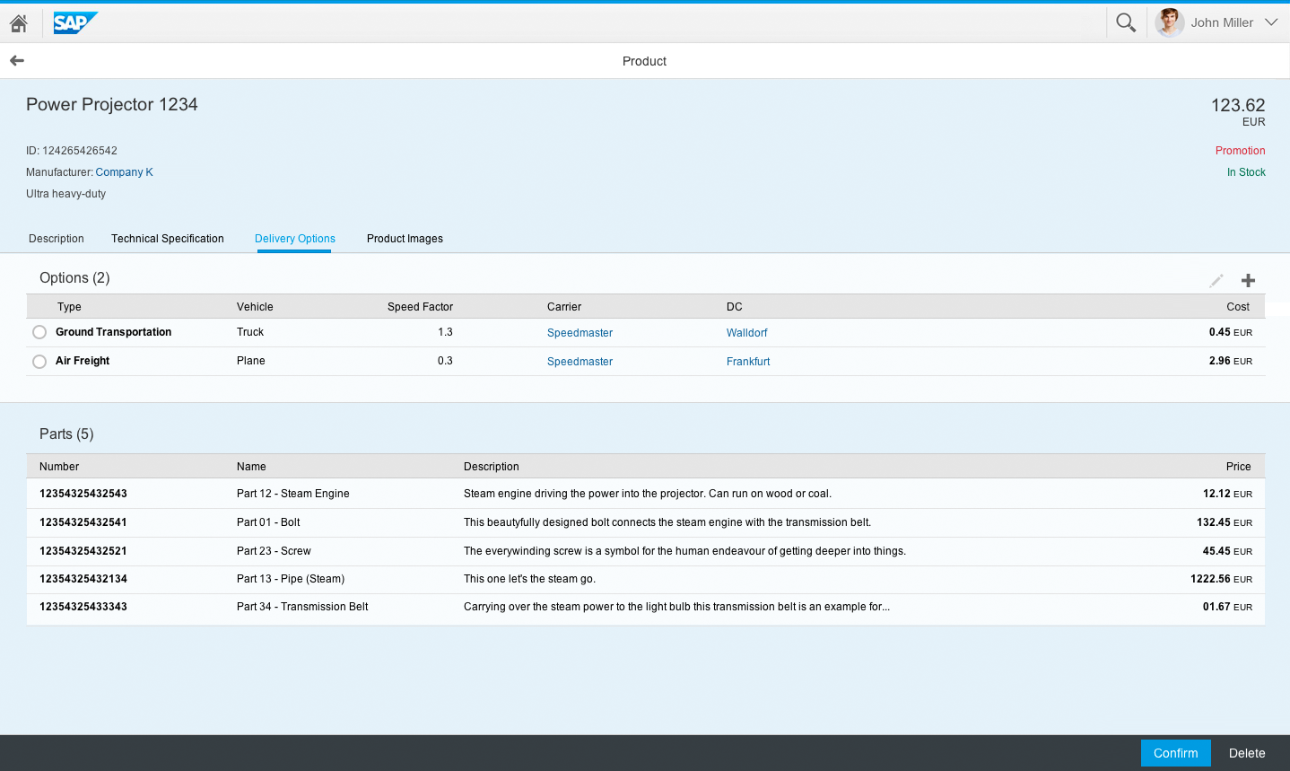
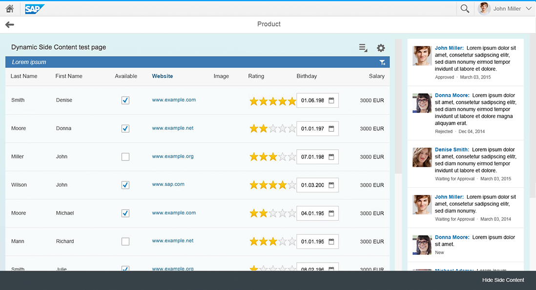
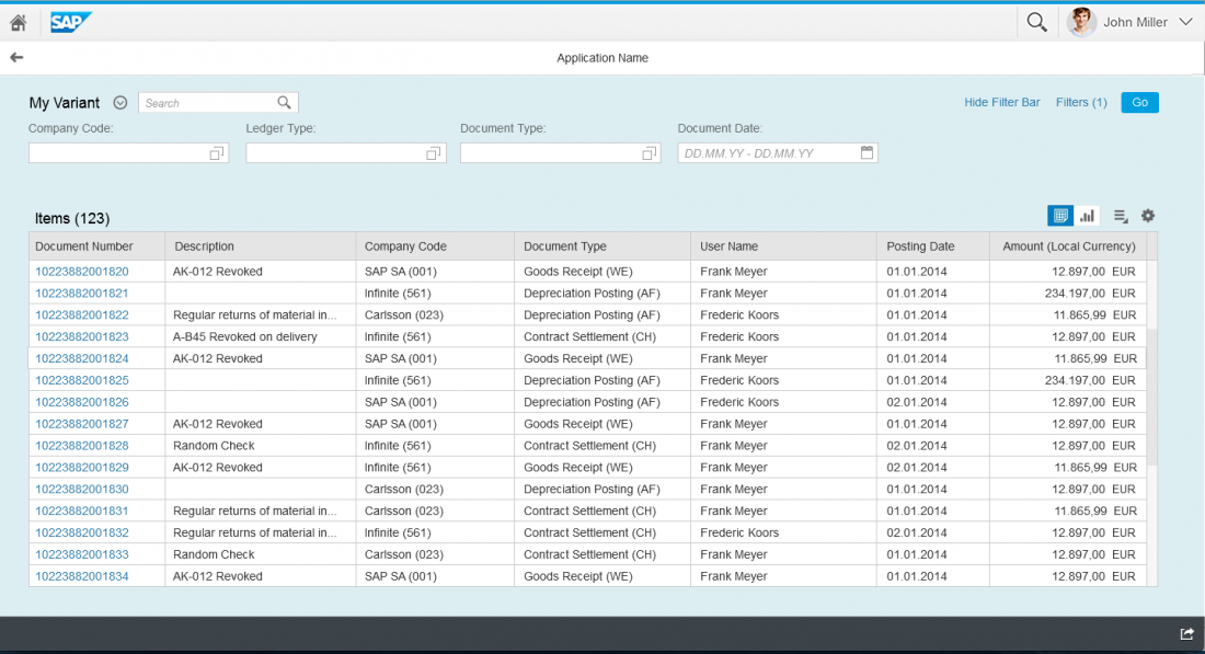
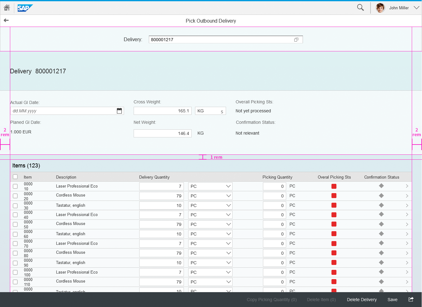
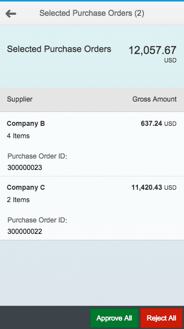
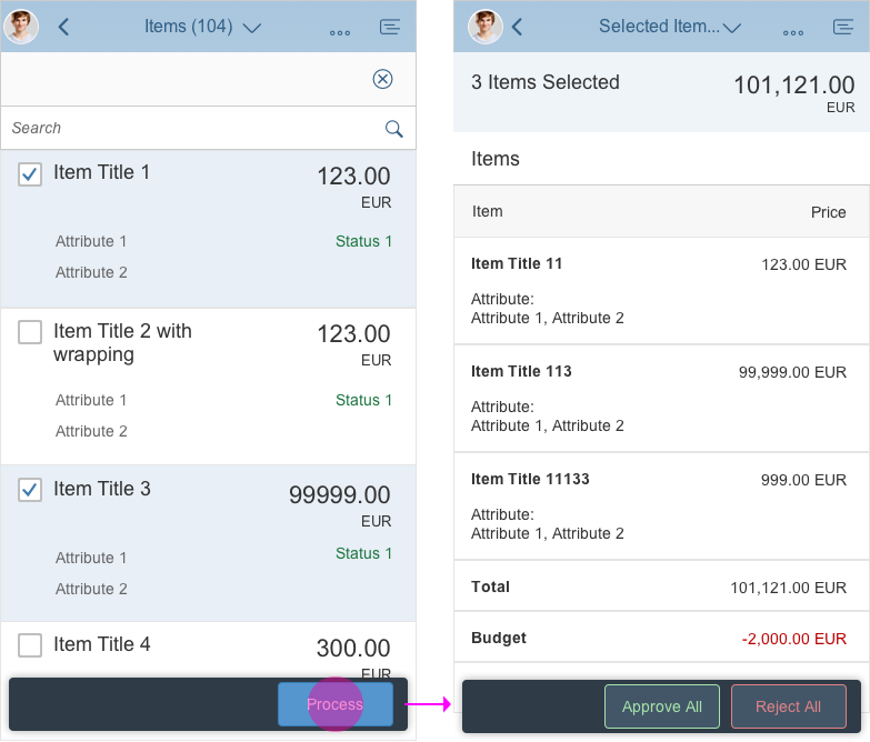
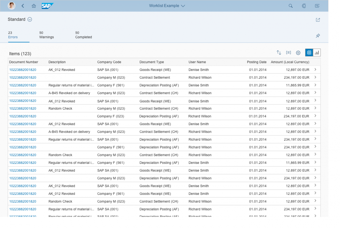
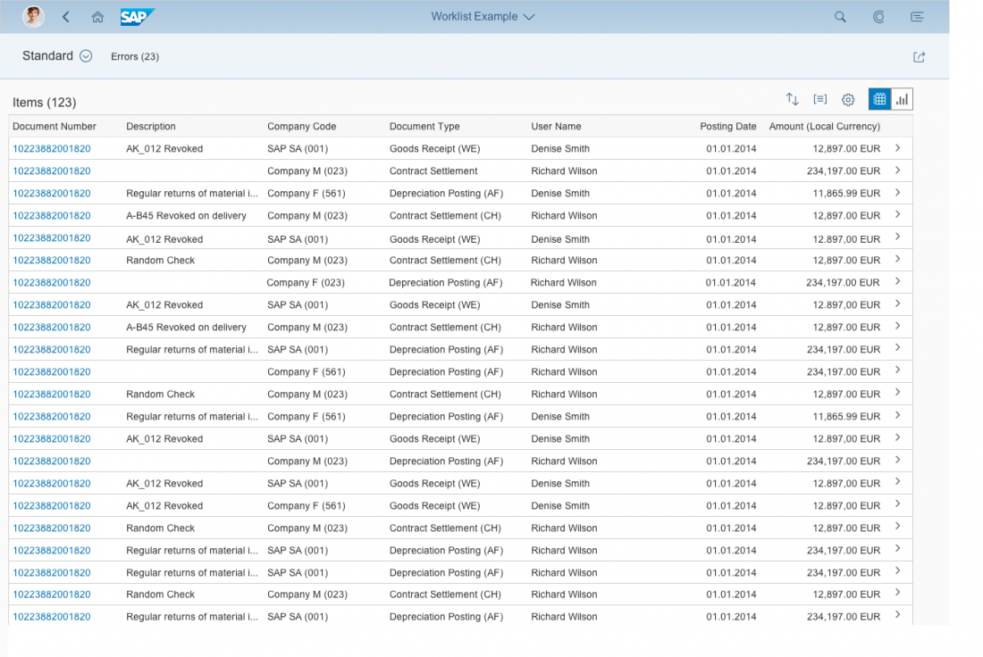
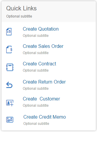
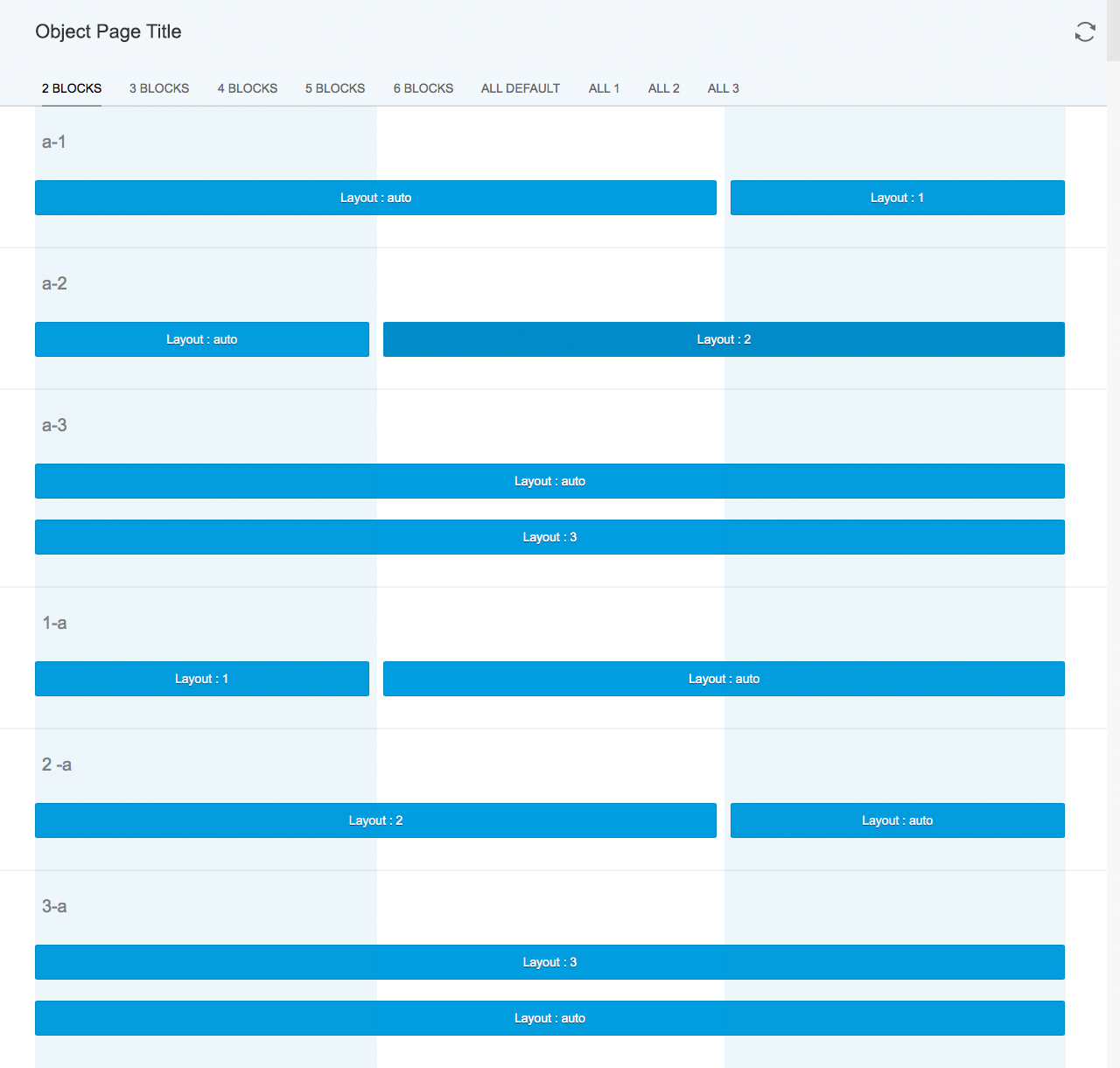
- You want to combine a long table with other object facets, but keep the table visible. In this case, the other aspects are shown as tabs and the table appears below the tab area.
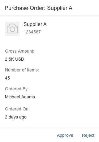
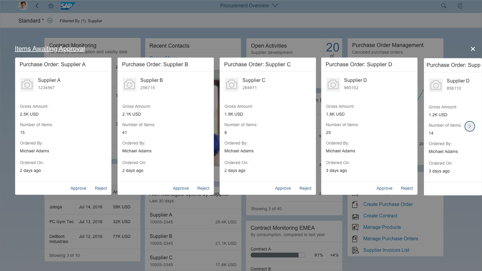
- You are building a typical approval app.
Do not use the object view floorplan if:
- You want to keep the same layout when the app switches between create/edit and display modes. In this case, use the flat object view.
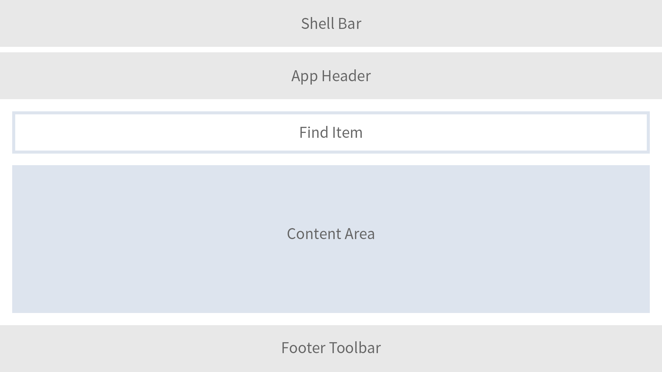
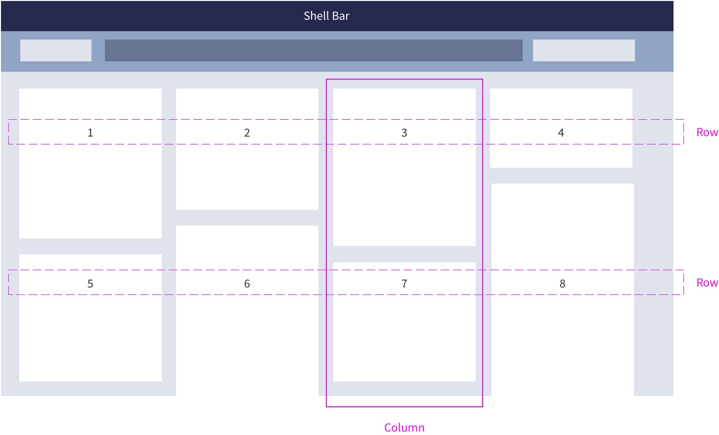
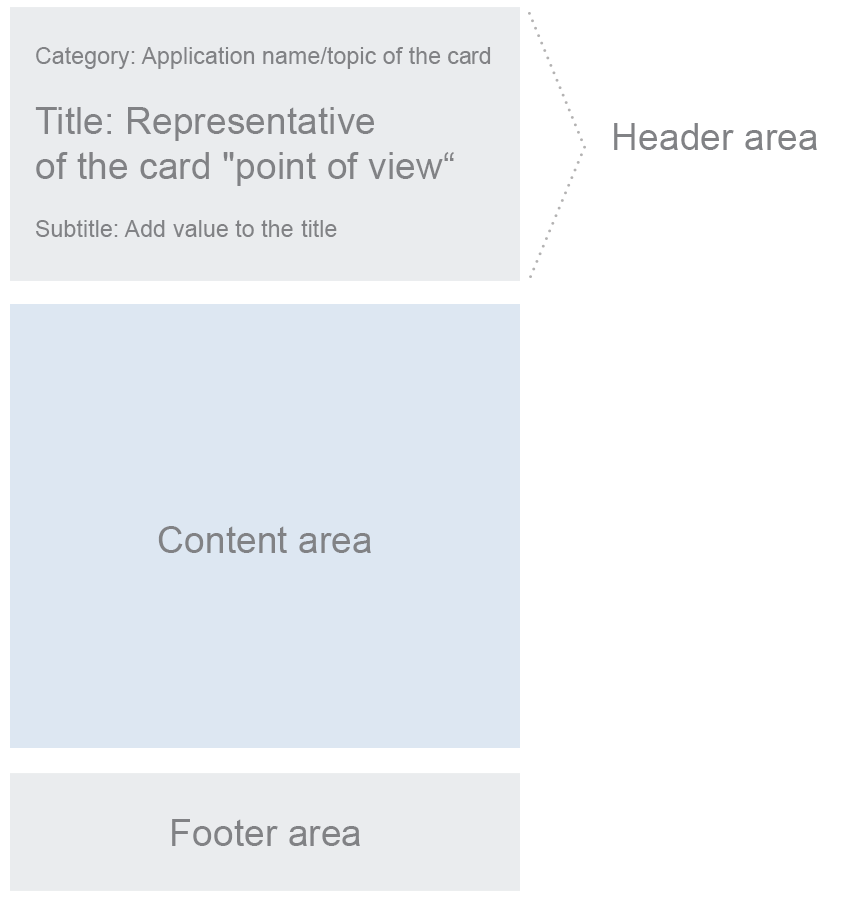
Structure
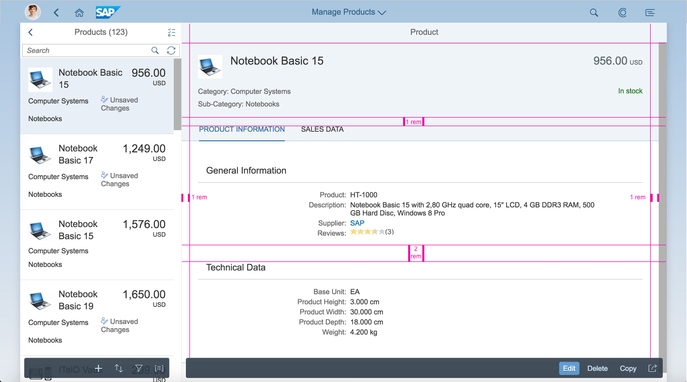
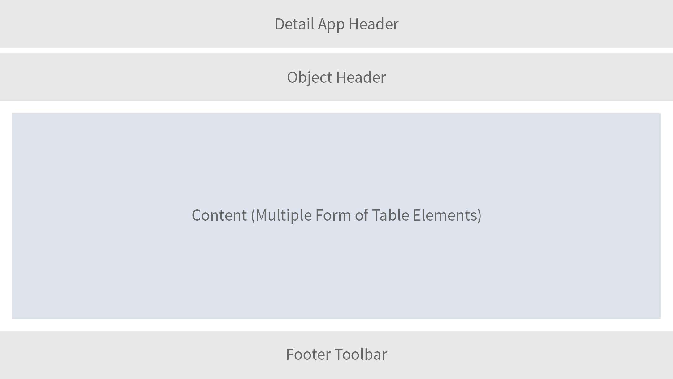
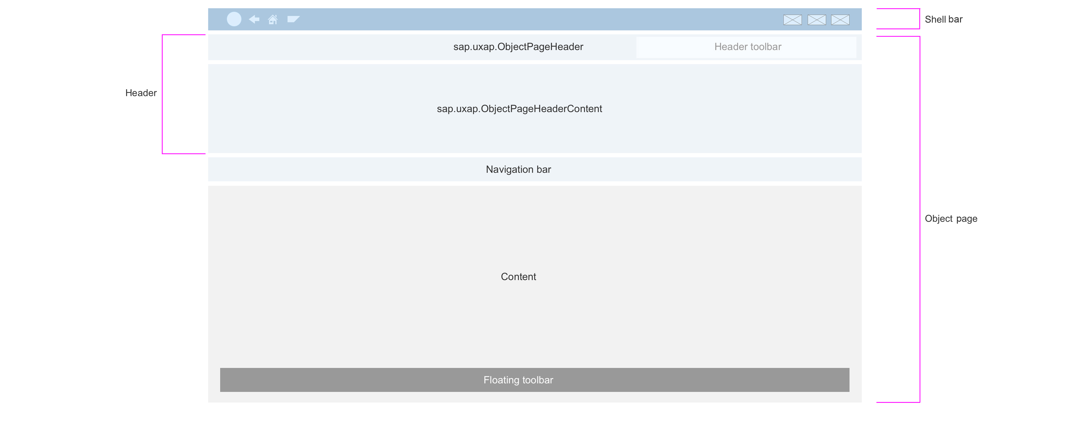
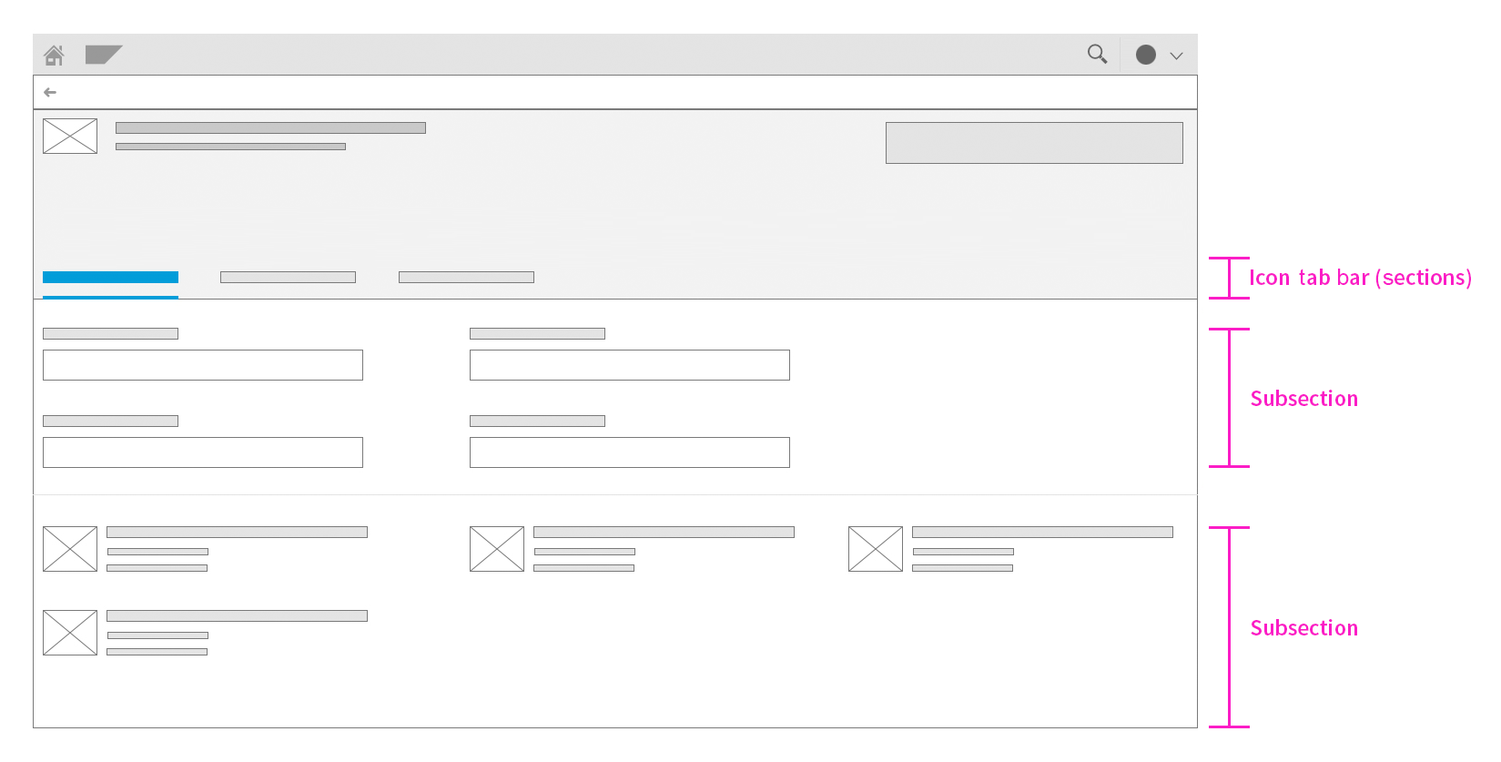
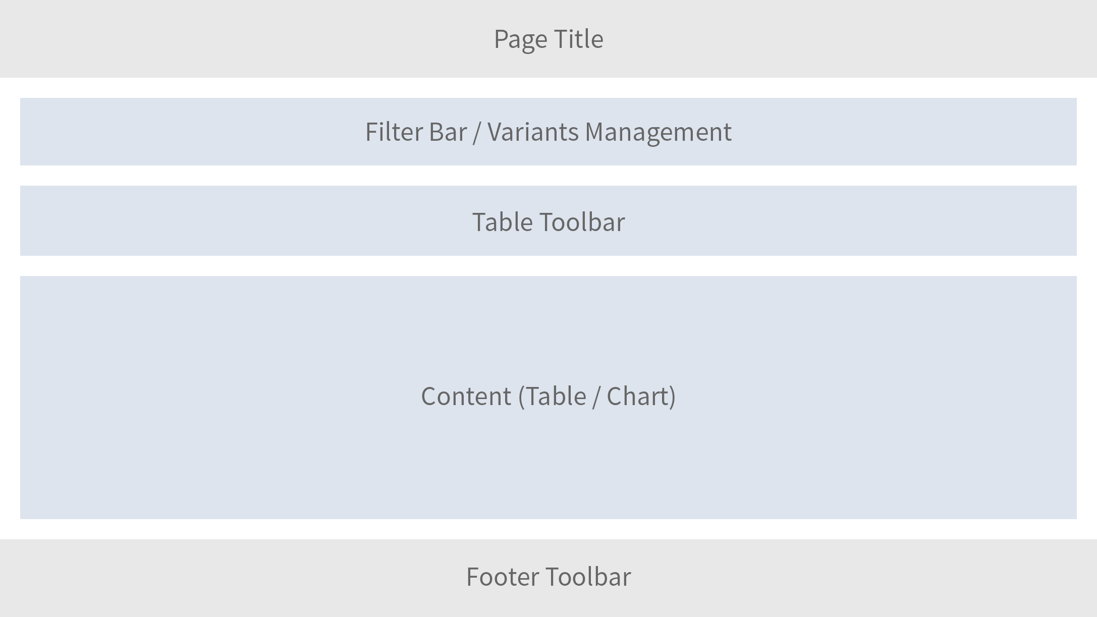
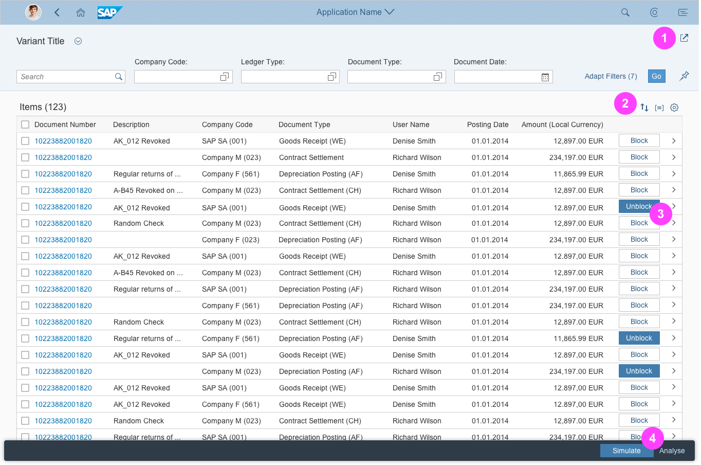
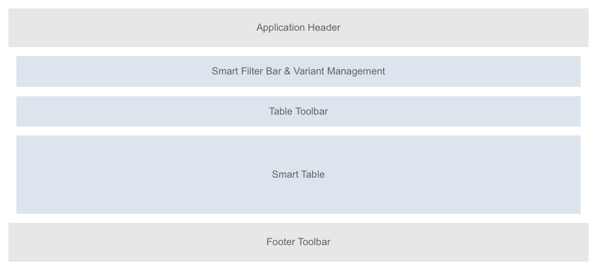
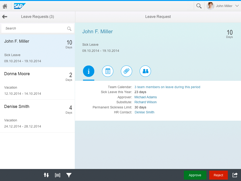
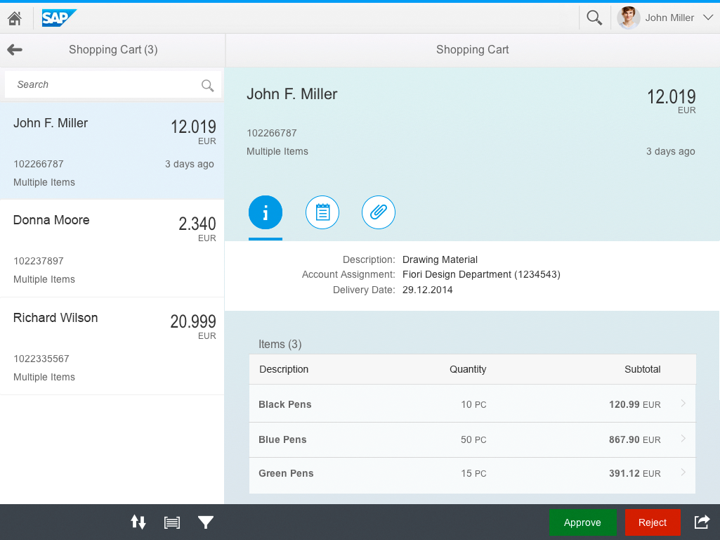
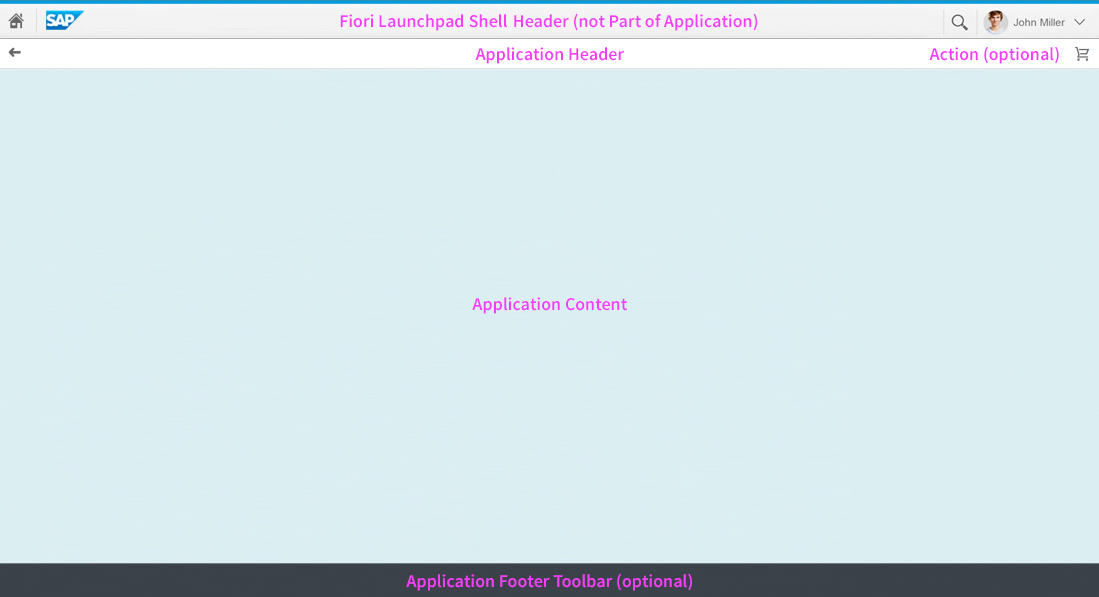
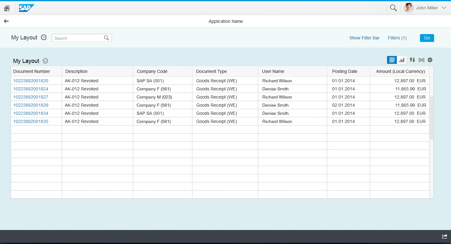
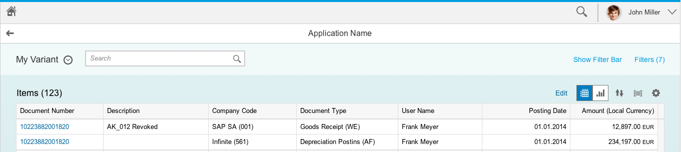
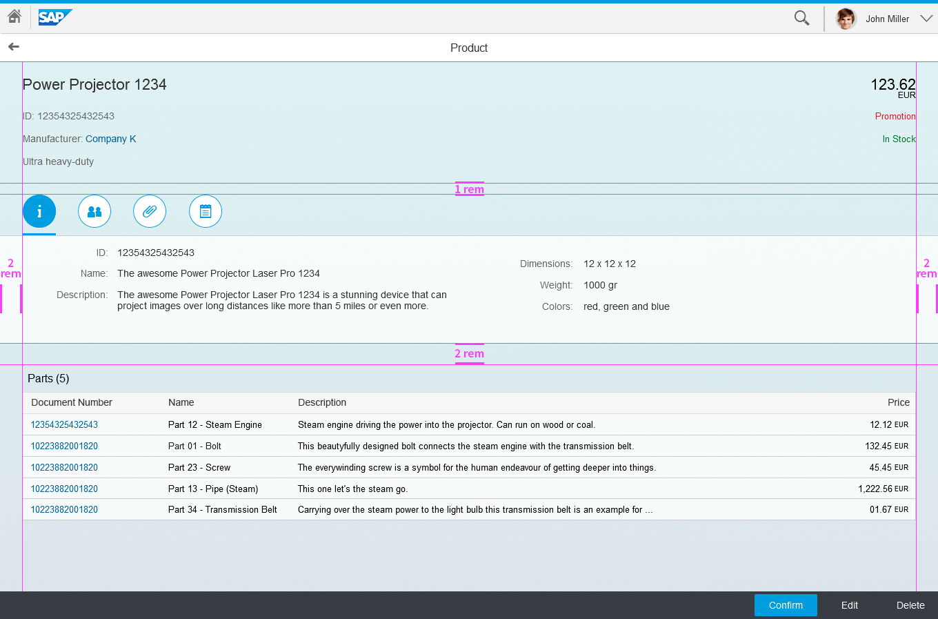
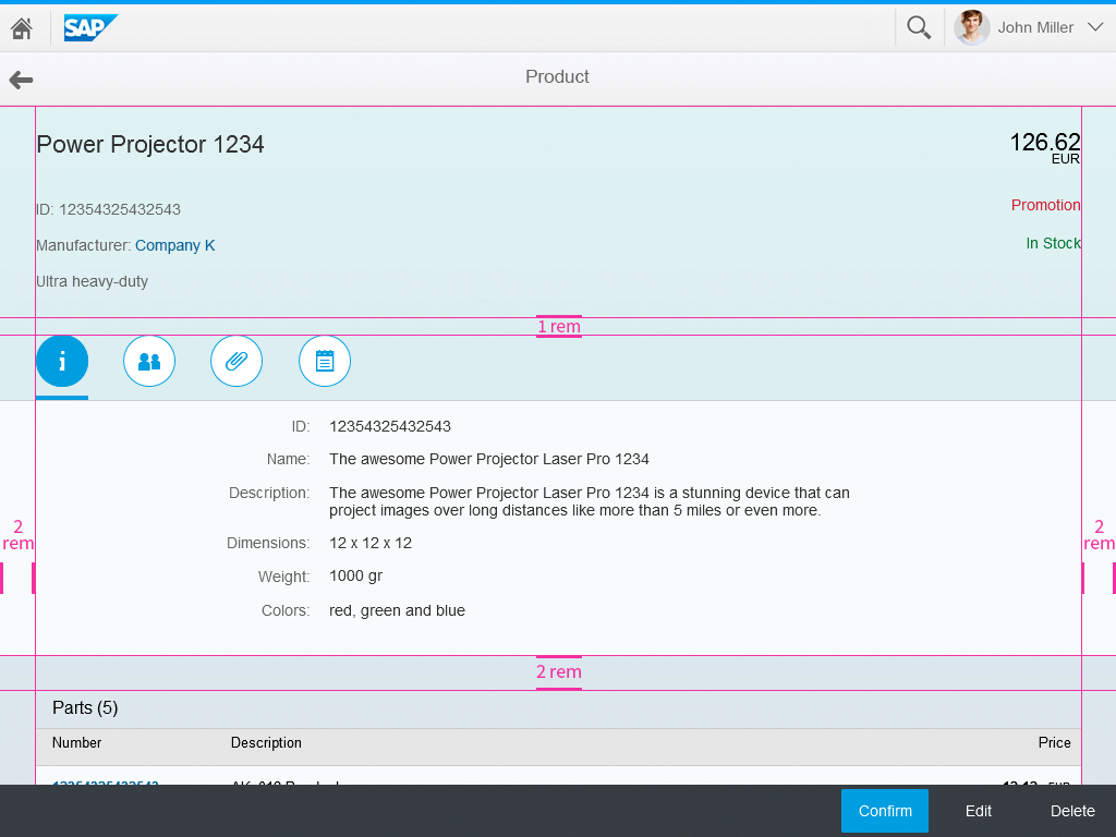
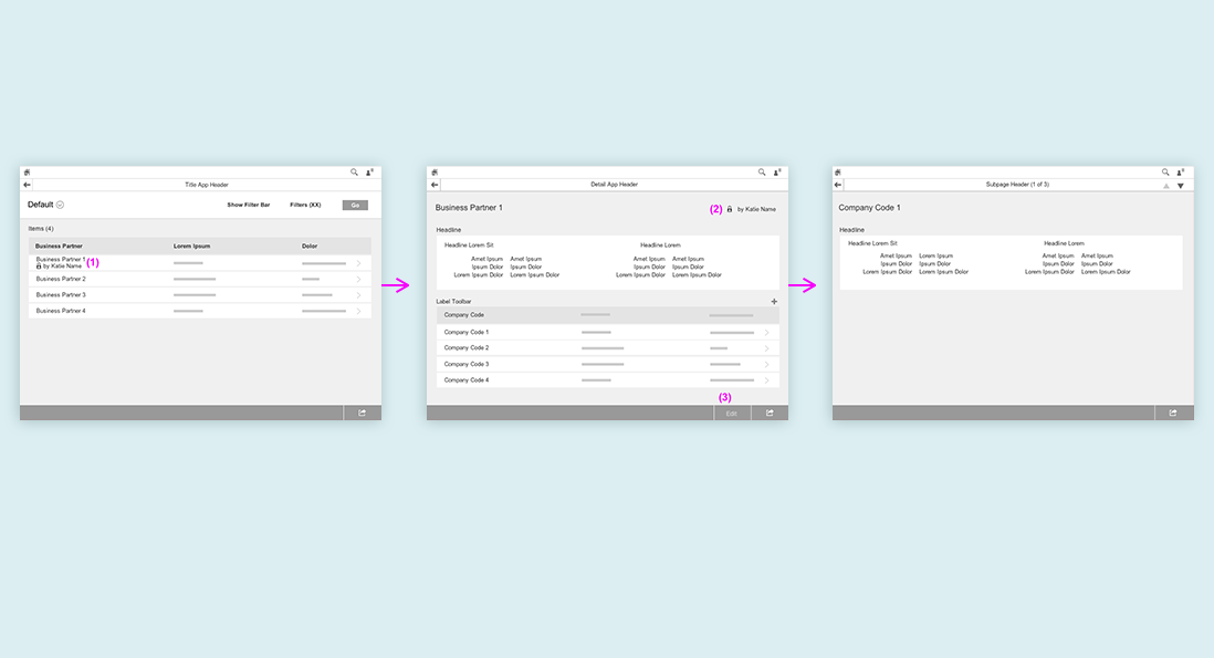
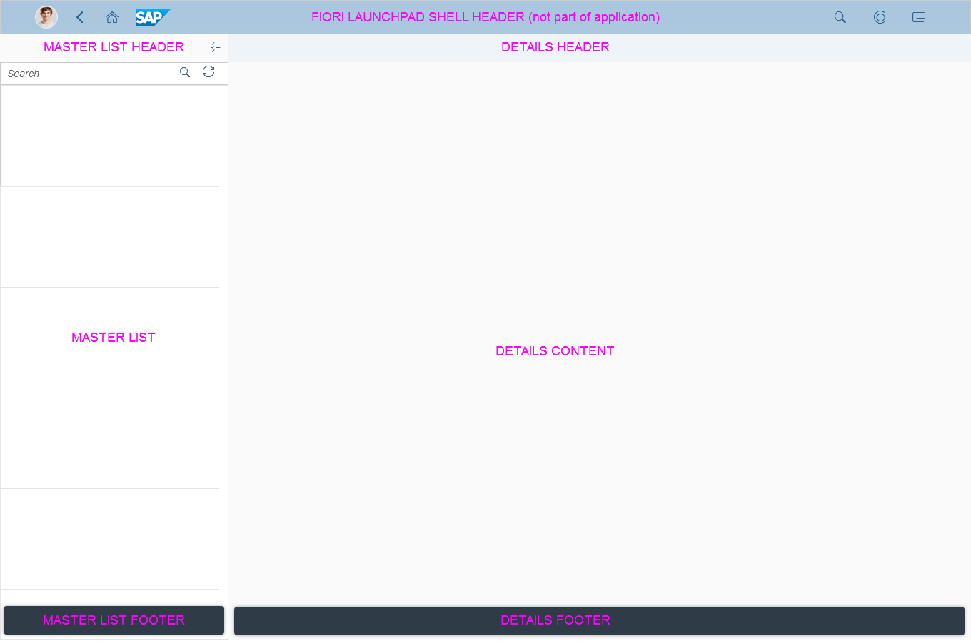
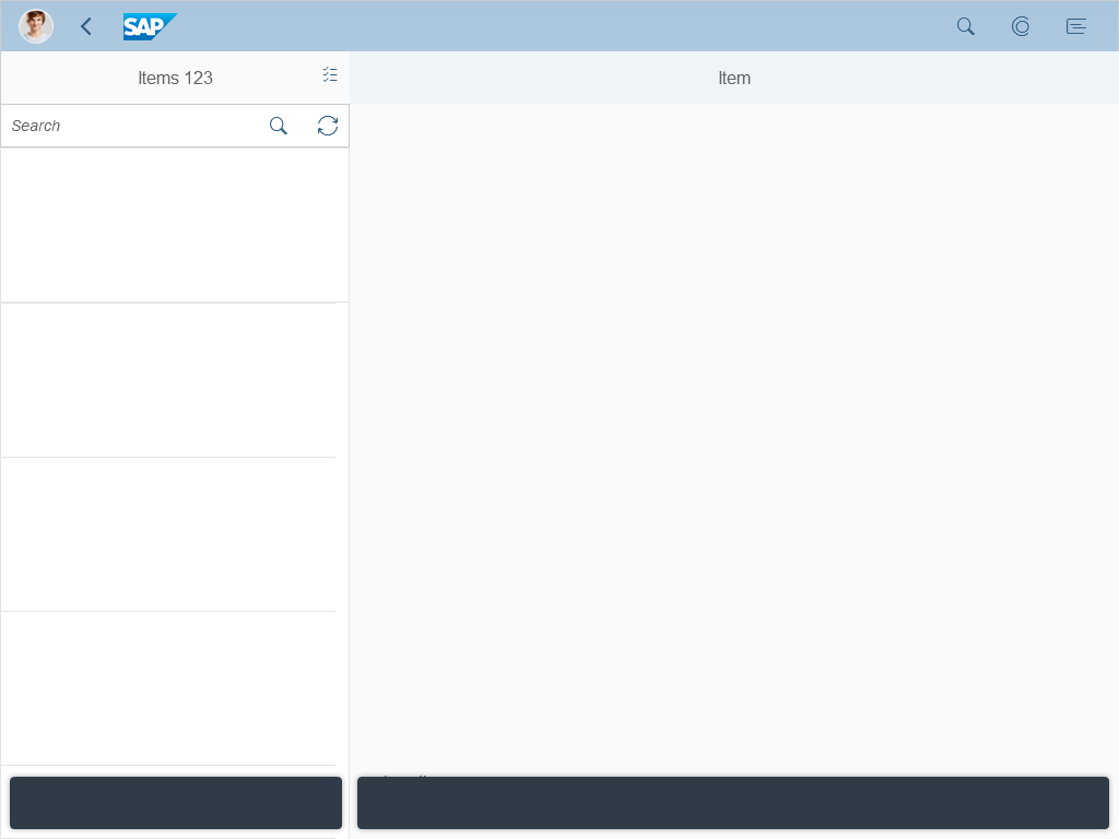
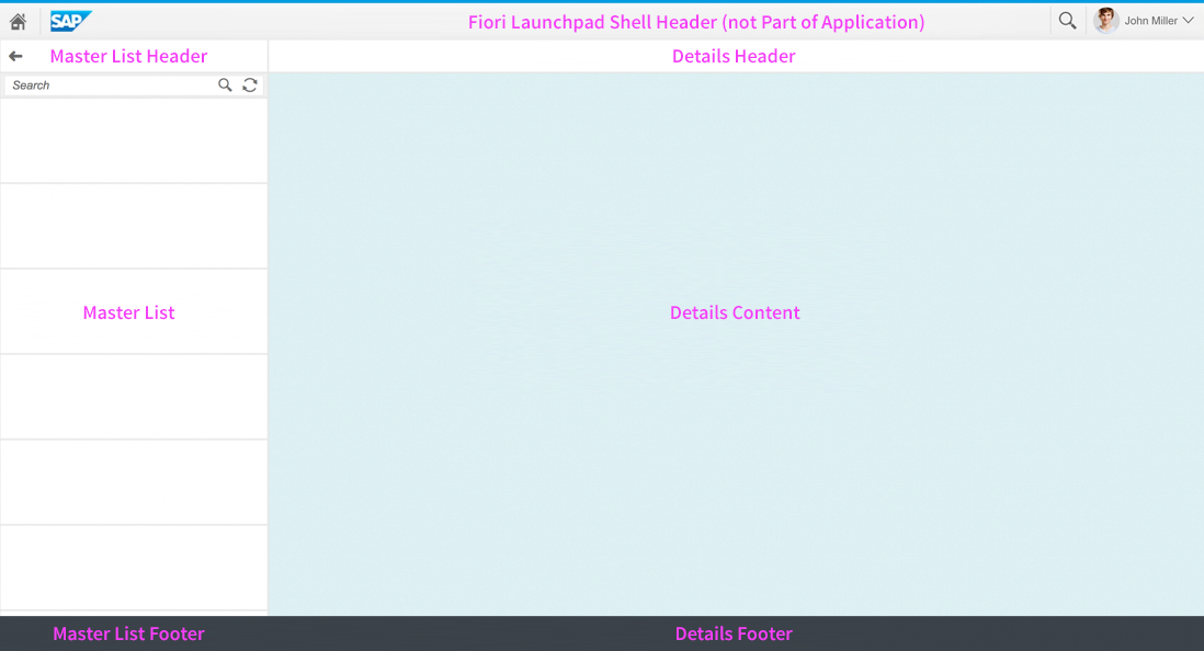
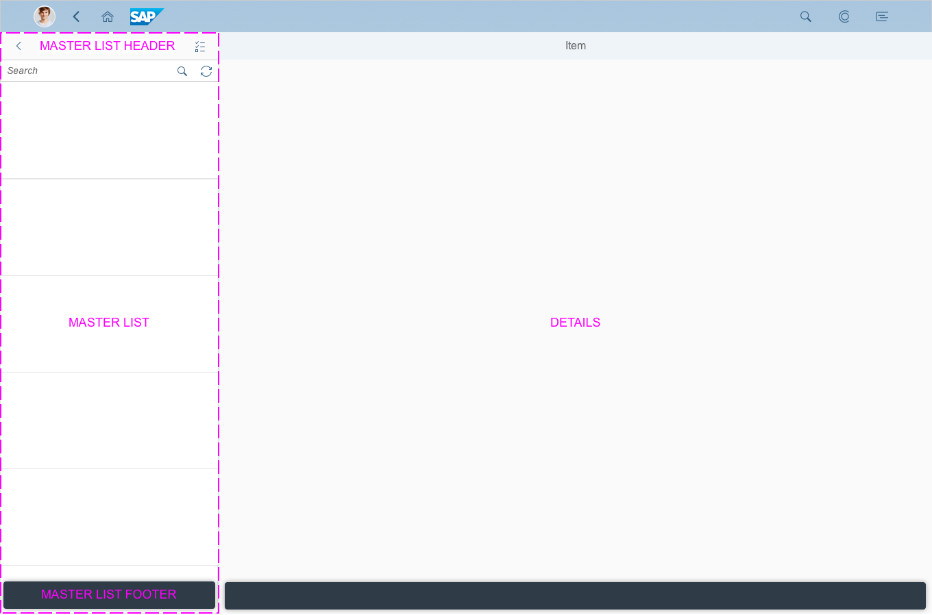
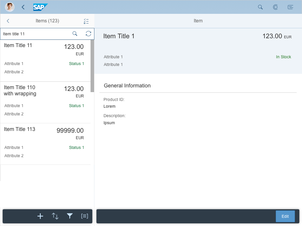
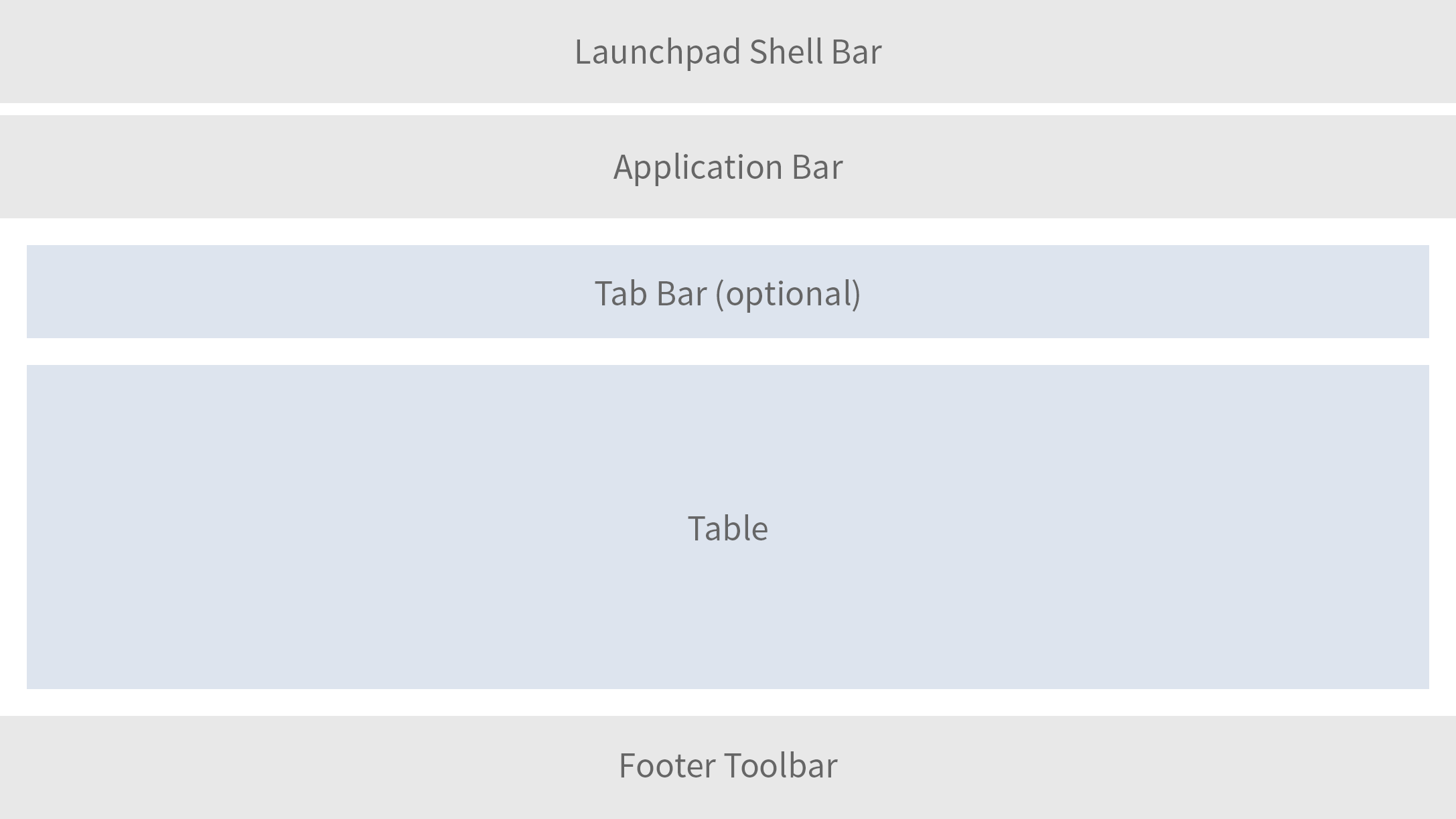
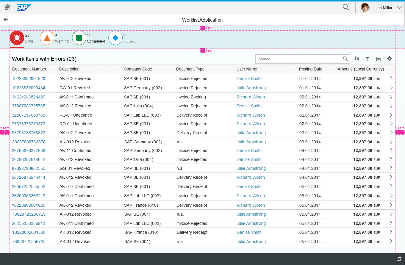
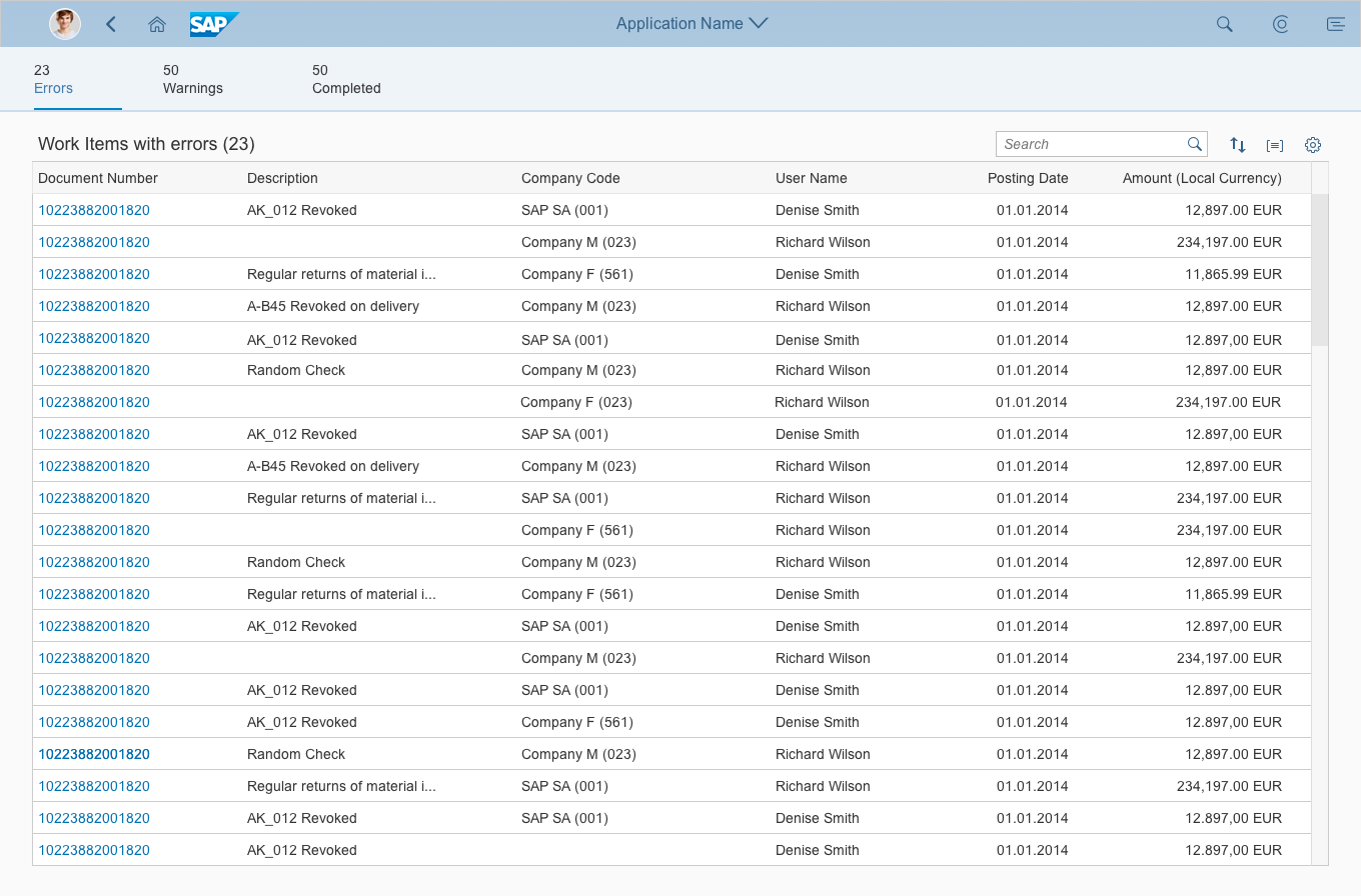
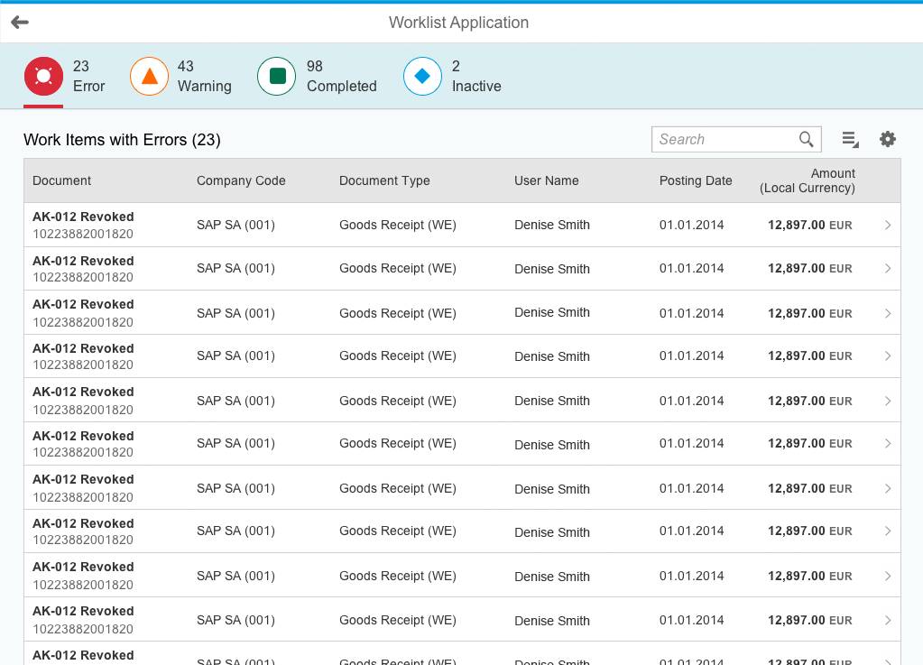
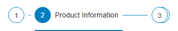
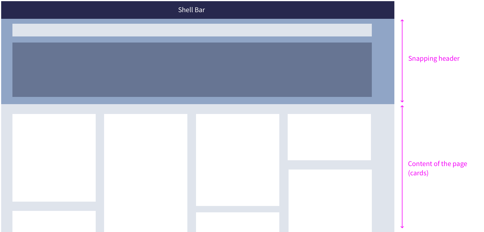
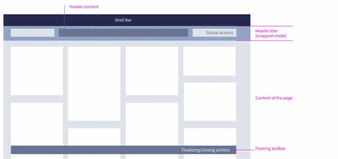
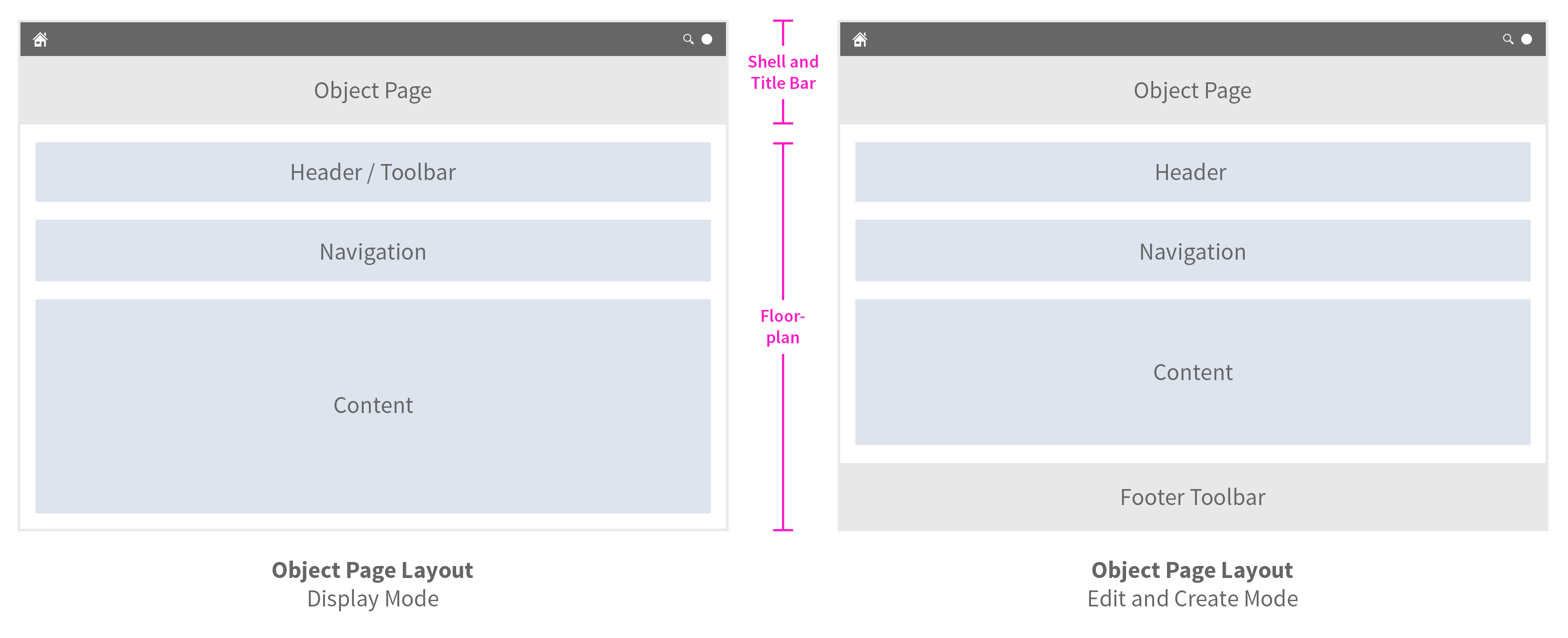
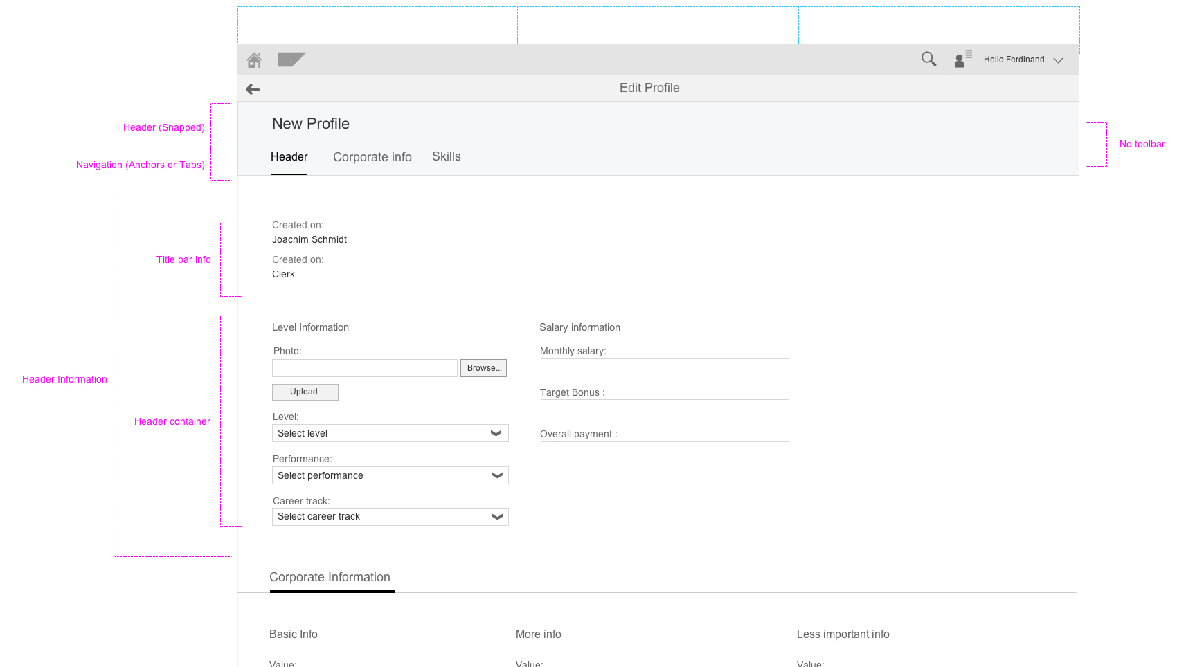
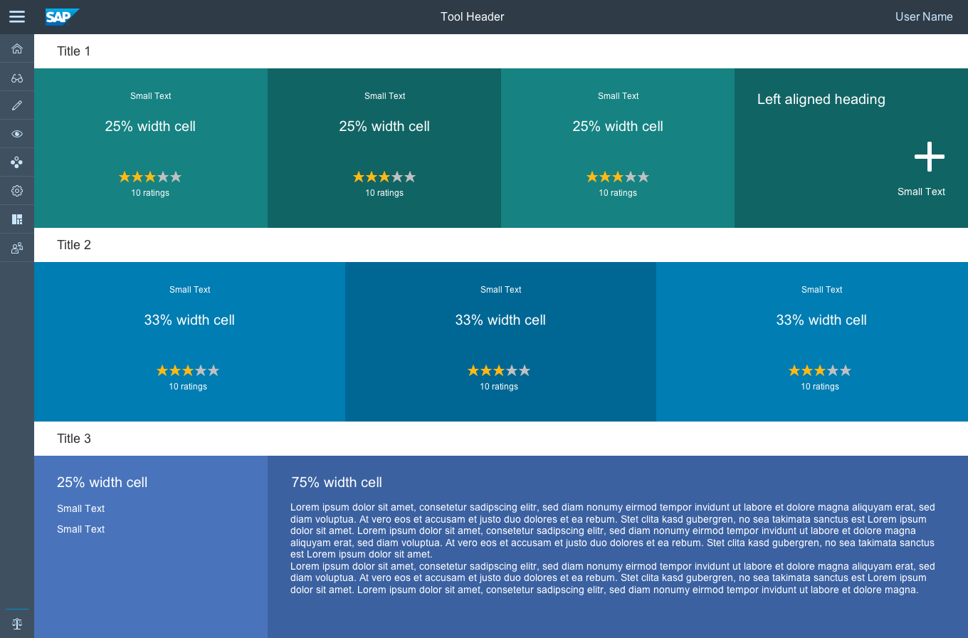
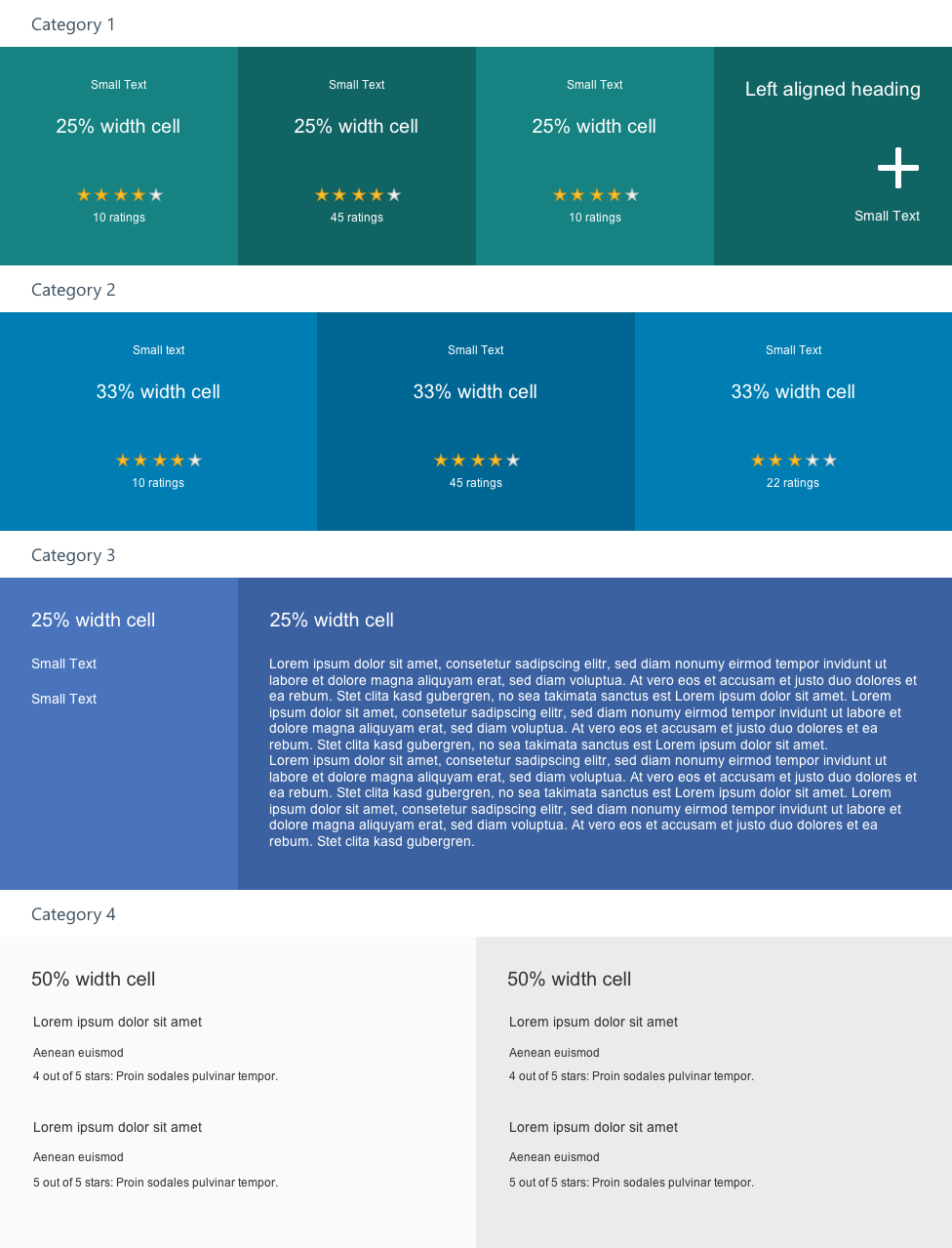
The object view floorplan comprises the following elements, from top to bottom:
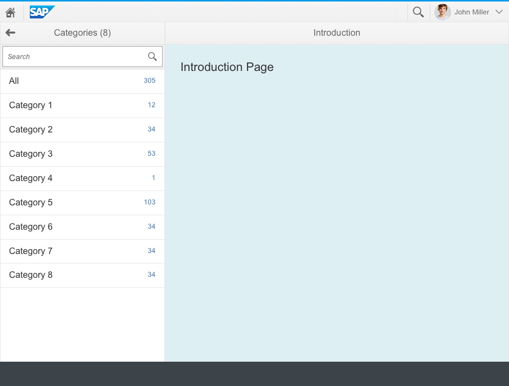
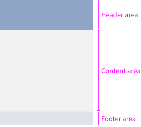
- Launchpad shell bar: Always available at the top of SAP Fiori apps.
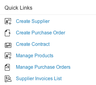
- Application header: Reflects the title of the launch tile, such as Manage Products.
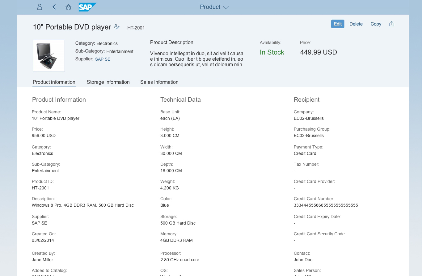
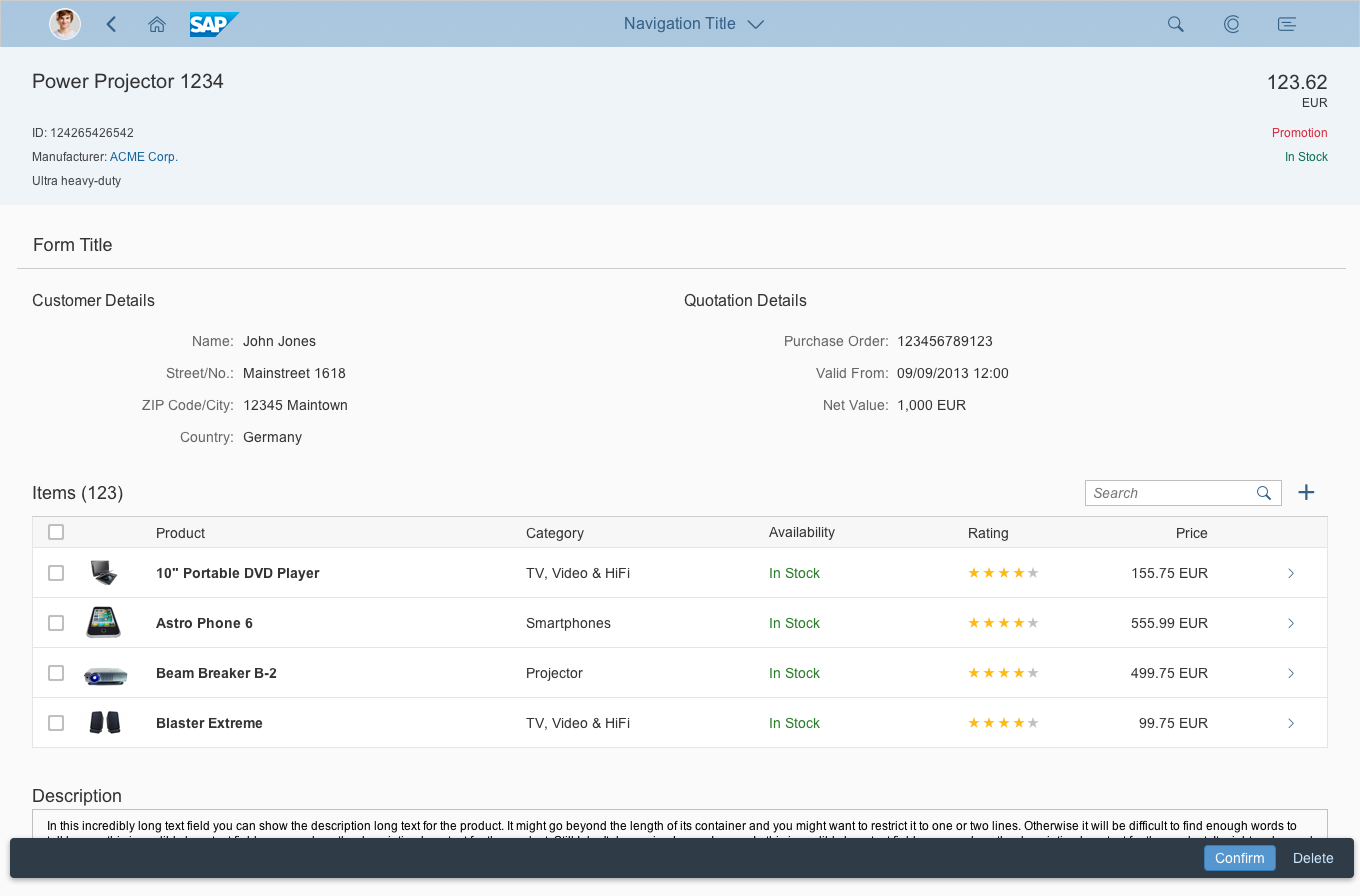
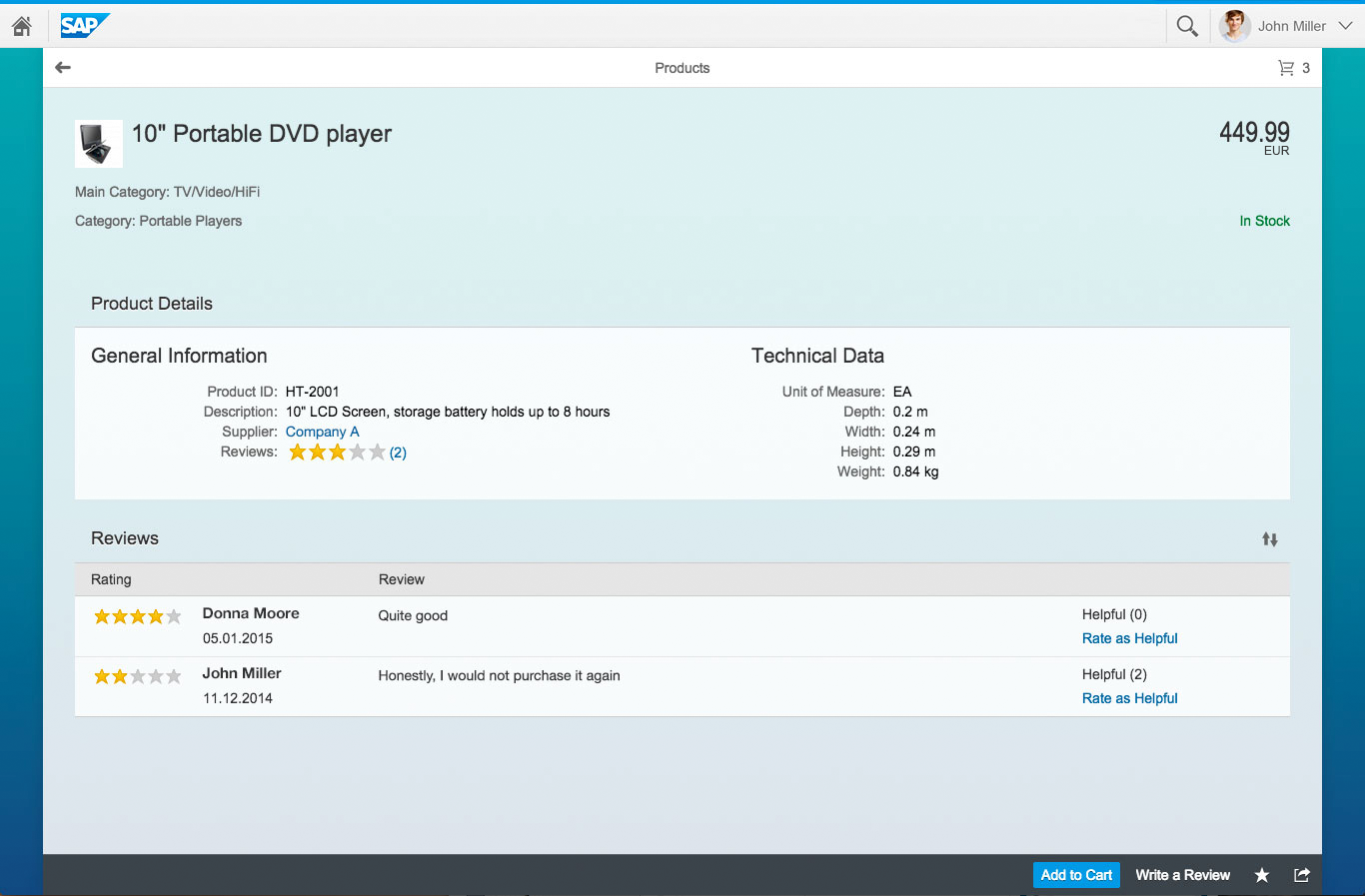
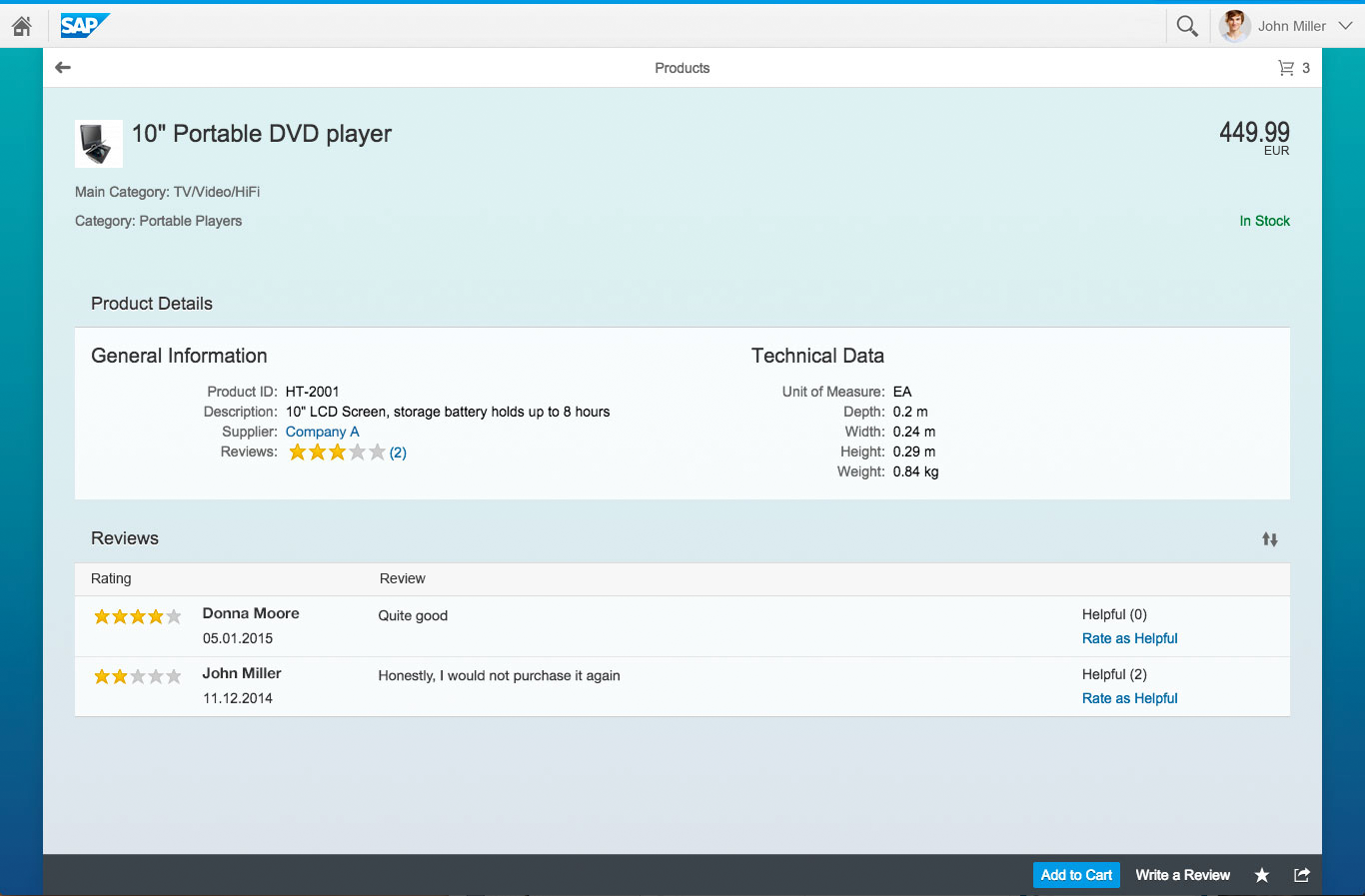
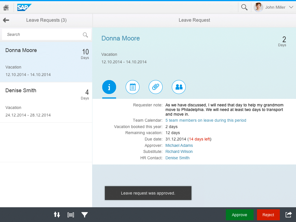
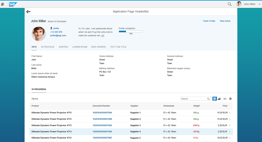
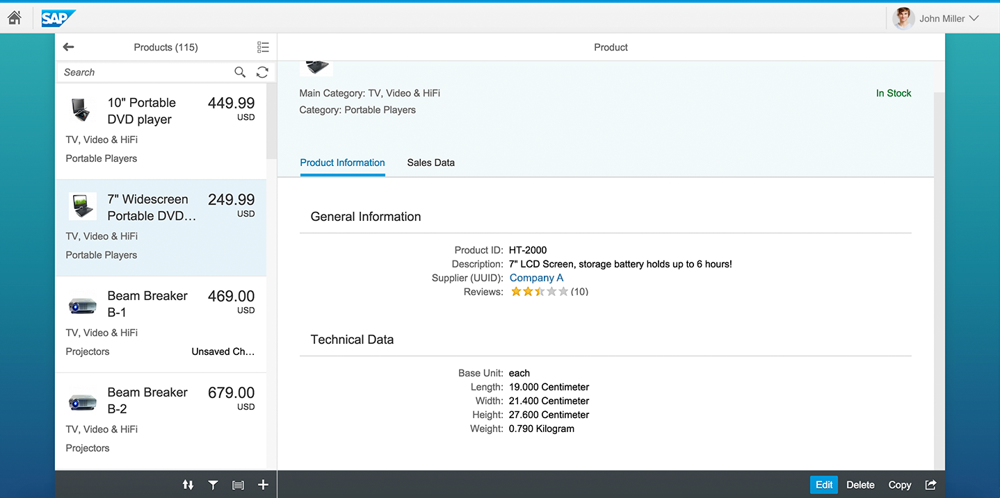
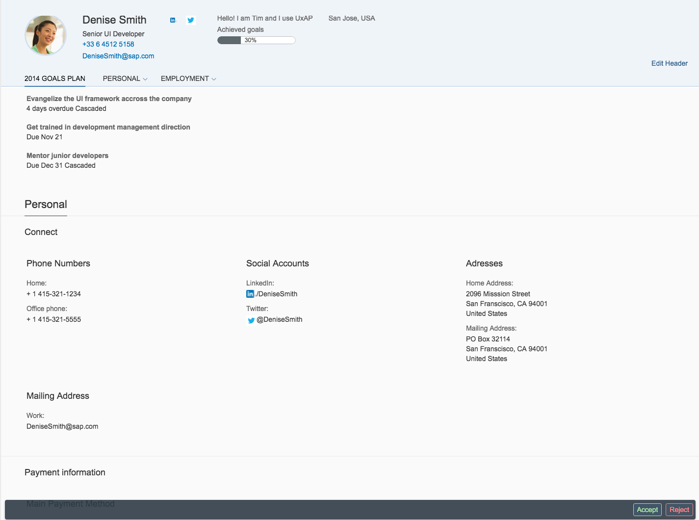
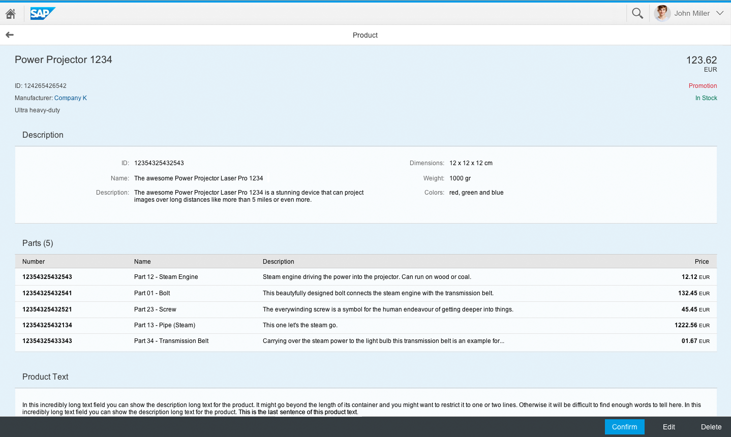
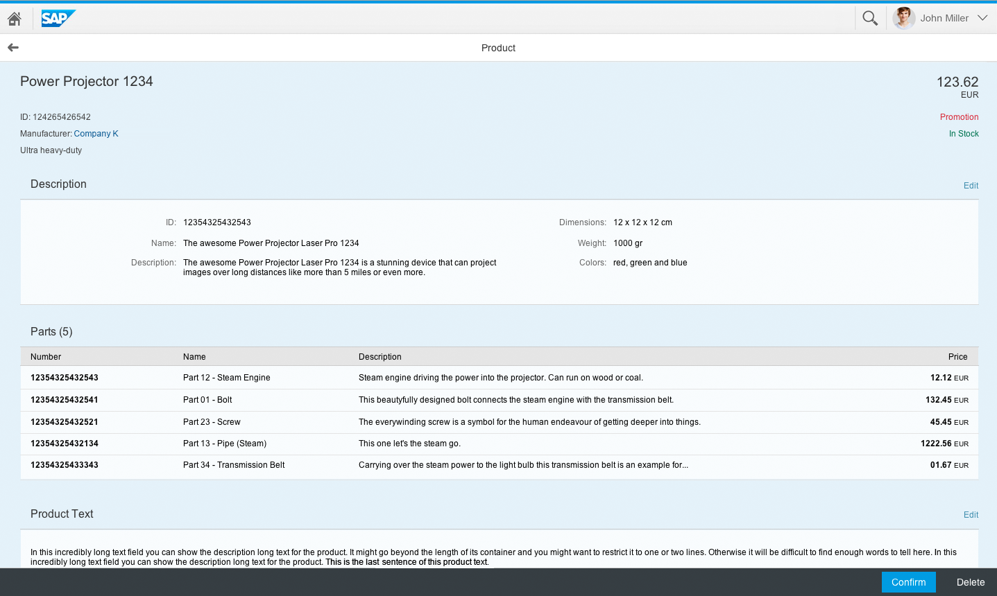
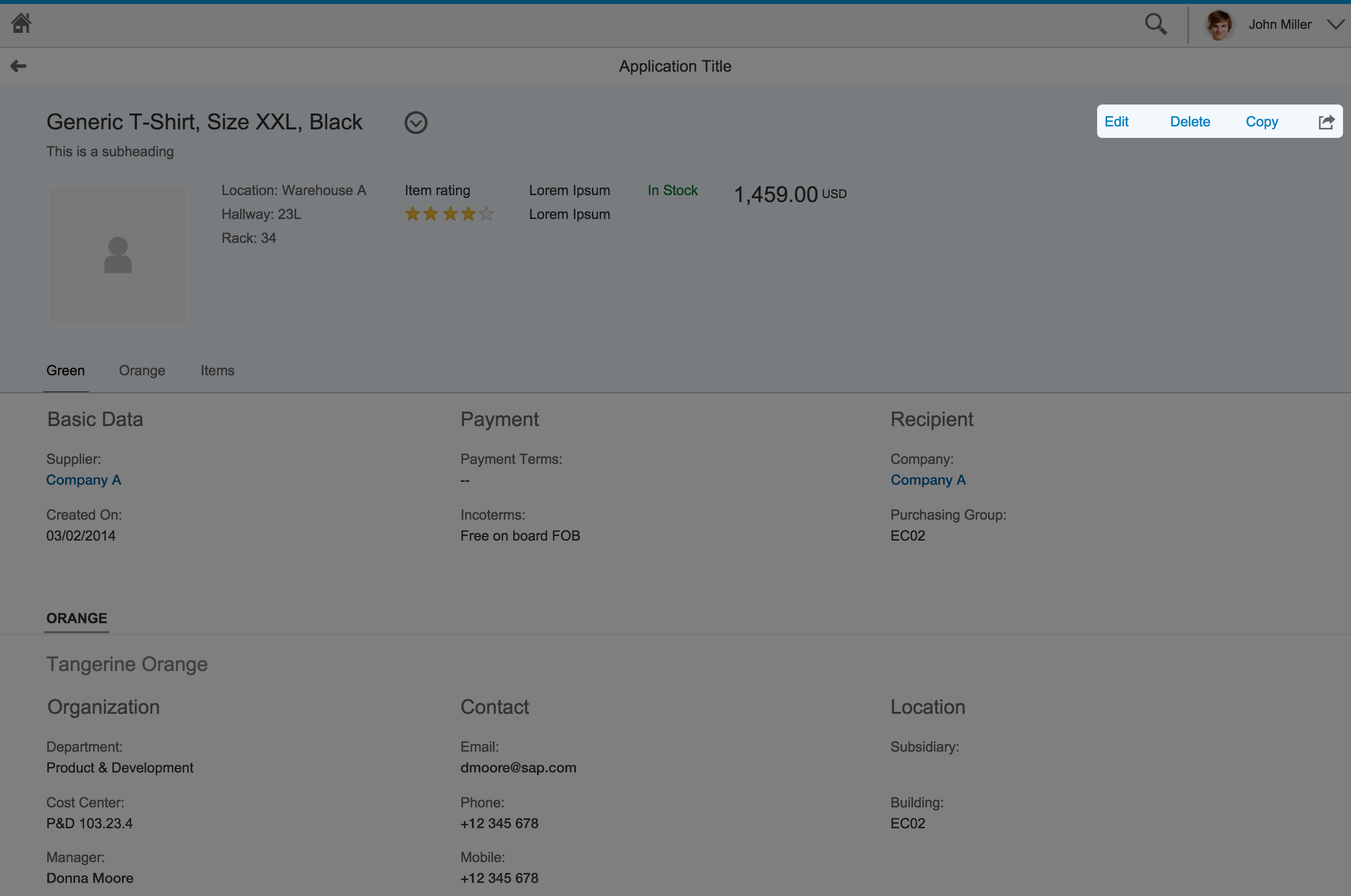
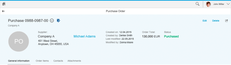
- Object header
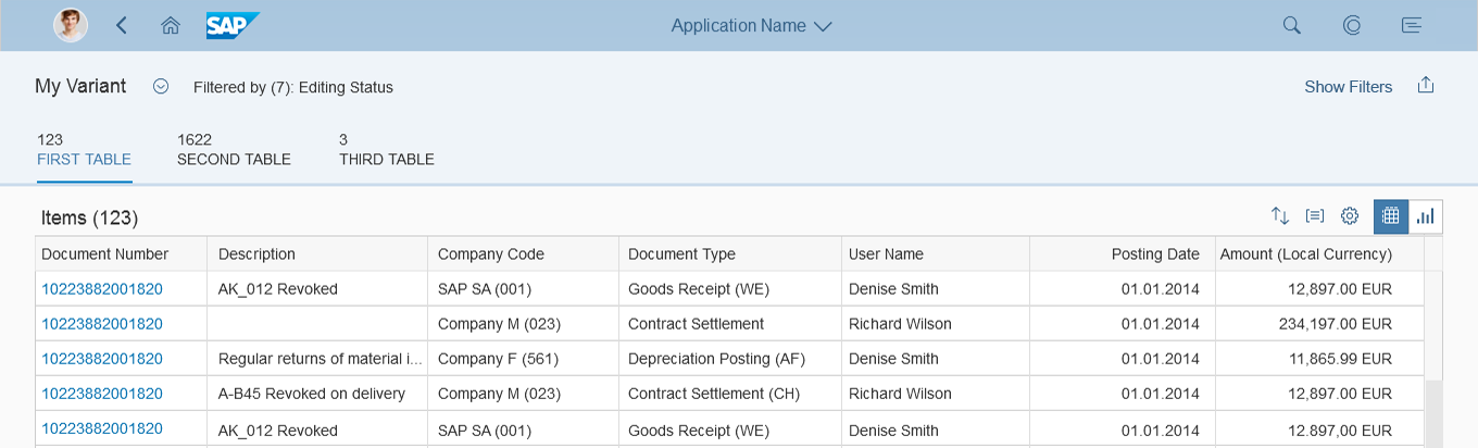
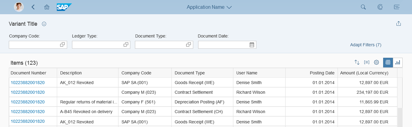
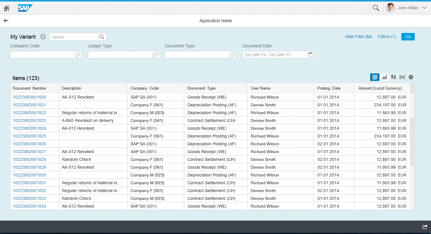
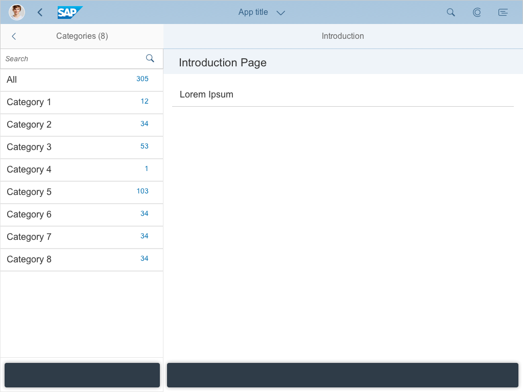
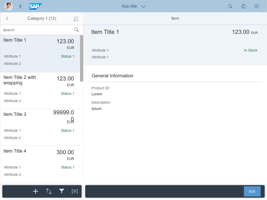
- Tabs (optional): If your content falls into different categories, or you want to display different tables, you can embed the content in an icon tab bar.
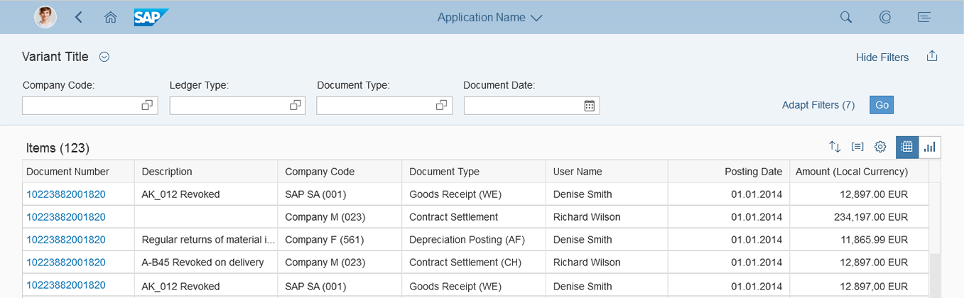
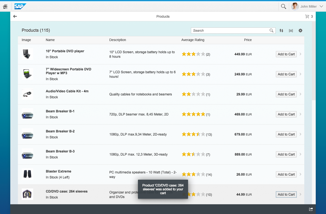
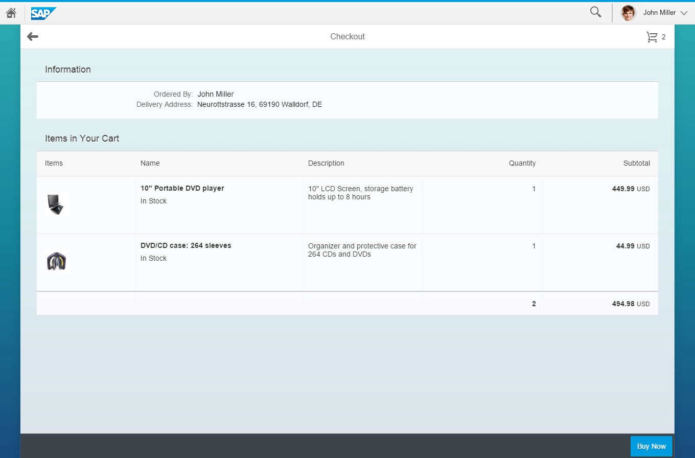
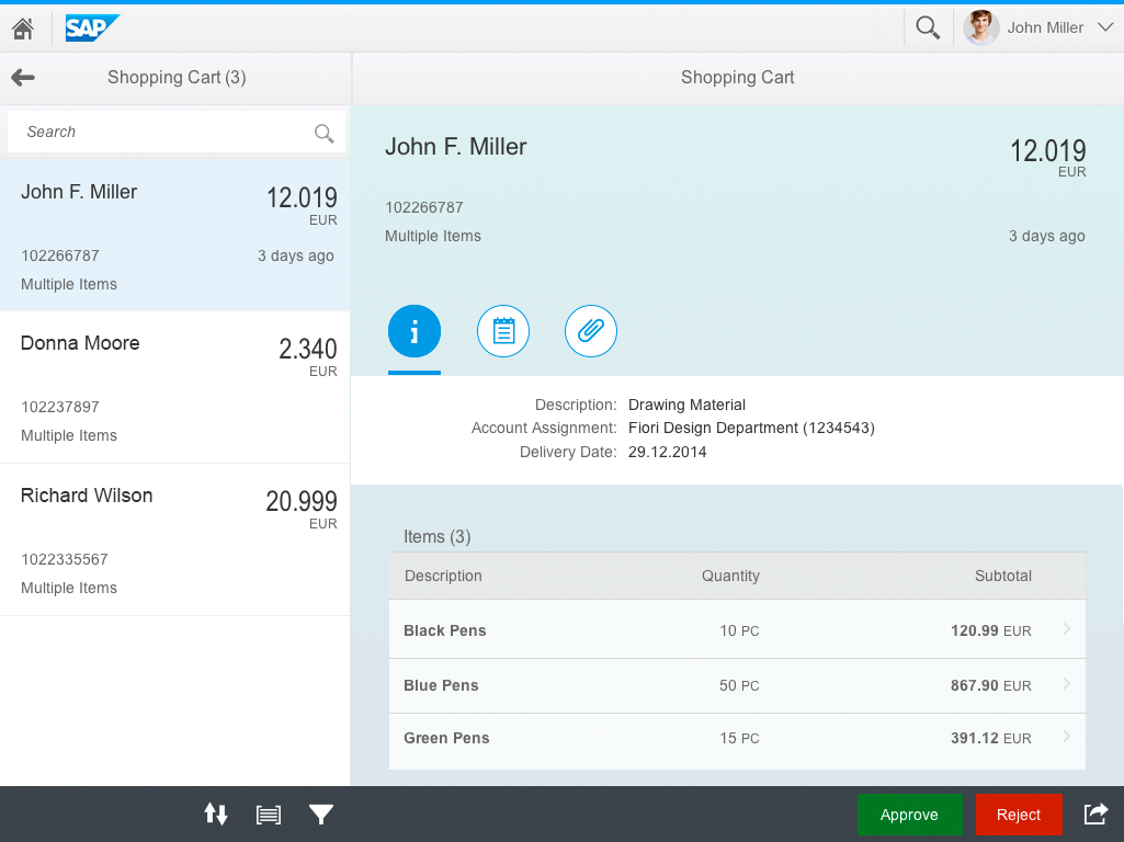
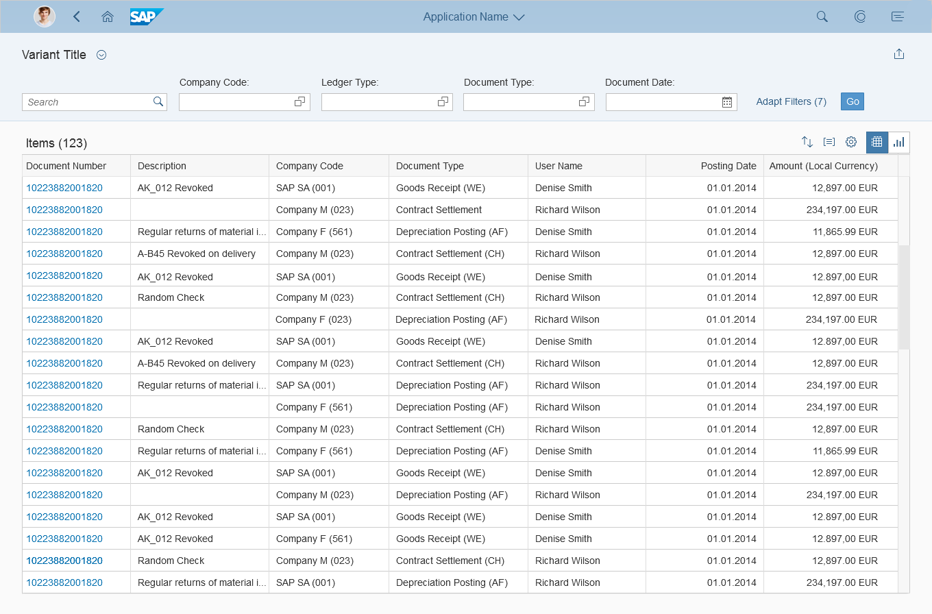
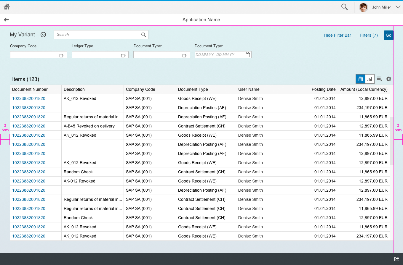
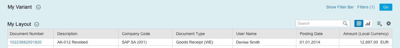
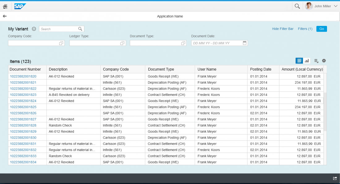
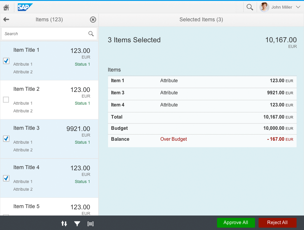
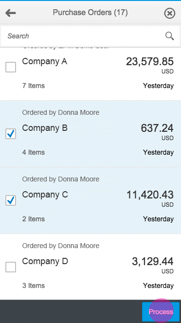
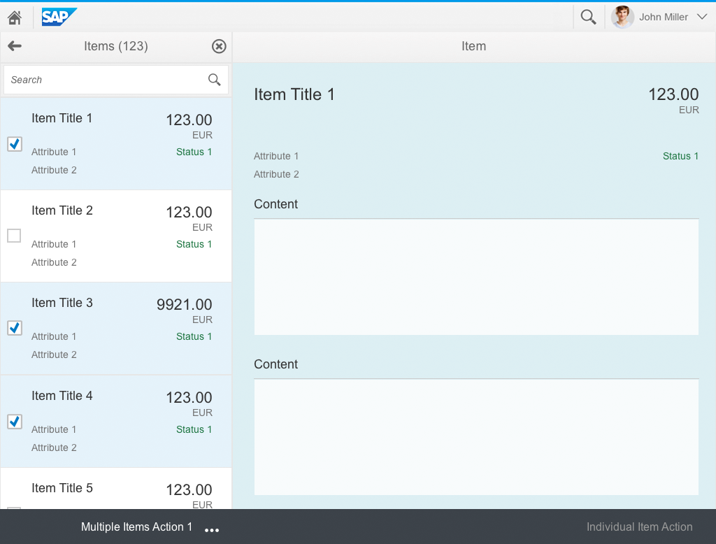
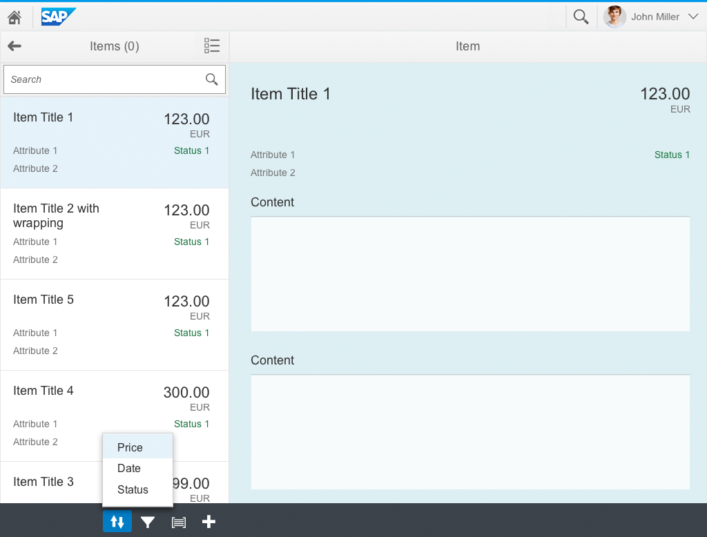
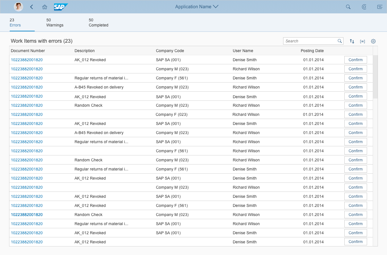
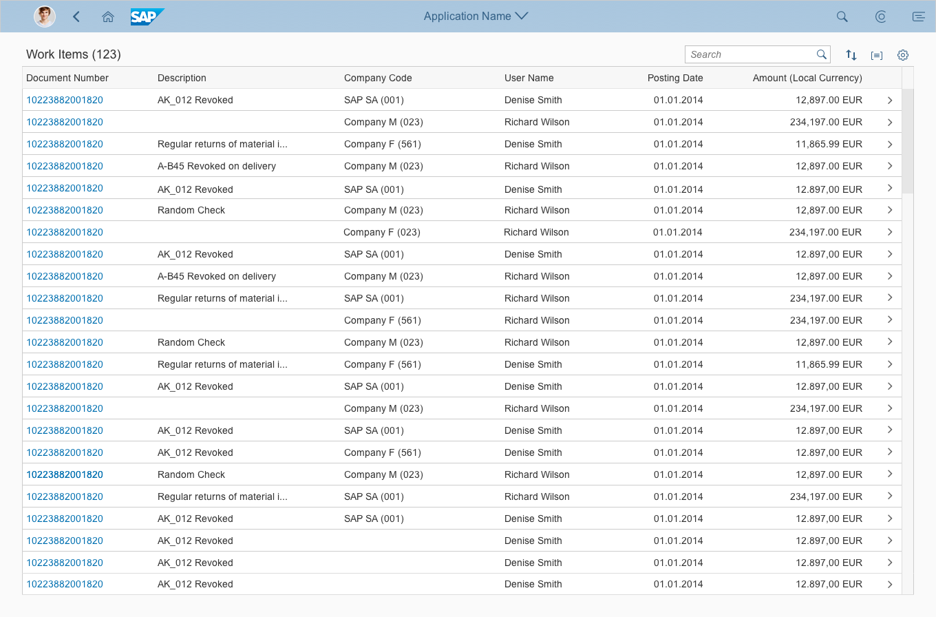
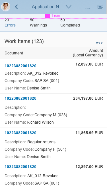
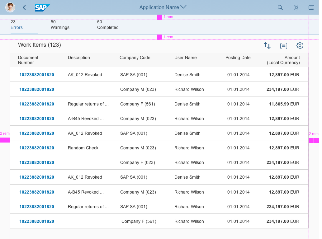
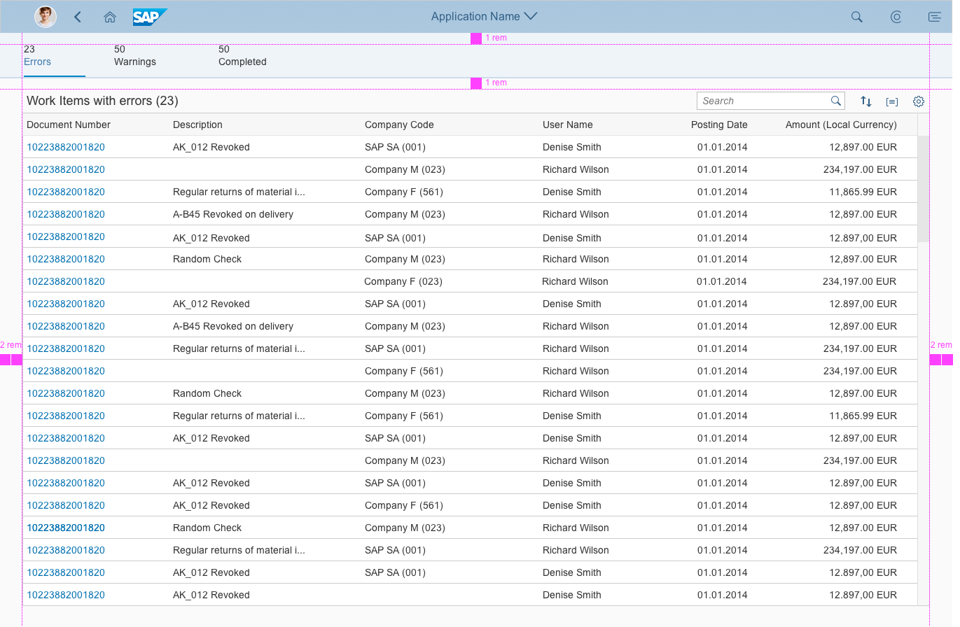
- Content area: The main part of the screen for displaying your data. You can use lists, tables, tree tables, or charts.
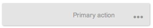
- Footer toolbar
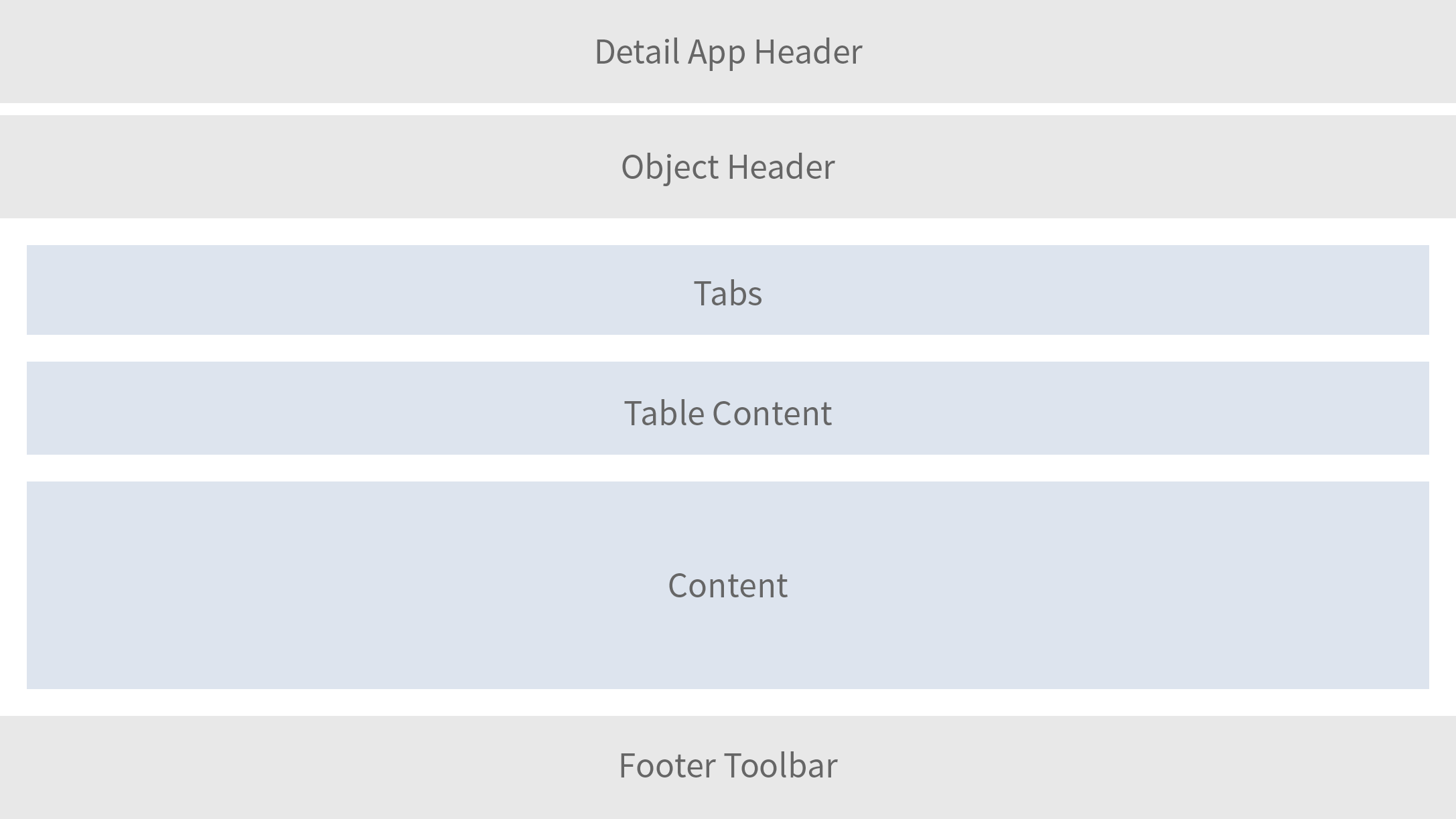
Structure of object view floorplan
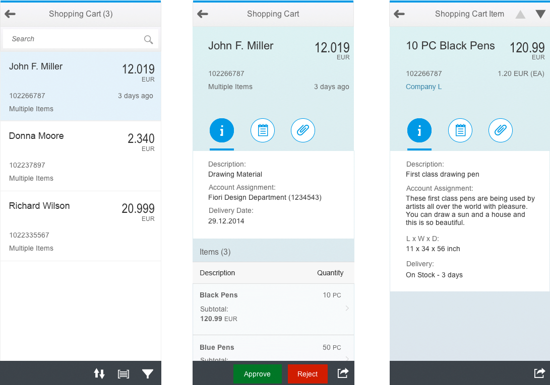
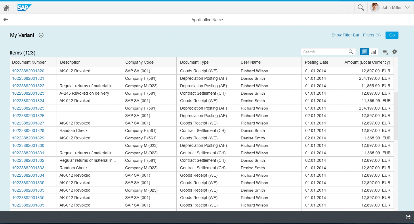
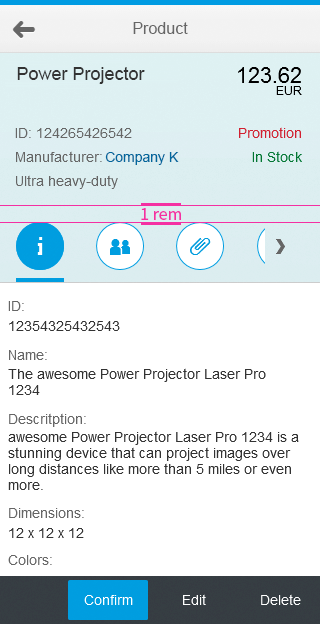
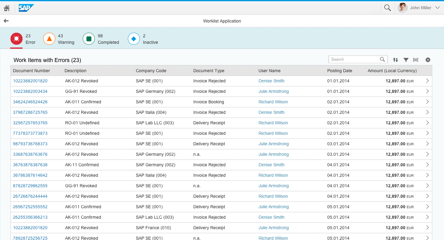
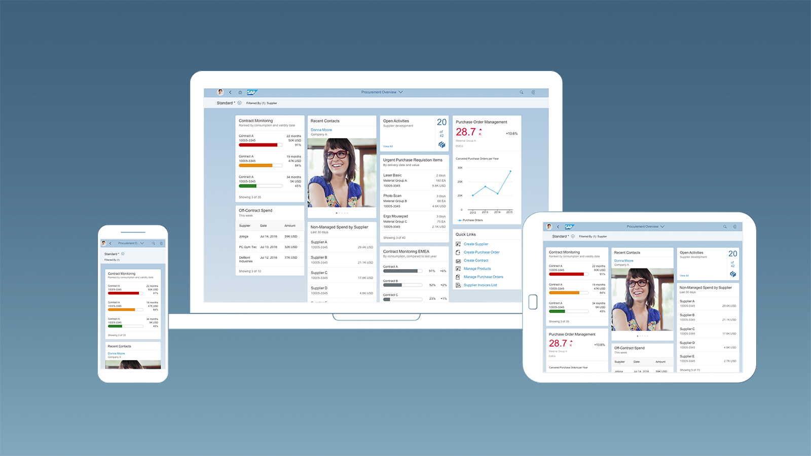
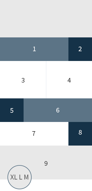
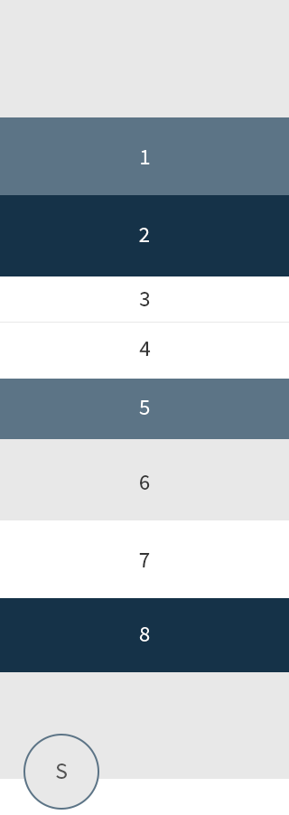
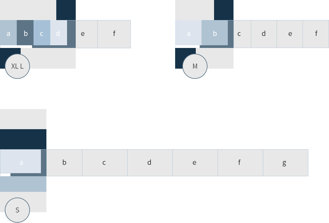
Responsiveness

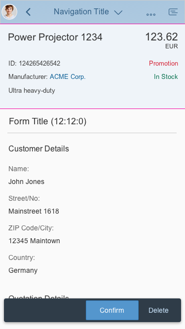
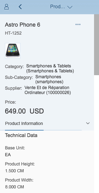
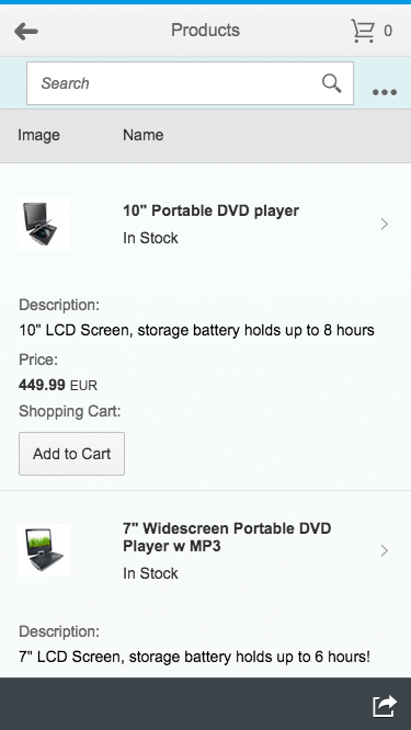
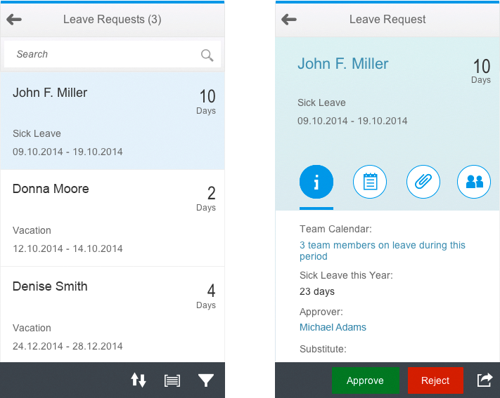
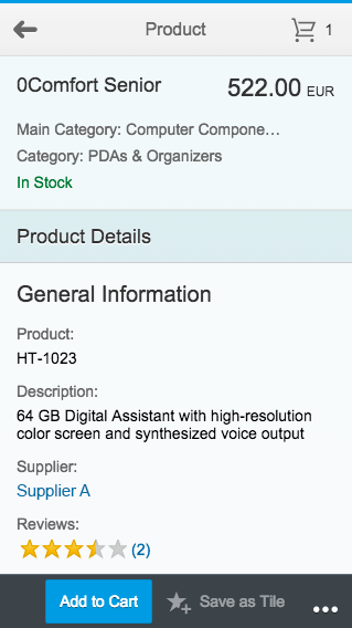
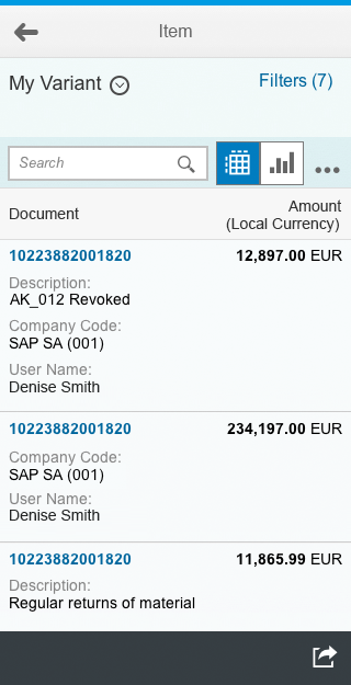
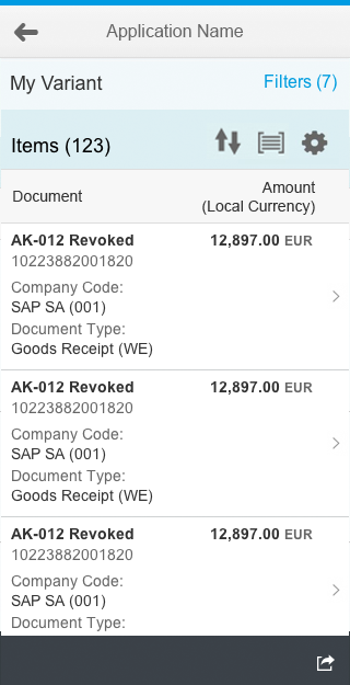
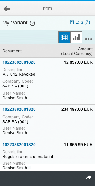
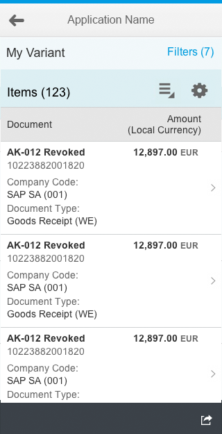
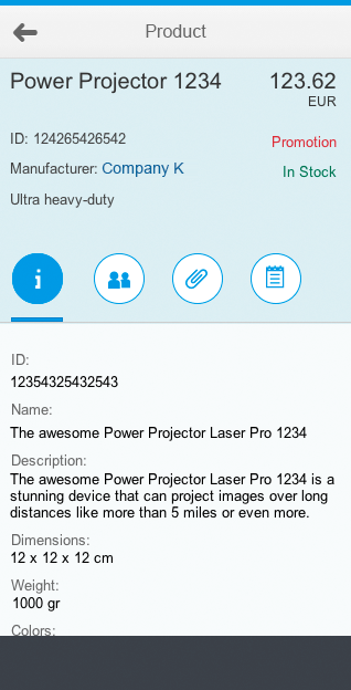
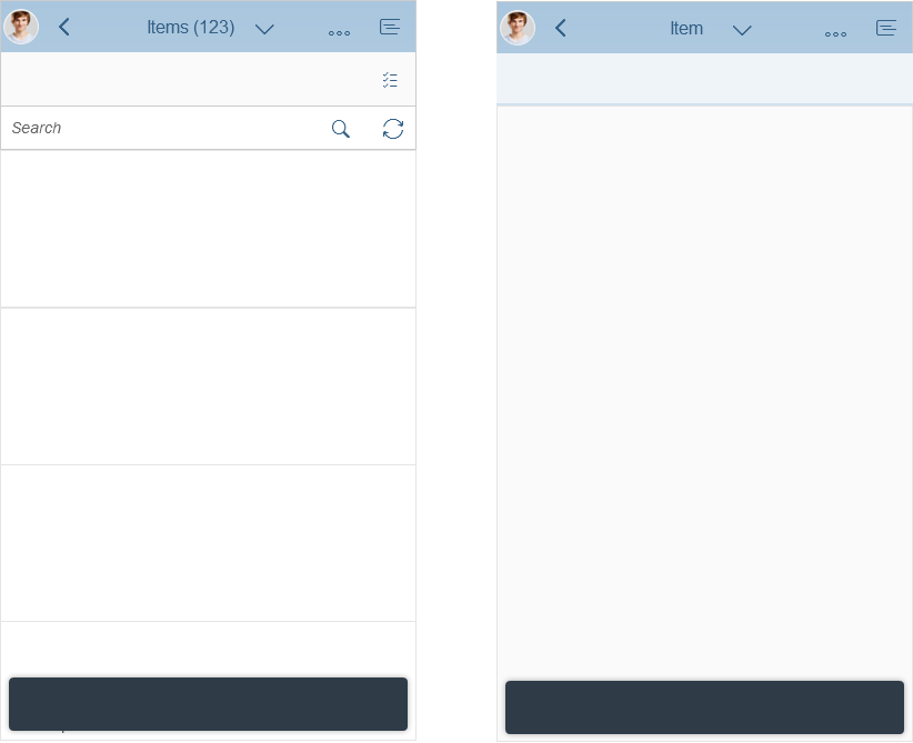
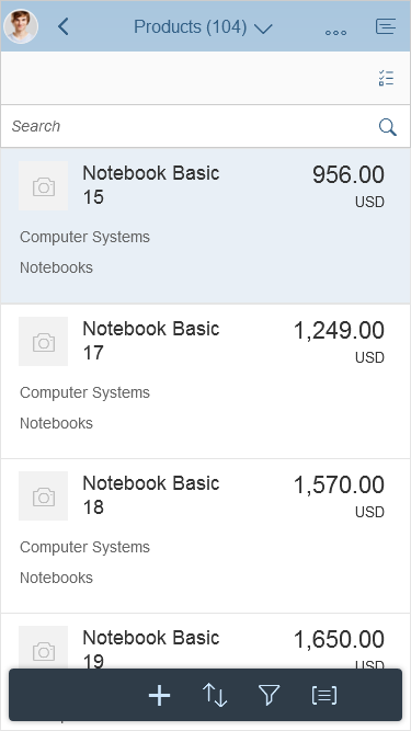
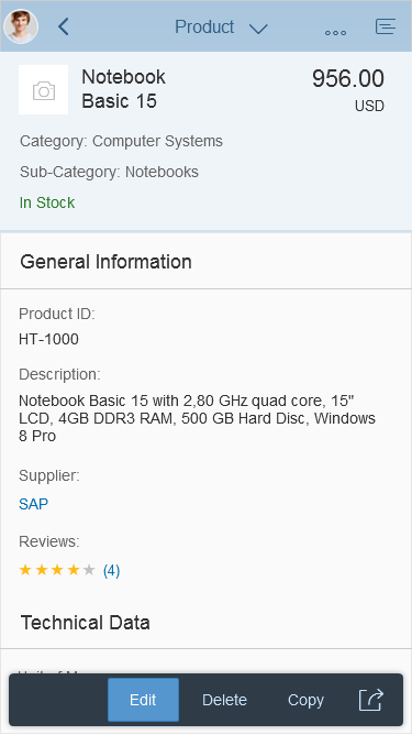
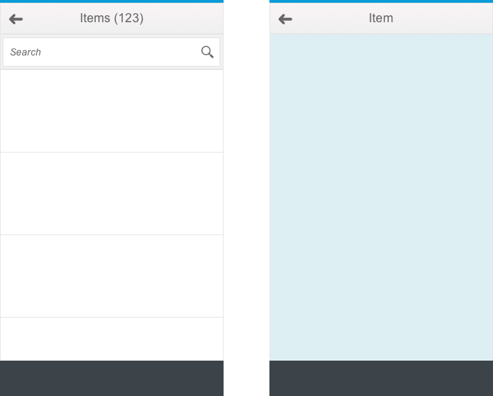
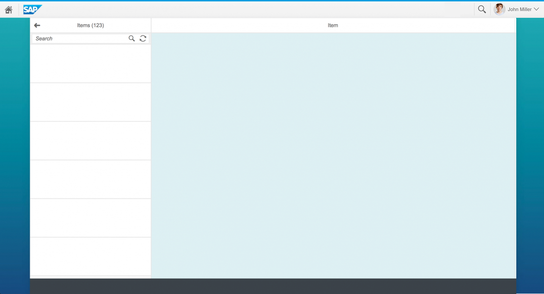
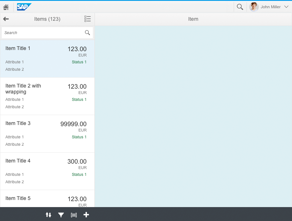
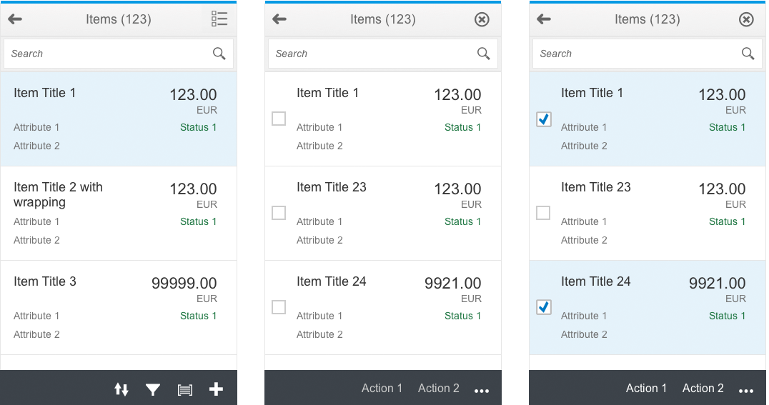
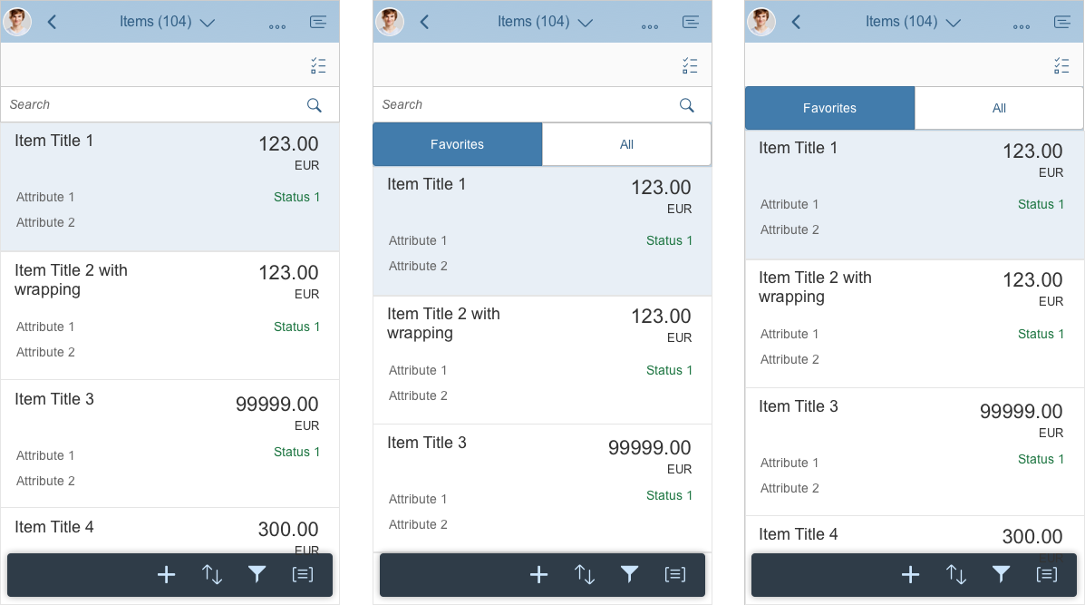
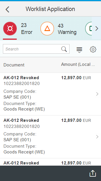
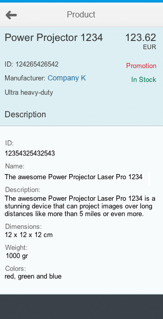
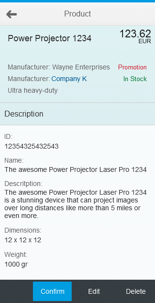
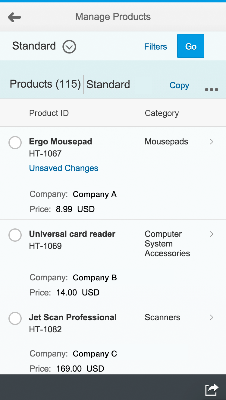
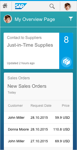
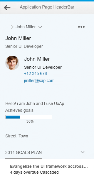
Object view on a smartphone
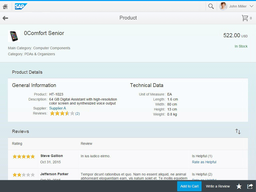
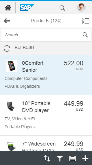
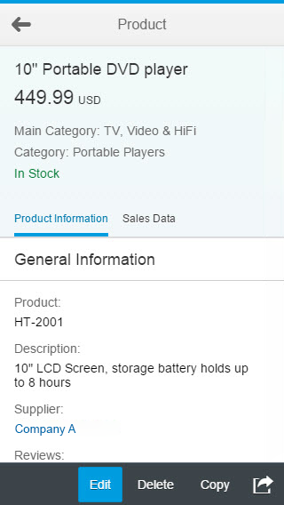
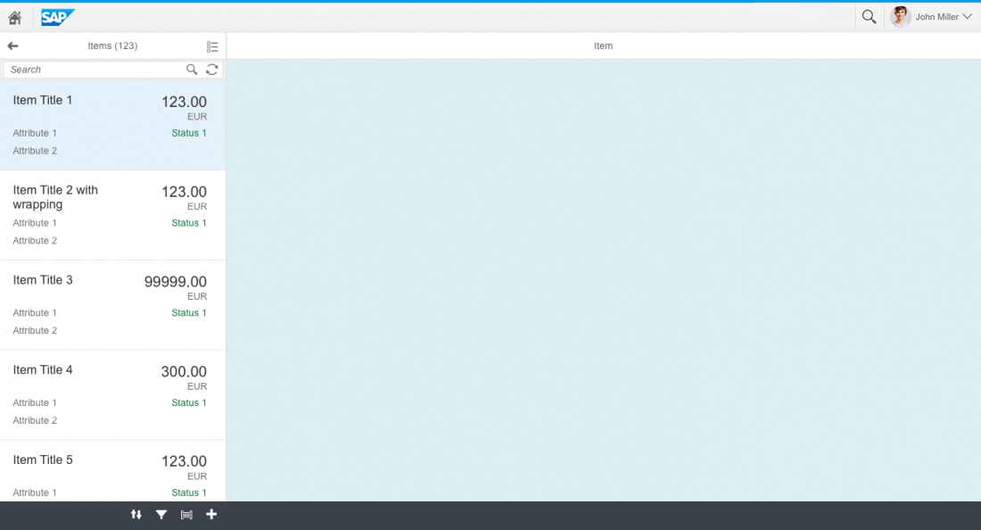
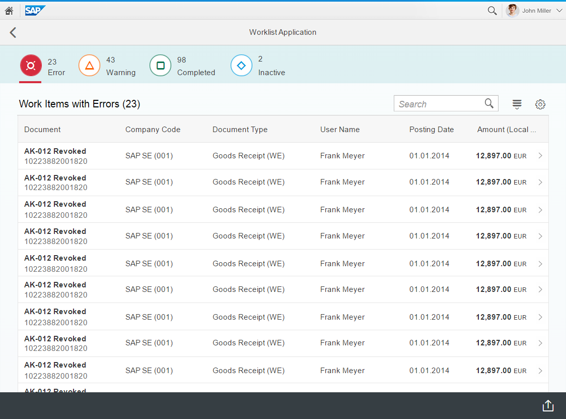
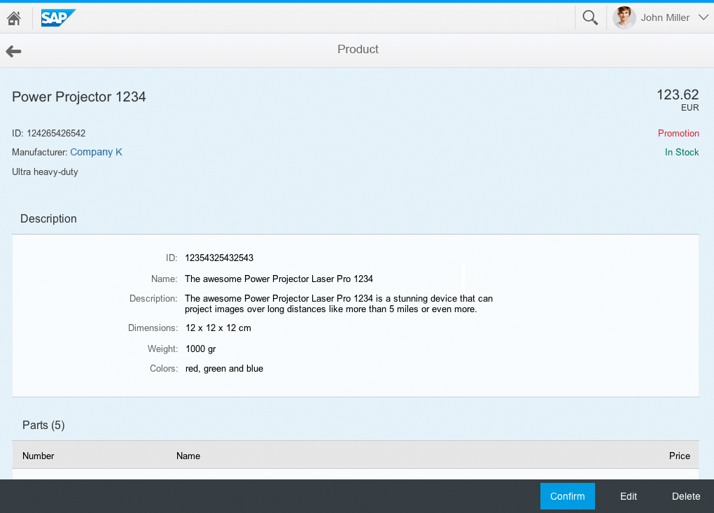
Object view on a tablet
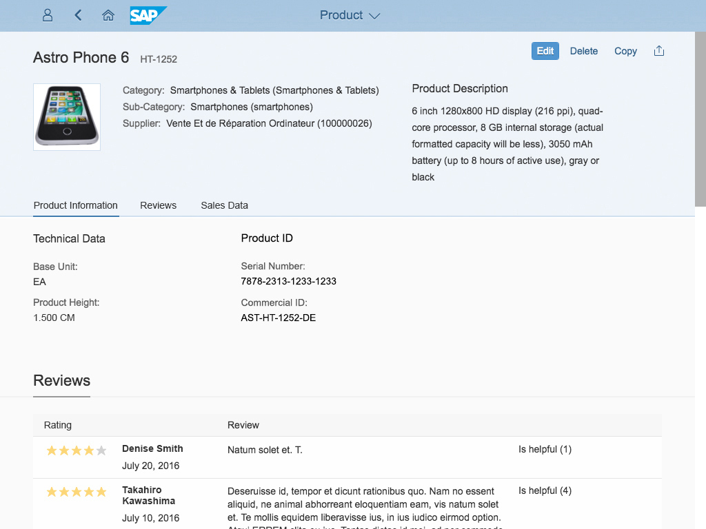
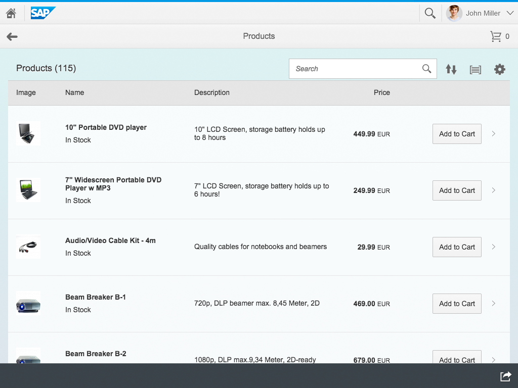
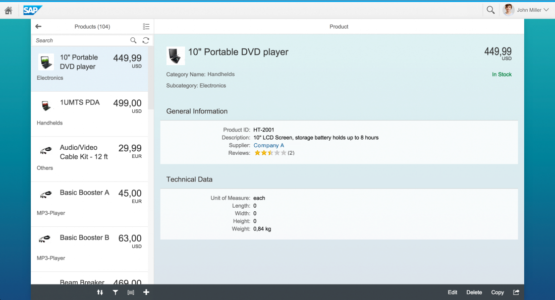
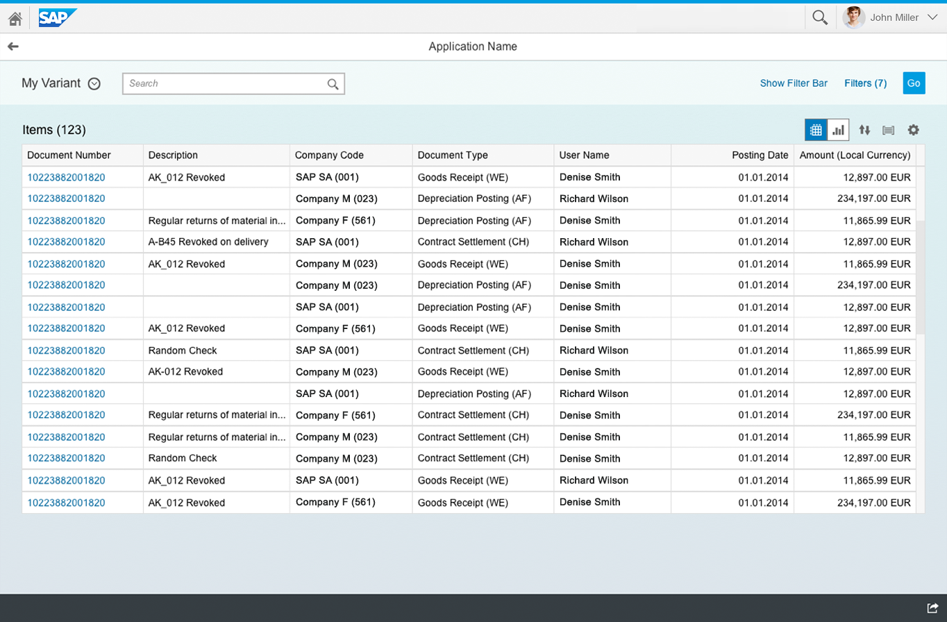
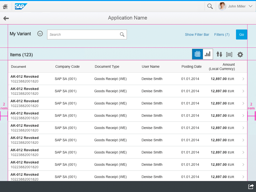
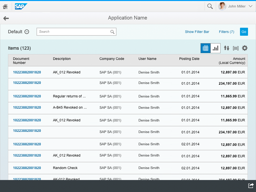
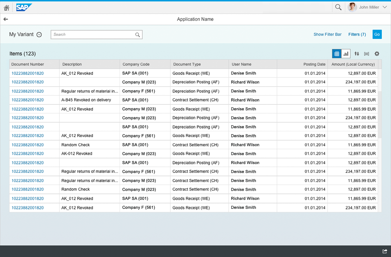
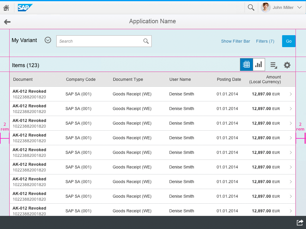
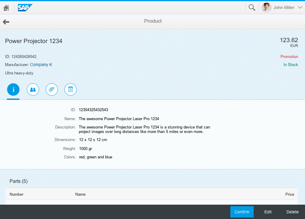
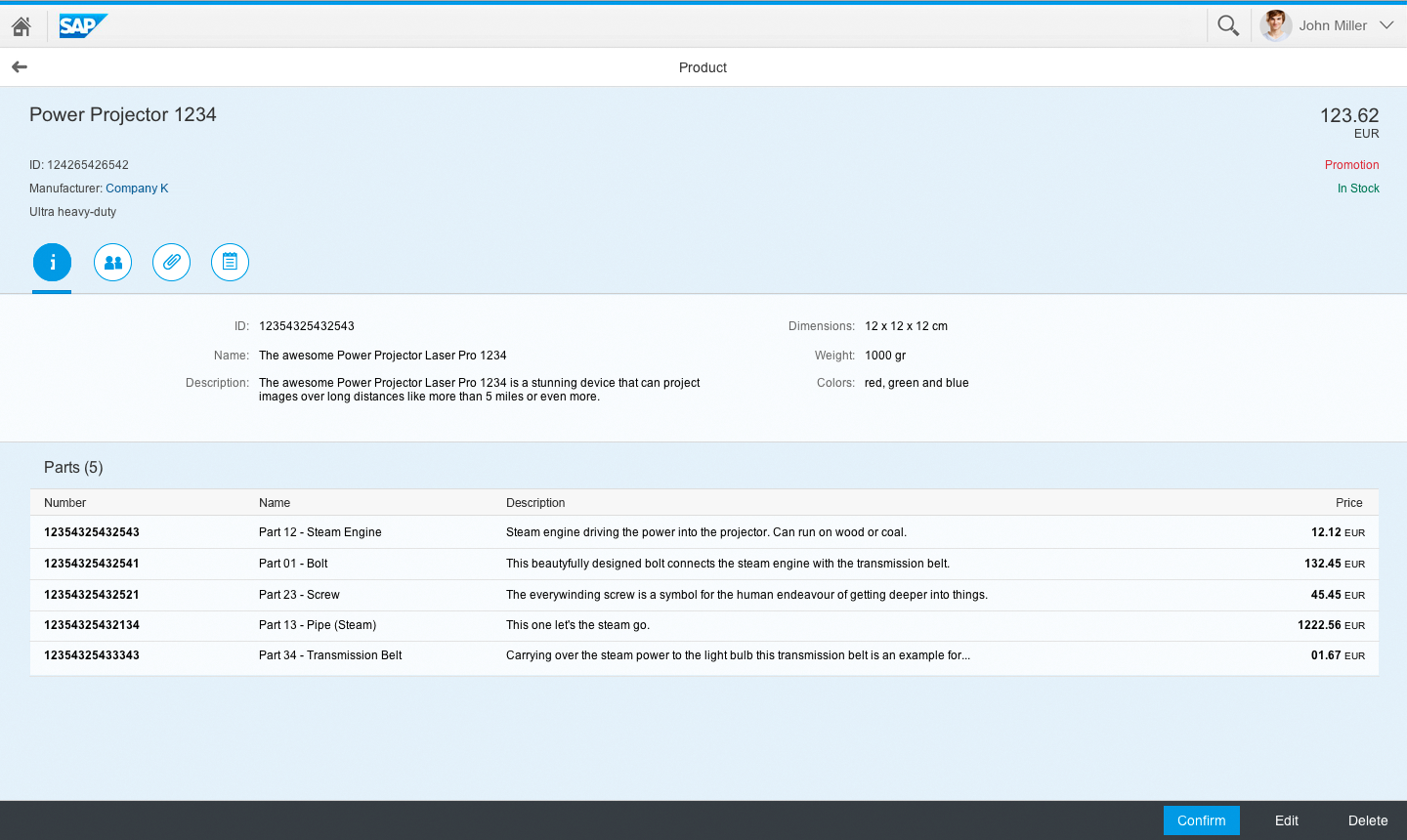
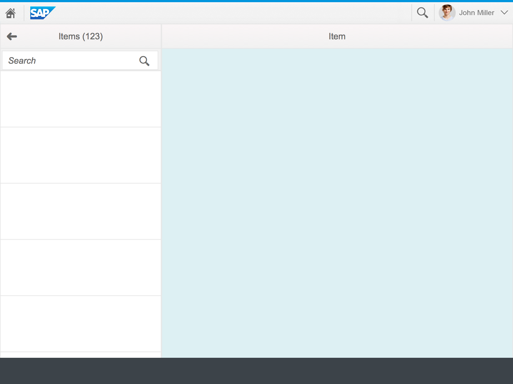
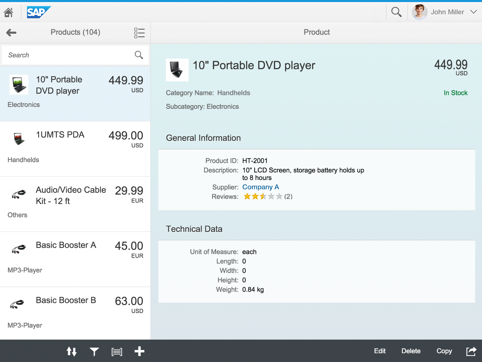
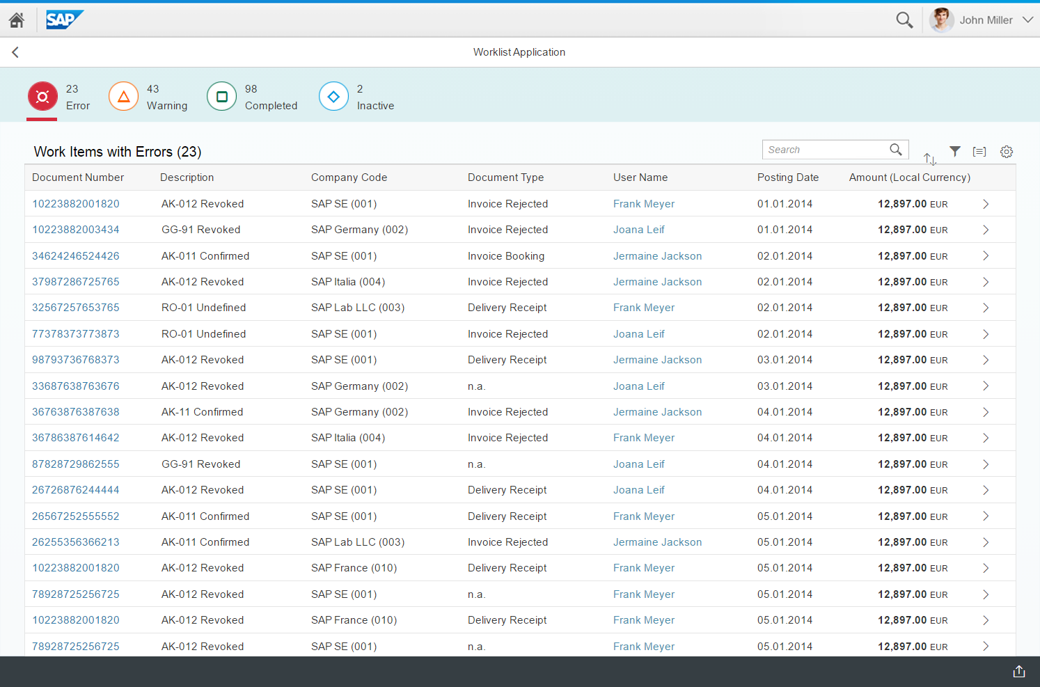
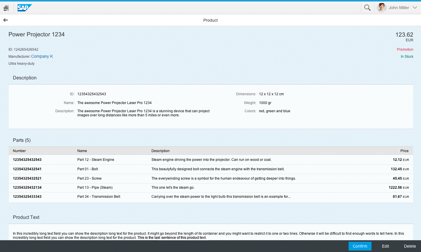
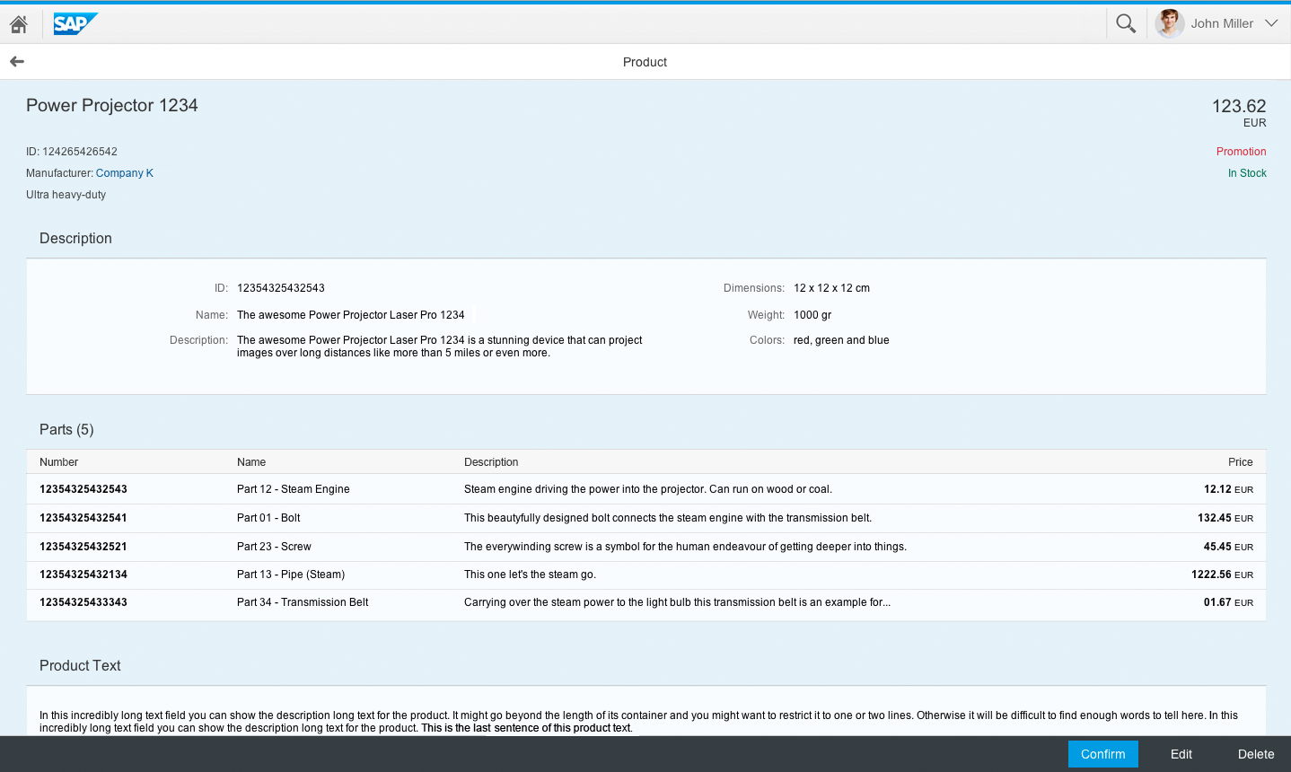
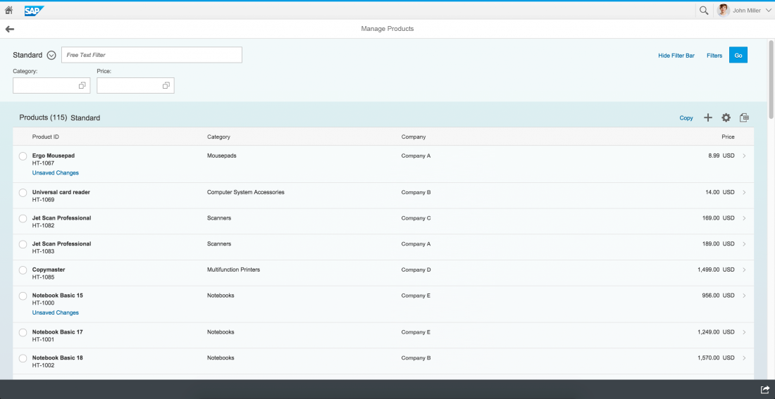
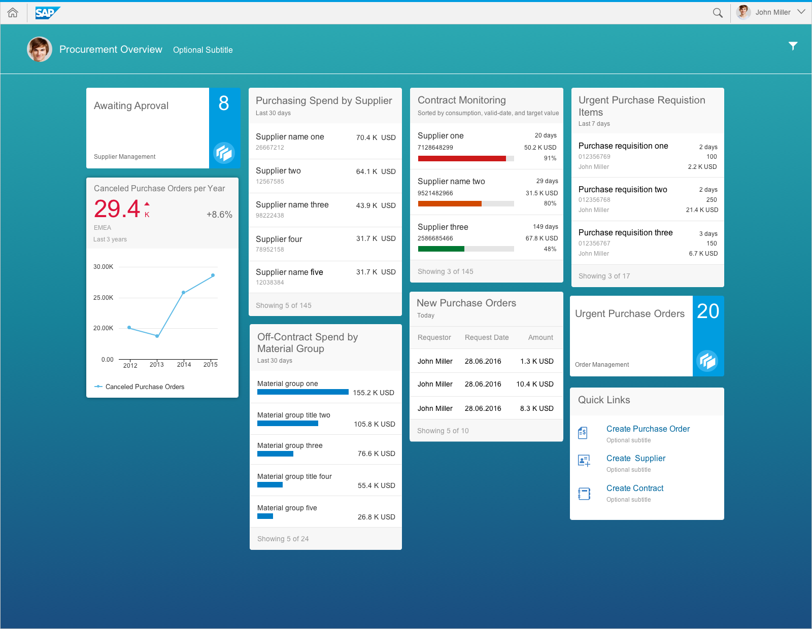
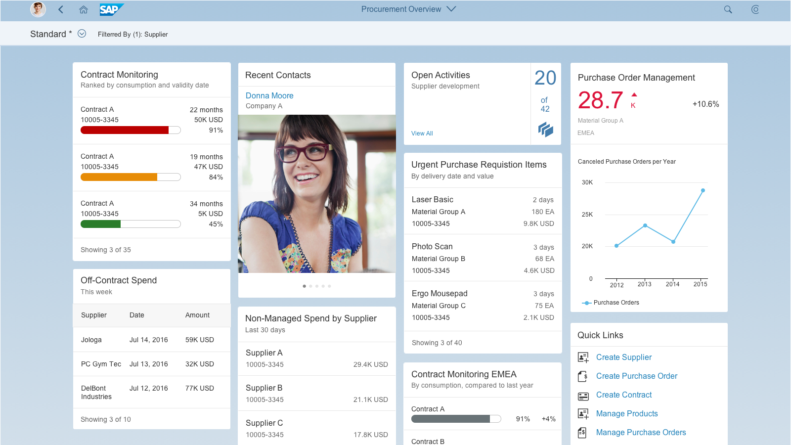
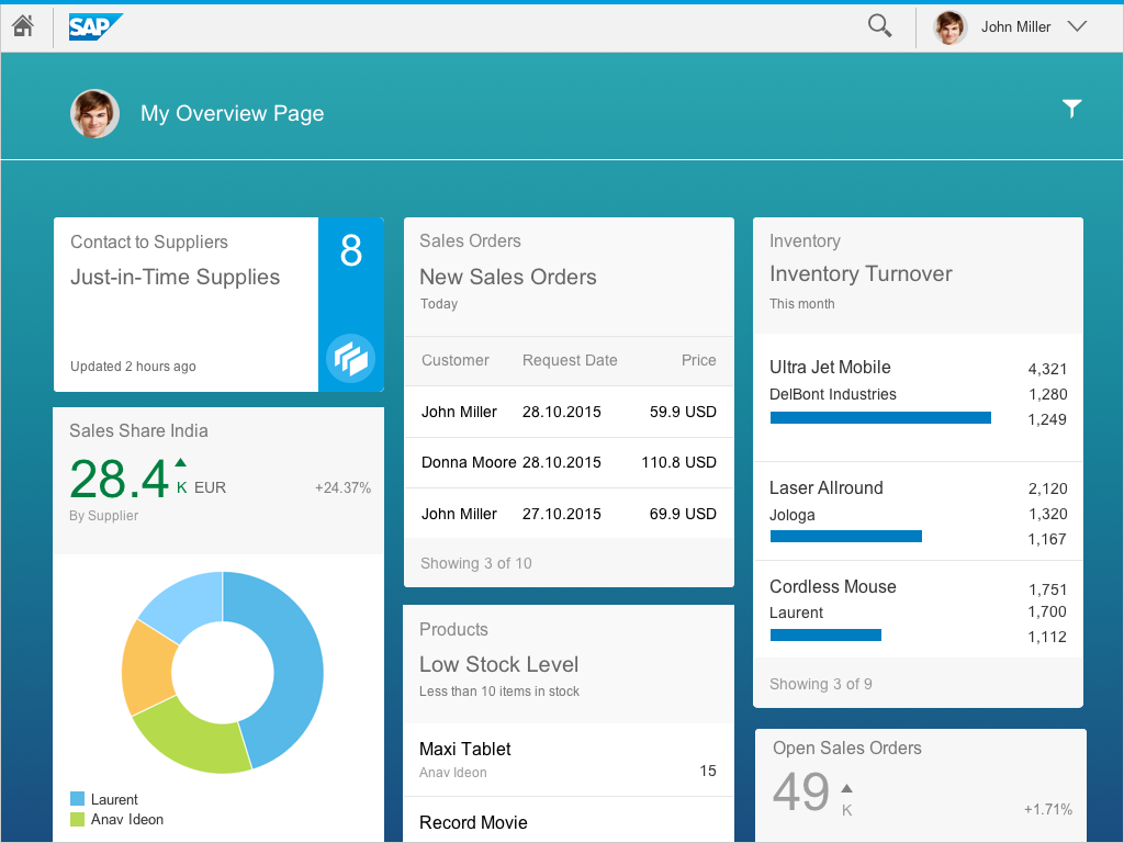
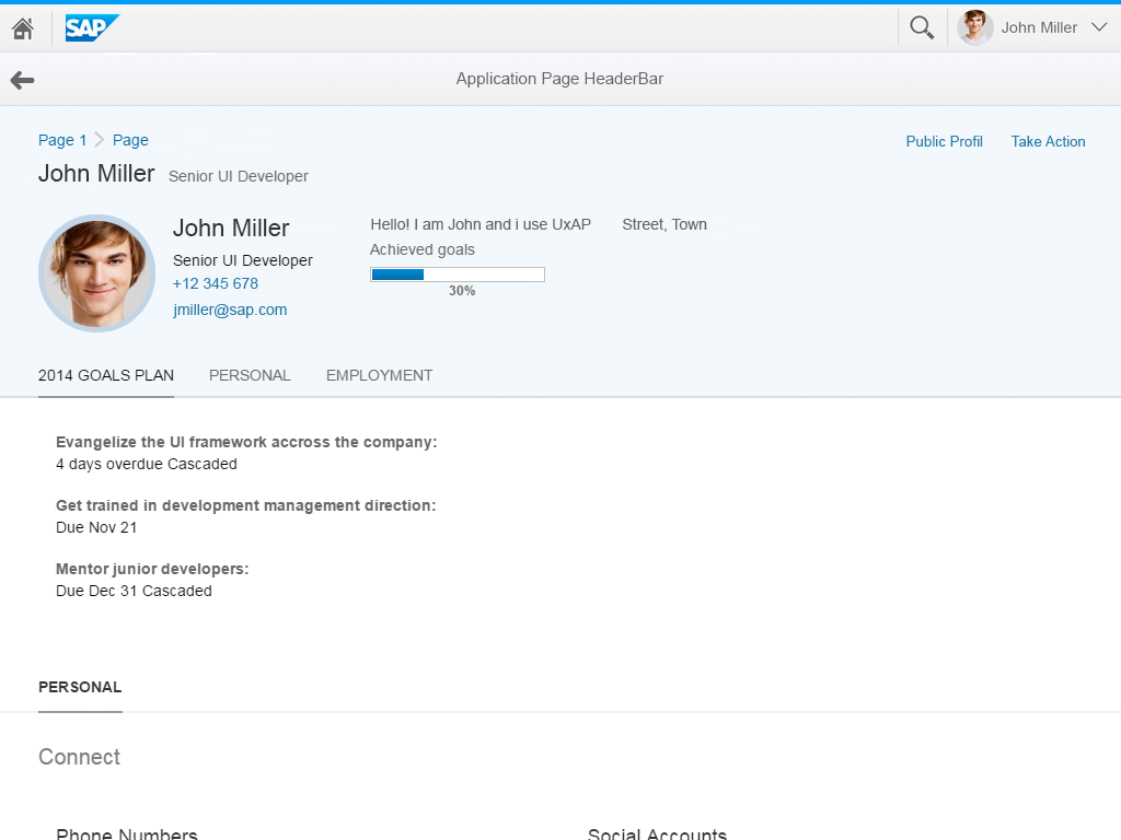
Object view on a desktop
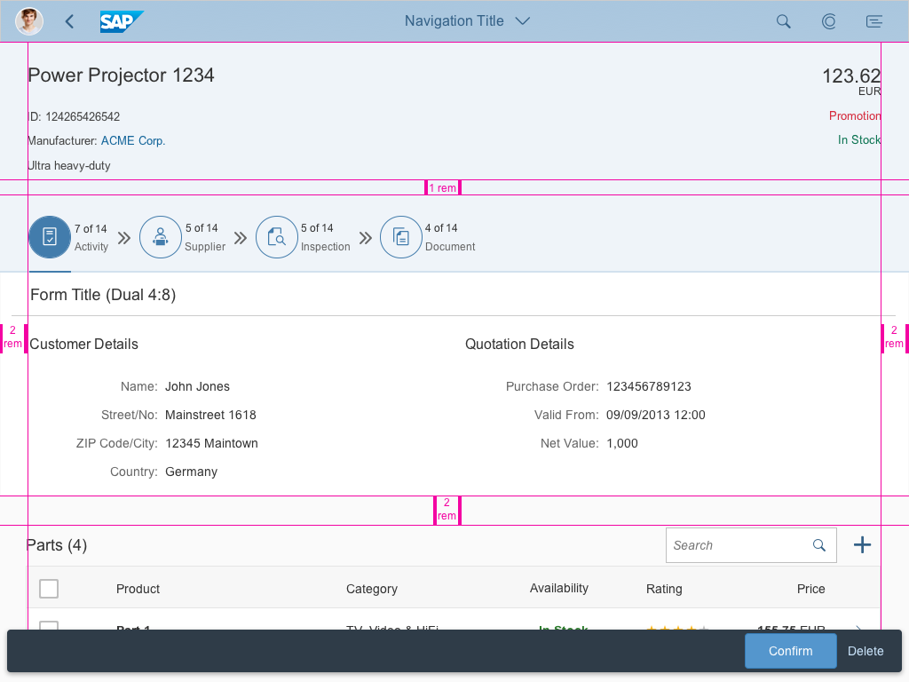
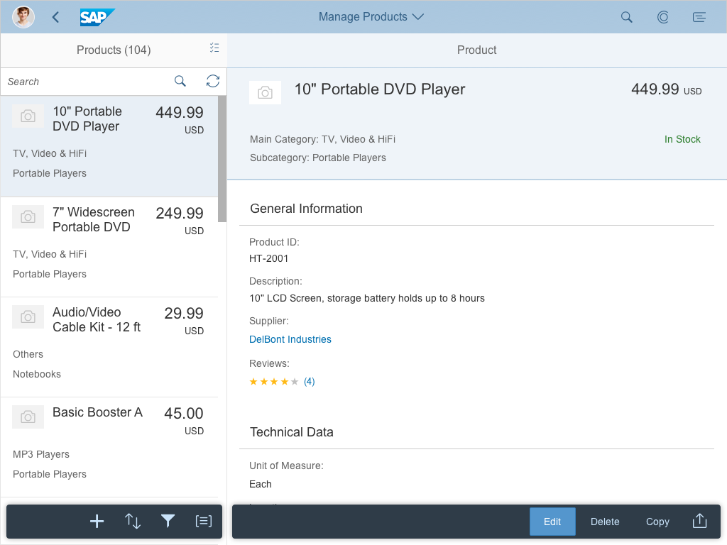
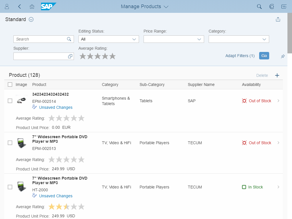
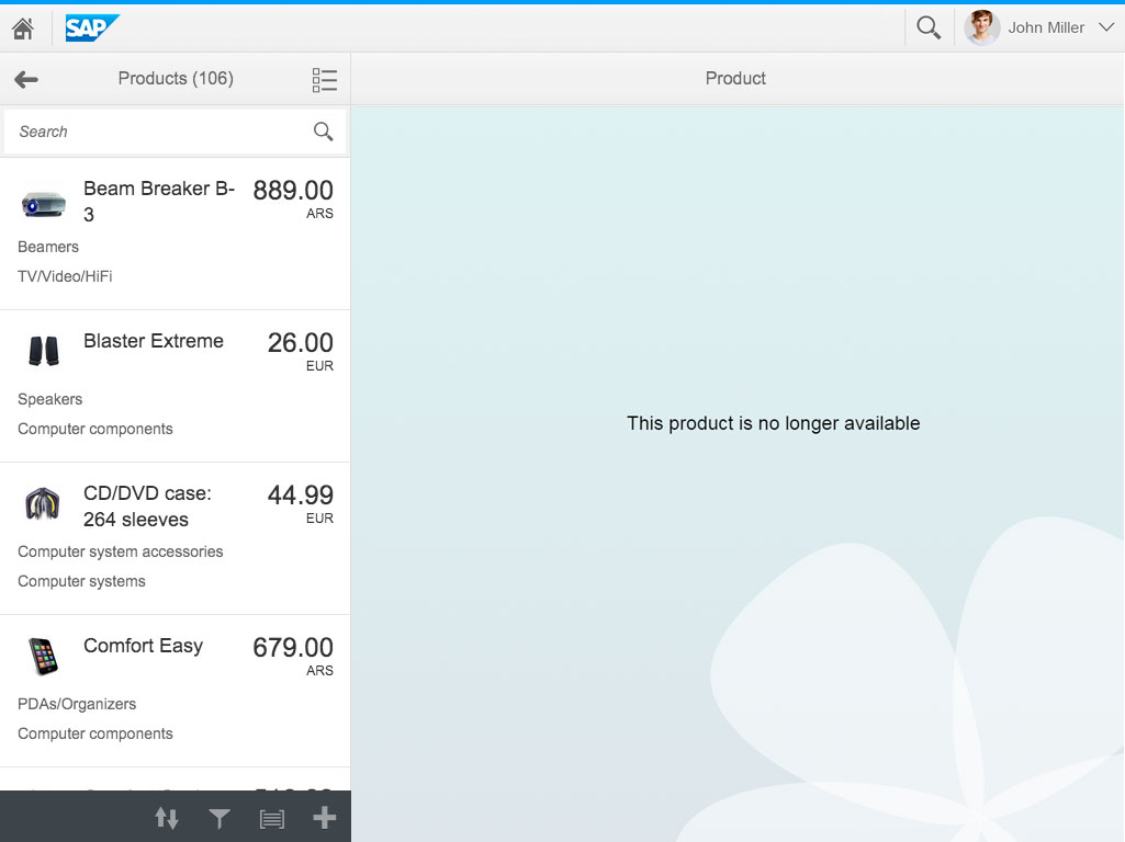
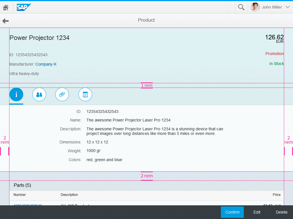
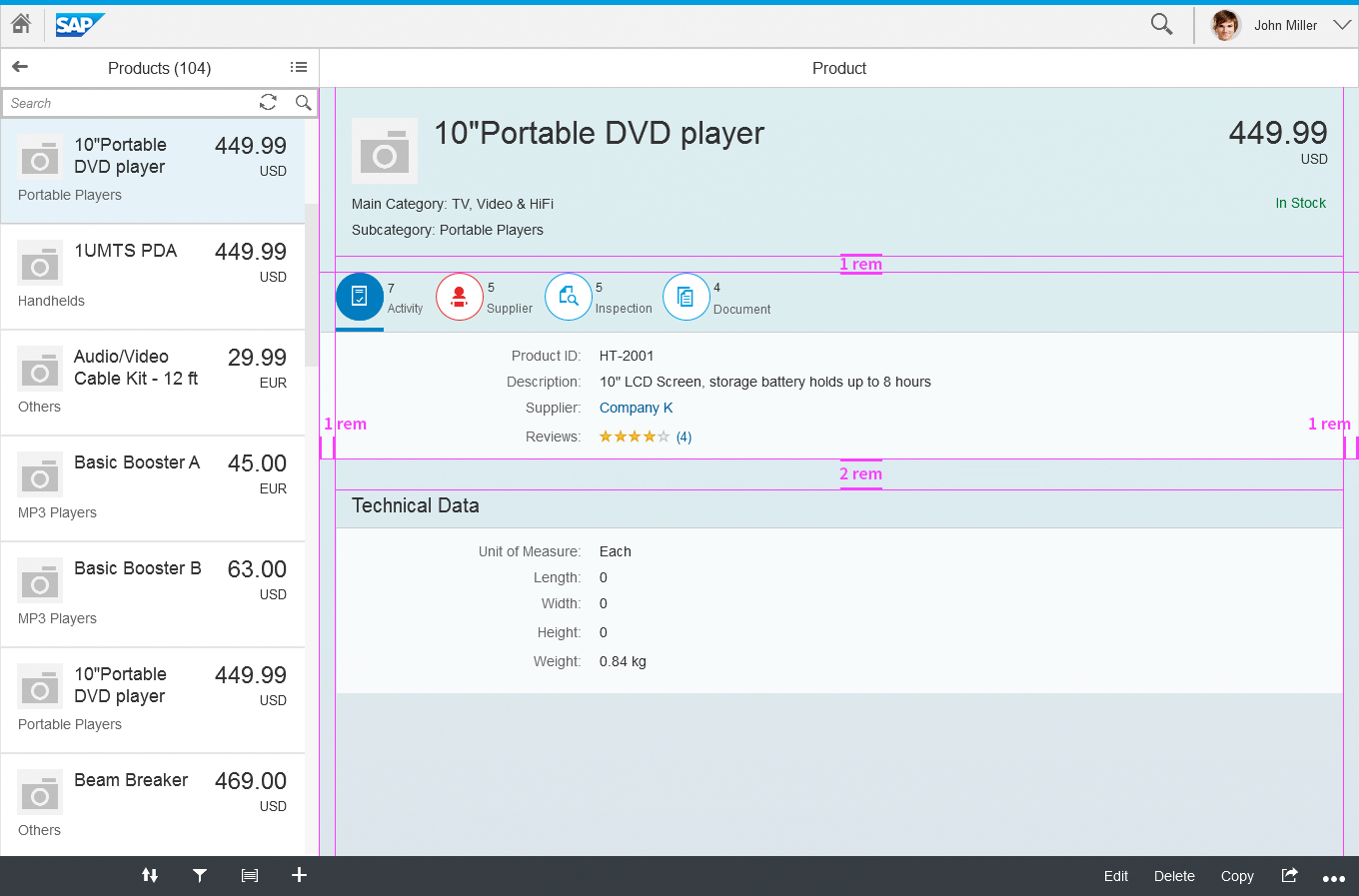
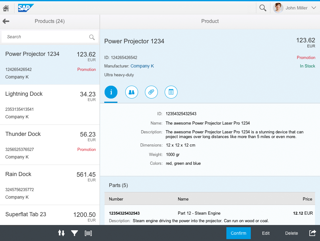
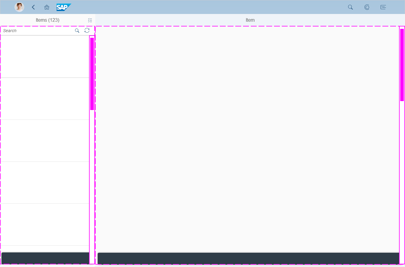
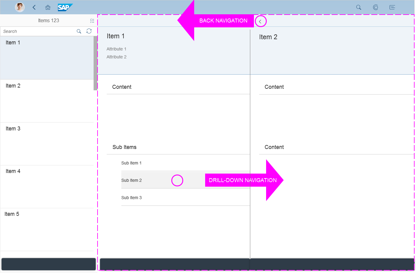
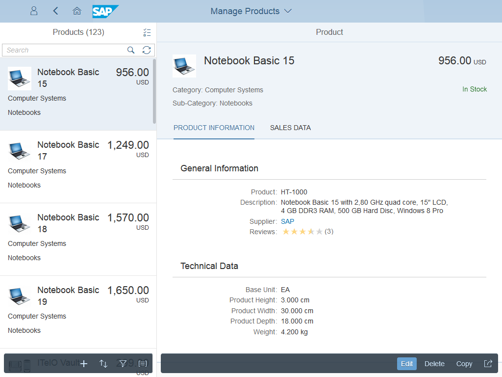
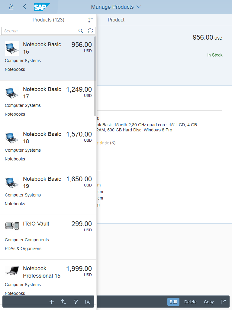
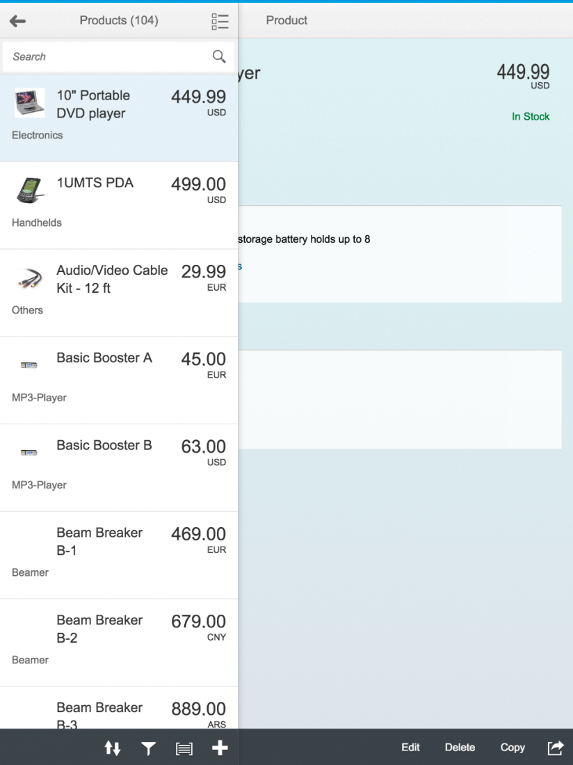
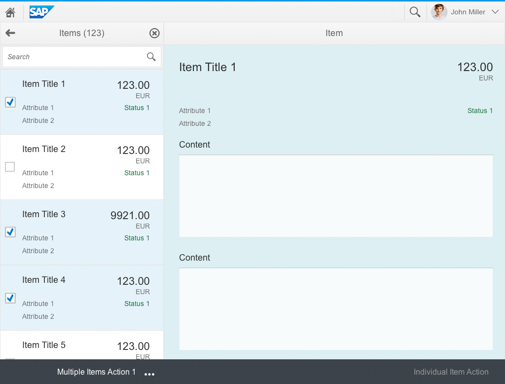
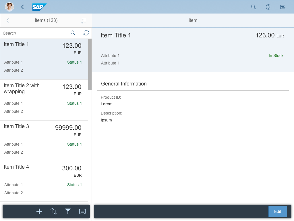
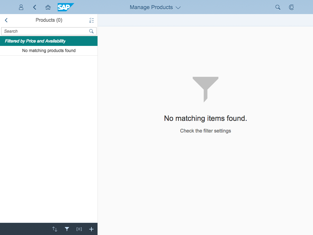
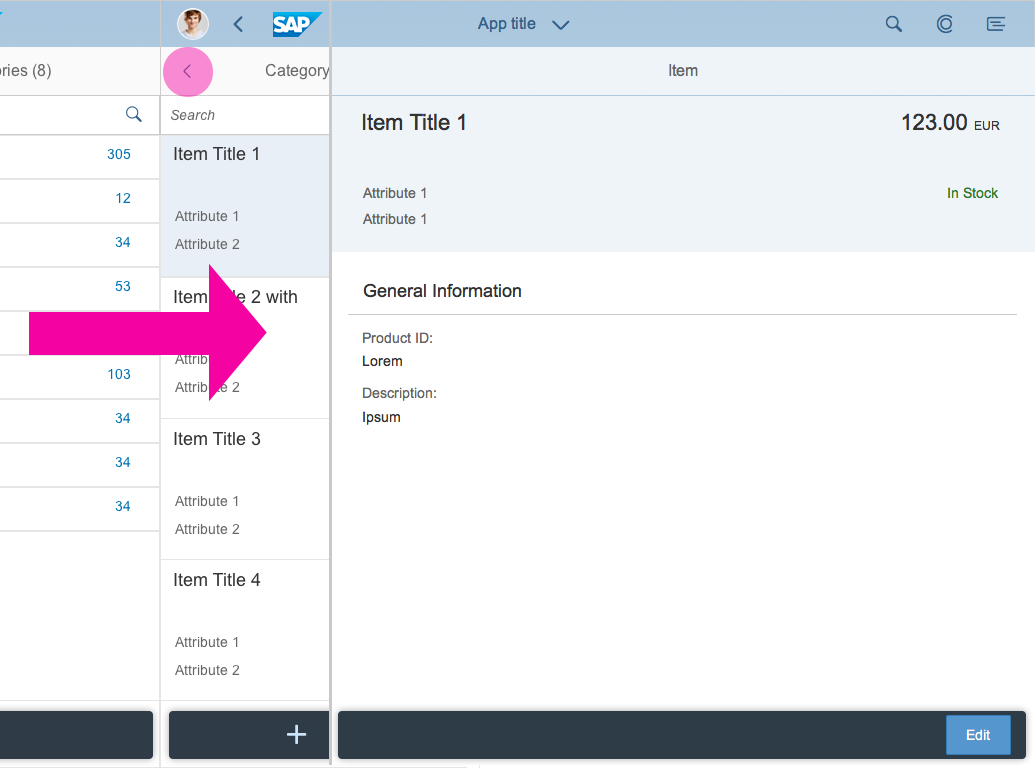
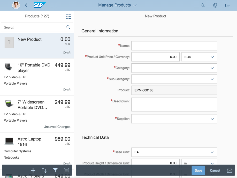
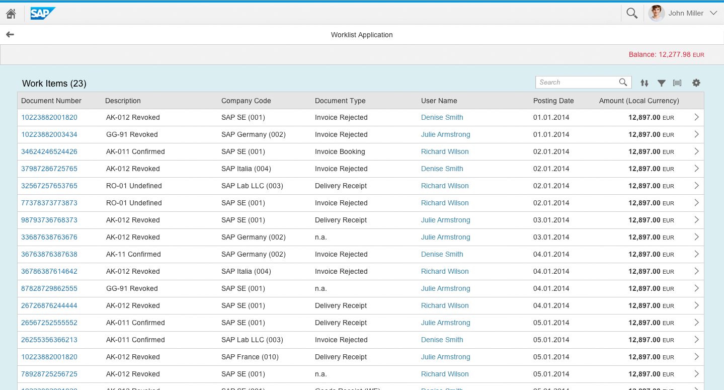
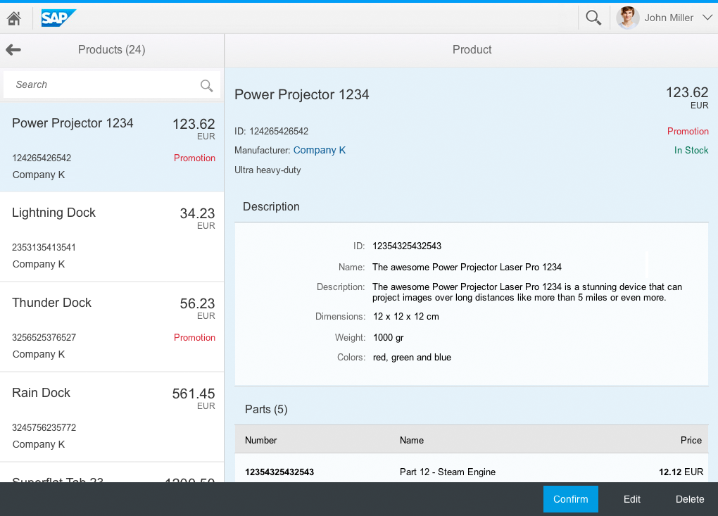
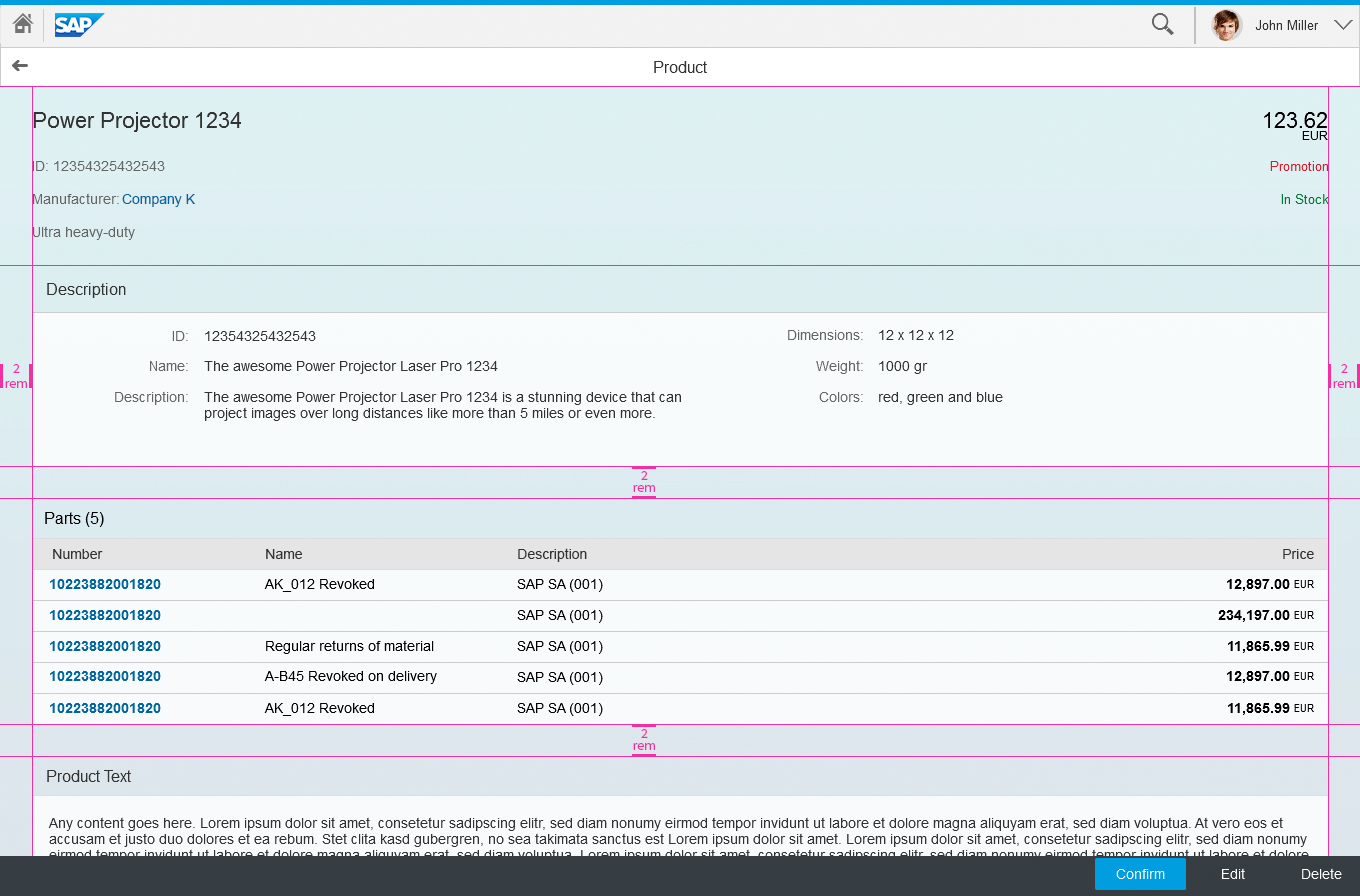
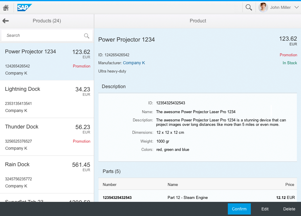
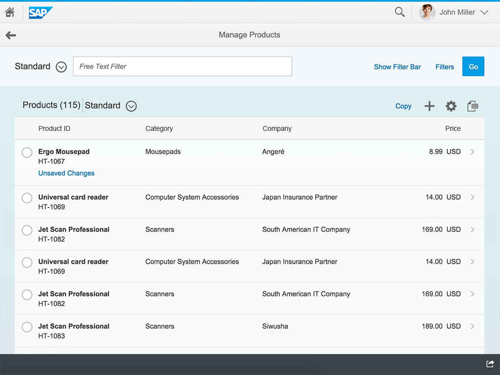
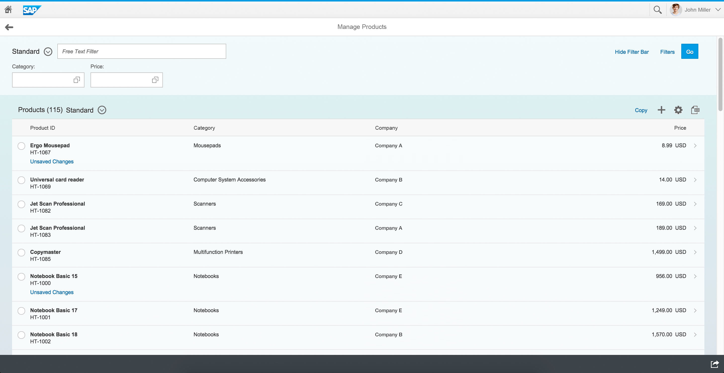
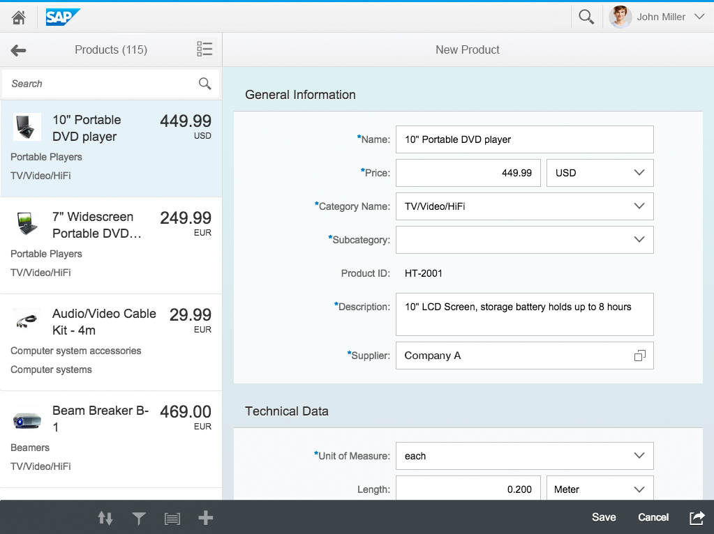
You can use the object view floorplan in both a full screen layout and split-screen layout.
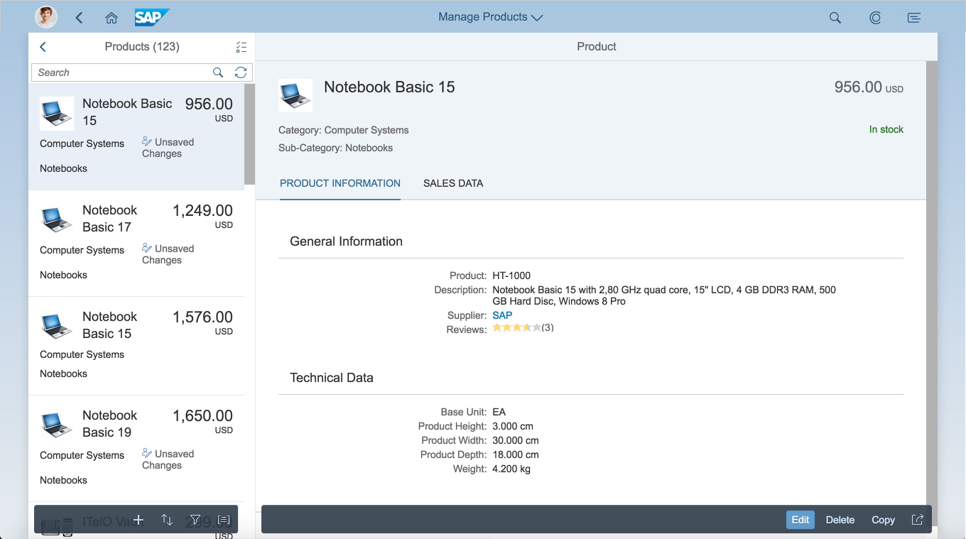
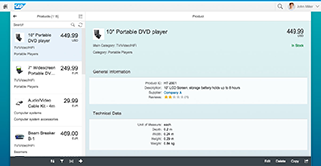
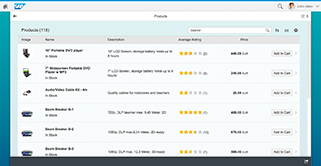
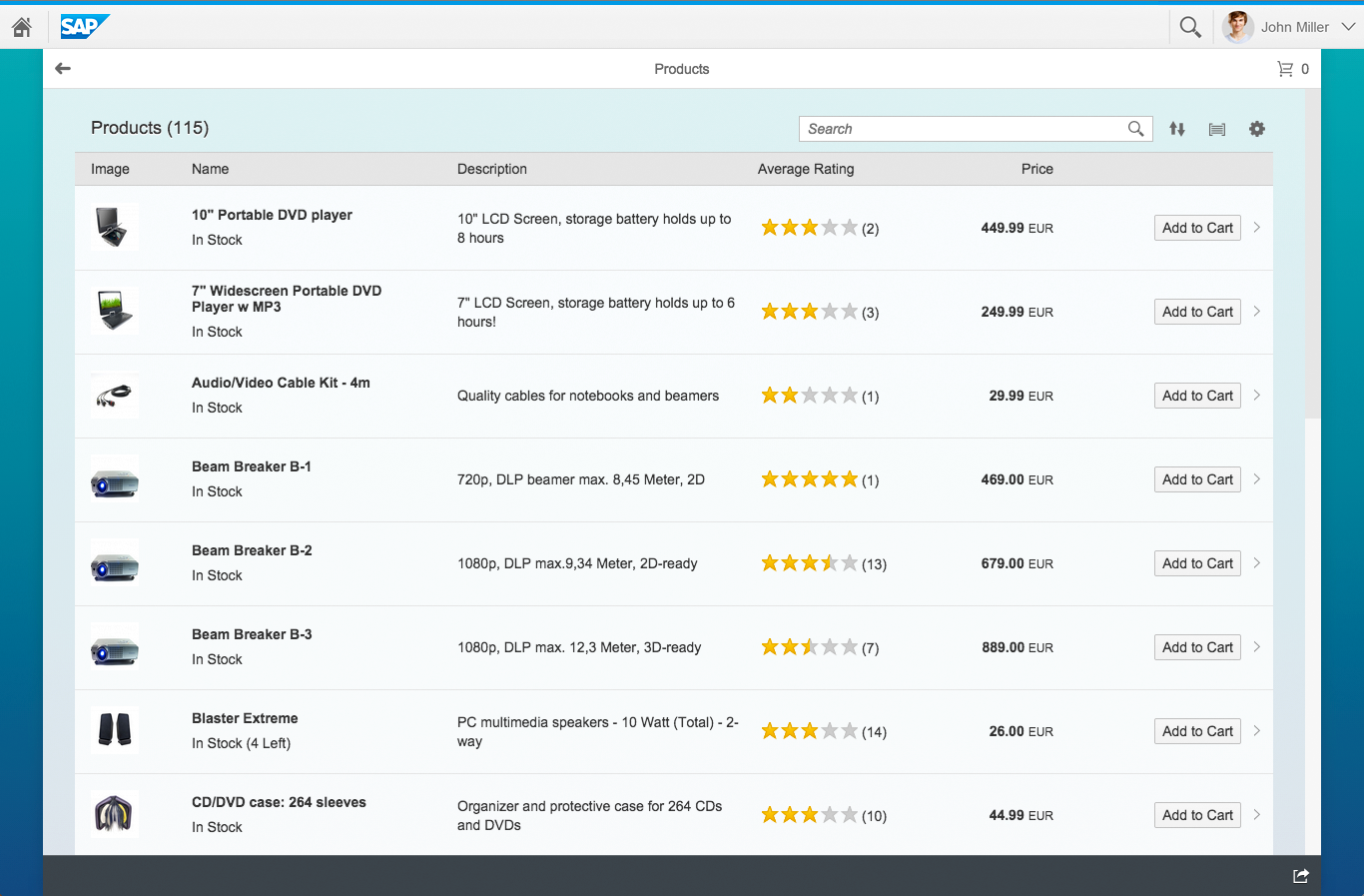
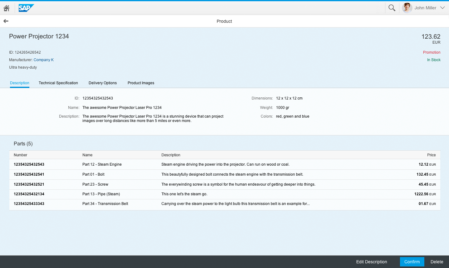
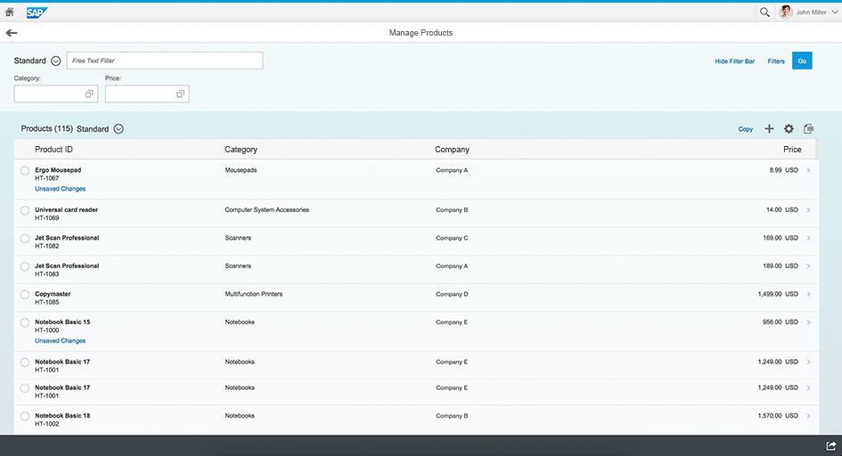
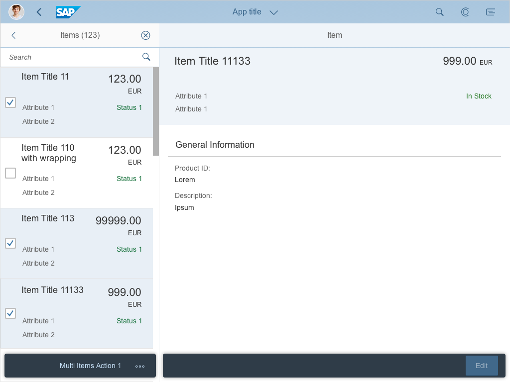
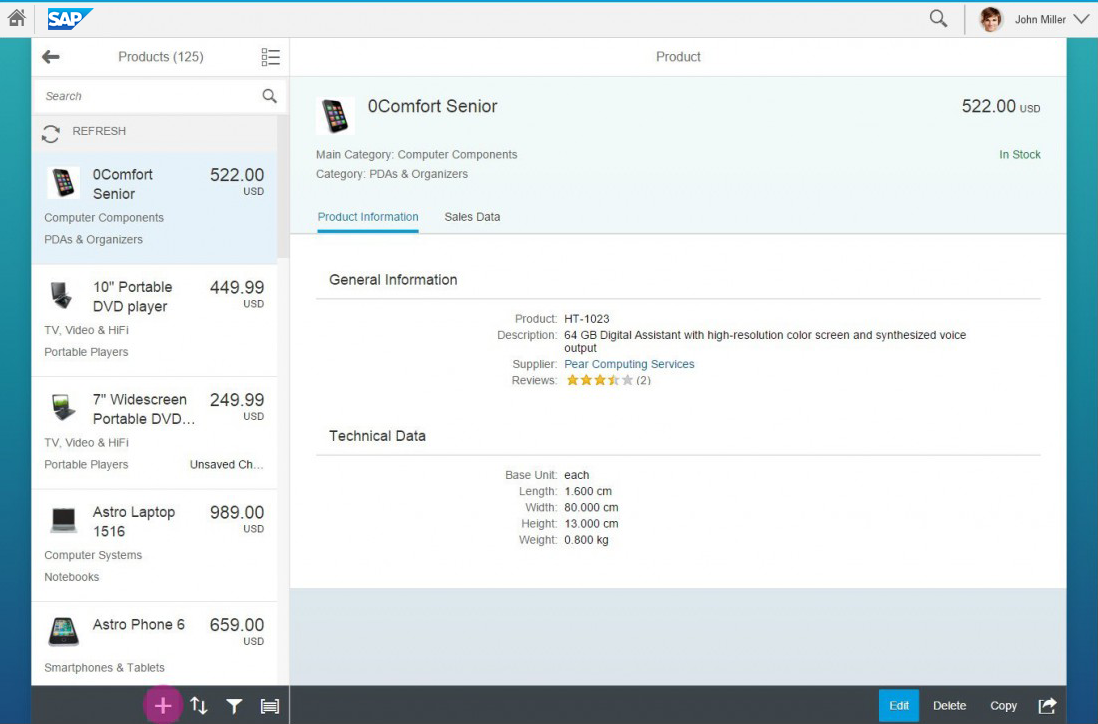
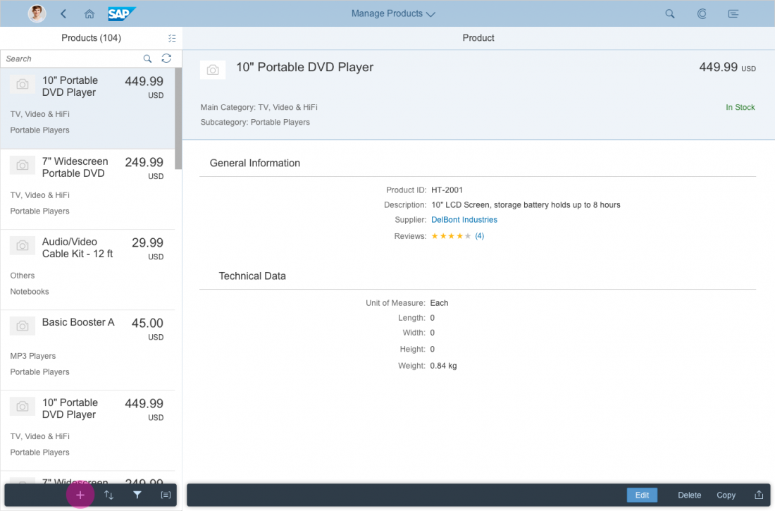
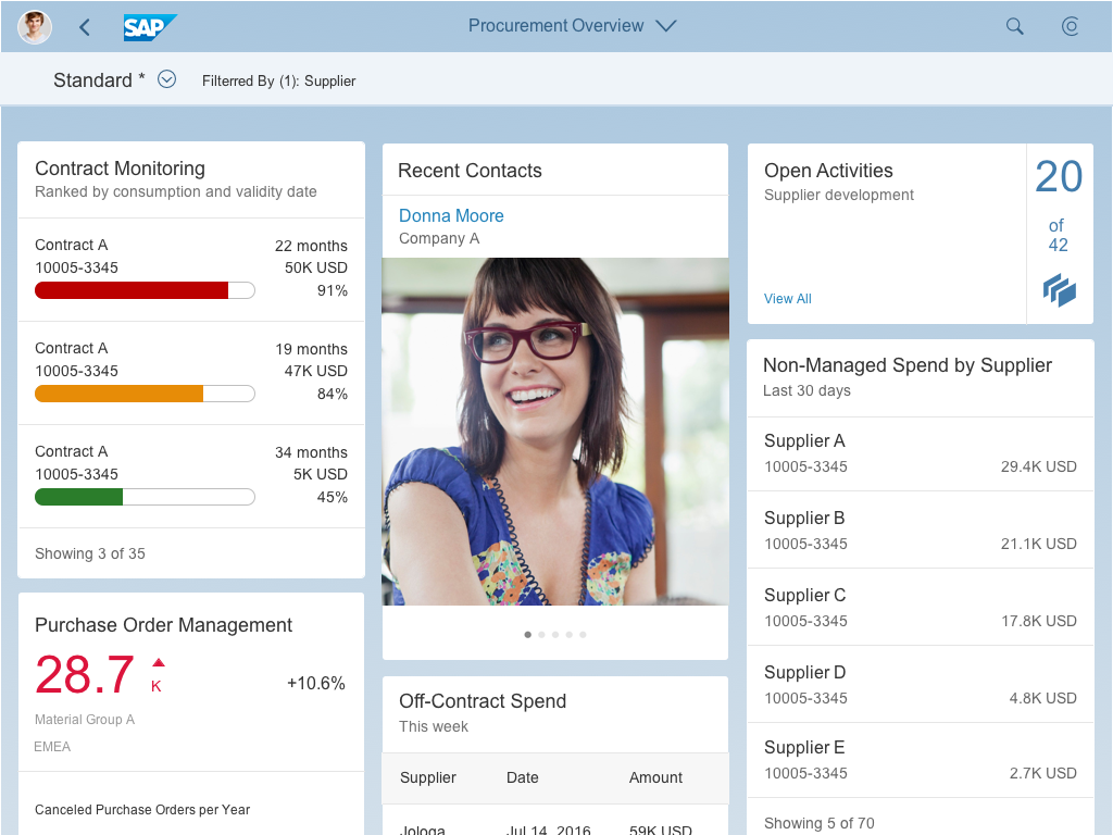
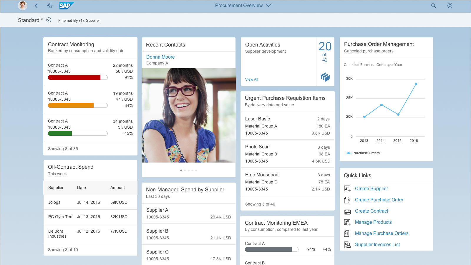
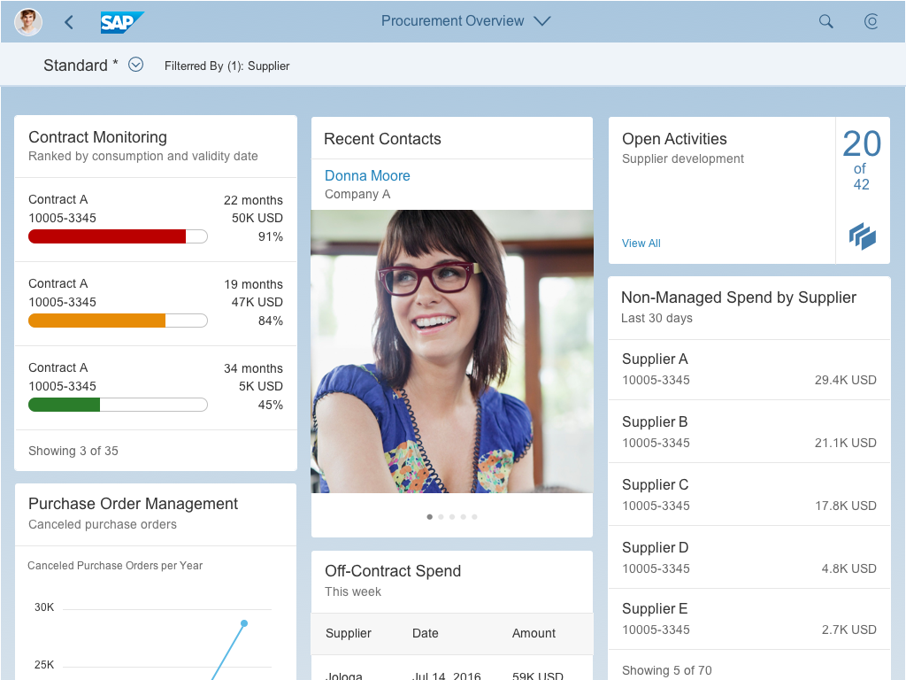
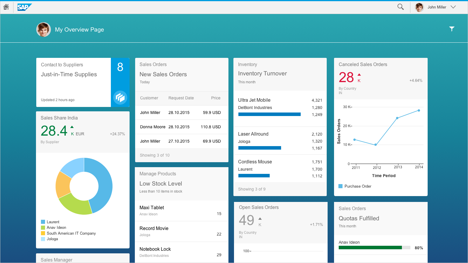
Object view in a split-screen layout (reference app: Manage Products )
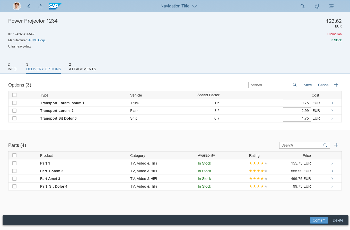
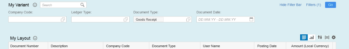
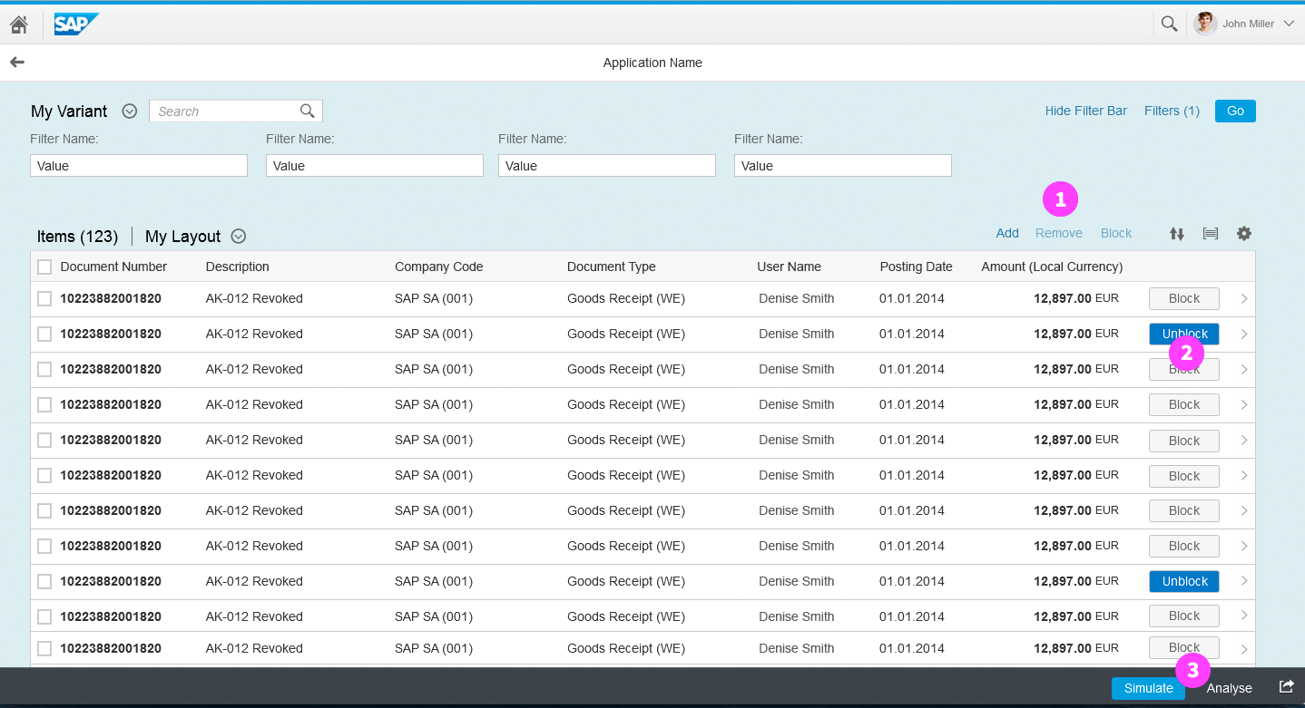
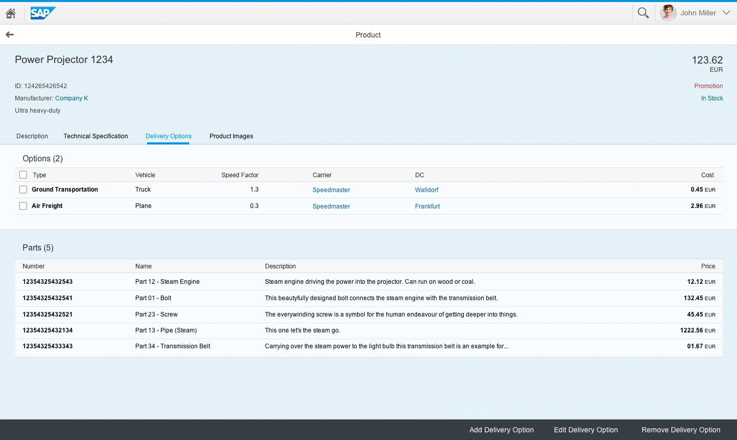
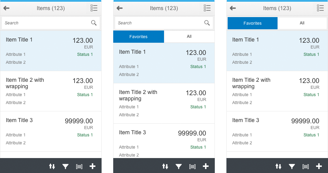
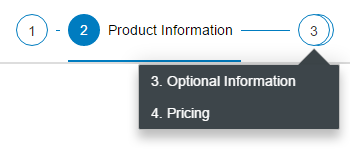
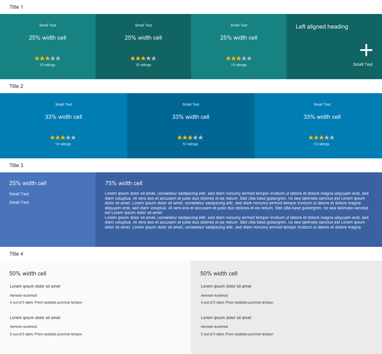
Tabs
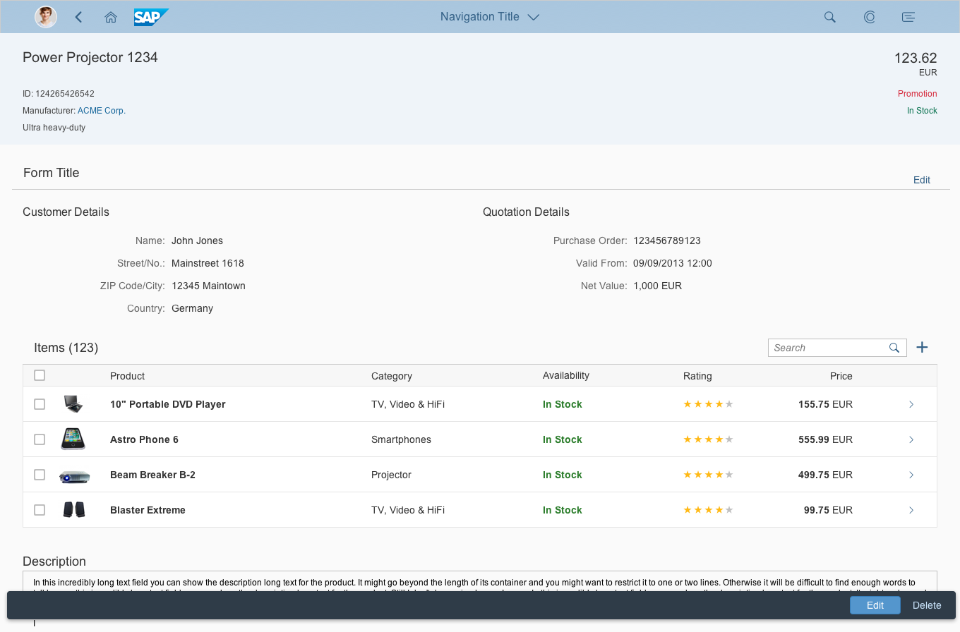
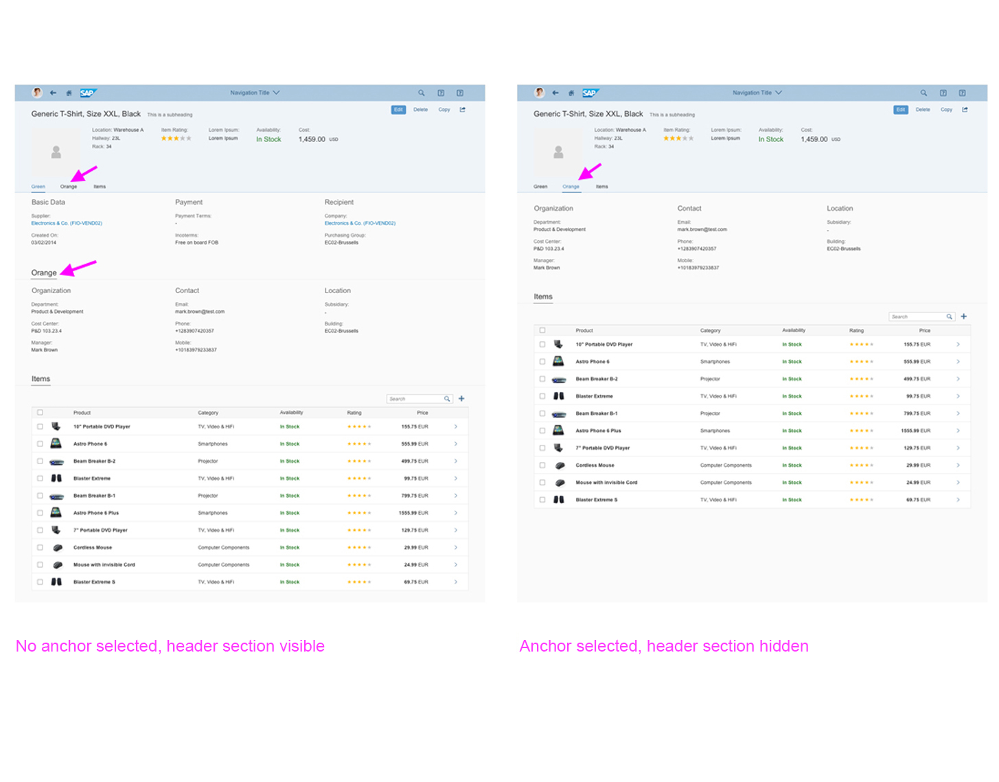
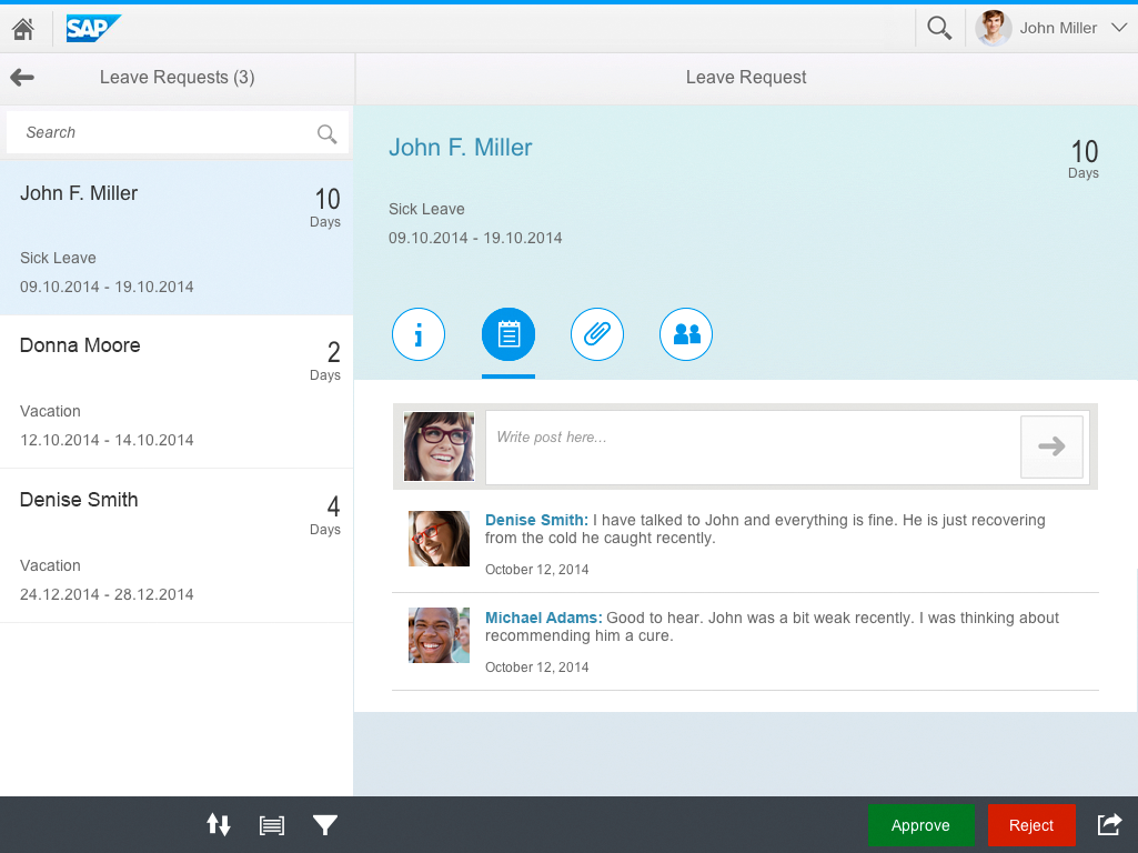
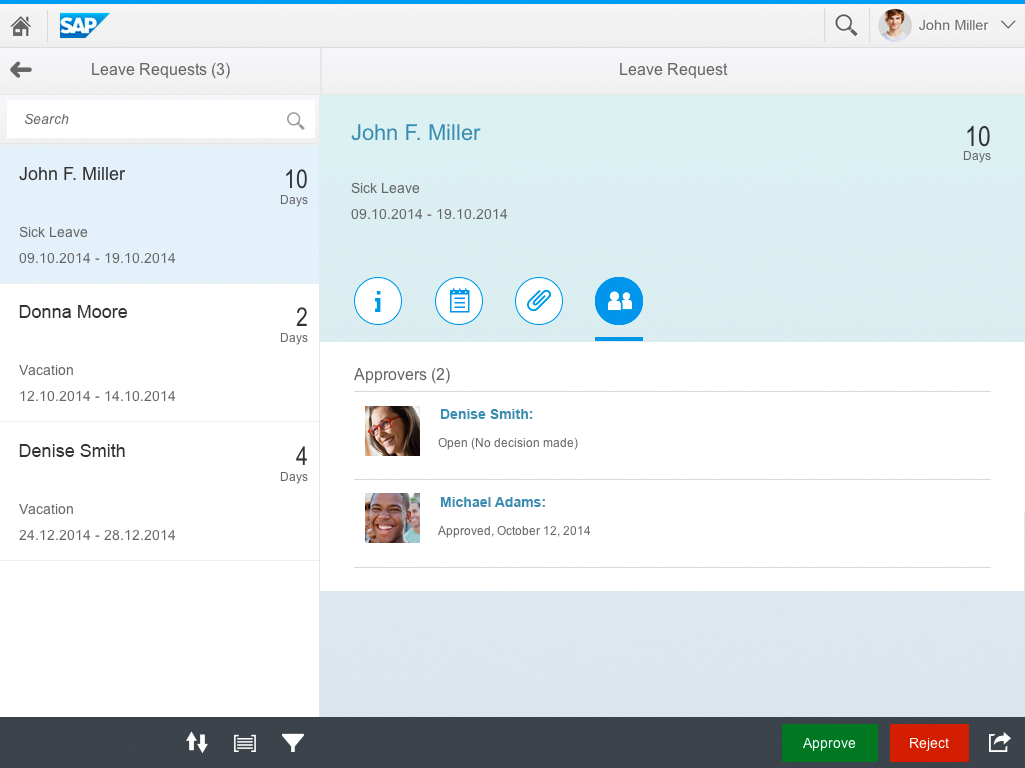
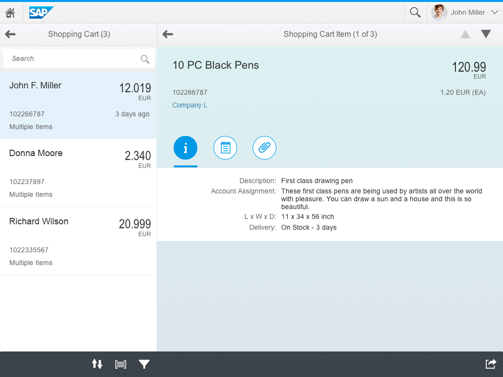
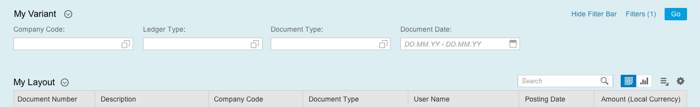
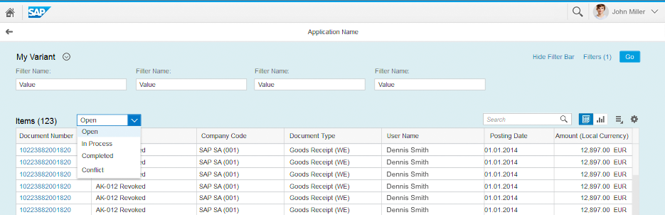
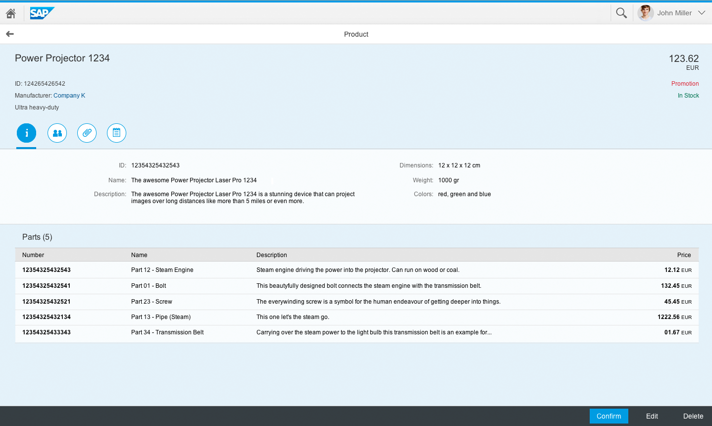
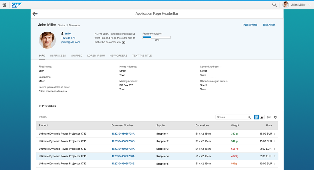
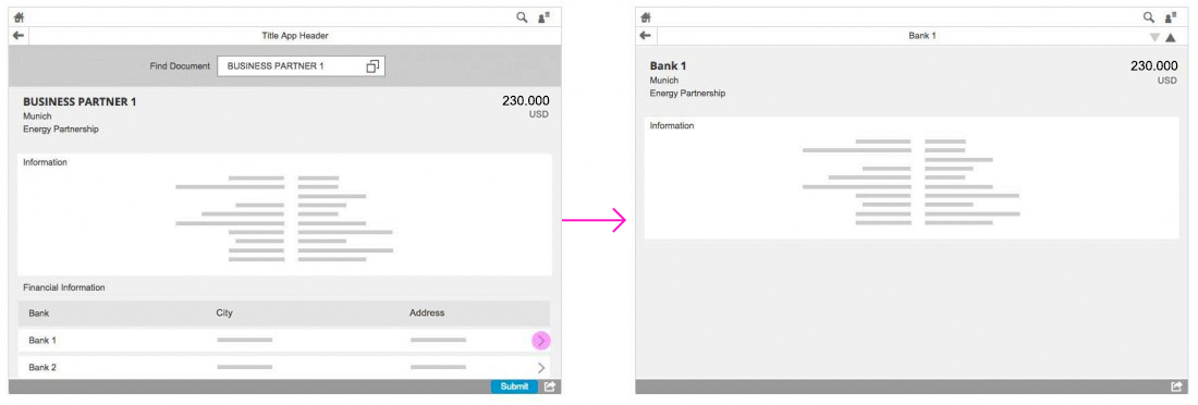
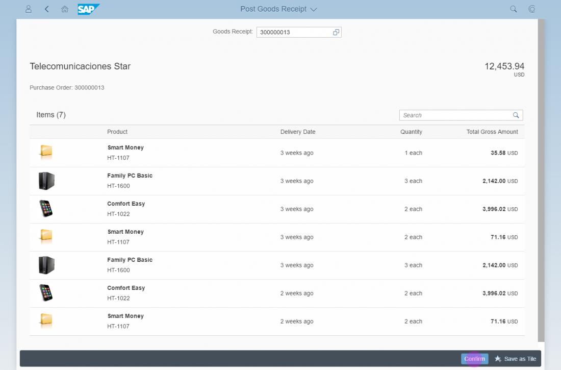
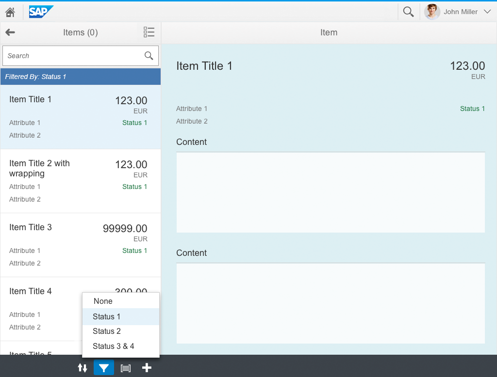
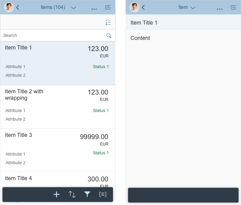
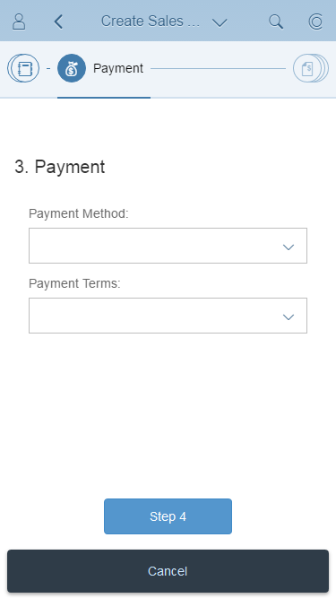
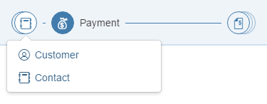
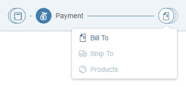
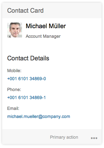
The key element of the object view is the icon tab bar. Each of the tabs shows a certain facet of the object. There are two primary facet types:
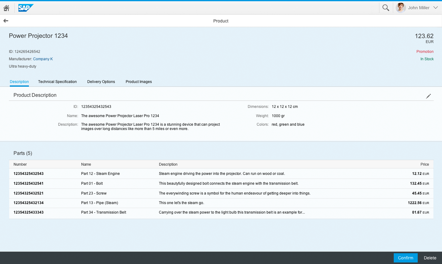
- Form-based facets display attributes of the object in a form layout (for example, object details or contact details).
- Tabular facets show a list of similar attributes or relationships in a list or table structure (such as attachments, contacts, or products).
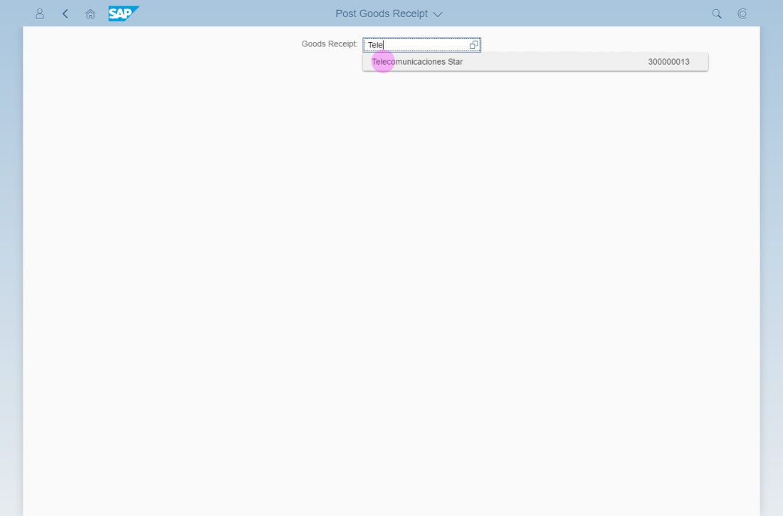
Defining Tabs
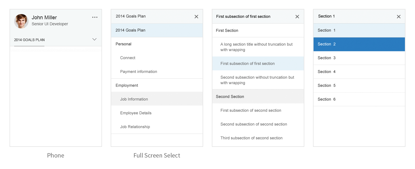
You can define tabs as expandable, allowing users to show or hide the tab content as needed.
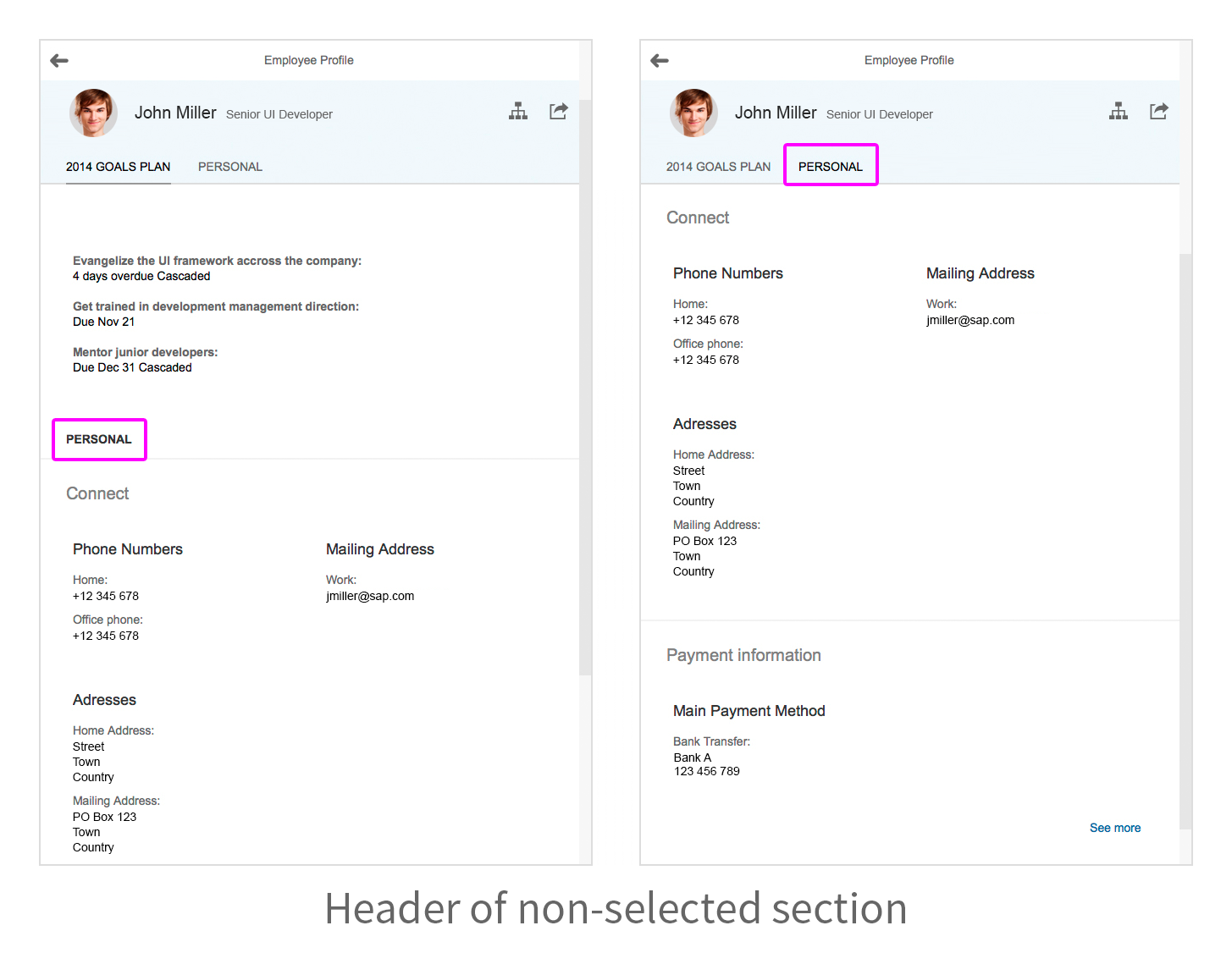
You can also define the default tab that is selected when the user opens the application. This might not always be the first tab on the left. However, you should ensure that the tab state is consistent for object views of the same type. This gives the user a coherent user experience when navigating between object views.
The user can switch between the object facets by just switching tabs. You can display additional information below the tabs.

Object view with text-only tabs
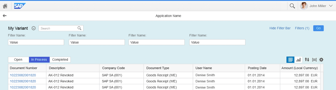
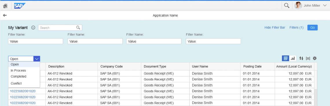
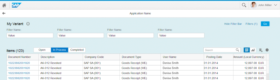
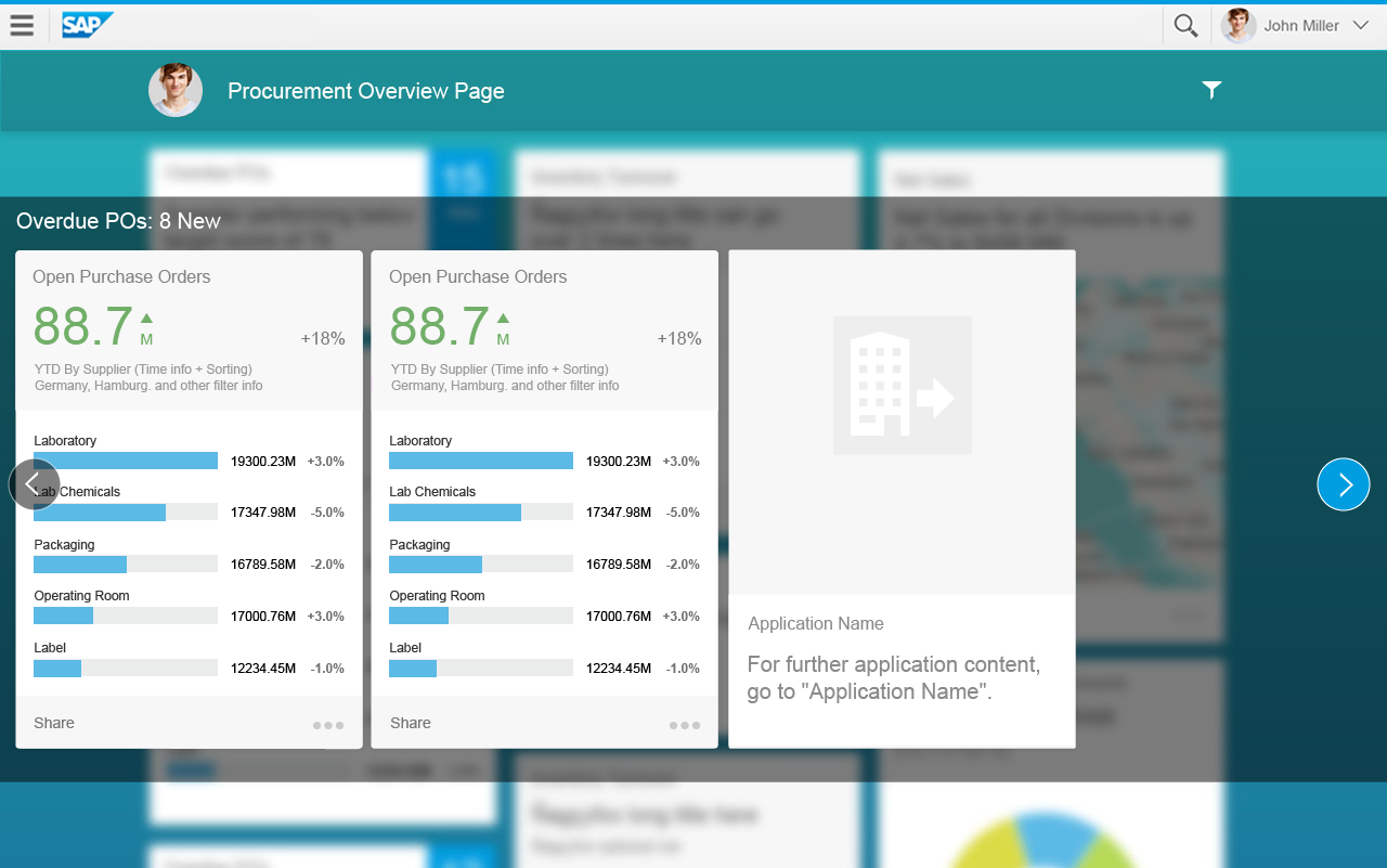
In the object view, you can use the following tab types:
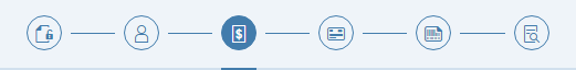
- Icon tabs: Use icons if you only need the standard tabs, such as information, attachments, and notes.
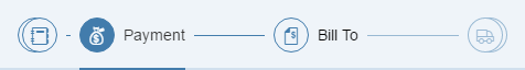
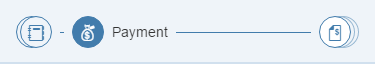
- Text only: Use text if you need tabs for other (non-standard) object facets.
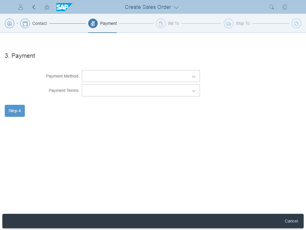
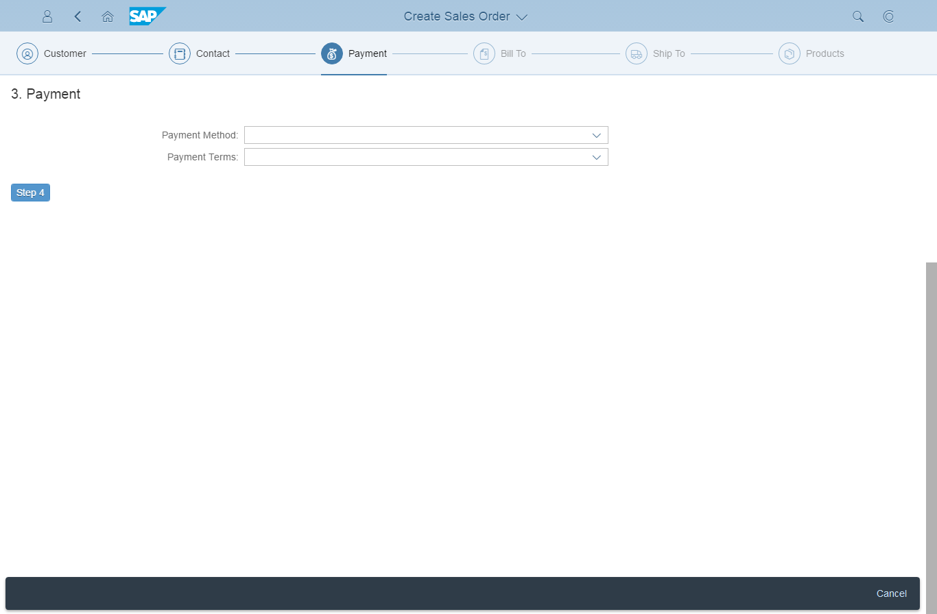
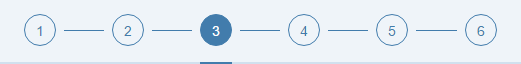
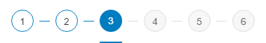
- Process tabs: You can also use the tab bar to depict a process. In this case, each tab stands for one step.
Guidelines for choosing a tab type:
- As a simple rule of thumb, if you have to think about which icon fits best, use the text-only type instead.
- Do not mix the text-only and icon tab types.
- Do not use separators between the tabs.
Flows and Variants
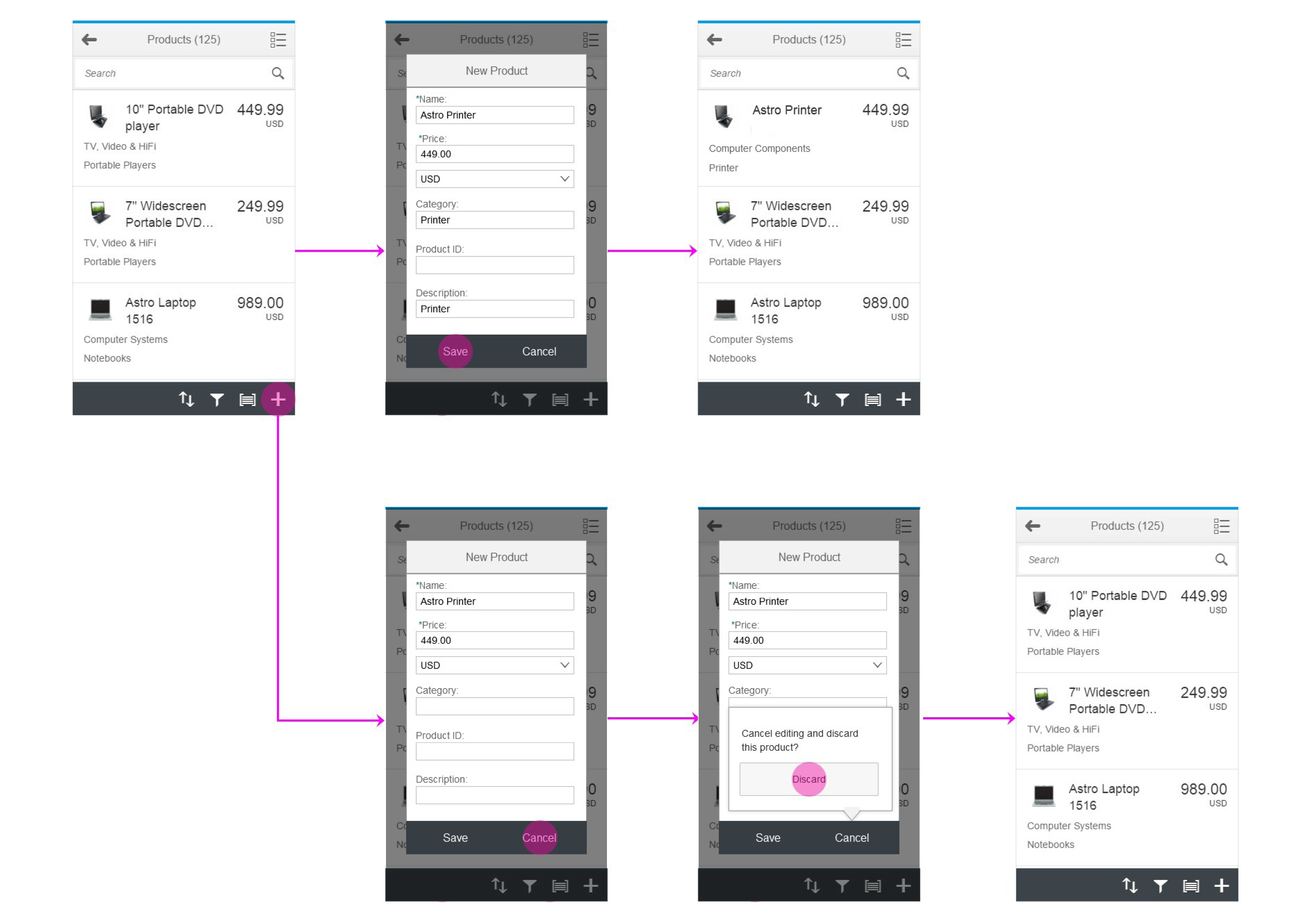
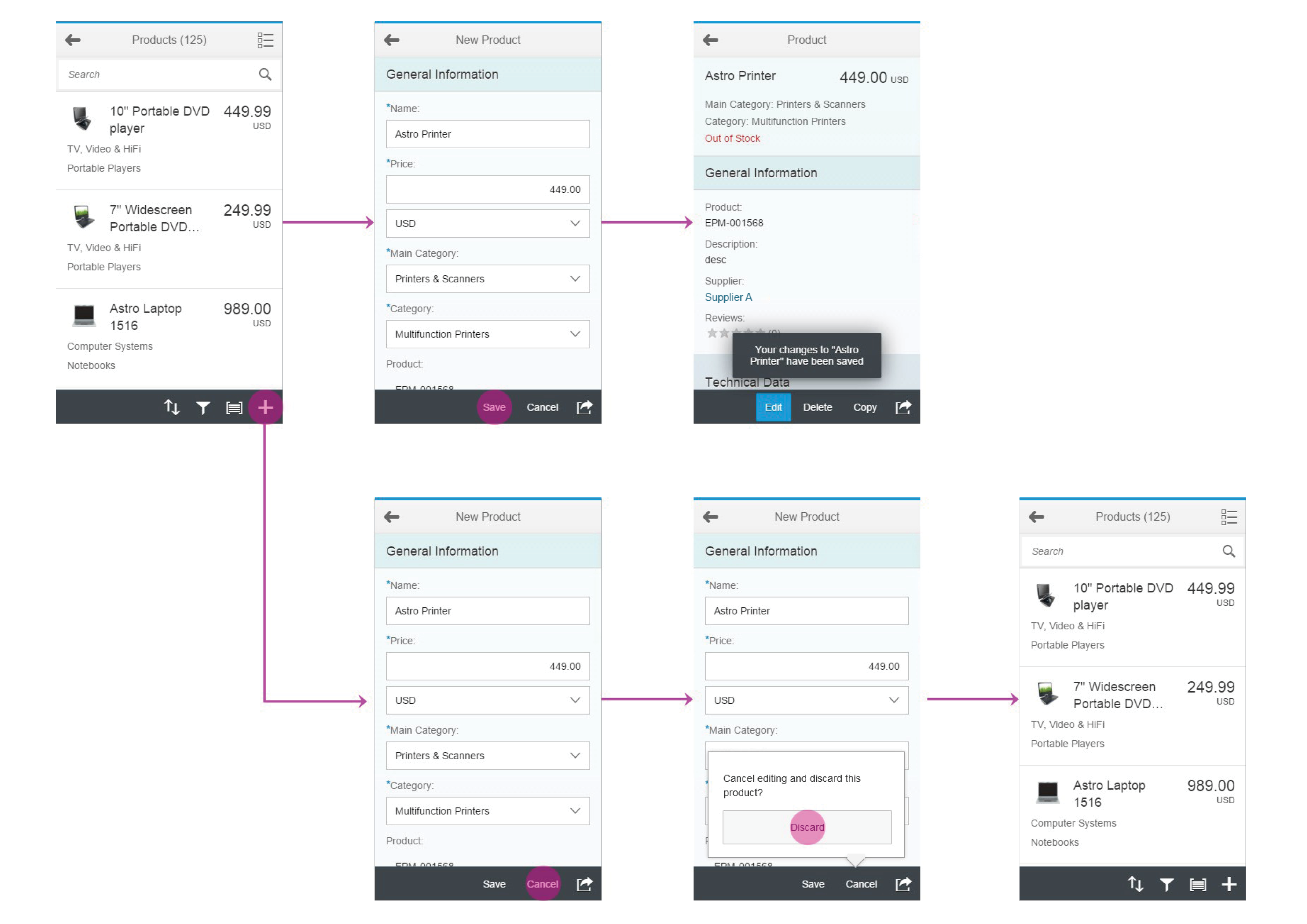
Create
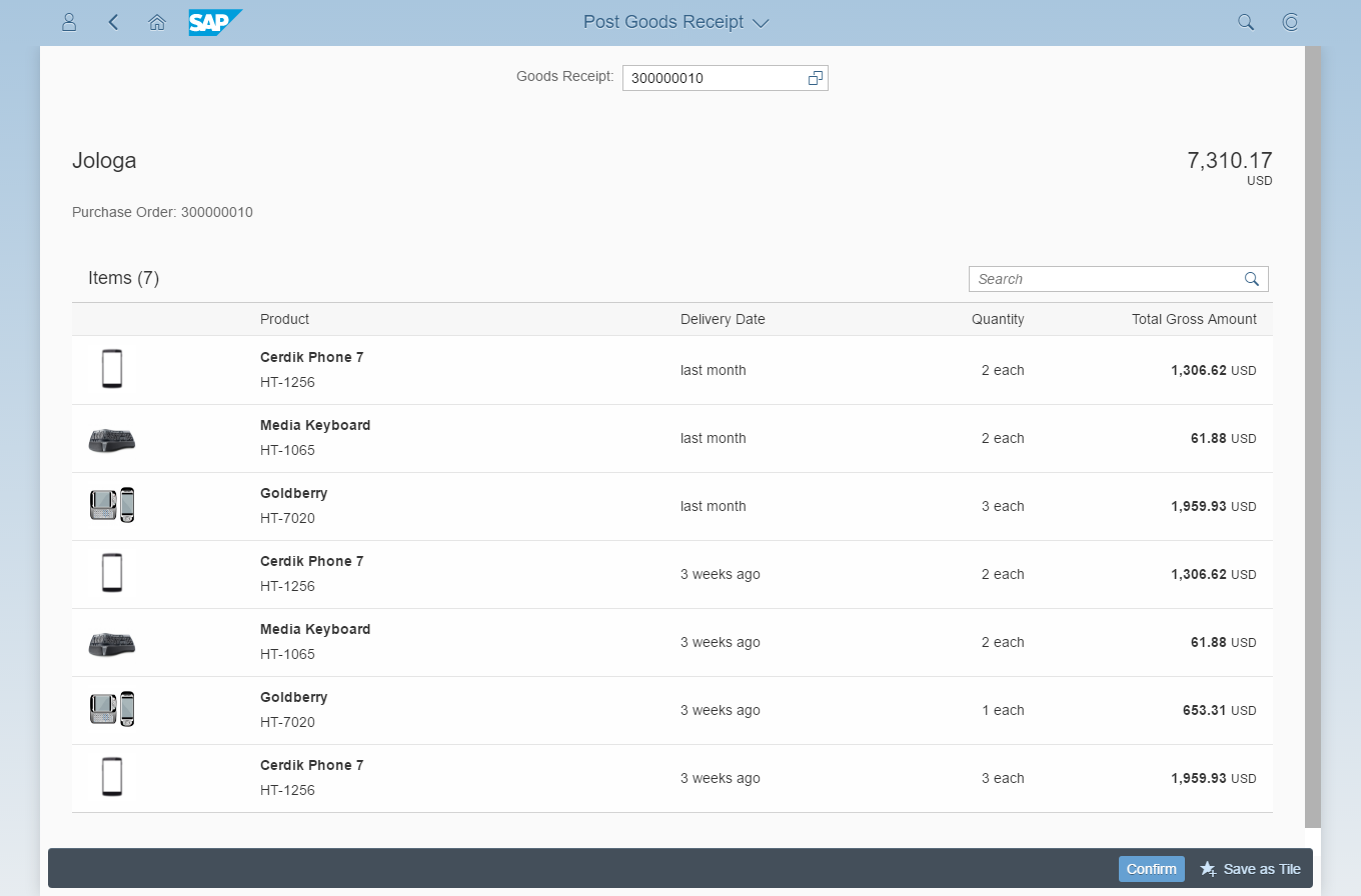
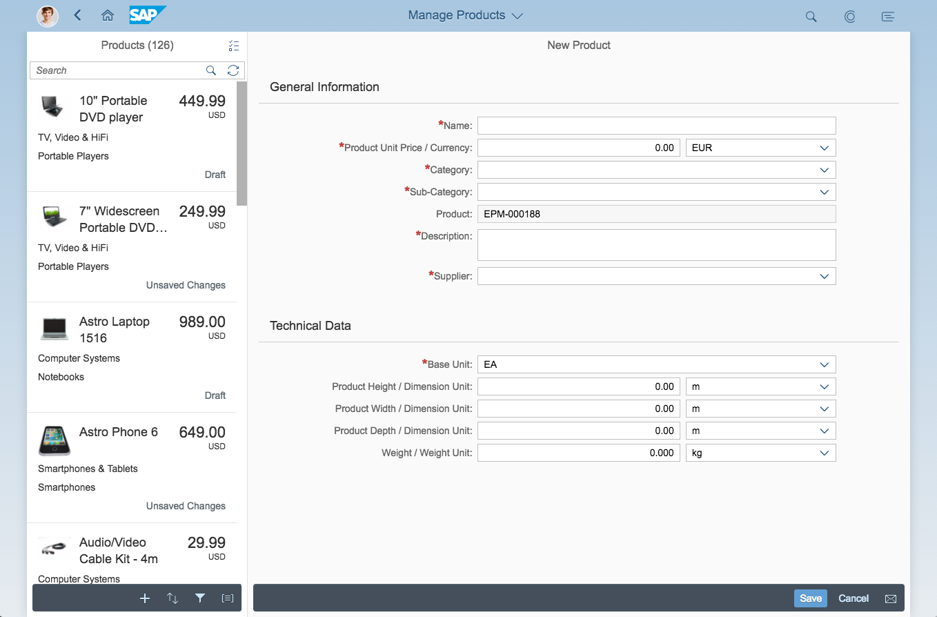
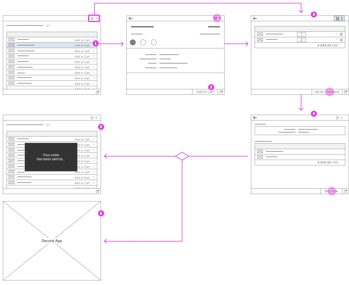
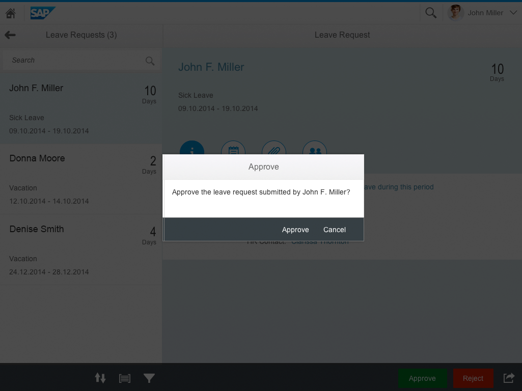
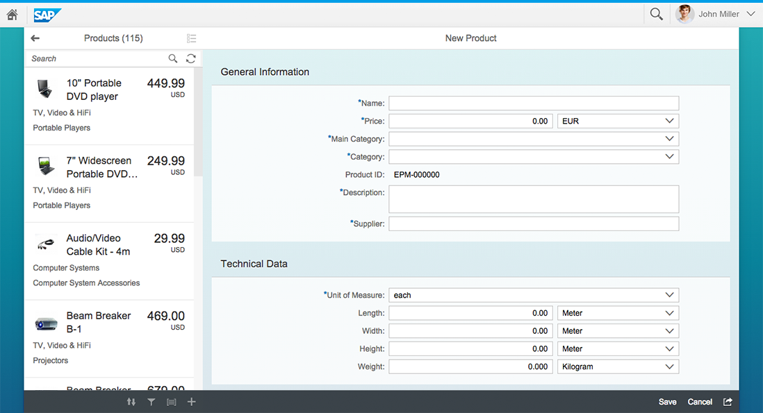
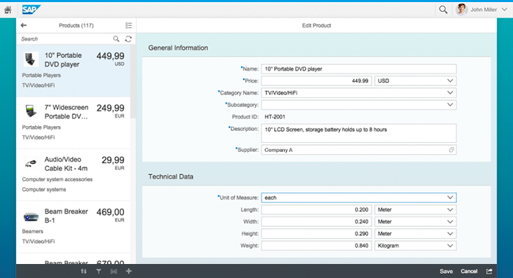
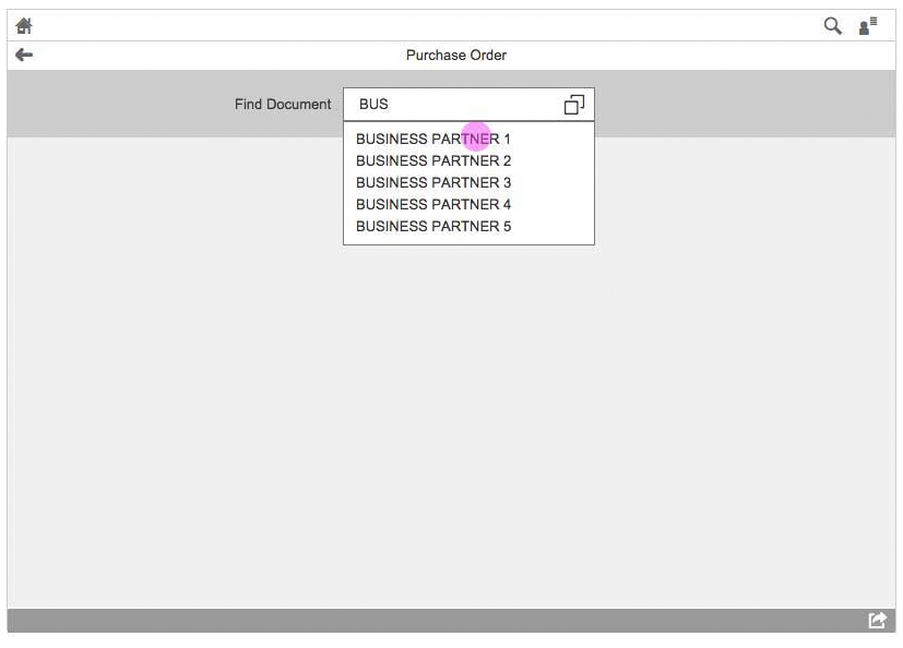
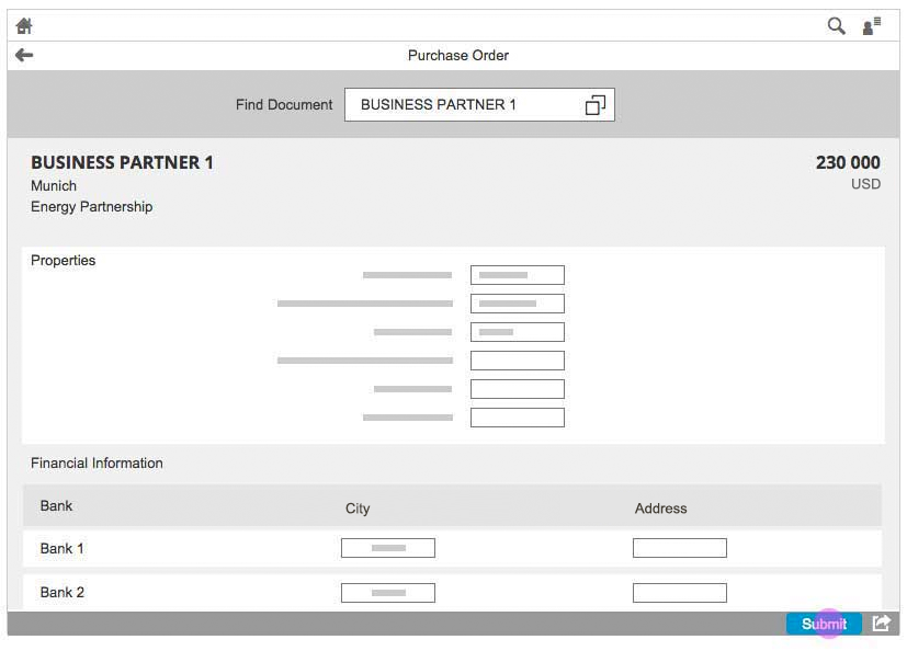
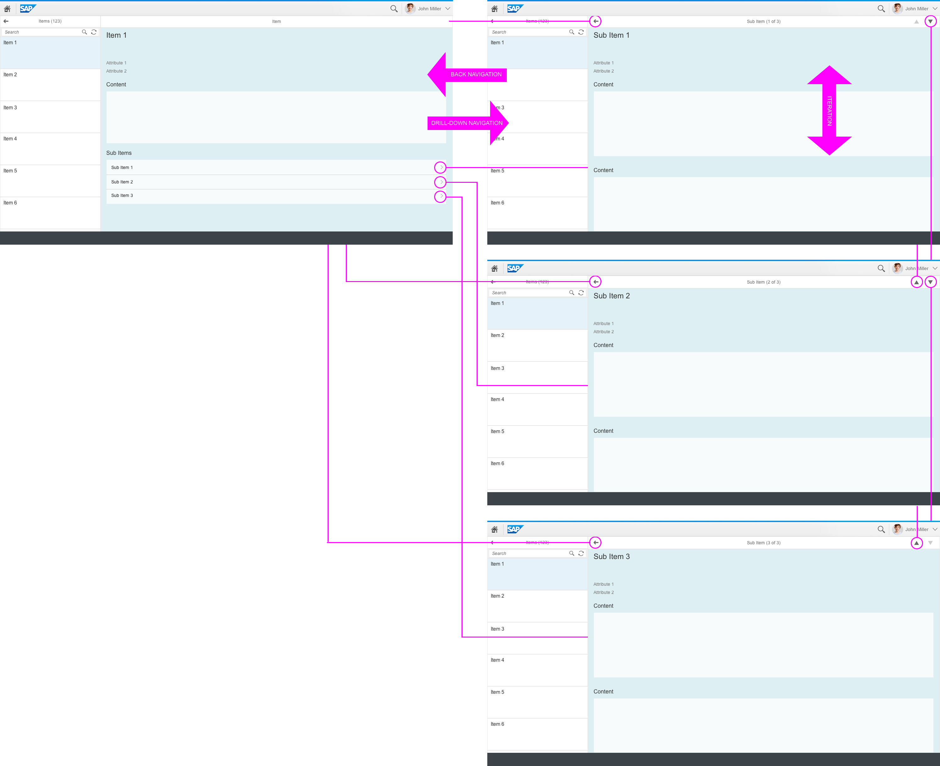
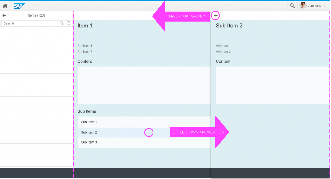
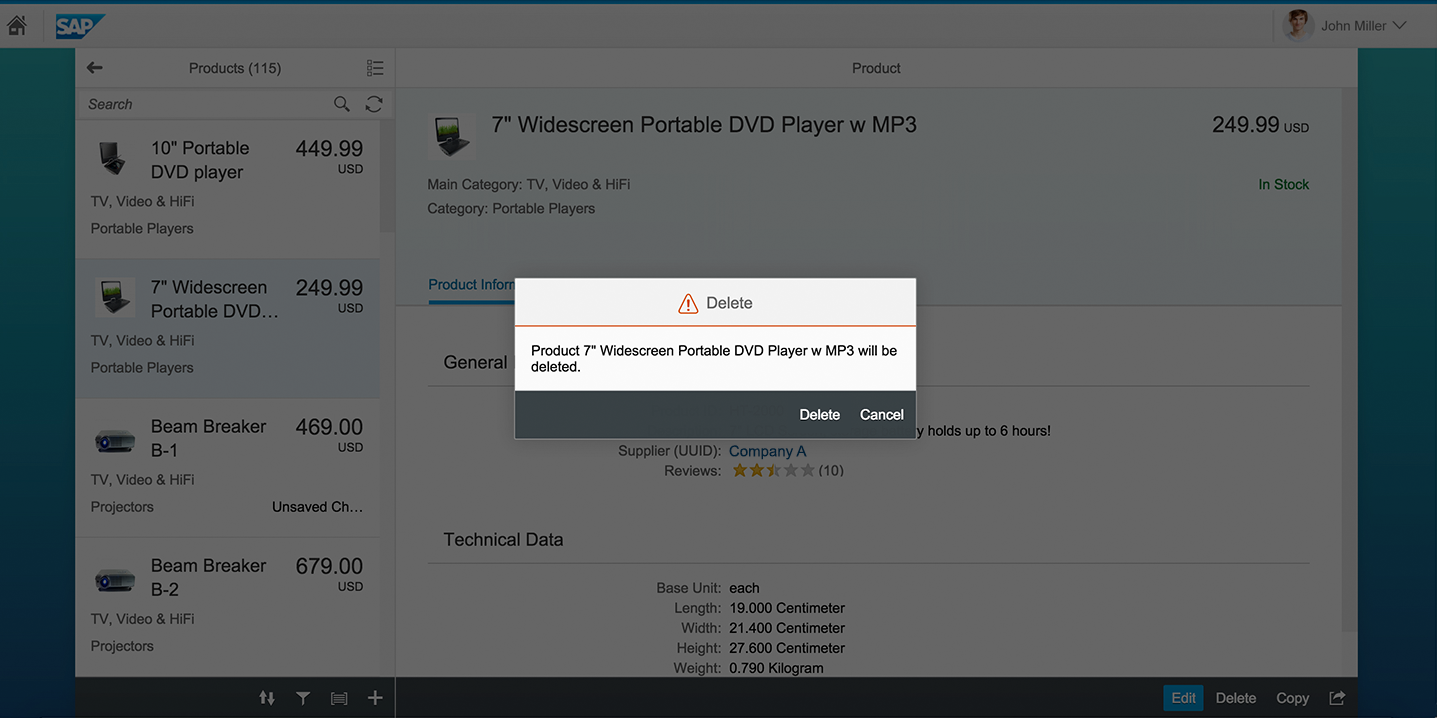
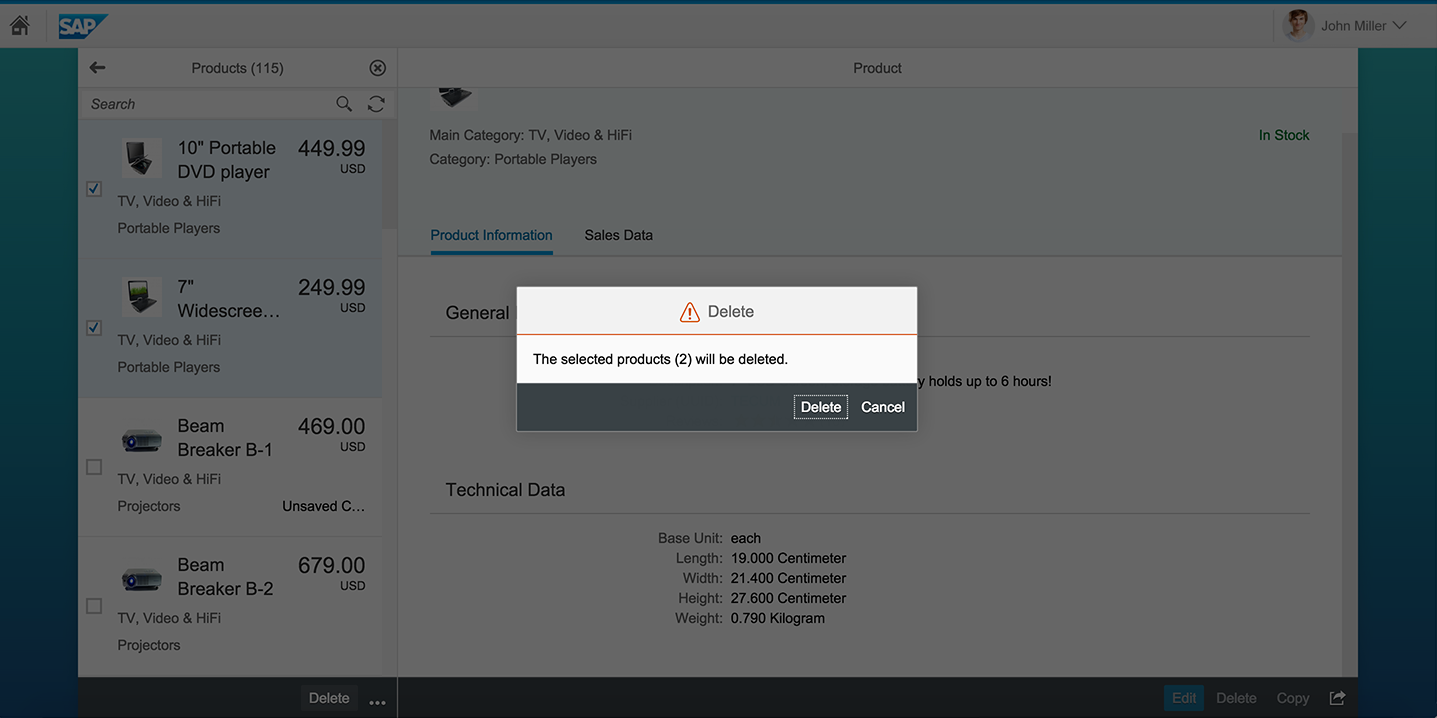
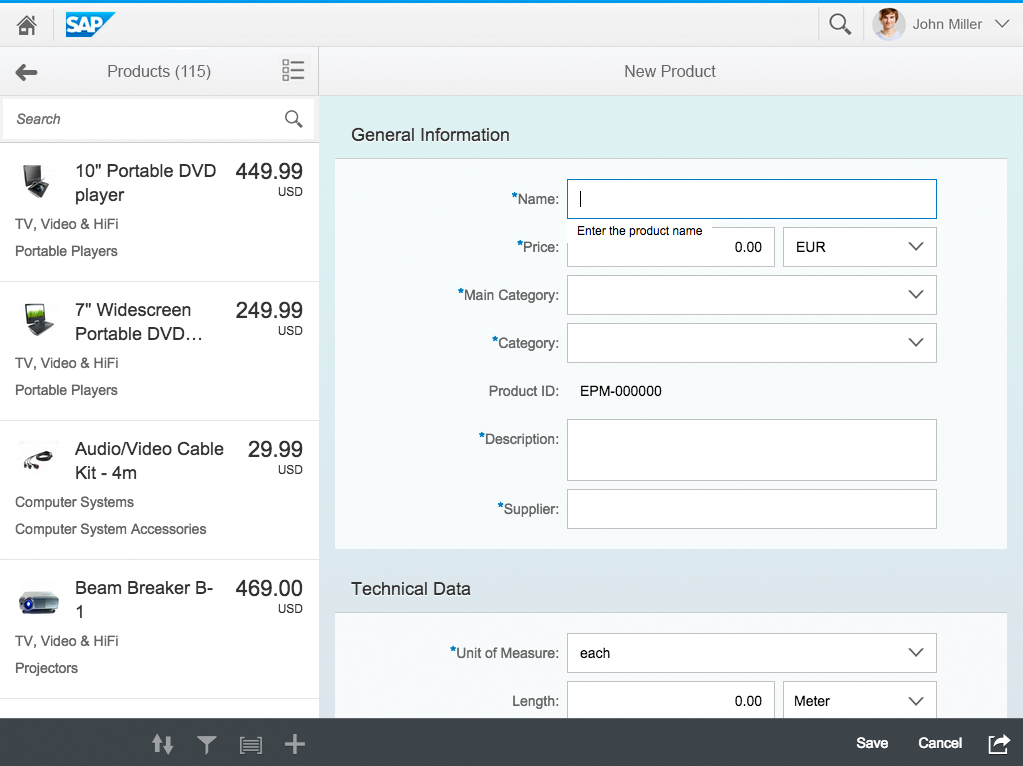
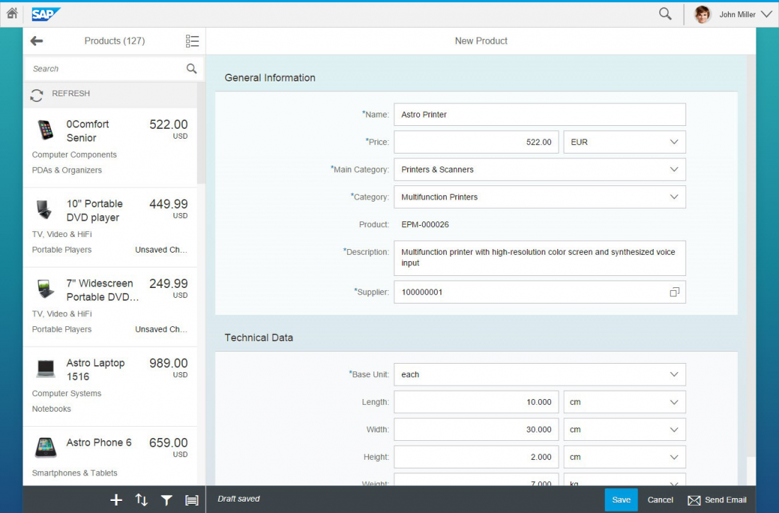
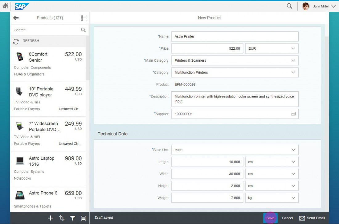
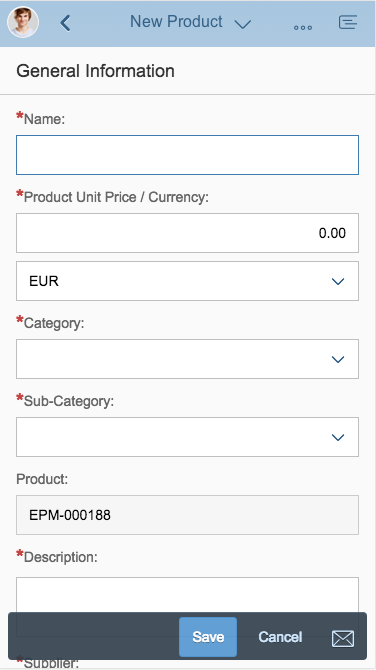
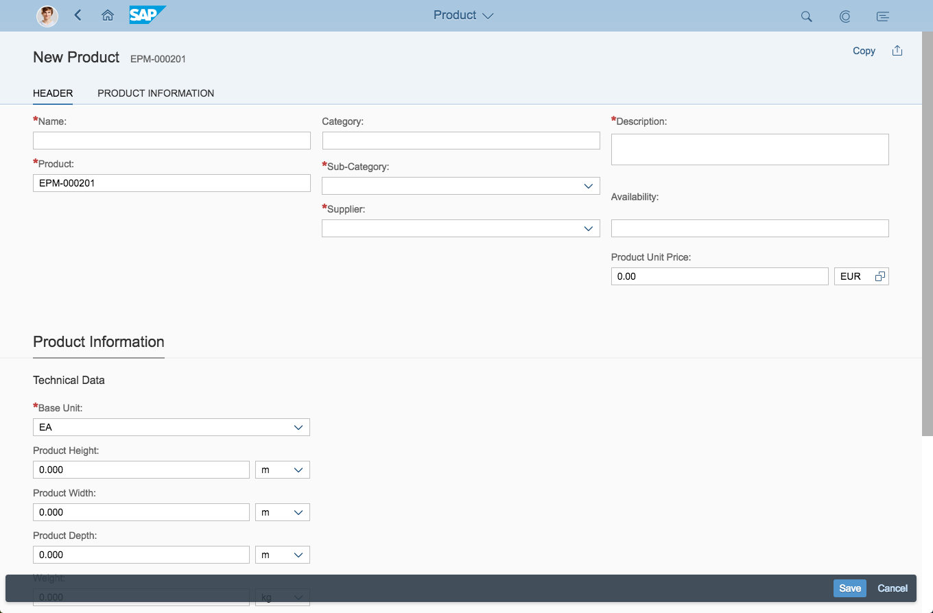
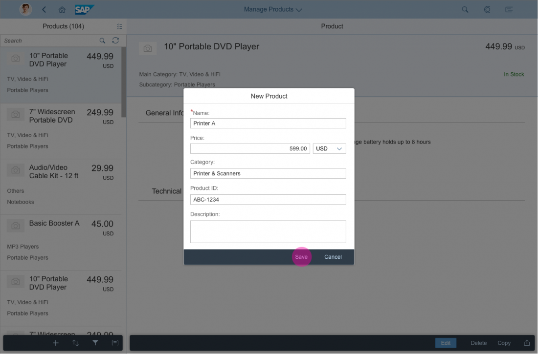
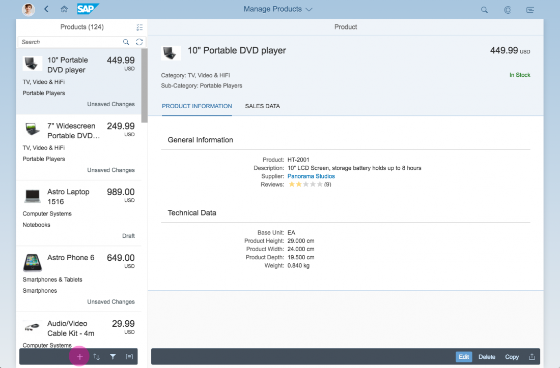
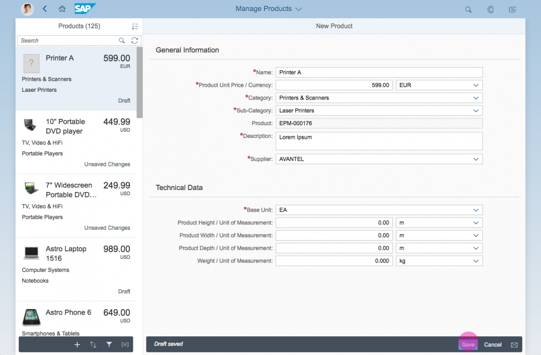
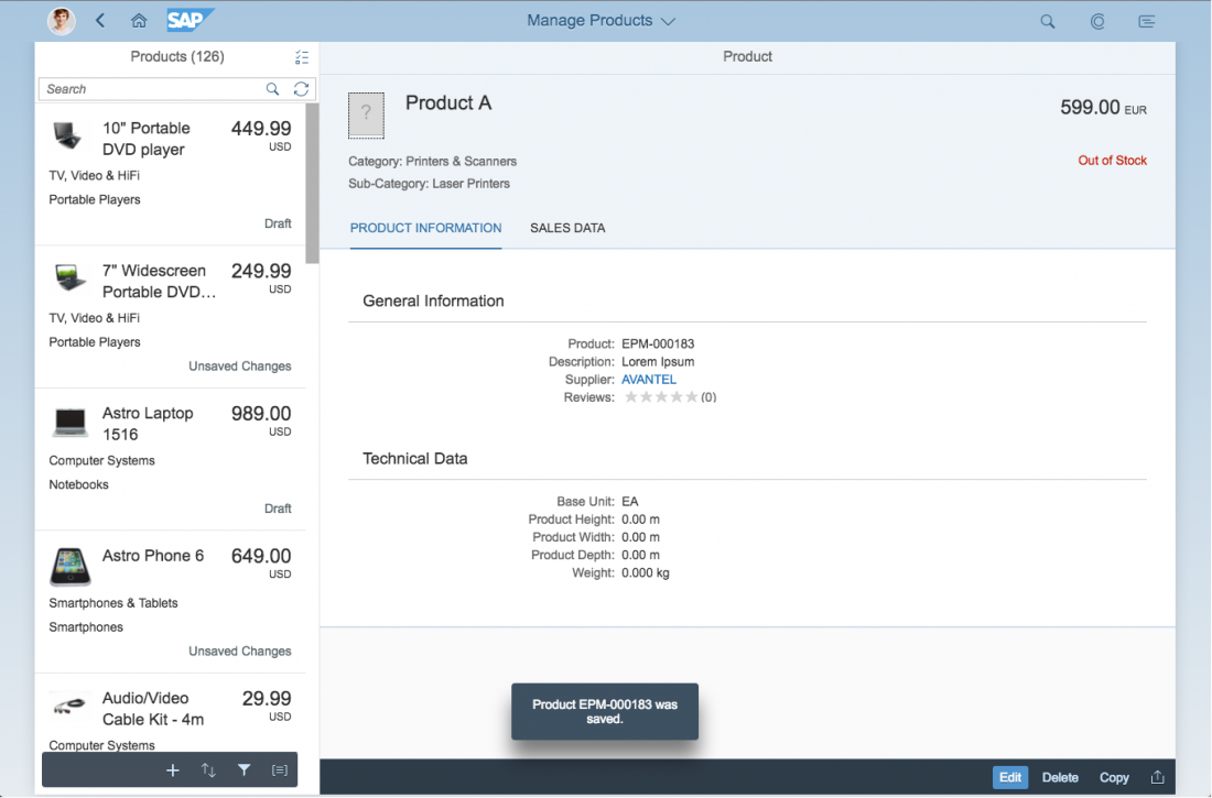
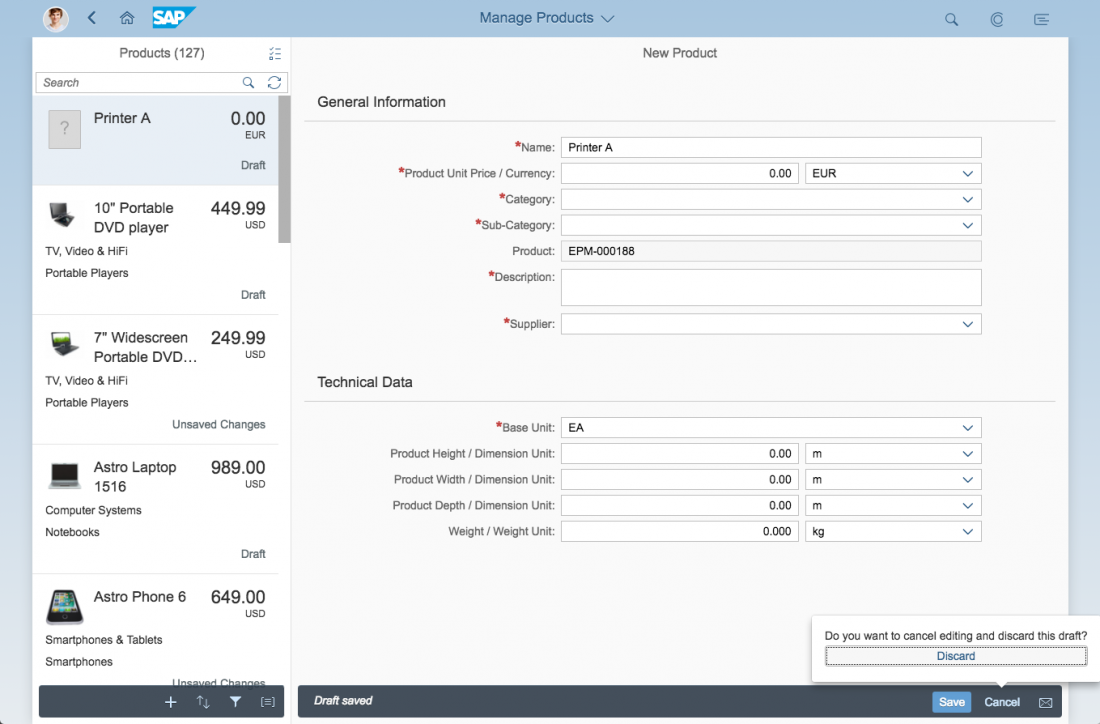
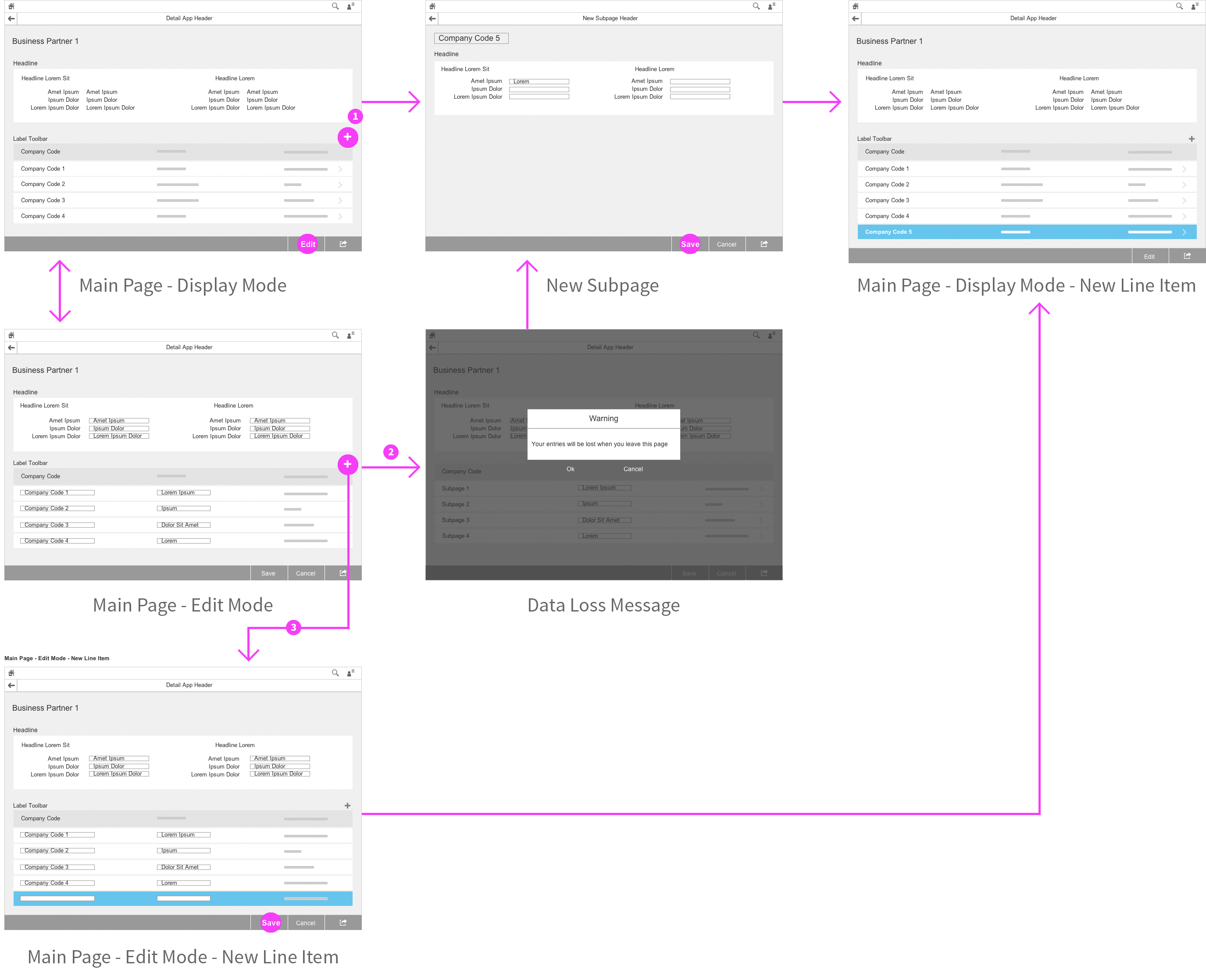
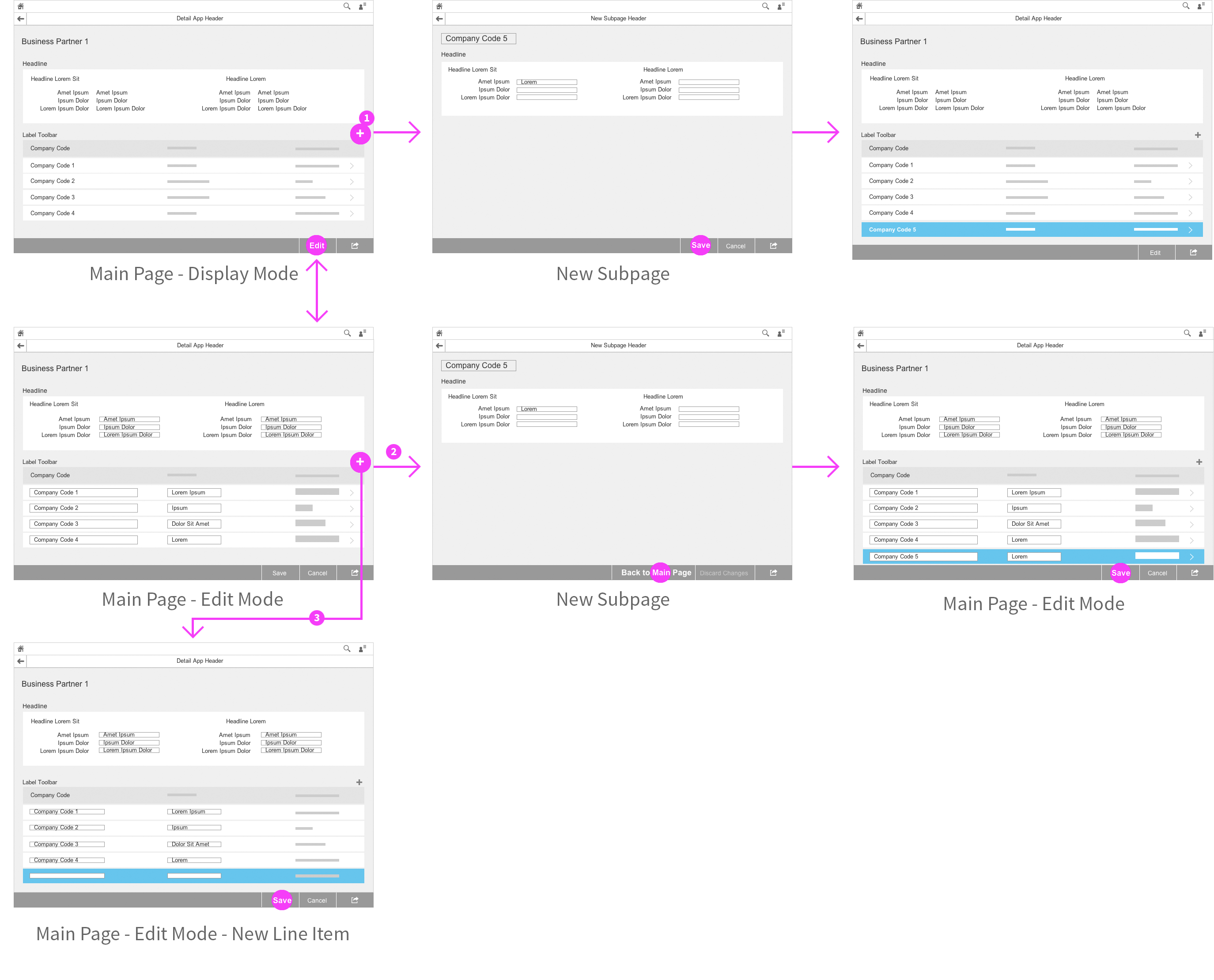
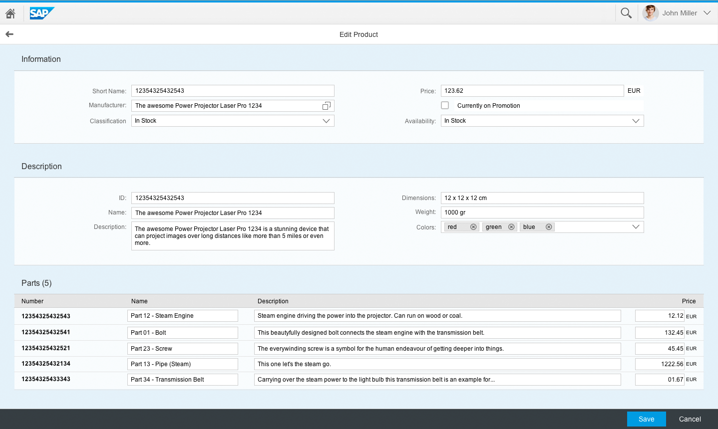
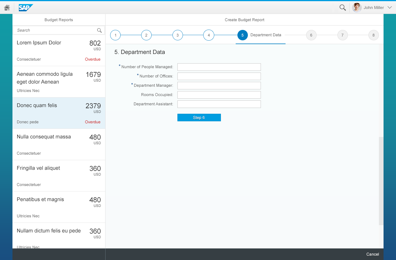
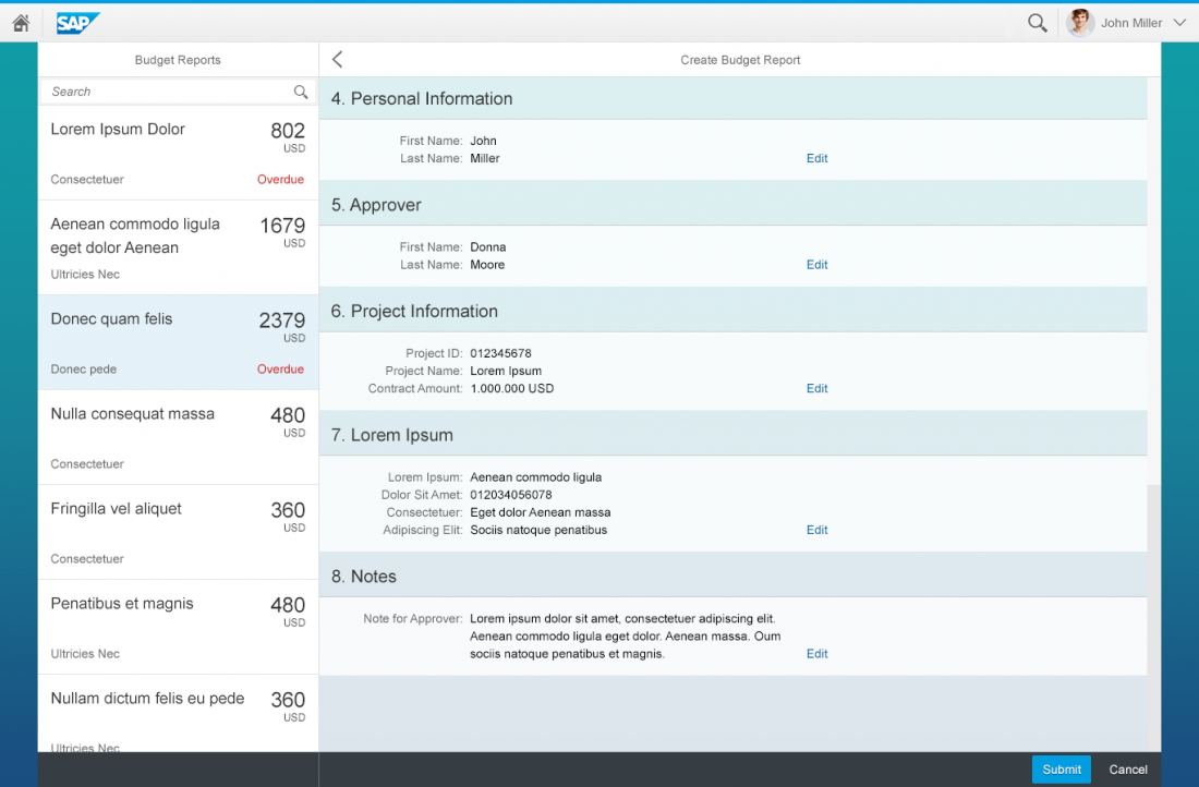
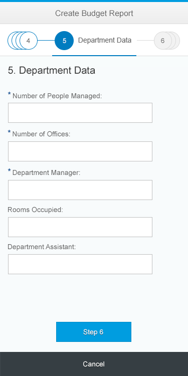
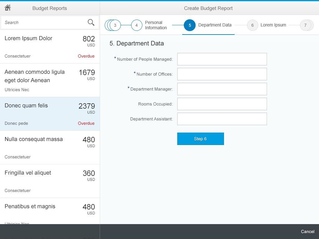
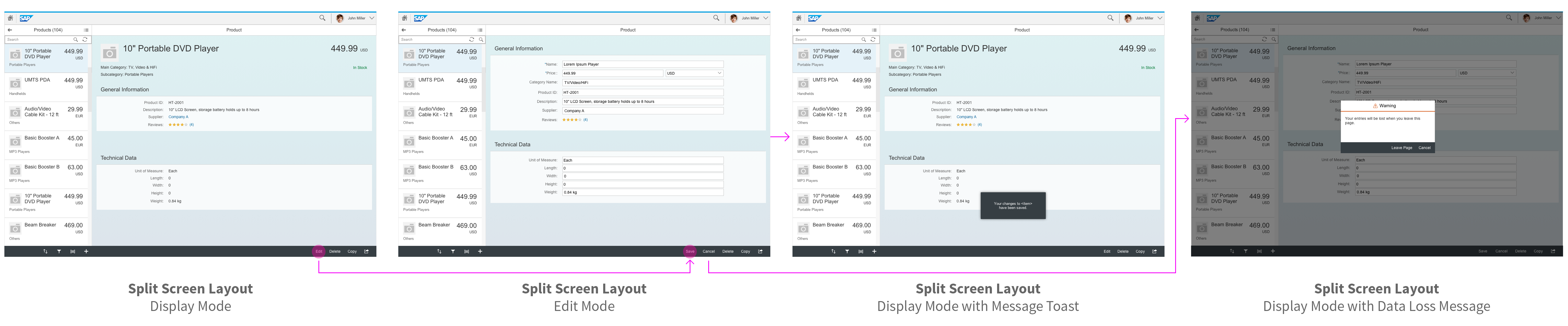
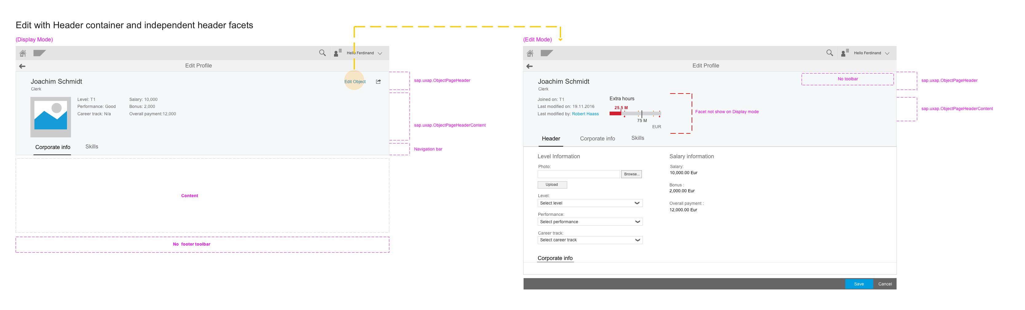
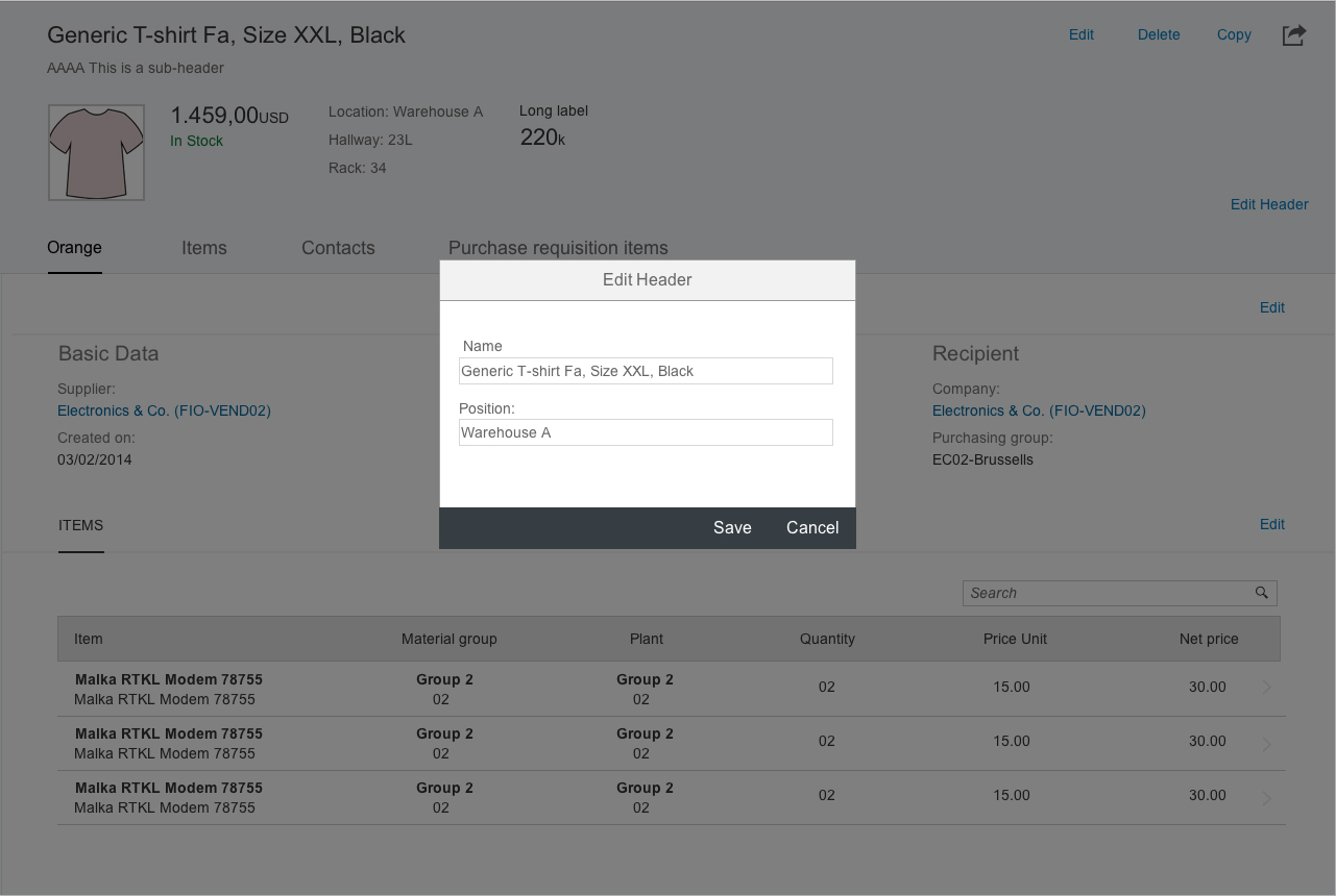
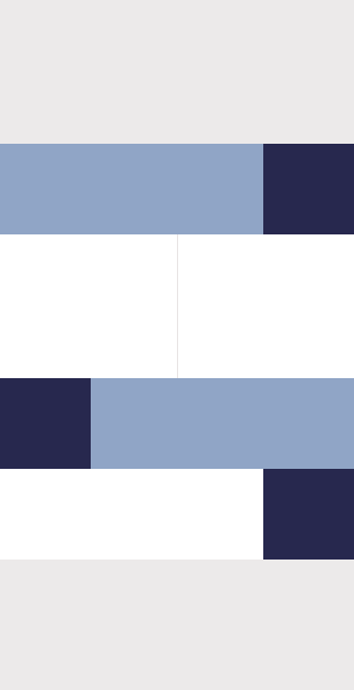
The create action creates a new object. The corresponding button can either be a plus ( ) button or a button with a meaningful text (such as Add Product). When the user creates a new object, the display changes to a flat object view in edit mode. Switching to this flat layout prevents user input and validation errors from being scattered across multiple tabs.
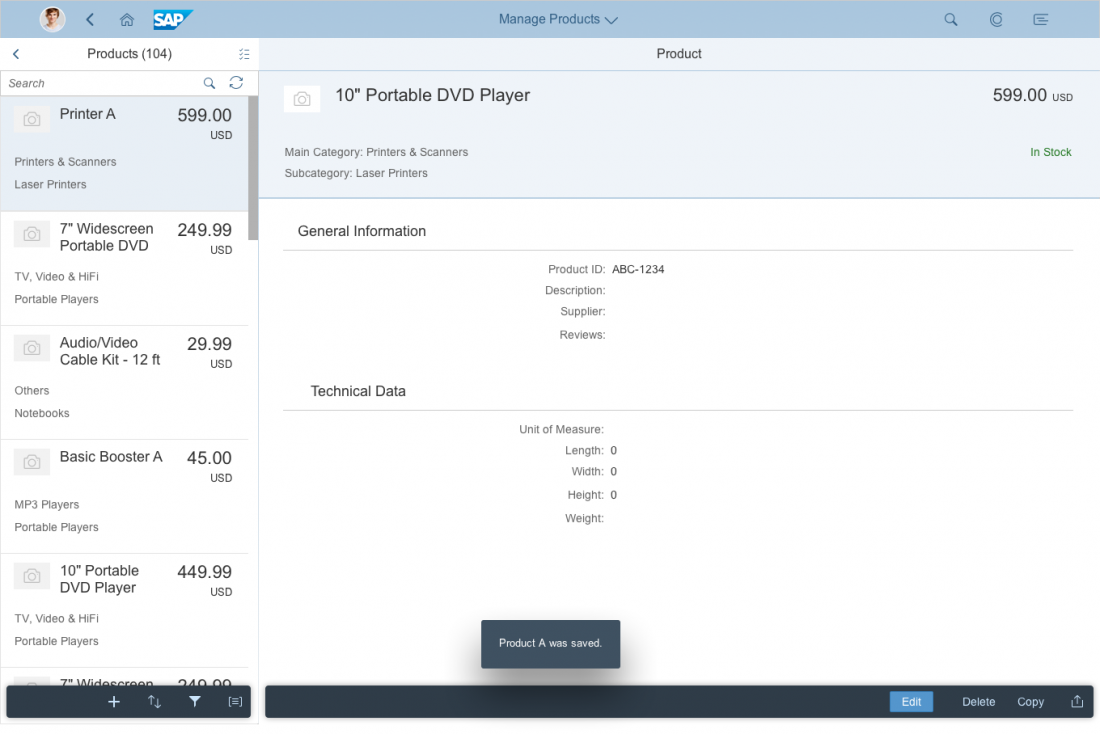
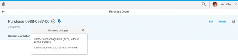
In the flat object view, users can fill out the details and save the object. After saving, the new object is shown using the standard object view. If the user navigates away from the object without saving the entries made so far, the app warns the user with a data loss dialog.
Edit
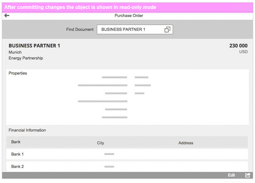
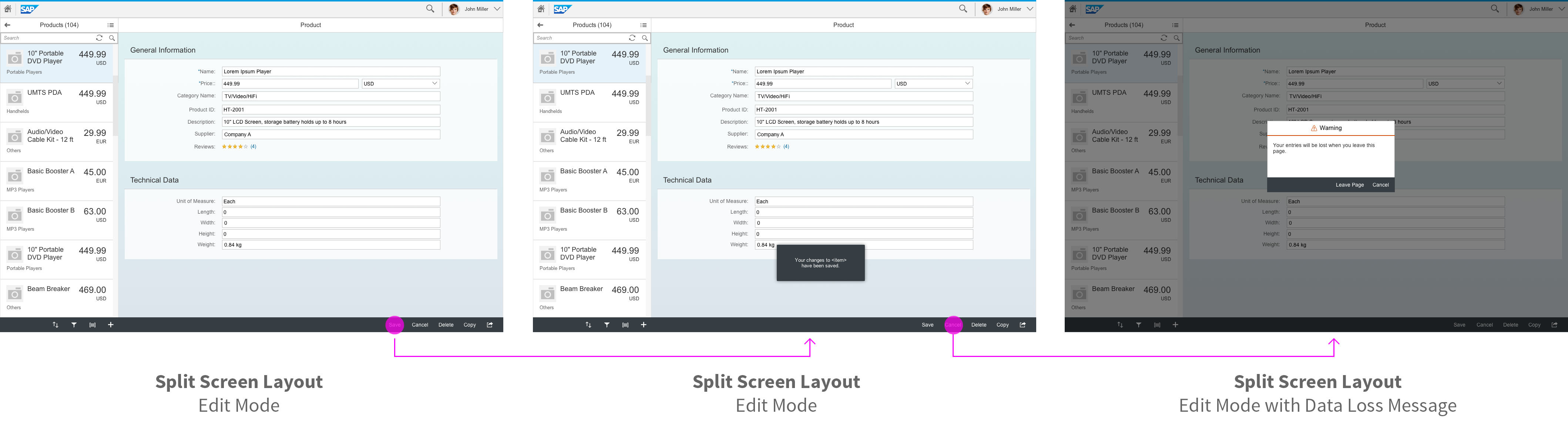
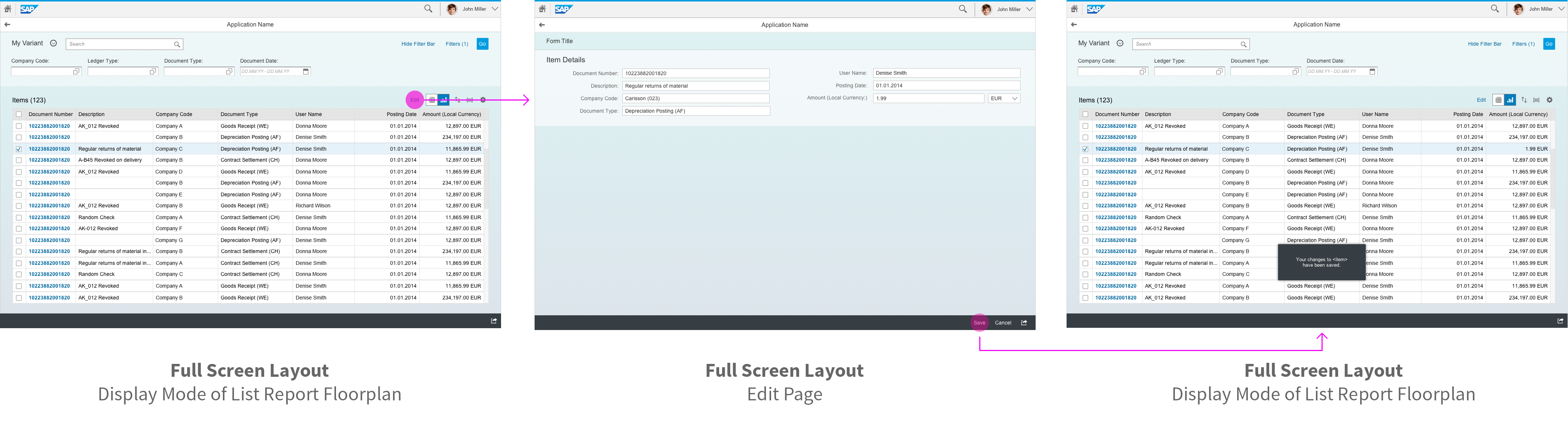
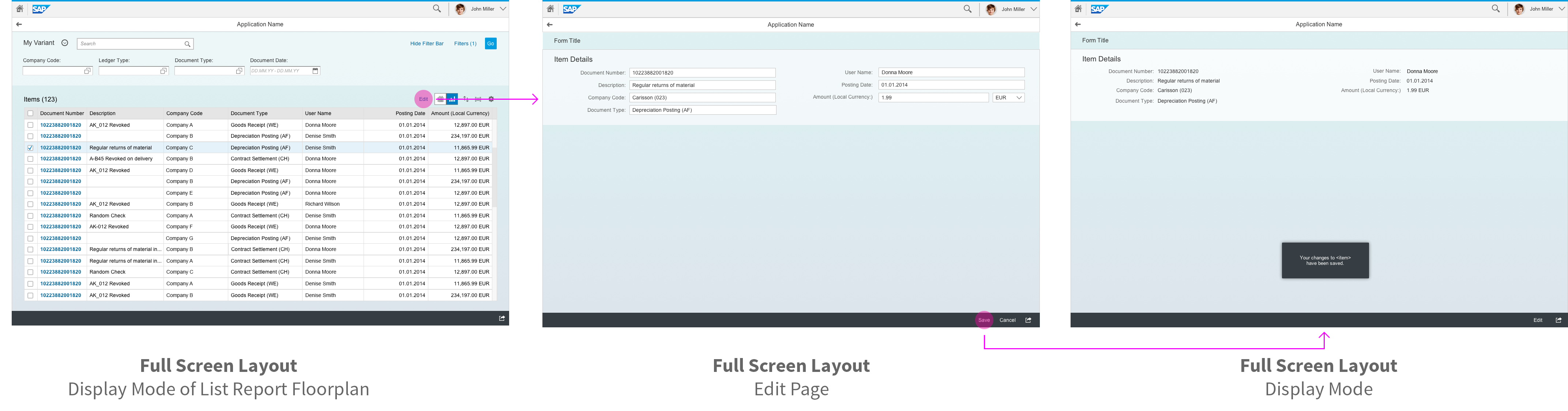
We recommend using the flat object view in edit mode (as for the “create” scenario above). When the user clicks or taps the Edit button, the floorplan switches from the display mode with tabs to the edit mode with the flat object view. The Edit button is replaced by the Save and Cancel buttons. Switching to this flat layout prevents user input and validation errors from being scattered across multiple tabs.
Save or Cancel takes the user back to the display mode of the object view with tabs. Cancel discards any changes made, while Save keeps the changes. If the user navigates to another object or navigates away from the edit page without saving, the app warns the user with a data loss dialog.
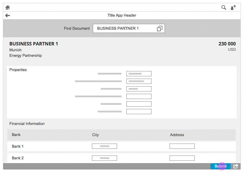
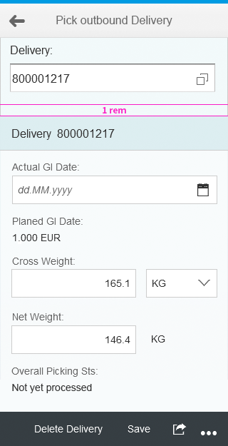
If the object view does not have any tabs, the page keeps its layout and structure in edit mode. For more information, see manage simple objects.
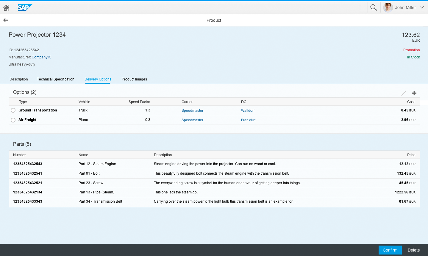
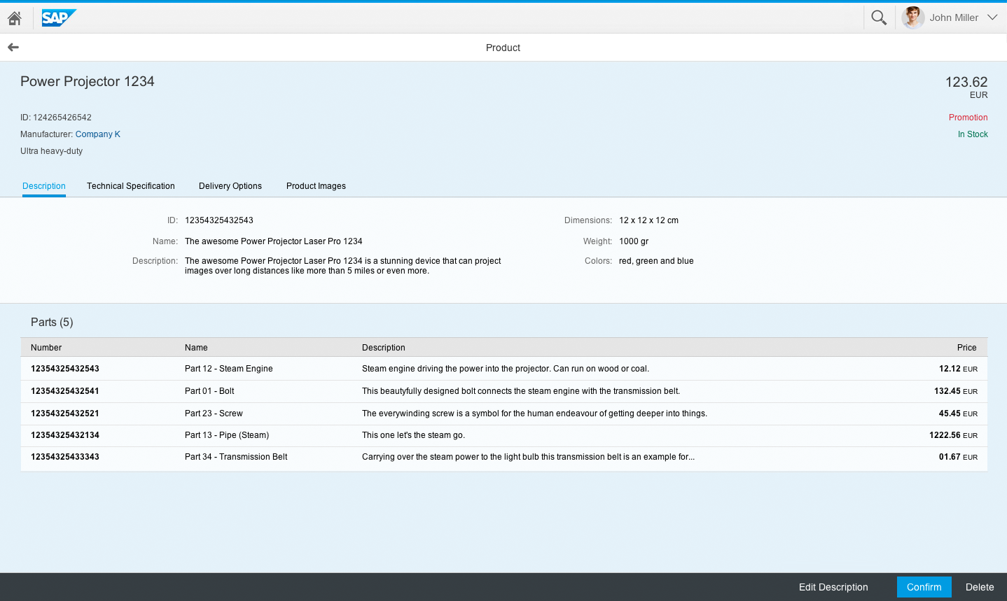
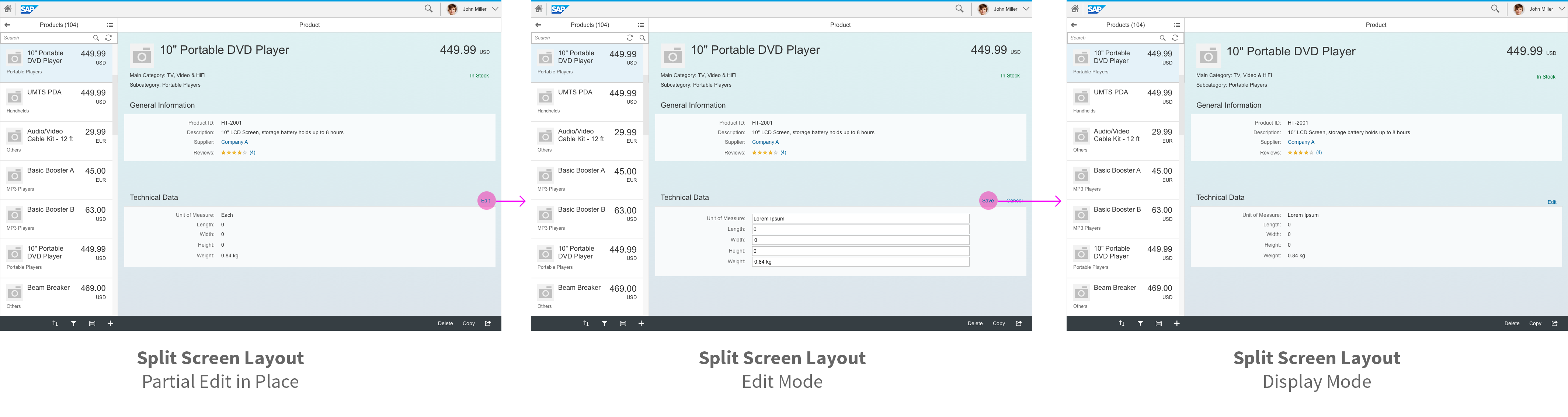
Exception: If the object view includes tabs, but only a few tabs have editable fields, you can also use in-place editing and keep the structure of the tabs. In this case, the edit button is positioned next to the editable content (see manage parts of an object for details).
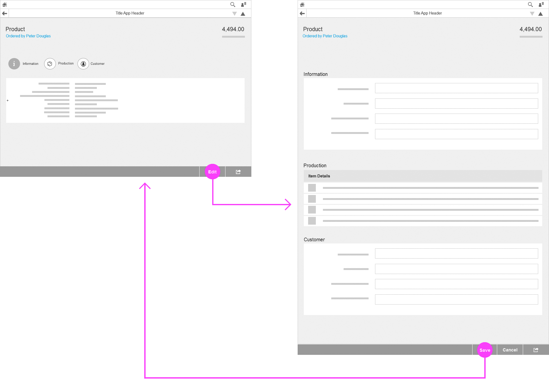
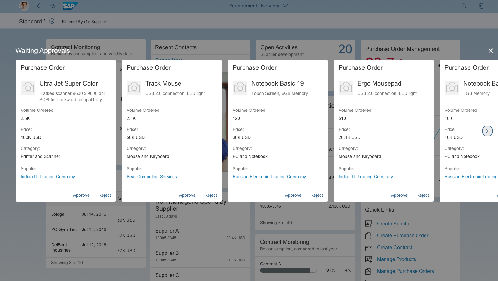
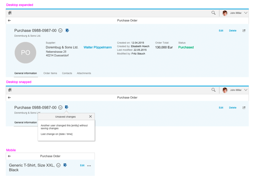
Object view – Edit flow behavior
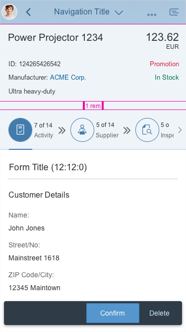
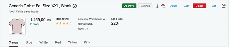
Display mode - Object view
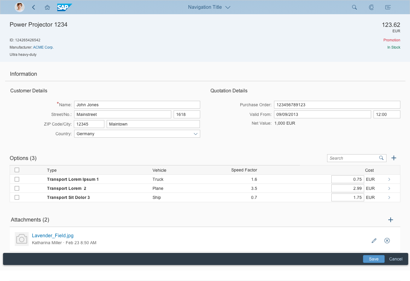
Edit mode – Object view switches to a flat object view
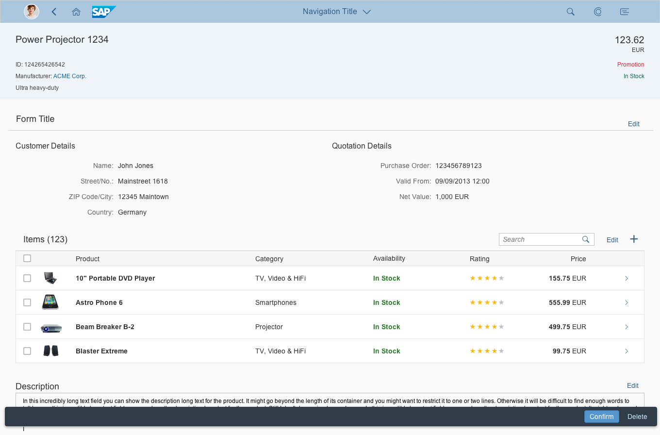
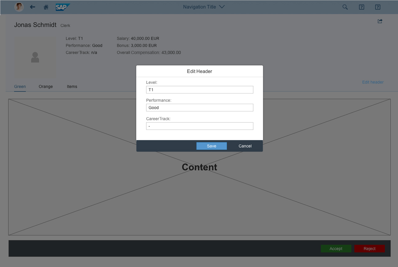
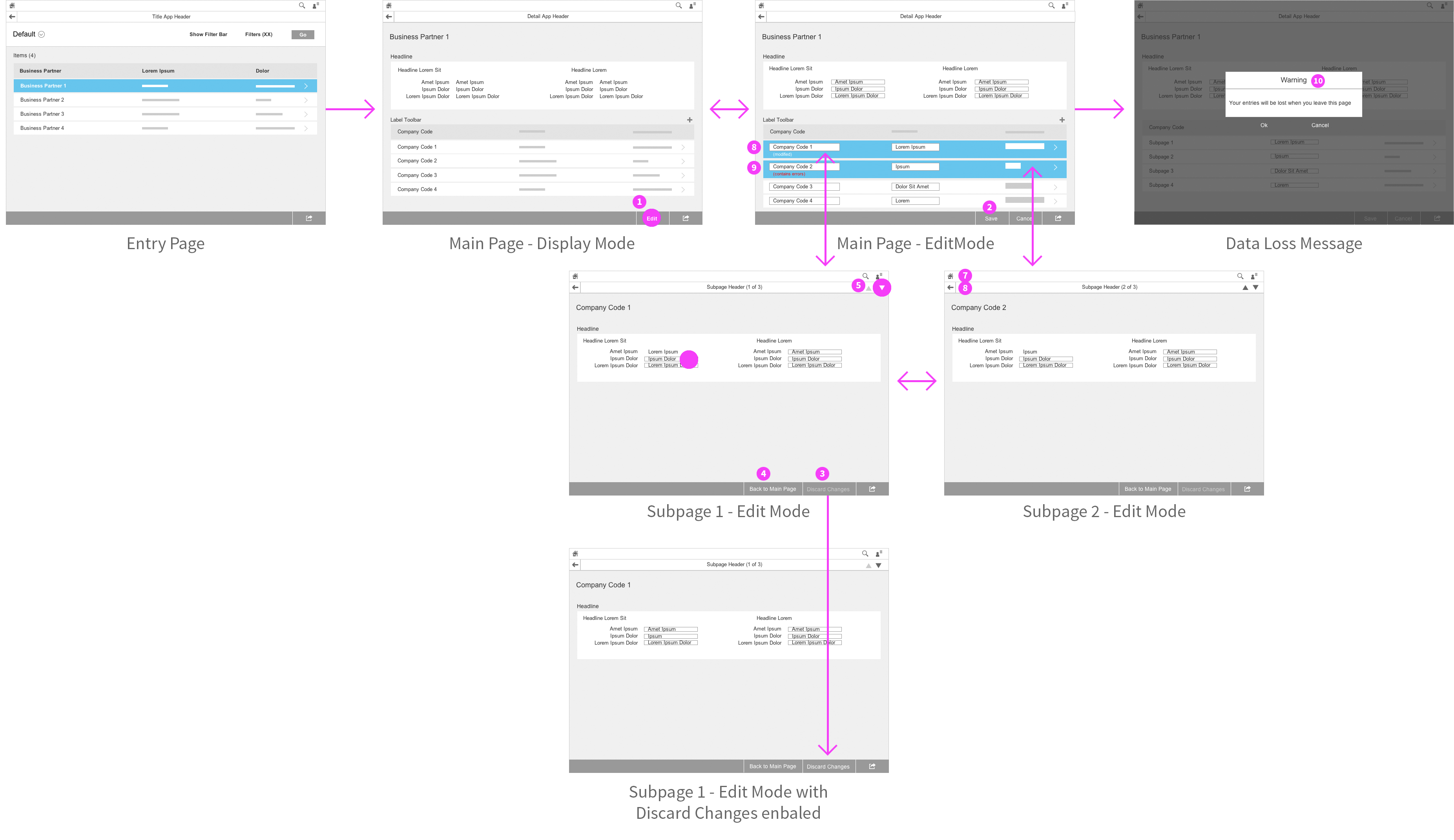
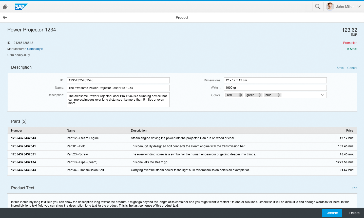
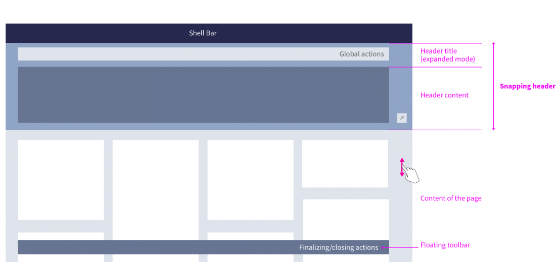
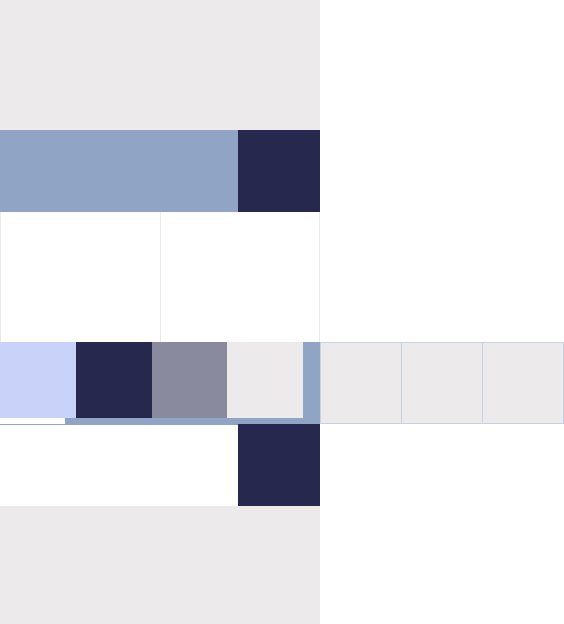
In addition to the full page edit mode, the flat object view also supports a partial edit flow, where only certain sections switch to edit mode.
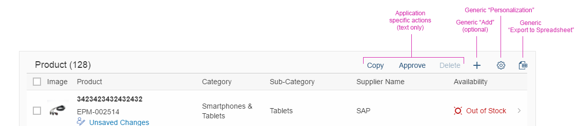
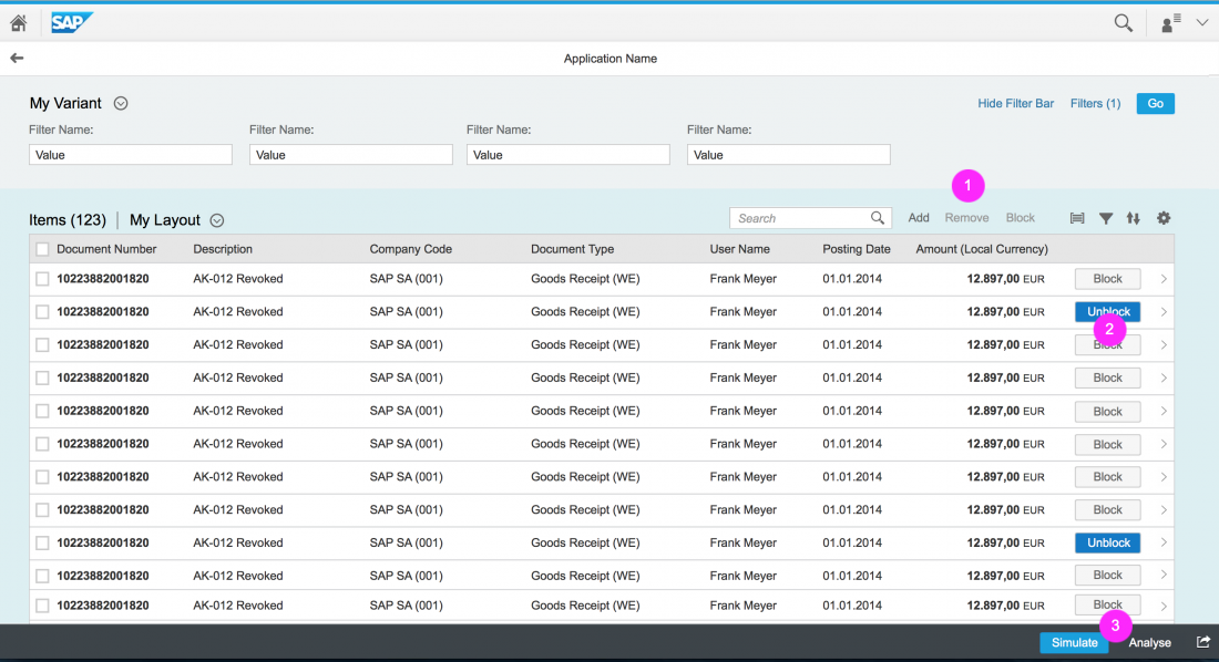
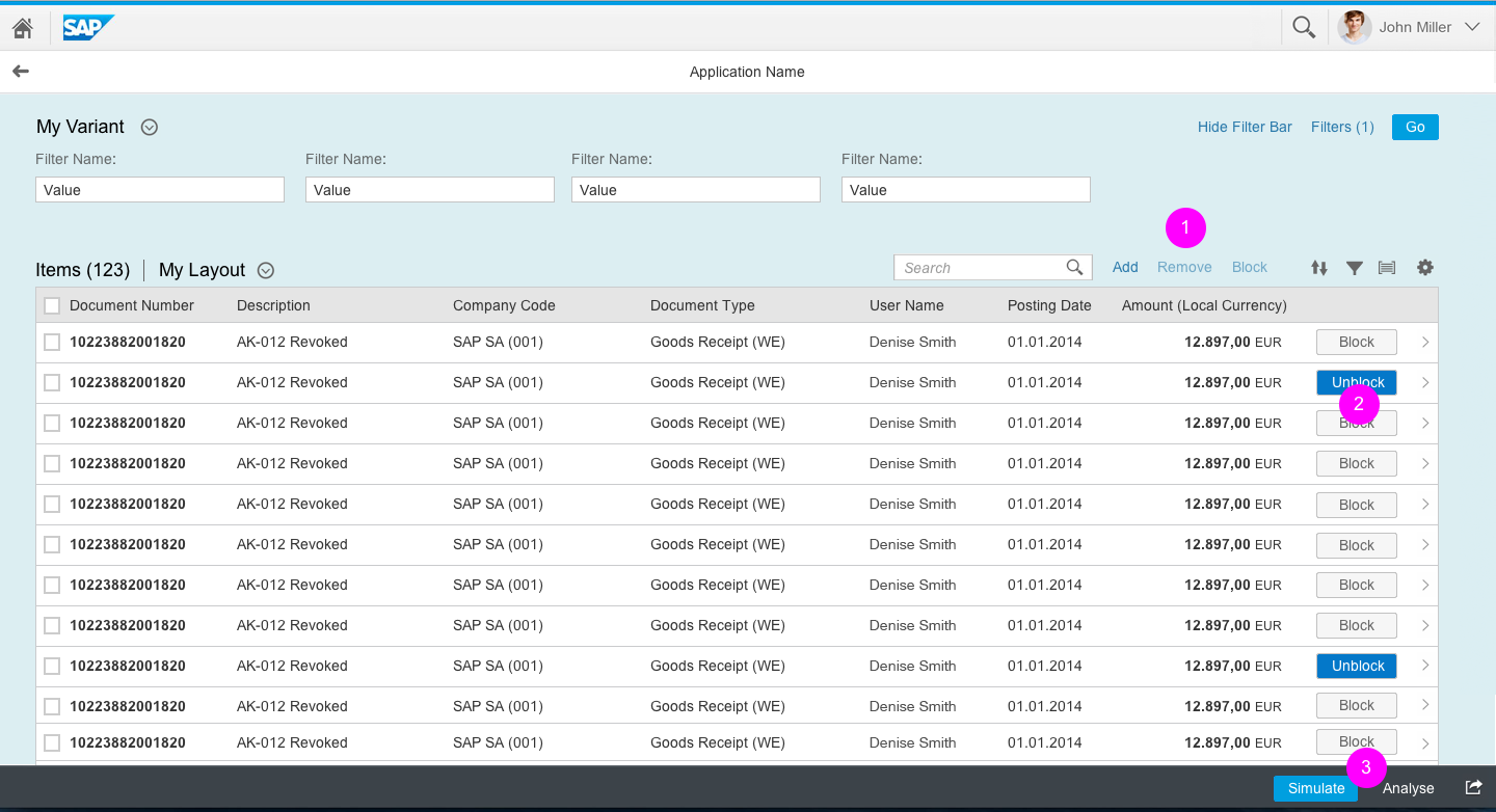
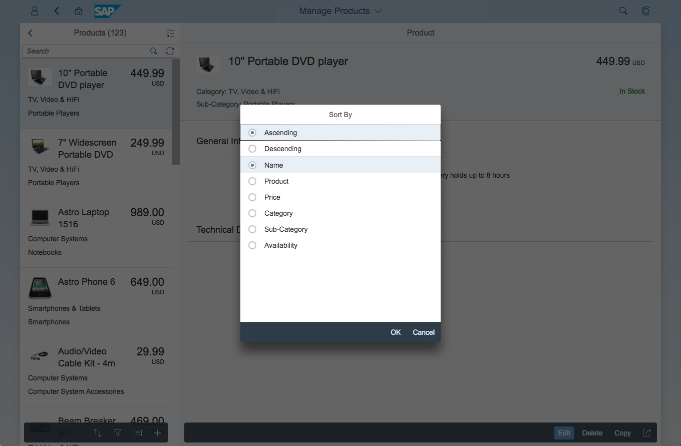
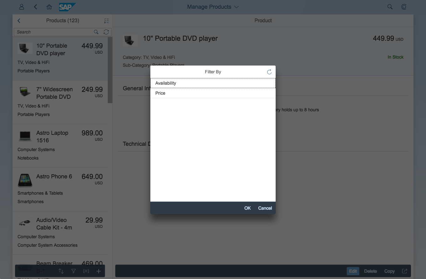
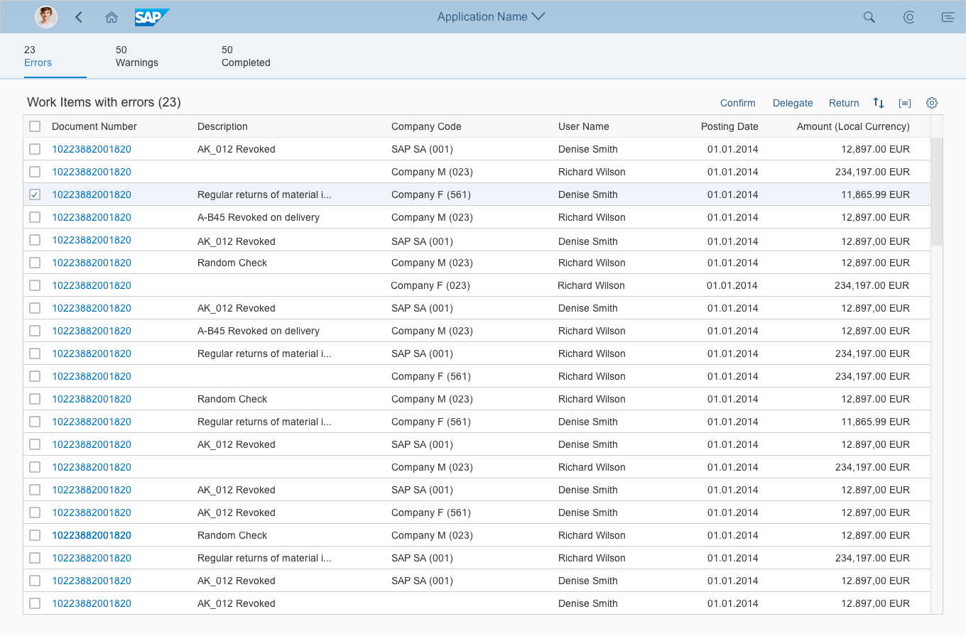
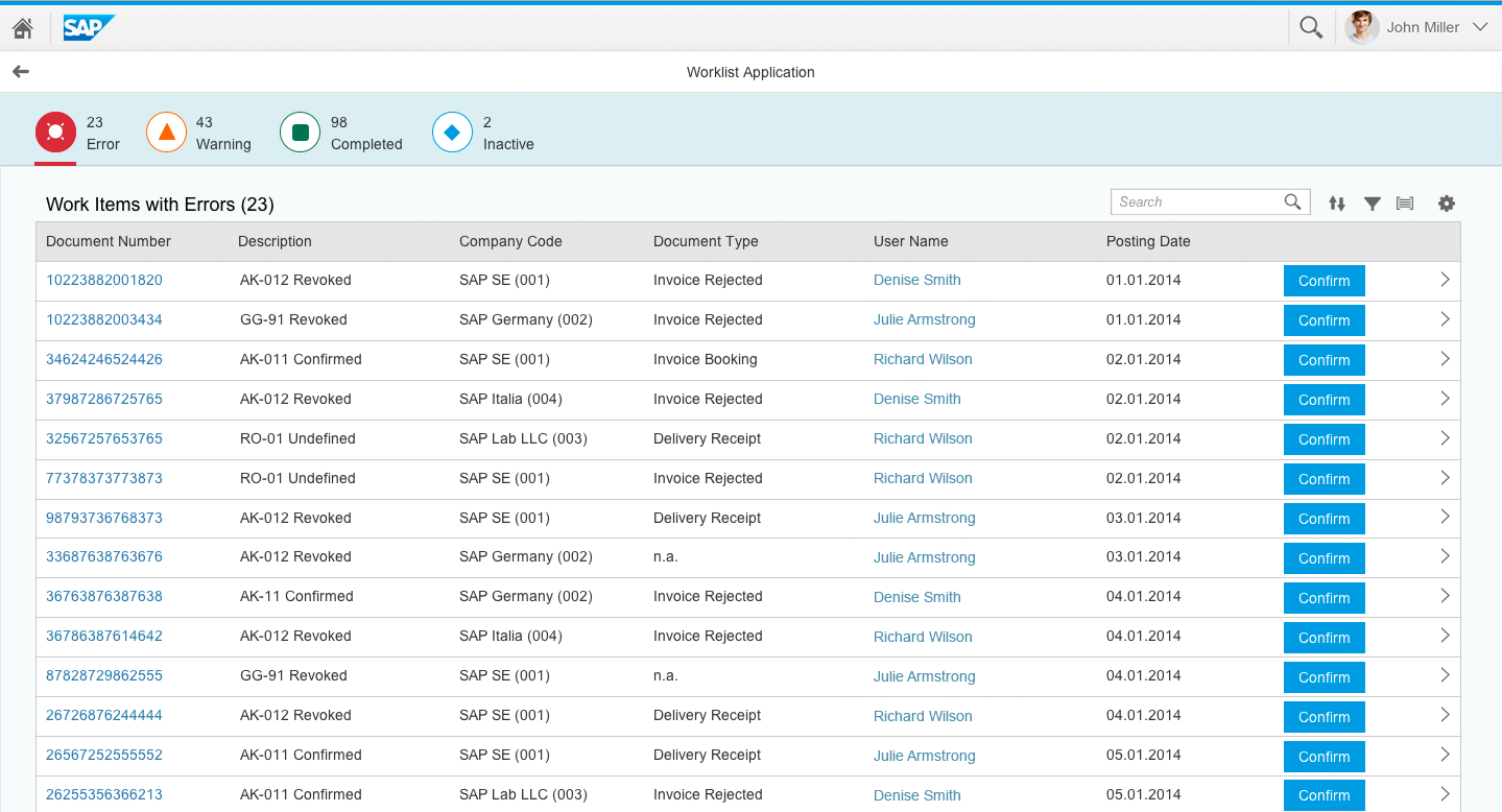
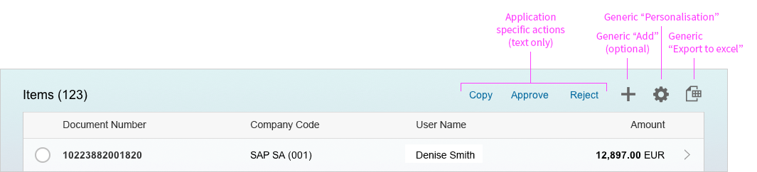
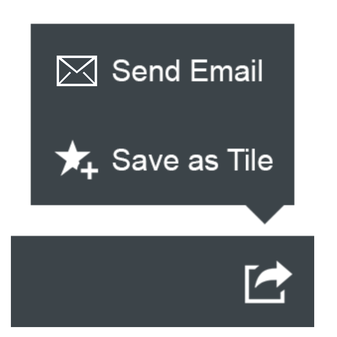
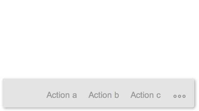
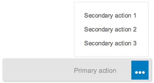
The footer toolbar in the object view floorplan is global. Actions in the footer toolbar must not change when the user switches tabs. If you need to include actions that relate to a specific tab (facet), include them in the tab content. For example, if the tab contains a table, offer actions in a table toolbar.
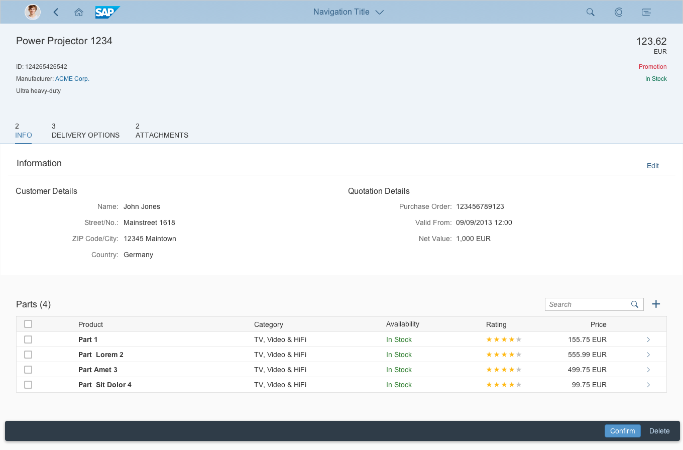
Object view with partial edit in display mode
Object view with editable section
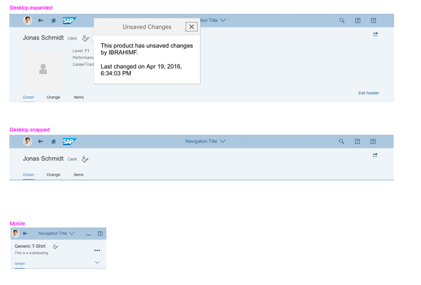
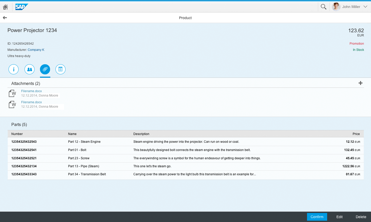
Attachment tab in an object view – Modeless editing
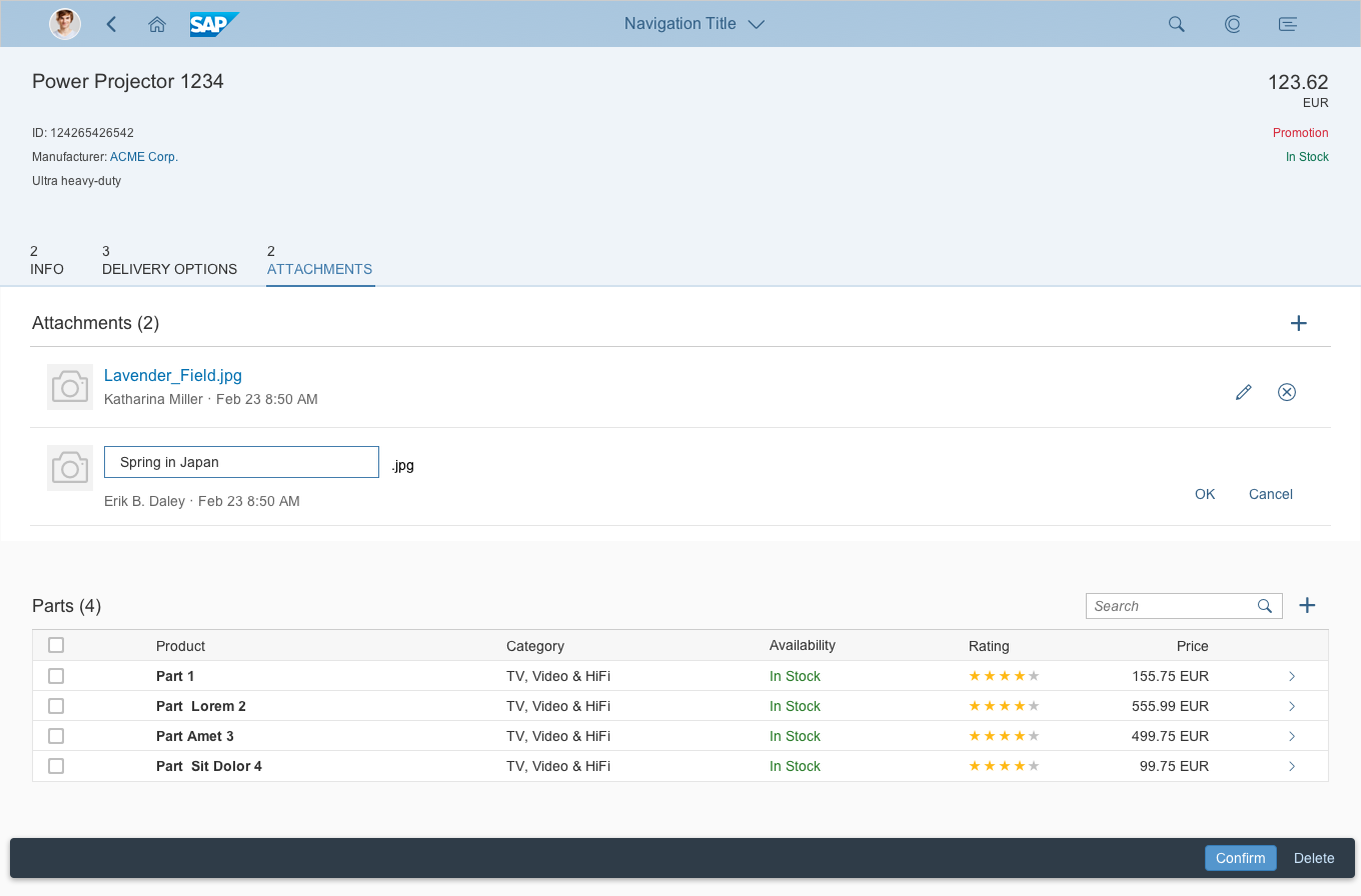
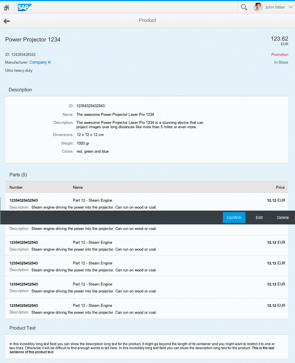
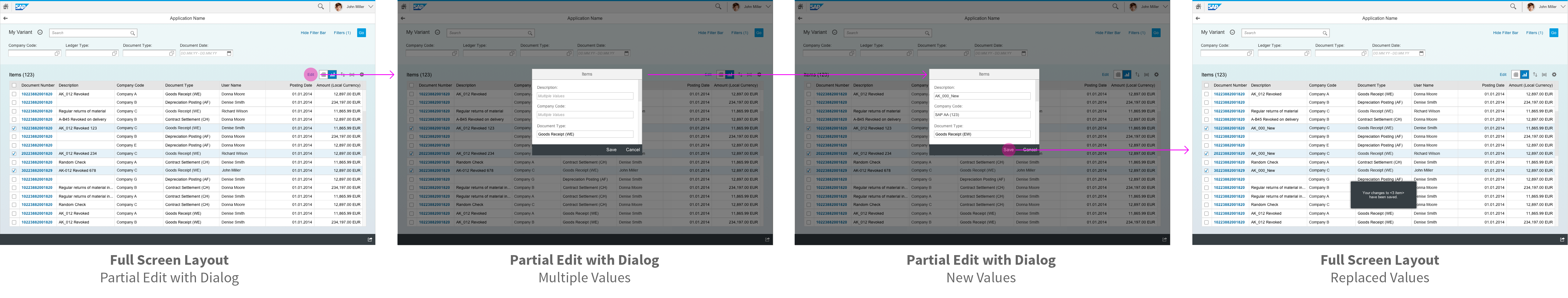
While the edit mode involves switching to a flat object view, some elements support “modeless” editing. These elements can be changed in both display and edit modes.
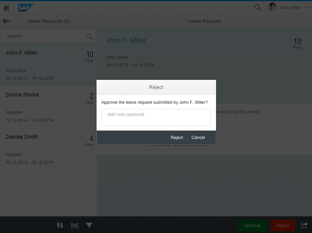
For example, adding a new attachment is a one-click action that is guided by a dialog. This action can be triggered without switching to edit mode. Any errors that might occur can be handled during this creation process.
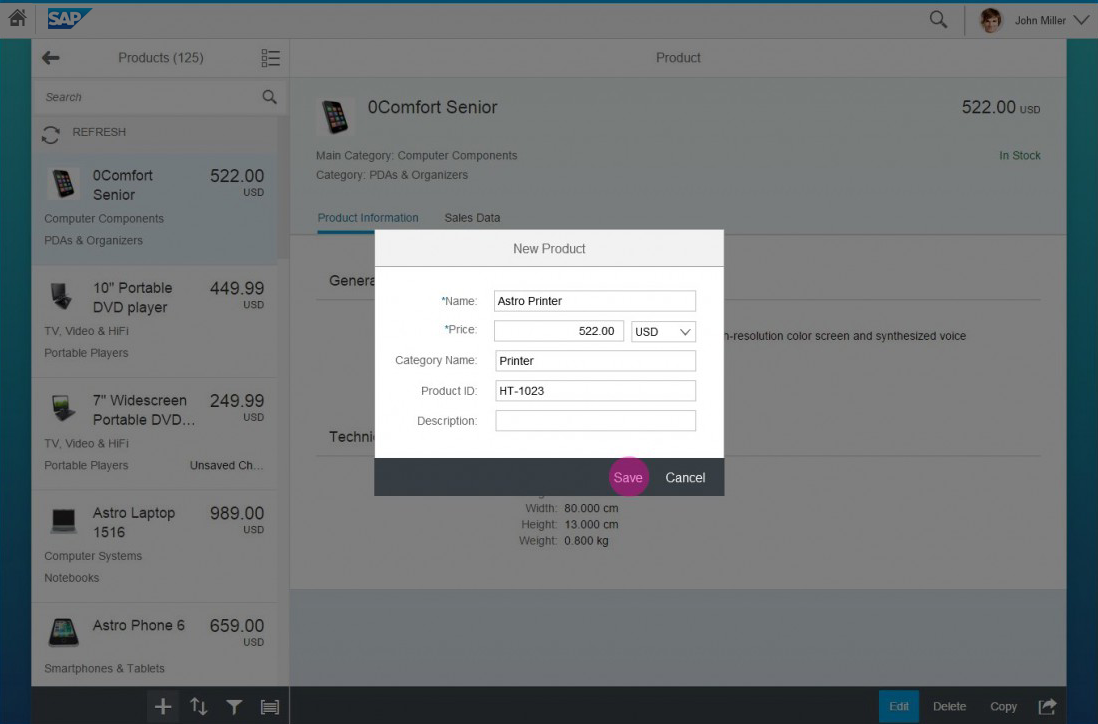
If you do not want to switch to a global edit mode, you can encapsulate your action in a dialog. Example use cases include:
- Editing certain attributes of an element (use a dialog)
- Adding line items to a tabular facet (use the plus ( ) button and a dialog or create page)
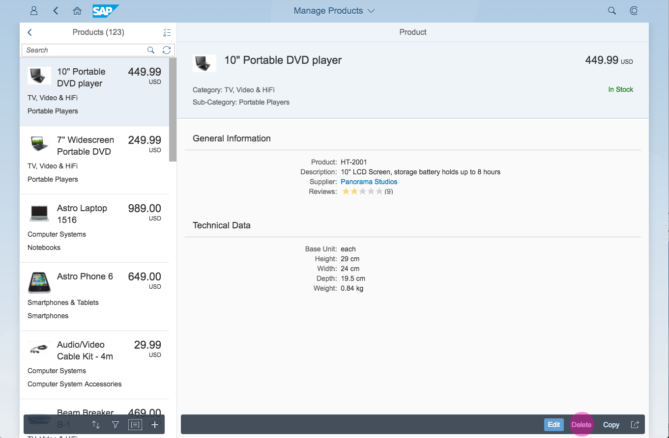
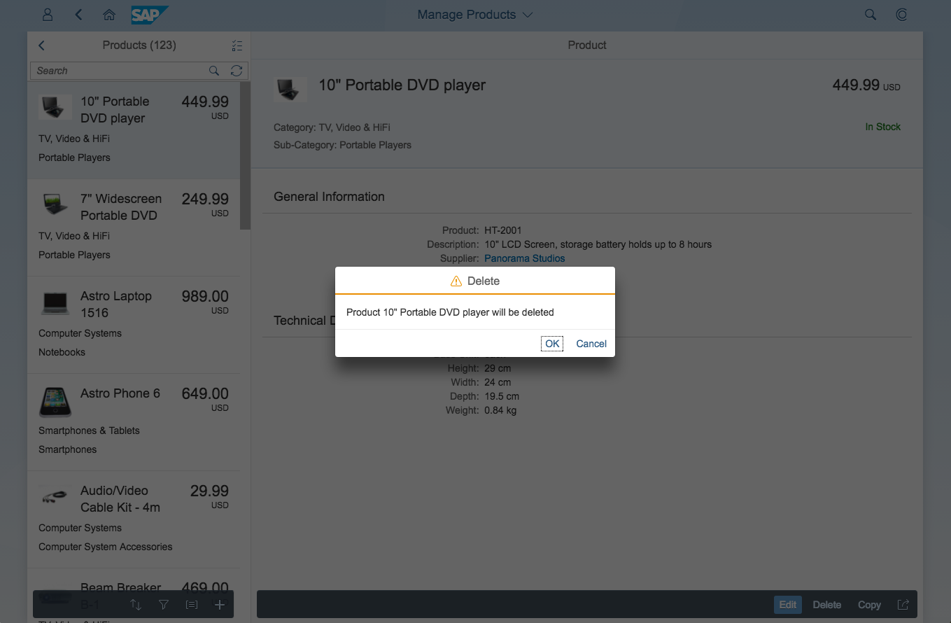
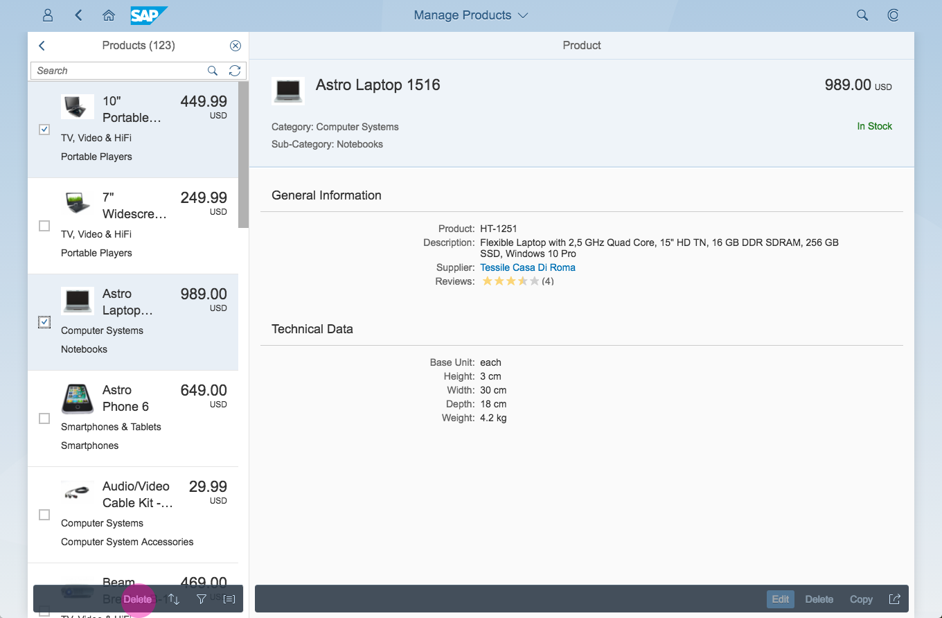
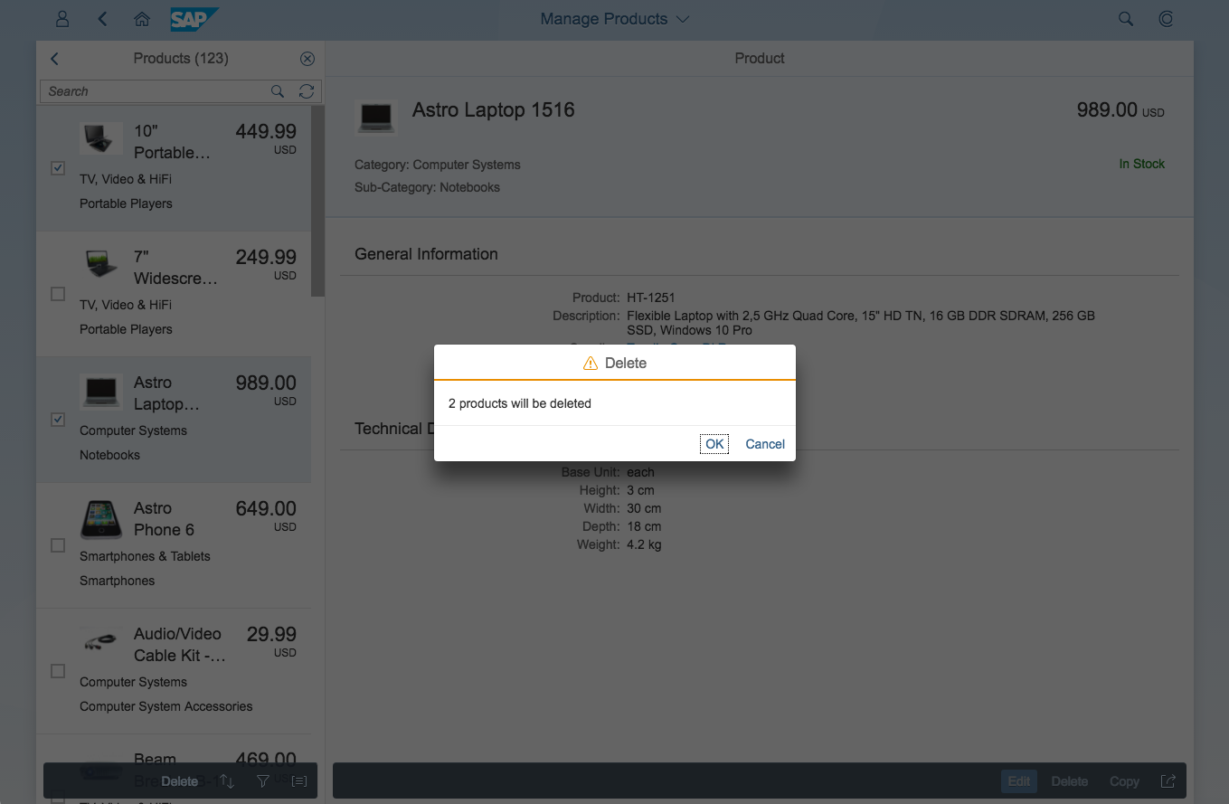
- Removing a line item (use a one-click action in the table)
Guidelines
- Do not switch the actions in the footer toolbar when the user switches tabs. The footer toolbar is global and constant. If you have tab-specific actions, place them in the tab content area.
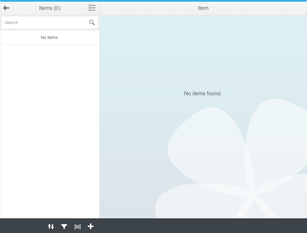
- You can hide empty tabs, but only if there is no way of adding content to the tab. For example, you still need to show an empty Attachments tab to enable users to upload attachments.
- Try to persist the selection state of tabs during a session so that the user finds a similar view while navigating between instances.
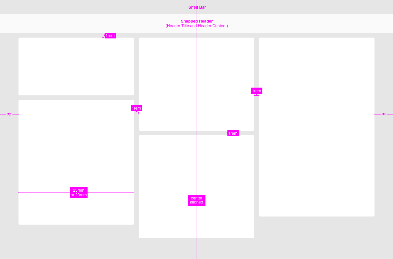
Visual Design
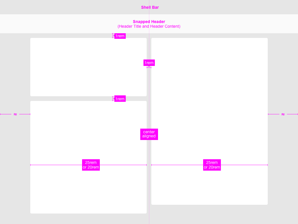
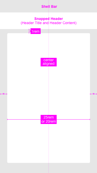
The object view floorplan has no visual design of its own, but application design and development should ensure that the margins and paddings are similar to the normal page layout. For example, the controls should have the same margins inside the side content container.
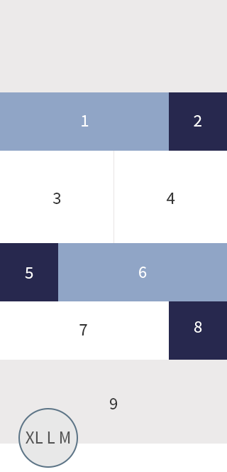
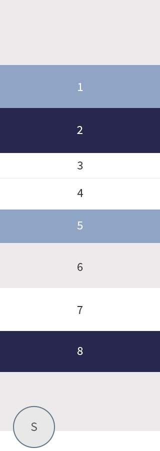
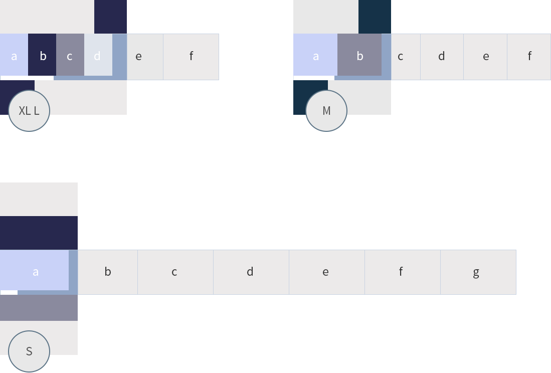
Basic layout of the object view on a smartphone
Basic layout of the object view on a tablet

Basic layout of the object view on a desktop
Basic layout of the object view on a desktop – Split screen
Resources
Want to dive deeper? Follow the links below to find out more about related controls, the SAPUI5 implementation, and the visual design.
Elements and Controls
- Object Header (guidelines)
- Icon Tab Bar (guidelines)
- Form (guidelines)
- Tables (guidelines)
Implementation
- Object Header (SAPUI5 samples)
- Icon Tab Bar (SAPUI5 samples)
- Simple Form (SAPUI5 samples)
- Table (SAPUI5 samples)


")
")
")
")


 Your feedback has been sent to the SAP Fiori design team.