SAP S/4HANA Product Home Page – My Home

Information
We continually optimize the SAP S/4HANA My Home page, so some details described in this guideline may differ from what you see in the latest demo systems.

Intro

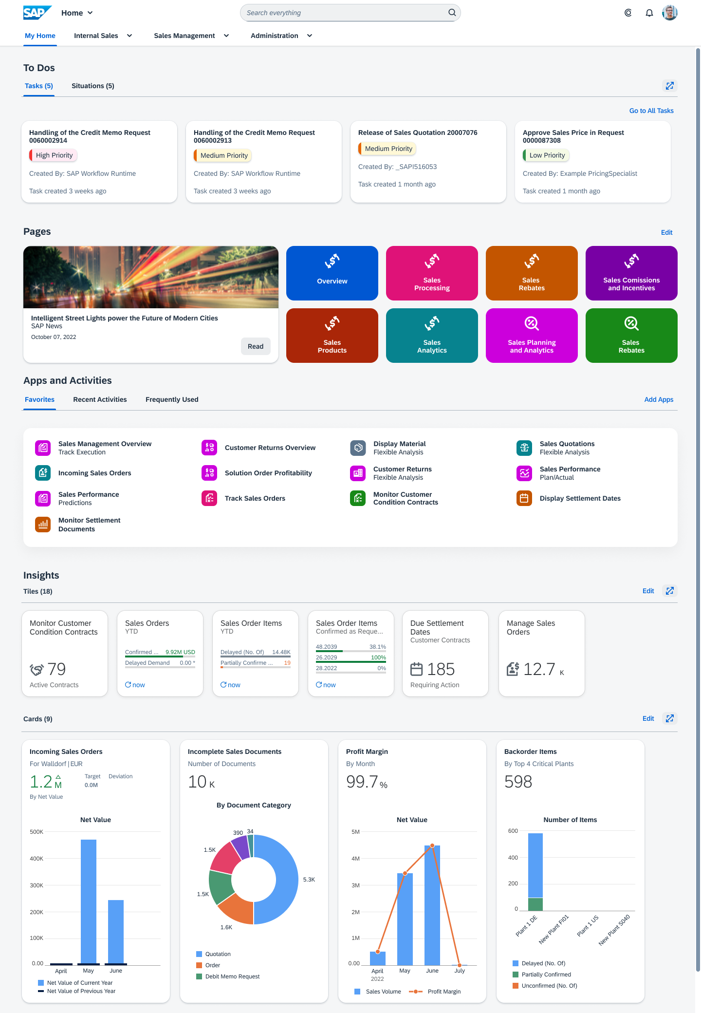
The SAP S/4HANA product home page is an alternative to the SAP Fiori launchpad My Home page when using SAP S/4HANA Cloud. The previously available SAP Fiori launchpad My Home page is the entry point to a personalized set of apps, presented as tiles or links, whereas the SAP S/4HANA product home page orchestrates much more information.

The new product home page is the entry point to apps, and also offers:

  • Access to tasks and situations
  • News feed
  • Quick navigation to pages
  • Analytical insights 
  • SAP Business AI recommendations

Additionally, users benefit from enhanced personalization features for content and layout.

Information
Keep in mind that referring generically to “My Home” can be understood to mean either the SAP S/4HANA product home page described in this article, which displays My Home on its interface, or the SAP Fiori launchpad My Home. 

The SAP S/4HANA product home page is based on SAP Fiori launchpad spaces and runs best with the Horizon theme, although it supports other SAP and custom themes. The SAP S/4HANA product home page has to be activated by a key user.
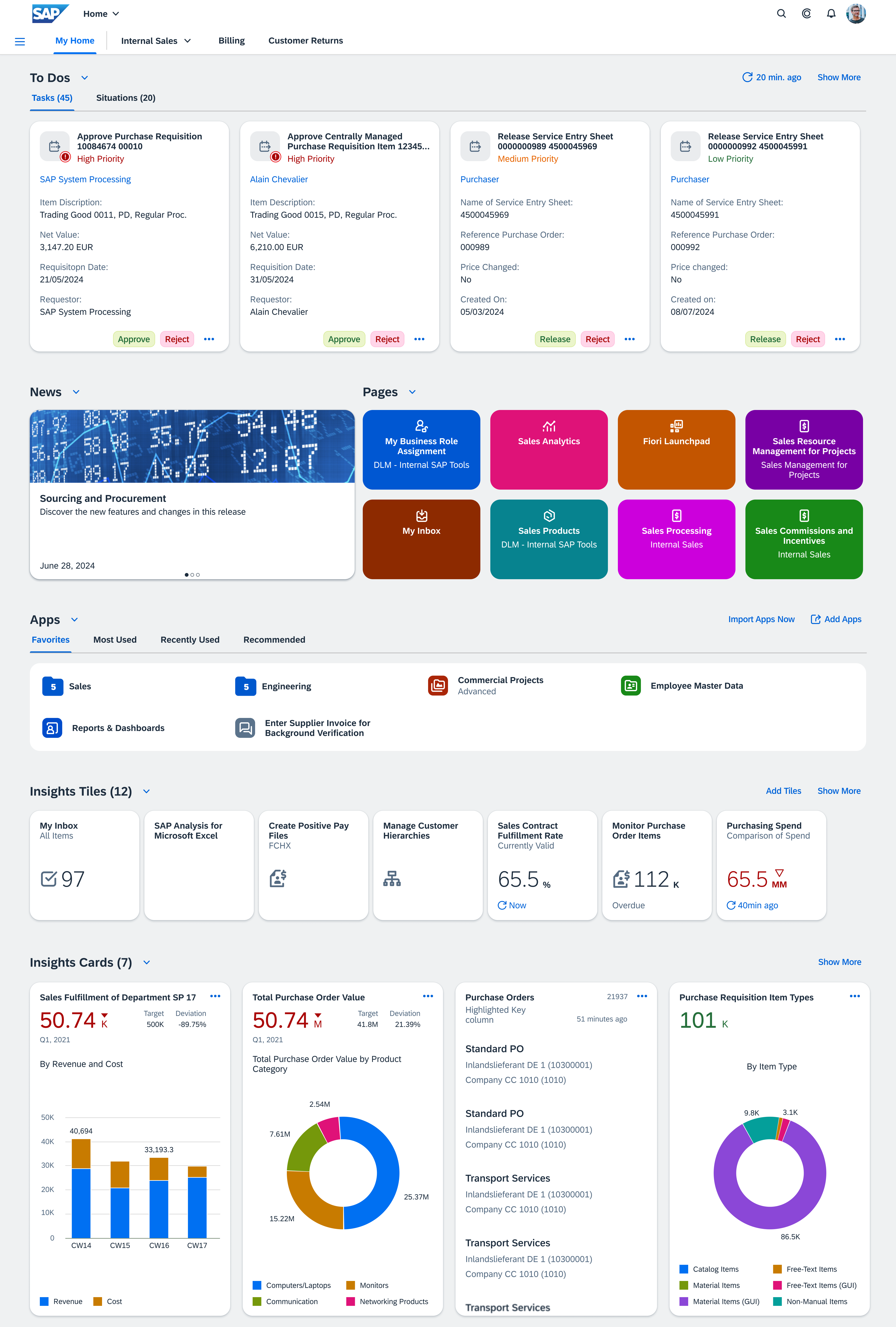
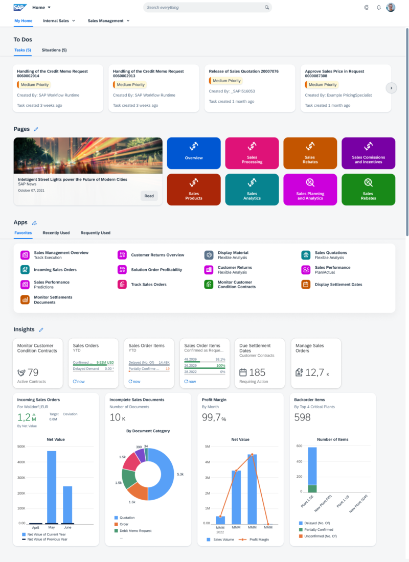
SAP S/4HANA product page 'My Home'

Components

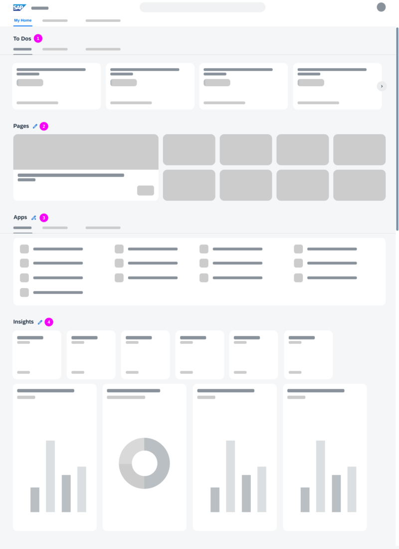
The SAP S/4HANA My Home page is the leftmost option in the top-level shell bar navigation and includes the following sections:

  1. To Dos
    Shows tasks and situations.
  2. News
    Shows new features, and changes from the latest release.
  3. Pages
    Shows a maximum of 8 pages displayed as tiles.
  4. Apps
    Shows the user’s favorite apps, most used apps, recently used apps, and apps recommended by SAP Business AI, based on the user’s business role.
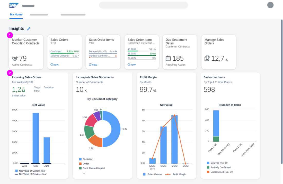
  5. Insights Tiles
    Shows tiles with analytical information.
  6. Insights Cards
    Shows cards from overview pages and list report-based apps.

The section menu (7) can be triggered from the arrow next to a section title and shows actions for the section.

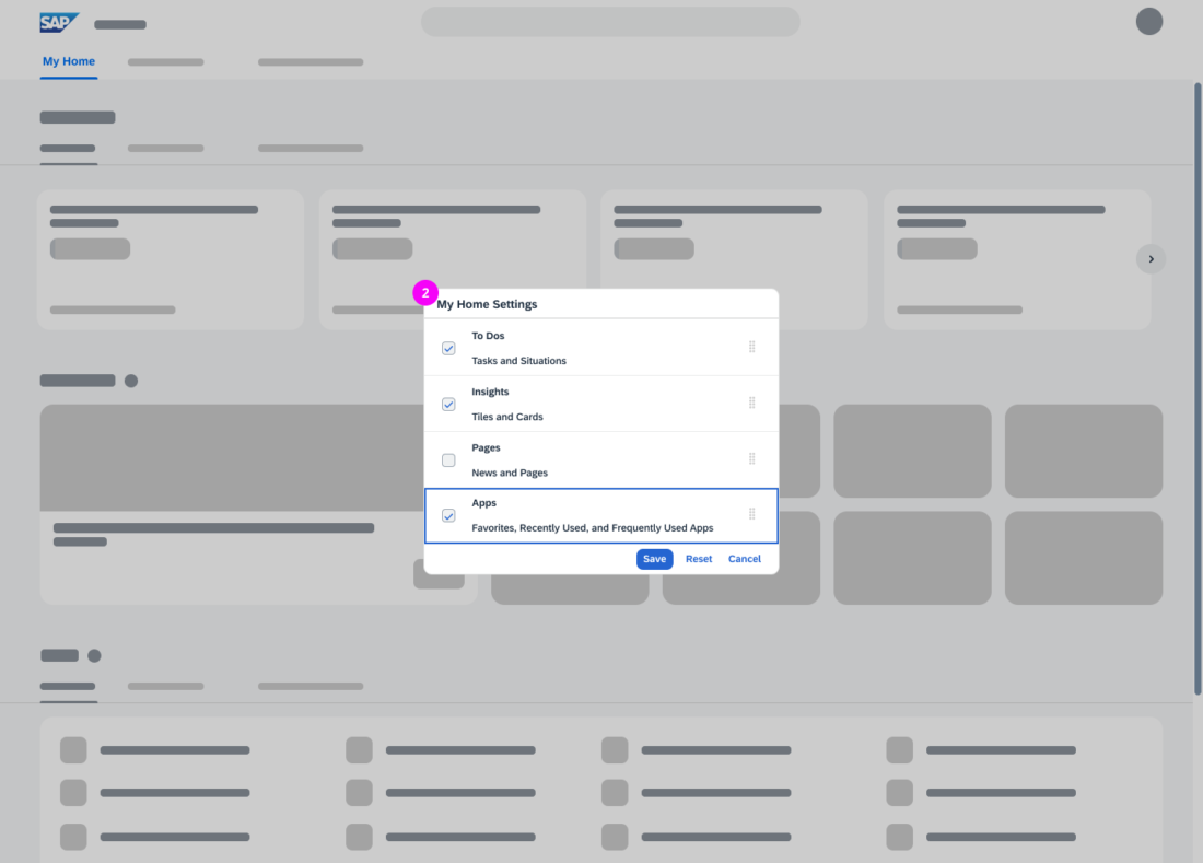
In My Home Settings, users can define the layout and visibility of the individual sections to personalize the My Home page.
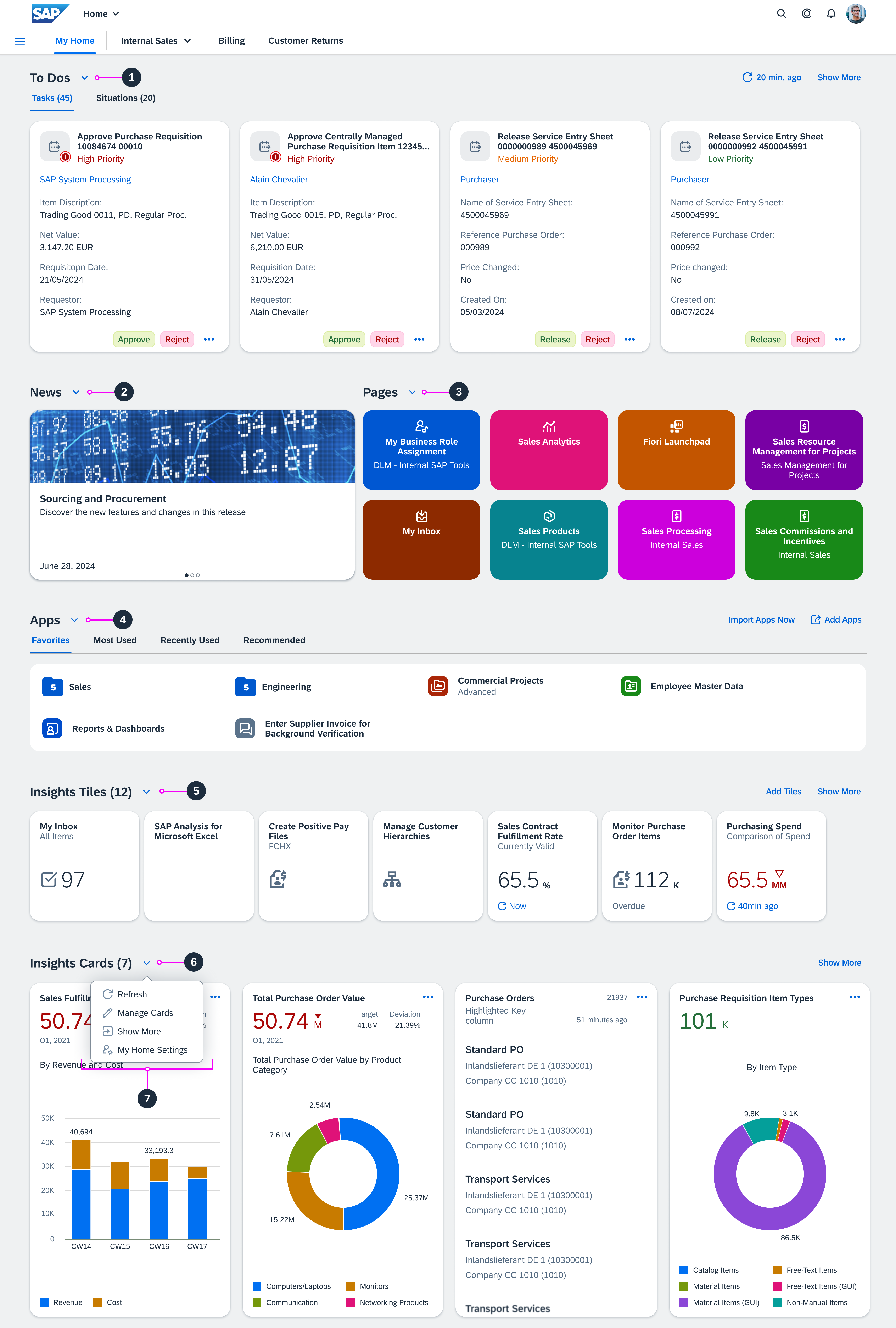
My Home - Sections
My Home - Sections

To Dos

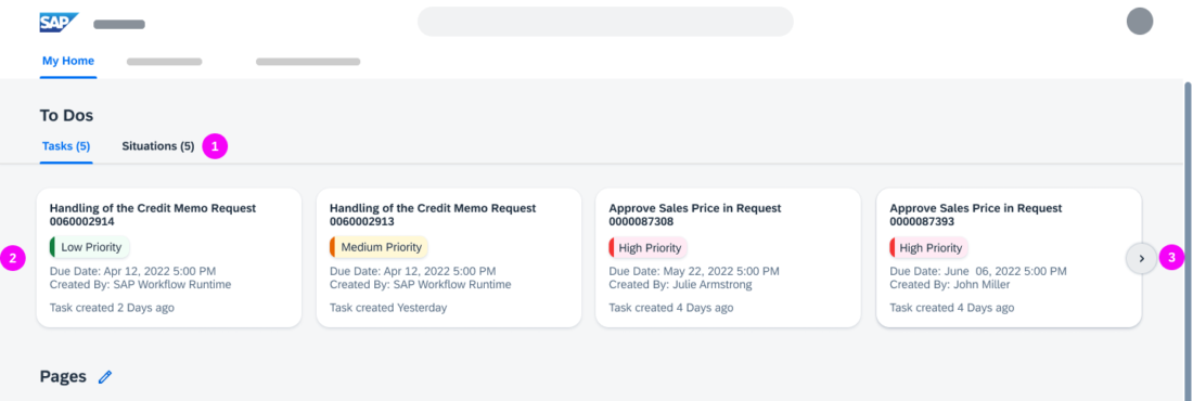
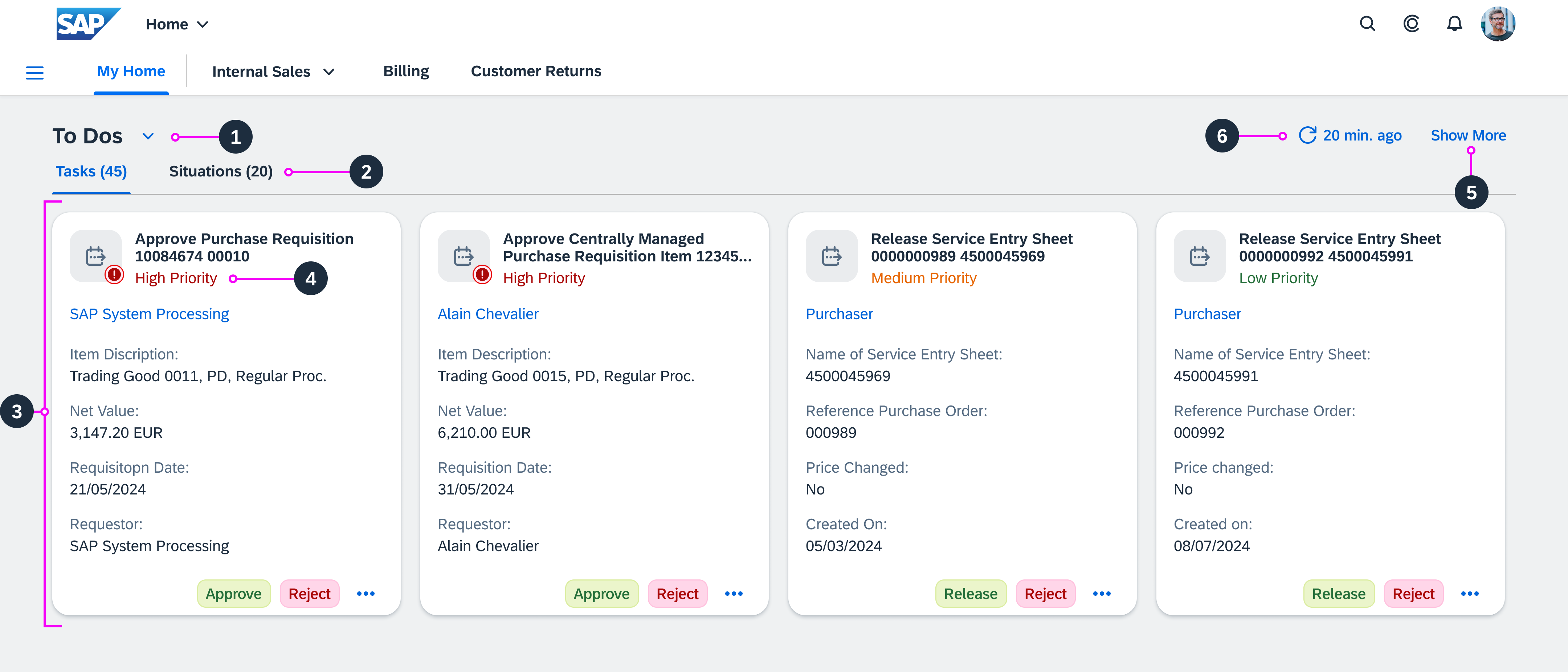
  1. The To Dos section includes tabs for workflow tasks from the My Inbox app and situations from the My Situations app.
  2. A counter next to each tab indicates the number of open tasks and situations.
  3. Cards, displayed in a row, present the tasks or situations in the tab:
    • Task cards contain a title, priority, creator name, and attributes according to the task type. The footer displays card actions.
    • Situation cards contain a title, body text, and a time stamp.
  1. The priority of the cards determines their order in the row, from high to low.
  2. The Show More button is displayed if not all tasks and situations can be displayed. The number of cards shown depends on the user’s screen resolution.
  3. The Refresh button displays the time stamp of the last refresh.
Information
If the My Inbox or My Situations apps are not assigned to the user, the To Dos section is not available.

If only one of the apps is assigned, the corresponding tab is shown.

My Home - 'To Dos'
My Home - 'To Dos'

News

  1. The News section shows a news tile with either RASD-based information feed or an RSS feed. Only news feed from one line of business (LOB) can be displayed on a news tile at a time.
  2. A carousel lets users switch among previews for the LOB-specific news threads.

In the Personalize News section of My Home Settings, users can personalize their news feed by choosing an LOB.

Information
The news feed is available only if a key user has activated it.
My Home - 'News'
My Home - 'News'

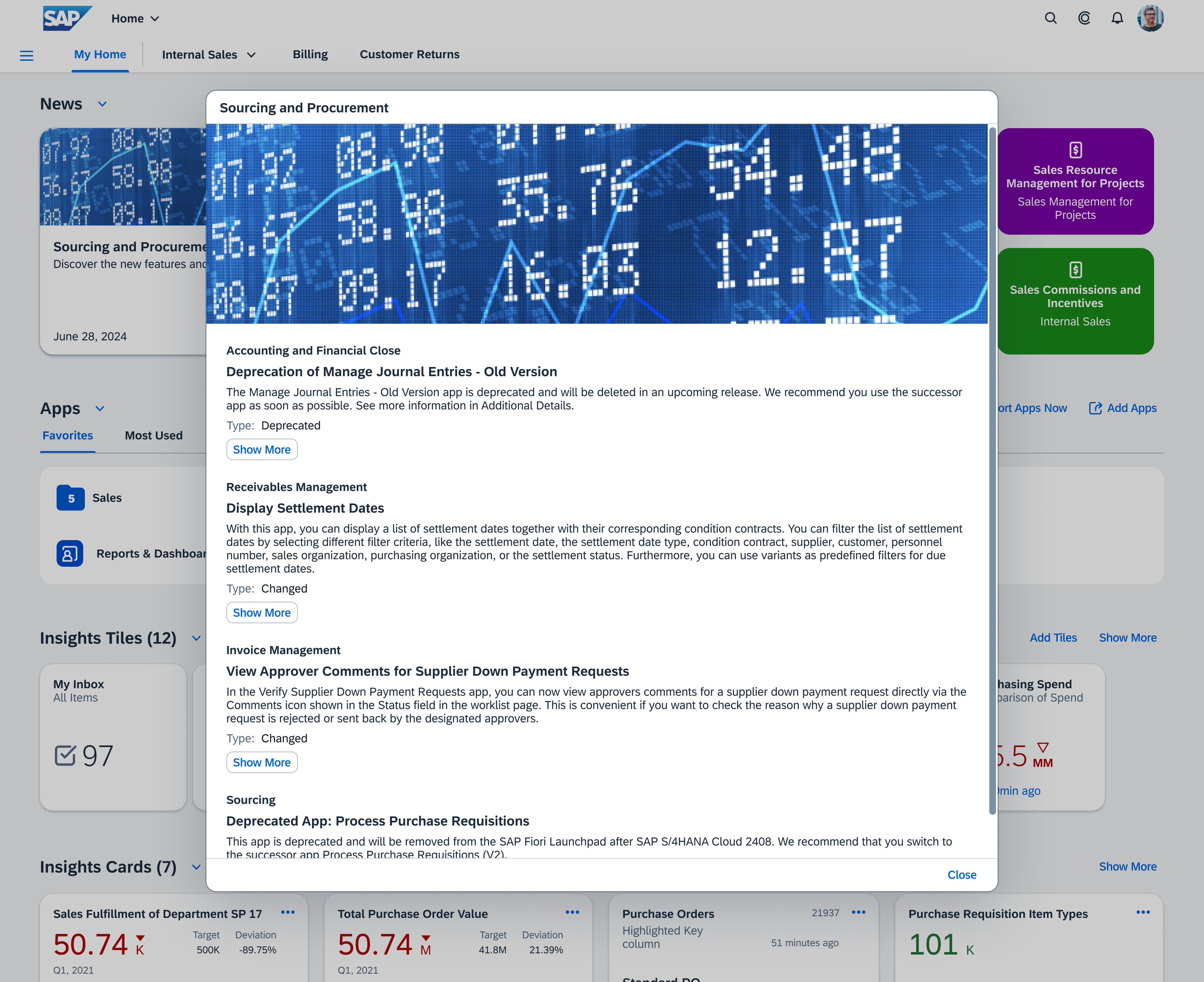
When users click a tile in the carousel, a summary with further information on the LOB-specific news feed opens in a popover.

My Home - 'News' (Popover with LOB-specific news feed)

Pages

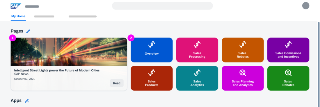
  1. The Pages section shows a maximum of 8 favorite pages.
  2. Tiles represent the favorite pages.

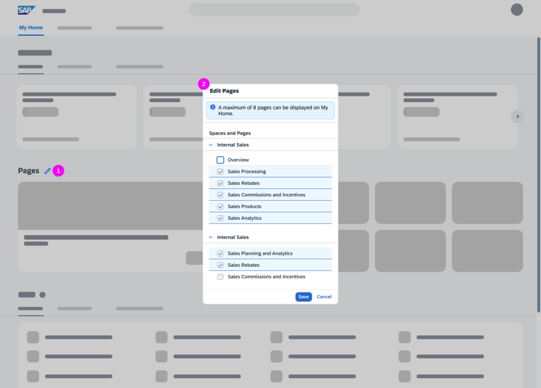
In the Personalize Pages section of My Home Settings, users can control the pages to show or hide in the Pages section.

Information
Key users can assign custom colors and icons to the pages.
My Home - 'Pages'
My Home - 'Pages'

Apps

The Apps section includes:

  1. Favorite apps, users can apps to their Favorites directly from the Most Used, Recently Used, or Recommended tab. They can also change the icon for the favorite app or remove it from Favorites. See Personalizing the Apps Section.
  2. Most Used apps
  3. Recently Used apps
  4. Recommended apps, the apps recommended by the SAP Business AI based on the user’s business role. Users can hide the tab from My Home in the advanced section (under recommendations) of the Settings dialog.
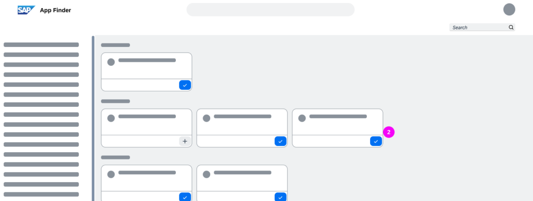
  5. The Add Apps action opens the app finder, where users can add apps to their Favorites.
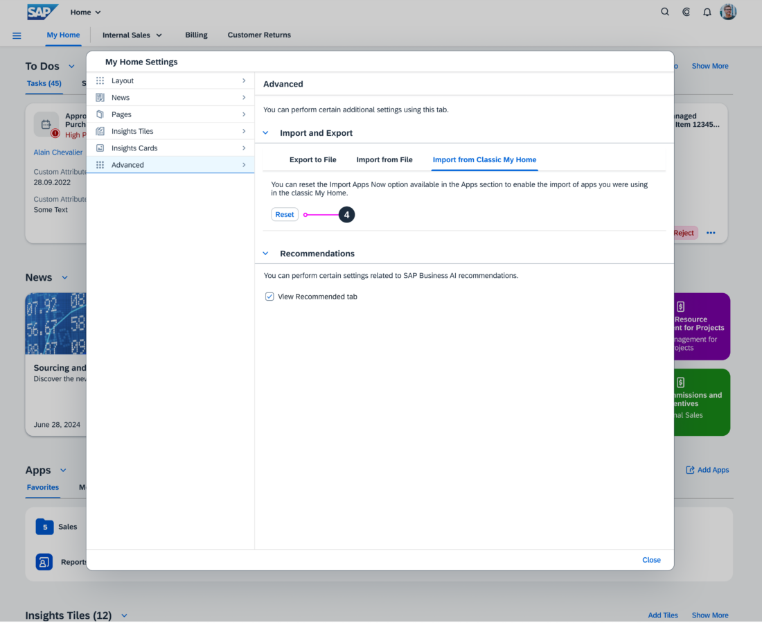
  6. The Import Apps Now action imports personalization content, for example, personalized groups from the classic Home page.
  7. App groups are displayed as a colored folder that contains the apps that the user has added to the group.
  8. An app is displayed with a colored icon that matches the app title.
  9. A deprecated badge next to outdated apps that will be removed in a future release.
Information
Most used and recently used apps are shown only if the user allows app tracking in the Settings dialog.

The Most Used tab displays the apps used in the last 30 days, in the order of the most to least used. Recently Used displays up to 30 activities, in the order of the most to least recently used.

My Home – 'Apps'
My Home – 'Apps'

Insights Tiles

  1. The Insights Tiles section contains tiles with analytical information, such as charts or KPI’s. The section header includes a counter that shows the number of tiles in the section.  All tiles are displayed in one row.
  2. Add Tiles opens the app finder where users can search and add tiles. They can also add tiles from their favorite apps.
  3. The Show More button is displayed if not all tiles can be displayed the one row. The number of displayed tiles depends on the screen resolution.

Further personalization of tiles is possible. See Personalize Insights Tiles.

My Home - 'Insights Tiles'

Insights Cards

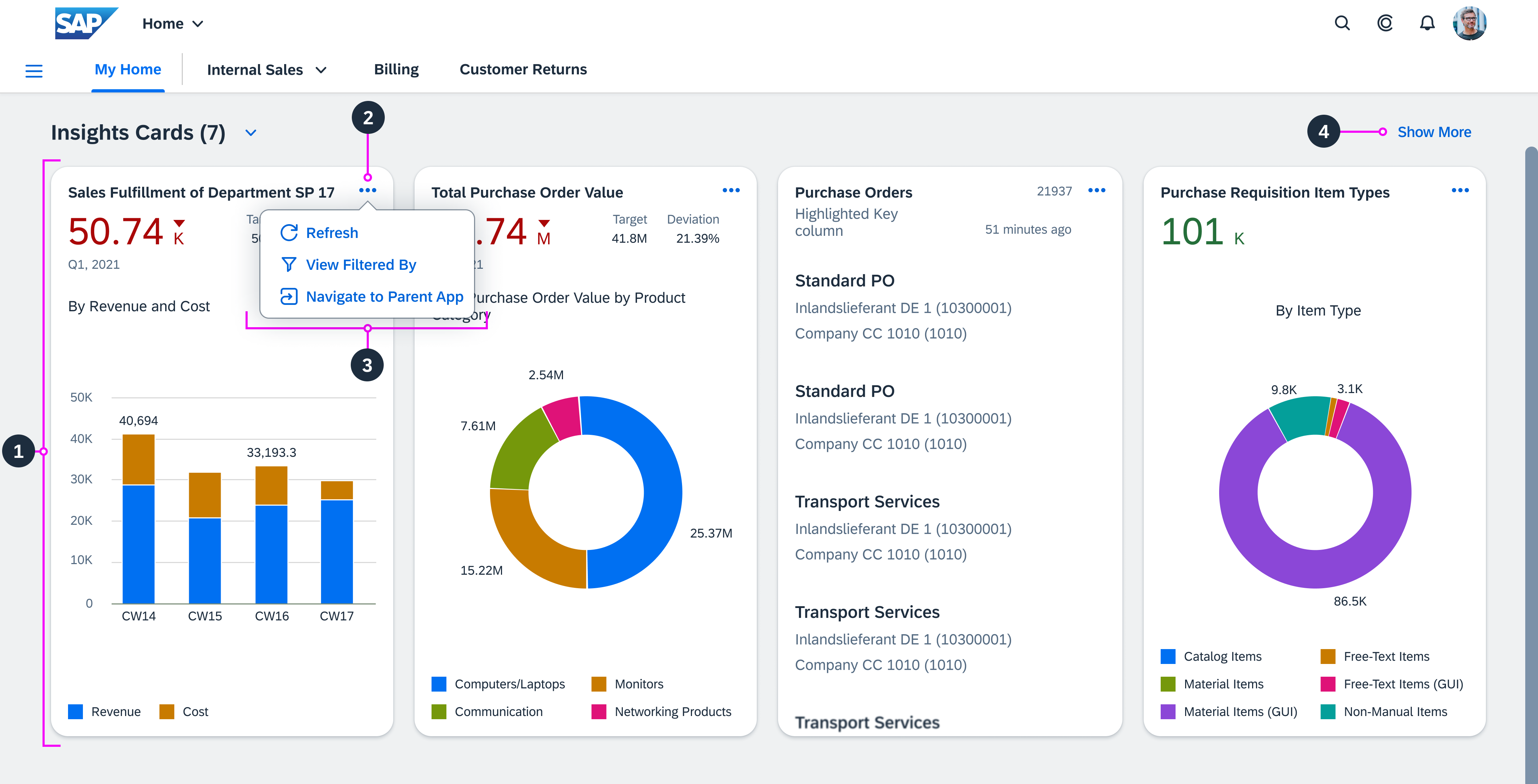
The Insights Cards section header includes a counter that shows the number of available cards. The section contains:

  1. A maximum of 10 cards from overview pages and list report-based applications
  2. An overflow menu for each card
  3. Card-specific actions
  4. The Show More button is displayed if not all cards can be displayed in one row. The number of displayed cards depends on the screen resolution.

Further personalization of cards is possible. See Personalize Insights Cards.
My Home - 'Insights Cards'

Behavior and Interaction

Users can personalize the SAP S/4HANA My Home page according to their needs.

In the Apps section on My Home, users can add and import apps to their Favorites, and personalize their favorite apps with colors and icons.

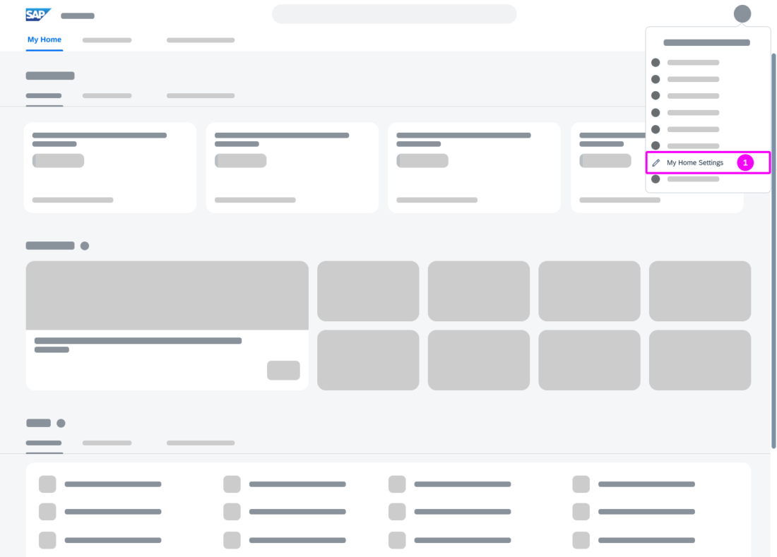
All other personalization options are available in the respective My Home sections or via My Home Settings in the user actions menu.

Showing More or Less Section Content

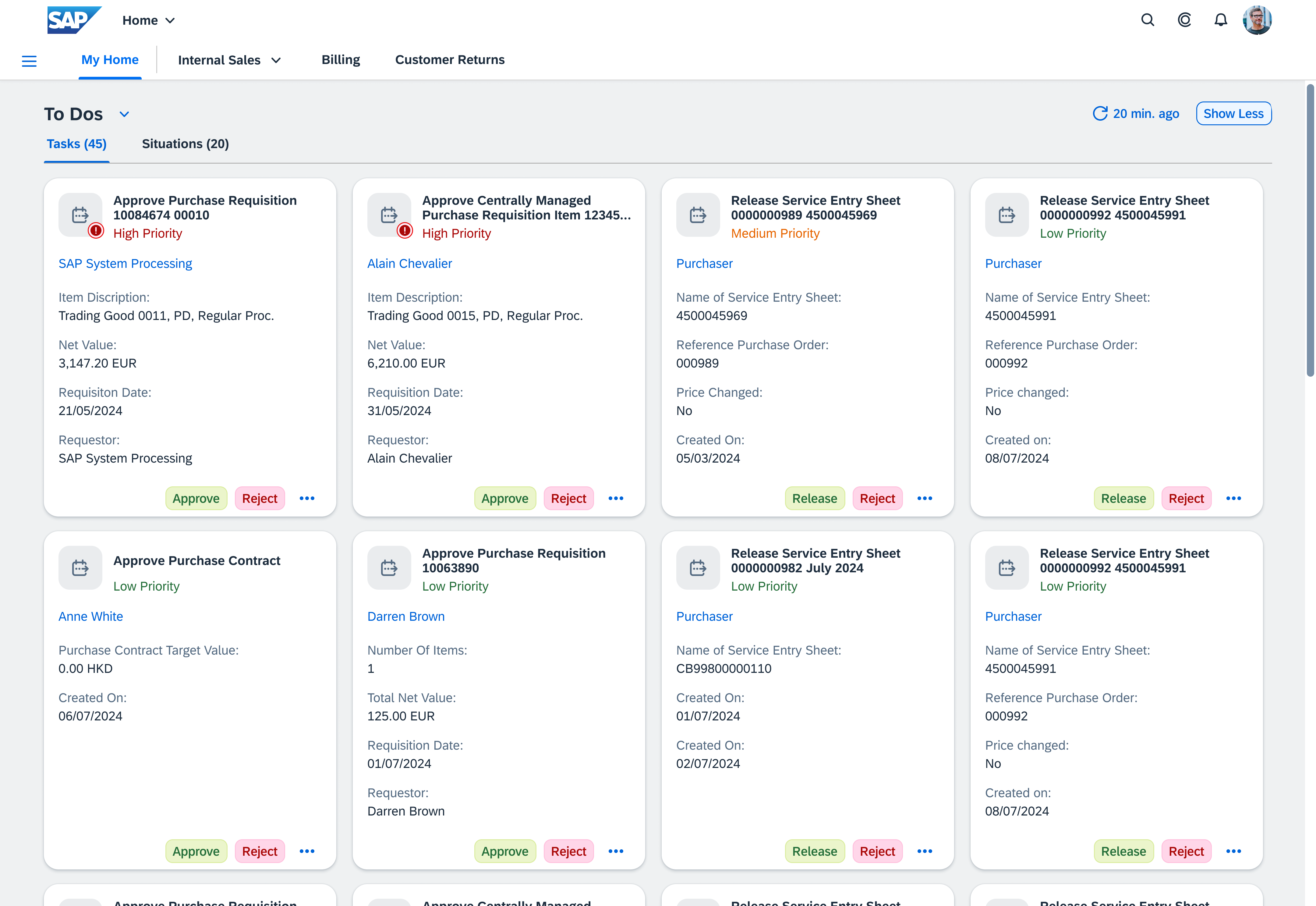
The Show More button is displayed at the top right of the To Dos, Insights Tiles, and Insights Cards sections when the section includes more content than can be displayed in one row.

On selection, it:

  • Displays all the section content
  • Hides the other My Home sections
  • Changes the button’s action to Show Less

If needed, scrolling within the show more view is possible.

When users select the Show Less button, it

  • Displays the section content in one row. The number of tiles or cards displayed depends on the screen resolution.
  • Displays the other My Home sections
  • Changes the button’s action to Show More
My Home - 'To Dos' -- Show more view

Personalizing the Apps Section

Users can add and import apps.

Adding Apps to Favorites

Users can add apps to their Favorites both from:

  • The My Home page
  • An app overflow menu

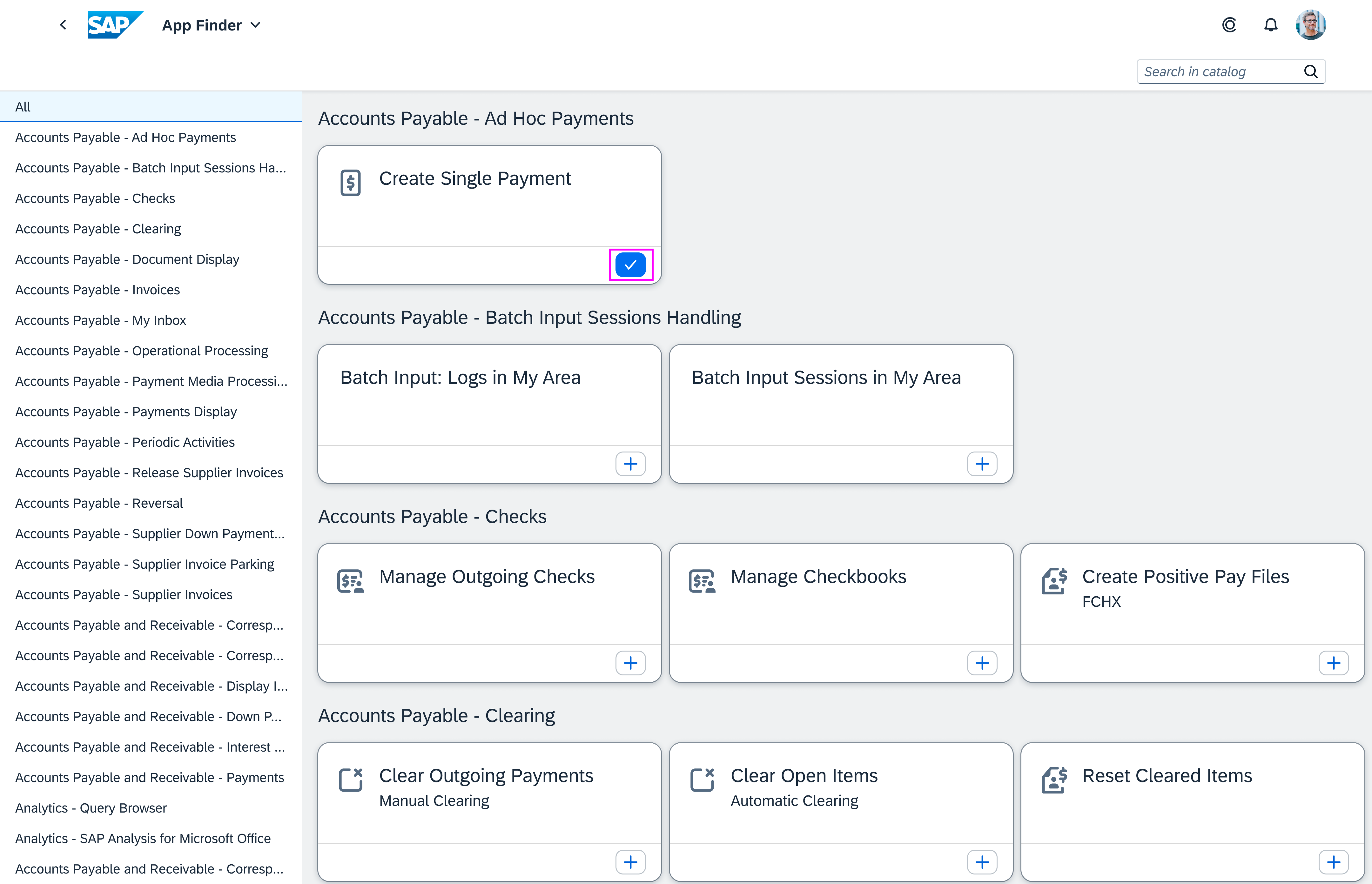
From the My Home page, users can select the Add Apps button to open the app finder, where they can search for apps and add them to the My Home page, with the Add button.
App finder view -- added app

From the Most Used, Recently Used and Recommended tabs, users can open the overflow menu and select the Add to Favorites action.

Personalize Apps - Add to Favorites

Personalizing Favorites

In the Favorites tab, from the overflow menu for an app, users can change the app’s color, move it to an app group, or remove it from My Home.

Personalize Apps - App overflow menu

Creating App Groups

Users can create app groups:

  • From the overflow menu for an app
  • From the menu for the Apps section
  • By dragging and dropping an app onto another

From the app group folder overflow menu, they can:

  • Change the name and color of the folder
  • Remove all apps from the folder
  • Delete the folder

Acting on Recommended Apps

The Recommended tab is active by default at first login. In it, the user sees applications recommended by SAP Business AI based on the user’s business role.

  1. An information message strip at the top of the tab advises users that in the Settings dialog, they can hide the Recommended tab, and it contains a link to the dialog.
  2. In the overflow menu, the user can do one of the following to the recommended app:
    • Add it to Favorites tab. This also removes it from the Recommended tab.
    • Remove it from the Recommended tab, by declining the recommendation with the Not Relevant menu item.
Information
The default app colors correspond to the colors of the page tiles.
Personalize Apps - Recommendations

Personalizing Other Sections

For other sections, such as News, Pages, News, Insights Tiles or Cards, personalization options are available in the:

  • Corresponding section menu, via the My Home Settings item, users can change the settings from within the context of the section.
  • User actions menu, via the My Home Settings item, users can change all settings for the My Home page from one dialog.
'My Home Settings' in section menu
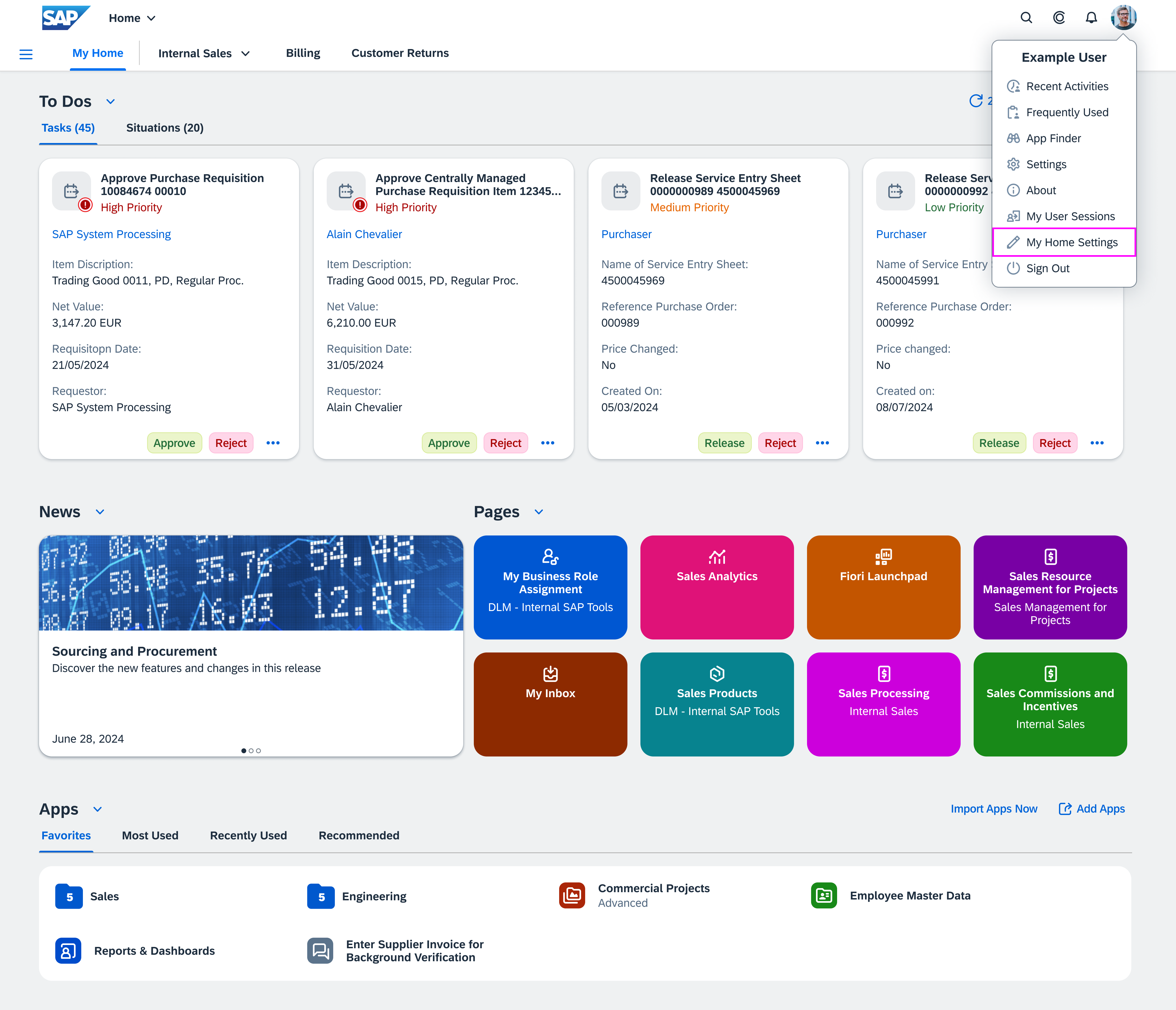

'My Home Settings' in the user actions menu

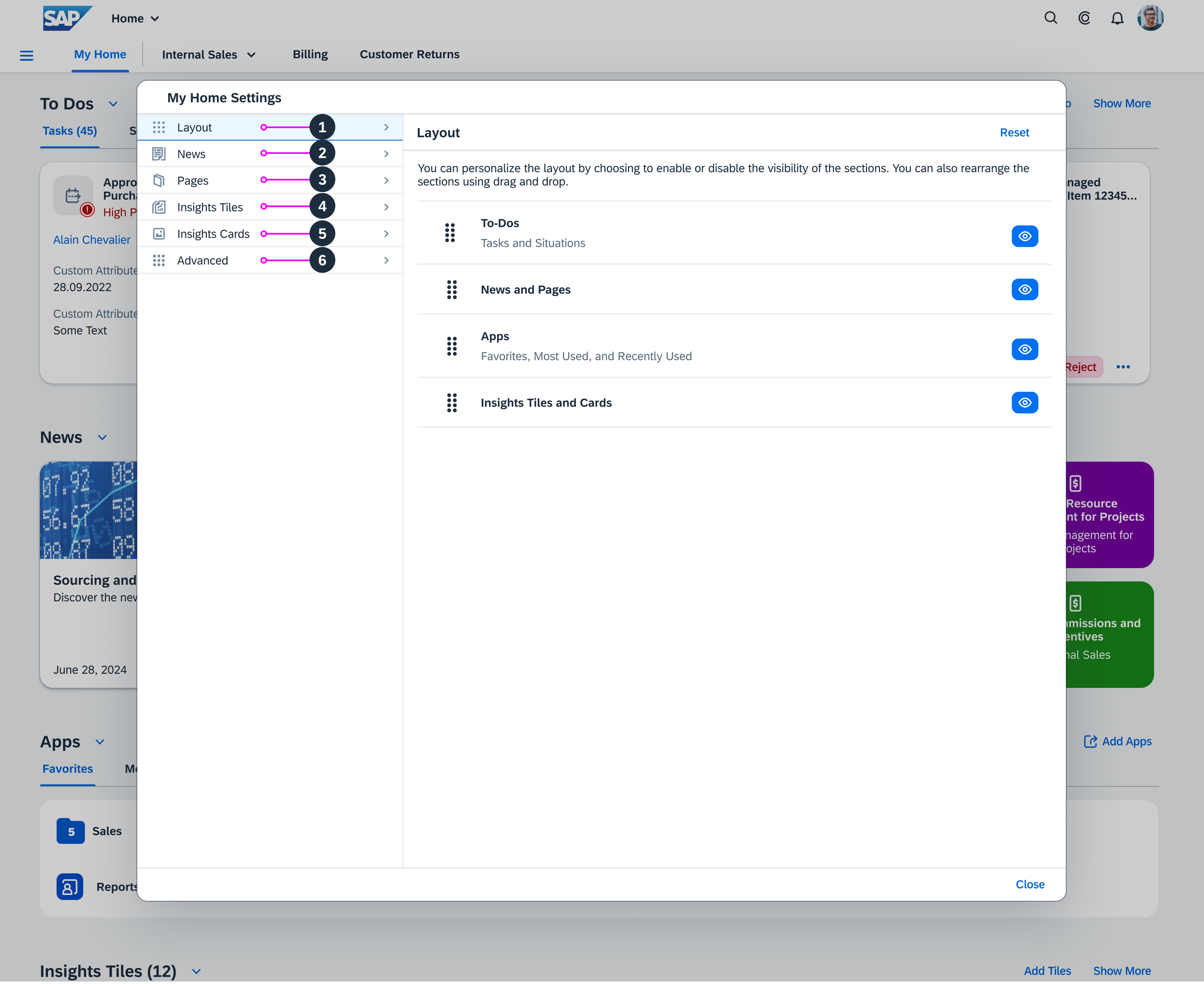
Personalize Layout

Users can:

  1. Enable the visibility of sections on the My Home page
  2. Disable the visibility of sections on the My Home page
  3. Change the order of the sections by dragging and dropping them
  4. Reset the layout to the defaults setting defined by the key user
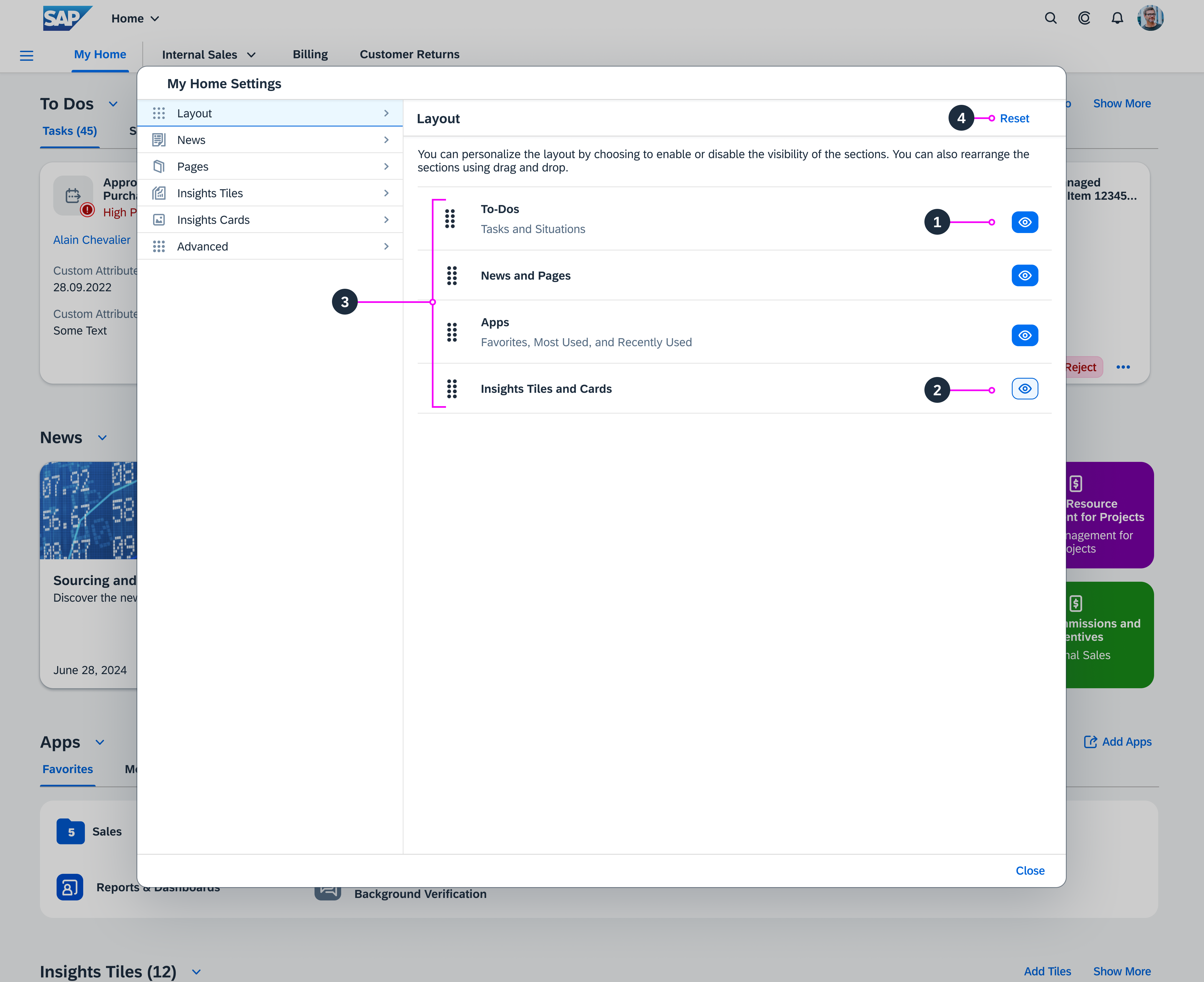
Personalize My Home - Layout

Personalize News

Users can:

  1. Personalize their news feed by choosing one or more lines of business
  2. Display all action items that require preparation in the news feed
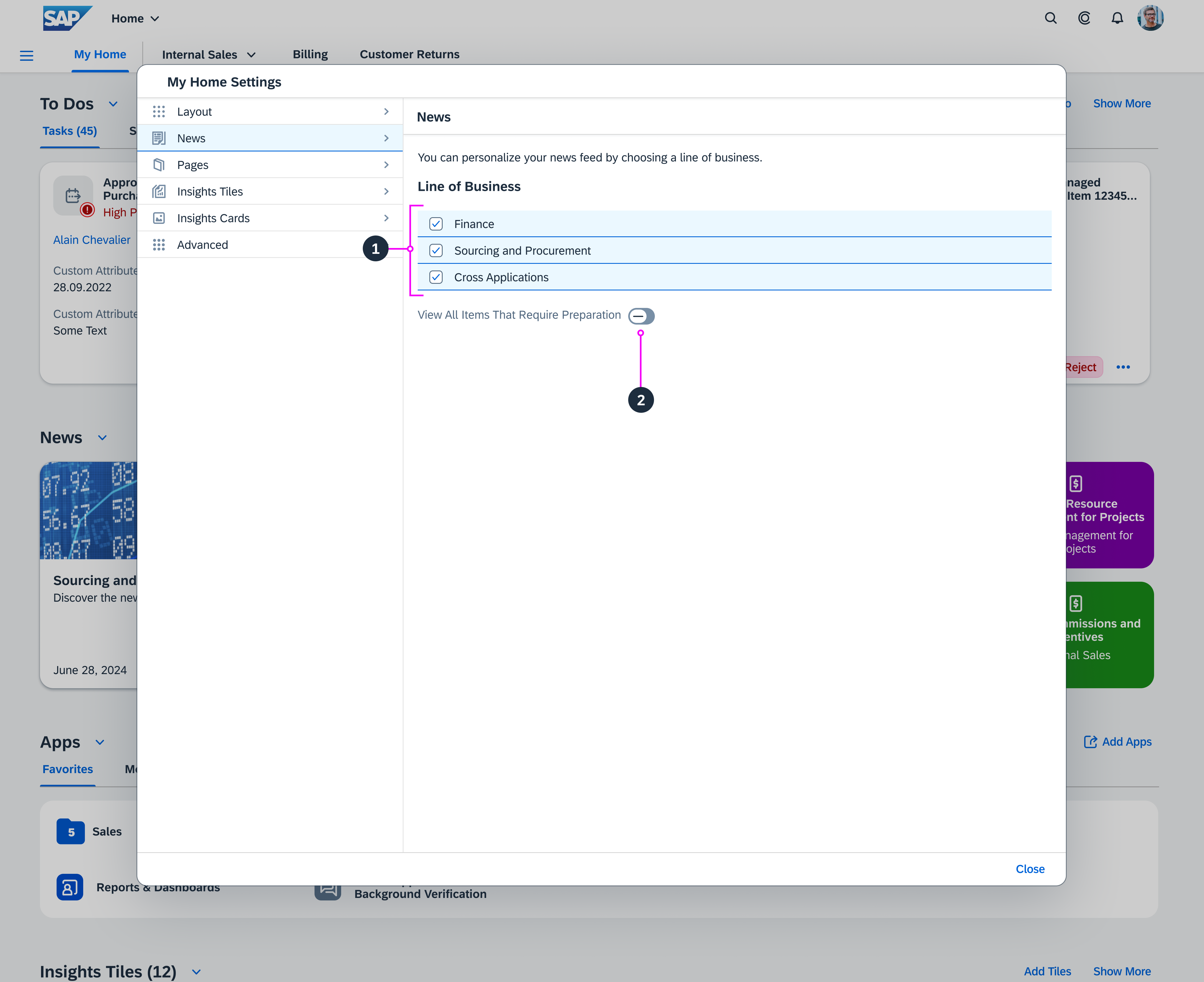
Personalize My Home - News

Personalize Pages

Users can:

  1. Search for specific spaces and pages
  2. Select up to 8 pages to show on My Home
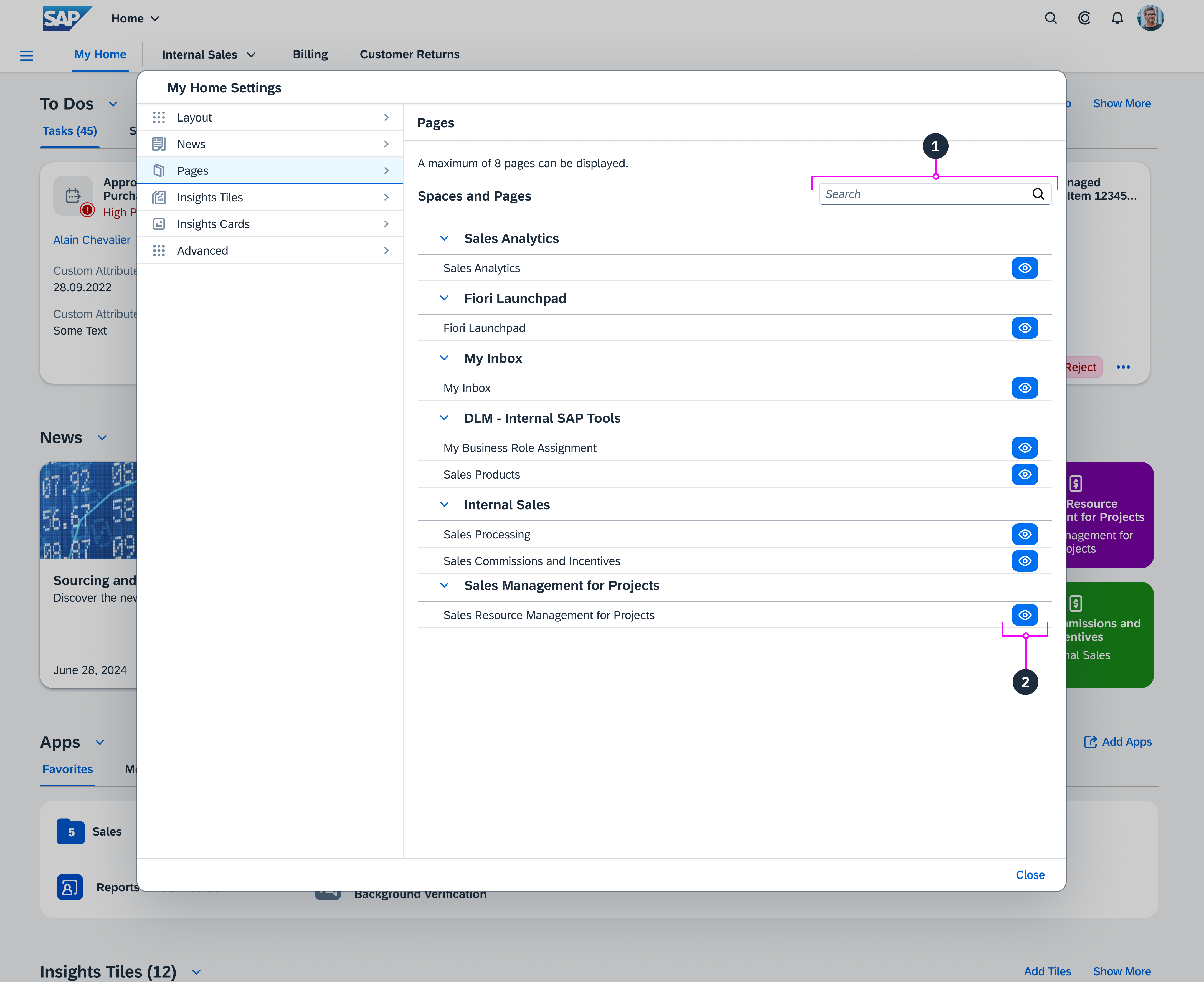
Personalize My Home - Pages

Personalize Insights Tiles

Users can:

  1. Search for specific tiles
  2. Change the order of tiles by dragging and dropping them
  3. Remove tiles
  4. Set the size of smart business tiles: Activating Wide displays larger tiles, deactivating it displays smaller ones.
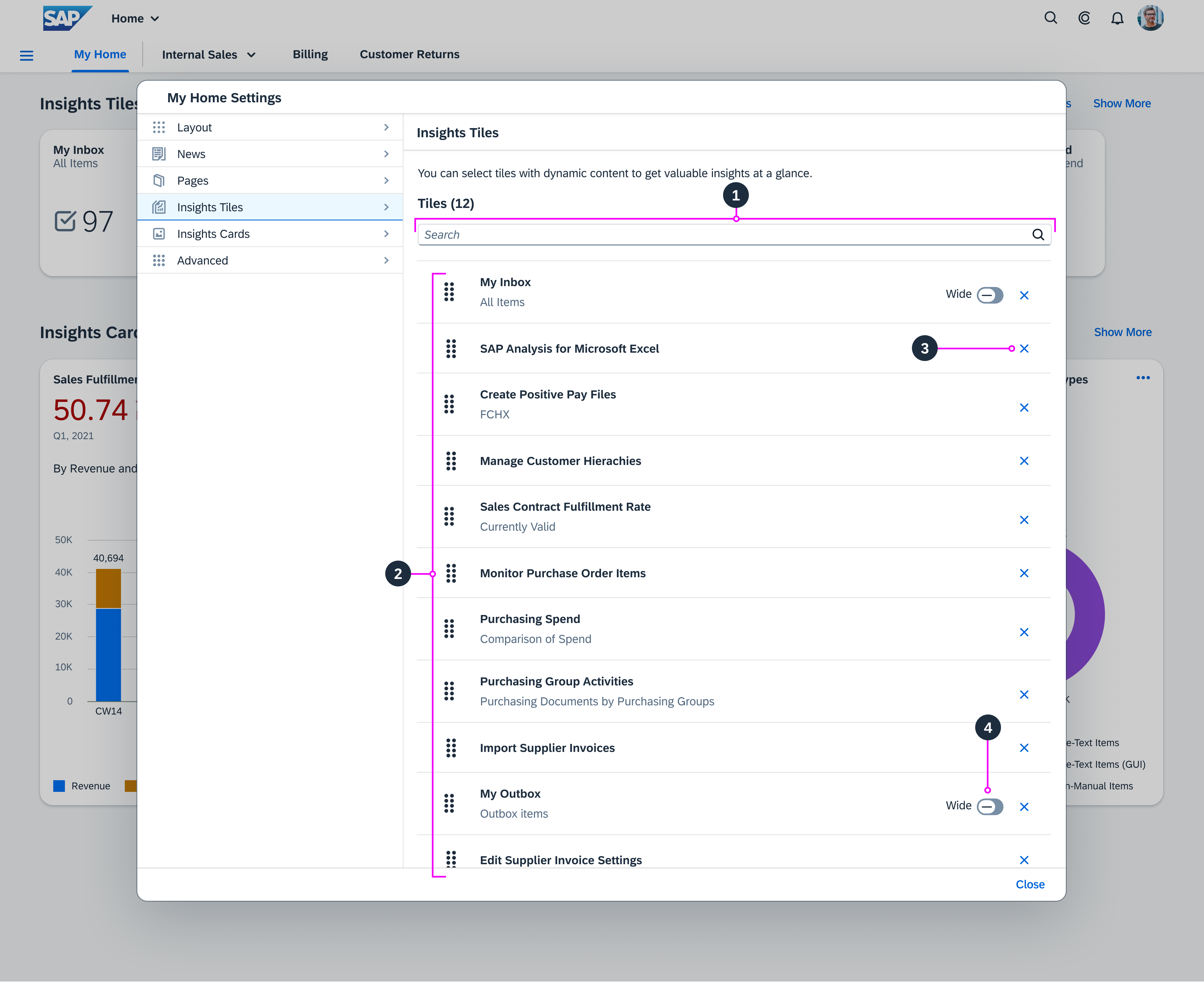
Personalize My Home - Tiles

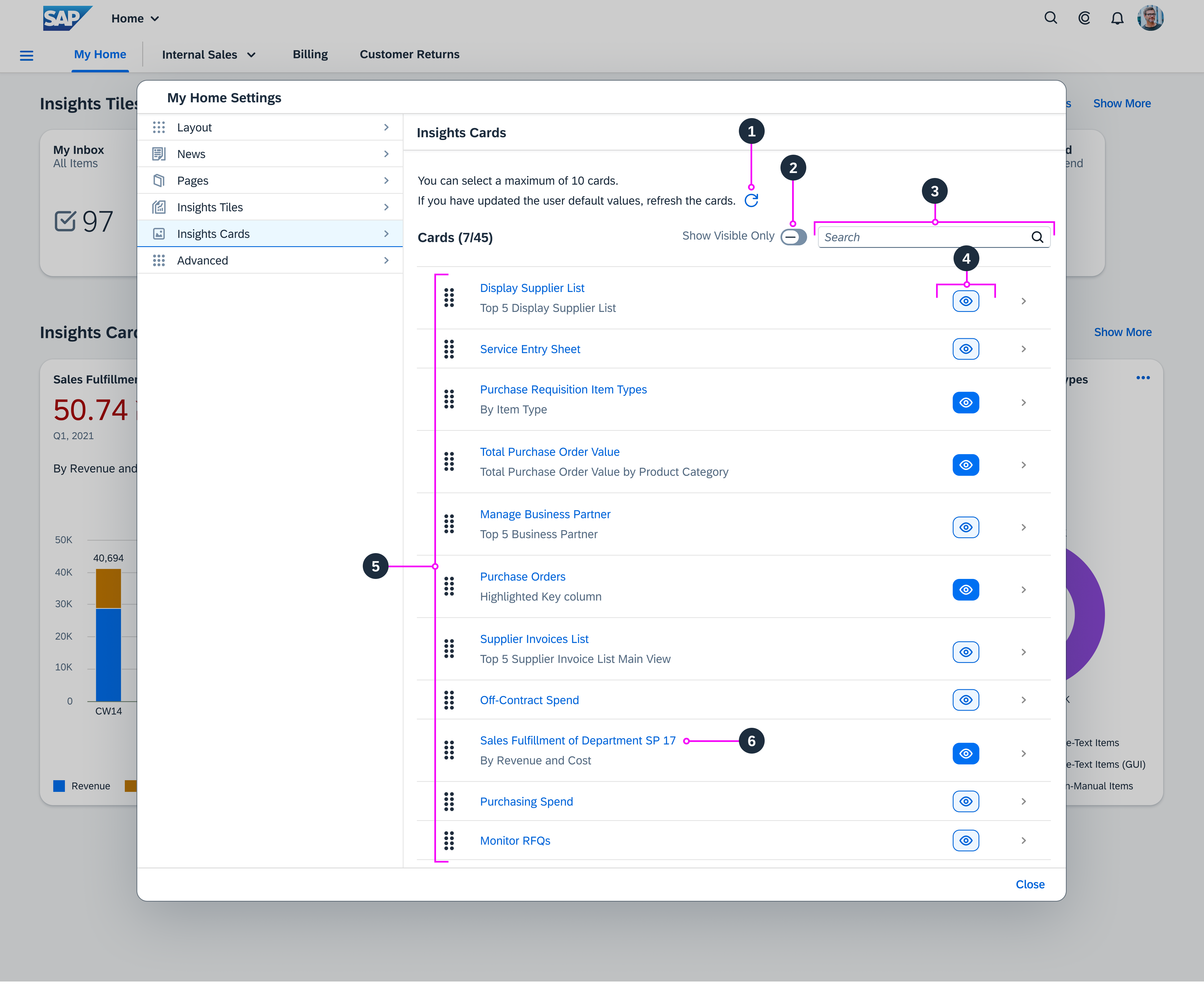
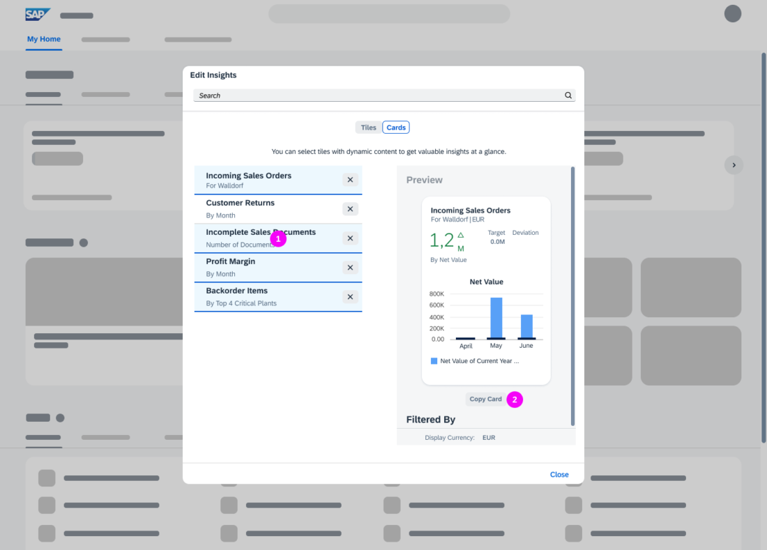
Personalize Insights Cards

Users can:

  1. Refresh cards
  2. Show only visible cards in the Insights Cards section of the My Home Settings dialog
  3. Search for specific cards
  4. Enable the visibility of up to 10 cards on the My Home page
  5. Change the order of cards by dragging and dropping them
  6. Preview cards in a popover
Personalize My Home - Cards

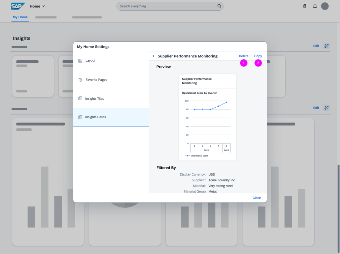
In the Card details view, users can:

  1. Delete the card
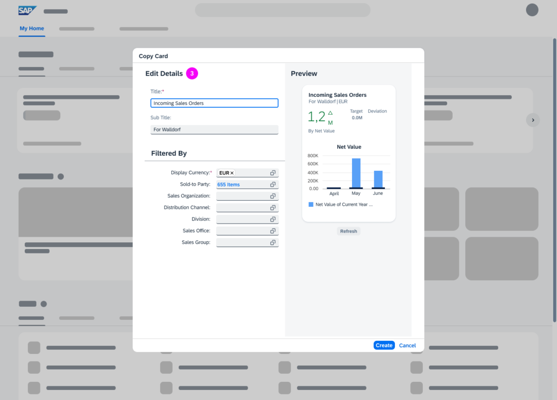
  2. Copy an existing card and customize it to create a new one
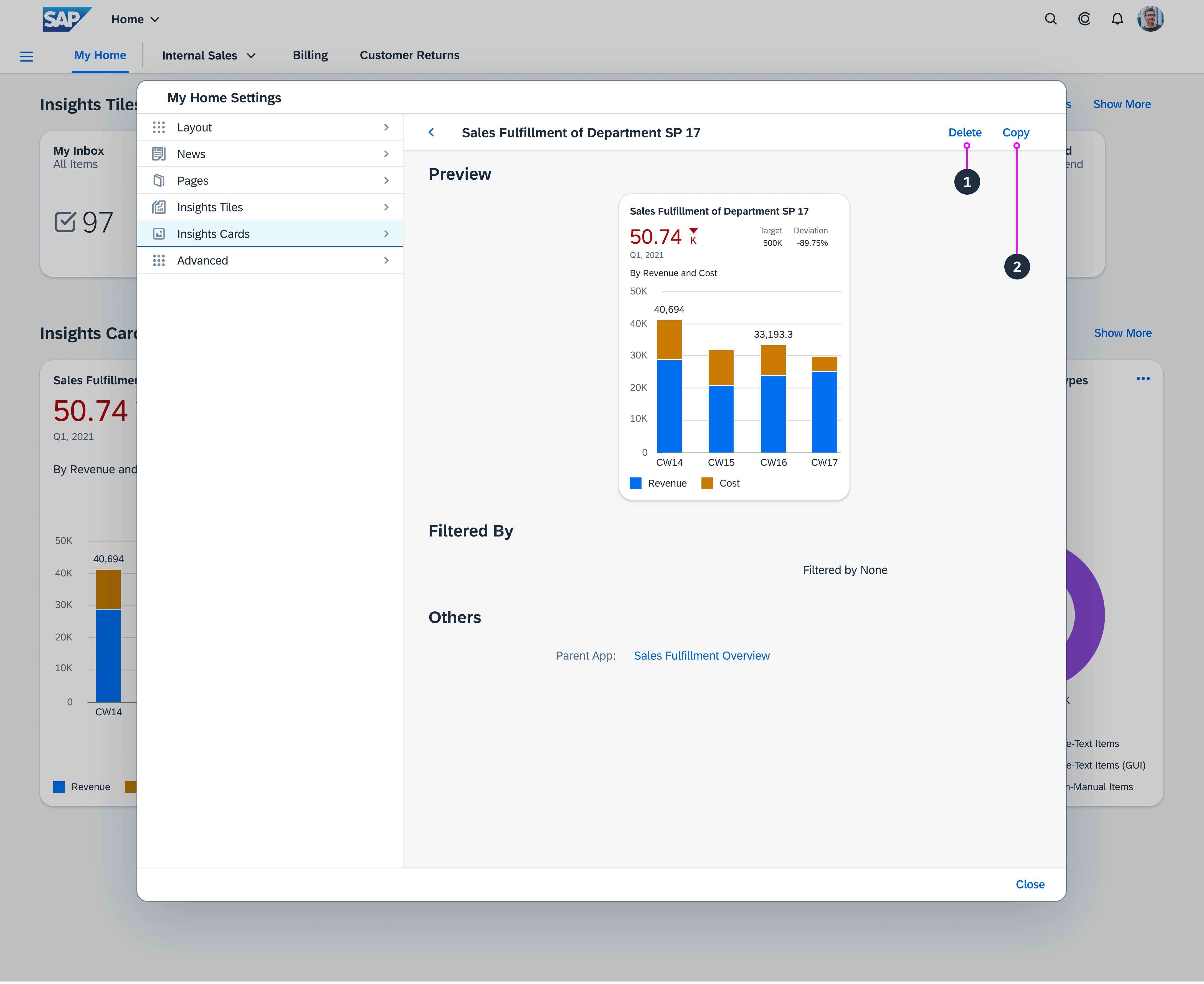
Personalize My Home - Cards (Details view)

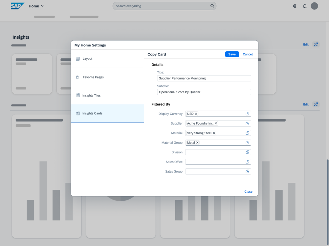
In the copy of a card, users can change the title, subtitle, and modify the filters. Then, to see the impact of the changes, they can refresh the Preview of the card.
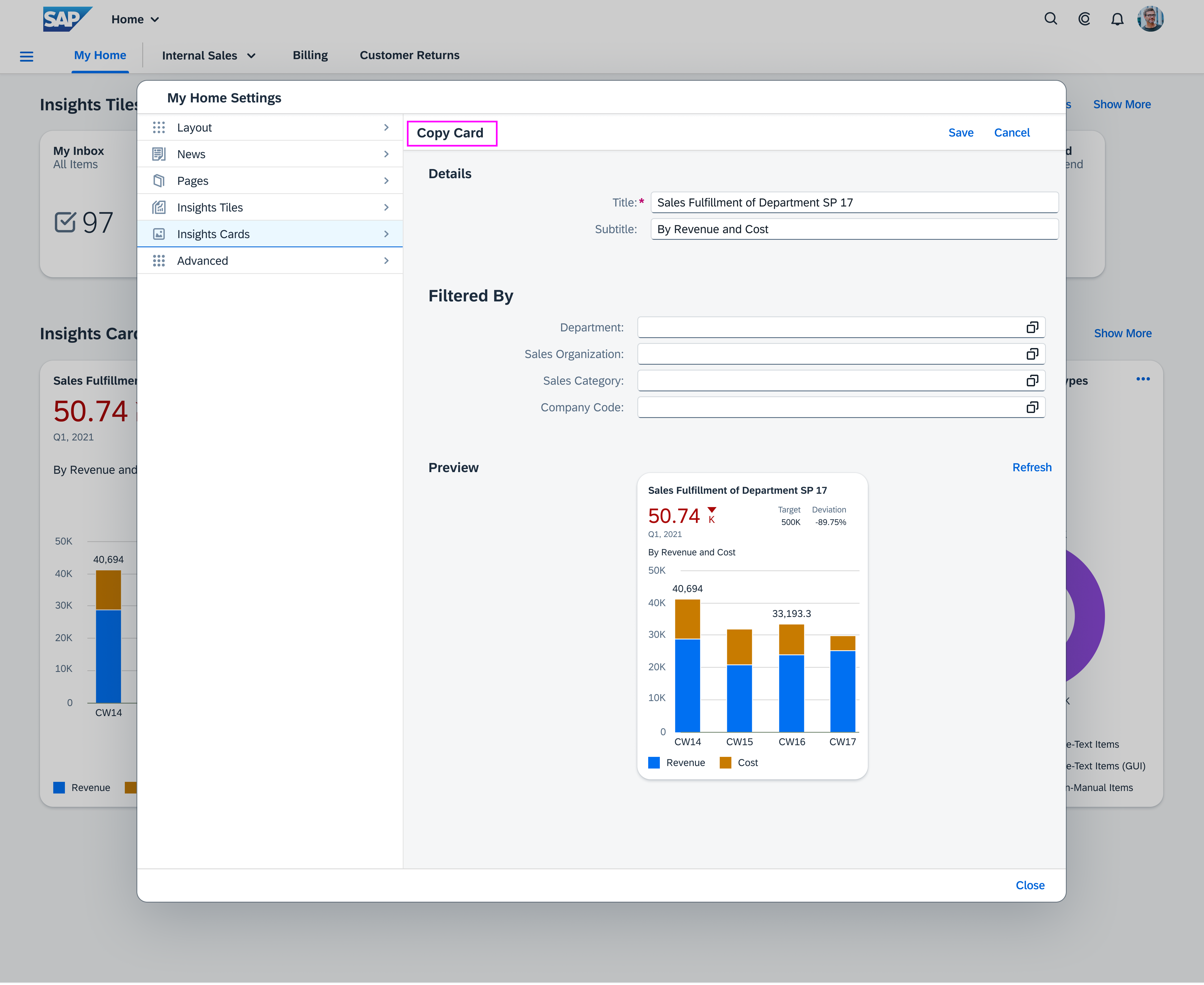
Personalize My Home - Copy Card

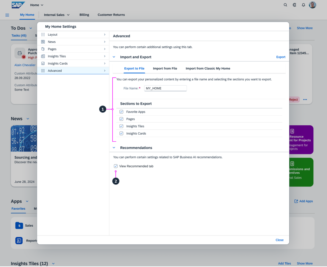
Advanced Settings

Users can:

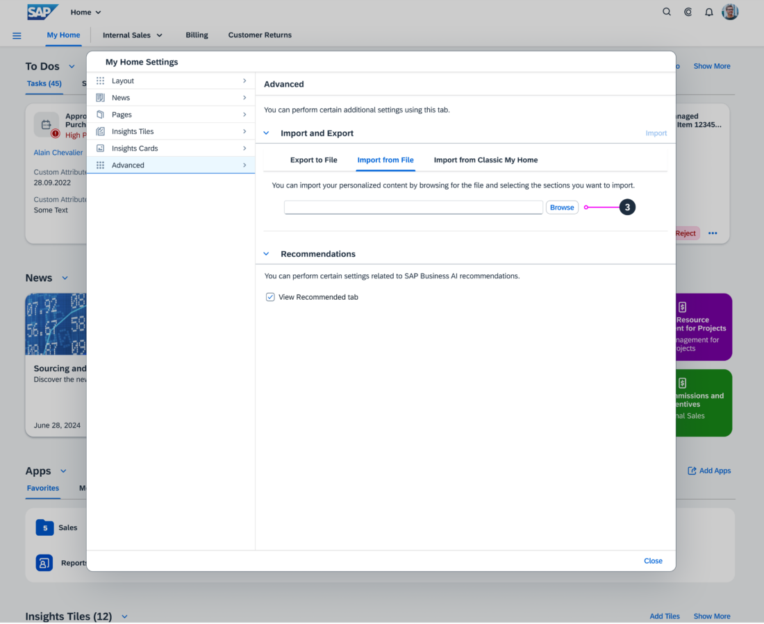
  1. Export sections to a file
  2. Enable or disable the SAP Business AI recommendations that show in the Recommendations tab in Apps section.
  3. Import sections or content from file
  4. Reset all changes to the default setting that the key user defined.

Responsiveness

The SAP S/4HANA My Home page is responsive and can be used on tablets and phones.

Related Links

My Home (Help portal)

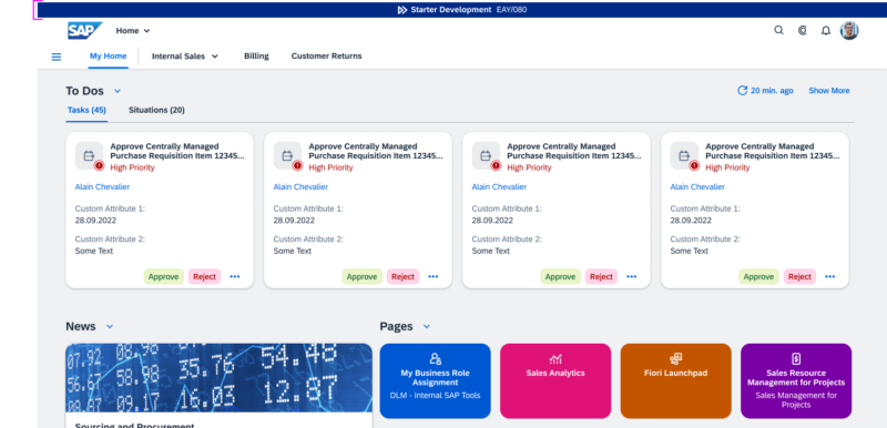
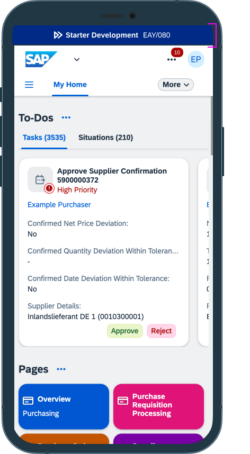
System Information Bar

With SAP S/4HANA Cloud, customers and partners receive a three-system landscape: a development system, a test system, and a production system.

The system information bar in the development and test systems allows users to quickly identify the system they are using. The system information bar is located above the shell bar. By default, the system information bar is turned on in all non-production systems.

The administrators can change the default icons and color of the system information bar, see “Icons and Colors“, in the SAP Fiori launchpad settings. They can also switch off the system information bar.

Components

The system information bar contains the following components:

  1. System type in the form of an icon, such as development system
  2. Tenant type, such as development or customizing tenant
  3. System ID/Client ID

Responsiveness

The system information bar is responsive.

System information bar on desktop
System information bar on phone

Icons and Colors

The following table shows all system types and tenant types with their default icons and colors. The system information bar is supported in all themes.

Systems with their default icon and color

Resources

Want to dive deeper? Follow the links below to find out more about related controls.

SAP S/4HANA Product Home Page – My Home

Intro

The SAP S/4HANA product home page is an alternative to the SAP Fiori My Home page when using SAP S/4HANA Cloud. Whereas the previously available SAP Fiori My Home page is the entry point to a personalized set of apps, presented as tiles or links, the SAP S/4HANA product home page orchestrates much more information.

Besides being the entry point to apps, the new product home page offers:

  • Access to tasks and situations
  • Quick navigation to pages
  • Analytical insights 

In addition, users benefit from enhanced personalization features for content and layout.

Information
Be aware that the SAP S/4HANA product home page is also labeled My Home on the interface but should not be confused with the previous SAP Fiori My Home.

The SAP S/4HANA My Home page is based on launchpad spaces and runs best with the Horizon theme, although it also supports other SAP and custom themes. The page must be activated by a key user.

SAP S/4HANA product page 'My Home'

Components

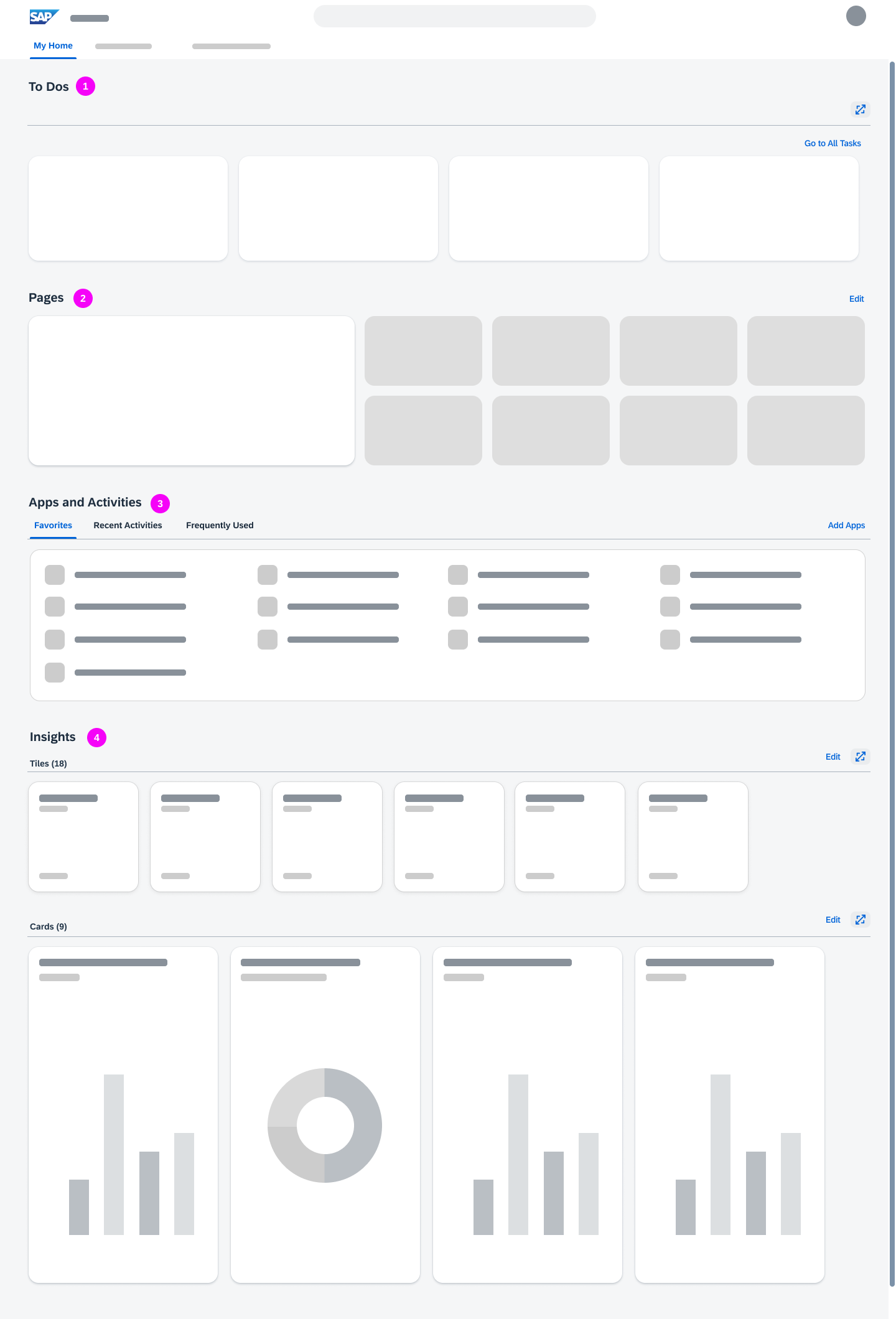
The SAP S/4HANA My Home page is the leftmost option in the top-level shell bar navigation and provides the following sections:

My Home - Sections
My Home - Sections

  1. To Dos
    Contains tasks and situations.
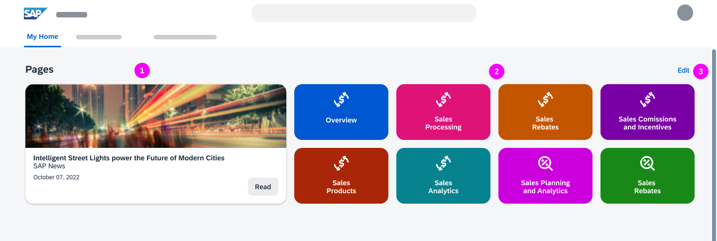
  2. Pages
    Shows a news feed and a maximum of 8 pages.
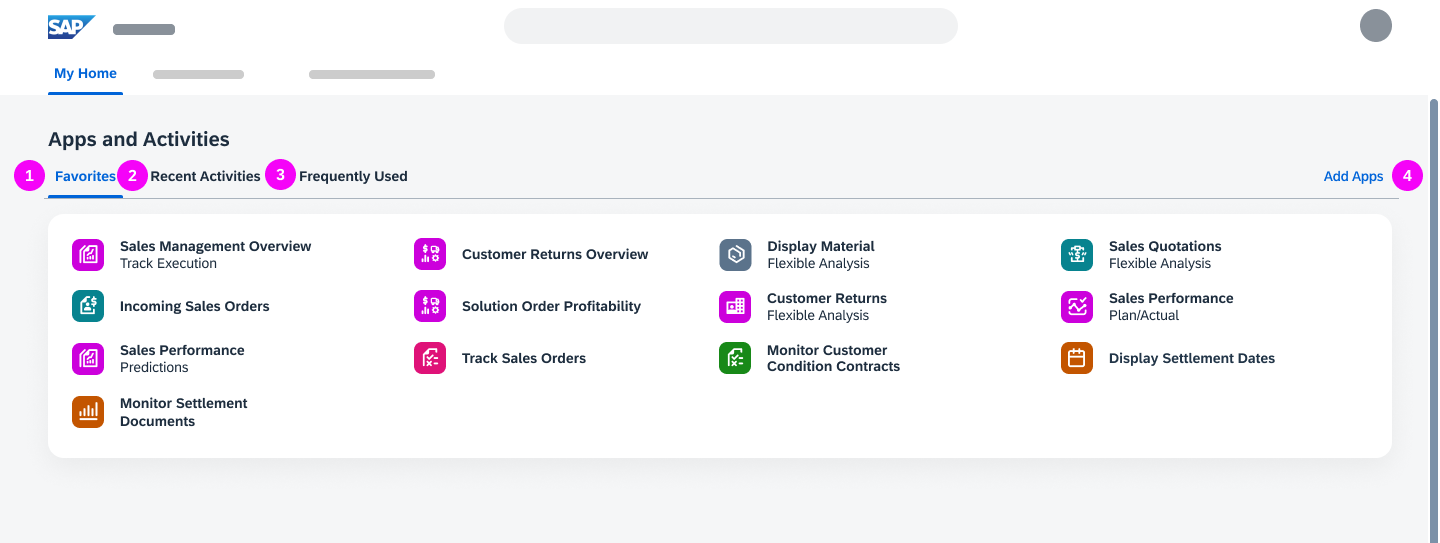
  3. Apps and Activities
    Shows the user’s favorite apps, recent activities, and frequently used apps.
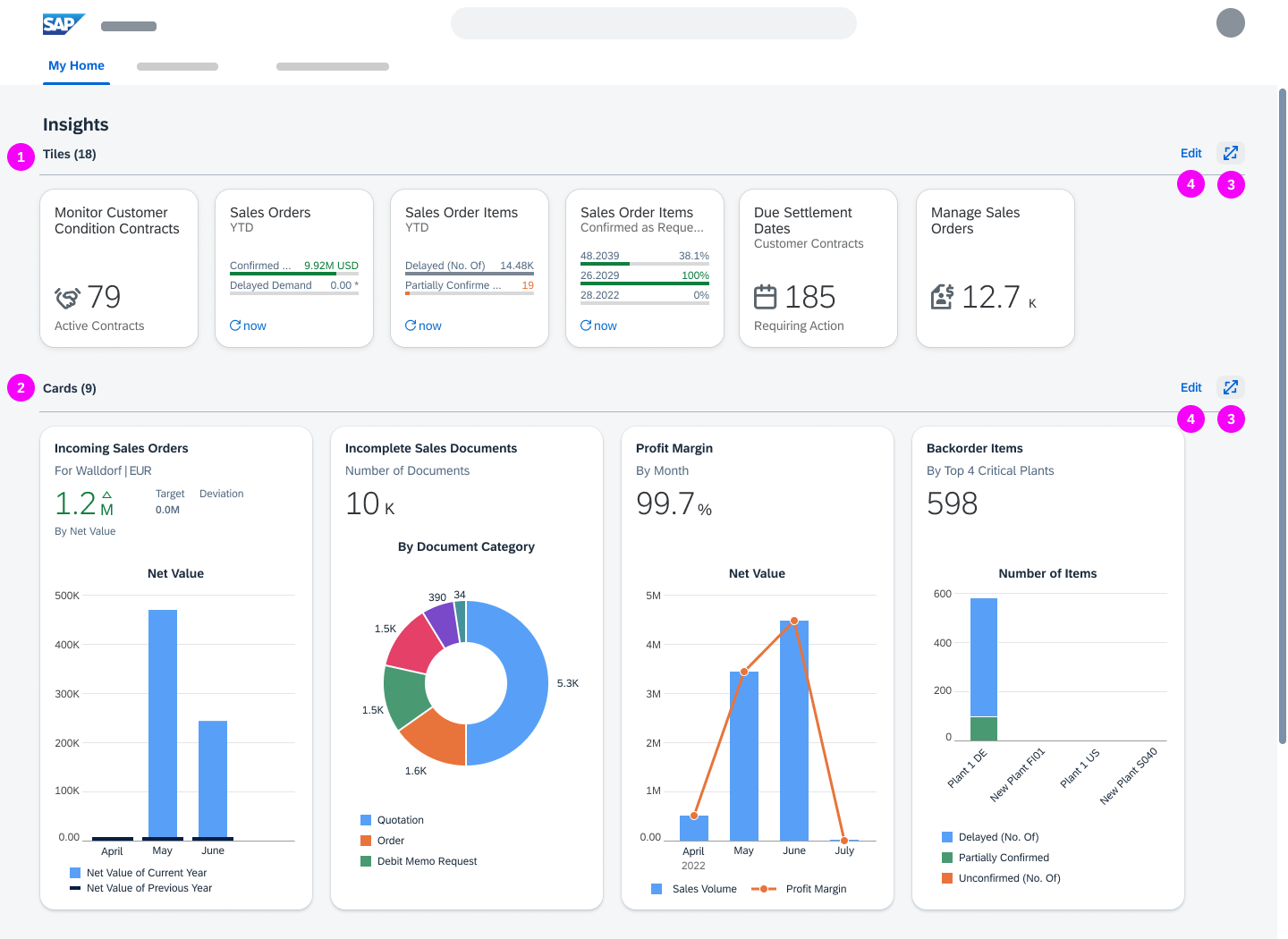
  4. Insights
    Shows tiles with analytical information, cards from overview pages, and cards from list report-based apps.

Users can define which sections are shown on My Home and how the sections are ordered. See My Home Settings.

To Dos

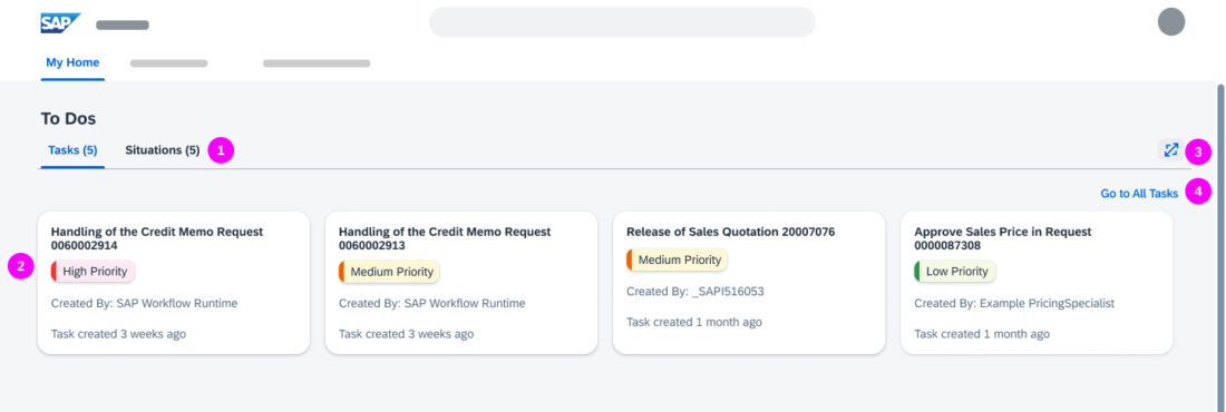
The To Dos section shows workflow tasks from the My Inbox app and situations from the My Situations app. Each tab includes a counter indicating how many tasks and situations are open (1). Tasks and situations are presented on cards. The cards are displayed on one row, sorted by priority (2).

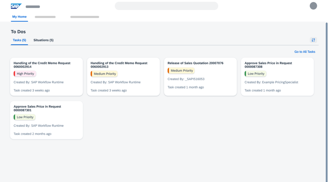
The number of cards shown depends on the user’s screen resolution. If not all tasks and situations can be displayed, the expand function shows up (3). In the expanded mode, all other sections are hidden. The number of tasks and situations also depends on the screen resolution.

To see all tasks or all situations, users can navigate to the My Inbox or My Situations app (4).

Information
If the My Inbox and My Situations apps are not assigned to the user, the To Dos section is not available. If only one of the apps is assigned, the corresponding tab is shown.

Pages

My Home - 'Pages'
My Home - 'Pages'

The Pages section shows a news feed (1) and a maximum of 8 favorite pages (2). Users can add and remove pages (3). See Personalize Pages.

Information
The news feed is only available if activated by a key user. Key users can also assign custom colors and icons to the pages.

Apps and Activities

My Home – 'Apps and Activities'

The Apps and Activities section shows the user’s favorite apps (1), recent activities (2), and frequently used apps (3).

Users can add apps to their favorites using the app finder (4). They can also change the color of the icon and delete apps from their favorites. See Personalize  Apps.

Information
Recent activities and frequently used apps are only shown if the user allows app tracking in the Settings dialog. Recent Activities shows up to 30 activities, with the most recent first. Frequently Used shows the apps used during the last 30 days, with those used most showing first.

Insights

My Home - 'Insights'

The Insights section has two subsections with:

  • Tiles containing analytical information, such as charts or KPIs (1).
  • A maximum of 10 cards from overview pages and list report-based applications (2).

Each subsection contains a counter indicating the number of tiles and cards available. Tiles and cards are each displayed in one row. The number of tiles or cards displayed depends on the screen resolution.

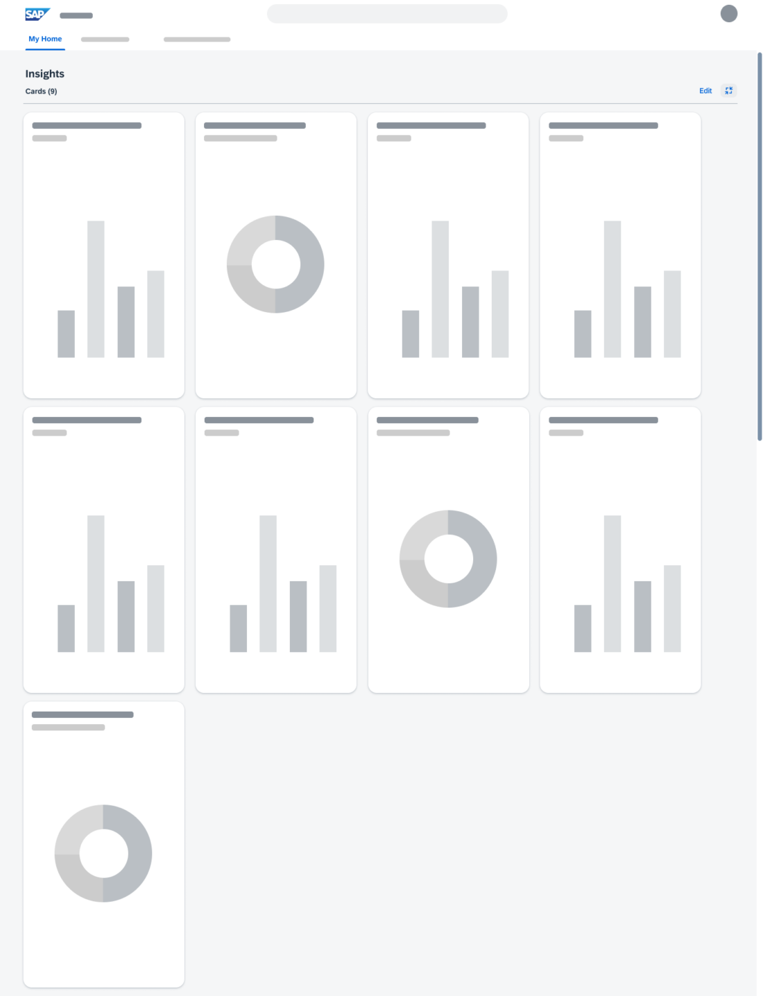
If not all tiles or cards can be displayed, the expand function shows up (3). In the expanded mode, all sections besides the expanded one are hidden. If needed, scrolling is possible.

Users can add and remove tiles and cards and change their order (4). See Personalize Insights.


My Home - Cards expanded

Behavior and Interaction

Users can personalize the SAP S/4HANA My Home according to their needs.

Favorite apps and their colors can only be personalized from the Apps and Activities section on My Home. See Personalize Apps.

All other personalization options are available in the respective My Home sections or via My Home Settings in the user actions menu:

User Actions Menu
User Actions Menu

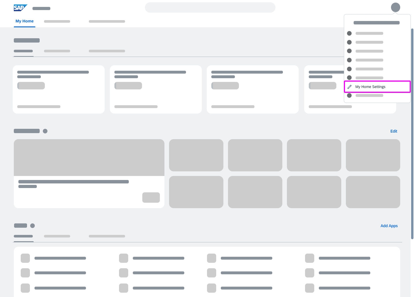
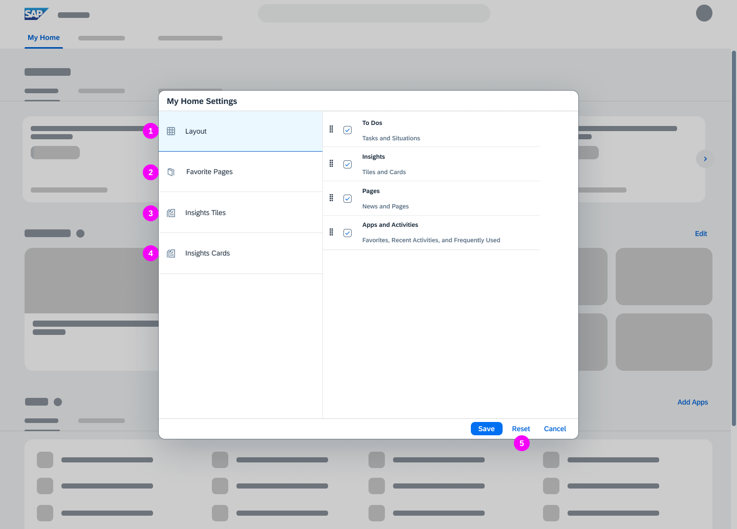
My Home Settings

My Home - Settings Dialog

In the My Home Settings, users can

  1. Personalize the layout.
    They can define which sections to show on My Home and change the order by drag and drop.
  2. Personalize pages
  3. Personalize insights for tiles
  4. Personalize insights for cards
  5. Reset all changes to the default setting that has been defined by the key user

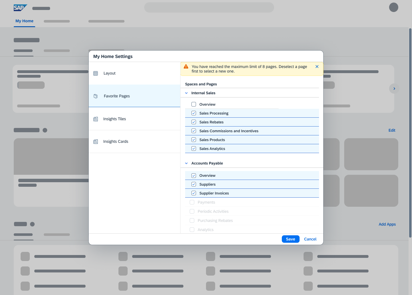
Personalize Pages

Personalize My Home - Pages

Users can select up to 8 pages to show on My Home.


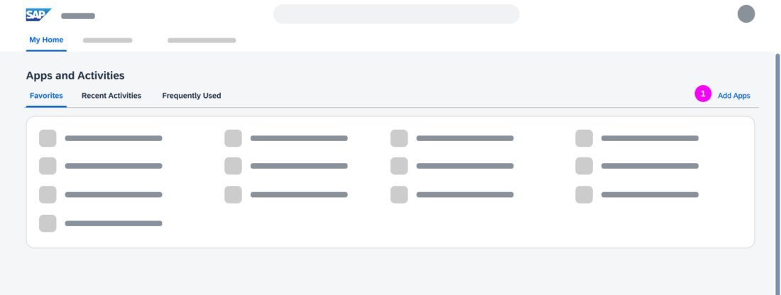
Personalize Apps

Users can add apps to their favorites, apply colors to their favorite apps, and remove apps from their favorites.

  1. In the Favorites subsection, the user selects Add Apps.
    The app finder opens.
  2. The user can browse and search for apps and add them to My Home.

Applying Colors and Removing Favorite Apps

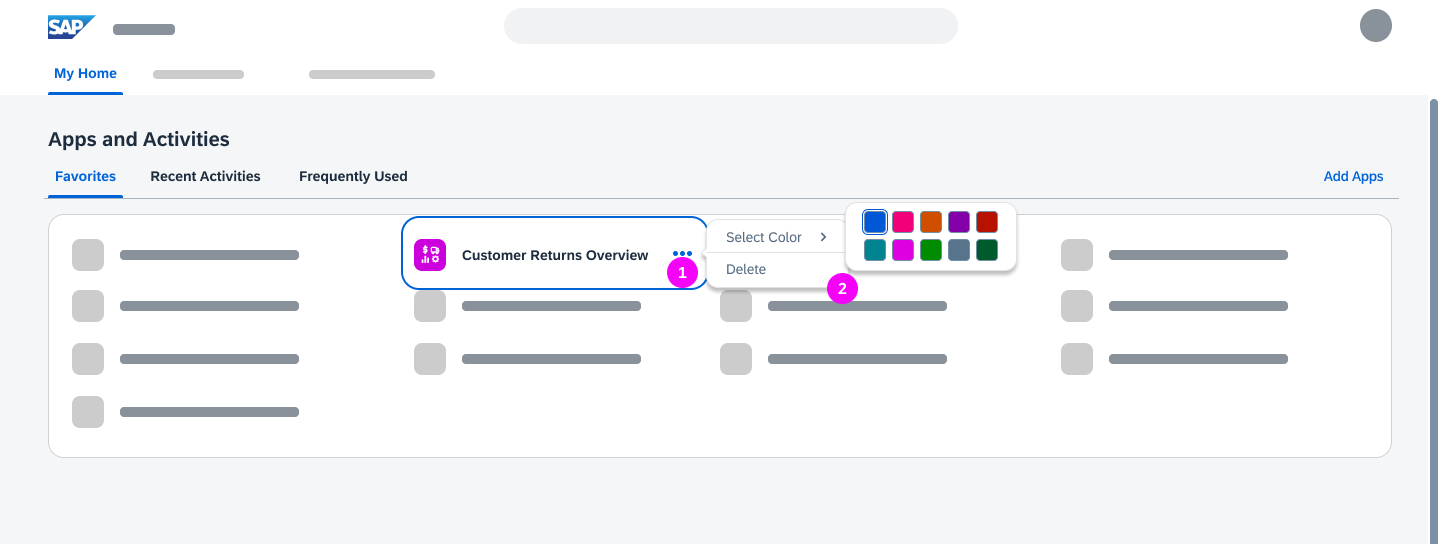
Personalize My Home – Changing app colors and deleting apps
  1. When the user selects an app, three dots appear.
  2. Clicking the dots opens a context menu that allows the user to change the color of the app icon or delete the app from the favorites.
Information
The default app colors correspond to the page colors.

Personalize Insights

Users can:

  • Add analytical tiles from their favorites or the app finder
  • Add cards from overview pages and list report-based applications
  • Copy a card and change the name and filters in the copy
  • Remove tiles and cards

Personalize Tiles

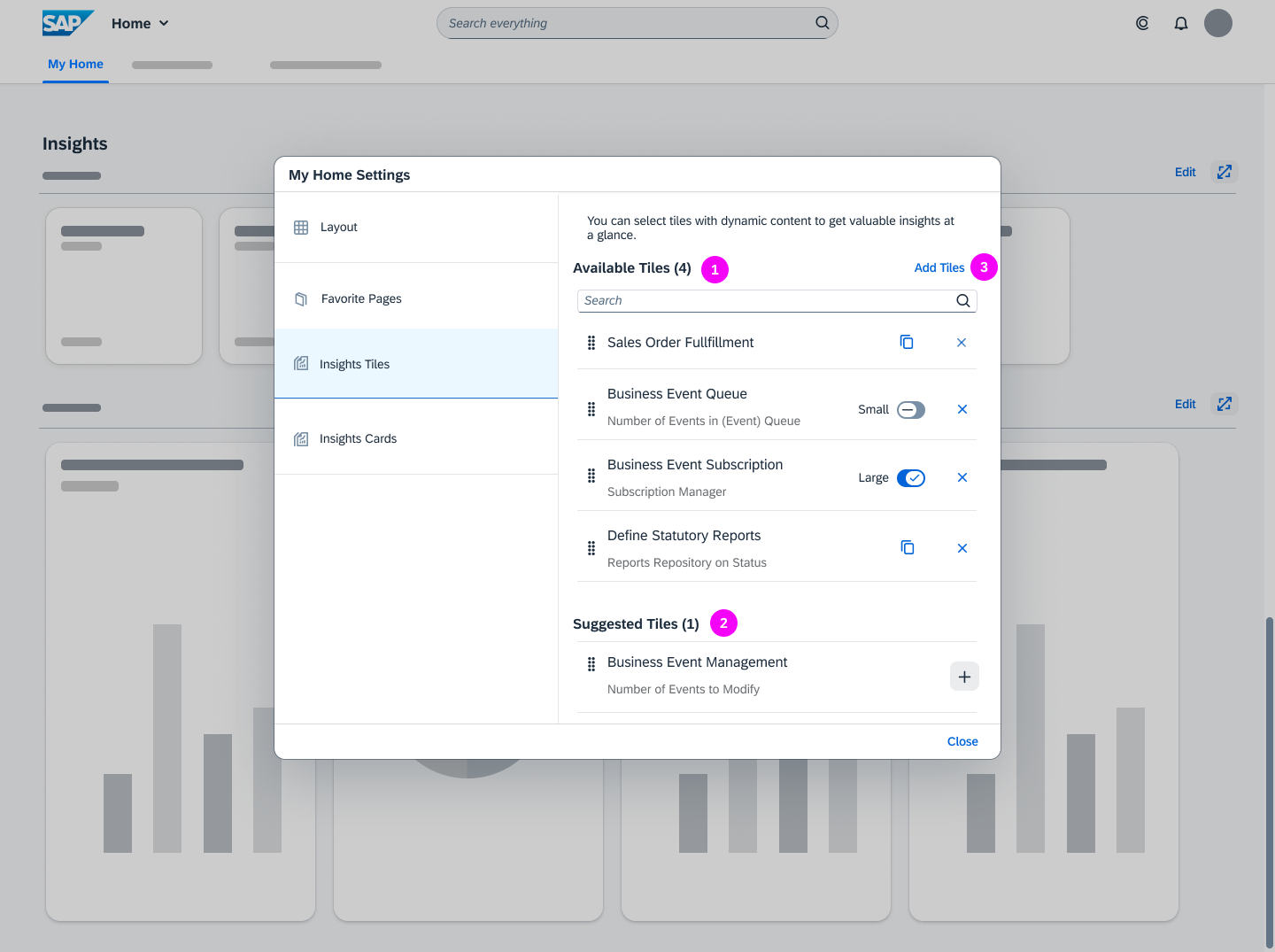
Personalize My Home – Tiles

All tiles listed in Available Tiles (1) are shown on My Home.

Users can add analytical tiles:

  • From the list of Suggested Tiles (2). All Favorites that can be represented as analytical tiles are displayed here.
  • From the app finder (3).

In the Available Tiles list users can:

  • Change the order of the tiles by dragging and dropping the items
  • Remove tiles
  • For analytical tiles: switch the size of the tiles between small and large
  • For the other tiles: create a duplicate that is shown in the Favorites subsection

All tiles listed in Available Tiles (1) are shown on My Home.

Users can add analytical tiles:

  • From the list of Suggested Tiles (2). All Favorites that can be represented as analytical tiles are displayed here.
  • From the app finder (3).

In the Available Tiles list users can:

  • Change the order of the tiles by dragging and dropping the items
  • Remove tiles
  • For smart business tiles, switch the size of the tiles between small and large.
  • For the other tiles, create a duplicate that is shown in the Favorites subsection.

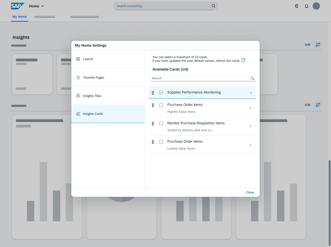
Personalize Cards

Users can select up to 10 cards to be shown on My Home. They can drag and drop the entries to change the order of the cards.

In the details view, users can delete a card (1) and customize a card by copying an existing card (2). In the copy, they can change the title and modify the filters.

Responsiveness

The SAP S/4HANA My Home page is responsive and can be used on tablets and phones.

Related Links

Integration of Classic SAP UIs (SAP Fiori Elements List Report)

This article describes how to navigate to create, display, and edit screens from a list report when you need to integrate classic UIs for some or all of these actions.

SAP Fiori apps vs. Classic UIs

In addition to SAP Fiori, SAP S/4HANA uses other UI technologies, such as SAP Web GUI and WebDynpro, which were available prior to SAP Fiori. We refer to these technologies as classic UIs.

In many cases, an SAP Fiori app and a classic UI are available. They are often used in parallel to create, edit, or display objects. The SAP Fiori app can differ from the classic UI in two ways:

  • The SAP Fiori app covers parts of the broader scope of the classic UI. This can be due to strategic decisions to exclude edge cases or because the full scope isn’t yet covered.
  • The SAP Fiori app offers additional functions not available in the classic UI.

Navigation to Classic UIs

Classic UIs for create, edit, and display actions were not part of the standard SAP Fiori navigation flow from the SAP Fiori elements list report. This means that each classic UI needed a tile on the launchpad.

Now, the list report supports direct navigation to the classic UIs, thus supporting the standard navigation from a list report to business objects. Tiles on the launchpad are not necessarily needed. See the example.

Technical Background

Classic UIs for displaying and editing objects start with a selection screen that requires the ID of the object. After entering the ID, the user navigates to the display or edit screens.

The SAP Fiori elements list report skips the entry screen and navigates directly to the classic UI. Changes carried out in the classic edit UI are reflected in the list report. Objects created using the classic create UI are also reflected in the list report.

When to Use

Use the list report as the entry point for:

  • Searching, filtering, and navigating to objects in classic UIs to edit and display them
  • Creating objects using a classic UI

Components

In the list report, you can offer navigation to classic UIs via the table toolbar or within a line item. If users need to access both the SAP Fiori and classic UIs for the same task, you can offer both side by side. This section outlines which UI elements to use.

Guidelines
If your SAP Fiori apps and the corresponding classic UIs cover the same features, just offer navigation to the SAP Fiori apps.
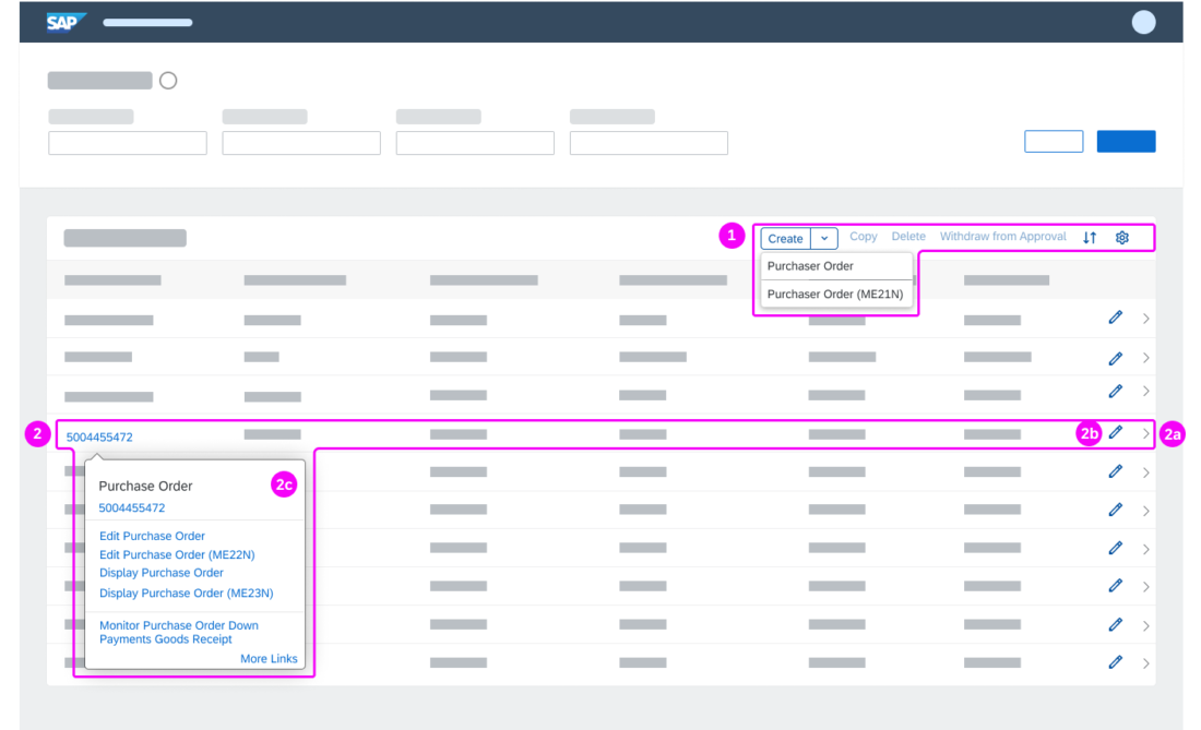
List report – UI elements

  1. Table toolbar
    For the create action, you can choose either a simple or a split menu button:

    1. Simple button
      Use it if you want to offer direct access to the create app.
    2. Split menu button
      Use it if both an SAP Fiori app and a classic UI are available for the create action.
  2. Line item
    For display and edit, you have the following options:

    1. Navigation
      Use it to navigate directly to the object in display mode.
    2. Edit
      Use it to navigate directly to the object in edit mode.
    3. Smart link
      Use it to show all edit and display navigation options.

Warning
Currently, you can show either the edit icon  or the navigation icon  per line item. The default is the navigation icon .
Showing both the edit and navigation icons is not yet possible.
Guidelines
Table toolbar:

Offer a button (simple button or split menu) only for creating an object. For editing and displaying an object, use the line item UI elements. In a split menu button, show the SAP Fiori app first. Keep in mind that the menu button always shows the last action selected by the user.

Line item:

  • Since you can only choose either the edit icon  or the navigation icon , show the one most relevant for your use case.
  • Offer all navigation options in the smart link.
  • In the smart link, structure the entries in a meaningful way and show the most important first. If an SAP Fiori app and a classic UI are available for the same task, show the SAP Fiori app first, followed by the classic UI.

Naming:

  • Whenever you need to offer both the SAP Fiori app and the classic UI in a UI element, add the transaction code for the classic UI in parentheses: <action (transaction code)>.
    Otherwise, apply the guidance for Word Choice.
  • In a split menu button, show Create on the button and the object type (such as Purchase Order) only in the menu list.

Navigation Flows

The navigation flows depend on the mix of SAP Fiori apps and classic UIs that you need to open from your list report. This section outlines the typical navigation flows for three use cases:

  • Classic UIs only
    Classic UIs are used for all actions (create, display, edit)
  • Mainly SAP Fiori apps (~80% SAP Fiori apps)
    For most create, edit, and display tasks, SAP Fiori apps are available and cover the most essential features. The corresponding classic UIs offer features not yet implemented in the SAP Fiori app. For a few tasks, only classic UIs are available.
  • Mainly classic UIs (~20% SAP Fiori apps)
    For create, edit, and display tasks, classic UIs are available. SAP Fiori apps are either not available or do not offer all features of the corresponding classic UI.

Classic UIs Only

Use the list report as the entry point for navigating to the classic UIs.

Create, Edit, Delete – Classic UIs Only

Create, display, edit – navigation to classic UIs only

In the list report, the user chooses:

  1. Create button
    The classic create UI opens. On the create page, the main navigation options are:

    • Finalizing action Create: Saves the object and goes back to the list report.
    • Exit action: Exits the create UI and navigates to the list report.
    • Cancel action: Discards any entries and goes back to the list report.
  2. Navigation  
    The classic display UI opens. On the display page, the main navigation options are:

    • Shell bar back icon  : Goes back to previous page (list report).
    • Edit action: Switches to the classic edit UI.
  3. Edit
    The classic edit UI opens. On the edit page, the main navigation options are:

    • Finalizing action Save: Saves the object and goes back to the list report.
    • Shell bar back icon  : Goes back to previous page (list report).
    • Exit action: Exits the edit UI and navigates to the list report
    • Display action: Switches to classic display UI.
    • Cancel action: Discards any entries and goes back to the list report.

Mainly SAP Fiori Apps

This section outlines the flows for the following scenario:


Create – SAP Fiori app and Classic UI

Create – navigation to SAP Fiori app or classic UI via split menu button

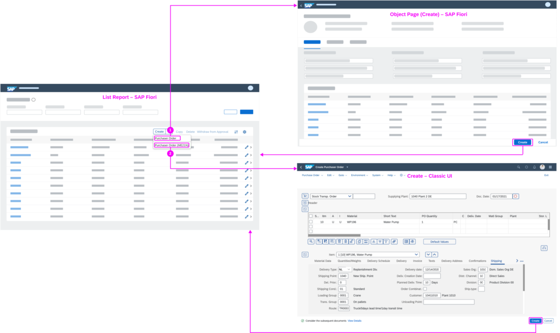
In the list report, the user chooses from the split menu button Create:

  1. Purchase Order
    The SAP Fiori create app opens. The main navigation options are:

    • Finalizing action Create: Saves the object and goes back to the list report.
    • Shell bar back icon  : Goes back to previous page (list report).
    • Cancel action: Discards any entries and goes back to the list report.
  2. Purchase Order (ME21N)
    The classic create UI opens. The main navigation options are:

    • Finalizing action (Create in the example): Saves the object and goes back to the list report.
    • Exit action: Exits the create app and navigates to the list report.
    • Cancel action: Discards any entries and goes back to the list report.


Display, Edit – SAP Fiori App (Default) and Classic UIs

Display, edit – navigation to SAP Fiori app or classic UIs

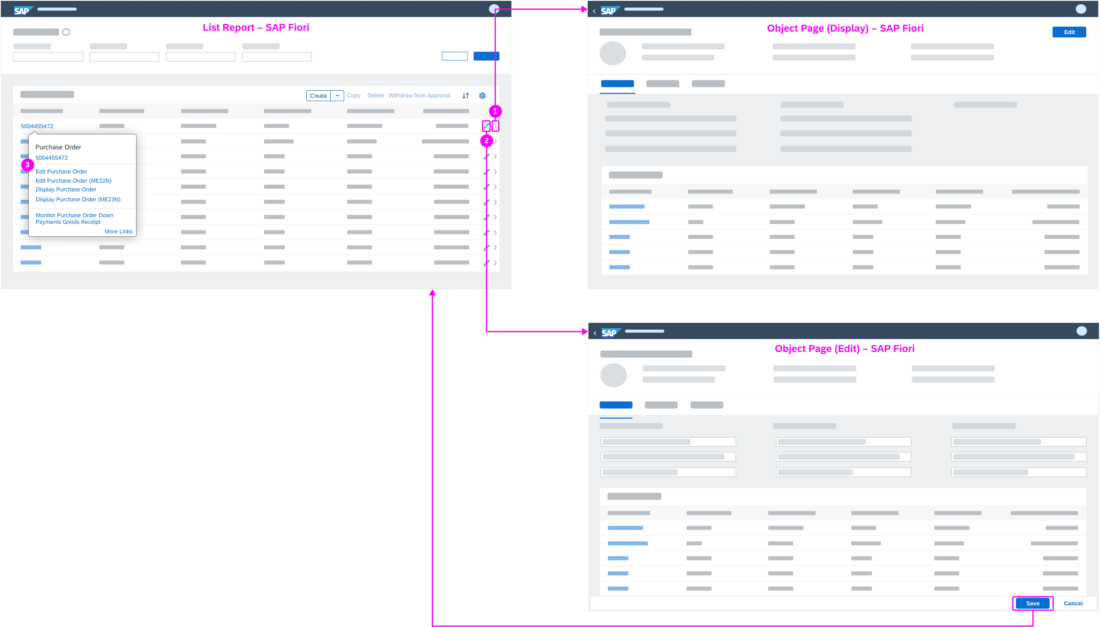
In the list report, the user chooses:

  1. Navigation 
    The SAP Fiori display app opens. On the display page, the main navigation options are:

    • Shell bar back icon  : Goes back to previous page (list report).
    • Edit action: Switches to SAP Fiori edit app.
  2. Edit  
    The SAP Fiori edit app opens. On the edit page, the main navigation options are:

    • Finalizing action Save: Saves the object and goes back to the list report.
    • Shell bar back icon  : Goes back to previous page (list report).
    • Cancel action. Discards any entries and goes back to the list report.
  3. Smart Link
    Both SAP Fiori and classic display and edit apps are available.

Mainly Classic UIs

This section outlines the flows for the following scenario:

  • For creating a purchase order, only a classic UI is available. 
  • For displaying a purchase order, both an SAP Fiori app (most essential features) and a classic UI (all features) are available. In this case, the SAP Fiori app is used.  
  • For editing a purchase order, only a classic UI is available. 

Create – Classic UI Only

Create – navigation to classic UI only

In the list report, the user chooses Create (1).

The classic create UI is opened. On the create page, the main navigation options are:

  • Finalizing action (Create in the example): Saves the object and goes back to the list report.
  • Exit action: Exits the create app and navigates to the list report.
  • Cancel action. Discards any entries and goes back to the list report.

Display – SAP Fiori App (Default) and Classic UI

Display – navigation to SAP Fiori app or classic UI

In the list report, the user chooses the navigation icon   (2).

The SAP Fiori display app opens. On the display page, the main navigation options are:

  • Edit action: Switches to the classic edit UI.
  • Shell bar back icon  : Goes back to previous page (list report).

The user can navigate to the classic display UI using the smart link.


Edit – Classic UI Only

Edit – navigation to classic UI only

In the list report, the user chooses the edit icon  (3).

The classic edit UI opens. On the edit page, the main navigation options are:

  • Finalizing action (Save in the example): Saves the object and goes back to the list report.
  • Shell bar back icon  : Goes back to previous page (list report).
  • Exit action: Exits the edit UI and navigates to the list report.
  • Display action: Switches to the SAP Fiori display app.
  • Cancel action: Discards any entries and goes back to the list report.

Example

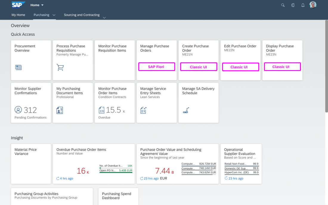
Before: In Purchasing, the user navigates to the classic UIs to create, edit, and display purchase orders using tiles on the launchpad.  

Launchpad
Launchpad

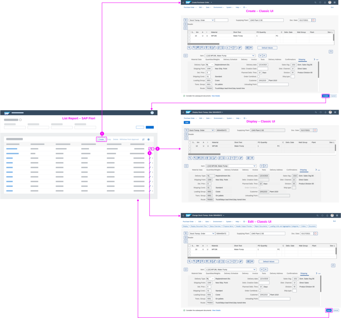
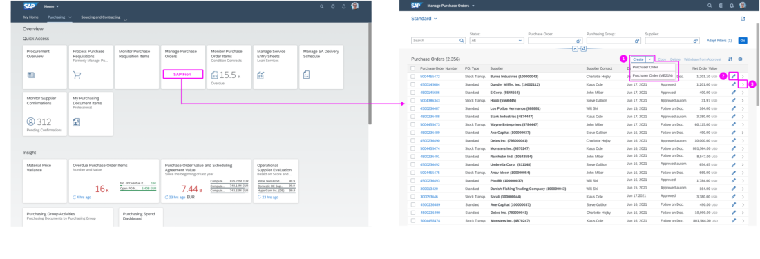
Now: The user navigates to the classic UIs via the Manage Purchase Orders list report.

Launchpad and list report

From the list report, the user can: 

  1. Create a purchase order.
    The split menu button enables navigation to both the SAP Fiori app and the classic UI (ME21N).  
  2. Edit a purchase order (classic UI ME22). 
  3. Display a purchase order (classic UI ME23N).

Top Tips

  • If your SAP Fiori apps and the corresponding classic UIs cover the same features, just offer the SAP Fiori apps within your navigation.
  • Collect all SAP Fiori and classic UIs for create, edit, and display actions and define a navigation flow, starting from the list report.
    Use the example flows as a reference.
  • For navigating from the list report:
    • For create, use a button.
    • For edit and display, use the line item edit  and navigation  icons and a smart link.
  • If you need to offer both an SAP Fiori app and a classic UI via the create button or a smart link:
    • Place the SAP Fiori app first and the classic UI below.
    • Add the transaction code for classic UIs in parentheses:
      <action (transaction code)>
    • In the split menu button, show Create on the button and the object type (such as Purchase Order) in the menu list.
    • In the smart link, show all edit and display apps and UIs.

Related Links

Elements and Controls

Implementation

SAP S/4HANA Product Home Page – My Home

Information
We’re still busy optimizing the SAP S/4HANA MyHome page, so some details in this guideline may differ from the latest demo systems.

Intro

The SAP S/4HANA product home page is an alternative to the SAP Fiori My Home page when using SAP S/4HANA Cloud. Whereas the previously available SAP Fiori My Home page is the entry point to a personalized set of apps, presented as tiles or links, the SAP S/4HANA product home page orchestrates much more information.

Besides being the entry point to apps, the new product home page offers:

  • Access to tasks and situations
  • Quick navigation to pages
  • Analytical insights 

In addition, users benefit from enhanced personalization features for content and layout.

Information
Be aware that the SAP S/4HANA product home page is also labeled My Home on the interface but should not be confused with the previous SAP Fiori My Home.

The SAP S/4HANA My Home page is based on launchpad spaces and runs best with the Horizon theme, although it also supports other SAP and custom themes. The page must be activated by a key user.

SAP S/4HANA product page 'My Home'

Components

The SAP S/4HANA My Home page is the leftmost option in the top-level shell bar navigation and provides the following sections:

My Home - Sections
My Home - Sections
  1. To Dos
    Contains tasks and situations.
  2. Pages
    Shows a news feed and a maximum of 8 pages.
  3. Apps
    Shows the user’s favorite, recently used, and frequently used apps.
  4. Insights
    Shows tiles with analytical information and cards from overview pages.

Users can define which sections are shown on My Home and how the sections are ordered. See Personalize Sections.

To Dos

My Home – Situations

The To Dos section shows workflow tasks from the My Inbox app and situations from the My Situations app. Each tab includes a counter indicating how many tasks and situations are open (1). Tasks and situations are presented on cards (2).

Up to 8 cards are shown, based on the priority of the tasks or situations (3). If more than 8 tasks or situations are exist, the last card is replaced by a standard card that allows navigation to the My Inbox or My Situations app. The apps show all tasks or all situations respectively.

Information
If the My Inbox and My Situations apps are not assigned to the user, the To Dos section is not available. If only one of the apps is assigned, the respective tab is shown.

Pages

My Home – Pages
My Home – Pages

The Pages section shows a news feed (1) and a maximum of 8 favorite pages (2). Users can add and remove pages. See Personalize Pages.

Information
The news feed is only available if activated by a key user. Key users can also assign custom colors and icons to the pages.

Apps

My Home – Apps
My Home – Apps

The Apps section shows the users favorite (1), recently used (2), and frequently used (3) apps .

Users can add and remove their favorite apps and change the color of the icon. See Personalize Apps.

Information
Recently and frequently used apps are only shown if the user allows app tracking in the Settings dialog. Recently Used shows up to 30 apps, with the most recent first. Frequently Used shows the apps used during the last 30 days, with those used most showing first.

Insights

My Home – Insights
My Home – Insights

The Insights section has two rows:

  • The first row shows tiles containing analytical information, such as charts or KPIs (1).
  • The second row contains a maximum of 8 cards from overview pages (2).

Users can add and remove tiles and cards. See Personalize Insights.

Behavior and Interaction

Users can personalize the SAP S/4HANA My Home according to their needs:

Personalize Sections

  1. From the user actions menu, the user selects My Home Settings.
  2. In the settings dialog, they can:
    • Choose which sections to show on My Home
    • Change the order of the sections using drag and drop
    • Reset all changes to the default setting that has been defined by the key user

Personalize Pages

Personalize My Home - Pages
  1. In the Pages section, the user selects the edit icon .
  2. In the dialog, users can select up to 8 pages to show on My Home.

Personalize Apps

Users can add apps to their favorites, apply colors to their favorite apps, and remove apps from their favorites.

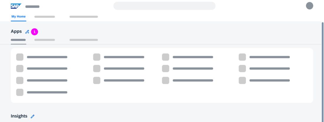
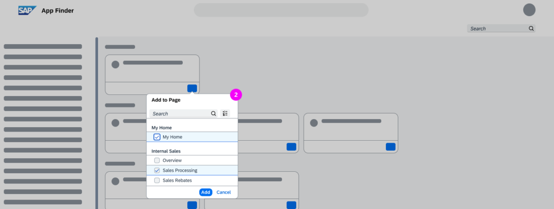
  1. In the Apps section, the user selects the edit icon .
    The App Finder opens.
  2. The user can browse and search for apps and add them to My Home.

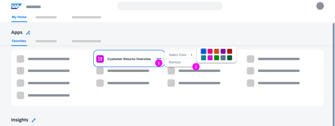
Applying Colors and Removing Favorite Apps

Personalize My Home – Changing colors of apps and deleting apps
  1. When the user selects an app, three dots appear.
  2. Clicking the dots opens a context menu that allows the user to change the color of the app icon or remove the app from the favorites.

Personalize Insights

Users can:

  • Add analytical tiles from their favorites or the app finder
  • Add cards from overview pages
  • Copy a card and change the name and filters in the copy
  • Remove tiles and cards

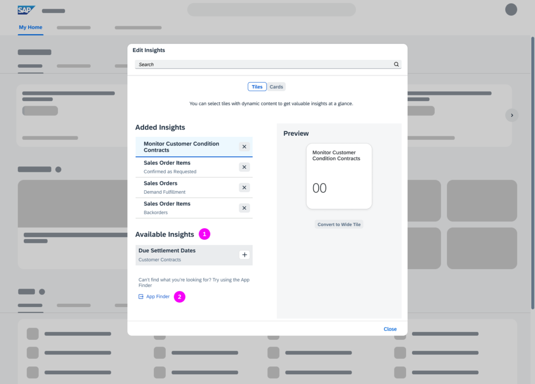
Users open the personalization options using the edt icon in the Insights section (1):

Personalize My Home - Insights

Personalize Analytical Tiles 

Personalize My Home – Tiles

All tiles listed in Added Insights are shown on My Home.

Users can add analytical tiles:

  • From the list of Available Insights. All Favorites that can be represented as analytical tiles are displayed here.
  • From the app finder

In the Added Insights list users can:

  • Change the order of the tiles by dragging and dropping the items
  • Remove tiles

Personalize Cards

Users can select up to 8 cards to be shown on My Home. They can change the order of the cards using drag and drop or remove them (1).

Users can customize a card by copying an existing card (2). In the copy (3), they can change the title and modify the filters.

Information
The default app colors correspond to the page colors.

Responsiveness

The SAP S/4HANA My Home page is responsive and can be used on tablets and phones.

Related Links

SAP S/4HANA Product Home Page – My Home

The SAP S/4HANA product home page is an alternative to the SAP Fiori My Home page when using SAP S/4HANA Cloud. Whereas the previously available SAP Fiori My Home page is the entry point to a personalized set of apps, presented as tiles or links, the SAP S/4HANA product home page orchestrates much more information.

Besides being the entry point to apps, the new product home page offers:

  • Access to tasks and situations
  • Quick navigation to pages
  • Analytical insights 

In addition, users benefit from enhanced personalization features for content and layout.

Information
Be aware that the SAP S/4HANA product home page is also labeled My Home on the interface but should not be confused with the previous SAP Fiori My Home.

The SAP S/4HANA My Home page is based on launchpad spaces and runs best with the Horizon theme, although it also supports other SAP and custom themes. The page must be activated by a key user.

SAP S/4HANA product page 'My Home'

Components

The SAP S/4HANA My Home page is the leftmost option in the top-level shell bar navigation and provides the following sections:

My Home - Sections
My Home - Sections
  1. To Dos
    Contains tasks and situations.
  2. Pages
    Shows a news feed and a maximum of 8 pages.
  3. Apps
    Shows the user’s favorite, recently used, and frequently used apps.
  4. Insights
    Shows tiles with analytical information and cards from overview pages.

Users can define which sections are shown on My Home and how the sections are ordered. See Personalize Sections.

To Dos

My Home – Situations

The To Dos section shows workflow tasks from the My Inbox app and situations from the My Situations app. Each tab includes a counter indicating how many tasks and situations are open (1). Tasks and situations are presented on cards (2).

Up to 8 cards are shown, based on the priority of the tasks or situations (3). If more than 8 tasks or situations are exist, the last card is replaced by a standard card that allows navigation to the My Inbox or My Situations app. The apps show all tasks or all situations respectively.

Information
If the My Inbox and My Situations apps are not assigned to the user, the To Dos section is not available. If only one of the apps is assigned, the respective tab is shown.

Pages

My Home – Pages
My Home – Pages

The Pages section shows a news feed (1) and a maximum of 8 favorite pages (2). Users can add and remove pages. See Personalize Pages.

Information
The news feed is only available if activated by a key user. Key users can also assign custom colors and icons to the pages.

Apps

My Home – Apps
My Home – Apps

The Apps section shows the users favorite (1), recently used (2), and frequently used (3) apps .

Users can add and remove their favorite apps and change the color of the icon. See Personalize Apps.

Information
Recently and frequently used apps are only shown if the user allows app tracking in the Settings dialog. Recently Used shows up to 30 apps, with the most recent first. Frequently Used shows the apps used during the last 30 days, with those used most showing first.

Insights

My Home – Insights
My Home – Insights

The Insights section has two rows:

  • The first row shows tiles containing analytical information, such as charts or KPIs (1).
  • The second row contains a maximum of 8 cards from overview pages (2).

Users can add and remove tiles and cards. See Personalize Insights.

Behavior and Interaction

Users can personalize the SAP S/4 HANA My Home according to their needs:

Personalize Sections

  1. From the user actions menu, the user selects My Home Settings.
  2. In the settings dialog, they can:
    • Choose which sections to show on My Home
    • Change the order of the sections using drag and drop
    • Reset all changes to the default setting that has been defined by the key user

Personalize Pages

Personalize My Home - Pages
  1. In the Pages section, the user selects the edit icon .
  2. In the dialog, users can select up to 8 pages to show on My Home.

Personalize Apps

Users can add apps to their favorites, apply colors to their favorite apps, and remove apps from their favorites.

  1. In the Apps section, the user selects the edit icon .
    The App Finder opens.
  2. The user can browse and search for apps and add them to My Home.

Applying Colors and Removing Favorite Apps

Personalize My Home – Changing colors of apps and deleting apps
  1. When the user selects an app, three dots appear.
  2. Clicking the dots opens a context menu that allows the user to change the color of the app icon or remove the app from the favorites.

Personalize Insights

Users can:

  • Add analytical tiles from their favorites or the app finder
  • Add cards from overview pages
  • Copy a card and change the name and filters in the copy
  • Remove tiles and cards

Users open the personalization options using the edt icon in the Insights section (1):

Personalize My Home - Insights

Personalize Analytical Tiles 

Personalize My Home – Tiles

All tiles listed in Added Insights are shown on My Home.

Users can add analytical tiles:

  • From the list of Available Insights. All Favorites that can be represented as analytical tiles are displayed here.
  • From the app finder

In the Added Insights list users can:

  • Change the order of the tiles by dragging and dropping the items
  • Remove tiles

Personalize Cards

Users can select up to 8 cards to be shown on My Home. They can change the order of the cards using drag and drop or remove them (1).

Users can customize a card by copying an existing card (2). In the copy (3), they can change the title and modify the filters.

Information
The default app colors correspond to the page colors.

Responsiveness

The SAP S/4HANA My Home page is responsive and can be used on tablets and phones.

Related Links

Integration of Classic SAP UIs (SAP Fiori Elements List Report)

This article describes how to navigate to create, display, and edit screens from a list report when you need to integrate classic UIs for some or all of these actions.

SAP Fiori apps vs. Classic UIs

In addition to SAP Fiori, SAP S/4HANA uses other UI technologies, such as SAP Web GUI and WebDynpro, which were available prior to SAP Fiori. We refer to these technologies as classic UIs.

In many cases, an SAP Fiori app and a classic UI are available. They are often used in parallel to create, edit, or display objects. The SAP Fiori app can differ from the classic UI in two ways:

  • The SAP Fiori app covers parts of the broader scope of the classic UI. This can be due to strategic decisions to exclude edge cases or because the full scope isn’t yet covered.
  • The SAP Fiori app offers additional functions not available in the classic UI.

Navigation to Classic UIs

Classic UIs for create, edit, and display actions were not part of the standard SAP Fiori navigation flow from the SAP Fiori elements list report. This means that each classic UI needed a tile on the launchpad.

Now, the list report supports direct navigation to the classic UIs, thus supporting the standard navigation from a list report to business objects. Tiles on the launchpad are not necessarily needed. See the example.

Technical Background

Classic UIs for displaying and editing objects start with a selection screen that requires the ID of the object. After entering the ID, the user navigates to the display or edit screens.

The SAP Fiori elements list report skips the entry screen and navigates directly to the classic UI. Changes carried out in the classic edit UI are reflected in the list report. Objects created using the classic create UI are also reflected in the list report.

When to Use

Use the list report as the entry point for:

  • Searching, filtering, and navigating to objects in classic UIs to edit and display them
  • Creating objects using a classic UI

Components

In the list report, you can offer navigation to classic UIs via the table toolbar or within a line item. If users need to access both the SAP Fiori and classic UIs for the same task, you can offer both side by side. This section outlines which UI elements to use.

Guidelines
If your SAP Fiori apps and the corresponding classic UIs cover the same features, just offer navigation to the SAP Fiori apps.
List report – UI elements

  1. Table toolbar
    For the create action, you can choose either a simple or a split menu button:

    1. Simple button
      Use it if you want to offer direct access to the create app.
    2. Split menu button
      Use it if both an SAP Fiori app and a classic UI are available for the create action.
  2. Line item
    For display and edit, you have the following options:

    1. Navigation
      Use it to navigate directly to the object in display mode.
    2. Edit
      Use it to navigate directly to the object in edit mode.
    3. Smart link
      Use it to show all edit and display navigation options.

Warning
Currently, you can show either the edit icon  or the navigation icon  per line item. The default is the navigation icon .
Showing both the edit and navigation icons is not yet possible.
Guidelines
Table toolbar:

Offer a button (simple button or split menu) only for creating an object. For editing and displaying an object, use the line item UI elements. In a split menu button, show the SAP Fiori app first. Keep in mind that the menu button always shows the last action selected by the user.

Line item:

  • Since you can only choose either the edit icon  or the navigation icon , show the one most relevant for your use case.
  • Offer all navigation options in the smart link.
  • In the smart link, structure the entries in a meaningful way and show the most important first. If an SAP Fiori app and a classic UI are available for the same task, show the SAP Fiori app first, followed by the classic UI.

Naming:

  • Whenever you need to offer both the SAP Fiori app and the classic UI in a UI element, add the transaction code for the classic UI in parentheses: <action (transaction code)>.
    Otherwise, apply the guidance for Word Choice.
  • In a split menu button, show Create on the button and the object type (such as Purchase Order) only in the menu list.

Navigation Flows

The navigation flows depend on the mix of SAP Fiori apps and classic UIs that you need to open from your list report. This section outlines the typical navigation flows for three use cases:

  • Classic UIs only
    Classic UIs are used for all actions (create, display, edit)
  • Mainly SAP Fiori apps (~80% SAP Fiori apps)
    For most create, edit, and display tasks, SAP Fiori apps are available and cover the most essential features. The corresponding classic UIs offer features not yet implemented in the SAP Fiori app. For a few tasks, only classic UIs are available.
  • Mainly classic UIs (~20% SAP Fiori apps)
    For create, edit, and display tasks, classic UIs are available. SAP Fiori apps are either not available or do not offer all features of the corresponding classic UI.

Classic UIs Only

Use the list report as the entry point for navigating to the classic UIs.

Create, Edit, Delete – Classic UIs Only

Create, display, edit – navigation to classic UIs only

In the list report, the user chooses:

  1. Create button
    The classic create UI opens. On the create page, the main navigation options are:

    • Finalizing action Create: Saves the object and goes back to the list report.
    • Exit action: Exits the create UI and navigates to the list report.
    • Cancel action: Discards any entries and goes back to the list report.
  2. Navigation  
    The classic display UI opens. On the display page, the main navigation options are:

    • Shell bar back icon  : Goes back to previous page (list report).
    • Edit action: Switches to the classic edit UI.
  3. Edit
    The classic edit UI opens. On the edit page, the main navigation options are:

    • Finalizing action Save: Saves the object and goes back to the list report.
    • Shell bar back icon  : Goes back to previous page (list report).
    • Exit action: Exits the edit UI and navigates to the list report
    • Display action: Switches to classic display UI.
    • Cancel action: Discards any entries and goes back to the list report.

Mainly SAP Fiori Apps

This section outlines the flows for the following scenario:


Create – SAP Fiori app and Classic UI

Create – navigation to SAP Fiori app or classic UI via split menu button

In the list report, the user chooses from the split menu button Create:

  1. Purchase Order
    The SAP Fiori create app opens. The main navigation options are:

    • Finalizing action Create: Saves the object and goes back to the list report.
    • Shell bar back icon  : Goes back to previous page (list report).
    • Cancel action: Discards any entries and goes back to the list report.
  2. Purchase Order (ME21N)
    The classic create UI opens. The main navigation options are:

    • Finalizing action (Create in the example): Saves the object and goes back to the list report.
    • Exit action: Exits the create app and navigates to the list report.
    • Cancel action: Discards any entries and goes back to the list report.


Display, Edit – SAP Fiori App (Default) and Classic UIs

Display, edit – navigation to SAP Fiori app or classic UIs

In the list report, the user chooses:

  1. Navigation 
    The SAP Fiori display app opens. On the display page, the main navigation options are:

    • Shell bar back icon  : Goes back to previous page (list report).
    • Edit action: Switches to SAP Fiori edit app.
  2. Edit  
    The SAP Fiori edit app opens. On the edit page, the main navigation options are:

    • Finalizing action Save: Saves the object and goes back to the list report.
    • Shell bar back icon  : Goes back to previous page (list report).
    • Cancel action. Discards any entries and goes back to the list report.
  3. Smart Link
    Both SAP Fiori and classic display and edit apps are available.

Mainly Classic UIs

This section outlines the flows for the following scenario:

  • For creating a purchase order, only a classic UI is available. 
  • For displaying a purchase order, both an SAP Fiori app (most essential features) and a classic UI (all features) are available. In this case, the SAP Fiori app is used.  
  • For editing a purchase order, only a classic UI is available. 

Create – Classic UI Only

Create – navigation to classic UI only

In the list report, the user chooses Create (1).

The classic create UI is opened. On the create page, the main navigation options are:

  • Finalizing action (Create in the example): Saves the object and goes back to the list report.
  • Exit action: Exits the create app and navigates to the list report.
  • Cancel action. Discards any entries and goes back to the list report.

Display – SAP Fiori App (Default) and Classic UI

Display – navigation to SAP Fiori app or classic UI

In the list report, the user chooses the navigation icon   (2).

The SAP Fiori display app opens. On the display page, the main navigation options are:

  • Edit action: Switches to the classic edit UI.
  • Shell bar back icon  : Goes back to previous page (list report).

The user can navigate to the classic display UI using the smart link.


Edit – Classic UI Only

Edit – navigation to classic UI only

In the list report, the user chooses the edit icon  (3).

The classic edit UI opens. On the edit page, the main navigation options are:

  • Finalizing action (Save in the example): Saves the object and goes back to the list report.
  • Shell bar back icon  : Goes back to previous page (list report).
  • Exit action: Exits the edit UI and navigates to the list report.
  • Display action: Switches to the SAP Fiori display app.
  • Cancel action: Discards any entries and goes back to the list report.

Example

Before: In Purchasing, the user navigates to the classic UIs to create, edit, and display purchase orders using tiles on the launchpad.  

Launchpad
Launchpad

Now: The user navigates to the classic UIs via the Manage Purchase Orders list report.

Launchpad and list report

From the list report, the user can: 

  1. Create a purchase order.
    The split menu button enables navigation to both the SAP Fiori app and the classic UI (ME21N).  
  2. Edit a purchase order (classic UI ME22). 
  3. Display a purchase order (classic UI ME23N).

Top Tips

  • If your SAP Fiori apps and the corresponding classic UIs cover the same features, just offer the SAP Fiori apps within your navigation.
  • Collect all SAP Fiori and classic UIs for create, edit, and display actions and define a navigation flow, starting from the list report.
    Use the example flows as a reference.
  • For navigating from the list report:
    • For create, use a button.
    • For edit and display, use the line item edit  and navigation  icons and a smart link.
  • If you need to offer both an SAP Fiori app and a classic UI via the create button or a smart link:
    • Place the SAP Fiori app first and the classic UI below.
    • Add the transaction code for classic UIs in parentheses:
      <action (transaction code)>
    • In the split menu button, show Create on the button and the object type (such as Purchase Order) in the menu list.
    • In the smart link, show all edit and display apps and UIs.

Related Links

Elements and Controls

Implementation