
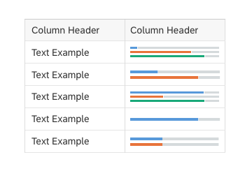
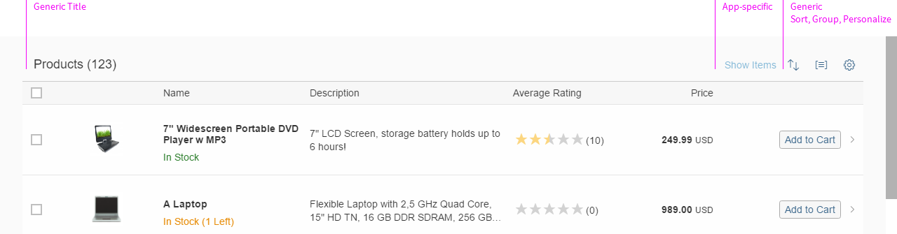
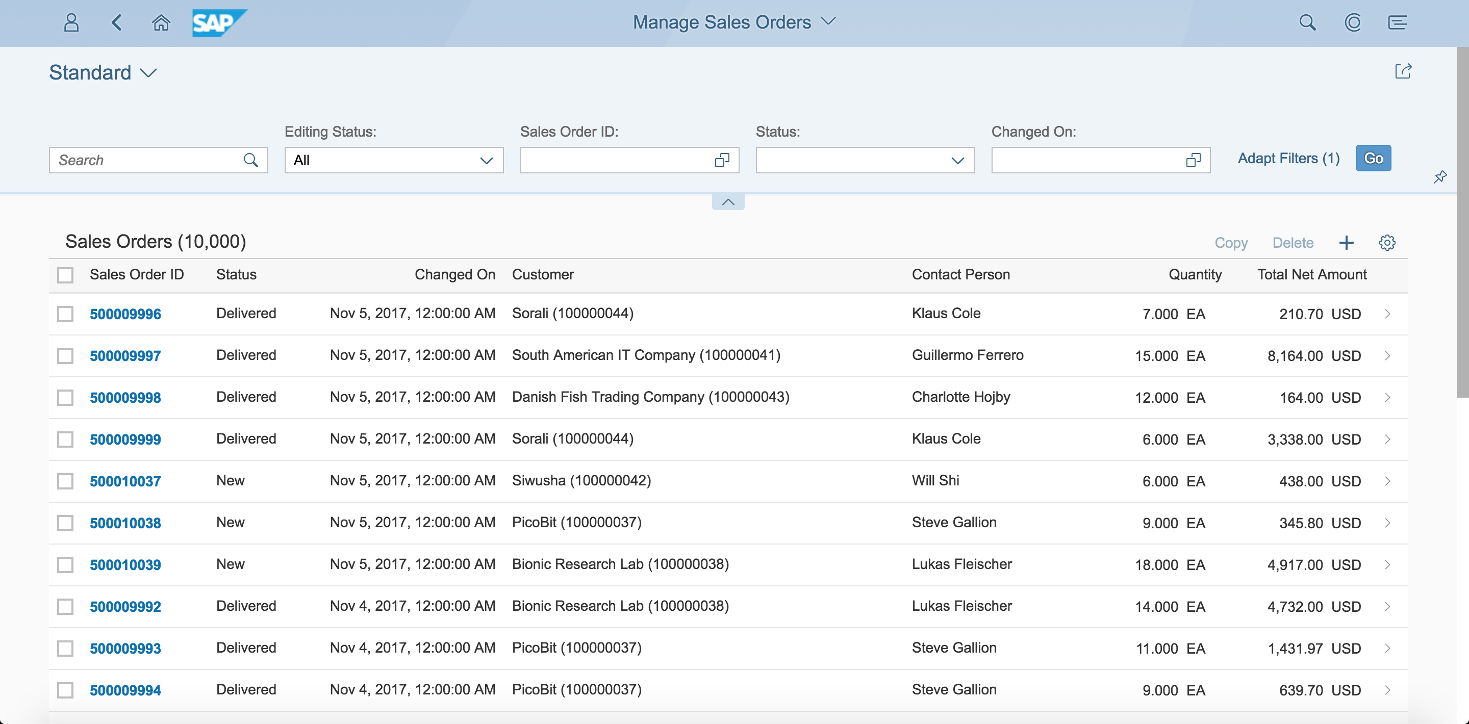
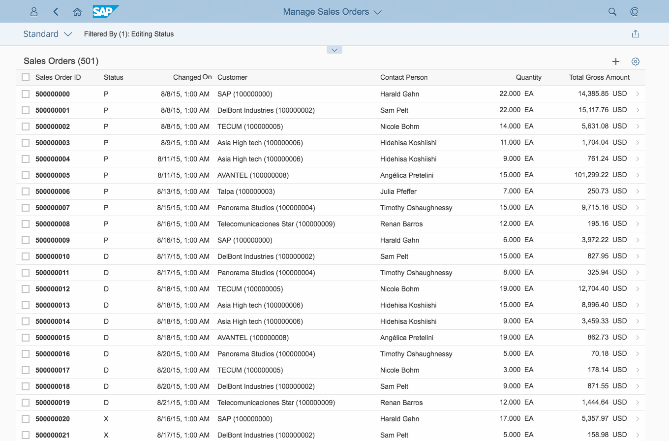
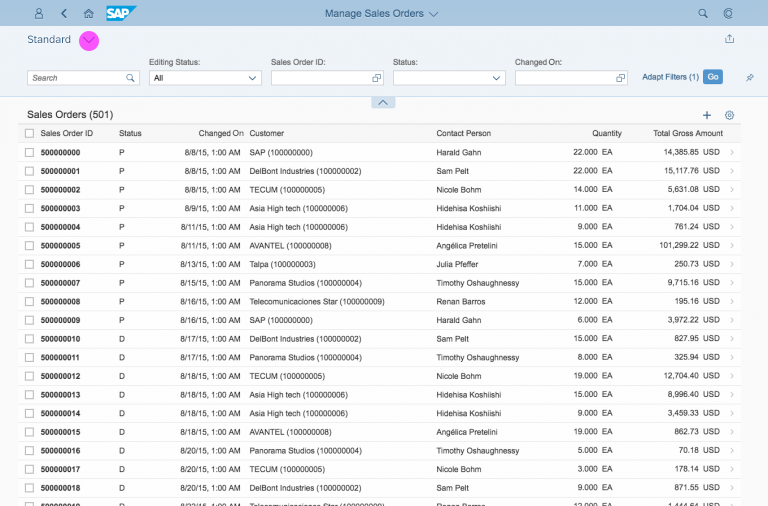
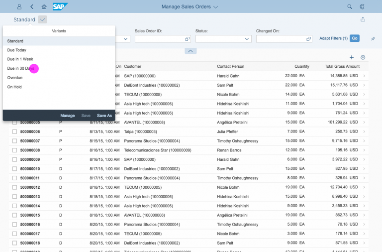
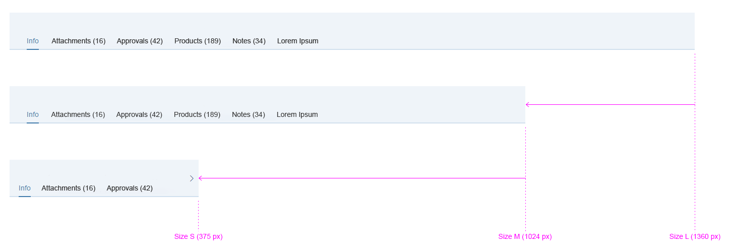
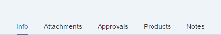
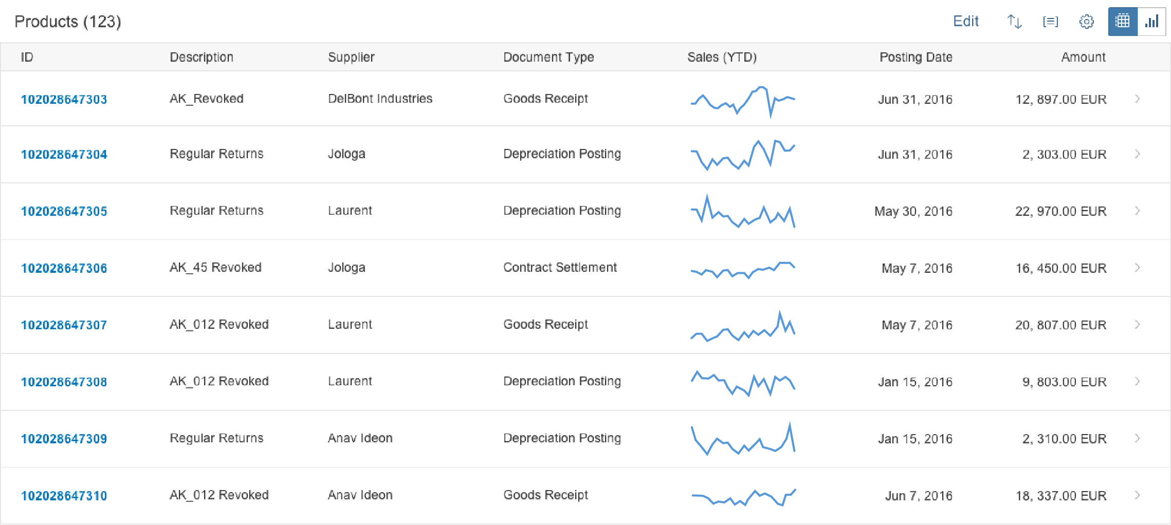
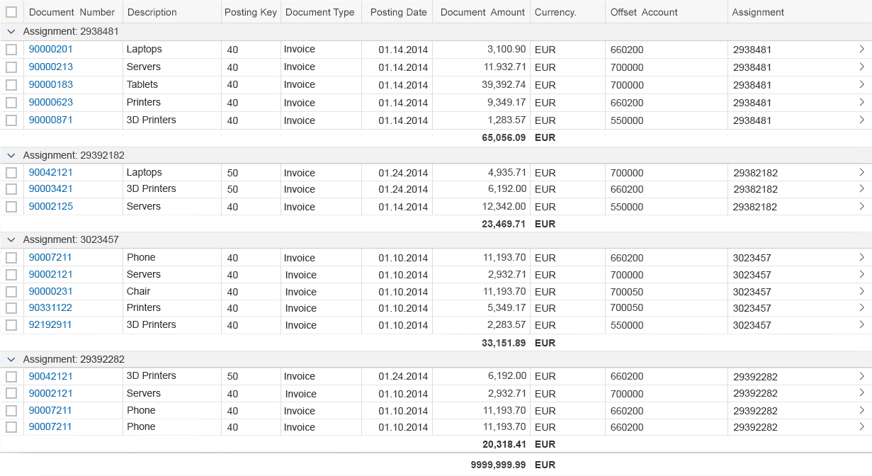
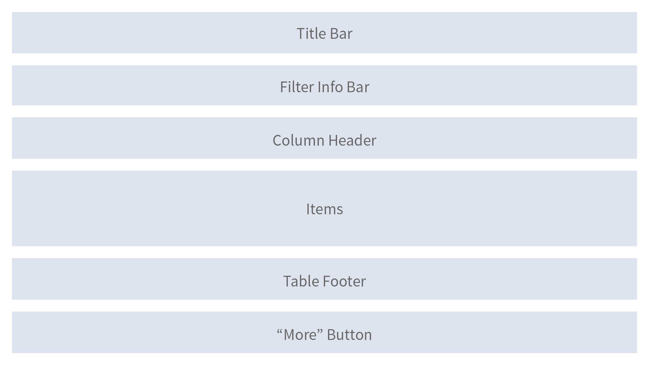
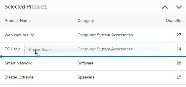
Table Personalization (Overview)
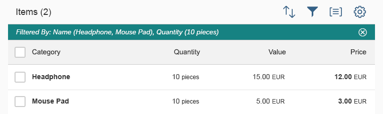
Table personalization can be used to modify the display and settings of a table.
It is a UI pattern that is used to change one or more of the following attributes:
- Visibility of columns
- Order of columns
- Sorting
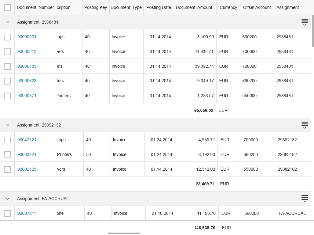
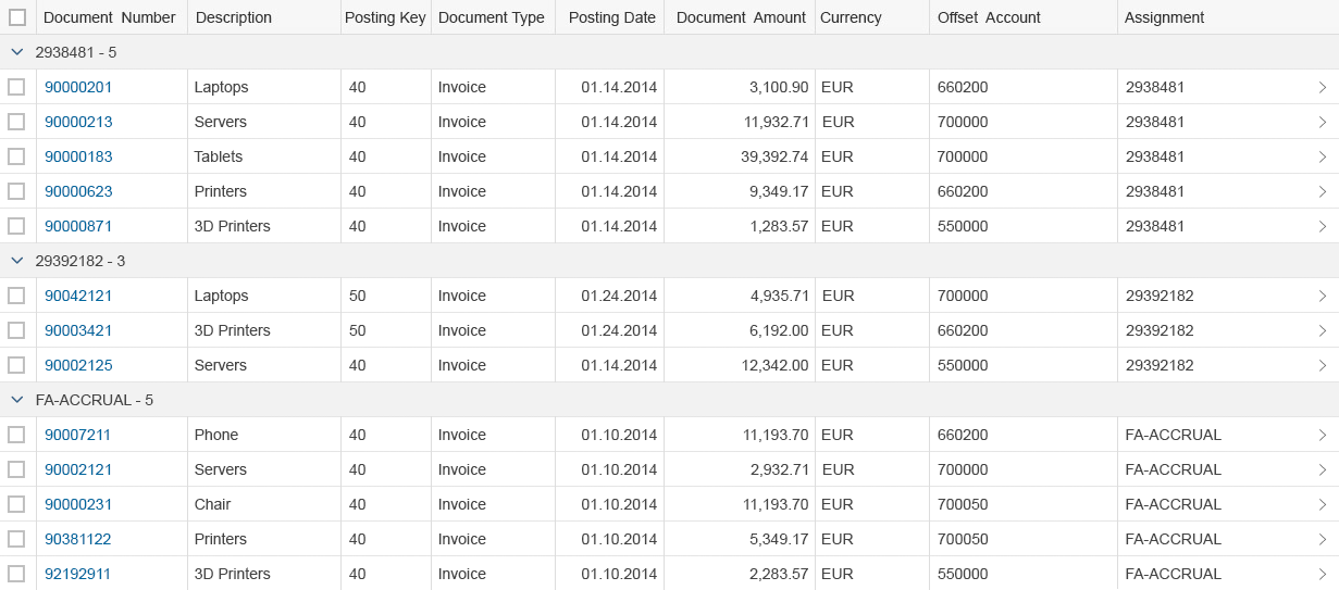
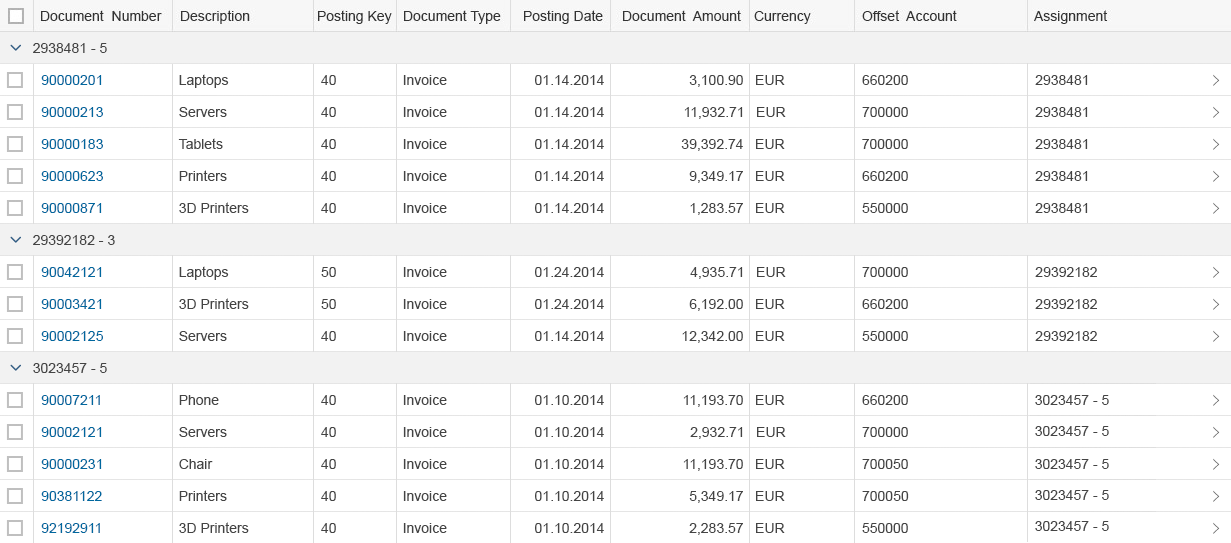
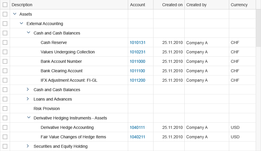
- Grouping
- Filtering
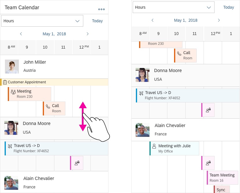
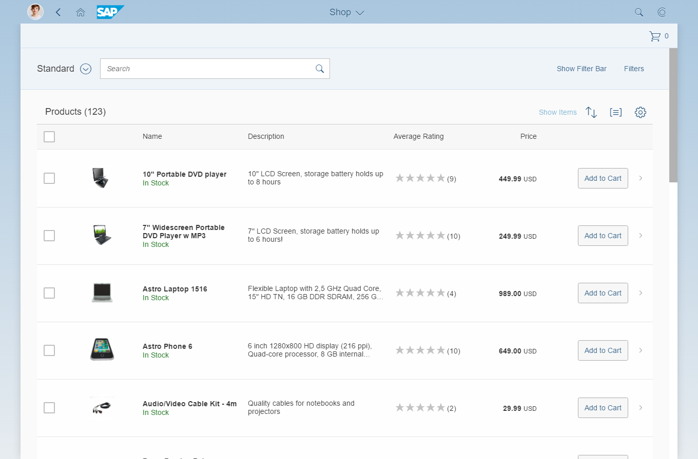
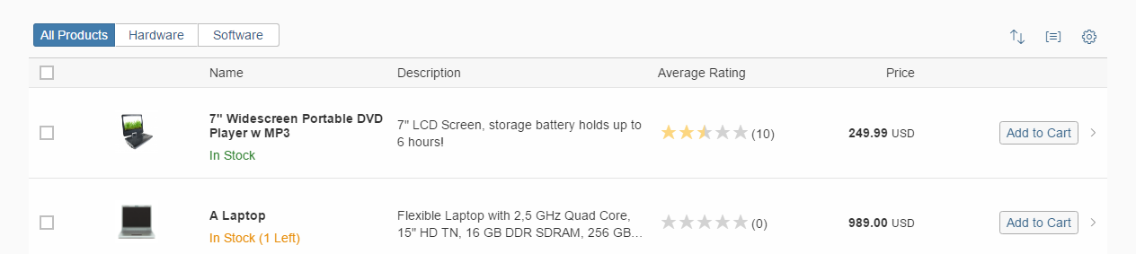
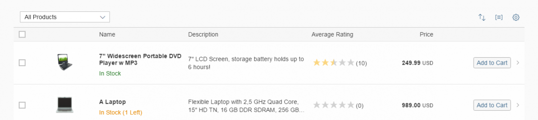
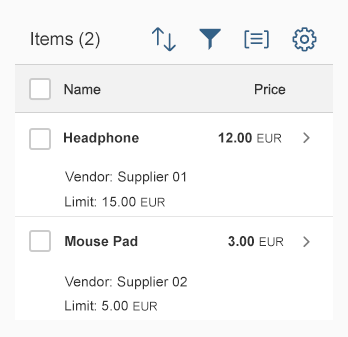
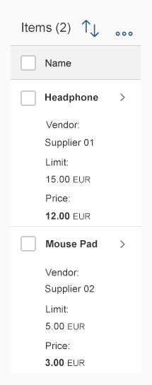
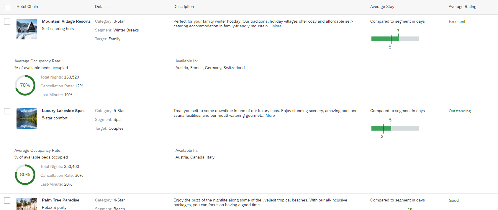
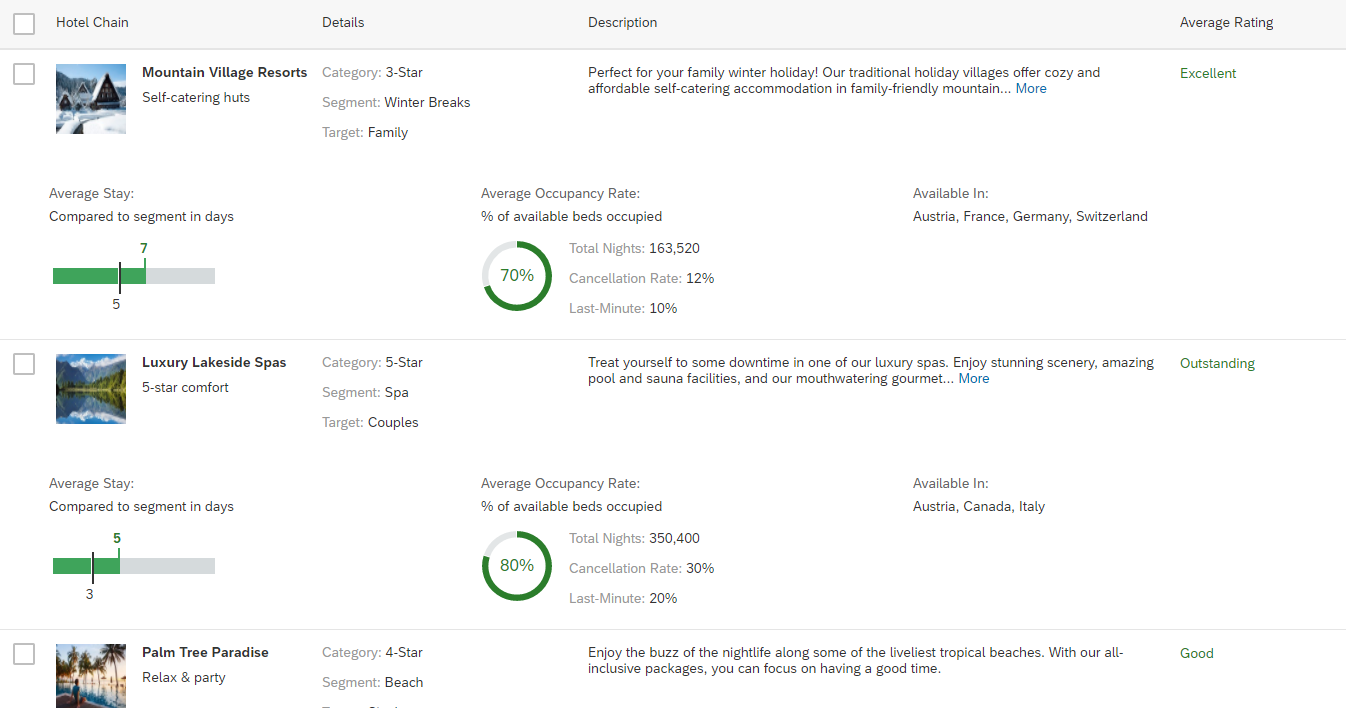
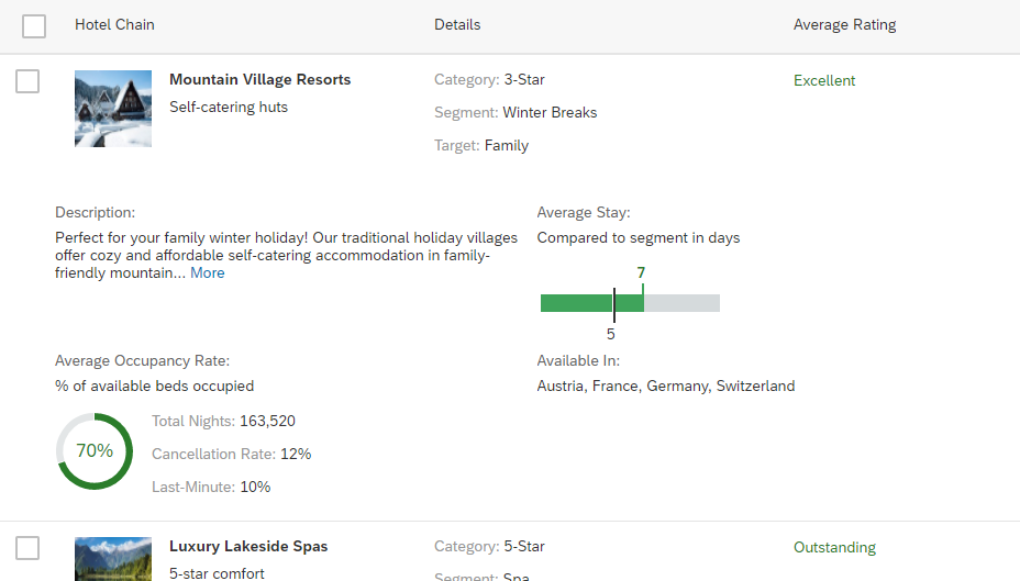
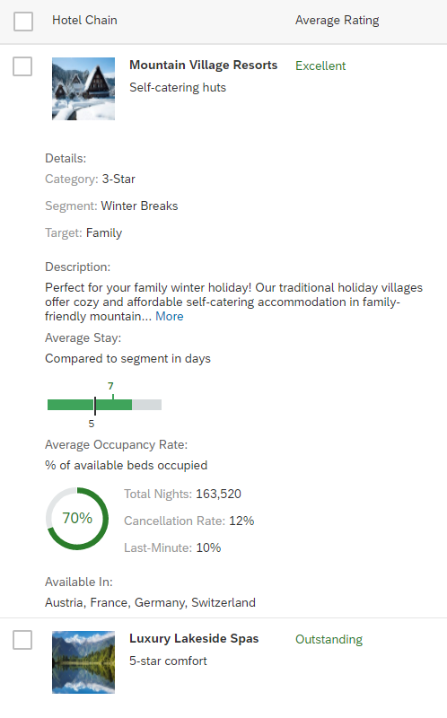
Table personalization can be applied to simple tables (up to about 20 columns) and complex tables (more than about 20 columns) using different controls.
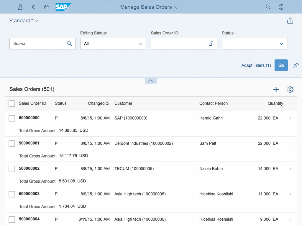
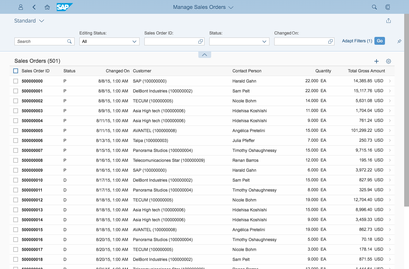
Usage
Use the view settings dialog if:
- The user is able to personalize fewer than about 20 columns.
- A combination of sorting, filtering, and grouping is needed.
Use the table personalization dialog if:
- The user is able to personalize fewer than about 20 columns.
- Columns need to be shown/hidden and reordered.
Use the view settings dialog AND the table personalization dialog if:
- The user wants to personalize fewer than about 20 columns.
- A combination of show/hide and one other function is needed.
Use the P13n dialog if:
- You are using an analytical table (ALV).
- The user is able to personalize more than about 20 columns.
- Complex queries have to be built for the respective table.
Do not use table personalization at all if:
- The table has very few columns and rows.
- A very complex filter is needed. In this case, consider using a filter bar instead of the filter tab.
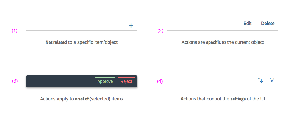
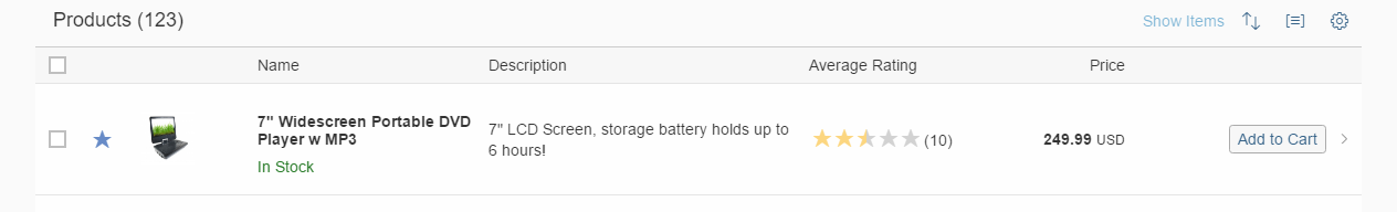
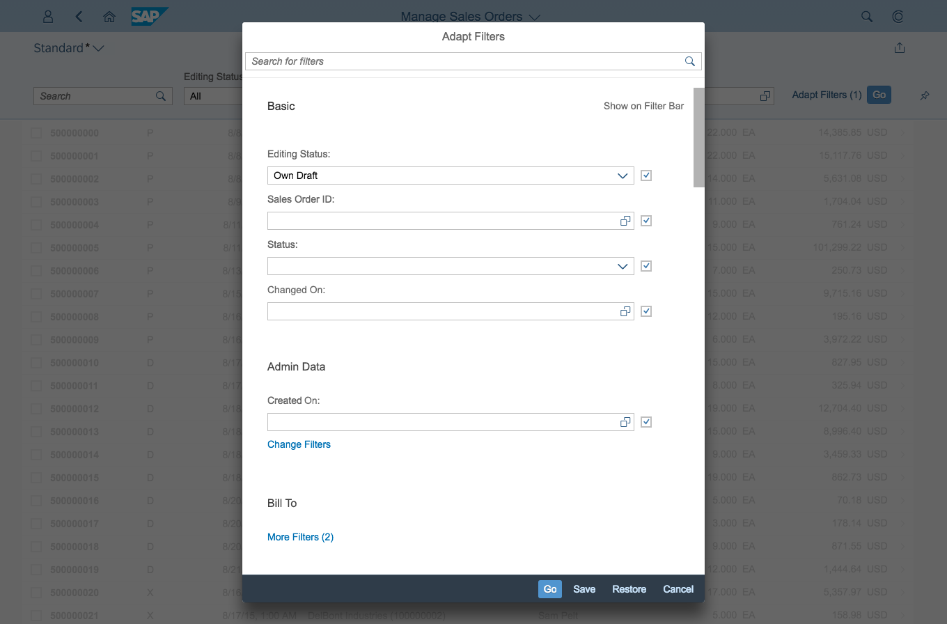
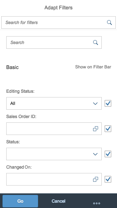
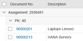
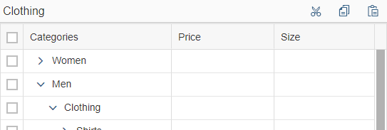
Types
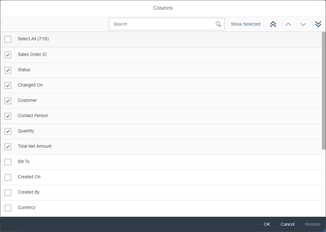
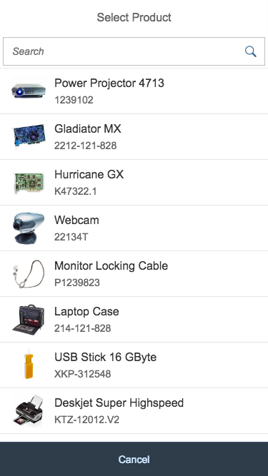
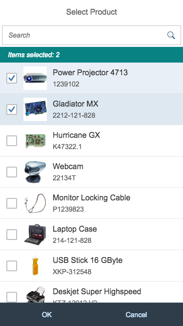
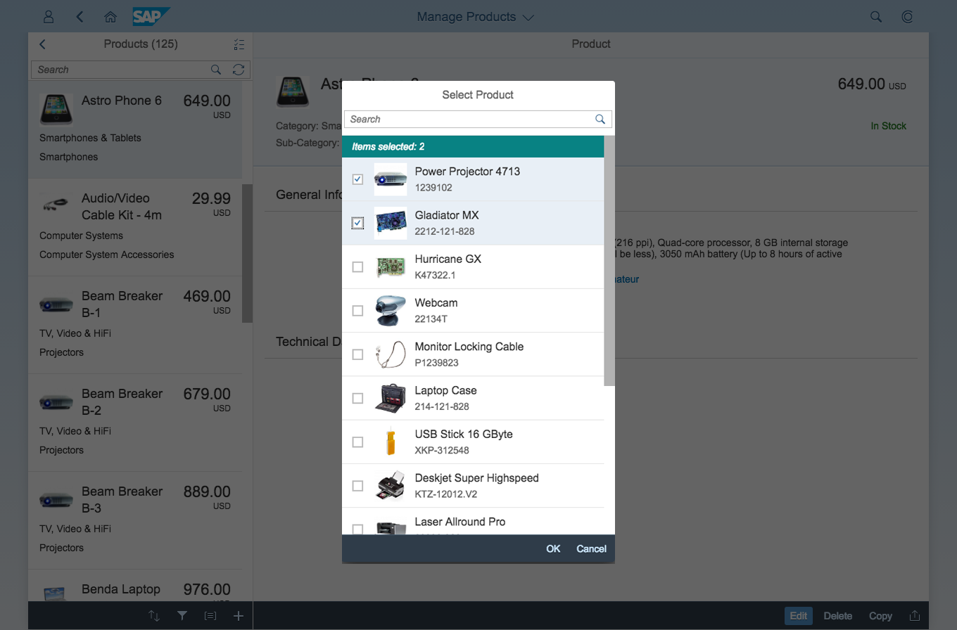
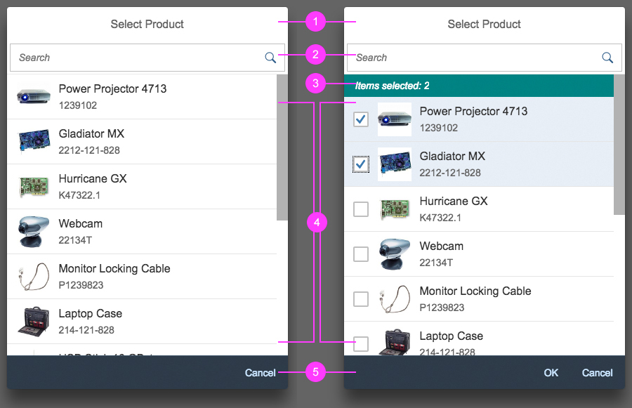
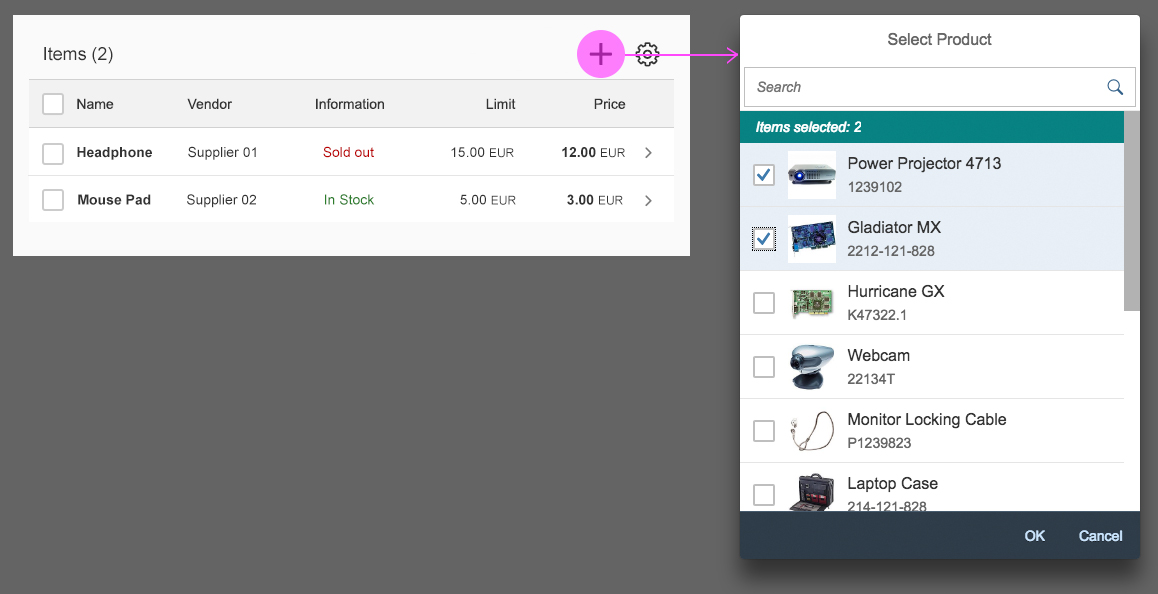
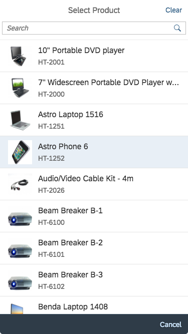
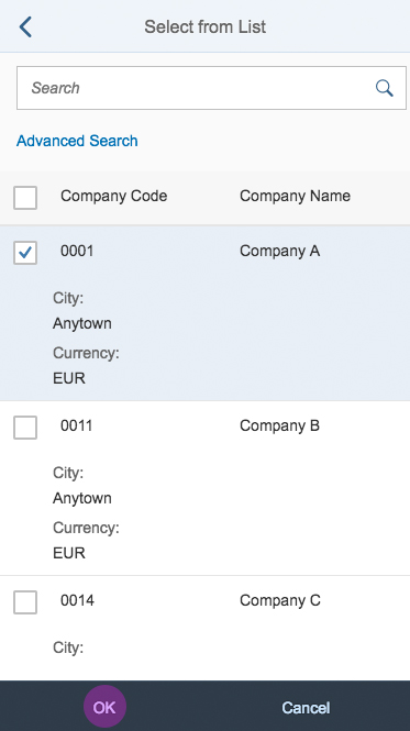
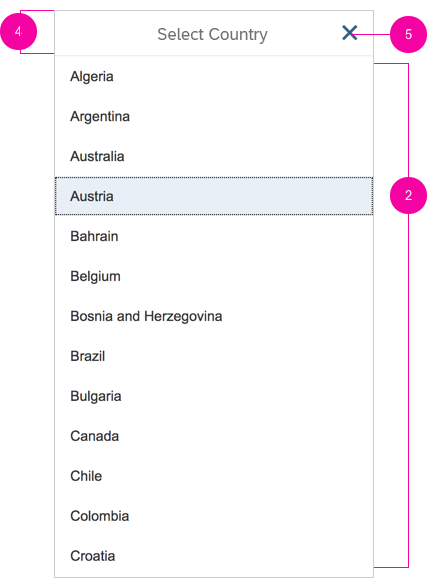
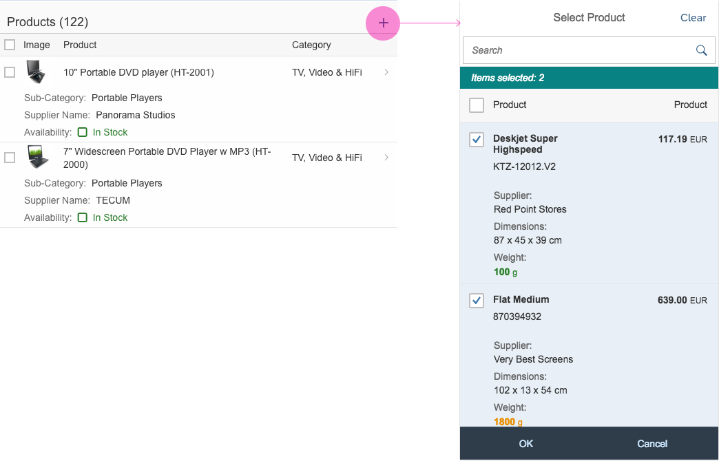
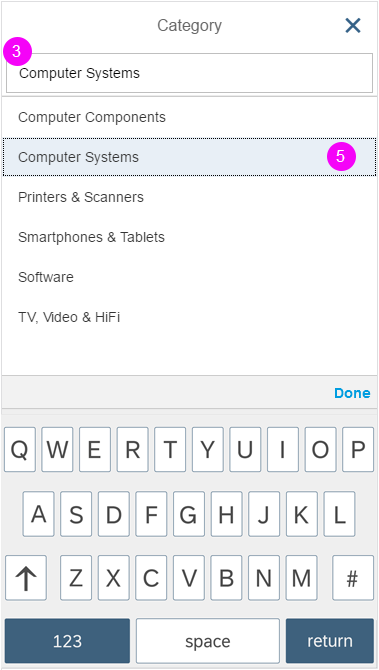
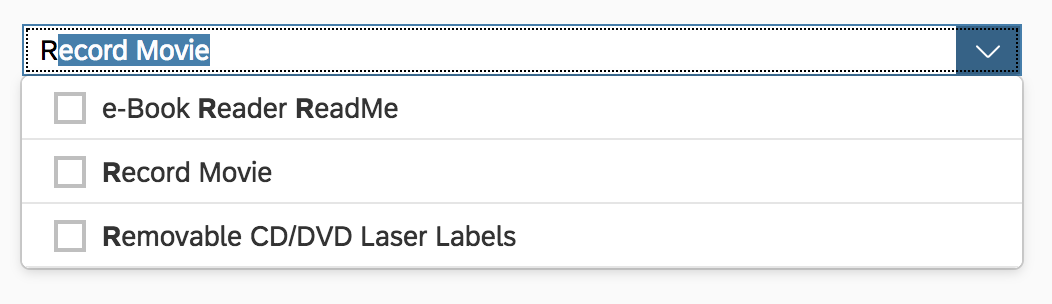
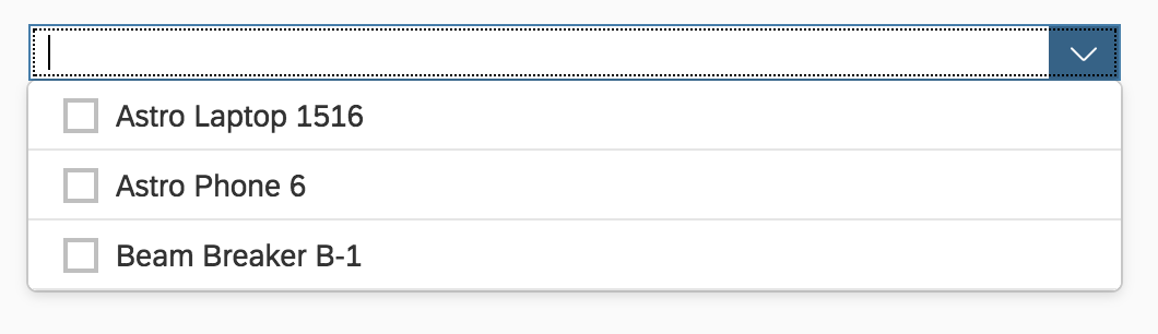
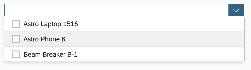
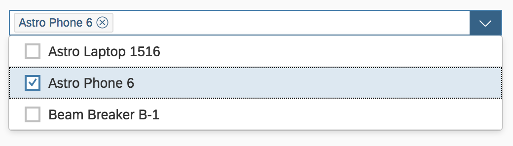
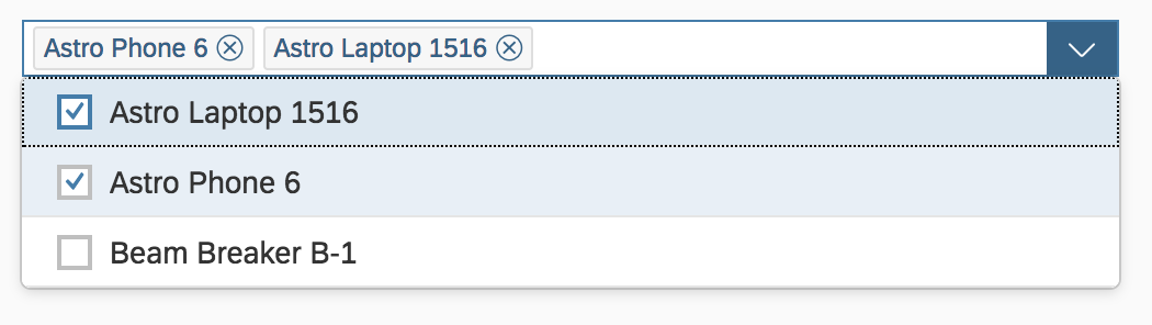
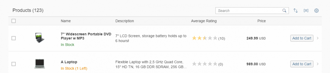
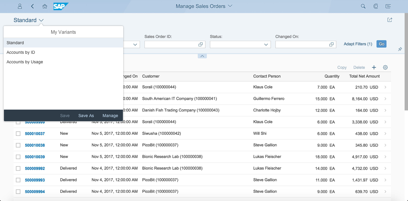
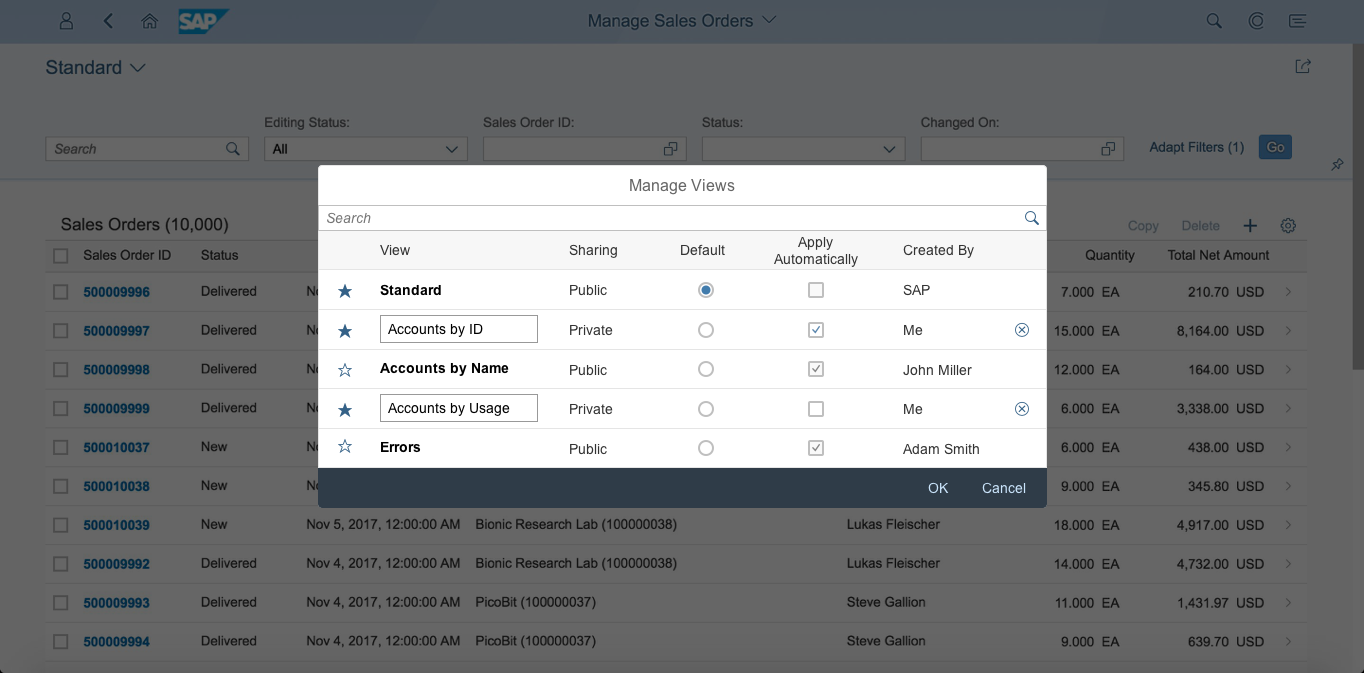
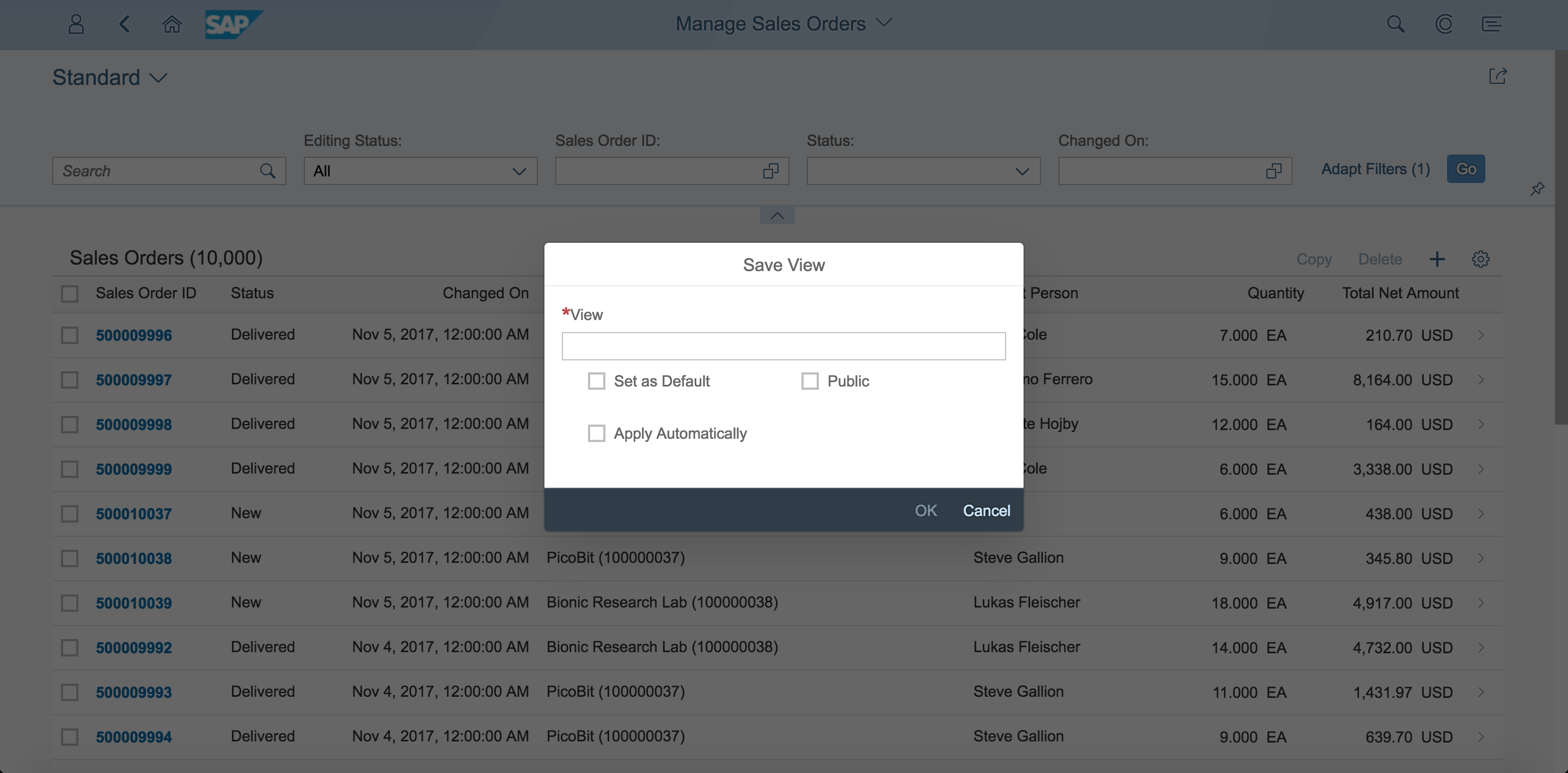
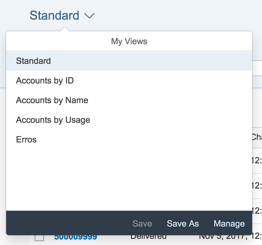
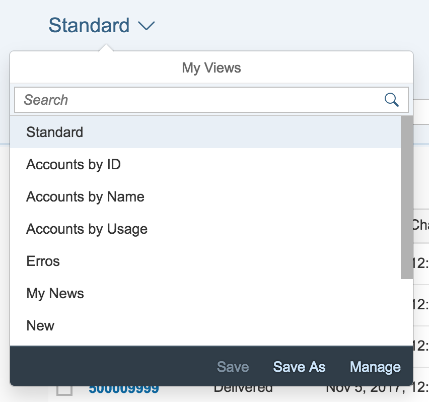
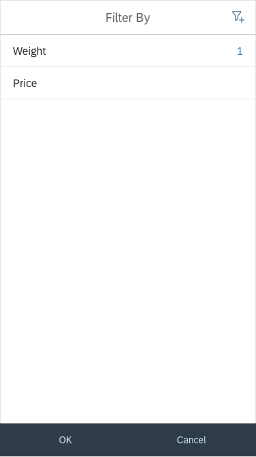
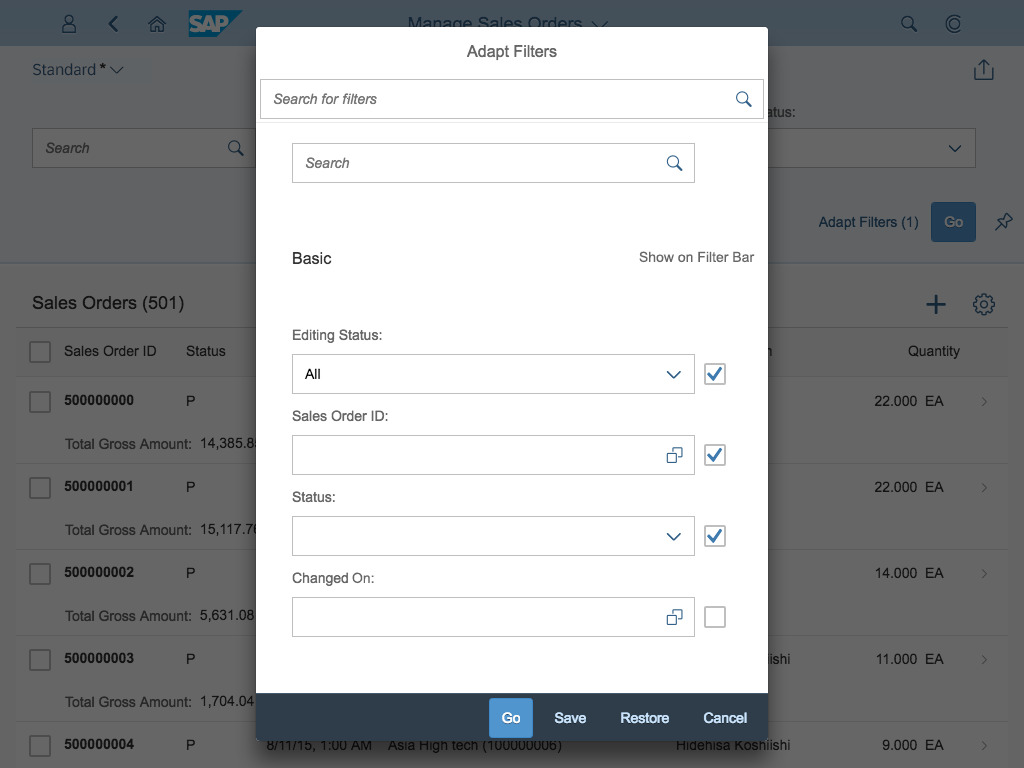
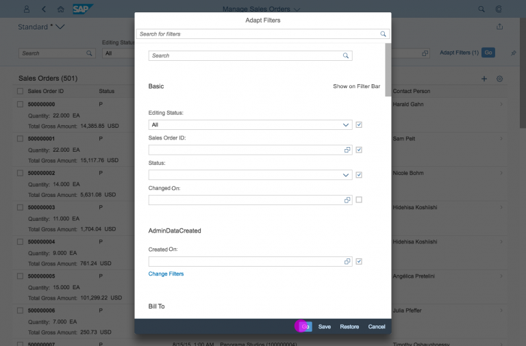
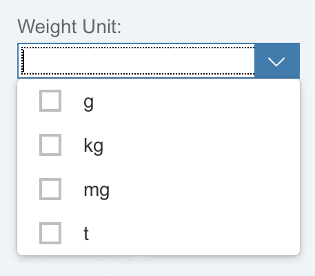
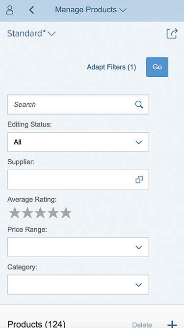
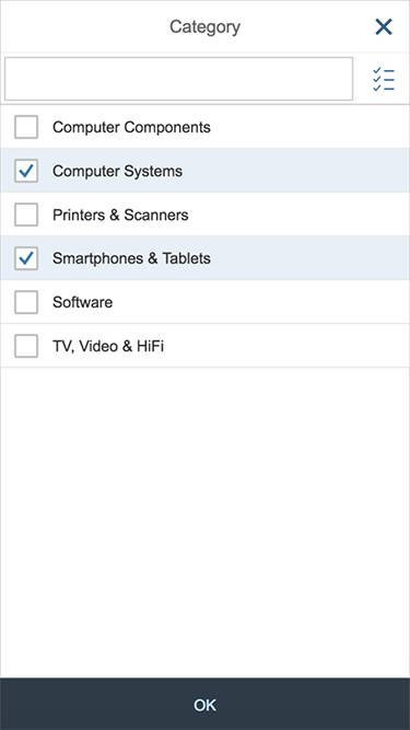
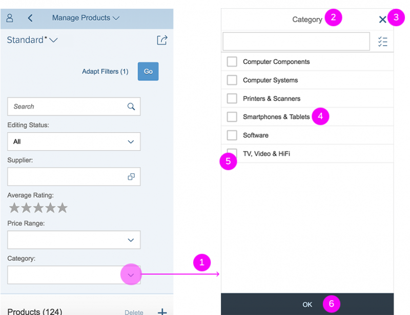
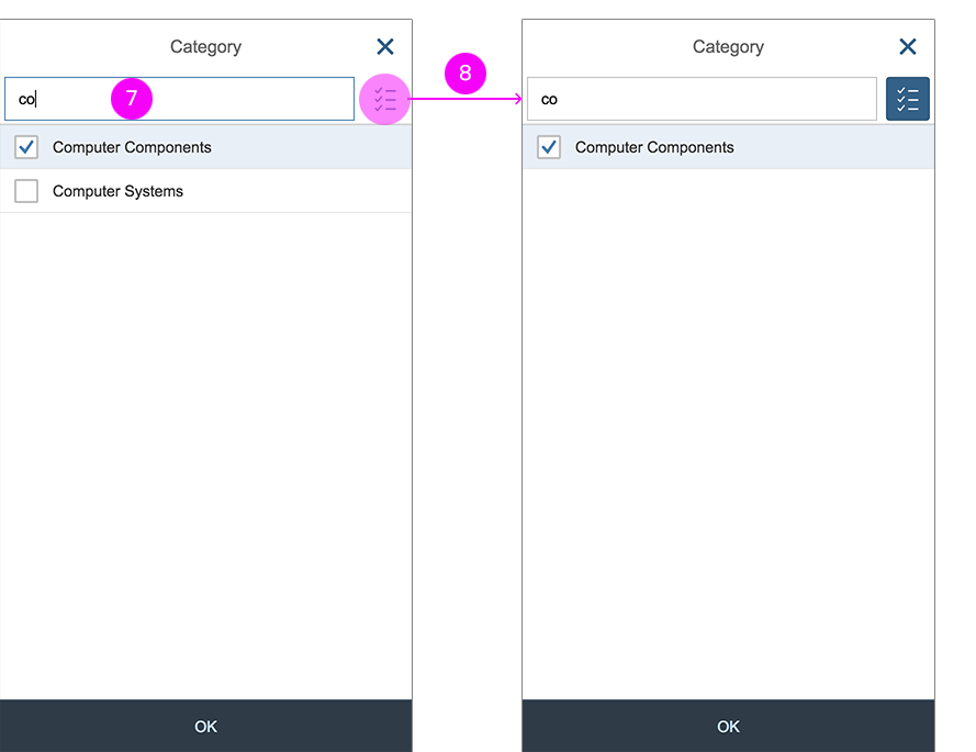
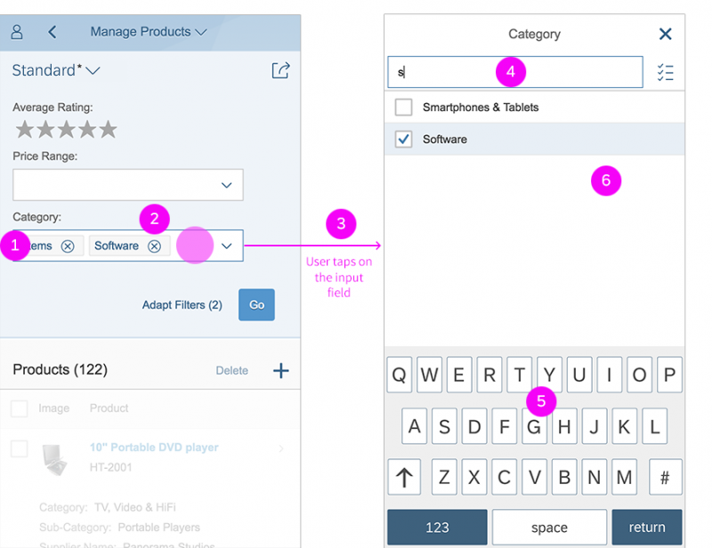
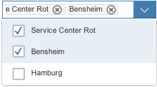
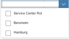
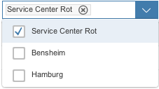
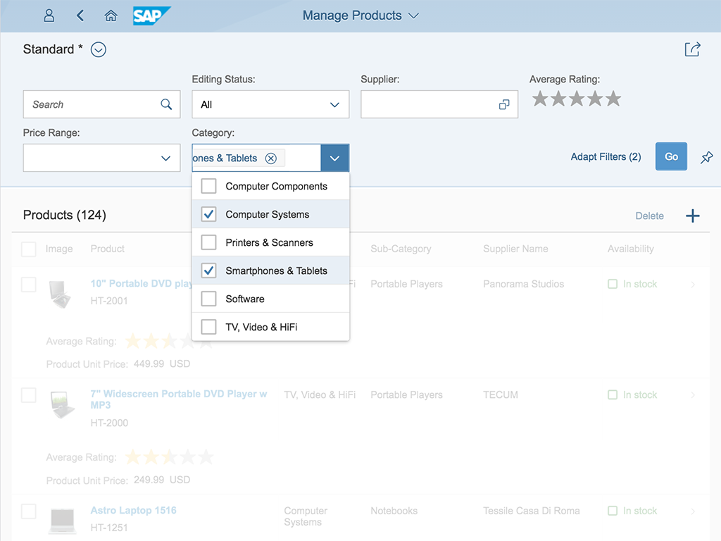
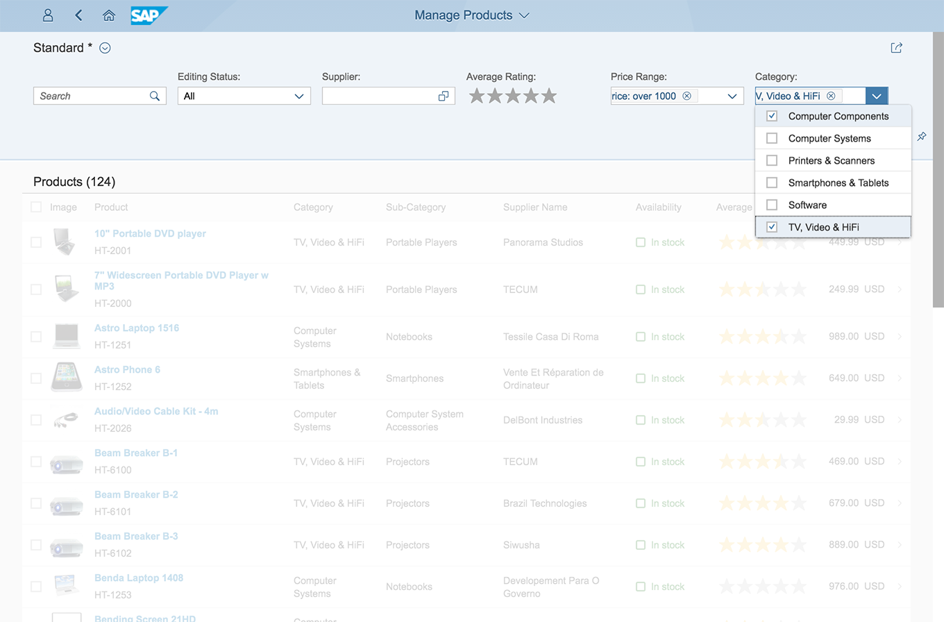
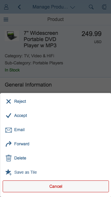
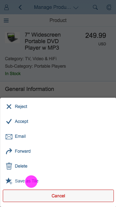
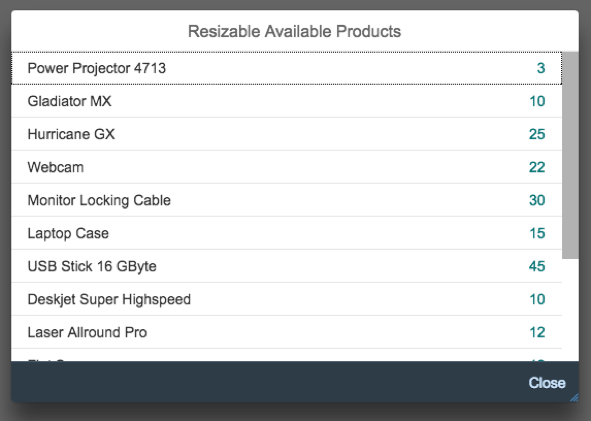
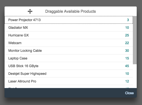
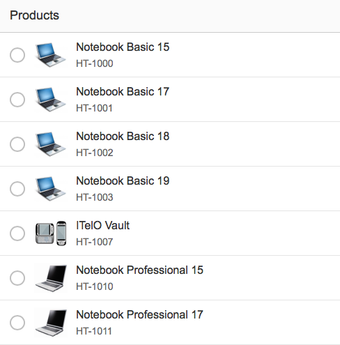
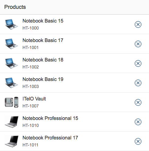
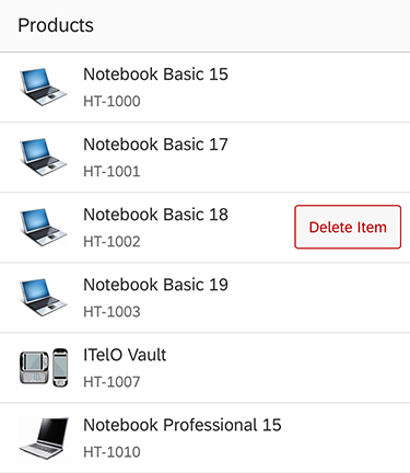
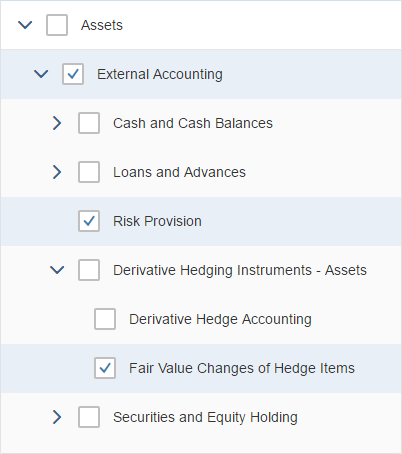
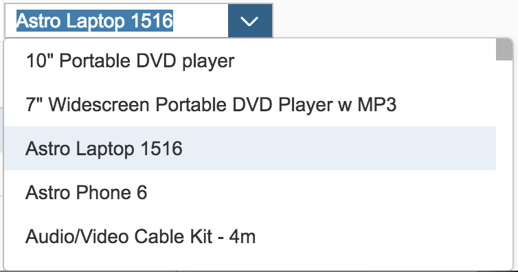
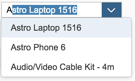
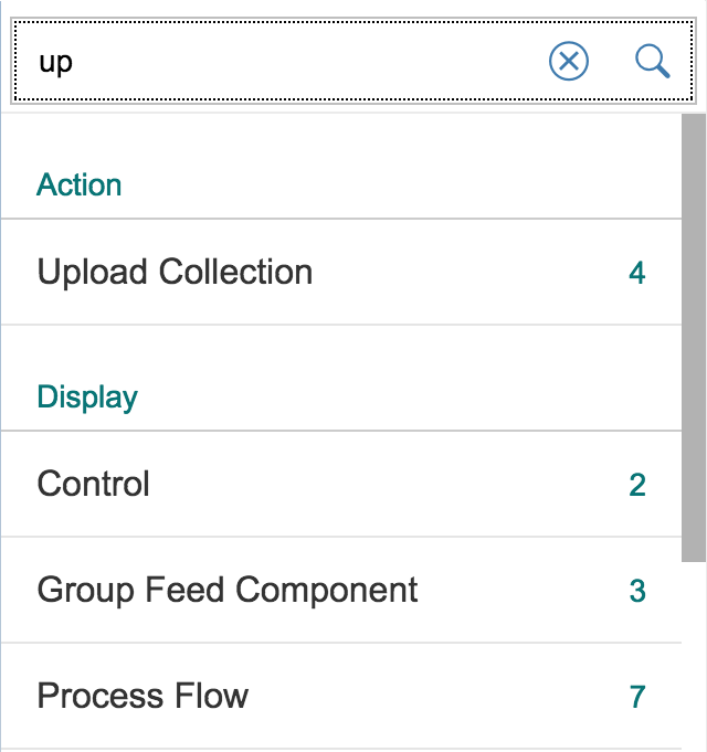
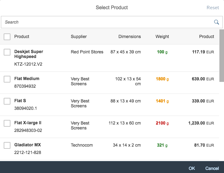
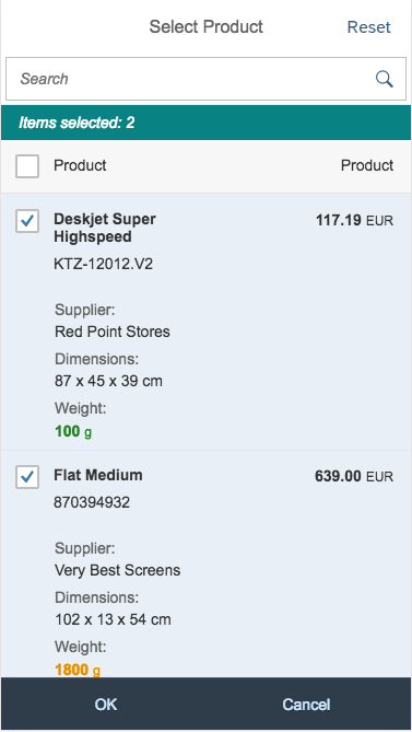
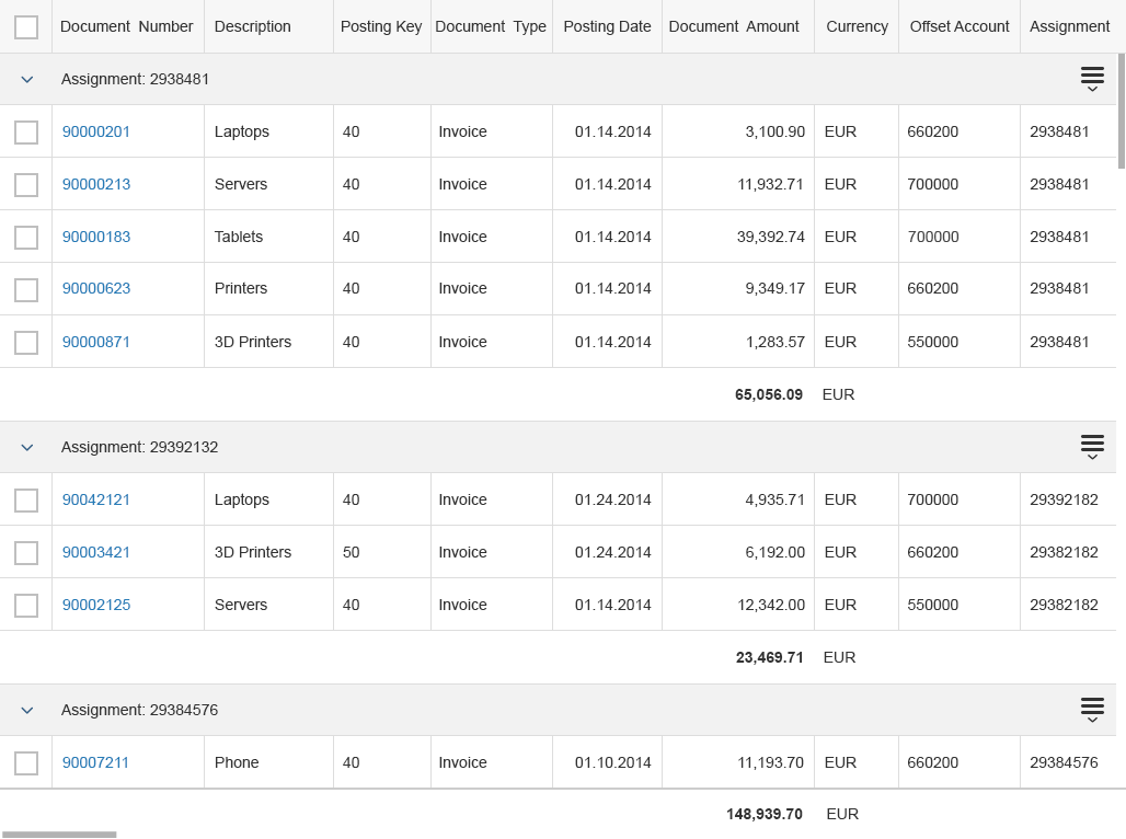
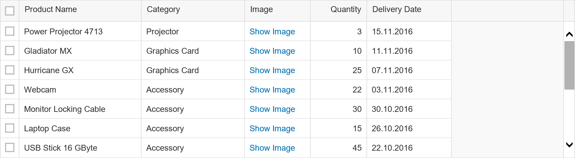
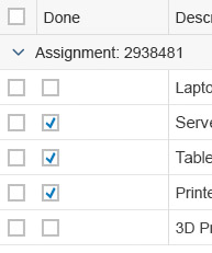
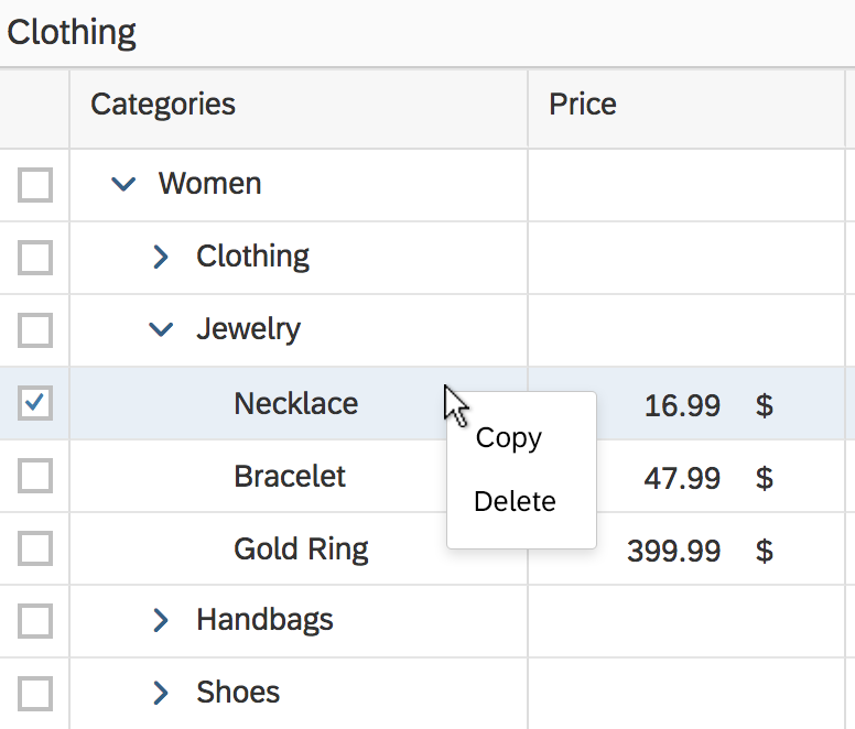
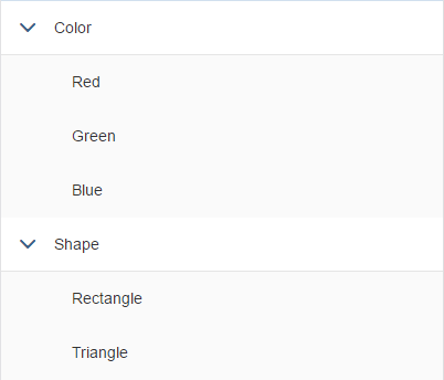
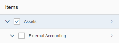
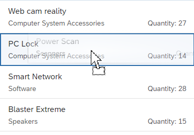
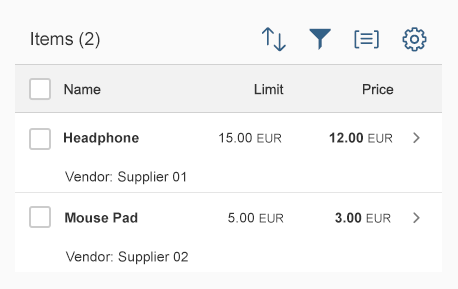
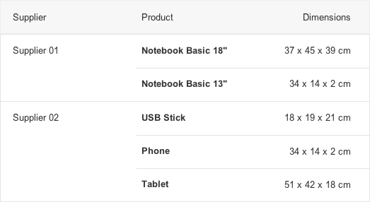
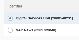
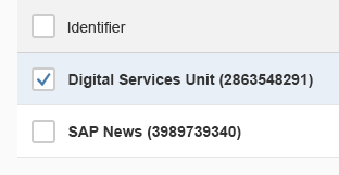
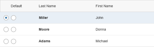
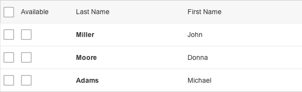
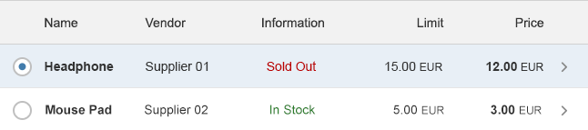
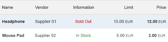
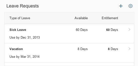
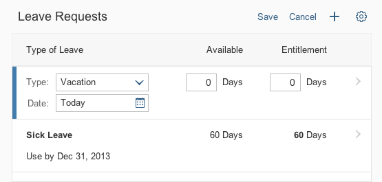
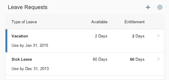
Table Personalization Dialog
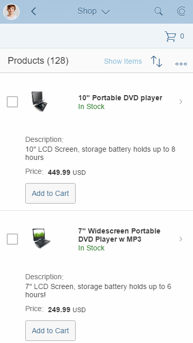
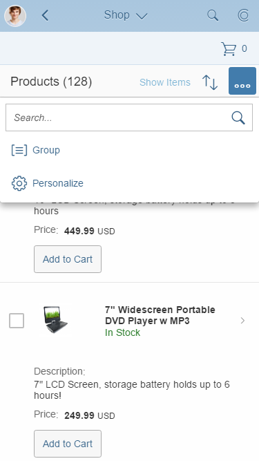
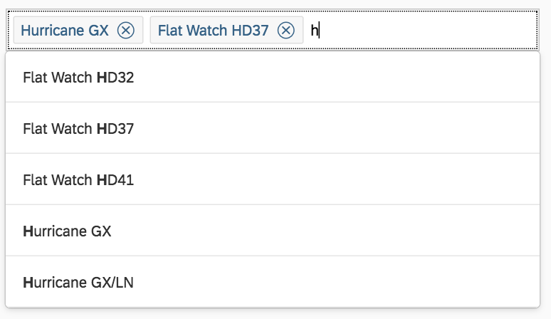
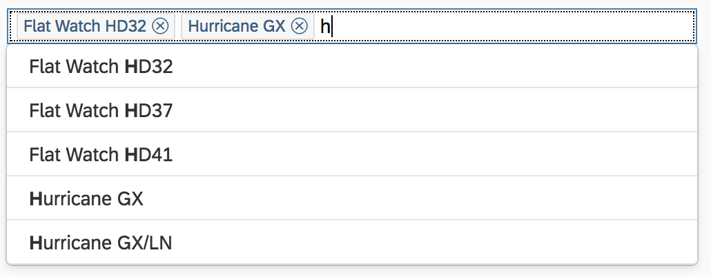
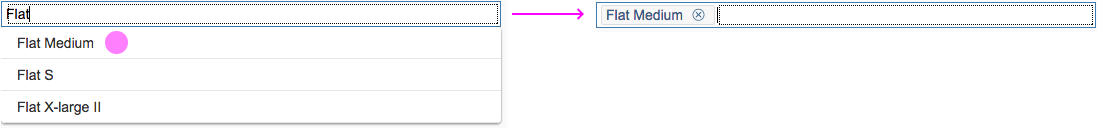
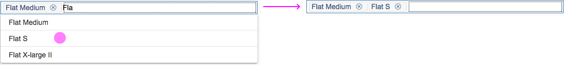
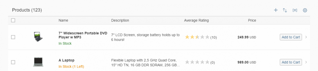
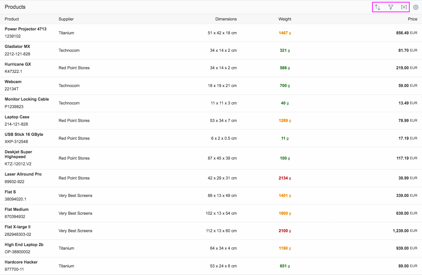
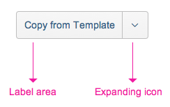
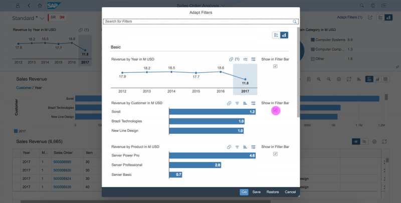
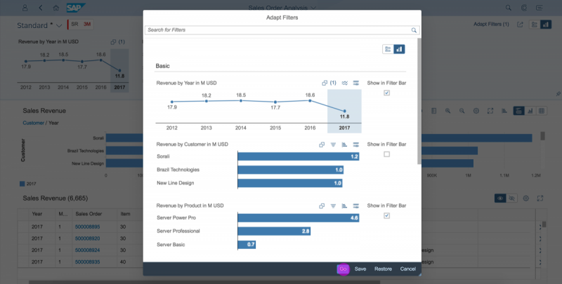
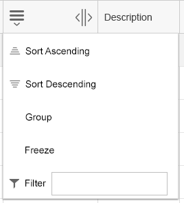
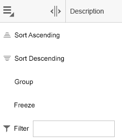
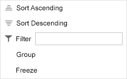
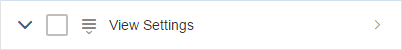
All table personalization dialogs are opened via the Settings button on the right-hand side of the table toolbar.
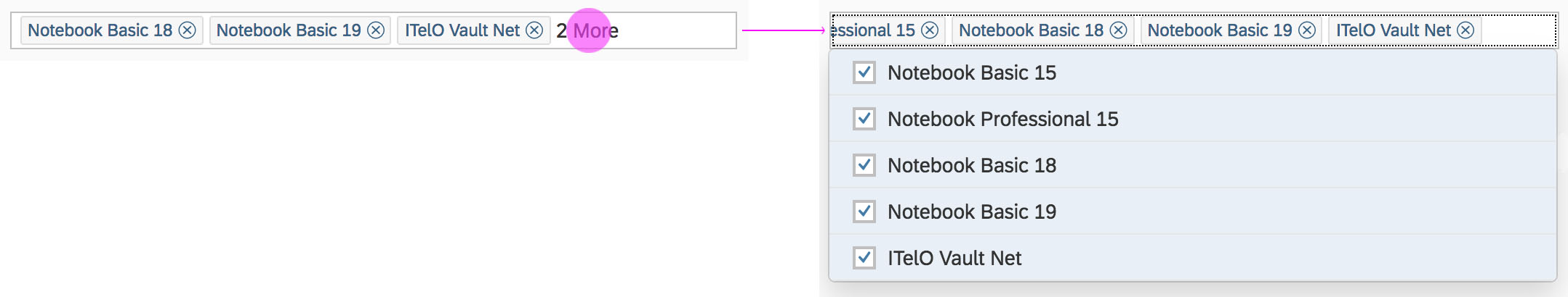
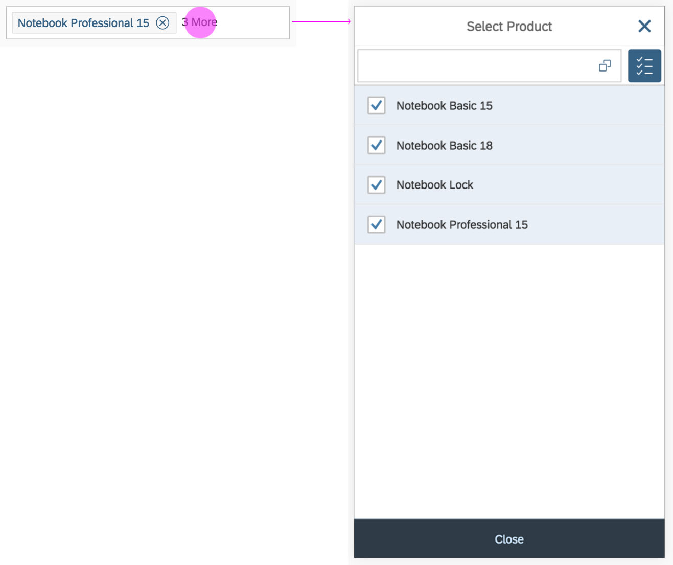
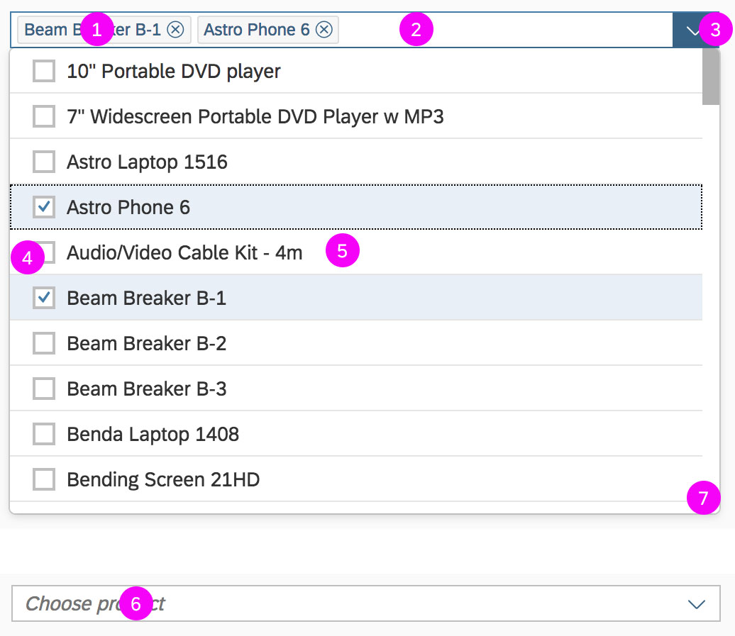
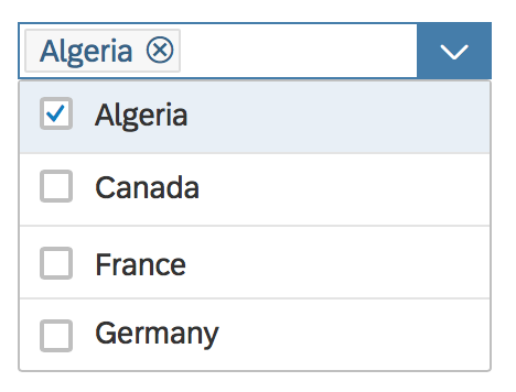
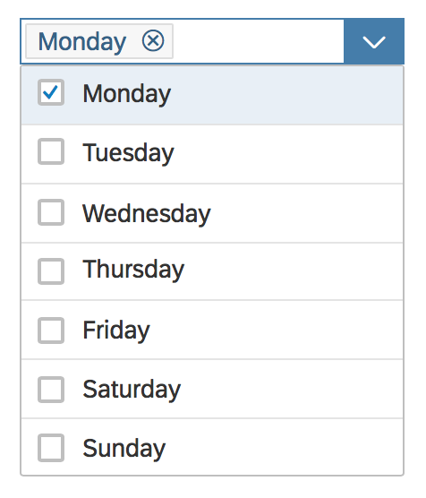
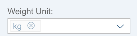
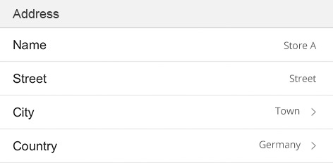
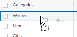
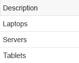
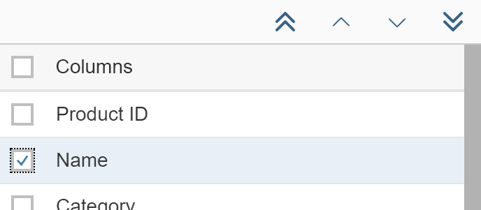
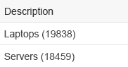
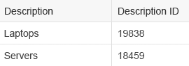
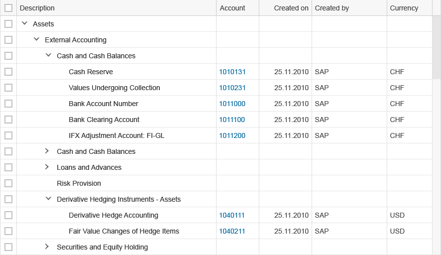
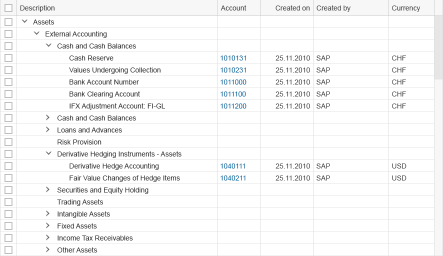
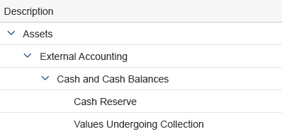
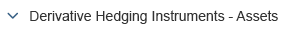
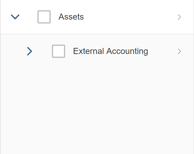
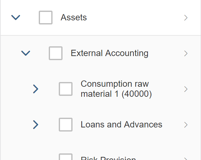
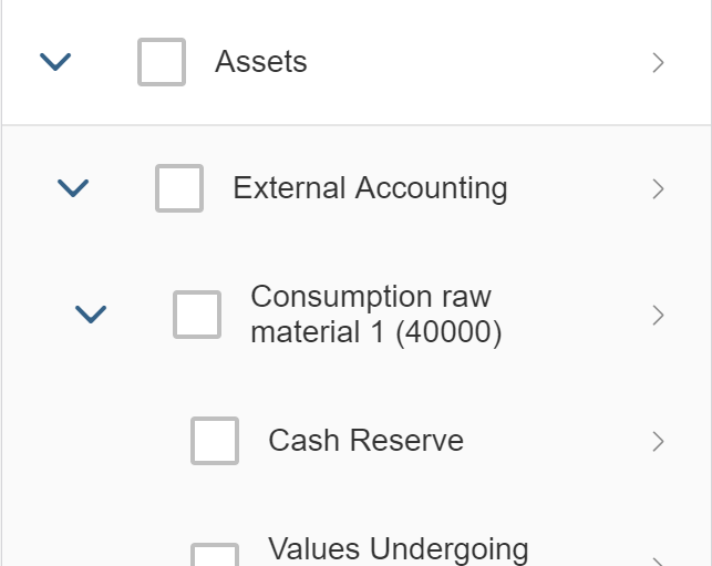
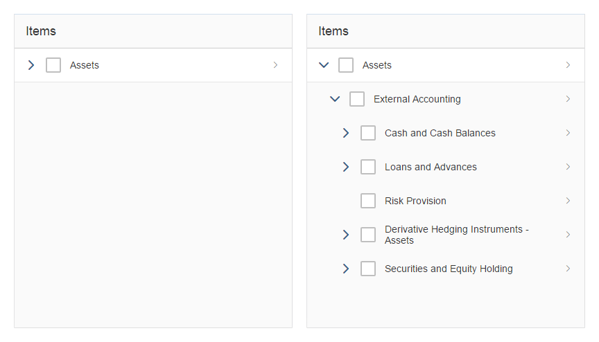
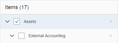
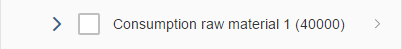
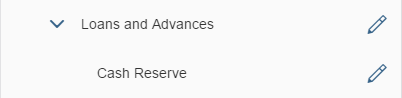
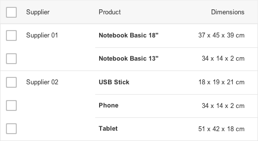
The table personalization dialog can show/hide and reorder columns.
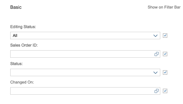
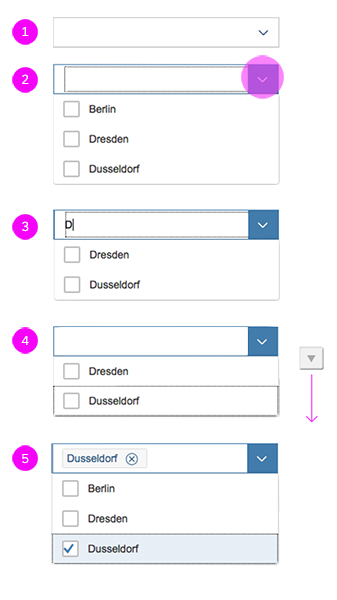
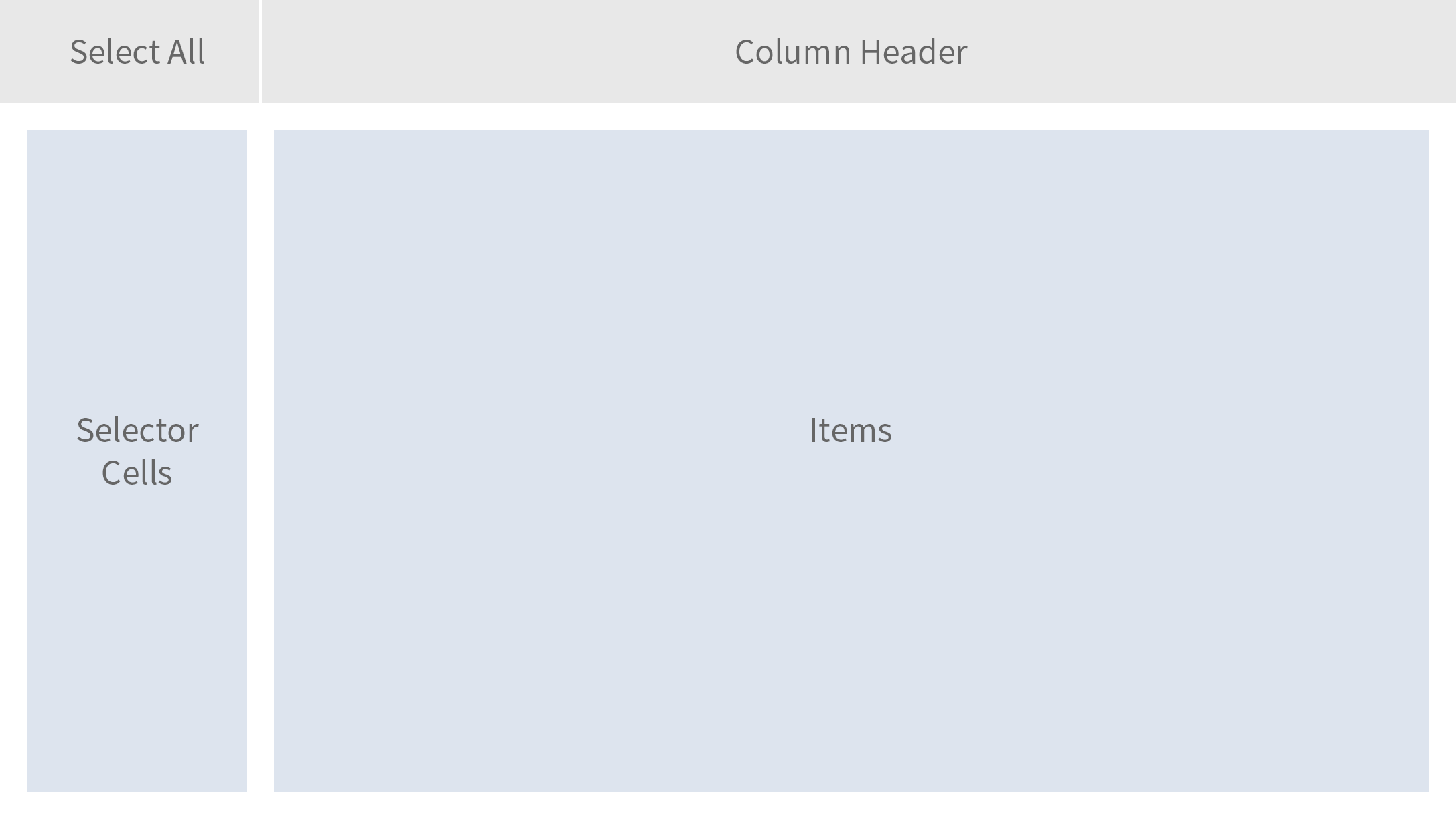
Hide/Show
To show or hide columns, the user only needs to select or deselect the checkboxes of the respective list item. Alternatively, the user can select all the items at once.
Reorder
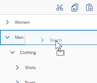
Two buttons on the left-hand side enable a selected column to be moved up or down.
The user confirms the dialog to apply the options to the table.
For more information, see table personalization dialog.
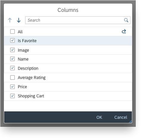
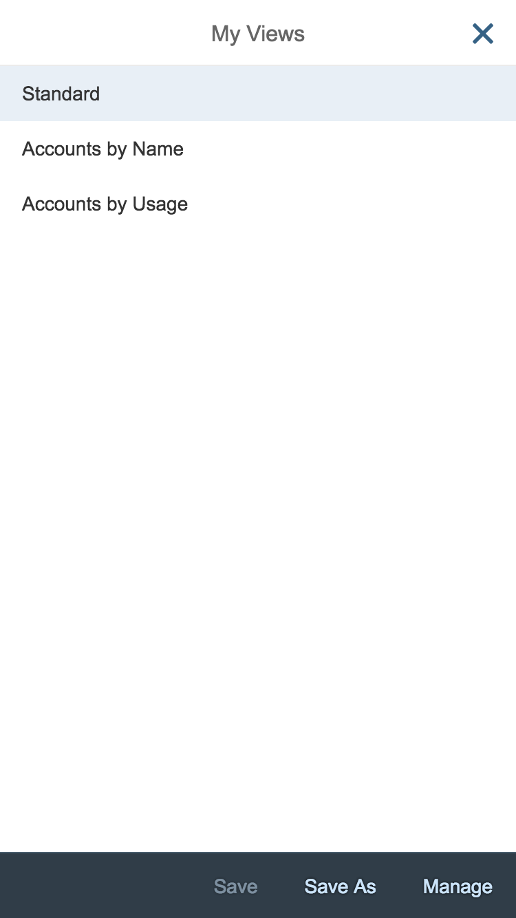
Table personalization dialog
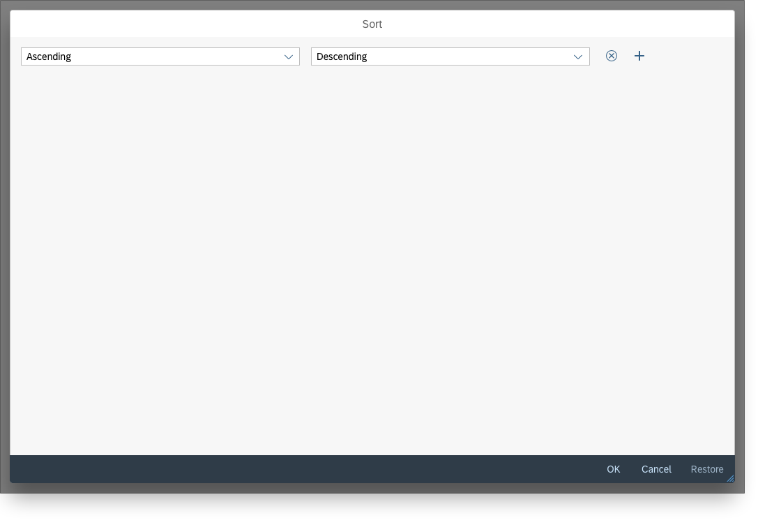
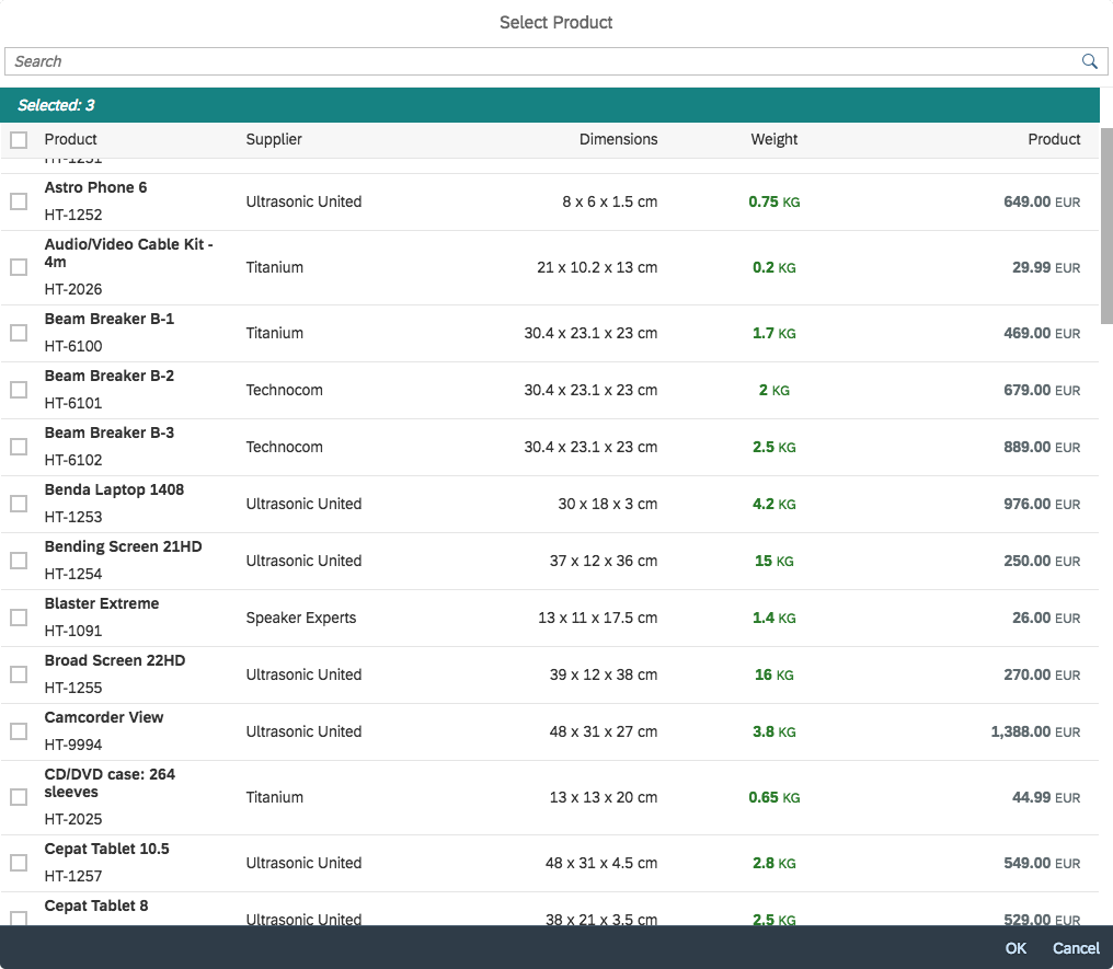
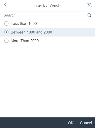
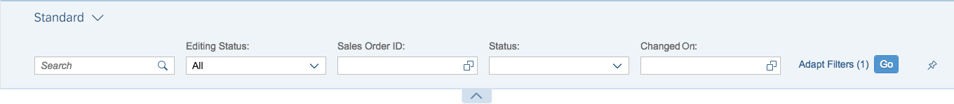
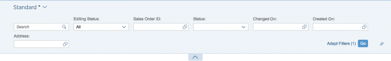
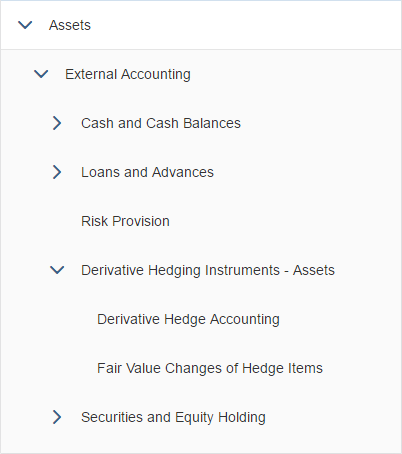
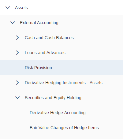
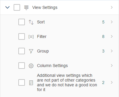
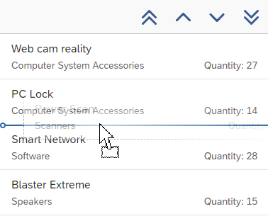
View Settings Dialog
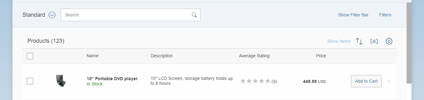
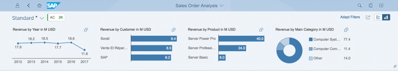
The sort, filter, and group features can all be applied to a table simultaneously.
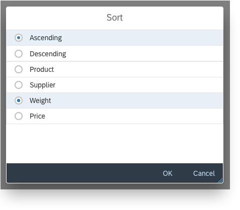
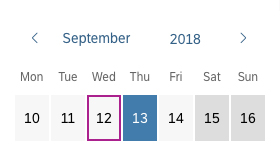
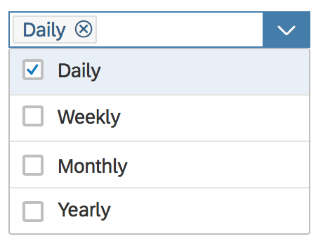
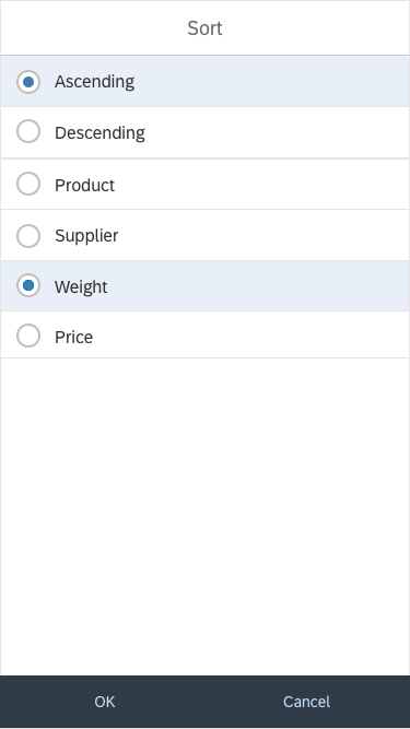
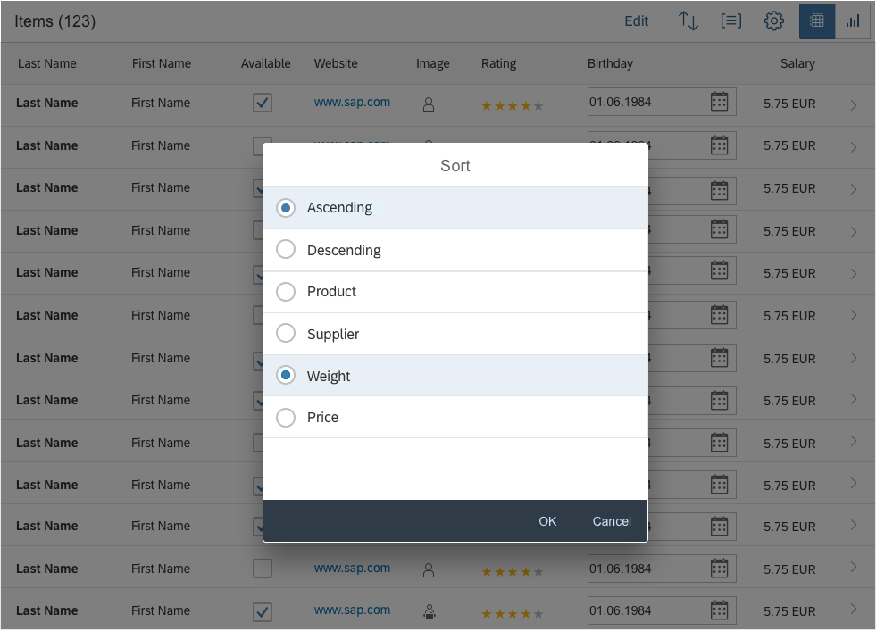
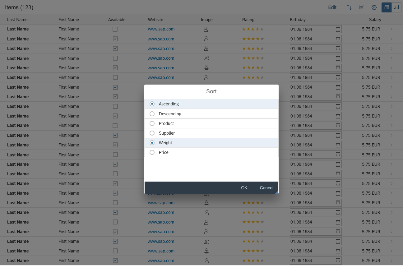
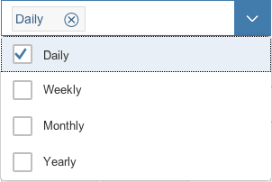
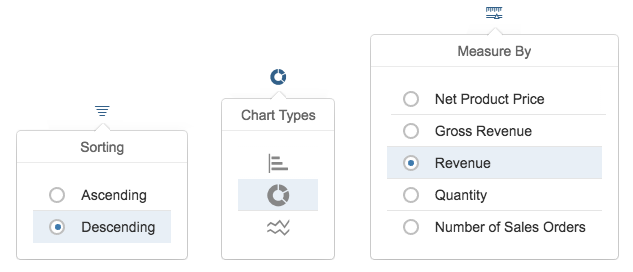
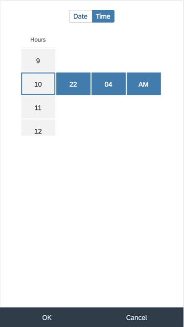
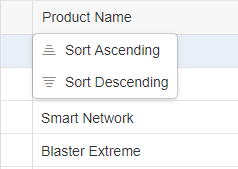
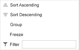
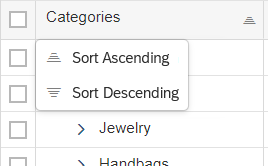
Sort
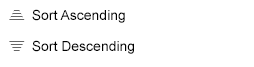
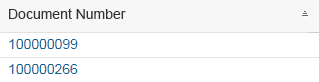
The first tab in the view settings dialog is the sort feature, which allows the table content to be sorted according to the chosen attribute.
The dialog offers two sort features:
- The first group sorts the table by a general ascending or descending order.
- The second group lets the user choose an attribute that fits either a column or part of a column since there are also columns that contain more than one data point.
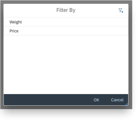
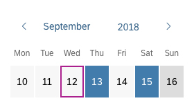
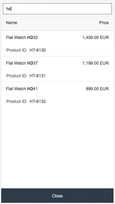
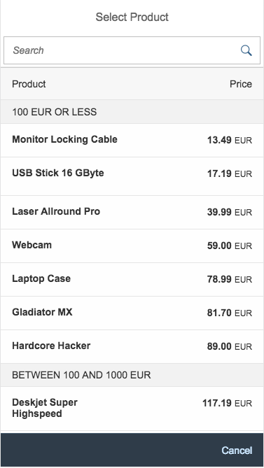
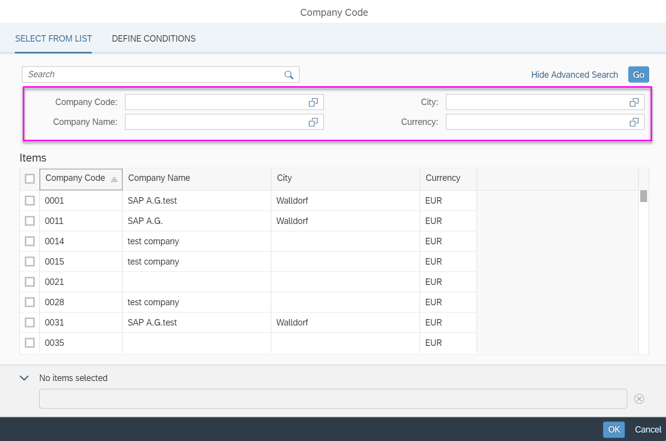
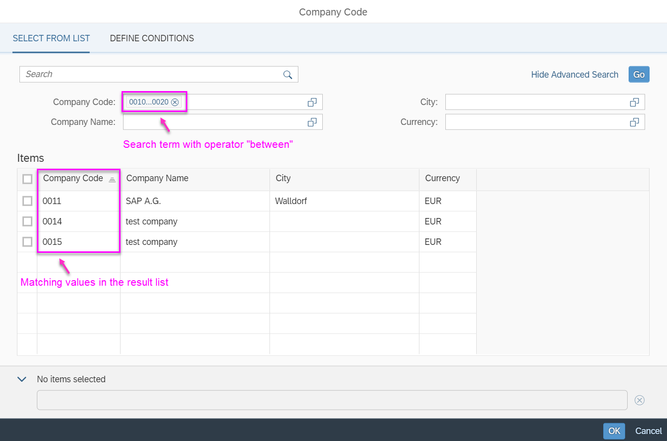
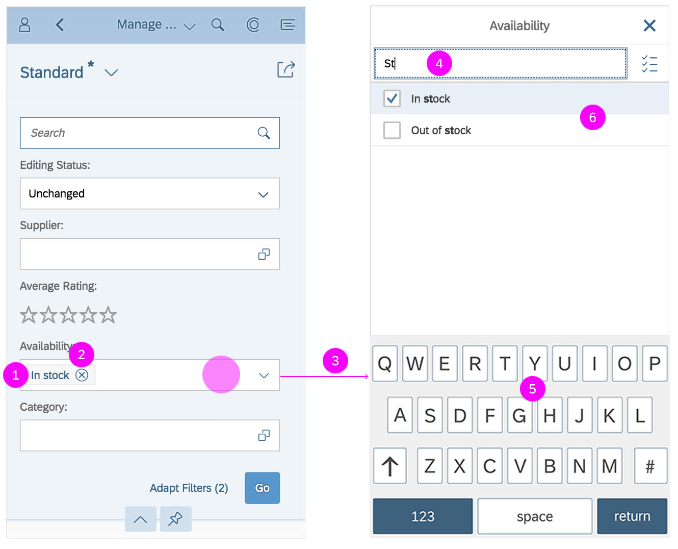
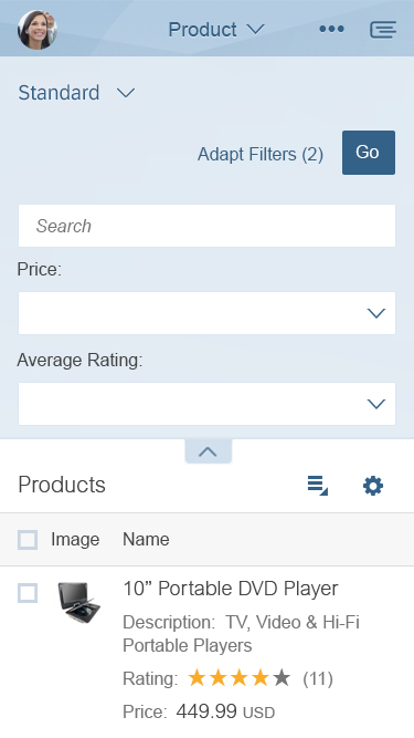
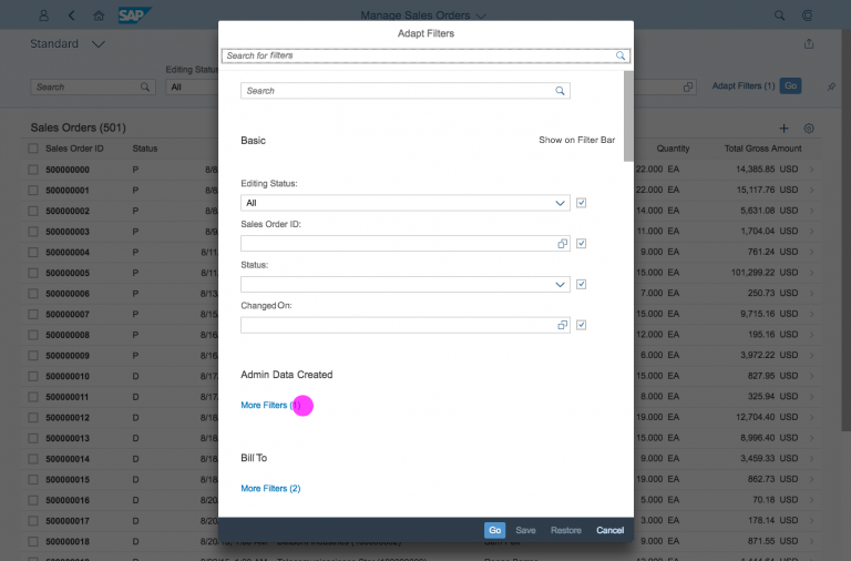
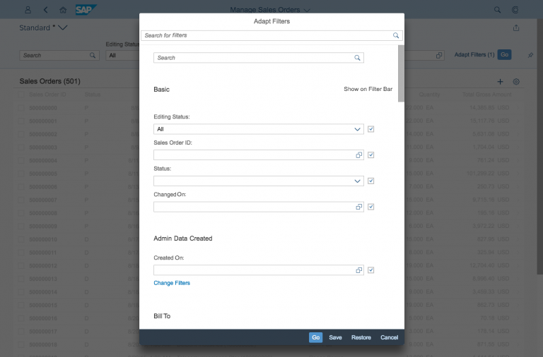
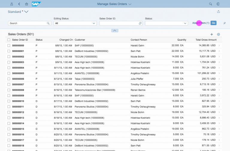
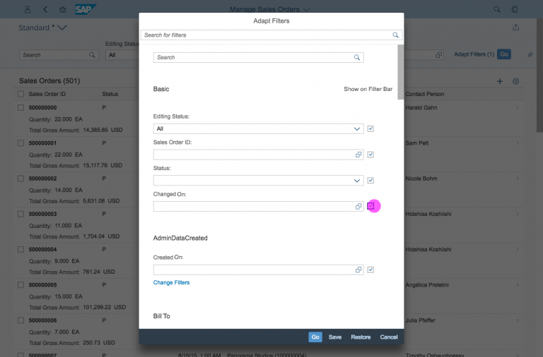
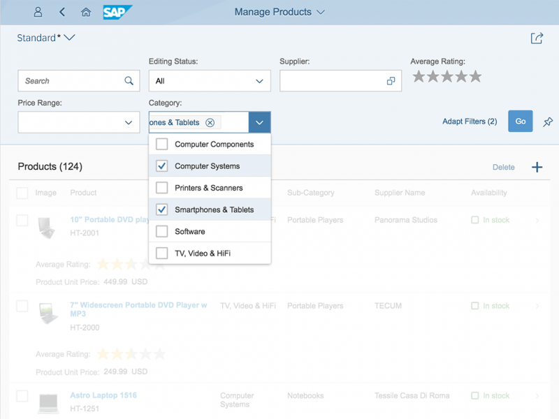
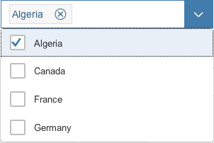
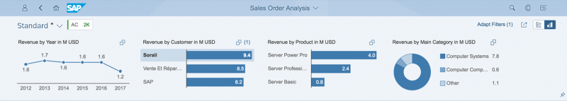
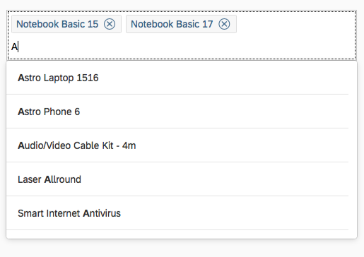
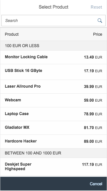
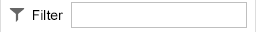
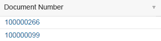
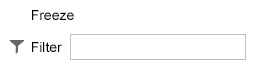
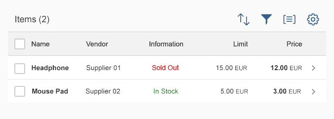
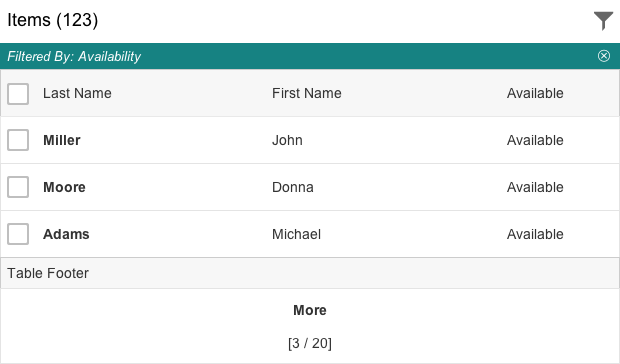
Filter
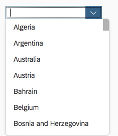
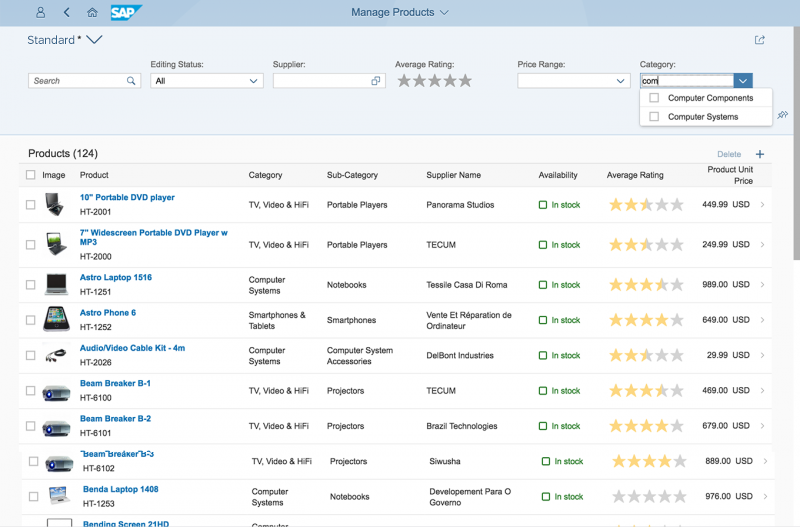
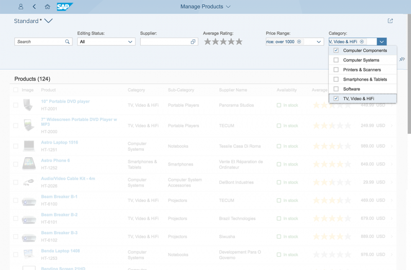
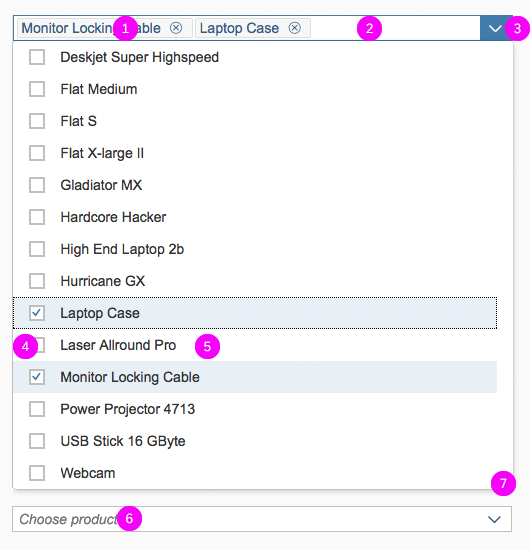
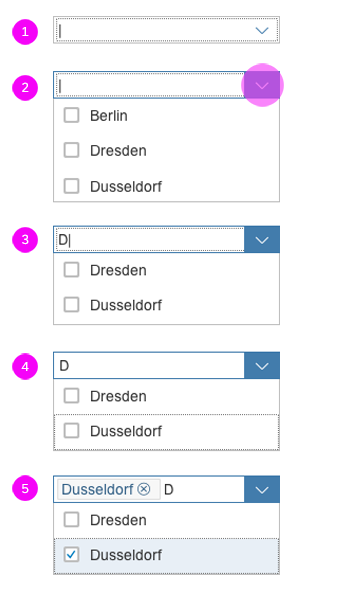
The second tab in the view settings dialog is the filter feature, which can offer a single filter selection list or a category list. The category list provides an overview and guides the user to detailed filter selection lists via drilldown. The options available are single selection, multiselection, a category list, a predefined list, and a custom filter.
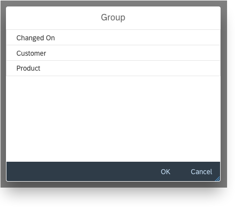
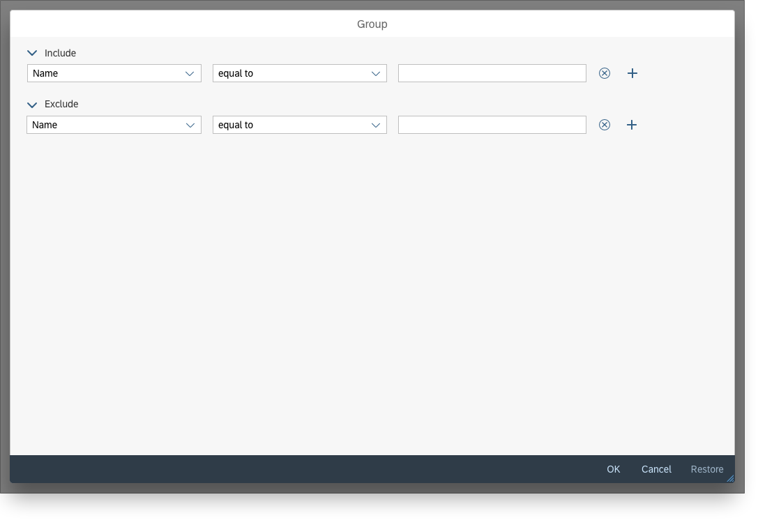
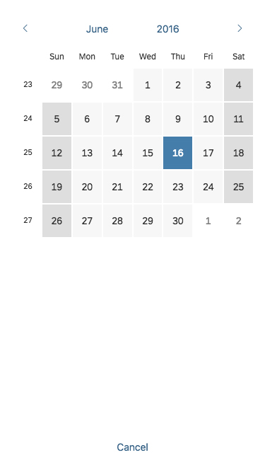
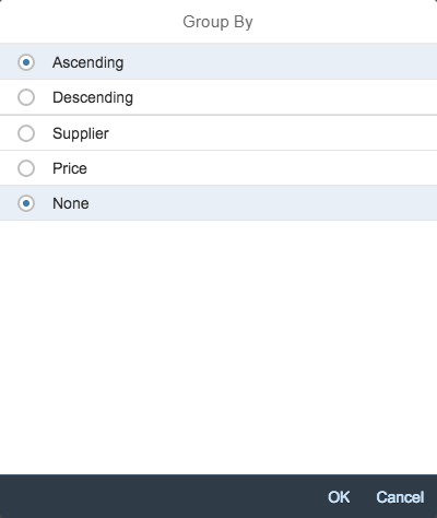
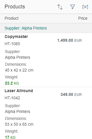
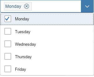
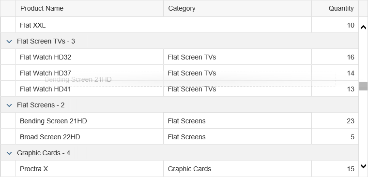
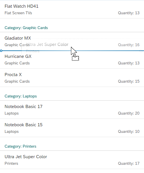
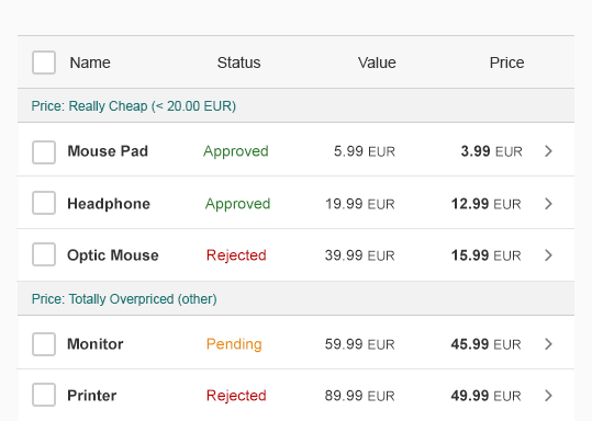
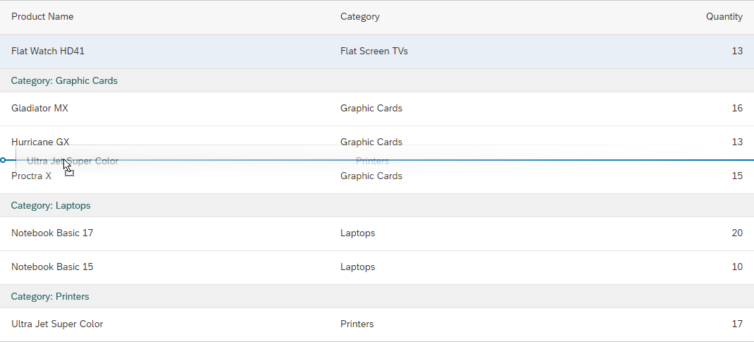
Group
The third tab in the view settings dialog is the group feature, which also offers two groups of attributes:
- The first group offers a general ascending or descending order that controls the order in which the defined groups appear.
- The second group offers attributes with which to group the corresponding data in the table.
View settings dialog – Sort tab
View settings dialog – Filter tab
View settings dialog – Group tab
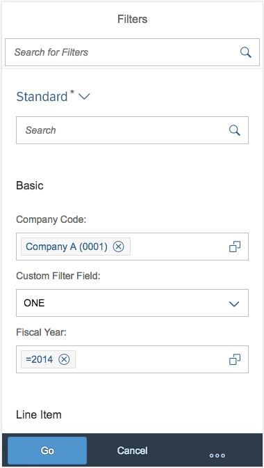
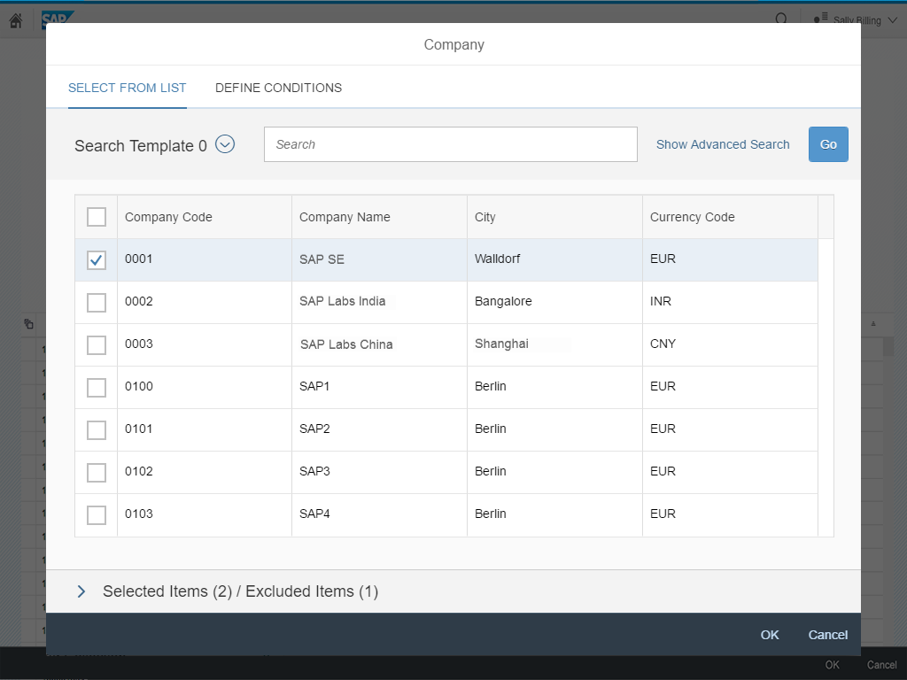
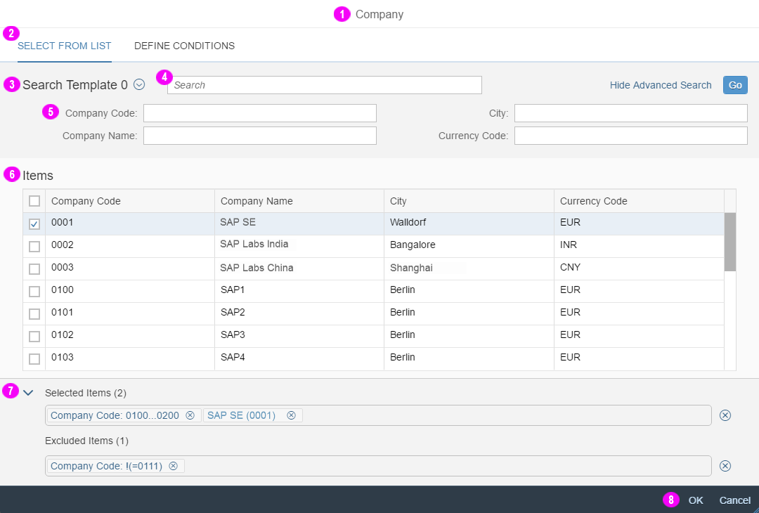
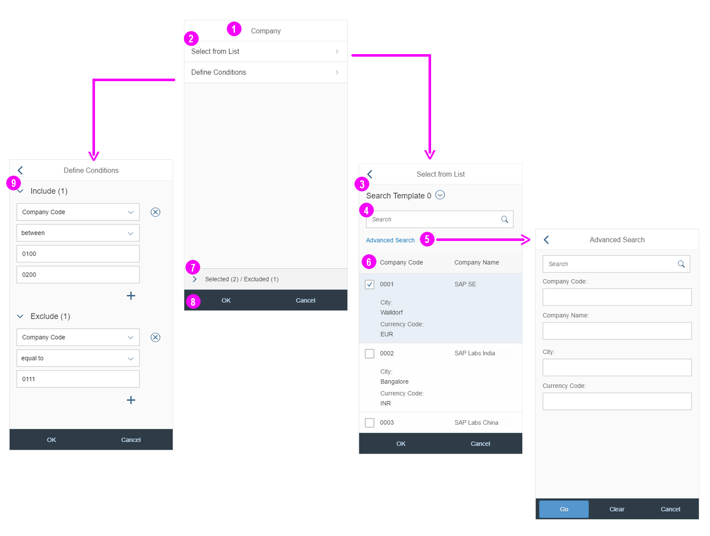
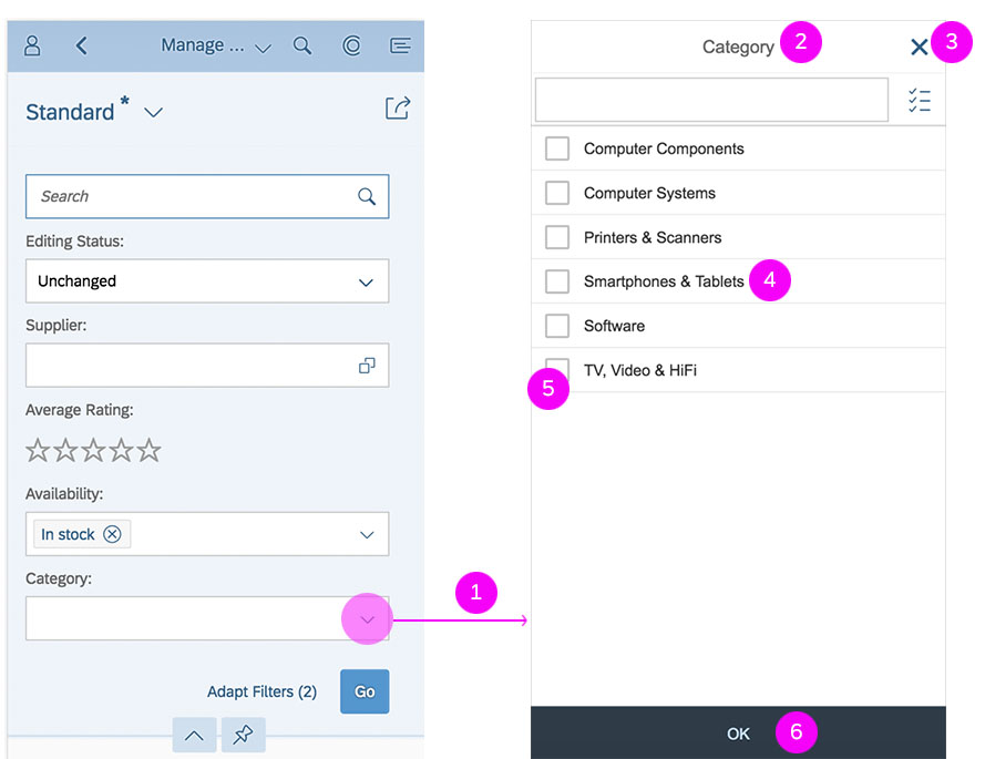
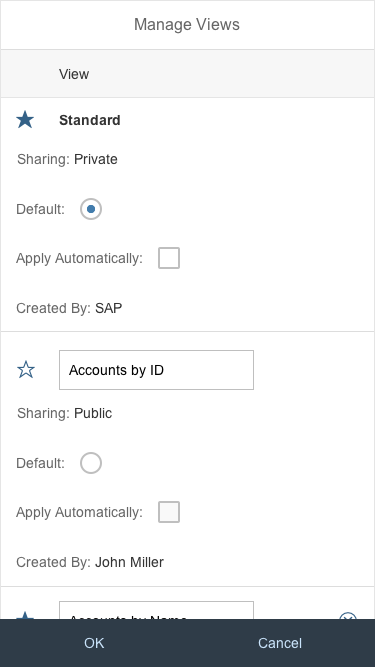
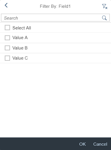
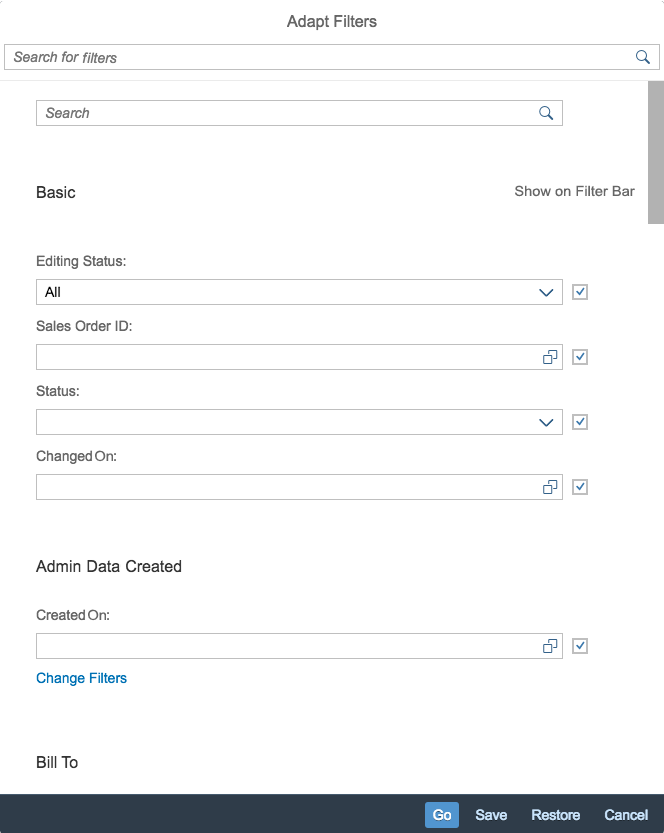
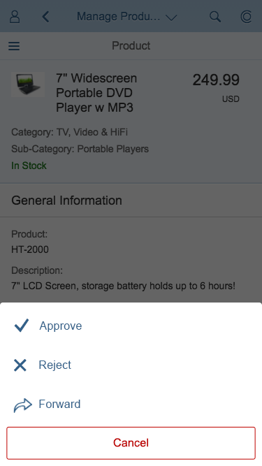
P13n Dialog
The P13n dialog is the most complex personalization option for tables. It is used if none of the other options are sufficient. Like the view settings dialog, it can combine any of the tabs available. By allowing inclusion and exclusion filters, as well as several group options (for some tables only), it can form more complex queries than the other options.
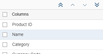
Columns
The P13n dialog offers the most options for changing the table columns that are shown and the order in which they are displayed.
It can show/hide a column and alter the order of the columns.
Columns tab in the P13n dialog
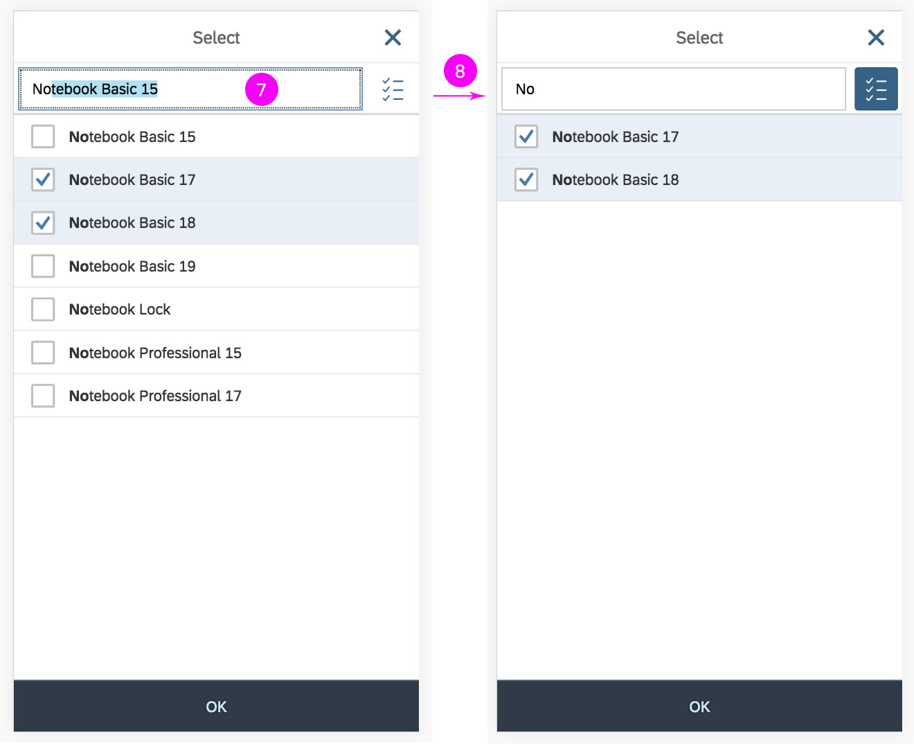
Sort
It also allows the user to sort the table content according to the columns that are chosen and in a specific order.
For more complex sorting needs, the user can add the required number of criteria by clicking the button (Add New Line) at the end of the line.
P13n dialog – Sort tab
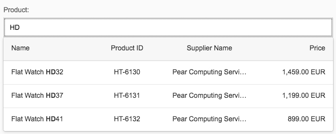
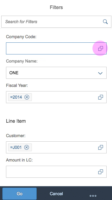
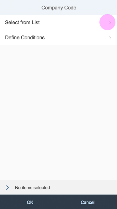
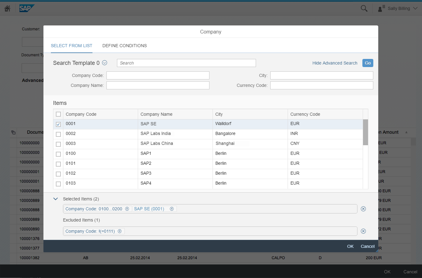
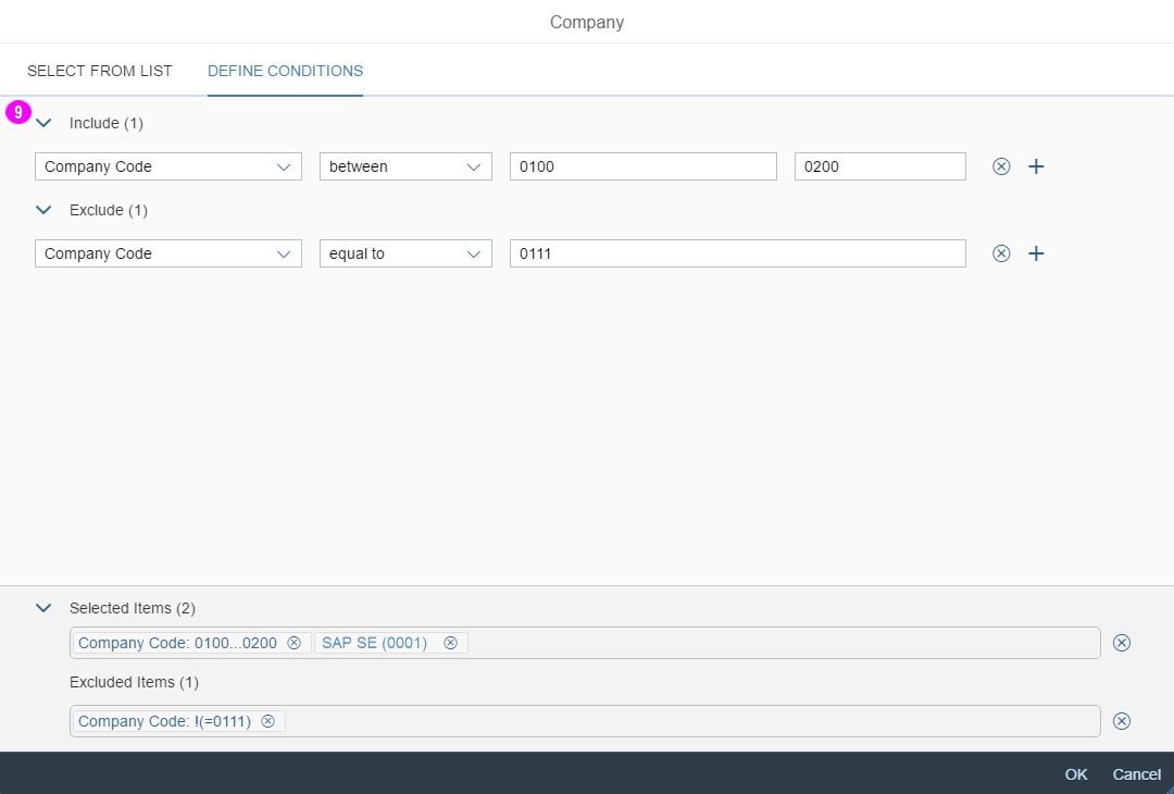
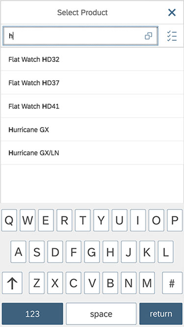
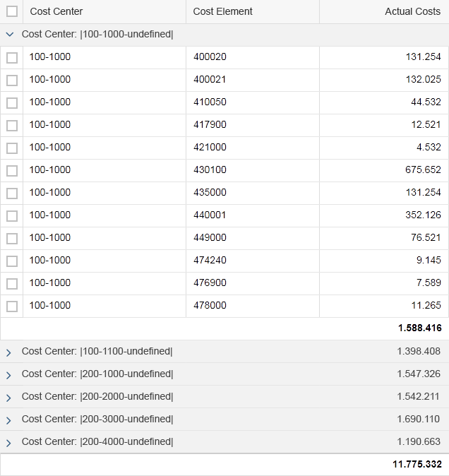
Filter
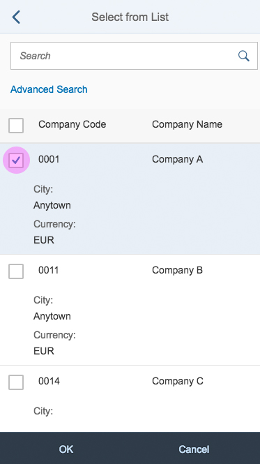
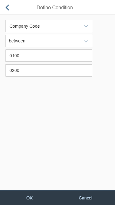
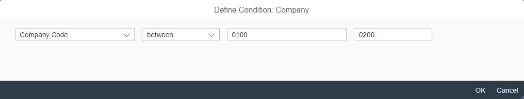
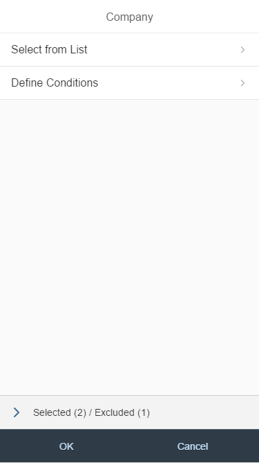
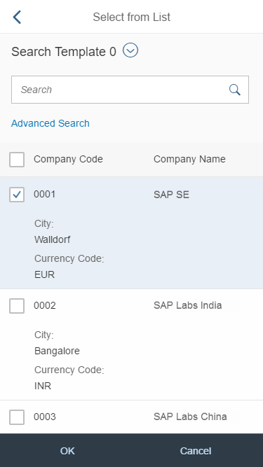
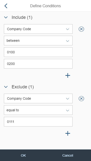
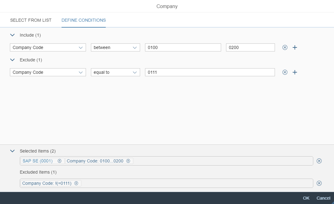
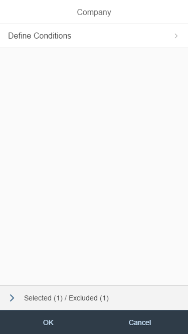
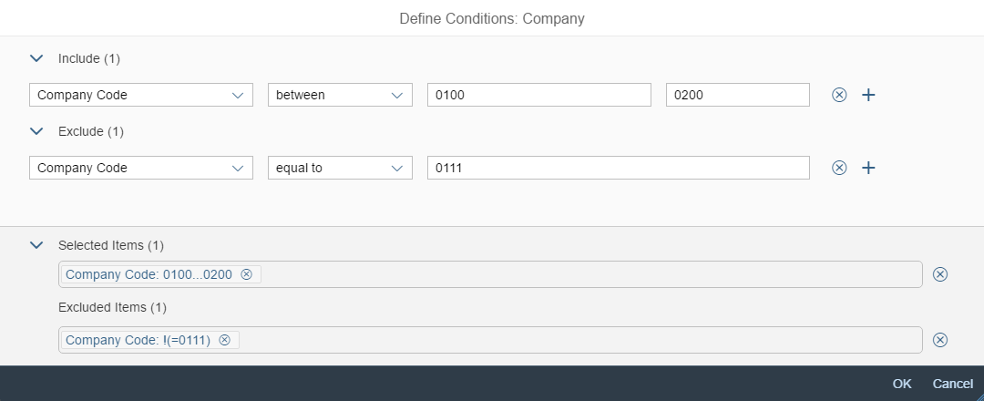
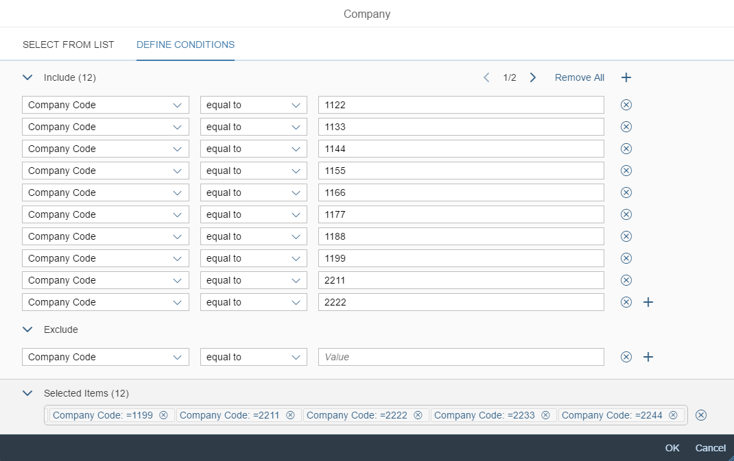
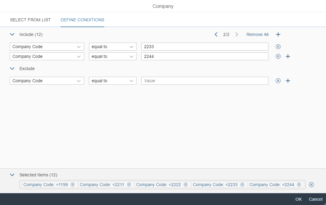
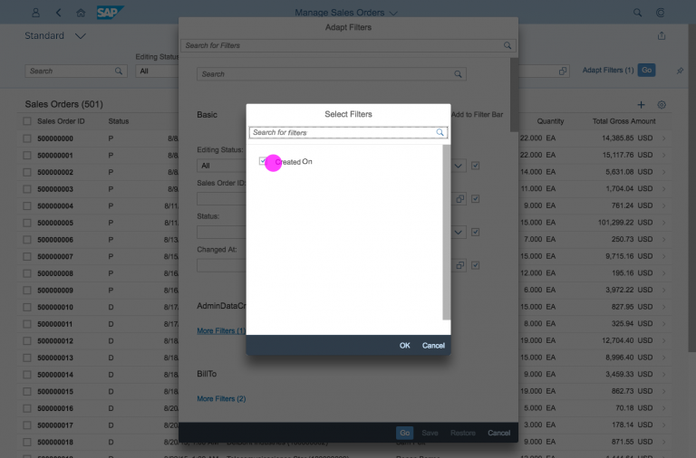
A filter option allows the user to filter the table information according to specific filter criteria, which can be included or excluded in the relevant section of the filter.
Each filter criterion consists of a column, an operator (depending on the data type of the column), and a value by which the selected column is filtered.
For more complex cases, the user can add filters by clicking the button (Add New Line), and remove them by clicking the button (Remove Line) at the end of each filter item.
P13n dialog – Filter tab
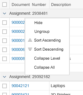
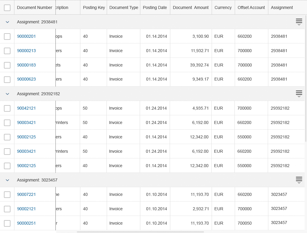
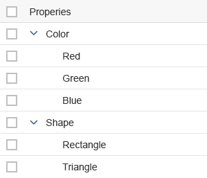
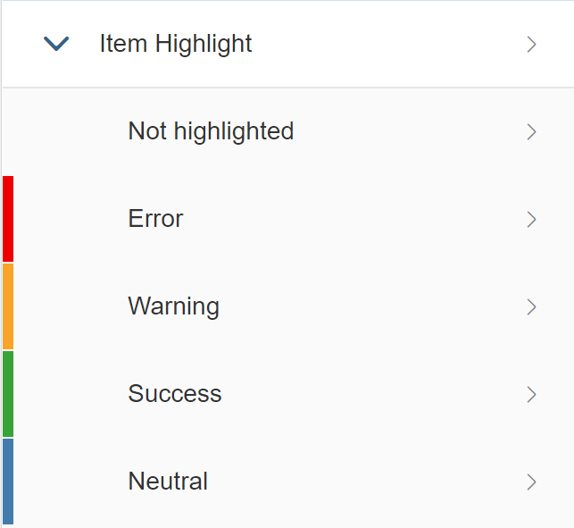
Group
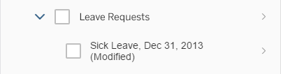
The Group tab enables the user to group the table data by one or more columns.
For more complex grouping scenarios, the user can add more grouping options by clicking the button (Add New Line) at the right-hand side of each grouping line (only available for the ALV table).

P13n dialog – Group tab
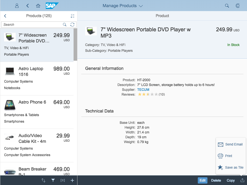
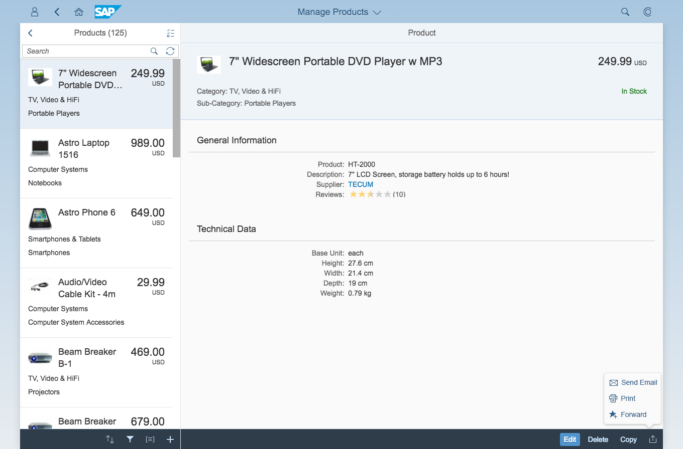
Resources
Want to dive deeper? Follow the links below to find out more about related controls, the SAPUI5 implementation, and the visual design.
Elements and Controls
- Table Overview (guidelines)
- Table Personalization Dialog (guidelines)
- P13n-Dialog (guidelines)
- View Settings Dialog (guidelines)
Implementation
- Table Personalization (SAPUI5 samples)
- View Settings Dialog (SAPUI5 samples)
- P13n-Dialog (SAPUI5 samples)
- Table Personalization Dialog (SAPUI5 API reference)
- Table Personalization Provider (SAPUI5 API reference)


 Your feedback has been sent to the SAP Fiori design team.