
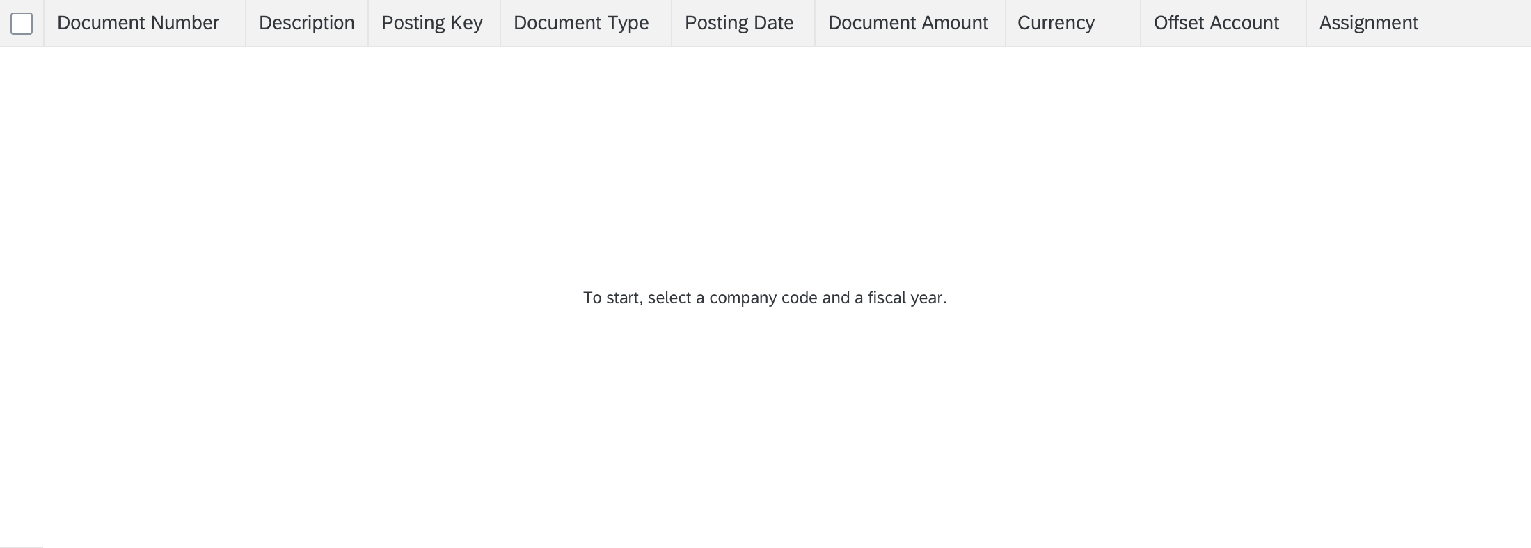
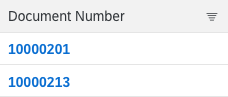
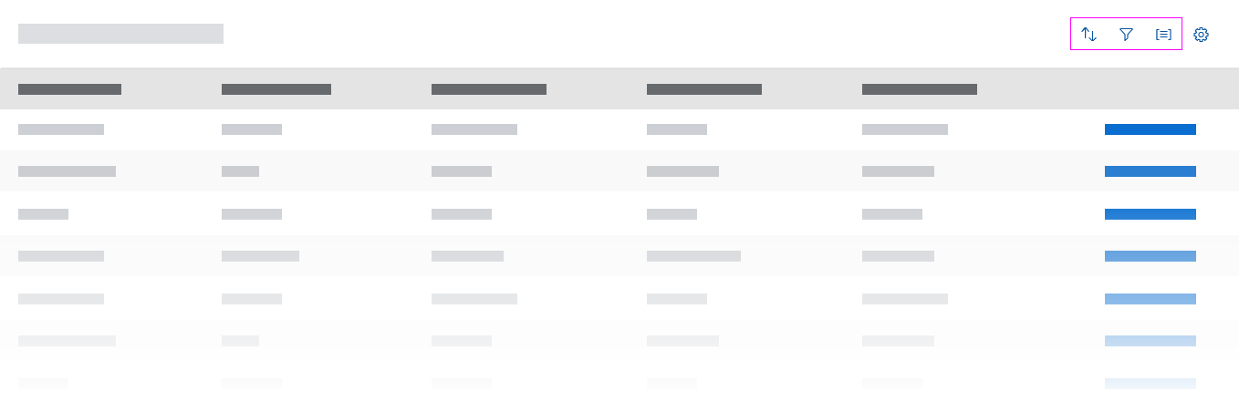
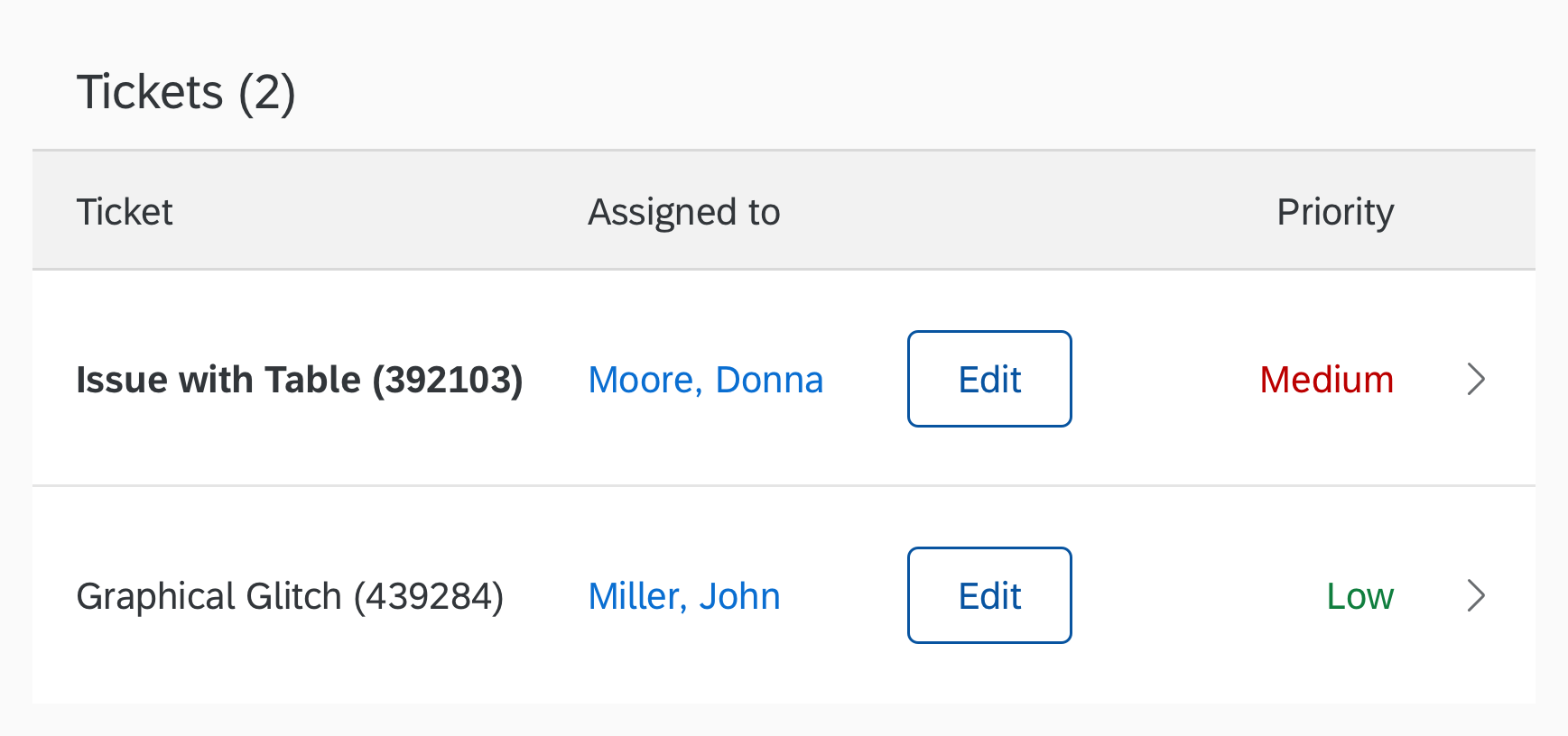
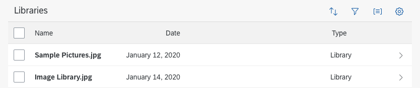
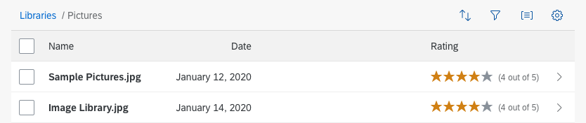
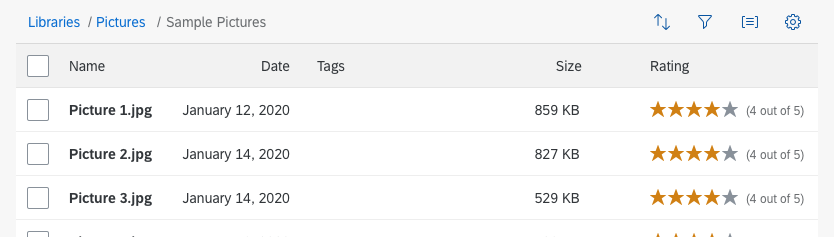
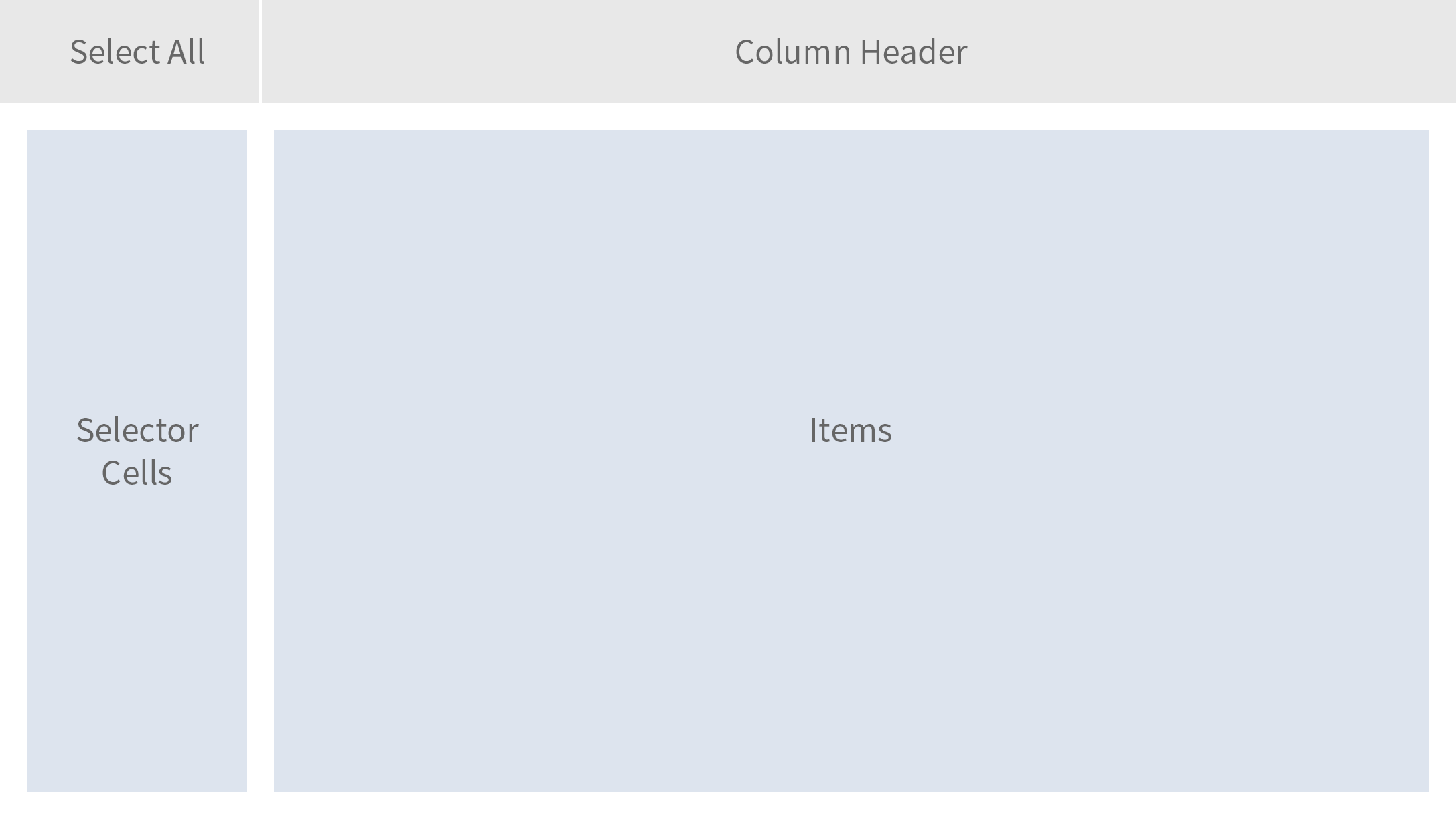
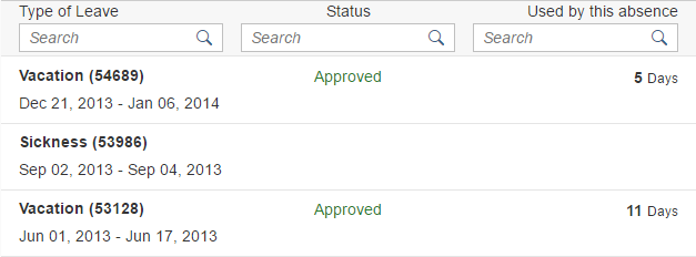
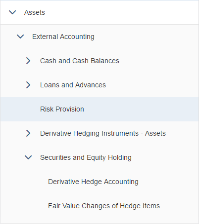
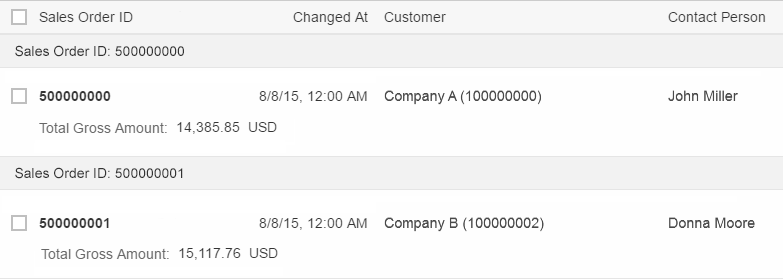
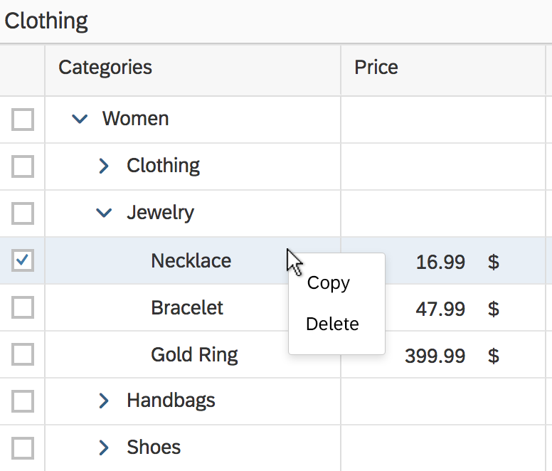
Responsive Table
The responsive table contains a set of line items and is fully responsive. Depending on the scenario, users can also navigate from the line items to further details.
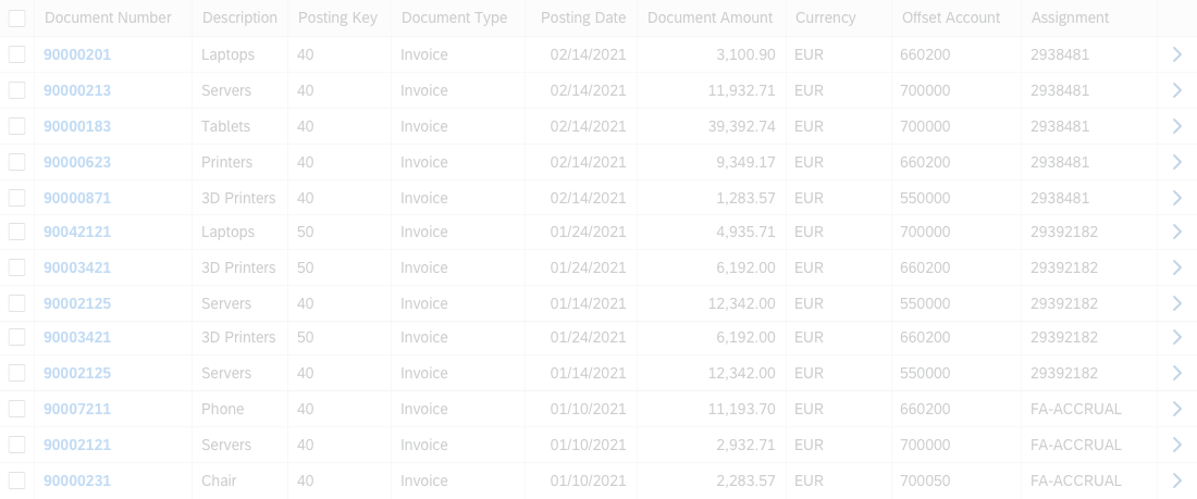
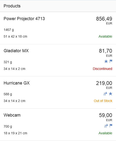
A line item contains several data points sorted into columns. A data point refers to a unit of information, such as a number, a text, a unit of measurement, and so on, which can be used to form the content of a table, form or other control. One data point is usually displayed by a control, such as a text, object status, or input field. A control can display more than one data point, for example, by concatenating text.
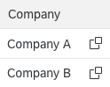
In contrast to traditional tables, a “cell” of the responsive table is not limited to displaying only one control, and therefore a single cell can present far more than one data point.
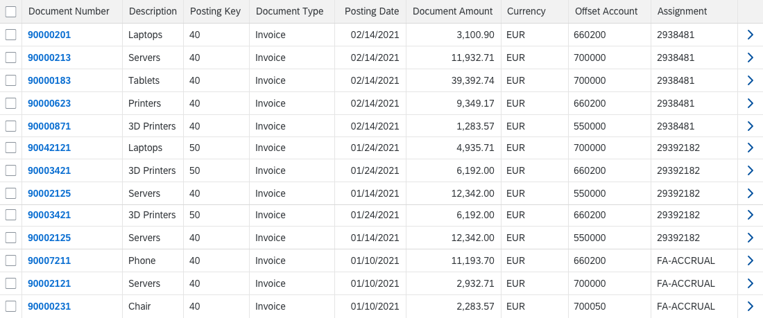
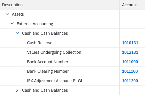
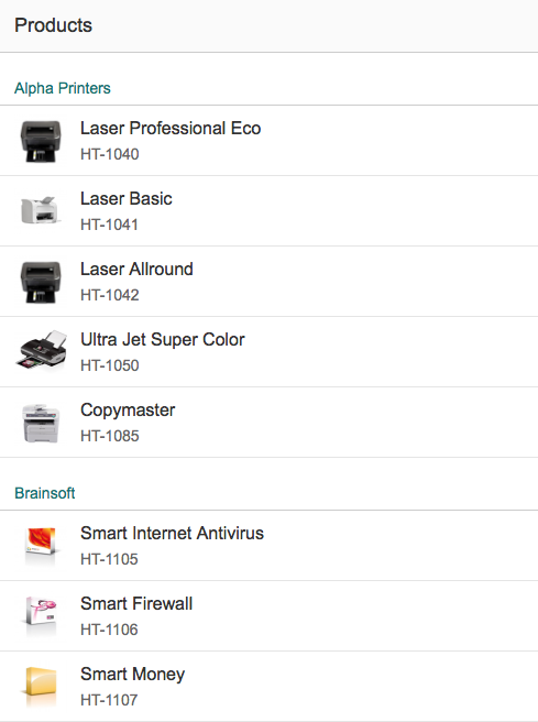
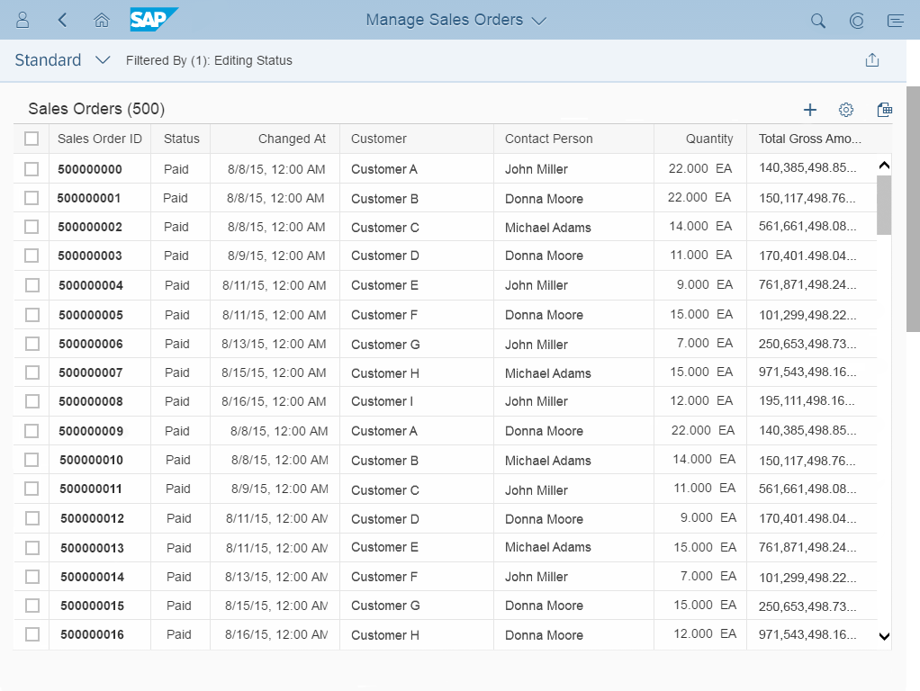
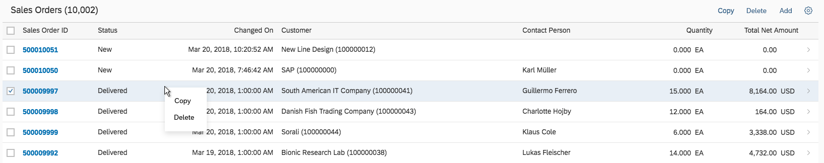
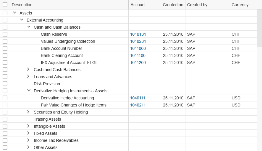
Responsive table
Usage
Use the responsive table if:
- You need a table to display a moderate amount of data. When your data is of average complexity, the responsive table can handle up to 200 items. However, more complex data lowers the limit, and less complex data raises it. Note that the limit is not on the number of items in the database or in the filtered results, but the volume of data loaded at any point. Factors that influence the exact limit include:
- The number of loaded rows in the table
- The number of displayed columns
- The complexity of the cell content (for example, simple text vs. complex charts)
- Other elements on the page (for example, multiple pages in a flexible column layout, or several tables/elements with more complex rendering on the page)
- The browser used
For loading large amounts of complex data, use a grid table instead, as it can handle higher volumes more efficiently.
- You need to use various controls inside a line item, such as micro charts. By contrast, the analytical table supports only a very limited set of controls.
- The focus is on line items, not on cells. The responsive table is optimized for viewing complete items on all devices.
- Selecting one or more items is a main use case and details are needed to choose the correct item.
- Line items are independent of each other and no operation across columns is needed.
- You want a single implementation for all devices. As its name suggests, the table is responsive and adjusts its appearance to the screen size so you can use it on all devices. However, make sure you adapt the responsive table design to offer the best solution for the tasks performed on mobile devices. Sometimes, a solution without a table is more useful and usable.
Do not use the responsive table if:
- The main use case is to select one item from a very small number of items, without viewing additional details. In this case, a select or combo box might be more appropriate.
- The main use case is to select one item from several items, with the possibility of viewing only a few details per item. In this case, a list might be more appropriate. Pay attention to the layout of the list item to ensure that it has a pleasant appearance.
- The cell level and the spatial relationship between cells is more important than the line item. In this case, use the analytical table or grid table. Examples include spreadsheet analyses and waterfall charts. Note that neither the analytical table nor the grid table are fully responsive. Both are only available for desktops and tablets, so you will need to take an adaptive approach by offering an additional UI for smartphones.
- You expect users to work with large amounts of complex data. Use the analytical table or grid table instead; they are optimized for those cases.
Note that the analytical table and the grid table are not fully responsive, but available only for desktops and tablets, so you will need to take an adaptive approach by offering an additional UI for smartphones. - Comparing items is a major use case. In this case, the analytical table or grid table might be more appropriate because each cell contains only one data point. In contrast, the responsive table offers greater flexibility within line items, including the ability to add more data points per cell and the pop-in function. Both make comparisons more difficult. Note that neither the analytical table nor the grid table are fully responsive. Both are only available for desktops and tablets, so you will need to take an adaptive approach by offering an additional UI for smartphones.
- Data needs to be structured in a hierarchical manner. In this case, a tree table might be more appropriate. Although the analytical table can have several grouping levels, it is not as flexible when nodes at several levels contain child nodes. Note that the analytical table isn’t fully responsive and is only available for desktops and tablets, so you will need to take an adaptive approach by offering an additional UI for smartphones.
- You need an overview of a large amount of data. In this case, use a chart.
- You just need it for layout reasons. In this case, use a layout container such as a horizontal layout or a vertical layout instead.
- You need read-only or editable field-value pairs. In this case, use a form instead. The responsive table is not optimized for form-like input navigation.
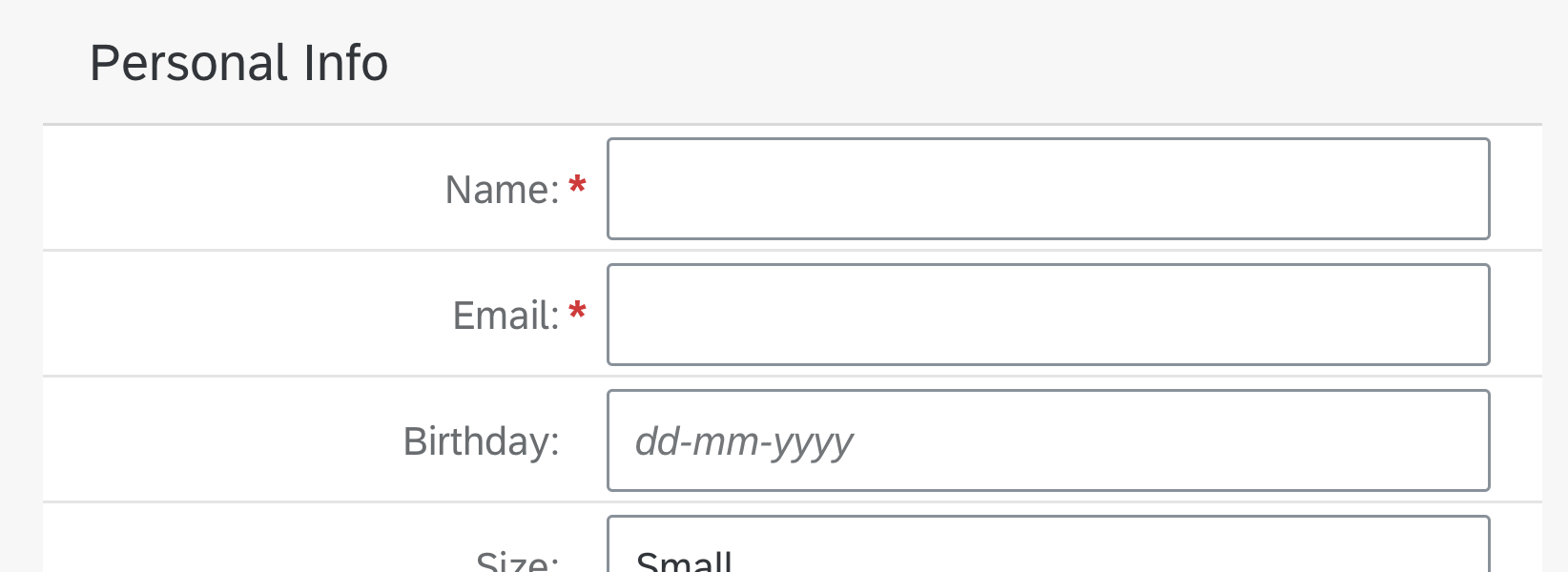
Don't use a responsive table as a form
See the table overview to decide which SAP Fiori table is most suitable for your needs.
Responsiveness
The responsive table is optimized for viewing one line item at a time with no scrolling or only vertical scrolling, irrespective of the display width.
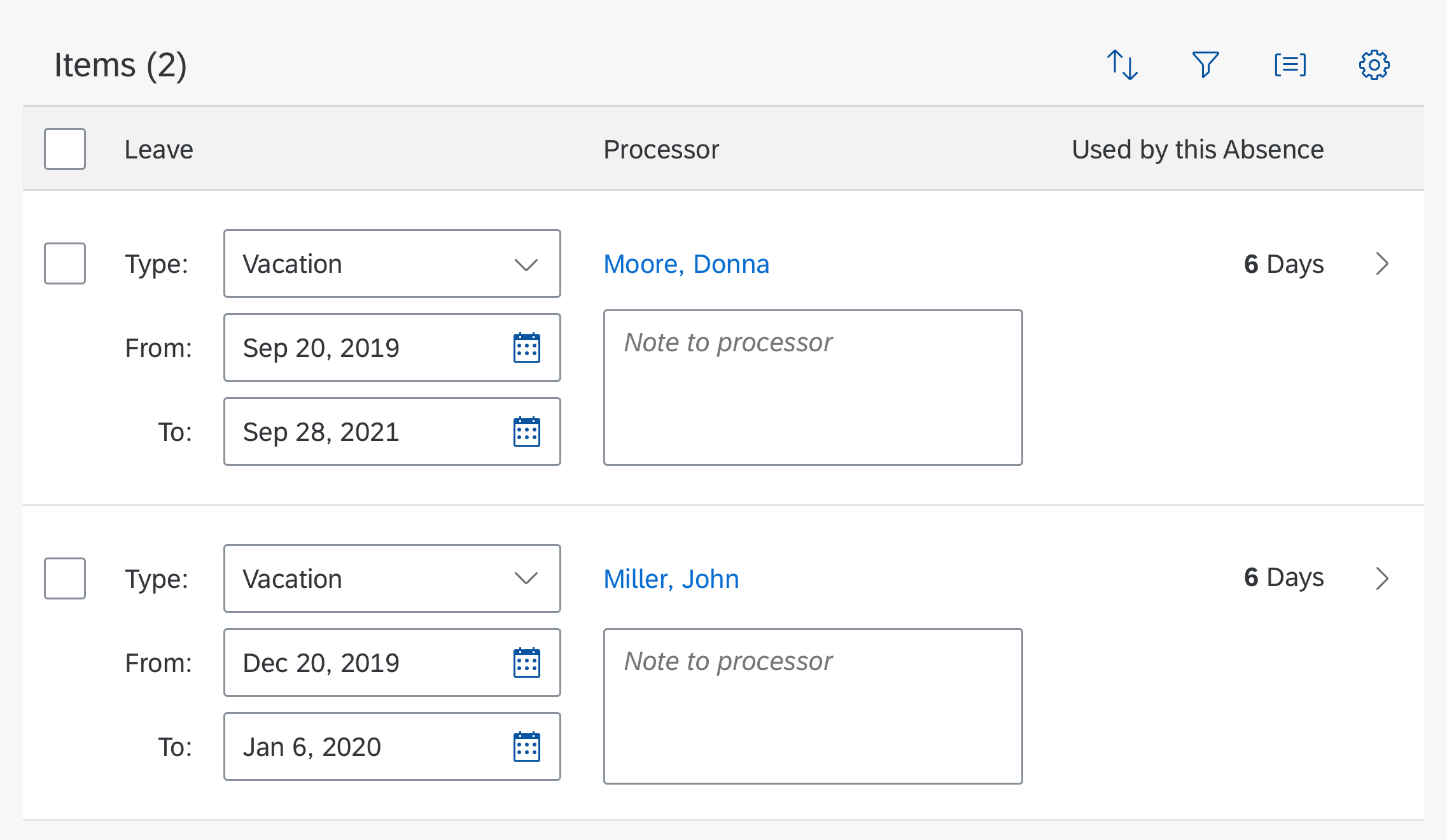
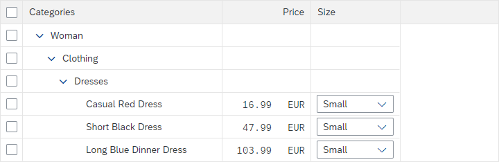
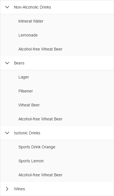
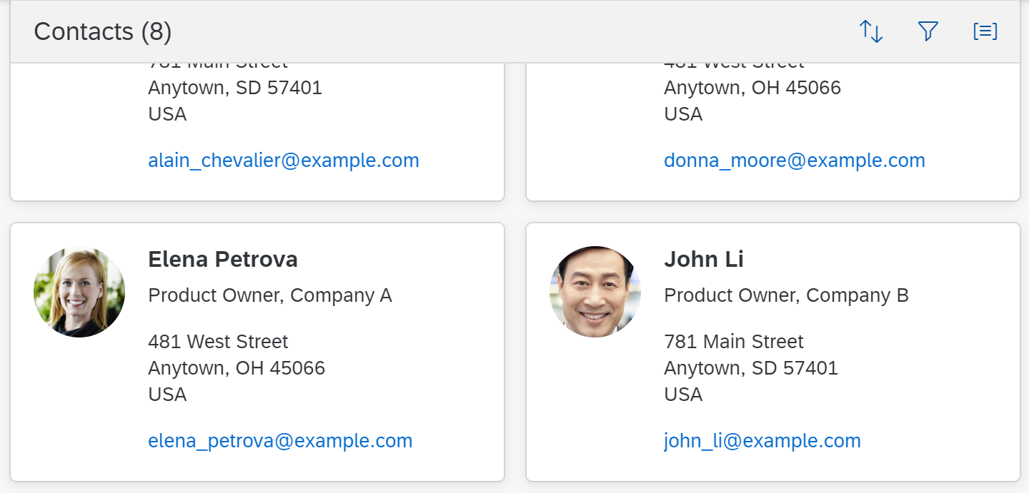
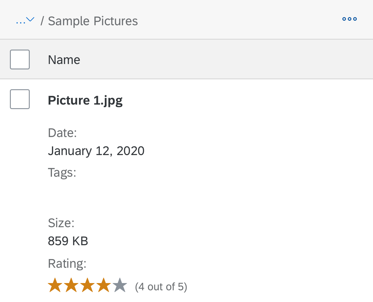
On smartphones, only the most important data remains in the one-column or two-column table, while all other data is moved to the space between two item rows, known as the “pop-in area”.
In this area, data for the corresponding cell is provided as a label/value pair. The label is defined by the column header, and the value is taken from the corresponding cell. Labels can be displayed next to the value or above the value.
Within the pop-in area, the label/value pairs can be displayed in the following ways (sap.m.Table, property: PopinLayout):
- Block: Label/value pairs are listed one below the other.
- GridSmall: Label/value pairs are displayed next to each other in equally spaced grid cells. An additional column is shown for each 13 rem of available width (208 px with default browser settings). If the number of grid cells exceeds the available width, the grid cells wrap. On S size, this layout transforms automatically to a block layout.
- GridLarge: The display logic is the same as for GridSmall,, but grid columns come with a larger minimum width (26 rem instead of 13 rem).
In all layouts, you can show the labels next to or above (recommended) the corresponding data.
The responsive table uses all the available space, and does not provide any padding. If there is space around the table, it comes from the spacing defined for the surrounding layout container.
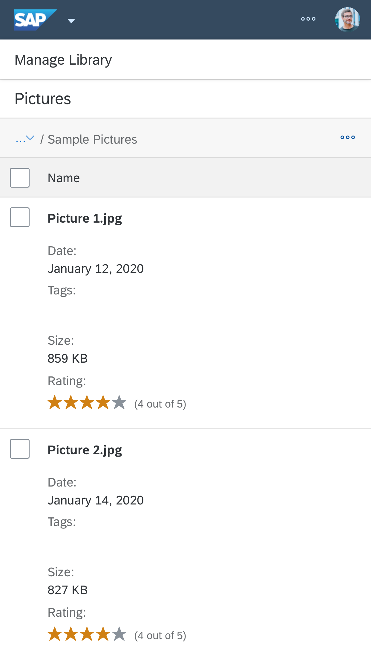
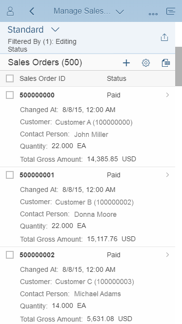
Responsive table displayed on a smartphone (size S)
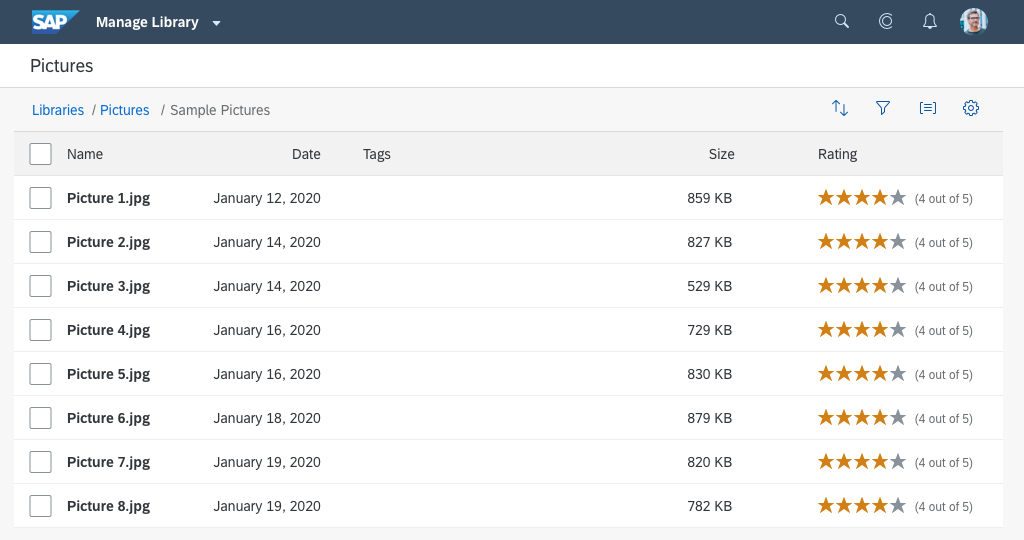
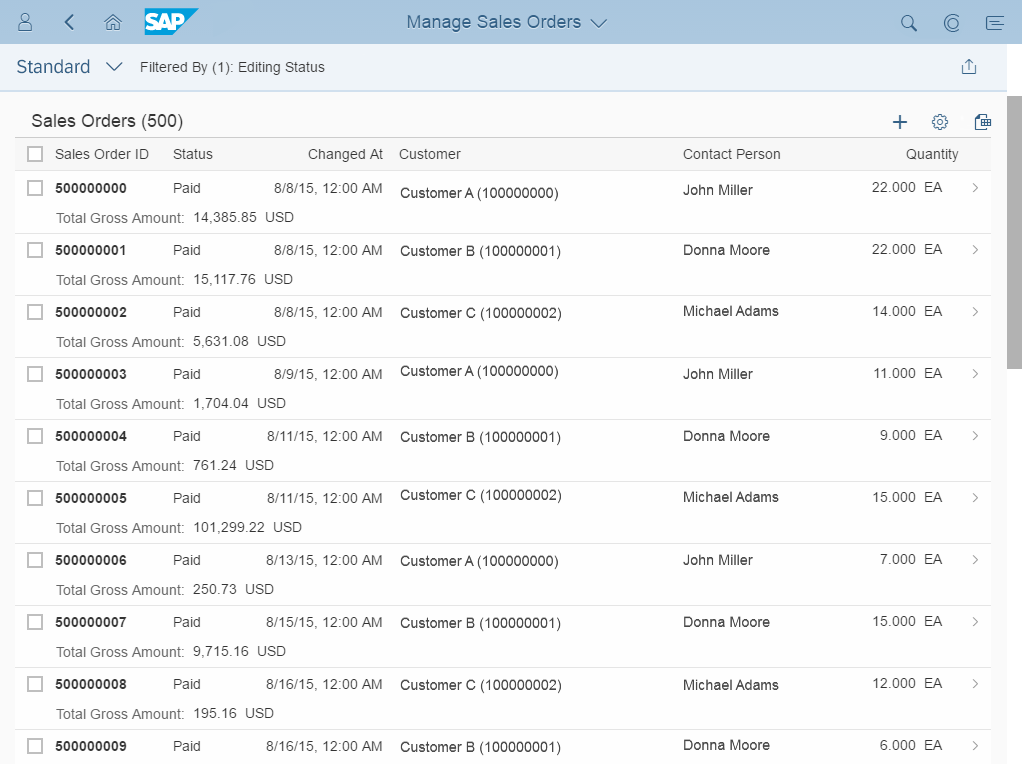
Responsive table displayed on a tablet (size M)

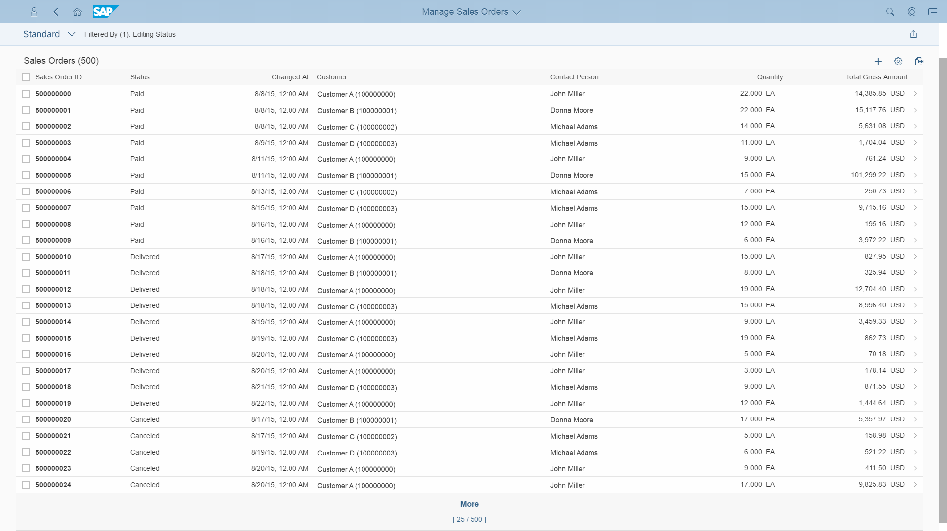
Responsive table displayed in compact mode on a desktop computer (size L)
The responsive behavior is optional. If it is not used, the responsive table minimizes all visible columns until they are no longer readable. The priority level assigned to columns also impacts the display of the responsive table. For more information on the priority levels, see: Smart Table
There are two ways to configure responsiveness: auto pop-in mode and manual pop-in mode (sap.m.Table, property: autoPopinMode).
The auto pop-in mode ensures responsiveness automatically and is sufficient in most cases. You can still influence the behavior per column, but only to a limited extent.
The manual mode is more flexible, but needs are more configuration. This configuration becomes more cumbersome when table columns can be shown/hidden or re-ordered. On the other hand, only the manual mode allows you to:
- Let more than one column stay in the tabular layout
- Move more than one column into the pop-in area at once
In both modes, the responsive table ensures that at least one column always remains in the table layout.
Auto Pop-In Mode
The auto pop-in mode handles responsiveness automatically. You can optimize this to a certain extent by adapting the behavior per column.
Columns have a minimum width. As soon as the width of all the visible columns exceeds the table width, the right-most column moves to the pop-in area. The default minimum width per column is 8 rem. You can change this value for each column (sap.m.Column, property: autoPopinWidth).
To further influence the behavior, you can assign columns a priority. Low-priority columns move to the pop-in area first (right-most low priority column first), medium-priority columns next, and high-priority columns last. The default priority is “none”, which is handled like the “medium” priority (sap.m.Column, property: importance).Instead of moving columns to the pop-in area, you can also hide columns of one or more priority levels (property: hiddenInPopin).
In auto pop-in mode, all other pop-in-related column settings are ignored.
Manual Pop-In Mode
The manual pop-in mode allows more flexibility but also requires more effort if you want it to work in a meaningful way. You also need to invest additional effort if table columns can be shown/hidden or re-ordered.
You need to configure each column manually. Depending on the width of the table (in pixels), the column needs to know which of the following responses is required:
- Stay in the table layout (in auto pop-in mode, only one column stays in the table layout).
- Move to the pop-in area (sap.m.Column, with the properties: demandPopin, minScreenWidth, popinHAlign, popinDisplay).
- Hide
By default, the table width is assumed to be the screen width. If the table does not use the full width of the screen, app developers must configure the table accordingly (sap.m.Table, property: contextualWidth).
Because you configure the pop-in response for each column individually, you can also handle more than one column at a given breakpoint. This allows you to move several columns to the pop-in area at once, which isn’t possible in auto pop-in mode
Each of the three device types has a predefined value for the screen width. However, you will get better results if you offer more breakpoints by using pixel values instead of the predefined values.
For the smallest screen width, keep the following information in the table layout:
- The identifier of the line item
- The key attribute
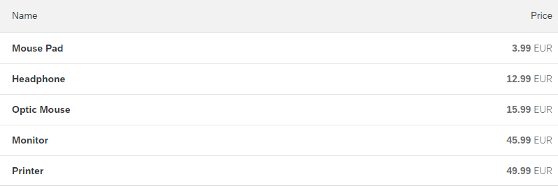
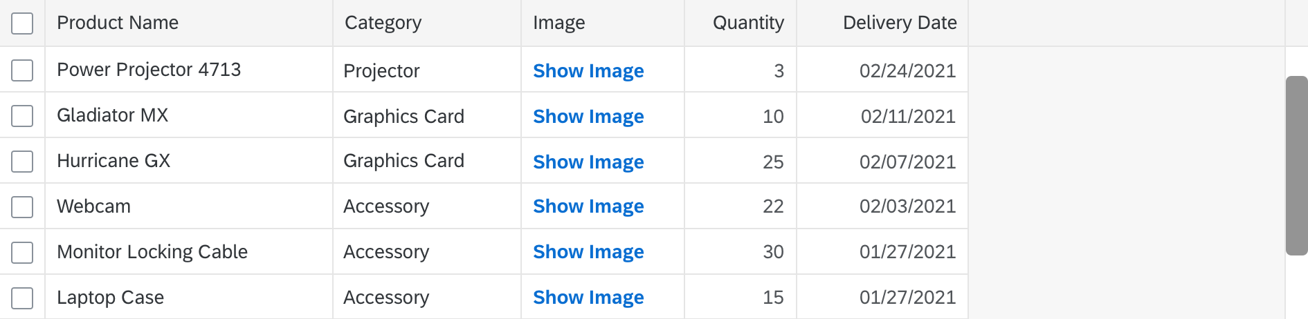
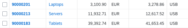
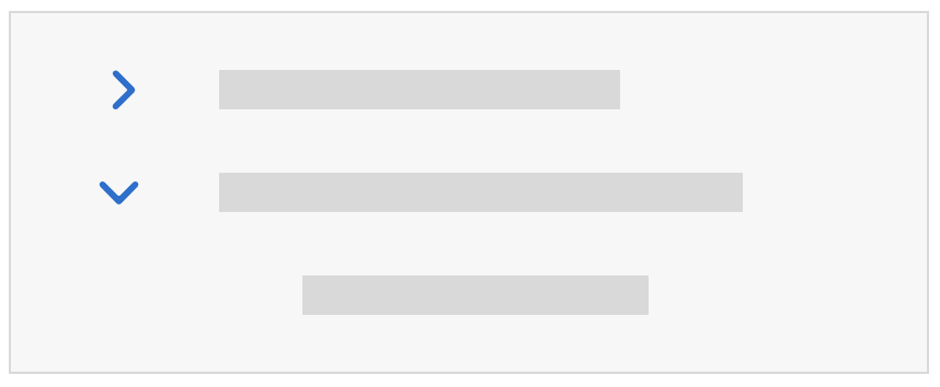
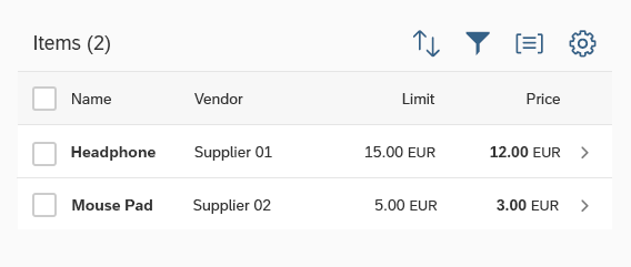
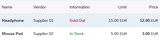
Example for Block Layout
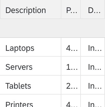
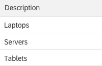
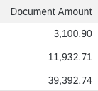
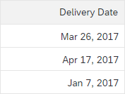
A typical responsive table.
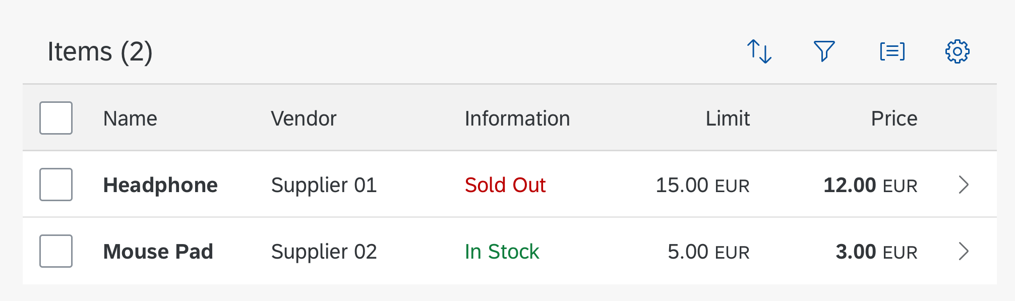
A typical responsive table
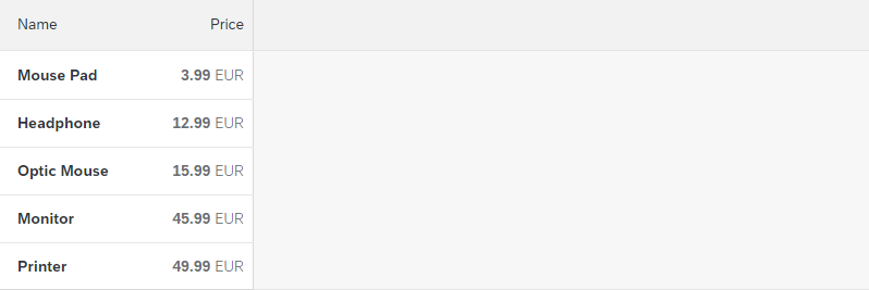
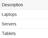
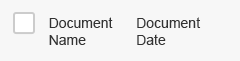
Hide the information column for a width smaller than 570 px.
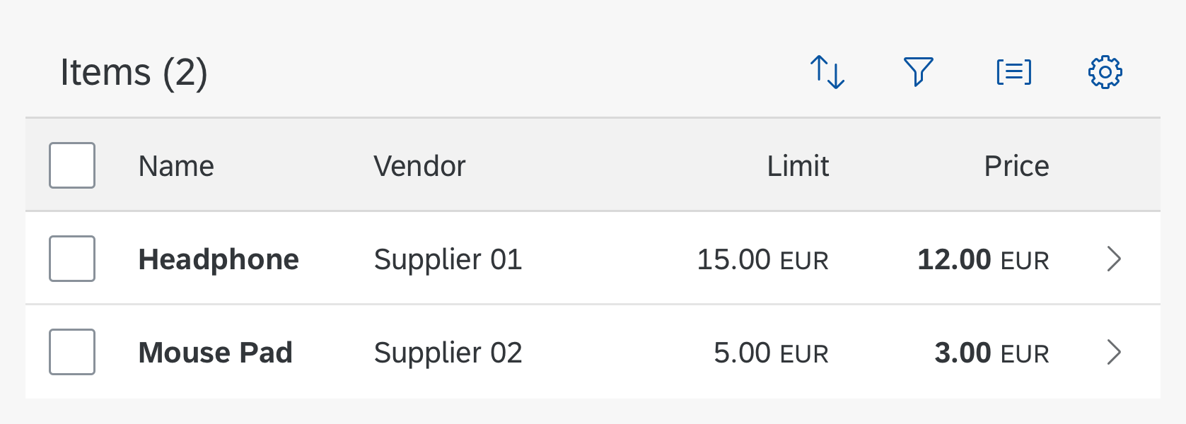
Hiding the information column
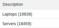
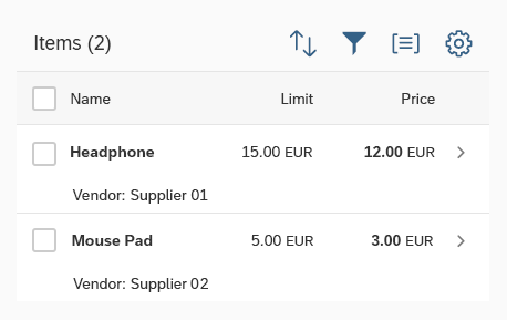
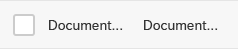
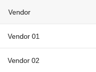
Move the column “vendor” to the pop-in area for a width smaller than 460 px (sap.m.Column, properties: demandPopin, minScreenWidth).
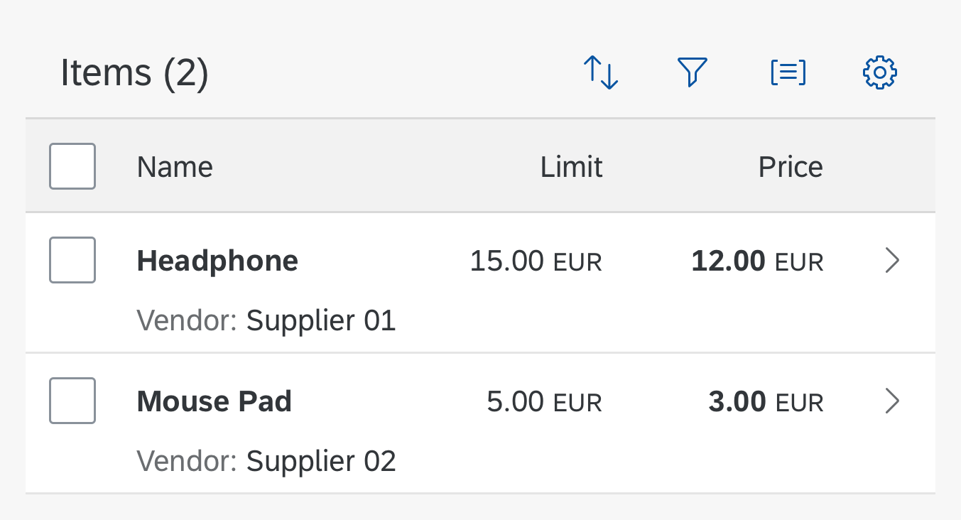
Moving the vendor column to the pop-in area
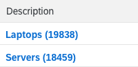
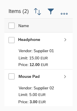
Move the column “limit” to the pop-in area for a width smaller than 350 px (sap.m.Column, properties: demandPopin, minScreenWidth).
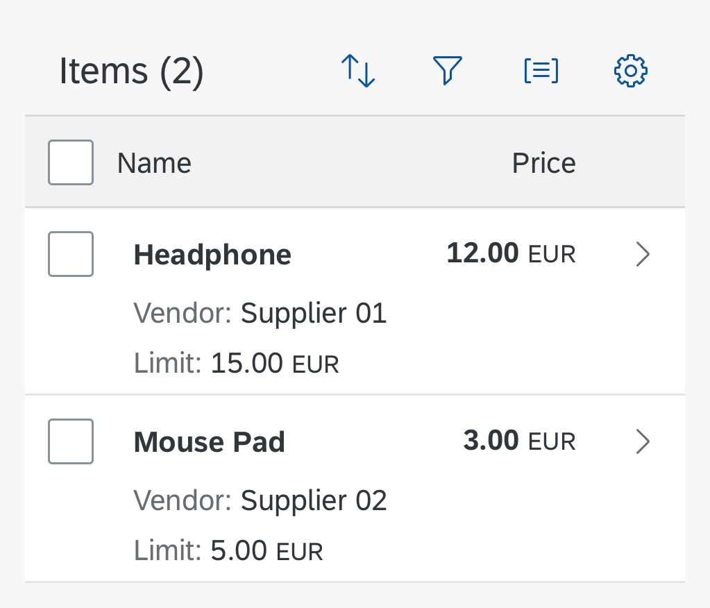
Moving the limit column to the pop-in area
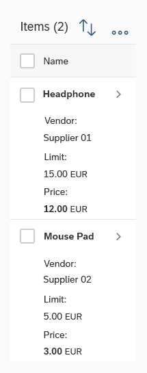
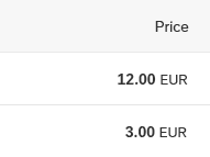
Move the column “price” to the pop-in area for a width smaller than 270 px (sap.m.Column, properties: demandPopin, minScreenWidth).

Moving the price column to the pop-in area
If you still need to support smaller screens, values can be moved below the corresponding labels inside the pop-in area. In these examples, this happens for a width smaller than 220 px (sap.m.Column, property: popinDisplay).
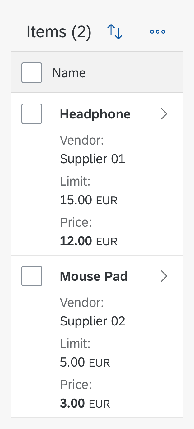
Pop-in area: Moving the data below the labels
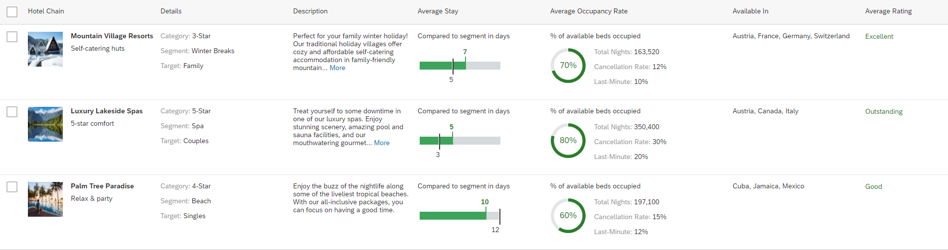
Example for GridLarge Layout
A more complex responsive table.
A more complex responsive table (full screen without pop-in content)
In this example, the Average Occupancy Rate and Available In columns move to the pop-in area if the screen width is less than 1900 pixels.
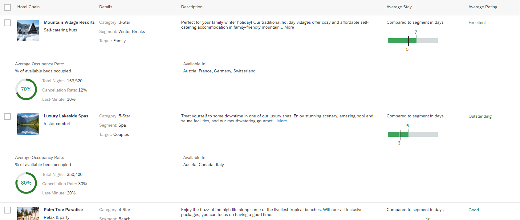
GridLarge layout - 'Average Occupancy Rate' and 'Available In' columns move to the pop-in area
If the width is less than 1500 pixels, the Average Stay column moves to the pop-in area.
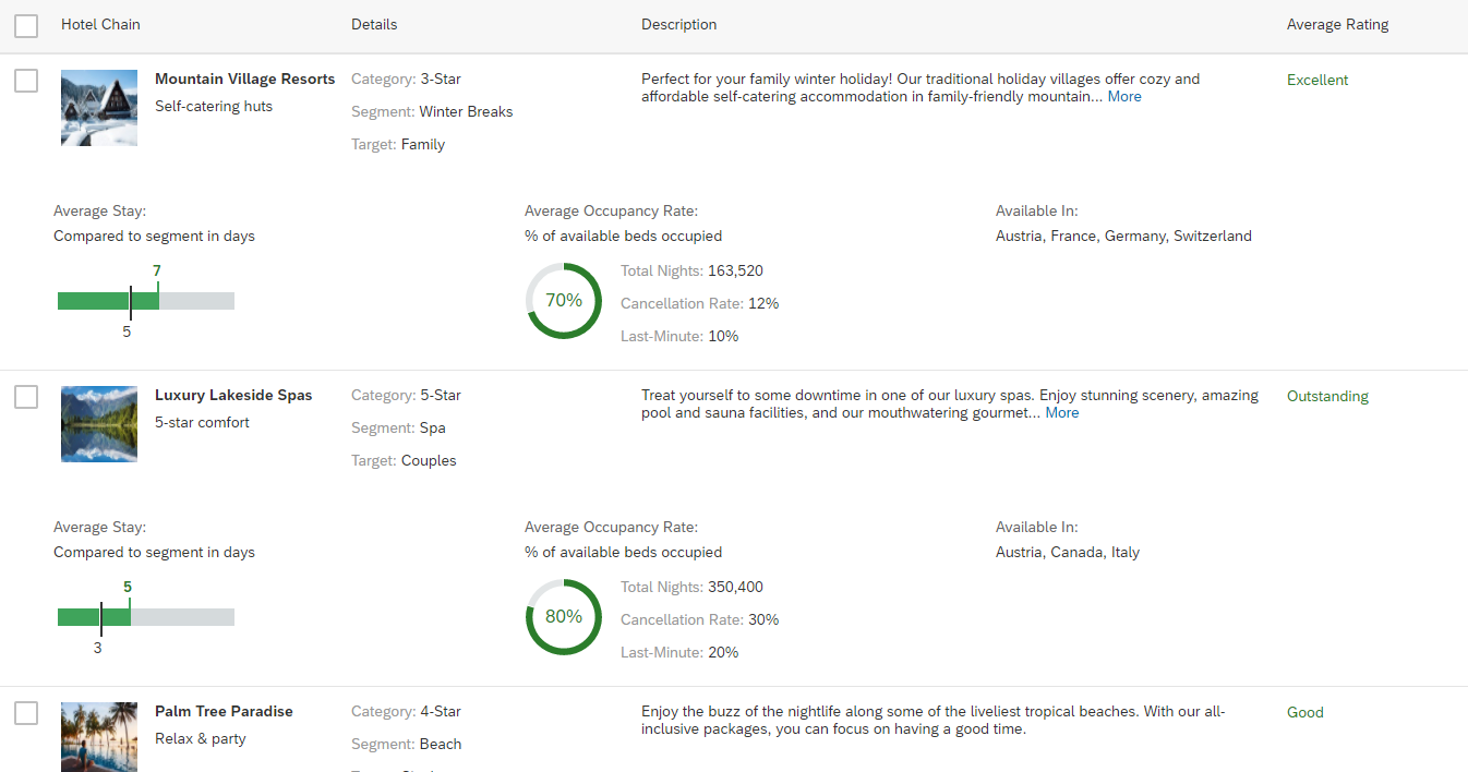
GridLarge layout - 'Average Stay' column moves to the pop-in area
If the width is less than 1100 pixels, the Description column moves to the pop-in area. Since all four columns in the pop-in area do not fit into one row, the pop-in content wraps.
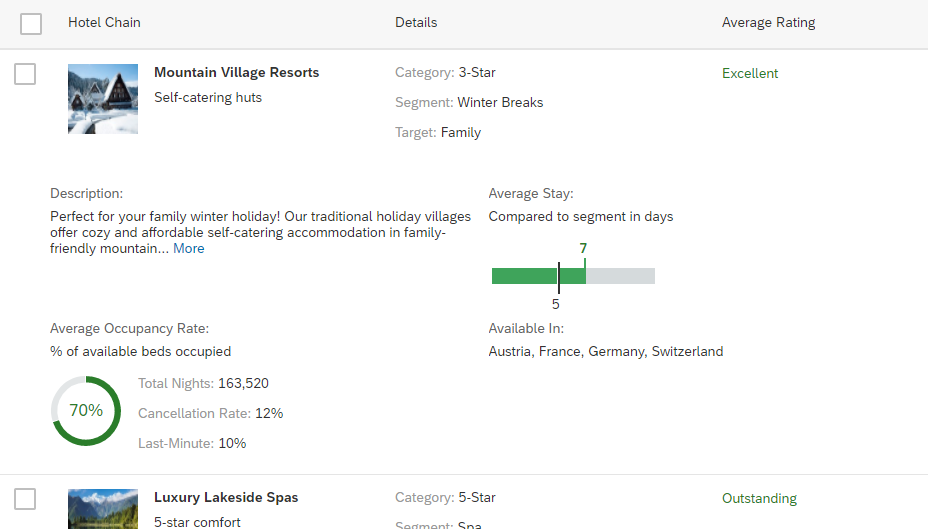
GridLarge layout - 'Description' column moves to the pop-in area
If the width is reduced even further, the Details column moves to the pop-in area. On this narrow screen, only one column fits into one pop-in row, so it looks exactly like the block layout.
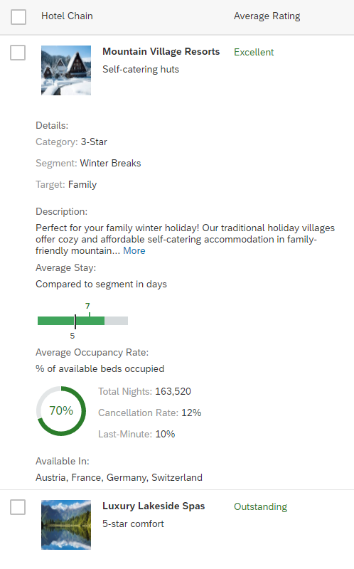
GridLarge layout - 'Details' column moves to the pop-in area
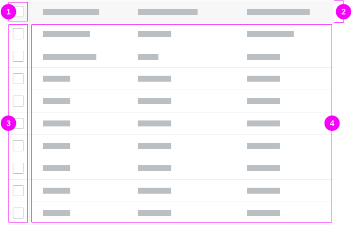
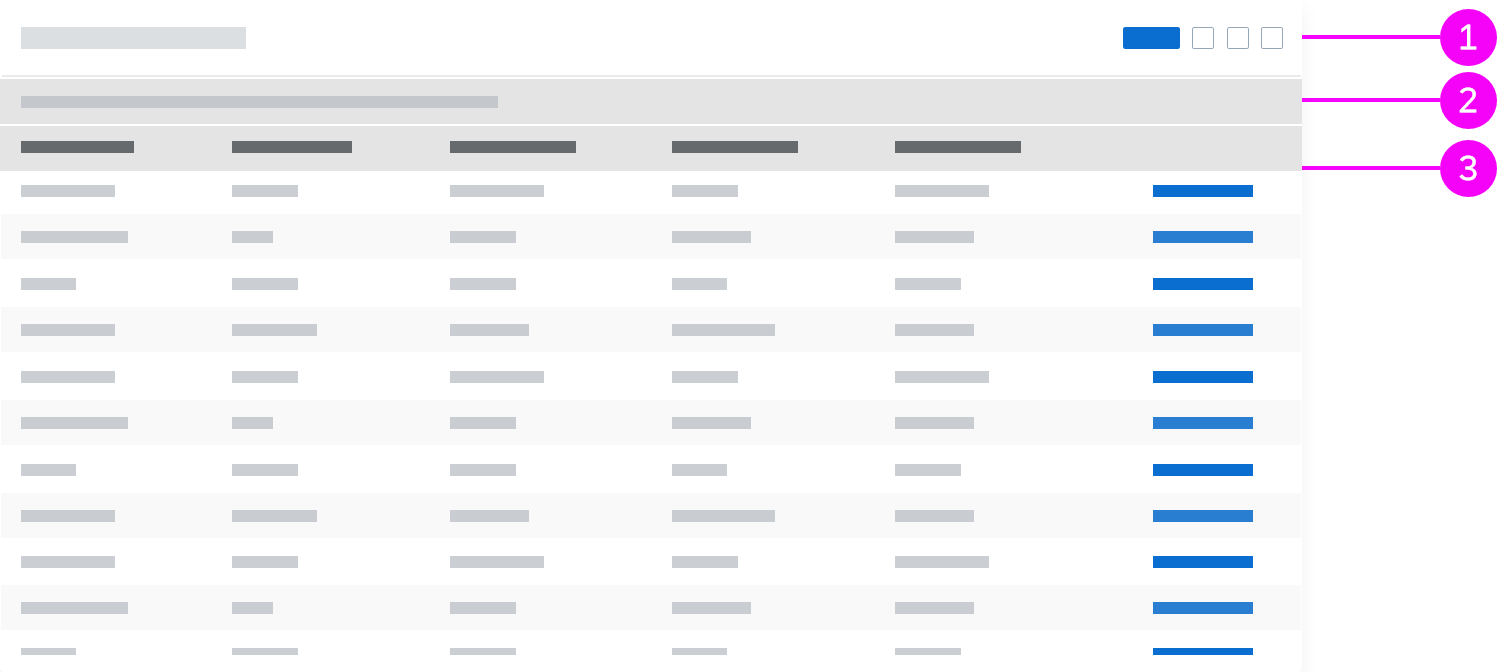
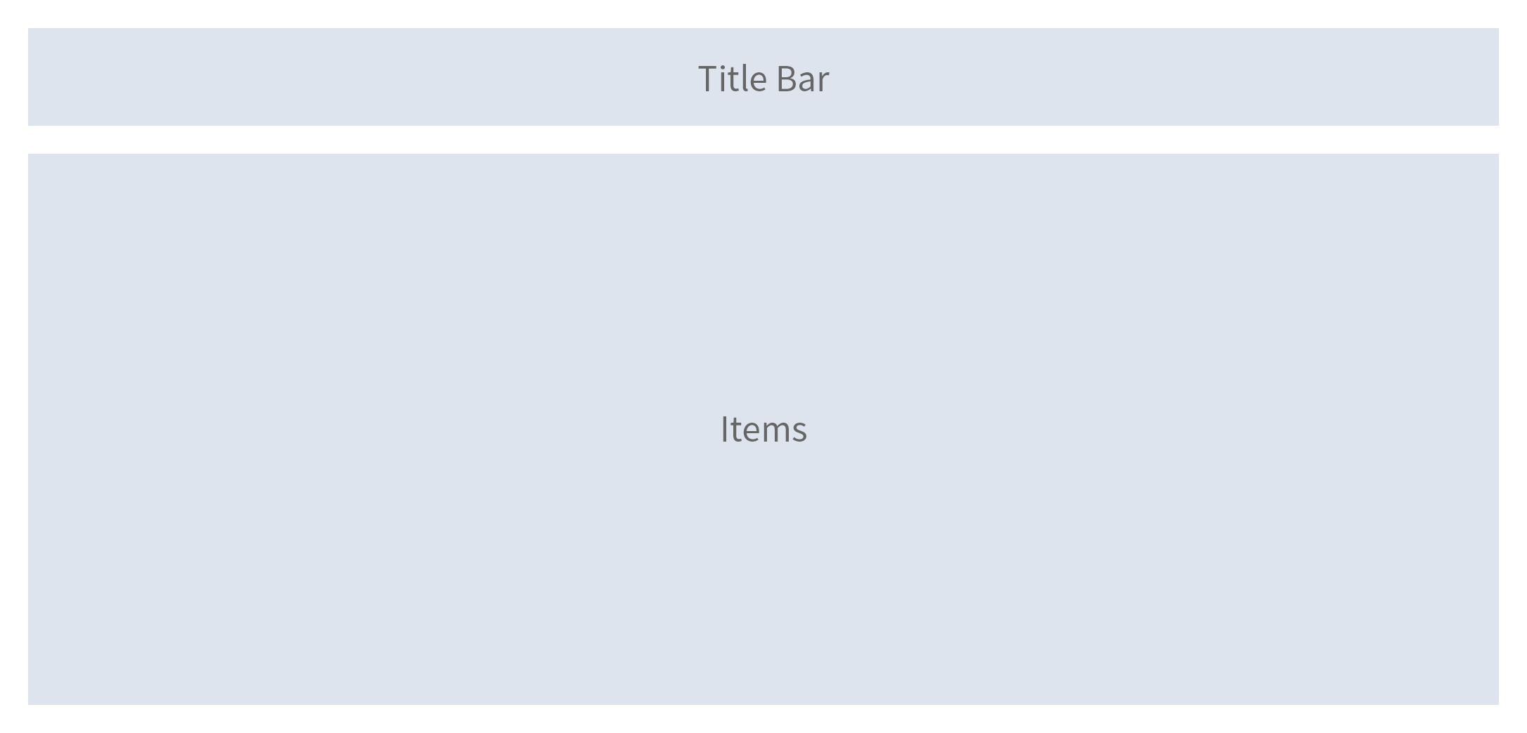
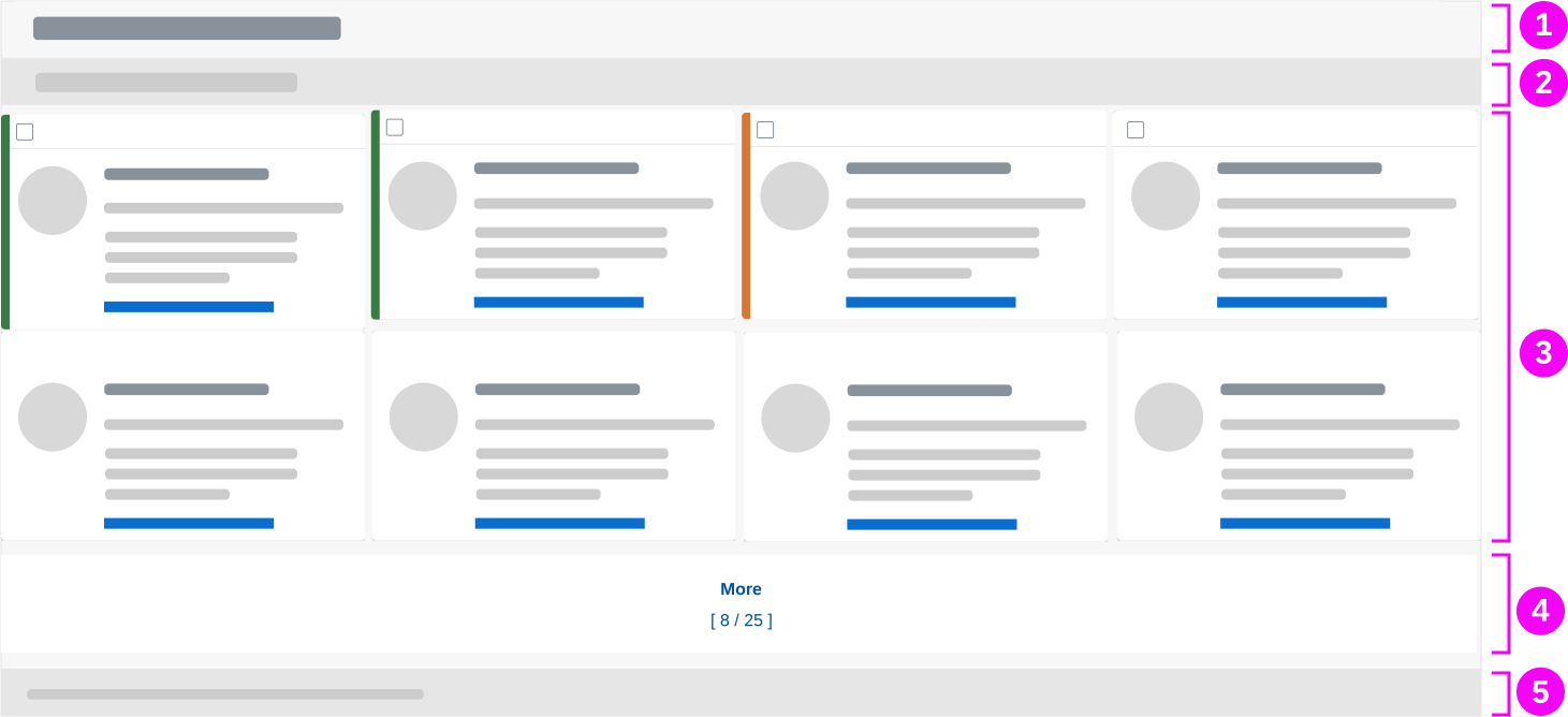
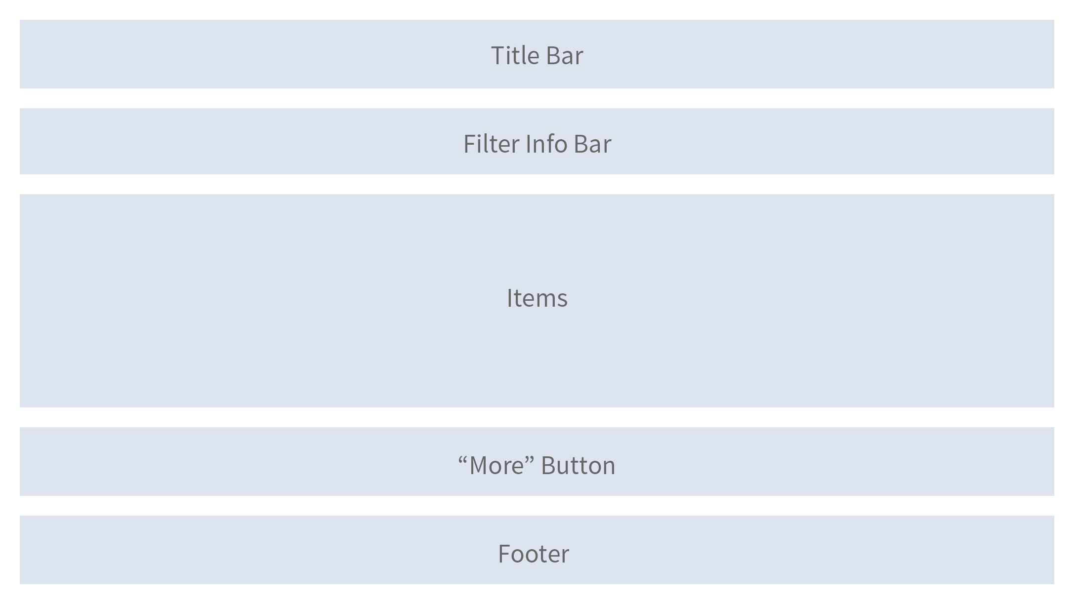
Layout
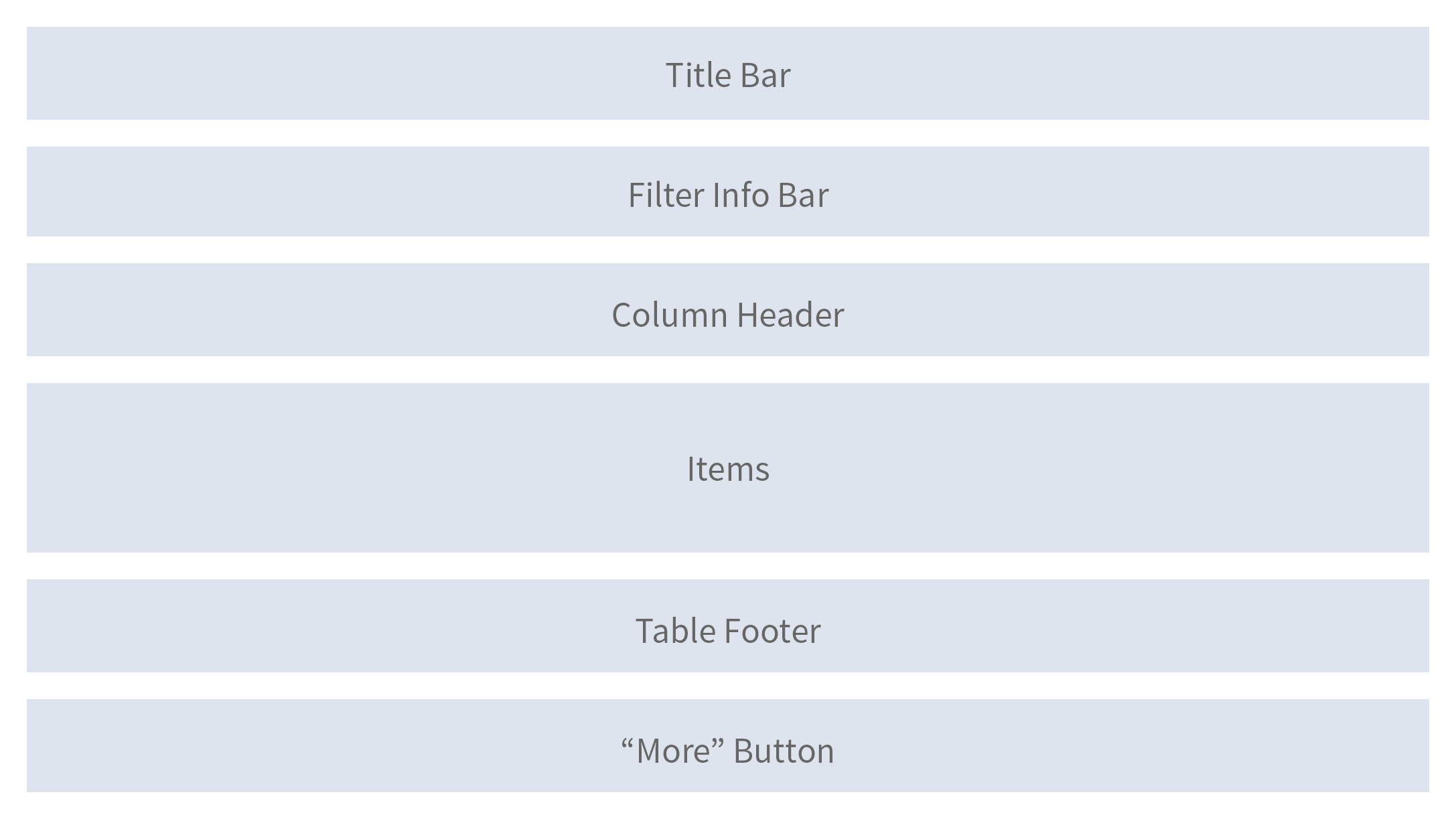
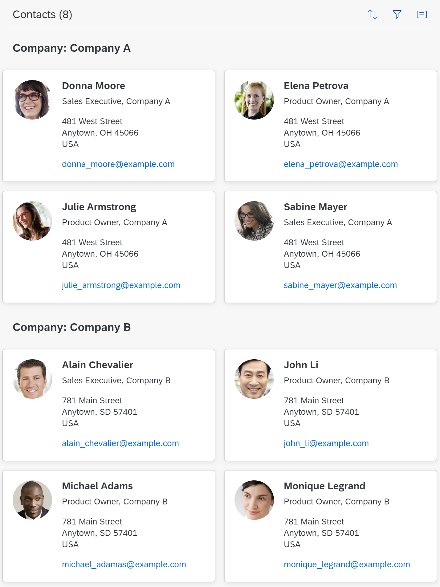
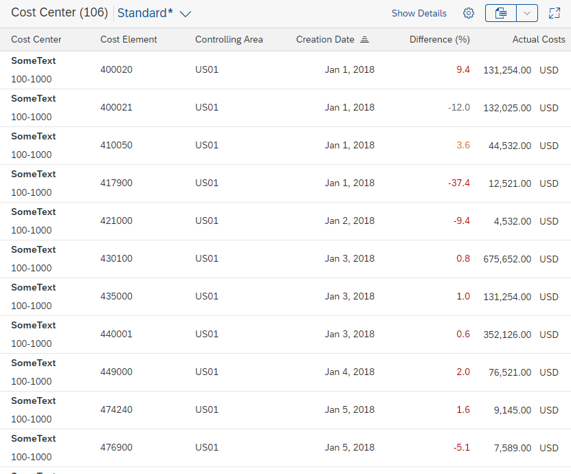
The optional title bar consists of the title of the responsive table, an item counter, variant management, and the toolbar.
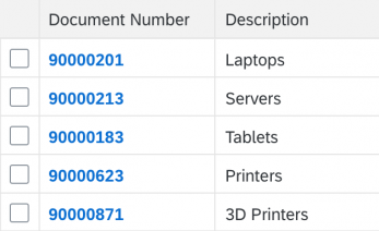
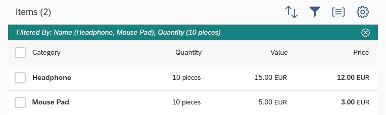
The filter infobar appears when the responsive table is filtered, and shows information on the filter settings.
The column header shows the label for each column. In addition, it allows the user to resize the column.
The collection of items, or rows, occupies the main part of the responsive table.
You can add aggregation information (such as totals) on the table footer.
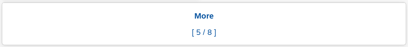
A More button can be shown if you do not want all items to be loaded at the start (known as “lazy loading”). Ideally, you should use scrolling to load more items instead of choosing the More button.
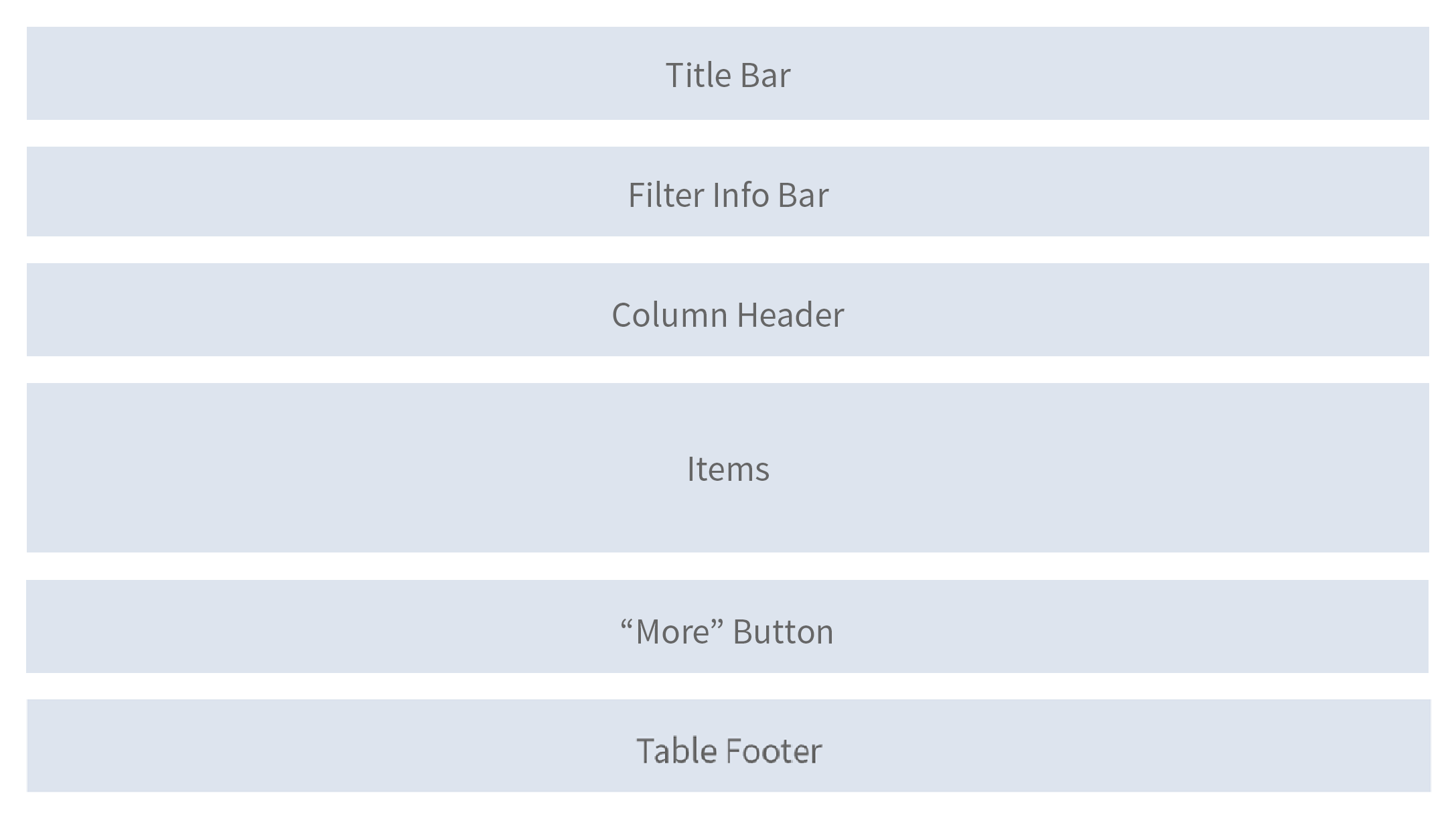
Schematic visualization of the responsive table
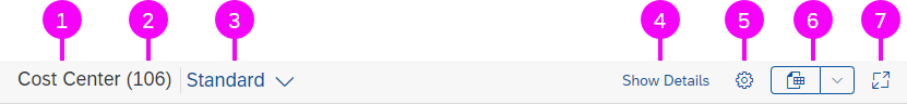
Components
The title bar contains the title of the responsive table, an item counter, variant management, and the toolbar.
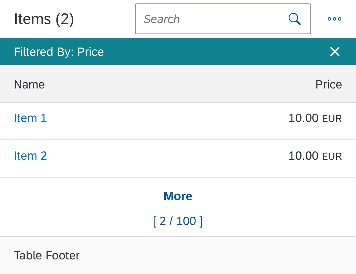
Components of the responsive table
Behavior and Interaction
The responsive table is quite flexible with regard to its content.
Table Level
Scroll
The height of the table is defined by the number of items it contains. It does not have a scroll container on its own, but is scrolled together with the app (in contrast to the grid table and the analytical table).
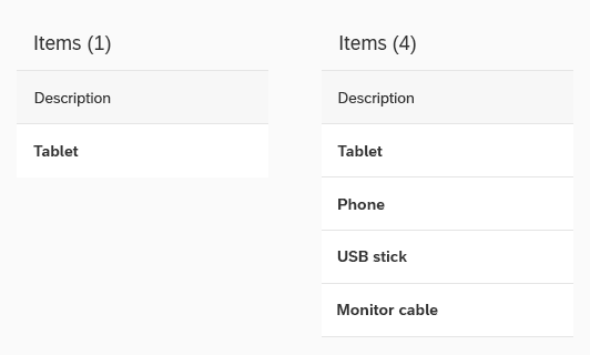
If the table works in “growing” mode, it only loads a few items at first. Additional items are only loaded (and rendered) on request. The “request” can either be triggered by scrolling (preferred), or by clicking the More button.
Same table, different number of items
When the user scrolls, the title bar, column headers, and filter infobar can stick to the top of the surrounding layout container (sap.m.Table, property: sticky).

Sticky table title and sticky column header
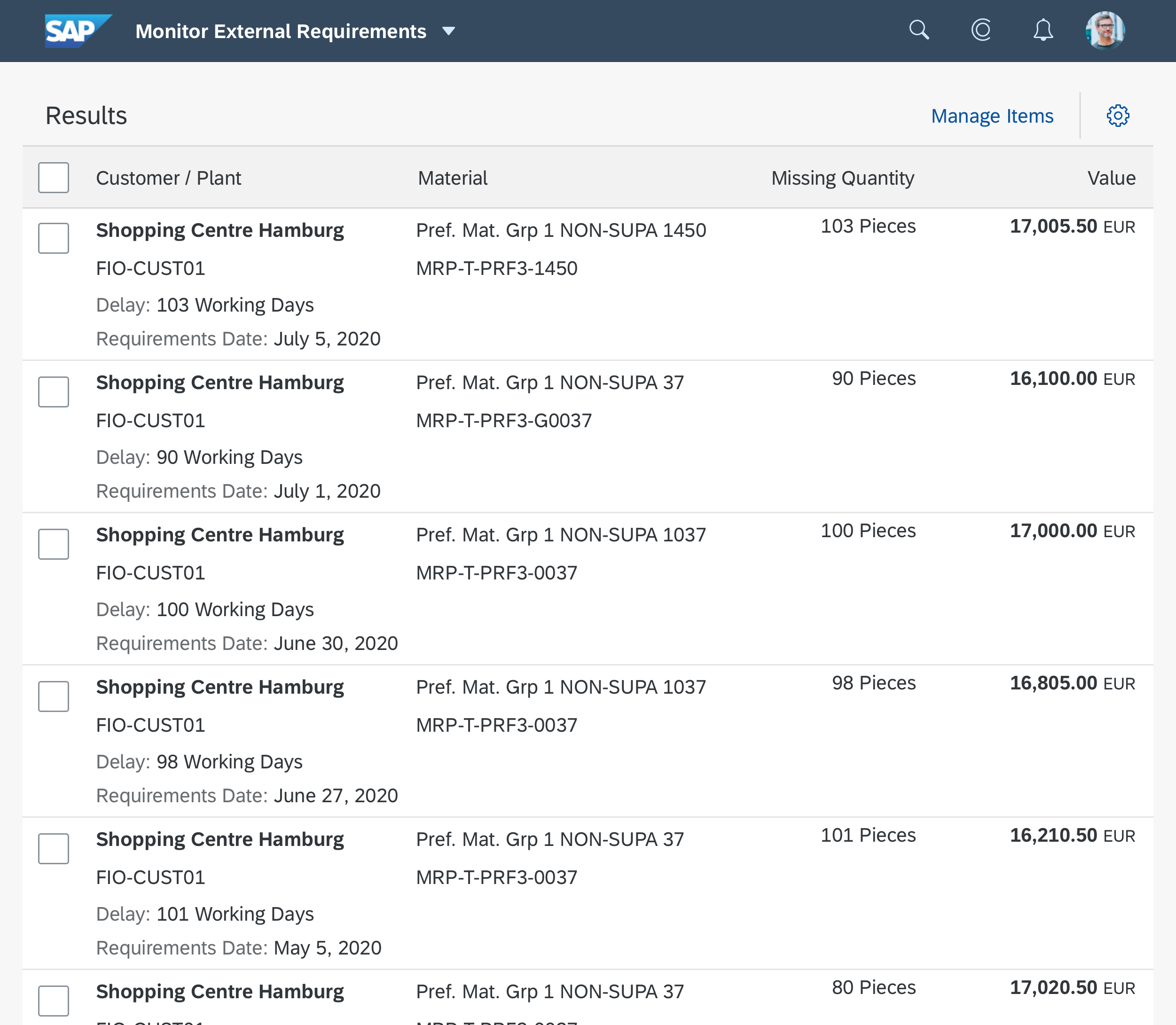
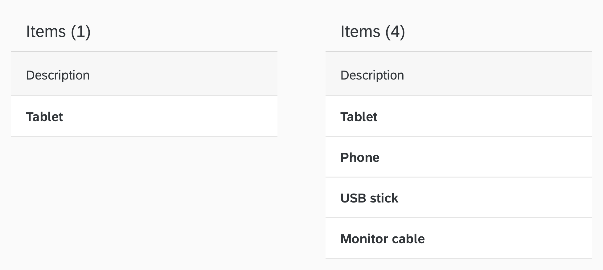
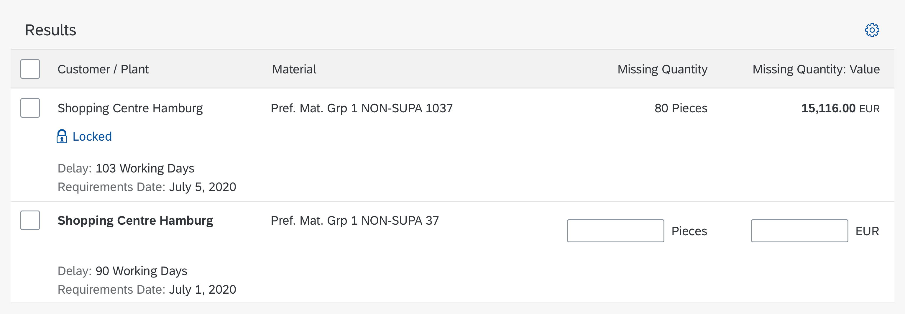
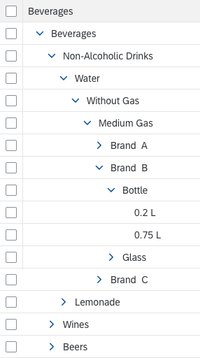
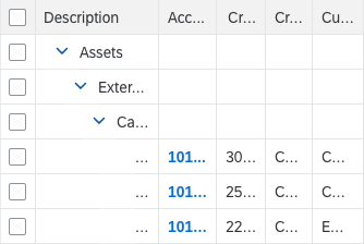
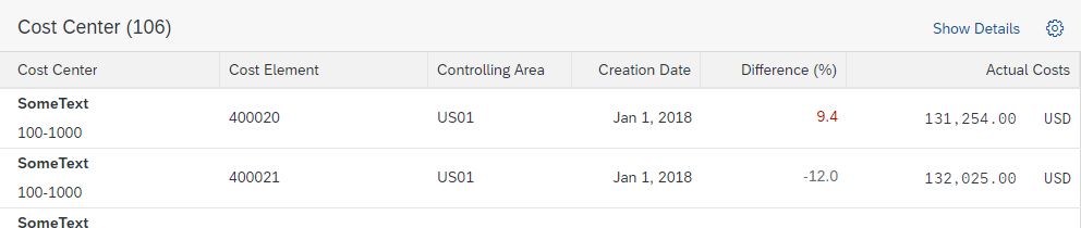
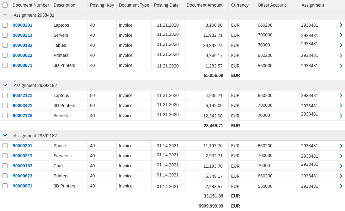
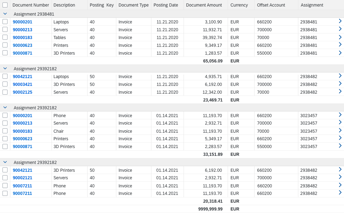
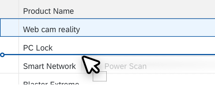
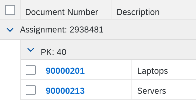
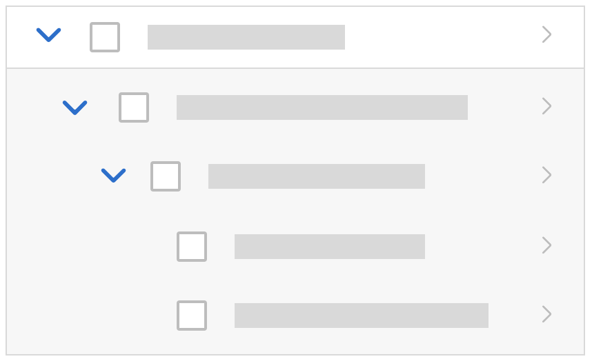
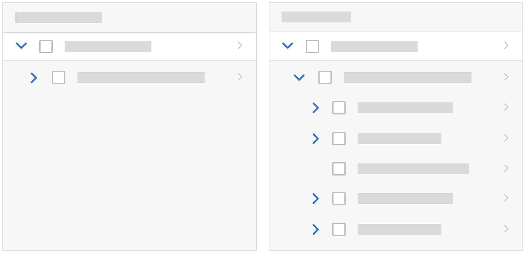
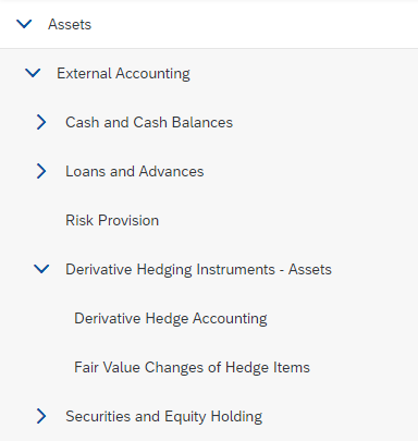
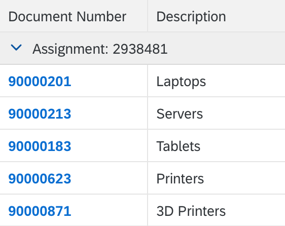
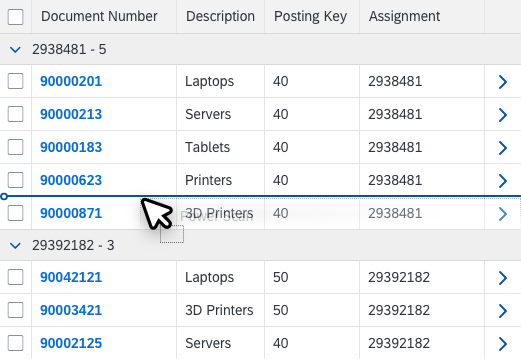
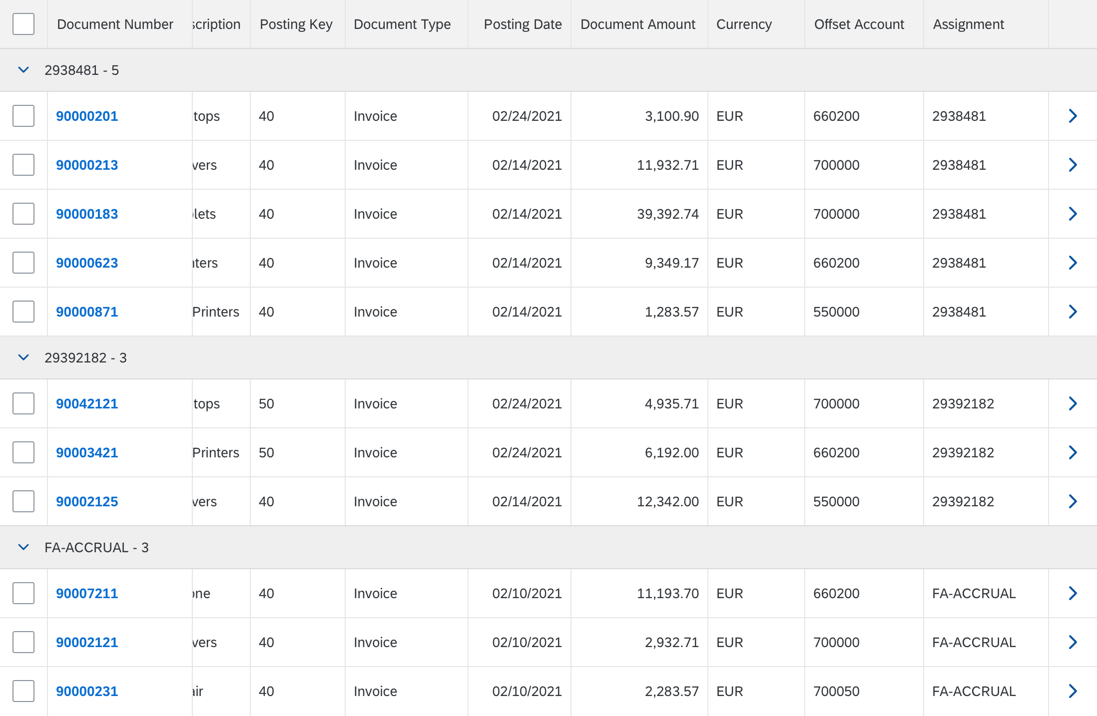
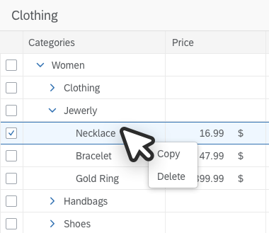
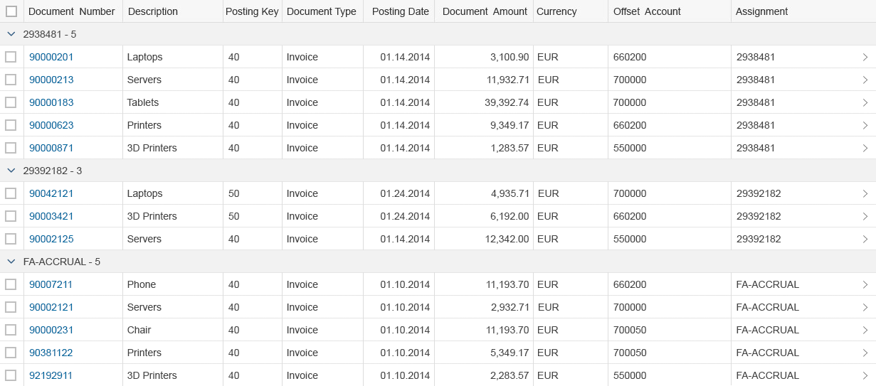
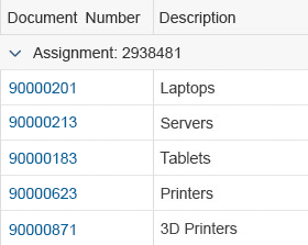
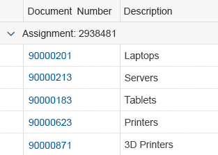
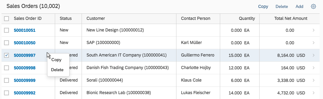
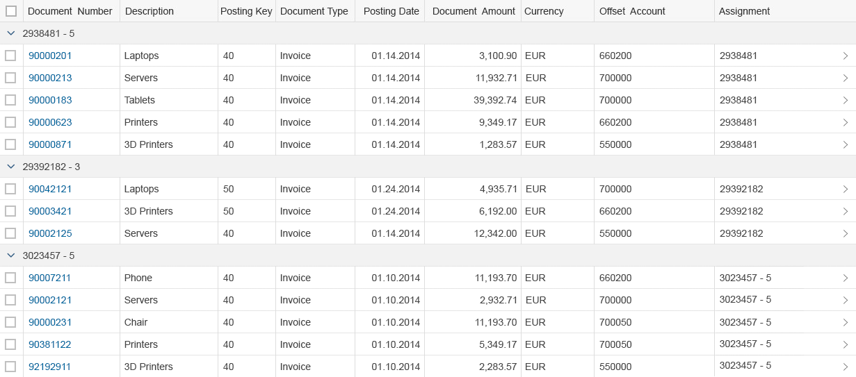
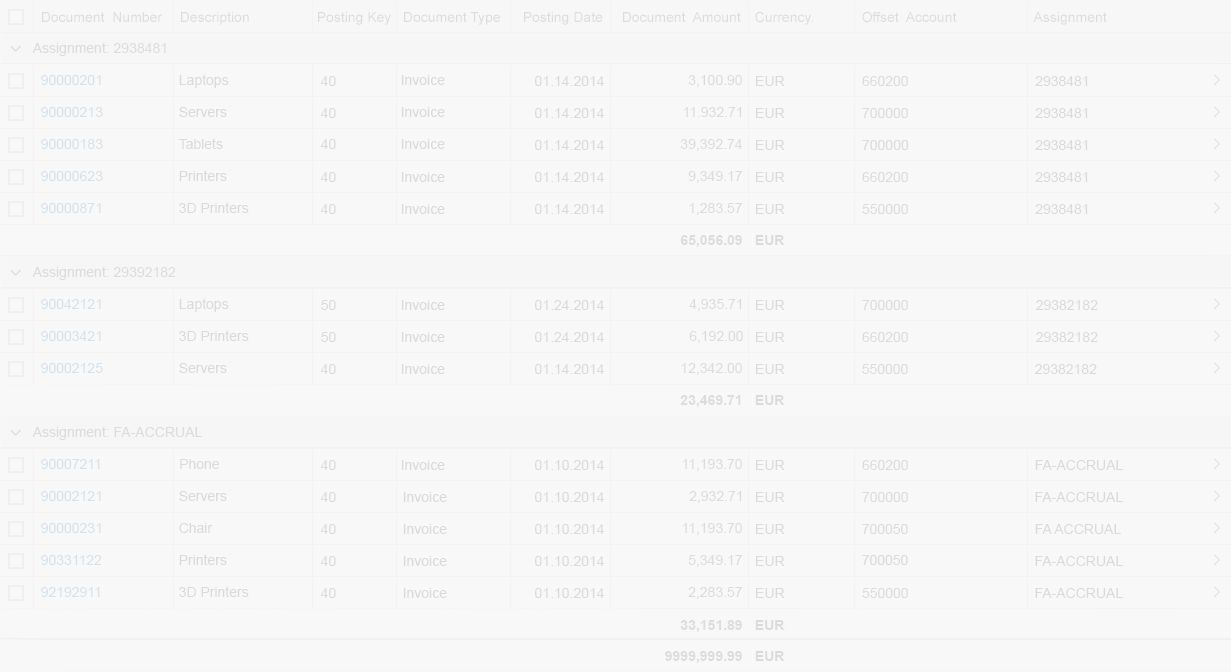
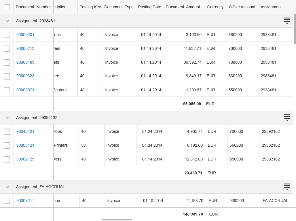
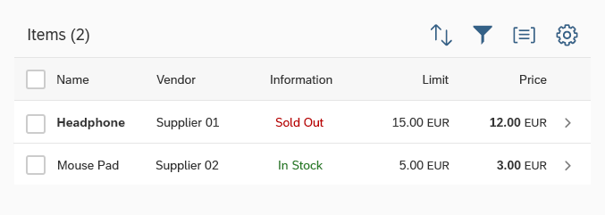
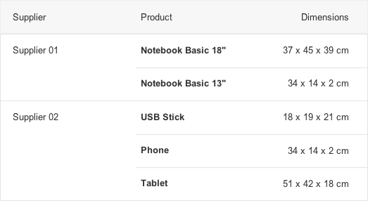
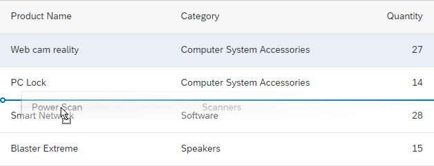
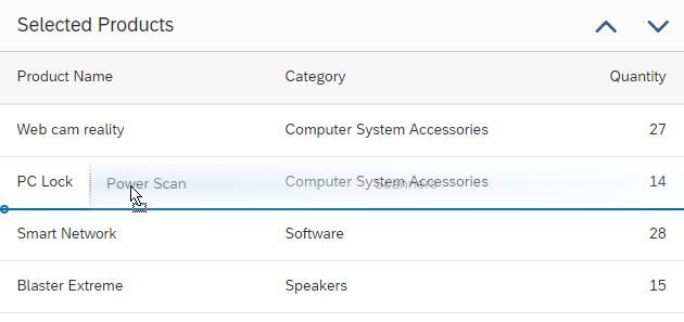
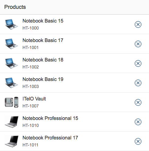
Merge Duplicates
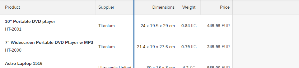
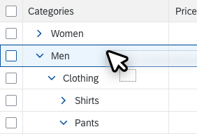
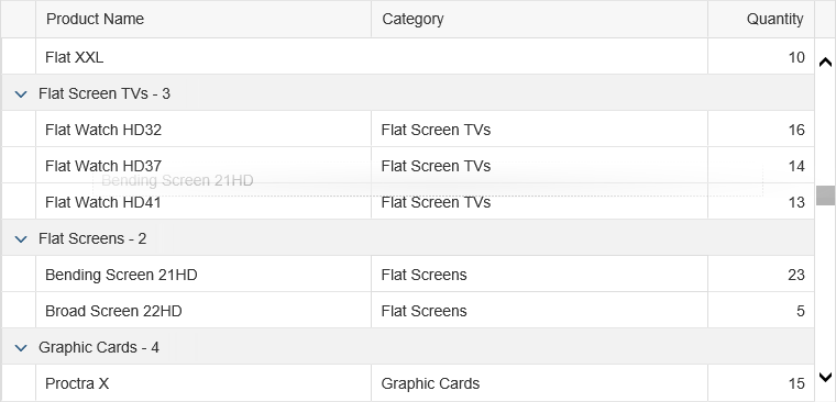
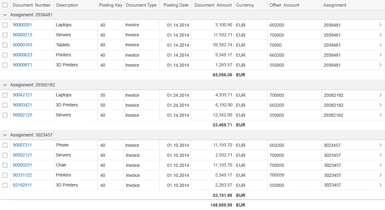
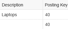
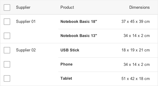
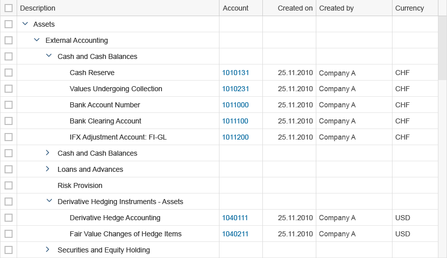
To simulate the behavior of row spanning, you can merge cells of consecutive rows inside one or more columns automatically if they contain the same value (sap.m.Column, properties: mergeDuplicates, mergeFunctionName).
Use the merge feature if you expect the column to contain duplicate entries, and it makes sense to group them. In the example screenshot, the Supplier, Product, and Dimensions columns reflect a hierarchical structure: Suppliers have products, which in turn have dimensions. Because suppliers typically have multiple products, merging duplicate entries for the supplier column makes the table easier to read. Note, however, that when the user sorts the table by another field, the hierarchy changes and the merged items are regrouped accordingly.
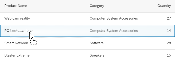
Do not use the merge feature:
- If duplicate entries are not part of the design. If consecutive table rows happen to have the same values at runtime, this alone isn’t a valid reason to group them.
- If the corresponding column can contain blank cells. Otherwise, it is cumbersome to differentiate between blank values and merged values.
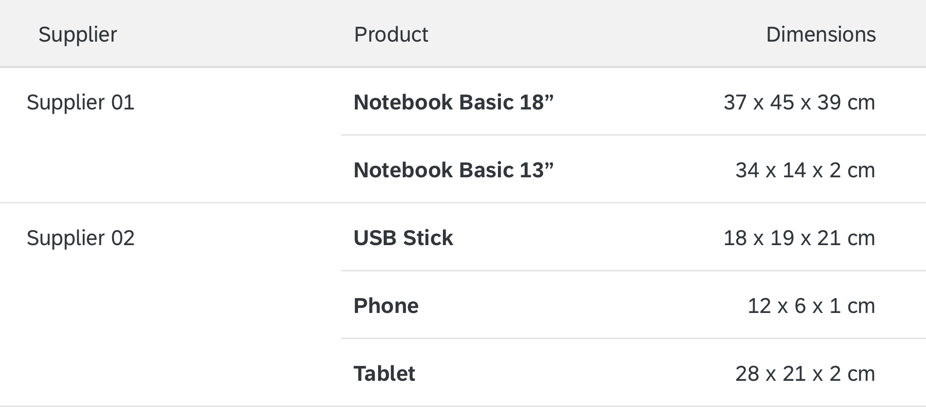
Supplier column merges duplicates in consecutive rows
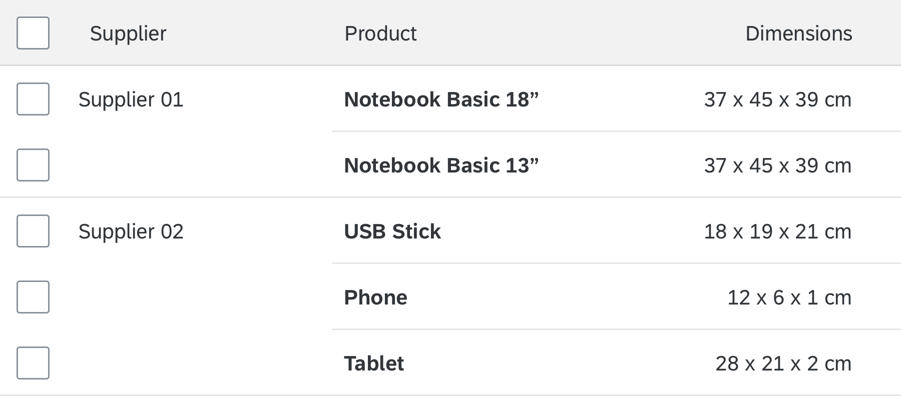
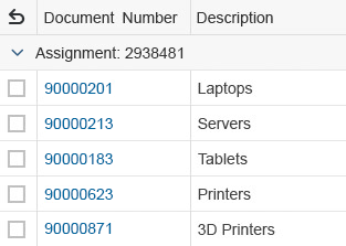
Merged columns with multiselection
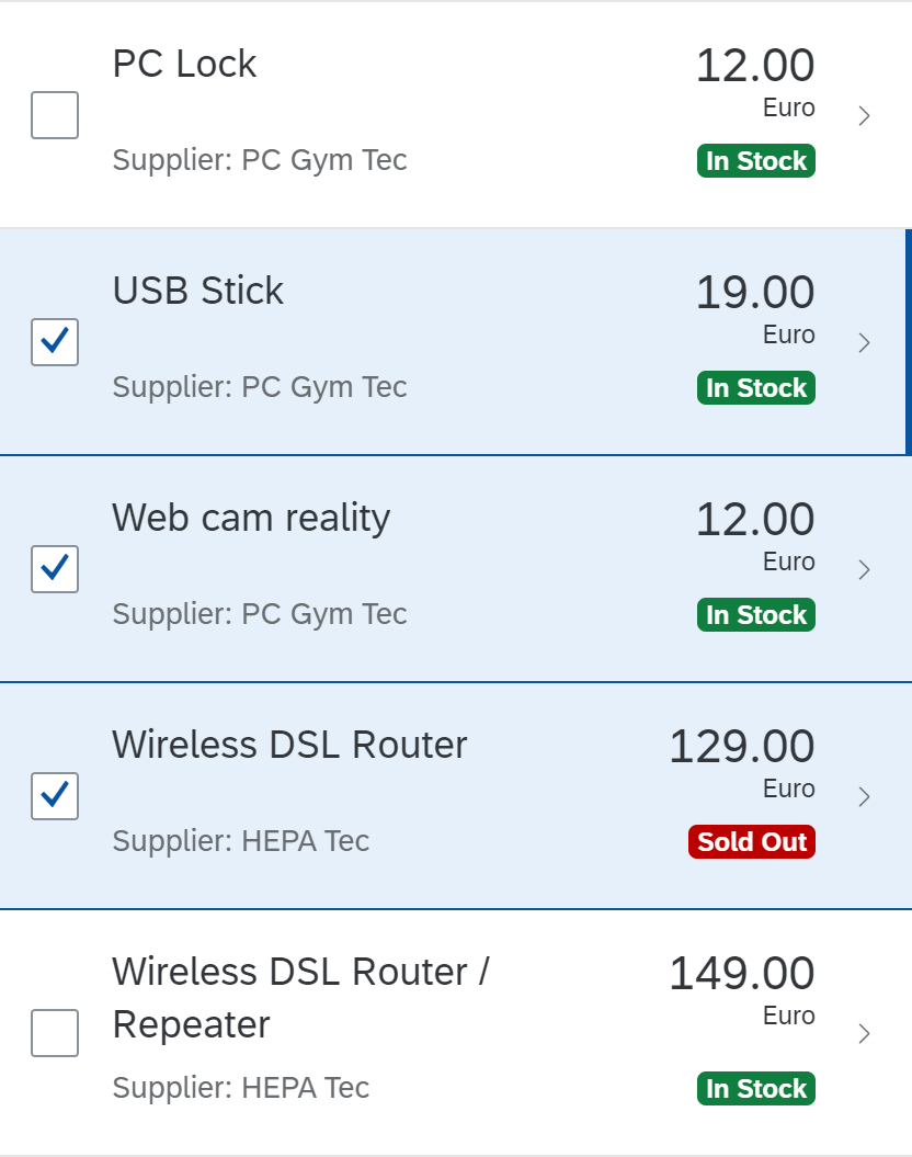
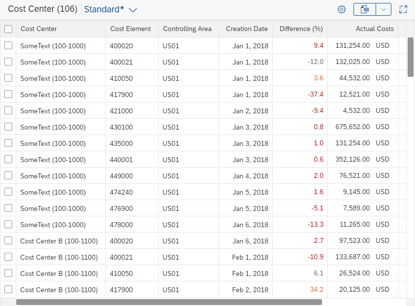
Select
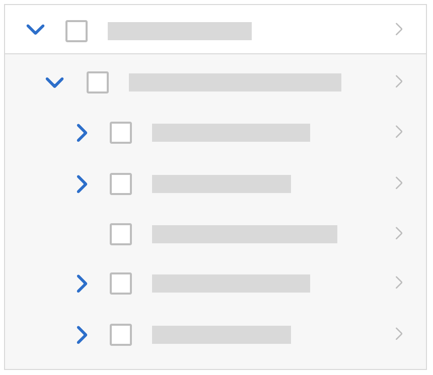
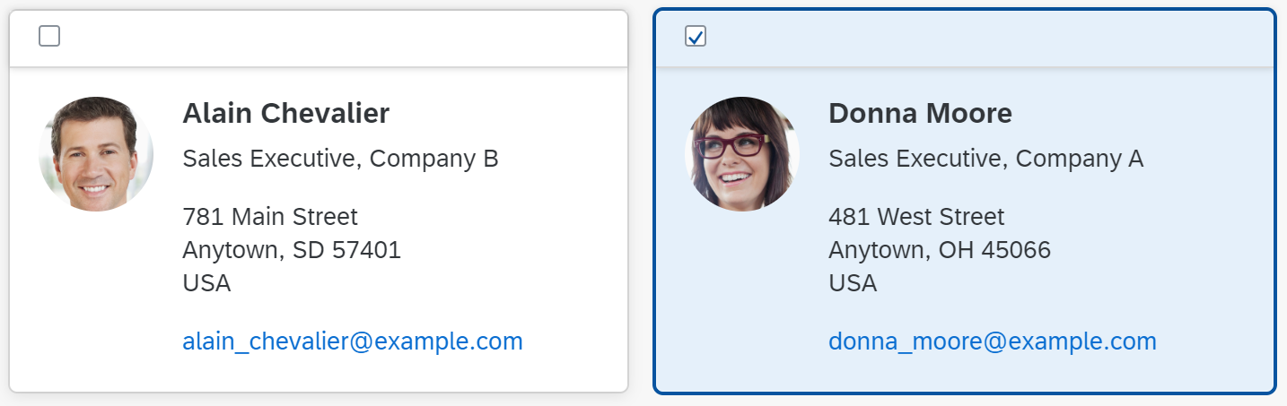
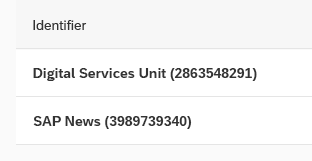
A responsive table can have one of the following selection modes (sap.m.Table/ sap.m.ListBase, property: mode):
- None: Items cannot be selected (
sap.m.ListMode.None).
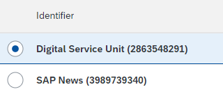
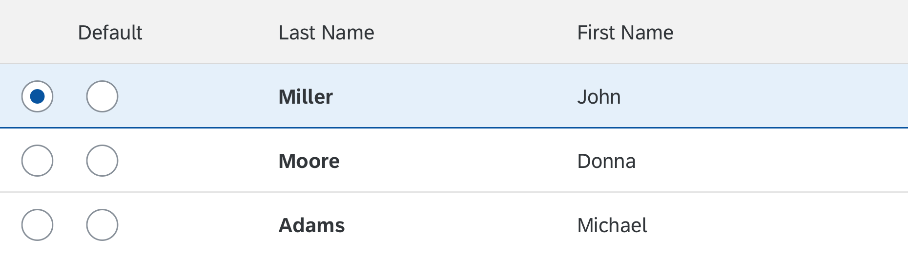
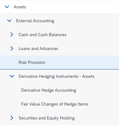
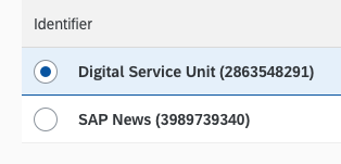
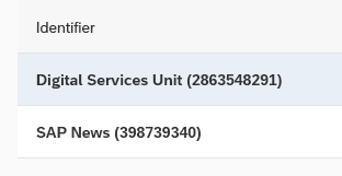
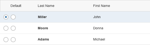
Note: Line items can still use thesap.m.ListType“navigation”, which allows click handling for specific line items. Only use this option if the click triggers navigation to a corresponding details page. - Single select master: One item in the responsive table can be selected. Items are selected by clicking the whole row. The single select master mode has no obvious visual cues, such as checkboxes or radio buttons. It only provides a light blue background for the selected state. Because of this, it can barely be differentiated from tables without selection (mode:
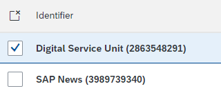
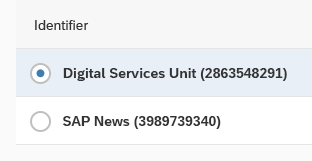
None). Single select master is the preferred mode for single selection (sap.m.ListMode.SingleSelectMaster). - Single select left: One item in the responsive table can be selected. For this, the responsive table provides radio buttons on the left side of each line item. This mode is not recommended (
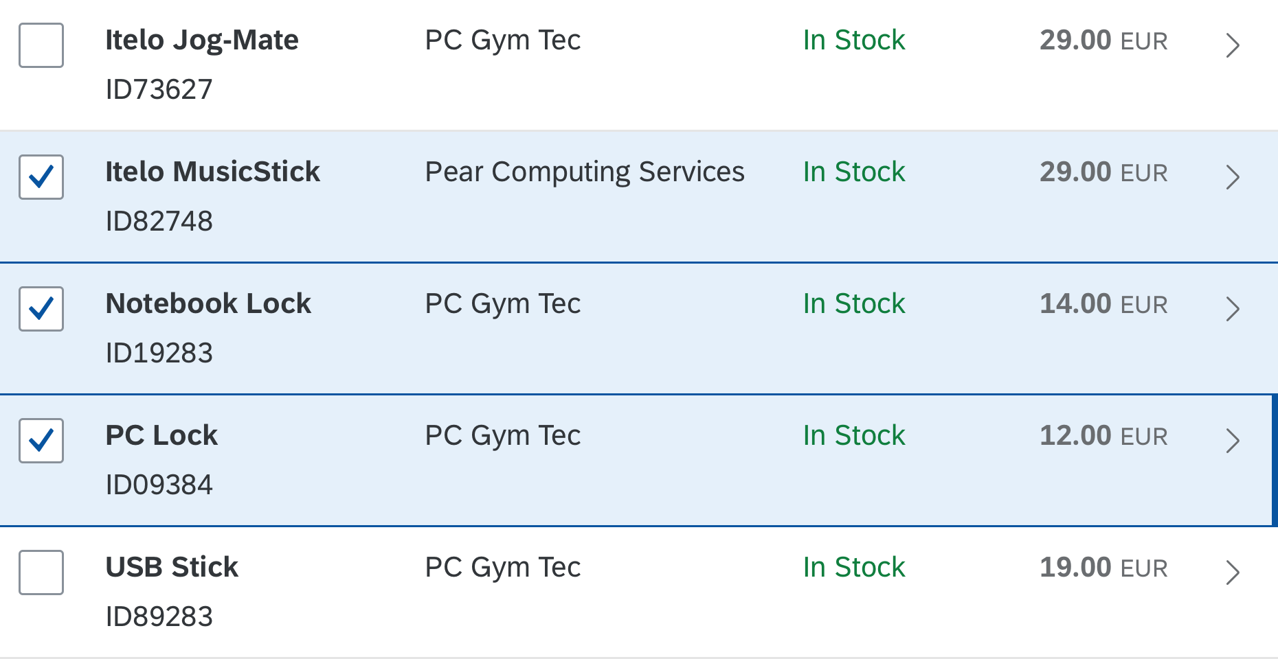
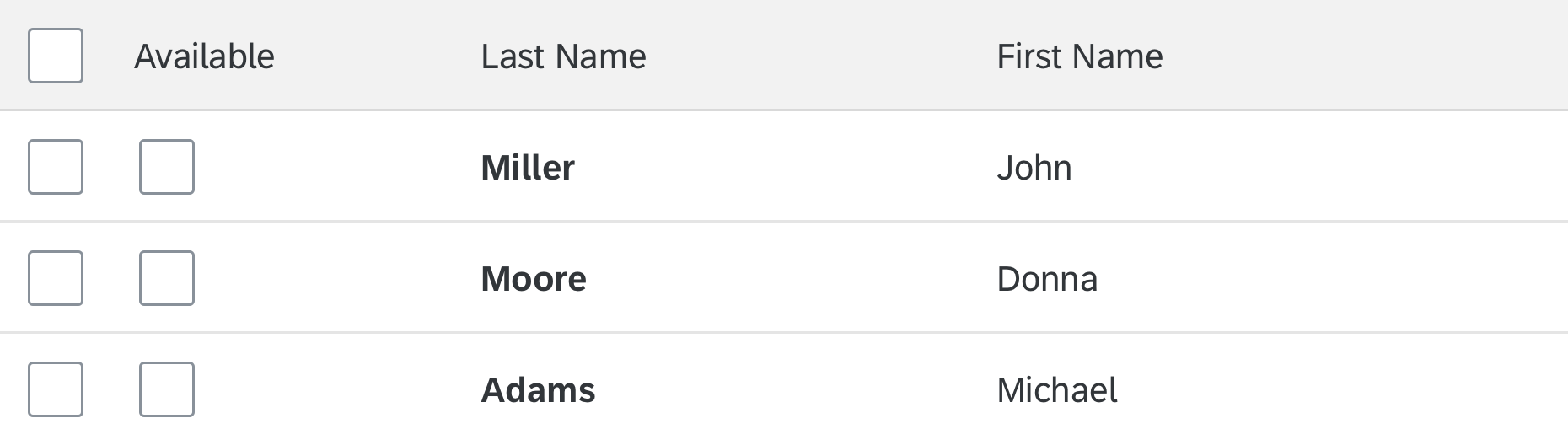
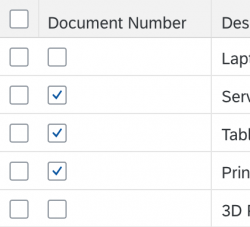
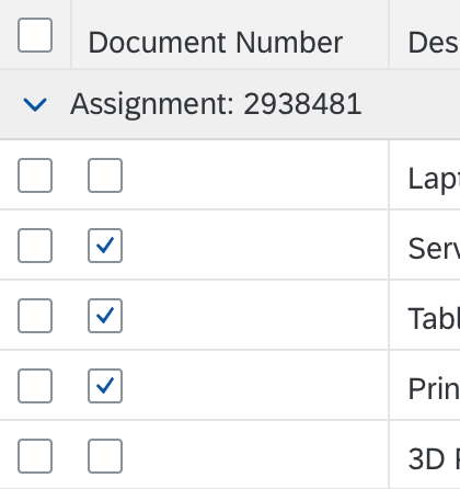
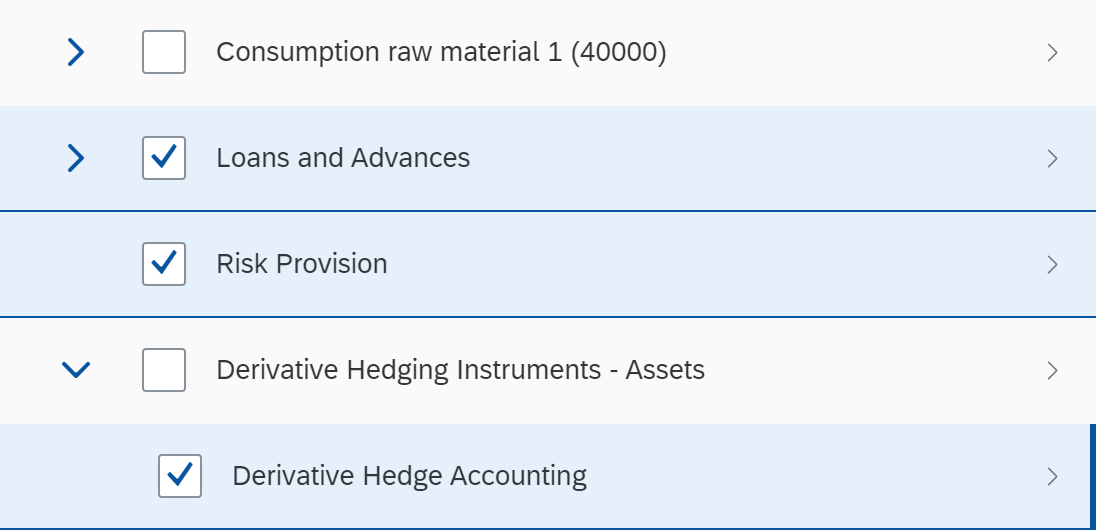
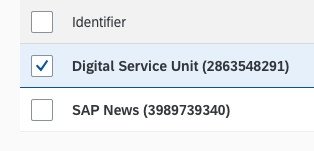
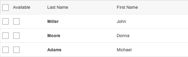
sap.m.ListMode.SingleSelectLeft). - Multi select: Users can select one or more items using the checkboxes on the left of each line item. The Shift key can be used to select a range. Users can (de)select all items using the Select All checkbox to the left of the column header (or CTRL+A). Select All should (de)select all items that the user can reach by scrolling. (sap.m.ListMode.MultiSelect).
Another multi select variant is to not provide a Select All option, but just a Clear All check box in the same place (property:multiSelectMode, value:ClearAll).
Keyboard: If the focus is on a row, the space bar selects the corresponding item.
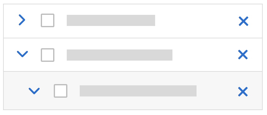
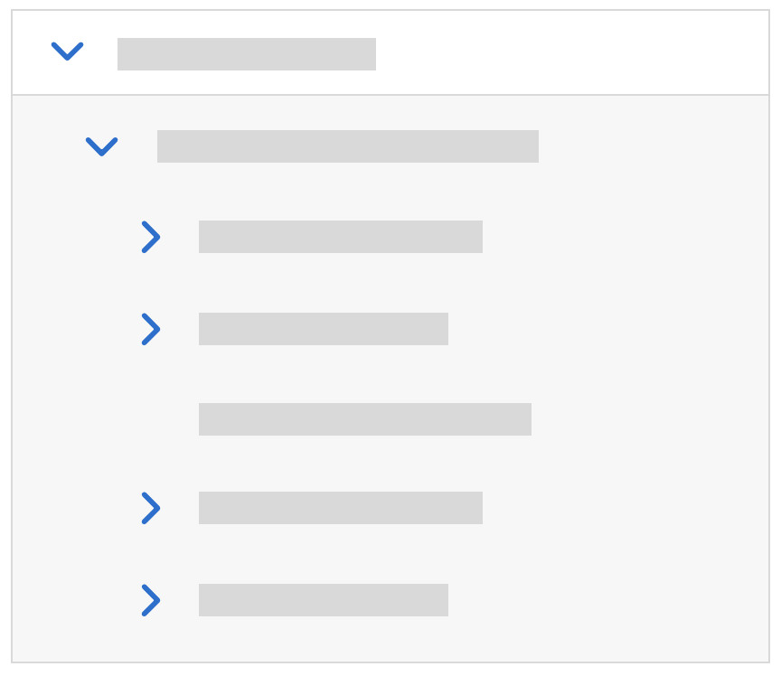
Responsive table without selectable items
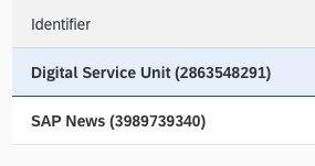
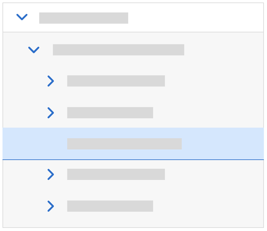
Single select master
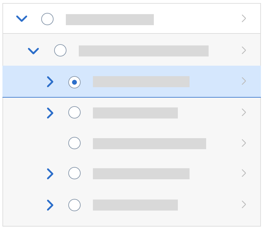
SIngle select left, with radio buttons. Use only if row clicks are used for something else.
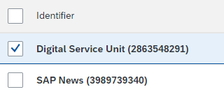
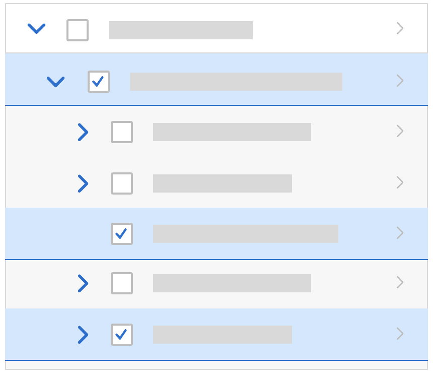
Multi select with 'Select All' checkbox
Multi select with 'Clear All' button
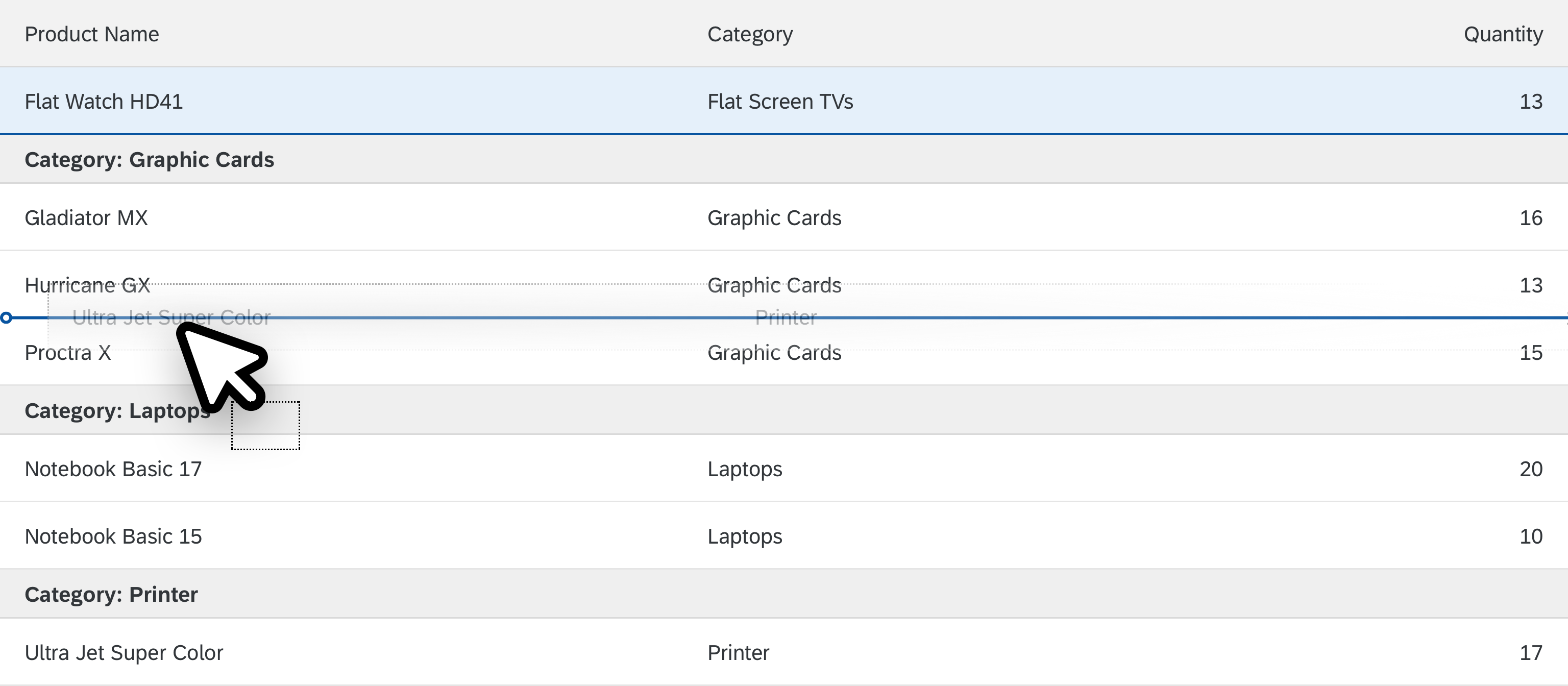
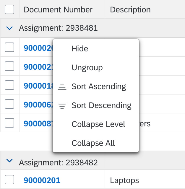
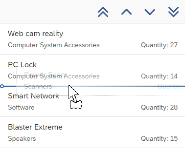
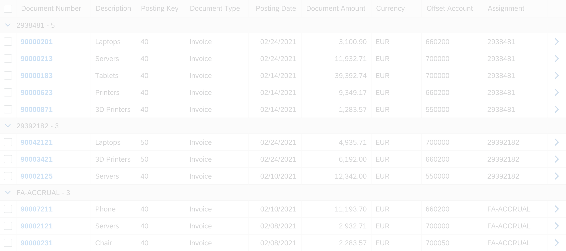
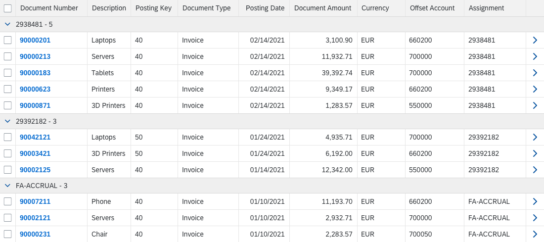
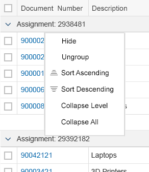
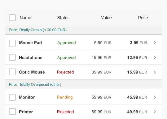
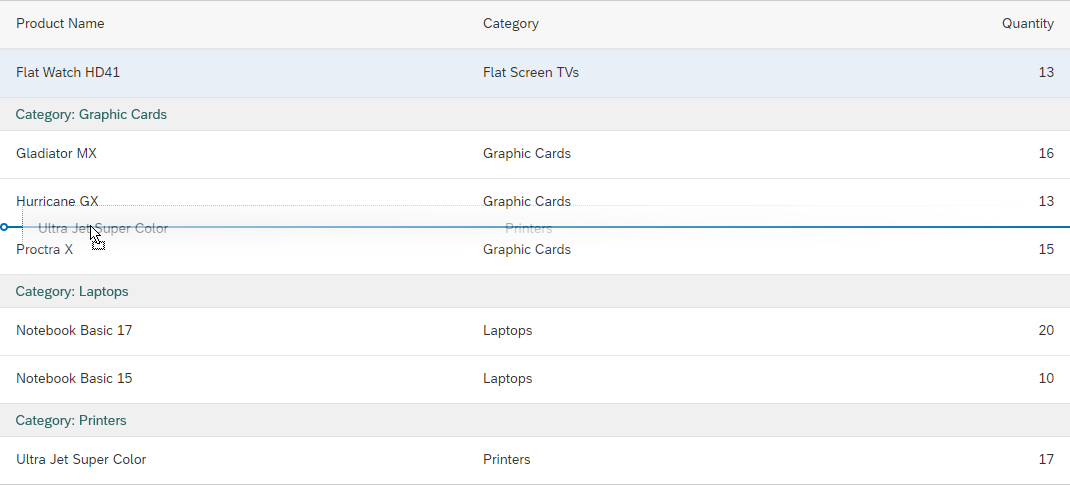
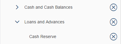
Group
When items are grouped, a group header is displayed. The group header is not interactive.
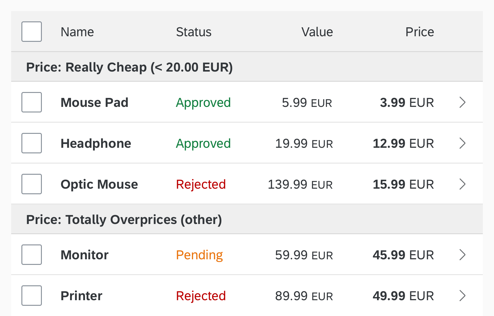
Group headers
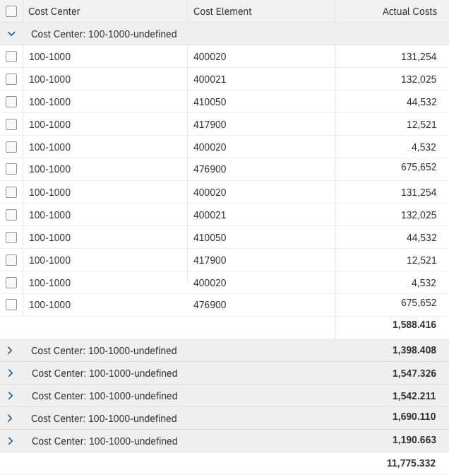
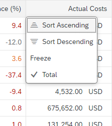
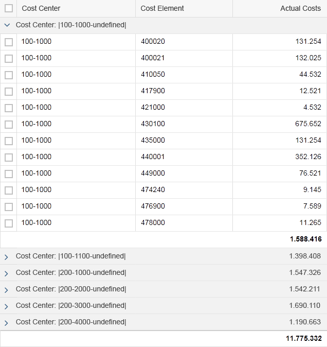
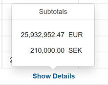
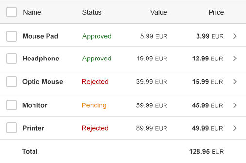
Show Aggregations
Show aggregations (such as totals) on the table footer (sap.m.Column, aggregation: footer).
Don’t show aggregations in “growing” mode. In “growing” mode it isn’t clear which values are being aggregated; only the items currently loaded in the front end, or all items.
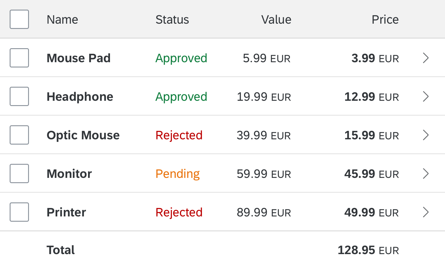
Table footer displays aggregated total
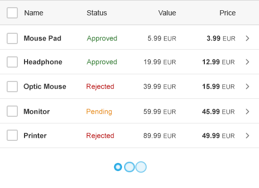
Load Items
When the responsive table fits the general requirements for your use case, always consider ways to reduce the amount of data loaded in the responsive table with, for example, filters, graphics, aggregation of information, and navigation. Keep in mind you should use it only to display moderate amounts of data, including factors like number of items and content complexity.
To show more than 100 items, use the “growing” mode (sap.m.Table/ sap.m.ListBase, properties: growing, growingThreshold, growingScrollToLoad, growingTriggerText). The “growing” mode allows the user to load only the first few items. Additional items are only loaded (and rendered) on request, which improves performance. You decide whether the user triggers the request by scrolling (preferred) or by clicking the More button.
If you use the More button, show the number of items already loaded and the total number items below the More text, if possible.
Do not show aggregations in “growing” mode. Also, do not display an item count on the table toolbar if “growing” mode is used. Use the count on the More button instead.
Load on scroll
Column Header Level
The column header provides the label for the corresponding column. It also handles the functionality for resizing columns.
Resizing Columns
If you implement column resizing, users can resize the columns as follows:
- Mouse interaction: The user drags the separator line between two columns. Double-clicking the line optimizes the column width based on the length of the currently visible data and the label of the column header.
- Touch interaction: As for mouse interaction, but with a larger target touch area.
- Keyboard interaction: When the focus is on the column header, Shift+Right increases the width of the focused column. Shift+Left decreases the width.
When a column is resized, the other columns can keep their original width or adapt their width. This depends on the column width settings:
- If column widths are set in pixel-based units (px, em, rem), the resized column is adapted and the columns that follow are moved accordingly. The width of all the other columns is not affected. If the visible columns don’t use the full width of the table control, empty space is added. If the visible columns exceed the width of the table control, one or more columns move to the pop-in area.
- If all column widths are set as a percentage or as “auto”, resizing one column might also result in automatic resizing of some or all other columns. The position of the resized column might also be affected. This ensures that the full table width is used and no white space is added.
Resizing a column
Line Item Level
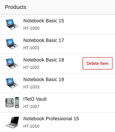
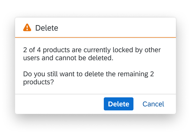
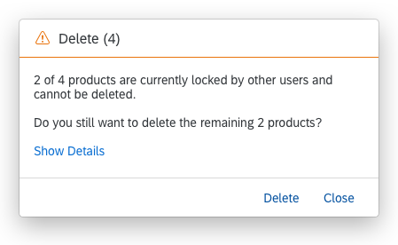
Delete Single Item Rows
To delete single item rows, use the table in the mode “delete” (sap.m.Table/ sap.m.ListBase, property: mode, value: sap.m.ListMode.Delete). This adds Delete buttons to each line item. Clicking this button triggers the deletion of the corresponding line item. (Keyboard: If the focus is on the row itself, the Delete key can be used to trigger the Delete button.)
Do not use this mode if deleting multiple lines at once is the preferred use case.
Delete is a mode of the responsive table and therefore cannot be used together with single selection or multiselection.
Responsive table in 'Delete' mode
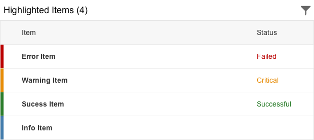
Highlight an Item
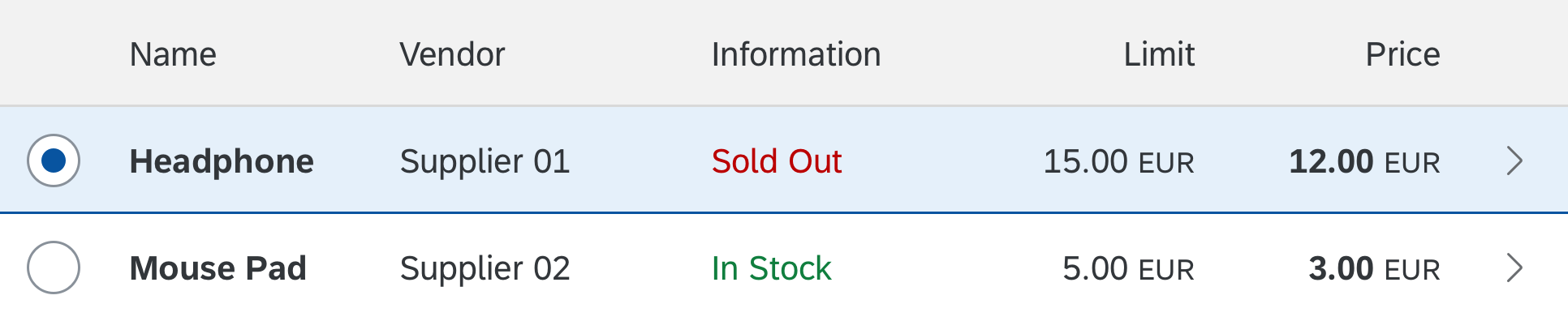
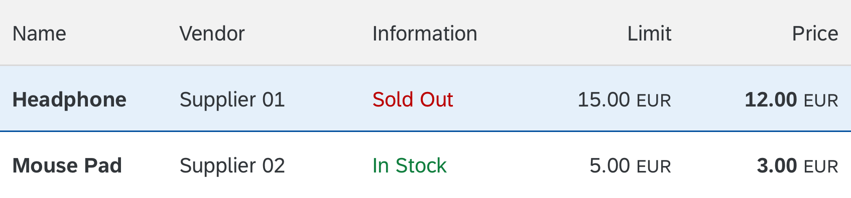
To highlight an item, use the “highlight” indicator (sap.m.ColumnListItem, properties: highlight).

Highlighted item
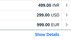
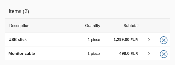
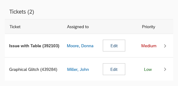
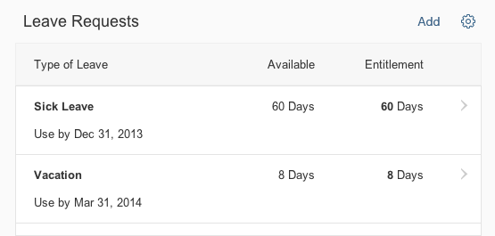
Navigate
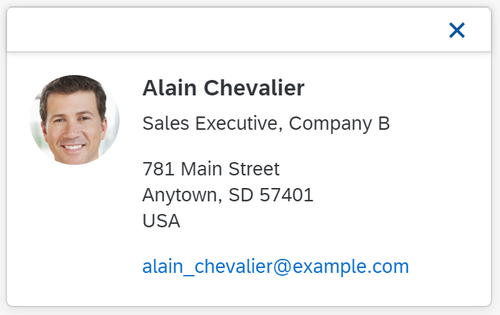
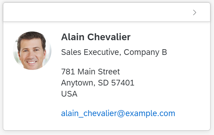
To allow navigation from a line item, use an item with the type “navigation” (sap.m.ColumnListItem/ sap.m.ListItemBase, property: type, value: sap.m.ListType.Navigation). This creates an indicator at the end of the line (“>”) and the entire line item becomes clickable (keyboard: if the focus is on the row itself, the Enter key triggers navigation). If the user clicks on the line, navigate to a new page containing line item details. In rare cases, you can also use the navigation mode for category navigation, without navigating to another page.
By contrast, clicking an interactive control within a line item does not trigger the navigation event. Instead, the corresponding control handles the click event.
If no navigation is possible, set sap.m.ListType to “inactive”.
“Navigation” is a list item type and therefore cannot be used together with “edit”, or in combination with click events for the entire item (“active”).

Navigation indicator
Indicate Navigated Item
When multi-selection is used in a list-detail scenario, it is not clear which item was last opened (for example, which item is currently shown in the second column of a flexible column layout). In this case only (multi-selection table with navigable items), you can display a “navigated” indicator to mark the item that is currently open (sap.m.ColumnListItem, property: navigated).
Navigated item
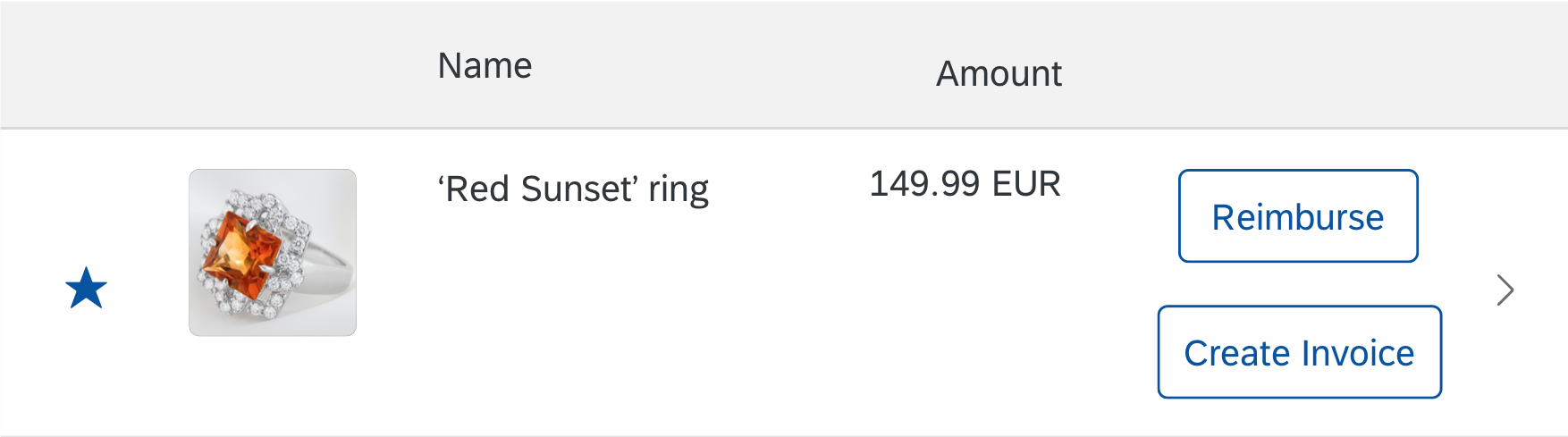
Edit Line Items
To allow editing for a line item, set sap.m.ListType to “detail” within the corresponding item (sap.m.ColumnListItem/ sap.m.ListItemBase, property: type, value: sap.m.ListType.Detail or sap.m.ListType.DetailAndActive). This will create an Edit button at the end of the line. Clicking the button triggers the edit event (keyboard: If the focus is on the row itself, the F2 key triggers the Edit button). Use this event to switch the corresponding line item to edit mode.
Edit is a list item type and therefore cannot be used together with “navigation” or in combination with click events for the entire item (“active”).

Edit button
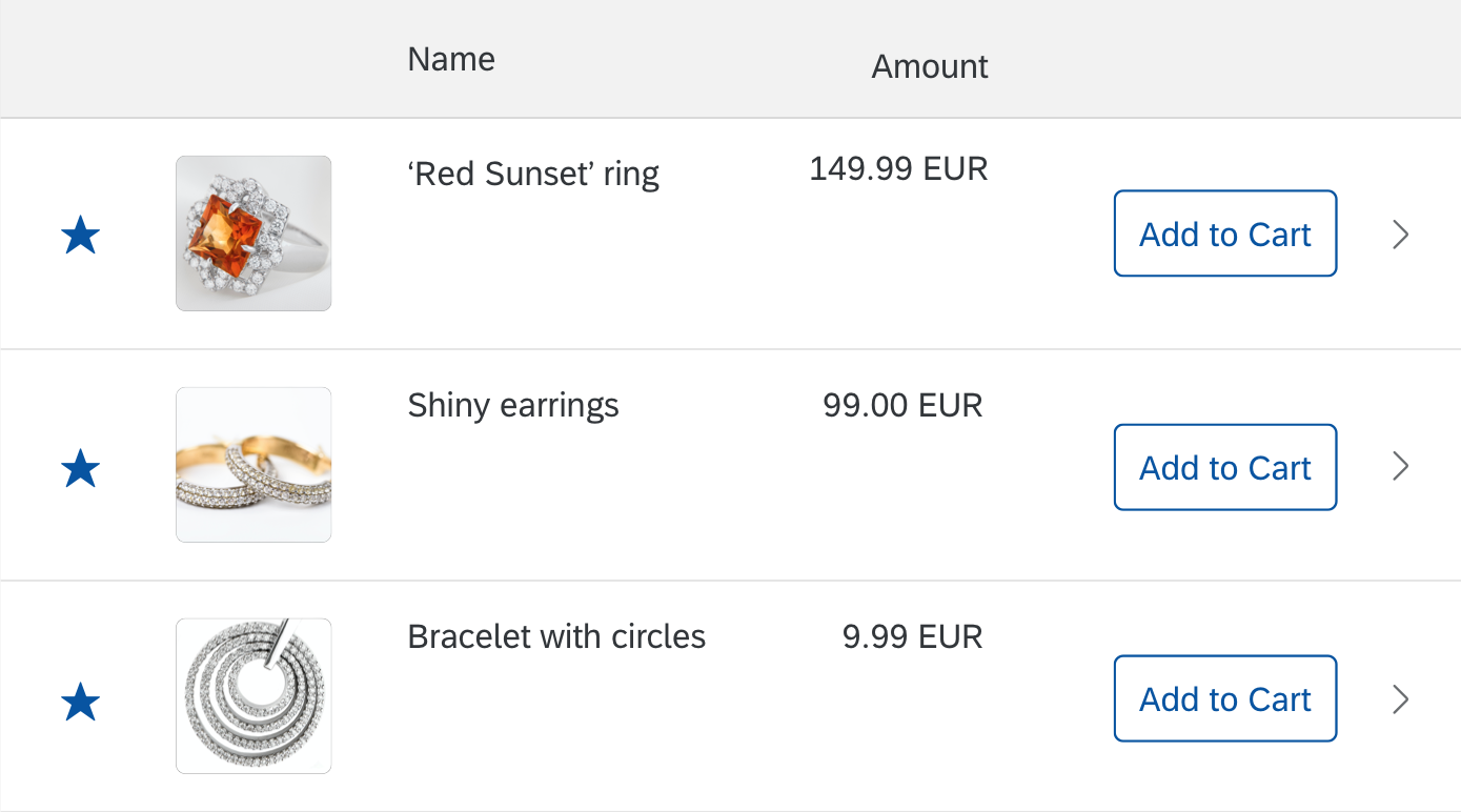
Click an Item
Items as a whole can be clickable. An event is fired by clicking on the item (anywhere where there is no interactive control inside the item). Apps can react on the event, for example, by opening a dialog (sap.m.ColumnListItem/ sap.m.ListItemBase, property: type, value: sap.m.ListType.Active or sap.m.ListType.DetailAndActive).
Active elements do not have a visual indication and can therefore not be differentiated from non-active elements.
Active is a list item type and can therefore not be used together with “navigation” or “edit”. In addition, “active” uses the whole item as a clickable area and therefore cannot be used together with a single-selection table.

Active element
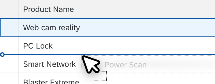
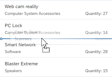
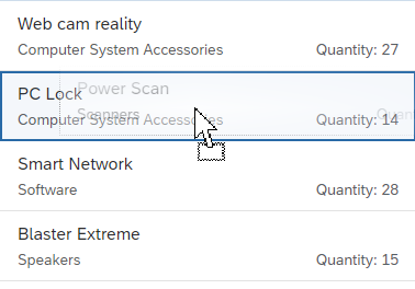
Drag and Drop
One or several items can be repositioned within a table or moved to other UI elements using drag and drop operations (sap.m.ListBase, aggregation: dragDropConfig). While being dragged, the items are shown as ghost elements on the mouse cursor.
Drop targets can be on items, between items, or both (sap.ui.core.dnd.DropPosition). On a drop target, the mouse cursor changes to either a “copy”, “link”, “move”, or “none” cursor. “None” indicates that the dragged item cannot be dropped in the current position (sap.ui.core.dnd.DropEffect).
Drag and drop is only available on supporting browsers.
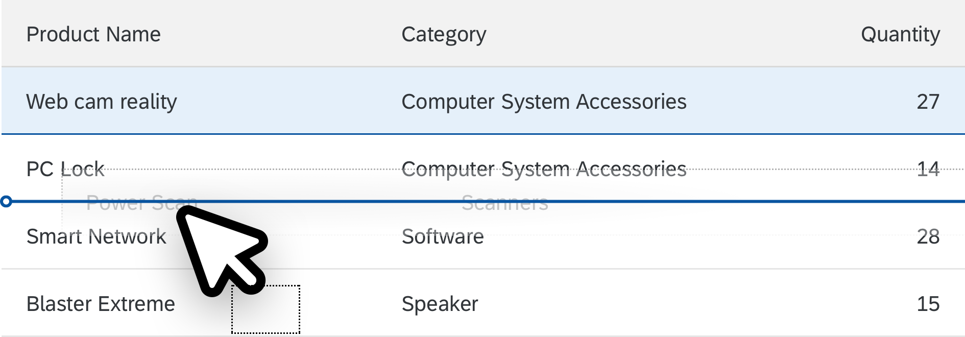
Drag and drop
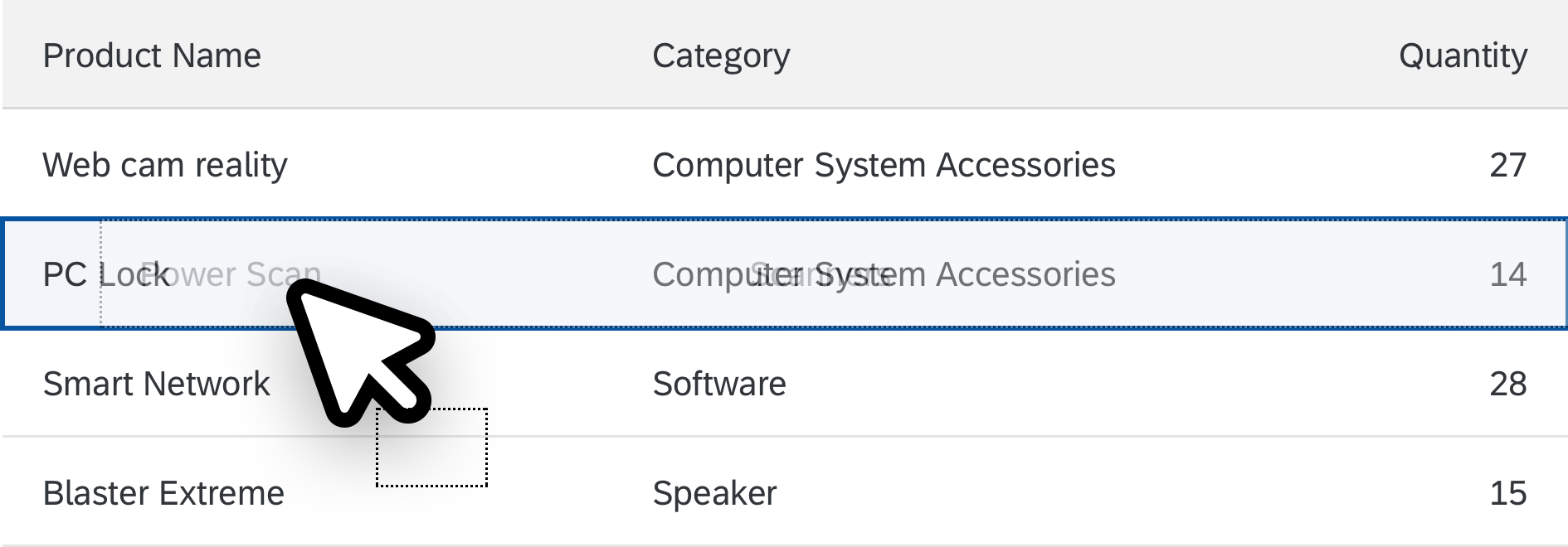
Whole item as drop target
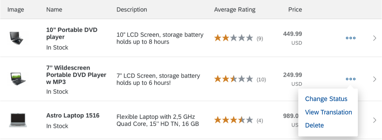
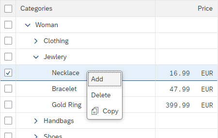
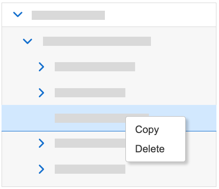
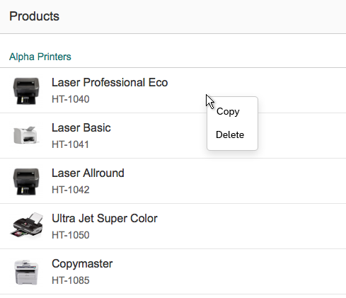
Context Menu
You can attach a context menu (sap.m.Menu) to a table. The context menu gives users an alternative way to modify the focused elements by giving them access to context-specific functions.
When opened, the context menu gets the row and column context, except for special columns (such as the selection column). Context menus can be implemented for a specific table or row.
Context menus are opened by right-clicking (desktop), long press (mobile), the context menu key, or Shift+F10.
Be aware that using the context menu overrides the browser context menu, which can no longer be opened.
If a control inside a table is the “click target”, and the control also provides a context menu, the control context menu “wins”.

Responsive table with a context menu
Cell Level
Showing Information
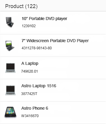
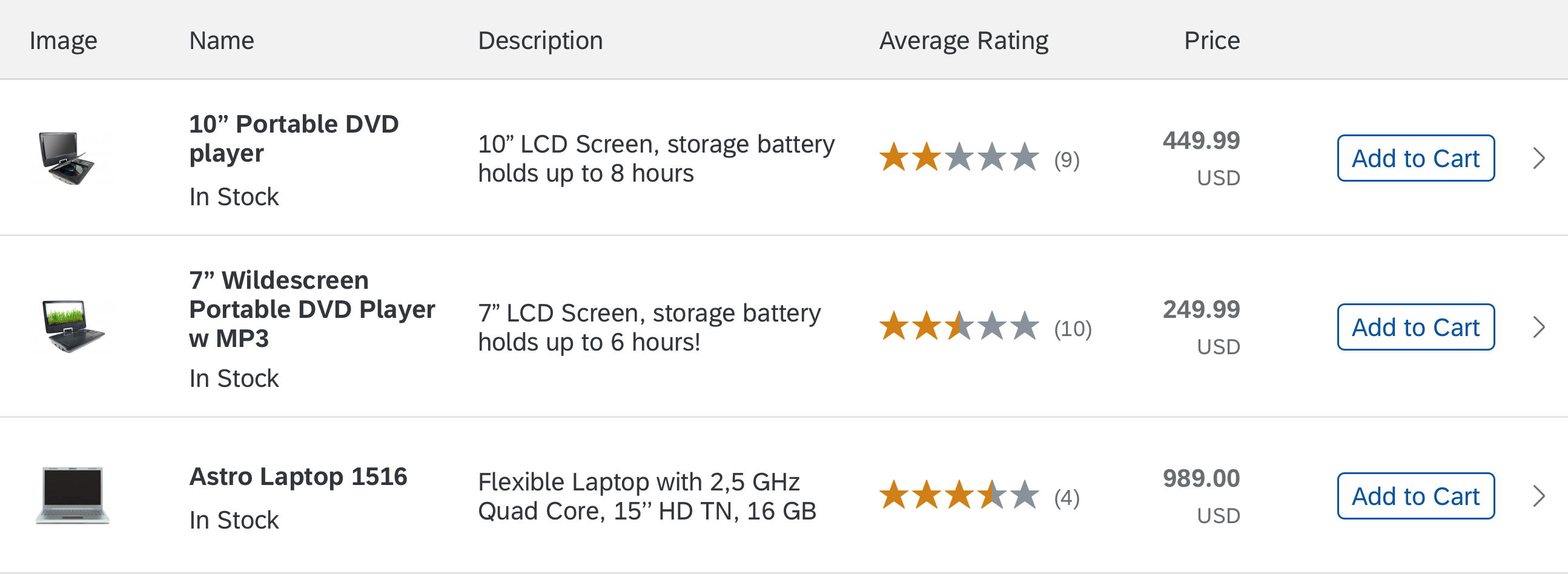
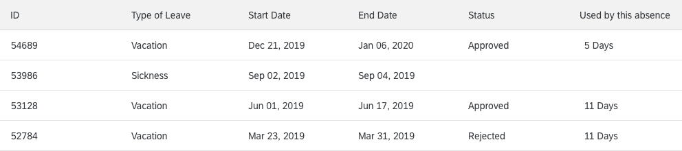
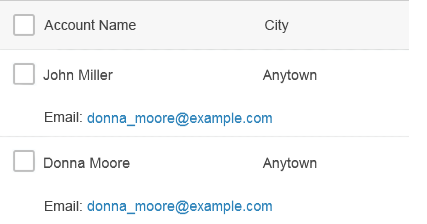
In contrast to traditional tables (such as the analytical table or the tree table), a cell can contain more than just one line of text.
Several lines of text within one cell
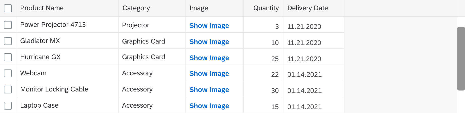
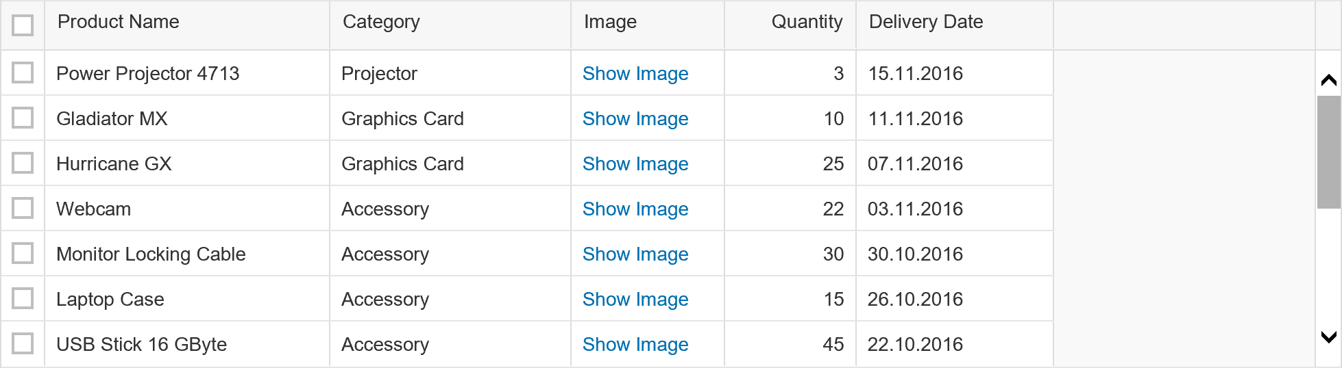
Add Controls
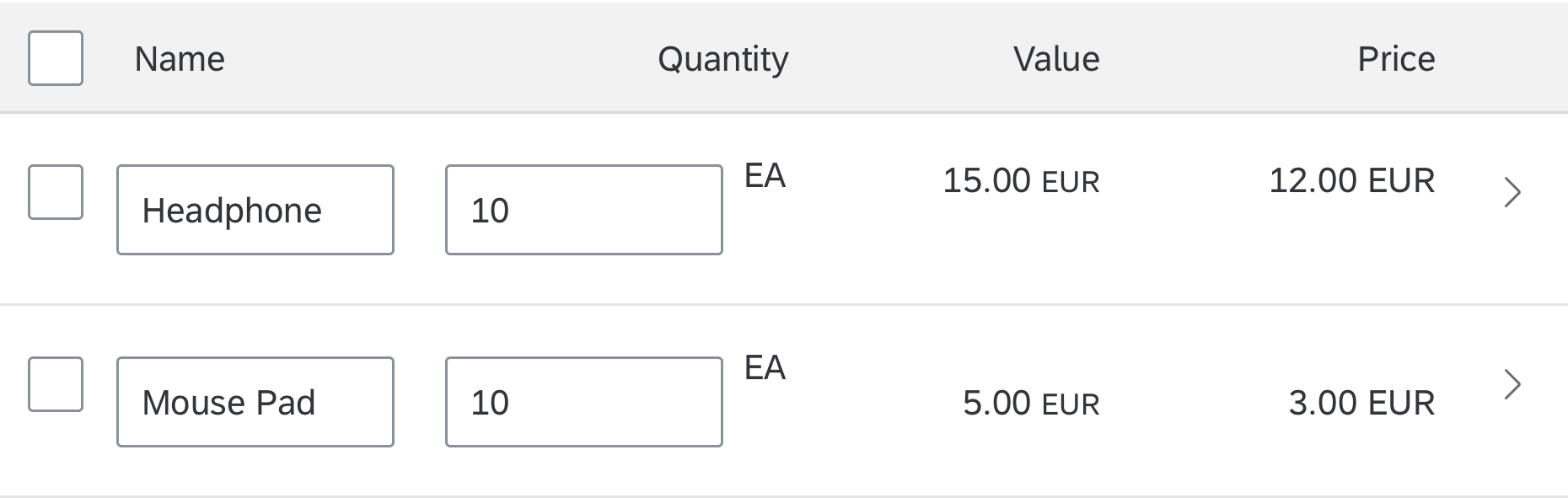
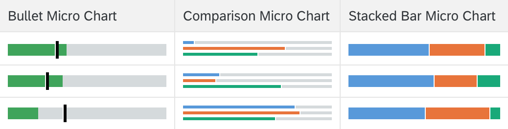
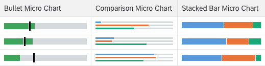
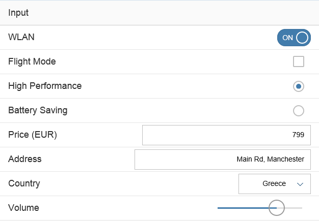
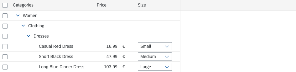
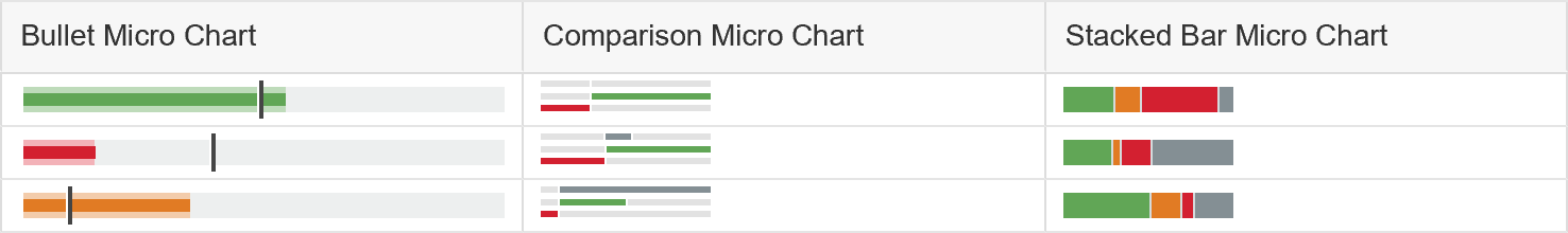
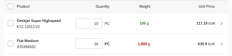
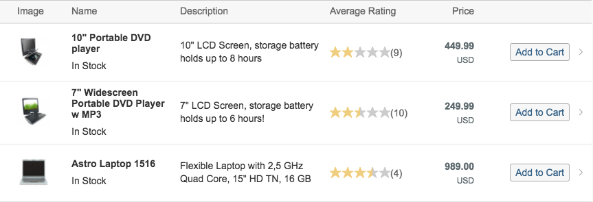
Alongside textual elements, you can also add any control to a table cell, such as input fields, microcharts, buttons, and so on.

Controls inside cells
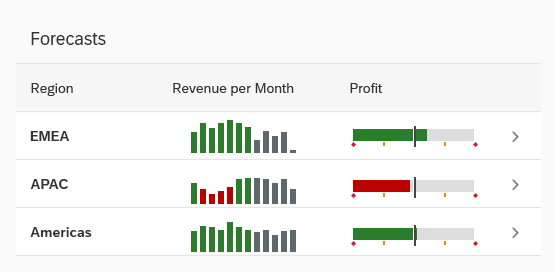
Any control can be placed inside cells
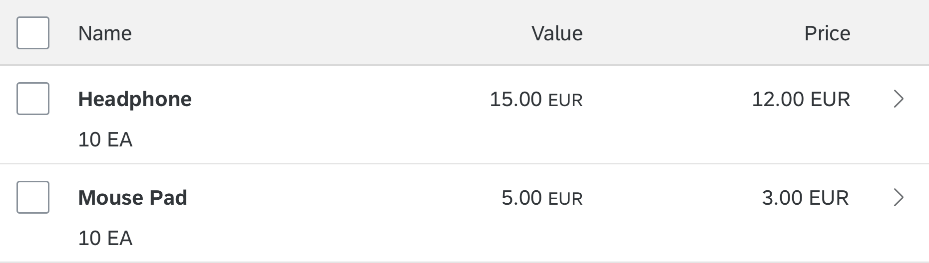
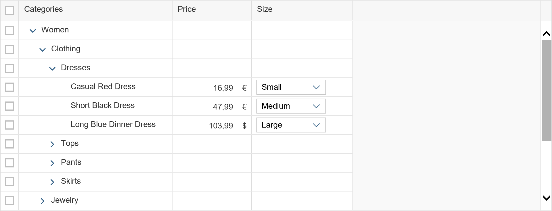
A cell can contain more than one control and more than one data point.
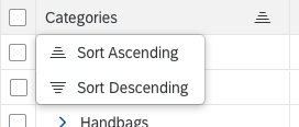
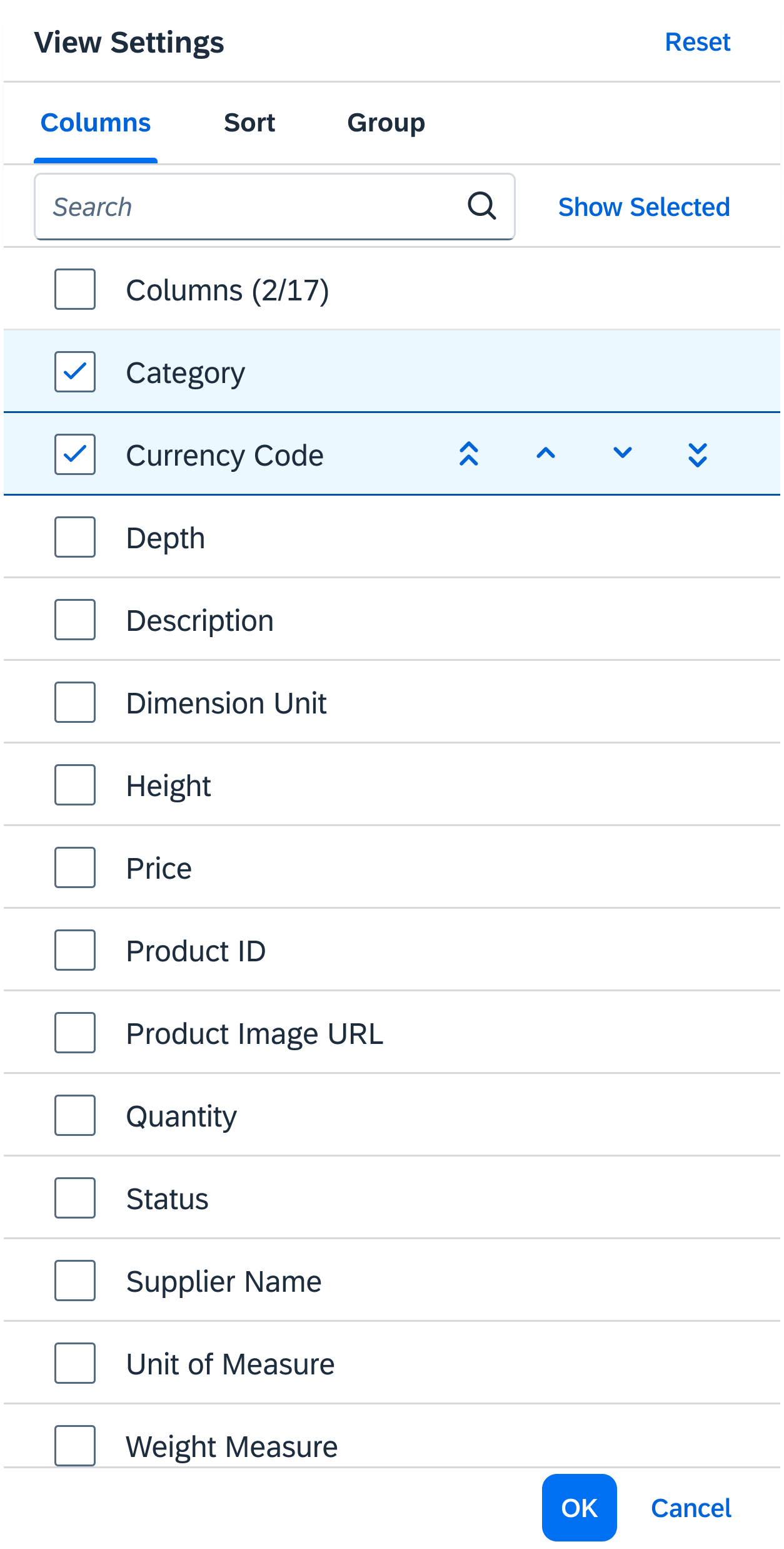
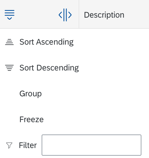
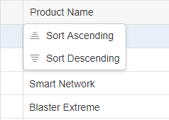
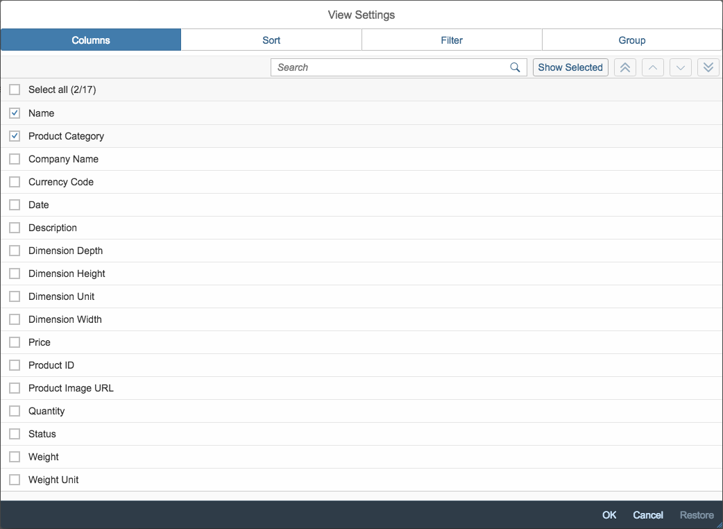
With the View Settings dialog, users can sort, filter, and group by each of these data points.
Several controls per cell
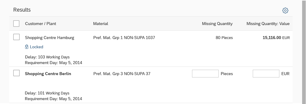
You can also have different controls in different rows in the same column. This could be the case if one item is locked, but another item is in edit mode, for example.
Different controls per column
Guidelines
Responsiveness
In most cases, the auto pop-in mode is sufficient. If you need to optimize further, first try to adapt the columns to influence the automatic behavior (sap.m.Column, properties: autoPopinWidth, importance). For example, set the priority for the two or three most important columns to “High” (identifying column, key attribute).
While the pop-in layouts GridLarge and GridSmall make better use of the available width, they also only look good with content that is specifically designed for these pop-in layouts. If you have text-only tables with only one value per column, use the Block layout (sap.m.Table, property: popinLayout).
Place the column header labels in the pop-in area above the corresponding values (sap.m.Column, property: popinDisplay, value: Block). This avoids alignment issues with different content. Be aware that the labels get top-aligned with the adjacent content.
Only place the label next to the corresponding value under the following conditions (sap.m.Column, property: popinDisplay, value: Inline):
- The values are text-only (no input fields, icons, images, micro charts, and so on)
- The available space is at least the double the width of size S.
This avoids truncation or “over-wrapping” of the labels and content.
If a column does not have a column header text (for example, if it always contains the same button with its own label), do not show the header text as a label in the pop-in area either (sap.m.Column, property: popinDisplay, value: withoutHeader). If you forget this setting, you will see an empty space followed by a colon (“:”).
Table Title
Use a table title only if the title of the table is not indicated in the surrounding area. Do not use a table title if it simply repeats text that is already above the table. For example:
- A pricing conditions table is the only control on a tab labeled Pricing Conditions.
- A section or subsection on an object page contains only one table.
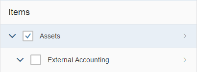
Use a table title if you need the item count, table toolbar, or variant management. To avoid repeating text, feel free to use generic text as a table title, such as Items.
Exception: If the surrounding area contains the table title, and both the item count and toolbar can be added to the surrounding area, no additional table title is needed.
Example: An object page (sub-)section contains only one table. In this case, add the item count and the table toolbar to the (sub-)section header.
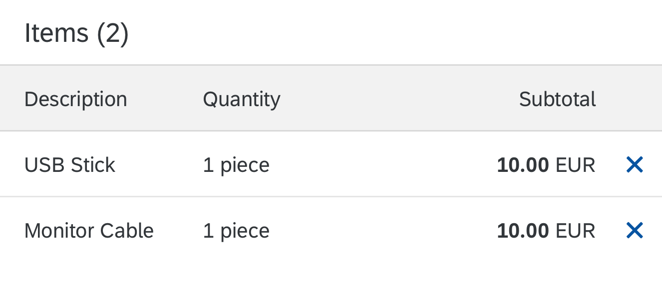
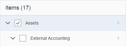
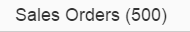
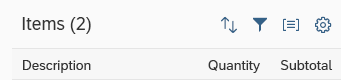
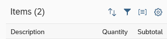
If you use a table title, show either a title for the table, with or without variant management, or an item count in the following format:
Items (2,534)
The item count in the table title includes all the visible items that a user can reach by scrolling. Group headers are not included.
Remove the item count in the table title if there are zero items. Do not use an item count together with “growing” mode.
If possible, keep the title bar sticky (sap.m.Table, property: sticky).
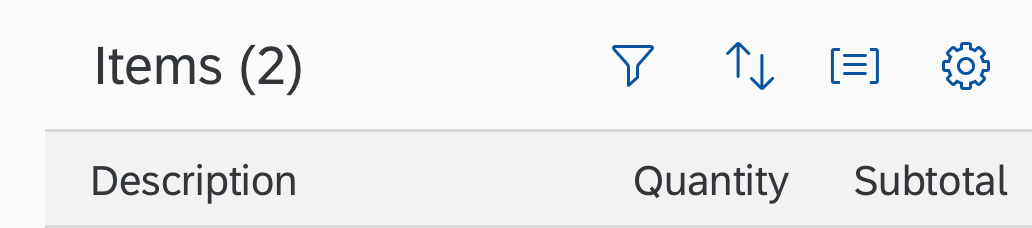
Table title with item count
Selection
For single selection cases, use the selection mode “single select master”. This is the recommended single-selection mode for list-detail scenarios within the flexible column layout. If you use it there, do not show a “navigated” indicator.
In rare cases, you can also use the click area for the row for another purpose (for example, to open dialogs). As a result, the click area cannot be used for selecting the row. In these cases only, use the “single select left” selection mode to offer a radio button as an additional click area for each row. To avoid confusion, make sure that the first data column does not contain radio buttons in the default delivery.
For all single selection modes, make sure that one item is initially selected. Otherwise, the user cannot return to the initial state. A selected item can only be deselected by selecting another item.
In multiple selection mode:
- Prefer Select All over Clear All
- Use Clear All only for tables with a large number of items (more than recommended above), where loading all items to select them would harm performance.
- To avoid confusion, don’t show checkboxes in the first data column in the default delivery.
- Make sure that the Select All checkbox (de)selects all items the user can reach by scrolling. This is only possible if all items are rendered.
- Never disable the selection checkbox. If an action can’t be performed on a specific item, inform the user after the corresponding action has been triggered. For more information, see Enabling/Disabling Actions.
Single selection left - Don't show radio buttons in the first column in the default delivery
Multiple selection - Don't show checkboxes in the first column in the default delivery
Use the selection mode "single select left" if clicking the row is used for something else (such as navigation)
Use the selection mode "single select master" in all other single selection cases
Loading Data
To indicate that the table is currently loading items, use the busy state. (sap.m.Table, property: busy). Do not show any items or text. As soon as the data is loaded, remove the busy state and show all items.

Table in busy state while loading data
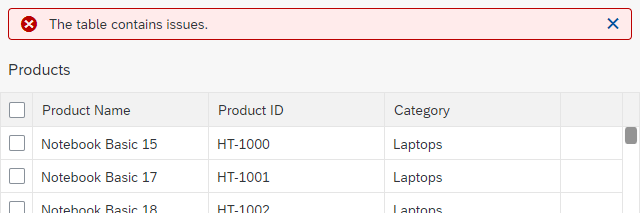
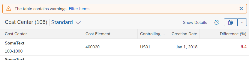
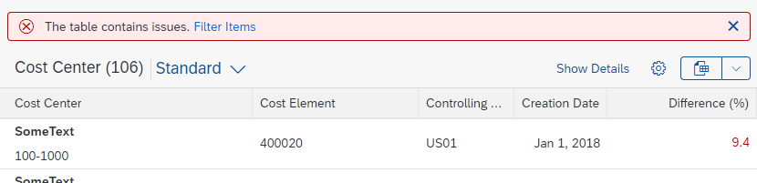
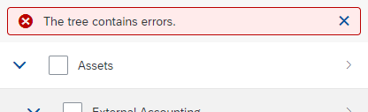
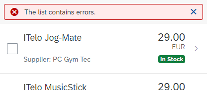
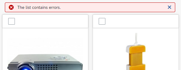
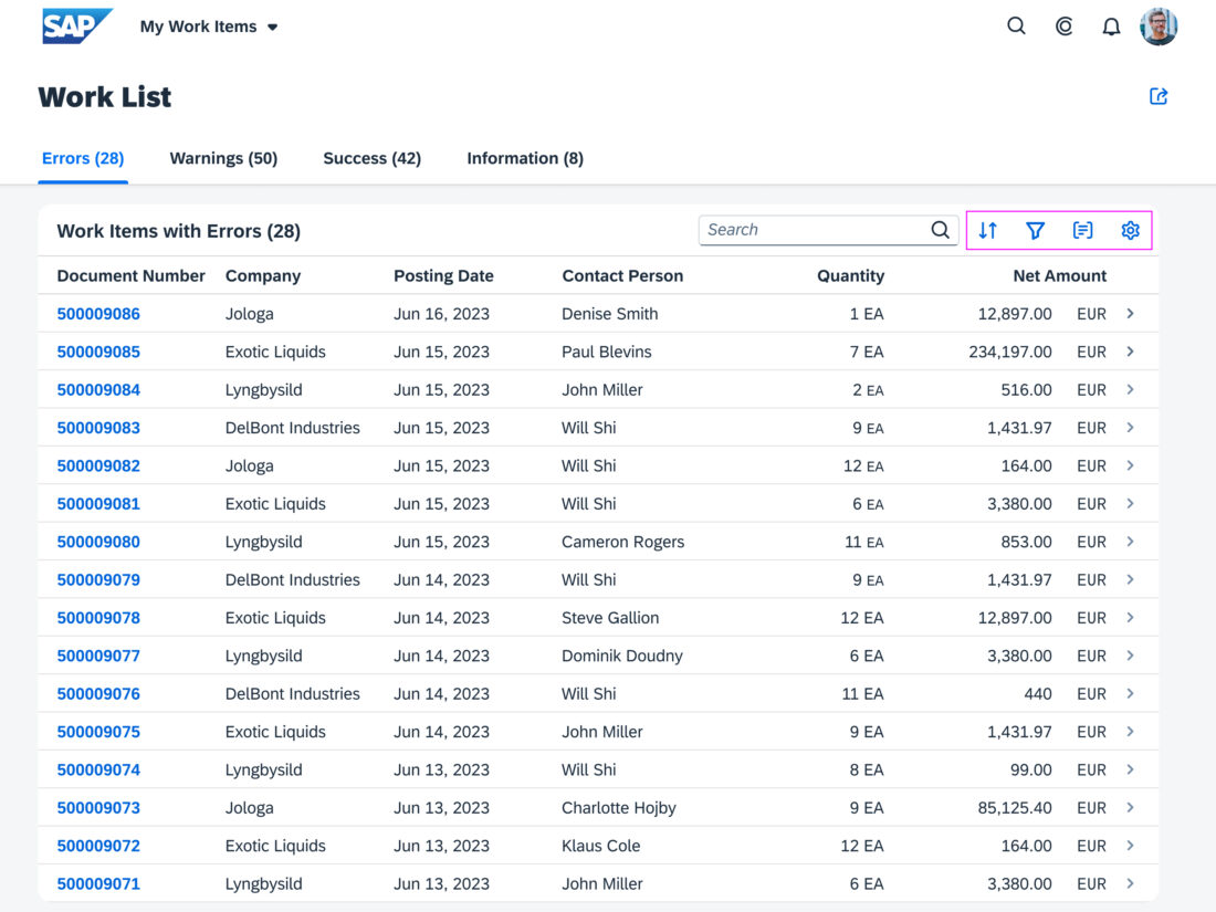
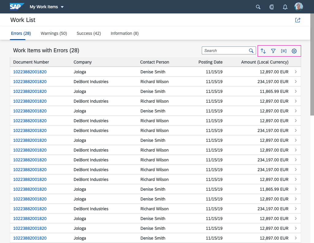
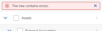
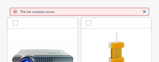
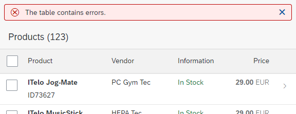
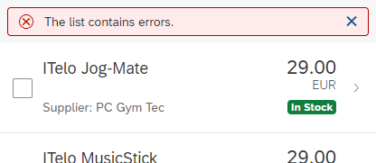
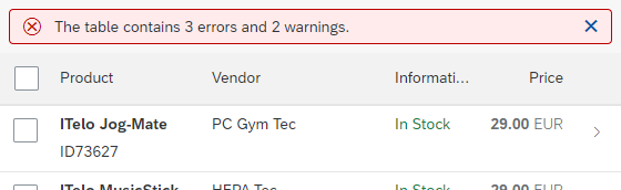
Errors and Warnings
To indicate that the table contains items with errors or warnings, show a message strip above the table. On the message strip, provide information on errors or warnings. When issues are solved or when new issues appear, update the message strip accordingly.
To indicate an error in a single row, see Item States below.
For details on displaying errors, warnings, and other messages, see Message Handling.
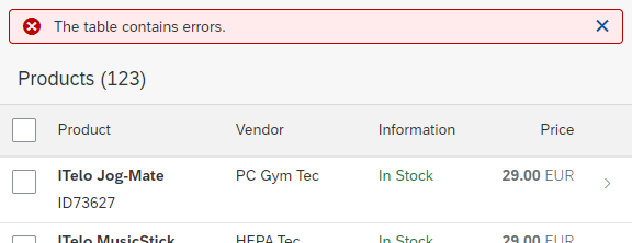
Table containing errors
Columns – Best Practices
Minimize the number of columns:
- On a smartphone, use only one or two columns, depending on the content.
- On a tablet or desktop, use three to five columns if the responsive table is shown within the flexible column layout. Use about eight columns if using the full screen width, depending on the content.
If the responsive table does not fit into the width provided:
- Hide columns to reduce the width of the table.
- Use pop-in areas to show the whole content by increasing the height of the line items (sap.m.Column, properties: demandPopin, minScreenWidth).
At the smallest size, keep the following information in the table layout:
- The column that identifies the line item.
- The column that contains the key attribute.
If both of these do not fit into the width provided, keep just the column with the line item identifier in the tabular layout.
The responsive table assigns the same width to each column by default. In doing so, it uses all the available space. We recommend overwriting this default to provide optimal space for your content (sap.m.Column, property: width).
Especially for tables with just a few columns, we recommend assigning a fixed width to each column and to disabling automatic distribution of the remaining available space (property: fixedLayout, value: Strict). In this case, the rest of the table is filled with empty space.
Optimize the column width for its initial content (sap.m.Column, property: width). If the content is dynamic, optimize the column width for typical content.
When defining the column width, consider the implications when a column is resized:
- If you define the column width in pixels or rem, resizing a column only affects the width of that particular column.
- If the table isn’t wide enough to show all the columns after a column has been resized, one or more of follow-on columns move into the pop-in area.
- If the columns don’t use up the available space, white space appears to the right of the last column (property: fixedLayout, value: strict).
- If only one column remains, and the width of this column exceeds the width of the table itself, the width of the column is reduced to the width of the table.
- If you define the column width as a percentage, resizing one column affects the width of several or all columns. Text wraps more when the browser window size is reduced. This ensures that all columns together make use of the full table width.
- If you define the column width as “auto”, the behavior is the same as for “percentage”. However, unlike “percentage”, “auto” distributes the columns equally.
- Be cautious of mixing columns with pixel-based and percentage-based widths. While this can be helpful in some cases, it could also cause even more unexpected side effects when columns are resized. If you are using percentage-based widths for one or more columns, consider not allowing end users to resize columns at all.
If you need more columns than those that fit on a tablet screen (usually five) to fulfill 80% of your main use cases, offer an option to add, remove, and rearrange columns via the table personalization dialog. Before doing so, try to reduce the number of columns, for example, by using several lines per column or by utilizing the pop-in function. See the cheat sheet for an example.
Do not distribute just a few columns across the full width
Use a fixed column width instead
Column Headers – Best Practices
Within the column header, provide a label for each column (sap.m.Column, aggregation: header). The column header label is reused as a label in the pop-in area.
Exception: If the column does not pop in, no column header label is needed as long as at least one column still has a column header label.
To keep the column headers readable, wrap or truncate the texts as follows:
- If columns are not resizable, use controls that wrap and support wrapping with hyphenation, such as text (with wrapping and hyphenation enabled). Do not use controls that truncate.
- If columns are resizable, use controls that truncate.
Keep column headers sticky.
Wrap column headers if columns are not resizable
Truncate column headers if columns are resizable
Column headers (sap.m.Column, aggregation: header) usually contain links or text-based controls.
Column headers can also contain other kinds of SAP Fiori controls. However, the column header cannot be aligned vertically, making it difficult to use many controls in the column header. Using other kinds of controls also creates problems with pop-in behavior and could thus lead to accessibility issues. Therefore, exercise caution when using them in a column header.
Accepted: Link as column header text (rarely used)

Accepted if responsiveness is taken into account: Text plus search field
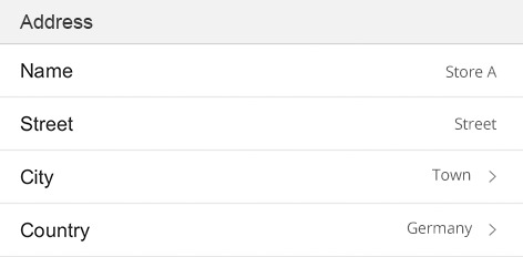
If a column cell contains several fields, use an umbrella term in the column header (such as Address for fields like Street, ZIP Code, and City).
For text and ID fields, use a generic label (for example, Employee for Name and ID).
If none of these are possible, separate the labels with “/” (for example, Name / Status).
For boolean values, such as checkboxes, find a descriptive text for the column header.
Horizontal Content Alignment
For alignment of cell content, follow the guidelines below (sap.m.Column, properties: halgin, valign, sap.m.ColumnListItem, property: VAlign). Align the column header horizontally according to the content of the cell.
Exception: Secondary information in a column always follows the alignment of the main information.
Left-Align
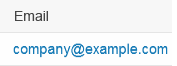
Left-align: Text, IDs, phone numbers, URLs, passwords, and email addresses.
Left-align text
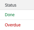
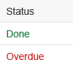
Left-align: Status information
Left-align status information
Right-Align
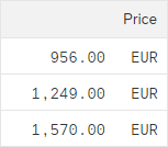
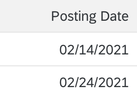
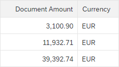
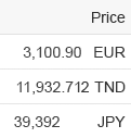
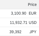
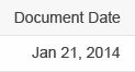
Right-align: Dates and times (to ensure comparability for most formats and locales)

Right-align dates
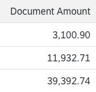
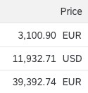
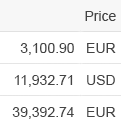
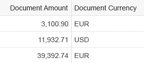
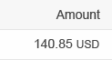
Right-align: Numbers and amounts, except IDs, to ensure figures are comparable
Right-align numbers
Center-Align
Center-align: Icons, images, and avatars
Keep the column name for center-aligned columns as short as possible to avoid excessive white space between columns. Alternatively, you can leave the column header empty on the visual UI, and use the invisible text control to provide information on the column content for screen reader listeners.
Align buttons with the content hierarchically
Always place buttons directly next to their content. Do not add an additional column for buttons. If you have more than one button, display them next to each other. Order the buttons based on importance. The most important button is on the left, the least important on the right. If there is not enough space to display them all in one line, move the buttons from the right onto the next line one by one. Do not use more than two buttons per line item.
Vertical Content Alignment
Top-align where possible to facilitate reading the content on one line.
Do not use top-alignment if it results in a peculiar layout. This usually happens when controls that need more vertical space are combined with text-only controls, such as input fields. In this case, try center-alignment instead and fine tune it until the layout fits.
Use top-alignment where possible
Don't use top alignment if it doesn't make sense
Content Formatting
The responsive table provides flexibility, including multi-line cells, by enabling every control to be put into a cell.
As a key identifier of an item, use an object identifier. Show the key identifier in the first column. For more information, see object display components.
If the table width is small, do not hide this column or move it to the pop-in area.
Object identifier
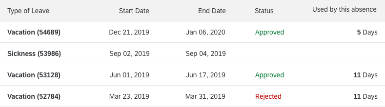
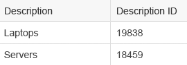
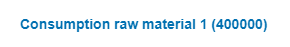
Strings with IDs: If the responsive table contains more single-line data, show the ID in brackets after the corresponding string.
This minimizes the line height.

For items with a small line height, place the ID in brackets after the corresponding string

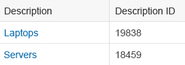
If displayed as a link, use the whole text as the link
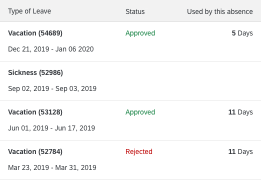
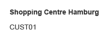
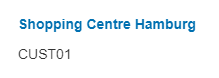
Strings with IDs: If line height is already large, show the ID below the corresponding string. Use the object identifier to do so.

For items with a large line height, place the ID below the corresponding string
Is displayed as a link, use only the first line as the link
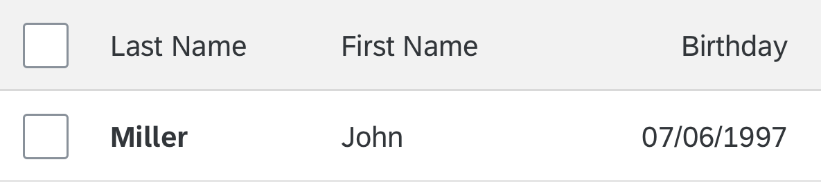
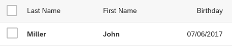
If there is more than one key identifier (for example, First Name and Last Name), display these columns first and show the values in bold text.
Several key identifiers
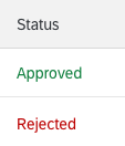
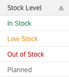
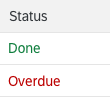
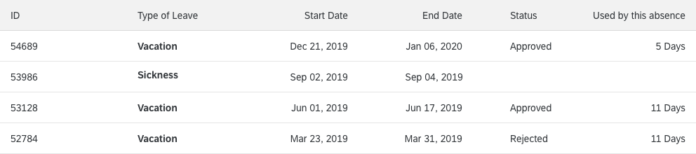
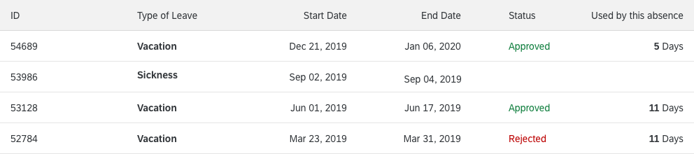
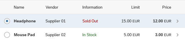
For status information, use semantic colors on the foreground elements.
For status information on text: If the status is actionable, add a transparent icon button next to the text.

Semantic colors on text
Avoid truncation. Use controls that wrap the text and support hyphenation.
For example, use text.

Wrap text
Don't truncate text
For editable content, use input fields and other interactive controls within the table cells. If you need to offer edit mode, change your text controls (labels, text, and links, to input fields or other appropriate controls) as soon as you switch to edit mode, but not before.
You can do this by changing the control or, in more complex cases, by exchanging the whole responsive table.
Interactive controls – Inline
If there is no value for a cell, leave it blank. Do not display text as N/A.
Leave empty fields blank
Numbering Items
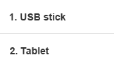
- If the item number has four digits/letters or less and is equally important as the corresponding description, concatenate the item number with the description and show it in one column.
- If the item number has five digits/letters or more, or if it is more important than the corresponding description, for example, when no description is available, use a separate column for the item number.
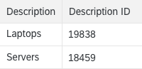
- If the item number is more like an ID in regards to its description, use ID formatting, like Description (ID).
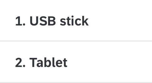
For short numbers, add the item number to the description
Flag and Favorite
Place the flag or favorite marker in the first column (in the default delivery). To change the settings, users need to drill down into the object itself.

Item marked as a favorite
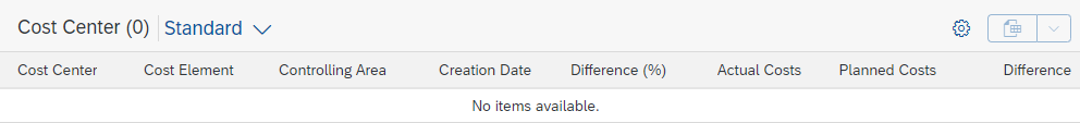
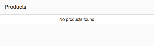
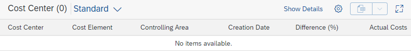
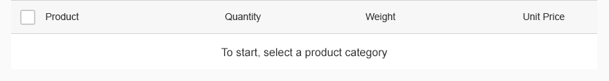
Empty Tables
Try not to display an empty responsive table. If there is no way around this, provide instructions on how to fill the table with data (sap.m.Table/ sap.m.ListBase, properties: showNoData, noDataText).
Examples:
- If a table is initially empty, provide at least a basic text:
No items available.
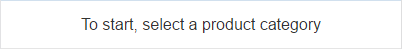
Overwrite this whenever a hint can be provided on how to fill the table with data. - If a table is used together with a filter bar (as in the list report), and is initially empty, use the following text:
To start, set the relevant filters. - If a table is used together with a filter bar and the filter does not return results, use the following text:
No data found. Try adjusting the filter settings.
Adapt the texts above if:
- The standard text is not precise enough for your use case (for example, a search is also offered, or only the search is offered).
- The standard text is misleading (for example, if the data is filled based on a list-detail pattern instead of filter settings).
Remove the item count in the table title if there are zero items.
Provide meaningful instructions
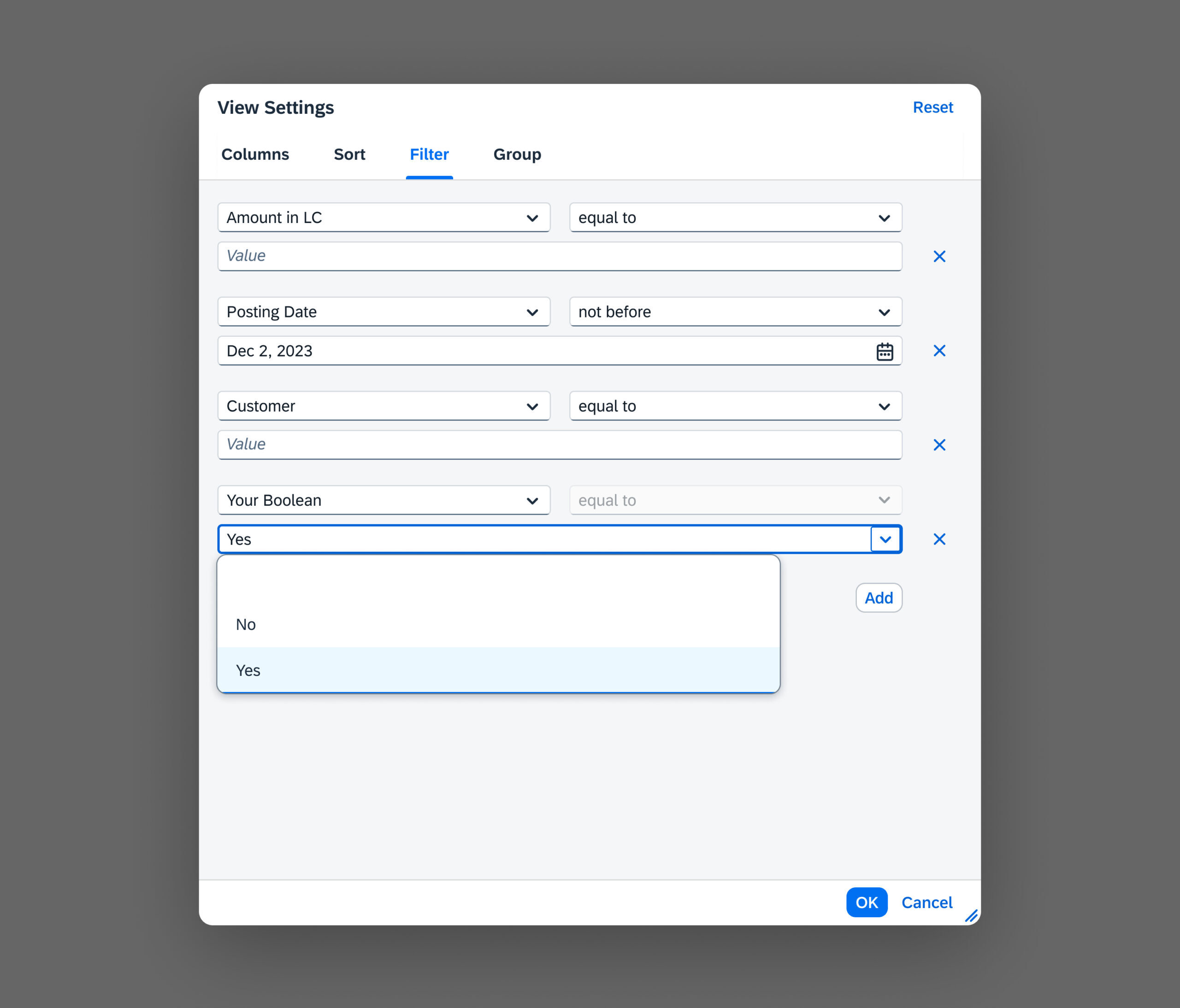
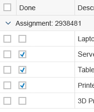
Displaying Boolean Values
If a column contains Boolean values, such as “Yes” or “No”, show a read-only checkbox next to the texts.
The supplementary checkbox makes it easier for users to see at a glance which items are “true” (checked) and which are “false” (unchecked).
Developer Hint
Use sap.m.checkbox with the Horizon theme and set the editable property to “false” to get the read-only variant. Add the checkbox next to the existing text value. The text itself should remain unchanged.
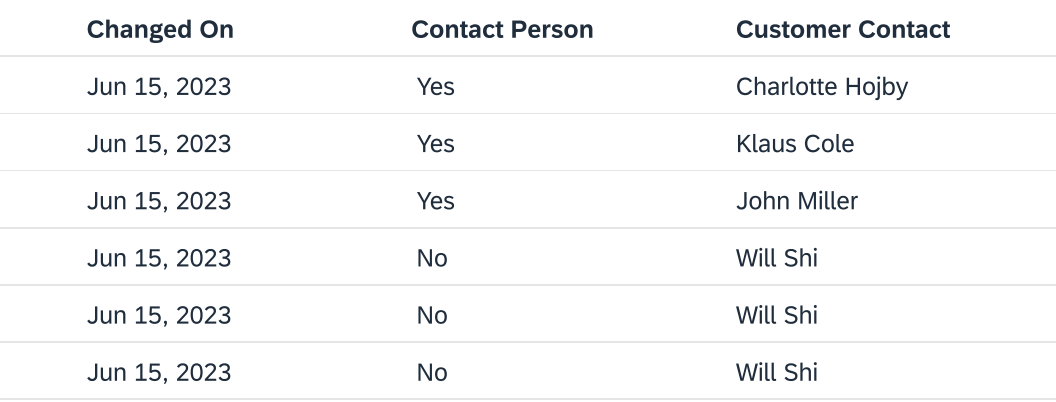
Avoid showing only text for Boolean values
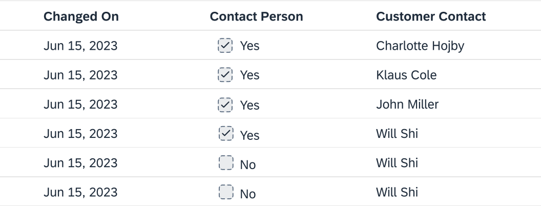
Boolean values with read-only checkboxes for easier scanning
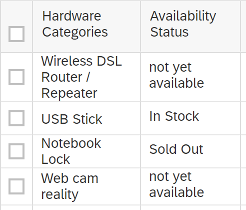
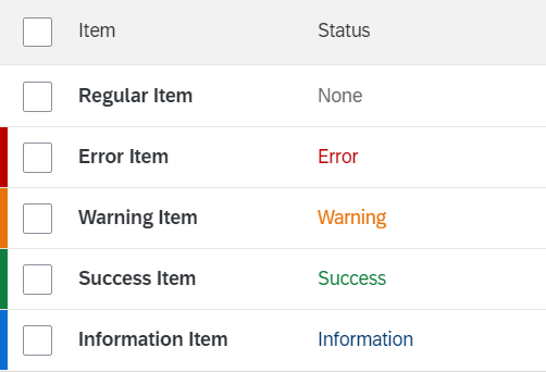
Item States
To show that an item is unread, use the corresponding flag (sap.m.Table, property: showUnread, sap.m.ColumnListItem/ sap.m.ListItemBase, property: unread). This shows most of the content in bold font.
An unread item
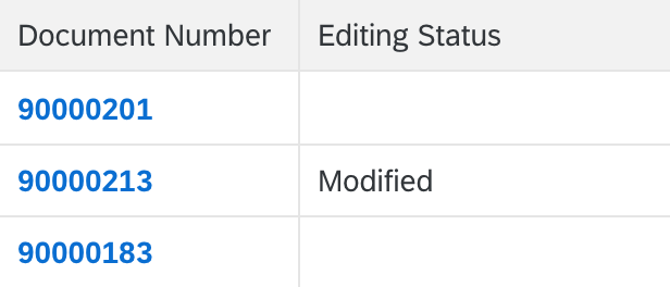
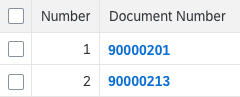
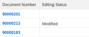
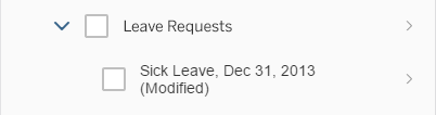
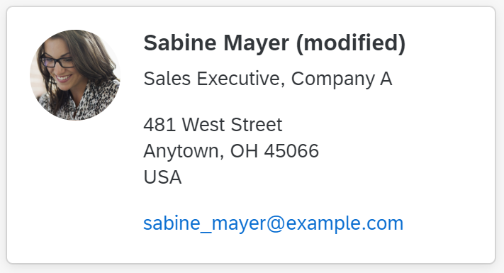
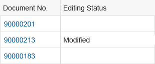
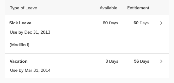
To show that an item has been modified, for example, within the global edit flow, add the string (Modified) at the bottom of the column that identifies the line item.
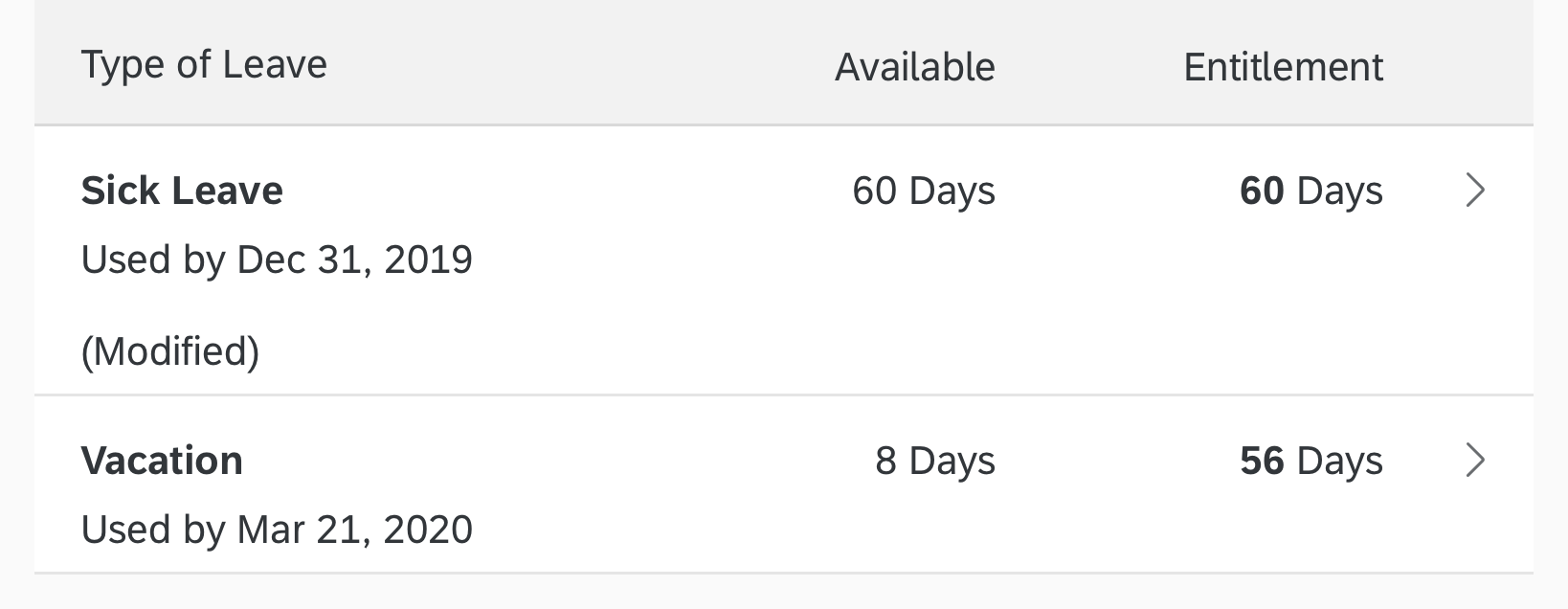
A modified item
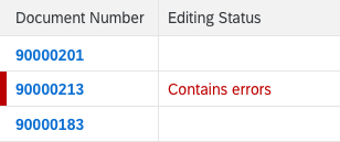
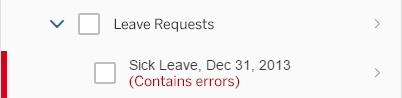
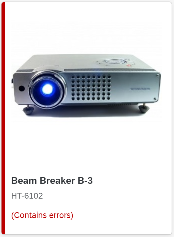
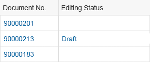
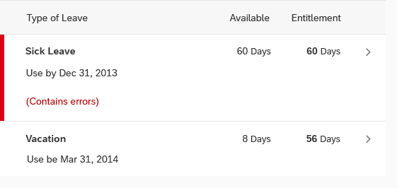
To show that a modified item contains an error (for example, within the global edit flow), add the string (Contains errors) at the bottom of the column that identifies the line item. To do this, use an object status control with the error state (sap.m.ObjectStatus, property: state, value: sap.ui.core.ValueState.Error).
In addition, highlight the row accordingly (sap.m.ListItemBase, property: highlight). A row with errors should be highlighted in all use cases – for example when the field is visible in the row in edit mode.
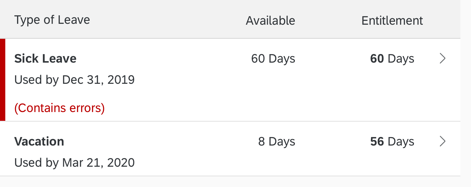
A modified item with an error
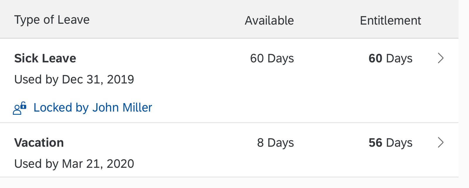
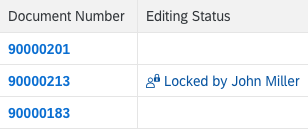
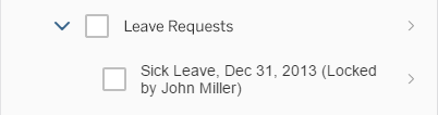
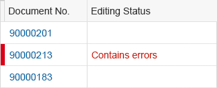
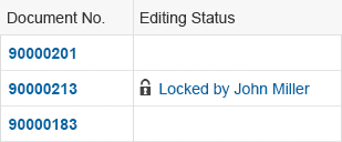
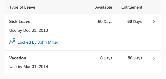
To show that an item is locked, use a transparent button with the corresponding icon and the text Locked by [Name] at the bottom of the identifying column. The user can click the button to open a quick view of the person.
A locked item
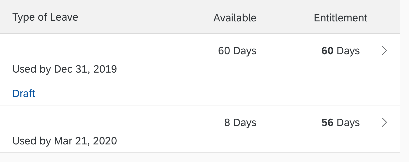
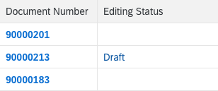
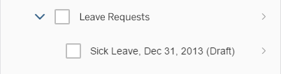
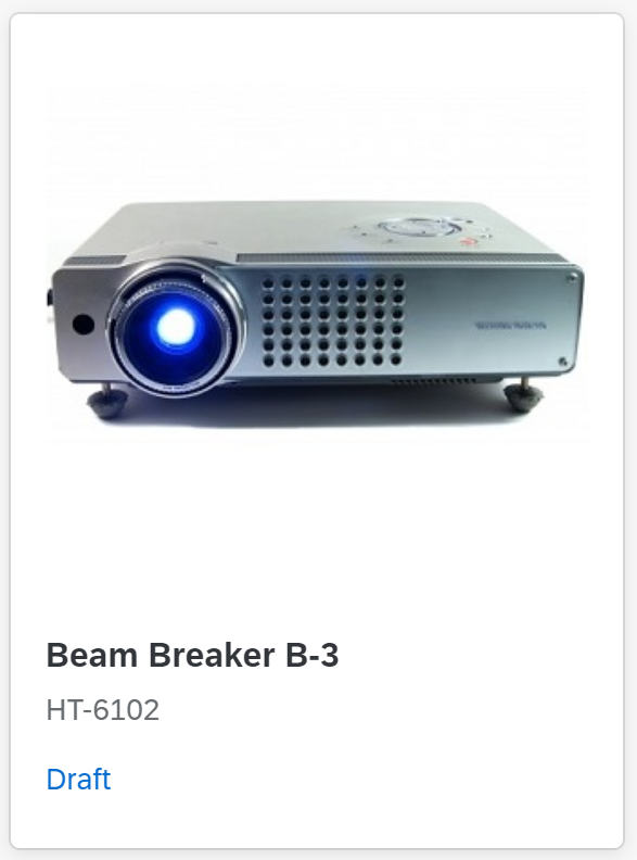
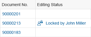
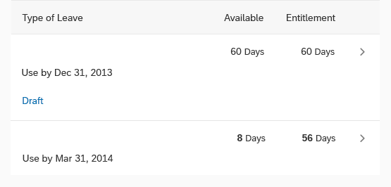
Item in draft state
Show only one state at any one time.
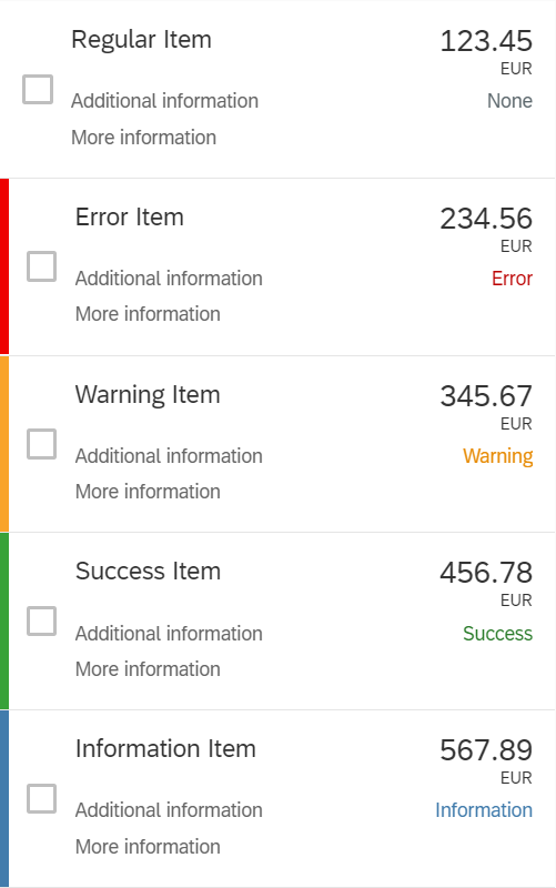
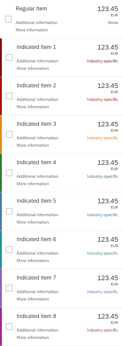
Highlight Items
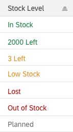
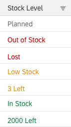
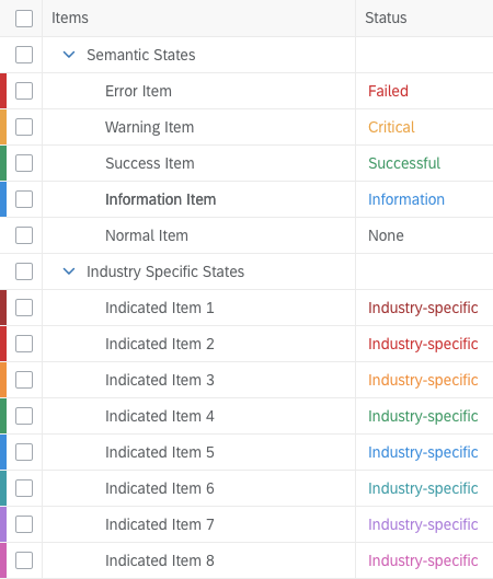
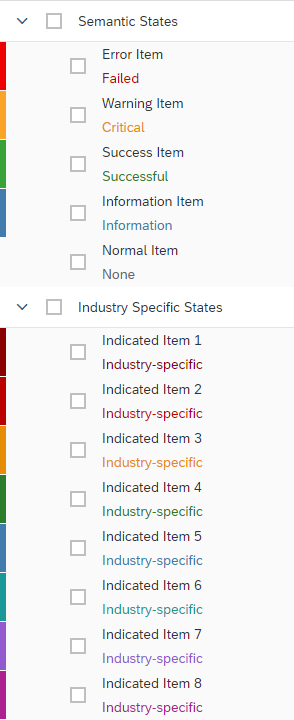
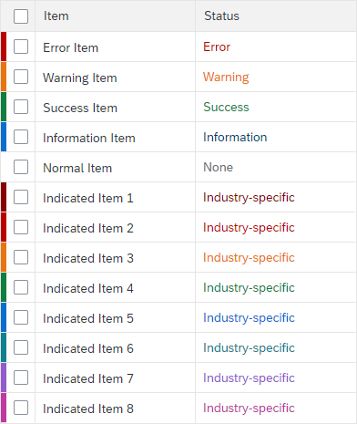
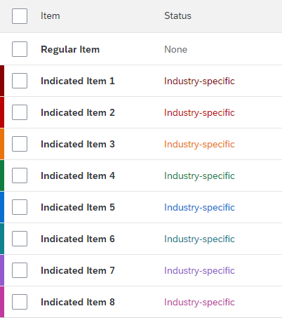
To show that an item needs attention, you can show a highlight indicator next to the item. The highlight indicator can indicate:
- A semantic state, such as red or orange for an error or warning. In this case, use semantic colors.
- Additional information, such as blue to highlight newly added items. In this case, use semantic colors.
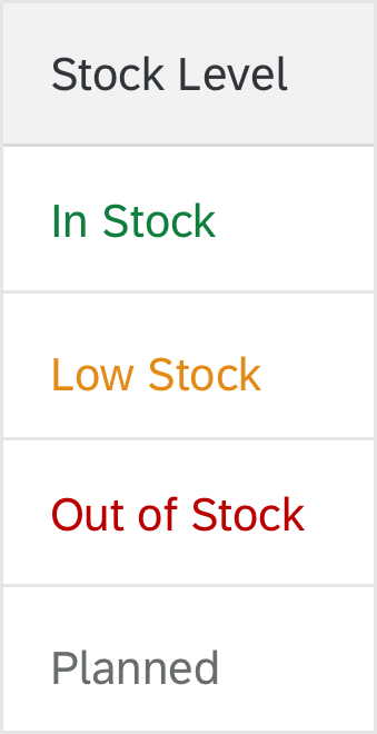
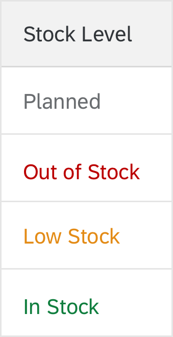
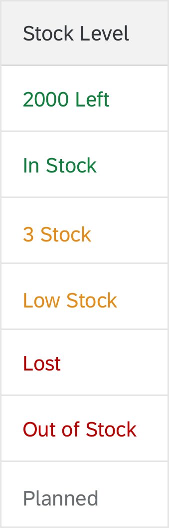
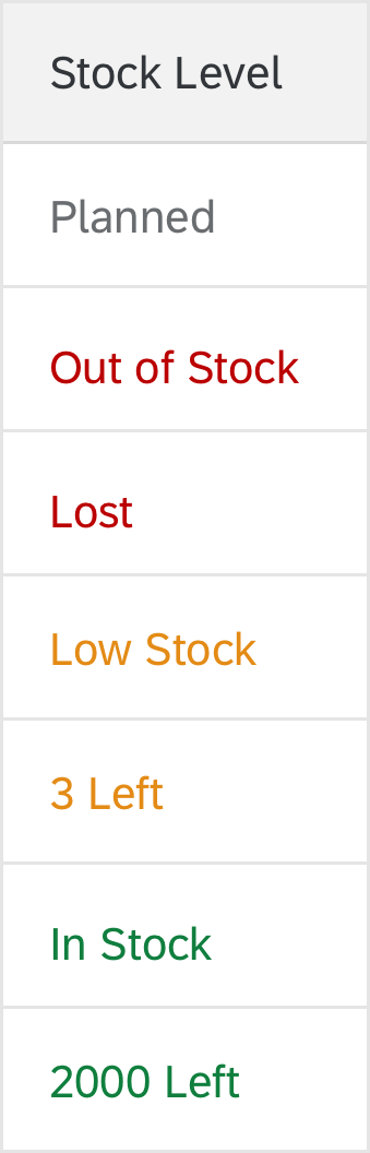
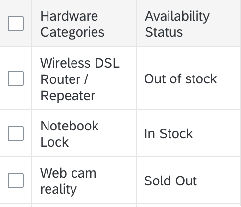
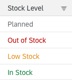
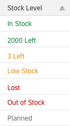
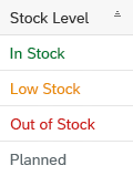
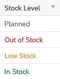
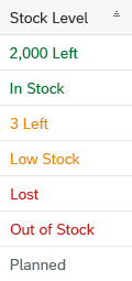
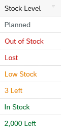
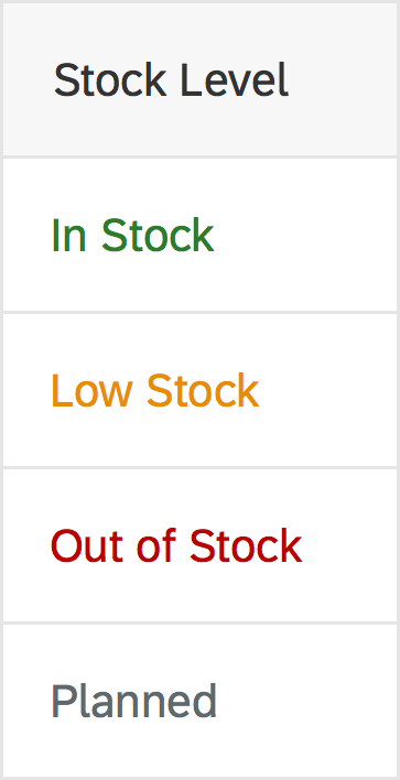
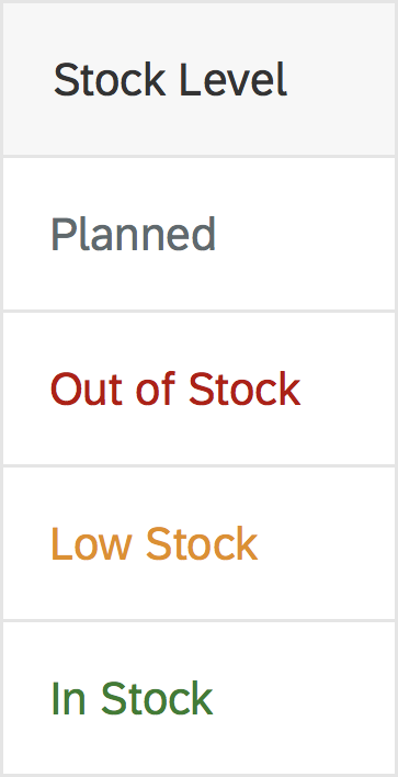
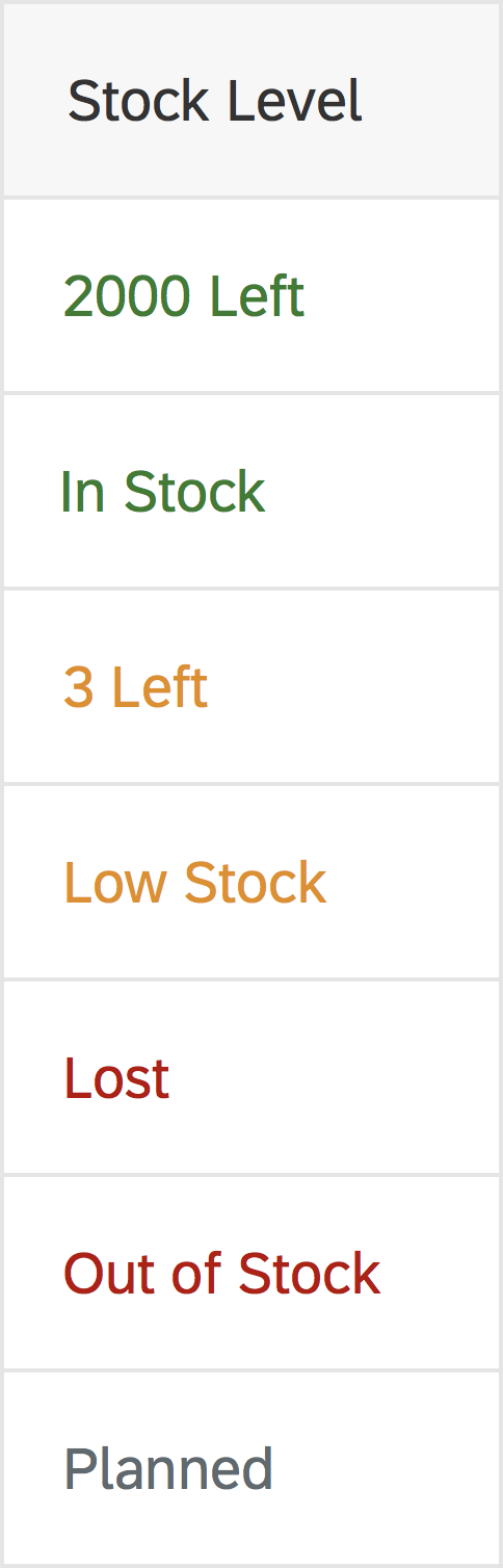
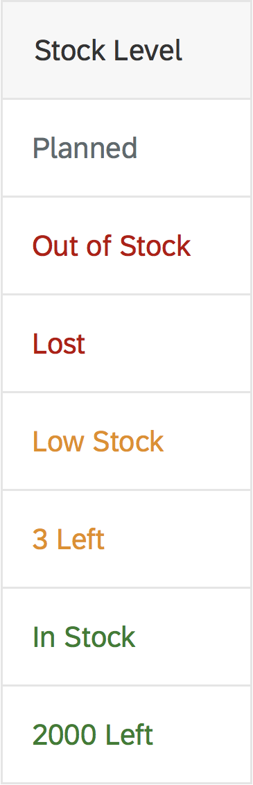
- Industry-specific or process-specific states, such as “out of stock” or “excess of inventory”. In this case, use indication colors.
Be aware that the highlight is just an indication. It doesn’t tell users exactly what is wrong. Make sure that you provide this information within the table row, ideally in the same color.
For details on the use of highlight colors, see How To Use Semantic Colors / Industry-Specific Colors.
(sap.m.ListItemBase, property: highlight)
Highlighted items using status colors
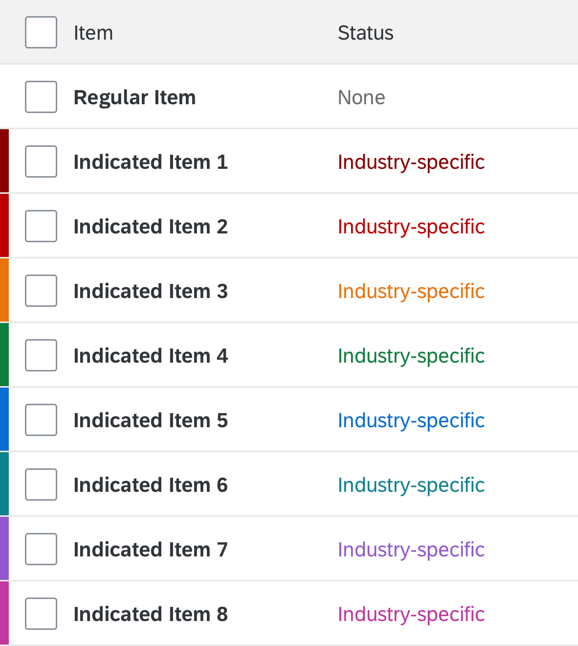
Highlighted items using industry-specific (indication) colors
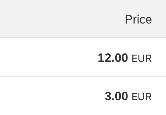
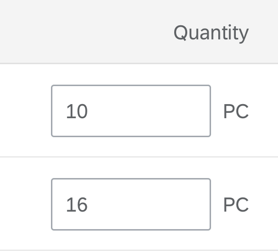
Numbers and Units
If the following conditions all apply, show the unit of measurement in the column header:
- The unit of measurement is the same for all rows
- A single cell contains only one amount with the unit of measurement
- The column header does not scroll away
In all other cases, show the unit of measurement together with the corresponding amount within the row.
Show the unit of measurement in the same column as the corresponding amount.
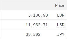
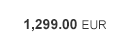
For numbers with units, show the correct formatting by using the object number control.
Object number
For the most important number with its unit, show the correct formatting by using the object number control and the emphasized flag.
Exception: If all numbers are of equal importance, emphasize none of them.
If the table width is narrow, do not hide this column or move it to the pop-in area.
Exception: If the column containing the object identifier and the column containing the key attribute do not fit together on the screen, move the column containing the key attribute to the pop-in area.
Object number (emphasized)
Drag and Drop
Drag and drop is “invisible” on the UI: users can’t see where dragging is available and where it isn’t. In addition there is no generic keyboard interaction. Drag and drop is also not available on all browsers. For these reasons, provide it only in addition to existing (and visible) UI elements that fulfill the same purpose and provide the corresponding keyboard support. For example, offer (toolbar) buttons for moving or for copying and pasting items. These are keyboard operable and available on all browsers.
Currently, there is no keyboard support for drag and drop.
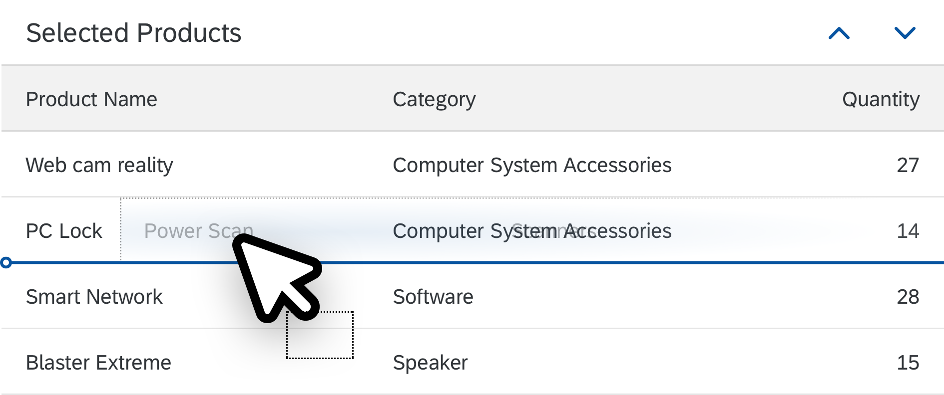
Use drag and drop only in addition to existing visible UI elements
If you offer drag and drop for rearranging items within the table, use drop targets that are between items (sap.ui.core.dnd.DropPosition.Between). This provides better feedback on where the item will be inserted. Show the “move” mouse cursor (sap.ui.core.dnd.DropEffect.Move).

Drop targets in between items
Do not combine rearranging items and sorting. If you really need to do so, make sure that there is a dedicated sort criterion for the user-defined sort order, and only offer options for rearranging items if this sort order is set.
When combining rearranging items with grouping, be aware that moving items to another group also means that a value of the dropped item changes: because grouping is based on values in a column, the dropped item needs to take on the value of the target group for the corresponding column. If this is not wanted, do not allow users to rearrange items in grouped tables.
Example:
A table is grouped by availability. An item is moved from the group “Not Available” to the group “In Stock”. In this case, the moved item needs to change its availability to “In Stock” to match the target group. If changing the value doesn’t make sense, only allow users to rearrange the items within the same group, or don’t allow rearranging at all.
Don't combine rearranging items with grouping, unless you know exactly what you're doing.
Context Menu
Use the context menu only to give users a quick way of accessing functions that are already available elsewhere (for example, as buttons in the toolbar).
Don’t just offer actions in the context menu itself, as users might not realize that these actions are available at all.
The context menu can be triggered for the whole table or per row.
Actions
To trigger actions on multiple items, use a multiselection table (sap.m.Table, property: mode, value: sap.m.ListMode.MultiSelect), and offer the corresponding actions on the table toolbar. Keep the table toolbar sticky (sap.m.Table, property: sticky).
Do not offer actions for multiple items if the table is expected to have fewer than 10 items in most cases.
To trigger actions on a single item only (sap.m.Table, property: mode, value: sap.m.ListMode.SingleSelectMaster):
- Show the actions on the table toolbar.
- In rare cases, show the actions within the line item. Since these actions are repeated in every line and thus use a lot of screen real estate, do this only for a maximum of one or two actions. In this case, show the action trigger near the content to which it belongs. Do not add a specific column for actions. Use a button, unless the action trigger belongs to a link. Hide the action in rows for which it is not applicable.
- Don’t bundle inline actions that don’t belong together under an unspecific label, such as Misc, Actions, … , or similar.
Inline actions
Don't combine unrelated inline actions
The following actions on single items must always be in-line:
Delete: Use “Delete” table mode (sap.m.Table/ sap.m.ListBase, property: mode, value: sap.m.ListMode.Delete). This places a Delete button at the end of each row.
Delete button
Navigation: Use the “Navigation” column list item type (sap.m.ColumnListItem/ sap.m.ListItemBase, property: type, value: sap.m.ListType.Navigation). This places a Navigation indicator at the end of each row.
Use this to navigate to a new page containing line item details. In rare cases, you can also use this for navigation within the table without navigating to another page.

Navigation indicator
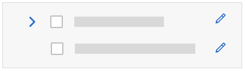
Edit: Use the “Detail” column list item type (sap.m.ColumnListItem/ sap.m.ListItemBase, property: type, value: sap.m.ListType.Detail). This places an Edit icon at the end of each row.

Edit button
From these three actions (delete, navigation, and edit), you can combine delete and edit, or delete and navigation.
Edit and navigation cannot be combined.
To trigger actions that are independent of the selection, show the actions on the table toolbar. Examples of such actions are add, edit (in the sense of changing the whole table to edit mode), sort, filter, group (or view settings), and table personalization.
To trigger a default action on the whole line item, use the “Active” or “DetailAndActive” column list item type (sap.m.ColumnListItem/ sap.m.ListItemBase, property: type, value: sap.m.ListType.Active).
Active items trigger an event when clicked, which can be handled by apps (for example, to open a dialog). Clicks on interactive controls within the item do not trigger the event, but are handled by the interactive control. Do not use this for navigation, to switch the line item to an edit state, or to delete the item.
Active can be combined with edit and delete, but not with navigation. Do not combine active with single selection.
| For information on enabling and disabling actions, see Enabling/Disabling Actions. |
Add Items
For adding items, place an Add or Create text button on the table toolbar.
- Use Create if the button adds a brand new item that doesn’t yet exist on the database.
- Use Add if the item already exists and is merely added or assigned to the current object.
Show new items as the first item of the table, with a visual highlight at the beginning of the row.
Enable the shortcut Ctrl+Enter (and ideally Enter in addition) to trigger the Add or Create button.
There are three options for adding an item. In order of priority (most recommended first), these are:
- Add the item inline. Create an empty, editable row as the first item of the table. Show the Save button on the table toolbar. This option is recommended for simple scenarios with just a few columns and no option to hide columns.
- Open a dialog for larger tables with up to 8 editable columns. Save the new item at the dialog level.
- Navigate to a new page. This behavior should only be used for very complex scenarios that cannot be handled by a dialog (for example, tables with more than 8 columns). When the user presses Save in the footer toolbar of the create page, navigate back to the table.
Depending on the flow, an item can be in one of three different states:
- New: The item was just created inline and is in edit mode (for example, after pressing the Create button). It is highlighted with a visual indicator (information state).
- Recent: The item was just created and is in read-only mode (for example, if Create leads to a dialog, and Save was triggered within the dialog). In this case, keep the item highlighted and display it as the first item of the table. Ignore current sort, filter and grouping criteria to keep the item visible.
- Added: The item has been fully added. It follows the sort, filter, and grouping settings and also loses the visual highlight. This state is used after:
- Inline creation: After Save was triggered on the table toolbar or at page level
- Create with dialog: A table showing one or several items with the state “Recent” gets updated (for example, after sorting, filtering, or grouping, or when the browser is refreshed).
In the context of the draft handling new items are not saved on table level, but rather with the entire draft.
For more details, see the guidelines for managing objects (including subarticles).

Add button in table toolbar
New item as first row in edit mode

Saved new item, still highlighted, still the first item
Editable Content
For editable content, use input fields and any other interactive controls within the table cells that meet your input needs.
All SAPUI5 controls can be used.
If you need edit mode, change your text controls, such as label, text, and link, to input fields, or other appropriate controls as soon as you switch to edit mode, but not before.
You can do this by exchanging the control or, in more complex cases, by exchanging the entire responsive table.
For mass editing items:
- Provide multiselection (sap.m.Table/ sap.m.ListBase, property: mode, value: sap.m.ListMode.MultiSelect).
- Provide an Edit button.
- If several items are selected, choosing the Edit button opens a dialog in which the user edits the corresponding fields for all selected items.
For details, see mass editing.
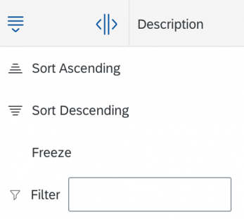
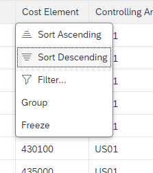
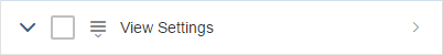
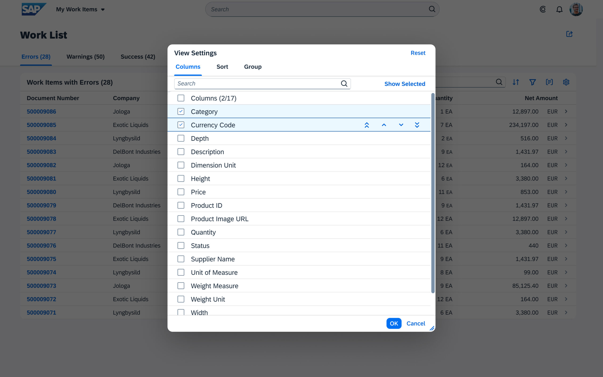
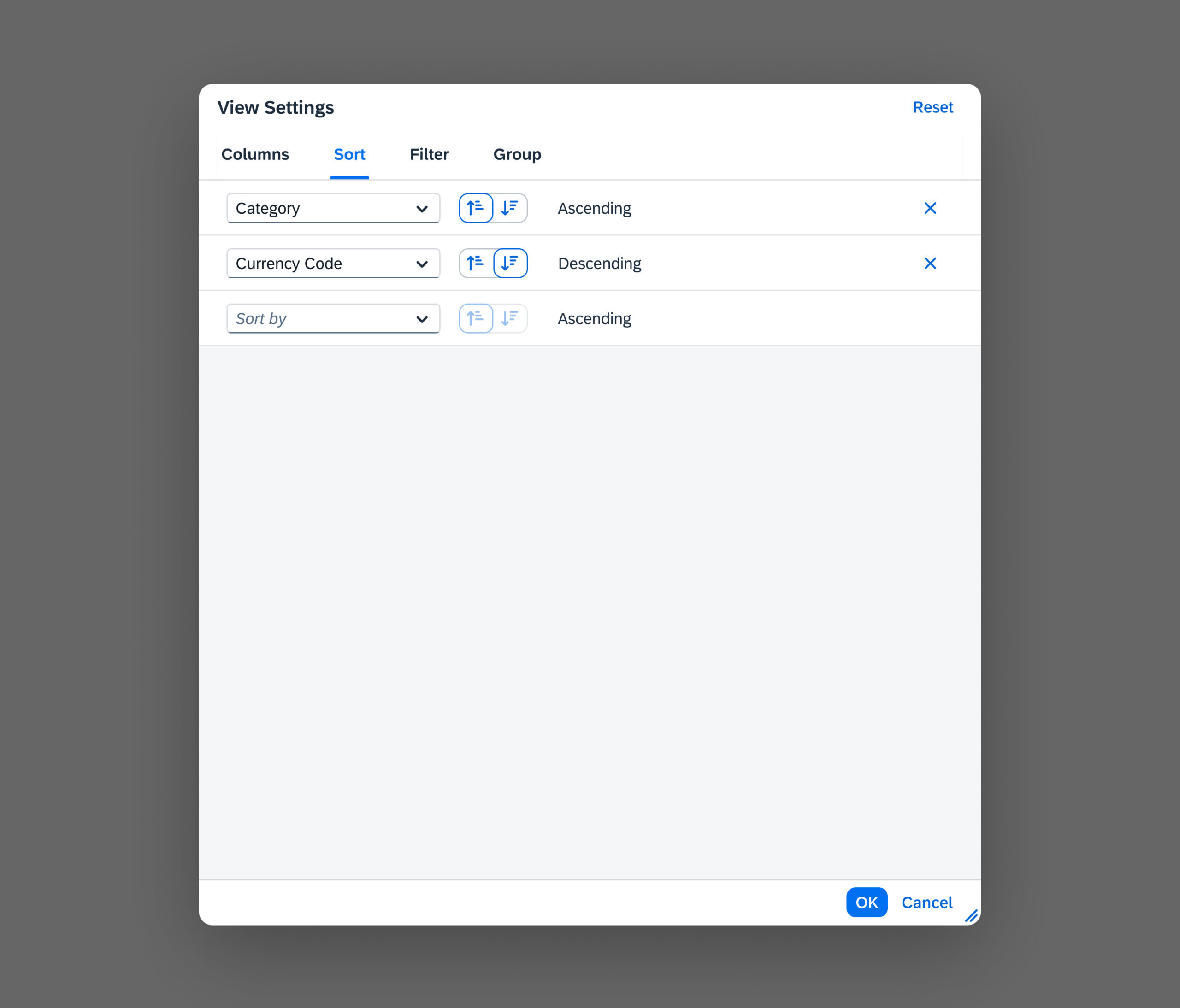
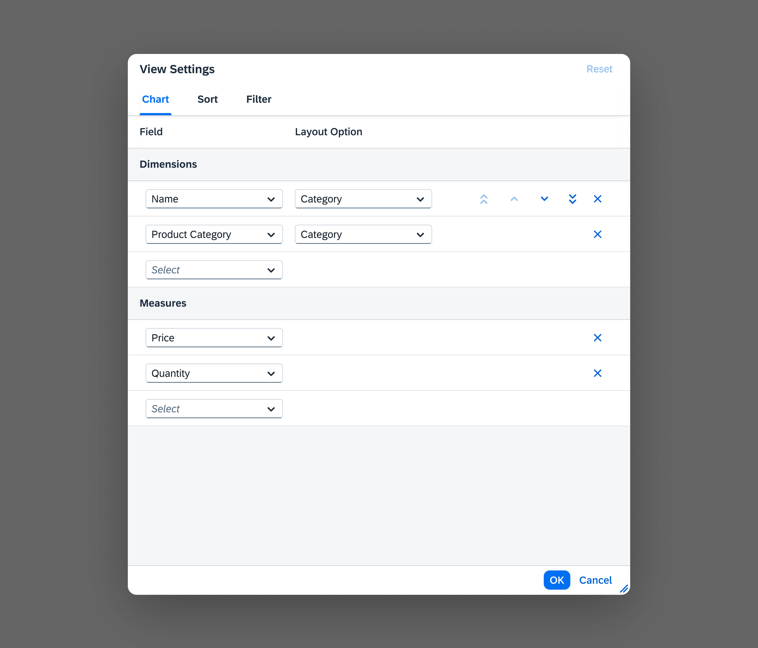
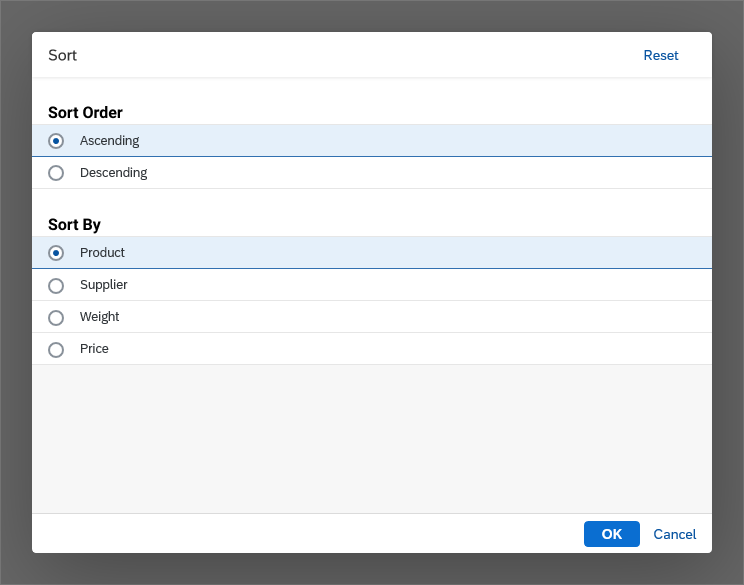
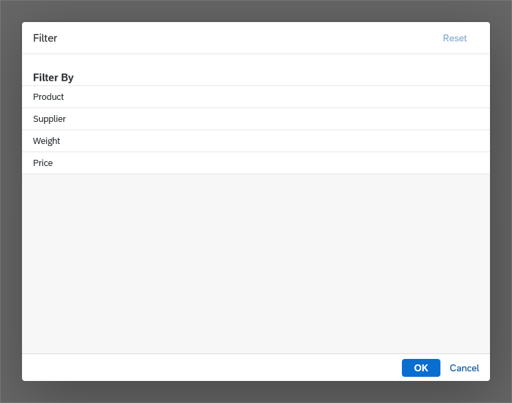
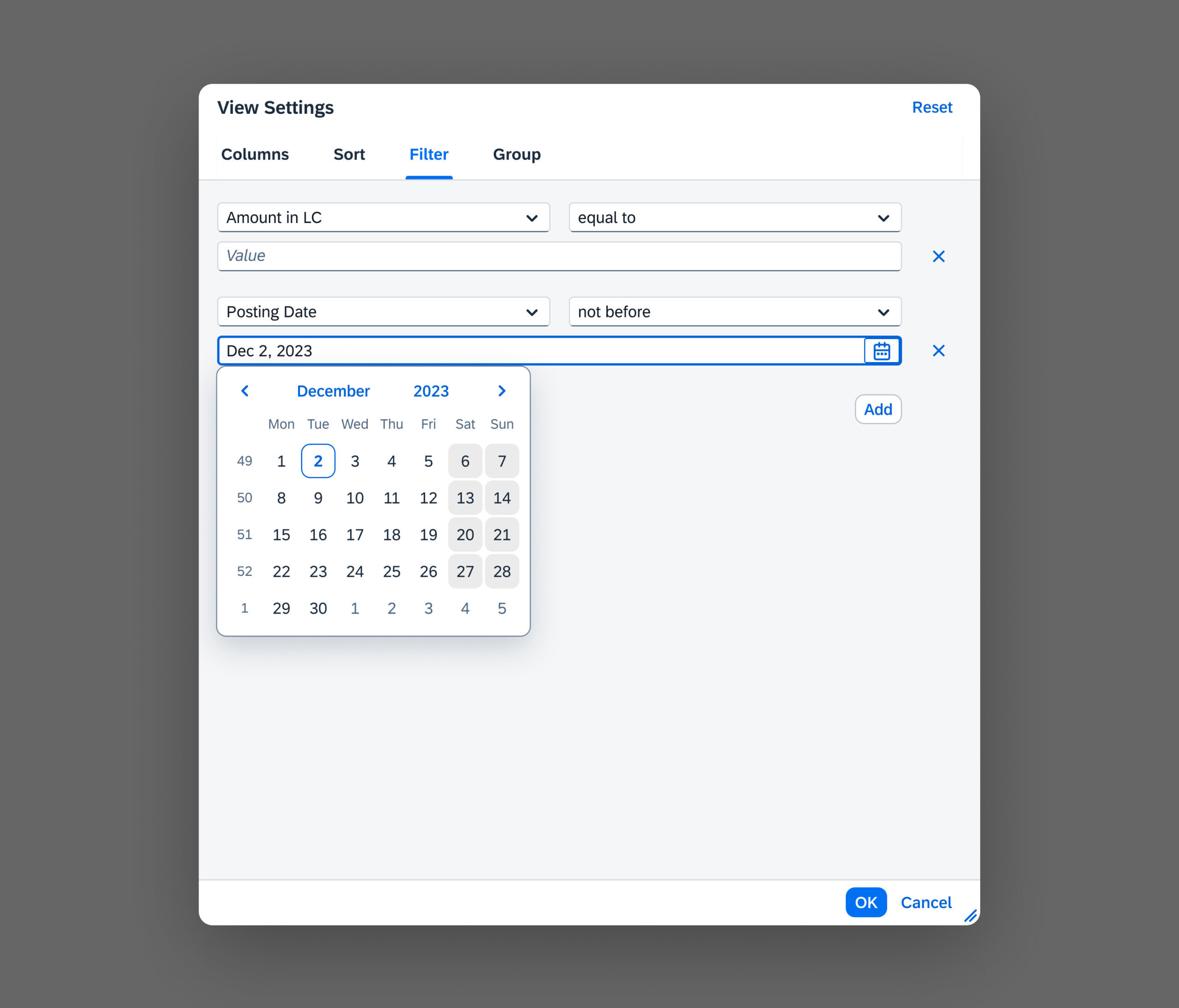
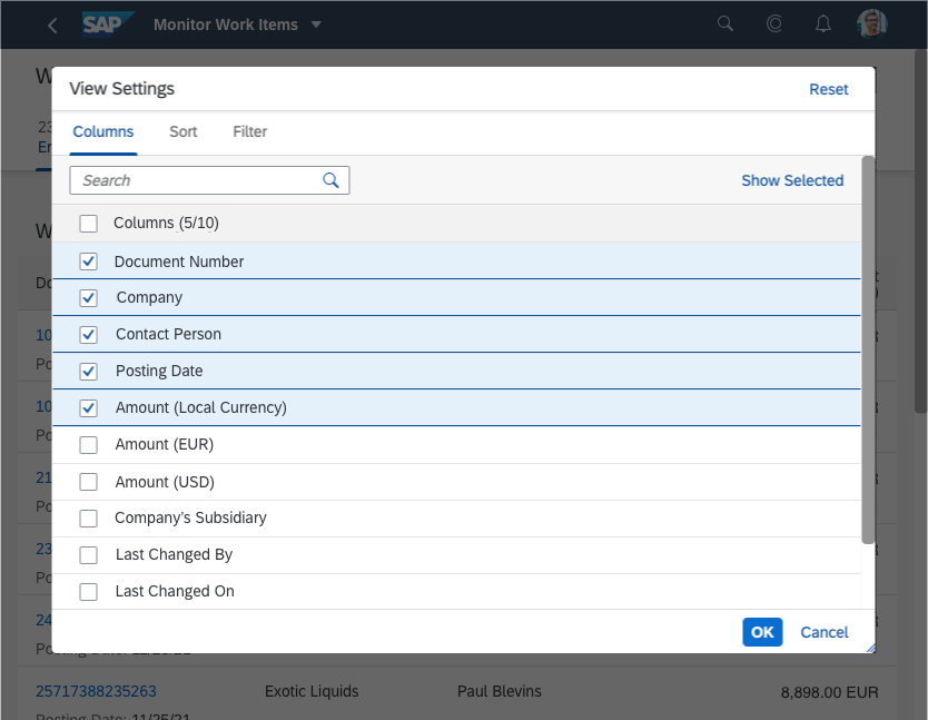
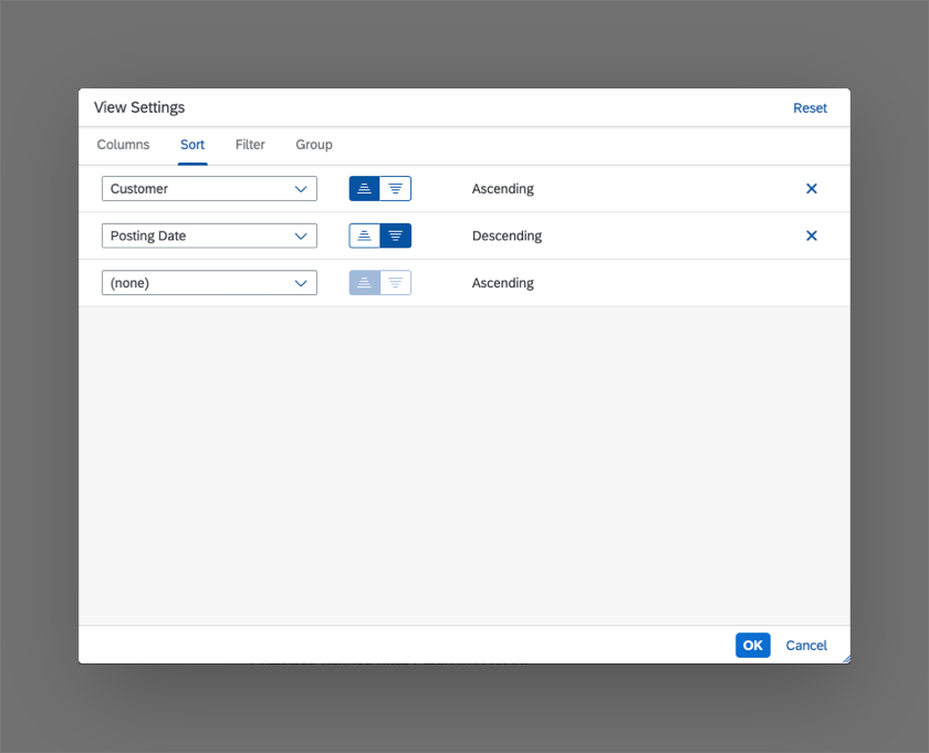
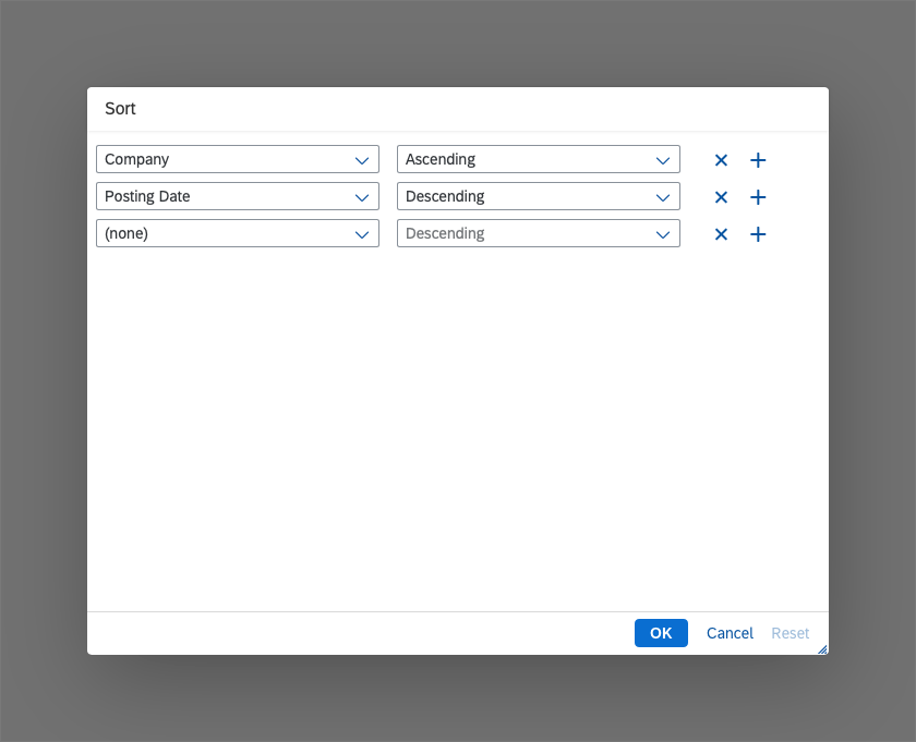
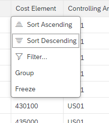
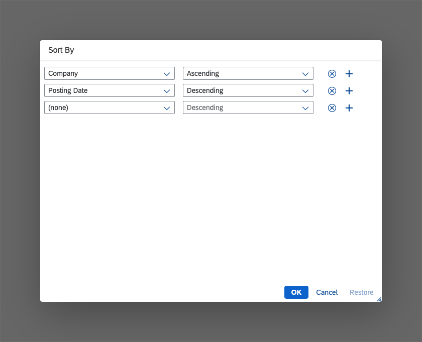
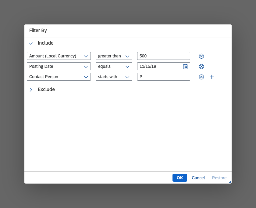
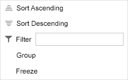
View Settings: Sort, Filter, Group
Sort, filter, and/or group settings are handled in the view settings dialog. This dialog can provide any combination of these three settings, including just one setting, such as sort only.
- If sorting, filtering, and/or grouping are a common use case in your app, offer one, two, or all three of the corresponding features in one or more view settings dialogs. Note: Do not offer these features if the table is expected to have only a small number of entries (up to 20 in most cases).
- If filtering is a main use case, do not offer filtering in the view settings dialog. Use the filter bar instead.
To trigger the view settings dialog, provide several buttons, one for each of these view settings. Each button opens a view settings dialog that contains only the relevant page.
You should always use only the view settings you really need. For example, do not offer grouping if it does not support your use case well.
Using the view settings dialog allows you to define several sort, filter, and/or group settings per column. Therefore, you can sort, filter, and/or group a column with several data points independently by each data point.

Several triggers for the different view settings (sort, filter, group)
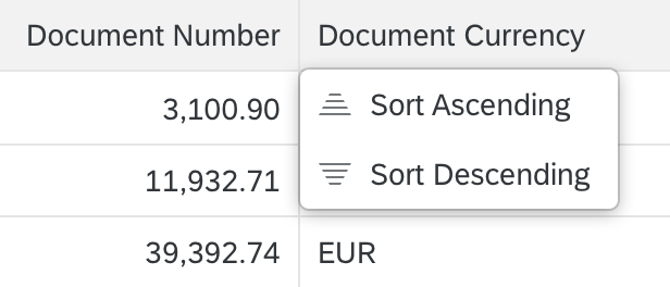
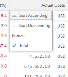
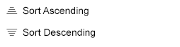
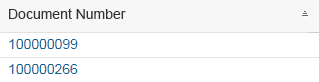
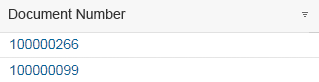
Sort
Always sort the table in a meaningful way when it first loads. In most cases, this means sorting by the column that identifies the row. This is usually the first column in the default delivery. Use the primary data point from this column.
If you offer sorting, offer it for each data point. In other words, allow sorting by both the primary and secondary information in a column. Allow sorting in both directions, ascending and descending. The descending sort order must always be the exact reverse of the ascending sort order.
For each data point, provide a meaningful sort order. For example:
- Sort text alphabetically
- Sort numbers by their value
- Sort status information by the severity of the status:
- Ascending: Sort status information from positive to negative, with neutral last.
- Descending: Sort status information from negative to positive, with neutral first.
Object status sorted ascending, with neutral status last
Object status sorted descending, with neutral status first
-
- Ascending with different values per severity level: Sort status information from positive to negative, with neutral last. Sort different values within a severity level (semantic color) alphabetically.
- Descending with different values per severity level: Sort status information from negative to positive, with neutral first. Sort different values within a severity level (semantic color) alphabetically.
Object status sorted ascending and alphabetically, from positive to negative with neutral last
Object status sorted descending and alphabetically, from negative to positive with neutral first
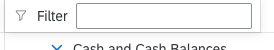
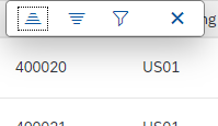
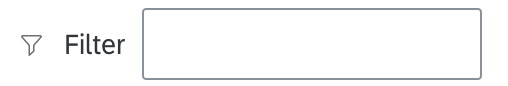
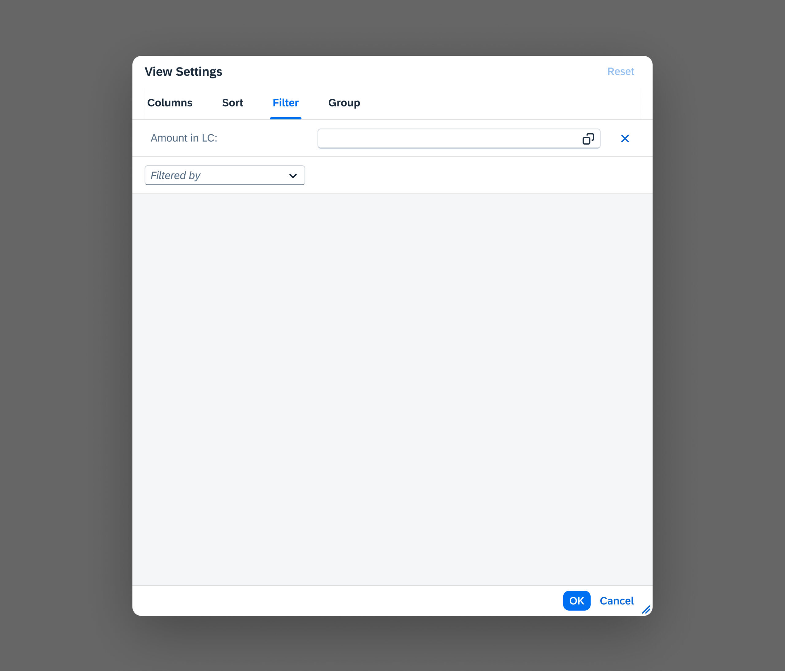
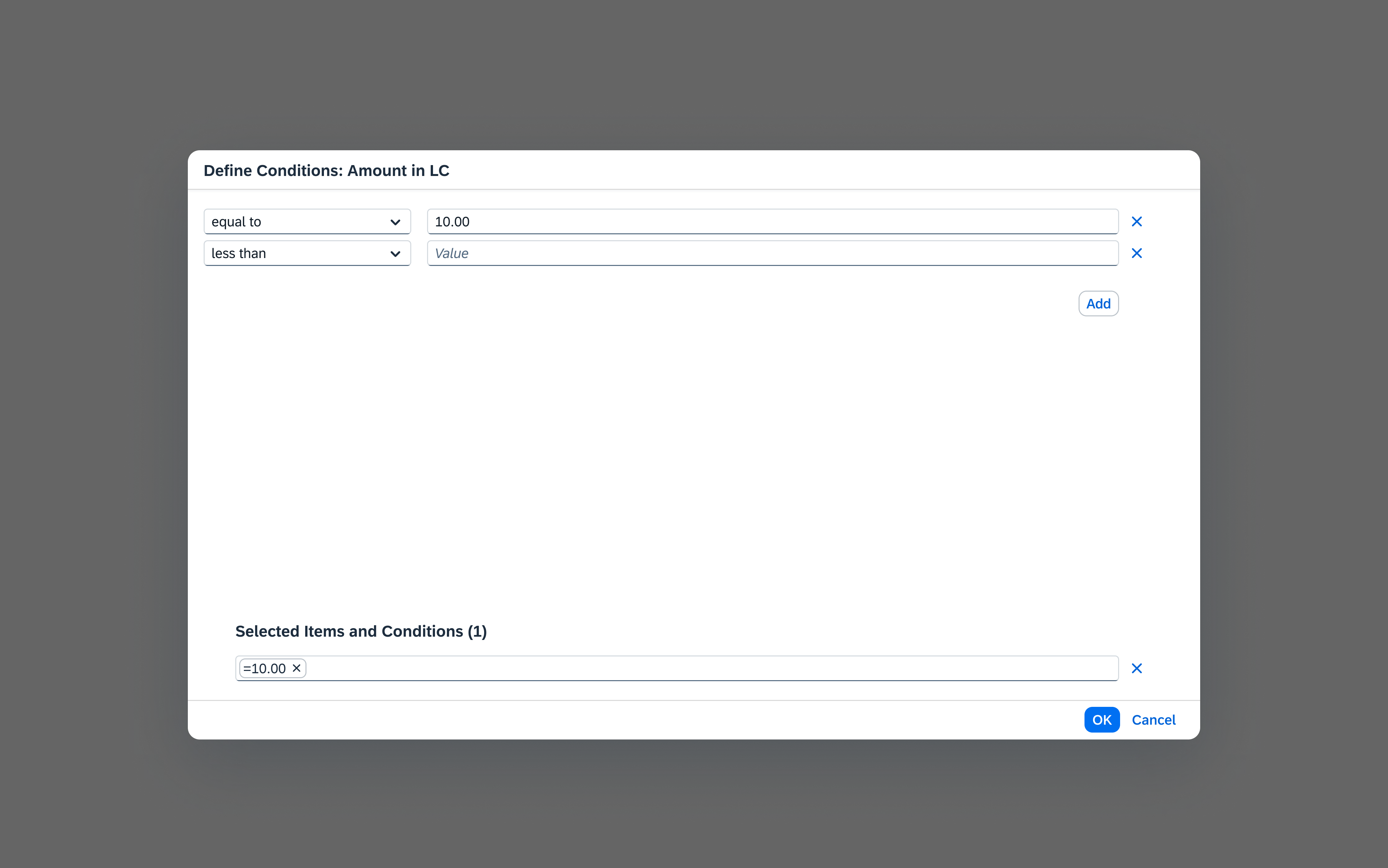
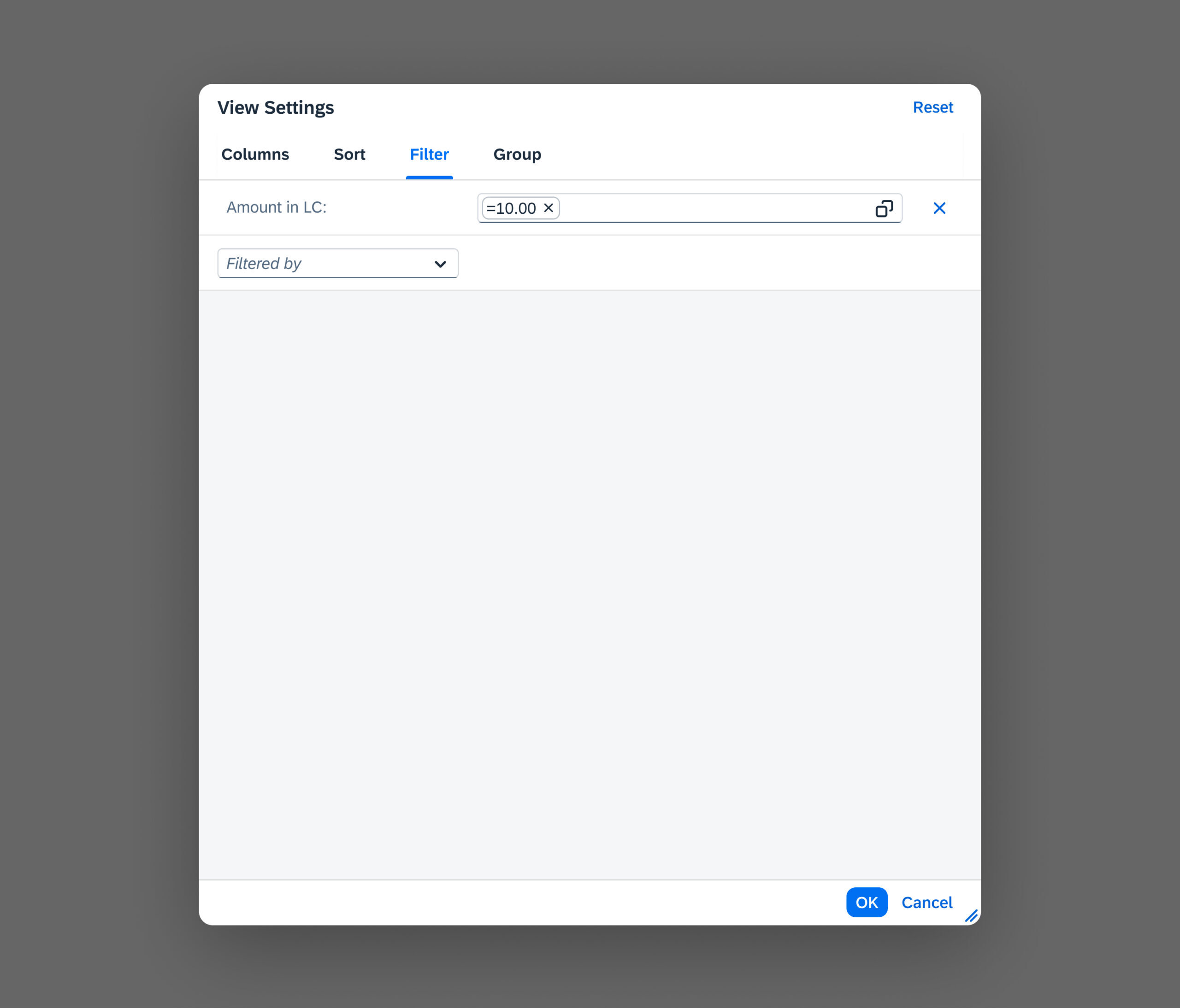
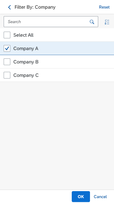
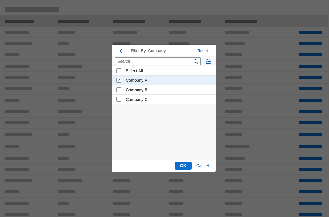
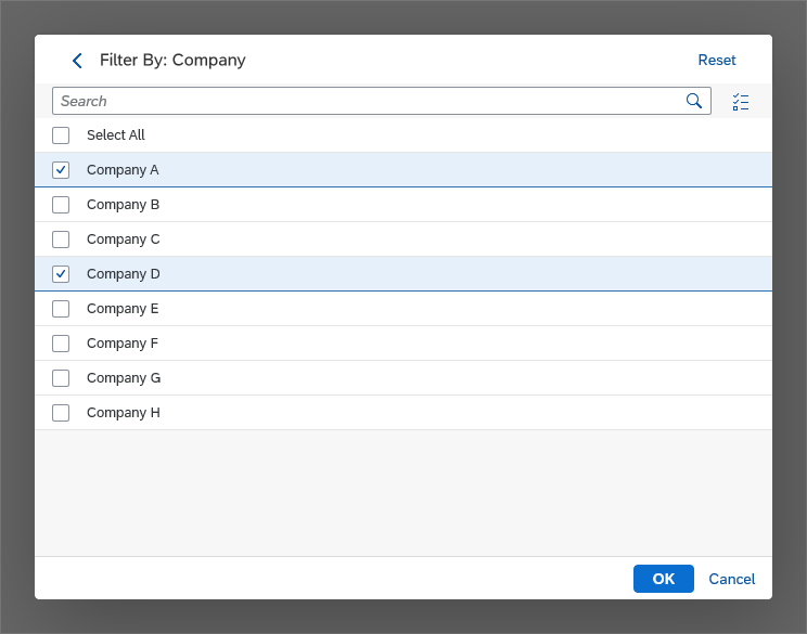
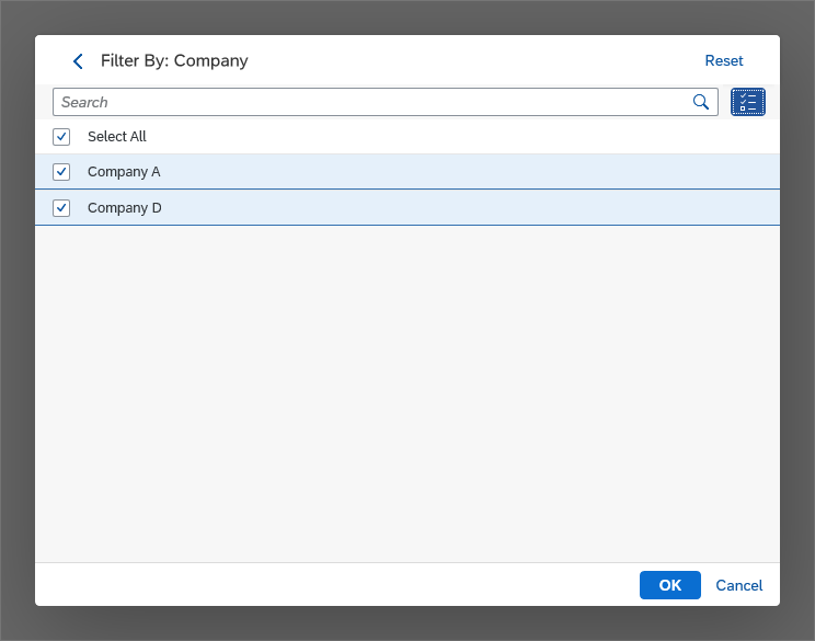
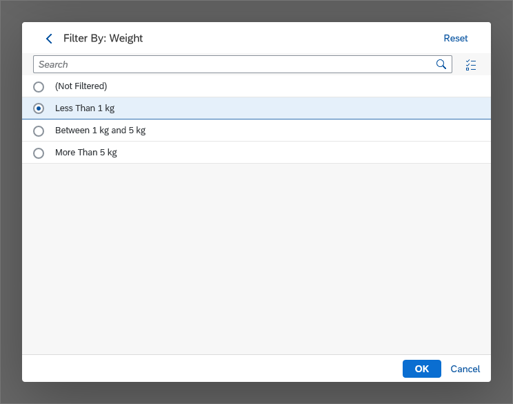
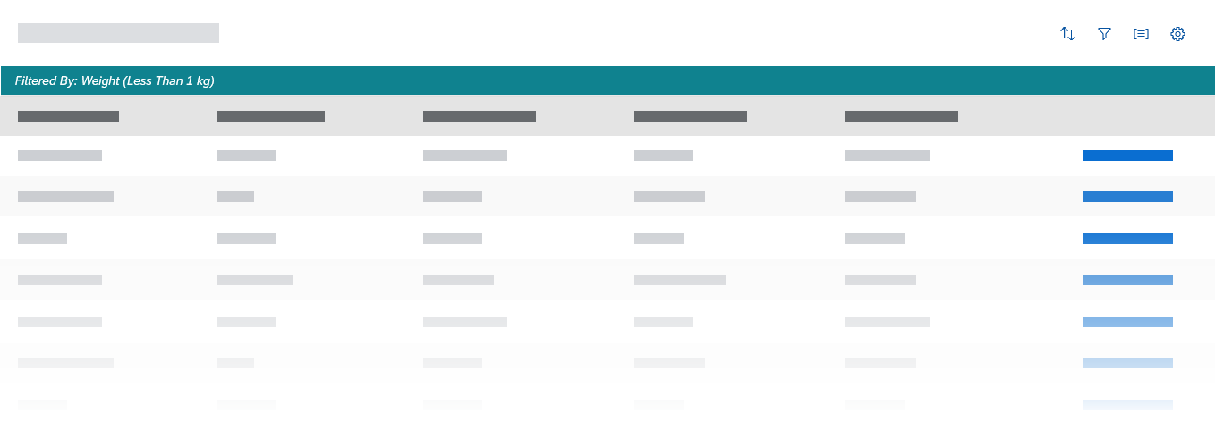
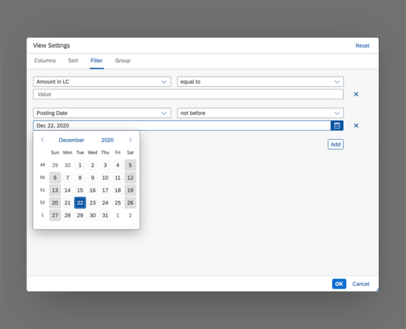
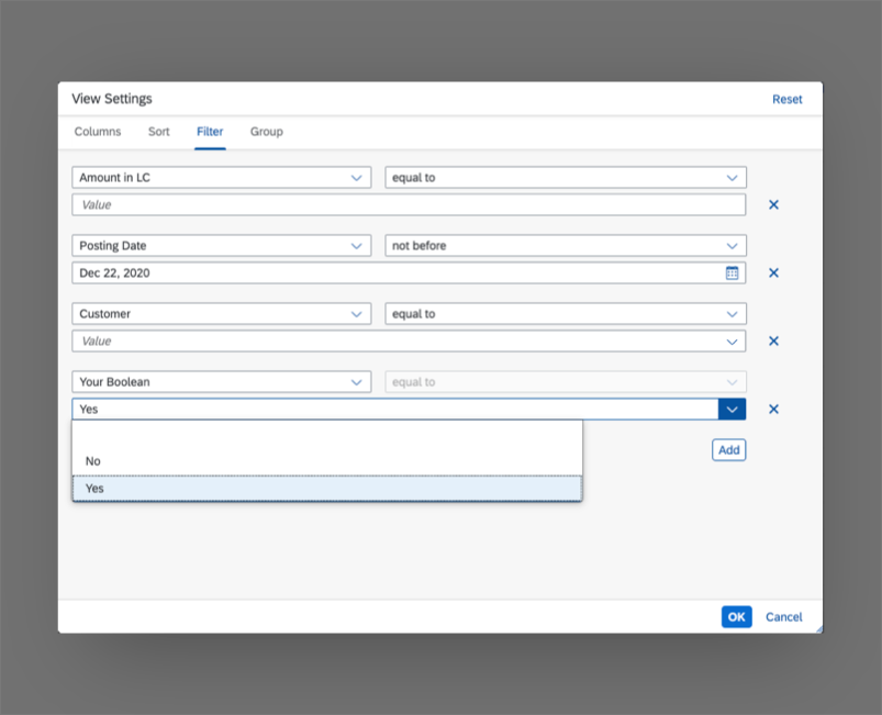
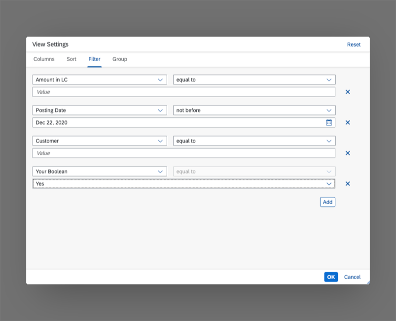
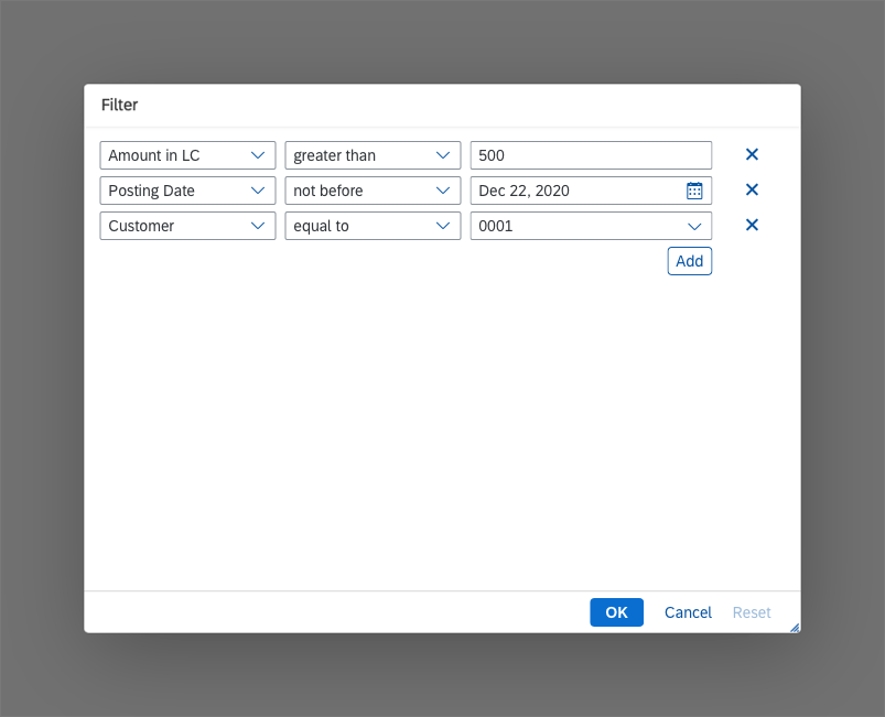
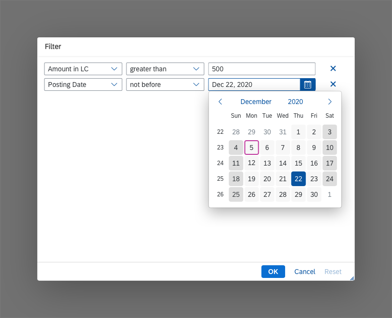
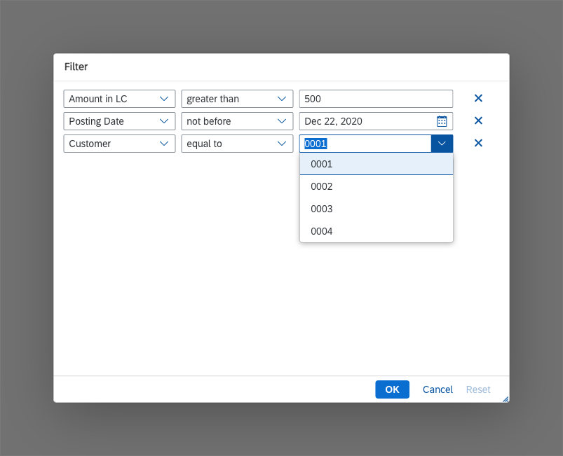
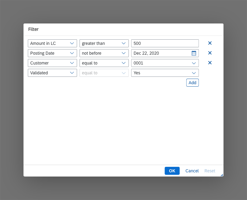
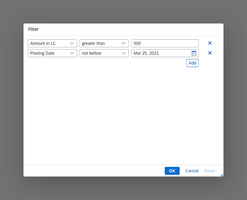
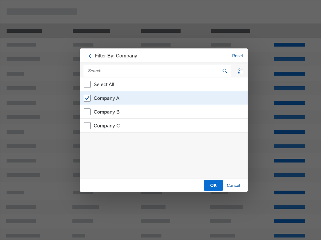
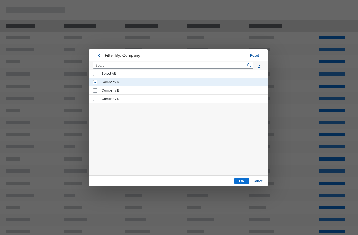
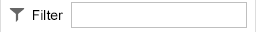
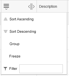
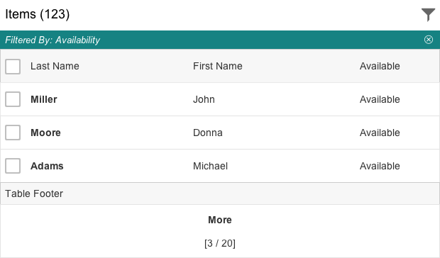
Filter
To display the current filter state, use the infobar below the table title. Clicking the infobar opens the view settings dialog on the filter page.
Show the infobar only if the filter settings are not shown somewhere else. For example, do not show the infobar for settings taken in the filter bar or in a select placed in the table toolbar.
If the infobar is shown, provide an option to reset all corresponding filters on the infobar.
Keep the infobar sticky (sap.m.Table, property: sticky).
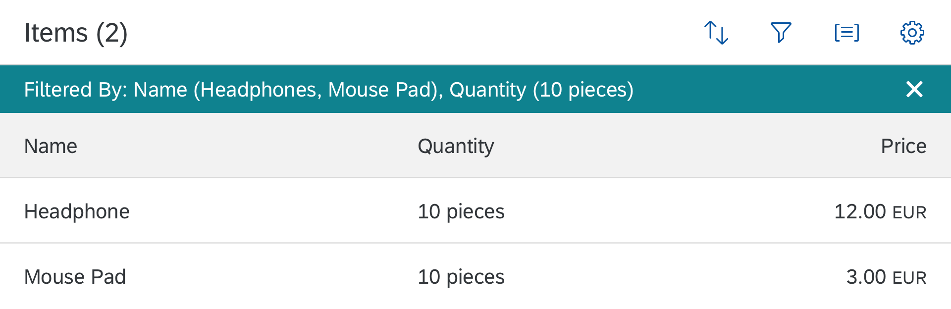
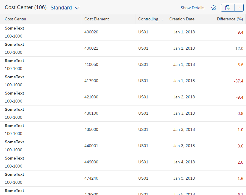
Filtered table
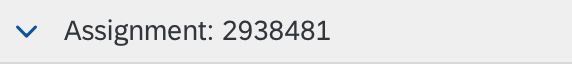
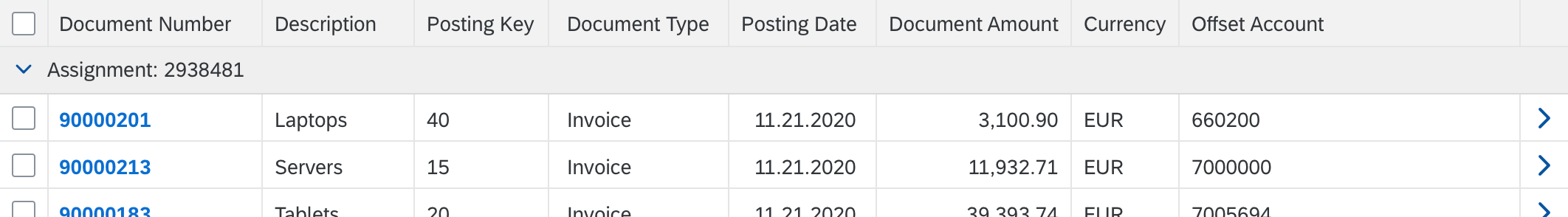
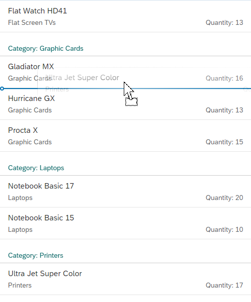
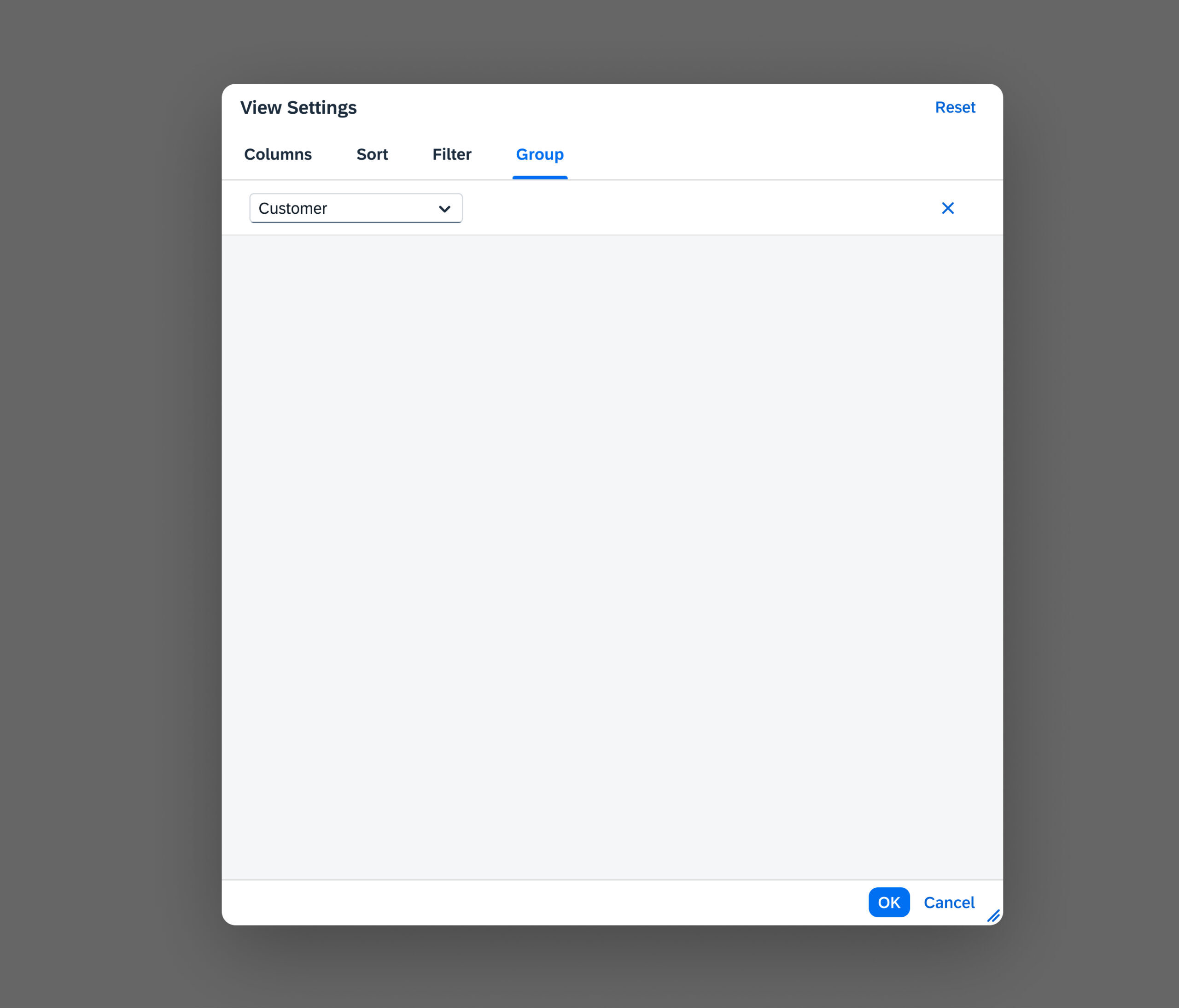
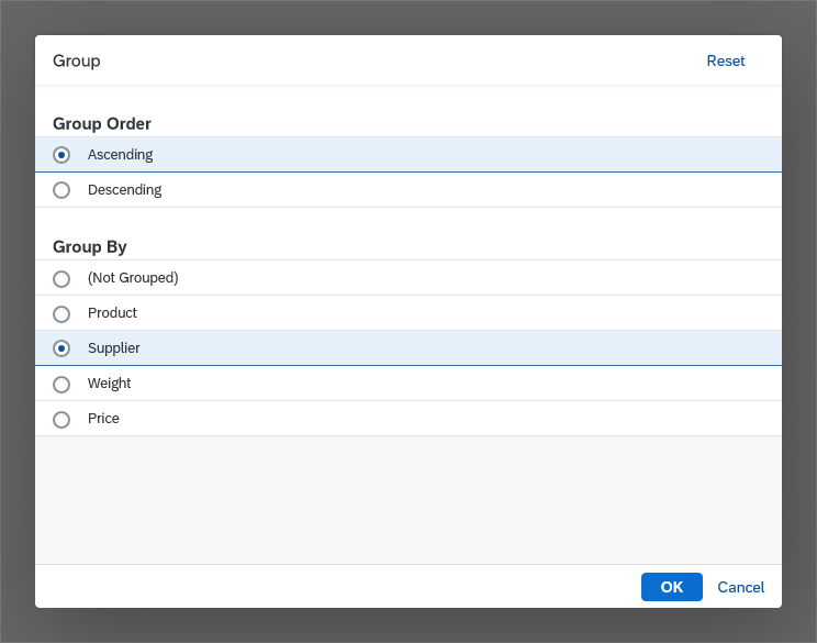
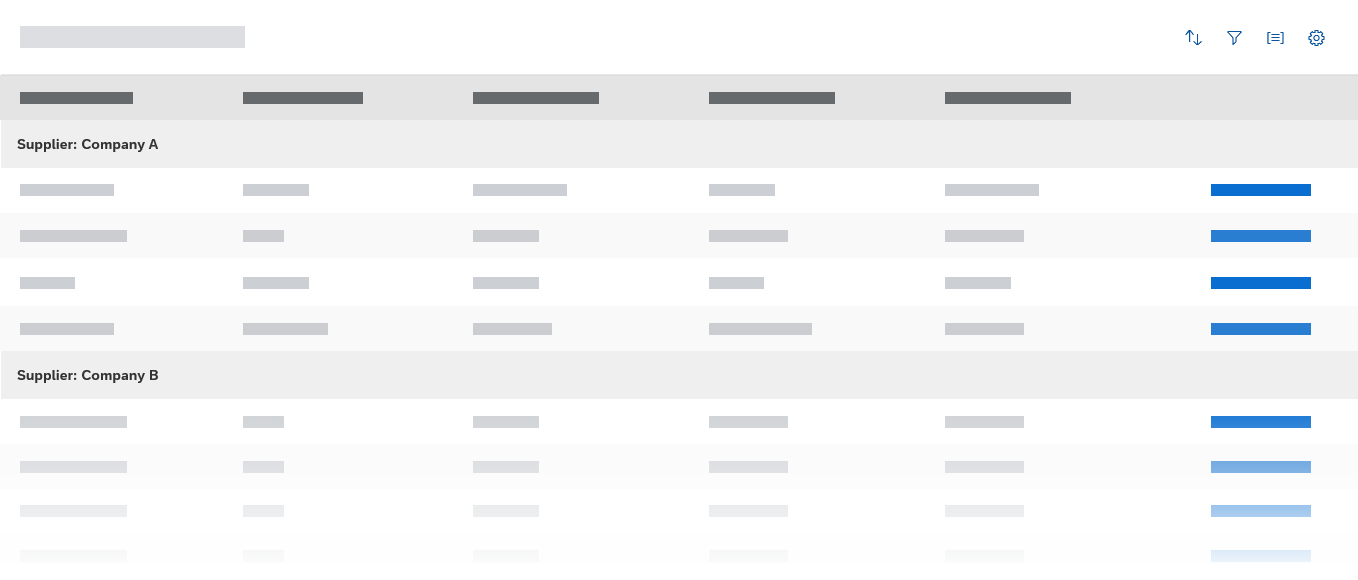
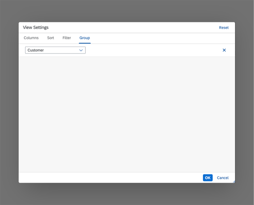
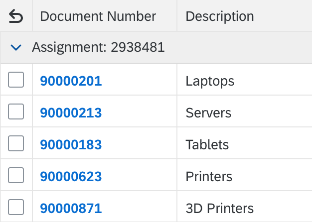
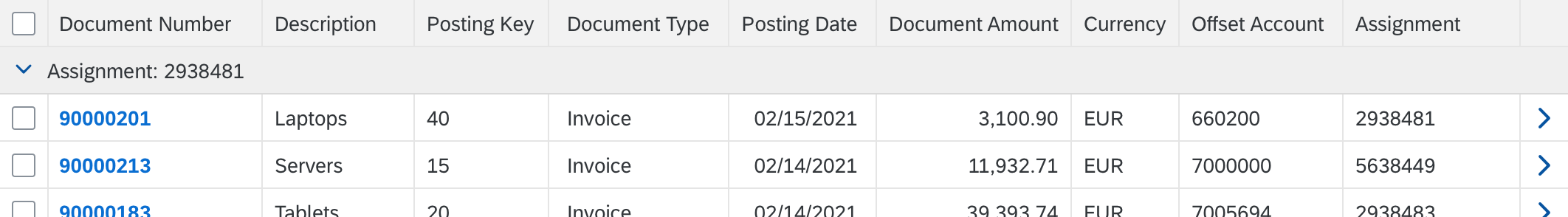
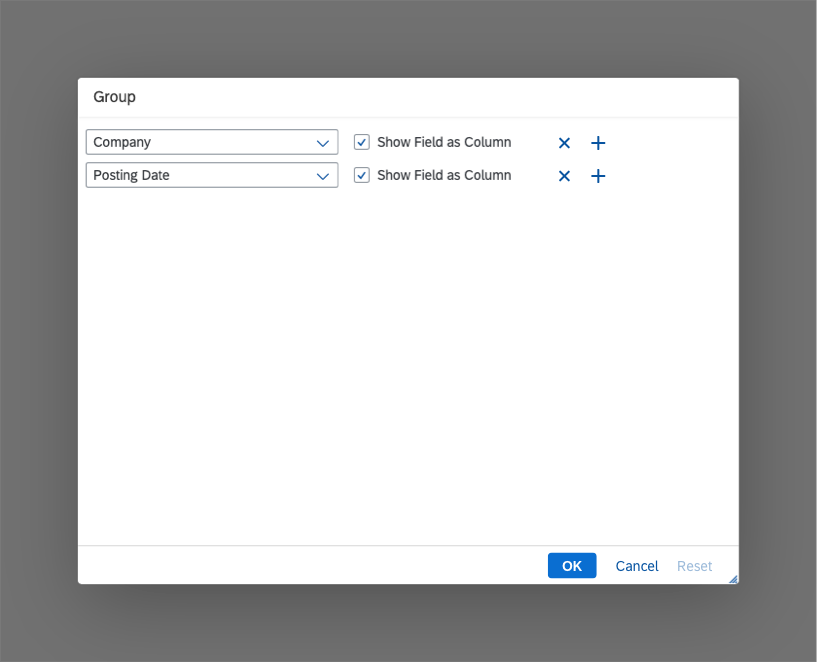
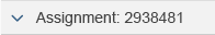
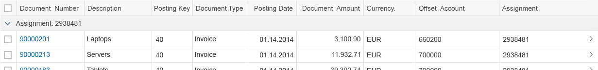
Group
To display the current group state, group headers are shown.
On the group header, show the following text (sap.m.GroupHeaderListItem, property: title):
[Label of the grouped column]: [Grouping Value]
Do not use several values on the group header.
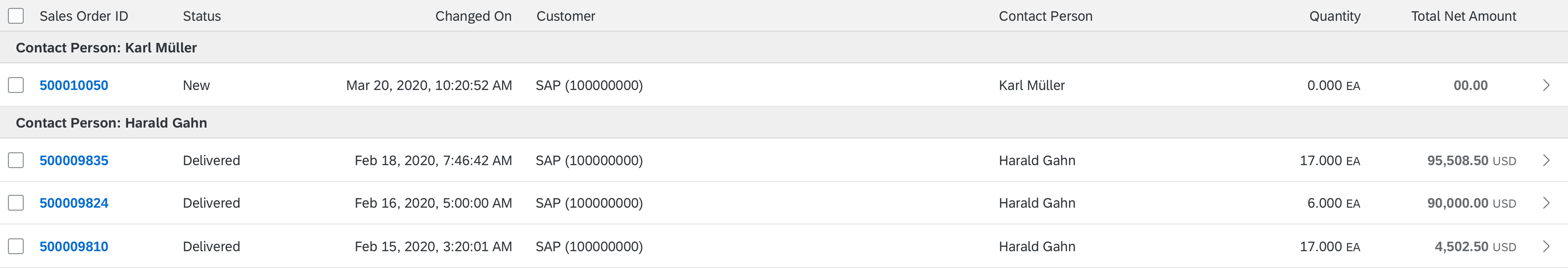
Grouped table
If there is no grouping value, show the following text:
[Label of the grouped column]: (Not Available)
This is the case if you have a group of items that don’t have a value for the grouped column.
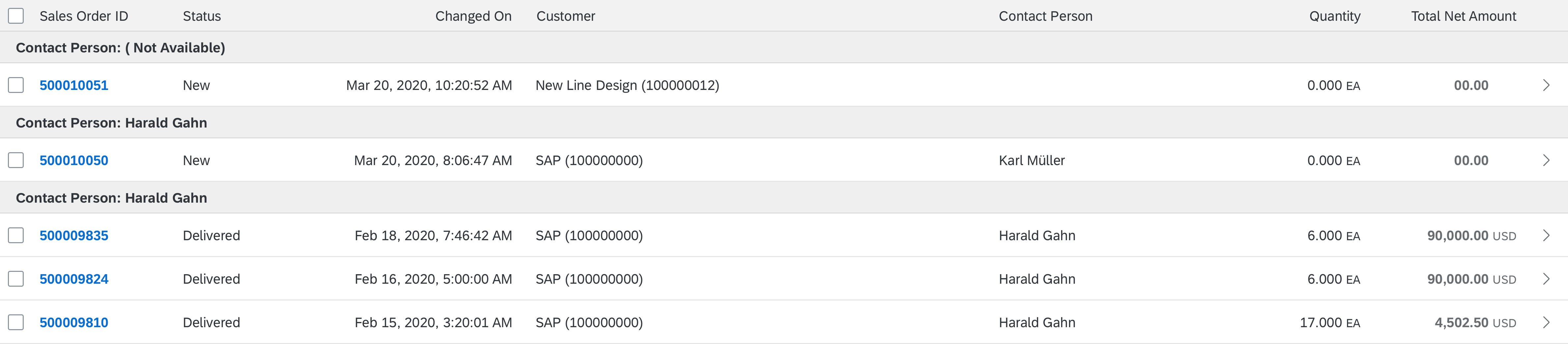
Grouped table, with missing grouping value
Persist the view settings. When a user reopens the app, show the responsive table with the same sort, filter, and group settings as last defined by this user.
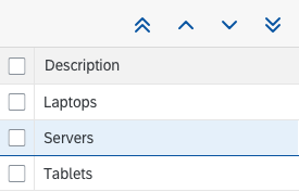
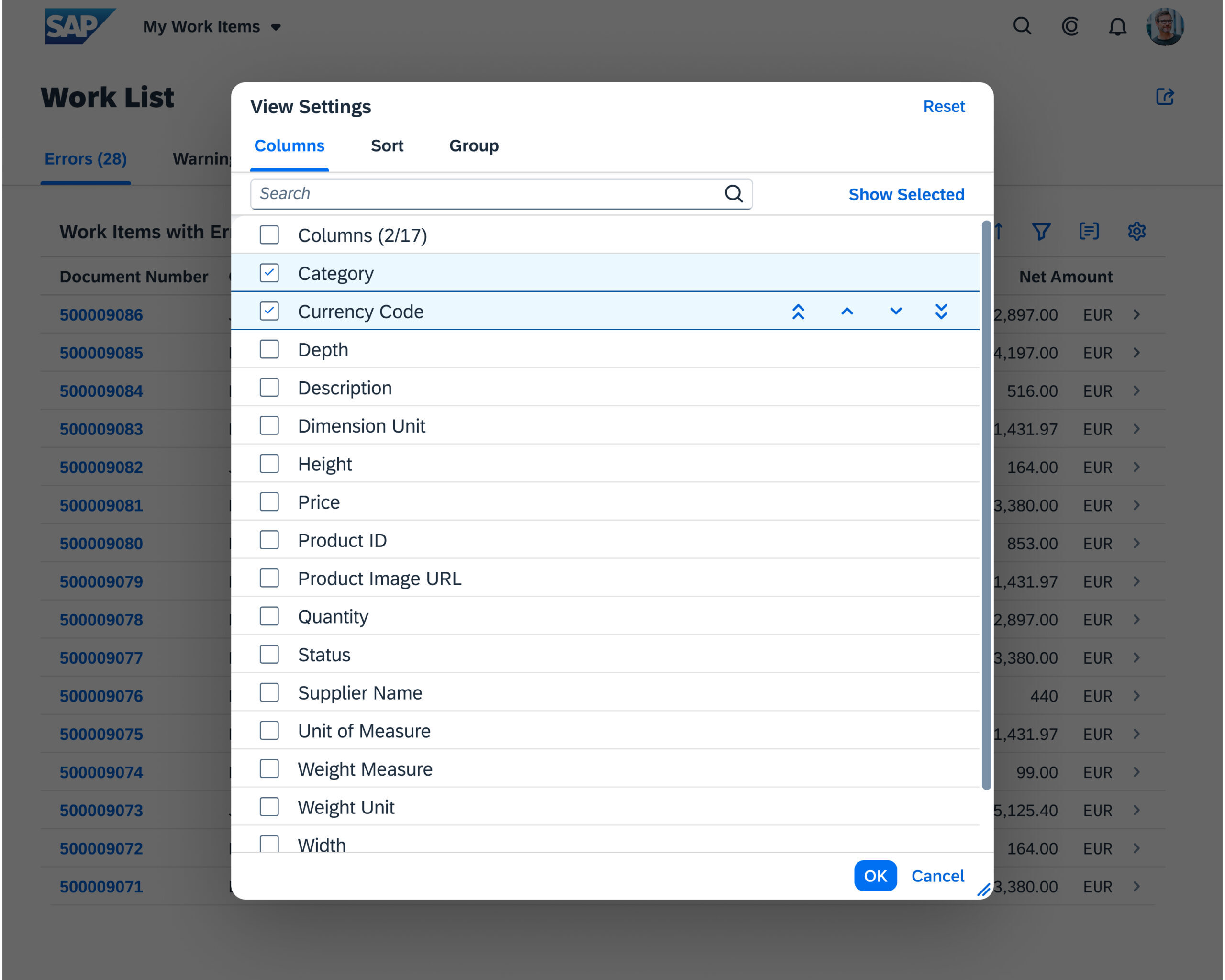
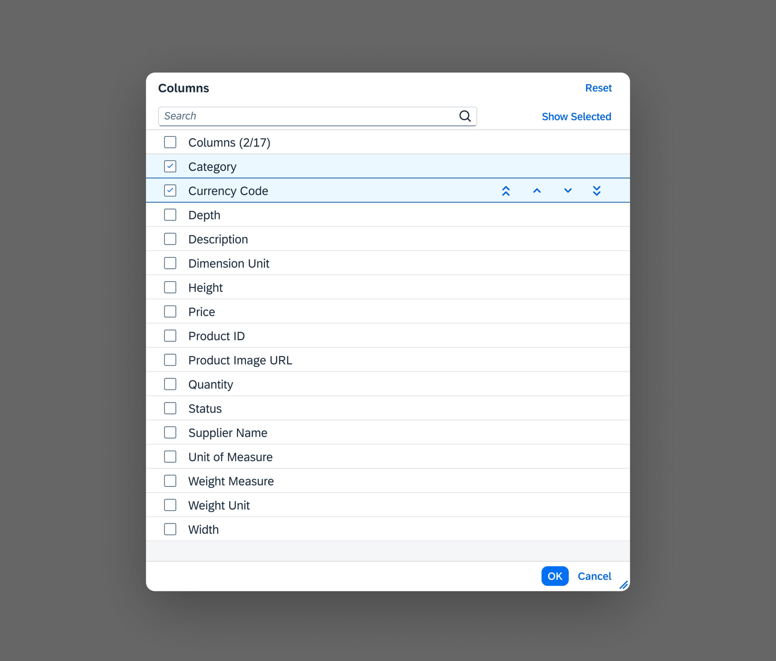
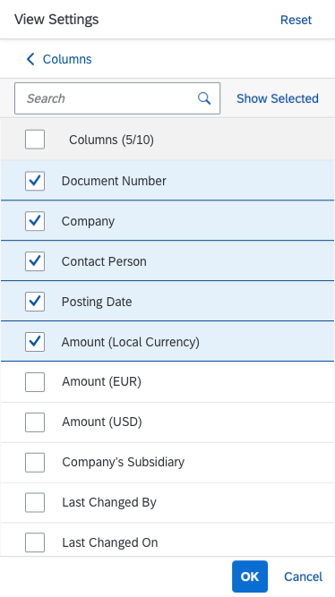
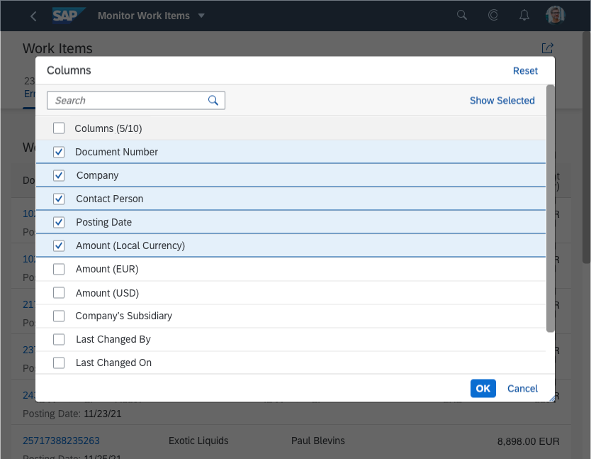
Personalization: Add, Remove, Rearrange Columns
To enable users to add, remove, or rearrange columns, use the table personalization dialog. Trigger the dialog via a button in the table toolbar. Add the shortcut Ctrl+Comma.
Offer personalization if you need more columns than those that fit on a tablet screen, which is usually five, to fulfill 80% of your main use cases. Before doing so, try to reduce the number of columns, for example, by using several lines per column or by utilizing the pop-in function. See the cheat sheet for an example.
If all columns are hidden, the table shows a corresponding “no data” text.
View settings and table personalization icons
Persist the column layout settings. When a user reopens the app, show the responsive table with the same column layout as last defined by this user.
Tables in Object Pages
For more information on the use of tables within the object page, see the Tables section of the Object Page article.
Export to Spreadsheet
On the table toolbar, apps can provide a menu button for exporting table data to a spreadsheet. For the export, use the export to spreadsheet function.

'Export to Spreadsheet' menu button
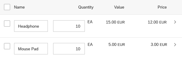
Paste
The browser paste function can be used to paste data from the clipboard to the table if the focus is on an editable control within the table. The browser paste is triggered with the Ctrl + V keyboard shortcut, the table toolbar action, or actions in either the browser context menu or the table generic context menu.
The pasting of a new row or cell follows the responsive table inline creation paradigm, where new items are created at the bottom of the table. The same happens when the data is pasted and a row is unselected or focused.
Note
Pasting via the browser context menu is unavailable if the table has its own context menu because table context menu takes precedence over the browser context menu.
Paste (Overwrite)
Pasting overwrites data present in the table only when a cell with data is selected prior to pasting. When a single cell is selected, all the data in the clipboard is pasted into the table, extending from that cell. The paste will overwrite the data contained in those additional cells, too.
Note
Clipboard Selection behaviour
If the clipboard has larger data set than the range selected for the paste, only the cells contained within the selection are updated.
On the other hand, if the clipboard has a dataset too small to fill all the cells selected for the paste, the pasted data updates only the selected cells for which there is data.
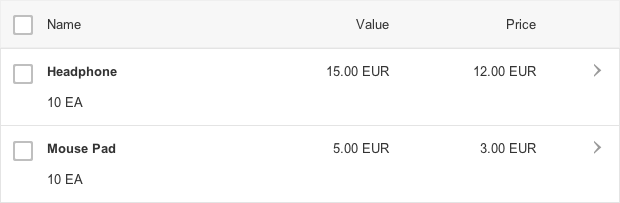
Read-Only
The paste action does not update read-only cells, even if there is data in the clipboard corresponding to those cells. Instead, it updates only the surrounding write cells.
Example
If the clipboard contains a range of four columns, and that data is pasted into a table, where column 2 is read-only, only the cells in column 1, 3, and 4 are updated.
Properties
sap.m.Table
The following additional properties are available for the responsive table:
- The property: fixedLayout defines the algorithm the control uses to define column width. Setting it to “false” would perform automatic calculations for the column width, based on the longest non-breakable content. You should always set it to “true” for performance reasons. Exceptions are permissible if the table has only a few columns for a large width and fewer than 10 rows are displayed.
- The property: backgroundDesign defines the background on which items are rendered. Use the default value.
- The property: showOverlay provides an overlay on the whole table, which prevents use of the responsive table. This is used within the list report floorplan to mark the table as outdated after filter settings have been changed but the new filter settings have not yet been applied. Do not use it in other cases.
- The property: inset adds a margin on all sides of the responsive table.
- The property: headerText is a simple way to set the table title if you just need a title. However, do not use any of the following:
- A separate toolbar
- variantManagement
- headerToolbar aggregation
- The property: headerDesign affects the appearance of the header if the theme supports it. Leave the default value as it is.
- The property: footerText adds a small additional row below the table footer or last item. This row can contain text only. Do not use this property.
- The property: width defines the width of the whole table.
- The property: includeItemInSelection uses a click on the whole line item to select the corresponding item if the responsive table is in a selection mode. This competes with other settings like “Navigation” or “Active” and should therefore not be used.
- The property: enableBusyIndicator automatically shows a busy indicator while data is loaded. (In contrast to the property: busy, where the application can control when the table is set to busy state)
- The property: modeAnimationOn does not have any effect. Do not use it.
- The property: showSeparators allows you to show all, none, or some separators. The default setting, which is to show all separators, is to be used.
- The property: swipeDirection allows you to define the direction in which to swipe if additional actions are hidden behind a table row. This works only on touch devices. Do not use this property.
- The property: rememberSelections leaves items selected even if they are not currently visible, for example, through filtering. If this behavior is not wanted, set the flag to “false”, but you should do so only in exceptional cases.
- The property: busy sets the table to a busy state. While in busy state, the whole table cannot be used and items cannot be read due to an overlay.
- The property: busyIndicatorDelay defines the time after which a busy state is shown after the responsive table has been set to this state. Use the default value.
- The property: visible shows the table (“true”) or hides it (“false”).
- The property: tooltip does not have an effect. Do not use it.
- The property: alternateRowColors displays the rows with alternating background colors (“banded rows”). Do not use it.
sap.m.Column
The following additional properties are available for sap.m.Column:
- The property: width defines the width of the column in all units allowed by HTML, such as em, rem, %, and px.
- The property: styleClass is used if you need to change the visual design of a column. Do not use this, but use the default style instead.
- The property: visible shows or hides the column.
- The property: tooltip does not have an effect. Do not use it.
sap.m.ColumnListItem
The following additional properties are available for sap.m.ColumnListItem:
- The property: selected allows an item to be selected programmatically.
- The property: counter does not have any effect. Do not use it.
- Do not use the property: busy.
- Do not use the property: busyIndicatorDelay.
- The property: visible shows or hides the item.
- The property: tooltip adds a tooltip to a whole row. The tooltip is only shown on mouse interaction. It will not work on tablets or smartphones. Do not use it.
Resources
Want to dive deeper? Follow the links below to find out more about related controls, the SAPUI5 implementation, and the visual design.
Elements and Controls
- Analytical Table (guidelines)
- Feed List Item (guidelines)
- Footer Toolbar (guidelines)
- Grid Table (guidelines)
- Object Identifier (guidelines)
- Object Number (guidelines)
- Table Personalization Dialog (guidelines)
- Table Toolbar (guidelines)
- Tree Table (guidelines)
- Variant Management (guidelines)
- View Settings Dialog (guidelines)
Implementation
- Responsive Table (SAPUI5 samples)
- Column (SAPUI5 samples)
- Column List Item (SAPUI5 samples)
- Responsive Table (SAPUI5 API reference)
- Column (SAPUI5 API reference)
- Column List Item (SAPUI5 API reference)


 Your feedback has been sent to the SAP Fiori design team.