- Version 1.126
- SAPUI Version 1.124
- SAPUI5 Version 1.122
- SAPUI5 Version 1.120
- SAPUI5 Version 1.118
- SAPUI5 Version 1.116
- SAPUI5 Version 1.114
- SAPUI5 Version 1.112
- SAPUI5 Version 1.110
- SAPUI5 Version 1.108
- SAPUI5 Version 1.106
- SAPUI5 Version 1.104
- SAPUI5 Version 1.102
- SAPUI5 Version 1.100
- SAPUI5 Version 1.98
- SAPUI5 Version 1.96
- SAPUI5 Version 1.94
- SAPUI5 Version 1.92
- SAPUI5 Version 1.90
- SAPUI5 Version 1.88
- SAPUI5 Version 1.86
- SAPUI5 Version 1.84
- SAPUI5 Version 1.82
- SAPUI5 Version 1.80
- SAPUI5 Version 1.78
- SAPUI5 Version 1.76
- SAPUI5 Version 1.74
- SAPUI5 Version 1.72
- SAPUI5 Version 1.70
- SAPUI5 Version 1.68
- SAPUI5 Version 1.66
- SAPUI5 Version 1.64
- SAPUI5 Version 1.62
- SAPUI5 Version 1.60
- SAPUI5 Version 1.58
- SAPUI5 Version 1.56
- SAPUI5 Version 1.54
- SAPUI5 Version 1.52
- SAPUI5 Version 1.50
- SAPUI5 Version 1.48
- SAPUI5 Version 1.46
- SAPUI5 Version 1.44
- SAPUI5 Version 1.42
- SAPUI5 Version 1.40
- SAPUI5 Version 1.38
- SAPUI5 Version 1.36
- SAPUI5 Version 1.34
- SAPUI5 Version 1.32
- SAPUI5 Version 1.30
- SAPUI5 Version 1.28
- SAPUI5 Version 1.26
- Latest Version 1.128
- Version 1.126
- SAPUI Version 1.124
- SAPUI5 Version 1.122
- SAPUI5 Version 1.120
- SAPUI5 Version 1.118
- SAPUI5 Version 1.116
- SAPUI5 Version 1.114
- SAPUI5 Version 1.112
- SAPUI5 Version 1.110
- SAPUI5 Version 1.108
- SAPUI5 Version 1.106
- SAPUI5 Version 1.104
- SAPUI5 Version 1.102
- SAPUI5 Version 1.100
- SAPUI5 Version 1.98
- SAPUI5 Version 1.96
- SAPUI5 Version 1.94
- SAPUI5 Version 1.92
- SAPUI5 Version 1.90
- SAPUI5 Version 1.88
- SAPUI5 Version 1.86
- SAPUI5 Version 1.84
- SAPUI5 Version 1.82
- SAPUI5 Version 1.80
- SAPUI5 Version 1.78
- SAPUI5 Version 1.76
- SAPUI5 Version 1.74
- SAPUI5 Version 1.72
- SAPUI5 Version 1.70
- SAPUI5 Version 1.68
- SAPUI5 Version 1.66
- SAPUI5 Version 1.64
- SAPUI5 Version 1.62
- SAPUI5 Version 1.60
- SAPUI5 Version 1.58
- SAPUI5 Version 1.56
- SAPUI5 Version 1.54
- SAPUI5 Version 1.52
- SAPUI5 Version 1.50
- SAPUI5 Version 1.48
- SAPUI5 Version 1.46
- SAPUI5 Version 1.44
- SAPUI5 Version 1.42
- SAPUI5 Version 1.40
- SAPUI5 Version 1.38
- SAPUI5 Version 1.36
- SAPUI5 Version 1.34
- SAPUI5 Version 1.32
- SAPUI5 Version 1.30
- SAPUI5 Version 1.28
- SAPUI5 Version 1.26
Multi-Device Support: Responsive vs. Adaptive
Intro
For our typical users who work on-the-go, the ability to switch between desktop and mobile devices is critical. As users increasingly come to expect consistent performance and a coherent look and feel across their devices, how can we make sure that we deliver a great user experience with our Fiori apps? The answer is through responsive and adaptive design.
Responsive and adaptive design allow Fiori apps to run on desktops, tablets, smartphones, and hybrid devices. As users switch across devices, our apps automatically accommodate the resolution, image size, and scripting. This way, our users can work how and where they want, regardless of device.
Responsive Design
One of the most compelling factors of SAP Fiori is that our applications need to be developed, configured and maintained only once for all changes to become effective across all devices. This way, the end users gets a consistent experience no matter which device they use. SAPUI5 makes responsive design easy by offering a wide range of UI controls that automatically adjust to different form factors and interaction styles. Additionally, SAPUI5 lets you adjust the size of the controls to match the type of interaction (such as touch device or keyboard/mouse). The advantage of responsive design is that apps can adjust to different screen sizes without requiring additional coding and maintenance efforts.
Responsive Grid
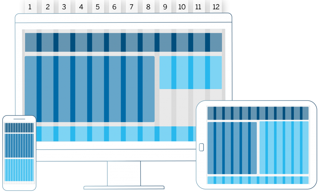
Responsive design is supported by a responsive grid.
The responsive grid positions UI elements in a 12-column flow layout. It can be configured to display a variable number of columns depending on available screen size. With this control, it is possible to achieve flexible layouts and line breaks for large, medium, and small-sized screens, such as desktop, tablet, and mobile.
Adaptive Design
There are certain use cases where a responsive approach may not be appropriate. For instance, users would probably prefer to enter large amounts of data on your desktop. At the same time, they may only want to view the data entered or perhaps enter a small subset of data on their tablet or smartphone. In such cases, it makes sense to design for different devices and adapt the complexity of the use case to the specific device. This is what we call adaptive design. This approach requires app developers to manually define specific designs for the different form factors. It means slightly more effort, but also allows for more targeted support of device-specific use cases.
Examples of Responsive Design
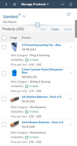
The examples in this section show how a standard list report floorplan would translate to different devices in a (semi-)responsive way.
For these examples, the following responsive design concepts apply:
- Content density: Compact content density mode is activated on desktop mode. On touch devices, the finger-friendly cozy mode is activated. Read more about content density.
- Filters: On a desktop, the filter fields are fully displayed. On a tablet or phone, the filter bar should be collapsed as default. Read more about filters.
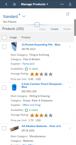
- Responsive controls: The responsive table moves content into a pop-in area as the available space decreases. Read more about the responsive table.
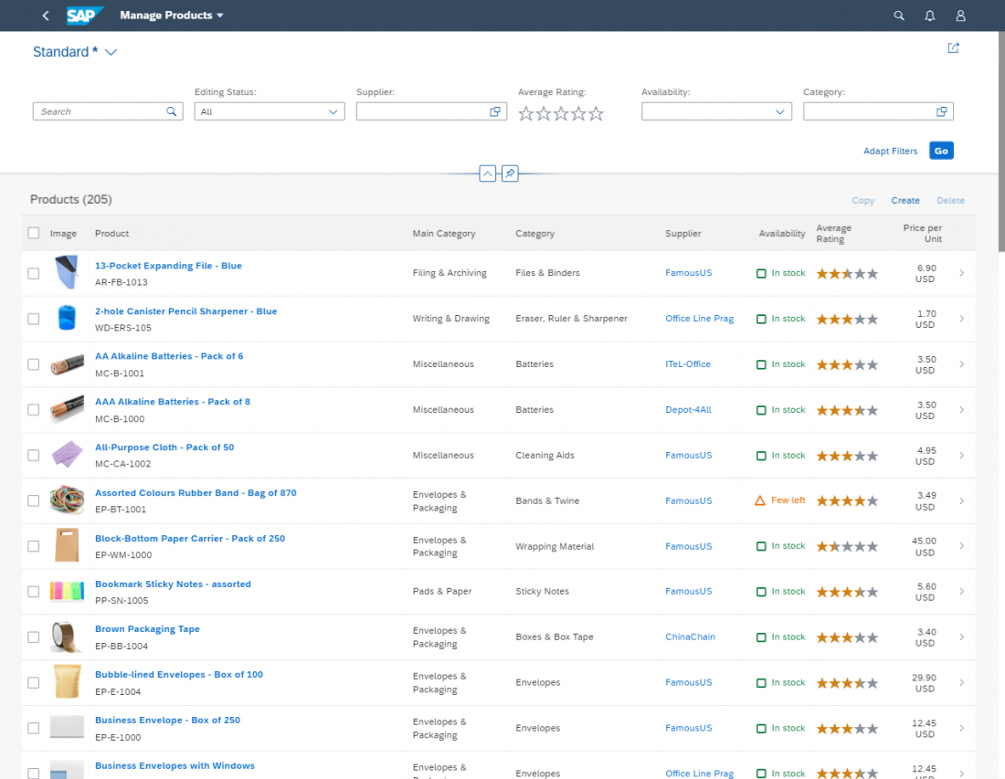
(1) Example of the list report floor plan on a desktop device. The filter bar is displayed and all the table columns show side by side.
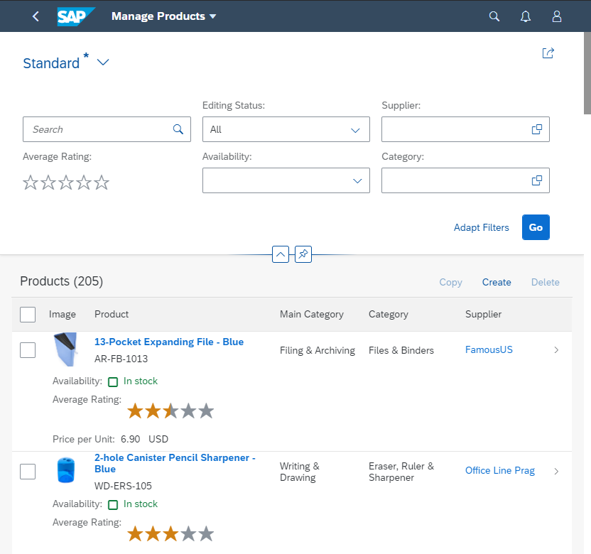
(2) Example of the list report floor plan on the screen size of a tablet. The size of the controls is increased to allow for interaction by touch. The filter fields are hidden, and some table columns move into the pop-in area.
Implementation
Think “mobile first”: Starting with mobile design first helps you stay focused. Begin with the core functionality and progressively enhance features for larger devices.
- If you are using desktop controls, replace them with responsive controls for a mobile device. However, we do not recommend using the sap.ui.commons library.
-
Analytical table, tree table and grid table are not fully responsive. They are available only for desktops and tablets, so when you use them you will need to take an adaptive approach by offering an additional UI for smartphones.
Use responsive controls: Most SAPUI5 controls are based on mobile controls. This means that they work on touch devices, or with a mouse and keyboard.
Properly configure the controls: Follow the guidelines to configure the responsive settings for the different controls.
Use the correct size settings: Set your apps to “large” on touch devices and to “medium” for devices operated by mouse or keyboard.
Use responsive layouts: There are several layout options available, which allow you to adjust to different sizes.
Use letterboxing: Many of the worklist apps do not have much content. By letterboxing them (restricting their width to a maximum of 1280 px), you can optimize the layout of the app and achieve a more compact look.
Too many functions? If the desktop app has too much functionality and is too complex to be used on a tablet or smartphone, you might have to switch off some functionality on your mobile device:
- Hide editing functionality and focus on display
- Hide functions from toolbar
- Hide alternative columns and views in tables
Summary and Quick Guidelines
- SAP Fiori apps must be able to run on all three major device types: desktop, tablet, and smartphone.
- If app functionality and information can be offered equally on all device types, responsive methods should be used to automatically adjust the app.
- If app functionality and/or information cannot be offered unaltered on different device types (due to the use case, the available screen real estate, or the device capabilities), the app should be adjusted manually according to device-specific requirements.
- Adaptive and responsive methods can be mixed.

 Your feedback has been sent to the SAP Fiori design team.