
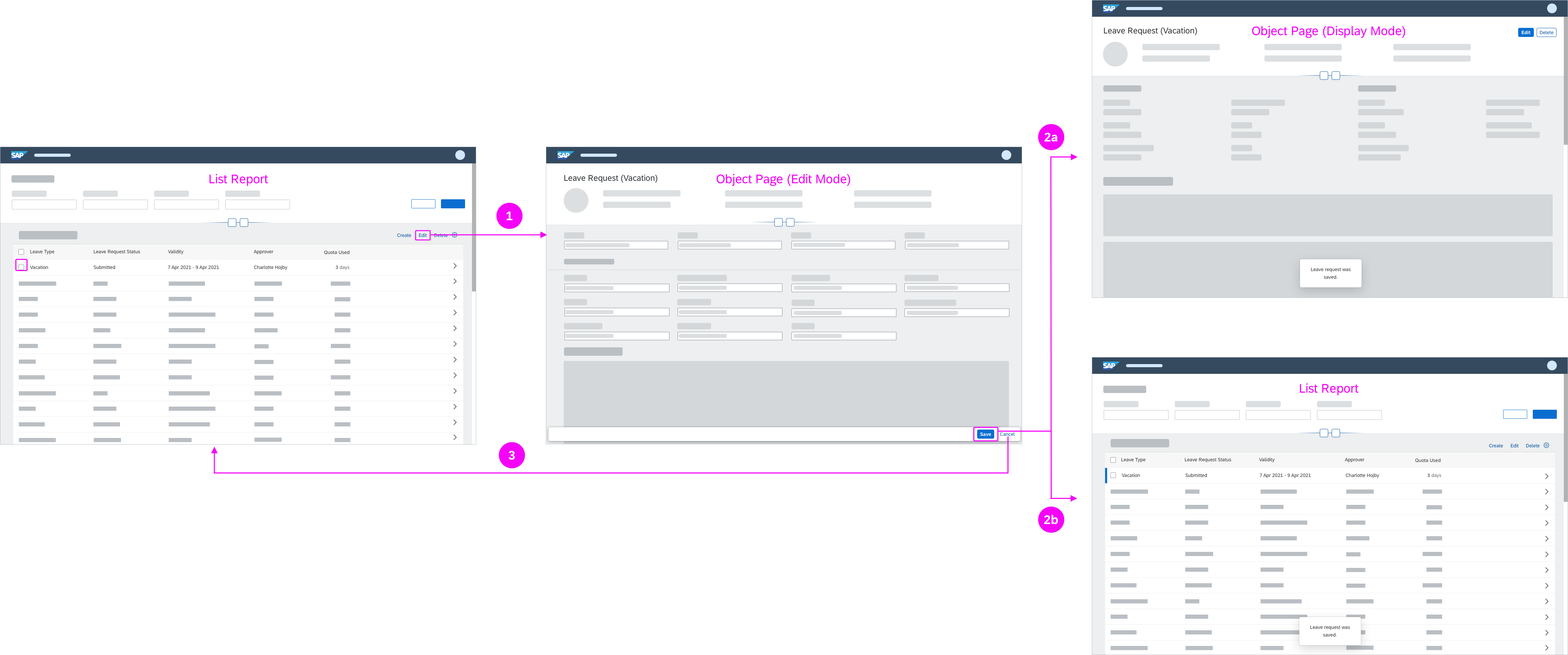
Object Handling – Partial Edit
Use this interaction flow if you want to make only part of an object editable (single sections or items).
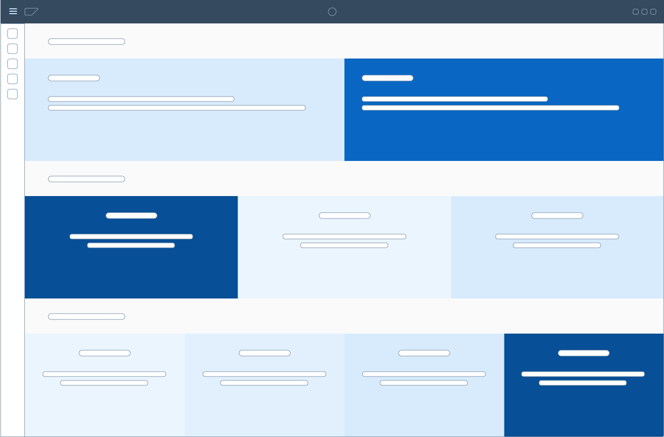
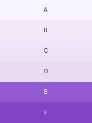
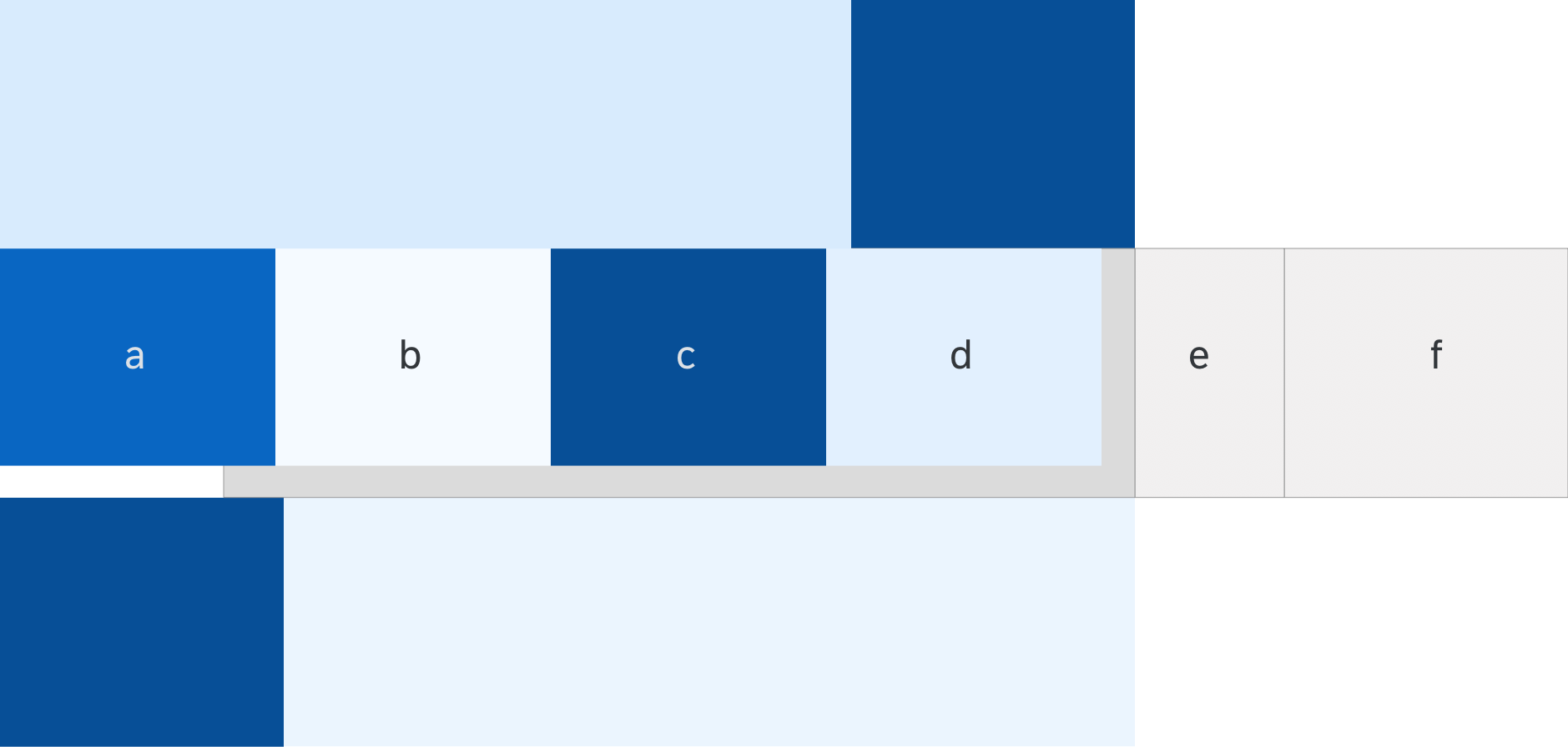
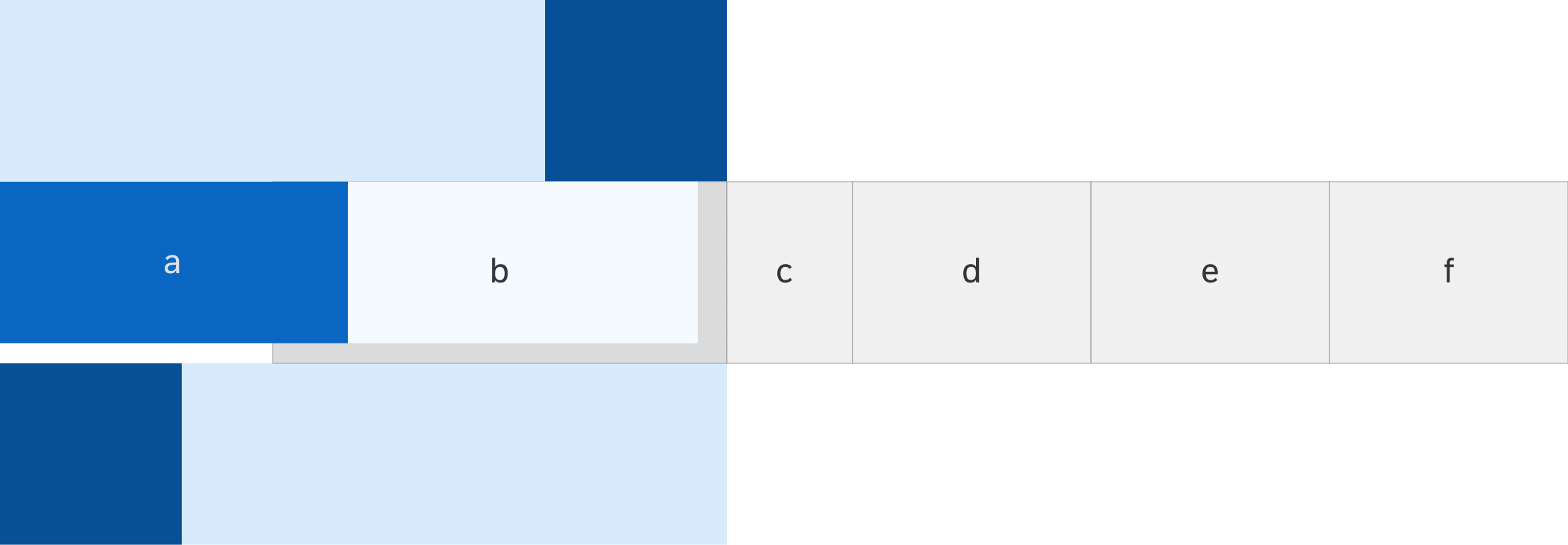
Partial flow (compact mode) - Size M/L
There are two variants for editing part of an object:
- Partial edit in place (preferred)
- Partial edit with dialog
You can use both variants in split screen and full screen layouts.
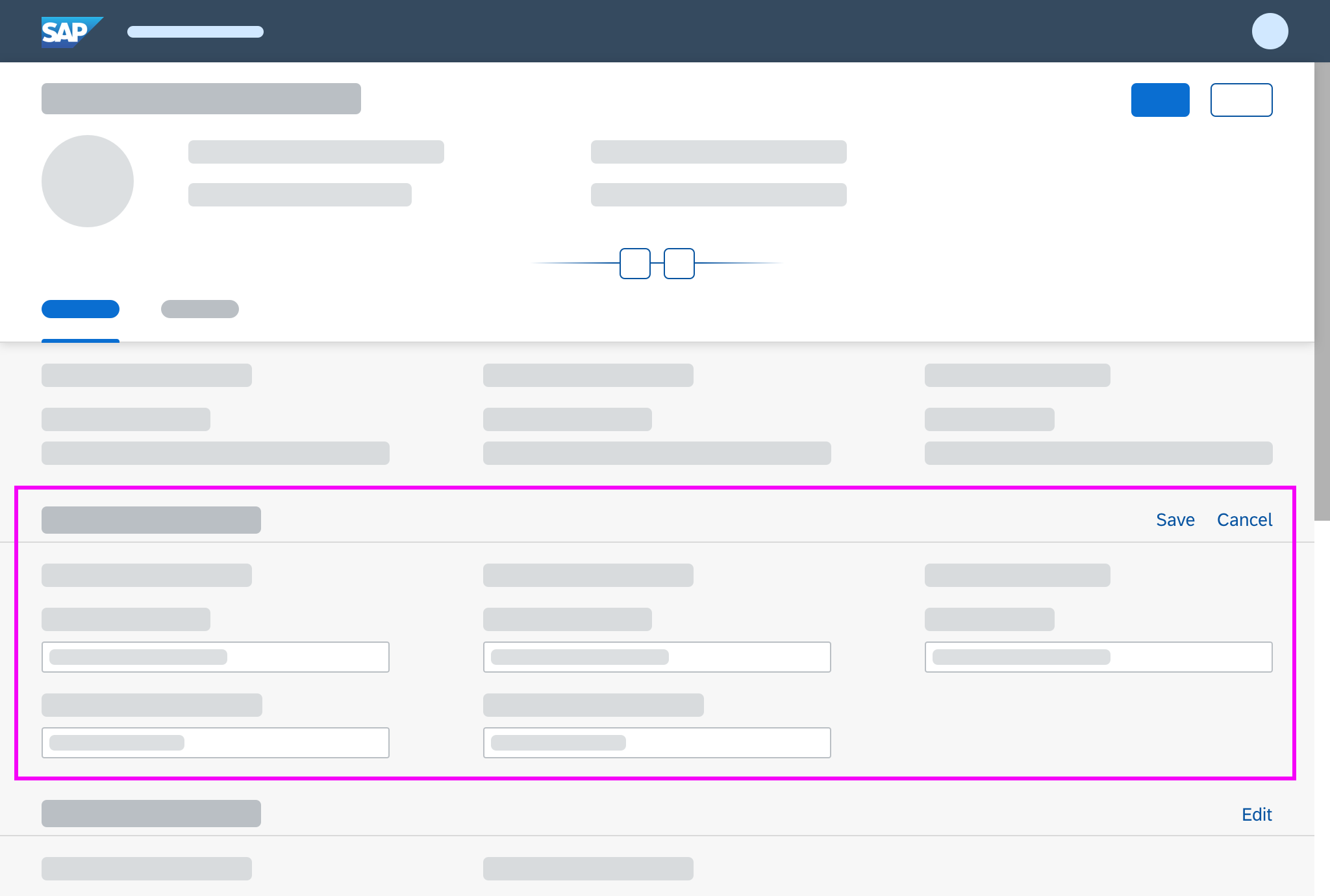
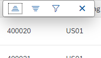
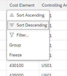
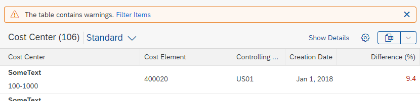
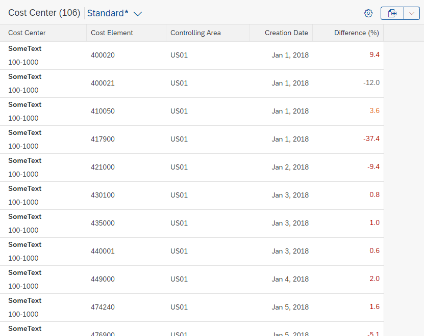
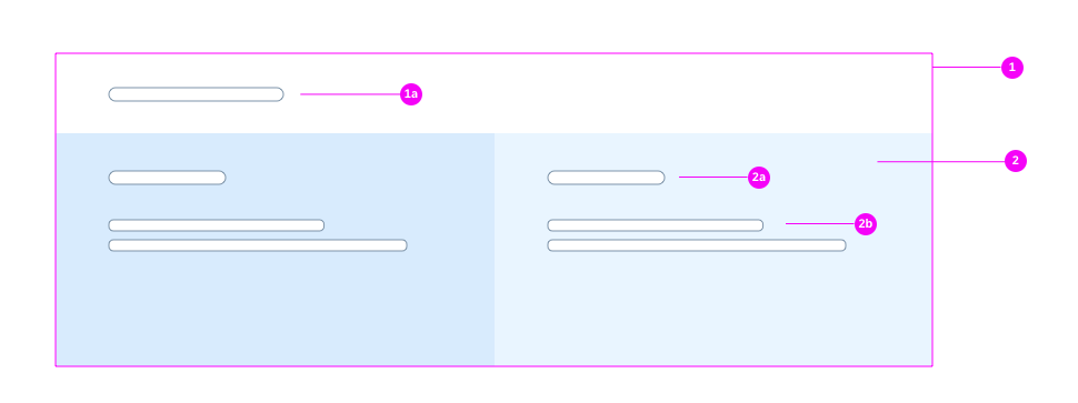
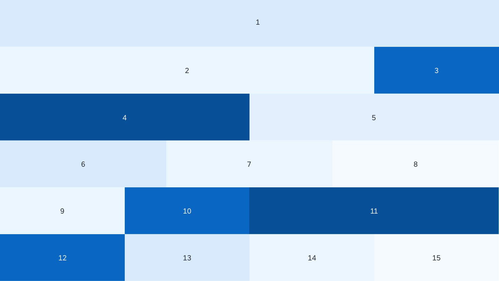
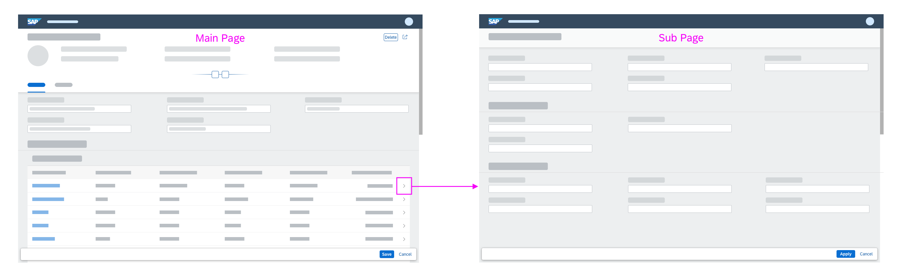
Partial Edit in Place
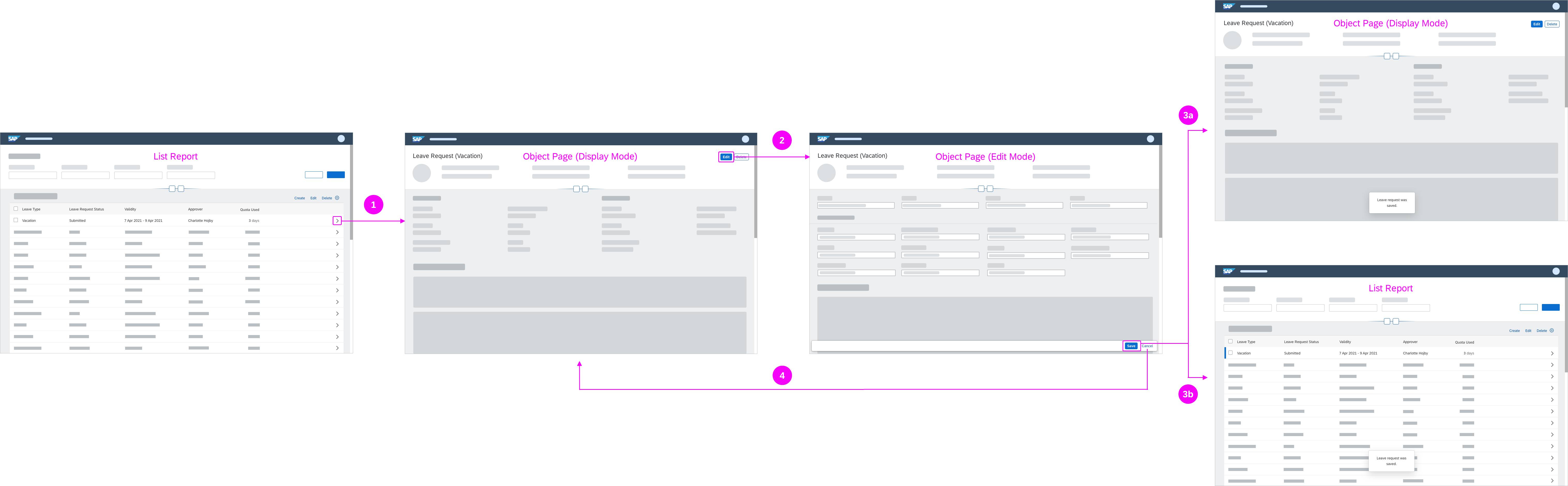
With this flow, the user edits a specific section of an object in place by clicking a transparent Edit button in the section header. The section then switches to edit mode, and the Edit button is replaced by Save and Cancel buttons.
In-place editing is the preferred method for changing part of an existing object into edit mode.
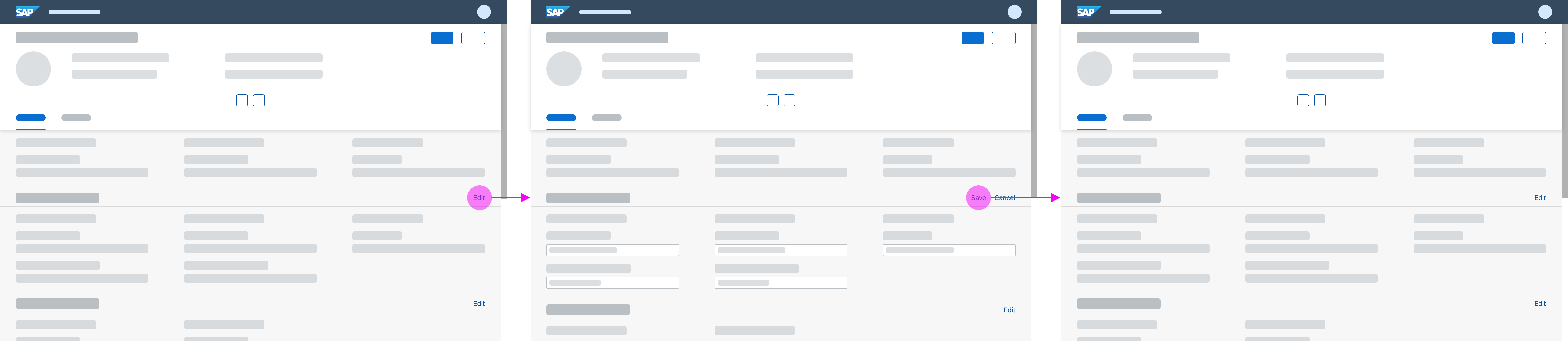
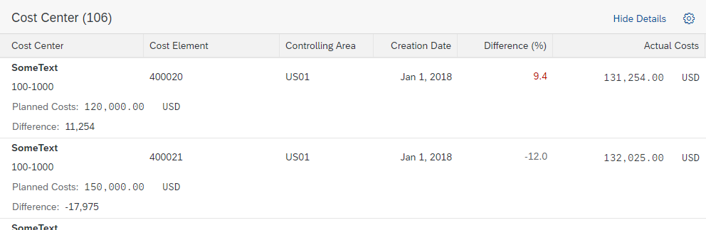
Partial edit in place
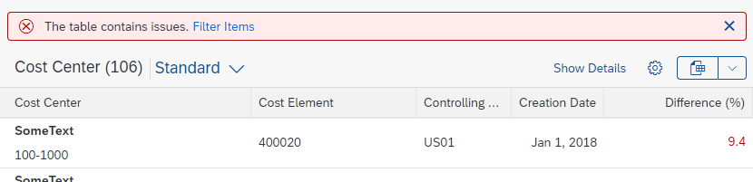
Data Loss Message
If the user has made changes in edit mode, show a data loss message whenever the user navigates away from the page being edited, or clicks Cancel. The data loss message is required for both split screen and full screen layouts.
If you want to keep unsaved changes, you need to implement draft handling.
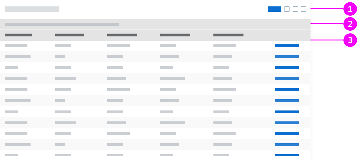
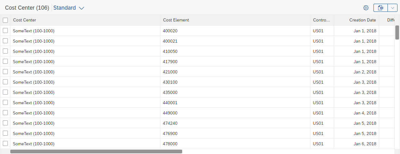
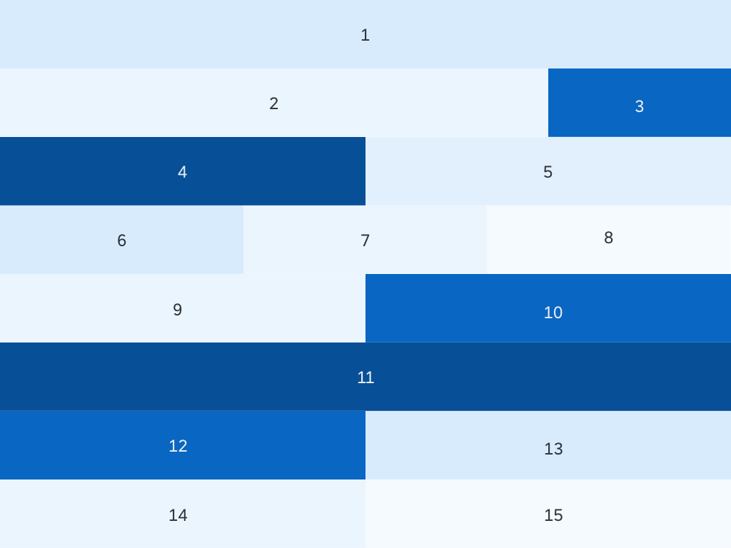
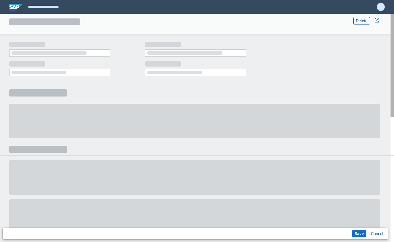
Partial Edit with Dialog
With this flow, the user selects one or several existing objects for editing. The values are then edited in a separate dialog. For more information, see Mass Edit.
When the user clicks Save, the dialog closes, and the line items in the table are updated.
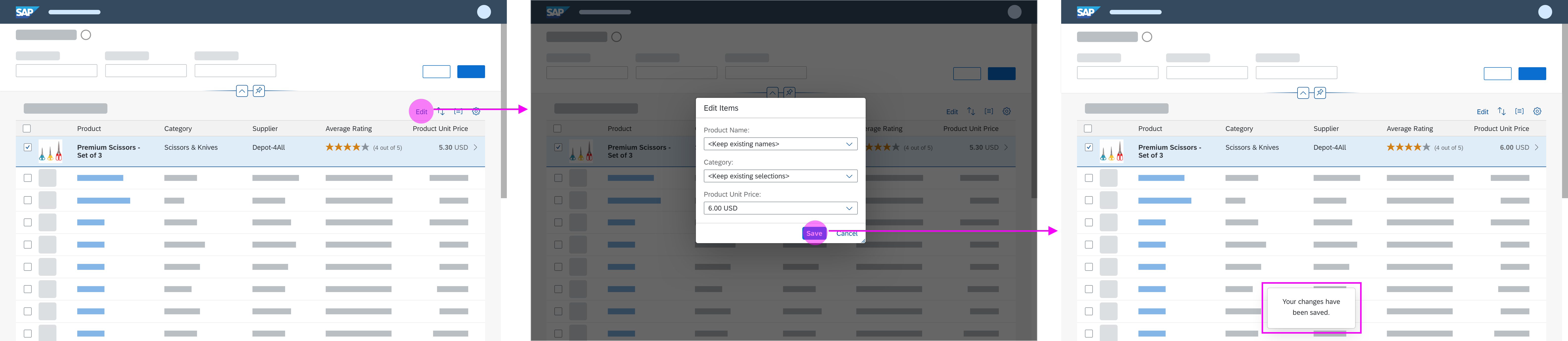
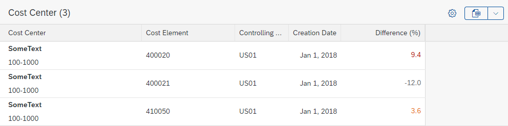
Partial edit with dialog
Use the partial edit flow with a dialog if the switch from display to edit mode involves an extensive change of layout, such as mass editing. If the dialog contains more than 8 editable fields, consider navigating to a details page instead.
Data Loss Message
No data loss message is required for the partial edit flow with a dialog. The user can leave the edit dialog by clicking Cancel. Any changes are discarded.
Resources
Want to dive deeper? Follow the links below to find out more about related controls, the SAPUI5 implementation, and the visual design.


 Your feedback has been sent to the SAP Fiori design team.