Radial Micro Chart

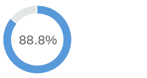
The goal of the radial chart is to display a single percentage value. The chart consists of a colored radial bar with a percentage value inside.

The radial micro chart can be embedded into a table, list, tile, or header.

Different radial charts

Usage

Use the radial micro chart if:

  • You want to display a single value in a table.
  • You want to show a percentage value; the proportion of the total is always calculated and displayed as a percentage.
  • You want to emphasize the visualization; the circular shape is more prominent.
  • You want to use colors from the chart color palettes.

Do not use the radial micro chart if:

  • You want to display a single value in the form of a fillable shape or group of shapes that describe their context. Use the status indicator instead.
  • You want to make it easier to compare better two or more values visually. Use the progress indicator instead.
  • You want to display custom values and not only percentages. Use the progress indicator instead.

Responsiveness

The radial micro chart is fully responsive. The size adjusts dynamically based on the dimensions of the parent container. In addition, there are four fixed sizes: L, M, S and XS. Each fixed size is a snapshot of the fully responsive micro chart for specific dimensions.

Radial micro chart - Size L
Radial micro chart - Size M
Radial micro chart - Size S
Radial micro chart - Size XS

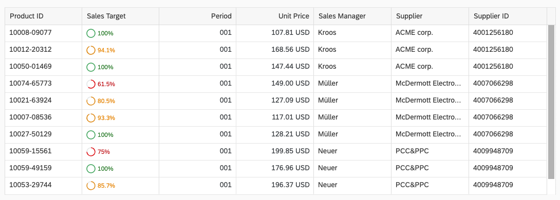
You can use size XS to embed the radial micro chart in the cells of a grid tableanalytical table, or tree table (also in condensed mode). Left-align the radial micro chart in the table cell.

Radial micro chart in size XS in a grid table

Maximum and Minimum Sizes

The radial micro chart can have the following dimensions:

Width Height
Maximum 320 px 94 px
Minimum 64 px 18 px

If the chart height is less than 56 px, only the slice label is visible.

Components

Labels

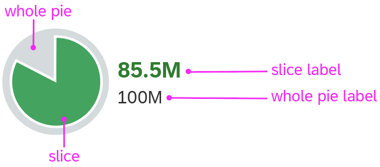
If the micro chart is smaller than size S, the label moves to the right (outside the radial chart). If there is no space to the right of the chart, no label is displayed.

Radial micro chart - components

Resources

Want to dive deeper? Follow the links below to find out more about related controls, the SAPUI5 implementation, and the visual design.

Elements and Controls

Implementation

Radial Micro Chart (SAPUI5 samples)

Harvey Ball Micro Chart

You can use a Harvey Ball chart to visualize a value compared to its total. This is not a pie chart with multiple values or sections, but rather just one value from a total. If you configure thresholds, the semantic color of the value shows a positive, critical, or negative value. You can also use regular chart colors from the qualitative palette without a semantic meaning.

Different Harvey Ball charts

Usage

The Harvey Ball micro chart can be embedded into a table, list, tile,or header.

Responsiveness

The Harvey Ball micro chart is fully responsive. The size adjusts dynamically based on the dimensions of the parent container. In addition, there are four fixed sizes: L, M, S and XS. Each fixed size is a snapshot of the fully responsive micro chart for specific dimensions.

Harvey Ball micro chart - Size L
Harvey Ball micro chart - Size M
Harvey Ball micro chart - Size S
Harvey Ball micro chart - Size XS

You can use size XS to embed the Harvey Ball micro chart in the cells of a grid tableanalytical table, or tree table (also in condensed mode). Left-align the Harvey Ball micro chart in the table cell.

Harvey Ball micro chart in size XS in a grid table

Maximum and Minimum Sizes

The Harvey Ball micro chart can have the following dimensions:

Width Height
Maximum 320 px 94 px
Minimum 64 px 18 px

If the chart height is less than 56 px, only the slice label is visible.

Components

Labels

If the container scales in height, the size of the micro chart adapts to the available vertical space.

  • If the container height increases, the size of the micro chart increases (assuming the available width is suffcient).
  • If the container height decreases, the size of the micro chart is reduced again.

If the micro chart is smaller than size S, only the chart slice and slice label are visible. If there is not enough space for the label, it is not shown.

Harvey Ball micro chart - components

Resources

Elements and Controls

Implementation

Delta Micro Chart

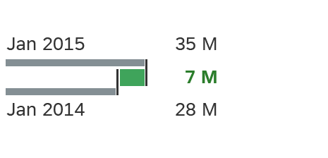
The delta micro chart helps to visualize a delta value (difference) between two main key figures. The delta can be a positive or negative value. Configured thresholds define the semantic coloring of the delta bar. The left-aligned labels can be omitted, whereas the right-aligned labels with the values are always shown.

Different delta charts

Usage

The delta micro chart can be embedded into a table, list, tile, or header.

Responsiveness

The delta micro chart is fully responsive. The size adjusts dynamically based on the dimensions of the parent container. In addition, there are four fixed sizes: L, M, S and XS. Each fixed size is a snapshot of the fully responsive micro chart for specific dimensions.

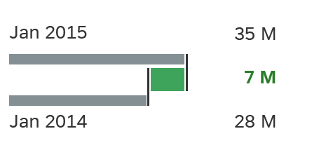
Delta micro chart - Size L
Delta micro chart - Size M
Delta micro chart - Size S
Delta micro chart - Size XS

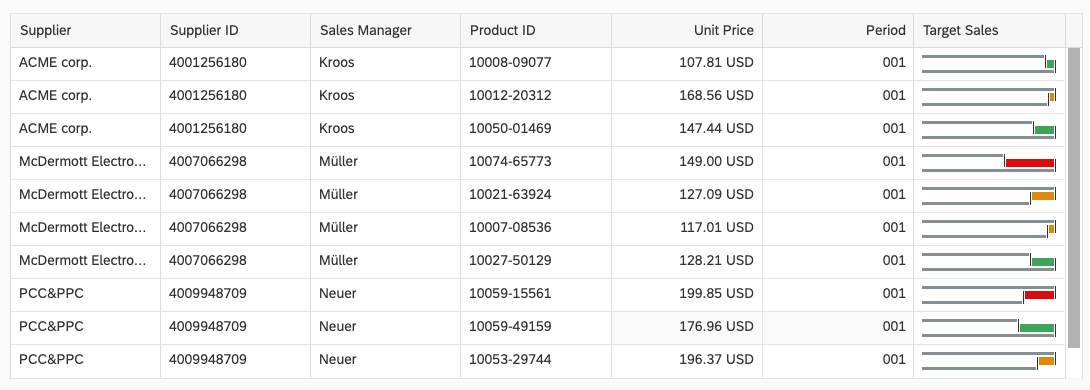
You can use size XS to embed the delta micro chart in the cells of a grid tableanalytical table, or tree table (also in condensed mode). Left-align the delta micro chart in the table cell.

Delta micro chart in size XS in a grid table

Maximum and Minimum Sizes

The delta micro chart can have the following dimensions:

Width Height
Maximum 320 px 94 px
Minimum 64 px 18 px

If the chart height is less than 56 px, all labels are hidden but the delta value is still visible.

With the minimum chart height, the labels are not shown.

Components

Labels

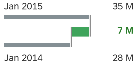
The delta micro chart has two main labels, which refer to two data points:

  • The main key value labels indicate the actual data points that are used to calculate the delta.
  • The delta value is the difference between these two data points and is displayed in a semantic color.

In the wide mode, the labels are placed before and after the chart. If the width is not sufficient to show all labels, the values are hidden first, followed by the date labels.

Delta micro chart - components

Resources

Want to dive deeper? Follow the links below to find out more about related controls, the SAPUI5 implementation, and the visual design.

Elements and Controls

Implementation

Comparison Micro Chart

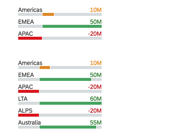
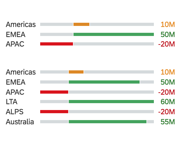
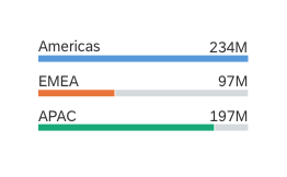
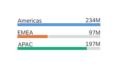
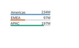
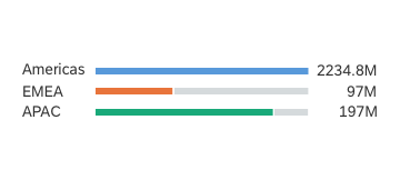
The comparison micro chart is a bar chart. It compares entries in a top N list. Depending on the width of the parent container, it can have two different layouts: normal view and wide view. You can use either the semantic chart palette or the qualitative chart palette.

Comparison micro charts in normal view
Comparison micro charts in wide view

Usage

The comparison micro chart can be embedded into a table, list, tile, or header.

Responsiveness

The comparison micro chart is fully responsive. The size adjusts dynamically based on the dimensions of the parent container. In addition, there are also four fixed sizes – L, M, S and XS. Each fixed size is a snapshot of the fully responsive micro chart for specific dimensions.

Comparison micro chart with 3 bars - Size L
Comparison micro chart with 3 bars - Size M
Comparison micro chart with 3 bars - Size S
Comparison micro chart with 3 bars - Size XS

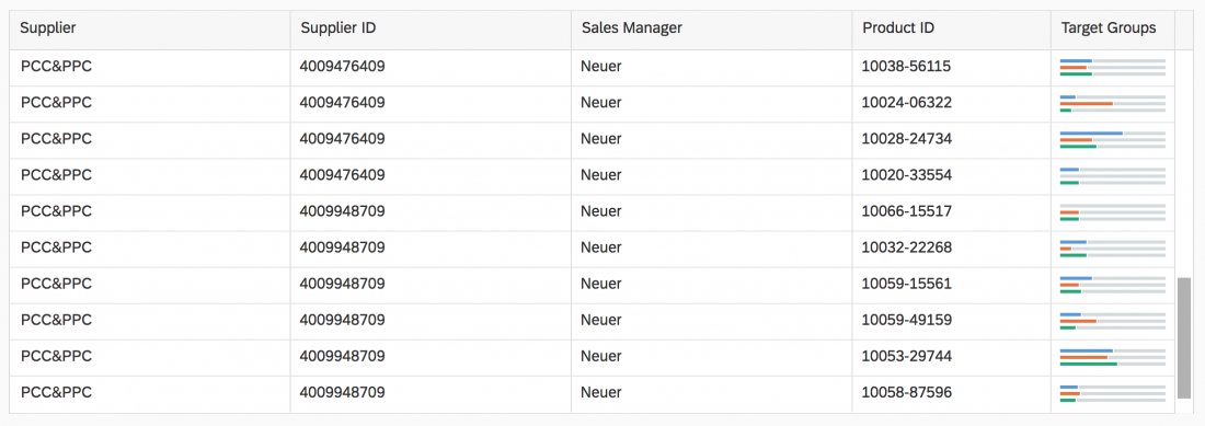
You can use the smallest XS size to embed the comparison micro chart in the table cells of the grid tableanalytical table, or tree table (also in condensed mode). Left-align the comparison micro chart in the table cell.

Comparison micro chart with 3 bars in XS size in the grid table

Maximum and Minimum Sizes

The column micro chart can have the following dimensions:

Width Height
Maximum 320 px 94 px
Minimum 64 px 18 px

In normal view, the labels for the bars are positioned on top of each bar.

If the chart width exceeds 192 px, the chart goes into wide view and the labels for the bars are positioned on both sides of the bar.

If the chart width is 96 px or less, the labels are hidden.

Comparison micro chart with 3 bars and labels on both sides
Comparison micro chart with 3 bars and labels above
Comparison micro chart with 3 bars without labels

Guidelines

  • Use a maximum of 12 bars in a single comparison micro chart.
  • We strongly recommended using at least 2 bars in a single chart to visualize a comparison.
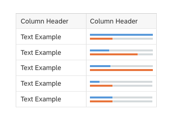
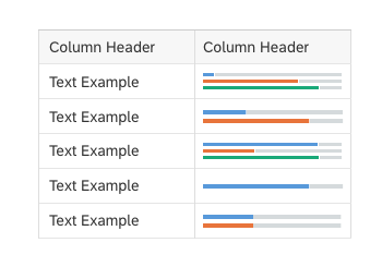
  • When embedding comparison charts in tables, use the same number of bars for all the charts in a given table column. This makes the data comparable and avoids misleading the user. Use a suitable column header to describe the embedded charts.
Do
Use comparison charts with the same number of bars in a table column
Don't
Do not use comparison charts with different numbers of bars in the same table column

Resources

Want to dive deeper? Follow the links below to find out more about related controls, the SAPUI5 implementation, and the visual design.

Elements and Controls

Implementation

Column Micro Chart

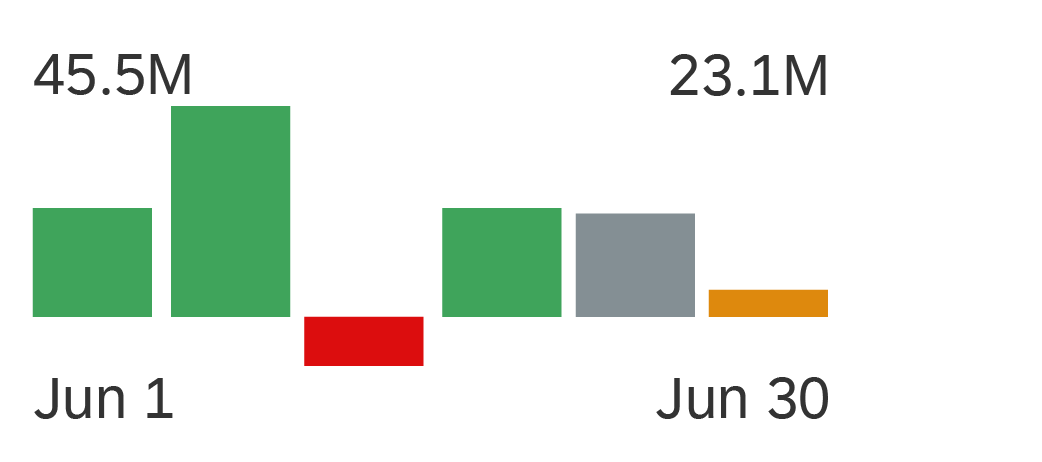
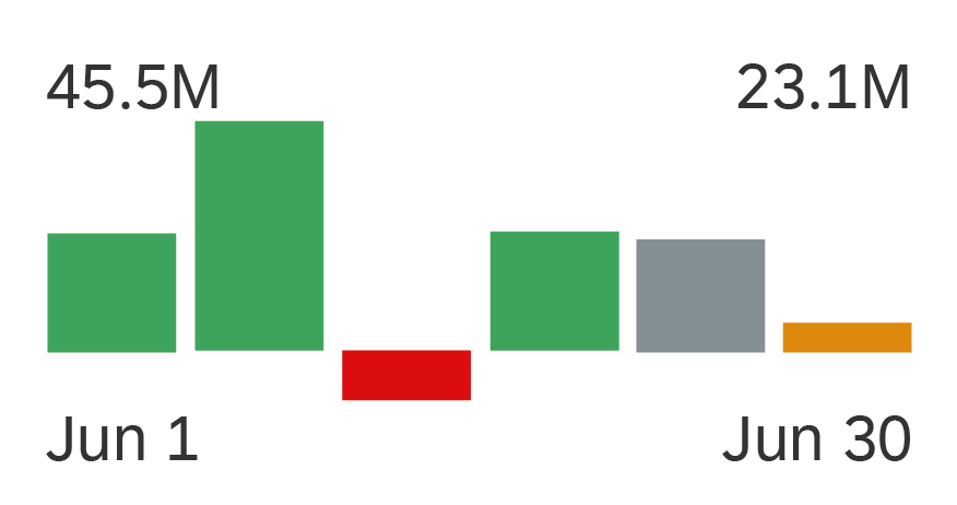
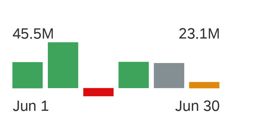
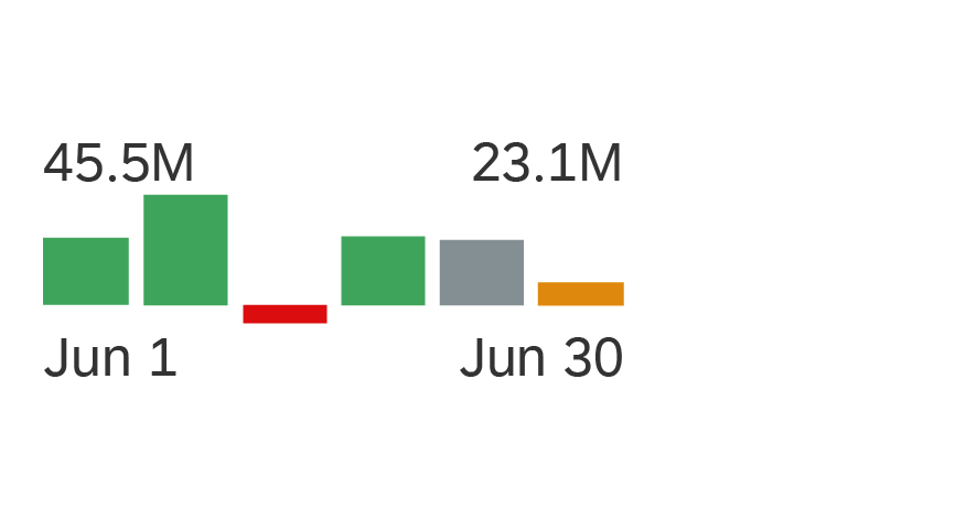
A column chart uses vertical bars to compare multiple values over time or across categories. One axis of the chart shows the categories being compared, the other axis represents a value. The bars of the column micro chart can represent both positive and negative values.

There are three main ways to visualize a column micro chart:

  • View with top labels for start and end values, and bottom labels for start and end dates
  • Detail view with labels for each vertical bar. This view can be used only if there is enough space for enough bars width in the container.
  • No labels. In all cases, the label can be switched off.

You can use either the semantic chart palette or the qualitative chart palette.

Column micro chart with top labels for start and end values, and bottom labels for start and end dates
Column micro chart without labels, using semantic colors
Column micro chart without labels, using qualitative colors

Usage

The column micro chart can be embedded into a tablelisttile, or header.

Use the column micro chart if:

  • You want to visualize a trend.
  • You want to compare multiple values over time or across categories.

Do not use the column micro chart if:

  • You have a scenario that does not require a comparison over time.

Responsiveness

The column micro chart is fully responsive. The size adjusts dynamically based on the dimensions of the parent container. In addition, there are four fixed sizes: L, M, S and XS. Each fixed size is a snapshot of the fully responsive micro chart for specific dimensions.

Column micro chart - Size L
Column micro chart - Size M
Column micro chart - Size S
Column micro chart - Size XS

You can use size XS to embed the column micro chart in the cells of a grid tableanalytical table, or tree table (also in condensed mode). Left-align the column micro chart in the table cell.

Column micro chart in size XS in a grid table

Maximum and Minimum Sizes

The column micro chart can have the following dimensions:

Width Height
Maximum 320 px 94 px
Minimum 64 px 18 px

If the chart height is less than 72 px, the column labels are hidden. Instead, the chart switches to the standard view, and shows the start and end values per chart, as well as start and end dates.

If the chart height is less than 56 px, all labels are hidden.

Components

Bars

The bars of the column micro chart can represent both positive and negative values.

We strongly recommend using only colours from the semantic palette for the bars (good, critical, bad, neutral). If your use case requires colours from the qualitative palette, use only one colour per chart.

Top and Bottom Labels

The labels for the column micro chart are optional. Use the bottom labels to indicate the beginning and the end of the time period. Use the top labels to show the corresponding values for the beginning and the end of the chart. The responsive behaviour of the chart hides labels if there is not enough space to display them (for XS size and smaller or if If the chart height is less than 56 px). Ensure that the labels for the values are not truncated.

Bar Labels

For a more detailed view of the chart, you can use bar labels. The bar labels are displayed only if the container is wide enough to accommodate a minimum number of bars. The bars must be at least as wide as the label. Otherwise, the responsive behavior of the chart automatically switches to the mode with only top and bottom labels displayed. Ensure that the labels for the values are not truncated.

Column micro chart - Components

Resources

Want to dive deeper? Follow the links below to find out more about related controls, the SAPUI5 implementation, and the visual design.

Elements and Controls

Implementation

Bullet Micro Chart

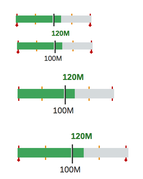
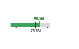
A bullet chart is a variation of a bar graph originally developed by Stephen Few and adapted by SAP Fiori in order to fulfill additional requirements. Much like the traditional thermometer charts and progress bars found in many dashboards, the bullet chart serves as a replacement for dashboard gauges and meters.

The bullet chart features a single, primary measure (for example, current year-to-date revenue). It compares that measure to one or more other measures to enrich its meaning (for example, compared to a target), and displays it in the context of qualitative ranges of performance, such as poor, satisfactory, and good.

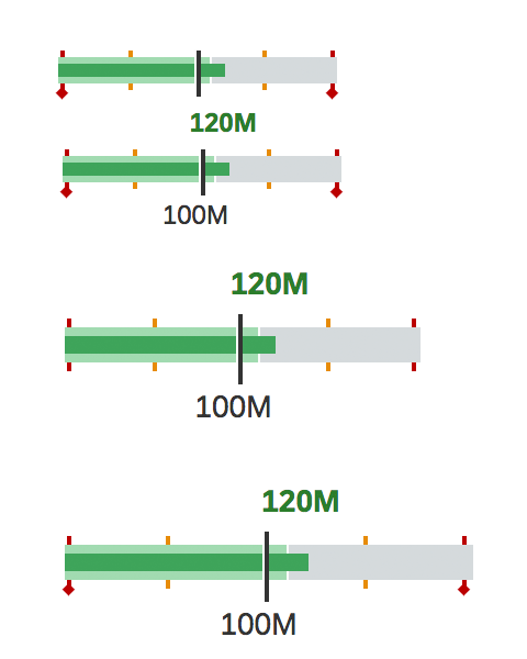
Bullet micro chart without forecast
Bullet micro chart with forecast
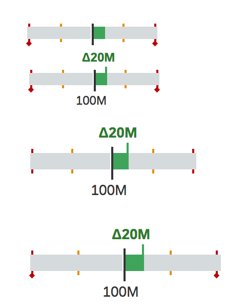
Bullet micro chart with only delta value shown

The actual value is shown as a colored horizontal bar, the target value as a vertical line (marker), and the thresholds as indicators above and below the bar. The actual and target values can have a label.

Only semantic colors (good, critical, bad, neutral) can be used for the actual value.

The forecast is shown as a bar with a lighter tint of the same color as the actual value in the background.

Based on the data points you want to show, choose one of the following visualizations:

  • Actual value vs. target value
  • Actual value vs. target value with forecast
  • The delta between the actual value and the target value. For this option, the delta is shown as a bar starting or ending at the target marker.

Usage

The bullet micro chart can be embedded into a tablelist, tile, and header.

Responsiveness

The bullet micro chart is fully responsive. The size adjusts dynamically based on the dimensions of the parent container. In addition, there are also four fixed sizes – L, M, S and XS. Each fixed size is a snapshot of the fully responsive micro chart for specific dimensions.

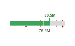
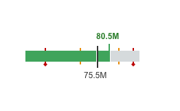
Bullet micro chart - Size L
Bullet micro chart - Size M
Bullet micro chart - Size S
Bullet micro chart - Size XS

You can use the smallest XS size to embed the bullet micro chart in the table cells of the grid table, analytical table, or tree table (also in condensed mode). Left-align the bullet micro chart in the table cell.

Bullet micro chart in size XS in a grid table

Maximum and Minimum Sizes

The bullet micro chart can have the following dimensions:

Width Height
Maximum 320 px 94 px
Minimum 64 px 18 px

If the chart height is less than 56 px, the labels are hidden.

Resources

Want to dive deeper? Follow the links below to find out more about related controls, the SAPUI5 implementation, and the visual design.

Elements and Controls

Implementation

Area Micro Chart

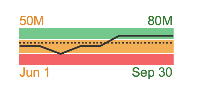
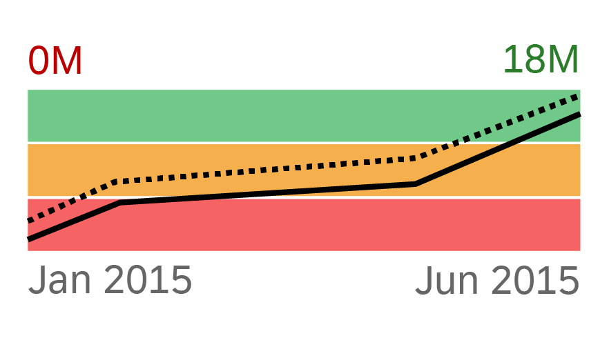
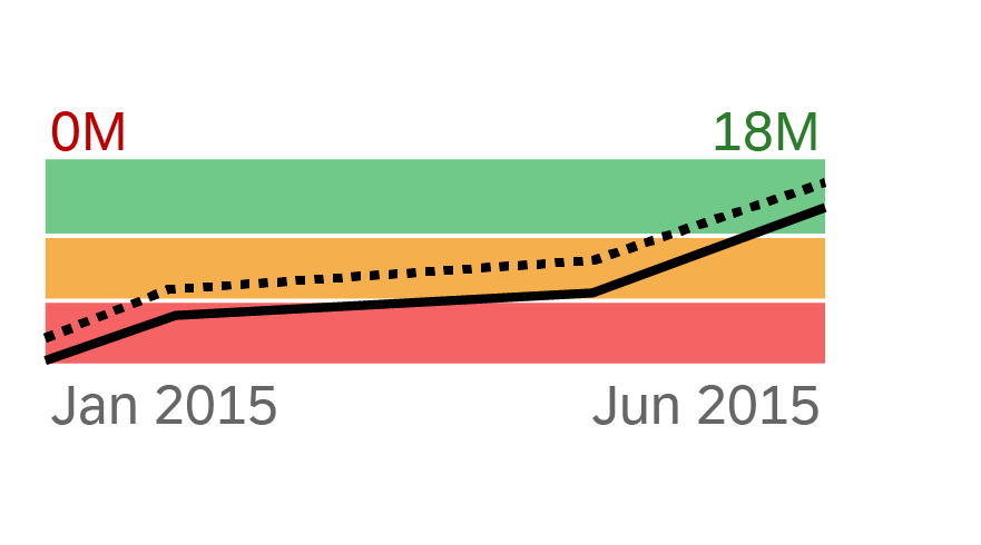
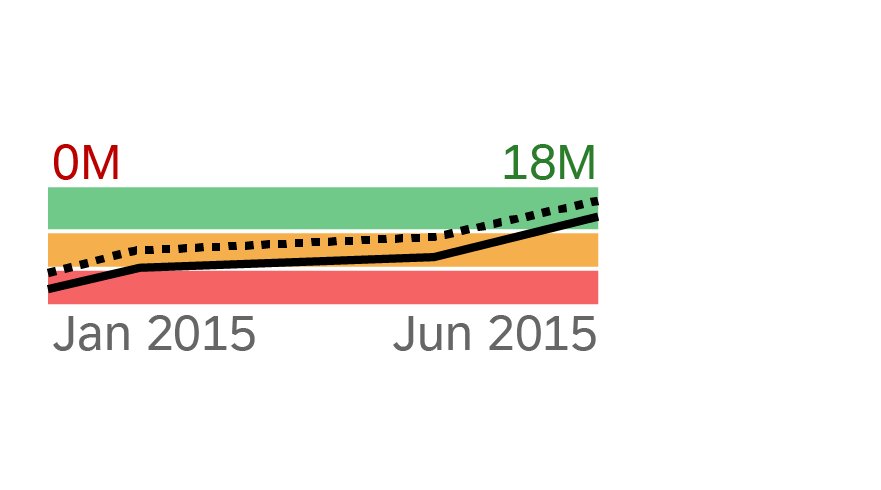
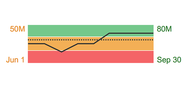
An area micro chart is a trend chart. It provides information for actual and target values for a specific time range. These values are visualized as segmented lines and can be compared to threshold areas shown in the background.

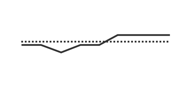
The area micro chart can be visualized in normal or wide mode. If no thresholds are defined, the area micro chart shows only the lines on a transparent background. You can also use colored lines from the qualitative color palette or apply semantic colors.

Area micro chart
Area micro chart

Usage

The area micro chart can be embedded into a table, list, tile, or header.

Use the area micro chart if:

  • You want to visualize a trend with information about actual and target values for a specific time range.
  • You want to visualize and compare actual and target values with threshold values.

Do not use the area micro chart if:

  • You have a scenario that does not require a comparison over time.

Responsiveness

The area micro chart is fully responsive. The size adjusts dynamically based on the dimensions of the parent container. In addition, there are four fixed sizes: L, M, S, and XS. Each fixed size is a snapshot of the fully responsive micro chart for specific dimensions.

Area micro chart - Size L
Area micro chart - Size M
Area micro chart - Size S
Area micro chart - Size XS

You can use size XS to embed the area micro chart in the cells of a grid tableanalytical table, or tree table (also in condensed mode). Left-align the area micro chart in the table cell.

 Area micro chart in size XS in a grid table
Area micro chart in size XS in a grid table

Maximum and Minimum Sizes

The area micro chart can have the following dimensions:

Width Height
Maximum 320 px 94 px
Minimum 64 px 18 px

If the chart height is less than 56 px, the labels are hidden in the normal mode.
If the chart height is less than 36 px, the labels are hidden in the wide mode.

Layout

The area micro chart can be visualized in normal or wide mode. When no thresholds are defined, the area micro chart shows only the lines on a transparent background.

Area micro chart - Normal mode
Area micro chart - Wide mode
Area micro chart without thresholds

Components

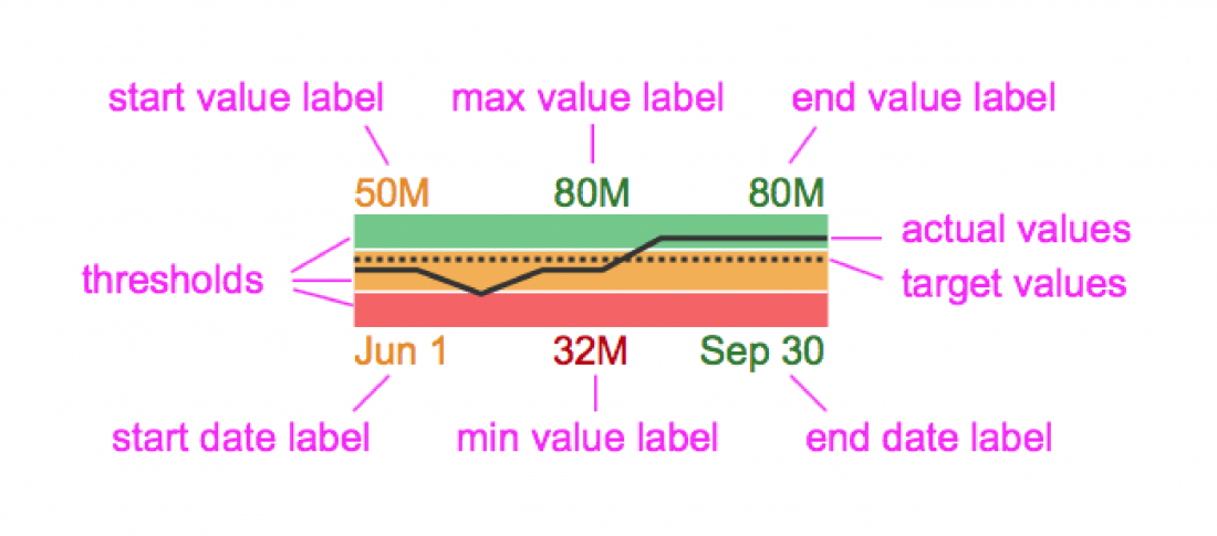
Actual and target values

The actual values are displayed as a solid line, the target values as a dotted line.

Thresholds

The thresholds are displayed as colored areas in the background.

Labels

You can show labels for the start and end values, the maximum and minimum values, and the beginning and end of the time range.

If the chart contains only start and end value labels and start and end date labels, each takes up half of the chart width. The responsive behavior of the chart hides the labels if there is not enough space to display them (for XS size and smaller or if If the chart height is less than 56 px for normal mode or less than 36 px for wide mode). Ensure that the labels for the values are not truncated. Bear in mind that if one of the paired labels (start or end) is too long, both labels are hidden.

If the chart also has minimum or maximum value labels, each label takes up a third of the chart width. The minimum or maximum value labels are optional. If the minimum or maximum value label gets truncated, both the minimum and maximum value labels are hidden.

In the wide mode, the labels are placed before and after the chart. The same rules apply to hiding the labels: if one of the paired labels does not fit in, they are both hidden.

Area micro chart - Components

Guidelines

For the wide mode, we strongly recommend that the chart width is greater than or equal to the chart height. Otherwise, use the normal mode.

Do
Chart width is greater than or equal to the chart height
Don't
Chart width is less than the chart height

Resources

Want to dive deeper? Follow the links below to find out more about related controls, the SAPUI5 implementation, and the visual design.
Elements and Controls

Implementation

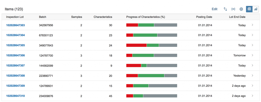
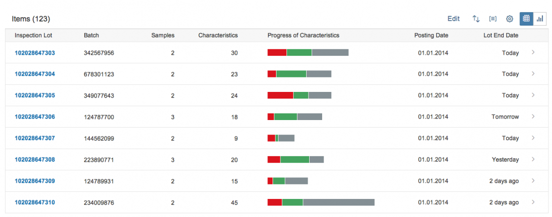
Stacked Bar Micro Chart

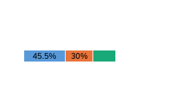
The stacked bar micro chart is designed to be embedded into a list, table, or object page header as a way to represent related values atop one another in order to visualize the single values as part of a whole. These values can be displayed in two different ways:

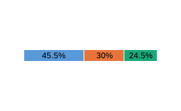
  • Percentage compared to 100%

    Use percentage values if your goal is to see each value in the composition as a percentage of the whole. In this case, the sum of the bars is always 100%.

Percentage values (without labels)
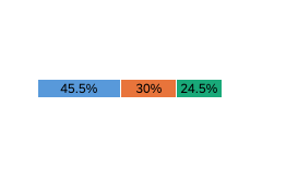
  • Values compared to a maximum value

    Use this option in a list or table if your goal is to compare the sum of the values to a maximum value (for example, the maximum of all data shown in the list or table), whilst still displaying the relative value of each to its local maximum.

Absolute values (without labels)

Please note: The stacked bar micro chart does not support negative values.

Usage

Use the stacked bar micro chart if:

  • You want to visualize a part-to-whole relationship embedded in a list or table, with all the features described above.
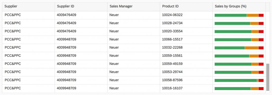
Chart embedded in a table - Percentage values (without labels)
Chart embedded in a table - Absolute values (without labels)
  • You want to visualize a part-to-whole relationship in an object page header, with all the features described above.

Also consider using a Harvey Ball micro chart as an alternative visualization for a part-to-whole relationship.

Chart embedded in an object header - Percentage values (with labels)
Chart embedded in an object header - Absolute values (with labels)

Do not use the stacked bar micro chart if:

  • You want to visualize a part-to-whole relationship on a SAP Fiori tile. The stacked bar micro chart is not designed to be embedded into an SAP Fiori tile and is therefore not supported. Consider using a Harvey Ball micro chart instead.


Responsiveness

The stacked bar micro chart is fully responsive. The size adjusts dynamically based on the dimensions of the parent container. In addition, there are also four fixed sizes – L, M, S and XS. Each fixed size is a snapshot of the fully responsive micro chart for specific dimensions.

Stacked bar micro chart - Size L
Stacked bar micro chart - Size M
Stacked bar micro chart - Size S
Stacked bar micro chart - Size XS

You can use the smallest XS size to embed the stacked bar micro chart in the table cells of the grid tableanalytical table, or tree table (also in condensed mode). Left-align the stacked bar micro chart in the table cell.

Stacked bar micro chart in XS size in the grid table

Maximum and Minimum Sizes

The stacked bar micro chart can have the following dimensions:

Width Height
Maximum 320 px 94 px
Minimum 64 px 18 px

If the label is too long to fit inside the bar, it is hidden. With the minimum chart height, the labels are not shown.

Components

Maximum Value

The chart is scaled relative to the maximum value. This means if a maximum value (maxValue) is set, then the width of the stacked chart represents the maximum value and each value within the chart is scaled relative to this maximum.

If the maximum value is not set, then the width of the chart represents 100% and each value is displayed as a relative percentage.

Precision

By setting a specific value for the precision, an application developer can influence rounding calculations by defining how many digits are displayed. By default this value is 1.

Display Value

By default, the control displays percentage values on the bars. However, application developers can also set a display property to show absolute values, or to show only bars (by entering a blank space).

Color

An application developer can set any color for the chart either by using names of semantic colors, or by using names from the qualitative palette (sapUiChartPaletteQualitativeHue1…11).

Please note: A legend is currently not available for the stacked bar micro chart. Since the use of multiple colors is not self-explanatory, we highly recommend using semantic colors and an explanatory title for the chart.

Resources

Want to dive deeper? Follow the links below to find out more about related controls, the SAPUI5 implementation, and the visual design.

Elements and Controls

Implementation

Smart Chart

Warning
This guideline was written for release 1.52 and is no longer updated. For the latest design guidelines on charts, see Chart (VizFrame)  and Chart Toolbar.

Background:
As of guideline release 1.54, the SAP Fiori Design Guidelines contain only general guidelines for all implementations. These guidelines also apply for implementations using smart controls. You can still use the smart chart, but the exact features will no longer be updated in the design guidelines.

Intro

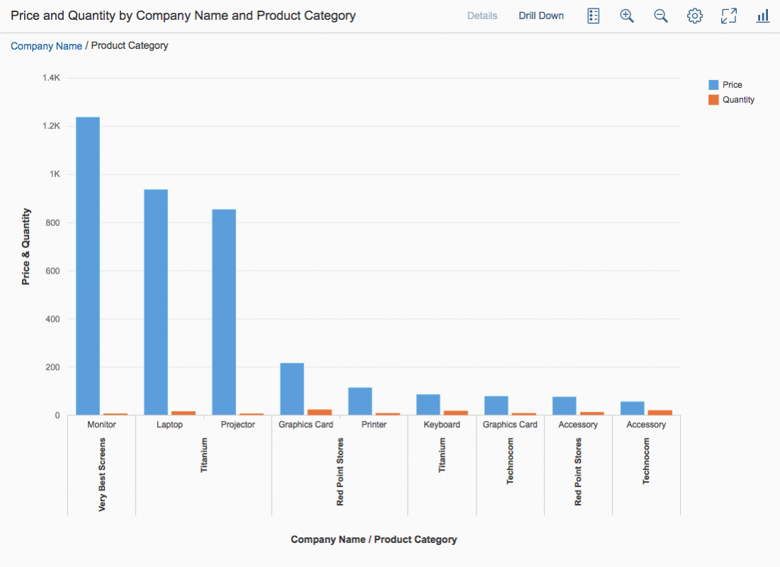
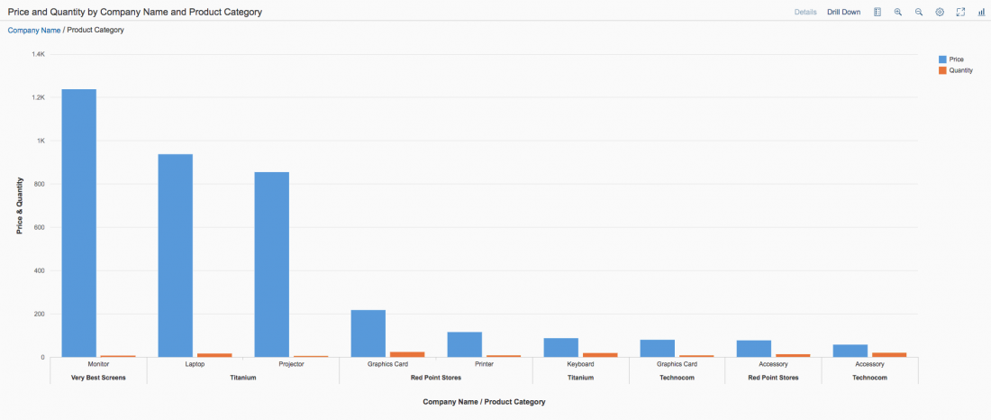
The smart chart is a wrapper around existing chart types, and can be used together with all existing chart types within VizFrame. The main purpose of the smart chart is to reduce development effort. However, this comes at the expense of decreased flexibility. The smart chart creates visualization based on the underlying OData service and the corresponding annotations. It also adds some generic functionality, such as a toolbar, complex personalization settings, variant management, breadcrumb, tooltip, drilldown and zoom capabilities. Everything that can be done using the smart chart can also be achieved using the standard VizFrame Chart, but with more development effort.

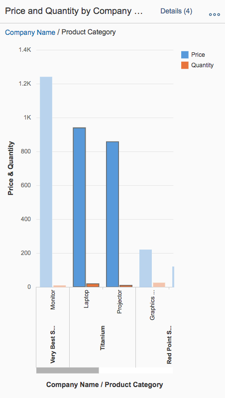
Smart chart
Smart chart

Usage

Use the smart chart if:

  • Data is fed through OData services.
  • You need to reduce development effort.
  • You would like to profit from drilldown and detailed information support.

Do not use the smart chart if:

  • You create your own UI coding, and the data is not fed through OData services. In this case, use the VizFrame chart instead.

Responsiveness

The smart chart is fully responsive It uses the overflow toolbar control, which is a container based on sap.m.Toolbar and which provides overflow when its content does not fit in the visible area. The Details text button never moves into the overflow, since it has a central function.

Size S
Size S
Size M
Size M
Size L
Size L

Layout

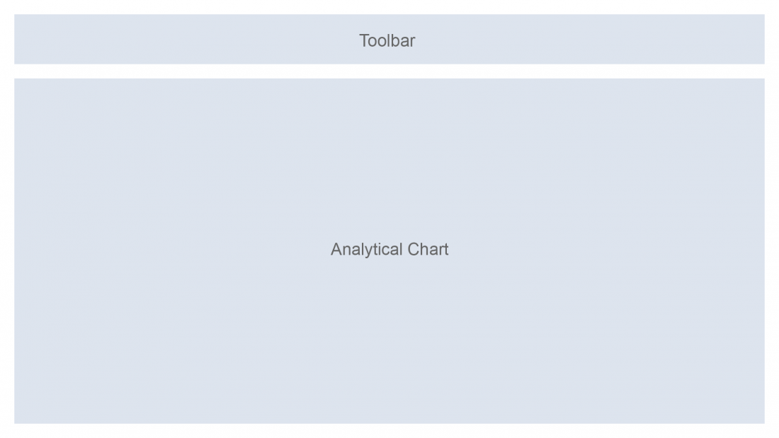
The header area contains the title of the smart chart, variant management, and the toolbar itself. All of these elements are optional.
The chart area shows the corresponding chart.

Schematic visualization of the smart chart

Components

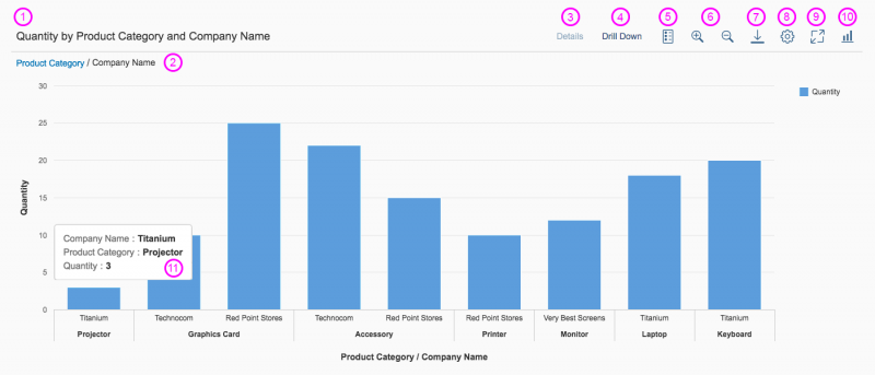
  1. Title and/or variant management: The title provides a short, meaningful summary of the chart content. Use the variant management control only if the user needs to save and load different filter settings and views of the chart.
  2. Breadcrumb: The interactive breadcrumb offers a history of the user’s drilldown path, enabling the user to return to the previous views of the chart.
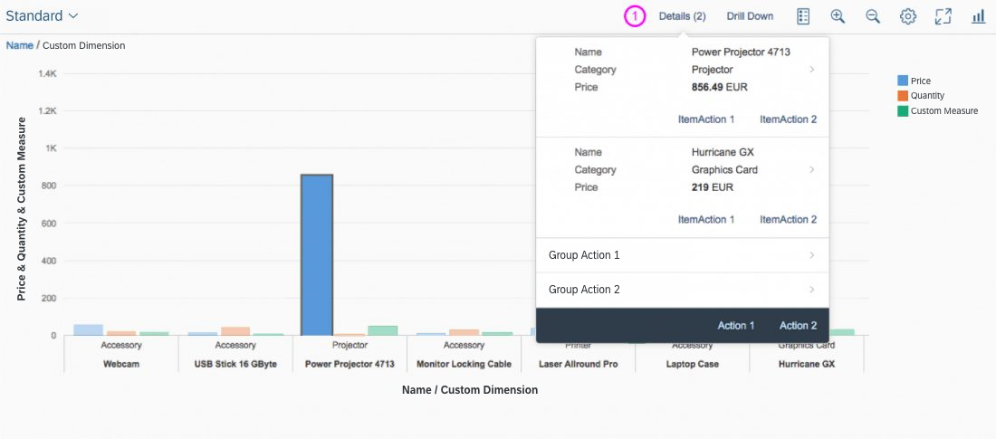
  3. Details:  If one or more data points are selected, the user can see detailed information for the selection(s) using the Details button. In the popover, you can offer both global actions and actions at item level.
  4. Drilldown: The chart provides two drilldown options:
    • The Drill Up Drill Down arrow icon buttons that come by default with the chart.
    • The Drill Down button (recommended). If no data points are selected, the Drill Down button affects all the data in the chart. If one or more data points are selected, drilling down is based on the selection.
  5. Legend: The Toggle Legend Visibility icon button toggles the legend on and off.
  6. Zoom in/out: The Zoom In and Zoom Out icon buttons allow users to decrease or increase the number of data points they see in one view.
  7. Download: The Download button downloads the current view of the chart.
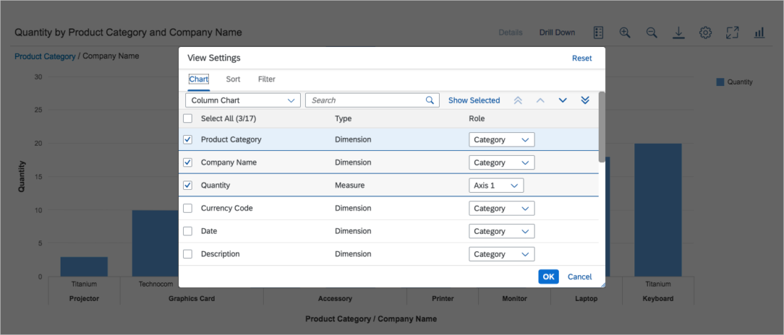
  8. Chart personalization: If you need to let users set the visibility of chart dimensions, or sort and filter data points, you can add a personalization dialog similar to the P13n Dialog.
  9. Full screen: The icon button toggles the full screen view.
  10. Chart type switch: The Selected Chart Type icon button offers a popover with the different available chart types.
  11. Tooltip: Shows information about the data point on hover.
Smart chart components
Smart chart personalization dialog

Behavior and Interaction

Selection

Data points can be selected by clicking or dragging. Both single selection and multiple selection are possible. Data points, labels, and legend items can be selected. Clicking into the background deselects all data points. For more information, see Chart – Selection.

Details

The Details popover gives detailed information on each selection made in the chart. The number of selections is shown in brackets.

  1. The Details popover shows detailed information on the selection.
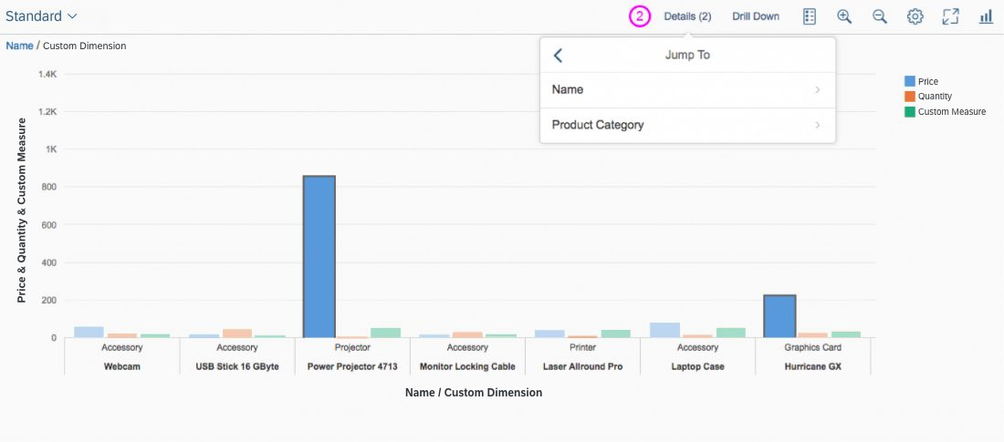
  2. Clicking on an item/selection in the popover shows the semantic navigation (smart links) related to the selection. In the example below, the information is divided into two groups.
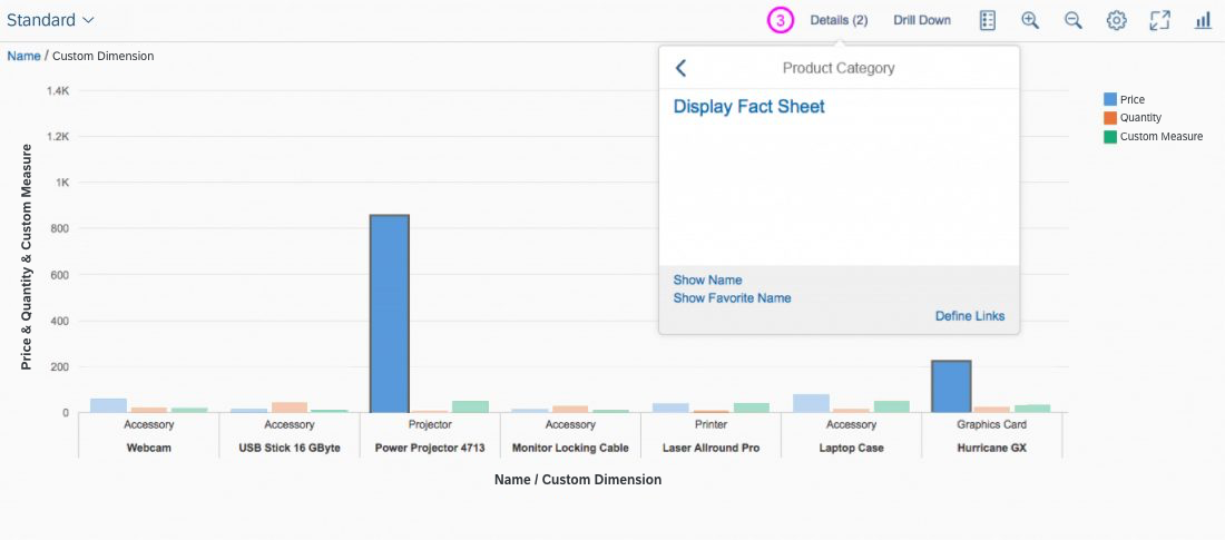
  3. The third image shows the semantic navigation information for the selected group (Name).

Guidelines

Semantic Colors

To display chart measures, the smart chart uses semantic coloring based on the UI.DataPoint annotation.

Use semantic coloring when you want to show data points with negative, critical, positive or neutral meaningsBased on the defined threshold values, the color of each data point can be red, green, or orange. For more information on color use, see Colors.

Smart chart - Semantic colors

Semantic Patterns

The smart chart supports semantic patterns, such as dashes, dots, or hatches, in order to distinguish:

  • Actual values: What values are (solid pattern).
  • Projected values: What values might be (dashed line, hatched areas).

Resources

Want to dive deeper? Follow the links below to find out more about related controls, the SAPUI5 implementation, and the visual design.

Elements and Controls

Implementation

Responsive Table – Content Formatting Cheat Sheet

A table often implies a “boring” layout. It contains plain text, one value per cell, and fails to catch the user’s attention. In contrast, the responsive table is much more flexible and eye-catching. It also contains many options for formatting the table content. Due to small screen widths on mobile devices, these options are necessary in order to reduce the number of visible columns.

This cheat sheet shows you how you can transform a plain table into the cutting edge style of SAP Fiori. Take a look at the example below.

Usage

Use this cheat sheet if:

Do not use this cheat sheet if:

Guidelines

Step
01
Starting point: A “traditional” table with one line of text per cell.

Traditional table
Traditional table
Step
02
Change the alignment:

  • Left-align text, IDs, phone numbers, URLs, passwords, email addresses, and status information.
  • Right-align numbers (except IDs and phone numbers), dates, and times.

Change the alignment
Step
03
Use the object identifier control to display key identifiers.
Use the object identifier control for key identifiers
Step
04
Use the object number control (sap.m.ObjectNumber, property: emphasized) to emphasize the key attribute (usually the value of a value-unit combination).
Use the object number control to display key attributes
Step
05
To indicate status information, use an object status control with semantic text colors. For more information on semantic colors, see colors.
Use the object status control to display status information
Step
06
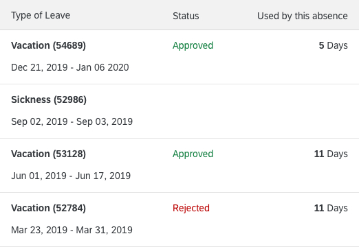
Remove columns by displaying the ID in brackets after the corresponding name.
Use ID-formatting to reduce the number of columns
Step
07
To gain even more width per column, remove additional columns by combining them.
Combine columns
Combine columns

And you’re done. With just a few simple steps, you can easily bring the SAP Fiori style to a plain table.

Resources

Want to dive deeper? Follow the links below to find out more about related controls, the SAPUI5 implementation, and the visual design.

Elements and Controls

Implementation