
Object Page – Content Area
The SAP Fiori elements object page template supports the features and settings for the object page content area detailed below.
For design information, see the Object Page Floorplan guidelines and the links below.
Feature Availability
Content Area |
Availability |
| Draft Object Validation | Default
Users can trigger the validation by pressing the Enter key while their cursor is in a field on the object or subobject page. |
| Navigation Bar: Anchor Bar | Default, you can turn it off when you only have one section. |
| Navigation Bar: Tab Bar | Available |
| Sections and Subsections | Available |
| Reuse Components as Sections | Available |
Subsections |
Availability |
| Link | Available
With SAP Fiori elements for OData V4, you can display an icon or image with the link. With SAP Fiori elements for OData V2, the default link shows the text and ID. You can remove the text or the ID. |
| Contact Facets | Available |
| Tables | Available |
| Charts | Available |
| Views for Tables and Charts | Available |
| Address | Available |
| Display of Related Properties Together | Available with SAP Fiori elements for OData for V4
The properties can also display as links. |
| Forms | Available |
| Text Control | With SAP Fiori elements V4, in edit mode, the default length of the text entry area allows for four lines of text.
You can:
|
| File Upload | With SAP Fiori elements for OData V4, users can upload a file to an object page property and delete it. |
| Dynamic Side Content | Available with an extension |
Subsection Behavior |
Availability |
| Subsection Starts Loading After the Object Page Elements Are Loaded | Default, you can change the behavior. |
| Adjustment of the Width for Content Display in a Subsection | Available |
Content Visibility |
Availability |
| Visible Sections, Subsections, Quickviews, and Tables | Default |
| Hiding Section, Subsection, Quickview and Table Content | Available |
| User-Controlled Visibility with Show More/Show Less | Available |
| Visible Smart Form Fields | Default, you can hide them in certain conditions. |
Content Area
Draft Object Validation
By default, data validation for the object page happens only when the users save the object so they enter data without interruption.
They can trigger data validation by pressing the Enter key while their cursor is in a field on the object or subobject page.
For more information, see: Form Field Validation
Navigation Bar
By default, the anchor bar is generated when the object page has more than one section.
It lets users navigate to the individual content area sections.
You can:
- Hide the anchor bar when you only have one section.
- Replace it with a tab bar.
With extensions, you can replace the buttons with another type of control.
If there is no Anchor Bar, but there is editable information in the header, the first temporary section in the Object Page which controls the header content will have a section title called ‘Header’.
For more information, see:
Sections and Subsections
You can add sections and subsections to the content area.
Sections contain only subsections. You build the subsection content with tables, charts, and forms.
When the object page uses:
- Tab bar navigation, the section title isn’t displayed in the content area
- Anchor bar navigation, only the title of the first section is hidden in the content area, unless the first section contains a table
Section and Subsection Titles
To minimize both the number of titles displayed and redundancies among the title values:
- When a section or subsection contains a single table or chart control, only the control title is displayed, but its value is replaced by the section or subsection title.
- For sections or subsections that contain a single text area, with SAP Fiori elements for OData V4, application teams can enable an option to display the section or subsection title instead of the text area label when the object page is in display mode. With the option enabled, the label is only displayed in edit mode if the field is mandatory.
For more information, see: Sections and Subsections.
Reuse Components as Sections
You can embed a reuse component as a section in the object page.
Subsections
Contact Facets
With both versions of SAP Fiori elements, in subsections, you can include a link that users can click to see additional information in a quickview.
For applications with Microsoft Team integration, the contact card and the quick view card both display options for starting a Microsoft Teams audio call, video call, or chat with the contact.
For more information, see:
Tables
You can include a table in a subsection.
When a table is the only content in a subsection, the subsection title is not displayed. Instead, the title of the table shows the value assigned to the subsection title.
For more information on SAP Fiori elements capabilities for tables, see the articles under SAP Fiori Elements: Table, starting with Table Types.
Charts
You can include a single chart facet in a subsection.
In the chart, you can:
- Display measures, their aggregation calculations, and dimensions to categorize the measures.
- Add custom actions to the toolbar for a chart and define whether they are enabled at all times or only after the user selects part of the chart for the action.
- Allow users to personalize the chart settings
When a chart is the only content in a subsection, the subsection title is not displayed. Instead the title of the chart shows the value assigned to the subsection title.
SAP Fiori Elements for OData V2
Charts are only supported for business objects or services that are not draft enabled or are read-only.
SAP Fiori Elements for OData V4
You can define a chart for a draft-enabled business object. The chart only displays active data, not data entered into an unsaved draft record.
For more information, see Chart (VizFrame).
For more information on chart options, see Chart.
Views for Tables and Charts
You can turn on views for:
- All the tables and charts on the page
- Individual tables and charts
For more information, see Views (Variant Management).
Address
You can add one or more address fields:
- As a separate subsection
- As part of a field group within a subsection
- To a quick view with smart link navigation
For more information, see:
Display of Related Properties Together
You can display two related properties side-by-side and with a single label in display mode.
For example, the label Date Time can display with the properties date and time side-by-side, even when they are distinct properties in the back end.
You can separate the values with a delimiter such as a slash (/) or a hyphen (-).
In edit mode, the fields can be edited separately.
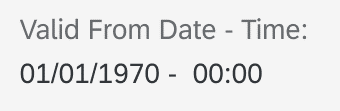
Side-by-side display of related properties
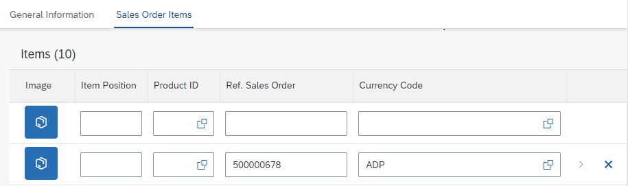
Related Properties as Links
The related properties can also display as links.

Related properties as links
Forms
You can add action buttons to the toolbar for a form contained in a subsection.
With SAP Fiori elements for OData V4, you can also add an action next to the form header.
The action types can be:
- Actions that occur in the system while the user stays on the object page.
- Actions that navigate to a different application, for example, when the user can open a purchase requisition from a specific purchase order.
Conditional Enablement of Navigation Buttons
You can enable buttons that navigate the user to another page or application based on the value of a specific field with SAP Fiori elements for OData V4. To achieve this with SAP Fiori elements for OData V2 requires extensions.
For example, you can enable the Generate Purchase Order button only for sales orders with the completed status.
Columns in a Form
To optimize onscreen space, the default number of columns in a form depends on the screen size, as follows:
Column Number |
Screen Size |
| 1 | Small |
| 2 | Medium |
| 3 | Large |
| 6 | Extra large |
Groups in a Form
You can group fields in a form and assign a name to the group.
Note that the group name is displayed only when a group contains fields.
User-Controlled Load of Fields with Low Importance
To improve the performance on application startup, you can prevent form fields with low importance from loading until the user clicks Show Details with SAP Fiori element for OData V4.
After the user clicks the button, the fields are loaded and the Hide Details button is displayed.
Text Control
By default, with SAP Fiori elements for OData V4, in edit mode, the default length of the text control allows for the entry of four lines of text.
You can:
- Set a maximum number of lines for the text control that’s greater than four.
- Enable growing mode: The length of the text control on first load allows for four lines. After the user has entered that number of lines, the length grows by one line at a time until it reaches the maximum number. A scrollbar is displayed next to the text entry area.
- Display below the text area the number of characters allowed in it. As the users enter text, the number decreases to show how many characters remain.
A notification is displayed if the users try to enter text beyond the limit.
In display mode, the text is truncated to 100 characters and a More link allows the user to display the full text. Alternatively, you can set the full text to display in a popover when the the user clicks More.
File Upload
With SAP Fiori elements for OData V4, users can upload a file to an object page property and delete the file.
For example, the sales order object can have a property for a contract and users can upload the contract file to the property.
The application developers can define the file size and types allowed for upload.
Dynamic Side Content
You can display additional content to the right of an object page subsection. Consult with the development team on doing this with a standard extension.
With this feature, the subsection toolbar contains a Show Details/Hide Details action for users to control the display of the dynamic side content. By default, the side content is hidden. You can show it instead. You can also rename the action to make it meaningful to the end user.
For more information, see:
- Dynamic Side Content
- Object Page: Dynamic Side Content
Subsection Behavior
Subsection Loading Behavior
By default, the subsection starts loading after the main object page elements are loaded.
You can change the loading behavior to load the subsection after the header data is loaded.
Example
When the subsection contains a table or chart and you want to allow the user to filter in the header before subsection data loads.
Width for Content Display in a Subsection
When you mix content — such as forms and tables — in one subsection, you can adjust the width allotted to each content type to display a table next to a form.
Content Visibility
Sections, Subsections, Quickviews, and Tables
By default, the object page displays these components.
You can set the entire components or selected content in the components to be displayed or hidden in the content area, according to the object’s state. For example, you can hide the Delivery section in a Sales Order until the order has a status where the delivery is planned.
User-Controlled Visibility
You can enable the Show More/Show Less button in the bottom right corner of a section to let users control the display of subsection content.
- When the subsection is hidden, Show More is displayed.
- When the subsection shows, the Show Less link is displayed.
Visibility of Smart Form Fields
By default, all smart form fields have the high importance setting and show on all screen sizes.
You can lower the level of importance for the fields to hide them on smaller screens.
According to the importance assigned to the field, it is displayed as follows:
- High (default): On all (small, medium, and large) screen sizes.
- Medium: On large and medium screens only.
- Low: On large screens only
For more information, see Responsiveness.
Related Links
Elements and Controls
- Object Page Floorplan (guidelines)
- Smart Link (guidelines)
- Quickview (guidelines)
- Smart Chart (guidelines)
- Views (Variant Management° (guidelines)
- Responsiveness (guidelines)

 Your feedback has been sent to the SAP Fiori design team.